
In Chapter 11, I introduced positioning. In this chapter, I discuss some odds and ends related to styling (X)HTML <table> elements and the controls that CSS provides for flexibility.
Tables are primarily a method to show the relationship between data, much as a spreadsheet application does. As I explore some acceptable uses of tables in this chapter, I discuss:
The optional table elements that can make it easier to style a table and that make the structure more intuitive
Controlling placement of the table caption
Controlling the layout of the table
Controlling the spacing between table cells
Tables can be complex creatures in (X)HTML. If used properly, they allow information to be presented in a neat, organized, and consistent manner. Put simply, data that needs to show relation and logic should be placed into tables. The discussion presented in this chapter also plays heavily into the discussion about styling XML in Chapter 14. The examples presented in Chapter 14 are identical to those presented in this chapter with one very important difference: They're written in XML.
Tables have several optional elements that may be used to further enhance the structure and presentation of a table. This is where I start the discussion.
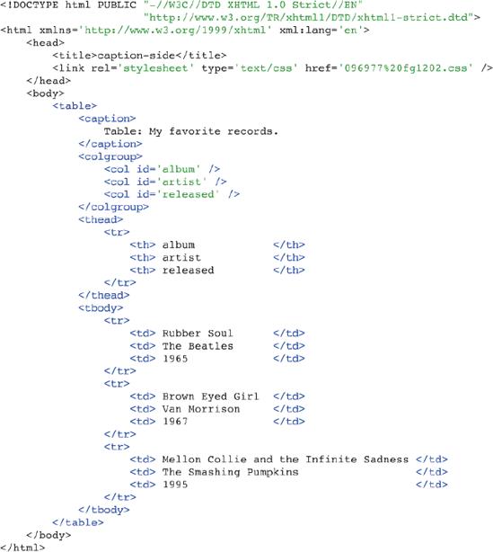
The <table> element has several optional elements that can be used to enhance the presentation of a table, including captions, columns, headings, and footers. Take a look at a <table> element that makes use of all these optional elements. When I get into the discussion of styling tables, beginning with the section "Table Captions and the caption-side Property," you'll need to understand what is possible in a table. I also present CSS 2 properties that are table-specific, allowing more control over table presentation. The markup in Figure 12-1 shows a table complete with all the optional bells and whistles.

In Figure 12-1, you can see that (X)HTML tables support many additional, optional elements.
The
<caption>element is used to provide the table with a caption or the name of the table.The
<colgroup>element is used to enclose each of the table<col />elements.<col />elements are used to control certain properties about each table column, the most common being the column width.The
<thead>element encloses information about column headers. If you print a table that spans more than one page, the information in the<thead>element is repeated at the top of each page.The
<tbody>element contains the main table data.The
<tfoot>element is similar to the<thead>element. When you print a table that spans more than one page, the information in the<tfoot>element is repeated at the bottom of each page.
In the coming sections, you learn more about what properties CSS offers for tweaking the visual presentation of (X)HTML tables.
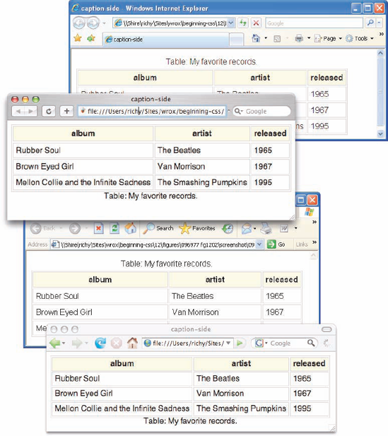
Captions are presented in the <caption> element. By default, these are rendered above the table in the document. You use the caption-side property to control the placement of the table caption.
The following table shows the caption-side property and its possible values.
Property | Value |
|---|---|
caption-side | top | bottom Initial value: top |
Although IE 6 and IE 7 support the
<caption>element for tables, neither IE 6 nor IE 7 supports the CSScaption-sideproperty.
Using the caption-side property, you can control whether the caption appears above or below the table. Figure 12-2 is a demonstration of the caption-side property.

The CSS in Figure 12-2a is included in the markup in Figure 12-2b.
In Figure 12-2c, you see how the caption-side property works in the browsers that support it. In Safari and Firefox, the table caption appears beneath the table, but in IE 6 and IE 7, neither of which support the caption-side property the table caption appears above the table (which is the default position of the caption).
In the next section, I continue the discussion of tables with what styles are allowed on table columns.
In HTML/XHTML, the <colgroup> and <col> elements allow the vertical columns of a table to be controlled. This is useful for controlling the width of a column of data or other aspects of presentation, such as background color or text color.
By using these elements, you can span more than one column or have one column defined for each actual column, as in the following example:
<table>
    <colgroup>
        <col span='2' />
        <col />
    </colgroup>
    <tbody>
        <tr>
            <td> column 1</td>
            <td> column 2</td>
            <td> column 3</td>
        </tr>
    </tbody>
</table>
<col span='2' /> controls the presentation of the <td> elements containing the text of column 1 and column 2, the first two columns of the table. The last <col/> element (without the span attribute) controls the presentation of column 3, contained in the last <td> element.
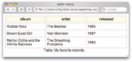
Using CSS, I can continue the example containing my favorite records. This example shows a column defined for each actual column of data, or in other words, each <td> element appearing in a row. In the example in Figure 12-3, a column is defined for each cell, and each row has three cells; consequently, there are three columns. In Figure 12-3, you see what styles are allowed on the <col /> element.
The CSS in Figure 12-3a is included in the markup in Figure 12-3b.
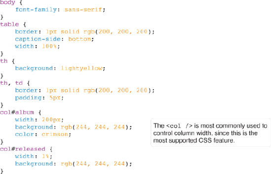
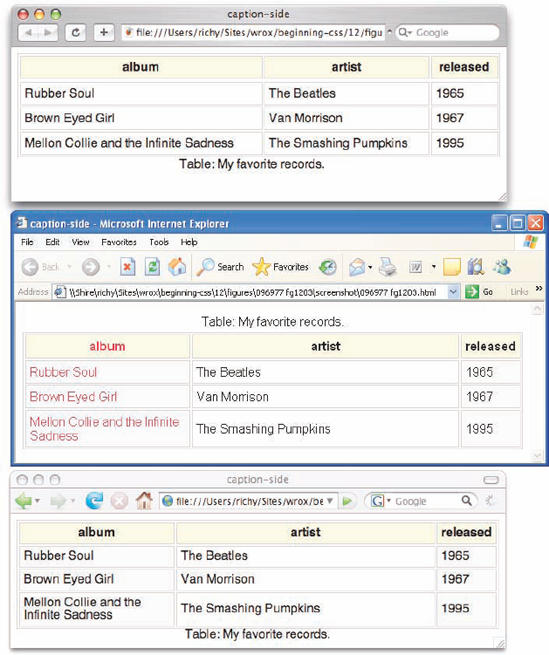
Figure 12-3c shows what you get when the markup is loaded into a browser. You can see in Figure 12-3c that Safari supports no CSS on the (X)HTML <col /> element. IE 6 (and IE 7) support the width, background, and color properties on the <col /> element. Mozilla Firefox supports the width and background properties.

In the following Try It Out, I show how all the extra bells and whistles available for <table> elements work in a real-world project and how these elements help you take advantage of CSS. This Try It Out demonstrates placing a recipe in a table. I'm also adding a little eye candy here with CSS background images to enhance the look and feel of the document. This example is also important in Chapter 14, where I show you how it can be ported to XML and styled with CSS as an XML document.
Try It Out: Applying Tables to a Real Project
Example 12-1. In the following steps, you apply tables to a real-world project.
Type the following XHTML markup into your text editor:
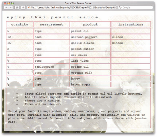
<!DOCTYPE html PUBLIC "-//W3C//DTD XHTML 1.0 Strict//EN"
                      "http://www.w3.org/TR/xhtmll/DTD/xhtmll-strict.dtd">
<html xmlns='http://www.w3.org/1999/xhtml' xml:lang='en'>
    <head>
        <title>Spicy Thai Peanut Sauce</title>
        <link rel='stylesheet' type='text/css' href='Example_12-1.css' />
    </head>
    <body>
        <table class='recipe'>
            <caption>
                Spicy Thai Peanut Sauce
            </caption>
            <colgroup>
                <col/>
                <col/>
                <col/>
                <col/>
            </colgroup>
            <thead>
                <tr>
                    <th> quantity     </th>
                    <th> measurement  </th>
                    <th> product      </th>
                    <th> instructions </th>
                </tr>
            </thead>
            <tbody>
                <tr>
                    <td> &fracl2;        </td>
                    <td> CUPS                </td>
                    <td> Peanut Oil          </td>
                    <td></td>
                </tr>
                <tr>
                    <td> 12                  </td>
                    <td> Each                </td>
                    <td> Serrano Peppers     </td>
                    <td> Sliced              </td>
                </tr>
                <tr>
                    <td> 16                  </td>
                    <td> Each                </td>
                    <td> Garlic Cloves       </td>
                    <td> Minced              </td>
                </tr>
                <tr>
                    <td> 2                   </td>
<td> CUPS </td> <td> Peanut Butter </td> <td></td> </tr> <tr> <td> 1 </td> <td> CUPS </td> <td> Soy Sauce </td> <td></td> </tr> <tr> <td> ½ </td> <td> CUPS </td> <td> Lime Juice </td> <td></td> </tr> <tr> <td> 4 </td> <td> TABLESPOONS </td> <td> Sesame Oil </td> <td></td> </tr> <tr> <td> 4 </td> <td> CUPS </td> <td> Coconut Milk </td> <td></td> </tr> <tr> <td> ½ </td> <td> CUPS </td> <td> Honey </td> <td></td> </tr> <tr> <td> ½ </td> <td> CUPS </td> <td> Brown Sugar </td> <td></td> </tr> </tbody> <tfoot> <tr> <td colspan='4'> <ul> <li> Sauté sliced serranos and garlic in peanut oil till lightly browned. </li> <li> Add all other ingredients and stir till dissolved. </li> <li> Simmer for 5 minutes. </li> </li> <li>Purée all in blender. </li> </ul> <p> Sauté your favorite vegetables; onions, mushrooms, green peppers, and squash work best. Sprinkle with allspice, salt, and pepper. Optionally add walnuts or pine nuts. Add browned chicken or tofu and glaze with sauce. Serve with jasmine rice. </p> </td> </tr> </tfoot> </table> </body> </html>Save the file as
Example_12-1.html.Write the following CSS into your text editor in a separate document:
html {
    background: #fff url('fruit_veg_web.jpg') no-repeat fixed center center;
}
body {
    font-family: monospace;
    padding: 10px;
    margin: 10px;
    /* Moz proprietary opacity property */
    -moz-opacity: 0.7;
    /* Microsoft proprietary filter property */
    filter: progid:DXImageTransform.Microsoft.Alpha(opacity=70);
    /* CSS 3 opacity property */
    opacity: 0.7;
    background: url('cross_hatch.jpg') repeat;
}
table.recipe {
    width: 100%;
    margin-bottom: 5px;
}
caption {
    text-align: left;
    margin-bottom: 5px;
    text-transform: lowercase;
    font-size: 160%;
    padding: 5px;
    letter-spacing: 10px;
    font-weight: bold;
}
table.recipe thead th {
    font-weight: bold;
    font-size: 150%;
    color: black;
}
table.recipe thead th, table.recipe tbody td {
padding: 5px; text-transform: lowercase; } table.recipe tbody td, table.recipe tfoot td { font-size: 130%; } table.recipe tfoot td { padding: 5px; } table.recipe tfoot td p { padding: 5px; } li { margin-left: 30px; padding-left: 30px; }Save the file as
Example_12-1.css. This results in the output shown in Figure 12-4.

How It Works
This example is a lot to digest. Take a look at each part of it in detail to see how it comes together. First, explore the markup of the document. I have included a <caption> element inside the table to house the name of the recipe:
<table class='recipe'>
    <caption>
        Spicy Thai Peanut Sauce
    </caption>
    <colgroup>
        <col/>
        <col/>
I could just as easily have put the name of the recipe in a heading element like <hl> and placed it outside the table. I chose the caption so the name of the recipe is bound to the table of ingredients. Later, if I choose to, I can include the name of the website or a logo above the table of ingredients. Next, I've added <colgroup> and <col/> elements. These can be used to control the layout of each column, although I haven't chosen to take advantage of this capability yet. Although you can use these elements, they are not absolutely necessary. I can leave them out, causing no impact on the table's final rendered layout. Next, I added the table headings, placed inside <thead> elements, and I used <th> instead of <td> to house the contents of each cell:
<col/>
    <col/>
</colgroup>
<thead>
    <tr>
        <th> quantity     </th>
        <th> measurement  </th>
        <th> product      </th>
        <th> instructions  </th>
    </tr>
</thead>
<tbody>
I added the <tbody> element to house the contents of the recipe itself, and near the bottom of the recipe I listed the instructions in an unordered list (<ul>) element. I placed final suggestions in a paragraph at the bottom of the document.
Look more closely at how the CSS comes together with the markup to produce the final rendered output in Figure 12-4. The first rule styles the <body> element, and there's quite a bit going on here:
body {
    font-family: monospace;
    padding: 10px;
    margin: 10px;
    /* Moz proprietary opacity property */
    -moz-opacity: 0.7;
    /* Microsoft proprietary filter property */
    filter:progid:DXImageTransform.Microsoft.Alpha(opacity=70);
    /* CSS 3 opacity property */
    opacity: 0.7;
    background: url('cross_hatch.jpg') repeat;
}
First things first: The <body> element is given a monospace font face, and 10 pixels of margin and 10 pixels of padding. I do both here because some browsers have a default margin, and others have default padding; by setting both values, you get cross-browser consistency.
The next three declarations all deal with opacity. At the time of this writing, the opacity property is an official part of CSS 3. Before the CSS 3 implementation, each browser had its own way of handling opacity, with the exception of Opera, which prior to version 9, did not support opacity, and as of version 9 supports the CSS 3 opacity property. The Mozilla proprietary CSS opacity property is -moz-opacity. Microsoft has a completely different method for specifying opacity: It's handled through a proprietary filter property, but despite its verbose syntax, it produces the same results as the standard CSS 3 opacity property that other browsers support. The use of these opacity properties produces an aesthetically pleasing transparency effect that allows the background specified for the <html> element in this rule to bleed through:
html {
   background: #fff url('fruit_veg_web.jpg') no-repeat fixed center center;
}
For the <body> element, I've applied a background that uses a cross-hatching effect. The backgrounds I've chosen for this document are purely aesthetic. The image 'fruit_veg_web.jpg' is quite large in size, over 100KB. On first download, this image takes a while to load on a low-bandwidth connection. However, with browser caching, the technique that saves a local copy of all the documents and components of the web page, the bite caused by this large file is limited to the first visit. As visitors view subsequent pages with the same background, the browser remembers that this file is the same one requested from the page before and simply displays that local copy instead of requesting it again from the server.
The next rule on the style sheet is the <table> containing the Spicy Thai Peanut Sauce recipe:
table.recipe {
    width: 100%;
    margin-bottom: 5px;
}
Here the table is told to take up 100% of the available space horizontally. Because it resides inside of the <body> element, the amount of free space is what's available inside of that element. A margin is applied to the bottom of the table to provide more spacing from the end of the <table> and the start of the <ul>. The caption, containing the name of the recipe, renders above the table by default. Therefore, the table appears in Figure 12-4 just as if you had written the following:
table.recipe {
    caption-side: top;
    width: 100%;
    margin-bottom: 5px;
}
If I wanted the caption to appear below the table, after the data contained in the <table> element, I would have included caption-side: bottom; instead. For this example, it made more sense for the caption to appear above the table because it contains the name of the recipe.
The next group of style sheet rules style the cells of the table:
table.recipe thead th {
    font-weight: bold;
    font-size: 150%;
    color: black;
}
table.recipe thead th, table.recipe tbody td {
    padding: 5px;
    text-transform: lowercase;
}
table.recipe tbody td, table.recipe tfoot td {
    font-size: 130%;
}
table.recipe tfoot td {
    padding: 5px;
}
For the cells of the table, I have chosen to take advantage of grouping elements to differentiate the styles for table headings (<thead> element), the body of the table (<tbody> element), and the footer of the table (<tfoot> element). This approach allows me to apply style to the table without adding additional id or class attributes. I use the descendant selector here to ensure that styles are applied only to tables containing the recipe class name. This allows me to include more than one recipe per page or possibly introduce other tables of data without affecting the styles for those tables. Again, the descendant selector works by looking at the element's ancestry. For instance, table.recipe thead th says to look first for a <table> that contains a recipe class name; then look for a <thead> element inside that table; look for a <th> element inside the <thead> element; and finally, apply the declarations contained inside the rule.
Now that you have seen the various elements available for use in a <table> element, the following section explores how you control table width with the table-layout property.
The following table outlines the table-layout property and its possible values.
Property | Value |
|---|---|
table-layout | auto | fixed Initial value: auto |
As you learned in Chapter 7, by default, a table expands and contracts to accommodate the data contained inside. As data fills the table, it continues to expand as long as there is space. When you look at them this way, tables are inherently fluid.
table {
   border: thin solid black;
}
This rule is the same as saying:
table {
    border: thin solid black;
    table-layout: auto;
}
The table-layout: auto; declaration is the default behavior of a table.
By default, the table expands only enough for the content that it contains, and this is the same as table-layout: auto;. Sometimes, however, it is necessary to force a table into a fixed width for both the table and the cells. Figure 12-5 is a demonstration of what happens when you specify a fixed width for the table.
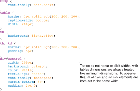
To see what a 200-pixel width looks like, Figure 12-5b adds a snippet of markup to the body of the XHTML document showing my favorite records.
This code results in the output depicted in Figure 12-5c.
The table is larger than 200 pixels because the text contained in the cells results in a width larger than 200 pixels. You can use the table-layout: fixed; declaration to force the table into a 200-pixel width. You simply add the declaration, like so:
table {
    border: 1px solid rgb(200, 200, 200);
    caption-side: bottom;
    width: 200px;
    table-layout: fixed;
}

Once you've added the table-layout: fixed; declaration, you get the output that you see in Figure 12-6.

The table is forced to maintain its width of 200 pixels, regardless of how much data is contained in its table cells. If the content inside the cells results in a width larger than 200 pixels, the content overflows. The clipped content is not visible when the document is viewed using IE 6 and IE 7, which is what is supposed to happen. As you see in Figure 12-6, however, the clipped content is visible in Safari, and the same is seen when the document is viewed in Firefox or Opera. You can correct this by adding the following rule:
th, td {
    overflow: hidden;
}
The result is shown in Figure 12-7.

This is what the output is supposed to look like according to the table-layout property as it appears in the CSS 2 standard, and as supported by IE and Opera. In contrast, as you saw in Chapter 7, the overflow property may also be used to add scroll bars so that the clipped content can be viewed.
The table-layout: fixed; declaration goes by the width defined for the <table> element. In this example, the width is 200 pixels, so the table is forced into having a 200-pixel width. If a width isn't defined for the <table> element, it goes by the width for each <col> element. If no width is defined there, it goes by the width for the <td> elements in the first row of the table.
By default, tables are rendered with table-layout: auto;, which in essence means that the table can expand and contract to accommodate the data contained in its cells. What happens if a percentage width is specified for the table? When the table has a percentage width, each cell is given an equal width that expands and contracts, depending on the space available to it. If the content of the cell is larger than the width, however, the content is clipped, just as it was with a fixed width. The rule for the table is changed to width: 100%; from width: 200px;, as seen in the following example:
table {
    border: 1px solid rgb(200, 200, 200);
    caption-side: bottom;
    width: 100%;
    table-layout: fixed;
}
The result is shown in Figure 12-8.
Each cell is spaced evenly. When the browser window is resized, the table gets smaller. As it gets smaller and the content of the cells become larger than the cell, the content gets clipped as it did in Figure 12-7.
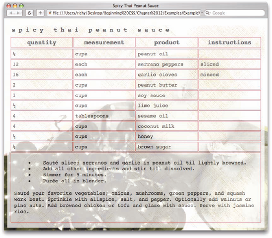
Now that I've presented what the table-layout property does, I want to demonstrate the results of this property when it's applied to the Spicy Thai Peanut Sauce recipe table. Before I apply the table-layout property, however, I first need to apply a temporary rule that adds a border to each cell so that you can see the effect of the table-layout property. In the following Try It Out, you add this rule to the style sheet.
Try It Out: Highlighting Cell Widths
Example 12-2. The following steps show you how to add a rule that applies a border to each cell.
Open
Example_12-1. cssand add the following rule to the style sheet:th, td { border: lpx solid crimson; }Save the file as
Example_12-2. css.Make the following changes to
Example_16-1.htmlto reference the new style sheet:<!DOCTYPE html PUBLIC "-//W3C//DTD XHTML 1.0 Strict//EN" "http://www.w3.org/TR/xhtmll/DTD/xhtmll-strict.dtd"> <html xmlns='http://www.w3.org/1999/xhtml' xml:lang='en'> <head> <title>Spicy Thai Peanut Sauce</title> <link rel='stylesheet' type='text/css' href='Example_12-2.css' /> </head> <body> <table class='recipe'> <caption> Spicy Thai Peanut Sauce </caption>Save the file as
Example_12-2.html. The result is depicted in Figure 12-9.
How It Works
The borders highlight the fact that the cells of the table are uneven. Each column has a different width depending on the contents of the cells of that column; by default, a table expands just enough to accommodate its content. This table has a 100% width, which only alters that behavior slightly. The columns still expand and contract depending only on how much content is in each cell. The more content a cell is given, the more its column width expands.
Temporary style rules like this are often helpful in highlighting the effects of rendering that are difficult to see. Keeping the highlighted borders, examine the following Try It Out to see what this example looks like when the table-layout: fixed; declaration is applied.
Try It Out: Applying the table-layout Property
Example 12-3. In the following steps, you apply the table-layout: fixed; property.
Open
Example_12-2. cssand add the highlighted declaration to the style sheet:table.recipe { width: 100%; margin-bottom: 5px; table-layout: fixed; }Save the file as
Example_12-3. css.Make the following changes to modify
Example_12-2.htmlso that it references the new style sheet:<!DOCTYPE html PUBLIC "-//W3C//DTD XHTML 1.0 Strict//EN" "http://www.w3.org/TR/xhtmll/DTD/xhtmll-strict.dtd"> <html xmlns='http://www.w3.org/1999/xhtml' xml:lang='en'> <head> <title>Spicy Thai Peanut Sauce</title> <link rel='stylesheet' type='text/ess' href='Example_12-3.css' /> </head> <body> <table class='recipe'> <caption> Spicy Thai Peanut Sauce </caption>Save the file as
Example_12-3.html. The result is shown in Figure 12-10.
How It Works
The addition of the table-layout: fixed; declaration gives the table a very clean, organized look. All the columns have equal, consistent widths. With this particular design, the table fills the area available inside the <body> element because it has a width of 100%.
The table-layout: fixed; declaration allows a table's layout to be more consistent by forcing a table to honor the value contained in the width property. The width property may be applied to the <table> element, to the <col/> elements inside the table, or to the cells.
Now that I've thoroughly explored the table-layout property, in the following sections I examine the other CSS properties that exist for controlling table layout.
The following table outlines the border-collapse property and its possible values.
Property | Value |
|---|---|
border-collapse | collapse | separate Initial value: separate |
Tables, by default, include some spacing between each of the cells appearing in the table. In this chapter, you've observed this in each of the "My Favorite Records" examples. In HTML, this was controlled with the cellspacing attribute. CSS 2 replaces this attribute with the border-collapse property and the border-spacing property. By default, the border-collapse property has a value of separate. If you set the value to collapse, you remove the spacing between each cell. When you use the "My Favorite Records" table example again, this is what the rule looks like with the border-collapse: collapse; declaration applied.
table {
    border: 1px solid rgb(200, 200, 200);
    caption-side: bottom;
    width: 100%;
    table-layout: fixed;
    border-collapse: collapse;
}
If you apply the collapse value, all the cells are squeezed tightly together. Figure 12-11 shows what happens.
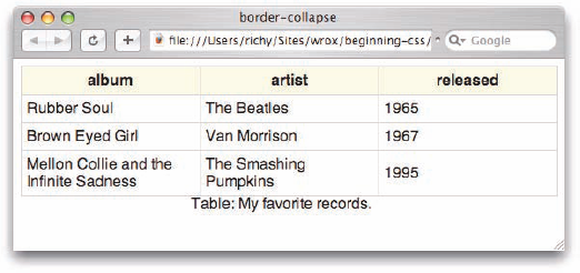
The
border-collapse: collapse; property is currently the best way to remove all spacing from between cells, because this property is supported by IE 6, IE 7, Firefox, Opera, and Safari.
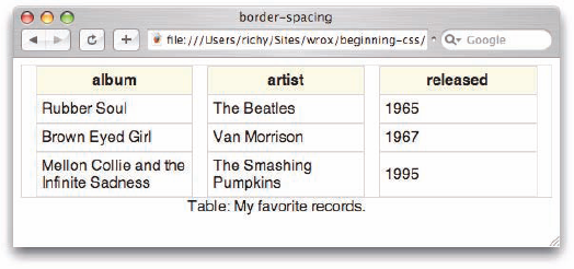
The next section talks about how you can control spacing between table cells with greater precision with the border-spacing property.
The following table outlines the border-spacing property and its possible values.
Property | Value |
|---|---|
border-spacing | <length> <length>? Initial value: 0 |
IE 6 and IE 7 do not support the
border-spacingproperty.
To control the spacing between cells, the border-spacing property was added in CSS 2. The border-spacing property allows more control over cell spacing than border-collapse because it allows the length to be specified.
If, as in the following example, you provide a single length value of 15px, 15 pixels of space are added between each cell, both vertically and horizontally:
table {
    border: 1px solid rgb(200, 200, 200);
    caption-side: bottom;
    width: 100%;
    table-layout: fixed;
    border-spacing: 15px;
}
The result is shown in Figure 12-12. You can see that IE 6 does not support the border-spacing property (nor does IE 7, for that matter). Firefox, Opera, and Safari do support this property.
The border-spacing property has the following syntax:
border-spacing: <vertical spacing length> <horizontal spacing length>;
If the optional second value is present, this property allows the vertical and horizontal spacing to be specified. The following snippet results in 15 pixels of space between the top and bottom of each cell:
table {
    border: 1px solid rgb(200, 200, 200);
    caption-side: bottom;
    width: 100%;
    table-layout: fixed;
    border-spacing: 0 15px;
}
The result is shown in Figure 12-13.

Whereas, if I flip the values around, as in the following:
table {
    border: 1px solid rgb(200, 200, 200);
    caption-side: bottom;
    width: 100%;
    table-layout: fixed;
    border-spacing: 15px 0;
}
I get 15 pixels of space between the left and right edges of each cell. The result is shown in Figure 12-14.
Now that I've shown you how to control the spacing between cells, you can apply this knowledge to the Spicy Thai Peanut Sauce recipe table. The following Try It Out demonstrates a practical use of the border-collapse property in action.
Try It Out: Applying Cell Spacing
Example 12-4. The following steps show how to work with cell spacing.
Open
Example_12-3. cssand make the following modifications to the file:table.recipe { width: 100%; margin-bottom: 5px; table-layout: fixed; border-collapse: collapse; }Save the file as
Example_12-4. css.Update the markup in
Example_12-3.htmlto reflect the new style sheet:<!DOCTYPE html PUBLIC "-//W3C//DTD XHTML 1.0 Strict//EN" "http://www.w3.org/TR/xhtmll/DTD/xhtmll-strict.dtd"> <html xmlns='http://www.w3.org/1999/xhtml' xml:lang='en1><head> <title>Spicy Thai Peanut Sauce</title> <link rel='stylesheet' type='text/css' href='Example_12-4.css' /> </head> <body> <table class='recipe'> <caption> Spicy Thai Peanut Sauce </caption>Save the file as
Example_12-4.html. The result of these changes is shown in Figure 12-15.

How It Works
As you can see in the output, the addition of border-collapse: collapse; fine-tunes the design for the Spicy Thai Peanut Sauce recipe table. Removing the extra space between the cells tightens up the design.
At this point, I can remove the temporary borders that I included to make the cell edges obvious:
th, td {
    border: 1px solid crimson;
}
With this rule removed, the page looks like what's shown in Figure 12-16.

The final product shown in Figure 12-16, with the temporary border removed, is saved in the source code files for download at www.wrox.com. After downloading the entire folder structure, you can find the files, Example_12-5.html and Example_12-5.css, under Chapter 12/Try It Out.
In this chapter, I showed you what is possible with HTML/XHTML tables. Here is what I covered:
Tables have a lot of optional elements that make the structure easier to style. These include columns, heading groupings, body groupings, and footer groupings.
You control the placement of a table's caption by using the
caption-sideproperty.You control a table's layout by using the
table-layoutproperty. With this property, it is possible to force a table into a certain width.You can remove the spacing between table cells by using the
border-collapseproperty.You can adjust the spacing between table cells by using the
border-spacingproperty.
In the next chapter, I discuss what CSS offers for styling content printing.
Later on, in Chapter 14, I begin discussing how to style an XML document. As I mentioned earlier in this chapter, Chapter 14 relies heavily on the content presented in this chapter because it shows you how to create the examples presented in this chapter with XML and CSS.
Which of the properties discussed in this chapter do not work in IE 6 and IE 7?
Describe what the
table-layout: fixed;declaration does.When sizing using the
table-layout: fixed;declaration, how does the browser determine the width of table columns?What purpose does the optional
<thead>element serve?What element would you use if you wanted table column headers that are styled bold and centered?
In what containing element does the main table data appear?
What browser does not support applying width to table columns? (At the time of this writing, of course.)