
This chapter examines the various properties that CSS provides to position elements in a document. Positioning can be thought of as layering, in that the various elements of a page can be layered on top of others and given specific places to appear in the browser's window. In this chapter I discuss:
The
positionproperty and the four types of positioning that CSS has to offer:static, relative, absolute, andfixedThe offset properties
top, right, bottom, andleft, and how these are used to deliver an element to a specific position in a web documentThe
z-indexproperty and how this property is used to layer the elements of a documentSome practical applications of positioning, such as multicolumn layouts and vertically centering a positioned element
Positioning makes CSS a very powerful presentational language, and further enhances its flexibility. Like floating elements, positioning offers some unique characteristics that allow behavior you might not always expect. This chapter begins the discussion of positioning with none other than the position property.
The position property is used to give elements different types of positioning. Positioning, gives you the ability to, with precision, dictate where in a document you want an element to appear. You can choose whether an element appears relative to another element, or relative to the browser window. You can layer elements one on top of another.
The following table outlines the position property and its possible values, and the four offset properties, top, right, bottom, and left, and their possible values.
Property | Value |
|---|---|
position | |
top | <length> | <percentage> | auto Initial value: auto |
right | <length> | <percentage> | auto Initial value: auto |
bottom | <length> | <percentage> | auto Initial value: auto |
left | <length> | <percentage> | auto Initial value: auto |
Positioning gives you a fantastic amount of control and increases the possibilities for the layout of a document, since you can specifically say where you want an element to appear, in addition to layering elements one on top of another.
In the next section, I begin the discussion of positioning with absolute positioning.
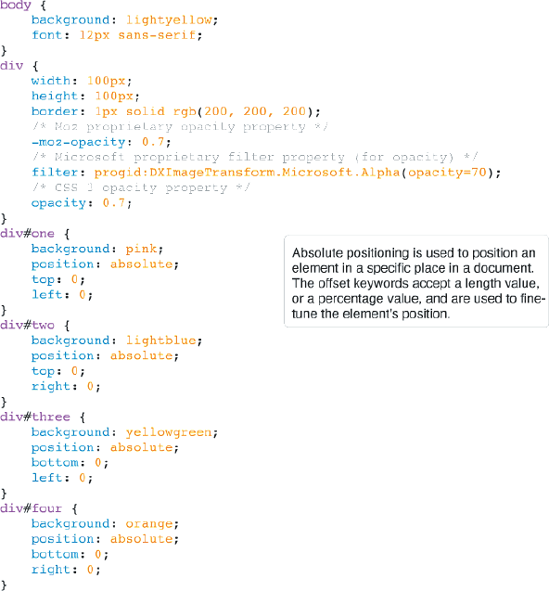
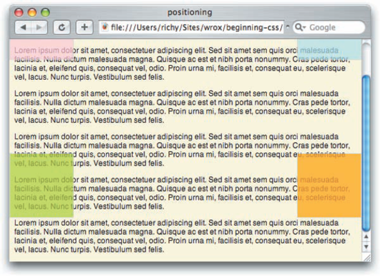
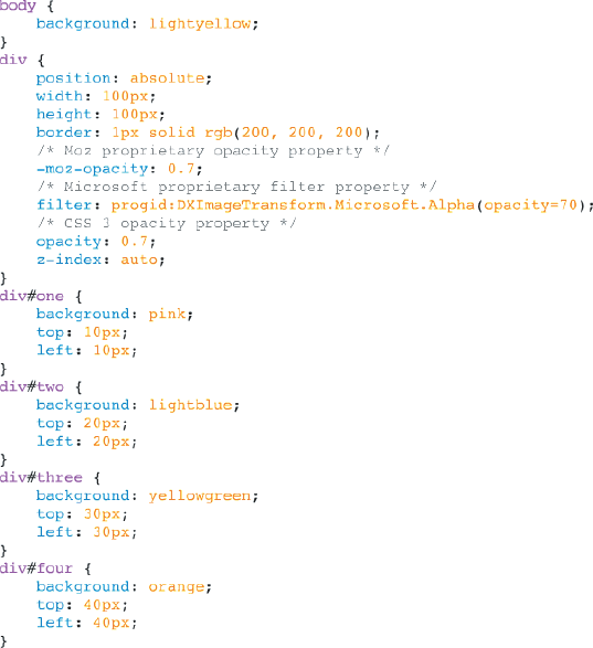
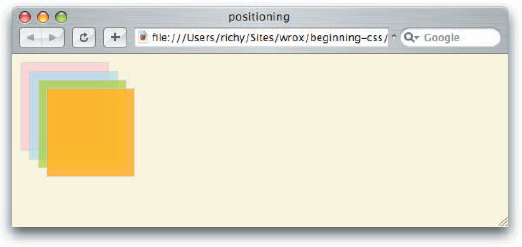
Absolute positioning allows you to render an element to a particular place in a document. The only way to grasp this concept is to see a demonstration of it in action. Figure 11-1 shows a document that we'll apply absolute positioning to.
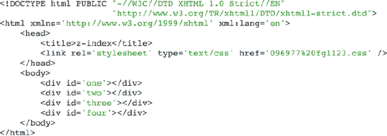
The CSS in Figure 11-1a is combined with the markup in Figure 11-1b.


The CSS in Figure 11-1a and the markup in Figure 11-1b results in the output that you see in Figure 11-1c.

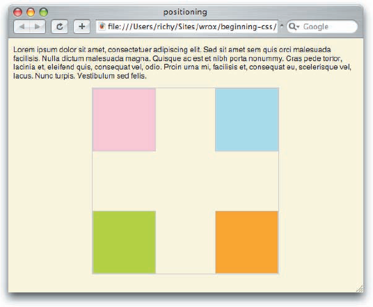
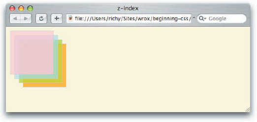
In Figure 11-1, you see what the document looks like before any kind of positioning is applied. Each <div> element in the example appears one after another from top to bottom. This is static positioning. In Figure 11-2, you can see how absolute positioning works.
The CSS in Figure 11-2a is combined with the markup in Figure 11-2b to get the output that you see in Figure 11-2c.
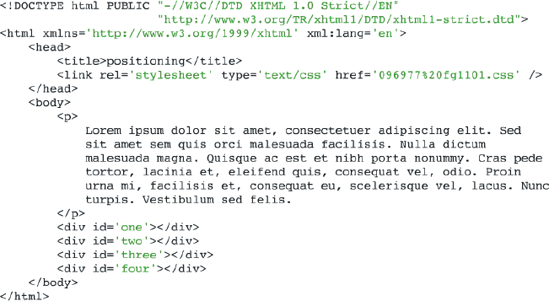
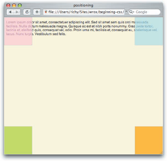
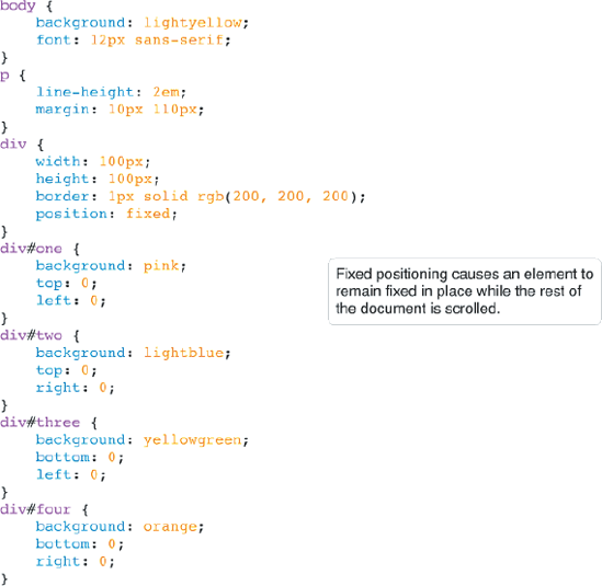
In Figure 11-2c, you can see that the four <div> elements are positioned in specific places in the document. The declaration position: absolute; causes the element to leave the normal flow of the document and become layered along an invisible z-axis. The position of each element is controlled by the four offset keywords, top, right, bottom, and left.
You also see in Figure 11-2a that I've used a few properties that you haven't seen before. These are the opacity, -moz-opacity, and filter properties. These are all used for the same thing: to make the positioned <div> elements semitransparent so that you can see what's underneath each <div>. I use three properties for the best cross-browser compatibility. Firefox prior to Firefox 1.5, Netscape, and the Mozilla SeaMonkey browser suite all used the –moz-opacity property for transparency. Firefox 1.5 and later, Safari, and Opera 9 all support the official CSS 3 opacity property. Both -moz-opacity and the CSS 3 opacity property take a floating-point value between 0 and 1, with 0 being fully transparent and 1 being fully opaque. For example, the value 0.5 would be half transparent and half opaque. The filter property, if you hadn't already guessed by its value, is proprietary to Microsoft and works in IE 5.5 and later. Although its syntax is quite a bit more verbose, it provides an identical effect to the CSS 3 opacity property supported by other browsers. Instead of a floating-point value between 0 and 1, it takes a percentage value between 0 and 100, where 100 is fully opaque, and 0 is fully transparent.
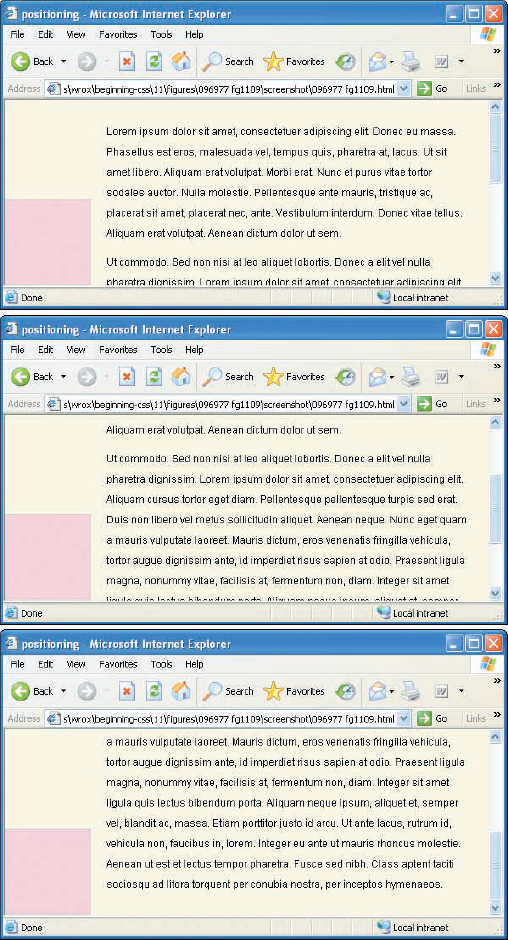
You'll notice in the simple example that I provide that the boxes are positioned relative to the viewport. This is made clearer by adding more copy to the document to make it scroll. In Figure 11-3a, you can see that each <div> element is positioned relative to the browser's viewport, that is, the initial visible area of the document.
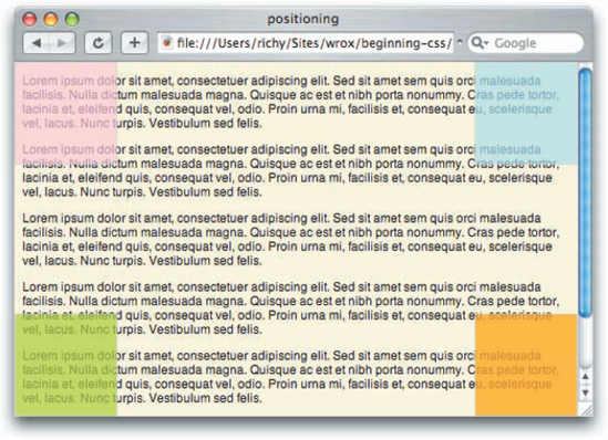
In Figure 11-3b, you can see that when you scroll down, the boxes stay where they were initially positioned when the page was loaded up.
You can modify what element is used as the point of reference for absolutely positioned elements. The rules are pretty simple: If an absolutely positioned element is contained within another element that has a position other than static, then that element is used as the point of reference for positioned elements. One common way to change the point of reference for positioned elements is to give the containing element a "relative" position, and that is the topic of the next section.
Try It Out: A Recap of Absolute Positioning
Example 11-1. To review the concepts of absolute positioning that you learned in this section, follow these steps.
Enter the following XHTML document in your text editor:
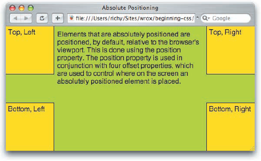
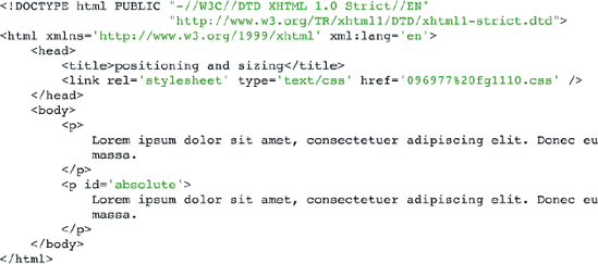
<!DOCTYPE html PUBLIC "-//W3C//DTD XHTML 1.0 Strict//EN"
                      "http://www.w3.org/TR/xhtml1/DTD/xhtml1-strict.dtd">
<html xmlns='http://www.w3.org/1999/xhtml' xml:lang='en'>
    <head>
        <title>Absolute Positioning</title>
        <link rel='stylesheet' type='text/css' href='Example_11-1.css' />
    </head>
    <body>
<p> Elements that are absolutely positioned are positioned, by default, relative to the browser's viewport. This is done using the position property. The position property is used in conjunction with four offset properties, which are used to control where on the screen an absolutely positioned element is placed. </p> <div id='top-left'> Top, Left </div> <div id='top-right'> Top, Right </div> <div id='bottom-left'> Bottom, Left </div> <div id='bottom-right'> Bottom, Right </div> </body> </html>Save the preceding document as
Example_11-1.html.Enter the following CSS in your text editor:
body {
    background: yellowgreen;
}
p {
    margin: 10px 110px;
}
div {
    position: absolute;
    background: yellow;
    padding: 5px;
    width: 100px;
    height: 100px;
}
div#top-left {
    top: 0;
    left: 0;
    border-right: 1px solid black;
    border-bottom: 1px solid black;
}
div#top-right {
    top: 0;
    right: 0;
    border-left: 1px solid black;
    border-bottom: 1px solid black;
}
div#bottom-left {
    bottom: 0;
    left: 0;
border-right: 1px solid black; border-top: 1px solid black; } div#bottom-right { bottom: 0; right: 0; border-left: 1px solid black; border-top: 1px solid black; }Save the preceding document as
Example_11-1.css. The preceding source results in the output in Figure 11-4.
How It Works
In Example 11-1, you saw a brief recap of the concepts presented so far. Elements that are absolutely positioned are delivered to a specific place onscreen, more specifically, to a specific place in the browser's viewport, which is the visible area of the rendered document. In Example 11-1, you placed four <div> elements at the four corners of the browser's viewport by absolutely positioning each <div> element with the position: absolute; declaration, and then specifically positioning each one with various combinations of the four offset properties. For example, the declarations top: 0; and left: 0; places the <div> element with the id name top-left to the top left corner of the viewport. Then you repeated the process for each of the other three <div> elements, positioning them in each of the three other corresponding corners of the browser's viewport. Later in this chapter you will observe some more practical uses for absolute positioning with various multicolumn layouts.
In the next section, I introduce a concept that goes hand-in-hand with absolute positioning because it enables you to control the context used when an element is positioned, and that is relative positioning.
Relative positioning is very similar to static positioning; elements to which relative positioning is applied do not leave the document flow. There are three differences between relative positioning and static positioning:
Elements with a relative position can be used as a point of reference for elements nested within them that are absolutely positioned.
The position of a relatively positioned element can be adjusted using the offset properties.
A relatively positioned element can have a position on the (invisible) z-axis (more on this later in this chapter).
To observe how a relatively positioned element can be used as a point of reference for absolutely positioned descendant elements, take a look at Figure 11-5.
As always, the CSS in Figure 11-5a is combined with the markup in Figure 11-5b to produce the output that you see in Figure 11-5c.
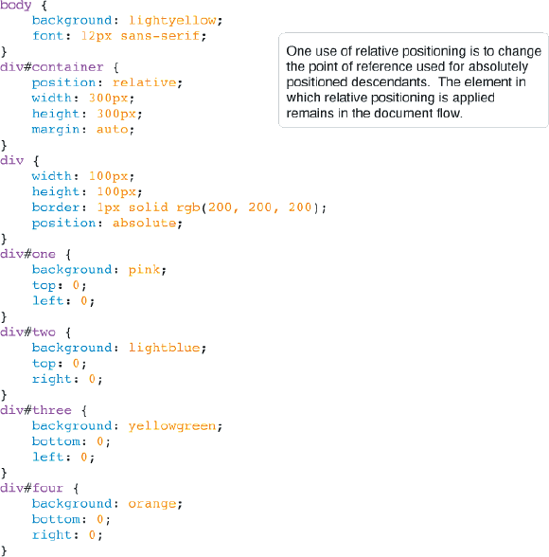
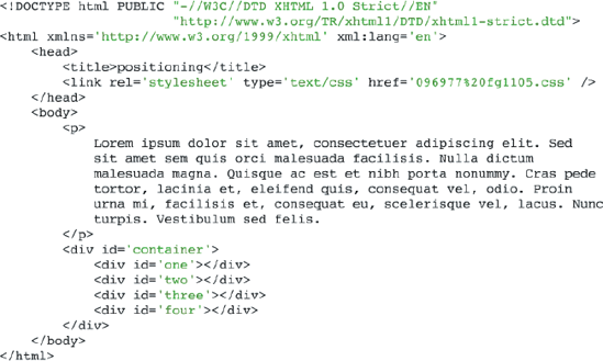
In Figure 11-5c, you can see that the position of each <div> element has changed. By nesting them inside a descendant of a <div> element that has a relative position, each <div> is positioned relative to the <div> element with an id name of container.
What happens if the <div> element with id name container has a static position? The output is shown in Figure 11-6.
In Figure 11-6, you see that the point of reference for positioning is determined by which element in the positioned element's ancestry has a position other than static (absolute, relative, or fixed). If there aren't any elements with a position other than static, the element is positioned relative to the browser's viewport.
Note
When no position is defined for any of an element's ancestral lineage (parent, grandparent, and so on), all elements are positioned relative to the browser's viewport by default. If an element does have a relative, absolute, or fixed position and is the ancestor of an element with absolute positioning, that element is used as the point of reference for the absolutely positioned element.
The position of elements with relative positioning can be adjusted using combinations of the four offset properties, top, right, bottom, and left. For example, the top and left properties can be used to adjust the position of a relatively positioned element. This works similarly to the margin property that you saw in Chapter 7. An example appears in Figure 11-7.

The CSS in Figure 11-7a is included in the markup in Figure 11-7b.

In Figure 11-7c, you see what happens when the offset properties top and left are applied to a relatively positioned <p> element, as opposed to margin with the same values applied to another <p> element.
In Figure 11-7c, you see that relatively positioned elements can be layered. In the example, the top and left properties each have a value of 25px, which results in the <p> element with an id name of relative being layered over the border of the <body> element. You also see how this differs from margin — the top <p> element with an id name of margin — is given a top and left margin of 25px. The top element's width is adjusted to accommodate the 25px of margin, but the bottom element width is not adjusted to accommodate the 25px that it is offset from the top and left.

A recap of relative positioning:
Relative positioning is just like static positioning, in that the elements remain in the normal document flow, but that's where the similarities end.
Relatively positioned elements can be used as a point of reference for absolutely positioned elements.
Relatively positioned elements can accept combinations of the four offset properties,
topandleft, topandright, bottomandleft, andbottomandright. The browser will ignore combinations of the offset properties beyond those mentioned here. For example, you can't combine thetopandbottomoffset properties on the same relatively positioned element.Relatively positioned content can be stacked and layered along the z-axis (more on this later in this chapter).
In the next section I cover fixed positioning.
Try It Out: Applying Relative Positioning
Example 11-2. To review the concept of relative positioning, follow these steps.
Enter the following XHTML document in your text editor:
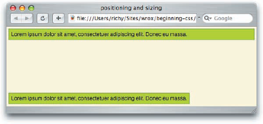
<!DOCTYPE html PUBLIC "-//W3C//DTD XHTML 1.0 Strict//EN" "http://www.w3.org/TR/xhtml1/DTD/xhtml1-strict.dtd"> <html xmlns='http://www.w3.org/1999/xhtml' xml:lang='en'> <head> <title>Relative Positioning</title> <link rel='stylesheet' type='text/css' href='Example_11-2.css' /> </head> <body> <p> Relative positioning has two primary purposes in web design. The first purpose is to create a point of reference for an absolutely positioned element. When an element with absolute positioning is nested within an element with relative positioning, the absolutely positioned element is positioned in context to the dimensions of the relatively positioned element. </p> <div id='relative'> <p> Relative positioning is a lot like static positioning; elements don't appear to leave the flow of the document. </p> <p id='bottom-right'> This element is positioned to the bottom right of the relatively positioned element. </p> </div> <p> The four offset properties can also be applied to relatively positioned elements, which can be used to modify the position of an element. </p> <div> <p id='offset'> This element is offset from its original position. </p> </div> </body> </html>Enter the following CSS in your text editor:
body {
    font: 12px sans-serif;
}
div {
    background: yellow;
    border: 1px solid black;
    margin: 0 20px;
}
div#relative {
    position: relative;
    height: 200px;
} p { padding: 5px; } p#bottom-right{ margin: 0; background: gold; border: 1px solid crimson; height: 50px; width: 200px; position: absolute; bottom: 5px; right: 5px; } p#offset { margin: 0; background: pink; border: 1px solid crimson; position: relative; top: 10px; left: 10px; }Save the preceding document as
Example_11-2.css. The preceding source code results in the rendered output that you see in Figure 11-8.

In Example 11-2, you reviewed two concepts used for positioning an element relatively: the first using an element as a point of reference for positioning absolutely positioned elements, and the second, using the four offset properties to adjust the position of a relatively positioned element.
To create a point-of-reference, you made a <div> element, with an id name of relative, which had one absolutely positioned child <p> element with an id name of bottom-right. The <p> element with the id name bottom-right is given an absolute position, and the declarations bottom: 5px; and right: 5px;. As you see in the rendered output in Figure 11-8, this causes the element to be positioned to the bottom and right of the <div> element with id name relative. If the position: relative; declaration were to be removed from the <div> element with id name relative, the bottom-right <p> element would be positioned relative to the viewport, as you saw in Figure 11-6.
The second concept at play in Example 11-2 is using offset properties to adjust the position of a relatively positioned element. The <p> element with id name offset is given the position: relative; declaration, and the declarations top: 10px; and left: 10px;, which caused its position to be modified from the top by 10 pixels, from its original position, which is where it would have been if it were a statically positioned element, and to the left 10 pixels. This causes it to overlap its parent <div> element. If these properties were not present, you would not see any of the parent <div> element's yellow background, since the <p> element would have completely blocked it out.
In the next section, I continue the concept of positioning with fixed positioning, which is similar to absolute positioning, in that the element leaves the normal flow of the document, but unlike absolute positioning, the context of a fixed positioned element cannot be altered by nesting the element in a relatively positioned element or another absolutely positioned element. Fixed position elements are always positioned relative to the browser's viewport, and remain in that position, even if the document is scrolled.
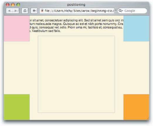
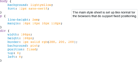
Fixed positioning is used to make an element remain in the same fixed position, even if the document is being scrolled. Alas, IE 6 does not support fixed positioning, so the example that follows will not work in IE 6. All is not lost however; there is a well-known workaround for IE 6's lack of support for fixed positioning, which is covered in the next section.
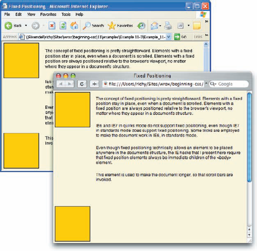
Elements with a fixed position are always positioned relative to the viewport, regardless of whether it is contained in an element with relative or absolute positioning applied. An example of fixed positioning appears in Figure 11-9.
The CSS in Figure 11-9a is included in the markup that appears in Figure 11-9b.

In Figure 11-9c, you see how fixed positioning is different from the example of absolute positioning that you saw in Figure 11-2c and Figure 11-3c. The same document is shown three times with the scroll bar in different positions to illustrate how the <div> elements with id names one, two, three, and four remain fixed in place as the document is scrolled.

Fixed positioning keeps the elements snapped into their positions, which is always determined relative to the viewport, as the document is scrolled. This type of positioning can be used for things such as side columns, headings, footers, or watermarks that remain in place as the document is scrolled. In the next section, you see some workarounds for IE 6 for its lack of support for fixed positioning.
In the following sections, I discuss two different methods of achieving fixed positioning without actually using CSS fixed positioning. The first method applies to IE exclusively, and it entails emulating fixed positioning in IE 6 with JavaScript and proprietary CSS features. The second method I present is applicable to all browsers, even those with proper support for fixed positioning, and is useful beyond fixing up IE's lack of support, and can be used for web page layouts in general, in all browsers.
A well-known and annoying limitation of IE 6 is that it does not support fixed positioning. Not to be left without this useful feature, some developers have gone to great lengths to find alternative methods that produce the same results.
I first read about the following IE 6 fixed positioning hacks on Anne van Kesteren's blog at http://annevankesteren.nl/test/examples/ie/position-fixed.html. Therefore, the following workarounds are derivative of the ones collected by Anne and others as documented in his blog.
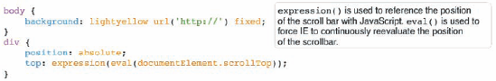
This first technique involves reproducing the same effects you would get if the declaration position: fixed; were supported in IE 6. For this technique, you'll need Microsoft's proprietary expression() feature, which allows you to use JavaScript within a style sheet, which you first saw in Chapter 7, where it helped you to overcome IE 6's lack of support for the min/max width/height properties. The first example demonstrates position: fixed; with top: 0; and left: 0; as the offset properties, and works when IE 6 is in standards-compliant rendering mode (see Chapter 7).
Emulation of fixed positioning is demonstrated in Figure 11-10.
The style sheets in Figures 11-10a and 11-10b are included in the markup that you see in Figure 11-10c.
You get the output that you see in Figure 11-10d, an element that acts as though the position: fixed; declaration is applied in IE 6.
There are a few things to keep in mind about this effect:
You must specify a "fixed" background image. The image doesn't have to exist; you can just include
http://as the background image, as I have. If you are using this effect in an SSL encrypted web page, be sure to make thathttps://, or you'll see SSL errors in IE. Without this essential hack, the element that you want to give a fixed position to will flicker as the page scrolls.This effect does not work in IE 6 or IE 7 in quirks mode, or IE 5.5. To get a compatible hack for IE 6 and IE 7 in quirks mode and IE 5.5, just change the declaration for the
topproperty to:top: expression(eval(document.body.scrollTop));
This effect does not work if JavaScript is disabled.
The effect emulates
top: 0;. To get a pixel value other than zero, use something like the following declaration:top: expression(eval(documentElement.scrollTop) + 5);
Just replace 5 with the pixel value you want.
You specify the
leftorrightproperties as you normally would.
What if you're looking for bottom: 0;, instead of top: 0; with a fixed position element? An example of this appears in Figure 11-11. Figure 11-11a begins with the style sheet that you give to all browsers.

The main style sheet in Figure 11-11a is followed by the IE 6 style sheet that appears in Figure 11-11b. As you see in Figure 11-11b, slightly more complicated trickery is required to emulate bottom: 0;. You have to subtract two pixels from the value; otherwise when the user scrolls to the bottom in IE 6, it will continue scrolling infinitely.
The style sheets in Figure 11-11a and Figure 11-11b are included in the markup document that you see in Figure 11-11c.
This source code in Figure 11-11 results in the output that you see in Figure 11-11d.
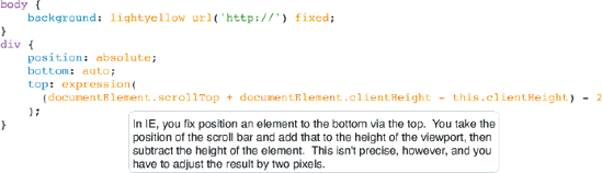

Emulating position: fixed; with bottom: 0; is similar to the process required for top: 0;, and it is therefore subject to the same limitations. Again, to create this effect in IE 6 and IE 7 in quirks mode, and IE 5.5, just replace documentElement with document.body. For emulating the bottom property with a value other than 0, take the value, add 2 to it, and replace where 2 is being subtracted with your new value. For example, to emulate bottom: 5px;, you'd do the following:
top: expression(
 (documentElement.scrollTop + documentElement.clientHeight - this.clientHeight) - 7
);
I use the value 7 in the preceding example, because at least 2 pixels must always be subtracted, so, 2 + 5 = 7. In the next section, I explore how you create the illusion of fixed positioning to workaround the lack of support for fixed positioning in IE 6.
Try It Out: A Review of Fixed Positioning
Example 11-3. To recap the concept of fixed positioning, follow these steps.
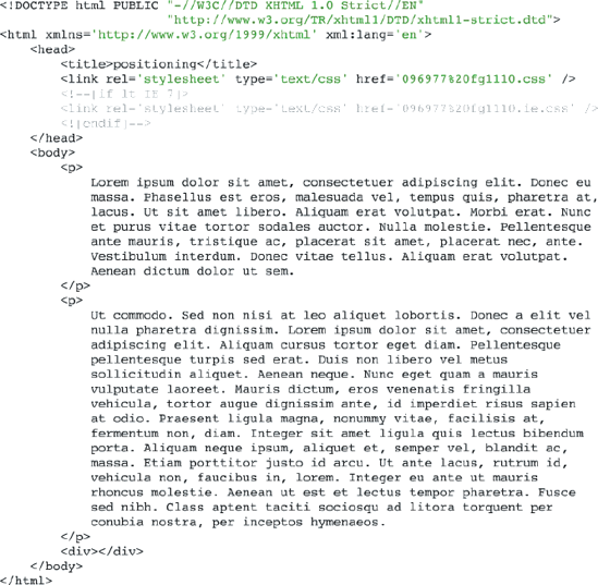
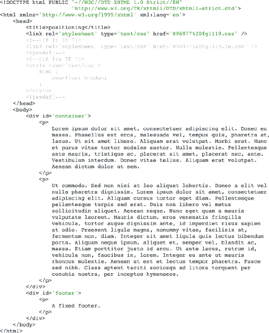
Enter the following XHTML document in your text editor:
<!DOCTYPE html PUBLIC "-//W3C//DTD XHTML 1.0 Strict//EN" "http://www.w3.org/TR/xhtml1/DTD/xhtml1-strict.dtd"> <html xmlns='http://www.w3.org/1999/xhtml' xml:lang='en'> <head> <title>Fixed Positioning</title> <link rel='stylesheet' type='text/css' href='Example_11-3.css' /> <!–[if lt IE 7]> <link rel='stylesheet' type='text/css' href='Example_11-3.ie.css' /> <![endif]–> </head> <body> <div id='fixed-top'> </div> <div id='fixed-bottom'> </div> <p> The concept of fixed positioning is pretty straightforward. Elements with a fixed position stay in place, even when a document is scrolled. Elements with a fixed position are always positioned relative to the browser's viewport, no matter where they appear in a document's structure. </p> <p> IE 6 and IE 7 in quirks mode do not support fixed positioning, even though IE 7 in standards mode does support fixed positioning. Some tricks are employed to make the document work in IE 6, in standards mode. </p> <p> Even though fixed positioning technically allows an element to be placed anywhere in the document's structure, the IE hacks that I present here require that fixed position elements always be immediate children of the <body> element. </p><p id='long'> This element is used to make the document longer, so that scroll bars are invoked. </p> </body> </html>Save the preceding document as
Example_11-3.html.Enter the following CSS in your text editor:
body {
    font: 12px sans-serif;
    background: lightyellow;
}
p {
    padding: 5px;
    margin-left: 110px;
}
p#long {
    height: 400px;
}
div {
    position: fixed;
    background: gold;
    border: 1px solid black;
    width: 100px;
    height: 100px;
}
div#fixed-top {
    top: 5px;
    left: 5px;
}
div#fixed-bottom {
    bottom: 5px;
    left: 5px;
}
Save the preceding CSS document as
Example_11-3.css.Enter the following style sheet for IE 6 in your text editor:
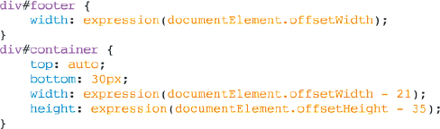
body {
    background: lightyellow url('http://') fixed;
}
div#fixed-top {
    position: absolute;
    top: expression(eval(documentElement.scrollTop) + 5);
}
div#fixed-bottom {
    position: absolute;
    bottom: auto;
    top: expression((documentElement.scrollTop +
                         documentElement.clientHeight - this.clientHeight) - 7);
}
Save the preceding document as
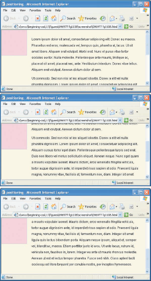
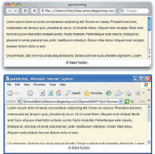
Example_11-3.ie.css. The preceding source code results in the rendered output that you see in Figure 11-12.
How It Works
In Example 11-3 you see the tools required for making cross-browser, fixed-position elements. These elements stay fixed in place even when the content is scrolled. For most browsers, Safari, Firefox, IE 7 in standards mode, and Opera, this is done using standard CSS 2. You apply the declaration position: fixed; to an element in tandem with offset properties, which provide the position of the element. In Example 11-3, you made two examples: one fixed-position element that's positioned to the top and left of the browser's viewport, and one fixed-position element that's positioned to the left and bottom of the browser's viewport.
To make this work in IE 6, you supplied a Microsoft-proprietary conditional comment style sheet, which uses dynamic expressions and a tiny snippet of JavaScript. The JavaScript that you keyed in dynamically updates the position of the pseudo-fixed position elements. For the fixed position element that's positioned to the top and left, you supply the declaration position: absolute;, since IE 6 doesn't recognize position: fixed;, and in the dynamic expression, you evaluate the position of the viewport's scroll bar with the JavaScript eval(documentElement.scrollTop). This causes the element to remain fixed in place as the document is scrolled. But you need one more hack to make it function as fluid as position: fixed; does on other browsers; you must give the <body> element a fixed background image. As you saw in Example 11-3, the background image doesn't even have to exist. The application of this hack causes IE 6 to render the fixed position element smoothly as the document is scrolled, rather than jerky. To get the same result as top: 5px; you also have to add 5 to the result of the evaluation, which gives you the following CSS:
top: expression(eval(documentElement.scrollTop) + 5);
To fix position an element to the bottom and left of the viewport in IE 6, you see a little more involved script. The element is again absolutely positioned, but instead of positioning from the bottom, as you might expect, the element is positioned from the top. To do this, you reset the bottom property to its default value, bottom: auto;. To get the element on the bottom, you get the position of the scroll bar, the height of the viewport, then subtract the height of the element that's being fixed positioned, which results in the same output as position: fixed;, with the declaration bottom: 5px; and left: 5px;.
top: expression((documentElement.scrollTop +
                         documentElement.clientHeight - this.clientHeight) - 7);
In the next section, I discuss how to create the illusion of fixed positioning using only absolute positioning.
The other way to get around IE 6, IE 5.5, and IE 7 quirks mode lack of support for fixed positioning is to just not use it at all, and use the principles of absolute positioning to your advantage. The following sections describe how to do the following:
Make a fixed header
Make a fixed footer
Make fixed side columns
All are with support for IE 6, and as are the usual suspects, Safari, Firefox, Opera, and so on. I begin with a discussion of how to stretch content by using offset properties in pairs.
One fundamental concept that is essential to making the fixed header, footer, and side columns techniques work has to do with how absolutely positioned elements handle sizing. In Chapter 7, you learned that block elements have a width that is expand-to-fit by default. Block elements such as <h1>, <div>, <p>, and so on, expand to fill the space available to them horizontally, and expand vertically in the shrink-to-fit fashion, that is, only enough to accommodate the content contained within them. When elements are positioned absolutely, they all take on the shrink-to-fit sizing behavior, for both width and height. An example of this appears in Figure 11-13.

The main style sheet in Figure 11-13a contains two demonstrations of sizing: a statically positioned <p> element, and an absolutely positioned <p> element. As you'll see in Figure 11-13c, positioning an element absolutely causes it to use a different method of sizing, shrink-to-fit. The main style sheet in Figure 11-13a is included in the markup that you see in Figure 11-13b to create the rendered output in Figure 11-13c.
In Figure 11-13c, you see that the two <p> elements have different dimensions. The statically positioned one takes up all the horizontal area that's available to it, and the absolutely positioned <p> element only expands enough to accommodate the content that it contains.
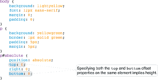
To use absolute positioning to emulate fixed positioning for a header, you need a way to make an absolutely positioned element use the other method of sizing, expand-to-fit. The CSS specification just so happens to support just such a feature, and specifying opposing offset properties on the same absolutely positioned element does it. For example, to stretch content horizontally for the entire width available to it, you specify both the left and right offset properties to imply width. Or if you want to stretch an element vertically for all the space available to it, you specify both the top and bottom offset properties to imply height. The term imply is used here because you don't actually specify width or height. Dimensions are implied because you expect specifying both the left and right offset properties on the same absolutely or fixed positioned element to stretch the element.
If you want both horizontal and vertical fluidity on an absolutely positioned element, you specify all four offset properties on the same element. Unfortunately IE 7 in quirks rendering mode, IE 6, and earlier do not support this useful feature (IE 7 in standards mode does support this feature), but as is the case with most problems with IE, there is a relatively painless workaround, which you observe later in this chapter.
An example of horizontally stretching an absolutely positioned element appears in Figure 11-14.

In Figure 11-14a, you see the main style sheet, and within it you see an example strikingly similar to the one you saw in the source code and screenshot that make up Figure 11-13. That is to say, you have a statically positioned <p> element, and an absolutely positioned <p> element. This time the absolutely positioned <p> element will wind up having the same dimensions as the statically positioned <p> element, and this is done by specifying left: 0; and right: 0; on that element to make it stretch horizontally, for all the space available to it, the same way that the statically positioned <p> element is sized as a normal block-level element. The main style sheet in Figure 11-14a is included in the markup that you see in Figure 11-14b.

In Figure 11-14c, the screenshot shows that the statically positioned <p> element and the absolutely positioned <p> element now have the same width. You'll see the same results in IE 7, but as I mentioned earlier, IE 6 has other plans, which you see a workaround for later in this chapter.
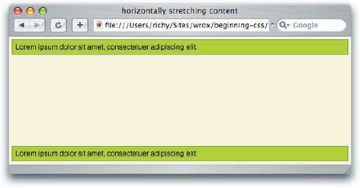
In Figure 11-14c, the concept of horizontally stretching an absolutely positioned element via specifying both the left and right properties is made clear, but this example begs the question, why can't you just specify the width as 100 percent? That's a good question, and a common misconception made by beginners. The answer to this question is, when you have any block element, absolutely positioned or not, and you apply padding, borders, or margin to it, and then give it a width of 100 percent on top of those properties, you won't end up with the results that you expect. This has to do with how percentage measurement works. If you recall from Chapter 7, a percentage width is determined by the width of an element's parent. So if the parent element has a width of 700 pixels, for example, your element with 100 percent width will also have a width of 700 pixels, and then the lengths for margin, borders, and padding are applied on top of that width, and your element overflows the boundaries of its parent. If the parent element is the <body> element, and the 700 pixels measurement happens to be the width of the browser's viewport, you'll wind up with your element with 100 percent width causing horizontal scroll bars, because it is too big to fit in that 700-pixel width. By stretching elements with opposing offset properties, the resulting width is whatever is left over after margin, borders, and padding are already applied, thus avoiding scroll bars.
Still not clear on how percentage width works? Try a small experiment for testing percentage width. Take the source code from Figure 11-14a and Figure 11-14b (you can get the source code for all of this book's examples with the book's source code download from www.wrox.com), and try applying a width of 100 percent to the absolutely positioned <div>. Compare the resulting output with what you see in Figure 11-14c. Notice any differences?
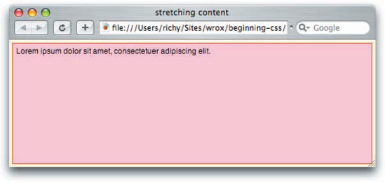
Conversely, Figure 11-15 demonstrates how to stretch an element vertically by specifying both the top and bottom offset properties.
In the main style sheet that you see in Figure 11-15a, the absolutely positioned <p> element now has both the top and bottom properties set as top: 0; and bottom: 0;, which will cause the <p> element to be stretched vertically for the height of the browser's viewport.
In Figure 11-15c, you observe that the absolutely positioned <p> element is stretched vertically for the height of the browser's viewport.


Figure 11-16 demonstrates both horizontal and vertical fluidity on the same element via specification of all four offset properties.
In the main style sheet that appears in Figure 11-16a, the absolutely positioned <p> element now has all four offset properties set, which causes the <p> element to be stretched both horizontally and vertically.
The CSS from Figure 11-16a is included in the markup that you see in Figure 11-16b.
In Figure 11-16c, you see that the <p> element is stretched both vertically and horizontally, taking up the whole browser window.


The screenshot shows how both horizontal and vertical fluidity is achieved through specifying top, right, bottom, and left on the same element. At this point you may be asking yourself, does the value of the offset property have to be zero? No, it does not. You can use any value you like, a value larger than zero will simply modify where the element is positioned and decrease its dimensions.
Try It Out: Implying Dimensions by Opposing Offset Properties
Example 11-4. To recap the concepts at play with implying dimensions via opposing offset properties, follow these steps.
Enter the following XHTML document in your text editor:
<!DOCTYPE html PUBLIC "-//W3C//DTD XHTML 1.0 Strict//EN"
                      "http://www.w3.org/TR/xhtml1/DTD/xhtml1-strict.dtd">
<html xmlns='http://www.w3.org/1999/xhtml' xml:lang='en'>
    <head>
        <title>Opposing Offset Properties</title>
        <link rel='stylesheet' type='text/css' href='Example_11-4.css' />
    </head>
    <body>
        <div id='offset-four'>
            <p id='offset-x'>
                When the left and right offset properties are applied to the same
                element, width is implied.
            </p>
            <p id='offset-y'>
                When the top and bottom offset properties are applied to the same
                element, height is implied.
            </p>
            <p id='offset-four-copy'>
                When all four offset properties are specified on the same element
                both width and height are implied.
            </p>
        </div>
    </body>
</html>
Save the preceding document as
Example_11-4.html.Enter the following CSS in your text editor:
body {
    font: 12px sans-serif;
    background: lightyellow;
}
div#offset-four {
    background: yellow;
    border: 1px solid rgb(128, 128, 128);
    position: absolute;
    top: 20px;
    right: 20px;
    bottom: 20px;
    left: 20px;
}
p {
    margin: 0;
padding: 5px; border: 1px solid black; } p#offset-x { position: absolute; bottom: 5px; left: 5px; right: 123px; background: gold; } p#offset-y { position: absolute; top: 5px; right: 5px; bottom: 5px; width: 100px; background: khaki; } p#offset-four-copy { border: none; margin-right: 123px; }Save the preceding document as
Example_11-14.css. When viewed in IE 7, Safari, Opera, or Firefox, you should see output like that in Figure 11-17. Bear in mind that this example does not work in IE 6, but you see a workaround for this lack of support in the coming sections.

How It Works
In Example 11-4, you see three different examples of using opposing offset properties to imply width or height, or both. The first example is a <p> element with id name offset-x. It is positioned relative to the <div> element with id name offset-four, and it is positioned relative to this element rather than the viewport, since the offset-four <div> element is positioned absolutely. To get the offset-x <p> element to span the bottom of the offset-four <div> element, you supplied to it both the left and right offset properties. In this example, you also see that the value can be any measurement you like. In this case, you offset from the left, 5 pixels, and from the right 123 pixels, which causes the element to be stretched along the bottom of the offset-four <div> element.
The second example that you see in Example 11-4 of using opposing offset properties is with the <p> element with id name offset-y. It is offset from the right 5 pixels, from the top 5 pixels, and from the bottom 5 pixels. Since it is offset from both the top and bottom by five pixels, height is implied, and the <p> element spans the whole height of the offset-four <div> element.
The third and last example that you see in Example 11-4 of using offset properties to imply dimensions is in the <div> element with id name offset-four. It is offset from all four sides by 20 pixels, which causes it to be stretched both horizontally and vertically relative to the browser's viewport.
This concept of stretching elements via absolute positioning is also an essential ingredient in the multi-column layouts that I present later in this chapter. In the next section, I discuss how to make a fixed header without fixed positioning.
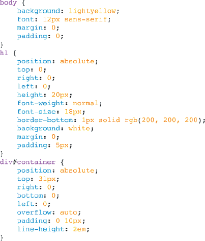
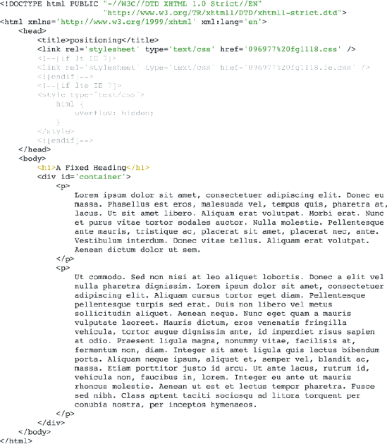
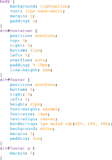
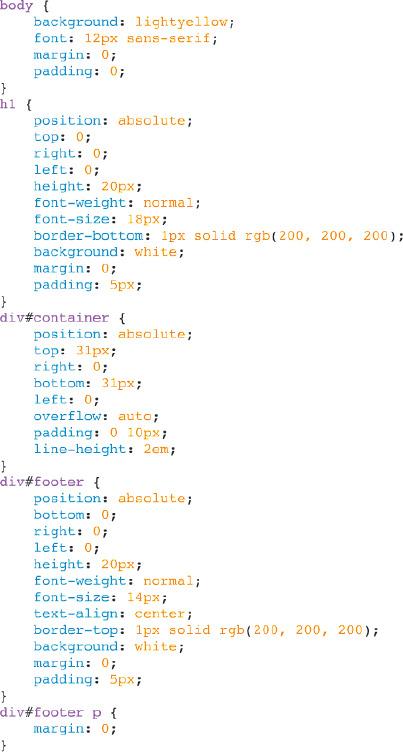
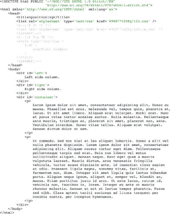
A fixed heading is pretty easy to pull off, without support for fixed positioning. You simply use absolute positioning to make a fixed heading, and a second container element that is also absolutely positioned, that invokes scroll bars using the overflow property that you saw in Chapter 7. Making a fixed heading is demonstrated in Figure 11-18.
In Figure 11-18a, you see the main style sheet that all browsers will see. The <h1> element is acting as your fixed heading for this example, and the document's content is going to be kept inside the <div> element with id name container. Both the <h1> element and the container <div> element are given an absolute position, so that their place on the screen can be dictated with fine precision. For the heading, you take the <h1> element and stretch it horizontally by specifying both the left and right offset properties with a value of zero. This will cause the absolutely positioned <h1> element to act like a statically positioned <h1> element, and take up all the space available to it horizontally. Could you just use a statically positioned <h1> element and get the same result? You can. It is not essential that the <h1> element be absolutely positioned; it's just another means to the same end, and a fine example of how web designers sometimes forget fundamental design concepts when designing a page, and actually end up over-engineering a design. The rule for the <h1> element could be rewritten as follows:
h1 {
    height: 20px;
    font-weight: normal;
    font-size: 18px;
    border-bottom: 1px solid rgb(200, 200, 200);
    background: white;
    margin: 0;
    padding: 5px;
}
The preceding rule produces the same result. I've included the over-engineered version to demonstrate how unnecessary properties can creep in unexpectedly. While it doesn't have to be positioned, I'm going to leave it that way merely for consistency with the other elements on the page, but bear in mind, it doesn't have to be that way.
For IE 6 to properly stretch the absolutely positioned elements, it needs a bit of help. The workarounds appear in Figure 11-18b.
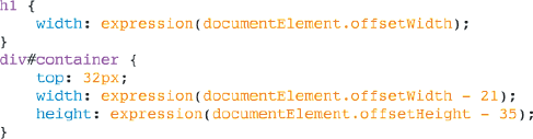
The CSS in Figure 11-18b is included because IE 6 does not support stretching an element via specifying opposing offset properties on the same element. As you've seen in earlier examples in this Chapter, and in Chapter 7, a dynamic expression is used to emulate the effect of opposing offset properties in IE 6. You simply include the dynamic expression feature, which references a small snippet of JavaScript. documentElement refers to the <html> element, and offsetHeight is a property that is used to get the <html> element's, well, offset height, which for you and me means the height of the browser's viewport. Remember, if you use a Document Type Declaration that causes IE 6 or IE 7 to render in quirks mode, this trick won't work. If you face this situation, you'll want to use document.body.offsetHeight instead of documentElement.offsetHeight. See Chapter 7 for more information on quirks rendering mode versus standard rendering mode (nearly all of the examples in this book invoke standards rendering mode).
The CSS in Figure 11-18a and Figure 11-18b are included in the markup that you see in Figure 11-18c.
IE 6 and IE 7 continue to show a scroll bar for the whole window, even though it isn't needed. You apply the overflow: hidden; declaration to the <html> element to get rid of the scroll bar via Microsoft's conditional comments that target IE 7 and earlier versions. Now the redundant scroll bar is no more.
The source code in Figure 11-18a, b, and c gives you a layout that works well between the different browsers, as you see in the screenshot that appears in Figure 11-18d.
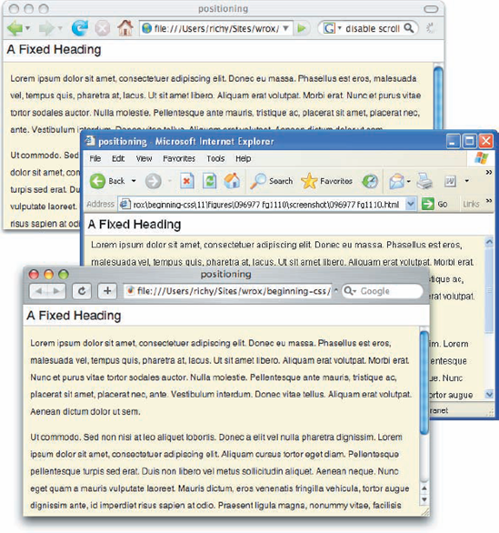
In Figure 11-18d, you can see that the heading stays in place whenever the content is scrolled. You could just as easily replace the <h1> with a <div> there and include additional content that stays fixed in place at the top of the page. But how do you do a fixed footer? This is covered in the next section.
For a fixed footer, the idea is pretty much the same as you saw for making a fixed heading, but everything's reversed to the bottom. A demonstration of how to do a fixed footer appears in Figure 11-19.
Then as was the case with the fixed heading example in the last section, another style sheet targeting IE 6 is made with adjustments to facilitate a fixed footer rather than a heading. The technique can have several approaches, but the principle is that either the top or the bottom offset property can be set, and the height of the container element must be adjusted in relation to the height of the viewport, and the height of the footer. The IE 6 style sheet appears in Figure 11-19b.
Again, the scroll bar for the viewport that is present by default must be turned off in IE 6 and IE 7, just as it was for the fixed heading example in the previous section. The CSS from Figure 11-19a and Figure 11-19b are included in the markup that appears in Figure 11-19c.
The result of the source code appears in Figure 11-19d, where you see a fixed footer that works on a variety of browsers and platforms.
In Figure 11-19d, top has become bottom, and the heading becomes the footer. The same concepts are at play here as you saw for the fixed heading. So naturally, it ought to be easy to combine the two now in one example. The next section describes how to do both.
The concepts of the previous two sections are now married into one example, which is demonstrated in the source code and screenshots shown in Figure 11-20. In Figure 11-20a, you see the styles from the fixed heading and the fixed footer examples have been merged into one style sheet.
Again, in Figure 11-20b, you see the IE 6 style sheet, which now contains styles that facilitate both a fixed heading and a fixed footer.

Then the styles from Figure 11-20a and Figure 11-20b are included in Figure 11-20c.

You see the result of the merged fixed heading and fixed footer examples in Figure 11-20d.

In Figure 11-20d, you can see that with just a few tweaks, you can have both a fixed heading and a fixed footer in your document. In the next section, I continue this style of layout with fixed side columns instead of a fixed heading or a fixed footer.
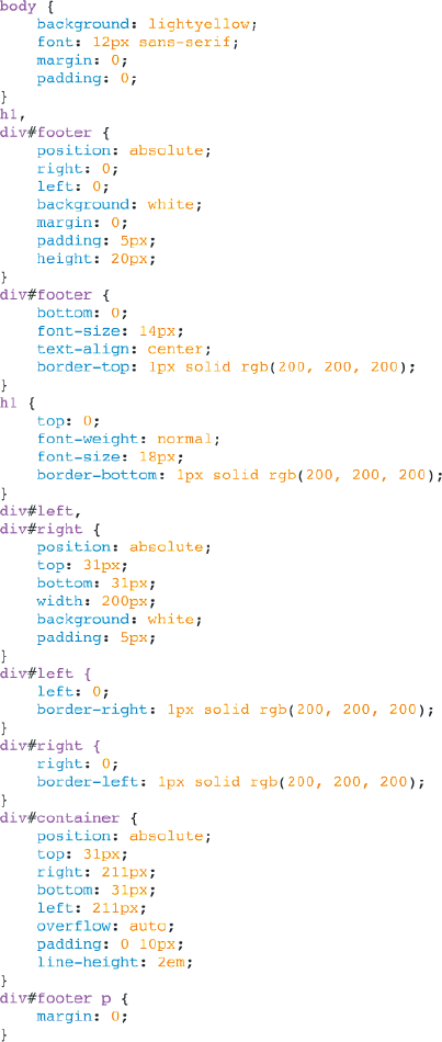
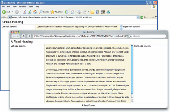
The ideas at play for making fixed side columns are along the same lines that you've observed in the previous three sections. With just a few modifications, you can have fixed side columns instead of fixed heading or a fixed footer. The source code and screenshots are in the collection of figures that together make up Figure 11-21. You begin with the main style sheet that's presented in Figure 11-21a.

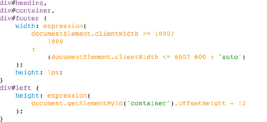
In Figure 11-21a, you see that instead of an <h1> element for the heading, and a <div> with an id name of footer for the footer, you have two <div> elements with id names left and right. Common style sheet declarations that both the left and right <div> elements share are grouped together, and additional rules appear for declarations that are unique to each. Again, the concept of absolute positioning is to create elements that remain fixed in place when the <div> element with id name container is scrolled. Like the examples that you saw for the fixed heading and the fixed footer, you use opposing offset properties to stretch each of the absolutely positioned elements vertically, which is done by specifying both the top and bottom offset properties on all three absolutely positioned elements to imply height. You must also alter the container <div> element so that there is enough room for the side columns; otherwise the side columns would simply overlap that container <div> element. You do this by setting the left and right offset properties to 211 pixels. This figure is arrived at by taking the width of the left <div>, for example, plus its left padding, plus its right padding, plus one pixel of border, which together add up to 211 pixels. The remaining styles present in the style sheet aren't really important, since they're really just cosmetic and don't effect the overall concept of making fixed side columns.
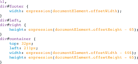
Of course, as you saw in previous examples, specifying opposing offset properties to stretch an element doesn't work in IE 6. You correct this deformity by supplying IE 6 a style sheet all its own, as you did in previous examples. This style sheet appears in Figure 11-21b.

The IE 6 style sheet makes similar adjustments as you've seen in previous examples. The two <div> elements with id names left and right are stretched for the whole height of the browser's viewport via a dynamic expression that calls a small snippet of JavaScript, which provides the height of the documentElement, or the <html> element, via its offsetHeight property. Remember, this technique does not work in IE 6 or IE 7 when those browsers are in quirks rendering mode, nor older versions of IE prior to version 6, and must be replaced with document.body.offsetHeight, instead of documentElement.offsetHeight. The style sheets that you saw in Figure 11-21a and Figure 11-21b are included in the markup that you see in Figure 11-21c.
Again in Figure 11-21c, the redundant scroll bar that IE 6 and IE 7 include is nullified with the overflow: hidden; declaration. Now IE 6, IE 7, Safari, Firefox, and Opera all produce the same results. The output from IE 6 as well as Safari appears in Figure 11-21d.

And to wind down the examples of fixed headings and footers and side columns, the next section demonstrates all of them together in the same document.
In this example, you put together the examples of the previous two sections to get a document with a fixed heading, footer, and side columns. You begin with the style sheet shown in Figure 11-22a.
No surprises here. The main style sheet in Figure 11-22a makes adjustments to the container <div> element to accommodate both a heading and a footer and side columns. You'll note that the container <div> element is offset from the top and bottom respective to the collective height of the heading and the footer, that is to say, the height property, plus top and bottom margin, border, and padding, and from the left and right relative to the collective width of the left and right side columns, which is the width property plus left and right margin, border, and padding. The side columns are also adjusted from the top and bottom with respect to the collective height of the footer and the heading. With the exception of these minor tweaks, the concept is basically the same as you've seen in previous sections. In Figure 11-22b, you see the IE 6 style sheet that's required to bring IE 6 on par with the output seen in other browsers.
In the IE 6 style sheet that you see in Figure 11-22b, you again see a marriage of the concepts that you've observed in previous sections, only now you see measurements that accommodate both side columns, a heading, and a footer. The style sheets in Figure 11-22a and Figure 11-22b are included in the markup that you see in Figure 11-22c.

The output that you see in Figure 11-22d is what results from the source code in Figure 11-22a, Figure 11-22b, and Figure 11-22c.
In the next section, I discuss how you can control layering of positioned elements with the z-index property.
The z-index property is used to control layering of positioned elements along an invisible z-axis, which you might imagine as an invisible line coming out of the computer screen. The following table outlines the z-index property and its possible values.
Property | Value |
|---|---|
z-index | auto | <integer> Initial value: auto |
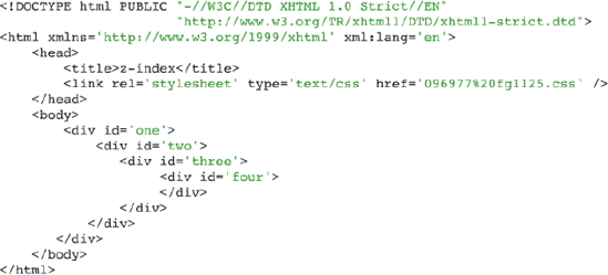
The z-index property controls elements' position on along the invisible z-axis, if those elements are positioned relative, absolute, or fixed. The concept of the z-axis is used to create dynamic applications like pop-up menus. The z-index property is demonstrated in Figure 11-23.
In the main style sheet in Figure 11-23a, four <div> elements are absolutely positioned to the top and left; each is increasingly positioned 10 pixels more from the top and left from the last so that they are overlapping, but each of the overlapped elements are still visible. For all of the <div> elements, the declaration z-index: auto; is supplied, although since this is the default value of the z-index property, it does not have to be provided at all. The style sheet in Figure 11-23a is included in the markup in Figure 11-23b.
In Figure 11-23c, you see how the z-index property with an auto value works. Each additional element in the document that is positioned absolutely has a higher z-index value than the last, so the <div> element with an id name of one is positioned at z-index: 1; on up to four.
In the next section, you see how to control the behavior of the z-index property with an integer value.
To control the layering of elements in a document, all you need to do is supply an integer value to the z-index property. In Figure 11-24, you see the layering of each of the positioned elements is reversed from what you saw in Figure 11-23c.

In the main style sheet that you see in Figure 11-24a, you explicitly set the z-index of each of the four <div> elements present in the document, giving the <div> element with id name one the highest z-index and the <div> element with id name four the lowest z-index. The style sheet in Figure 11-24a is included in the markup that you see in Figure 11-24b.

In Figure 11-24c, you can see that the layering of the <div> elements is reversed from what you saw in Figure 11-23c. The <div> element with id name one is now on top, and the <div> element with id name four is now on the bottom.
Although I presented the z-index in Figure 11-24a with z-index values that ascend from one to four, you don't have to keep the values sequential. You can have any z-index value you like, 1,000, even 10,000, if you deem it appropriate. The browser will sort the highest z-index value as being on top, and the lowest on the bottom where elements are layered one on top of another.
Nested elements take on a different behavior where the z-index property is concerned. Nested elements behave like z-index is set to auto, and the integer value is ignored. Take for example the code presented in Figure 11-25.
In the main style sheet, you see something similar to what you saw in Figure 11-24a, with the exception that all four <div> elements are offset from the top and left ten pixels. This is done since the elements are now nested one inside of each other, as you can see in the markup in Figure 11-25b.

In Figure 11-25c, you find that the z-index is being ignored; the <div> element with id name one is still on the bottom. This fulfills the rule that an element's descendents cannot have a higher z-index than it does.
IE 6 and IE 7 support the z-index property just fine, but both browsers have trouble with the z-index property in certain situations. It doesn't take a very complex design to invoke these bugs either, so anyone looking to utilize positioning in a layout should be aware of how to spot and crush these bugs. In the following source, you actually see two IE 6/IE 7 bugs. The first bug has to do with z-index stacking, and the other has to do with spacing between <li> elements. The example in Figure 11-26 demonstrates these bugs.

In the main style sheet you see that I've set up a list, where the <li> elements are relatively positioned, and the <div> element is absolutely positioned. The style sheet in Figure 11-26a is included in Figure 11-26b.
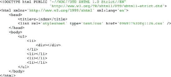
In Figure 11-26c, the problem becomes clear. In IE the absolutely positioned <div> element is positioned correctly where its parent <li> element is concerned, but incorrectly where the additional <li> elements are concerned. IE also has a list bug, where if an absolutely positioned element appears in an <li> element, additional space is included above or below the <li> element. Luckily, both of these problems have a fix, but they aren't pretty.
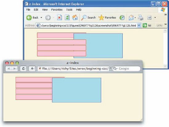
To correct the z-index bug that you see in Figure 11-26, you have to manually z-index all of the elements involved. That is to say, beginning with the first <li> element, assign each a z-index in decreasing order. So the first <li> element would be four, the second <li> element would be three, and so on to the last <li> element. This is demonstrated in Figure 11-27. There are no changes in the main style sheet from the CSS that you saw in Figure 11-26a, so you begin with the markup in Figure 11-27a.
In Figure 11-27a, you see that I've applied this fix inline, since I didn't believe that it would be any better to create a unique id for each <li> element, and then apply each z-index in the external style sheet. You'll see that the <div> element doesn't need a z-index at all. Since it is a nested element, it has a higher z-index than its parent, and the z-index problem that you see here is with the z-index of each <li> element, rather than the <div> element.


As for the <li> spacing bug, there is only one known fix: to make the <li> element an inline element with the declaration display: inline;. Since this would have adverse effects for other browsers, you need to apply the fix to IE only (via conditional comments), and to avoid the content collapsing, you need to nest a block-level element inside each <li> element, like this: <li><div></div></li>. The nested <div> element prevents the content from collapsing, as would be the case if the <li> elements were inline elements.
Try It Out: The z-index Property
Example 11-5. To review the z-index property, follow these steps.
Enter the following XHTML in your text editor:
<!DOCTYPE html PUBLIC "-//W3C//DTD XHTML 1.0 Strict//EN"
                      "http://www.w3.org/TR/xhtml1/DTD/xhtml1-strict.dtd">
<html xmlns='http://www.w3.org/1999/xhtml' xml:lang='en'>
    <head>
        <title>The z-index</title>
        <link rel='stylesheet' type='text/css' href='Example_11-5.css' />
    </head>
    <body>
        <div class='slide'>
            <p>
                The z-index property controls how elements are layered along an
                invisible z-axis. By default, elements are layered automatically.
                The first instance of an absolutely positioned element results in
                a z-index value of one, and with each subsequent element, the
                z-index is increased.
            </p>
            <div class='container'>
                <div class='zauto zone'></div>
                <div class='zauto ztwo'></div>
                <div class='zauto zthree'></div>
                <div class='zauto zfour'></div>
            </div>
        </div>
        <div class='slide'>
            <p>
                You can control the z-index explicitly, however, by providing an
                integer value to the z-index property.
            </p>
            <div class='container'>
                <div class='zauto zone' id='five'></div>
                <div class='zauto ztwo' id='six'></div>
                <div class='zauto zthree' id='seven'></div>
                <div class='zauto zfour' id='eight'></div>
            </div>
        </div>
        <div class='slide'>
            <p>
                Nested elements handle the z-index property differently. Descendant
                elements must always have a z-index higher than that of their
                parent.
            </p>
            <div class='container' id='nested'>
                <div class='zauto zone' id='nine'>
                    <div class='zauto ztwo' id='ten'>
                        <div class='zauto zthree' id='eleven'>
                            <div class='zauto zfour' id='twelve'></div>
                        </div>
                    </div>
                </div>
</div> </div> </body> </html>Save the preceding XHTML source code as
Example_11-5.html.Enter the following style sheet in your text editor:
body {
    font: 12px sans-serif;
    background: lightyellow;
}
div.container {
    height: 132px;
    position: relative;
}
div.zauto {
    position: absolute;
    border: 1px solid black;
    width: 100px;
    height: 100px;
}
div.zone {
    background: purple;
    top: 0;
    left: 0;
}
div.ztwo {
    background: orange;
    top: 10px;
    left: 10px;
}
div.zthree {
    background: magenta;
    top: 20px;
    left: 20px;
}
div.zfour {
    background: yellow;
    top: 30px;
    left: 30px;
}
div#five,
div#nine {
    z-index: 4;
}
div#six,
div#ten {
    z-index: 3;
}
div#seven,
div#eleven {
    z-index: 2;
} div#eight, div#twelve { z-index: 1; } div#nested div { top: 10px; left: 10px; } div.slide { float: left; padding: 5px; width: 200px; border: 1px solid rgb(200, 200, 200); background: white; margin: 5px; height: 400px; }Save the preceding style sheet as
Example_11-5.css. When you run the preceding source code in your browser, you should see output like that in Figure 11-28.
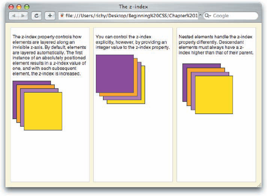
In Example 11-5, you saw three fundamental concepts to the z-index property. In the first example, you saw how when there is no explicit z-index defined, it is defined automatically, and each subsequent element is positioned higher than the last one.
Then, in the second example, you gave each of the elements an explicit z-index; starting with the <div> element with the id name five through the <div> element with id name eight. The <div> element with id name five is positioned highest in this stack, since it has a z-index of 4, then each subsequent <div> element is stacked lower, all the way to the <div> element with id name eight, which has a z-index of 1.
In the third example, you see how the z-index is ignored when it is placed on descendant elements, since descendant elements must always have a higher z-index than that of their parents and ancestors.
In the next section I demonstrate how to apply positioning to some real-world examples, such as vertically aligning content and multicolumn layouts.
Positioning is a powerful tool that enables you to create applications in web-based layouts from the simple to the very complex. In the following sections I examine a couple of practical applications of positioning in website design, starting with vertically and horizontally aligning content.
The following technique is used to horizontally and vertically center content in a web browser, although, it could be easily adapted for other alignment scenarios. The technique is demonstrated in Figure 11-29.
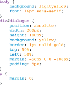
In the main style sheet in Figure 11-29a, you see two fundamental concepts coming together. The <div> element with id name dialogue is positioned absolutely, and then offset from the top and the left by 50 percent. This is one of the few places where percentage measurement is actually useful. Then the top and left margins of the <div> with id name dialogue are adjusted in the negative by exactly half of the element's collective width and collective height. So the top margin is set to a negative number that is exactly half of the sum of the top and bottom border-width, padding, and height values. In this case that number is 112, so half of 112 is 56. Then the left margin is adjusted in the negative by exactly half of the element's collective width, or the left and right border-width, padding, and width values, which comes to the sum of 212, half of which is 106.
The style sheet in Figure 11-29a is included in the markup in Figure 11-29b.
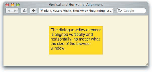
Once the source code in Figure 11-29a and Figure 11-29b is rendered in a browser, you get output like that in Figure 11-29c.

In Figure 11-29c, you see that the <div> element with id name dialogue is centered both vertically and horizontally in the browser window. Having seen this technique, you might wonder if this can be achieved with variable width or variable height content, that is to say, have a <div> with id name dialogue that doesn't have a fixed width or height. And the answer is no, the element this technique is applied to must have a fixed width and height for this technique to succeed. For the overwhelming majority of cases, however, this isn't a problem. You can always overflow content, and provide scroll bars if necessary with the overflow property.
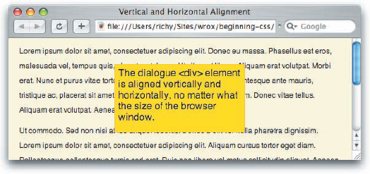
With this technique, you can create dialogues for your users that pop up layered over other content, for example, as shown in Figure 11-30.
You can make the <div> with id name dialogue a fixed position element, and you'll have a dialogue that stays in place as the user scrolls. This technique is typically coupled with JavaScript to create pop-up dialogues, and those despised pop-up advertisements that come floating onto the screen from nowhere. Unfortunately, pop-ups like this have many, many legitimate uses, too, so browsers are unable to block them.
In the next section I discuss multicolumn layouts.
Multicolumn layouts are the crown jewel of web design. Multicolumn web design is pretty ubiquitous and, thankfully, they're easy to crank out too. Earlier in this chapter I demonstrated how to make fixed side columns, and fixed headers and footers. The techniques I discuss in this section are very similar. In fact, you'll see some familiar techniques from those earlier examples at play in the ones that follow, with the difference being that these designs feature no "fixed" position elements, and are designed to be scalable.
A challenge of web page design in making pages that work on a variety of platforms, operating systems, and viewing environments is that different environments hold different challenges. One challenge in particular is creating fluid designs that function on a variety of screen resolutions. A typical goal today is to design for a minimum, 800 × 600 screen resolution, and scale up if the resolution is higher. Thankfully, the number of people still using an 800 × 600 screen resolution is diminishing all the time; you can expect to see about 10 percent of your audience using this screen resolution, and less than a fraction of a percent are using a lower screen resolution, with the majority of people at 1024 × 768 or greater. The designs that I present here scale down to 800 × 600 as the lowest screen resolution threshold, and up to 1024 × 768 as an upper viewing threshold. In Chapter 7, you saw that the min-width and max-width properties are used to define thresholds like this.
So without further ado, the first example of a multicolumn layout that I demonstrate is a simple two-column design. This is demonstrated in Figure 11-31.
In the main style sheet in Figure 11-31a, you see that the <div> element with id name container contains some groundwork for the multicolumn design. As the id name implies, the container <div> element contains the elements that will come together to create the two-column layout. It is given a relative position, so that the absolutely positioned left column <div> positions relative to it. It has a lower width threshold of 600 pixels, and an upper threshold of 1,000 pixels, so that the design can scale up and down, as necessary, to accommodate changes to the window size, or the user's screen resolution. The element that holds the document's content is the <div> element with id name content. It is given a left margin equal to the left column <div> element's collective width, which includes the sum of that element's left and right margin, border, padding, and width. Thus, the framework for a two-column layout is made. In Figure 11-31b, you see a style sheet that targets IE 6 and less.
In Figure 11-31b, you'll recognize the dynamic expressions from both Chapter 7 and earlier in this chapter. To emulate the min-width and max-width properties, you apply a dynamic expression to the container <div> element. When the width of the browser's viewport is greater than 1,000, the width of the container <div> element is set to 1000; when it's less than 1,000, but greater than 600, the width of the container element is set to auto; and when the browser's viewport is smaller than 600 pixels, the width is set to 600 pixels. The second hack present emulates setting opposing offset properties to imply height for the left column. The style sheets in Figure 11-31a and Figure 11-31b are included in the markup in Figure 11-31c.
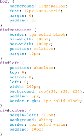

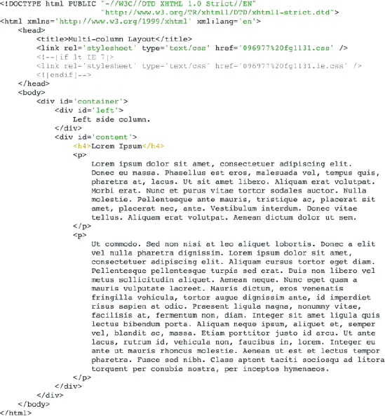
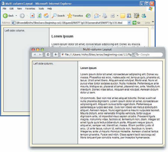
Figure 11-31d shows a simple two-column layout that works in a variety of browsers.
The technique presented in Figure 11-31 puts together concepts from Chapter 7, and concepts that you've see throughout this chapter, but why stop with just a two-column layout? In the next section, I present how to add a heading and a footer to the two-column layout.
Adding a heading and footer to the multicolumn layout is pretty straightforward; you simply have to make room with the left column, and everything else falls into place. Figure 11-32 demonstrates how to alter the multicolumn layout to accommodate a heading and footer.
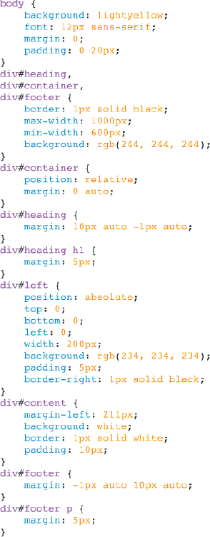
The main style sheet in Figure 11-32a is followed by the IE 6 style sheet that you see in Figure 11-32b.
The style sheets in Figure 11-32a and the style sheet in Figure 11-32b are included in the markup in Figure 11-32c.
Figure 11-32d shows a flexible, two-column design that includes a heading and footer.
There are a few important concepts at play that you need to be aware of in this example. First, have a look at the styles for the heading and the footer; each contains an element that has margin applied. The heading has an <h1> element nested with 5 pixels of margin applied, and the footer has a <p> element nested within it with 5 pixels of margin applied. The heading and the footer both have a one-pixel, solid, black border around each. This is done for more than mere aesthetic reasons; without the border you have the margin of the nested element collapsing with the margin of its parent element. If you recall from Chapter 7, margin collapsing happens whenever the top or bottom margin of one element comes into contact with the top or bottom margin of a parent, or adjacent element. In this example, to prevent margin collapsing from taking place, you need to apply a border to the parent elements, which are the <div> elements with id names heading and footer. If you remove the border, do so remembering to take margin collapsing into account.
The heading and the footer are also included outside of the container <div> element; you do this to accommodate content in each of these that is of variable height. If the heading and footer were to be placed inside of the container <div> element, you would have to give each a fixed height, and adjust the top and bottom properties of the left column <div> with respect to the collective height of the heading and the footer.


In the IE style sheet, you'll see one odd declaration, height: 1px;. You'll also note that the height of the heading, footer, and container <div> elements is not one pixel in IE 6. This is a hack! In the web design community, this hack is a variation of a famous hack known as the "Holly Hack." Big John and Holly Bergevin of positioniseverything.net originally devised the Holly Hack. The Holly Hack is used to correct certain layout calculation errors that can come up in IE 6 and IE 7. In this case, the left column <div> element was not positioning correctly; the values of top and left were inconsistent with other browsers. When you encounter this, it is usually a case where the Holly Hack is appropriate. To fix a layout bug in IE, you need to apply the Holly Hack to each parent of the element with wacky positioning until its layout corrects. Since explaining the Holly Hack requires a complicated discussion about the internals of IE 6, I avoid going deeper into the topic than what I've explained here. If you'd like to learn more about the Holly Hack, and the concepts at play there, have a look at http://www.satzansatz.de/cssd/onhavinglayout.html.
In this chapter, you saw the power of positioning in web design. Positioning offers web designers solutions to challenges both simple and complex. In this chapter, you learned the following:
Absolute positioned elements are positioned relative to the viewport, by default.
Relative positioning allows you to change the point of reference used for absolute positioning.
The four offset properties can be used on relatively positioned content to adjust its position with respect to its static origin.
Fixed position elements remain in the same place when a document is scrolled, and fixed position elements are always positioned relative to the viewport.
IE 6 doesn't support fixed positioning, but you can use dynamic expressions and JavaScript to work around the lack of support.
Specifying opposing offset properties on the same element is used to imply dimensions, which is used to get positioned elements that are stretched with fluidity.
You can create the illusion of fixed positioning with absolute positioning, a technique that's often used to create frame-like designs without the frames.
The way in which positioned elements are layered can be controlled with the
z-indexproperty, which accepts an integer value.By default, elements are stacked in ascending order.
Nested elements can't have a higher z-index than their parent.
You can center content vertically and horizontally using positioning, and some tricks with the
marginproperty.Absolute positioning is key in making multicolumn designs.
What is the default value of the
top, right, bottom, andleftproperties?What are offset properties used for?
If the
<body>element has a sole child that is positioned absolutely, what point of reference is used for its positioning?If the
<body>element has a sole child that is positioned relatively, with an id name of relative-element, and that relatively positioned element has a child that is absolutely positioned, what point of reference is used for the absolutely positioned element?If the element from Exercise 4, relative-element, has a fixed position child, what point of reference is used for its positioning?
Write a rule that you would use to make an element with the following standard CSS work in IE 6 in standards rendering mode.
div#element {
    position: fixed;
    top: 0;
    left: 0;
}
To make fixed position elements compatible with IE 6, what element must you always place fixed position elements inside of?
Write a rule that you would use to make an element with the following standard CSS work in IE 6 and IE 7 in quirks rendering mode.
div#element {
    position: fixed;
    bottom: 0;
    left: 0;
}
The following rule refers to an element that you want to take up all of the space available to it vertically, and positioned to the left. Fill in the blanks.
div#column {
    position: absolute;
    ___  : 0;
    ___  : 0;
    ___  : 0;
    padding: 10px;
     border: 1px solid black;
}
You have five elements that are all absolutely positioned siblings, but no
z-indexis specified for any of them. Name the stacking order that the browser will use for those elements'z-indexproperty. Provide thez-indexdeclaration for each element, in order.How do you fix the
z-indexbug in IE 6 and IE 7?