
In Chapter 1 you received a taste of what CSS is capable of in Example 1-1, a web page that contains the four gas giant planets of our solar system and some facts about them. In this chapter, I begin the process of drilling down into CSS syntax. Throughout Chapter 2, I take an exacto knife to the solar_system.css style sheet that you wrote for Example 1-1, and explore what makes CSS work. I begin this discussion with CSS rules.
As you dissect a style sheet, it can be broken down into progressively smaller bits. From large to small, it goes like this:
Style sheet
Rule
Selector
Declaration
Property
Value
In between, some special characters are used to mark the beginning and ending of one bit from another. Figure 2-1 shows a CSS rule.
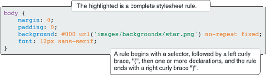
You can set the layout of the rule according to your preferences; you can add line breaks and spacing to make CSS readable, sensible, and organized:
body {
     margin: 0;
     padding: 0;
     background: #000 url('images/backgrounds/star.png') no-repeat fixed;
     font: 12px sans-serif;
}
Or you can scrunch it all together:
body {margin: 0; padding: 0; background: #000 url('images/backgrounds/star.png')
no-repeat fixed; font: 12px sans-serif;}
Like HTML, CSS can use white space and line breaks for purposes of readability. The interpreter reading the CSS doesn't care how much white space appears in the style sheet or how many line breaks are used. Humans, however, must often add some sort of structure to prevent eyestrain, and to increase maintainability and productivity.
Within a rule, the bit that chooses what in the HTML document to format is called a selector.
In CSS, a selector is the HTML element or elements to which a CSS rule is applied. Put simply, the selector tells the browser what to format. The simple selector that you saw in the last section is called a type selector; it merely references an HTML element. The selector portion of a CSS rule is highlighted in Figure 2-2.

body is written in the style sheet without the left and right angle brackets, < >. This rule applies the CSS properties: margin, padding, background, and font to the <body> element. I talk more about what these properties do in Chapters 6, 7, and 10.
Declarations are enclosed within curly braces to separate them from selectors. A declaration is the combination of a CSS property and value. Figure 2-3 highlights the property and value portions of a declaration.
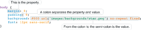
The property appears before the colon, and the colon is used to separate the property from the value. Declarations are used to describe. What would the CSS be like if I used CSS to describe myself? It might look like the following
richard {
    mood: content;
    height: 6.1ft;
    weight: auto;
    hair: brown;
    eyes: hazel;
    belly: full;
}
A declaration is a complete instruction for styling a property of an HTML element. The whole declaration appears highlighted in Figure 2-4.

A declaration always ends with a semi-colon.
When more than one declaration or selector appears in the same rule, they are said to be grouped.
You can group multiple selectors together in a single rule by providing a comma after each selector; this is illustrated in Figure 2-5. The result is that a rule applies to more than one selector at a time.

The rule in Figure 2-5 applies to the HTML elements, <h1>, <h2>, <h3>, <h4>, <h5>, and <h6>. Try it for yourself.
Try It Out: Grouping Selectors
Example 2-1. To see how a selector is used to select HTML elements in the body, follow these steps.
Fire up your favorite text editor and type the following XHTML:
<!DOCTYPE html PUBLIC "-//W3C//DTD XHTML 1.0 Strict//EN"
"http://www.w3.org/TR/xhtml1/DTD/xhtml1-strict.dtd">
<html xmlns='http://www.w3.org/1999/xhtml' xml:lang='en'>
    <head>
        <meta http-equiv='Content-Type' content='text/html; charset=UTF-8' />
        <title>Selectors and Grouping</title>
        <style type='text/css'>
            h1, h2, h3, h4, h5, h6 {
                font-family: sans-serif;
                color: maroon;
                border-bottom: 1px solid rgb(200, 200, 200);
            }
        </style>
    </head>
    <body>
        <h1>Style Sheet</h1>
        <h2>Rule</h2>
        <h3>Selector</h3>
        <h4>Declaration</h4>
        <h5>Property</h5>
        <h6>Value</h6>
    </body>
</html>
Save this as
Example_2-1.html.Fire up your favorite browser and load the file. Figure 2-6 shows how CSS selects the different headings in the body of the HTML document to apply style.

How It Works
In Figure 2-6 you see the hierarchy of a style sheet, drilling down from the whole style sheet to the value of a property. In Example 2-1, you included a single CSS rule with a selector that provides properties for all six HTML heading elements, <h1>, <h2>, <h3>, <h4>, <h5>, and <h6>. The selector contains three declarations that provide the browser with information about how to style the aforementioned heading elements. The browser is told to give each heading text colored maroon in the sans-serif font face, and a bottom border that's gray, solid, and one pixel thick.
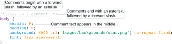
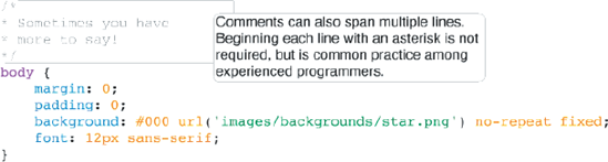
As is the case with HTML, comment text can be added to style sheets as well. In a multipage template, this helps you remember which CSS rule applies to what or why it was added in the first place. CSS supports multiline comments that begin with a forward slash and an asterisk (/*) and terminate with an asterisk and a forward slash (*/). This is illustrated in Figure 2-7.
CSS comments provide a mechanism that allows you to insert notes about what the styles in the style sheet do and why they were added. The design of a website can get complicated, and often it's helpful to make notes that help you remember why you added one thing or another. The following are some examples of what you can do with comments.
Comments can appear inside of a rule, as illustrated in Figure 2-8.
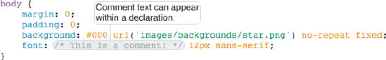
Comments can appear inside of a declaration, as demonstrated in Figure 2-9.
Comments can span multiple lines, as shown in Figure 2-10.
Comments can be used to disable portions of a style sheet, as shown in Figure 2-11.

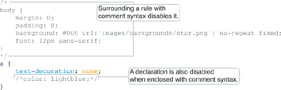
Disabling portions of a style sheet can be useful if you are trying to track down problematic styles, or if you are simply experimenting with different effects.
CSS can become quite complex in terms of what it allows a property's value to be. Figure 2-5 illustrates some, but not all, of the potential types of values that you see in CSS. In the coming sections I discuss each of the different types of values that CSS allows in greater detail, beginning with keyword values.
A keyword value is used to invoke a predefined function. For example, red, green, and blue are CSS keywords, red, green and blue; all have a predefined purpose. Color keywords can be used on any property that accepts a color value. Figure 2-12 shows some examples of keywords in a style sheet.
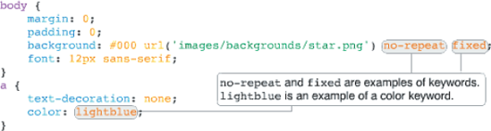
The keywords in Figure 2-12 are no-repeat, fixed, and lightblue. no-repeat and fixed provide the browser with instructions for how to render the background image. lightblue is a keyword that tells the browser what color the text of hyperlinks should be.
Many types of keywords are used in CSS, and sometimes a single keyword can have different meanings depending on the element to which it is applied. The auto keyword, for example, is used by CSS to apply some default style or behavior, and its meaning depends on the way it's used, and what property it is used with. Try the auto keyword in this example.
Try It Out: Adding auto width to a Table
Example 2-2. To see the effects of the auto keyword as applied to a <table> element, follow these steps.
Enter the following XHTML-compliant markup.
<!DOCTYPE html PUBLIC "-//W3C//DTD XHTML 1.0 Strict//EN"
                      "http://www.w3.org/TR/xhtml1/DTD/xhtml1-strict.dtd">
<html xmlns='http://www.w3.org/1999/xhtml' xml:lang='en'>
    <head>
        <meta http-equiv='Content-Type' content='text/html; charset=UTF-8' />
        <title>Auto width on tables</title>
        <style type='text/css'>
            table {
                width: auto;
                background: black;
                color: white;
            }
        </style>
    </head>
    <body>
        <table>
            <tbody>
                <tr>
                    <td>How will this table react to auto width?</td>
                </tr>
            </tbody>
        </table>
    </body>
</html>
Save the preceding markup as
Example_2-2.html, and then load it into a browser. Figure 2-13 showswidth: auto;applied to the<table>element.
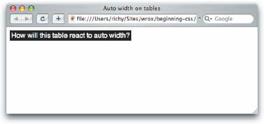
In Figure 2-13, you can see that the table expands only enough to accommodate the text within it.
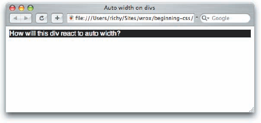
When width: auto; is applied to a <table> element, it invokes a different mechanism for width measurement than when it is applied to a <div> element. Next, see what happens when auto width is applied to a <div> element.
Try It Out: Applying auto width to a div
Example 2-3. To see the effects of the auto keyword as applied to a <div> element, follow these steps.
Enter the following document:
<!DOCTYPE html PUBLIC "-//W3C//DTD XHTML 1.0 Strict//EN"
                      "http://www.w3.org/TR/xhtml1/DTD/xhtml1-strict.dtd">
<html xmlns='http://www.w3.org/1999/xhtml' xml:lang='en'>
    <head>
        <meta http-equiv='Content-Type' content='text/html; charset=UTF-8' />
        <title>Auto width on divs</title>
        <style type='text/css'>
            div {
                width: auto;
                background: black;
                color: white;
            }
        </style>
    </head>
    <body>
        <div>How will this div react to auto width?</div>
    </body>
</html>
Save the preceding markup as
Example_2-3.html. Figure 2-14 showswidth: auto;applied to the<div>element.
How It Works
All elements with a width property have an auto value by default, but not all elements behave the same way when auto width is applied. The <table> element, for instance, only expands horizontally to accommodate its data, which is a method called shrink-to-fit. A <div> element, on the other hand, expands horizontally as far as there is space, which is called expand-to-fit.
I've added a background for each element in Examples 2-2 and 2-3 so that you can see its width. The border outlines the edges of each element, showing exactly how much space each element occupies. You learn more about how width works in Chapter 7, "The Box Model."
Keywords always invoke some special, predefined behavior. Another example I can present is with the CSS border property: A border may take three separate keywords that define how it appears when the browser renders it:
border: thin solid black;
This example defines a property with three keyword values: thin, solid, and black. Each value refers to a different characteristic of the border's appearance: thin refers to its measurement, solid to its style, and black to its color.
Sometimes you have need of including content from a style sheet or referencing a file path or including a font name that has spaces in its name or referencing an HTML element's attribute value. To accomplish these tasks, CSS supports a type of value called strings.
A string is any sequence of characters. For example, "Hello, World" is a string. In most programming languages and in CSS, strings are enclosed within either single or double quotation marks. A string is what is known as a data type. Data types are used to classify information. Integers, real numbers, and strings are examples of data types. Strings may contain text, numbers, symbols—any type of character. An integer can be a number that has a positive or negative value, and can only be a whole number, no decimals. A real number can have decimal places. These data types are made to conform to their defined rules by the language. Whereas a string can contain any character, real numbers are expected to be whole numbers or decimals; a string cannot appear where a real number is expected, and a real number cannot appear where an integer is expected, and so on.
One use of strings in CSS is to specify a font that contains spaces in its name.
font-family: "Times New Roman", Times, serif;
Font faces with spaces in the name are enclosed with quotations to keep the program that interprets CSS from getting confused. The quotes act as marking posts for where the font face's name begins and ends. You see more about how fonts work in Chapter 6, "Fonts."
Strings may also be used to include content in an HTML document from a style sheet. Try including content from a style sheet for yourself.
Try It Out: Including Content from a Style Sheet
Example 2-4. To include content from a style sheet, follow these steps.
Type in the following document:
<!DOCTYPE html PUBLIC "-//W3C//DTD XHTML 1.0 Strict//EN"
                      "http://www.w3.org/TR/xhtml1/DTD/xhtml1-strict.dtd">
<html xmlns='http://www.w3.org/1999/xhtml' xml:lang='en'>
    <head>
        <meta http-equiv='Content-Type' content='text/html; charset=UTF-8' />
        <title>Generated content</title>
        <style type='text/css'>
            div {
                font-family: sans-serif;
            }
            div::before {
                content: "I said, "Hello, world!"";
                background: black;
                color: white;
                margin-right: 25px;
            }
        </style>
    </head>
    <body>
        <div>The world said, "Hello, yourself!"</div>
    </body>
</html>
Save the document as
Example_2-4.html.Open the example with Safari, Firefox, or Opera—IE 6 and IE 7 don't support this feature. Figure 2-15 shows that the string "I said, "Hello, world!"" is inserted into the
<div>element using thecontentproperty.
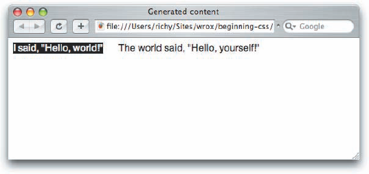
You included the string "I said, "Hello, world!"" in the HTML document by using the CSS content property.
Strings may contain any sequence of characters of any length (at least up to whatever arbitrary limit a browser may have defined)—even quotation marks are allowed. However, strings may contain quotation marks only if they're escaped using another special character, the backslash character. When you escape quotation marks, you tell the browser: "Ignore the quotation mark; it is part of the string." The backslash is used to quote Foghorn Leghorn in the following code:
div {
    content: "Foghorn said: "Get away from me son, you bother me."";
}
As an escape character, a backslash is included to tell the browser to ignore only the quotation mark that appears directly after it. The same backslash character is used to escape single quotes as well, if the string is enclosed by single quotes:
div {
    content: 'Foghorn said: 'Get away from me son, you bother me.'';
}
The browser also ignores the single quotes in the middle with the use of the backslash character before the quote mark. Quotation marks do not have to be escaped if single quotes are used within a string enclosed by double quotes or vice versa. In this example
div {
    content: "Foghorn said: 'Get away from me son, you bother me.'";
}
the single quotes do not have to be escaped because double quotes enclose the string.
There are two kinds of lengths used in CSS: relative and absolute. Absolute lengths are not dependent on any other measurement. An absolute measurement retains its length regardless of the environment (operating system, browser, or screen resolution of a computer monitor) in which it is applied. Relative lengths, on the other hand, depend on the environment in which they're used, such as the computer monitor's screen resolution or the size of a font.
Absolute measurements are defined based on real-world units such as inches, centimeters, points, and so on. These measurements have been used for centuries in the print industry, and one would be accustomed to finding them on a ruler.
CSS supports a variety of real-world measurements. Each absolute length unit supported by CSS is defined in the following table.
Description | |
|---|---|
in | |
cm | Centimeters |
mm | Millimeters |
pt | Points, 1 point is equal to 1/72nd of an inch |
pc | Picas, 1 pica is equal to 12 points |
Absolute lengths are not intended for the computer screen; they are intended for where a physical measurement is necessary. For example, printing a document requires real-word measurements. When you are composing a web document, you want the printable version of that document to be made using lengths that are reliable for the print environment.
On the other hand, when absolute measurements are applied to the computer screen, some inconsistencies surface.
Coding real-world physical lengths into a computer isn't as easy as it may seem. When applied to a computer screen, physical measurements are based on pixels. Pixels are tiny dots that a computer monitor uses to create the image you see, and the number of pixels displayed depends on the monitor's screen resolution. For example, a computer monitor set to an 800 × 600 screen resolution displays 800 pixels horizontally and 600 pixels vertically for a possibility of 480,000 total pixels.
Windows defines one inch as 96 pixels, by default. The definition of an inch as 96 pixels depends on an operating system display setting called DPI, or dots per inch. The DPI setting of an operating system is a user-configurable setting for defining the number of dots (or pixels) that make up an inch.
In the earlier days of the web, Macintosh and Windows had different DPI settings; a Mac's default DPI was 72 and Windows' was 96. Today all modern browsers, including those on the Macintosh, have standardized on Windows' 96 DPI measurement as the de facto default standard for DPI. While this de facto standardization makes for a greater likelihood of consistency, because the DPI setting can be customized, absolute measurement cannot be relied upon for onscreen layout. For example, Firefox still includes a setting in its font options menu for the DPI to either 72 or 96 DPI, and it's possible to change the DPI setting through other means, such as within Windows display settings control panel.
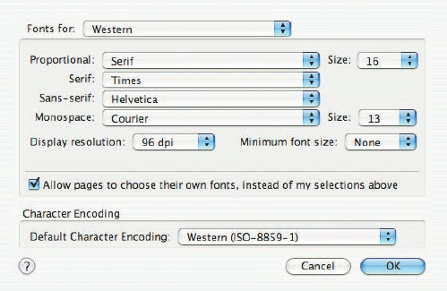
Figure 2-16 shows Firefox 1.5's DPI setting, a setting that has since been eliminated from Firefox 2.0, since Macs just use the same DPI setting as Windows these days.
In the next two examples, you set up an experiment to see how the DPI can affect absolute measurements in CSS, and ultimately discover the reason why absolute measurements are not suited for onscreen layout purposes.
Try It Out: Testing 96 DPI Equals an Inch
Example 2-5. To see a side-by-side comparison of pixels to inches, follow these steps.
Enter the following document:
<!DOCTYPE html PUBLIC "-//W3C//DTD XHTML 1.0 Strict//EN"
"http://www.w3.org/TR/xhtml1/DTD/xhtml1-strict.dtd">
<html xmlns='http://www.w3.org/1999/xhtml' xml:lang='en'>
    <head>
        <meta http-equiv='Content-Type' content='text/html; charset=UTF-8' />
        <title>Pixels to Inches</title>
        <style type='text/css'>
            div {
                background: #000;
                border: 1px solid rgb(128, 128, 128);
                color: white;
                font: 9px monospace;
                margin: 15px;
                text-align: center;
            }
            div#inches {
                width: 1in;
                height: 1in;
            }
            div#pixels {
width: 96px; height: 96px; } </style> </head> <body> <div id='inches'><-- 1 Inch --></div> <div id='pixels'><-- 96 Pixels --></div> </body> </html>Open the document in your browser of choice. Figure 2-17 shows two
<div>elements: The top<div>element has a height and width of 1 inch, and the bottom<div>has a height and width of 96 pixels. Both have a black background with white text for clarity. Switching the screen resolution from 800 × 600 pixels to 1280 × 1024 shows that the measurement of 1 inch remains the same as the 96-pixel measurement.

How It Works
By default, browsers conform to the Windows default of 96 dots per inch for the onscreen definition of what an inch is.
Obviously, since absolute measurement is not well suited for onscreen layout, there must surely be another, right? Yes! The other method of measurement in CSS is relative measurement.
Relative measurement is better suited for the purpose of onscreen layout. The following table defines the four types of relative measurement that CSS allows.
Description | |
|---|---|
em | Length relevant to the nearest font size. |
ex | The x-height of the relevant font (height of the letter x). |
px | Pixels, relative to the viewing device, for example, a computer monitor. |
% | Percentage measurement; how percentage length is calculated depends on what property it is being applied to. |
The em and ex units are measured relative to the font size of a document, pixels use the real pixels of the monitor's screen resolution, and percentage measurement depends on what property it is being applied to. In the coming sections you explore each type of relative measurement in greater detail.
Measurement in em is currently the most favored of relative measurement for onscreen layout, for most measurements. A measurement that is relative to the font size allows for designs that scale up and down gracefully with the user's font size preferences.
Try It Out: Comparing em to Pixels
Example 2-6. To see how the em measurement compares to pixel measurement, follow these steps.
Enter the following XHTML document:
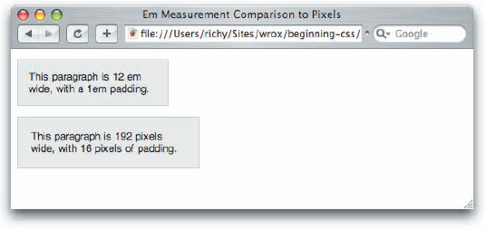
<!DOCTYPE html PUBLIC "-//W3C//DTD XHTML 1.0 Strict//EN"
                      "http://www.w3.org/TR/xhtml1/DTD/xhtml1-strict.dtd">
<html xmlns='http://www.w3.org/1999/xhtml' xml:lang='en'>
    <head>
        <meta http-equiv='Content-Type' content='text/html; charset=UTF-8' />
        <title>Em Measurement Comparison to Pixels</title>
        <style type='text/css'>
            body {
                font: 1em sans-serif;
            }
            p {
                background: rgb(234, 234, 234);
                border: 1px solid rgb(200, 200, 200);
            }
            p#em-measurement {
                width: 12em;
                padding: 1em;
            }
            p#px-measurement {
                width: 192px;
                padding: 16px;
            }
</style> </head> <body> <p id='em-measurement'> This paragraph is 12em wide, with a 1em padding. </p> <p id='px-measurement'> This paragraph is 192 pixels wide, with 16 pixels of padding. </p> </body> </html>Save the preceding document as
Example_2-6.html, and load it up in your favorite browser. When Example 2-6 is loaded up, you should see something like that in Figure 2-18.

How It Works
In Figure 2-18 you see that 12em is the same measurement as 192 pixels. When the font size is set to 16 pixels (the default in all modern browsers). So with the em unit, you can layout a whole web page that scales with the user's font size preference.
All modern browsers provide a mechanism for scaling the font size up or down to the user's preference. On the Mac,
In Figure 2-19, you see that the 12em measurement no longer matches the 192-pixel measurement when the text is scaled up. IE 7 and Opera do not display the effect the same as seen in Figure 2-19, however, since they scale everything, even the size of a pixel.
Figure 2-20 shows what happens when text is scaled down.

In Figure 2-20, the opposite of what you observed in Figure 2-19 has happened; the top paragraph is now smaller than the paragraph with a 192-pixel width. Em measurement lets you layout a web page with the font size preferences of the end user in mind, which in turn makes your website more accessible to people with visual disabilities. Again, IE 7 and Opera do not display the effect the same as shown in Figure 2-20, since they scale all content, which many would argue is much better than having designers trying to design scalable websites with features like the em unit. The IE 7 and Opera approach takes designers out of the equation and puts users in charge, which is much better for accessibility.
Like the em unit, the ex unit is based on font size, but unlike the em unit, the ex unit is based on the height of the lowercase letter "x."
The ex measurement, also known as x-height, is (like the em) based on the font size. However, the ex measurement is relative to the height of the lowercase letter x. The ex measurement is another unit of measurement derived from typography.
Like measurement in inches, the ex measurement is unreliable, but for different reasons. Because it is difficult to determine the actual height of the lowercase letter x for a given font, most browser creators take a shortcut in implementing the ex measurement. Instead of relying on the height of the lowercase letter x, ex measurement is defined by taking the measurement of half of 1em, or 0.5em. Because of its inconsistencies, ex measurement is yet another unit of measure to be avoided when designing for display on a computer monitor.
As you may have guessed from the discussion in this chapter about absolute measurements, pixels, the px measurement, are measured relative to the computer monitor's settings. This measurement depends on the resolution of the user's monitor. For instance, a 1px measurement viewed at a resolution of 800 × 600 is larger than a 1px measurement viewed at a resolution of 1024 × 768.
Pixels are easiest to understand when they specify the width and height of an image because most images are created based on the number of pixels they contain. This type of image is known as a bitmap image. Examples of bitmap images are the J-PEG, GIF, and PNG image formats. These image formats store information about an image by the pixel, and those are mapped together to create the image that you see. To illustrate my point, Figure 2-21 is a screenshot of Safari's window controls from the upper left-hand corner of Figure 2-20 while zoomed to the maximum of 1600% in Photoshop. At this level of detail the pixels are clearly visible as individual squares, and it becomes easier to imagine what a pixel is, since you're actually seeing them.

Keeping the image portrayed in Figure 2-21 in mind, when you measure in pixels with CSS, the individual pixels are as wide as the squares you see in Figure 2-21, which can be larger or smaller depending on the screen resolution setting of your monitor.
Pixel measurements have some advantages and disadvantages. Pixel measurements use the actual pixels on your computer monitor. Although that is often fine for screen display, it is not as precise when it comes to printing documents. The size of a pixel can change depending on many factors, among which are monitor size and resolution and the fine-tuning settings that stretch and shrink the display output. Therefore, defining a pixel measurement for print leaves lots of room for browser inconsistencies. How big is a pixel in the real world? It simply isn't a constant measurement for physical length the same way that centimeters are. This is an area best suited for the absolute units that I discussed earlier in the chapter. I discuss this issue further in Chapter 13, "Styling for Print."
Note
Use the right tool for the job! Pixels should be used for measurements where a user's font size preference won't be a factor, and where a real-world, absolute length wouldn't be superior, such as for print. An example of a good place to use pixels would be for the width of a border around a box.
The last type of relative measurement that CSS has to offer is percentage measurement.
Percentage measurements are always dependent on something else; therefore, percentage measurements are also a form of relative measurement. The behavior of a percentage measurement changes depending on the element to which the measurement is being applied. Try applying a percentage width yourself.
Try It Out: Experimenting with Percentage Measurement
Example 2-7. To see how percentage measurement works, follow these steps.
Enter the following markup into your text editor.
<!DOCTYPE html PUBLIC "-//W3C//DTD XHTML 1.0 Strict//EN"
"http://www.w3.org/TR/xhtml1/DTD/xhtml1-strict.dtd">
<html xmlns='http://www.w3.org/1999/xhtml' xml:lang='en'>
    <head>
        <meta http-equiv='Content-Type' content='text/html; charset=UTF-8' />
        <title>Experimenting with Percentage Measurement</title>
        <style type='text/css'>
            div {
                width: 100%;
                background: black;
                color: white;
            }
        </style>
    </head>
    <body>
        <div>What happens when I apply a 100% width?</div>
    </body>
</html>
Save the document as
Example_2-7.html, and load it up into your favorite browser. When you load Example 2-7 into a browser, you should see something like Figure 2-22.

How It Works
Percentage measurement works differently depending on what property it is applied to; you'll continue to see examples of this throughout this book. In Example 2-7, you applied the declaration width: 100%; to the <div> element, and when loaded into a browser you see that the <div> element expands for the whole width of the window. If you've been paying attention, you might have noted that this result is identical to the one you observed for Example 2-3, earlier in this chapter. Yes, when applied this way, the width: auto; declaration and the width: 100%; declaration produce identical results; however, there are fundamental differences between these two completely different methods of specifying width. The percentage method used here calculates the width of the <div> element based on its parent element. In this case, the parent element is the <body> element, and the width of the <div> is set to 100% of the width of the <body> element, no ifs, ands, or buts. Although you may not see why auto width is different at this point, it is, and that is a topic that is much too big to get into right now. You learn more about the differences between auto width and percentage width in Chapter 7, "The Box Model."
Because it's a presentational language, most of CSS is affected in some way by length and units of measurement. The fundamental unit for all measurements when you design for display on a computer monitor is the pixel, because computers display images in pixels. You can define lengths relative to font sizes, using em units as the most practical and consistent solution. Absolute lengths, on the other hand, are better suited for print because of the multitude of inconsistencies that occur when absolutes are used for presentations on a computer monitor. In the next section, I continue the discussion of CSS property values with a look at how CSS interprets numbers.
CSS allows numbers as values for several properties. Two types of numbers are accepted by CSS: integers and real numbers. Like strings, integers and real numbers are data types and are often used in CSS for the measurement of length. The first type, integer, is expected to be exclusively a whole number, meaning no decimals are allowed.
In CSS, an integer may be preceded by a plus (+) or minus (−) to indicate the sign. Although some properties do not accept negative values, many do. As you can see in the following example, one property that allows negative values is the margin property.
Try It Out: Setting a Negative Margin
Example 2-8. To see what happens when the margin property has a negative value, follow these steps.
Enter the following markup:
<!DOCTYPE html PUBLIC "-//W3C//DTD XHTML 1.0 Strict//EN"
"http://www.w3.org/TR/xhtml1/DTD/xhtml1-strict.dtd">
<html xmlns='http://www.w3.org/1999/xhtml' xml:lang='en'>
    <head>
        <meta http-equiv='Content-Type' content='text/html; charset=UTF-8' />
        <title>Setting a Negative Margin</title>
        <style type='text/css'>
            div {
                background: black;
                color: white;
                margin: −10px 0 0 −15px;
                font: 12px sans-serif;
            }
        </style>
    </head>
    <body>
        <div>What happens when I apply a negative margin?</div>
    </body>
</html>
Save the markup that you entered as
Example_2-8.html, and load it into your favorite browser. You should see something like what you see in Figure 2-23.
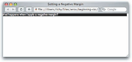
From Figure 2-23, you can see that the position of the <div> element has been altered by the addition of the negative margin. It has been moved a little off-screen on the left and just a tad off-screen on the top. This is one example of how you can use an integer in CSS. You learn more about how the margin property works in Chapter 7, "The Box Model."
Real numbers can have a decimal value, and decimal values increase the precision of measurements in CSS. As was the case for integers, real numbers in CSS can also be preceded by plus (+) or minus (−) to indicate the number's sign. The value 1.2em, for example, means 1.2 times the font size. As in mathematics, a positive sign is assumed if no sign is present. If I have a declaration that says margin-left: −1.2em;, this causes an element to shift to the left 1.2 times the font size.
CSS provides some basic and reasonable rules for the specification of integers and real numbers in property values. CSS is also very flexible with how colors are specified, a topic I discuss in the following section.
CSS has a number of options for specifying colors, ranging from a 216-color, web-safe palette to the full range of colors available in the RGB format, a total of 16,777,216 colors! More specifically, those options are as follows:
Color keywords: These enable you to specify a color by its name.
RGB values: These enable you to specify a color via a Red, Green, Blue representation, which provides access to millions of colors.
RGB Percentage: This option is the same as RGB but uses percentages.
RGBA (RGB with Alpha channel [available in CSS 3]): The RGB palette is used with the addition of an alpha channel to specify transparency.
Hexadecimal: This enables you to specify a color by a special hexadecimal number.
Shorthand Hexadecimal: This is a shortened representation of hexadecimal numbers; it is limited to a special 216-color, web-safe palette.
Each method is a means of accomplishing the same thing: specifying a color. You can use these methods to specify text color, border color, or background color. Next, you see what each of these methods looks like when used in the context of a style sheet rule.
The first method for specifying color, mentioned previously, is to use a color keyword. This is the most intuitive method because all you need to do is reference the name of the color itself. Here are some examples:
div {
    color: black;
    background-color: red;
    border: thin solid orange;
}
This rule applies to any <div> element contained in the document. I have specified that each <div> element should have black text, a red background, and a thin, solid orange border around the element. In this example, black, red, and orange are color keywords, so a color keyword is simply the name of the color.
In CSS 3, 147 colors are named. Browser support for these colors is very good. I have found only a single color not supported by IE 6. That color is lightgray, spelled with an a; however, the browser does support lightgrey, spelled with an e. This is an obscure bug that arises because Internet Explorer allows only the British spelling of grey and not the American English gray. The CSS specification supports both spellings of gray. Firefox, Opera, and Safari support all 147 named colors.
A complete table of CSS-supported color keywords is available in Appendix C.
RGB stands for Red, Green, and Blue. These are the primary colors used to display the color of pixels on a computer monitor. When you use these three colors in various combinations, it is possible to create every color of the rainbow. This is done through different colored lights either overlapping each other or appearing side by side in different intensities to display color. RGB is also known as luminous or additive color. Luminous means that RGB uses light in varying intensities to create color, and additive means colors are added to one another to produce the colors of the spectrum. Many computer monitors are capable of displaying millions of colors: 16,777,216 colors, in fact. CSS RGB color is specified using a special three-number syntax, with each one representing a color channel. This first number is red, the second green, and the third blue:
body {
    background-color: rgb(128, 128, 128);
}
This produces the same color as the CSS color keyword gray. Equal amounts of all three channels form a variation of gray, where 0, 0, 0 is black and 255, 255, 255 is white.
Here's another example:
body {
    background-color: rgb(135, 206, 235);
}
This produces the same color as the CSS color keyword skyblue. The number 135 refers to the red channel, 206 to the green channel, and 235 to the blue channel. RGB values may also be represented using percentages:
body {
    background-color: rgb(50%, 50%, 50%);
}
This also produces the same color as the CSS color keyword gray.
CSS 3 is to introduce one more variation on the RGB scheme, with RGBA. This specification includes an alpha channel, which is used to make an element transparent. The alpha channel of RGBA is specified in the same manner as regular RGB with the A indicating how transparent the color is, with 0 being fully opaque, and 255 being fully transparent. No browser supports the RGBA specification yet.
Hexadecimal colors have been around nearly as long as the World Wide Web has been. Hexadecimal refers to a numbering scheme that uses 16 characters as its base, expressed in a combination of letters and numbers. The decimal numbering system, on the other hand, uses 10 numbers as its base. A hexadecimal system uses 0-9 for the first 10 digits and A-F to represent the remaining 6 digits. Letter A corresponds to the number 10, B to 11, C to 12, and so on up to 15, which is represented by F. Hexadecimal values are another way of expressing an RGB value. For instance, #FFFFFF refers to white, which is expressed in RGB as 255, 255, 255. To switch from RGB values to hexadecimal, each channel is converted to its hexadecimal equivalent, so each 255 becomes FF in hexadecimal. To calculate the hexadecimal value, divide the RGB number by 16. The result is the first hexadecimal digit. The remainder from the division becomes the second hexadecimal digit. The RGB value 255 divided by 16 equals 15 with a remainder of 15. In hexadecimal, the number "15" is represented by "F", so applying this formula results in FF. The process is repeated for each RGB color channel, so the hexadecimal notation of 255, 255, 255 is FF, FF, FF or #FFFFFF. In CSS, hexadecimal colors are included just as RGB or color keywords are, as shown in the following example.
div {
    color: #000000;
    background-color: #FF0000;
    border: thin solid #FFA500;
}
#000000 is the hexadecimal representation of black; the same as RGB 0, 0, 0 or simply the black color keyword. #FF0000 is a hexadecimal representation of red, or RGB 255, 0, 0, or the red color keyword. Finally, #FFA500 is a hexadecimal representation of orange, or RGB 255, 165, 0, or the orange color keyword.
There are 216 web-safe colors. A web-safe color is a hexadecimal color comprised of any combination of the following: FF, CC, 99, 66, 33, 00, for a potential of 216 colors. These colors were originally identified and given their web-safe name by Lynda Weinman, a graphic and web design guru and author of numerous graphic and web design books. These 216 colors were identified as colors safe for crossplatform, cross-browser use on computer systems capable of displaying only 256 colors; in other words, 8-bit systems. There are 216 colors, minus 40 colors reserved for use by operating systems. Different operating systems, such as Macintosh OS and Windows OS, do not reserve the same 40 colors, so these 40 colors cannot be relied upon. If you attempt to use a color outside of the 216-color palette on a system capable of displaying only 256 colors, the operating system may attempt to display the color through a process called dithering. Dithering is a process in which the operating system attempts to mix two colors that it is capable of displaying to get the requested color. While today the majority of computers are comfortably able to display millions of colors, there is still one audience that is using devices that aren't capable of displaying that many colors, and that is people using cell phones and other small screen devices to access the web.
Figure 2-24 shows a normal image.
Figure 2-25 shows the dithered image.


If you look at these two figures together, you should be able to see the effects of dithering. The image in Figure 2-25 is pixelated and grainy; the image in Figure 2-24 is smooth and fluid.
Dithering causes all sorts of nasty things to happen to an image or solid color. In some cases a grid appears on a solid background where the operating system attempts to display the color using two colors.
Hexadecimal notation is capable of expressing all 16,777,216 colors allowed by RGB. If a color outside the web-safe palette is used, this leads to dithering. Short hexadecimal notation, on the other hand, allows only the 216-color, web-safe palette:
div {
    color: #000;
    background-color: #F00;
    border: thin solid #FFA500;
}
Only FF, CC, 99, 66, 33, and 00 are allowable in the web-safe palette, so the notation for these can be simplified. FF becomes simply F, CC becomes C, 99 becomes 9, and so on. A single digit rather than two represents the pair. So in this example, #000 refers to black and #F00 refers to red. #FFA500 is not representable in short hexadecimal notation because A5 cannot be simplified to a single digit. Only pairs in which both numbers have the same value can be converted to short hexadecimal notation.
Although in the past the web-safe pallet was frequently necessary for designers, today advanced graphic cards capable of displaying millions of colors have become so common that the number of 8-bit systems capable of displaying only 256 colors has fallen dramatically. Today, it is safer to design creatively with color. The browser-safe pallet is not yet completely dead—it still has a place in designing web content for display on PDAs and cell phones, most of which are limited to 256 colors.
CSS uses a special term—URI (Universal Resource Indicator)—when the location of a resource or data file must be specified. The acronym URI is related to two other acronyms, URL (Universal Resource Locator), and URN (Universal Resource Name). The ideas behind both of these specifications are combined to get the URI, the term used in the W3C CSS specifications. URIs are most used in CSS for two purposes:
The inclusion of style sheets
The inclusion of background images
The URI is referenced using a special method, as shown in the following example:
background: url(mypicture.jpg);
The url() syntax is used to enclose the URI of the file being referenced. In this example, mypicture.jpg must exist in the same directory as the style sheet. If the style sheet is named mystyle.css and it's located at http://www.example.com/styles/mystyle.css, the mypicture.jpg file must also exist in the styles directory, where its path is http://www.example.com/styles/mypicture.jpg. The complete, absolute path or the shortened relative paths are both acceptable references to the file. I address this topic again in Chapter 10, "Backgrounds," where I discuss the background property and the syntax it allows.
CSS is very flexible regarding how you call it in a document. You can include CSS in a document in four ways:
CSS can be included in a document by using embedded style sheets, which are included between
<style>and</style>tags directly in an HTML document, as demonstrated in Figure 2-26. These tags must appear between the<head>and</head>tags.CSS can be included in its own document and linked to an HTML document by using the
<link>element, shown in Figure 2-27.CSS can be imported from within another style sheet by using an
@importrule, as shown in Figure 2-28.CSS can be included directly in an element in an HTML document by using inline styles with the
styleattribute, as shown in Figure 2-29.


Each method has its own particular usefulness. The upcoming sections describe how you can use each of these methods to include CSS in an HTML document.
You use the <style></style> tag set to include embedded style sheets directly in the document. You can include HTML comment tags if you want to hide style sheet rules from non-equipped browsers. Since HTML's early days, HTML has supported the capability of adding comment text to a document. Comment text gives the web author the ability to add notes to a project so he can recall why he did something in a certain way or to mark the sections of a document. In HTML, you add a comment by typing a left angle bracket, an exclamation mark, two dashes, at least one space, and then the comment text itself. You close the comment by typing at least one space, two more dashes, and the right angle bracket. Here's what a comment looks like:
<!--Hi. I'm comment text. -->
In the context of an embedded style sheet, comments have a special meaning. Because they appear inside the <style></style> tags, they tell browsers that don't support CSS to ignore the text that appears between them. Modern CSS-equipped browsers, on the other hand, read the sequence of <style>, followed by <!--, and know that style sheet rules appear there. This allows CSS to be hidden from browsers that are incapable of interpreting it. The following snippet shows how you can use comment tags to hide CSS from older browsers:
<style type='text/css'>
    <!--
body, td {
color: blue;
}
-->
</style>Older browsers simply ignore any CSS rules defined inside the HTML comments.
For the <style> tag to be strictly formed XHTML syntax, a type attribute is required for the <style> tag. This is intended to tell the browser what type of syntax follows. For the purposes of CSS, the type attribute appears in the <style> tag with a value of text/css, as shown in the preceding block of code.
The next section describes how CSS can be written in its own document and included in an HTML or XHTML document.
The authors of CSS recognized that HTML-template creation is a common need. As such, the W3C body made recommendations that allow external style sheets to be included in a document from within HTML or XHTML by use of the <link> element or from within a style sheet itself using the @import rule. External style sheets are the preferred method of CSS inclusion in a web document. External style sheets can be cached by the user's browser. This frees the user, who no longer needs to download the web page or website's style sheet on every page request. This also ensures that documents load very quickly, which is another feature of CSS that conserves expensive bandwidth.
Here's a demonstration of the <link> element method:
<link rel='stylesheet' href='/path/to/stylesheet.css' type='text/css' />
The following attributes are required to use the <link> element for linking to a CSS document:
rel: Defines the relation between the external document and the calling document. In this case, the relation is that the external document is the style sheet for the calling document.href: Like the anchor tag,<a>, hrefstands for hyperlink reference. It accepts an absolute or relative path to the style sheet document.type: Refers to the MIME type of the external file.
An absolute path means the complete path to the file. For instance, http://www.example.com is an absolute path. A relative path triggers the application to find the document relative to the requesting document. So if the example file's URL is http://www.example.com/example.html and the CSS document is stored in the stylesheets directory as stylesheet.css, the relative path included in <link> is stylesheets/stylesheet.css and the absolute path to the document is http://www.example.com/stylesheets/stylesheet.css or /stylesheets/stylesheet.css.
A style sheet is really easy to set up, and I discuss this in the next section.
External style sheets are essentially the same thing as embedded style sheets; the key difference is that no markup exists in a CSS file. When you create an external, independent CSS document, it must be created using the .css file extension.
An external CSS document may contain nothing but CSS rules or comments. A CSS document cannot contain any markup; see how this is done in the following Try It Out.
You can also link to an external style sheet by using the @import rule. Here's a demonstration:
<style type='text/css'>
    @import url(path/to/cssdoc.css);
</style>
This example uses the <style></style> method but includes the @import notation. It's very straightforward: Plug in the @import rule followed by the url(), which may contain an absolute or relative path.
The
@importmethod is not supported by older browsers, and it is sometimes used as a hack to hide styles from browsers that would crash horribly if these styles were present. One such browser is Netscape Navigator 4, which has horrible CSS support and has been known to lock up when certain styles are present.
The next section describes how styles can be included inline, directly on elements, by using the style attribute.
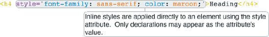
The last method for including CSS in a document is from within the XHTML elements themselves. Sometimes it doesn't make sense to clutter your external or embedded style sheets with a rule that will be used on only one element in one document. This is where the style="" attribute comes into play; it's demonstrated by the following markup:
<table style="border: 1px solid black; margin: auto;">
    <tr>
        <td style="text-align: right; font-size: 18pt;">
            Some text aligned left.
        </td>
    </tr>
</table>
This method allows for the text to be formatted from within the document and may be applied to any rendered element.
The following Try It Out demonstrates how the style attribute is used to add styles directly to the elements of a web document.
Throughout this chapter you learned about the bits and pieces that make CSS work. You learned the following:
Style sheets are made up of rules.
Rules are made up of selectors and declarations.
Declarations are made up of properties and values.
Values can be keywords, lengths, colors, strings, integers, real numbers, or URIs.
The em measurement is better for onscreen layout. Absolute units such as inches and centimeters are better for print layout. The pixel unit should be used where the user's font size preference won't be a factor.
Dithering is a method of mixing known colors to simulate an unknown one.
RGB is additive color. The colors red, green, and blue are added to each other in varying intensities to produce every color on the rainbow.
Hexadecimal color is just another way of expressing RGB color.
Short hexadecimal is a way of expressing web-safe colors.
The URI is used to include style sheets and background images (external documents) in CSS.
Style sheets can be embedded directly in an HTML document with the
<style>element.A style sheet can appear in its own document, and linked to from an HTML document using the
<link>element, or linked from a style sheet using the@importrule.Styles can be included inline, directly in an HTML element using the
styleattribute.
Chapter 3 continues the discussion with selectors.
Style sheets are made of what?
What's the difference between when
width: auto;is applied to a<table>as opposed to a<div>element?Complete the sequence: Declaration, Property, __________
Convert the color RGB(234, 123, 45) to hexadecimal.
What is the shortened hexadecimal notation of #FFFFFF?
When does dithering occur?
If I have a style sheet located at
http://www.example.com/stylesheet.css, and a web page located athttp://www.example.com/index.html, what markup would I include in index.html to includestylesheet.cssvia a relative path?