
Chapter 8
Formula Notation and Complex Statistics
What you will learn in this chapter:
- How to use formula notation for simple hypothesis tests
- How to use formula notation in graphics
- How to carry out analysis of variance (ANOVA)
- How to conduct post-hoc tests
- How the formula syntax can be used to define complex analytical models
- How to carry out complex ANOVA
- How to draw summary graphs of ANOVA
- How to create interaction plots
The R program has great analytical power, but so far most of the situations you have seen are fairly simple. In the real world things are usually more complicated, and you need a way to describe these more complex situations to enable R to carry out the appropriate analytical routines. R uses a special syntax to enable you to define and describe more complex situations. You have already met the ~ symbol; you used this as an alternative way to describe your data when using simple hypothesis testing (see Chapter 6, “Simple Hypothesis Testing”) and also when visualizing the results graphically (see Chapter 7, “Introduction to Graphical Analysis”). This formula syntax permits more complex models to be defined, which is useful because much of the data you need to analyze is itself more complex than simply a comparison of two samples. In essence, you put the response variables on the left of the ~ and the predictor variable(s) on the right, like so:
response ~ predictor.1 + predictor.2In this syntax you simply link the predictor variables using a + sign, but you are able to specify more complicated arrangements, as you will see. This chapter begins with a quick review of the formula syntax in relation to those two-sample tests and graphs you met before. After that you move on to look at analysis of variance, which is one of the most widely used of all statistical methods.
Examples of Using Formula Syntax for Basic Tests
Some commands enable you to specify your data in one of two forms. When you carry out a t.test() command, for example, you can specify your data as two separate vectors or you can use the formula notation described in the introduction:
t.test(sample.1, sample.2)
t.test(response ~ predictor, data = data.name)
In the first example you specify two numeric vectors. If these vectors are contained in a data frame, you must “extract” them in some fashion using the $ syntax or the attach() or with() commands. The options are shown in the following example:
> grass2
  mow unmow
1  12     8
2  15     9
3  17     7
4  11     9
5  15    NA

> t.test(grass2$mow, grass2$unmow)

> with(grass2, t.test(mow, unmow))

> attach(grass2)
> t.test(mow, unmow)
> detach(grass2)
In this case you have a simple data frame with two sample columns. If you have your data in a different form, you can use the formula notation:
> grass
  rich graze
1   12   mow
2   15   mow
3   17   mow
4   11   mow
5   15   mow
6    8 unmow
7    9 unmow
8    7 unmow
9    9 unmow

> t.test(rich ~ graze, data = grass)
This time the following data frame contains two columns, but now the first is the response variable and the second is a grouping variable (the predictor factor) which contains exactly two levels (mow and unmow). Where you have more than two levels, you can use the subset = instruction to pick out the two you want to compare:
> summary(bfs)
     count            site
 Min.   : 3.000   Arable: 9
 1st Qu.: 5.000   Grass :12
 Median : 8.000   Heath : 8
 Mean   : 8.414
 3rd Qu.:11.000
 Max.   :21.000

> t.test(count ~ site, data = bfs, subset = site %in% c('Grass', 'Heath'))
In this example you see that you have a data frame with two columns; the first is numeric and is the response variable. The second column contains three different levels of the grouping variable.
When you are looking at correlations you can use a similar approach. This time, however, you are not making a prediction about which variable is the predictor and which is the response, but merely looking at the correlation between the two:
cor.test(vector.1, vector.2)
cor.test(~ vector.1 + vector.2, data = data.name)
In the first case you specify the two numeric vectors you want to correlate as individuals. In the second case you use the formula notation, but now you leave the left of the ~ blank and put the two vectors of interest on the right joined by + sign.
In the following activity you can practice using the formula notation by carrying out some basic statistical tests.

> str(grass)
> summary(grass)> t.test(rich ~ graze, data = grass)> str(hog)
> summary(hog)> wilcox.test(count ~ site, data = hog, exact = FALSE)> names(trees)
> str(trees)
> summary(trees)> cor.test(~ Girth + Height, data = trees, method = 'pearson')Formula Notation in Graphics
When you need to present a graph of your results, you can use the formula syntax as an alternative to the basic notation. This makes the link between the analysis and graphical presentation a little clearer, and can also save you some typing.
You met the formula notation in regard to some graphs in Chapter 7, “Introduction to Graphical Analysis.” For example, if you want to create a box-whisker plot of your t.test() result, you could specify the elements to plot using exactly the same notation as for running the test. Your options are as follows:
boxplot(vector.1, vector.2)or
boxplot(response ~ predictor.1 + predictor.2, data = data.name)In these examples the first case shows that you can specify multiple vectors to plot simply by listing them separately in the boxplot() command. The second example shows the formula notation where you specify the response variable to the left of the ~ and put the predictor variables to the right. In this example, the predictor variables are simply joined using the + sign, but you have a range of options as you see shortly.
In the case of a simple x, y, scatter plot you also have two options for creating a plot:
plot(x.variable, y.variable)or
plot(y.variable ~ x.variable, data = data.name)Notice how the x variable is specified first in the first example, but in the second case it is, of course, the predictor variable, so it goes to the right of the ~.
Whenever you carry out a statistical test, it is important that you also produce a graphical summary. In the following activity you will produce some graphs based on the statistical tests you carried out in the previous activity.
> boxplot(rich ~ graze, data = grass, col = 'lightgreen')> title(ylab = 'Species Richness', xlab = 'Grazing Treatment',
main = 'Species richness and grazing')> boxplot(count ~ site, data = hog, col = 'tan', horizontal = TRUE)> title(ylab = 'Water speed', xlab = 'Hoglouse abundance',
main = 'Hoglouse and water speed')> pairs(~Girth + Height + Volume, data = trees)> plot(~ Girth + Height, data = trees)> plot(Girth ~ Height, data = trees, col = 'blue', cex = 1.2,
xlab = 'Height (ft.)', ylab = 'Girth (in.)')> title(main = 'Girth and Height in Black Cherry')Analysis of Variance (ANOVA)
Analysis of variance is an analytical method that allows for comparison of multiple samples. It is probably the most widely used of all statistical methods and can be very powerful. As the name suggests, the method looks at variance, comparing the variability between samples to the variability within samples. This is not a book about statistics, but the analysis of variance is such an important topic that it is important that you can carry out ANOVA.
The formula notation comes in handy especially when you want to carry out analysis of variance or linear regression, see Chapter 10, “Regression (Linear Modeling).” You are able to specify quite complex models that describe your data and carry out the analyses you require. You can think of analysis of variance as a way of linear modeling. R has an lm() command that carries out linear modeling, including ANOVA (see Chapter 10). However, you also have a “convenience” command, aov(), that gives you an extra option or two that are useful for ANOVA.
One-Way ANOVA
You can use the aov() command to carry out analysis of variance. In its simplest form you would have several samples to compare. The following example shows a simple data frame that comprises three columns of numerical data:
> head(bf)
  Grass Heath Arable
1     3     6     19
2     4     7      3
3     3     8      8
4     5     8      8
5     6     9      9
6    12    11     11
To run the aov() command you must have your data in a different layout from the one in the preceding example, which has a column for each numerical sample. With aov () you require one response variable (the numerical data) and one predictor variable that contains several levels of a factor (character labels). To achieve this required layout you need to convert your data using the stack() command.
Stacking the Data before Running Analysis of Variance
The stack() command can be used in several ways, but all produce the same result; a two-column data frame. If your original data have multiple numeric vectors, you can create a stacked data frame simply by giving the name of the original data like so:
> stack(bf)
   values    ind
1       3  Grass
2       4  Grass
3       3  Grass
4       5  Grass
5       6  Grass
6      12  Grass
...
This produces two columns, one called values and the other called ind. If you give your new stacked data frame a name, you can then apply new names to these columns using the names() command:
> bfs = stack(bf)
> names(bfs) = c('count', 'site')
However, there is a potential problem because the original data may contain NA items. You do not really want to keep these, so you can use the na.omit() command to eliminate them like so:
> bfs = na.omit(stack(bf))
> names(bfs) = c('count', 'site')
This eliminates any NA items and is stacked in the appropriate manner.
In most cases like this you want to keep all the samples, but you can select some of them and create a subset using the select = instruction as part of the stack() command like so:
> names(bf)
[1] "Grass"  "Heath"  "Arable"
> tmp = stack(bf, select = c('Grass', 'Arable'))
> summary(tmp)
     values          ind
 Min.   : 3.00   Arable:12
 1st Qu.: 4.00   Grass :12
 Median : 8.00
 Mean   : 8.19
 3rd Qu.:11.00
 Max.   :21.00
 NA's   : 3.00
In this case you create a new item for your stacked data; you require only two of the samples and so you use the select = instruction to name the columns required in the stacked data (note that the selected samples must be in quotes). Here you can see from the summary that you have transferred some NA items to the new data frame, so you should re-run the commands again but use na.omit() like so:
> tmp = na.omit(stack(bf, select = c('Grass', 'Arable')))
> summary(tmp)
     values          ind
 Min.   : 3.00   Arable: 9
 1st Qu.: 4.00   Grass :12
 Median : 8.00
 Mean   : 8.19
 3rd Qu.:11.00
 Max.   :21.00
Now you can see that the NA items have been stripped out. Notice, too, that the headings are values and ind, which is not necessarily what you want (although they are logical and informative). You instead need to use the names() command to alter the headings, giving the names you require like so:
> names(tmp) = c('count', 'site')Note that the names are given in quotes (single or double, as long as they match). Once your data are in the right format, you are ready to move on to carrying out the analysis.
Running aov() Commands
Once you have your data in the appropriate layout, you can proceed with the analysis of variance using the aov() command. You use the formula notation to indicate which is the response variable and which is the predictor variable, like so:
> summary(bfs)
     count            site
 Min.   : 3.000   Arable: 9
 1st Qu.: 5.000   Grass :12
 Median : 8.000   Heath : 8
 Mean   : 8.414
 3rd Qu.:11.000
 Max.   :21.000

> bfs.aov = aov(count ~ site, data = bfs)
In this example, you can see that you have a numeric vector as the response variable (count) and a predictor variable (site) comprising three levels (Arable, Grass, Heath). This kind of analysis, where you have a single predictor variable, is called one-way ANOVA. To see the result you simply type the name of the result object you created:
> bfs.aov
Call:
   aov(formula = count ~ site, data = bfs)

Terms:
                    site Residuals
Sum of Squares   55.3678  467.6667
Deg. of Freedom        2        26

Residual standard error: 4.241130
Estimated effects may be unbalanced
This gives you some information, but to see the classic ANOVA table of results you need to use the summary() command like so:
> summary(bfs.aov)
            Df Sum Sq Mean Sq F value Pr(>F)
site         2  55.37  27.684  1.5391 0.2335
Residuals   26 467.67  17.987
Here you can now see the calculated F value and the overall significance.
Simple Post-hoc Testing
You can carry out a simple post-hoc test using the Tukey Honest Significant Difference test via the TukeyHSD() command, as shown in the following example:
> TukeyHSD(bfs.aov)
  Tukey multiple comparisons of means
    95% family-wise confidence level

Fit: aov(formula = count ~ site, data = bfs)

$site
                  diff       lwr      upr     p adj
Grass-Arable -3.166667 -7.813821 1.480488 0.2267599
Heath-Arable -1.000000 -6.120915 4.120915 0.8788816
Heath-Grass   2.166667 -2.643596 6.976929 0.5110917
In this case you have a simple one-way ANOVA and the result of the post-hoc test shows the pair-by-pair comparisons. The result shows the difference in the means, the lower and upper 95 percent confidence intervals, and the p-value for the pairwise comparison.
Extracting Means from aov() Models
Once you have conducted your analysis of variance and the post-hoc test, you may want to see what the mean values are for the various levels of the predictor variable. One way to do this is to use the model.tables() command; this shows you the means or effects for your ANOVA:
> model.tables(bfs.aov, type = 'effects')
Tables of effects

 site
    Arable  Grass  Heath
     1.586 -1.580 0.5862
rep  9.000 12.000 8.0000

> model.tables(bfs.aov, type = 'means')
Tables of means
Grand mean

8.413793

 site
    Arable  Grass Heath
        10  6.833     9
rep      9 12.000     8
The default is to display the effects, so if you do not specify type = ‘means’, you get the effects. You can also compute the standard errors of the contrasts by using the se = TRUE instruction. However, this works only with a balanced design, which the current example lacks.
Chapter 9 looks at other ways to examine the means and other components of a complex analysis.
In the following activity you use analysis of variance to examine some data; you will need to rearrange the data into an appropriate layout before carrying out ANOVA, a post-hoc test and a graphical summary.
> cws = na.omit(stack(cw))> names(cws) = c('weight', 'diet')> str(cws)
> summary(cws)> boxplot(weight ~ diet, data = cws)> cws.aov = aov(weight ~ diet, data = cws)
> summary(cws.aov)> TukeyHSD(cws.aov)Two-Way ANOVA
In a basic one-way ANOVA you have one response variable and one predictor variable, but you may come across a situation in which you have more than one predictor variable, as in the following example:
> pw
   height    plant water
1       9 vulgaris    lo
2      11 vulgaris    lo
3       6 vulgaris    lo
4      14 vulgaris   mid
5      17 vulgaris   mid
6      19 vulgaris   mid
7      28 vulgaris    hi
8      31 vulgaris    hi
9      32 vulgaris    hi
10      7   sativa    lo
11      6   sativa    lo
12      5   sativa    lo
13     14   sativa   mid
14     17   sativa   mid
15     15   sativa   mid
16     44   sativa    hi
17     38   sativa    hi
18     37   sativa    hi
In this case you have a data frame with three columns; the first column is the response variable called height, and the next two columns are predictor variables called plant and water. This is a fairly simple example, but if you had more species and more treatments it becomes increasingly harder to present the data as separate samples. It is much more sensible, then, to use the layout as you see here with each column representing a certain variable. If you use the summary() command it appears that you have a balanced experimental design like so:
> summary(pw)
     height           plant   water
 Min.   : 5.00   sativa  :9   hi :6
 1st Qu.: 9.50   vulgaris:9   lo :6
 Median :16.00                mid:6
 Mean   :19.44
 3rd Qu.:30.25
 Max.   :44.00
The summary() command shows you that each of the predictor variables is split into equal numbers of observations (replicates). You now have to take into account two predictor variables, so your ANOVA model becomes a little more complicated. You can use one of the two following commands to carry out an analysis of variance for these data:
> pw.aov = aov(height ~ plant + water, data = pw)
> pw.aov = aov(height ~ plant * water, data = pw)
In the first command you specify the response variable to the left of the ~ and put the predictor variables to the right, separated by a + sign. This takes into account the variability due to each factor separately. In the second command the predictor variables are separated with a * sign, and this indicates that you also want to take into account interactions between the predictor variables. You could also have written this command in the following manner:
> pw.aov = aov(height ~ plant + water + plant:water, data = pw)The third term in the ANOVA model is plant:water, which indicates the interaction between these two predictor variables. If you run the aov() command with the interaction included, you get the following result:
> pw.aov = aov(height ~ plant * water, data = pw)
> summary(pw.aov)
            Df  Sum Sq Mean Sq  F value    Pr(>F)
plant        1   14.22   14.22   2.4615  0.142644
water        2 2403.11 1201.56 207.9615 4.863e-10 ***
plant:water  2  129.78   64.89  11.2308  0.001783 **
Residuals   12   69.33    5.78
~DH-
Signif. codes:  0 ‘***’ 0.001 ‘**’ 0.01 ‘*’ 0.05 ‘.’ 0.1 ‘ ‘ 1
Again you see the “classic” ANOVA table, but now you have rows for each of the predictor variables as well as the interaction.
> pw.aov1 = aov(height ~ plant + water, data = pw)
> pw.aov2 = aov(height ~ plant * water, data = pw)
> anova(pw.aov1, pw.aov2)
Analysis of Variance Table

Model 1: height ~ plant + water
Model 2: height ~ plant * water
  Res.Df     RSS Df Sum of Sq      F   Pr(>F)
1     14 199.111
2 12 69.333 2 129.78 11.231 0.001783 **More about Post-hoc Testing
You can run the Tukey post-hoc test on a two-way ANOVA as you did before, using the TukeyHSD() command like so:
> TukeyHSD(pw.aov)
  Tukey multiple comparisons of means
    95% family-wise confidence level

Fit: aov(formula = height ~ plant * water, data = pw)

$plant
                     diff       lwr       upr    p adj
vulgaris-sativa -1.777778 -4.246624 0.6910687 0.142644

$water
             diff        lwr       upr     p adj
lo-hi  -27.666667 -31.369067 -23.96427 0.0000000
mid-hi -19.000000 -22.702401 -15.29760 0.0000000
mid-lo   8.666667   4.964266  12.36907 0.0001175

$`plant:water`
                               diff          lwr        upr     p adj
vulgaris:hi-sativa:hi     -9.333333 -15.92559686  -2.741070 0.0048138
sativa:lo-sativa:hi      -33.666667 -40.25893019 -27.074403 0.0000000
vulgaris:lo-sativa:hi    -31.000000 -37.59226353 -24.407736 0.0000000
sativa:mid-sativa:hi     -24.333333 -30.92559686 -17.741070 0.0000004
vulgaris:mid-sativa:hi   -23.000000 -29.59226353 -16.407736 0.0000007
sativa:lo-vulgaris:hi    -24.333333 -30.92559686 -17.741070 0.0000004
vulgaris:lo-vulgaris:hi  -21.666667 -28.25893019 -15.074403 0.0000014
sativa:mid-vulgaris:hi   -15.000000 -21.59226353  -8.407736 0.0000684
vulgaris:mid-vulgaris:hi -13.666667 -20.25893019  -7.074403 0.0001702
vulgaris:lo-sativa:lo      2.666667  -3.92559686   9.258930 0.7490956
sativa:mid-sativa:lo       9.333333   2.74106981  15.925597 0.0048138
vulgaris:mid-sativa:lo    10.666667   4.07440314  17.258930 0.0016201
sativa:mid-vulgaris:lo     6.666667   0.07440314  13.258930 0.0469217
vulgaris:mid-vulgaris:lo   8.000000   1.40773647  14.592264 0.0149115
vulgaris:mid-sativa:mid    1.333333  -5.25893019   7.925597 0.9810084
You get a more lengthy output here compared to a one-way ANOVA because you are now looking at a lot more pairwise comparisons. You can reduce the output slightly by specifying which of the terms in your model you want to compare. You use the which instruction to give (in quotes) the name of the model term (or terms) you are interested in, as shown in the following example:
> TukeyHSD(pw.aov, which = 'water')
> TukeyHSD(pw.aov, which = c('plant', 'water'))
> TukeyHSD(pw.aov, which = 'plant:water')
In the first case you look for pairwise comparisons for the water treatment only. In the second case you look at both the water and plant factors independently. In the final case you look at the interaction term only. The results show you the difference in means and also the lower and upper confidence intervals at the 95 percent level. You can alter the confidence level using the conf.level = instruction like so:
> TukeyHSD(pw.aov, which = 'plant:water', conf.level = 0.99)
  Tukey multiple comparisons of means
    99% family-wise confidence level

Fit: aov(formula = height ~ plant * water, data = pw)

$`plant:water`
                               diff         lwr         upr     p adj
vulgaris:hi-sativa:hi     -9.333333 -17.8003408  -0.8663259 0.0048138
sativa:lo-sativa:hi      -33.666667 -42.1336741 -25.1996592 0.0000000
vulgaris:lo-sativa:hi    -31.000000 -39.4670075 -22.5329925 0.0000000
...
Now you can see the lower and upper confidence intervals displayed at the 99 percent level.
You can also alter the way that the output is displayed; if you look at the first column you see it is called diff, because it is the difference in means. You can force this to assume a positive value and to take into account the increasing average in the sample by using the ordered = TRUE instruction. The upshot is that the results are reordered in a subtly different way. Also, the significant differences are those for which the lower end point is positive:
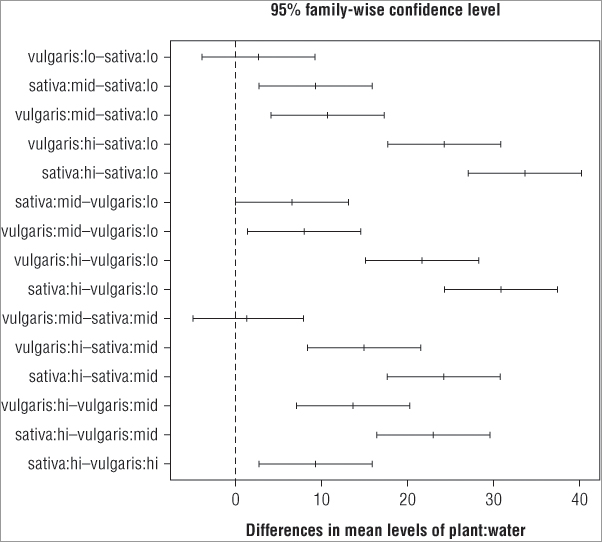
> TukeyHSD(pw.aov, which = 'plant:water', ordered = TRUE)
  Tukey multiple comparisons of means
    95% family-wise confidence level
    factor levels have been ordered

Fit: aov(formula = height ~ plant * water, data = pw)

$`plant:water`
                              diff         lwr       upr     p adj
vulgaris:lo-sativa:lo     2.666667 -3.92559686  9.258930 0.7490956
sativa:mid-sativa:lo      9.333333  2.74106981 15.925597 0.0048138
vulgaris:mid-sativa:lo   10.666667  4.07440314 17.258930 0.0016201
vulgaris:hi-sativa:lo    24.333333 17.74106981 30.925597 0.0000004
sativa:hi-sativa:lo      33.666667 27.07440314 40.258930 0.0000000
sativa:mid-vulgaris:lo    6.666667  0.07440314 13.258930 0.0469217
vulgaris:mid-vulgaris:lo  8.000000  1.40773647 14.592264 0.0149115
vulgaris:hi-vulgaris:lo  21.666667 15.07440314 28.258930 0.0000014
sativa:hi-vulgaris:lo    31.000000 24.40773647 37.592264 0.0000000
vulgaris:mid-sativa:mid   1.333333 -5.25893019  7.925597 0.9810084
vulgaris:hi-sativa:mid   15.000000  8.40773647 21.592264 0.0000684
sativa:hi-sativa:mid     24.333333 17.74106981 30.925597 0.0000004
vulgaris:hi-vulgaris:mid 13.666667  7.07440314 20.258930 0.0001702
sativa:hi-vulgaris:mid   23.000000 16.40773647 29.592264 0.0000007
sativa:hi-vulgaris:hi     9.333333  2.74106981 15.925597 0.0048138
In this case, you see that the differences in the means are all positive. The lower confidence intervals that are positive produce significant p-values and the negative ones do not.
Graphical Summary of ANOVA
You should always produce a graphical summary of your analyses; a suitable graph for an ANOVA is the box-whisker plot, which you can produce using the boxplot() command. The instructions you give to this command to produce the plot mirror those you used to carry out the aov() as you can see in the following example:
> pw.aov = aov(height ~ plant * water, data = pw)
> boxplot(height ~ plant * water, data = pw, cex.axis = 0.9)
> title(xlab = 'Interaction', ylab = 'Height')
In this case an extra instruction, cex.axis = 0.9, is added to the boxplot() command. This makes the axis labels a bit smaller so they fit and display better (recall that values greater than 1 make the labels bigger and values less than 1 make them smaller). The title() command has also been used to add some meaningful labels to the plot, which looks like Figure 8-1.
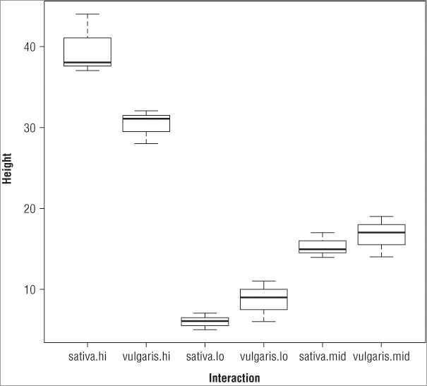
If you compare the boxes to the results of the TukeyHSD() command, you can see that the first result listed for the interactions is vulgaris.lo – sativa.lo, which corresponds to the two lowest means (presented with the smaller taken away from the larger to give a positive difference in means). If you look at the second item in each pairing, you see that it corresponds to higher and higher means until the final pairing represents the comparison between the boxes with the two highest means (in this example, this is sativa:hi – vugaris.hi).
Graphical Summary of Post-hoc Testing
The TukeyHSD() command has its own dedicated plotting routine via the plot() command:
> plot(TukeyHSD(pw.aov))

> pw.ph = TukeyHDS(pw.aov)
> plot(pw.ph)
In the first case the TukeyHSD() command is called from within the plot() command, and in the second case the post-hoc test was given a name and the plot() command is called on the result object. Both give the same result (see Figure 8-2).
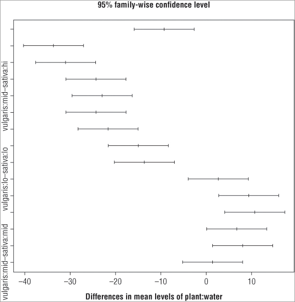
The main title and x-axis labels are defaults; you cannot easily alter these. You can, however, make the plot a bit more readable. At present the y-axis labels are incompletely displayed because they evidently overlap one another. You can rotate them using the las = instruction so that they are horizontal. You must give a numeric value to the instruction; Table 8-1 shows the results for various values.
Table 8-1: Options for the las Instruction for Axis Labels
| Command | Explanation |
| las = 0 | Labels always parallel to the axis (the default) |
| las = 1 | All labels horizontal |
| las = 2 | Labels perpendicular to the axes |
| las = 3 | All labels vertical |
You can also adjust the size of the axis labels using the cex.axis = instruction, where you specify the expansion factor for the labels. In this case the labels will still not fit because the margin of the plot is simply too small. You can alter this, but you need to do some juggling. The commands you need to produce a finished plot are as follows:
> op = par(mar = c(5, 8, 4, 2))
> plot(TukeyHSD(pw.aov, ordered = TRUE), cex.axis = 0.7, las = 1)
> abline(v = 0, lty = 2, col = 'gray40')
> par(op)
You cannot set the margins from within the plot() command directly and must use the par() command to set the options/parameters you require. The par() command is used to set many graphical parameters, and the options set remain in force for all plots. Following are the steps you need to perform to complete the plot using the preceding commands:
By using the order = instruction you have ensured that all the significant pairwise comparisons have the lower end of the confidence interval > 0. This enables you to spot the significant interactions at a glance.
In the following activity you will carry out a two-way analysis of variance using some sample data that are built-into R.
> head(warpbreaks)
> names(warpbreaks)
> str(warpbreaks)
> summary(warpbreaks)> boxplot(breaks ~ wool * tension, data = warpbreaks)> wb.aov = aov(breaks ~ wool * tension, data = warpbreaks)
> summary(wb.aov)> TukeyHSD(wb.aov)> TukeyHSD(wb.aov, order = TRUE)> plot(TukeyHSD(wb.aov, order = T), las = 1, cex.axis = 0.8)
> abline(v = 0, lty = 'dotted', col = 'gray60')Extracting Means and Summary Statistics
Once you have carried out a two-way ANOVA and done a post-hoc test you will probably want to view the mean values for the various components of your ANOVA model. You can use a variety of commands, all discussed in the following sections.
Model Tables
You can use the model.tables() command to extract means or effects like so:
> model.tables(pw.aov, type = 'means', se = TRUE)
Tables of means
Grand mean

19.44444

 plant
plant
  sativa vulgaris
  20.333   18.556

 water
water
   hi    lo   mid
35.00  7.33 16.00

 plant:water
          water
plant      hi    lo    mid
  sativa   39.67  6.00 15.33
  vulgaris 30.33  8.67 16.67

Standard errors for differences of means
        plant water plant:water
        1.133 1.388       1.963
replic.     9     6           3
In this case, the mean values are examined and the standard errors of the differences in the means are shown, much as you did when looking at the one-way ANOVA. In this case, because you have a balanced design, the se = TRUE instruction produce the standard errors. You see that you are shown means for the individual predictor variable as well as the interaction. If you want to see only some of the means, you can use the cterms = instruction to state what you want:
> model.tables(pw.aov, type = 'means', se = TRUE, cterms = c('plant:water'))In this case you produce only means for the interactions and the grand mean (which you always get). If you create an object to hold the result of the model.tables() command, you can see that it is comprised of several elements:
> pw.mt = model.tables(pw.aov, type = 'means', se = TRUE)
> names(pw.mt)
[1] "tables" "n"      "se"
Some of these elements are themselves further subdivided:
> names(pw.mt$tables)
[1] "Grand mean"  "plant"       "water"       "plant:water"
You can therefore access any part of the result that you require using the $ syntax to slice up the result object; in the following example you extract the interaction means:
> pw.mt$tables$'plant:water'
          water
plant      hi       lo       mid
  sativa   39.66667  6.00000 15.33333
  vulgaris 30.33333  8.66667 16.66667
Notice that some of the elements are in quotes for the final part; you can see this more clearly if you look at the tables part:
> pw.mt$tables
$`Grand mean`
[1] 19.44444

$plant
plant
  sativa vulgaris
20.33333 18.55556

$water
water
      hi       lo      mid
35.00000  7.33333 16.00000

$`plant:water`
          water
plant      hi       lo       mid
  sativa   39.66667  6.00000 15.33333
  vulgaris 30.33333  8.66667 16.66667
The ‘Grand mean’ and ‘plant:water’ parts are in quotes. This is essentially because they are composite items—the first contains a space and the second contains a : character.
Table Commands
You can also extract components of your ANOVA model by using the tapply() command, which you met previously, albeit briefly (in Chapter 5). The tapply() command enables you to take a data frame and apply a function to various components. The basic form of the command is as follows:
tapply(X, INDEX, FUN = NULL, ...)In the command, X is the variable that you want to have the function applied to; usually this is your response variable. You use the INDEX part to describe how you want the X variable split up. In the current example you would use the following:
> attach(pw)
> tapply(height, list(plant, water), FUN = mean)
               hi       lo      mid
sativa   39.66667 6.000000 15.33333
vulgaris 30.33333 8.666667 16.66667
> detach(pw)
Here you use the list() command to state the variables that you require as the index (if you have only a single variable, the list() part is not needed). Note that you have to use the attach() command to enable the columns of your data frame to be readable by the command. You might also use the with() command or specify the vectors using the $ syntax; the following examples give the same result:
> with(pw, tapply(height, list(plant, water), FUN = mean))
> tapply(pw$height, list(pw$plant, pw$water), FUN = mean)
Once you have the command working you can easily modify it to use a different function; you can obtain the number of replicates, for example, by using FUN = length:
> with(pw, tapply(height, list(plant, water), FUN = length))
         hi lo mid
sativa    3  3   3
vulgaris  3  3   3
Interaction Plots
It can often be useful to visualize the potential two-way interactions in an ANOVA, and indeed you probably ought to do this before actually running the analysis. You can visualize the situation using an interaction plot via the interaction.plot() command. The basic form of the command is as follows:
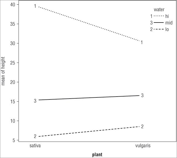
interaction.plot(x.factor, trace.factor, response, ...)> interaction.plot(water, plant, height)
> interaction.plot(plant, water, height)In the first case you split the x-axis by the water treatment, whereas in the second case you split the x-axis according to the plant variable. The plots that result look like Figure 8-4.
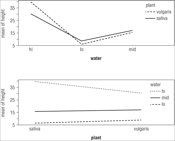
The top plot shows the x-axis split by the water treatment and the bottom plot shows the axis split by the other predictor variable (plant). You see how to split your plot window into sections in Chapter 11, “More About Graphs.”
You can give a variety of additional instructions to the interaction.plot() command. To start with, you may want to see points on the plot in addition to (or instead of) the lines; you use the type = instruction to do this. You have several options: type = ‘l’, the default, produces lines only; type = ‘b’ produces lines and points; and type = ‘p’ shows points only. In the following example you produce an interaction plot using both lines and points:
> attach(pw)
> interaction.plot(plant, water, height, type = 'b')
> detach(pw)
Notice how the attach() command is used to read the variables in this case. The plot that results looks like Figure 8-5.
When you add points, the plotting characters are by default simple numbers, but you can alter them using the pch = instruction. You can specify the pch characters in several ways, but the simplest is to use the number of levels in the trace.factor down to 1. In this example, this would equate to pch = 3:1:
> interaction.plot(plant, water, height, type = 'b', pch = 3:1)You can also alter the style of line using the lty = instruction. The default is to use the number of levels in the trace.factor down to 1, and in the example this equates to lty = 3:1:
> interaction.plot(plant, water, height, type = 'b', pch = 3:1, lty = 3:1)You can use colors as well as line styles to aid differentiation by using the col = instruction. By default the color is set to black, that is, col = 1, but you can specify others by giving their names or numerical values. For example:
> interaction.plot(plant, water, height, type = 'b', pch = 3:1, lty = 3:1,
col = c('red', 'blue', 'darkgreen'))
You can also use a different summary function to the mean (which is the default) by using the fun = instruction (note that this is in lowercase); in the following example the median is used rather than the mean:
> interaction.plot(plant, water, height, type = 'b', pch = 3:1, fun = median)You can specify new axis titles as well as an overall title by using the xlab =, ylab =, and main = instructions like you have seen previously. The following example plots lines and points using specified plotting characters and customized titles:
> interaction.plot(plant, water, height, type = 'b', pch = 3:1,
xlab = 'Plant treatment', ylab  = 'Mean plant height cm',
main = 'Interaction plot')
The final plot looks like Figure 8-6.
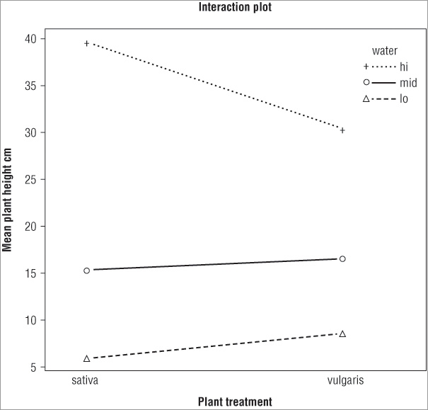
Table 8-2 shows a summary of the main instructions for the intreraction.plot() command.
Table 8-2: Instructions to be Used for the interaction.plot() Command
| Instruction | Explanation |
| x.factor | The factor whose levels form the x-axis. |
| trace.factor | Another factor representing the interaction with the x-axis. |
| response | The main response factor, which is plotted on the y-axis. |
| fun = mean | The summary function used; defaults to the mean. |
| type = ‘l’type = ‘b’type = ‘p’ | The type of plot produced: ‘l’ for lines only, ‘b’ for both lines and points, ‘p’ for points only. |
| pch = as.character(1:n)pch = letters/LETTERSpch = 1:n | The plotting characters. The default uses numerical labels, but symbols can be used by specifying numeric value(s). So, pch = 1:3 produces the symbols corresponding to values 1 to 3. pch = letters uses standard lowercase letters, and pch = LETTERS uses uppercase letters. |
| lty = nc:1 | Sets the line type. Line types can either be specified as an integer (0 = blank, 1 = solid [default], 2 = dashed, 3 = dotted, 4 = dotdash, 5 = longdash, 6 = twodash) or as one of the character strings "blank", "solid", "dashed", "dotted", "dotdash", "longdash", or "twodash", where "blank" uses “invisible lines” (that is, does not draw them). |
| lwd = 1 | The line widths. 1 is the standard width; larger values make it wider and smaller values make is narrower. |
| col = 1 | The color of the lines. Defaults to “black” (that is, 1). |
| xlab = ‘x axis title’ | The x-axis title. |
| ylab = ‘y axis title’ | The y-axis title. |
| main = ‘main plot title’ | A main graph title. |
| legend = TRUE | Should the legend be shown? (Defaults to TRUE.) |
In the following activity you will explore a two-way ANOVA using the interaction.plot() command.
> names(warpbreaks)
> boxplot(breaks ~ wool * tension, data = warpbreaks)> with(warpbreaks, interaction.plot(tension, wool, breaks))> with(warpbreaks, interaction.plot(tension, wool, breaks, type = 'b'))> with(warpbreaks, interaction.plot(tension, wool, breaks, type = 'b',
pch = 1:2, col = 1:2, lty = 1:2))> with(warpbreaks, interaction.plot(tension, wool, breaks, type = 'b',
pch = 1:2, col = 1:2, lty = 1:2, las = 1))> with(warpbreaks, interaction.plot(wool, tension, breaks, fun = median,
type = 'b', pch = 1:3, col = 1:3, lty = 1:3, las = 1))More Complex ANOVA Models
So far you have looked at fairly simple analyses of variance, one-way and two-way. You can use the formula notation to create more complex models as occasions demand. In all cases, you place your response variable to the left of the ~ and put your predictor variables to the right. In Table 8-3 a range of formulae are shown that illustrate the possibilities for representing complex ANOVA models. In these examples, y is used to represent the response variable (a continuous variable) and x represents a predictor in the form of a continuous variable. Uppercase A, B, and C represent factors with discrete levels (that is, predictor variables).
Table 8-3: Formula Syntax for Complex Models
| Formula | Explanation |
| y ~ A | One-way analysis of variance. |
| y ~ A + x | Single classification analysis of covariance model of y, with classes determined by A and covariate x. |
| y ~ A * By ~ A + B + A:B | Two-factor non-additive analysis of variance of y on factors A and B, that is, with interactions. |
| y ~ B %in% Ay ~ A/B | Nested analysis of variance with B nested in A. |
| y ~ A + B %in% Ay ~ A + A:B | Nested analysis of variance with factor A plus B nested in A. |
| y ~ A * B * Cy ~ A + B + C + A:B + A:C + B:C + A:B:C | Three-factor experiment with complete interactions between factors A, B, and C. |
| y ~ (A + B + C)^2y ~ (A + B + C) * (A + B + C)y ~ A * B * C – A:B:Cy ~ A + B + C + A:B + A:C + B:C | Three-factor experiment with model containing main effects and two-factor interactions only. |
| y ~ A * B + Error(C) | An experiment with two treatment factors, A and B, and error strata determined by factor C. For example, a split plot experiment, with whole plots (and hence also subplots), determined by factor C. |
| y ~ A + I(A + B)y ~ A + I(A^2) | The I() insulates the contents from the formula meaning and allows mathematical operations. In the first example, you have an additive two-way analysis of variance with A and the sum of A and B. In the second example you have a polynomial analysis of variance with A and the square of A. |
You can see that when you have more complex models, you often have more than one way to write the model formula. The operators +, *, –, :, and ^ have explicit meanings in the formula syntax; the + simply adds new variables to the model. The * is used to imply interactions and the – removes items from the model. The : is used to show interactions explicitly, and the ^ is used to specify the level of interactions in a more general manner.
If you want to use a mathematical function in your model, you can use the I() command to “insulate” the part you are applying the math to. Thus y ~ A + I(B + C) is a two-way ANOVA with A as one predictor variable; the other predictor is made by adding B and C. That is not a very sensible model, but the point is that the I() part differentiates between parts of the model syntax and regular math syntax.
You can specify an explicit error term by using the Error() command. Inside the brackets you specify terms that define the error structure of your model (for example, in repeated measures analyses).
You can use transformations and other mathematical manipulations on the data through the model itself, as long as the syntax is not interpreted as model syntax, so log(y) ~ A + log(B) is perfectly acceptable. If there is any ambiguity you can simply use the I() command to separate out the math part(s).
Other Options for aov()
A few additional commands can be useful when carrying out analysis of variance. Here you see just two, but you look at others when you come to look at linear modeling and the lm() command in Chapter 10, “Regression (Linear Modeling).”
Replications and Balance
You can check the balance in your model by using the replications() command. If you run the command on the original data, you get something like the following:
> summary(pw)
     height           plant   water
 Min.   : 5.00   sativa  :9   hi :6
 1st Qu.: 9.50   vulgaris:9   lo :6
 Median :16.00                mid:6
 Mean   :19.44
 3rd Qu.:30.25
 Max.   :44.00

> replications(pw)
plant water
    9     6
Warning message:
In replications(pw) : non-factors ignored: height
In this case you have a data frame with three columns; the first is the response variable (which is numeric) and this is ignored. The next two columns are factors (character vectors) and are counted toward your replicates. In the previous example you used a two-way ANOVA, but a better way to use the command is to give the formula for the aov() model. You can do this in two ways: you can specify the complete formula or you can give the result object of your analysis. This latter option only works if you have actually run the aov() command. If you have run the aov() command, the formula is taken from the result, although you still need to state where the original data are. The following example shows the replications() command applied to the two-way ANOVA result that was calculated earlier:
> replications(pw.aov, data = pw)
      plant       water plant:water
          9           6           3

> replications(height ~ plant * water, data = pw)
      plant       water plant:water
          9           6           3
If your aov() model is unbalanced, you get a slightly different result. In the following example, a slight imbalance is caused by deleting the final row and saving the result to a new data frame called pw2:
> pw2 = pw[1:17, ]
> replications(height ~ plant * water, data = pw2)
$plant
plant
  sativa vulgaris
       8        9

$water
water
 hi  lo mid
  5   6   6

$`plant:water`
          water
plant      hi lo mid
  sativa    2  3   3
  vulgaris  3  3   3
There were 18 rows in the original data frame; the new data is made up of the first 17 of them. You now get a more complex result showing you that you have one fewer replicate; you can see where the imbalance lies. The result is shown as a list; you can tell this because it is split into several blocks, each named and starting with a $. In the previous example you had a balanced model, and the result of the replications() command was a simple vector (it looks more complicated because it also has names). You can use this feature to make a test for imbalance because you can test to see if your result is a list or not:
!is.list(replications(formula,data))In short, you add !is.list() to your replications() command. This looks to see if the result is not a list. If it is not a list, the balance must be okay so you get TRUE as a result. If it is a list, there is not balance and you should get FALSE. If you run this command on the two examples, you get the following:
> !is.list(replications(height ~ plant * water, data = pw))
[1] TRUE
> !is.list(replications(height ~ plant * water, data = pw2))
[1] FALSE
The first case is the original data and you have balance. In the second case the last row of data is deleted, and, of course, the balance is lost.
Balance is always important in ANOVA designs. There are other ways to check for the balance and view the number of replicates in an aov() model; you look at these in the next chapter.
Summary
- The formula syntax enables you to describe your data in a logical manner, that is, with a response variable and a series of predictor variables.
- The formula syntax can be used to carry out many simple stats tests because most of the commands will accept either formula notation or separate variables.
- The formula syntax can be applied to graphics, which enables you to plot more complex arrangements.
- The aov() command carries out analysis of variance (ANOVA). The formula syntax is used to describe the analysis you require, so the data must be in the appropriate layout with columns for response and predictor variables.
- The stack() command can rearrange multiple samples into a response ~ predictor arrangement. If there are NA items, the na.omit() command can be used to remove them.
- After the ANOVA you can run post-hoc tests to separate the effects of the individual samples. The TukeyHSD() command carries out a common version, the Tukey Honest Significant Difference.
- The results of the TukeyHSD() command can be plotted graphically to help visualize the pairwise comparisons.
- The model.tables() command can be used to extract means from the data after the ANOVA has been carried out. Alternatively, you can use the tapply() command to view the means or use another function (for example, standard deviation).
- The interaction.plot() command enables you to visualize the interaction between two predictor variables in a two-way ANOVA.
- The replications and model balance of your data can be examined by using the replications() command.
Exercises
You can find the answers to these exercises in Appendix A.
Use the chick and bats data objects from the Beginning.RData file for these exercises.
What You Learned in This Chapter
| Topic | Key Points |
| Formula syntax response ~ predictor |
The formula syntax enables you to specify complex statistical models. Usually the response variables go on the left and predictor variables go on the right. The syntax can also be used in more simple situations and for graphics. |
| Stacking samples stack() |
In more complex analyses, the data need to be in a layout where each column is a separate item; that is, a column for the response variable and a column for each predictor variable. The stack() command can rearrange data into this layout. |
| Analysis of variance (ANOVA) aov() |
The aov() command carries out ANOVA. You can specify your model using the formula syntax and can carry out one-way, two-way, and more complicated ANOVA. |
| TukeyHSD() | The Tukey Honest Significant Difference is the most commonly used post-hoc test and is used to carry out pairwise comparisons after the main ANOVA. You can plot() the result of the TukeyHSD() command to help visualize the pairwise comparisons. |
| Interaction plots interaction.plot() |
The interaction plot is a graphical means of visualizing the difference in response in a two-way ANOVA. The lines show different levels of a predictor variable (compared to the other predictor) and non-parallel lines indicate an interaction. |
| Extracting elements of an ANOVA model.tables() tapply() |
The elements of an ANOVA can be extracted in several ways. The model.tables() command is able to show means or effects from an aov() result. The tapply() command is more general, but is useful in being able to use any function on the data; thus, you can extract means, standard deviation, and number of replicates from the data. |
| Replications and balance replications() |
The replications() command is a convenient command that enables you to check the balance in an ANOVA model design. |