
Chapter 10
Regression (Linear Modeling)
What You Will Learn In This Chapter:
- How to carry out linear regression (including multiple regression)
- How to carry out curvilinear regression using logarithmic and polynomials as examples
- How to build a regression model using both forward and backward stepwise processes
- How to plot regression models
- How to add lines of best-fit to regression plots
- How to determine confidence intervals for regression models
- How to plot confidence intervals
- How to draw diagnostic plots
Linear modeling is a widely used analytical method. In a general sense, it involves a response variable and one or more predictor variables. The technique uses a mathematical relationship between the response and predictor variables. You might, for example, have data on the abundance of an organism (the response variable) and details about various habitat variables (predictor variables). Linear modeling, or multiple regression as it is also known, can show you which of the habitat variables are most important, and also which are statistically significant. Linear regression is quite similar to the analysis of variance (ANOVA) that you learned about earlier. The main difference is that in ANOVA, the predictor variables are discrete (that is, they have different levels), whereas in regression they are continuous.
Although this is not a book about statistical analysis, the techniques of regression are so important that you should know how to carry them out. The lm() command is used to carry out linear modeling in R. To use it, you use the formula syntax. Undertaking regression involves a range of other R skills that are generally useful; this will become evident as you work through the examples in the text.
Simple Linear Regression
The simplest form of regression is akin to a correlation where you have two variables—a response variable and a predictor. In the following example you see a simple data frame with two columns, which you can correlate:
> fw
         count speed
Taw          9     2
Torridge    25     3
Ouse        15     5
Exe          2     9
Lyn         14    14
Brook       25    24
Ditch       24    29
Fal         47    34

> cor.test(~ count + speed, data = fw)

       Pearson's product-moment correlation

data:  count and speed
t = 2.5689, df = 6, p-value = 0.0424
alternative hypothesis: true correlation is not equal to 0
95 percent confidence interval:
 0.03887166 0.94596455
sample estimates:
      cor
0.7237206
Note that in this simple correlation you do not have a response term to the left of the ~ in the formula. You can run the same analysis using the lm() command; this time, though, you place the predictor on the left of the ~ and the response on the right:
> lm(count ~ speed, data = fw)

Call:
lm(formula = count ~ speed, data = fw)

Coefficients:
(Intercept)        speed
8.2546 0.7914 The result shows you the coefficients for the regression, that is, the intercept and the slope. To see more details you should save your regression as a named object; then you can use the summary() command like so:
> fw.lm = lm(count ~ speed, data = fw)
> summary(fw.lm)

Call:
lm(formula = count ~ speed, data = fw)

Residuals:
    Min      1Q  Median      3Q     Max
-13.377  -5.801  -1.542   5.051  14.371

Coefficients:
            Estimate Std. Error t value Pr(>|t|)
(Intercept)   8.2546     5.8531   1.410   0.2081
speed         0.7914     0.3081   2.569   0.0424 *
---
Signif. codes:  0 ‘***’ 0.001 ‘**’ 0.01 ‘*’ 0.05 ‘.’ 0.1 ‘ ’ 1

Residual standard error: 10.16 on 6 degrees of freedom
Multiple R-squared: 0.5238,      Adjusted R-squared: 0.4444
F-statistic: 6.599 on 1 and 6 DF,  p-value: 0.0424
Now you see a more detailed result; for example, the p-value for the linear model is exactly the same as for the standard Pearson correlation that you ran earlier. The result object contains more information, and you can see what is available by using the names() command like so:
> names(fw.lm)
 [1] "coefficients"  "residuals"     "effects"       "rank"
 [5] "fitted.values" "assign"        "qr"            "df.residual"
 [9] "xlevels"       "call"          "terms"         "model"
You can extract these components using the $ syntax; for example, to get the coefficients you use the following:
> fw.lm$coefficients
(Intercept)       speed
  8.2545956   0.7913603

> fw.lm$coef
(Intercept)       speed
  8.2545956   0.7913603
In the first case you type the name in full, but in the second case you see that you can abbreviate the latter part as long as it is unambiguous.
Many of these results objects can be extracted using specific commands, as you see next.
Linear Model Results Objects
When you have a result from a linear model, you end up with an object that contains a variety of results; the basic summary() command shows you some of these. You can extract the components using the $ syntax, but some of these components are important enough to have specific commands. The following sections discuss these components and their commands in detail.
Coefficients
You can extract the coefficients using the coef() command. To use the command, you simply give the name of the linear modeling result like so:
> coef(fw.lm)
(Intercept)       speed
  8.2545956   0.7913603
You can obtain confidence intervals on these coefficients using the confint() command. The default settings produce 95-percent confidence intervals; that is, at 2.5 percent and 97.5 percent, like so:
> confint(fw.lm)
                  2.5 %    97.5 %
(Intercept) -6.06752547 22.576717
speed        0.03756445  1.545156
You can alter the interval using the level = instruction, specifying the interval as a proportion. You can also choose which confidence variables to display (the default is all of them) by using the parm = instruction and placing the names of the variables in quotes as done in the following example:
> confint(fw.lm, parm = c('(Intercept)', 'speed'), level = 0.9)
                   5 %      95 %
(Intercept) -3.1191134 19.628305
speed        0.1927440  1.389977
Note that the intercept term is given with surrounding parentheses like so, (Intercept), which is exactly as it appears in the summary() command.
Fitted Values
You can use the fitted() command to extract values fitted to the linear model; in other words, you can use the equation of the model to predict y values for each x value like so:
> fitted(fw.lm)
      Taw  Torridge      Ouse       Exe       Lyn     Brook     Ditch       Fal
 9.837316 10.628676 12.211397 15.376838 19.333640 27.247243 31.204044 35.160846
In this case the rows of data are named, so the result of the fitted() command also produces names.
Residuals
You can view the residuals using the residuals() command; the resid() command is an alias for the same thing and produces the same result:
> residuals(fw.lm)
        Taw    Torridge        Ouse         Exe         Lyn       Brook
 -0.8373162  14.3713235   2.7886029 -13.3768382  -5.3336397  -2.2472426
      Ditch         Fal
 -7.2040441  11.8391544
Once again, you see that the residuals are named because the original data had row names.
Formula
You can access the formula used in the linear model using the formula() command like so:
> formula(fw.lm)
count ~ speed
This is not quite the same as the complete call to the lm() command which looks like this:
> fw.lm$call
lm(formula = count ~ speed, data = fw)
Best-Fit Line
You can use these linear modeling commands to help you visualize a simple linear model in graphical form. The following commands all produce essentially the same graph:
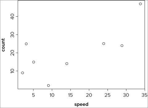
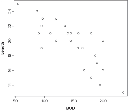
> plot(fw$speed, fw$count)
> plot(~ speed + count, data = fw)
> plot(count ~ speed, data = fw)
> plot(formula(fw), data = fw)
The graph looks like Figure 10-1.
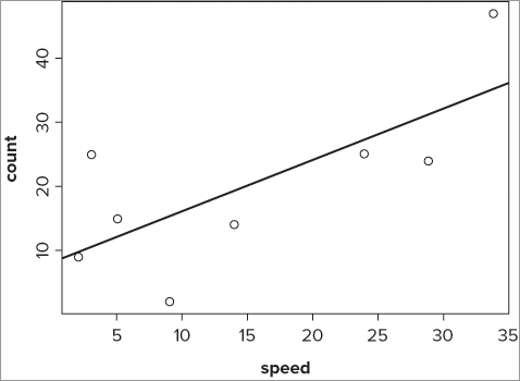
To add a line of best-fit, you need the intercept and the slope. You can use the abline() command to add the line once you have these values. Any of the following commands would produce the required line of best-fit:
> abline(lm(count ~ speed, data = fw))
> abline(a = coef(fw.lm[1], b = coef(fw.lm[2])))
> abline(coef(fw.lm))
The first is intuitive in that you can see the call to the linear model clearly. The second is quite clumsy, but shows where the values come from. The last is the most simple to type and makes best use of the lm() result object. The basic plot with a line of best-fit looks like Figure 10-2.
You can draw your best-fit line in different styles, widths, and colors using options you met previously (lty, lwd, and col). Table 10-1 acts as a reminder and summary of their use.
Table 10-1: Summary of Commands used in Drawing Lines of Best-Fit
| Command | Explanation |
| lty = n | Sets the line type. Line types can be specified as an integer (0 = blank, 1 = solid (default), 2 = dashed, 3 = dotted, 4 = dotdash, 5 = longdash, 6 = twodash) or as one of the character strings "blank", "solid", "dashed", "dotted", "dotdash", "longdash", or "twodash", where "blank" uses invisible lines (that is, does not draw them). |
| lwd = n | Sets the line width using an numerical value where 1 is standard width, 2 is double width, and so on. Defaults to 1. |
| col = color | Sets the line color using a named color (in quotes) or an integer value. Defaults to “black” (that is, 1). You can see the list of colors by using colors(). |
You look at fitting curves to linear models in a later section.
Simple regression, that is, involving one response variable and one predictor variable, is an important stepping stone to the more complicated multiple regression that you will meet shortly (where you have one response variable but several predictor variables). To put into practice some of the skills, you can try out regression for yourself in the following activity.
> str(cars)
'data.frame':     50 obs. of  2 variables:
 $ speed: num  4 4 7 7 8 9 10 10 10 11 ...
$ dist : num 2 10 4 22 16 10 18 26 34 17 ...> cars.lm = lm(dist ~ speed, data = cars)
> summary(cars.lm)> names(cars.lm)> cars.lm$coeff
> coef(cars.lm)> confint(cars.lm)> cars.lm$fitted
> fitted(cars.lm)> cars.lm$resid
> resid(cars.lm)> cars.lm$call
lm(formula = dist ~ speed, data = cars)
> formula(cars.lm)
dist ~ speed> plot(dist ~ speed, data = cars)> abline(cars.lm)> help(cars)Similarity between lm() and aov()
You can think of the aov() command as a special case of linear modeling, with the command being a “wrapper” for the lm() command. Indeed you can use the lm() command to carry out analysis of variance. In the following example, you see how to use the aov() and lm() commands with the same formula on the same data:
> str(pw)
'data.frame': 18 obs. of  4 variables:
 $ height: int  9 11 6 14 17 19 28 31 32 7 ...
 $ plant : Factor w/ 2 levels "sativa","vulgaris": 2 2 2 2 2 2 2 2 2 1 ...
 $ water : Factor w/ 3 levels "hi","lo","mid": 2 2 2 3 3 3 1 1 1 2 ...
 $ season: Factor w/ 2 levels "spring","summer": 1 2 2 1 2 2 1 2 2 1 ...

> pw.aov = aov(height ~ water, data = pw)
> pw.lm = lm(height ~ water, data = pw)
You can use the summary() command to get the result in a sensible layout like so:
> summary(pw.aov)
            Df  Sum Sq Mean Sq F value    Pr(>F)
water        2 2403.11 1201.56  84.484 6.841e-09 ***
Residuals   15  213.33   14.22
---
Signif. codes:  0 ‘***’ 0.001 ‘**’ 0.01 ‘*’ 0.05 ‘.’ 0.1 ‘ ’ 1

> summary(pw.lm)

Call:
lm(formula = height ~ water, data = pw)

Residuals:
    Min      1Q  Median      3Q     Max
-7.0000 -2.0000 -0.6667  1.9167  9.0000

Coefficients:
            Estimate Std. Error t value Pr(>|t|)
(Intercept)   35.000      1.540  22.733 4.89e-13 ***
waterlo      -27.667      2.177 -12.707 1.97e-09 ***
watermid     -19.000      2.177  -8.726 2.91e-07 ***
---
Signif. codes:  0 ‘***’ 0.001 ‘**’ 0.01 ‘*’ 0.05 ‘.’ 0.1 ‘ ’ 1

Residual standard error: 3.771 on 15 degrees of freedom
Multiple R-squared: 0.9185,      Adjusted R-squared: 0.9076
F-statistic: 84.48 on 2 and 15 DF,  p-value: 6.841e-09
In the first case you see the “classic” ANOVA table, but the second summary looks a bit different. You can make the result of the lm() command look more like the usual ANOVA table by using the anova() command like so:
> anova(pw.lm)
Analysis of Variance Table

Response: height
          Df  Sum Sq Mean Sq F value    Pr(>F)
water      2 2403.11 1201.56  84.484 6.841e-09 ***
Residuals 15  213.33   14.22
---
Signif. codes:  0 ‘***’ 0.001 ‘**’ 0.01 ‘*’ 0.05 ‘.’ 0.1 ‘ ’ 1
ANOVA is essentially a special form of linear regression and the aov() command produces a result that mirrors the look and feel of the classic ANOVA. For most purposes you will use the aov() command for ANOVA and the lm() command for linear modeling.
Multiple Regression
In the previous examples you used a simple formula of the form response ~ predictor. You saw earlier in the section on the aov() command that you can specify much more complex models; this enables you to create complex linear models. The formulae that you can use are essentially the same as you met previously, as you will see shortly. In multiple regression you generally have one response variable and several predictor variables. The main point of the regression is to determine which of the predictor variables is statistically important (significant), and the relative effects that these have on the response variable.
Formulae and Linear Models
When you looked at the aov() command to carry out analysis of variance, you saw how to use the formula syntax to describe your ANOVA model. You can do the same with the lm() command, but in this case you should note that the Error() instruction is not valid for the lm() command and will work only in conjunction with the aov() command.
The syntax in other respects is identical to that used for the aov() command, and you can see some examples in Table 10-2. Note that you can specify intercept terms in your models. You can do this in aov() models as well but it makes less sense.
Table 10-2: Formula Syntax and Regression Modeling
| Formula | Explanation |
| y ~ xy ~ 1 + x | Linear regression of y on x. Implicit intercept.Explicit intercept. |
| y ~ 0 + xy ~ -1 + xy ~ x -1 | Linear regression of y on x through origin, that is, without intercept. |
| log(y) ~ x1 + x2 | Multiple regression of transformed variable y on x1 and x2 with implicit intercept. |
| y ~ poly(x, 2)y ~ 1 + x + I(x^2) | Polynomial regression of y on x of degree 2. First form uses orthogonal polynomials. Second form uses explicit powers. |
| y ~ X + poly(x, 2) | Multiple regression y with model matrix consisting of matrix X as well as orthogonal polynomial terms in x to degree 2. |
| y ~ A | One-way analysis of variance. |
| y ~ A + x | Single classification analysis of covariance model of y, with classes determined by A and covariate x. |
| y ~ A * By ~ A + B + A:B | Two-factor non-additive analysis of variance of y on factors A and B, that is, with interactions. |
| y ~ B %in% Ay ~ A/B | Nested analysis of variance with B nested in A. |
| y ~ (A + B + C)^2y ~ A * B * C – A:B:C | Three-factor experiment with model containing main effects and two-factor interactions only. |
| y ~ A * xy ~ A/xy ~ A/(1 + x) -1 | Separate linear regression models of y on x within levels of A, with different coding.Last form produces explicit estimates of as many intercepts and slopes as there are levels in A. |
You can see from this table that you are able to construct quite complex models using the formula syntax. The standard symbols –, +, * , /, and ^ have specific meanings in this syntax; if you want to use the symbols in their regular mathematical sense, you use the I() instruction to “insulate” the terms from their formula meaning. So, the following examples are quite different in meaning:
y ~ x1 + x2
y ~ I(x1 + x2)
In the first case you indicate a multiple regression of y against x1 and x2. The second case indicates a simple regression of y against the sum of x1 and x2. You see an example of this in action shortly in the section, “Curvilinear Regression.”
Model Building
When you have several or many predictor variables, you usually want to create the most statistically significant model from the data. You have two main choices: forward stepwise regression and backward deletion.
- Forward stepwise regression: Start off with the single best variable and add more variables to build your model into a more complex form
- Backward deletion: Put all the variables in and reduce the model by removing variables until you are left with only significant terms.
You can use the add1() and drop1() commands to take either approach.
Adding Terms with Forward Stepwise Regression
When you have many variables, finding a starting point is a key step. One option is to look for the predictor variable with the largest correlation with the response variable. You can use the cor() command to carry out a simple correlation. In the following example you create a correlation matrix and, therefore, get to see all the pairwise correlations; you simply select the largest:
> cor(mf)
           Length       Speed      Algae         NO3        BOD
Length  1.0000000 -0.34322968  0.7650757  0.45476093 -0.8055507
Speed  -0.3432297  1.00000000 -0.1134416  0.02257931  0.1983412
Algae   0.7650757 -0.11344163  1.0000000  0.37706463 -0.8365705
NO3     0.4547609  0.02257931  0.3770646  1.00000000 -0.3751308
BOD    -0.8055507  0.19834122 -0.8365705 -0.37513077  1.0000000
The response variable is Length in this example, but the cor() command has shown you all the possible correlations. You can see fairly easily that the correlation between Length and BOD is the best place to begin. You could begin your regression model like so:
> mf.lm = lm(Length ~ BOD, data = mf)In this example you have only four predictor variables, so the matrix is not too large; but if you have more variables, the matrix would become quite large and hard to read. In the following example you have a data frame with a lot more predictor variables:
> names(pb)
 [1] "count"      "sward.may"  "mv.may"     "dv.may"     "sphag.may"  "bare.may"
 [7] "grass.may"  "nectar.may" "sward.jul"  "mv.jul"     "brmbl.jul"  "sphag.jul"
[13] "bare.jul"   "grass.jul"  "nectar.jul" "sward.sep"  "mv.sep"     "brmbl.sep"
[19] "sphag.sep"  "bare.sep"   "grass.sep"  "nectar.sep"

> cor(pb$count, pb)
     count sward.may   mv.may     dv.may sphag.may   bare.may  grass.may
[1,]     1 0.3173114 0.386234 0.06245646 0.4609559 -0.3380889 -0.2345140
     nectar.may sward.jul    mv.jul  brmbl.jul sphag.jul   bare.jul  grass.jul
[1,]   0.781714 0.1899664 0.1656897 -0.2090726 0.2877822 -0.2283124 -0.1625899
     nectar.jul sward.sep   mv.sep  brmbl.sep sphag.sep   bare.sep  grass.sep
[1,]   0.259654 0.6476513 0.877378 -0.2098358 0.7011718 -0.4196179 -0.6777093
     nectar.sep
[1,]  0.7400115
If you had used the plain form of the cor() command, you would have a lot of searching to do, but here you limit your results to correlations between the response variable and the rest of the data frame. You can see here that the largest correlation is between count and mv.sep, and this would make the best starting point for the regression model:
> pb.lm = lm(count ~ mv.sep, data = pb)It so happens that you can start from an even simpler model by including no predictor variables at all, but simply an explicit intercept. You replace the name of the predictor variable with the number 1 like so:
> mf.lm = lm(Length ~ 1, data = mf)
> pb.lm = lm(count ~ 1, data = pb)
In both cases you produce a “blank” model that contains only an intercept term. You can now use the add1() command to see which of the predictor variables is the best one to add next. The basic form of the command is as follows:
add1(object, scope)The object is the linear model you are building, and the scope is the data that form the candidates for inclusion in your new model. The result (shown here) is a list of terms and the “effect” they would have if added to your model:
> add1(mf.lm, scope = mf)
Single term additions

Model:
Length ~ 1
       Df Sum of Sq     RSS    AIC
<none>              227.760 57.235
Speed   1    26.832 200.928 56.102
Algae   1   133.317  94.443 37.228
NO3     1    47.102 180.658 53.443
BOD     1   147.796  79.964 33.067
In this case you are primarily interested in the AIC column. You should look to add the variable with the lowest AIC value to the model; in this instance you see that BOD has the lowest AIC and so you should add that. This ties in with the correlation that you ran earlier. The new model then becomes:
> mf.lm = lm(Length ~ BOD, data = mf)You can now run the add1() command again and repeat the process like so:
> add1(mf.lm, scope = mf)
Single term additions

Model:
Length ~ BOD
       Df Sum of Sq    RSS    AIC
<none>              79.964 33.067
Speed   1    7.9794 71.984 32.439
Algae   1    6.3081 73.656 33.013
NO3     1    6.1703 73.794 33.060
You can see now that Speed is the variable with the lowest AIC, so this is the next variable to include. Note that terms that appear in the model are not included in the list. If you now add the new term to the model, you get the following result:
> mf.lm = lm(Length ~ BOD + Speed, data = mf)
> summary(mf.lm)

Call:
lm(formula = Length ~ BOD + Speed, data = mf)

Residuals:
    Min      1Q  Median      3Q     Max
-3.1700 -0.5450 -0.1598  0.8095  2.9245

Coefficients:
            Estimate Std. Error t value Pr(>|t|)
(Intercept) 29.30393    1.62068  18.081 1.08e-14 ***
BOD         -0.05261    0.00838  -6.278 2.56e-06 ***
Speed       -0.12566    0.08047  -1.562    0.133
---
Signif. codes:  0 ‘***’ 0.001 ‘**’ 0.01 ‘*’ 0.05 ‘.’ 0.1 ‘ ’ 1

Residual standard error: 1.809 on 22 degrees of freedom
Multiple R-squared: 0.6839,      Adjusted R-squared: 0.6552
F-statistic:  23.8 on 2 and 22 DF,  p-value: 3.143e-06
You can see that the Speed variable is not a statistically significant one and probably should not to be included in the final model. It would be useful to see the level of significance before you include the new term. You can use an extra instruction in the add1() command to do this; you can use test = ‘F’ to show the significance of each variable if it were added to your model. Note that the ‘F’ is not short for FALSE, but is for an F-test. If you run the add1() command again, you see something like this:
> mf.lm = lm(Length ~ BOD, data = mf)

> add1(mf.lm, scope = mf, test = 'F')
Single term additions

Model:
Length ~ BOD
       Df Sum of Sq    RSS    AIC F value  Pr(F)
<none>              79.964 33.067
Speed   1    7.9794 71.984 32.439  2.4387 0.1326
Algae   1    6.3081 73.656 33.013  1.8841 0.1837
NO3     1    6.1703 73.794 33.060  1.8395 0.1888
Now you can see that none of the variables in the list would give statistical significance if added to the current regression model.
In this example the model was quite simple, but the process is the same regardless of how many predictor variables are present.
Removing Terms with Backwards Deletion
You can choose a different approach by creating a regression model containing all the predictor variables you have and then trim away the terms that are not statistically significant. In other words, you start with a big model and trim it down until you get to the best (most statistically significant). To do this you can use the drop1() command; this examines a linear model and determines the effect of removing each one from the existing model. Complete the following steps to perform a backwards deletion.
> mf.lm = lm(Length ~ ., data = mf)> formula(mf.lm)
Length ~ Speed + Algae + NO3 + BOD> drop1(mf.lm, test = 'F')
Single term deletions
Model:
Length ~ Speed + Algae + NO3 + BOD
Df Sum of Sq RSS AIC F value Pr(F)
<none> 57.912 31.001
Speed 1 10.9550 68.867 33.333 3.7833 0.06596 .
Algae 1 6.2236 64.136 31.553 2.1493 0.15818
NO3 1 6.2261 64.138 31.554 2.1502 0.15810
BOD 1 12.3960 70.308 33.850 4.2810 0.05171 .
---
Signif. codes: 0 ‘***’ 0.001 ‘**’ 0.01 ‘*’ 0.05 ‘.’ 0.1 ‘ ’ 1 > mf.lm = lm(Length ~ Speed + NO3 + BOD, data = mf)> drop1(mf.lm, test = 'F')
Single term deletions
Model:
Length ~ Speed + NO3 + BOD
Df Sum of Sq RSS AIC F value Pr(F)
<none> 64.136 31.553
Speed 1 9.658 73.794 33.060 3.1622 0.08984 .
NO3 1 7.849 71.984 32.439 2.5699 0.12385
BOD 1 88.046 152.182 51.155 28.8290 2.520e-05 ***
---
Signif. codes: 0 ‘***’ 0.001 ‘**’ 0.01 ‘*’ 0.05 ‘.’ 0.1 ‘ ’ 1 You can see now that the NO3 variable has the lowest AIC and can be removed. You can carry out this process repeatedly until you have a model that you are happy with.
Comparing Models
It is often useful to compare models that are built from the same data set. This allows you to see if there is a statistically significant difference between a complicated model and a simpler one, for example. This is useful because you always try to create a model that most adequately describes the data with the minimum number of terms. You can compare two linear models using the anova() command. You used this earlier to present the result of the lm() command as a classic ANOVA table like so:
> mf.lm = lm(Length ~ BOD, data = mf)

> anova(mf.lm)
Analysis of Variance Table

Response: Length
          Df  Sum Sq Mean Sq F value    Pr(>F)
BOD        1 147.796 147.796  42.511 1.185e-06 ***
Residuals 23  79.964   3.477
---
Signif. codes:  0 ‘***’ 0.001 ‘**’ 0.01 ‘*’ 0.05 ‘.’ 0.1 ‘ ’ 1
You can also use the anova() command to compare two linear models (based on the same data set) by specifying both in the command like so:
> mf.lm1 = lm(Length ~ BOD, data = mf)
> mf.lm2 = lm(Length ~ ., data = mf)

> anova(mf.lm1, mf.lm2)
Analysis of Variance Table

Model 1: Length ~ BOD
Model 2: Length ~ Speed + Algae + NO3 + BOD
  Res.Df    RSS Df Sum of Sq      F  Pr(>F)
1     23 79.964
2     20 57.912  3    22.052 2.5385 0.08555 .
---
Signif. codes:  0 ‘***’ 0.001 ‘**’ 0.01 ‘*’ 0.05 ‘.’ 0.1 ‘ ’ 1
In this case you create two models; the first contains only a single term (the most statistically significant one) and the second model contains all the terms. The anova() command shows you that there is no statistically significant difference between them; in other words, it is not worth adding anything to the original model!
You do not need to restrict yourself to a comparison of two models; you can include more in the anova() command like so:
> anova(mf.lm1, mf.lm2, mf.lm3)
Analysis of Variance Table

Model 1: Length ~ BOD
Model 2: Length ~ BOD + Speed
Model 3: Length ~ BOD + Speed + NO3
  Res.Df    RSS Df Sum of Sq      F Pr(>F)
1     23 79.964
2     22 71.984  1    7.9794 2.6127 0.1209
3     21 64.136  1    7.8486 2.5699 0.1239
Here you see a comparison of three models. The conclusion is that the first is the minimum adequate model and the other two do not improve matters.
Building the best regression model is a common task, and it is a useful skill to employ; in the following activity you practice by creating a regression model with the forward stepwise process.
> str(mtcars)> mtcars.lm = lm(mpg ~ 1, data = mtcars)> add1(mtcars.lm, mtcars, test = 'F')> mtcars.lm = lm(mpg ~ wt, data = mtcars)> summary(mtcars.lm)> add1(mtcars.lm, mtcars, test = 'F')> mtcars.lm = lm(mpg ~ wt + cyl, data = mtcars)> summary(mtcars.lm)> add1(mtcars.lm, mtcars, test = 'F')> help(mtcars)> pairs(mtcars)
> cor(mtcars$mpg, mtcars)Curvilinear Regression
Your linear regression models do not have to be in the form of a straight line; as long as you can describe the mathematical relationships, you can carry out linear regression. When your mathematical relationship is not in straight-line form then it is described as curvilinear). The basic relationship for a linear regression is:
y = mx + c
In this classic formula, y represents the response variable and x is the predictor variable; this relationship forms a straight line. The m and c terms represent the slope and intercept, respectively. When you have multiple regression, you simply add more predictor variables and slopes, like so:
y = m1x1 + m2x2 + m3x3 + mnxn + c
The equation still has the same general form and you are dealing with straight lines. However, the world is not always working in straight lines and other mathematical relationships are probable. In the following example you see two cases by way of illustration; the first case is a logarithmic relationship and the second is a polynomial.
In the logarithmic case the relationship can be described as follows:
y = m log(x) + c
In the polynomial case the relationship is:
y = m1x + m2x2 + m3x3 + mnxn + c
The logarithmic example is more akin to a simple regression, whereas the polynomial example is a multiple regression. Dealing with these non-straight regressions involves a slight deviation from the methods you have already seen.
Logarithmic Regression
Logarithmic relationships are common in the natural world; you may encounter them in many circumstances. Drawing the relationships between response and predictor variables as scatter plots is generally a good starting point. This can help you to determine the best approach to take.
The following example shows some data that are related in a curvilinear fashion:
> pg
   growth nutrient
1       2        2
2       9        4
3      11        6
4      12        8
5      13       10
6      14       16
7      17       22
8      19       28
9      17       30
10     18       36
11     20       48
Here you have a simple data frame containing two variables: the first is the response variable and the second is the predictor. You can see the relationship more clearly if you plot the data as a scatter plot using the plot() command like so:
> plot(growth ~ nutrient, data = pg)This produces a basic scatter graph that looks like Figure 10-3.
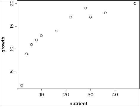
You can see that the relationship appears to be a logarithmic one. You can carry out a linear regression using the log of the predictor variable rather than the basic variable itself by using the lm() command directly like so:
> pg.lm = lm(growth ~ log(nutrient), data = pg)
> summary(pg.lm)

Call:
lm(formula = growth ~ log(nutrient), data = pg)

Residuals:
    Min      1Q  Median      3Q     Max
-2.2274 -0.9039  0.5400  0.9344  1.3097

Coefficients:
              Estimate Std. Error t value Pr(>|t|)
(Intercept)     0.6914     1.0596   0.652     0.53
log(nutrient)   5.1014     0.3858  13.223 3.36e-07 ***
---
Signif. codes:  0 ‘***’ 0.001 ‘**’ 0.01 ‘*’ 0.05 ‘.’ 0.1 ‘ ’ 1

Residual standard error: 1.229 on 9 degrees of freedom
Multiple R-squared: 0.951, Adjusted R-squared: 0.9456
F-statistic: 174.8 on 1 and 9 DF,  p-value: 3.356e-07
Here you specify that you want to use log(nutrient) in the formula; note that you do not need to use the I(log(nutrient)) instruction because log has no formula meaning.
You could now add the line of best-fit to the plot. You cannot do this using the abline() command though because you do not have a straight line, but a curved one. You see how to add a curved line of best-fit shortly in the section “Plotting Linear Models and Curve Fitting”; before that, you look at a polynomial example.
Polynomial Regression
A polynomial regression involves one response variable and one predictor variable, but the predictor variable is encountered more than once. In the simplest polynomial, the equation can be written like so:
y = m1x + m2x2 + c
You see that the predictor is shown twice, once with a slope m1 and once raised to the power of 2, with a separate slope m2. Each time you add an x to a new power, the curve bends. In the simplest example here, you have one bend and the curve forms a U shape (which might be upside down).
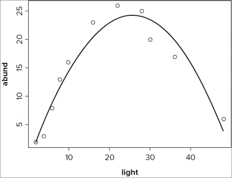
Polynomial relationships can occur in the natural world; examples typically include the abundance of a species in response to some environmental factor. The following example shows a typical situation. Here you have a data frame with two columns; the first is the response variable and the second is the predictor:
> bbel
   abund light
1      2     2
2      3     4
3      8     6
4     13     8
5     16    10
6     23    16
7     26    22
8     25    28
9     20    30
10    17    36
11     6    48
It appears that the response variable increases and then decreases again. If you plot the data (see Figure 10-4), you can see the situation more clearly:
> plot(abund ~ light, data = bbel)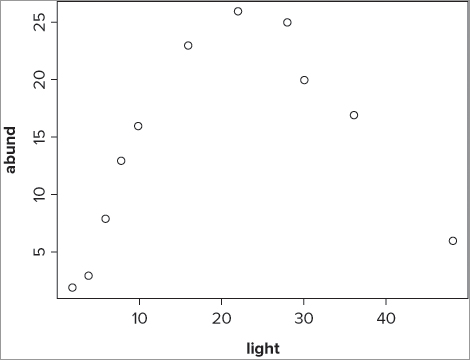
The relationship in Figure 10-4 looks suitable to fit a polynomial model—that is, y = x + x2 + c—and you can therefore specify this in the lm() model like so:
> bbel.lm = lm(abund ~ light + I(light^2), data = bbel)Notice now that you place the light^2 part inside the I() instruction; this ensures that the mathematical meaning is used. You can use the summary() command to see the final result:
> summary(bbel.lm)

Call:
lm(formula = abund ~ light + I(light^2), data = bbel)

Residuals:
   Min     1Q Median     3Q    Max
-3.538 -1.748  0.909  1.690  2.357

Coefficients:
             Estimate Std. Error t value Pr(>|t|)
(Intercept) -2.004846   1.735268  -1.155    0.281
light        2.060100   0.187506  10.987 4.19e-06 ***
I(light^2)  -0.040290   0.003893 -10.348 6.57e-06 ***
---
Signif. codes:  0 ‘***’ 0.001 ‘**’ 0.01 ‘*’ 0.05 ‘.’ 0.1 ‘ ’ 1

Residual standard error: 2.422 on 8 degrees of freedom
Multiple R-squared: 0.9382,      Adjusted R-squared: 0.9227
F-statistic: 60.68 on 2 and 8 DF,  p-value: 1.463e-05
The next step in the modeling process would probably be to add the line representing the fit of your model to the existing graph. This is the subject of the following section.
Plotting Linear Models and Curve Fitting
When you carry out a regression, you will naturally want to plot the results as some sort of graph. In fact, it would be good practice to plot the relationship between the variables before conducting the analysis. The pairs() command that you saw in Chapter 7 makes a good start, although if you have a lot of predictor variables, the individual plots can be quite small.
You can use the plot() command to make a scatter plot of the response variable against a single predictor variable. For instance, earlier you created a linear model like so:
> mf.lm = lm(Length ~ BOD, data = mf)You can make a basic scatter graph of these data using the plot() command:
> plot(Length ~ BOD, data = mf)The graph that results looks like Figure 10-5.
If you have only one predictor variable, you can also add a line of best-fit, that is, one that matches the equation of the linear model.
Best-Fit Lines
If you want to add a best-fit line, you have two main ways to do this:
- The abline() command produces straight lines.
- The lines() command can produce straight or curved lines.
You have already met the abline() command, which can only draw straight lines, so this will only be mentioned briefly. To create the best-fit line you need to determine the coordinates to draw; you will see how to calculate the appropriate coordinates using the fitted() command. The lines() command is able to draw straight or curved lines, and later you will see how to use the spline() command to smooth out curved lines of best-fit.
Adding Line of Best-Fit with abline()
To add a straight line of best-fit, you need to use the abline() command. This requires the intercept and slope, but the command can get them directly from the result of an lm() command. So, you could create a best-fit line like so:
> abline(mf.lm)This does the job. You can modify the line by altering its type, width, color, and so on using commands you have seen before (lty, lwd, and col).
Calculating Lines with fitted()
You can use the fitted() command to extract the fitted values from the linear model. These fitted values are determined from the x values (that is, the predictor) using the equation of the linear model. You can add lines to an existing plot using the lines() command; in this case you can use the original x values and the fitted y values to create your line of best-fit like so:
> lines(mf$BOD, fitted(mf.lm))The final graph looks like Figure 10-6.
You can do something similar even when you have a curvilinear fit line. Earlier you created two linear models with curvilinear fits; the first was a logarithmic model and the second was a polynomial:
> pg.lm = lm(growth ~ log(nutrient), data = pg)
> bbel.lm = lm(abund ~ light + I(light^2), data = bbel)
When you come to plot these relationships, you start by plotting the response against the predictor, as shown in the following two examples:
> plot(growth ~ nutrient, data = pg)
> plot(abund ~ light, data = bbel)
The first example plots the logarithmic model and the second plots the polynomial model. You can now add the fitted curve to these plots in exactly the same way as you did to produce Figure 10-6 by using the original x values and the fitted values from the linear model:
> lines(pg$nutrient, fitted(pg.lm))
> lines(bbel$light, fitted(bbel.lm))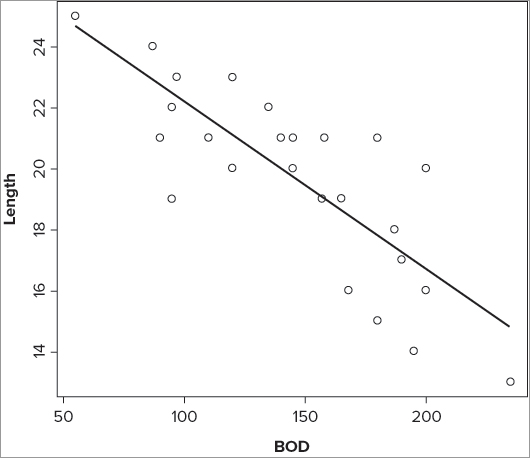
This produces a line of best-fit, although if you look at the polynomial graph as an example (Figure 10-7), you see that the curve is really a series of straight lines.

What you really need is a way to smooth out the sections to produce a shapelier curve. You can do this using the spline() command, as you see next.
Producing Smooth Curves using spline()
You can use spline curve smoothing to make your curved best-fit lines look better; the spline() command achieves this. Essentially, the spline() command requires a series of x, y coordinates that make up a curve. Because you already have your curve formed from the x values and fitted y values, you simply enclose the coordinates of your line() in a spline() command like so:
> lines(spline(bbel$light, fitted(bbel.lm)))This adds a curved fit line to the polynomial regression you carried out earlier. The complete set of instructions to produce the polynomial model and graph are shown here:
> bbel.lm = lm(abund ~ light + I(light^2), data = bbel)
> plot(abund ~ light, data = bbel)
> lines(spline(bbel$light, fitted(bbel.lm)), lwd = 2)
The final graph appears like Figure 10-8.
In this case you have made your smooth line a trifle wider than the standard using the lwd = instruction that you saw previously.
In the following activity you will carry out a logarithmic regression and create a plot that includes a curved line of best-fit.

> pg.lm = lm(growth ~ log(nutrient), data = pg> summary(pg.lm)> plot(growth ~ nutrient, data = pg, ylab = 'Plant growth',
xlab = 'Nutrient concentration')> lines(spline(pg$nutrient, fitted(pg.lm)), lwd = 1.5)> plot(growth ~ log(nutrient), data = pg, ylab = 'Plant growth', xlab = 'log(Nutrient)')> abline(coef(pg.lm))Confidence Intervals on Fitted Lines
After you have drawn your fitted line to your regression model, you may want to add confidence intervals. You can use the predict() command to help you do this. If you run the predict() command using only the name of your linear model result, you get a list of values that are identical to the fitted values; in other words, the two following commands are identical:
>fitted(mf.lm)
>predict(mf.lm)
       1        2        3        4        5        6        7        8        9
16.65687 17.76092 20.24502 21.07305 21.62507 21.07305 22.45310 18.42334 17.76092
      10       11       12       13       14       15       16       17       18
16.93288 18.97537 19.69299 19.96901 19.69299 18.58895 17.37450 17.20889 19.03057
      19       20       21       22       23       24       25
22.72912 14.72480 16.65687 24.66119 22.89472 22.34270 22.45310
However, you can make the command produce confidence intervals for each of the predicted values by adding the interval = “confidence” instruction like so:
> predict(mf.lm, interval = 'confidence')
        fit      lwr      upr
1  16.65687 15.43583 17.87791
2  17.76092 16.78595 18.73588
3  20.24502 19.45005 21.03998
4  21.07305 20.17759 21.96851
5  21.62507 20.62918 22.62096
6  21.07305 20.17759 21.96851
7  22.45310 21.27338 23.63282
8  18.42334 17.56071 19.28597
9  17.76092 16.78595 18.73588
10 16.93288 15.77840 18.08737
11 18.97537 18.17562 19.77511
12 19.69299 18.92137 20.46462
13 19.96901 19.19054 20.74747
14 19.69299 18.92137 20.46462
15 18.58895 17.74852 19.42938
16 17.37450 16.32009 18.42891
17 17.20889 16.11799 18.29980
18 19.03057 18.23527 19.82587
19 22.72912 21.48183 23.97640
20 14.72480 12.98494 16.46466
21 16.65687 15.43583 17.87791
22 24.66119 22.89113 26.43126
23 22.89472 21.60574 24.18371
24 22.34270 21.18925 23.49615
25 22.45310 21.27338 23.63282
The result is a matrix with three columns; the first shows the fitted values, the second shows the lower confidence level, and the third shows the upper confidence level. By default, level = 0.95 (that is both upper and lower confidence levels are set to 95 percent), but you can alter this by changing the value in the level = instruction.
Now that you have values for the confidence intervals and the fitted values, you have the data you need to construct the model line as well as draw the confidence bands around it. To do so, perform the following steps:
>prd = predict(mf.lm, interval = 'confidence', level = 0.95)> attach(mf)
> prd = data.frame(prd, BOD)
> detach(mf)> with(mf, prd = data.frame(prd, BOD))
Error in eval(expr, envir, enclos) : argument is missing, with no default> prd = data.frame(prd)
> prd$BOD = mf$BOD> head(prd)
fit lwr upr BOD
1 16.65687 15.43583 17.87791 200
2 17.76092 16.78595 18.73588 180
3 20.24502 19.45005 21.03998 135
4 21.07305 20.17759 21.96851 120
5 21.62507 20.62918 22.62096 110
6 21.07305 20.17759 21.96851 120> prd = prd[order(prd$BOD),]
> head(prd)
fit lwr upr BOD
22 24.66119 22.89113 26.43126 55
23 22.89472 21.60574 24.18371 87
19 22.72912 21.48183 23.97640 90
7 22.45310 21.27338 23.63282 95
25 22.45310 21.27338 23.63282 95
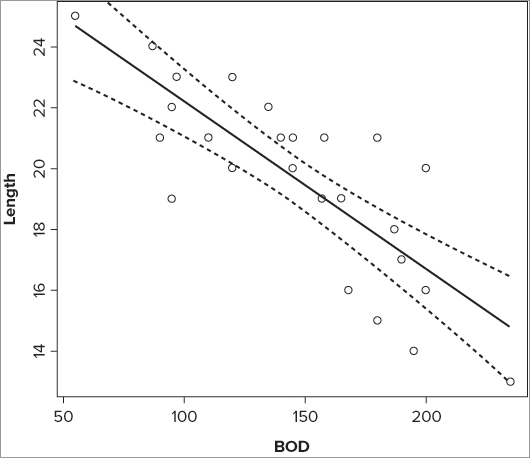
24 22.34270 21.18925 23.49615 97> plot(Length ~ BOD, data = mf)> lines(prd$BOD, prd$fit)> lines(prd$BOD, prd$lwr, lty = 2)
> lines(prd$BOD, prd$upr, lty = 2)> prd = predict(mf.lm, interval = 'confidence', level = 0.95) # make CI
> attach(mf)
> prd = data.frame(prd, BOD) # add y-data
> detach(mf)
> prd = prd[order(prd$BOD),] # re-sort in order of y-data
> plot(Length ~ BOD, data = mf) # basic plot
> lines(prd$BOD, prd$fit) # also best fit
> lines(prd$BOD, prd$lwr, lty = 2) # lower CI
> lines(prd$BOD, prd$upr, lty = 2) # upper CIThis produces a plot that looks like Figure 10-9.
If you use these commands on a curvilinear regression, your lines will be a little angular so you can use the spline() command to smooth out the lines as you saw earlier:
>lines(spline(x.values, y.values))If you were looking at the logarithmic regression you conducted earlier, for example, you would use the following:
> plot(growth ~ nutrient, data = pg)
> prd = predict(pg.lm, interval = 'confidence', level = 0.95)
> prd = data.frame(prd)
> prd$nutrient = pg$nutrient
> prd = prd[order(prd$nutrient),]
> lines(spline(prd$nutrient, prd$fit))
> lines(spline(prd$nutrient, prd$upr), lty = 2)
> lines(spline(prd$nutrient, prd$lwr), lty = 2)
Confidence intervals are an important addition to a regression plot. To practice the skills required to use them you can carry out the following activity.
> pg.lm = lm(growth ~ log(nutrient), data = pg> plot(growth ~ nutrient, data = pg, ylab = 'Plant growth',
xlab = 'Nutrient concentration')> prd = predict(pg.lm, interval = 'confidence')> prd = as.data.frame(prd)> prd$nutrient = pg$nutrient> prd = prd[order(prd$nutrient),]> lines(spline(prd$nutrient, prd$fit))> lines(spline(prd$nutrient, prd$upr), lty = 2)> lines(spline(prd$nutrient, prd$lwr), lty = 2)Summarizing Regression Models
Once you have created your regression model you will need to summarize it. This will help remind you what you have done, as well as being the foundation for presenting your results to others. The simplest way to summarize your regression model is using the summary() command, as you have seen before. Graphical summaries are also useful and can often help readers visualize the situation more clearly than the numerical summary.
In addition to producing graphs of the regression model (which you see later), you should check the appropriateness of your analysis; you can do this using diagnostic plots. This is the subject of the next section.
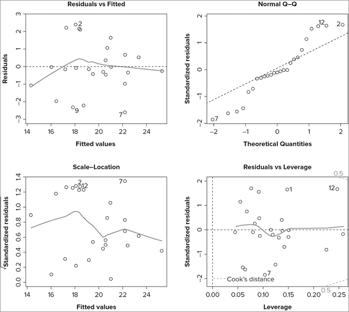
Diagnostic Plots
Once you have carried out your regression analysis, you should look at a few diagnostics. The methods of regression have some underlying assumptions, and you should check that these are met before presenting your results to the world at large.
You can produce several diagnostic plots quite simply by using the plot() command like so:
plot(my.lm)Once you type the command, R opens a blank graphics window and gives you a message. This message should be self-explanatory:
Hit <Return> to see next plot:Each time you press the Enter key, a plot is produced; you have four in total and you can stop at any time by pressing the ESC key. The first plot shows residuals against fitted values, the second plot shows a normal QQ plot, the third shows (square root) standardized residuals against fitted values, and the fourth shows the standardized residuals against the leverage. In the following example, you can see a simple regression model and the start of the diagnostic process:
> mf.lm = lm(Length ~ BOD + Speed, data = mf)
> plot(mf.lm)
Hit <Return> to see next plot:
In Figure 10-10 the graphics window has been set to display four graphs so the diagnostic plots all appear together.
You see how to split the graphics window in Chapter 11 “More About Graphs.” If you do not want all the plots, you can select one (or more) by adding a simple numeric instruction to the plot() command like so:
> plot(my.lm, 1)
> plot(my.lm, c(1,3))
> plot(my.lm, 1:3)
In the first case you get only the first plot. In the second case you get plots one and three, and in the final example you get plots one through three.
Summary of Fit
If your regression model has a single predictor variable, you can plot the response against the predictor and see the regression in its entirety. If you have two predictor variables, you might attempt a 3-D graphic, but if you have more variables you cannot make any sensible plot. The diagnostic plots that you saw previously are useful, but are aimed more at checking the assumptions of the method than showing how “good” your model is.
You could decide to present a plot of the response variable against the most significant of the predictor variables. Using the methods you have seen previously you could produce the plot and add a line of best-fit as well as confidence intervals. However, this plot would tell only part of the story because you would be ignoring other variables.
One option to summarize a regression model is to plot the response variable against the fitted values. The fitted values are effectively a combination of the predictors. If you add a line of best-fit, you have a visual impression of how good the model is at predicting changes in the response variable; a better model will have the points nearer to the line than a poor model. The approach you need to take is similar to that you used when fitting lines to curvilinear models. In the following activity you try it out for yourself and produce a summary model of a multiple regression with two predictor variables.
> mf.lm = lm(Length ~ BOD + Speed, data = mf)> prd = predict(mf.lm, interval = 'confidence')> prd = as.data.frame(prd)> prd$Length = mf$Length> prd = prd[order(prd$Length),]> plot(Length ~ fit, prd, xlab = 'Fitted Values')> abline(lm(Length ~ fit, prd))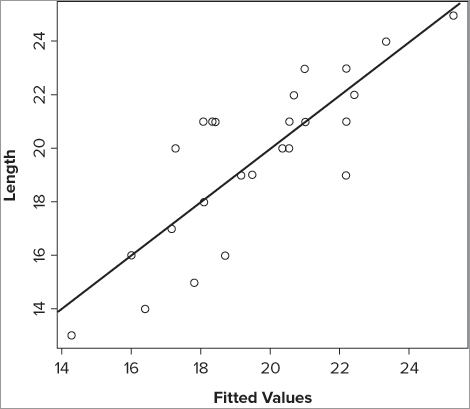
Summary
- You use the lm() command for linear modeling and regression.
- The regression does not have to be in the form of a straight line; logarithmic and polynomial regressions are possible, for example.
- Use the formula syntax to specify the regression model.
- Results objects that arise from the lm() command include coefficients, fitted values, and residuals. You can access these via separate commands.
- You can build regression models using forward or backward stepwise processes.
- You can add lines of best-fit using the abline() command if they are straight.
- You can add curved best-fit lines to plots using the spline() and lines() commands.
- Confidence intervals can be calculated and plotted onto regression plots.
- You can produce diagnostic plots easily using the plot() command.
Exercises
You can find the answers to these exercises in Appendix A.
What You Learned in this Chapter
| Topic | Key Points |
| Simple regression: cor.test() lm() |
Simple linear regression that could be carried out using the cor.test() command can also be carried out using the lm() command. The lm() command is more powerful and flexible. |
| Regression results: coef() fitted() resid()confint() |
Results objects created using the lm() command contain information that can be extracted using the $ syntax, but also using dedicated commands. You can also obtain the confidence intervals of the coefficients using the confint() command. |
| Best-fit lines: abline() |
You can add lines of best-fit using the abline() command if they are straight lines. The command can determine the slope and intercept from the result of an lm() command. |
| ANOVA and lm(): anova() |
Analysis and linear modeling are very similar, and in many cases you can carry out an ANOVA using the lm() command. The anova() command produces the classic ANOVA table from the result of an lm() command. |
| Linear modeling:formula syntax | The basis of the lm() command is the formula syntax (also known as model syntax). This takes the form of response ~ predictor(s). Complex models can be specified using this syntax. |
| Model building: add1()drop1() |
You can build regression models in a forward stepwise manner or by using backward deletion. Moving forward, terms are added using the add1() command. Backward deletion uses the drop1() command. |
| Comparing regression models: anova() |
You can compare regression models using the anova() command. |
| Curvilinear regressionlm() | Regression models do not have to be in the form of a straight line, and as long as the relationship can be described mathematically, the regression can be described using the model syntax and carried out with the lm() command. |
| Adding best-fit lines: abline()fitted() spline() |
Lines of best-fit can be added using the abline() command if they are straight. If they are curvilinear, the lines() command is used. The lines can be curved using the spline() command. The fitted() command extracts values from the lm() result that can be used to determine the best-fit. |
| Confidence intervals: predict()lines() spline() |
Confidence intervals can be determined on the fit of an lm() model using the predict() command. These can then be plotted on a regression graph using the lines() command; use the spline() command to produce a smooth curve if necessary. |
| Diagnostic plots: plot() |
You can use the plot() command on an lm() result object to produce diagnostic plots. |