
Chapter 7
Introduction to Graphical Analysis
What you will learn in this chapter:
- How to create a range of graphs to summarize your data and results
- How to create box-whisker plots
- How to create scatter plots, including multiple correlation plots
- How to create line graphs
- How to create pie charts
- How to create bar charts
- How to move graphs from R to other programs and save graphs as files on disk
Graphs are a powerful way to present your data and results in a concise manner. Whatever kind of data you have, there is a way to illustrate it graphically. A graph is more readily understandable than words and numbers, and producing good graphs is a vital skill. Some graphs are also useful in examining data so that you can gain some idea of patterns that may exist; this can direct you toward the correct statistical analysis.
R has powerful and flexible graphical capabilities. In general terms, R has two kinds of graphical commands: some commands generate a basic plot of some sort, and other commands are used to tweak the output and to produce a more customized finish.
You have already encountered some graphical commands in previous chapters. This chapter focuses on some of the basic graph types that you may typically need to create. In Chapter 11, you will revisit the graphical commands and add a variety of extras to lift your graphs from the merely adequate, to fully polished publication quality material.
Box-whisker Plots
The box-whisker plot (often abbreviated to boxplot) is a useful way to visualize complex data where you have multiple samples. In general, you are looking to display differences between samples. The basic form of the box-whisker plot shows the median value, the quartiles (or hinges), and the max/min values. This means that you get a lot of information in a compact manner. The box-whisker plot is also useful to visualize a single sample because you can show outliers if you choose. You can use the boxplot() command to create box-whisker plots. The command can work in a variety of ways to visualize simple or quite complex data.
Basic Boxplots
The following example shows a simple data frame composed of two columns:
> fw
         count speed
Taw          9     2
Torridge    25     3
Ouse        15     5
Exe          2     9
Lyn         14    14
Brook       25    24
Ditch       24    29
Fal         47    34
You have seen these data before. You can use the boxplot() command to visualize one of the variables here:
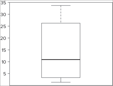
> boxplot(fw$speed)This produces a simple graph like Figure 7-1. This graph shows the typical layout of a box-whisker plot. The stripe shows the median, the box represents the upper and lower hinges, and the whiskers show the maximum and minimum values.
If you have several items to plot, you can simply give the vector names in the boxplot() command:
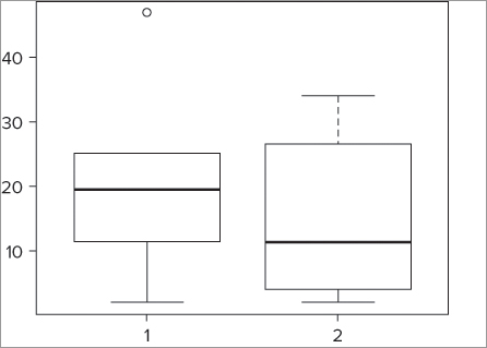
> boxplot(fw$count, fw$speed)The resulting graph appears like Figure 7-2. In this case you specify vectors that correspond to the two columns in the data frame, but they could be completely separate.
Customizing Boxplots
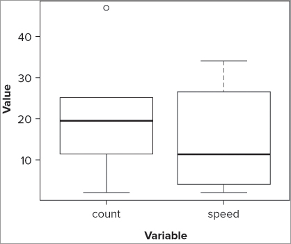
A plot without labels is useless; the plot needs labels. You can use the xlab and ylab instructions to label the axes. You can use the names instruction to set the labels (currently displayed as 1 and 2) for the two samples, like so:
> boxplot(fw$count, fw$speed, names = c('count', 'speed'))
> title(xlab = 'Variable', ylab = 'Value')
The resulting plot looks like Figure 7-3. In this case you used the title() command to add the axis labels, but you could have specified xlab and ylab within the boxplot() command.
Now you have names for each of the samples as well as axis labels. Notice that the whiskers of the count sample do not extend to the top, and that you appear to have a separate point displayed. You can determine how far out the whiskers extend, but by default this is 1.5 times the interquartile range. You can alter this by using the range = instruction; if you specify range = 0 as shown in the following example, the whiskers extend to the maximum and minimum values:
> boxplot(fw$count, fw$speed, names = c('count', 'speed'), range = 0,
xlab = 'Variable', ylab = 'Value', col = 'gray90')
The final graph appears like Figure 7-4. Here you not only force the whiskers to extend to the full max and min values, but you also set the box colors to a light gray. You can see which colors are available using the colors() command.

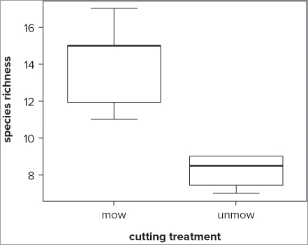
In the examples you have seen so far the data samples being plotted are separate numerical vectors. You will often have your data in a different arrangement; commonly you have a data frame with one column representing the response variable and another representing a predictor (or grouping) variable. In practice this means you have one vector containing all the numerical data and another vector containing the grouping information as text. Look at the following example:
> grass
  rich graze
1   12   mow
2   15   mow
3   17   mow
4   11   mow
5   15   mow
6    8 unmow
7    9 unmow
8    7 unmow
9    9 unmow
With data in this format, it is best to use the same formula notation you used with t.test(). When doing so, you use the ~ symbol to separate the response variable to the left and the predictor (grouping) variable to the right. You can also instruct the command where to find the data and set range = 0 to force the whiskers to the maximum and minimum as before. See the following example for details:
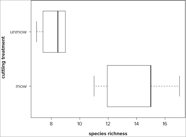
> boxplot(rich ~ graze, data = grass, range = 0)
> title(xlab = 'cutting treatment', ylab = 'species richness')
Here you also chose to add the axis labels separately with the title() command. Notice this time that the samples are automatically labeled; the command takes the names of the samples from the levels of the factor, presented in alphabetical order. The resulting graph looks like Figure 7-5.
You can give additional instructions to the command; these are listed in the help entry for the boxplot() command. Before you learn those, however, first take a look at one additional option: horizontal bars.
Horizontal Boxplots
With a simple additional instruction you can display the bars horizontally rather than vertically (which is the default):
> boxplot(rich ~ graze, data = grass, range = 0, horizontal = TRUE)
> title(ylab = 'cutting treatment', xlab = 'species richness')
When you use the horizontal = TRUE instruction, your graph is displayed with horizontal bars (see Figure 7-6). Notice how with the title() command you had to switch the x and y labels. The xlab instruction refers to the horizontal axis and the ylab instruction refers to the vertical.
In the following activity you can practice creating box-whisker plots using some data in various forms.

>boxplot(bf$Grass)> with(bf, boxplot(Grass, Heath, Arable))> boxplot(bf$Grass, bf$Heath, bf$Arable, names = c('Grass', 'Heath', 'Arable'))> title(xlab = 'Habitat', ylab = 'Butterfly Count')> boxplot(bf$Grass, bf$Heath, bf$Arable, names = c('Grass', 'Heath', 'Arable'),
range = 0, xlab = 'Habitat', ylab = 'Butterfly Count', col = 'lightblue')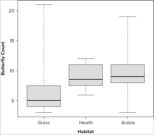
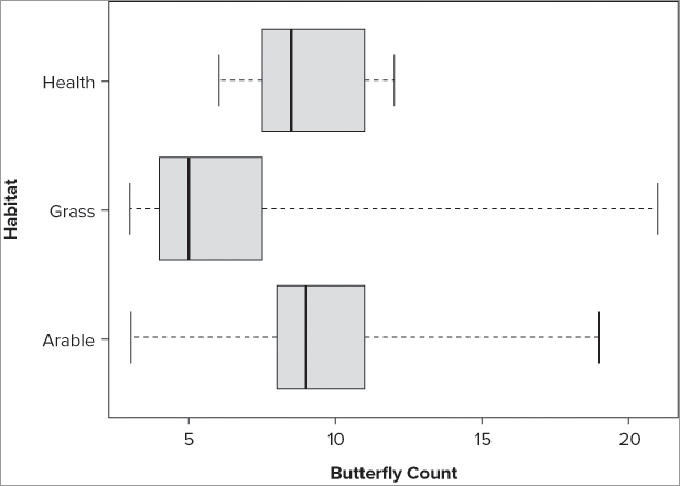
The order in which samples appear in your plots depends on the command that you used to create the graphic. If you use a command that reads the columns of a data frame (or matrix), the samples appear in the order in which the columns are in the data object.
If your data are in the form of a response variable and a predictor (grouping) variable, the samples will be in alphabetical order.
You can reorder the samples in a simple data frame by specifying them explicitly. For example:
> names(bf)
[1] "Grass"  "Heath"  "Arable"
> boxplot(bf[c(2,3,1)])
> boxplot(bf[c('Heath', 'Arable', 'Grass')])
The two boxplot() commands produce the graph with the samples in a new order.
If your data are in a response ~ grouping layout, it is harder to reorder the graph. The following example shows how you might achieve a reordering:
> with(bfs, boxplot(count[site=='Heath'], count[site=='Arable'],
count[site=='Grass'], names = c('Heath', 'Arable', 'Grass'))) # data frame
The box-whisker plot is very useful because it conveys a lot of information in a compact manner. R is able to produce this type of plot easily. In the rest of this chapter you see some of the other graphs that R is able to produce.
Scatter Plots
The basic plot() command is an example of a generic function that can be pressed into service for a variety of uses. Many specialized statistical routines include a plotting routine to produce a specialized graph. For the time being, however, you will use the plot() command to produce xy scatter plots. The scatter plot is used especially to show the relationship between two variables. You met a version of this in Chapter 5 when you looked at QQ plots and the normal distribution.
Basic Scatter Plots
The following data frame contains two columns of numeric values, and because they contain the same number of observations, they could form the basis for a scatter plot:
> fw
         count speed
Taw          9     2
Torridge    25     3
Ouse        15     5
Exe          2     9
Lyn         14    14
Brook       25    24
Ditch       24    29
Fal         47    34
The basic form of the plot() command requires you to specify the x and y data, each being a numeric vector. You use it like so:
plot(x, y, ...)If you have your data contained in a data frame as in the following example, you must use the $ syntax to get at the variables; you might also use the with() or attach() commands. For the example data here, the following commands all produce a similar result:
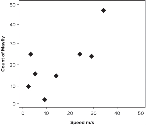
> plot(fw$speed, fw$count)

> with(fw, plot(speed, count))

> attach(fw)
> plot(speed, count)
> detach(fw)
The resulting graph looks like Figure 7-9. Notice that the names of the axis labels match up with what you typed into the command. In this case you used the $ syntax to extract the variables; these are reflected in the labels.
Adding Axis Labels
You can produce your own axis labels easily using the xlab and ylab instructions. For example, to create labels for these data you might use something like the following:
> plot(fw$speed, fw$count, xlab = 'Speed m/s', ylab = 'Count of Mayfly')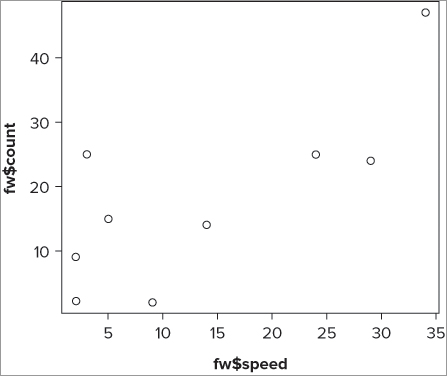
Previously you used the title() command to add axis titles. If you try this here you end up writing text over the top of the existing title. You can still use the title() command to add axis titles later, but you need to produce blank titles to start with. You must set each title in the plot() command to blank using a pair of quotes as shown in the following:
> plot(fw$speed, fw$count, xlab = "", ylab = "")This is quite convoluted so most of the time it’s better to set the titles as part of the plot() command at the outset.
Plotting Symbols
You can use many other graphical parameters to modify your basic scatter plot. You might want to alter the plotting symbol, for example. This is useful if you want to add more points to your graph later. The pch = instruction refers to the plotting character, and can be specified in one of several ways. You can type an integer value and this code will be reflected in the symbol/character produced. For values from 0 to 25, you get symbols that look like the ones depicted in Figure 7-10.

These were produced on a scatter plot using the following lines of command:
> plot(0:25, rep(1, 26), pch = 0:25, cex = 2)
> text(0:25, 0.95, as.character(0:25))
The first part produces a series of points, and sets the x values to range from 0 to 25 (to correspond to the pch values). The y values are set at 1 so that you get a horizontal line of points; the rep() command is used to repeat the value 1 for 26 times. In other words, you get 26 1s to correspond to your various x values. You now set the plotting character to vary from 0 to 25 using pch = 0:25. Finally, you make the points a bit bigger using a character expansion factor (cex = 2). The text() command is used to add text to a current plot. You give the x and y coordinates of the text and the actual text you want to produce. In this instance, the x values were set to vary from 0 to 25 (corresponding to the plotted symbols). The y value was set to be 0.95 because this positions the text just under each symbol. Finally, you state the text you require; you want to produce a number here so you state the numbers you want (0 to 25) and make sure they are forced to be text using the as.character instruction.
The values 26 to 31 are not used, but values from 32 upward are; these are ASCII code. The value 32 produces a space, so it is not very useful as a plotting character, but other values are fine up to about 127. You can also specify a character from the keyboard directly by enclosing it in quotes; to produce + symbols, for example, you type the following:
> plot(fw$speed, fw$count, pch = "+")The + symbol is also obtained via pch = 3. You can alter the size of the plotted characters using the cex = instruction; this is a character expansion factor. So setting cex = 2 makes points twice as large as normal and cex = 0.5 makes them half normal size.
If you want to alter the color of the points, use the col = instruction and put the color as a name in quotes. You can see the colors available using the colors() command (it is quite a long list).
Setting Axis Limits
The plot() command works out the best size and scale of each axis to fit the plotting area. You can set the limits of each axis quite easily using xlim = and ylim = instructions. The basic form of these instructions requires two values—a start and an end:
xlim = c(start, end)
ylim = c(start, end)
You can use these to force a plot to be square, for example, or perhaps to “zoom in” to a particular part of a plot or to emphasize one axis.
You can add all of these elements together to produce a plot that matches your particular requirements. In the current example, you might type the following plot() command:
> plot(fw$speed, fw$count, xlab = 'Speed m/s', ylab = 'Count of Mayfly',
pch = 18, cex = 2, col = 'gray50', xlim = c(0, 50), ylim = c(0, 50))
This is quite long, but you can break it down into its component parts. You always start with the x and then y values, but the other instructions can be in any order because they are named explicitly. The resulting scatter plot looks like Figure 7-11.
Using Formula Syntax
There is another way that you can specify what you want to plot; rather than giving the x and y values as separate components, you produce a formula to describe the situation:
> plot(count ~ speed, data = fw)You use the tilde character (~) to symbolize your formula. On the left you place the response variable (that is, the dependent variable) and on the right you place the predictor (independent) variable. At the end you tell the command where to find these data. This is useful because it means you do not need to use the $ syntax or use the attach() command to allow R to read the variables inside the data frame. This is the same formula you saw previously when looking at simple hypothesis tests in Chapter 6.
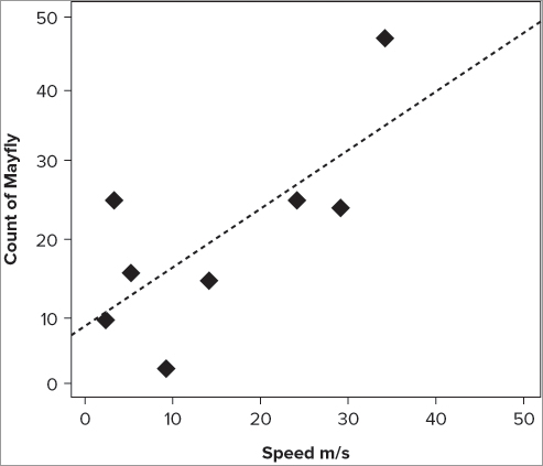
Adding Lines of Best-Fit to Scatter Plots
In Chapter 5 you used the abline() command to add a straight line matching the slope and the intercept of a series of points when you produced a QQ plot. You can do the same thing here; first you need to determine the slope and intercept. You will look at the lm() command in more detail later (Chapter 10), but for now all you need to know is that it will work out the slope and intercept for you and pass it on to the abline() command.
> abline(lm(count ~ speed, data = fw))Now you can see another advantage of using the formula notation: the command is very similar to the original plot() command. The default line produced is a thin solid black line, but you can alter its appearance in various ways. You can alter the color using the col = instruction, you can alter the line width using the lwd = instruction; and you can alter the line type using the lty = instruction.
The lwd instruction requires a simple numeric value—the bigger the number, the fatter the line! The col instruction is the same as you have met before and requires a color name in quotes. The lty instruction allows you to specify the line type in two ways: you can give a numeric value or a name in quotes. Table 7-1 shows the various options.
Table 7-1: Line Types that Can be Specified Using the lty Instruction in a Graphical Command
| Value | Label | Result |
| 0 | blank | Blank |
| 1 | solid | Solid (default) |
| 2 | dashed | Dashed |
| 3 | dotted | Dotted |
| 4 | dotdash | Dot-Dash |
| 5 | longdash | Long dash |
| 6 | twodash | Two dash |
Notice that you can draw a blank line! The number values here are recycled, so if you use lty = 7 you get a solid line (and then again with 13).
You can use these commands to customize your fitted line like so:
> abline(lm(count ~ speed, data = fw), lty = 'dotted', lwd = 2, col = 'gray50')If you combine the previous plot() command with the preceding abline() command like so, you get something like Figure 7-12:
> plot(count ~ speed, data = fw, xlab = 'Speed m/s',
ylab = 'Count of Mayfly', pch = 18, cex = 2,
col = 'gray50', xlim = c(0, 50), ylim = c(0, 50))
> abline(lm(count ~ speed, data = fw), lty = 'dotted', lwd = 2,
col = 'gray50')
The plot() command is very general and can be used by programmers to create customized graphs. You will mostly use it to create scatter plots, and in that regard it is still a flexible and powerful command. You can add additional graphical parameters to the plot() command. You see more of these additional instructions in Chapter 11, but for the time being the following activity gives you the opportunity to try making some scatter plots for yourself.
> plot(women, pch = 19, cex = 1.5)> abline(lm(weight ~ height, data = women), lty = 2)> names(cars)
[1] "speed" "dist"
> plot(cars$speed, cars$dist, xlab = 'Car speed (mph)',
ylab = 'Stopping distance (ft)')> abline(lm(dist ~ speed, data = cars), lwd = 2)> plot(Length ~ BOD, data = mf, col = 'blue', pch = 18)> abline(lm(Length ~ BOD, data = mf), lty = 'dotdash')> plot(Length ~ Algae, data = mf)
> abline(lm(Length ~ Algae, data = mf), lty = 2)> plot(Length ~ Algae, data = mf, xlim = c(0,80), ylim = c(12,24))
> abline(lm(Length ~ Algae, data = mf), lty = 2)The scatter plot is a useful tool for presentation of results and also in exploring your data. It can be useful, for example, to see a range of scatter plots for a data set all in one go as part of your data exploration. This is the focus of the next section.
xaxs = ‘r’
yaxs = ‘i’Pairs Plots (Multiple Correlation Plots)
In the previous section you looked at the plot() command as a way to produce a scatter plot. If you use the same data as before—two columns of numerical data—but do not specify the columns explicitly, you still get a plot of sorts:
> fw
         count speed
Taw          9     2
Torridge    25     3
Ouse        15     5
Exe          2     9
Lyn         14    14
Brook       25    24
Ditch       24    29
Fal         47    34
> plot(fw)
This produces a graph like Figure 7-13.
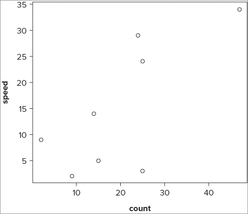
The data have been plotted, but if you look carefully you see that the axes are in a different order than the one you used before. The command has taken the first column as the x values, and the second column as the y values. If you try this on a data frame with more than two columns (as follows), you get something new, shown in the Figure 7-14:
> head(mf)
  Length Speed Algae  NO3 BOD
1     20    12    40 2.25 200
2     21    14    45 2.15 180
3     22    12    45 1.75 135
4     23    16    80 1.95 120
5     21    20    75 1.95 110
6     20    21    65 2.75 120
> plot(mf)
You end up with a scatterplot matrix where each pairwise combination is plotted (refer to Figure 7-14). This has created a pairs plot—you can use a special command pairs() to create customized pairs plots.
By default, the pairs() command takes all the columns in a data frame and creates a matrix of scatter plots. This is useful but messy if you have a lot of columns. You can choose which columns you want to display by using the formula notation along the following lines:
pairs(~ x + y + z, data = our.data)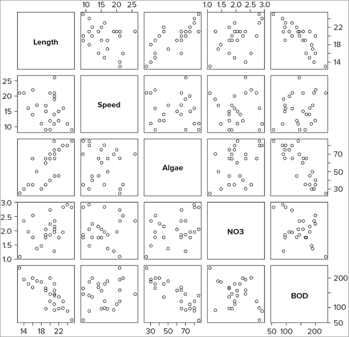
Your formula does not need anything on the left of the ~ because a response variable is somewhat meaningless in this context (this is like the cor() command you used in Chapter 6). You simply provide the required variables and separate them with + signs. If you are using a data frame, you also give the name of the data frame. In the current example you can select some of the columns like so:
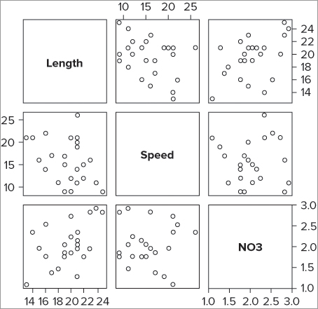
> pairs(~ Length + Speed + NO3, data = mf)This produces a graph like Figure 7-15.
You can alter the plotting characters, their size, and color using the pch, cex, and col instructions like you saw previously. The following command produces large red crosses but otherwise is essentially the same graph:
> pairs(~ Length + Speed + NO3, data = mf, col ='red', cex = 2, pch = 'X')It is possible to specify other parameters, but it is fiendishly difficult without a great deal of experience; the only parameters you can alter easily are the size of the labels on the diagonal, and the font style. To alter either of these you can use the following instructions:
cex.labels = 2
font.labels = 1
The default magnification for the diagonal labels is 2; you can alter this by specifying a new value. You can also alter the font style: 1 = normal, 2 = bold, 3 = italic, and 4 = bold and italic.
Pairs plots are particularly useful for exploring your data. You can see several graphs in one window and can spot patterns that you would like to explore further. In the next section you look at another use for the plot() command: line charts.
Line Charts
So far you have looked at the plot() command as a way to produce scatter plots, either as a single pair of variables or a multiple-pairs plot. There may be many occasions when you have data that is time-dependent, that is, data that is collected over a period of time. You would want to display these data as a scatter plot where the y-axis reflects the magnitude of the data you recorded and the x-axis reflects the time. It would seem sensible to be able to join the data together with lines in order to highlight the changes over time.
Line Charts Using Numeric Data
If the time variable you recorded is in the form of a numeric variable, you can use a regular plot() command. You can specify different ways to present the data using the type instruction. Table 7-2 lists the main options you can set using the type instruction.
Table 7-2: The type = Instruction Can Alter the Way Data is Drawn on the Plot Area
| Instruction | Explanation |
| type = ‘p’ | Points only. |
| type = ‘b’ | Points with line segments between. |
| type = ‘l’ | Lines segments alone with no points. |
| type = ‘o’ | Lines overplotted with points, that is, no gap between the line segments. |
| type = ‘c’ | Line segments only with small gaps where the points would be. |
| type = ‘n’ | Nothing is plotted! The graph is produced, setting axis scales but the data are not actually drawn in. |
Therefore, if you want to highlight the pattern, you can specify type = “l” and draw a line, leaving the points out entirely. Notice that you can use type = “n” to produce nothing at all! This can be useful because it enables you to define the limits of a plot window, which you can add to later.
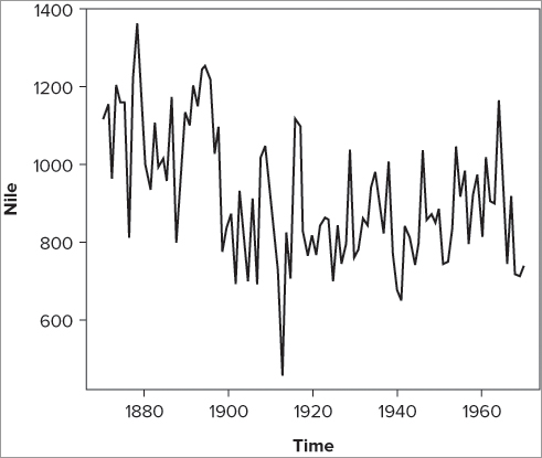
Look at the Nile data that comes with R (simply type its name: Nile). This is stored as a special kind of object called a time series. Essentially, this enables you to specify the time in a more space-efficient manner than using a separate column of data. In the Nile data you have measurements of the flow of the Nile river from 1871 to 1970. If you plot these data you see something that resembles Figure 7-16.
> plot(Nile, type = 'l')Here you specified type = “l”, which is the default for time series objects but not for regular objects.
If your data are not in numerical order, you can end up with some odd-looking line charts. You can use the sort() command (recall Chapter 3) to reorder the data using the x-axis data, which usually sorts out the problem (pardon the pun). Look at the following examples:
> with(mf, plot(Length, NO3, type = 'l'))
> with(mf[order(mf$Length),], plot(sort(Length), NO3, type = 'l'))
In the first case the data are not sorted, and the result is a bit of a mess (the result is not shown here, but you can try it for yourself). In the second case the data are sorted, and the result is a lot better.
Line Charts Using Categorical Data
If the data you have is a sequence but doesn’t have a numerical value, you have a trickier situation. For example, your time interval might be recorded as month of the year. In this case you can think of a line plot as a special case of a scatter plot, but where one axis (the dependent/x-axis) is not a numeric scale but a categorical one. The following data provides an example; in this case you have numeric data with labels that are categorical (each being a month of the year):
> rain
Jan Feb Mar Apr May Jun Jul Aug Sep Oct Nov Dec
  3   5   7   5   3   2   6   8   5   6   9   8
Alternatively, you might have data in the form of a data frame; the following example shows the same data but this time the labels are in a second column:
> rainfall
   rain month
1     3   Jan
2     5   Feb
3     7   Mar
4     5   Apr
5     3   May
6     2   Jun
7     6   Jul
8     8   Aug
9     5   Sep
10    6   Oct
11    9   Nov
12    8   Dec
In either case, you could try plotting the data using the plot() command like so:
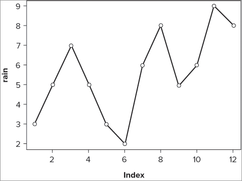
plot(rain, type = 'b')
plot(rainfall$rain, type = 'b')
In the first instance of the command you simply type the name of the data vector; in the second case you have to use the $ syntax to get the data from within the data frame. As part of the plot() command you add the instruction type = ‘b’; this creates both points and lines. You do get a plot of sorts (see Figure 7-17), but you do not have the months displayed; the x-axis remains as a simple numeric index.
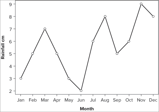
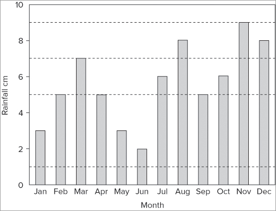
To alter the x-axis as desired you need to remove the existing x-axis, and create your own using the character vector as the labels. Perform the following steps to do so:
> plot(rain, type = 'b', axes = FALSE, xlab = 'Month', ylab = 'Rainfall cm')axis(side, at = NULL, labels = TRUE)> month = c('Jan', 'Feb', 'Mar', 'Apr', 'May', 'Jun', 'Jul', 'Aug',
'Sep', 'Oct', 'Nov', 'Dec')
> axis(side = 1, at = 1: length(rain), labels = month)> axis(side = 2)The entire exercise takes the following five lines of commands:
> plot(rain, type = 'b', axes = FALSE, xlab = 'Month', ylab = 'Rainfall cm')
> month = c('Jan', 'Feb', 'Mar', 'Apr', 'May', 'Jun', 'Jul', 'Aug',
'Sep', 'Oct', 'Nov', 'Dec')
> axis(side = 1, at = 1: length(rain), labels = month)
> axis(side = 2)
> box()The final plot looks like Figure 7-18.
You can alter the plotting characters and the characteristics of the line using instructions that you have seen before: pch alters the plotting symbol, cex alters the symbol size, lty sets the line type, and lwd makes the line wider or thinner. You can use the col = instruction to specify a color for the line and points (both set via the same instruction).
Pie Charts
If you have data that represents how something is divided up between various categories, the pie chart is a common graphic choice to illustrate your data. For example, you might have data that shows sales for various items for a whole year. The pie chart enables you to show how each item contributed to total sales. Each item is represented by a slice of pie—the bigger the slice, the bigger the contribution to the total sales. In simple terms, the pie chart takes a series of data, determines the proportion of each item toward the total, and then represents these as different slices of the pie.
The pie chart is commonly used to display proportional data. You can create pie charts using the pie() command. In its simplest form, you can use a vector of numeric values to create your plot like so:
> data11
 [1] 3 5 7 5 3 2 6 8 5 6 9 8
When you use the pie() command, these values are converted to proportions of the total and then the angle of the pie slices is determined. If possible, the slices are labeled with the names of the data. In the current example you have a simple vector of values with no names, so you must supply them separately. You can do this in a variety of ways; in this instance you have a vector of character labels:
> data8
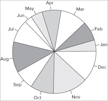
[1] "Jan" "Feb" "Mar" "Apr" "May" "Jun" "Jul" "Aug" "Sep" "Oct" "Nov" "Dec"To create a pie chart with labels you use the pie() command in the following manner:
> pie(data11, labels = data8)This produces a plot that looks like Figure 7-19.
You can alter the direction and starting point of the slices using the clockwise = and init.angle = instructions. By default the slices are drawn counter-clockwise, so clockwise = FALSE; you can set this to TRUE to produce clockwise slices. The starting angle is set to 0º (this is 3 o’clock) by default when you have clockwise = FALSE. The starting angle is set to 90º (12 o’clock) when you have clockwise = TRUE. To start the slices from a different point, you simply give the starting angle in degrees; these may also be negative with –90 being equivalent to 270º.
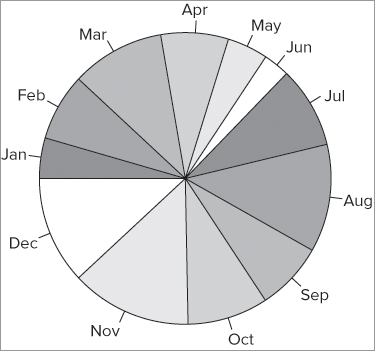
The default colors used are a range of six pastel colors; these are recycled as necessary. You can specify a range of colors to use with the col = instruction. One way to do this is to make a list of color names. In the following example you make a list of gray colors and then use these for your charted colors:
> pc = c('gray40', 'gray50', 'gray60', 'gray70', 'gray80', 'gray90')
> pie(data11, labels = data8, col = pc, clockwise = TRUE, init.angle = 180)
You can also set the slices to be drawn clockwise and set the starting point to 180º, which is 9 o’clock. The resulting plot looks like Figure 7-20.
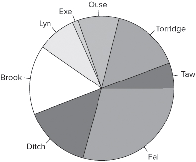
When your data are part of a data frame, you must use the $ syntax to access the column you require or use the with() or attach() commands. In the following example, the data frame contains row names you can use to label your pie slices:
> fw
         count speed
Taw          9     2
Torridge    25     3
Ouse        15     5
Exe          2     9
Lyn         14    14
Brook       25    24
Ditch       24    29
Fal         47    34

> pc = c('gray65', 'gray70', 'gray75', 'gray80', 'gray85', 'gray90')
> pie(fw$count, labels = row.names(fw), col = pc, cex = 1.2)
In this case you set the colors to six shades of gray and also use the cex = instruction to make the slice labels a little bigger. The labels = instruction points to the row names of the data frame. The final graph looks like Figure 7-21.
When your data are in matrix form, you have a few additional options: you can produce pie charts of the rows or the columns. The following data example shows a matrix of bird observation data; the rows and the columns are named:
> bird
              Garden Hedgerow Parkland Pasture Woodland
Blackbird         47       10       40       2        2
Chaffinch         19        3        5       0        2
Great Tit         50        0       10       7        0
House Sparrow     46       16        8       4        0
Robin              9        3        0       0        2
Song Thrush        4        0        6       0        0
You can use the [row, column] syntax with the pie() command; here you examine the first row:
> pie(bird[,1], col = pc)This produces a graph like Figure 7-22; note that you use the same gray colors that you created earlier as your color palette:
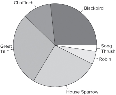
If you have your data in a data frame rather than a matrix, you get an error message like the following when you try to pie chart a row:
> mf[1,]
  Length Speed Algae  NO3 BOD
1     20    12    40 2.25 200

> pie(mf[1,])
Error in pie(mf[1, ]) : 'x' values must be positive.
When you look at the row in question, it looks as though it ought to be fine but it is not. You can make it work by converting the data into a matrix. You can do this transiently using the as.matrix() command. In the following example you see a data frame and the command used to make a pie chart from the first row:
> head(mf)
  Length Speed Algae  NO3 BOD
1     20    12    40 2.25 200
2     21    14    45 2.15 180
3     22    12    45 1.75 135
4     23    16    80 1.95 120
5     21    20    75 1.95 110
6     20    21    65 2.75 120

> pie(as.matrix(mf[1,]), labels = names(mf), col = pc)
You can, of course, make pie charts from the columns, in which case you specify the column you require using the [row, column] syntax. The following command examples both produce a pie chart of the Hedgerow column in the bird data you saw previously:
> pie(bird[,2])
> pie(bird[,'Hedgerow'])
You can add other instructions to the pie() command that will give you more control over the final graph. You learn some of these later in Chapter 11. Next you look at the Cleveland dot plot.
Cleveland Dot Charts
An alternative to the pie chart is a Cleveland dot plot. All data that might be presented as a pie chart could also be presented as a bar chart or a dot plot. You can create Cleveland dot plots using the dotchart() command. If your data are a simple vector of values then like the pie() command, you simply give the vector name. To create labels you need to specify them. In the following example you have a vector of numeric values and a vector of character labels; you met these earlier when making a pie chart:
> data11; data8
 [1] 3 5 7 5 3 2 6 8 5 6 9 8
 [1] "Jan" "Feb" "Mar" "Apr" "May" "Jun" "Jul" "Aug" "Sep" "Oct" "Nov" "Dec"

> dotchart(data11, labels = data8)
The resulting dot plot looks like Figure 7-23.
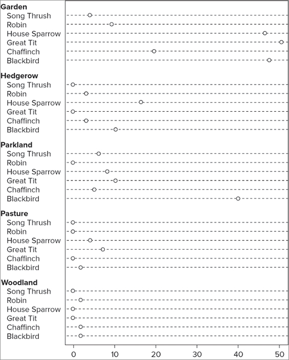
You can alter various parameters, but first you look at a more complex data example. Your data are best used if they are in the form of a matrix; the following data are bird observations that you used in previous examples:
> bird
              Garden Hedgerow Parkland Pasture Woodland
Blackbird         47       10       40       2        2
Chaffinch         19        3        5       0        2
Great Tit         50        0       10       7        0
House Sparrow     46       16        8       4        0
Robin              9        3        0       0        2
Song Thrush        4        0        6       0        0
With a pie chart you must create a pie for the rows or the columns separately; with the dot plot you can do both at once. You can create a basic dot plot grouped by columns simply by specifying the matrix name like so:
> dotchart(bird)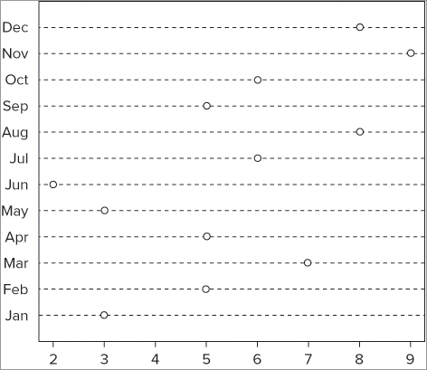
This produces a dot plot that looks like Figure 7-24.
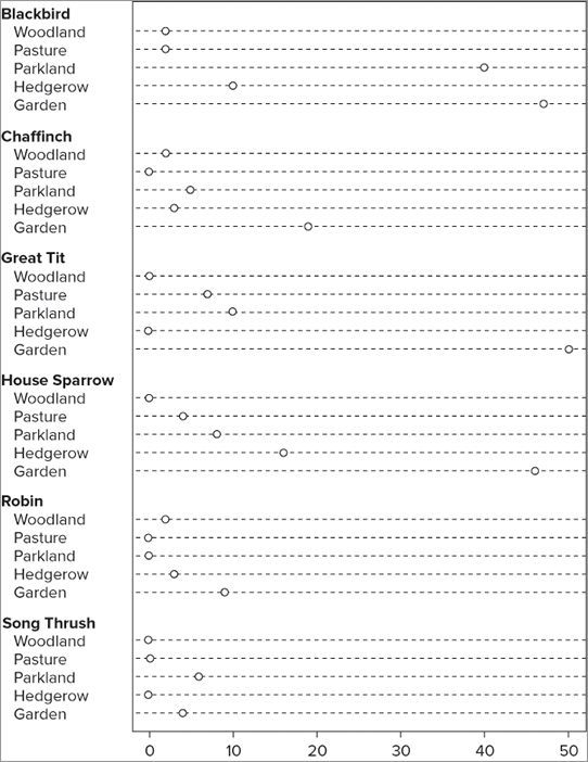
Here you see the data shown column by column; in other words, you see the data for each column broken down by rows. You might choose to view the data in a different order; by transposing the matrix you could display the rows as groups, broken down by column:
> dotchart(t(bird))You use the t() command to transpose the matrix and produce your dot plot, which looks like Figure 7-25.
You can alter a variety of parameters on your plot. Table 7-3 illustrates a few of the options.
Table 7-3: Some of the Additional Graphical Instructions for the dotchart() Command
| Instruction | Explanation |
| color = ‘color.name’ | Specifies the color to use for the plotted points and the main labels. |
| gcolor = ‘color.name’ | Specifies the color to use for the group labels and group data points (if specified). |
| gdata = group.data | You can specify a value to show for each group. This will typically be a mean. |
| lcolor = ‘gray’ | Specifies the color to use for the lines across the chart. |
| cex = 1 | Sets the character expansion factor for points and all the labels on the axes. |
| xlab = ‘text.label’ | You can specify a label/title for the x-axis. You can also specify one for the y-axis, but this will usually overlap the labels from the data. Use the title() command afterwards to place an axis label/title. |
| xlim = c(start, end) | Sets the limits of the x-axis. You specify the start and end points. |
| bg = ‘color.name’ | Sets the background color for the plotting symbols. This works only with an open style of symbol. |
| pch = 21 | Sets the plotting character. Use a numerical value or a character from the keyboard in quotes. |
The following command utilizes some of these instructions to produce the graph shown in Figure 7-26:
> dotchart(bird, color = 'gray30', gcolor = 'black', lcolor = 'gray30',
cex = 0.8, xlab = 'Bird Counts', bg = 'gray90', pch = 21)
If you try to add a y-axis label using the ylab instruction you find it overlaps the labels you already have. So, if you want an overall y-axis title you can specify it later using the title() command, when it will be pushed a bit wider and not overlap.
You can also specify a mathematical function to apply to each of the groups using the gdata = instruction. It makes the most sense to use an average of some kind—mean or median— to do so. In the following example the mean is used as a grouping function:
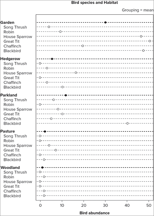
> dotchart(bird, gdata = colMeans(bird), gpch = 16, gcolor = 'blue')
> mtext('Grouping = mean', side =3, adj = 1)
> title(main = 'Bird species and Habitat')
> title(xlab = 'Bird abundance')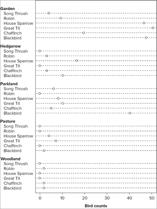
The first line of command draws the main plot; the mean is taken by using the colMeans() command and applying it to the plot via the gdata = instruction. You can specify this function in any way that produces the values you require, and you can simply specify the values explicitly using the c() command.
The plotting character of the grouping function is set using the gpch = instruction; here, a filled circle is used to make it stand out from the main points. The gcolor = instruction sets a color for the grouping points (and labels).
The second line adds some text to the margin of the plot; here you use the top axis (side = 1 is the bottom, 2 is the left) and adjust the text to be at the extreme end (adj = 0 would be at the other end of the axis). The final two lines add titles to the main plot and the value axis (the x-axis); the resulting plot looks like Figure 7-27.
The mtext() command is explored more thoroughly in Chapter 11, where you learn more about customizing and tweaking your graphs.
The Cleveland dot chart is a powerful and useful tool that is generally regarded as a better alternative to a pie chart. Data that can be presented as a pie chart can also be shown as a bar chart, and this type of graph is one of the most commonly used graphs for many purposes. Bar charts are the subject of the next section.
Bar Charts
The bar chart is suitable for showing data that fall into discrete categories. In Chapter 3, “Starting Out: Working with Objects,” you met the histogram, which is a form of bar chart. In that example each bar of the graph showed the number of items in a certain range of data values. Bar charts are widely used because they convey information in a readily understood fashion. They are also flexible and can show items in various groupings.
You use the barplot() command to produce bar charts. In this section you see how to create a range of bar charts, and also have a go at making some for yourself by following the activity at the end.
Single-Category Bar Charts
The simplest plot can be made from a single vector of numeric values. In the following example you have such an item:
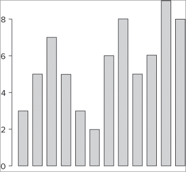
> rain
 [1] 3 5 7 5 3 2 6 8 5 6 9 8
To make a bar chart you use the barplot() command and specify the vector name in the instruction like so:
barplot(rain)This makes a primitive plot that looks like Figure 7-28.
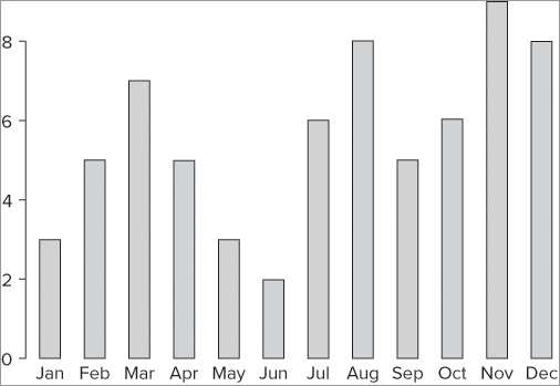
The chart has no axis labels of any kind, but you can add them quite simply. To start with, you can make names for the bars; you can use the names = instruction to point to a vector of names. The following example shows one way to do this:
> rain
 [1] 3 5 7 5 3 2 6 8 5 6 9 8
> month
 [1] "Jan" "Feb" "Mar" "Apr" "May" "Jun" "Jul" "Aug" "Sep" "Oct" "Nov" "Dec"
> barplot(rain, names = month)
In this case you already had a vector of names; if you did not, you could make one or simply specify the names using a c() command like so:
> barplot(rain, names = c('Jan', 'Feb', 'Mar', 'Apr', 'May', 'Jun', 'Jul',
'Aug', 'Sep', 'Oct', 'Nov', 'Dec'))
If your vector has a names attribute, the barplot() command can read the names directly. In the following example you set the names() of the rain vector and then use the barplot() command:
> rain ; month
 [1] 3 5 7 5 3 2 6 8 5 6 9 8
 [1] "Jan" "Feb" "Mar" "Apr" "May" "Jun" "Jul" "Aug" "Sep" "Oct" "Nov" "Dec"
> names(rain) = month
> rain
Jan Feb Mar Apr May Jun Jul Aug Sep Oct Nov Dec
  3   5   7   5   3   2   6   8   5   6   9   8
> barplot(rain)
Now the bars are neatly labeled with the names taken from the data itself (see Figure 7-29).
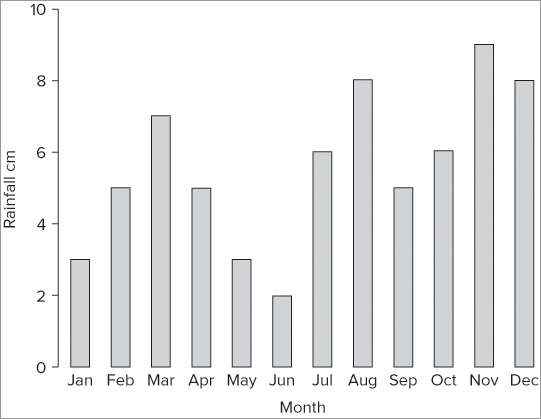
To add axis labels you can use the xlab and ylab instructions. You can use these as part of the command itself or add the titles later using the title() command. In the following example you create axis titles afterwards:
> barplot(rain)
> title(xlab = 'Month', ylab = 'Rainfall cm')
The y-axis is a bit short in Figure 7-29. You can alter the y-axis scale using the ylim instruction as shown in the following example:
> barplot(rain, xlab = 'Month', ylab = 'Rainfall cm', ylim = c(0,10))Recall that you need two parts to set the y-axis limit: a starting point and an ending point. Once you implement these two parts your plot looks more reasonable (see Figure 7-30).
You can alter the color of the bars using the col = instruction. If you want to “ground” the plot, you could add a line under the bars using the abline() command:
> abline(h = 0)In other words, you add a horizontal line at 0 on the y-axis. If you would rather have the whole plot enclosed in a box, you could use the box() command. You can also use the abline() command to add gridlines:
> abline(h = seq(1, 9, 2), lty = 2, lwd = 0.5, col = 'gray70')In this example you create horizontal lines using a sequence, the seq() command. With this command you specify the starting value, the ending value, and the interval. The lty = instruction sets the line to be dashed, and the lwd = instruction makes the lines a bit thinner than usual. Finally, you set the gridline colors to be a light gray using the col = instruction. When you put the commands together, you end up with something like this:
> barplot(rain, xlab = 'Month', ylab = 'Rainfall cm', ylim = c(0,10),
col = 'lightblue')
> abline(h = seq(1,9,2), lty = 2, lwd = 0.5, col = 'gray40')
> box()
The final graph looks like Figure 7-31.
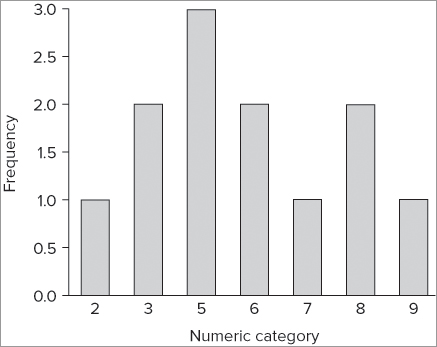
Previously you looked at the hist() command as a way to produce a histogram of a vector of numeric data. You can create a bar chart of frequencies that is superficially similar to a histogram by using the table() command:
> table(rain)
rain
2 3 5 6 7 8 9
1 2 3 2 1 2 1
Here you see the result of using the table() command on your data; they are split into a simple frequency table. The first row shows the categories (each relating to an actual numeric value), and the second row shows the frequencies in each of these categories. If you create a barplot() using these data, you get something like Figure 7-32, which is produced using the following commands:
> barplot(table(rain), ylab = 'Frequency', xlab = 'Numeric category')
> abline(h = 0)
In Figure 7-32 you also added axis labels and drew a line under the bars with the abline() command.
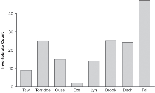
When your data are part of a data frame, you must extract the vector you require using the $ syntax or the attach() or with() commands. In the following example you see a data frame with two columns. In this case you also have row names, and you can use these to create name labels for the bars:
> fw
         count speed
Taw          9     2
Torridge    25     3
Ouse        15     5
Exe          2     9
Lyn         14    14
Brook       25    24
Ditch       24    29
Fal         47    34

> barplot(fw$count, names = row.names(fw), ylab = 'Invertebrate Count' ,
col = 'tan')
> abline(h = 0)
This produces the plot shown in Figure 7-33.
If you try to plot the entire data frame, you get an error message:
> barplot(fw)
Error in barplot.default(fw) : 'height' must be a vector or a matrix
This fails because you need a matrix and you only have a data frame. You need to convert the data into a matrix in some way; you can use the as.matrix() command to do this “on the fly” and leave the original data unchanged like so:
> barplot(as.matrix(fw))This is not a particularly sensible plot. If you try it you see that you get two bars, one for each column in the data. Each of these bars is a stack of several sections, each relating to a row in the data. This kind of bar chart is called a stacked bar chart, and you look at this in the next section.
Multiple Category Bar Charts
The examples of bar charts you have seen so far have all involved a single “row” of data, that is, all the data relate to categories in one group. It is also quite common to have several groups of categories. You can display these groups in several ways, the most primitive being a separate graph for each group. However, you can also arrange your bar chart so that these multiple categories are displayed on one single plot. You have two options: stacked bars and grouped bars.
Stacked Bar Charts
If your data contains several groups of categories, you can display the data in a bar chart in one of two ways. You can decide to show the bars in blocks (or groups) or you can choose to have them stacked.
The following example makes this clearer and shows a matrix data object that you have used in previous examples:
> bird
              Garden Hedgerow Parkland Pasture Woodland
Blackbird         47       10       40       2        2
Chaffinch         19        3        5       0        2
Great Tit         50        0       10       7        0
House Sparrow     46       16        8       4        0
Robin              9        3        0       0        2
Song Thrush        4        0        6       0        0

> barplot(bird)
The plot that results is a stacked bar chart (see Figure 7-34) and each column has been split into its row components.
You can use any of the additional instructions that you have seen so far to modify the plot. For example, you could alter the scale of the y-axis using the ylim = instruction or add axis labels using the xlab = and ylab = instructions (the title() command can also do this). The colors shown are shades of gray, and at present there is no indication of which color belongs to which row category. You can alter this with some simple instructions, as you see in the next section.
Grouped Bar Charts
When your data are in a matrix with several rows, the default bar chart is a stacked chart as you saw in the previous section. You can force the elements of each column to be unstacked by using the beside = TRUE instruction as shown in the following code (the default is set to FALSE):
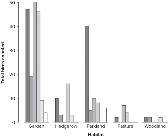
> barplot(bird, beside = TRUE, ylab = 'Total birds counted', xlab = 'Habitat')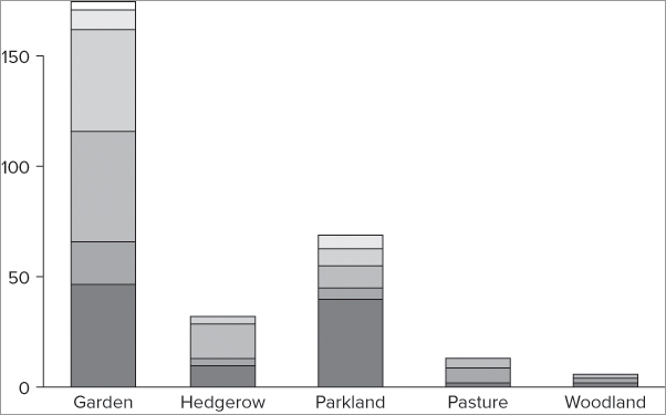
The resulting graph now shows as a series of bars in each of the column categories (Figure 7-35).
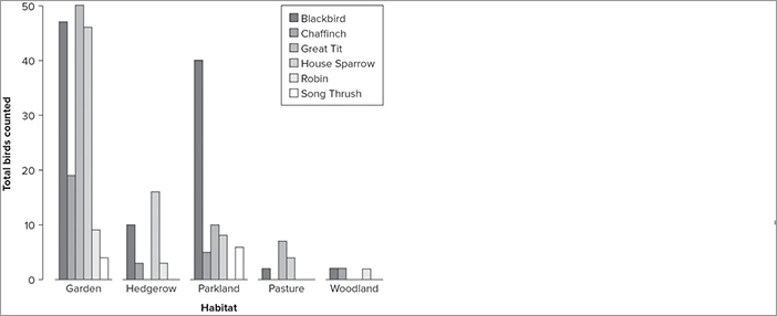
This is useful, but it is even better to see which bar relates to which row category; for this you need a legend. You can add one automatically using the legend = instruction, which creates a default legend that takes the colors and text from the plot itself:
> barplot(bird, beside = TRUE, legend = TRUE)
> title(ylab = 'Total birds counted', xlab = 'Habitat')
The legend appears at the top right of the plot window, so if necessary you must alter the y-axis scale using the ylim = instruction to get it to fit. In this case, the legend fits comfortably without any additional tweaking (see Figure 7-36).
You can alter the colors of the bars by supplying a vector of names in some way; you might create a separate vector or simply type the names into a col = instruction:
> barplot(bird, beside = TRUE, legend = TRUE, col = c('black', 'pink',
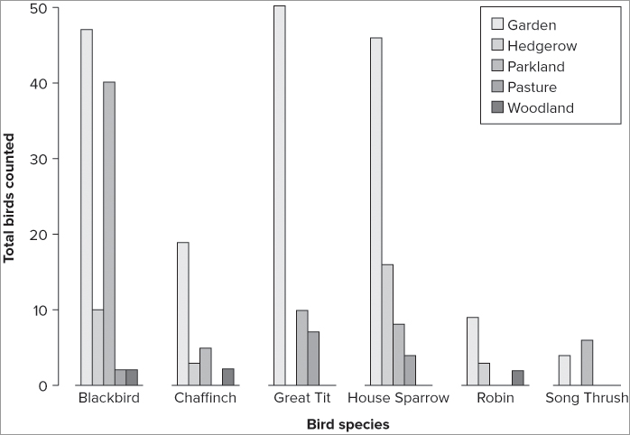
'lightblue', 'tan', 'red', 'brown'))If you would rather have the row categories as the main bars, split by column, you need to rotate or transpose the matrix of data. You can use the t() command to do this like so:
> barplot(t(bird), beside = TRUE, legend = TRUE, cex.names = 0.8,
col = c('black', 'pink', 'lightblue', 'tan', 'red', 'brown'))
> title(ylab = 'Bird Count', xlab = 'Bird Species')
Notice this time that another instruction has been used; cex.names = 0.8 makes the bar name labels a bit smaller so that they display neatly (see Figure 7-37). The character expansion of the names uses a numerical value like you used previously with the cex = instruction; a value >1 makes text larger and <1 makes it smaller.
So far you have seen how to create simple bar charts, and also how to make multiple category charts. It is also possible to display the bars horizontally rather than vertically, which is the subject of the next section.
Horizontal Bars
You can make the bars horizontal rather than the default vertical using the horiz = TRUE instruction (this is slightly different from the instruction in the boxplot() command):
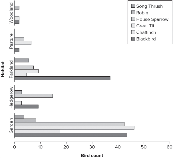
> barplot(bird, beside = TRUE, horiz = TRUE)You can use all the regular instructions that you have met previously on horizontal bar charts as well, for example:
> bccol = c('black', 'pink', 'lightblue', 'tan', 'red', 'brown')
> barplot(bird, beside = TRUE, legend = TRUE, horiz = TRUE,
xlim = c(0, 60), col = bccol)
> title(ylab = 'Habitat', xlab = 'Bird count')
The bars now point horizontally (see Figure 7-38). The y-axis and x-axis are the original orientation as far as the commands are concerned; here the x-axis is rescaled to make it a bit longer.
The title() command was used here, but you could have specified the axis labels using xlab = and ylab = instructions as part of the barplot() command. In either case, you need to remember that the xlab instruction refers to the bottom axis and the ylab to the side (left) axis.
Bar Charts from Summary Data
In the examples of bar charts that you have seen so far the data were already in their final format. However, in many cases you will have raw data that you want to summarize and plot in one go. You will most often want to calculate and present average values of various columns of a data object. You already encountered some of the commands that can produce summary results in Chapter 3; these include colMeans(), apply(), and tapply().
When you have a data frame containing multiple samples, you may want to present a bar chart of their means. The following example shows a data frame composed of several columns of numeric data; the columns are samples (that is, repeated observations). You want to summarize each one using a mean and create a bar plot of those means:
> head(mf)
  Length Speed Algae  NO3 BOD
1     20    12    40 2.25 200
2     21    14    45 2.15 180
3     22    12    45 1.75 135
4     23    16    80 1.95 120
5     21    20    75 1.95 110
6     20    21    65 2.75 120
You can make your bar plot in one of two ways. You can use the colMeans() command to extract the mean values, which you then plot:
> barplot(colMeans(mf), ylab = 'Measurement')You can also use the apply() command to extract the mean values:
> barplot(apply(mf, 2, mean, na.rm = T), ylab = 'Measurement')The apply() command is a little more complex than colMeans() but is also more powerful; you could chart the median values, for example:
> barplot(apply(mf, 2, median, na.rm = T), ylab = 'Median Measurement')This produces a simple plot (see Figure 7-39).
You can alter additional parameters to customize your barplot(); you return to some of these in Chapter 11. For the time being you can try the following activity to help familiarize yourself with the basics.
> barplot(hoglouse$fast, names = rownames(hoglouse), cex.names = 0.8,
col = 'slategray')
> abline(h=0)
> title(ylab = 'Hoglouse count', xlab = 'Sampling site')> cols = c('brown', 'tan', 'sienna', 'thistle', 'yellowgreen')
> barplot(VADeaths, legend = TRUE, col = cols)
> title(ylab = 'Death rates per 1000 per year')> barplot(VADeaths, legend = T, beside = TRUE, col = cols)
> title(ylab = 'Death rates per 1000 per year')> barplot(VADeaths, legend = T, beside = TRUE, col = cols, horiz = TRUE)
> title(xlab = 'Death rates per 1000 per year')> barplot(apply(bf, 2, median, na.rm=T), col = 'lightblue')
> abline(h=0)
> title(ylab = 'Butterfly Count', xlab = 'Site')> barplot(tapply(bfs$count, bfs$site, FUN = median), col = 'lightblue',
xlab = 'Site', ylab = 'Butterfly abundance')
> abline(h=0)Bar charts are a useful and flexible tool, as you have seen. The options covered in this section enable you to produce bar charts for a wide range of uses. You can add other instructions to the barplot() command, which you learn about in Chapter 11.
Copy Graphics to Other Applications
Being able to create a graphic is a useful start, but generally you need to transfer the graphs you have made to another application. You may need to make a report and want to include a graph in a word processor or presentation. You may also want to save a graph as a file on disk for later use. In this section you learn how to take the graphs you create and use them in other programs, and also how to save them as graphics files on disk.
Use Copy/Paste to Copy Graphs
When you make a graph using R, it opens in a separate window. If your graphic is not required to be of publication quality, you can use copy to transfer the graphic to the clipboard and then use paste to place it in another program. This method works for all operating systems, and the image you get depends on the size of the graphics window and the resolution of your screen.
If you need a higher quality image, or if you simply need the graphic to be saved as a graphic file to disk, the method you need to employ depends upon the operating system you are using.
Save a Graphic to Disk
You can save a graphics window to a file in a variety of formats, including PNG, JPEG, TIFF, BMP, and PDF. The way you save your graphics depends on the operating system you are using. In Windows and Mac the GUI has options to save graphics. In Linux you can save graphics only via direct commands, which you can also use in the other operating systems too, of course.
Windows
The Windows GUI allows you to save graphics in various file formats. Once you have created your graphic, click the graphics window and select Save As from the File menu. You have several options to choose from (see Figure 7-40).
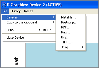
The JPEG option gives you the opportunity to select from one of several compressions. The TIFF option produces the largest files because no compression is used. The PNG option is useful because the PNG file format is widely used and file sizes are quite small.
You can also use commands typed from the keyboard to save graphics files to disk, and you can go about this in several ways. The simplest is via the dev.copy() command. This command copies the contents of the graphics window to a file; you designate the type of file and the filename. To finish the process you type the dev.off() command. In the following example the graphics window is saved using the png option:
> dev.copy(png, file = 'R graphic test.eps')
png:R graphic test.eps
                     3
> dev.off()
windows
      2
When you use this command the filename has to be specified in quotes and the file extension needs to be given. By default the file is saved in your working directory. You can see what the current working directory is using the getwd() command that you met in Chapter 2, “Starting Out: becoming Familiar With R.”
Macintosh
The Macintosh GUI allows graphics to be saved as PDF files. PDF is handled easily by Mac and is seen as a good option because PDF graphics can be easily rescaled. To save the graphics window, click the window to select it and then choose Save or Save As from the File menu.
If you want to save your graphic in another format, you need to use the dev.copy() and dev.off() commands, much like you saw in the preceding section regarding the Windows operating system.
In the following example, the graphics window is saved as a PDF file. The filename must be specified explicitly—the default location for saved files is the current working directory.
> dev.copy(pdf, file = 'Rplot eg.pdf')
pdf
  3
> dev.off()
quartz
     2
You can save a file to another location by specifying the full path as part of the filename.
Linux
In Linux, R is run via the terminal and you cannot save a graphics file using “point and click” options. To save a graphics file you need to use commands typed from the keyboard.
The dev.copy() and dev.off() commands are used in the same way as described for Windows or Mac operating systems. You start by creating the graphic you require and then use the dev.copy() command to write the file to disk in the format you want. The process is completed by typing the dev.off() command.
In the following example, the graphics window is saved as a PNG file. The file is saved to the default working directory—if you want it to go somewhere else, you need to specify the path in full as part of the filename.
> dev.copy(png, file = 'R graphic test.eps')
png
  3
> dev.off()
X11cairo
       2
The dev.copy() command requires you to specify the type of graphic file you require and the filename. You can specify other options to alter the size of the final image. The most basic options are summarized in Table 7-4.
Table 7-4: Additional Graphics Instructions for the dev.copy() Command
| Instruction | Explanation |
| width = 480 | The width of the plot in pixels; defaults to 480. |
| height = 480 | The height of the plot in pixels; defaults to 480. |
| res = NA | The resolution in pixels per inch. Effectively, the default works out to be 72. |
| quality = 75 | The compression to use for JPEG. |
The additional instructions shown in Table 7-4 enable you to alter the size of the final graphic. The dev.copy() command enables you to make a graphics file quickly, but the final results are not always exactly the same as you may see on the screen. If you use a high resolution and large size, the text labels may appear as a different size from your graphics window. You find out more about graphics and the finer control of various elements of your plots in Chapter 11.
Summary
- R has extensive graphical capabilities. The basic graphs that can be produced can be customized extensively.
- The box-whisker plot is produced using the boxplot() command. This kind of graph is especially useful for comparing samples.
- The scatter plot is created using the plot() command and is used to compare two continuous variables. The plot() command also enables you to do this for multiple pairs of variables.
- The plot() command can produce line plots and the axis() command can create customized axes from categorical variables.
- Pie charts are used to display proportional data via the pie() command.
- The Cleveland dot chart is a recommended alternative to a pie chart and is created using the dotchart() command.
- Bar charts are used to display values across a range of categories. The barplot() command can produce simple bar charts, or multiple category charts using stacked columns or grouped columns.
- Graphics can be copied to the clipboard, or saved directly to disk as a graphics file.
Exercises
You can find the answers to the exercises in Appendix A.
Use the bfs data object from the Beginning.RData file for Exercise 5. The other data objects are all built into R.
What You Learned in This Chapter
| Topic | Key Points |
| Box-whisker plots: boxplot() |
The box-whisker plot is useful because it presents a lot of information in a compact manner. The data can be specified as separate vectors, an entire data frame (or matrix), or using the formula syntax. You can present bars vertically (the default) or horizontally. |
| Scatter plots: plot() |
The basic plot() command is used to make scatter plots. You can specify the data in several ways, as two vectors or as a formula. If you specify an entire data frame (or matrix), a multiple correlation plot may result (see next item). |
| Multiple correlation plots: pairs() |
The pairs() command is used to create multiple correlation plots, which also result when the plot() command is used on a multiple column data object. |
| Line plots and custom axes: axis() |
The plot() command produces points by default, but you can force the points to “join up” or create a line-only plot using the type = instruction. The axis() command is used to create customized axes, especially useful when your x-axis is categorical rather than a continuous variable. |
| Pie charts: pie() |
Pie charts are used to display proportional data. The pie() command can produce pie charts, which can be customized to display data counter-clockwise, for example. |
| Cleveland dot charts: dotchart() |
The Cleveland dot chart is an alternative to the pie chart. It is more flexible because you can present multiple categories in one plot and can also display group summary results (for example, mean). |
| Bar charts: barplot() |
The bar chart is used to display data over various categories. The barplot() command can produce simple bar charts and can make stacked charts from multiple category data. These data can also be displayed with bars grouped rather than stacked. A legend can be added. |
| Graphical instructions: xlab ylab mainxlim ylimpch cexlty lwd |
Many graphical instructions can be applied to plots. Axis labels can be specified and the scales altered. The plotting symbols and colors can be changed as well as the size of the symbols and labels. |
| Colors: colors() |
Many colors are available to customize graphics. The colors() command shows the names of the colors available and the col instruction is most commonly used to apply these to the graphic. |
| Axis titles: title() |
The title() command can add titles to axes as well as to the main plot. This is an alternative to specifying the titles from the main graphical command, which can be helpful to make commands shorter. |
| Lines on charts: abline() |
The abline() command can be used to add lines to charts. Horizontal or vertical lines can be added. The other use is to take results from linear models to determine slope and intercept, thus adding a line of best-fit. The lines can be customized to have different styles, colors, and weights. |
| Marginal text: mtext() |
The mtext() command can add extra text to the margins of plots. Text can be added to any axis and placed left, right, or centered. |
| Moving and saving graphics: dev.copy()dev.off() |
Graphics windows can be copied to the clipboard and transferred to most other programs. The Windows and Mac GUI also permit the saving of graphics via a menu. Graphics can be saved to a file on disk using the dev.copy() command. This can create a range of graphics formats (for example: PNG, JPEG, TIFF, PDF) and you can also alter the size and resolution of the files. The process is finalized using the dev.off() command. |