
Chapter 11
More About Graphs
What You Will Learn In This Chapter:
- How to add error bars to existing graphs
- How to add legends to plots
- How to add text to graphs, including superscripts and subscripts
- How to add mathematical symbols to text on graphs
- How to add additional points to existing graphs
- How to add lines to graphs, including mathematical expressions
- How to plot multiple series on a graph
- How to draw multiple graphs in one window
- How to export graphs to graphics files and other programs
Previously, you saw how to make a variety of graphs. These graphs were used to illustrate various results (for example, scatter plots and box-whisker plots) and also to visualize data (for example, histograms and density plots). It is important to be able to create effective graphs because they help you to summarize results for others to see, as well as being useful diagnostic tools. The methods you learned previously will enable you to create many types of useful graphs, but there are many additional commands that can elevate your graphs above the merely adequate.
In this chapter you look at fine-tuning your plots, adding new elements, and generally increasing your graphical capabilities. You start by looking at adding various elements to existing plots, like error bars, legends, and marginal text. Later you see how to create a new type of graph, enabling you to plot multiple series on one chart.
Adding Elements to Existing Plots
Once you have a basic graph of some sort, you will often want to add extra things to it to help the reader understand the situation better. These extra things may be simple axis labels or more complex error bars and legends. Generally speaking, the graphical commands you have seen so far produce adequate graphs, but the addition of a few tweaks can render them more effective at communicating the situation to the reader.
Error Bars
Error bars are an important element in many statistical plots. If you create a box-whisker plot using the boxplot() command, you do not need to add any additional information regarding the variability of the samples because the plot itself contains the information. However, bar charts created using the barplot() command will not show sample variability because each bar is a single value—for example, mean. You can add error bars to show standard deviation, standard error, or indeed any information you like by using the segments() command.
Using the segments() Command for Error Bars
The segments() command enables you to add short sections of a straight line to an existing graph. The basic form of the command is as follows:
segments(x_start, y_start, x_end, y_end)The command uses four coordinates to make a section of line; you have x, y coordinates for the starting point and x, y coordinates for the ending point. To see the use of the segments() command in a bar chart perform the following steps.
> bf
   Grass Heath Arable
1      3     6     19
2      4     7      3
3      3     8      8
4      5     8      8
5      6     9      9
6     12    11     11
7     21    12     12
8      4    11     11
9      5    NA      9
10     4    NA     NA
11     7    NA     NA
12 8 NA NA> bf.m = apply(bf, 2, mean, na.rm = TRUE)
> bf.m
Grass Heath Arable
6.833333 9.000000 10.000000 > bf.sd = apply(bf, 2, sd, na.rm = TRUE)
> bf.sd
Grass Heath Arable
5.131601 2.138090 4.272002 > bf.s = apply(bf, 2, sum, na.rm = TRUE)
> bf.s
Grass Heath Arable
82 72 90
> bf.l = bf.s / bf.m
> bf.l
Grass Heath Arable
12 8 9 > bf.se = bf.sd / sqrt(bf.l)
> bf.se
Grass Heath Arable
1.481366 0.755929 1.424001 > bf.m + bf.se
Grass Heath Arable
8.314699 9.755929 11.424001 > max(bf.m + bf.se)
[1] 11.424> bf.max = round(max(bf.m + bf.se) + 0.5, 0)
> bf.max
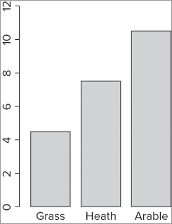
[1] 12> bp = barplot(bf.m, ylim = c(0, bf.max))The graph that results looks like Figure 11-1.
You can add axis labels later using the title() command. Notice that you gave your plot a name—you will use this to determine the coordinates for the error bars. If you look at the object you created, you see that it is a matrix with three values that correspond to the positions of the bars on the x-axis like so:
> bp
     [,1]
[1,]  0.7
[2,]  1.9
[3,]  3.1
In other words, you can use these as your x-values in the segments() command. You are going to draw lines from top to bottom, starting from a value that is the mean plus the standard error, and finishing at a value that is the mean minus the standard error. You add the error bars like this:
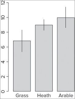
> segments(bp, bf.m + bf.se, bp, bf.m - bf.se)The plot now has simple lines representing the error bars (see Figure 11-2).
The segments() command can also accept additional instructions that are relevant to lines. For example, you can alter the color, width, and style using instructions you have seen before (that is, col, lwd, and lty).
You can add cross-bars to your error bars using the segments() command like so:
> segments(bp - 0.1, bf.m + bf.se, bp + 0.1, bf.m + bf.se)
> segments(bp - 0.1, bf.m - bf.se, bp + 0.1, bf.m – bf.se)
The first line of command added the top cross-bars by starting a bit to the left of each error bar and drawing across to end up a bit to the right of each bar. Here you used a value of ±0.1; this seems to work well with most bar charts. The second line of command added the bottom cross-bars; you can see that the command is very similar and you have altered the + sign to a – sign to subtract the standard error from the mean.
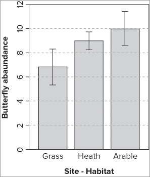
You can now tidy up the plot by adding axis labels and “grounding” the bars; the full set of commands is as follows:
> bp = barplot(bf.m, ylim = c(0, bf.max))
> segments(bp, bf.m + bf.se, bp, bf.m - bf.se)
> segments(bp - 0.1, bf.m + bf.se, bp + 0.1, bf.m + bf.se)
> segments(bp - 0.1, bf.m - bf.se, bp + 0.1, bf.m - bf.se)
> box()
> title(xlab = 'Site - Habitat', ylab = 'Butterfly abundance')
> abline(h = seq(2, 10, 2), lty = 2, col = 'gray85')
The box() command simply adds a bounding box to the plot; you could have made a simple “grounding” line using the following:
abline(h = 0)You add simple axis titles using the title() command, and finally, use abline() to make some gridlines. The finished plot looks like Figure 11-3.
You can add additional instructions to your segments() command when drawing the error bars. You might, for example, make the lines wider using the lwd = instruction or alter the color using the col = instruction. Most of the other graphical instructions that you have seen will work on the segments() lines.
In the following activity you add some error bars for yourself.

> grass.m = tapply(grass$rich, grass$graze, FUN = mean)> grass.sd = tapply(grass$rich, grass$graze, FUN = sd)
> grass.l = tapply(grass$rich, grass$graze, FUN = length)
> grass.se = grass.sd / sqrt(grass.l)> grass.max = round(max(grass.m + grass.se)+0.5, 0)> bp = barplot(grass.m, ylim = c(0, grass.max))
> title(xlab = 'Treatment', ylab = 'Species Richness')> segments(bp, grass.m + grass.se, bp, grass.m - grass.se, lwd = 2)> segments(bp - 0.1, grass.m + grass.se, bp + 0.1, grass.m + grass.se, lwd = 2)
> segments(bp - 0.1, grass.m - grass.se, bp + 0.1, grass.m - grass.se, lwd = 2)Using the arrows() Command to Add Error Bars
You can also use the arrows() command to add your error bars; you look at this command a little later in the section on adding various sorts of line to graphs. The main difference from the segments() command is that you can add the “hats” to the error bars in one single command rather than separately afterward.
Adding Legends to Graphs
If you have more than one series of data to plot as a bar chart, you may need to create a legend to add to your plot. There is a legend() command to create legends and add them to existing plots. You can also use legend as an instruction in some plot types, including the barplot() command. In the following example you see a data matrix; the barplot() command is used to create a bar chart and include a legend:
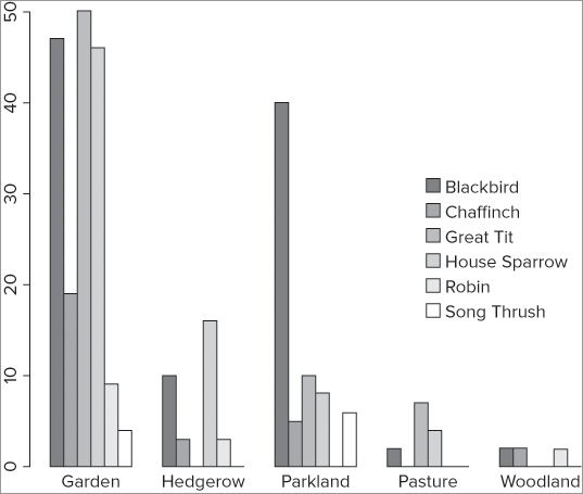
> bird
              Garden Hedgerow Parkland Pasture Woodland
Blackbird         47       10       40       2        2
Chaffinch         19        3        5       0        2
Great Tit         50        0       10       7        0
House Sparrow     46       16        8       4        0
Robin              9        3        0       0        2
Song Thrush        4        0        6       0        0

> barplot(bird, beside = TRUE, legend = TRUE)
This produces a graph that looks like Figure 11-4.
This is simple enough, and you created something similar in Chapter 7. However, you are able to customize the legend with a variety of additional instructions. The legend() command itself allows quite a few parameters to be set, and you can pass these directly via the barplot() command using the args.legend() instruction. In the following example, you alter the position of the legend from its “topright” default position, and also turn off the border to the legend like so:
> barplot(bird, beside = TRUE, legend = TRUE, args.legend = list(x = 'right', bty = 'n'))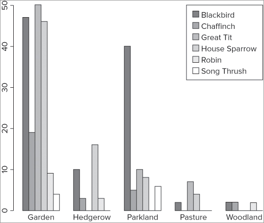
The new graph looks like Figure 11-5.
You include all the instructions for the legend() part inside a list() command. These instructions can alter the colors displayed, the plotting characters, the text, and other items. You see some of these instructions shortly.
Color Palettes
The barplot() example (refer to Figure 11-5) used default colors (gamma-corrected gray colors, in this case), but you can alter the colors of the bars by specifying them explicitly or via the palette() command. If you use the palette() command without any instructions, you see the current settings:
> palette()
[1] "black"   "red"     "green3"  "blue"    "cyan"    "magenta" "yellow"
[8] "gray"
These colors will be used for plots that do not have any special settings (many do). It is useful to be able to set the colors so that you can match up the colors of the bars of a barplot() to the colors in a legend().
In the current barplot() example you have six series of data (corresponding to the six rows), so you require your customized palette to have six colors. You have various options; in the following example you create six gray colors:
> palette(gray(seq(0.5, 1, len = 6)))
> palette()
[1] "#808080" "gray60"  "gray70"  "gray80"  "#E6E6E6" "white"
In this case you start with a 50 percent gray (0.5) and end up with white (1); you split the sequence into six parts (len = 6). You can reset to the default palette at any time using the following:
> palette('default')Now, whenever you need your sequence of colors you can use palette() to utilize them like so:
> palette(gray(seq(0.5, 1, len = 6)))
> barplot(bird, beside = TRUE, col = palette(), legend = TRUE, args.legend = list(bty = 'n'))
You do not need to specify the colors of the legend in this case because you have specified the palette() colors for the plot. However, if you use the legend() command separately, you do need to specify the fill colors for the legend boxes like so:
> barplot(bird, beside = T, col = palette())
> legend(x = 'topright', legend = rownames(bird), fill = palette())
You see more about legends in the next section. Table 11-1 lists some other color palette commands you can use.
Table 11-1: Color Palettes
| Color palette command | Explanation |
|
Sets rainbow colors (red, orange, yellow, and so on); n = the number of colors required; alpha = the transparency (1 is solid); start = beginning color (1 = red, 1/6 = yellow, and so on); end = end color. |
|
Sets reds and oranges as the colors. |
|
Uses a range of colors starting with greens, then yellow and tan. |
|
Uses “topographic” colors, starting with blues, then greens and yellows. |
|
Uses blues and pinks. |
|
Sets grays where 0 = black and 1 = white. Usually a vector of levels is given. For example, seq(0.5, 1, len = 6) producing six gray colors from 50 percent to white. |
You can also specify the palette() colors explicitly like so:
> palette(c('blue', 'green', 'yellow', 'pink', 'tan', 'cornsilk'))
> palette()
[1] "blue"     "green"    "yellow"   "pink"     "tan"      "cornsilk"
Placing a Legend on an Existing Plot
As you saw previously, you can create a legend as part of a barplot() command. However, with most graphs the legend must be added separately after the main plot has been drawn. The legend() command is what you need to do this.
When placing a legend on an existing plot you need to control the colors used so that you can match up the plot colors with the legend colors. In the following example, you create a gray palette using six shades of gray to match the number of bars you will get in each category using the following commands:
> palette(gray(seq(0.5, 1, len = 6)))
> barplot(bird, beside = TRUE, col = palette())
You see in the second command the instructions to plot the bar chart using the palette() colors. Now you can use the legend() command to add a legend. The general form of the legend() command is as follows:
legend(x, y = NULL, legend, fill = NULL, col = par('col')The first part defines the x and y coordinates of the top-left part of the legend, You can specify a single value as text, for example, “topright”. The legend = part is a vector containing the names to appear in the legend. The fill = part is used when you have a bar or pie chart and want to show the bar or slice color by the names; it creates a simple block of color. The col = part is used when you have plots with points and/or lines.
In the current example, you place the legend at the top-right corner of the graph like so:
> legend(x = 'topright', legend = rownames(bird), fill = palette(), bty = 'n')You set the names of the rows to appear as your legend text and use the palette() colors to become the colored boxes beside each name. Finally, you use the bty = ‘n’ instruction to set the border type to “none” (the default is “o”, presumably for “on”).
In this case the graph looks exactly the same as the one you drew earlier (refer to Figure 11-4) except that the legend has no border. You can use all the legend() instructions as part of a barplot() by setting legend = TRUE and then using args.legend = list(...). You replace the contents of the brackets with the instructions as required; the instructions are summarized in Table 11-2.
Table 11-2: Legend Instructions/Parameters
| Instruction | Explanation |
|
|
|
The x coordinate for the top-left of the legend box. If y is not specified, you can use one of the following text strings: ‘topright’, ‘topleft’, ‘left’, ‘right’, ‘top’, ‘bottom’, ‘bottomright’, ‘bottomleft’, ‘center’. These may be abbreviated. |
|
The y coordinate for the top left of the legend box. |
|
A vector of names to be used as the text for the legend. |
|
If specified, this causes blocks to appear beside the legend names filled in the color(s) specified. |
|
Used to set colors for lines or points if specified. |
|
The box/border type for the legend; bty = ‘n’ sets the box/border to “none” and bty = ‘o’ sets the box/border to “on.” |
|
The plotting character to use in the legend beside the names; these will be set to the color specified in the col = instruction. |
|
Sets the line type if appropriate. |
|
Sets the line width if appropriate. |
A host of additional instructions can be used with the legend() command; look at the help entry via the help(legend) command. You see a few more examples later when you look at the matplot() command.
Adding Text to Graphs
Adding text to a graph can improve its readability enormously, and generally turn it into an altogether more useful object. You have already seen a few examples of how to add text to an existing plot; the most obvious one being the axis labels (using xlab and ylab). Text can also be used within the plot area, to show statistical results, for example.
Here you look at ways to add text to the main plotting area, as well as means to customize your axis labels in various useful ways.
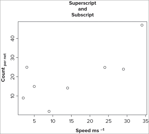
Making Superscript and Subscript Axis Titles
So far the axis titles that you have used have all been plaintext, but you may want to use superscript or subscript. The key to achieving this is the expression() command; this takes plaintext and converts it into a more complex form. You can use the expression() command to create mathematical symbols too, which you see later.
You can use the expression() command directly as part of your plot() command or you can create your text label separately; in any event you use rules similar to “regular expressions” to generate the output you require. In the following example you create a simple scatter plot and then add titles to the axes using the title() command; this makes it easier to see:
> plot(count ~ speed, data = fw, xlab = "", ylab = "")
> title(xlab = expression('Speed ms'^-1))
> title(ylab = expression('Count '['per net']))
> title(main = 'Superscript
and
Subscript')
The plot() command simply draws a scatter plot; you suppress the axis titles by using double quotes. In expression() syntax a caret symbol (^) means “create superscript,” so the first part of your label is in regular quotes and the ^-1 part that follows creates a superscript -1. To create subscript you enclose the part you want in square brackets; note that you have two sets of quoted text, one outside the [] and the other inside the [].
Although not strictly an axis label, the example included a main title to illustrate that you can create newlines using ; in this example, the is ignored as text and the text following it appears on a fresh line. The graph that results from this looks like Figure 11-6.
You do not always need to put your text in quotes like regular axis labels because the expression() command converts what you want into a text string. However, the command does not like spaces, and in this case you required Speed ms-1 as a label. You can use the * to link the items together; the following example would have produced the same text as before:
> title(xlab = expression(Speed*' '*ms^-1))This time you use a pair of quotes with a single space to split the two elements. You also used quotes for the subscripted label; you cannot avoid them in the [‘per net’] part, because the space needs to be present. You could, however, drop the quotes from the first part; the following would give you the same result as before (Countper net):
> title(ylab = expression(Count['per net']))Better still would be to avoid quotes altogether and use the tilde (~) symbol. This takes the place of spaces in the expression() command. In the current example, therefore, you would use the following commands:
> title(xlab = expression(Speed ~ ms^-1))
> title(ylab = expression(Count[per ~ net]))
So, the spaces you see in the commands are actually ignored and it is the ~ symbols that produce the spaces in the final text labels.
If you require your labels to be in another typeface, such as italic, you need to alter the expression() text itself by adding an extra part. You have several options, as shown in Table 11-3.
Table 11-3: Modifying the Font in a Text expression()
| Command | Explanation |
|
The text in the brackets is plaintext. |
|
Makes the text in the brackets italic font. |
|
Creates bold font. |
|
Sets the font for the following text to bold and italic. |
For the example you have here, your x- and y-axis labels could be set to italics in the following manner:
> title(ylab = expression(italic(Count['per net'])))
> title(xlab = expression(italic(Speed*' '*ms^-1)))
It is possible to build up quite complex labels in this manner, but it is also easy to make a mistake! For this reason it can be helpful to create objects to hold the expression() labels:
> xl = expression(italic(Speed ~ ms^-1))
> yl = expression(italic(Count[per ~ net]))
> plot(count ~ speed, data = fw, xlab = xl, ylab = yl)
You can also use the expression() command to create mathematical symbols and expressions; you return to these shortly.
Orienting the Axis Labels
For the most part you have used labels on your plots that were oriented in a single direction: horizontal to the axis. You can alter this using the las = instruction. Recall that you used this when looking at the results of a Tukey HSD test. The instruction is useful in helping to fit in labels that would otherwise overlap. Table 11-4 summarizes the options for the las instruction.
Table 11-4: Options for the las() Command for Axis Label Orientation
| Command | Explanation |
|
Labels always parallel to the axis (the default). |
|
All labels horizontal. |
|
Labels perpendicular to the axes. |
|
All labels vertical. |
If you rotate the axis labels, it is possible that they may not fit into the plot margin, and you may need to alter this to make room. This is the subject of the following section.
Making Extra Space in the Margin for Labels
You can alter the margins of a plot with a call to the mar = instruction. You cannot set the margins “on the fly” while you are creating a plot so you must use the par() command before you start. The general form of the mar() instruction is as follows:
mar = c(bottom, left, top, right)You use numeric values to set the size of the margins (as lines of text). The default values are:
mar = c(5, 4, 4, 2) + 0.1)It is a good idea to save the original values so that you can recall/reset them later. The easiest way is to create an object to hold the old values:
> opt = par(mar = c(8, 6, 4, 2))
various graphical commands here...
> par(opt)
In this example you create an object called opt and set the margins to new values. Then you carry out various graphical commands before resetting. It can take some trial and error to get the correct values for an individual plot, but the up arrow can recall an earlier command, so this process it not too hard.
Setting Text and Label Sizes
You can set the sizes of text and labels using the cex = instruction. You can use several subsettings, as summarized in Table 11-5.
Table 11-5: Options for Setting Character Expansion
| Command | Explanation |
|
Sets the magnification factor for the plotting characters (or text). If n = 1, “normal” size is used. Values > 1 make items larger and values < 1 make them smaller. |
|
The magnification factor for axis labels; for example, units on y-axis. |
|
Magnification factor for main axis labels. |
|
Sets the magnification factor for names labels; for example, bar category labels. |
|
The magnification factor for the main plot title. |
Adding Text to the Plot Area
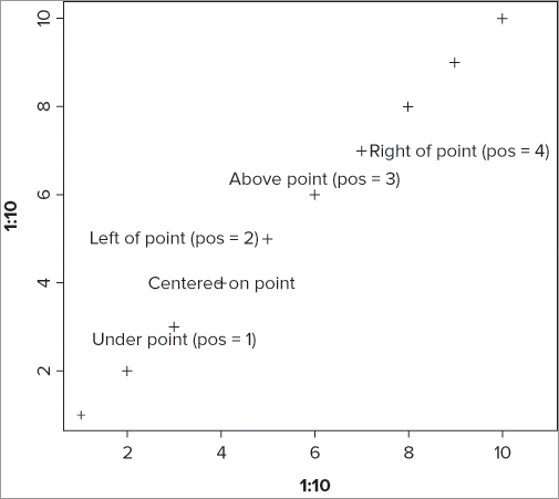
Adding text to an existing graph can be useful for many reasons; you may need to label various points or state a statistical result, for example. You can add text to an existing graph by using the text() command. You specify the x and y coordinates for your text and then give the text that you require; this can be in the form of text in quotes or an expression(). The general form of the command is as follows:
text(x, y, labels = , ...)The text you create is effectively centered on the x, y coordinates that you supply; you can alter this by using the pos = instruction. The following example shows the range of options:
> plot(1:10, 1:10, pch = 3, cex = 1.5)
> text(4, 4, 'Centered on point')
> text(3, 3, 'Under point (pos = 1)', pos = 1)
> text(5, 5, 'Left of point (pos = 2)', pos = 2)
> text(6, 6, 'Above point (pos = 3)', pos = 3)
> text(7, 7, 'Right of point (pos = 4)', pos = 4)
The simple plot() command creates a scatter plot with points (as +) so you can see the effects of altering the text position. The graph that results looks like Figure 11-7.
You can add a variety of other instructions to modify the text; changing its size, color, and so on. Table 11-6 shows a few of the options.
Table 11-6: Options for Altering Text Appearance when Added to a Graph
| Instruction | Explanation |
|
Sets the text color, usually with a simple name. For example, ‘gray50’. |
|
The character expansion factor >1 makes text larger and <1 makes it smaller. |
|
Sets the font type; 1 = plain (default), 2 = bold, 3 = italic, 4 = bold italic. |
|
The position of the text relative to the coordinates; 1 = below, 2 = to the left, 3 = above, 4 = to the right. If missing, the text is centered on the coordinates. |
|
An additional offset in character widths (default = 0.5). |
|
The rotation of the text in degrees, thus srt = 180 produces upside down text. |
Knowing exactly where to place the text can be a bit hit-or-miss and involves some trial and error. However, it is also possible to determine the appropriate coordinates by using the locator() command. You have two possibilities. You can simply use the locator() command to find coordinates by clicking on a plot:
locator(1)You now select the graph window, and when you left-click in the plot area you get the x and y coordinates of the position you clicked; you can then use these in your text() command. Alternatively, you can use locator(1) as part of the text() command:
> text(locator(1), 'Text appears at the point you click')After you press Enter the program waits for you to click in the plot window; then the text appears. In this example the text would be centered on the point you click, but you can add the pos = instruction to alter this (refer Table 11-6).
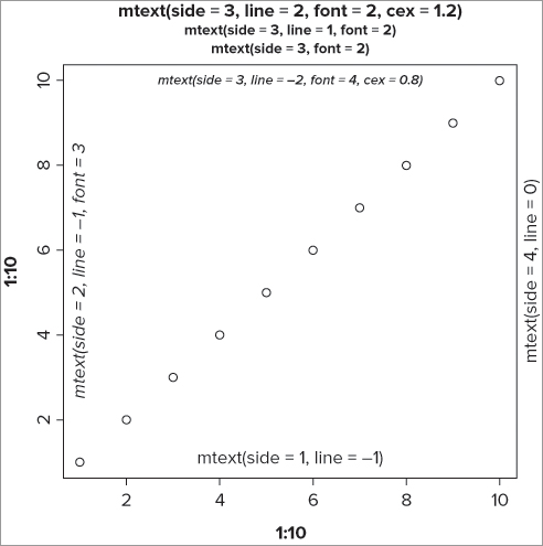
Adding Text in the Plot Margins
You have already seen how to label the main axes using xlim and ylim instructions, but sometimes you need to add text into the marginal area of a graph. You can add text to the plot margins using the mtext() command. The general form of this command is as follows:
mtext(text, side = 3, line = 0, font = 1, adj = 0.5, ...)You can use regular text (in quotes) or an expression(), or indeed any object that produces text. The side = instruction sets which margin you want (1 = bottom, 2 = left, 3 = top, 4 = right); the default is the top (side = 3). You can also offset the text by specifying the line you require; 0 (the default) is at the outer part of the plot area nearest the plot. Positive values move the text outward and negative values move it inward. You can also set the font, color, and other attributes. The following example produces a simple plot to demonstrate:
> plot(1:10, 1:10)
> mtext('mtext(side = 1, line = -1)', side = 1, line = -1)
> mtext('mtext(side = 2, line = -1, font = 3)', side = 2, line = -1, font = 3)
> mtext('mtext(side = 3, font = 2)', side = 3, font = 2)
> mtext('mtext(side = 3, line = 1, font = 2)', line = 1, side = 3, font = 2)
> mtext('mtext(side = 3, line = 2, font = 2, cex = 1.2)', cex = 1.2, line = 2, side = 3, font = 2)
> mtext('mtext(side = 3, line = -2, font = 4, cex = 0.8)', cex = 0.8, font = 4, line = -2)
> mtext('mtext(side = 4, line = 0)', side = 4, line = 0)
This produces a graph that looks like Figure 11-8.
You can adjust how far along each margin the text appears using the adj = instruction; a value of 0 equates to the bottom or left of the margin, and a value of 1 equates to the top or right of the margin. The default equates to 0.5, the middle of the side. Table 11-7 shows the main options.
Table 11-7: Options for using the mtext() Command
| Option | Explanation |
|
Sets the side of the plot window to add the text; 1 = bottom, 2 = left, 3 = top (default), 4 = right. |
|
Which line of the margin to use; 0 (the default) is nearest to the plot window. Larger values move outward and lower (-ve) values move into the plot area. |
|
How far along the axis/margin to place text: 0 equates to left or bottom alignment and 1 equates to right or top alignment. |
|
The character expansion factor; values > 1 make text larger and values < 1 make it smaller. |
|
The color to use; generally a text value. For example, “gray40”. |
|
Sets the font; 1 = plain (default), 2 = bold, 3 = italic, 4 = bold italic. |
|
The orientation of the text relative to the axis/margin: 0 = parallel to axis (default), 1 = horizontal, 2 = perpendicular to axis/margin, 3 = vertical. |
Creating Mathematical Expressions
Earlier you saw how to use the expression() command to make superscript and subscript text. The command also enables you to specify complex mathematical expressions in a similar manner. You have lots of options, but the following examples illustrate the most useful ones:
> plot(1:10, 1:10, type = 'n')
> opt = par(cex = 1.5)

> text(1, 1, expression(hat(x)))
> text(2, 2, expression(alpha==x))
> text(3, 3, expression(beta==y))
> text(4, 4, expression(frac(x, y)))
> text(5, 5, expression(sum(x)))
> text(6, 6, expression(sum(x^2)))
> text(7, 7, expression(bar(x) == sum(frac(x[i], n), i==1, n)))
> text(8, 8, expression(sqrt(x)))
> text(9, 9, expression(sqrt(x, 3)))

par(opt)
This produces something like Figure 11-9.
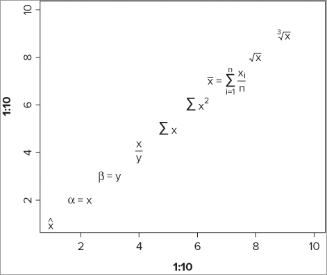
You begin by creating a blank plot and then reset the cex instruction to produce text 1.5 times larger than normal. The cex instruction could, of course, be used for each text() command, but this way is more efficient.
The first command produces a simple letter x with a hat: ˆx. The second command produces a Greek character. You use two equal signs to get your final text: α = x. The next example uses the Greek letter beta and you end up with β = y.
The fourth command creates a fraction; you specify the top and the bottom parts of the fraction separated with a comma. The fifth command creates a ∑ character, and you make this more complex in the sixth command by adding a superscript.
The seventh command is quite complicated and uses several elements including a subscript. The final two commands use the square root symbol.
You can alter the character size directly using the cex = instruction and can also control the color via the col = instruction. The typeface must be set from within the expression itself. For example:
expression(italic(x^2))This command produces x2, with the whole lot being in an italic typeface. The expression() syntax enables you to produce more or less any text you require; for full details look at help(plotmath). Table 11-8 outlines a few of the options for producing math inside text expressions.
Table 11-8: Producing Math Inside Text Expressions
| Expression | Result |
|
Produces x plus y. For example, x + y. |
|
Produces x minus y. For example, x – y. |
|
Creates x equals y. For example, x = y. |
|
Creates x plus or minus y. For example, x ± y. |
|
Produces x divided by y. For example, x y. |
|
Produces x with an over-bar. |
|
A fraction with x on the top and y on the bottom. |
|
Makes x up-arrow y. For example, x y. |
|
An infinity symbol. |
|
Sets italic text. |
|
Sets plaintext. |
|
Lowercase Greek symbols. |
|
Uppercase Greek symbols. |
|
Adds the degree symbol. For example, 180˚. |
|
Leave a space between x and y. For example, x y. |
Recall the bar chart you created earlier when you created and added error bars using the segments() command. In the following activity you will recreate the graph and add a variety of text items to it.
> bp = barplot(grass.m, ylim = c(0, grass.max), las = 1, cex.names = 2)
> segments(bp, grass.m + grass.se, bp, grass.m, lwd = 2)
> segments(bp - 0.1, grass.m + grass.se, bp + 0.1, grass.m + grass.se, lwd = 2)> title(ylab = expression(Richness~per~m^2))> title(xlab = expression(Treatment[cutting]))> text(bp, grass.m - 0.5, as.character(grass.m))> result = 't = 4.8098
df = 5.411
p = 0.0039'> text(locator(1), result, font = 3)> mtext('Mean values', side = 4)> box()Adding Points to an Existing Graph
You may need to add points to an existing graph, for example, if you need to create a scatter plot containing more than one sample. You can add points to an existing plot window by using the points() command. This works more or less like the plot() command, except that you do not create a new graph. The general form of the points() command is as follows:
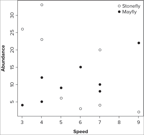
points(x, y = NULL, type = "p", ...)You specify the x and y coordinates for your points like you would with any other plot(); this means that you can use a formula, in which case you do not need the y = instruction because the x and y coordinates are taken from the formula. You can also add other graphical instructions that affect the plotting characters; you can alter the size, color, and type for example. You cannot, however, alter the y-axis size or the axis labels because these will only work when you make a new plot. Instead, you use the title() command to make axis titles or the mtext() command. The following example shows the creation of a simple two-series scatter plot. The data are a simple data frame with three columns:
> fwi
  speed sfly mfly
1     9    2   22
2     6    3   15
3     7    4   10
4     5    6    9
5     4   23    5
6     3   26    4
7     4   33   12
8     7   20    8
The first column contains the predictor variable (the x-axis) and the next two columns are response variables (two lots of y-axis). You can create a simple scatter plot using the plot() command like so:
> plot(sfly ~ speed, data = fwi, pch = 21, ylab = 'Abundance', xlab = 'Speed')Notice that you have specified the plotting character and axis titles explicitly. The graph now shows one series of data in the plot window. You can add the second series by using the points() command:
> points(mfly ~ speed, data = fwi, pch = 19)To differentiate between the two series of data, you use a different plotting character (pch = 19); you can also use a different color or size via the col = and cex = instructions. To add a legend to help the reader see the different series, you can use the legend() command in the following way:
> legend(x = 'topright', legend = c('Stonefly', 'Mayfly'), pch = c(21,19), bty = 'n')In this case you place the legend at the top right of the plot window and set the legend text explicitly. You also set the plotting characters that appear in the legend to match those used in the plots; if you had used different colors you could set the colors to match in a similar fashion. The commands are repeated in the following code:
> plot(sfly ~ speed, data = fwi, pch = 21, ylab = 'Abundance', xlab = 'Speed')
> points(mfly ~ speed, data = fwi, pch = 19)
> legend(x = 'topright', legend = c('Stonefly', 'Mayfly'), pch = c(21,19), bty = 'n')
The final graph looks like Figure 11-10.
In the current example it does not make a lot of sense to join the dots, but it is possible to create points that are joined for use in more appropriate circumstances.
You can use the points() command very much like the plot() command and create a series of joined-up points. When you create a scatter plot that uses only points, you do not need to be concerned about the order in which the items are plotted. In the current example, however, the x-data are unsorted, and if you tried to plot them with connecting lines, you would end up with a mess! You need to sort them in ascending order of the x-variable. Once your data are in the right order, you can proceed with the line-plot.
In the following activity, you reorder the data that you have seen here to produce a line-plot with two series of data.
- Sort the data “on the fly”
- Sort the data before you start
> plot(sfly[order(speed)] ~ sort(speed), data = fwi, pch = 21, ylab = 'Abundance',
xlab = 'Speed', type = 'b', lty = 2, cex = 1.5, lwd = 2)> points(mfly[order(speed)] ~ sort(speed), data = fwi, pch = 19, type = 'b', lty = 3,
cex = 1.5, lwd = 2)> legend(x = 'topr', legend = c('Stonefly', 'Mayfly'), pch = c(21, 19), bty = 'n',
lty = c(2, 3), pt.cex = 1.5, lwd = 2)> fwi = fwi[order(fwi$speed),]> plot(sfly ~ speed, data = fwi, type = 'b', pch = 21, lty = 2, ylab = 'Aundance',
xlab = 'Speed', cex = 1.5, lwd = 2)> points(mfly ~ speed, data = fwi, type = 'b', pch = 19, lty = 3, cex = 1.5, lwd = 2)> legend(x = 'topr', legend = c('Stonefly', 'Mayfly'), pch = c(21, 19), bty = 'n',
lty = c(2, 3), pt.cex = 1.5, lwd = 2)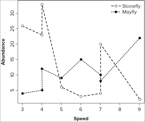
Adding Various Sorts of Lines to Graphs
You have seen some examples of adding lines to existing plots already; you saw how to add straight lines using the abline() command. You also saw how to create lines fitted to results of linear regressions using lines() and the spline() command to make them curved. You also saw how to use the segments() command to add sections of straight line; you used these to create error bars. In this section you review some of these methods and add a few extra ways to draw straight and curved lines onto existing graphs.
Adding Straight Lines as Gridlines or Best-Fit Lines
You can use the abline() command to add straight lines to an existing plot. The command will accept instructions in several ways; you can use a slope and intercept as explicit values:
abline(a = slope, b = intercept, ...)The command thus works using the equation of a straight line, that is, y = a + bx. You can also specify the equation directly from the result of a linear model:
abline(lm(response ~ predictor, data = data), ...)You may already have a linear model and can use the result directly if you have saved it as a named object. Finally, you can specify that you want a horizontal or vertical line:
abline(h = value, ...)
abline(v = value, ...)
You can alter the display of your line using other instructions; for example, you can change the color, width, style, or thickness. The following activity gives you a chance to explore some of the possibilities.
> plot(sfly ~ speed, data = fwi, ylim = c(0,30), xlim = c(0,10))> abline(lm(sfly ~ speed, data = fwi))> abline(h = seq(5, 30, 5), lty = 2, col = 'gray50')> abline(v = 1:9, lty = 2, col = 'gray50')> abline(a = 0, b = 1, lty = 3, lwd = 1.8)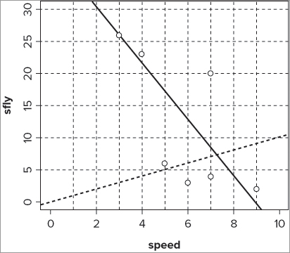
The abline() command is pretty flexible, but it can draw only straight lines; you see how to create curved lines shortly. The command options/instructions for the abline() command are summarized in Table 11-9.
Table 11-9: The abline() Command and its Options
| Command/Instruction | Explanation |
|
Draws a straight line with intercept = a and slope = b. |
|
Uses a linear model result to create intercept and slope. Alternatively, any vector containing two values may be interpreted as the intercept and slope. |
|
Draws horizontal lines at the y coordinates specified in the value. |
|
Draws vertical lines at the x coordinates specified in the value. |
|
Sets the line type. Line types can either be specified as an integer (0 = blank, 1 = solid (default), 2 = dashed, 3 = dotted, 4 = dotdash, 5 = longdash, 6 = twodash) or as one of the character strings "blank", "solid", "dashed", "dotted", "dotdash", "longdash", or "twodash", where "blank" uses “invisible lines” (that is, does not draw them). |
|
Sets the line color; usually as a text value. For example, "gray50". |
|
Sets the line width as a proportion; > 1 makes line wider and < 1 makes the line narrower. |
Making Curved Lines to Add to Graphs
You can add curved lines to plots in a variety of ways. The lines() command is especially flexible and allows you to add to existing plots. In a general way, the command takes x and y coordinates and joins them together on your plot. The general form of the command is:
lines(x, y = NULL, ...)You can specify the coordinates in many ways. Earlier you used the results of linear modeling to create curved lines of best-fit to both logarithmic and polynomial regressions; you used the original x-values and took the y-values from the fitted() command like so:
> bbel.lm

Call:
lm(formula = abund ~ light + I(light^2), data = bbel)

Coefficients:
(Intercept)        light   I(light^2)
   -2.00485      2.06010     -0.04029

> plot(abund ~ light, data = bbel)
> lines(bbel$light, fitted(bbel.lm))
In this case you specify both x and y coordinates individually, but you could have used a formula instead:
> lines(fitted(bbel.lm) ~ light, data = bbel)This produced a slightly angular line because the x, y coordinates are joined by short sections of straight lines, so you used the spline() command to bend the line and produce a better curve as shown in the following:
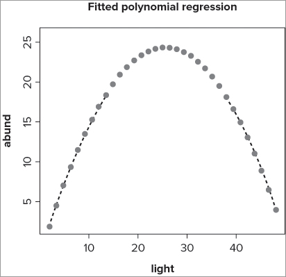
> lines(spline(bbel$light, fitted(bbel.lm)))You can alter the appearance of the line in many ways. You might change the line style, color, or width, for example, using graphical instructions that you have used before. You can also use the type = instruction to create a line with points along it. The following example demonstrates some of the possibilities:
> plot(abund ~ light, data = bbel, type = 'n')
> lines(spline(bbel$light, fitted(bbel.lm)), type = 'b', pch = 16, lty = 3,
col = 'gray50')
> title(main = 'Fitted polynomial regression')
In this case you use the data from a polynomial regression, but do not actually plot the data (you use type = ‘n’ to suppress the points). Next you use the fitted() command to get the y-values for the polynomial model. The spline() part of the command smooths out the curve to produce a better bend. As part of the lines() command, you set the type = ‘b’ to create a line and points along it; you also alter the plotting character, the line style, and the color. Finally, you add an overall title to the plot. The final plot looks like Figure 11-13.
Some of the additional graphical instructions you can apply are summarized in Table 11-10.
Table 11-10: Graphical Instructions that Can be Applied to Lines on Graphs
| Instruction | Explanation |
|
Sets the kind of line drawn. type = ‘l’ (the default) produces a line only, ‘b’ produces a line split by points, ‘o’ produces a line overlain with points, ‘n’ suppresses the line. |
|
Sets the line type. Line types can either be specified as an integer (0 = blank, 1 = solid (default), 2 = dashed, 3 = dotted, 4 = dotdash, 5 = longdash, 6 = twodash) or as one of the character strings "blank", "solid", "dashed", "dotted", "dotdash", "longdash", or "twodash", where "blank" uses “invisible lines” (that is, does not draw them). |
|
Sets line width where n = 1 is “normal” width. Values > 1 make line wider and values < 1 make it narrower. |
|
Sets line color, usually as a text names. For example, ‘gray50’. |
|
Sets plotting character (used if type = ‘b’ or ‘o’); usually specified as a numerical value but a quoted character may be used. For example, “+”. |
Plotting Mathematical Expressions
You can draw mathematical functions, either as a new plot or to add to an existing one. The plot() command can be pressed into service here and you can also use the curve() command. The general form of both these commands is similar. Following is the curve() command:
curve(expr, from = NULL, to = NULL, n = 101, add = FALSE, type = ‘l’, log = NULL, ...)You start by creating an expression to plot. This can be a simple math function (for example, log, sin) or a more complex function that you define. You also need to determine the limits of the plot, that is, the starting and ending values for your x-axis. The command works out the mathematical expression for n times, spread across the range of values you specify; n is set at 101 by default but you can add extra points to produce a smoother curve. You can add a mathematical curve to an existing plot using the add = TRUE instruction. By default, a line is drawn but you can specify other types, for example, type = ‘b’, to produce points joined by sections of line. You can also specify a log scale for one or both axes. Finally, you can alter the line type, color, and other parameters much like the other plotting commands you have seen.
Here are some simple examples:
> plot(log)
> plot(log, from = 1, to = 1e3)
> curve(log10, from = 1, to = 1e3, add = TRUE, lty = 3)
In the first line you plot a simple logarithm (natural log); the limits of the x-axis are set from 0 to 1 by default. In the second line, you specify that you want to use 1 and 1000 as the x-axis limits. In the third line you add a curve to the existing plot; you specify log to the base 10 and also set the line type to dotted (that is, lty = 3).
If you want a logarithmic axis you can specify this via the log = instruction like so:
> curve(log, from = 1, to = 1e3, log = 'x')You use a simple text label to say which axis you require to be on the log scale: “” for neither (the default), “x” for just the x-axis, “xy” for both, and “y” for the y-axis only.
The axis titles are created using default values, and if you plot more than one mathematical function you may want to alter these. In the following example you change the y-axis title:
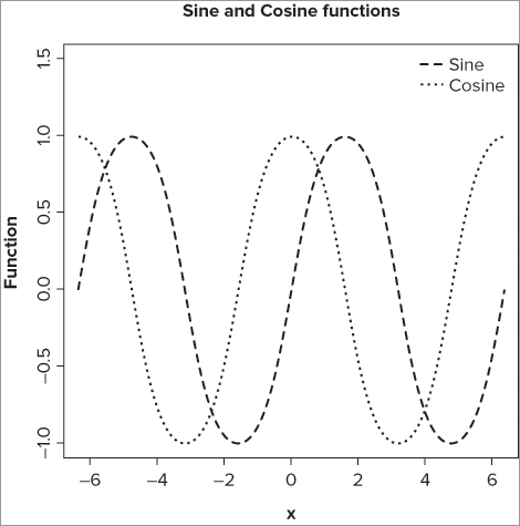
> curve(sin, -pi*2, pi*2, lty = 2, lwd = 1.5, ylab = 'Function', ylim = c(-1,1.5))
> curve(cos, -pi*2, pi*2, lty = 3, lwd = 1, add = TRUE)
> legend(x = 'topright', legend = c('Sine', 'Cosine'), lty = c(2, 3),
lwd = c(1.5, 1), bty = 'n')
> title(main = 'Sine and Cosine functions')
In this case you alter the y-axis title, and also the limits of the axis to accommodate the legend. You make the first curve in one style (lty = 2) and a bit wider than “normal” (lwd = 1.5). The second curve is set to a different style (lty = 3) and, of course, set to the same axis limits as the sine curve (from – * 2 to * 2). Next, you add a legend to differentiate between the two curves; note that you specify the legend text and the line styles and thicknesses explicitly. The final graph looks like Figure 11-14.
If you require a more complex mathematical function, you must specify it separately using the function() command; then you can refer to your function in the curve() command. In the following example you create a simple mathematical function:
> pn = function(x) x + x^2
> pn
function(x) x + x^2
The function() command has two parts: the first part is a list of arguments and the second part is the list of commands that use these arguments. In this case, the single argument is in the parentheses, x; the value of x is added to x2 and this is what the function does, creates x + x2 values. You can see how it works by using the new function on some values directly like so:
> pn(1)
[1] 2
> pn(2)
[1] 6
> pn(1:4)
[1]  2  6 12 20
When you use the new function as part of a curve() command, you therefore plot the following equation:
y = x + x2
Recall the polynomial model you had before:
> bbel.lm
Call:
lm(formula = abund ~ light + I(light^2), data = bbel)
Coefficients:
(Intercept) light I(light^2)
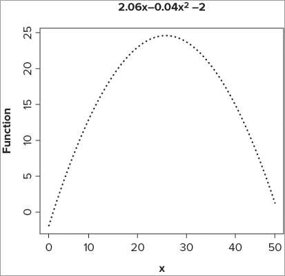
-2.00485 2.06010 -0.04029 You could set a function to mimic this formula and then plot that like so:
> pn = function(x) (2.06*x)+(-0.04 * x^2)-2
> curve(pn, from = 0, to = 50, lwd = 2, lty = 3, ylab = 'Function')
> title(main = expression(2.06*x~-0.04*x^2*~-2))
The first line sets the polynomial function; for every value of x you type, the function will evaluate y = 2.06x - 0.04x2 – 2. Now you use the curve() command to draw this function; you set the line type to dashed and make it a little wider than normal. In the last line you set an expression() to create the formula as the title. The graph that results looks like Figure 11-15.
Table 11-11 summarizes the instructions that can be used with the curve() command. You see the function() command again in the next chapter when you look at creating simple scripts to help you automate your work.
Table 11-11: Instructions Used with the curve() Command
| Instruction | Explanation |
| expr | A mathematical expression to evaluate; for example, log, sin, cos. A predefined function() can be used. |
| from = | The starting value for the x-axis and expression to be evaluated. |
| to = | The ending value for the x-axis and expression to be evaluated. |
| n = 101 | The number of points to evaluate. |
| lty = n | The line type; for example, 2 = dashed, 3 = dotted. |
| lwd = n | The line width. 1 = “normal”, > 1 makes line wider, < 1 makes it thinner. |
| col = ‘color’ | The line color, usually as a text string. For example, “gray50”. |
| type = ‘l’ | The type of plot used. ‘l’ is the default and draws a line only, ‘b’ produces sections of line with points between. |
| pch = n | The plotting character, usually as a numeric value but can be a text string. For example, “+” (the same as pch = 3). Used only if lty = ‘b’, ‘p’, or ‘o’. |
| add = FALSE | If set to TRUE, the curve is added to an existing plot. |
Adding Short Segments of Line to an Existing Plot
You can add short segments of line to an existing plot using the segments() command; you saw this before when adding error bars to a bar chart. The basic form of the command is as follows:
segments(x0, y0, x1, y1, ...)You provide the starting coordinates and the ending coordinates. You can also use a host of other graphical instructions to alter the appearance of these segments; for example, lty, col, and lwd to alter line type, color, and width, respectively.
If you have a series of coordinates you can use these to draw shapes onto existing plots.
Adding Arrows to an Existing Graph
You can use the arrows() command in much the same way as the segments() command. The arrows() command draws sections of line from one point to another and adds arrowheads as specified in the command instructions. The basic form of the command is as follows:
arrows(x0, y0, x1, y1, length = 0.25, angle = 30, code = 2, ...)The command requires the x and y coordinates of the starting and ending points. The length = instruction specifies the length of the arrowhead (if appropriate) and the angle = instruction is the angle of the head to the line; this defaults to 30˚. The code = instruction specifies on which end(s) the arrowheads should be drawn; 1 = the back end (that is, x0, y0), 2 = the front end (that is, x1, y1), and 3 = both ends.
One use for the arrows() command is to create error bars with hats. Previously you used the segments() command to add error bars but you used three separate commands, one for the bars and one for each of the hats. You can use the arrows() command to add the hats at either end:
> arrows(bp, bf.m+bf.se, bp, bf.m-bf.se, length = 0.1, angle = 90, code = 3)In this case you use a length of 0.1 to give a short hat and set the angle at 90˚. The code = 3 instruction sets heads at both ends. The values for the coordinates are determined from the data; look back at the previous section on error bars for a reminder on how to do this.
You can specify other graphical instructions to alter line style, color, and width, for example. In the following example you see some of these instructions applied:
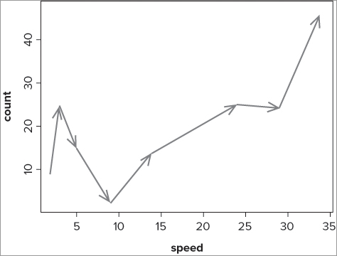
> fw
         count speed
Taw          9     2
Torridge    25     3
Ouse        15     5
Exe          2     9
Lyn         14    14
Brook       25    24
Ditch       24    29
Fal         47    34

> plot(count ~ speed, data = fw, pch = '.')
> s = seq(length(fw$speed)-1)
> s
[1] 1 2 3 4 5 6 7

> arrows(fw$speed[s], fw$count[s], fw$speed[s+1], fw$count[s+1], length = 0.15,
angle = 20, lwd = 2, col = 'gray50')
You complete the following steps to achieve the preceding example:
In this case the data were already sorted in ascending order of x-value (speed), but if they were not, you would need to reorder the data in some fashion. The following example reverses the order of the data:
> fws = fw[order(fw$speed, decreasing = TRUE),]If you now plotted the data and the arrows using the fws data (which is sorted in reverse), your arrows would run in the opposite direction. Table 11-12 summarizes the arrows() command instructions.
Table 11-12: Instructions for the arrows() Command
| Instruction | Explanation |
| x0, y0 | The starting coordinates for the arrow. |
| x1, y1 | The ending coordinates for the arrow. |
| length = 0.25 | The length of any arrowhead. |
| angle = 30 | The angle of the head to the main arrow in degrees. |
| code = 2 | Which arrowheads are to be drawn; 0 = neither, 1 = the beginning point, 2 = the ending point, 3 = both ends. |
| lty = | The line type/style. For example, 1 = plain, 2 = dashed, 3 = dotted. |
| lwd = n | Line width. 1 = default, > 1 makes line wider, < 1 makes line thinner. |
| col = ‘color’ | Line color, usually as a text string. For example, “gray50”. |
Matrix Plots (Multiple Series on One Graph)
Sometimes you need to produce a plot that contains several series of data. If your data are categorical, the barplot() command is the natural choice (although the dotchart() command is a good alternative). If your data are continuous variables, a scatter plot of some kind is required. You saw previously how to add extra points or lines to a scatter plot. However, the matplot() command makes a useful and powerful alternative.
In Chapter 8, “Formula Notation and Complex Statistics” you looked at interaction plots using the interaction.plot() command. You can produce a similar graph using the matplot() command, which plots the columns of one matrix against the columns of another. This command is particularly useful for plotting multiple series of data on the same chart. The general form of the command is as follows:
matplot(x, y, type = ‘p’, lty = 1:5, pch = NULL, col = 1:6)The x refers to the matrix containing the columns to be used as the x-data. The y refers to the matrix containing the columns to be plotted as the y-data. The two matrix objects do not have to contain the same number of columns, but they do need to have the same number of rows. By default, only points are plotted, but if you select type = ‘b’, for example, the style of line differs for each column in your y-matrix; the lty = instruction uses values from one to five and recycles these values as required. If you require different line types, you can specify them yourself. The plotting characters are set by default to use numbers from one to nine, then zero, then lowercase letters, and finally the uppercase letters. You can, of course, set the symbols you require using the pch = instruction explicitly. You can also set the colors of the plotted lines/characters by altering the col = instruction; by default this uses colors one through six (black, red, green, blue, cyan, violet).
The following example shows two data matrices. The first contains two columns and these relate to two response variables. The second matrix is a single column representing a predictor variable:
> ivert
     sfly mfly
[1,]   26    4
[2,]   23    5
[3,]   33   12
[4,]    6    9
[5,]    3   15
[6,]    4   10
[7,]   20    8
[8,]    2   22
> spd
     speed
[1,]     3
[2,]     4
[3,]     4
[4,]     5
[5,]     6
[6,]     7
[7,]     7
[8,]     9
To create a basic plot, you can try the following:
> matplot(spd, ivert)In this case you have a single x-variable (spd), and the two columns in your y-data are plotted against this. Using all the defaults, you end up with a plot that shows two sets of points, with the plotting characters being black “1” and red “2”.
In the following example you add some additional instructions to produce a more customized plot and follow this up with a legend:
> matplot(spd, ivert, type = 'b', pch = 1:2, col = 1, lty = 2:3, xlab = 'Speed',
ylab = 'Invertebrate count')
> legend(x = 'topright', legend = c('Stonefly', 'Mayfly'), pch = 1:2, col = 1,
bty = 'n', lty = 2:3)
Your matplot() command produces a plot with both lines and points using the type = ‘b’ instruction. This time you specify the plotting characters explicitly using pch = 1:2 (an open circle and an open triangle). You set both lines to black using col = 1, but vary the line type using lty = 2:3 (producing a dashed line and a dotted line). Finally, you add explicit axis titles using the xlab = and ylab = instructions.
When you add your legend using the legend() command, you can copy some of the instructions because you need to match the line type, color, and plotting characters. To do so perform the following steps:
If you were to have two columns in your x-values matrix, the first column of the x-matrix would match up to the first column of the y-matrix, and so on. If you have more columns in the y-matrix than in the x-matrix, the columns of the x-matrix are recycled as necessary. In this way, you can arrange your data so that you produce the multi-series plot you need.
In addition to the matplot() command, you can add points and lines to an existing graph using matpoints() and matlines() commands. These use the same kinds of additional instructions as before to alter plotting character, color, and so on. Table 11-13 summarizes the commands associated with matrix plots.
Table 11-13: Options for Matrix Plots
| Instruction | Explanation |
| x | A matrix of numerical data, the columns of which will form the x-axis of the plot. |
| y | A matrix of numerical data, the columns of which will form the y-axis of the plot. If only one matrix is specified, this will become the y-axis data and a simple index will be used for the x-axis. |
| type = | The type of plot. Defaults to ‘p’ for matplot() and matpoints(); defaults to ‘l’ for matlines(). Allowable types are ‘n’, ‘p’, ‘b’, and ‘o’ for no plot, points, both, and overplot (similar to both except points overlie the line). |
| lty = 1:5 | Line type. 1 = plain, 2 = dashed, 3 = dotted. The default values are 1:5, and if more are required the values are recycled. |
| lwd = 1 | Line width. 1 = normal, > 1 makes line wider, < 1 makes line narrower. |
| pch = null | The plotting symbols used; by default numbers 1–9 are used, followed by 0, then lowercase and uppercase letters. Explicit symbols may be specified by numerical value or as a text string. For example, “+”. |
| col = 1:6 | Color of the plotted line and/or points. The default values are 1:6 (black, red, green, blue, cyan, or violet), which are recycled if required. Colors may be specified as a numerical value but are more often given as a text string. For example, ‘gray50’. |
| ... | Other graphical instructions. For example, ylim, xlab, or cex. |
Multiple Plots in One Window
It is sometimes useful to create several graphs in one window. This could be because they are closely related and you want to display them together. You could make separate plots and then later position them together using a graphics program or your word processor. However, it is more efficient to split a graphical window into sections and draw your graphs into the sections directly from R. You are able to achieve this in a couple of ways, as you see in the following sections.
Splitting the Plot Window into Equal Sections
You can split the graphical window into several parts using the graphical instructions mfrow() and mfcol(); you can access these instructions only via the par() command. Usually, it is a good idea to store the current par() instructions so that they can be recalled/reset later. The mfrow() and mfcol() instructions both require two values, the number of rows and the number of columns, like so:
mfrow = c(nrows, ncols)
mfcol = c(nrows, ncols)
Once set, the split plot window remains in force until altered or reset to its original values. In the following example you split the window into four; that is, two rows and two columns:
> opt = par(mfrow = c(2,2))
> plot(Length ~ BOD, data = mf, main = 'plot 1')
> plot(Length ~ Algae, data = mf, main = 'plot 2')
> plot(Length ~ Speed, data = mf, main = 'plot 3')
> plot(Length ~ NO3, data = mf, main = 'plot 4')
> par(opt)
The first command sets the number of rows and columns for the plot window; note that you create an object to hold the current settings. The next four lines produce simple scatter plots; this is where the difference between mfrow() and mfcol() becomes evident. In the case of mfrow() the plots are created row by row, whereas if you had set mfcol() the plots would fill up column by column. At the end you reset the window by calling up the object you created earlier. The final plot looks like Figure 11-18.
You can skip a plot by using the plot.new() command. The result of issuing a plot.new() command is that the current plot is finished; if you have a split window, you skip over the next position in the sequence. You must remember that the current plot is not the one that you just drew, but the one that is ready to draw into! In the following example you set the window to four sections again, but draw plots by column:
> opt = par(mfcol = c(2,2))
> plot(Length ~ BOD, data = mf, main = 'plot 1')
> plot.new()
> plot.new()
> plot(Length ~ NO3, data = mf, main = 'plot 4')
> par(opt)
After you issue the mfcol() instruction the plot is ready (although you cannot see it), and so the first plot will go into the top-left position. The next plot is ready to go into the bottom left, but you use plot.new() to skip it and get the next ready instead. However, you decide to skip this too and so the next plot goes into the bottom section of the window. The final graph appears like Figure 11-19. The blank areas might be useful to add text, for example, or perhaps some other graphic.
Splitting the Plot Window into Unequal Sections
You can control the sections of the plotting window more exactly using the split.screen() command. This command provides finer control of the splitting process and you can also place a plot in exactly the section you require. The basic form of the command is as follows:
split.screen(figs = c(rows, cols))This is similar to the mfrow() instruction you saw in the previous section, but you can go further; you can subdivide each of the sections you just created as well. The following example is a good way to illustrate the possibilities:
> split.screen(figs = c(2, 1))
[1] 1 2
> screen()
[1] 1
In this case you divide the graphics window into two rows and one column; the command gives you a message showing that you now have two areas available. The second command, screen(), checks to see which is the current window; you get a 1 in this instance, which indicates that you are at the top. You switch to the bottom row (screen two) because you want to subdivide it:
> screen(2)
> split.screen(figs = c(1, 2))
[1] 3 4
You start by simply switching to screen number two using screen(2), then you split this into more parts; in this case you decide to make a single row and two columns. Your graphics window is now split into four parts; this is not immediately obvious! You have the original split, which was the top half and the bottom half. You have the bottom half also split into two parts; this makes four altogether. You can see how many parts you have by using the close.screen() command like so:
> close.screen()
[1] 1 2 3 4
When you use this command without any instructions, you get a list of the available screens. You can plot into any of the screens by selecting one and then using the plot() command (or any other command that produces a graph). In the following example you make a scatter plot in screens two and one:
> screen(2)
> plot(Length ~ Algae, data = mf, main = 'plot 2')
> screen(1)
> plot(Length ~ BOD, data = mf, main = 'plot 1')
The graph that results looks like Figure 11-20.
You still have split the bottom part into two sections (that is, one row and two columns), so you could create a more complex plot. You begin by erasing the bottom plot (screen two) using the erase.screen() command like so:
> opt = par(bg = 'white')
> erase.screen(n = 2)
> par(opt)
The default for this command is to use the currently selected screen, so you must be careful to specify which screen you want to erase. By default, the background color of the plot is used to erase the drawing; in many cases this is transparent, so you set it to white in this case to ensure that you wipe out the current plot. You can now draw into the cleared area at the bottom of the plot window:
> screen(3)
> plot(Length ~ Speed, data = mf, main = 'plot 3')
> screen(4)
> plot(Length ~ NO3, data = mf, main = 'plot 4')
Recall that you split the window into four parts with screens three and four making up the bottom half. You start by selecting screen(3) and plotting a scatter plot; you then select screen(4) and make another plot. The result is shown in Figure 11-21.
You can use the close.screen() command to remove splits:
> close.screen(n = 3:4)
[1] 1 2
Here you see that you retain screens one and two. If you want to close all the screens, you can specify this as an instruction in the close.screen() command like so:
> close.screen(all.screens = TRUE)
> close.screen()
[1] FALSE
When you use the close.screen() command without any instructions, you now see FALSE as a result, indicating that you have no screens remaining (that is, no splits, only the basic graphical window).
When you use split screens it is advisable to complete an entire plot before switching to a new screen; so complete the addition of titles, extra text, lines, and points before moving to the next. Table 11-14 shows a summary of splitting screens.
Table 11-14: Summary of Screen (Graphics Window) Splitting Commands and Options
| Command/Instruction | Explanation |
| split.screen(figs, screen) | Splits the graphical window into subsections. |
| figs | The number of rows and columns required. For example, c(2,2) sets two rows and two columns. |
| screen | A numerical value specifying which screen is to be split; only works if the graphical window is already split. |
| screen(n = ) | Switches to the screen specified by n. If n is missing, the current screen number is given. |
| erase.screen(n = ) | Erases the selected screen by drawing over it in the current background color; this may be translucent and not appear to have any effect. |
| opt = par(bg = ‘white’) par(opt) |
Sets the background color to white, which enables a screen to be erased. The command also stores all graphical parameters, so all can be reset using par(opt). |
| close.screen() | Returns the numbers of the available screens remaining. |
| n | Selects the screen to be closed; the numbers of the remaining available screens is returned. |
| all.screens = TRUE | If set to TRUE, all screens are closed and the single graphical window remains. |
Exporting Graphs
Once you have made a graph, you will have it on your computer screen. This may well be extremely useful as a diagnostic tool, but to reach a wider audience you will need to transfer your graph to another location. If you are going to use the graph in a report or presentation, you will need to place it into an appropriate program. Previously (in Chapter 7) you saw how to use copy and paste to transfer graphs directly into other programs and how to save the graphic window as a file on disk. Here you see a brief review of these processes before looking at ways to fine-tune your graphics via the device driver, which can produce high-quality graphics files.
Using Copy and Paste to Move a Graph
For many purposes, using the clipboard is simple and produces acceptable quality graphics for your word processor or presentation. You can resize the graphic window using your mouse like you would for any other program window and your graph will be resized accordingly.
If you want more control over the size of the graphics window, you can create a blank window with the dimensions you require using one of the following commands:
windows(height, width, bg)
quartz(height, width, bg)
X11(height, width, bg)
Which command you need depends on the operating system you are using at the time.
- For Windows users, the windows() command creates a new graphic window.
- For Macintosh users, the quartz() command opens a graphic window. The X11() command also opens a graphic window, but in the X11 application.
- For Linux users, the X11() command opens a graphic window.
You set the height and width in inches; the defaults depend on your system. You can also specify the background color using the bg instruction; the default is bg = “transparent”.
The default size for the graphics window can be set in the options for the GUI in Windows and Macintosh. In Linux you have to set a default in a profile file to run each time R loads. For most users the defaults are acceptable (7 inches), and for special uses it is quite simple to use the X11() command to produce a custom-sized window.
Saving a Graph to a File
Saving to a file generally makes a better quality graphic than using the clipboard. As you saw in Chapter 7, you have a variety of options for saving graphics files according to your operating system.
Windows
When you have a graphics window you will see that it contains a menu bar. The File menu enables you to save the contents of the window to a disk file. You have several choices of format, including PNG, JPEG, BMP, TIFF, and PDF. The JPEG option also allows you to specify the compression.
Macintosh
The Mac does not present you with a menu as part of the graphics window. Once the graph is selected, the File menu enables you to save your graph as a file. The default is to use PDF format. It is not trivial to alter the default. If you need a file in a different format, you can use the device driver, as you see shortly.
Linux
In Linux there is no GUI, and R runs via the Terminal application. This means that you cannot save the graphics window in this fashion; you must use the device driver in some manner.
Using the Device Driver to Save a Graph to Disk
The device driver allows more subtle control of your graphics and the quality of the finished article. If you are a Linux user, you have to use the device driver in some way unless a simple copy-and-paste operation will suffice. In Chapter 5 you saw how to use the device driver briefly. Here you see a few more of the options available to you.
You can think of the device driver as a way to send your graphics to an appropriate location; this may be the screen, a PNG file, or a PDF file. You can use the device driver in two main ways:
- Send an existing screen graphic to a file.
- Create a graphic file directly on disk.
The device driver can accept a variety of instructions, including the size of the graphic as well as the color of the background and the resolution (DPI). Here you see the device driver in action for saving PNG and PDF files.
PNG Device Driver
You access the PNG device via the png() command, which has the following general form:
png(filename = "Rplot%03d.tif", width = 480, height = 480, units = "px", bg = "white", res = NA)You must specify a filename in quotes; the default will be used if you do not. This file will be written to your default directory. To alter the location you must either alter the default or specify the location explicitly as part of the filename. The height and width are specified in pixels by default, and the units instruction controls which units are used; you can specify “in”, “cm”, or “mm” as alternatives to the “px” default. The bg instruction sets the background color, and the res instruction controls the resolution.
The resolution is not recorded in the file unless you specify it explicitly. Many graphics programs will assume that 72 dpi has been used, so in practice it is a good idea to specify one—72 dpi is the standard for screen use, and with the 480 pixels size this comes out to 6.67 inches. You can use the png() command to create a file directly, or to copy a screen graphic to disk.
PDF Device Driver
The PDF device driver is accessed via the pdf() command and has similar options to the png() command.
pdf(file = "Rplot%03d.pdf", width, height, bg, colormodel)The filename must be given in quotes and are saved to your default directory unless you alter it or specify the location explicitly as part of the filename. The height and width are measured in inches and use the default of 7 inches. The background color is set to “transparent” by default.
The colormodel instruction enables you to specify the general color of the plot; the default is “rgb”, which produces colored graphics. You can also specify “gray” to produce a grayscale plot.
Copying a Graph from Screen to Disk File
If you have created a graph on the screen and want to save it as a disk file, you can use device driver to copy the file. In effect, you are copying the graphic from one device to another. You can use two commands to achieve this:
dev.copy(device)
dev.print(device)
These are very similar, and you can treat them the same for most purposes. The device instruction is essentially the png() or pdf() command that you saw previously (you can also use tiff(), jpeg(), and bmp() commands).
The difference between the two dev commands is that dev.print() writes the graphic file immediately, whereas the dev.copy() command opens the graphic file and sends a copy but does not finish. This means that you can add additional commands to the graphic on disk without altering the one on the screen! Once you are finished with the graphic, you must close the device to finish writing the file and complete the operation. You do this using a new command:
dev.off()No additional instructions are required. The graphics file created is closed and becomes available as soon as the dev.off() command is executed. The dev.print() command does not need you to do this because the file is written and closed in one go.
Making a New Graph Directly to a Disk File
The device driver enables you to create a graphic directly as a disk file, bypassing the screen entirely. This can be particularly useful if you need to create an especially large graphic that might not fit on the screen. You can also control the resolution and produce high-quality graphics suitable for publication.
The starting point is the device itself. Earlier you saw the png() and pdf() devices, which are likely to be the most useful. The steps you require to do create a graphics file on disk are as follows:
Your computer will be set up to create graphics windows of a certain size. When you make a graph directly on disk, it is important to match the resolution you require to the appropriate size (in pixels); otherwise, the text, plotting characters, and so on will either be far too small or far too large. In the following activity you create a graph and explore the effects of altering the resolution.
> plot(sfly ~ speed, data = fwi, main = 'Scatter plot', pch = 16, cex = 2, las = 1)
> abline(h = mean(fwi$sfly), lty = 3, lwd = 2)
> abline(v = mean(fwi$speed), lty = 3, lwd = 2)
> abline(lm(sfly ~ speed, data = fwi), lty = 2, col = 'blue')
> text(max(fwi$speed), mean(fwi$sfly)+ 0.5, 'Mean sfly', pos = 2, font = 3)
> text(mean(fwi$speed), max(fwi$sfly), pos = 4, srt = 270, 'Mean speed', font = 3)> windows(width = 7, height = 7)
> quartz(width = 7, height = 7)
> X11(width = 7, height = 7)> png(file = '7in 300dpi.tif', height = 2100, width = 2100, res = 300, bg = 'white')> Graphics commands here..
> def.off()> png(file = '7in 150dpi.tif', height = 2100, width = 2100, res = 150, bg = 'white')> Graphics commands here..
> def.off()> png(file = '7in 600dpi.tif', height = 2100, width = 2100, res = 600, bg = 'white')> Graphics commands here..
> def.off()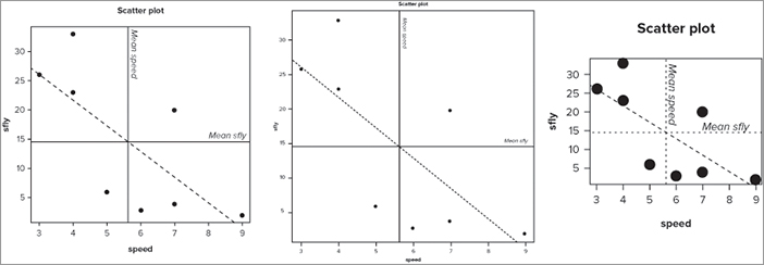
Summary
- You can add error bars to graphs using segments() or arrows() commands.
- You can add legends using the legend instruction from some graph commands; for example, barplot() or separately using the legend() command.
- You can define color palettes using the palette() command.
- Use the expression() command to create complex text including superscripted and subscripted typeface. It can also create mathematical text.
- You can alter the plot margins to accommodate text by using the mar instruction within the par() command.
- Text labels on axes can be altered in various ways; for example, altering the orientation, color, size, and font.
- You can add text and points to existing graphs using the text() and points() commands.
- Various commands can add lines to graphs, including abline(), lines(), and curve(). The spline() command can bend sections of straight line to create a smooth curve.
- The matplot() command can plot multiple series on one chart. The matpoints() and matlines() can add to an existing plot.
- The graphical window can be split into sections to allow multiple graphs to be produced in one window. The sections do not have to be the same size.
- The device driver can create a blank graphics window as well as copy an existing graphic to a disk file. You can also create a graphic directly as a disk file.
Exercises
You can find answers to these exercises in Appendix A.
What You Learned In This Chapter
| Topic | Key Points |
| Error bars: segments () arrows() |
Error bars can be added using segments() or arrows() commands. |
| Legends: legend () |
The legend() command can be used to add a legend to an existing plot. The barplot() command can use a legend instruction to add a legend directly. |
| Colors: palette () |
The palette() command can be used to create a palette of colors that can be used on plots where multiple series are drawn. Colors can also be specified explicitly. |
| Text: expression () text() srt col cex font |
The expression() command can produce text that is superscripted or subscripted. It can also produce mathematical symbols. The text() command can add text to an existing plot. This text can be modified; by typeface, orientation, color, and size, for example. |
| Axis labels: las cex.axis col.axis par (mar) |
You can modify axis labels by altering their color, size, and orientation. The margins of the plot window can also be altered using the par() command and the mar instruction. |
| Marginal text: mtext () |
Text can be placed in the margins of the plot (inside or out) using the mtext() command. You can control the size, color, and position of the text. |
| Math: expression () curve () |
Mathematical symbols can be created using the expression() command. Mathematical functions can be drawn using the curve() command. Non-standard functions can be drawn using the function() and curve() commands together. |
| Lines: abline () curve() lines() Gridlines: segments () arrows() |
Lines can be added to graphs in several ways. Straight lines can be added using the abline() command (for example, for lines of best-fit and gridlines). Fitted lines (for example, to regression models) can be added using the lines() command and these can be curved and smoothed using splines(). The segments() and arrows() commands can also add sections of straight line to graphs. |
| Multiple series graphs: points () lines() matplot () matpoints() matlines() |
The points() and lines() commands can be used to add extra series of data to an existing plot. The matplot() command plots one matrix against another and so achieves a similar result. |
| Splitting the graphics window: par (mfrow) par(mfcol) plot.new() split.screen () screen() close.screen() erase.screen() |
The graphics window can be split into equal sections using the mfrow and mfcol instructions as part of the par() command. The split.screen() command can produce unequally sized windows (as well as equal ones). |
| Exporting graphs: windows () quartz() X11() png () pdf() dev.copy() dev.print() dev.off() |
You can transfer a graph to another program using copy and paste. The device driver allows a finer control of graphic quality and can produce files in several formats including PNG, PDF, and TIFF. You can copy an existing (screen) graphic to a file or create one directly. |