
WHAT YOU WILL LEARN IN THIS CHAPTER:
Information collection techniques with InfoPath 2010
How to create and InfoPath form template
How to create a reusable template part
How to connect to external data using InfoPath
An important aspect of working in a business environment and collaborating with others is the collection of information. A common challenge is to identify ways to make this process more efficient and effective. One solution is to collect information in a form that contains preconfigured fields for the data you want to receive. This ensures that all the required information is collected, and it also helps consolidate information which can be used for comparison or calculations. For example, by collecting feedback from your customers on their satisfaction level with your services, you can identify trends or averages in their responses. If the average of all customer satisfaction ratings is 4.5 out of 5, and a customer submits a rating of 3 out of 5, it is easy to see that the response is below average. If all customer feedback was submitted verbally or via a less structured format such as email, it would be more difficult to compare results in a calculated manner.
Forms simplify the task of gathering important information. In Microsoft Office, you can use InfoPath Designer to create electronic forms that you can then publish to team members and others through SharePoint. InfoPath is straightforward enough that nonprogrammers can use it for a simple forms creation system, yet flexible enough for programmers to create sophisticated forms-based applications.
After reading this chapter, you should feel comfortable identifying scenarios where the use of InfoPath forms would be beneficial for your organization for the collection of information from various key stakeholders. This chapter requires that you use Microsoft InfoPath Designer 2010 for the creation of form templates. In addition, in order for users to complete forms created in InfoPath Designer, you must either design the forms to be browser compatible or the users will need to have Microsoft InfoPath Filler installed on their systems. For the majority of the exercises in this chapter, you will be creating browser-based forms.
InfoPath is an application that integrates with SharePoint to collect and present data. InfoPath forms are XML-based documents that you can design to help collect data in ways that the standard SharePoint interface cannot. While InfoPath can be used on its own, it truly excels as a data collection tool when combined with SharePoint. Some ways of using InfoPath within an organization include:
Team reports: Team members can create weekly status reports from which the team's manager can create a single report that tracks the team's progress. This involves creating a form template that features fields related to weekly activities and publishing it to a shared location, such as the team's SharePoint site. Every week, the manager can access a special view that displays all the forms and then she can merge them into a single document. This consolidation reduces the amount of work that a manager must perform each week. She can even customize that single document to present to her own management team.
Data connections: Sales people can use forms to report on customer information from a centralized database containing details on the customer and previous purchases. They can also attach a document with a record of meetings and communication with the customer so that colleagues can access this later. Again, you must create a form template and store it on a centralized team site, but this template features special data connections that display customer data directly from the database. This reduces duplicate data by eliminating the need to recreate this content in SharePoint because it already exists in the database, improves data access, and allows the sales team to make accurate decisions. With InfoPath, you can also submit information to other data systems via a web service, which means that you don't have to enter data into two separate systems.
Customer web forms: Customers can visit a web page and complete an electronic form to request information on a company's products and services. The form is submitted securely to a location, and the customer is supplied with the requested information. A special feature of InfoPath, when utilized with the Enterprise version of SharePoint Server, is the ability to create forms that customers can view and edit via the browser. This eliminates the need for users to have special software on their computers.
Employee feedback: A human resources department can get feedback from employees on new policies and procedures. To help control the collection of feedback, the department sends a form embedded in an Outlook email message. Employees can complete the form and send it directly back the human resources SharePoint site where the information is collected and analyzed. Employees can keep a copy of their submitted information in a folder in Microsoft Outlook for later reference.
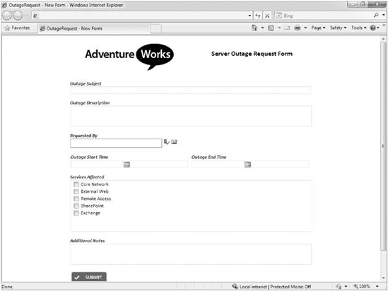
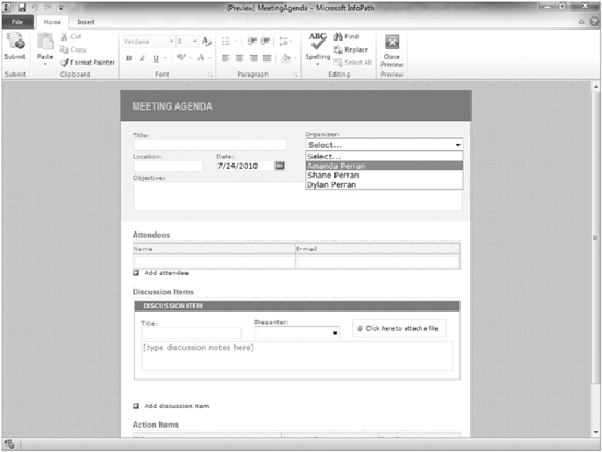
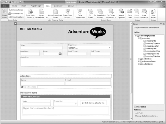
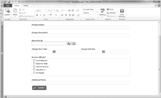
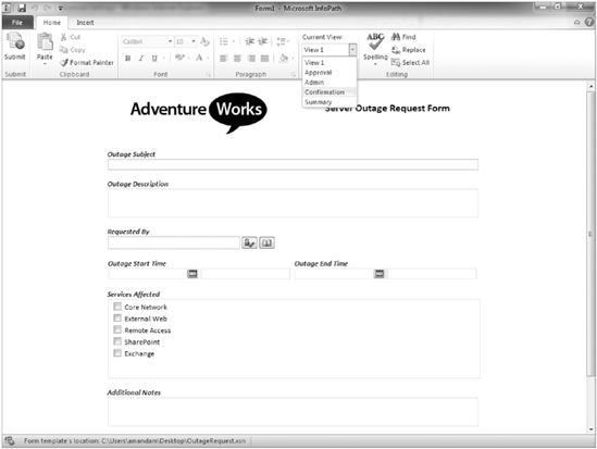
You use InfoPath in situations when you need to improve how information is shared or collected in your organization. One of the primary advantages of using InfoPath is that the interface can be made very simple and intuitive for users to add and complete information. An example of a typical InfoPath form is shown in Figure 12-1.
Before a user can complete an InfoPath form, you must start with a form template, which someone using the InfoPath Designer application creates. An InfoPath form template is a file with an .xsn extension. You then have to publish the template to a location where users can complete the form by adding information. Each time a user completes and saves the form, a new file is created. The data file that is created when a user completes a form has an .xml extensions. For example, if you take the example of the weekly status reports described in the introduction of this chapter, a single form template exists that contains all the required and optional fields that the form should contain. This form template would be published to the SharePoint site using a method similar to that described in Chapter 4 for document libraries or Chapter 6 for content types. Each team member would then click the New button on the Library toolbar to open a new instance of the form. Once the form is completed, the team member would save it to the library and create a new form data file. If there are five members on a team, then each week five new form data files are created in the library as the team members create their status reports. However, there would only be one form template file for the status reports.
To get started with using InfoPath, you must first create or design a form template. In the first Try It Out in this section, you open an existing sample template in Design view and modify a field to make it more appropriate for your organization. You can also make modifications to the form to give it a look and feel that is more appropriate for your organization. This may include adding a company logo to the various form views or adopting a color scheme that matches that of other company documents and interfaces. The second Try It Out in this section illustrates how to do this.
TRY IT OUT: Creating an InfoPath Form
Using a starting point to create a form gives you more time to focus on tailoring the form to fit your needs. In this Try It Out, you modify the existing Meeting Agenda form template to include the names of staff members who typically organize your meetings. You also make this a mandatory field because, in your company, every meeting should have an identified meeting organizer. Giving users a list of values rather than a standard textbox reduces the amount of time it takes users to complete the form. The list of values also allows you to build special views in the SharePoint library so that you can filter them via the meeting organizer. For example, this allows Amanda Perran to select or create a view that only displays meetings that she organizes.
Open the Microsoft Office InfoPath Designer application.
From the New tab of the Ribbon, select Open.
Locate the
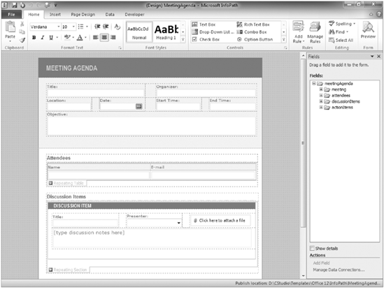
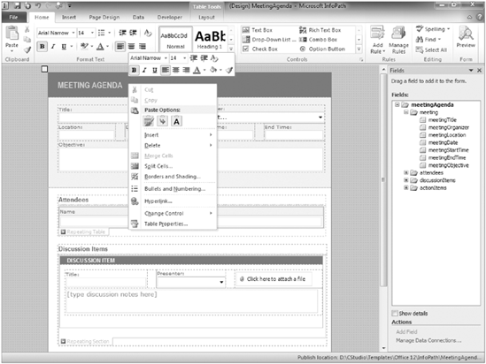
MeetingAgenda.xsnform template from this chapter's materials and click Open. The form will open in design mode as shown in Figure 12-2.Click to select the Organizer field.
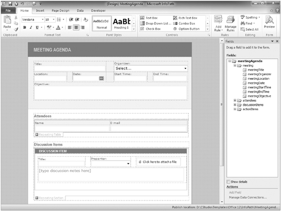
Right-click and select Change Control, then Drop-Down List Box from the menu, as shown in Figure 12-3. Notice that the Organizer field changes from a standard textbox to a drop-down listbox.
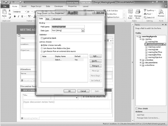
Right-click again, and this time select Drop-down List Box Properties. The Drop-Down List Box Properties dialog box appears, as shown in Figure 12-4.
Check the Cannot be blank checkbox under the Validation section.
From the List box choices section, click Add. The Add Choice dialog box appears.
Enter a name for the team organizer. For this example, enter Amanda Perran in the Value and Display Name fields. When you enter the text for the Value field first, it is automatically added to the Display Name field.
Click OK. You will now see Amanda Perran as a value listed in the properties of the field.
Repeat this process by clicking Add again and entering another team organizer. In this case, enter Shane Perran as a value for the drop-down, and then again enter your own name as a value.
Click Apply.
Click OK.
Save the file on your computer in the location containing the resource files for this chapter. Give the form template a file name of CH12meetingagenda.xsn.
Select the Preview option from the right-hand side of the Home Ribbon menu. Your form opens in preview mode, as shown in Figure 12-5.
You now see that the Organizer field is a drop-down listbox featuring the names you entered in the previous steps.
TRY IT OUT: Customize the Look and Feel of a Form Template
In this Try It Out, you add your company's logo to the form template so that it appears whenever users view or print the form. Branding forms and document templates help create a more professional image for your forms and can help customers identify you as a company. Also, it's good to have a standardized template with a logo for conducting business activities so that people can clearly identify the official company template.
For this example, you make slight look-and-feel changes to the form template. Note that any alterations you make should be reviewed with the appropriate departments in your organization such as communications or marketing. If these departments do not exist in your organization, consider reviewing changes with stakeholders. By allowing others to participate in the design and planning stages, you can increase the probability of solid end-user adoption because you are more likely to directly address their needs and requirements.
Open the form template designed in the previous example called
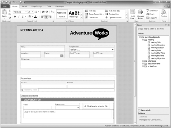
CH12meetingagenda.xsnusing the same method described in the previous Try It Out.Click the header of the form just to the right of the words "meeting agenda" and right-click, as shown in Figure 12-6.
Select Borders and Shading. The Borders and Shading dialog will appear.
Select the Shading tab.
Select the light-blue color. You will notice that the background color of the heading changes to match your selection.
Click the header of the form just to the right of the words "meeting agenda" and right-click.
Select Split Cells. A dialog box appears requesting information on the format you want to create for your table.
Enter 2 for the number of columns, keep the value of 1 for number of rows, and click OK. The table is reformatted as specified.
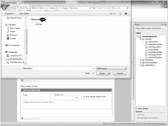
Click in the right-hand column of the header. Select the Insert tab of the Ribbon and select the Picture option. A file selection window appears as shown in Figure 12-7.
Browse to the resource files from this chapter and select
awlogo.png.Click the Insert button. The form will refresh, displaying the AdventureWorks logo, as shown in Figure 12-8.
In InfoPath, the Ribbon, shown in Figure 12-9, contains the most common design activities and concepts related to customizing or developing a form template. By clicking any of the tabs, you get a listing of actions relevant to that subject.
You start with a blank form template, and it launches with fields or controls. You may choose to apply a layout to the form. As you add controls to the form in design mode, fields automatically appear in the form's data source to support the use of these controls. The data source represents all the available fields that have been added to the form template. You can view the data source by clicking the Show Fields option on the Data tab of the Ribbon. Next, you can create various views for the form, which are similar as those discussed in Chapter 4 related to lists and libraries, but in this case they are specifically located in the form. You can basically create a set of criteria that displays your data in different ways, depending on what you want to collect or represent. You then check your design to make sure that it's compatible in the browser where it will operate. Some field types are not suitable for use in a web browser, so when creating a form for the browser, it is important to only include elements that are supported. InfoPath has a Design Checker mode that helps support you with this. Finally, you publish your form template so that others can use it and so that you can begin collecting data.
Note
To learn how to create and publish a form template, see the next section, "Working with Form Templates."
If you are not creating your form from an existing file, you should take time to plan it out. By considering your information requirements in advance and sketching a form out on paper, you can determine what your form and data source elements should be before you even start creating the form template.
The Page Design tab allows you to create tabular layouts in your form to control how information is presented. Quite often, in order to create a form that contains multiple columns of information, you need a table to effectively organize everything. From the Page Design tab, you can:
Insert a predefined layout into your form template that corresponds to your need
Create or change views
Apply style changes or themes to your form
Apply page settings such as margins or print settings
Configure header and footer settings
Once you lay out a form and define its overall structure, the next step is to add the fields that the form will contain. InfoPath offers a variety of controls that can be used to effectively collect and display information in a form, including textboxes, rich text boxes, selection listboxes, data pickers, checkboxes, option buttons, buttons, and sections.
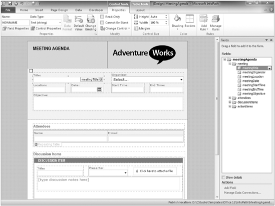
Adding controls is closely linked to creating the form's data source, which is covered in the next section. You can start with a blank form template and create the data source by adding controls to the form. As you add a control to the form, an item is created automatically in the data source to represent that control. You can add a control by selecting the area in the form where the field is to appear and clicking on the control from the Home tab of the Ribbon menu. You should name your fields as you add the controls. You can rename a field by selecting it and editing the name property in the Ribbon menu as shown in Figure 12-10 or right-clicking the field and selecting the control Properties. The name cannot contain spaces and should be intuitive. When you open the Properties dialog box, you will see other aspects of the field that you can customize, such as default values, display options, or selection values. Each type of control has its own set of unique attributes and properties. Some controls are not supported in browser-based forms and are only available when using the InfoPath Form Filler tool for the completion of forms. Therefore, when planning your forms, it is important to consider the medium by which they will be completed and the availability of specific controls to support your requirements.
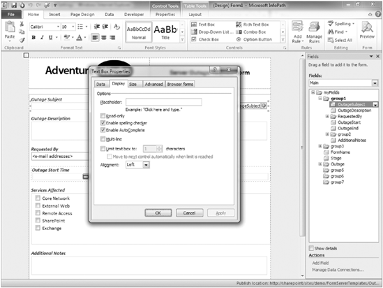
A textbox can hold all sorts of information types such as Name, Phone Number, or Currency. When you edit the properties of a textbox, you can determine what format the information should be stored as by selecting the Data Type. When designing a form using this field type, you can have default values populated based on a user's selection for other fields. InfoPath also supports the use of customizable rules that allow you to perform actions such as show a dialog box message or set a field's value based on the user's selection of an item or activity within the form. You may also include placeholder text that demonstrates to a user the type of information that the field should contain or how they can complete the item. Some of the options related to the textbox control are listed in Figure 12-11, including some of the formatting and display alternatives:
Auto Complete: This option suggests words or phrases to a user as she is completing a form based on previously entered options. Sometimes Auto Complete can make the process for filling out a form easier for the users. However, it is not typically appropriate for forms where information entered may be of a sensitive or confidential nature.
Spell Check: This enables spell checking on content stored in the field.
Multi-line: By using this option, you can specify whether a textbox can include paragraph breaks or if text can wrap. This is helpful for situations where the text may exceed a single line. If you do select Multi-line, you can determine whether the control should allow scrolling or expand to display the text when it exceeds a single line.
Text box limit: This option allows you to specify the number of characters a field can contain. You may use this option when accepting information, such as a phone number or Social Security number, where the number of characters is limited to a fixed number. If you enable the Multi-line option listed previously, this option will be disabled.
Placeholder Text: You can use placeholder text to include suggestions in a textbox or field to represent the text a user might enter or provide instruction on how he or she should complete a field. For example, for a name field, you might have placeholder text that states "Enter Name Here." As soon as a user clicks the field, the text is erased.
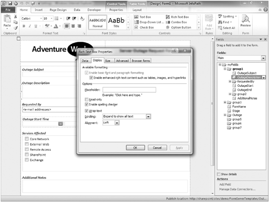
You use the rich text box to collect more detailed information from a user, such as a description or background information. This field type or control has many of the same customization features as the textbox, including spell check, placeholder, conditional formatting, and wrapped text. When customizing this field type, you may choose to support basic rich text formatting or enhanced rich text. An example of the additional formatting options available within an enhanced rich text field is shown in Figure 12-12.
Selection listbox field controls include drop-down listbox, combo box, listboxes, and multiple selection listboxes. Depending on the type of information you are collecting from your users and whether you intend to make the form available in the browser, your implementation choices may vary:
Drop-down listbox: This type of box allows users to select from fixed sets of values. If there are many items, you may select a drop-down listbox to save room because it only shows one item until the user clicks a down arrow. Having too many items can negatively affect the user experience, so consider applying a filter so that only a relevant set of items are displayed based on a user's selection in another field. For example, if the user enters the United States as his country, a field for State or Province selection could be filtered to only display states because there is no requirement to display provinces.
Standard listbox: This option allows users to select from a fixed set of values. The items are displayed in a listing box and are viewable all at once. This is different from the drop-down box for that reason and is typically only suitable when you have less than 10 or so values. Otherwise, the control will take up a large amount of space, and selecting from too large a set of values may be difficult for some readers.
Combo box: The combo box is very similar in presentation to the drop-down listbox; however, it also allows users to enter their own values in a list. Therefore, if the item they want to select is not listed in the drop-down, they can type in their own value.
Multiple selection listbox: The multiple listbox is similar to the standard listbox but contains checkboxes for each item and can also optionally allow users to enter their own values into the list. An example of a multiple selection listbox is shown in Figure 12-13.
Person or Group Picker: This selection field integrates with the membership listing of your SharePoint environment to allow for the selection of users or groups through this field. By using this field type, you can link a user's profile directly within a form rather than merely just entering a textbox with their name. This field is very similar to the person or group column type that was explored in Chapter 4.
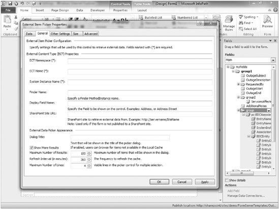
External Item Picker: This selection field integrates with the Business Connectivity Services feature of SharePoint Server to allow for the selection of external business data within an InfoPath form. If an external application has been defined in SharePoint Server through the Business Connectivity Services feature, you may associate it with this field type. An example of the configuration options for defining the data source of this field type is shown in Figure 12-14. Business Connectivity Services is explored in Chapter 15 of this book.
This feature helps a user select a date, which is especially helpful when you have regional variations in date formats. For example, 05/06/07 can represent a completely different day in Canada than it would in the United States. An example of the Date Picker control as seen by an end user on the completed form is shown in Figure 12-15.
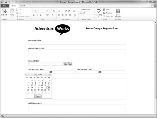
You can configure the Date Picker to contain certain default values including special functions, such as today (), which sets the default date to the current date of when the user is completing the form.
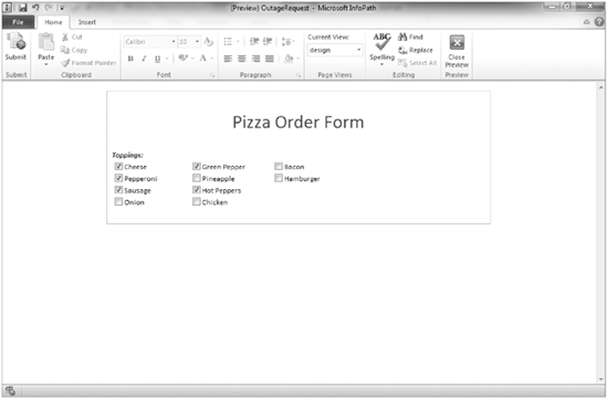
In many of the exercises in this book, you selected a checkbox to enable an option for an application. The same logic applies in a form template. You can have a single checkbox to provide a Yes or No type answer to a question. For example, if a checkbox were associated with a to-do list, a blank box would indicate that the task had not been completed, whereas a selected checkbox would be an indication that task was complete. Alternatively, you have checkboxes that allow a user to select one or more items from a group of choices, as shown in Figure 12-16. While each choice is an individual field, you can group the checkboxes in a section or table for data organization purposes.
The Option button, sometimes referred to as a radio button, gives users a choice between items. Instead of allowing users to select more than one item, you give them a list of choices and only allow them to select one of them. In Figure 12-17, a user can only select a single size when ordering their pizza.
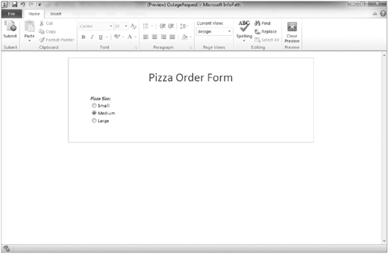
You select how many choices you want to give the user, and you assign each option button a unique ID that makes it easy for you to identify the user's selection.
You can add a button to launch a new activity or series of rules on a form. When the user clicks the button, the activity or rule triggers. You can use buttons to launch a number of actions, including:
Change views in a form
Submit to a data connection
Retrieve information from a data connection
Launch a new form (InfoPath Form Filler Only)
Launch a message window or display box (InfoPath Form Filler Only)
Set the value for a field in the form
Close a form
By implementing rules in combination with special conditions, a simple form template can become a dynamic application and drive specific business processes in a way that is very intuitive and easy to use.
A Picture button has the same capabilities of the button control described previously but has the additional capability of allowing the form designer to select a custom image for the presentation of the button.
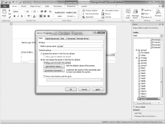
Sections give elements structure and are, therefore, important when you design a form's data source and display needs. You can add, remove, or hide sections within a form template. As shown in Figure 12-18, you can select an option to have a section initially excluded from the form or added by a user. You may choose to hide a section if you want to have portions of your form only appear based on a user's response to a question. For example, if you have a set of questions in your form related to what pizza toppings a user wants on their pizza, you might choose to hide those questions if in a previous answer the user selected that he wanted to order hamburgers.
It is generally a good idea to add sections to your form templates to group information that is similar or related. You should name sections appropriately so that you can better identify a set of related fields within the form's data source.
The previously listed field types are just a few of the standard controls available for use in an InfoPath form. Additional control types include:
Tables: You can include tables in your form for users to complete. Each table can contain a number of fields and may include repeating rows so that users can add more information or items to the table as required.
Master/Detail: In some cases, you may have two controls or sections whereby the selection in one will dictate the detail displayed in another. An example of this might be a product category list and a product details listing. If a user selects a category, the details listing should be reformatted to display only the items related to the selected category.
Lists: A list can be a more informal control that allows a user to add a bulleted or numbered list in his response. You may include a list in a form that asks a user to submit ideas for a new product or accomplishments for a particular time period.
File Attachment: It may be appropriate or beneficial to have a user attach a file to his form instance. This file becomes embedded in the form document and others can access it later when reviewing the form.
Picture: This control allows you to create a field that will either upload and embed a picture in the form, or link to a picture stored elsewhere.
Ink Picture: For users with a drawing tablet or Tablet PC, InfoPath has built-in support for Ink, which allows a user to write directly into a form with a digital pen. This field supports the drawing of an image directly within the form. This field is only supported for forms that will be completed using InfoPath Filler.
Hyperlink: This control allows you to insert a hyperlink into the form whereby you can specify the link to location and display text.
Calculated Value: For more advanced users, this control can be used to enter an XPath expression that can perform advanced calculations on data stored in the form. The results of the calculation are displayed in the form.
Vertical Label: For design purposes, you may want to have a vertical label added to your form. This control presents the form designer with a textbox within which text can be added. This text is displayed vertically on the form. This field is supported only for forms that will be completed using InfoPath Filler.
Regions or Groups: Similar to sections, regions and groups are organizational elements that can be added to pages to support fields or text.
The primary data source of your InfoPath form is basically the skeletal information structure of your form. In order to have a field in the form, it must be tied to an element in the data source. When you create your form by adding controls, data source elements are automatically added in the primary data source for you. You can also have secondary data sources, such as external data connections that you can use to display information in the form. For example, you may have a secondary data source that is a database. You can drag information from your database onto the form and select which fields or controls should be used to display the information.
As described in the last section, the data source is very closely tied to the controls. You should name your fields as you add the controls. This will automatically update the data source. The name cannot contain spaces and should be intuitive. You can also add groups, tables, or sections in your form's data source so that you can easily track elements or items that related to one another.
The primary data source of a form can be imported based on an XML file, or generated from a data connection. The available options for creating a new form from a data connection are displayed in Figure 12-19. This approach is more advanced; a formalized data structure is imported into the form and then controls are added to the form to represent the data.
If you are not creating your data source from a data connection or XML schema file, you should take time to plan it out. Consider your information requirements, and sketch a form out on paper. By considering what some of the information requirements are in advance, you can generate a good idea on what your data elements should be before you even start creating the form template.
Note
When you remove a control from a form's view, you do not remove the field from your data source. Views are discussed in the next section.
In addition to the primary data source of a form template, additional data sources become available as new data connections are added to the form. An example of this can be seen in Figure 12-20.
Similar to the behavior of the primary data source, you can drag elements within a secondary data source onto the page. This can help provide some data reporting from external data sources within the form itself. You can add items either as sections or tables and then format them as required. For example, in a form template that tracks information about a customer, the primary data source of the form may contain items such as the customer's phone number, company name, and email address. And you might create a secondary data source that connects to the orders database. You can drag information from this secondary data source onto the form to show a salesperson all the products the customer has purchased.
In Chapter 4, you saw how to create custom views for lists and libraries to display different records and columns from a single data source. With InfoPath, you can also create multiple views from a single form. The views can either act as reports or pages in a form where they can represent completely unique steps related to the completion of a process. For example, you can have a form template with four different views: one for customer requests; a second that logs troubleshooting issues that an employee must resolve; a third that tracks correspondence with customer; and a final one that tracks customer's comments on the level of service they've received.
Views can be created from the Page Design tab of the Ribbon menu by selecting New View. When a view is created, it is blank. The Form Designer must drag layout elements such as tables onto the form and add controls as needed. A single field can be added to multiple views. For example, you may have a field for customer name. You can add this field to every view in your form. You can also change unique characteristics related to the presentation of the field on each view. While the data remains the same, the presentation of a field on each view can be slightly different. For example, on one page the customer's name may appear in large bold letters in Read-Only format, and on another it may appear in a drop-down box. However, the data of the field remains the same. Therefore, if "Graphical Wonder" is listed as the customer in one view, it will also be listed on all other views in that field.
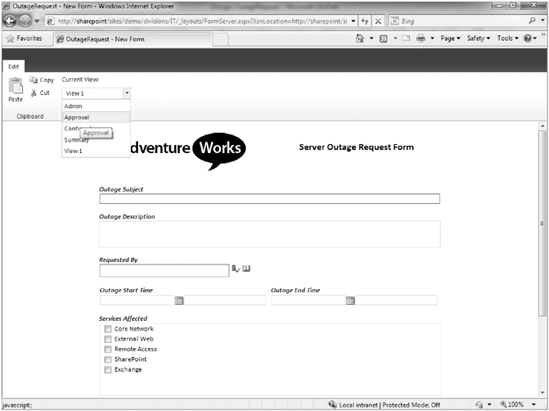
You can use buttons on views to toggle between each of the available views. In some cases, multiple views and buttons can be implemented on a form to collect information from a user in steps. You essentially add a button to a view that, when selected, will launch another view using the Rules capabilities of buttons. This replicates the experience of a wizard and can help simplify the experience of the user as she completes the operation. If you don't use custom buttons, you can have users switch between various form views within the InfoPath Filler application using the Current View menu, as shown in Figure 12-21.
A similar view selector may be enabled on the toolbar of browser-based forms as shown in Figure 12-22. This is an optional setting that can be configured in the Advanced Form options that is available from the File menu.
As previously stated, not all form controls are supported for use within browser-based forms. Therefore, you need to consider who the audience for your form will be and how they will access the form. If the form has to be available for use on the browser, careful consideration is required to ensure that the experience is positive. This may seem like a lot to understand if you are just getting used to creating these forms. Therefore, a Design Checker exists with the InfoPath application to guide you by highlighting anything you may have in your form that would not be compatible with the browser or previous versions of InfoPath.
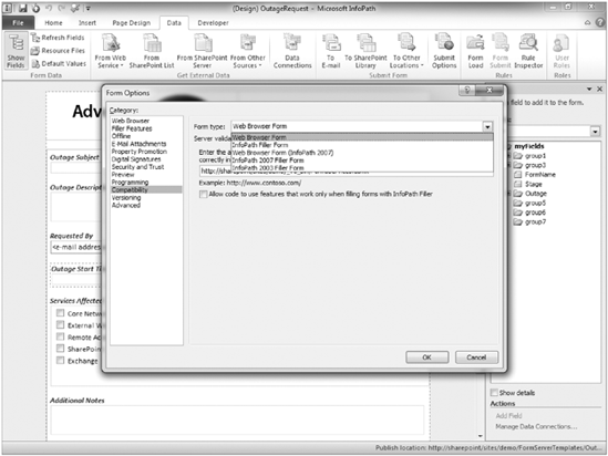
If you decide that a form should be browser-compatible after you have already begun the form design process, you can change the setting by selecting the Web Browser Form within the Compatibility settings under Advanced Form Options, as shown in Figure 12-23.
Another option in this same interface is a URL to test whether the form will be compatible with the destination SharePoint server. If you specify a URL, the Design Checker displays alerts and messages indicating items in your form that may affect compatibility with either the browser or older versions of the application.
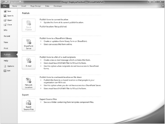
You can always save a template in a location for your personal use and to edit further, but to make your form available to others, you need to publish the template to a central location. You can publish an InfoPath form template to any of the following locations:
A SharePoint Server with Enterprise Features (supports browser-based forms or the use of InfoPath Filler)
A SharePoint Server with Standard Features (requires InfoPath Filler)
A SharePoint Foundation Server (requires InfoPath Filler)
A shared network location such as a file share (requires InfoPath Filler)
An email message to recipients (requires InfoPath Filler)
Depending on the environment in which you are working and what tools you have available, you may select any one of these options when completing the Publishing Wizard.
Note
The next section, "Working with Form Templates," walks you through examples of publishing an InfoPath form to a SharePoint server, including directly publishing a form to a document library, creating an InfoPath Form content type, and uploading an administrator-approved form template.
If you publish your form template to any of these locations, you must save a local copy of the template on your computer. If later you want to make updates to the form template, you can make them to your local copy and complete the Publishing Wizard to update your form template in its shared location. However, you should be confident that no edits were performed directly on the template in its shared location. If there are edits, then you may overwrite them by publishing an older version of the form. It is a good idea to identify and define development policies and procedures related to your organization's custom InfoPath forms to ensure that such situations do not occur. Once the initial publishing process has completed, future updates can be delivered to the server using the Quick Publish feature. This republishes the form using the same settings as previously defined in the last publishing process.
Now that you know the design-related functions of an InfoPath form template, you can start creating some actual form templates that can help you collect and view information. This section discusses creating a new form template and then addresses some options for publishing and customizing the form to further meet the business requirements.
Before you can begin creating a new form, you need to figure out the form's requirements. This might involve gathering information from the group or sponsors who are requesting the form. However you gather the information, you should know the following:
What types of information should the form collect?
How should you present the information, and what special rules are there for submitting the information? For example, you should create Name and Email fields because they are required to contact employees after they submit feedback.
How should you format the Data fields? For example, you may apply special formatting or filtering that disables a field based on a user's input in another field. This is helpful to ensure that users only have to deal with the fields they are required to complete.
Is there additional data that is stored in an external system that should be available within your form?
Once you have the information that you need, it's time to do the actual work of creating the form template.
Although there are many steps in the next Try It Out, they represent a small portion of the steps required to create the most basic of electronic forms. In the second Try It Out of this section, you look at the functionality of InfoPath related to creating reusable template components called template parts.
TRY IT OUT: Design a New Form Template
For this Try It Out, you first set up the layout of the form. This helps mold the canvas for how the form will look. It is also recommended that prior to opening the InfoPath application you should always sketch out how you want the form to look on a piece of paper. This is something that can be helpful for collecting feedback from your sponsors prior to starting any development work. As you see in the Try It Out, sometimes there can be many steps to even creating the most basic of forms. Therefore, it is always a good idea to have a solid roadmap before you even start.
Once the layout is defined, you begin adding controls and creating the data source. In this situation, every time you add a new control to the page, it creates a new data source field. You name the fields as you go along to keep things organized and easy to follow. This is very important as forms become more complex and large numbers of fields are created.
Open the Microsoft InfoPath Designer 2010 application. The new form template selection window will appear.
Select the option to create a blank form. On the right-hand side of the window, your selection will be displayed as shown in Figure 12-24.
Click the Design Form button. A blank form template will open.
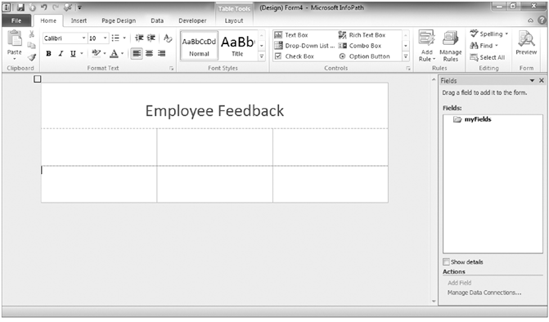
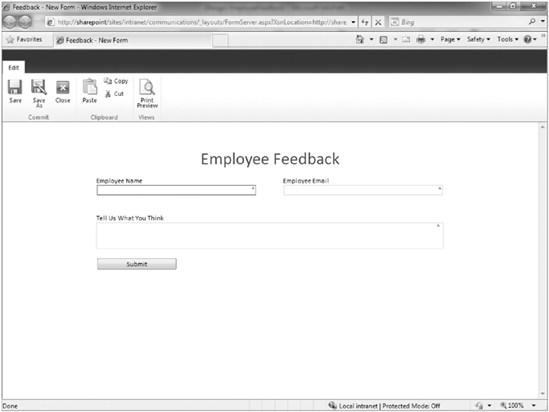
Click in the title area and enter Employee Feedback for the form title.
Click within the second row of the form template, and select the Layout tab of the Ribbon.
Select the option to Split Cells. The Split Cells dialog will appear.
Enter 3 as the value for columns and 2 as the value for rows.
Click OK. Your new form layout will be displayed as shown in Figure 12-25.
Select within the area of the first row and column of your table and right-click to select the Table Properties menu option.
Enter 300 px for the width of the left column.
Click the Next Column button. The middle column will be selected.
Enter 50 px for the width of the middle column.
Click the Next Column button. The right column will be selected.
Enter 300 px for the width of the right column.
Click Apply and then OK. The table properties dialog window will close, and you will be returned to your form.
Click within the left column of the first row, and enter the words Employee Name.
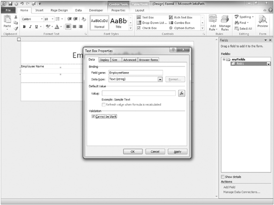
From the Home tab of the Ribbon, select the Text box control. A new textbox field will appear below the Employee Name label.
Right-click on the field, and select the Text Box Properties option.
Specify EmployeeName for the field name.
Check the Cannot be blank setting checkbox, as shown in Figure 12-26.
Click Apply, then OK.
Click within the right column of the first row, and enter the words Employee Email.
From the Home tab of the Ribbon, select the Text Box control. A new textbox field will appear below the Employee Email label.
Specify EmployeeEmail for the field name.
Check the Cannot be blank setting checkbox.
Click Apply, then OK.
Select the last row in the table with your mouse to highlight each column.
Select the merge cells option from the Layout tab of the Ribbon menu.
In the newly merged row, enter the text Tell Us What You Think and press Enter.
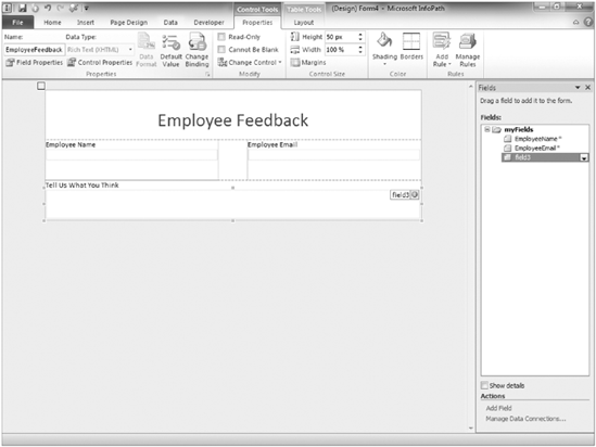
From the Home tab of the Ribbon menu, select the Rich Text box. A new field will be added to the form.
Select your newly created field, and click the Properties tab of the Ribbon menu.
Enter EmployeeFeedback in the name field, as shown in Figure 12-27.
Select the Cannot be blank checkbox from the Ribbon.
Select the entire table within your form. This is most easily done by selecting the box that appears at the very top left of the form whenever you click within a table cell.
Select the Cell Padding option from Layout tab of the Ribbon menu.
Enter 10 px for the Left and Right cell padding options.
Click the Apply the OK buttons. You will notice that the form will refresh displaying more space around each of the form fields and labels.
From the File tab, select the Save as button.
Save the form in the folder containing this chapter's resource files using the name EmployeeFeedback.xsn.
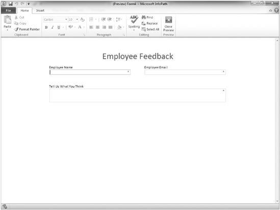
From the Home tab of the Ribbon menu, click the Preview button.
How It Works
After you finish adding fields and save the form, you preview it. Figure 12-28 demonstrates that each field has a special character within it that communicates to the user that the fields are required.
TRY IT OUT: Create a Template Part
In the last Try It Out, you looked at the process for creating an entire form template. However, a fantastic feature in InfoPath is the ability to create reusable components called template parts. A template part is a section or group of controls that may have specific fields, data connections, or customizations that could be potentially reused across multiple form templates. For example, consider a common contact form. It generally contains a name, email address, phone number, and address. In fact, many other forms also contain this information. Therefore, it's beneficial to create template parts containing each of those items so that they can be easily added in the future to all other forms requiring those components.
Select the option to create a blank template part.
Click the Design Form button. A blank form template will appear.
From the Controls section from the Home tab of the Ribbon menu, select the Section control. A blank section control will appear in your form.
Right-click on the new section control, and select Section Properties.
Enter ContactInformation as the name of the section.
Click the Apply and OK buttons.
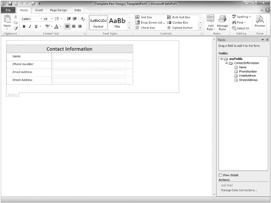
Insert a table and add four new textbox fields to your form, as shown in Figure 12-29, to represent the name, phone number, email address, and street address fields.
Apply your desired configuration settings to the four fields. When finished, select the Save as option from the File tab of the Ribbon.
Save the form using the name ContactInfo in the folder containing this Chapter's resources.
Close the form.
From the File tab of the Ribbon, select the option to create a New Blank Form using the same steps described in the previous Try It Out.
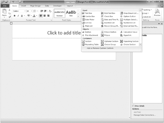
Expand the controls section of the Home menu, as shown in Figure 12-30.
Select the option to Add or Remove Custom Controls. A dialog box will appear.
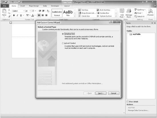
Click Add. The Add Custom Control Wizard will appear, as shown in Figure 12-31.
Select the option to add a Template Part, and click Next.
Browse to the location of your Contact Info Template part that was saved in step 10.
Click Finish.
Click Close.
Click OK.
How It Works
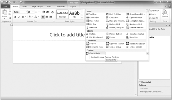
The custom template part that you created will now be available for use within the Controls section of the Home menu, as shown in Figure 12-32. In future scenarios where a form template calls for a combination of name, email address, phone number and street address fields, this control can be dropped onto the form.
In the previous example, you created a very simple form for users to fill out to provide feedback to a communications group within an organization. Once a form template is created, it must be published to a location where users can fill it out. As previously mentioned in the introduction of this chapter, SharePoint includes support for browser-based forms, an Enterprise server feature that allows for users to complete InfoPath Forms via the browser so they do not require the InfoPath application. In order for a site to support this functionality, this Enterprise feature must be activated on the site collection and the site to which the form is being published.
In the next Try It Out, you create a new SharePoint site named "Communications" which uses the Blank site template. Creating a new site is not a requirement for publishing a new form template; however, because you will be adding very specific lists for use by this form, you will create a brand-new site from which to work. Once the site is created, you explore the process for publishing a form template to a document library. Finally, in the last Try It Out of this section, you learn how to configure a document library to ensure that all users have the same editing experience, and specify that the form be opened as a web page in a browser regardless of whether the user has the InfoPath application installed on their computer.
TRY IT OUT: Publish a Form Template to a Document Library
From the Corporate Intranet Site created in Chapter 1 of this book, create a new site based upon the Blank site template, called "Communications."
Note
Detailed steps for creating a new site are described in the first Try it Out of Chapter 2.
Open the Microsoft InfoPath Designer application.
Select Open from the File menu.
Locate the
employeefeedback.xsntemplate that you created in the first Try it Out of this chapter, and click Open.Select Publish from the File menu. The Publish window will appear as shown in Figure 12-33.
Enter the URL of the site you created in the first step of this Try It Out.
Click Next.
Ensure that the checkbox is selected to enable this form to be filled out using a browser.
Select the option to publish to a Form Library, and click Next.
Select the option to create a New Form Library, and click Next.
Enter Feedback as the name of the library.
For Description, enter the following:
Electronic form for collecting feedback from employees on new communications web site.
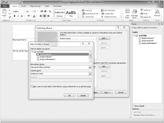
Click Next. The wizard will continue to the field selection stage of the publishing process.
Click Add.
Select the EmployeeName field from the list of fields, as shown in Figure 12-34.
Click OK.
Repeat steps 16 and 17 for the remaining fields in the form.
Click Next.
Click the Publish button. Upon the successful publishing of your form, you will receive a confirmation window containing a link to view the form within the browser and to open the form library.
How It Works
In this example, you created a new document library on the communications sites as part of the form-publishing process. This document library has the form template associated with it so that whenever a user enters the site and clicks the New button, the form is launched.
During the publishing process, you chose to promote specific fields within your form template to become columns within your document library. This allows you to see the contents of the forms in a view in the library without having to open each form individually. This makes it possible to create custom reports on data stored within a document library.
TRY IT OUT: Force a Form to Open as a Web Page
In the next Try It Out, you will review how you can change the setting on the document library to enforce everyone to open the form within a browser. In some situations, this technique will be used to ensure that all users have a consistent experience when completing forms. As well, it helps control the interface so that only items exposed within a specific view are displayed to the user. Depending on the default settings of your server, form libraries may already be configured to open forms in the browser by default. This same process can be used to force the form to open in either the browser or the InfoPath Filler application.
From the main page of your communications site, click the All Site Content link.
Click the Feedback link to enter the document library.
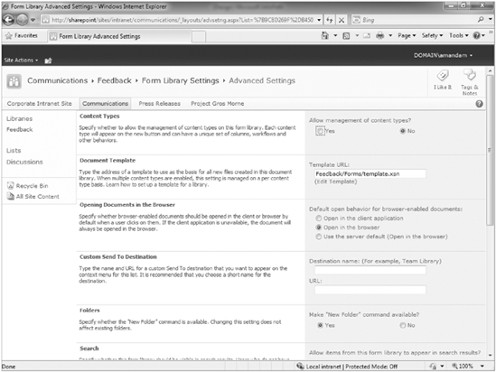
Select the Library Settings option from the Library tab of the Ribbon.
For the Opening Documents in the Browser value, select Open in the browser, as shown in Figure 12-35.
Click OK.
Return to the document library by clicking Feedback in the breadcrumb navigation.
Click the New Document option from the Document tab of the Ribbon.
How It Works
As previously described, in some situations it may be necessary to ensure that all users open a form as a web page regardless of whether or not they have the InfoPath Filler application installed. In this exercise, you modified the properties of the document library to ensure that all browser-enabled documents, including InfoPath forms, are opened in the browser.
Now that you have published your form template to the site, users can enter the site and complete the form template. When they are done, they can save the form back to the library by using the toolbar buttons. However, after giving the matter some consideration, you have decided that it would be nice to add a Submit button to the form, which will save the document back to the library and name it automatically. This is the subject of the next section.
Once a template has been created and published to a library, it can still be edited and enhanced to further address business needs. As a form designer, you should consult with business users to identify ways in which the form can evolve to better suit their needs. This may include improving how data is submitted or saved to a library as well as how the form is presented to users.
In this section, you are going to review some of the enhancements and changes you can make to a form template that might make it a more effective tool for a team. In the first Try It Out, you look at how you can add a button to a form as well as a submit a data connection that will save the form to a destination library without requiring a user to select Save As from the File menu. These approaches helps ensure that a proper naming scheme is followed for saved forms because the name can be derived from form data upon submission. As well, it makes the user experience better for those completing the form because they do not have to bother with understanding the details of where and how they should save the form. Once you add a Submit button, there may no longer be a need to expose the Save buttons on the form's toolbar to users. Therefore, in the next Try It Out of this section, you learn how the form's toolbar can be customized to suit your needs. You then look at how a data connection can be added to a form template to retrieve information from another content source.
TRY IT OUT: Add a Submit Button to a Form Template
In some cases, rather than having users select Save As and manually name their form file, it's more appropriate to offer a Submit button at the bottom of the form that users can select when they complete the form. This makes the submission process easier because the users do not have to be concerned with where the file is being saved and what the filename will be.
In this exercise, you edit the Employee Feedback form to include a Submit button that will save the file to your library and automatically generate a name based on information stored within the form.
Open the Microsoft InfoPath Designer application.
Select Open from the File menu.
Locate the
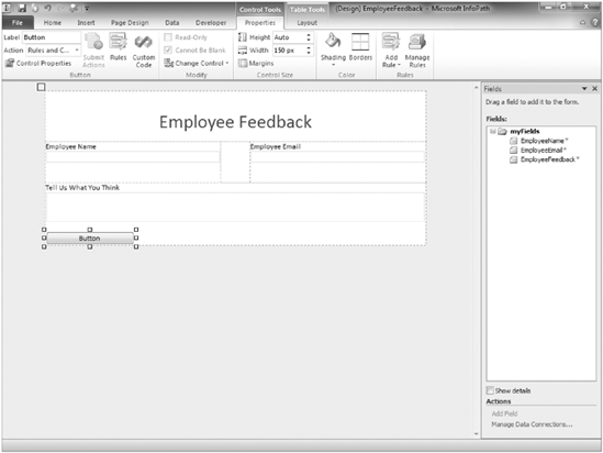
employeefeedback.xsntemplate that you created in the first Try it Out of this chapter, and click Open.Add some space to the bottom of your form by selecting to the right of the Employee Feedback control and pressing Enter twice.
Add the button control from the Controls section of the Home Ribbon.
Select the button and select the Control Tools Ribbon. The Properties tab of the Control Tools Ribbon will appear, as shown in Figure 12-36.
Enter Submit in the Label field.
From the Action drop-down, select Submit. The Submit Options window will appear.
Select the option to allow users to submit the form. The submit options will become enabled.
Select the option to Send form data to a single destination and select SharePoint document library from the associated drop-down menu.
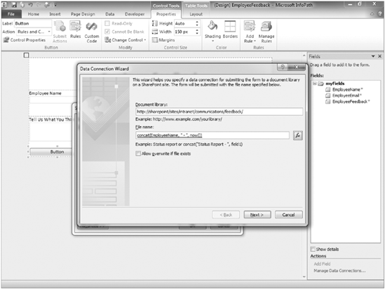
Enter the URL for the document library you created for feedback forms. If you are unsure of the exact URL, visit the document library and copy the URL. Be sure to only include the URL of the library and to remove the portion of the URL that includes the text "Forms/AllItems.aspx" or similar text. An example is shown in Figure 12-37.
For the Filename field, click the fx button to the right of the field.
Enter the following into the Formula field, as shown in Figure 12-37.
Check the checkbox Allow overwrite if file exists.
Click Next.
Click Finish.
Click OK.
Complete the form with sample data, and click the Submit button.
Return to the Feedback library of your Communications site, and you should see a form successfully submitted to the library, as shown in Figure 12-38.
How It Works
In this example, you made a modification to the form template to allow users to more easily submit their changes to the document library. Previously, you had to rely on users to click the Save As button from the toolbar or menu. From that point, users were required to name the file on their own. This could lead to major inconsistencies in naming practices and the ability to easily identify specific differences between forms.
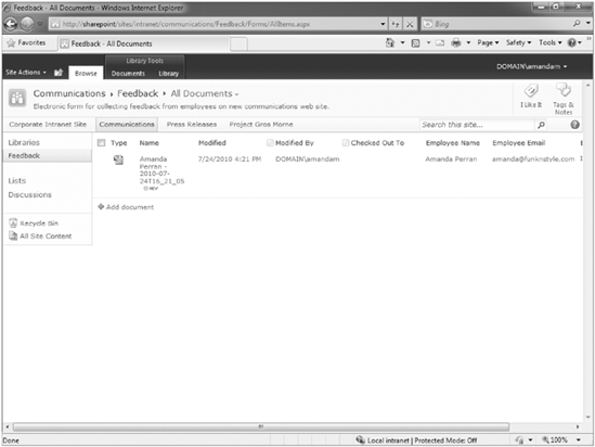
You implemented a Submit button on the form. There were a number of different methods you could use to submit the form, including the use of Web Services or email. However, in this situation, because all completed forms are being saved to the same document library you are using to launch the form, it makes sense to use the Submit to Document Library option.
In addition to specifying where you can submit a form, you can also select how the form should be named and whether items with the same name should be overwritten, along with what actions take place once the form is submitted. In this situation, you chose to name the forms based on the name of the employee submitting the form in addition to a special set of characters known as now(), which define the exact time the form was submitted. While this does not create a visually appealing filename, you can be sure that it will be very easy to identify who submitted each form, and you can ensure that filenames will be unique. You also determined that if a file was updated and resubmitted, then the existing form record should be overwritten rather than creating a completely new record.
TRY IT OUT: Customize the Browser-Based Form Toolbar
Typically, once such an update is made to a local copy of the form template, the changes should be immediately published to the SharePoint document library again. However, there is still another set of changes that need to be made to the form to make it more usable and intuitive. In Figure 12-39, you see a screenshot of what the form looks like in its current form.
The users now have to choose between the custom Submit button, a Save button, and a Save As button. This can lead to some users choosing to save their forms using their own naming structure, and thereby eliminates any benefits associated with a standardized naming scheme that has been introduced with the custom button. Most importantly, for a very simple form you are offering users far too many choices. This leads to confusion and possibly even frustration. So in this example, you customize the toolbar that is automatically added to the browser-based forms to only display the Print View option because this is something that users might find useful. In addition, because your form is fairly simple and small, you will remove the Footer toolbar because you don't need it in this form.
Return to your local copy of the Employee Feedback template featuring the changes implemented in the previous example.
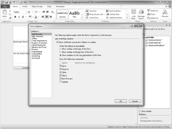
Select Form Options from the File tab of the Ribbon. The Form Options will appear, as shown in Figure 12-40.
Select the option to Show toolbar at the top of the form.
Unselect all commands except Print Preview.
Click OK.
From the File tab of the Ribbon menu, select the Quick Publish option. You will receive a message confirming the operation has completed successfully once the form has been published.
How It Works
In this example, you used the Form Options menu to customize what commands are displayed in a toolbar when users view the form via the browser. You did this to simplify the interface so that users can easily identify what they should select when it comes time for them to submit their information to the site. As in most cases, it is far more important for users to focus on the information they are submitting rather than the steps they are taking to submit it. Once your changes were complete, you used the Quick Publish option in InfoPath to republish your changes to the previously published location.
TRY IT OUT: Add a Data Connection to a Form Template
So far, you have reviewed how to create a custom template that supports browser-based viewing and editing. You created a data connection in the form template to allow for the form to be submitted to the document library using a standardized naming scheme. However, you can also use data connections to display information in a form from an external data source, such as a database, web service, or SharePoint site.
In this example, you discover how data entry can be made easier by allowing information to be pulled directly from a central source. For this example, you will use the user information list from your site collection. If for some reason you are unable to query that list, you can create a custom list on your site containing a field for Employee Name and Work Email Address and use that list as a data source.
Return to your local copy of the Employee Feedback template featuring the changes implemented in the previous example.
Select the EmployeeName field from the form's Design view, and click the right mouse button.
Select Change Control, then Drop-Down List Box. The field is transformed into a drop-down listbox.
Select the employeeName field from the form's Design view, and click the right mouse button.
Select the Drop-Down List Box Properties option. The properties window appears.
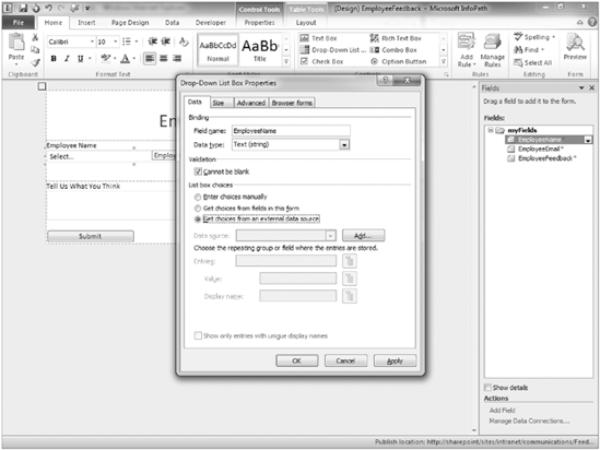
From the List Box Choices section, select Get choices from an external data source option, as shown in Figure 12-41.
Select the Create a New Connection To option button, and select Receive Data.
Click Next.
Enter the URL of the top-level site of your site collection. A listing of all lists in that site is returned.
Select the User Information list.
Click Next.
Select the Name and Work Email fields, and click Next.
Select the checkbox to store a copy of the data in the form template.
Click Next.
Retain the default settings for the data connection name and synchronization settings.
Click Finish.
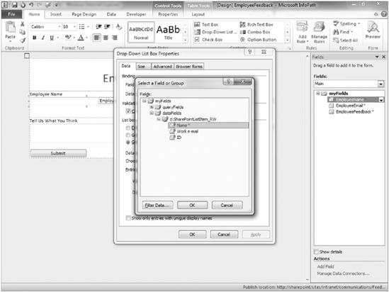
Click the button to the right of the Entries field.
Expand the groups and select the Name field, as shown in Figure 12-42.
Click OK.
Click the Apply button, then OK.
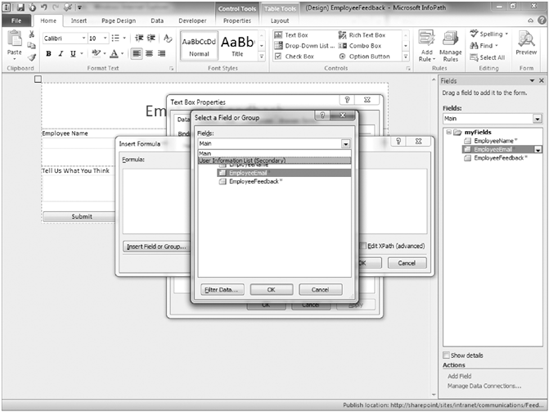
Right-click on the EmployeeEmail field and select Text Box Properties.
Select the fx button to the right of the Value field.
Click the Insert Field or Group button.
From the Data Source drop-down, select User Information List (Secondary), as shown in Figure 12-43.
Expand the Data Fields group along with SharePointListItem group to view available fields.
Select the work_e-mail field.
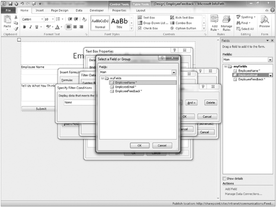
Click the Filter Data button.
Click Add to create a new rule for the filtering.
Select Name for the left-hand drop-down.
For the right-hand drop-down, choose the Select a Field or Group option.
Change the data source back to Main and select EmployeeName, as shown in Figure 12-44.
Click OK on all open windows to commit changes.
Click the Save button on the File tab to ensure that your changes are committed to the template.
How It Works
When you first created your feedback form, you allowed users to enter whatever they wanted into the User Name field. As a result, you had mixed results because sometimes users would enter their first name and not their last, or enter their employee user ID, or, in a rush, would make a typo or misspell their name. This makes reporting on the data difficult. Instead of allowing users to enter their name in a textbox, you decided to let them select their name from a drop-down list of choices. In addition, rather than manually maintaining this list of users, you can draw the value list from an external data source. In this case, it made sense to look up the users who were members of the SharePoint intranet site because these were the users you would be collecting information from directly.
In addition to a requirement to standardize the data that was being entered for name, you recognized a need to reduce and simplify the data entry experience of users as they were completing the form. For example, it seemed somewhat ridiculous to some users to specify their email address because they were logged in to the network as registered users. Therefore, the organization should already have an email address associated with them. You did not want to just strictly remove the field because your goal might be to later email all users who complete the form. Therefore, you decided that it would be useful to retain the Email Address field but have its value auto-populated based on the selection of a user's name.
Therefore, you added a new data connection to the form template that looked up the user information list of the site collection. You specified that the information contained in this list should be available within the form itself. This allows you to open and interact with the external data when you are offline or detached from the network. A cached local copy of the data will be available to users to while they are offline. From the data connection, you selected the name and work email fields to be added to the form's secondary data source.
Once the data connection was configured, you connected the drop-down listbox to the data connection. By default, all names are returned and displayed in the drop-down listbox. However, if required, with additional filtering you can display only a certain subset of users. You then configured the default value of your email address to be the email address specified for the user on the team site who had the same name as the value selected for EmployeeName within the form.
When you click the Preview button after making the changes, you should see the names of users from your communications site displayed in the drop-down listbox. As you select a user, you should see that user's email address appear in the Email Address field of the form. If you do not, the user may not have a specified email address within her SharePoint user profile.
Once you finish your updates, it will be necessary to publish these changes to the SharePoint server again to update the template associated with the library.
In the section "Publishing a Form Template to a Library," you learned how a form template is published to a single document library. This approach is suitable for scenarios where a form is only required in a single location and where multiple groups or sites do not reuse the form. However, you may need to make a form template available to multiple sites in a site collection or multiple site collections. In each of these cases, you can choose one of the advanced form publishing options.
For scenarios where you want to publish a form template to multiple sites or libraries in the same site collection, the optimal publishing choice is to publish as a Content Type. In Chapter 6, you learned how content types can be associated with multiple libraries and locations in a single site collection. In the first Try It Out of this section, you publish your employee feedback form template as a content type so that it can be added to multiple libraries. Because the data connection is added to submit your form to a central location, you do not have to worry about users saving the form data in multiple locations.
In some situations, you may have a single form template that you want to make available in multiple site collections. In this case, you would choose to upload your template as an Administrator-Approved form template via the Central Administration site. From there, form templates can be activated to site collections from one central location. This method is also the only supported choice for advanced form templates containing custom code or highly complex data connections. In the second Try It Out of this section, you walk through the process of uploading a form template to the Central Administration site and activating it out to a site collection.
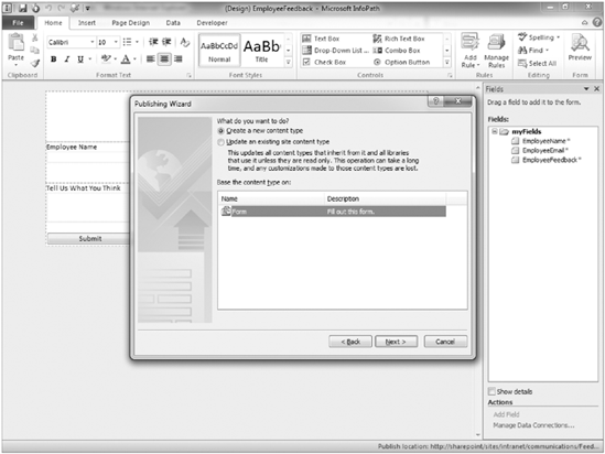
TRY IT OUT: Publish a Form Template as a Content Type
You now know how to publish a form template directly to a SharePoint document library. The next step to look at is the process for creating a content type by publishing a form template. For this example, you use the Feedback form created in the previous section. However, you open it in Design view and choose a different publishing location and type. You will publish the form template as a content type so that you can deploy it to multiple sites in the site collection.
From the File tab, select the Publish option.
Select SharePoint Server from the list of Publish choices.
Because you have previously published this form, an existing URL may already exist. Remove it and enter the URL of your corporate intranet portal (example:
http://servername), and click Next.Check the Enable the Form to Be Filled Out by Using a Browser checkbox.
Select Site Content Type (Advanced).
Click Next.
Select the Create a new content type option, as shown in Figure 12-45.
For the name of the content type, specify Employee Feedback Form and enter the following for the description:
This content type is an electronic form for collecting feedback from employees on various communication methods and promotions. All content submitted using this content type will be directed to the communications site.
Click Next.
Click the Browse button to specify a location where the form template can be stored within the site collection.
Enter the name in the Filename field as employeefeedback.xsn.
Click Save.
Click Next.
Verify that the appropriate fields have been selected to be promoted as columns to document libraries within the site collection, and click Next.
Click the Publish button. You will receive a confirmation indicating that the form template was successfully published.
Click Close to complete the wizard.
How It Works
After reviewing the number of responses you receive from the feedback form, you notice that not enough people were coming to the site to complete the form. Therefore, you decide it makes more sense to push the form template out to other sites in the site collection because quite often users are more inclined to complete a form from their own workspace rather than take the time to visit other workspaces. One of the primary advantages of a content type is being able to add a single content type to multiple locations throughout a site collection. Using the previously explored method of publishing directly to a document library, the form template could only be pushed out and associated with a single library. There would be no way to add it to other libraries without republishing it manually in a series of redundant and unrelated processes. Because the submit and receive data connections are still associated with the form, even if the template is added to a document library in another site, completed forms will still be submitted directly to the specified document library on the communications team site.
To add the InfoPath content type to a document library on other sites, you use the same process as was explored in Chapter 4. Similarly, you can apply all the same features available to content types to this form template including the association of workflow processes, information policies, as well as additional site columns.
TRY IT OUT: Publish a Form Template as an Administrator-Approved Template
You may have a single form template that you are required to share with users across multiple site collections or a form template that was created using advanced development techniques and custom code. For each of these situations, you are required to use the Administrator-Approved Upload technique as described in this example. The example shows how to publish a form template to an administrative area of the portal so that it can be activated and published to multiple site collections. You typically use this method for complex forms that contain custom code, use advanced functionality, or must be created as content types across more than one site collection. In this example, you use one of the sample forms available with InfoPath to keep things simple, but recognize that this is the method most commonly used for custom-developed complex forms.
From the File tab, select the Publish option.
Select SharePoint Server from the list of Publish choices.
Enter the URL of your corporate intranet portal (example:
http://servername), and click Next.Check Enable the Form to Be Filled Out by Using a Browser checkbox.
Select Administrator-approved form template (Advanced).
Save the file locally to the folder containing all resource files for this chapter. Name the file feedbackformtemplate.xsn. Click Next.
Select any fields from the form that you want displayed in document libraries as columns, and click Next.
Click the Publish button. You will receive a confirmation indicating that the form template was successfully published.
Click Close to complete the wizard.
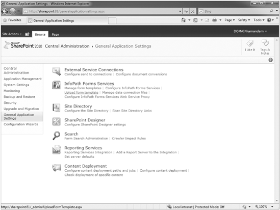
Go to the Central Administration site for your SharePoint server. If you do not have access to this site, you will require assistance from your server administrator to complete this exercise.
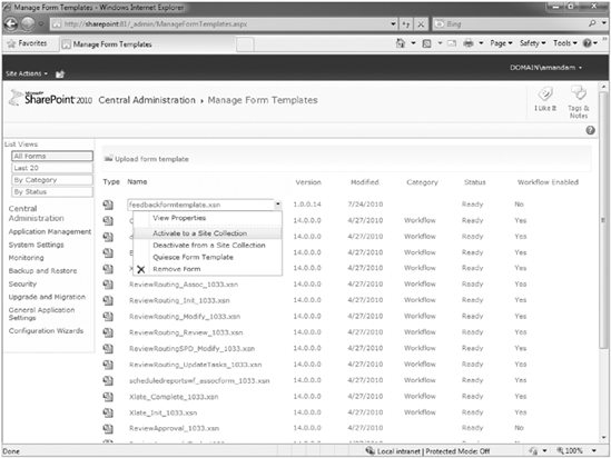
Select Upload Form Template from the InfoPath Forms Services group, as shown in Figure 12-46. The Upload Form Template page appears.
Browse to the location where you saved the
feedbackformtemplate.xsntemplate in Step 8. Select the form and click Open. You are returned to the Upload Form Template page.Click the Upload button. You receive a success message.
Click OK.
The final step in this process is to activate the form template in a site collection. Hover over the form's name in the list of form templates and select Activate to a Site Collection from the drop-down menu, as shown in Figure 12-47.
Select your Corporate intranet site collection as the Activation Location. You may need to change the default value to do this.
Click OK.
How It Works
In this exercise, to publish the form template, you first had to save it locally as is required for publishing all form templates. Next, you defined where you want to publish the template. You then had to save the form a second time. The most common reason for this second save is that in many organizations, the person creating the form is not necessarily the person with the rights to perform the upload operation. Instead, the form's creator saves the form template to a shared location on the network where a server farm administrator can access the form and complete the operation.
Once you completed the Publishing Wizard, the form was prepped for uploading. However, the upload had to take place from the SharePoint Central Administration site. From there, the form template was uploaded from the shared location. Once it was uploaded, it was then activated in the site collections where you intend to use the form. The activation process created a content type within the site collection using the Microsoft Office InfoPath group name.
This chapter discussed how a Microsoft Office application for creating electronic forms can be used and integrated with SharePoint, using InfoPath Forms Services.
You looked at how InfoPath has evolved since its last release, including support for browser editing and viewing of form data, as well as enhanced support for external data connections and controls.
You learned about the various design-level tasks and elements associated with an InfoPath form, including its layout, controls, data source, design check, and publishing functions. You saw some of the standard controls you can add to a form, as well as what some of the publishing possibilities are for a form template.
This chapter offered several step-by-step examples showing how to create form templates and use them within SharePoint. After reading this chapter, you should feel comfortable planning, designing, and developing InfoPath form templates that can map directly to specific business activities within your organization and improve the efficiency and effectiveness of collecting information from users.