
WHAT YOU WILL LEARN IN THIS CHAPTER:
What web parts are
How to add and configure web parts
How to use out-of-the-box web parts
How to create custom web parts
Web parts are elements of a SharePoint page that display data and provide their own functionalities. Web parts are modular, which means that they can individually be added, removed, and even rearranged, in order to customize the way the content is displayed. Web parts are the basic building blocks on SharePoint pages, and one of the best ways in which targeted information can be made available to business users.
When making the decision as to which web parts to add to a page, think about the information on the site that will be the most dynamic, interesting or relevant to the site's users.
Before delving into descriptions of each out-of-the-box web part, it is important to have an understanding of some web part fundamentals. In this section, you will learn not only how to add a web part to a page but also how to configure or delete it. You will also learn the process for importing and exporting web parts, and even for connecting them to each other.
Multiple web parts can be added to any SharePoint page, using the new contextual Ribbon interface at the top of the page. Web parts are added to web part zones on the page. Web part zones are predefined areas of a page, which are laid out in a specific manner. Web parts can be moved between zones, hidden within the page or completely closed. When a SharePoint site is created, depending on what site template is selected, there will be a different web part zone layout, and even a different way to add web parts to a page. In SharePoint 2010, wiki pages and web part pages have different interfaces, so each of these will now be explained.
SharePoint wiki pages are pages that allow for not only the insertion of web parts, but allow for freeform rich text to be typed directly on the page and formatted as desired. When a new site is created, and the Team Site template is selected (for example), the home page of the team site is a wiki page. When web parts and images are added to a page, they are simply dropped into this rich text area.
Web part pages are different from wiki pages in that they do not contain free-form rich text areas. These pages simply consist of one or more web part zones in which web parts can be added in a vertical stack. When a new site is created, and the document workspace template is selected (for example), the home page of the site is a web part page by default.
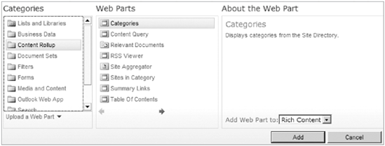
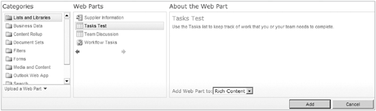
Figure 7-1 displays the pane for adding a web part to a page.
Now that the web part has been added to the page, it can be moved around from zone to zone by clicking the title part of the web part, and dragging it around the page.
Each web part that has been added to a page can be customized to change settings or its look and feel. The Web Part tool pane is where most configurations will be accomplished. The Web Part properties in this tool pane will vary between different types of web parts, but there is a standard set of options that are standard across web parts. In this section, each of the standard web part settings will be covered and described.
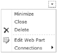
To configure a web part, the logged-in user must have at least a permission level of Designer. Hover your mouse over the top-right corner of any web part to see a small black triangle. Click this triangle to display a drop-down box. Choose Edit Web Part to elicit the Web Part tool pane, which will show on the right side of the page.
Note
When the page is in edit mode, there will be more choices in the drop-down box in the corner of the web part. Click Site Actions and Edit Page to switch to edit mode.
Figure 7-2 shows an example of a web part drop-down box when the page is in edit mode.
The following standard settings exist in the web part tool pane properties of every web part. The name and description of each property are listed.
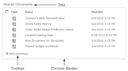
The Appearance section is used to set up the size and the way that the frame of the web part looks. The following table lists the options available in the Appearance section of the Web Part tool pane. The chrome is the frame, or the box around the web part, and this section allows you to choose the way it looks.
NAME | DESCRIPTION |
|---|---|
Title | This is the title that displays in the top of the frame of the web part. For list (and library) web parts, by default the title is the name of the list. Note that changing the web part title does not change the actual name of the list. This can be done in the list settings, in the Title, Description and Navigation section. |
Height | The height of the web part, in a selectable measurement, such as pixels or inches. |
Width | The width of a web part, in a selectable measurement. |
Chrome State | The options are minimized and normal, with normal being the default. |
Chrome Type | These options consist of various combinations of the title and border of the web part. When "none" is selected, neither a title nor a border will be displayed. |
Figure 7-3 shows some of the appearance options, and the way they apply to the look of a web part.
The layout is how the web part looks, relative to the rest of the page and the other web parts.
NAME | DESCRIPTION |
|---|---|
Hidden | Hide the web part. This web part can only be seen by the page designer, while the page is in edit mode. This option is sometimes useful for testing purposes, or in cases where the web part contains code or script and does not need to be displayed. When working in a wiki page, this is not configurable. |
Direction | Right to left or left to right. |
Pick which web part zone to put the web part in. This is not configurable in wiki pages. | |
Zone Index | Type the number of the zone index. This is the order in which the web parts are displayed within the web part zone. Typing a "1" here will bring the web part to the top of the page. This can optionally be used instead of dragging web parts with the mouse. This is also not configurable in wiki pages. |
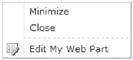
The main consideration for this section is that each site member will have options available for modifying the way a page is displayed personally, even though they do not have Designer permission on the page. Figure 7-4 shows the drop-down box at the top-right corner of a web part, as seen by a site member.
The Advanced Options allow the page designer to restrict some of the ways that site members can modify the way the page looks to them.
There are two different ways to remove a web part from a page, closing it or deleting it. It is important to know the difference between these methods, so that page performance does not suffer because of bad practices. Click Site Actions and Edit Page in order to see the close and delete options in the drop-down box in the top-right corner of each web part on a web part page.
Note
The ability to close a web part without deleting it is not available on a wiki page. This can only be done on a web part page.
Close a Web Part: When a web part is closed, it is temporarily removed from the page but is placed in a "Closed Web Parts" category in the list of web part categories on the site, and it can be added back at any time. When many closed web parts exist on a page, it can affect the page load performance. Closing a web part is usually not necessary but is done in cases where the web part and its configuration need to be saved for later, but not displayed on the page.
Delete a Web Part: Deleting a web part permanently removes it from the page. It is a good practice to get in the habit of deleting web parts instead of closing them, unless it is absolutely necessary to close one and use it later.
Most anything that needs to be done to configure a standard web part has already been covered in this section, but just as in many places in SharePoint, there are multiple ways to accomplish the same goal. New in SharePoint 2010 is a small checkbox at the top-right corner of every web part. Checking this box when the page is in edit mode opens the Web Part Tools/Options Ribbon at the top of the page, as shown in Figure 7-5.
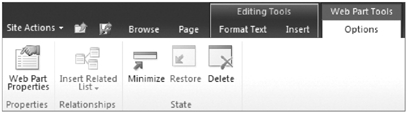
Web Part Properties: Opens up the Web Part tool pane.
Minimize and Restore: Minimizes or restores the web part, which is the same as the Chrome State in the Appearance options.
Delete: Permanently deletes the web part.
Insert Related List: Any list can have one or more lookup columns that look up information in another list on the site. Once this lookup field exists, these two lists are considered to be related lists. This button allows you to quickly add a second list that is related with a lookup to the currently selected list. The two web parts are then automatically connected. If there is no other list on the site that is related to the current list, this button will be disabled. There will be more information about web part connections in the section in this chapter called "Connect Web Parts."
Some types of web parts can be imported and exported, which is a way of saving a web part and its settings, and adding it to another page. List View (list and library) web parts cannot be exported, but most other types can. When in edit mode, click the drop-down box at the top right of a web part, to see if Export is listed as an option. When the Export button is clicked, you will be prompted to save the web part to your computer. Pick a location on your computer to save the web part to.
Saved web parts can be imported to be displayed on a page. When adding a web part to a page, as shown in Figure 7-1, notice that in the bottom left there is an Upload a Web Part button. Click this button, and then browse to the location on your computer where the web part file exists. Click the Upload button. The next time you click to insert a web part, there is a new category on the right, called Imported Web Parts, which is where the new web part can be selected and inserted on the page.
What if you want this customized web part to always be displayed when you click to insert a web part? Take a look at the "The Web Part Gallery" section toward the end of this chapter.
Some web parts on a page can be connected to each other to allow for passing of filters or parameters from one web part to another. When web parts on a page contain columns with common data in them, they can be connected. An example of common data that can be connected, is a list that contains a lookup column to another list on the site. It is not required that the connected lists contain a lookup column, as long as the data columns being connected contain the same type of information, such as a number or text. The web part that sends the filter information is called the "provider," and the web part that gets filtered is referred to as the "consumer." When a page is in edit mode, click the drop-down box in the top-right corner of a web part to see the Connections option, as shown in Figure 7-2.
TRY IT OUT: Connecting Web Parts
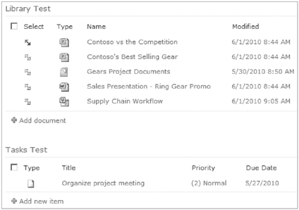
In this Try It Out, you will learn how to connect two web parts to each other. This example will entail creating tasks on the site, and setting up each task so that it is associated with a specific document in a document library. Multiple tasks can be created and associated with any one document. You will then create an interface on the page so that site users can click one document and automatically see the list of tasks associated with that document.
On your SharePoint site, click Site Actions and choose More Options. On the Create screen, click Tasks as the type of list. In the Name box on the right side, type "Tasks Test" and click Create.
On the same site, click Site Actions, and choose New Document Library. Name the library "Library Test" and click Create.
Upload several example documents to the library, and be sure to fill out the Title column for each one.
On the Quick Launch Toolbar on the left, click the Tasks Test to go back to the Task list. In the Ribbon at the top of the page, click the List tab.
In the Manage Views section of the Ribbon, click the Create Column button. Fill out the Create Column screen as follows:
FIELD NAME
DATA
Column Name
Document
Type of information
Lookup
Get information from
Select Library Test from the drop-down list
In this column
Select Title from the drop-down list
Leave all other fields at the default, and click OK.
In the Tasks Test list, create a few sample tasks in the list, fill out the various fields, and for each task, pick the name of a document in the Document drop-down box. Now the relationship has been created between tasks and documents, so the web part connection can be created.
On the home page of your site, follow the instructions in the "Try It Out: Adding a Web Part to a Page" to add the Tasks Test and the Library Test to the page.
Open the Web Part properties of the Library Test web part, and in the drop-down in the top corner of the web part, choose Connections. In the fly-out, choose Send Row of Data To, and choose Tasks Test.
On the Choose Connection box that pops up, leave the default of Connection Type: Get Filter Values From, and click Configure.
On the Configure Connection tab that is shown in Figure 7-6, choose Title as the Provider, and Document as the Consumer. Click Finish.
Click the Save button at the top left of the page, to save your page changes.
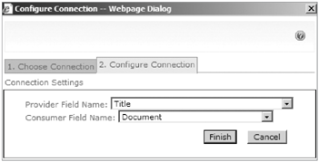
The web parts are now connected! The Title of the document in the Library Test is the provider. The Document is the lookup field that you created in the Tasks Test list, which looks up to the Title column, and it is the consumer. Each time you click the gray double arrow next to a document, the task list will be filtered to show only tasks associated with that document, as shown in Figure 7-7.
To remove a web part connection, follow step 9 above, and then click the Remove Connection button on the Configure Connection screen. Sometimes it is necessary to temporarily remove connections in order to make changes to the filter web part configurations.
There are so many web parts that already exist in SharePoint, that they can be used for most everything that needs to be accomplished on a SharePoint page. On one end of the spectrum, programmers can save themselves a lot of development time by learning what SharePoint can already do. On the other end of the spectrum, site managers and end users can decrease the use of IT resources to accomplish some simple "web page development" that does not involve the use of any custom code.
Any SharePoint list or library can be inserted onto a page as a web part, and these are referred to as List View web parts. As you learned in Chapter 4, views are simply different ways of looking at the same data. Whether working with lists or libraries, this web part is referred to as "list view," and the term "lists" in this section refers to both lists and libraries.
We define the way data will be displayed in a list web part by selecting columns and setting up grouping, sorting and filtering. Learn more about views in Chapter 2, "Working With SharePoint Lists."
The Web Part tool pane is displayed on the right side of the page when configuring Web Part properties. At the top-right corner of every web part, there is a small arrow, which opens a drop-down box. In this drop-down list, click Edit Web Part in order to view the Web Part tool pane. As shown in Figure 7-8, there are several sections of settings to configure. The focus here is on the options that are unique to list view web parts.
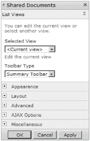
The List Views section of the Web Part tool pane contains a drop-down box called Selected View. Any existing view can be selected, or an ad hoc view can be created by clicking Edit the current view.
The Toolbar Type contains three options. The Summary Toolbar only displays an Add new Item or Add new Document button at the bottom of the Web Part, and it is the same as Full Toolbar. Show Toolbar displays the standard toolbar that you normally see when you go to the home page of a list or library. No Toolbar obviously removes all toolbars.
TRY IT OUT: Using the List View Web Part
In this Try It Out, you will learn the steps and the principles behind adding and modifying List View web parts on a page. In this scenario, you will create a task list, take a look at its default views, and then display an existing view in a web part on your home page. You will then modify the web part view.
Go to the Tasks Test list that was created in the Connect Web Parts section of this chapter.
In some of the tasks, edit them to put your own name in the Assigned To column.
At the top of the screen, the View drop-down box will say All Tasks because that is the default view. Click this view name, and choose the My Tasks view. Notice that this view only displays items that are assigned to you, the logged-in user.
In the breadcrumb trail at the top of the page, click to go back to the home page of the site.
Click Site Actions, and choose Edit Page.
In the Ribbon at the top of the screen, in the orange Editing Tools section, click the Insert tab.
Click the Web Part button, and a new pane will be displayed across the top of the page, with lists of all of the web parts that can be inserted. This is shown in Figure 7-9.
By default, the Lists and Libraries section on the left is selected. Scroll to the right, using the dark gray arrows in the Web Parts section, click to select the Tasks Test list, and click the Add button.
The task list is now displayed as a web part on the page. At the top right of the web part, click the arrow drop-down and choose Edit Web Part.
In the Selected View drop-down box in the Web Part Tool Pane, choose the My Tasks view.
An informational message will pop up. It states that switching to a different view removes changes you have made to this view. This means that, since the web part "current view" is not one of the saved views in the list, any view changes that have been made in this web part will be lost when a new view is selected.
At the bottom of the pane, click the Apply button.
Notice that the web part now displays only tasks assigned to you. This view in the web part is now disconnected from the My Tasks view in the list, and changes made here will not affect that view. In the Web Part tool pane, click Edit current view, so that a couple of tweaks can be made.
On the View Settings page, only put check marks next to the columns called Title and Due Date. In the Sort section, pick the Due Date column, and choose ascending order. In the Item Limit section, type a number 3 as the item limit. Click OK.
The My Tasks view has now been customized to take up less space on the home page, by decreasing the number of displayed columns and displaying fewer items in the view. When viewing the home page, users will now see the list of their three upcoming tasks.
AJAX is short for asynchronous JavaScript and XML. It allows for data to be retrieved from the server asynchronously. This means users do not have to refresh the browser to see changes that others may have made to data that is shown on the page in the web part. The web part's information will be refreshed in the background without interfering with the display, behavior, or other web parts on the existing page. The following are the AJAX options available for list web parts and data view web parts. In this context, asynchronous means that the content in the web part will be loaded independently of the other web parts on the page.
This table lists the options available for AJAX, per web part.
NAME | DESCRIPTION |
|---|---|
When the page loads, this web part loads independently of the others. An example of the use of this option is when one web part must retrieve a large amount of data (list items) to be displayed. An animated GIF will indicate that the data is loading. | |
This checkbox allows any of the below checkboxes to be configured. | |
Select this in order to allow end users to click a button to refresh the data. | |
When a user navigates to the page and leaves it open in the browser all day, live data will continue to be displayed without having to use F5 to refresh the browser page. | |
When Enable Asynchronous Automatic Refresh is selected, type the number interval of seconds at which the automatic refresh needs to happen. |
Note
When "Show manual refresh button" or "Enable Asynchronous Automatic Refresh" options are checked, the checkbox for "Enable asynchronous update" will also automatically be selected when the Web Part properties are saved.
NAME | DESCRIPTION |
|---|---|
If the list is empty, sample data can be displayed while testing the web part. | |
This is the URL to an XSL style sheet that contains display settings for the web part. | |
Cache the data view. | |
Data View Caching Time-out (seconds) | If caching is enabled, set the time in seconds that the data should be cached. |
When web part connections are used, when this option is enabled on the provider web part, the first row of the web part will be sent to the consumer, as the default filter. |
This category of web parts displays data from SharePoint or other line-of-business systems. In this context, business data can consist of charts, graphs, key performance indicators, and even Visio diagrams.
The Chart web part is an extremely customizable web part that displays charts based on data existing in one of the following locations:
A SharePoint list: Connect to any list not only in the current site but anywhere in the current site collection.
The Business Data Catalog: Connect to external content types, for example, other databases such as SQL, and other line-of-business systems.
Excel Services: Connect to data that exists in a spreadsheet that exists in a library on the site.
Another web part: Connect to another web part on the same page.
This web part consists of easy wizards for connecting to data and customizing the way the chart looks. Once the data connection has been set up, there is an Advanced Properties interface in which the chart's look and feel can be granularly customized.
TRY IT OUT: Using the Chart Web Part
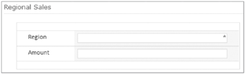
In this Try It Out, you will go through the steps of configuring the Chart web part to display data in a SharePoint list. First, you will create a simple list with regional sales data, which the chart will be based on. Once the example data exists, you will insert a chart on the front page of your SharePoint site.
At the top-left corner of the site, click Site Actions and choose More Options.
Choose Custom List as the type, name the list Regional Sales, and click Create.
Now that the list has been created, in the List tab of the Ribbon, click List Settings.
In the Columns section, click the name of the Title column, and change the name of the column to "Region" instead of "Title."
In the Columns section, click Create column. Call this new column "Amount," and choose Currency as the type of information in this column. Click OK.
In the breadcrumb trail at the top of the page, click Regional Sales, so that you can start adding items to this example list.
Click the Add new item button, and you will add four items, as shown in the following table.
REGION
AMOUNT
North
800
South
500
East
1000
West
400
Now that the list contains some data, the Chart web part can be added to the page. Navigate to the home page of the site, click Site Actions, and click Edit Page. Add the Chart web part to the page, and a standard chart with blue bars is displayed as the default.
Click Data & Appearance, in the middle of the web part, to get to the Data Connection & Chart Appearance Wizards screen shown in Figure 7-10. If a message pops up warning about saving changes to the web page, click OK.
Click Connect Chart to Data.
On the Choose a Data Source screen, choose Connect to a List. Click Next.
In the Site drop-down box, choose the name of the site in which the lists exists. In this example, it will be the name of the site in which the Regional Sales list was created at Step 2. Then, in the List drop-down box, choose the Regional Sales list. Note that this web part can be configured to display list information from any site in the site collection. Click Next.
The Filter Data screen gives you the option of creating a data filter. Click the plus next to Filter Data, which expands the section to show the interface for creating filters. No filters will be created in this example, so click Next.
At Step 4, Bind Chart to Data, explore this page by clicking the plus sign next to each section to view all available chart options. Make no changes, and click the Finish button.
The Chart web part is now displayed on the page, still with the standard blue bars. Next, click Data & Appearance again, and this time click Customize Your Chart.
On the Select Chart Type screen that is shown in Figure 7-11, select the Bar chart type and the 3D Chart Types tab. Click Next.
Notice that there is an Auto Preview displayed on the right side of the screen from this point on in the wizard, so that changes can be previewed in real time. Change the theme to your favorite color and click Next.
Explore the Chart Element Properties screen by clicking each of the tabs across the top, which contain options for Title and Legend, Axes and Grid Lines, Data Labels and Markers, and Hyperlinks and tooltips. Click Finish.
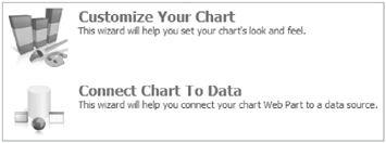
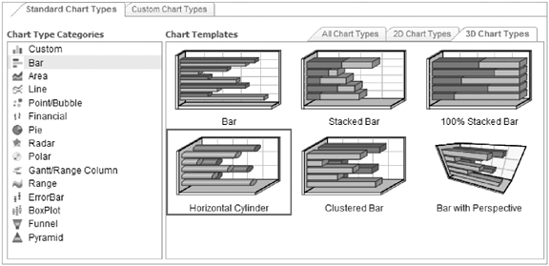
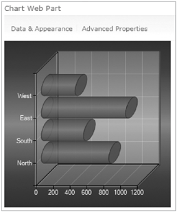
Figure 7-12 shows an example of what the final 3D chart looks like.
After a chart has been created, if further customization is needed, click the Advanced Properties button. This advanced Chart Properties interface allows for granular changes to be made to the different aspects of the chart.
Chart web parts can also be exported and then imported to other sites or site collections. By default, the ability to export the web part is disabled. To enable the ability to export, in the Web Part tool pane's advanced section, change the Export Mode option to Export all data. Charts that display data from external content types or Excel Services can even be imported onto sites in other site collections.
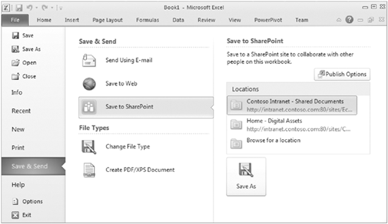
The Excel Web Access web part allows for the display of a spreadsheet or portion of a spreadsheet on a page. When planning for these types of web parts, the location of the site or specific document library must be added to the list of trusted locations in the Excel Service Application in Central Administration. A spreadsheet can be published to Excel Services from within Excel. On the File menu, choose the Save & Send tab on the left, and select Save to SharePoint. As shown in Figure 7-13, click the Publish Options towards the top right of this screen.
This Publish Options screen is quite useful, because it allows for granular selection of components of a spreadsheet to be published, such as sheets, charts, and ranges. This screen also allows for the creation of parameters, which are useful in creating spreadsheet interactivity, and in connecting to other web parts on the page.
Once an Excel Web Access web part is added to a page, the Web Part tool pane contains a multitude of configuration options. Select the spreadsheet that is to be displayed, and optionally type the name of one range, chart, or table in the Named Item box.
The Status List web part displays key performance indicators from an existing Status List in SharePoint. Once a Status List has been created, indicators can be created to view data values compared to goals. In the Web Part properties, pick an existing Status List anywhere in the current site collection.
The Indicator Details web part displays a single selected indicator from within a Status List on the site. In the Web Part properties, select a Status List in the current site collection and a specific indicator in that Status List.
TRY IT OUT: Using the Status List Web Part
In this Try It Out, you will learn how configure the Status List web part. A prerequisite before getting started is to create and populate the Regional Sales list, following the instruction steps one through seven from "Try It Out: Using the Chart Web Part." The goal in this example is to display indicators that allow management to quickly determine which regions are doing well in their sales figures.
Click Site Actions and choose More Options. Choose Status List, name the list Status List Test, and click Create.
In the list's New drop-down box, choose SharePoint List-based Status Indicator.
Fill in the fields on the New Item screen, based on the following table, and click OK.
FIELD
VALUE
Name
Regional Sales
List URL
Click the orange icon, select the Regional Sales list, and click OK.
Value Calculation
Calculation using all list items in the view. Choose Average (in the calculation drop-down box) of Amount (in the drop-down box of number fields in the list)
Display [green]
1,000
Display [yellow]
500
On the home page of the site, click to insert a web part. In the Business Data section, choose the Status List web part and add it to the page.
Open the Web Part tool pane. In the Indicator List box, select the Status List Test. Configure the rest of the Web Part properties as indicated in the following table, and click OK.
FIELD
VALUE
Show only Status icon
Yes
Display multiple indicators columns
Yes
Status Indicator
Regional Sales
Column or dimension
Region
Members to display
Click the filter icon and select all four regions.
The regional sales data is now displayed, simply represented by indicator icons. These icons are based on the goal values of 1,000 and 500 in the indicator properties. The resulting web part is shown in Figure 7-14.

The Visio Web Access web part displays a Visio diagram on a page. Visio is an Office Suite application that allows for the creation of advanced visuals such as charts, diagrams, flowcharts, and even network diagrams and floor plans. When working in Visio, files can be saved as Web Drawing (VDW) files. In the properties of the Visio Web Access web part, an existing VDW file is selected for display. Additional settings can be configured, such as the toolbar and drawing interactivity.
There are several more web parts in the list, that all start with "Business Data." These web parts will be covered in Chapter 15.
The main thing that all of the Content Rollup web parts have in common is the fact that they can all display information from other sites, or from multiple sites. Each of these web parts works in a different manner, and they are all useful in their own unique way.
The Content Query web part is used in order to display content from multiple sites in one rolled-up view, and it is only available on sites in which the SharePoint Server Publishing Infrastructure feature has been enabled. The settings of this web part have two main sections, called Query and Presentation, which allow you to configure the type of data to roll up and in what manner to present it.
Content Type: Pick any one content type to roll up, or keep the default of "All Content Types."
Audience Targeting: Each list and library has an audience targeting setting that can be turned on. Each item in that list can then be targeted to an audience. When those lists are displayed in this web part, and this setting is selected, site visitors will only see items in this web part that are targeted to them. Check the box Include items that are not targeted, if you would like untargeted items to be displayed.
Additional Filters: Up to three filters can be created to narrow down the content that is displayed. Only site columns are available to choose from.
Grouping and Sorting: Pick from site columns to group or sort by.
Styles: Choose predefined styles for groups and items.
Fields to Display: Type the names of the site columns to be displayed, separated by semicolons.
Feed: Check this box to include an RSS feed icon and link in the corner of the web part.
TRY IT OUT: Using the Content Query Web Part
In this Try It Out, you will learn about this powerful web part that allows you to display information from multiple locations. This web part is only available on sites that have the SharePoint Server Publishing feature activated. For the source of the content query, pick the whole site collection, a particular site, or an individual list. The list types to choose from will be familiar, because these are seen on the Create screen for new lists and libraries. The content types to choose from can also be seen in Site Settings
First of all, the publishing feature needs to be enabled at the site collection level. At the top-level site of a new site collection, click Site Actions and choose Site Settings.
In the Site Collection Administration section, click Site collection features.
Next to SharePoint Server Publishing Infrastructure, click the Activate button.
Navigate to the home page of the site where this web part will be added. Click Site Actions and choose Edit Page.
Look at the Ribbon at the top of the screen, and in the Editing Tools section, click the Insert tab.
Click the Web Part button in the Ribbon, take a look at the Categories section on the left side of the screen, and click the Content Rollup category.
Click to select the Content Query web part, and in the Add Web Part drop-down box choose the location on the page in which you would like to insert the web part. Click the Add button.
In the top-right corner of this web part, click the small arrow that is a drop-down box. Choose Edit Web Part.
The Web Part tool pane is now displayed on the right side of the screen. In the Query section, fill out the settings according to the following table, and click OK.
FIELD
VALUE
Source
Show items from all sites in this site collection
Show items from this list type
Posts
Group items by
<Site>, Ascending
Sort items by
Created, Descending
Group style
Banded
Item style
Title and description
Fields to Display: Link
Nothing, leave it blank
Fields to Display: Title
Title
Fields to Display: Description
Created By
Enable feed for this web part
checked
Feed Title
Consolidated Blogs
Feed Description
This is a consolidated feed of all of the blogs in the site collection.
An example of what the end result could look like is shown in Figure 7-15.
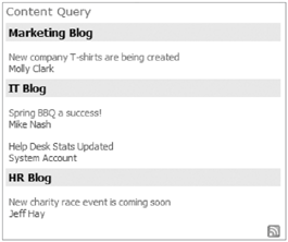
The 15 most recent blog posts are displayed, grouped by the name of the blog site. The name of the person who created each item is displayed under its title. Click the orange RSS Feed icon at the bottom right in order to view or subscribe to this list of blogs as a single RSS feed.
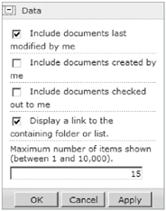
The Relevant Documents web part displays all site documents that are relevant to the current logged-in user. The Data section of the Web Part properties contains several configuration options, as shown in Figure 7-16.
Relevant Documents rolls up information from all libraries on the site, and automatically displays only the most recent ones in the order that they were modified, descending. This web part is only available on sites that have the publishing feature enabled.
Similar to the Content Query web part, the RSS Viewer web part is only available on publishing sites. This web part is used in order to view an RSS feed of content that exists either inside or outside of SharePoint. Within the Web Part tool pane, enter the URL of the existing RSS feed, and choose a Refresh Time (in minutes) and a Feed Limit. The feed limit is the number of most recent items to be displayed from the feed. It is important to think about how often the content changes in the RSS feed, so that the refresh time may be configured accordingly. It would be a waste of resources to configure a refresh time of 120 minutes for content that is only updated once a week.
The Summary Links web part allows you to add a list of links to the page. The Summary Links web part is only available when the publishing features are enabled on the site. Each time a new link is added, there are several configuration options, such as the ability to set the link to open in a new window. Click the Configure Styles and Layout button to pick group and item styles.
The Web Analytics web part is a great way to display the site's most popular content. Each time this web part is added to a page, it can be configured to display one of the following:
Most Viewed Content: Pick a scope, such as the current site collection or site, and this web part will display the list of items that have been clicked on the most.
Most Frequent Site Search Queries: In the search box on the site, when users click "This Site:..." as their scope, this is considered a site search.
Most Frequent Search Center Queries: When searches are performed on "All Sites," or performed from within the Search Center on the site, these are considered Search Center queries. When this option is selected, a drop-down box will be available, from which to pick all search scopes or a specific one.
For more information about searches and scopes, read Chapter 17.
WSRP stands for Web Services for Remote Portlets. The WSRP Viewer web part displays portals from websites that use WSRP 1.1. WSRP is an older network protocol specification that allows you to use presentation-oriented web services created by developers, and display that data inside of SharePoint. This would be used in situations where the organization has other intranet applications which need to be leveraged inside of SharePoint.
The XML Viewer web part displays a selected XML file. It transforms XML data using XSL and displays the results. Enter the XML or XSL into their respective editors, or link to already existing XML or XSL files.
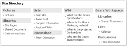
This web part displays a table of contents consisting of sites, lists and libraries. By default, this web part displays two child levels below the current site, as shown in Figure 7-17.
The Web Part properties tool pane allows for further configuration. There are options to change the site level to start on, the number of levels deep to display, and columns, styles, and sort options.
There is a set of web parts called Documents, and most of these pertain to Document Sets. Document Sets are a new feature in SharePoint 2010, in which you can group together similar files, and they exist as a content type in a document library. When the name of the Document Set is clicked, you are taken to a special page that acts as a welcome page for the Document Set, which is shown in Figure 7-18, and it consists of the two web parts called Document Set Contents and Document Set Properties. Use these web parts in situations where the detailed information about a document set needs to be displayed outside of the context of the Document Set welcome page.

The Document Set Contents web part is similar to a list view web part, but it displays only files that exist in the current Document Set.
The Document Set Properties web part displays pertinent information about the current Document Set, such as the title and description.
The Document ID web part exists in the category of Document Set web parts, but is not necessarily related to Document Sets. There is a site collection feature that can be enabled, called Document ID Service. When documents have this unique ID, the Document ID web part is used to quickly type in the ID of a document to open up that file. This web part simply consists of a text box and a button to open the file.
The media and content web parts are added in order to make a SharePoint page visually appealing. Inserting media such as images and video is a good way to grab the attention of site visitors.
The Content Editor web part is a freeform and very versatile web part. Once it has been added to a page, click "Click here to add new content" in the body of the web part. This is where most of the web part configuration is done, which is a lot different from previous versions of SharePoint. When the cursor is in the body of the web part, an Editing Tools tab will show in the Ribbon, as seen in Figure 7-19. Type and edit rich text, or click the HTML button to directly edit the HTML source of the web part.
This web part allows for the display of a single image on the page. Before an image can be displayed using this web part, it must exist either somewhere on the Internet, where it can be referenced from, or on the SharePoint site. If the document does not exist online yet, create a Picture Library on the site and upload the image to it. The URL to the image can be pasted into the Image Link box in the Web Part properties. Note that visitors to the page must also have at least read-only access to the image in order for it to be displayed properly to those people.
Besides using the Image Viewer web part, there is another way to insert images onto a page, which is new to SharePoint 2010. When a page is in edit mode, on the Insert tab in the Ribbon, click the Image button. On a Web Part Page, this action is identical to placing the Image Viewer web part on a page. Alternately on a wiki page, clicking to insert an image will prompt with three choices: From Computer, From Address, or From SharePoint.
Display streaming media in the Media web part. Now in SharePoint 2010, the steps for inserting media files on a page are simple and intuitive. Media files consist of movie files, such as those of the type *.WMV, or audio files such as *.MP3 or *.MP4. The follow is a list of the web part settings:
Change Media: Insert a media file that exists on your computer, on SharePoint, or at an address (URL of a website).
Change Picture: Insert a picture that exists on your computer, on SharePoint, or at an address (URL of a website). This picture will be displayed as the default view of the web part when the page is loaded.
Title: Create a descriptive title for the media. This title is displayed on the web part and at the top of the media file while it is playing.
Start media automatically: The media will immediately start playing when each user arrives at the site. It is recommended that this setting be used minimally, in order to conserve network bandwidth.
Loop until stopped: When the movie is played, it will continue to play over and over again until it is manually stopped.
Styles: There are two different styles that can be applied to the media player, dark or light. This relates to the shading of the Play button on the web part and the frame.
Size: Configure the size of the media player on the screen by setting up the height and width in number of pixels.
TRY IT OUT: Using the Media Web Part
In this Try It Out, you will learn the steps of how to insert a WMV movie on your site, in order to display a marketing department training video.
On your SharePoint home page, click Site Actions and choose More Options.
Click Picture Library, call it "Media," and click Create.
Click Site Actions and choose Edit Page.
In the Editing Tools tab at the top of the Ribbon, click the Insert tab.
Click the Video and Audio button.
A blank Media web part will now be displayed on the page. Unlike all other web parts, most of the configuration is accomplished via the Ribbon at the top of the page as opposed to the Web Part tool pane. Click the middle of the empty Media web part in order to display the contextual Ribbon showing a Media Options tab. This tab is shown in Figure 7-20.
Click the Change Image button, and pick From Address. The image used in this example already exists on the server. Type the following in the Address box and click OK: /_layouts/images/newsimage.jpg
In the Title box, type Marketing Training.
For the media file, you'll need your own file on your local computer. Click the Change Media button and choose From Computer.
You will be prompted to upload the media file from your computer to a SharePoint library. Click the Browse button to select the media file on your computer. In the Upload To box, pick the "Media" library that you created at step two. Click OK.
When the screen comes up that says that the document was uploaded successfully, click the Save button.
At the top left of the SharePoint page, click the Save button to save the page changes.

Figure 7-21 shows the resulting Media web part. Click the play button (triangle) to watch the movie in the browser.

The Page Viewer web part is used to display content from another place, similar to looking at another site through a small window. Types of locations that can be shown in this web part are web pages, folders, and files. The folder and file choices only apply to network shares and files on network shares.
Previously known as the This Week in Pictures web part, the Picture Library Slideshow web part is perfect for displaying picture library content on any SharePoint page, in a nice visual slideshow format. The web part tool properties allow you to select a picture library from a drop-down box that contains all of the picture libraries on the current site. Configure the duration in seconds that each picture is to be shown, pick a view from the library, and show the pictures in either random or sequential order.
The Outlook Web Access web parts are mainly for use on SharePoint My Sites, and they allow a user to display information from their own Outlook account, such as email, tasks, contacts, and a calendar. Each of these web parts has a mailbox name box, where a user's email address name is typed. There is also a Mail Server Address box. On a SharePoint intranet, the mail server address is the internal URL of a mail server, such as http://servername/exchange, and not the URL that a user would go to from outside of the network, such as https://email.contoso.com.
WEB PART NAME | DESCRIPTION |
|---|---|
My Calendar | Display your calendar from Outlook. Web part properties contain settings to display a daily or weekly view. |
My Contacts | Display your Outlook contacts. |
My Inbox | This web part allows you to display your own Outlook inbox. |
My Mail Folder | Select this to display a specific folder in your mailbox. |
My Tasks | Display the tasks in your Outlook task list. |
The Form web parts all entail allowing end users to fill in a form inside of a web part, and the InfoPath Form web part is brand new to SharePoint 2010.
By default, the HTML Form web part consists of a textbox and a Go button. There is a Source Editor button in the Web Part properties, which allows the code behind the form to be modified. This web part is typically connected to another web part to send the form field information to filter another web part on the page.
The InfoPath Form web part allows you to insert any browser-based InfoPath form on a page. When a form is easily accessible to site users as a web part, it is a few clicks easier for site users to fill out the form. The Web Part properties allow you to select a form from your site collection or site. Forms that have been activated to the site collection as administrator-approved templates will be available, as well as forms that have been published to a library on the site. In SharePoint 2010, there is a new ability to convert a regular SharePoint list form to an InfoPath form. These SharePoint list forms are also available to choose from in the Web Part Properties.
TRY IT OUT: Using the InfoPath Form Web Part
In this Try It Out, you will insert an InfoPath form on a page. By default, there will not be any InfoPath forms on the site, so this exercise entails creating an InfoPath form first. A prerequisite before getting started is to create and populate the Regional Sales list, following the instruction steps one through seven from "Try It Out: Using the Chart Web Part."
Open the Regional Sales list, and click the List tab in the Ribbon.
Click List Settings, and click Advanced Settings.
Change the Attachments setting to Disabled and click OK. Click OK on the warning message.
Click Regional Sales in the breadcrumb trail at the top, and choose the List tab in the Ribbon again.
Click the big Customize Form button.
Look at the form that is automatically created in InfoPath, and click the Quick Publish button at the top left (next to the Save button).
Click OK to the message that the form template was published successfully, and close InfoPath.
On the home page of the site, insert the InfoPath Form web part.
Open the Web Part tool pane, and in the List or Library drop-down box, choose Regional Sales.
In the Submit Behavior box, choose Close the Form. In the Appearance section, type Regional Sales as the Title. Click OK.
The resulting form is shown in Figure 7-22.
See that users can now fill out the form directly on the page. Also notice that there is no Submit button. Click your cursor inside of the form, and see the contextual Ribbon at the top of the page. Among other items, the Ribbon contains a large Save button that users can click once they have filled out the form.
This category of web parts is centered around the concept of personalization in SharePoint. SharePoint users are individuals, and those individuals interact with each other not only in their day-to-day jobs but also via SharePoint. SharePoint 2010 brings together content collaboration, personal information, and communication, which are all utilized in the Social Collaboration web parts.
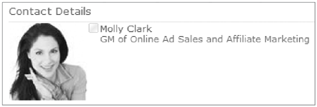
The Contact Details web part displays contact information about an individual in the organization. One good example of a use for this web part is to display information to site users, regarding whom they should contact with questions about the site. In the Web Part properties, pick a user's name from the global address list, and pick whether to display their picture and their job title. The picture of the contact comes from the user's My Site photo, and an example of this web part is shown in Figure 7-23.
When the organization uses an integrated instant messaging server, such as Office Communication Server (OCS) and Office Communicator or Windows Live Messenger are installed on the client computers, the Site Users web part can be used. Display site users in order to quickly send instant messages or email to them. Pick the maximum number of users to display, as well as a specific SharePoint group of people, such as Site Members.
The User Tasks web part displays tasks that are assigned to the currently logged-in user. This information comes from all task lists on the current site, where the user is in the Assigned To column.
As part of the new social computing components in SharePoint, there are several new out-of-the-box web parts. These web parts, such as Note Board, Organization Browser, and Tag Cloud, will be covered in Chapter 11.
The Filter web parts are used to filter information in other web parts on the same page. These web parts are always used with a web part connection to another web part on the page. Any one of these web parts will not be useful without a connection to another web part. Connections are required. For more information about web part connections, read the "Connect Web Parts" section earlier in this chapter.
Note
If one of the Filter web parts has been added to a wiki page, but isn't visible when the page is in edit mode, here's a trick. On any other web part on the page, click the drop-down box in the top right, and choose Edit Web Part. Your hidden Filter web part will appear, so that you can now configure it.
In this filter, manually type in a list of choices in the Web Part properties. The site user will be presented with a filter button that allows them to pick from one of the choices. Use this web part when the items in the choice list are fairly static, compared to the SharePoint List Filter, which is used for a dynamic list of items.
Display a choice list of items that exist in a SharePoint list on the current site. This filter is used for dynamic data, or data that is updated fairly frequently. Select a list or library, and pick which column to display as the drop-down choices. Unfortunately, the Title column will not be available as an option in this web part.
The Current User Filter web part utilizes information about the currently logged-in user, which comes from a specific profile property. This data exists in the user profile properties. Some of this information comes from the company's directory service such as Active Directory, and some of the information is entered by each user on their My Site. In the Current User Filter properties, the default property is the current user name. There is a drop-down box called SharePoint profile value for current user, in which you can select from a long list of other properties, such as Department, Manager, or Job Title.
The Date Filter web part consists of a date picker box. In the Web Part properties, the default value can be set to today, a specific date, or a number of days relative to today. When connecting this web part, the matching column in the consumer web part must be a date column.
The Page Field Filter web part can only be used on a wiki page. This web part filters data using column information from the page library in which the current Wiki Page exists.
The Query String (URL) Filter uses information from the URL of the current page. For example, the URL to the default view of a task list might look something like this:
http://intranet.contoso.com/Lists/Tasks/AllItems.aspx
Once this web part has been added to the task list's allitems.aspx page, the URL with a query string would have a question mark in it, followed by the name of the filter, as in the following example URL:
http://intranet.contoso.com/Lists/Tasks/AllItems.aspx?Status=CompletedIn this example, "Status" has been set as the parameter, and a web part connection has been created to send the query string to the status column in the Tasks web part on the page. The result is a list of items filtered by only tasks that are complete.
The most simple of the Filter web parts, the Text Filter is simply a freeform textbox. The filter text must exactly match the column that is to be filtered, and no wildcards are allowed.
This filter uses a SQL Analysis Services cube. Before using this web part, a data connection to a cube must be created in a Data Connection library. Within the Web Part properties, select the dimension and hierarchy of the cube.
The Filter Actions web part is used in conjunction with another Filter web part on the same page. Use this web part to allow users to save their favorite filters. Once a user has set a filter to a certain value and saved it, that same filter will be applied next time that user visits the site.
TRY IT OUT: Using the Filter Web Parts
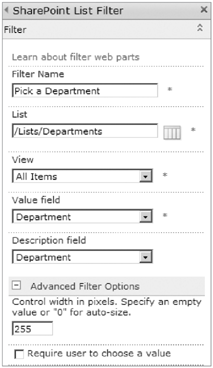
In this Try It Out, you will learn how to insert Filter web parts on a page and configure them to send information to a Consumer web part. In this example, the goal is to display a list of tasks on the site to filter by a department name. Users will be able to switch the filter to view another department's tasks. The two web parts that will be used are the SharePoint List Filter and the Tasks Test list that you created in "Try It Out: Connecting Web Parts."
Click Site Actions, choose More Options, and choose Custom List. Name the list "Departments" and click Create.
In the List tab of the Ribbon, click Create Column. For the column name, call it "Department," change Enforce Unique Values to Yes, and click OK.
Click List Settings, and in the Columns section click the name of the Title column. Change "Require that this column contains information" to No. Click OK.
In the breadcrumb trail at the top of the screen, click Departments.
Add two new items to the list, with simply "IT" and "Marketing" as each Department name. Again, you are not using the Title column at all because the SharePoint List Filter web part will not recognize it.
Click the Tasks Test list on the left side of the page, and click the List tab in the Ribbon. Click the Create Column button.
Fill in the following information when creating the new column, and click OK:
FIELD
VALUE
Column Name
Department
The type of information in this column
Lookup
Get information from
Departments
In this column
Department
In the example tasks in the list, edit each item and pick a department to associate with it.
On the home page of the site, add two web parts, the Tasks Test list, and then the SharePoint List Filter.
Open the Web Part tool pane for the SharePoint List Filter. The List box allows you to click the orange icon on the right in order to select the departments list on the site.
Configure the web part as shown in Figure 7-24, and click Apply.
In the drop-down box in the corner of the SharePoint List Filter, click Connections. In the fly-out, choose Send Filter Values To, and choose Tasks Test.
In the Choose Connection box that pops up, click Configure.
In the Consumer Field Name drop-down box, choose Department and click Finish.
Save the page.
The end result is a filter in which users can select a department, which then filters the tasks list to only show tasks associated with that department name. In the Departments list, unique values were enforced, so that the same department will not ever be listed twice.
TESTING FILTER WEB PARTS
In some cases, it is not always apparent exactly what data will be provided from the Filter web part. There is an easy way that these web parts can be tested to see exactly what the filter information will be. Add your provider web part (such as the Current User Filter) to the page, and also add the Text Filter web part. Configure your provider web part as needed, and then create a web part connection to Send Default Value To
Search web parts exist on search pages in a Search Center site, and are covered in Chapter 17.
The XSLT web part was previously known as the Data View web part or the Data Form web part. This flexible web part can be used to display and aggregate information from various sources. Your company may have data dispersed on multiple systems in addition to SharePoint. With the functionality leveraged by XSLT List View web parts in SharePoint 2010, there is the potential to have a singular repository accessible by the end users. Data of interest can be displayed all in one place — SharePoint.
As custom as this web part is inherently, you don't need to know any development language, and you don't have to be a programmer to create XSLT List View web parts. Web part creation is accomplished in a friendly user interface, using a free program called SharePoint Designer 2010. Not only can you create these types of web parts to extend the look and functionality of regular list views, but you can create views of data in other external systems, also. These systems include databases, web services, XML files, and linked data sources.
Why create these custom web parts? Have you ever run into a situation where a regular list view didn't quite achieve the requirements for a site? This is where the XSLT List View web part steps in to allow you to take it to the next level. Create conditional formatting; create custom buttons in the Ribbon, and even modify the "no matching items" message.
Creating an XSLT List View web part is as simple as opening up your site in SharePoint Designer, opening a list, and clicking the New button to create a new view. When working in these web parts it is a good practice to click the View tab and choose Zoom to Contents. This way, changes cannot accidentally be made to the other areas of the page, such as the navigation.
The web part gallery exists on every site collection and is the master location that all web parts are stored. These files are either .DWP or .WEBPART files. On the Site Settings page at the top level of the site collection, in the Galleries section, click Web Parts. Explore this list by clicking the Edit button on different rows to see some of the settings. Notice the Title field, which will help you to recognize the names of some of the web parts. Also, see that the Group field indicates which category the web part will be displayed in when inserting it on a page.
Exporting and Importing web parts was covered earlier in this chapter, and it was mentioned that a web part can be imported to a gallery instead of just one page. When it is determined that a web part should be available on all sites and it has been tested on different sites in a site collection, it can be uploaded to the gallery and categorized. On the Documents tab in the Ribbon, click the Upload Document button, and upload the file to the gallery. It will then be available on all sites in the site collection.
Web parts are fundamental to the way SharePoint pages display content, and to how people who visit your site will perceive it. This chapter has supplied you with a plethora of introductory information so that you can effortlessly add and configure web parts on your site. Not only have web parts fundamentals been described, but you have also learned about each of the out-of-the-box web parts and even tried some of them out.