
WHAT YOU WILL LEARN IN THIS CHAPTER
In the previous chapters, you learned how to use the page-editing tools of SharePoint Designer to control the content layout and structure of your SharePoint pages. This chapter builds on this foundation and shows you how to use SharePoint Designer's cascading style sheet (CSS) tools to apply fonts, colors, and other finishing touches to your sites.
The original intention of the HTML specification was to define the content of a web page and not how the content on the page should appear. Yet, over time, stylistic elements such as the <FONT> tag crept into the specification. Embedding these elements in pages throughout a website proved to be a nightmare. Web developers hard-coded font names and colors in each and every web page, and, as you can imagine, deciding to change what font should be used was a very time-consuming and error-prone activity.
The Cascading Style Sheets (CSS) specification was created to solve this problem. CSS is a language that solely focuses on describing how web pages should look. Because CSS is independent of the actual HTML, web pages can easily share common display characteristics. Not only can colors, fonts, and positioning be defined in a single location, web pages can be formatted for devices such as printers and mobile phones without your having to create separate HTML.
A style sheet contains at least one rule set. A CSS rule set comprises a selector and a declaration block. Think of a rule set as a term and a definition. When you combine multiple defined terms, you get a glossary. Combine multiple glossaries and you get a dictionary. Collectively, the rule sets are your style sheets and these style sheets define your site's visual language. The following code snippet shows three examples of CSS rule sets:
body {
color: black;
padding: 10px;
}

.ms-quickLaunch{
padding-top:5px;
}

#navcontainer{
font-family: Tahoma;
}
Everything up to (but not including) the first left curly brace ({) in each of the preceding statements is the selectors. A selector "selects" the HTML elements on the page that are affected by the rule set. The selector in a CSS statement can represent all HTML elements of a type by specifying no prefix, a class specified for the element with a "dot" (.) prefix, or the ID of a specifically named element with the hash, or pound, (#) prefix. In the code snippet, the selectors in the three examples are the <body> HTML element, the CSS class .ms-quickLaunch, and the HTML element with an ID attribute set to navcontainer, respectively.
When a rule set targets an HTML element without a class or name, every instance of that element will be affected. This type of selector is also called an element selector because it refers to structural HTML elements such as paragraphs (<p>) or headings (<h1>). The following code snippet shows more examples of element selectors:
<html>
    <head>
        <style type="text/css">
            h1 {
                color: black;
            }
            p {
                font-family: Tahoma
            }
        </style>
    </head>
<body>
    <h1>This text will appear in black.</h1>
    <p>This text will appear in the font Tahoma.</p>
    <p>This text will appear in the font Tahoma, too.</p>
    <span> This text will NOT appear in the font Tahoma.</span>
</body>
</html>
In the code snippet, the header (<h1>) element displays its contents in black with the default font of the browser. Both of the paragraph (<p>) elements will display their text with the Tahoma font. The <span> element will not appear in black or use the Tahoma font (unless the user sets the Tahoma font as the default font for their browser) because none of the CSS rule sets apply to it.
You can group and apply selectors more specifically. Consider the following:
ul li a {
font-color:red
}
If this is the only style applied to a document, only links that are found in an unordered list will appear red. All other links will be displayed in blue, the browser default.
Another type of selector is the <input> element is a special element in that it represents several different types of controls based on the value of its type attribute. Although not often seen in default SharePoint, the following list outlines the values you use for the type attribute and the control that appears in the browser:
INPUT TYPE VALUE | CONTROL SHOWN |
|---|---|
button | |
checkbox | |
textbox and button for uploading files | |
(nothing appears) | |
image | |
textbox whose characters are masked so they cannot be read by passersby | |
radiobutton | |
button that resets the | |
button that submits the page to the server | |
| textbox |
It is difficult to style an <input> element using only type selectors because a type selector would target all the <input> elements on the page that did not have a class or name. To address this issue, attribute selectors were created. Attribute selectors allow you to target HTML elements using one of their attributes in addition to their element type. In the following code snippet, attribute selectors are used to style textboxes (<input type="text">) and radio buttons (<input type="radio">):
<style type="text/css">
  input[type="button"] {
    width: 100px;
  }
input[value="red"] {
background: red;
}
input[value="green"] {
background: green;
}
input[value="blue"] {
background: blue;
}
}
</style>
<input name="color" type="radio" value="red">Red</input>
<input name="color" type="radio" value="green">Green</input>
<input name="color" type="radio" value="blue">Blue</input>
<input type="text" value="red"/>
<br/>
<input name="okButton" type="button" value="OK" />
<input name="cancelButton" type="button" value="Cancel" />In the code snippet, the attribute selectors are the square braces and their contents, and appear to the right of the input type selector. To create an attribute selector, you add opening and closing square braces to the right of the type selector and place an equality expression between them that compares an attribute with the value you are targeting. In the code snippet, the selector input[type="button"] targets only the <input> elements whose type attribute is set to button. The type attribute is the most commonly used attribute, but you can target other attributes as well. In the code snippet, the last three CSS rule sets target <input> elements based on the value of their value attribute. When the HTML is loaded in the browser, the background color of the radio buttons (<input type="radio">) will be styled with the CSS rule set whose attribute selector matches the value specified for their value attribute. Additionally, the background of the textbox (<input type="text">) will also be red since its value attribute is set to red.
Note
Attribute selectors are case-sensitive for all attributes except type. If the value of the target attribute does not match the value in the attribute selector in both characters and casing, the match will not be made. For example, the attribute selector input[value="red"] will not match <input value="Red"> because the attribute value in the <input> element is in proper case whereas the attribute selector value is in lower case.
If you want to target multiple types of HTML elements, you use class selectors. Class selectors will style any HTML element with that class assigned. Class selectors always start with a period (.). You can apply many class selectors to one HTML element. In the following example, the paragraph (<p>) element is styled with two different rule sets:
<html>
<head>
<style type="text/css">
.heavy {
font-weight: bold;
}
.quote {
font-style:italic;
}
</style>
</head>
<body>
<p class="heavy quote">This paragraph will appear bold and italic.</p>
</body>
</html>
In the code snippet, both the .heavy class and the .quote class are applied to the paragraph <p> element. One additional way to define a selector is to target a specific type of HTML element and a specific class. In the following code snippet, both type and class selectors are used:
<html>
<head>
<style type="text/css">
p.title {
color: blue;
font: Arial;
}
</style>
</head>
<body>
<p>This text will NOT be blue or in font Arial.</p>
<p class="title">This text will be blue and in font Arial.</p>
<span class="title">This text will NOT be blue or in font Arial.</span>
</body>
</html>
Note that only the second paragraph (<p>) will appear in blue in the font Arial. This is because the rule set targets only the HTML elements that are paragraphs (<p>) and have the .title class.
Warning
Do not create class names that begin with a number. They will not work in some browsers, including FireFox, Opera, and Chrome.
Sometimes, you will want to style a specific element on the page. ID selectors, such as #navcontainer, match the element with the attribute id="navigation". ID selectors should be unique and must be prefixed with a hash symbol (#). The major difference between ID and class selectors is that an ID selector normally only applies to one element on the page, whereas a class selector could apply to several elements. The following code snippet shows how to use an ID selector:
<html>
<head>
<style type="text/css">
      #navcontainer{
      font-weight: bold;
      font-family: Tahoma;
      font-style: italic;
      }
</style> </head> <body> <div id="navcontainer"> This text will appear bold and italic in the Tahoma font. </div> <div id="footer"> This text will appear with the browser default color and font. </div> </body> </html>
In the code snippet, only the first <div> element is affected by the #navcontainer ID selector because the <div> element's id attribute is set to navcontainer.
Warning
Do not create ID names that begin with a number. They will not work in some browsers, including FireFox, Opera, and Chrome.
The declaration block of a CSS rule set is represented by the curly braces ({}) and their contents. The contents of the declaration blocks are the declarations. A declaration block will contain one or more declarations.
The declarations themselves are in the form of property: value, where property represents the property of the HTML element to be modified and value represents the value of the modification. Each declaration ends in a semicolon (;) because some declarations can have values that contain spaces, as in the following code snippet:
td {
border: 1px solid black;
}
In the code snippet, a black, solid border one pixel in size is applied to every table cell (<td>) on the page.
Warning
When specifying a unit of measure in a CSS property declaration, do not place a space between the number and the unit of measure. Otherwise, the property declaration will not work in some browsers. See the following code snippet for proper usage:
td {
border: 1px solid black; /* This will work. */
}

td {
border: 1 px solid black; /* This will not work. */
}In the previous code examples, the CSS rule sets were embedded in the HTML page itself. You can embed a style sheet by using the <style> element within the <head> tag. The type attribute is required and used to specify a media type. Placing the following example within a master page would enable you to manage all paragraph (<p>) and web part body styles through the master page.
<style type="text/css">
p {
margin-bottom:5px;
}
.ms-WPBody {
font-size:1em;
background:#fff;
}
</style>
Another way to apply styles is to use inline styles. Inline styles are styles set within one tag. They affect only the current tag; every other similar tag on the page will have the default styles. In the following code snippet, you see a comparison of using embedded versus inline styles:
<html>
<head>
<style type="text/css">
            .warning {
            font-weight: bold;
            color: red;
            }
</style>
</head>
<body>
<p>This text has no styling applied.</p>
<p style="font-weight: bold; font-style:italic;">This text has an inline style
and is bold and italic.</p>
<p class="warning">This text uses a CSS rule set embedded in the page and is
bold and red. </p>
</body>
</html>
In the code snippet, the first paragraph (<p>) has no styles and is shown using the browser default color and font. The second paragraph (<p>) uses an inline style, which sets the text to be bold and italic. The third paragraph (<p>) uses a CSS rule set embedded in the page, and its text is displayed in bold and red.
To create an inline style, you simply add a style attribute to the target HTML element. Afterwards, you set the value of the attribute to the CSS declarations that define the style you want. To convert the third paragraph (<p>) to use inline styles instead, remove the class attribute and add the style attribute. Then, set the style attribute to the declarations inside the declaration block of the .warning class CSS rule set. The result should look like this:
<p style="font-weight: bold; color: red;">This text uses a CSS rule set embedded
in the page and is bold and red. </p>
One interesting feature of CSS styles is that you can combine inline and embedded styles. When you combine both kinds of styles, the target HTML element will have a class attribute that applies the embedded style, and a style attribute that applies the inline style. Here is an example of using both kinds of styles:
<html>
<head>
<style type="text/css">
            .warning {
            font-weight: bold;
            color: red;
            }
</style>
</head>
<body>
<p class="warning" style="font-style: italic">This text uses a CSS rule set
embedded in the page and is bold and red.
It also happens to be in italics.</p>
</body>
</html>
In the code snippet, the paragraph (<p>) is bold, red, and in italics. The bold font weight and the red color are applied using the .warning class CSS rule set embedded in the page. The italic font style is applied using the inline style via the style attribute.
External styles are the last way to apply styles to your HTML. They are the same as embedded styles in every respect except that they are stored separately from the HTML page. An external style sheet is a .css file that contains style declarations. To use an external style sheet, you create a .css file that contains your CSS rule sets, and then add a <link> element inside the <head> tag on your page. The following code snippet shows an example referring to an external style sheet:
<html>
<head>
<link rel="stylesheet" type="text/css" href="styles.css" />
</head>
<body>
<p class="warning" style="font-style: italic">This text uses a CSS rule set
embedded in the page and is bold and red. It also happens to be in italics.</p>
</body>
</html>
In the code snippet, the previous example was updated by moving the .warning class CSS rule set to a file named styles.css and replacing the <style> tag with a <link> tag referring to the new .css file. All of the styles in the .css file will still be applied to the HTML elements on the page. When adding a <link> tag to your page, you only need to set the value of the href attribute to an absolute or relative URL to the location of the .css file.
Warning
Do not remove or modify the values of the rel or type attributes or the link tag will not work.
The best practice for managing the styles in your site is to use an external style sheet. External style sheets will allow you to use the same styles on every page of your site, lending it a consistent look and feel. SharePoint 2010 has its own external style sheet named corev4.css, which is located at http://yoursiteurl/_layouts/locale/styles/Themable/corev4.css, where yoursiteurl is the URL of your site and locale is the locale for your site. If you are using the locale for United States English (en-us), the value for locale is 1033. If you are styling a non-English site, the locale will become important since the layout, size, and position of elements could change if the target language is right-to-left or if the language needs extra space to display things like the Site Actions menu button. Regardless of the language of your site, SharePoint 2010 has thousands of CSS rule sets that you can override to apply your own brand to your site.
Apply CSS Styles
In this activity, you apply styles to a simple HTML page.
Open SharePoint Designer from your Start menu.
Click the Open Site button.
When the Open Site dialog appears, enter the URL to your site in the Site name textbox and click the OK button.
If a Windows Security dialog appears, enter your username and password for the SharePoint site and click the OK button.
After the site opens, select Site Pages from the Navigation bar on the left.
Select Page

Rename the newly created file in the Site Pages list to CSSExample.aspx. To rename a file in SharePoint Designer, right-click the file and select Rename from the context menu.
Double-click the newly renamed CSSExample.aspx file to open it.
If a dialog asks you to open the page in advanced mode, click Yes.
Type the following HTML between the <form> element's opening and closing tags:
<label>Name:</label>
<input name="nameTextBox" type="text" value="John Q. Public" />
<br/>

<label>Credit Score:</label>
<input name="creditScoreTextBox" type="text" class="readOnlyBox"
readonly="readonly" value="750"/>
<br/>

<input name="color" type="radio" value="red">Red</input>
<input name="color" type="radio" value="green">Green</input>
<input name="color" type="radio" value="blue">Blue</input>
<br/>

<input name="okButton" type="button" value="OK" />
<input name="cancelButton" type="button" value="Cancel" />
Add the following
<script>block just before the ending<head>tag at the top of the page:<style type="text/css"> label { color: green; font-family: Arial, Helvetica, sans-serif; font-size: 12pt; } .readOnlyBox { background: #CCCCCC; } input { font-family: "Courier New", Courier, monospace; } input[type="button"] { width: 100px; } input[value="red"] { background: red; } input[value="green"] { background: green; } input[value="blue"] { background: blue; } } </style>Save the page by clicking the Save button in the Quick Access Toolbar at the top of the SharePoint Designer window.
Run the page in the browser by selecting Preview in Browser from the Home tab on the ribbon.
How It Works
The first CSS rule set styles the font, color, and size of the two <label> elements by targeting their element type. The second CSS rule set targets the creditScoreTextBox<input> element using a class selector matching its configured class name readOnlyBox. The CSS rule set with the input type selector sets the font of the textboxes, the radio buttons, and the buttons. The rest of the CSS rule sets target <input> elements based on the values of their type and value attributes.
One of the most useful features of CSS is the ability to apply a rule set to an HTML element high in the page's hierarchy that will apply the rule set's style declarations to that element and its descendants. If you were to create the following rule set, every element on the page would use the Arial font since every element is ultimately a child element of the <body> tag.
body {
font-family: Arial;
}
The ability to "cascade" a style from the target element to its lowest descendants is useful since you will not have to write many redundant rule sets for each type of HTML element that you use in your pages. You can also override an inherited style by defining a style that targets an HTML element lower in the page's hierarchy. When that occurs, the CSS rule set with the most specific selector is used to style the target HTML element. For example, you may want every page in your site to use the Arial font, except that links in your site use the Verdana font. To apply that rule, you could write the following code snippet:
<html>
<head>
<style type="text/css">
body {
font-family: Arial;
}
a {
font-family: Verdana;
}
</style>
</head>
<body>
    This text is in Arial font.
<p>This text is in Arial font, too</p>
<a href="help.html">This text is in Verdana font.</a>
</body>
</html>
In the code snippet, CSS rule sets are defined for the <body> tag and the anchor (<a>) tags. All of the text on the page is displayed using the Arial font except for the anchor (<a>) tag, which is displayed using the Verdana font. The CSS rule set with the most specific selector is used to style the target HTML element. Think of each selector like an adjective. The more adjectives you assign to a noun, the more descriptive you are and the easier you can communicate. This conversation illustrates the concept:
Nice man: "I would like to buy a piece of jewelry for my lady."
Jewelry store clerk: "We have lots of jewelry here."
Nice man: "I would like to buy a necklace. A diamond necklace. A diamond necklace with rubies. A diamond necklace with rubies and a matching bracelet."
Jewelry store clerk: "I know just the piece. Let me go find it!"
The jewelry store clerk knows exactly which piece of jewelry to go get because of the very specific description given by the nice man.
To further illustrate the point, examine the following code snippet:
<html>
<head>
<style type="text/css">
            .comp {
            background: gray;
            color: red;
            }
            p.comp {
            background: black;
            color: blue;
            }
            #main p.comp {
            background: black;
            color: white;
            }
</style>
</head>
<body>
<p>This text is in the browser's default color and background.</p>
<span class="comp">This text is in red with a gray background.</span>
<p class="comp">This text is in blue with a black background.</p>
<div id="main" class="comp">
    This text is in red with a gray background.
<p class="comp">This text is in white with a black background.</p>
<span class="comp">This text is in red with a gray background</span>
<p>This text is in red with a gray background.</p>
</div>
</body>
</html>
In the code snippet, three CSS rule sets are defined: one for the .comp class, one for paragraphs (<p>) that use the .comp class, and one for paragraphs (<p>) that use the .comp class and are also descendant from any element whose ID attribute is main. In the code snippet, the first paragraph (<p>) is displayed using the browser's default color and background because it is not styled using the .comp class. The first <span> element is displayed in red with a gray background because it does implement the .comp class but it is not a paragraph (<p>). The second paragraph (<p>) is displayed in blue with a black background because it matches the selector for the p.comp rule set by being a paragraph (<p>) and having its class attribute set to comp.
The tricky part of the code snippet is the <div> element. Its ID attribute is set to main and the class attribute is set to comp. But the #main p.comp rule set does not affect it directly because it does not meet every condition of the selector, as it is not a paragraph (<p>). However, the #main p.comp rule set does affect the <div> element's children if they are paragraphs (<p>) that also have their class attribute set to comp. That is why the first paragraph (<p>) inside the <div> element is displayed in white with a black background and the second paragraph <p> is not. Like the previous example with the <body> element and the anchor (<a>) elements, the second paragraph <p> is displayed in red with a gray background because an ancestor element, the<div> element, is styled using the .comp class.
Up to now, you have learned three different places to place CSS rule sets, inline, embedded, and external, and three different ways to create selectors, type of element, CSS class, and by element ID. Inevitably, the same selector will be defined in more than one place but with different property declarations. When that happens, the browser applies rules to determine which declaration will be applied. The following rules are applied in order of least to most importance:
The browser's default settings.
A local CSS file configured by the end user in browser settings. (This is common with users who are visually impaired.)
External style sheets referenced with a
<link>element and embedded styles contained within a<style>element on the page itself. (When there are multiple<link>or<style>elements on the page, the importance is determined by their position on the page. The first element is the least important and the last element is the most important.)Inline styles contained within the
styleattribute of the target HTML element.Declarations that have
!importantright before the semicolon (;).
The following code snippet shows how the rules in the previous list work:
<html>
<head>
<style type="text/css">
body {
font-family: Arial;
color: red;
}
a {
font-family: Verdana;
color: blue;
}
a {
color: green;
}
</style>
</head>
<body>
  This text is in red using the Arial font.
<p>This text is in red using the Arial font, too</p>
<a href="help.html">This text is in green using the Verdana font.</a>
</body>
</html>
In the code snippet, the anchor (<a>) element is displayed in green using the Verdana font. The two CSS rule sets targeting anchor (<a>) elements are applied in the order in which they appear on the page. When the second CSS rule set is encountered by the browser, its property declaration for setting the text to green is used because the second CSS rule set is lower on the page than the first one and is treated as being more important. Note that the font declaration in the first CSS rule set targeting anchor (<a>) elements is still applied because no other CSS rule set with higher importance has a declaration for font. The thing to remember is that it is the declarations that conflict, not the selectors themselves.
In the previous list, item 5 has not been previously mentioned because it is best to save it for last, especially since CSS declarations marked with !important will override all other conflicting CSS declarations for the target HTML element. The following code snippet shows how order and importance works:
<html>
<head>
<style type="text/css">
body {
font-family: Arial;
color: red;
}
a {
color: blue !important;
}
a {
font-family: Verdana;
color: green;
}
</style>
</head>
<body>
  This text is in red using the Arial font.
<p>This text is in red using the Arial font, too</p>
<a href="help.html" style="color: orange;">
This text is in blue using the Verdana font.
</a>
</body>
</html>
In the code snippet, there are two CSS rule sets that target anchor (<a>) elements. The first CSS rule set styles the text inside anchor (<a>) elements to be blue, whereas the second styles the text to be green instead and use the Verdana font. Additionally, the anchor (<a>) element has an inline style to set the text color to be orange. However, the color declaration in the first CSS rule set is applied because it is marked with !important. The inline style, which would have been more important than the embedded style, is now less important because declarations marked with !important are treated as most important of all.
SharePoint 2010 has become more sophisticated in the way that the cascade of styles is architected. Because of this and the use of more advanced CSS design patterns in play, understanding the fundamentals of CSS is important. You can find more in-depth explanations of these concepts and many more at http://w3schools.com/css.
Before you start designing your award-winning website, take time to read and apply the following best practices to ensure your success with CSS:
Validation — Validating your CSS is always important. This is to make sure that your CSS is error-free and is interpreted the right way in all browsers. You can submit your CSS for validation via a URL, file upload, or direct input using the free CSS Validation Service located at the following URL:
http://jigsaw.w3.org/css-validator/
Comments — Just as in any other language, commenting your code is a sign of good craftsmanship. It helps you troubleshoot what you are building and helps others maintain it long after your site is in production. For example:
/*this is appropriate commenting syntax*/
Naming — Naming classes according to their function rather than what they will look like is a best practice. No matter how tempted you are to name a class "
bigredbox" because doing so makes sense at the time, don't do it. If "bigredbox" were changed later to have a blue background instead of red, the class name would become meaningless.Compression — In this chapter, the CSS code snippets were formatted for reading by humans by adding spaces and carriage returns, which increase the size of
.cssfiles. Computers do not need this unnecessary white space to read.cssfiles properly. Therefore, it is a best practice to remove the white space from your.cssfiles before you put the files in production. Smaller.cssfiles will make your site load faster in the browser. You can use a CSS compressor like the one at the following URL to automatically remove the white space for you:http://cleancss.com. A similar tool for HTML is located athttp://www.mycoolform.com.
SharePoint Designer offers an abundance of tools to delight the web designer and serve to identify, create, modify, delete, and manage styles. The web designer's tool belt in SharePoint Designer 2010 is available primarily through a series of task panes.
To explore the functionality in these task panes, you should create a safe environment that you can alter without recourse. The following activity will guide you through the initial steps to start managing styles in SharePoint by creating a copy of a site's master page and linking it to the custom.css file created in a previous activity.
Setup for Branding a SharePoint Site
In this activity, you create a custom master page and a custom CSS file and apply them to your SharePoint site.
Open SharePoint Designer from your Start menu.
Click the Open Site button.
When the Open Site dialog appears, enter the URL to your site in the Site name textbox and click the OK button.
If a Windows Security dialog appears, enter your username and password for the SharePoint site and click the OK button.
After the site opens, select Master Pages from the Navigation bar on the left.
In the list of master pages, right-click
v4.masterand select Copy from the context menu.Select Paste from the ribbon.
Rename the newly created
.masterfile tocustom.master. To rename a file in SharePoint Designer, right-click the file and select Rename from the context menu.Right-click the newly renamed
custom.masterfile and select Set as Default Master Page from the context menu.When the Set as Default Master Page dialog appears, click the Yes button.
Double-click the
custom.masterfile to open it.If a dialog stating "The file is under source control" appears, click the Yes button to check out the
custom.masterfile.Select All Files from the Navigation bar on the left.
When the list of files and folders is displayed, double-click the Style Library folder to open it.
Select File
Rename the newly created
.cssfile tocustom.css. To rename a file in SharePoint Designer, right-click the file and select Rename from the context menu.Switch back to the
custom.masterfile.Select Attach Style Sheet from the Style tab on the ribbon.
In the Attach Style Sheet dialog, type /Style Library/custom.css in the URL textbox and click the OK button.
Select Split from the View tab on the ribbon.
Locate the ending tag for the
<head>element.Ensure the newly added
<link>element pointing to thecustom.cssfile is the last element before the ending tag for the<head>element.Save the
custom.masterfile by clicking the Save button in the Quick Access Toolbar at the top of the SharePoint Designer window.In the Site Definition Page Warning dialog, click the Yes button to confirm that you are customizing the master page.
How It Works
Making a copy of v4.master and editing that copy ensures you can make your customizations while maintaining the ability to rollback to another page if your customizations were to cause a problem with the site. Setting the custom.master file as the default master page configures the site to use your master page instead of v4.master for the site pages in your site. Any modifications you make to custom.master will appear on any site page in the site. Creating and attaching the custom.css file to the custom.master file gives you a place to store the CSS rules sets you write to style the site. Since the <link> element appears last inside the <head> element, any CSS rule sets you write should have priority over those in corev4.css. Note that any inline styles, embedded styles that appear inside the <body> element, and styles marked as !important will not be overridden in your custom.css file unless you mark your conflicting styles as !important, too. Do not mark your styles as !important if they do not conflict with a style whose priority is higher than yours.
Warning
Do not modify the built-in forms and files in SharePoint. If you break one of these forms or files, you can irreparably break your SharePoint installation. If you need to modify a built-in form, such as a master page, always make a copy of the file and edit the copy. That way, you will always be able to "rollback" to a file that works.
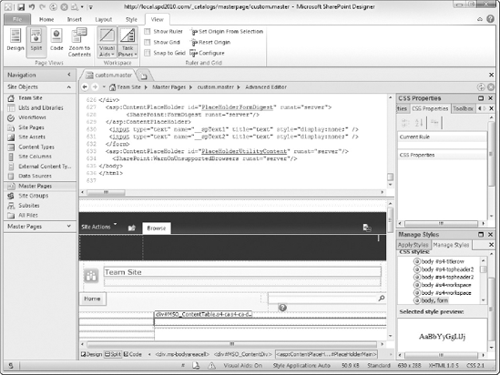
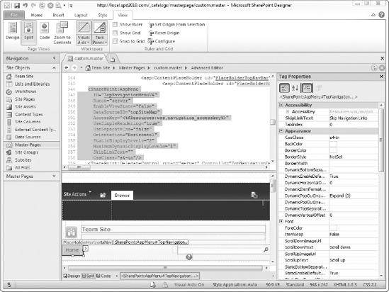
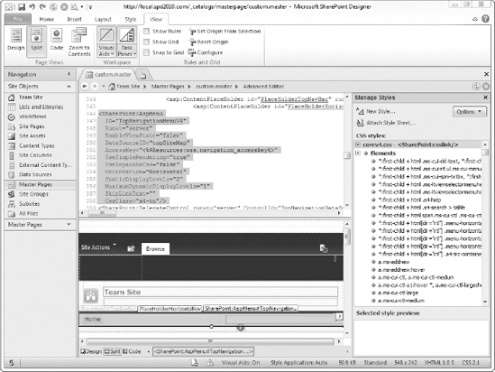
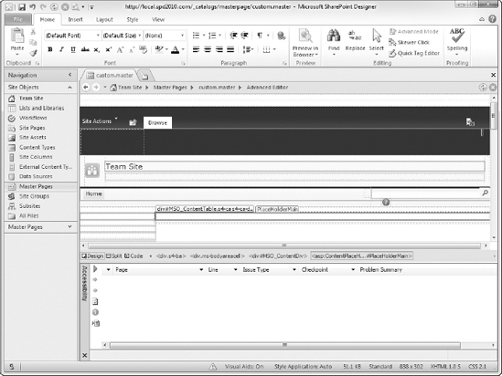
In the previous activity, you created a copy of the v4.master master page. When you open the master page, you will see a screen similar to the one in Figure 5-1. In the center of the screen, the master page is displayed in split mode. You can view your pages in design view, code view, or split view, which shows the code view on top and the design view on the bottom. To switch between the different views, click the Design, Split, or Code buttons at the bottom of the screen. Alternately, you can select the Design, Split, or Code buttons from the View tab on the ribbon. Normally, you will use the Split view so you can work with the HTML code and the Design view at the same time.
The Workspace section of the View tab has two useful drop-down buttons: Visual Aids and Task Panes. The Visual Aids button will allow you to display HTML elements in the Design view that normally would be invisible in the browser. Elements that are not visible in the browser include empty <div> elements and elements styled with display:none or visibility:hidden. The Task Panes button toggles the display of various task panes you will use later in the chapter. You can click the top half of the Visual Aids and Task Panes buttons to hide or show the currently enabled visual aids and task panes.
One interesting feature of the Code view and Split view is that you can hold down the Control (Ctrl)key and click any of the CSS class names, and SharePoint Designer will automatically open the .css file where the class name is defined. The CSS functionality in SharePoint is provided by the corev4.css file. This file is located on the SharePoint web server's file system and if you modify this file, you affect every site in your farm. If you break the file, you just broke every site in the farm, so it is best to only look and not touch the file.
The corev4.css file contains thousands of CSS rule sets used by the many elements of SharePoint pages. They affect everything from the color and font to display for text and links to even the border surrounding web parts. The main CSS rule sets used in SharePoint are covered later in the chapter.
If you want to "brand" or "skin" your SharePoint site, you have many options. Usually, web designers will either tweak the look and feel of a SharePoint site by adding an additional CSS file to their master page whose CSS rule sets override the default SharePoint rule sets, or they will completely start from scratch. When web designers create a master page from scratch, they start with a completely blank master page and update its HTML content with the output from a professional design tool, such as Adobe Photoshop or Microsoft Expression Design. Once the master page has the initial look and feel, they add the various SharePoint elements using one of the existing built-in master pages. Though it is worth mentioning, styling a SharePoint site in this way is very difficult and is out of scope for this book.
Note
If you must create a master page from scratch, be sure to include ALL of the <asp:ContentPlaceHolder> and <SharePoint:DelegateControl> elements from v4.master in your master page. If you leave out an element, your site will probably not work. If you want to hide one of the elements, set its Visible attribute to False.
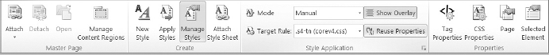
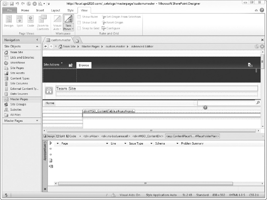
Clicking the Style tab exposes the features of SharePoint Designer that are important for managing your styles (see Figure 5-2). You can create a new style, attach a style sheet, and open key task panes from this part of the ribbon.
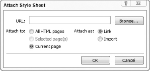
When you click the Attach Style Sheet button, the dialog in Figure 5-3 appears. The Attach Style Sheet dialog allows you to browse to a .css file in your site and attach it to the current page. If you select the option to attach as a link, a <link> element pointing to the .css file is added just before the ending tag of the <head> element. The option to attach as an import adds a <style> element instead. Inside the <style> element, SharePoint Designer adds a CSS instruction to include the .css file. The best practice, though, is to link your .css file using a <link> element. If you want to include additional .css files, you can add more <link> elements or add the CSS import instruction to your .css file. The latter minimizes the changes you have to make to your HTML pages when you want to add or remove multiple .css files.
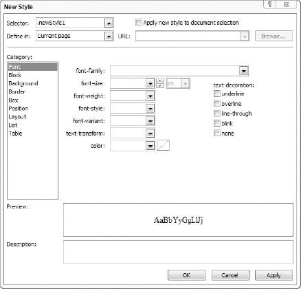
Clicking the New Style button will display the New Style dialog in Figure 5-4. The New Style dialog allows you to create a new CSS rule set without writing it by hand. First, you select an option from or type directly into the Selector drop-down list. Then, you select an option from the Define in drop-down list to indicate where the new rule set should be saved. The best practice is to select "Existing style sheet" and then select the .css file you attached to the page from the URL drop-down list. If you selected an element on the page before clicking the New Style button, you can also select the "Apply new style to document selection" checkbox to automatically apply the style to the element you selected.
The Category list box contains the categories of CSS declarations you can use. When you select a category, the declarations to the right of the list box change to the declarations in that category. While you are configuring the declarations for your rule set, the Preview box at the bottom of the dialog will update itself with a preview of how your rule set will look in your page. The Description box displays the actual CSS declarations that will be saved to your rule set once you click the OK or Apply buttons.
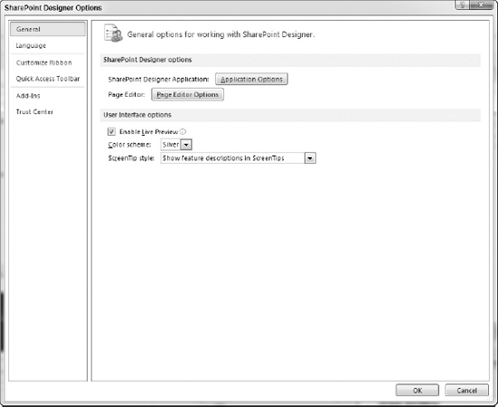
In the Style Application section of the Style tab, the Mode drop-down list is used to indicate if SharePoint Designer should automatically determine where to apply your CSS changes. If you select Auto from the Mode drop-down list, SharePoint Designer will use the preferences on the CSS tab of the Page Editor Options dialog in Figure 5-6 when applying your styles. To display the Page Editor Options dialog, select the File tab from the ribbon. Then, click Options to display the SharePoint Designer Options dialog in Figure 5-5. Finally, click the Page Editor Options button to display the Page Editor Options dialog.
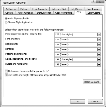
In the CSS tab of the Page Editor Options dialog, the radio button list at the top of the dialog is used to set the default value for the Mode drop-down list on the Style tab in the ribbon. The drop-down lists in the center of the dialog are used to indicate whether SharePoint Designer should use CSS classes or inline styles for the various categories of CSS declarations when updating your CSS styles. The following table lists those CSS categories and the properties they affect:
CATEGORY | PROPERTIES AFFECTED |
|---|---|
Body properties such as background images and background colors | |
Font and font formatting such as bold, italics, and color | |
Background | Background properties such as background images and colors |
Borders | Border properties such as patterns and colors |
Properties for paddings and margins for borders, cells, and other structural elements | |
Applied to alignment, position, and layers | |
Applied to bullets and numbering properties |
If you decide to allow SharePoint to automatically manage your styles, you can select the "Only reuse classes with the prefix 'style' " checkbox to control which styles will be automatically reused when you make your CSS changes. Automatically reusing styles can simplify your design by reducing the overall number of CSS rule sets in your site, but SharePoint Designer could make things worse by junking up an existing CSS rule set with property declarations that you otherwise would not have done if you were to do it by hand. Finally, select the "Use width and height attributes for images instead of CSS" checkbox if you want SharePoint Designer to add the width and height attributes directly on your images. Otherwise, CSS declarations will be used instead.
As previously stated, the Task Panes button on the View tab in the ribbon is used to toggle the display of the various task panes you use to manage CSS styles in SharePoint Designer. Clicking the bottom half of the Task Panes button will display the list of task panes you can enable. The following table lists a brief description of the most commonly used task panes for managing styles and pages. You can access these panes through the Style or the View tabs in the ribbon in SharePoint Designer.
TASK PANE | DESCRIPTION |
|---|---|
Tag Properties | Shows the attributes for the selected element. |
CSS Properties | Shows all styles associated with the current document. Can give a more granular view of styles applied to current element. |
Apply Styles | Allows you to apply, remove, modify, rename, and delete styles, attach or detach external cascading style sheets (CSS), select all instances of a style, and go to the code that contains a style's rule set. |
Manage Styles | Lists all styles defined in the external and internal style sheets of the current document and displays a preview of the style. |
Layers | Lists all the layers that are positioned, either absolutely or relatively. Displays the stacking order of the layers. |
Accessibility | Provides accessibility reports based on the |
Compatibility | Allows you to run a compatibility check based on HTML and XHTML standards and browsers. |
CSS Reports | Check for undefined and orphaned files using the CSS reports feature. |
The Tag Properties task pane displays the attributes of the selected HTML element, whether it was selected in the Design view, Code view, or Split view. In Figure 5-7, the Top Navigation bar is selected, which updates the Tag Properties task pane to display the attributes of the Top Navigation bar. In Figure 5-7, the AccessKey, SkipLinkText and CssClassattribute names are displayed in bold, dark blue text, which indicates that those attributes have been configured on the HTML element. Attributes that are not configured appear in normal, black text and the default value for the attribute is displayed to the right of the attribute name.
Note
Applying a CSS class to ASP.Net and SharePoint elements is a little different than applying them to HTML elements. Use the CssClass attribute to configure the CSS classes for ASP.Net and SharePoint elements. For HTML elements, use the class attribute instead. The easiest way to tell if an element is HTML versus ASP.Net or SharePoint is that ASP.Net or SharePoint elements have a colon (:) in their tag name, whereas HTML elements do not. The following code snippet shows these differences:
<!-- Example HTML elements and their CSS classes. -->

<span class="s4-help"></span>
<div class="s4-rp s4-app"></div>

<!-- Example ASP.Net elements and their CSS classes. -->

<asp:Label runat="server" CssClass="s4-breadcrumb-header" />
<asp:TextBox runat="server" CssClass="ReadOnlyText" />
<!-- Example SharePoint elements and their CSS classes. -->

<SharePoint:AspMenu ID="TopNavigationMenuV4" Runat="server"
CssClass="s4-tn" />
<Sharepoint:SPNavigationManager id="QuickLaunchNavigationManager"
runat="server"
CssClass="ms-quicklaunch-navmgr" />
At the top of the Tag Properties task pane are four buttons that affect the way the attributes are displayed. If you click the first button, the attributes will be grouped by their category and sorted alphabetically as shown. In Figure 5-7, you can see the categories Accessibility and Appearance and their properties listed underneath them. If you click the second button, the attributes are sorted alphabetically but not grouped. While you are styling your pages, you will find yourself switching between both buttons, which is OK. The third button is a toggle button. When the button is depressed, any properties that have been configured will appear at the top of the list. If the attributes are being grouped, they appear as the first attributes in the group. Clicking the fourth button will select the immediate parent element of the location where your cursor is located, which in turn updates the Tag Properties task pane to display the newly selected element's attributes. If you have already selected an element, the fourth button may be disabled.
Note
You have learned that CSS keeps content separate from its presentation and is a best practice for managing styles in SharePoint. Many controls have HTML formatting attributes available for styling. When using the Tag Properties task pane, you will see many styling attributes, including "backcolor." If you must add an inline style to an HTML element, be sure to document it, as it may cause annoying issues during troubleshooting later on.
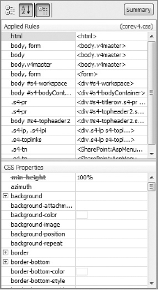
The CSS Properties task pane in Figure 5-8 is similar to the Tag Properties task pane, except that it only shows the rule sets and CSS property declarations for the selected element. The CSS Properties task pane also has buttons at the top to control whether the properties are grouped or simply sorted and whether configured CSS properties appear at the top of the list. It also displays a configured property's name in bold, dark blue text. The Summary button at the top of the task pane is very useful in that when depressed, only the configured CSS properties will appear in the task pane. Click the button again to display all the CSS properties again.
In the center of the task pane is the Applied Rules list. The Applied Rules list contains all the rule sets that apply to the selected element, including its ancestors up to the <html> element itself. In the right-hand column of the list, the HTML element that is configured for the rule set is shown.
Whenever you click a rule set in the Applied Rules list, the CSS Properties list below it will change to reflect only the CSS property declarations for the selected rule set. As previously stated, configured properties appear in a bold, dark blue font. However, if the configured property has been overridden by another rule set, the property name will appear with a red strikethrough line, as shown in Figure 5-9 for the min-height CSS property.
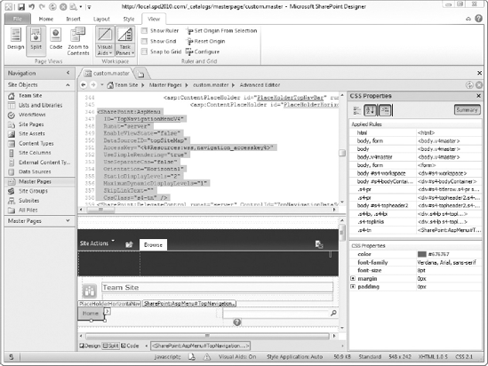
Another feature of the Applied Rules list is that the name of the .css file where the selected rule set is stored is displayed as a blue hyperlink just under the Summary button. Clicking the .css file hyperlink will open it in a new tab in SharePoint Designer. Since a .css file can have thousands of rule sets defined in it, you can double-click any of the rule sets in the Applied Rules list and its .css file will open in a new tab. Additionally, the text cursor will be automatically positioned at the location of the CSS rule set so you do not have to search or scroll to find it. Right-clicking inside the Applied Rules list will display a context menu giving you options for creating a new style, copying an existing style, renaming or removing a style, and creating a new inline style. In the following activity, you will use what you have learned so far to style a few elements in your custom.master master page.
Create a New Style Using the CSS Properties Task Pane
In this exercise, you create a new style for an element. You must complete the "Setup for Branding a SharePoint Site" activity earlier in the chapter before starting this activity.
Open SharePoint Designer from your Start menu.
Click the Open Site button.
When the Open Site dialog appears, enter the URL to your site in the Site name textbox and click the OK button.
If a Windows Security dialog appears, enter your username and password for the SharePoint site and click the OK button.
After the site opens, select Master Pages from the Navigation bar on the left.
In the list of master pages, double-click
custom.masterto open it.Display the CSS Properties task pane by selecting Task Panes
Place the
.masterpage in Design mode by selecting the Design from the View tab on the ribbon.Click the site's title, located to the right of the site's logo.
Note that the CSS Properties task pane has changed to reflect the styles applied to the site's title.
Right-click inside the Applied Rules list of the CSS Properties task pane and select New Inline Style from the context menu. Ensure that <inline style> is selected in the Applied Rules list.
In the CSS Properties task pane, click the second button at the top of the pane to store the CSS properties alphabetically.
In the CSS Properties task pane, locate the font property and click the plus sign to the left of the font property to expand it.
Click inside the value box for (font-family) to display the drop-down list controls for picking the font.
Click the drop-down list and select Comic Sans MS as the value for font.
Enter 20pt as the value for (font-size).
Save the
custom.masterfile by clicking the Save button in the Quick Access Toolbar at the top of the SharePoint Designer window.Select Team Site from the Navigation bar on the left.
Select Preview in Browser from the Home tab on the ribbon.
Notice that the site's title font and size have changed.
Click any of the links to navigate around the site. Notice that the change to the site's title appears there, too.
How It Works
The CSS Properties list inside the CSS Properties pane is driven by two things: the selected element in the master page and the selected CSS rule set in the Applied Rules list. When you created the new inline style, the property changes you made were applied to that inline style. Since the element styled was in the site's master page, your changes appeared on every site page in the site.
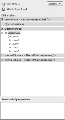
The Apply Styles task pane (Figure 5-10) displays the styles defined in all style sheets related to the page. At the top of the task pane, there are buttons to create a new style and to attach a style sheet. Clicking these buttons will display the same dialogs found in Figure 5-3 and Figure 5-4. There is also an Options button that you can use to categorize the styles by their order in their respective .css files or their type. The Options button can also be used to filter the styles to display all styles, only the styles used in the current page, only the styles used in the current element, or only the styles used in the current selection.
The Select CSS style to apply list box contains the list of the styles you can apply to the selected element. If you want to remove all styles from the element, select Clear Styles at the top of the list. Each of the styles listed is displayed in the font, color, and background of the style. That allows you to preview the style before applying it to the selected element. To apply a style to the selected element, simply select it from the list. That will replace the current style, if any, with the style you selected. If you want to apply multiple styles, hold down the Control (Ctrl) key and click each style you want to apply.

The CSS is grouped by the source of the style, whether external, embedded, or inline. Class-based and ID-based styles appear under either the name of the external .css file that contains the style, or Current Page if the style is in an internal CSS. Element-based styles are organized the same way but appear under a separate heading named Contextual Selectors below the list of class-based and ID-based styles.
In Figure 5-11, the Manage Styles task pane is shown. This task pane appears the same as the Apply Styles task pane, but it has a few unique features. One feature is the additional option, Separate Grouped Selectors, which toggles via the Options button. In CSS, if you have two rule sets with the same declarations, you can combine the selectors for the two rule sets so they share a common declaration block, as shown in the following code snippet:
/* Ungrouped selectors */
th {
  color:green;
  font-size: 12pt;
  font-family: arial, verdana;
}
td {
color:green;
font-size: 12pt;
font-family: arial, verdana;
}
/* Grouped selectors */
th,td {
color:green;
font-size: 12pt;
font-family: arial, verdana;
}In the code snippet, the first two rule sets have type selectors for table headings (<th>) and table cells (<td>), respectively, and they have the same CSS declarations. The third rule set combines the first two by placing both selectors before the declaration block and separating them with a comma. The third rule set is applied as an HTML element that matches either of the two type selectors.
By default, the Manage Styles task pane would display only one item in the CSS styles list box (th, td). If the Separate Grouped Selectors option is enabled, two items are displayed as if they were truly separate rule sets. This would be handy if you wanted to move the td rule set from the code snippet of one .css file to another. That leads to the next unique feature of the Manage Styles task pane, the ability to move styles by dragging them to another .css file in the CSS styles list box. You can also reorder the styles in the .css file simply by dragging them to the desired location.
Note
Reordering styles only works if you enabled the Categorize By Order option via the Options button.
You may have noticed the icons to the left of the styles on the Apply Styles and Manage Styles task pages. These icons serve as a visual aid to indicate the style's selector type, whether or not the style is used on the current page, and other valuable information. The following list outlines the various icons and their meanings:
A blue icon is displayed for a style with a type selector.
A red icon is displayed for a style with an ID selector.
A green icon is displayed for a style with a class selector.
A yellow icon is displayed for an inline style with a class selector.
A An icon with a circle around it indicates that the style is used on the current page.
There are two more icons that may be displayed for your .css files. If the style sheet is missing or the URL is incorrect, an error icon is displayed to the left of the style sheet name, as shown in Figure 5-12.
If the style sheet is attached to the current page using the CSS @import directive, an @ sign will appear next to the style sheet name. The following code snippet shows how to use @import to attach a style sheet to the current page instead of using a <link> element:
<style type="text/css">
@import url('../../Style%20Library/custom.css'),
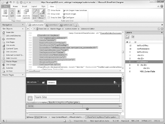
</style>The Layers task pane lists the CSS layers in the current page. A CSS layer is a <div> element that uses the position property of CSS. The position property is set to absolute or relative and the left property is used to position the layer on the horizontal axis. The top property is used to position the layer on the vertical axis.
Normally, a page is rendered top to bottom and left to right, also called a "flow" layout. If the layer's position property is set to absolute, the layer is taken out of the flow of the document. If the layer also has the left and top properties set to 0px, the layer will be displayed in the top-left corner of the page regardless of where it appears in the page's HTML. In this case, the layer is always rendered at a position calculated from the top-left corner of the page. If the layer's position property is set to relative, the position of the layer is calculated from the position of the layer as if the position property had not been set. In other words, setting a layer's position property to relative and its top property to 5px will move the layer down five pixels from its original location.
In Figure 5-13, the Layers task pane is displayed with two buttons at the top of the task pane. The first button is the New Layer button, which creates a new layer as a child of the selected layer in the list. If no layer has been selected and the page is in Design view, the new layer is added as the first child of the <body> element. Otherwise, the new layer is added at the location of the text cursor in the code window. The second button is the Draw Layer button, which allows you to draw a rectangle on the Design view surface. Once the rectangle has been drawn, the layer is created and assigned the next available z-index value. z-index is a CSS property that determines how these layers should appear when they visually overlap.
The layer with the highest z-index value is displayed in front of all other layers. The layer with the lowest z-index value is displayed behind all other layers. If you were to imagine these layers as a deck of cards, the card on the top would have the highest value and the card on the bottom would have the lowest value. It is completely possible that a layer could be completely obscured by a layer with a higher z-index value. Of course, if none of the layers overlap, the z-index value really does not come into play when the page is rendered in the browser.
Underneath the buttons is the list of layers in the current page. The list has three columns. The first column has an "eye" in its column header. This column is used to indicate whether the CSS visibility property is set to visible, hidden, or not set at all. If the visibility property is set to visible, an open eye is displayed in the column. If it is set to hidden, a closed eye appears. If the property is not set at all, the column is left blank. Clicking in the column will cycle the visibility value from default (blank) to visible to hidden and back to default again.
The second column displays the z-index value of the layer. You may have noticed that the layers are sorted in descending z-index order. That puts the topmost layer at the top of the list and the bottommost at the bottom. If you want to change a z-index value, double-click it to put the value in edit mode.
The third column displays the layer's ID attribute. It is also used to indicate if a layer has any child layers, meaning that the <div> element has other <div> elements nested between its tags. If a layer has child layers, an expand/collapse icon will appear to the left of the layer's ID value. In Figure 5-13, the s4-workspace layer has an unnamed layer as a child, which in turn has another unnamed layer as a child. Unnamed layers are <div> elements whose ID attribute has not been set. <No ID> is displayed in the ID column for those layers. If you want to change the ID value, double-click it to put the value in edit mode.
If you need to reposition the layers, simply drag the layer in the task pane to the place you want to move it. The layer's z-index value will be adjusted automatically to an appropriate value for the layer's new position. You can also nest a layer by moving it on top of another layer.
CSS layers, which enable advanced scripting and layouts, are a complex topic. You can find specifications at www.w3.org/TR/CSS2/visuren.html#layers.
To improve usability of your site for people with visual or auditory impairments, you should check your site for accessibility issues. Figure 5-14 shows the Accessibility task pane, which appears by default at the bottom of the screen. The first thing you will notice is the green arrow in the task pane toolbar. Clicking the green arrow displays the Accessibility Checker dialog in Figure 5-15.
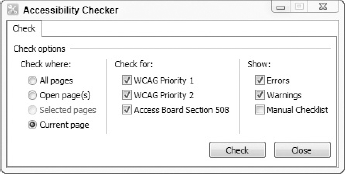
Use the radio buttons on the left side of the dialog to indicate which pages you want to check. The checkboxes in the middle of the dialog are the standards that the Accessibility Checker can use to check your pages. The first two options are the Web Content Accessibility Guidelines (WCAG) and were created by the World Wide Web Consortium (W3C). Priority 1 guidelines must be satisfied or at least one group of users will not be able to use your site at all. Priority 2 guidelines should be satisfied or at least one group of users will have significant difficulty in using your site. You can read more about meeting WCAG guidelines at http://www.w3.org/TR/WCAG10/#Guidelines.
The last option is for the accessibility guidelines from Section 508 of the United States Rehabilitation Act. If you work or are affiliated with the United States Federal government, you will need to meet these standards, especially if your site is public-facing or will be considered an "enterprise-level" application used by many federal employees and contractors. The Section 508 standards are similar to the WCAG guidelines, but they are not prioritized in the amount of impact they have on accessibility.
The checkboxes on the right side of the dialog are used to indicate whether errors or warnings should be shown in the Accessibility Checker results. You can also select the Manual Checklist checkbox to include a list of stock issues that you would check manually against your site. Once you have configured the dialog, click the Check button to run the report.
Once the report is complete, a list of issues will be displayed in the Accessibility task pane. Except for the Manual Checklist issues, each issue will indicate the page and line where the issue occurs. The Problem Summary column displays the gist of the issue. If you want more information about the problem, including possible tips to address the problem, right-click the issue and select Problem Details from the context menu.
You can also navigate to the issue on the affected page by double-clicking the issue or right-clicking the issue and selecting Go to Page from the context menu. One convenient feature of this task pane is that you can navigate straight to the guideline on the Internet by right-clicking the issue and selecting Learn More. Unfortunately, Learn More only works for WCAG guidelines. If you need to share your results with others, click the bottom button on the task pane toolbar to export the results to an HTML report. The generated report will open in a new tab in SharePoint Designer.
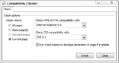
The Compatibility task pane (Figure 5-16) is used to check your pages against XHTML and CSS standards. When you display the Compatibility task pane, it appears at the bottom of the screen. As with the Accessibility task pane, there is a green arrow you can click to show the Compatibility Checker dialog in Figure 5-17.
The left side of the dialog has radio buttons you use to indicate which pages should be checked. The right side of the dialog has two drop-down lists that you use to select which HTML/XHTML and CSS guidelines you want to use during the compatibility checks. Select the checkbox if you want to include the page's DOCTYPE declaration in the checks. Once you are ready to run the report, click the Check button.
The results of the checks are displayed in the Compatibility task pane. Just as with the Accessibility task pane, you can double-click an issue to navigate to the problem and generate an HTML report by clicking the bottom button in the task pane toolbar.
Note
You may get false positives for incompatibility or code errors for content controls since they are not populated until the page is accessed via the browser.
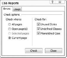
The CSS Reports task pane in Figure 5-18 allows you to check your CSS for errors. Clicking the green arrow button displays the CSS Reports dialog in Figure 5-19. In the dialog, the Errors tab is shown. Like the dialogs in the previous figures, you can use the radio buttons on the left side of the dialog to indicate which pages should be checked. The right side of the dialog contains the options for the types of problems that can be checked. Once you have made your selection, click the Check button to run the report.
The results of the CSS checks are displayed in the task pane. The task pane has columns for the page, line, and style where the issues are encountered. The Error Summary column indicates the nature of the issue. To navigate to the spot where an issue has been encountered, double-click the issue or right-click the issue and select Go to Page from the context menu.

Having efficient and clean CSS is important. No matter much you plan in advance, the iterative and dynamic nature of business will lead to changes in markup and styling. Sometimes, these changes happen quickly and code is left in a messy state with undefined and orphaned selectors.
Leaving your pages in a messy state will greatly increase the costs of future maintenance and cause an undue burden for anyone who inherits the responsibility for maintaining such a site. You should remove unused code from your final product prior to launch. The smaller your files are, the faster your site will perform.
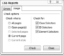
The CSS Reports task pane also gives you the ability to audit the usage of CSS styles in your site. Instead of filling out the Errors tab of the CSS Reports dialog, you fill out the Usage tag as shown in Figure 5-20. The main difference between the two tabs of the CSS Reports dialog is the set of options on the right side of the Usage tab. The checkboxes allow you to choose which types of CSS rule sets will appear in the usage report. Once you have made your selection, click the Check button to run the report.
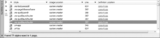
In Figure 5-21, the usage report is displayed. The columns shown are different from those for the CSS errors report. The report lists the styles used, the pages that use them, the lines where they are used, and where the style is defined. If you click the name of the .css file in the Definition Location column, the .css file will open in a new tab and the text cursor will be positioned at the place where the style is located in the file. As with the CSS errors report, double-clicking a style in the report will navigate to where that style is used in the page listed in the Usage Location column.
SharePoint provides the Style Library document library in the root of every site collection, and you use it to store your branding files, including CSS, ECMA Script (also known as JavaScript or JScript), and image files. By default, the Style Library is empty, but if your site was created using the Publishing site template or you activate the SharePoint Server Publishing Infrastructure feature, the Style Library will be populated with the images and XSL files used by the Content Query Web Part and other publishing web parts.
Note
The SharePoint Server Publishing Infrastructure feature is only available in the Standard and Enterprise editions of SharePoint 2010.
Although different schools of thought exist as to how much you should rely on the Style Library for all of your branding artifacts (especially when working on very large projects), getting in the habit of using the library for these types of files is a good idea. Having a central location that is easily managed through SharePoint Designer enables you to customize a site efficiently, especially if you are working as part of a team.
The best way to learn about SharePoint styles is to get your hands dirty and play with the styles. Later in the chapter, you will see the CSS related to the key user interface elements of SharePoint pages. Customarily, a designer will override the CSS styles for these key UI elements and store those overriding styles in a custom .css file.
One of the first things users want is for you to make SharePoint look like something other than SharePoint. Their requests can range from simple tweaks, including custom color schemes, to complete overhauls that make the site look so different that nobody would guess that it is based on SharePoint. Currently, there are several hundreds of public-facing websites based on SharePoint 2007 and SharePoint 2010. To get an idea of what is possible when branding a SharePoint site, visit the following URL to see a list of example websites:
http://www.wssdemo.com/SitePages/SitesByIndustry.aspx
The most common UI elements you would modify are in this section of the chapter, including the ribbon, menus, headings, links, and toolbars. The good thing is that all of the CSS styles you need to override are in the corev4.css file and only a few styles for each control will likely need to be overridden. However, the final number of styles you need to override will depend on the number of changes you wish to make to these controls. When you read about the controls in the next paragraphs, remember that these styles and figures are from a Team Site using the v4.master and the corev4.css file.
The ribbon, shown in Figure 5-22, is a new feature in SharePoint 2010.
The new ribbon control has 520 styles associated with it. These styles rely heavily on the !important attribute to enforce their property declarations. If you override the styles in the ribbon control, you will have to add the !important attribute to your property declarations, too. The following styles are most commonly overridden when this control is customized:
CSS SELECTOR | WHERE USED |
|---|---|
The ribbon's tab headers | |
| A ribbon tab header |
A selected ribbon tab header | |
The anchor ( | |
The tab header text | |
The ribbon tab's body containing the sections and buttons | |
A ribbon section | |
The vertical line separating ribbon sections | |
A ribbon section's body, where the buttons are located | |
A ribbon section's title | |
A ribbon button displayed with a large image | |
| A ribbon button's text when displayed with a large image |
A ribbon button displayed with a medium image | |
A ribbon button's text when displayed with a medium image | |
| A ribbon button displayed with a small image |
A ribbon button hidden from the UI |
The site's title appears directly under the ribbon. The site title displays as a link, and the page and path are displayed as breadcrumbs, as shown in Figure 5-23.
The following styles are most commonly overridden when this control is customized:
CSS SELECTOR | WHERE USED |
|---|---|
The site logo | |
The site title | |
| The site title font and size |
The site title link color | |
The separator between breadcrumbs in the site title area | |
The site description |
Note
SharePoint 2010 uses a technique called CSS sprites to compile multiple graphics into one image. Using the background-position attribute in CSS, SharePoint displays one specific graphic from the larger CSS sprite image. By using CSS sprites, SharePoint reduces the number of files requested and downloaded, resulting in noticeable decreases in page-load time and bandwidth.
One example of a CSS sprite image used in SharePoint styles is the bgximg.png image found in the layouts directory: http://yoursitename.com/_layouts/images/bgximg.png.
This one-pixel-wide image is used to apply a gradient to the background of various elements on the page. If you were to open this URL in your browser, the page would look blank since the imae is so thin, but when it is repeated many times in a horizontal direction, it looks like a larger, elaborate image. The best part is that the file is extremely small, which makes it download almost instantly.
The search controls appear on the top right of the page, inside the navigation bar, as shown in Figure 5-24.
The following styles are most commonly overridden when this control is customized:
CSS SELECTOR | WHERE USED |
|---|---|
The search control container | |
The search textbox's font and border | |
The search textbox's text color | |
The search button |
The sign-in link is at the top right of the screen, as shown in Figure 5-25.
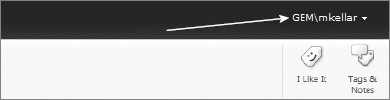
Override the .s4-signInLink style to restyle the link. You have to add the !important attribute to override the link's text color.
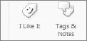
The social media notification buttons on the right-side of the ribbon in SharePoint 2010 are shown in Figure 5-26.
The following styles are most commonly overridden when this control is customized:
CSS SELECTOR | WHERE USED |
|---|---|
The vertical separator to the left of the I Like It button | |
| The buttons themselves |
| The buttons when the mouse is hovering over them |
The text on the buttons |
The top navigation bar of the site (see Figure 5-27) is located at the top of the site's pages, just under the ribbon.
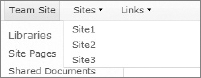
The clickable HTML elements in the top navigation bar are called navigation nodes. Navigation nodes with children have a down arrow that appears to the right, and when the arrow is clicked, a fly-out menu appears displaying the navigation node's children. The following styles are most commonly overridden when this control is customized:
CSS SELECTOR | WHERE USED |
|---|---|
The | |
The unordered list ( | |
| The navigation nodes that appear as tabs on the navigation bar that do not have children. |
The anchor ( | |
| The navigation nodes that appear as tabs on the navigation bar that have children. |
| The flyout menu containing the children of a navigation node. |
The anchor ( | |
Styles the navigation node currently selected. A navigation node is considered to be selected when the browser has navigated to that navigation node's destination URL. In Figure 5-29, the Team Site navigation node is currently selected because the browser had navigated to the site's home page. | |
Styles the navigation node currently selected when the mouse is hovering over it. |
In a site with Publishing features enabled, a yellow status bar (Figure 5-28), called the Page Status Bar, will appear just under the ribbon on each site page. The Page Status Bar indicates the current page's checkout and publishing status.
The following styles are most commonly overridden when this control is customized:
CSS SELECTOR | WHERE USED |
|---|---|
The | |
The page status bar itself | |
| The page status bar and its descendants |
| Any anchor ( |
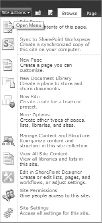
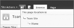
The Site Actions menu (see Figure 5-29) appears just above the ribbon in the upper left-hand corner of the page. Of all of the component parts of the Site Actions menu, the actual Site Actions button you click to display the menu is the most commonly styled element. Since many of the menu items have icons next to them in the menu, you will need to take care if you style the background behind the images to avoid making them difficult to see. The button to the right of the Site Actions menu is the Navigate Up button, which displays the breadcrumb trail for the current page. Figure 5-30 shows the breadcrumb trail that appears when the Navigate Up button is clicked.
The following styles are most commonly overridden when this control is customized:
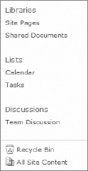
The Quick Launch bar in Figure 5-31 is located on the left side of site pages. The quick launch navigation has two different areas: the left navigation links and the special navigation links for Recycle Bin and All Site Content. All of these areas are security trimmed. Security trimmed elements do not appear on the page when the user does not have permission to see the element or navigate to the element's destination URL when clicked.
The following styles are most commonly overridden when this control is customized:
CSS SELECTOR | WHERE USED |
|---|---|
| The |
| The Quick Launch bar. |
The items in the top area of the Quick Launch bar. | |
The text of the items in the top area of the Quick Launch bar. | |
The headings in the top area of the Quick Launch bar. In Figure 5-31, the headings are Libraries, Lists, and Discussions. | |
| The items under the headings in the Quick Launch bar. |
The bottom area of the Quick Launch bar containing the Recycle Bin and All Site Content links. | |
| The Recycle Bin. |
All Site Content link. | |
The anchor ( |
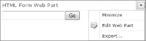
Web parts have many HTML elements that can be styled. Web parts have a title bar, a web part menu, the divider between the title bar and the web part's content, the web part's content area, and the "chrome" border around the web part. In Figure 5-32, the HTML Form Web Part is displayed along with its web part menu on the right.
The following styles are most commonly overridden when this control is customized:
CSS SELECTOR | WHERE USED |
|---|---|
The title bar at the top of the web part | |
The empty space to the left of the web part title | |
The web part title | |
| The area to the left of the web part menu arrow that contains the web part's title |
| The down arrow that displays the web part menu when clicked |
| The web part menu |
The border around the web part body | |
The web part body |
SharePoint themes are a collection of CSS and images applied at runtime to control the look and feel of your site. Themes have been tailored for use by non-technical people. In fact, themes can be completely managed through the user interface without the user having any knowledge of CSS.
In SharePoint 2007, you created a theme by creating a subfolder under the C:Program FilesCommon FilesMicrosoft SharedWeb Server Extensions12TEMPLATETHEMES folder where the out-of-the-box themes were stored. Usually, you named the subfolder to match the name of the theme. Inside the subfolder, you would places the images and CSS files comprising your theme.
In SharePoint 2010, themes have changed dramatically as you now design your themes using Microsoft PowerPoint 2010 the same way you design a custom Microsoft Office theme. A Microsoft Office 2010 theme includes a set of theme colors, fonts, and visual effects that are stored in a special .thmx file. In SharePoint 2010, these .thmx files can be uploaded to SharePoint, which allows site owners to choose one of those new themes for their site. SharePoint 2010 comes with 20 themes out of the box, but you can easily create your own.
To create a new theme, open Microsoft PowerPoint 2010. Once the program has opened, click the Design tab as shown in Figure 5-33. To choose your theme's colors, select the Colors drop-down from the ribbon and click Create New Theme Colors to display the Create New Theme Colors dialog in Figure 5-34.
In the dialog, choose the colors for your theme, enter your theme name in the Name textbox, and click the Save button. You can use the Sample images on the right side of the dialog to preview your color scheme.
Once you have made your color selection, select the Fonts drop-down from the ribbon and click Create New Theme Fonts to display the Create New Theme Fonts dialog in Figure 5-35. Select a font for Headings from the Heading font drop-down list and a font for body text from the Body font drop-down list, enter your theme name in the Name textbox, and click the Save button. The Sample textbox shows a preview of your font selection.
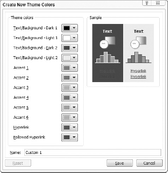
Now that you have selected your colors and fonts, click the down arrow just to the right of the Effects drop-down list and click Save current theme (Figure 5-36) to save your theme to a .thmx file. In the Save Current Theme dialog, select a convenient folder for your .thmx file, such as My Documents or Desktop, enter the name of your theme, and click the Save button.
When you are ready to deploy your theme to SharePoint, you may be tempted to deploy the files to C:Program FilesCommon FilesMicrosoft SharedWeb Server Extensions14TEMPLATETHEMES, but that folder is for backwards compatibility purposes. Now, you can upload your themes in the browser or SharePoint Designer. In SharePoint 2010, the new Theme Gallery (Figure 5-37) is provided for you to store your themes. To open the Theme Gallery using your browser, select Site Settings from the Site Actions menu. Then, click the Theme Gallery link under the Galleries section of the Site Settings page. Alternately, you can use SharePoint Designer to access the Theme Gallery by clicking All Files in the Navigation bar on the left side of the screen and navigating the site's folder structure to /_catalogs/theme as shown in Figure 5-38.
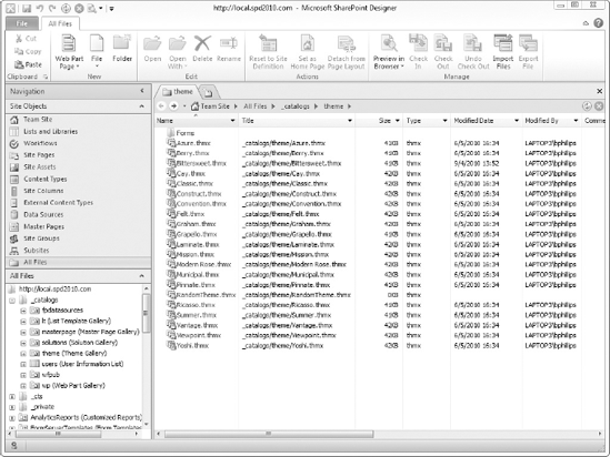
Note
Unlike the Master Page Gallery, the Theme Gallery only exists at the site collection level. Once you upload your theme, it will be available to all sites in the site collection.
Once your theme is uploaded to SharePoint, use the Site Theme page to apply it to your site. You access the Site Theme page by selecting Site Settings from the Site Actions menu and clicking Site theme under the Look and Feel section of the Site Settings page.
The Site Theme page in Figure 5-39 is very powerful. You can select a theme for your site from the Select a Theme list box and apply the theme to all subsites using the Inherit Theme and Apply Theme radio button lists. To customize your selected theme, make your changes in the Customize Theme section of the page. Clicking Select a color next to one of the colors will display the Colors dialog in Figure 5-40. In the Colors dialog, you can manually enter the RGB value in the textbox or select a color from the color wheel. You can also preview the site using your selected theme by clicking the Preview button to display the Preview dialog in Figure 5-41. Once you are satisfied with your changes, click the Apply button to apply them to your site.
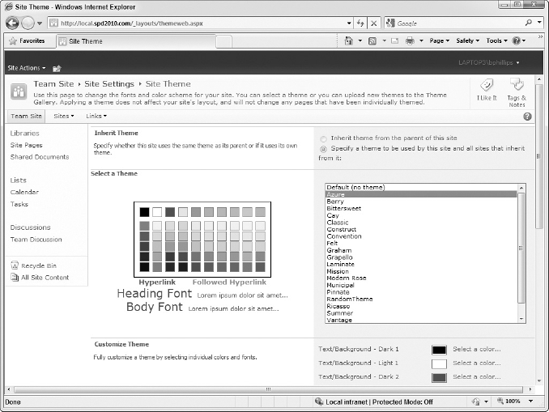
Note
The Preview dialog previews the theme using your site's home page, but you will not be able to navigate to any other page to preview it. Clicking a link in the Preview dialog will open a new browser window, which will not have the previewed theme applied to it. However, you can use the ThemeOverride query string variable to preview your theme on any page. The ThemeOverride query string variable needs to be set to the relative URL of the theme's .thmx file in the Theme Gallery. For example, to preview the Vantage theme with the Site Settings page, use http://siteurl/_layouts/settings.aspx?ThemeOverride=/_catalogs/theme/Vantage.thmx, where siteurl is the URL of your site. If your URL already contains query string variables, modify your URL like so: http://siteurl/_layouts/people.aspx?MembershipGroupId=5&ThemeOverride=/_catalogs/theme/Vantage.thmx.
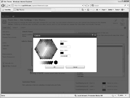
If you have a theme you created for SharePoint 2007 and want to upgrade it to work in SharePoint 2010, you have two options: recreate the theme by hand in PowerPoint 2010 or deploy the theme's files to the Style Library and use the techniques you learned in this chapter to style your master page with them. Specifically, you must attach the .css file from the old theme to your master page. Keep in mind that many of the CSS class names have changed between SharePoint 2007 and SharePoint 2010, so you will have to substitute the new class names for the old ones.
Create and Use a Custom Theme
In this activity, you will use Microsoft PowerPoint 2010 to create a custom theme and apply it to your site.
Open Microsoft PowerPoint 2010.
Select Colors
In the Create New Theme Colors dialog, select a different color for each of the Theme Colors drop-down lists.
Enter RandomTheme in the Name textbox.
Click the Save button to close the dialog.
Select Fonts
In the Create New Theme Fonts dialog, select a different font for each of the font drop-down lists.
Enter RandomTheme in the Name textbox.
Click the Save button to close the dialog.
Click the down arrow to the left of Effects in the Design tab on the ribbon.
Select Save Current Theme at the bottom on the Themes drop-down menu.
In the Save Current Theme dialog, navigate to your desktop and enter RandomTheme in the File name textbox.
Click the Save button to save your theme.
Close Microsoft PowerPoint 2010. If prompted, do not save the new presentation that was created when you first opened Microsoft PowerPoint 2010.
Open your browser and navigate to your SharePoint site.
Select Site Settings from the Site Actions menu.
Click Themes under the Galleries section of the Site Settings page.
Select Upload Document from the Documents tab on the ribbon.
In the Upload Document dialog, click the Browse button and navigate to the
.thmxfile on your desktop.Select the
.thmxfile and click Open to close the dialog.In the Upload Document dialog, click OK to upload your theme to your SharePoint site.
When the Theme Gallery - RandomTheme.thmx dialog appears, click the Save button.
Notice that your theme is now available in the list.
Select Site Settings from the Site Actions menu.
Click Site Theme under the Look and Feel section of the Site Settings page.
Select RandomTheme from the Select a Theme list box.
Notice that a preview of the selected theme now appears to the left of the Select a Theme list box.
Click the Preview button at the bottom of the page.
After the preview dialog opens and navigates to your site's home page, notice how the site has changed.
Close the preview dialog.
Click the Apply button at the bottom of the page to set RandomTheme as the site's theme.
Click the site's title to return to the site's home page.
To revert back to the site's default theme, follow Steps 24–32, selecting Default (no theme) in Step 26.
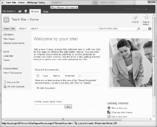
How It Works
The theme colors and fonts you selected in Microsoft PowerPoint 2010 were saved in a .thmx file. The .thmx file is actually a .zip archive and is structured according to the Office Open XML File Formats. Other examples of Office Open XML files are Microsoft Word (.docx), Microsoft Excel (.xlsx), and Microsoft PowerPoint (.pptx) files. When you uploaded the .thmx file to the Theme gallery, SharePoint read the theme colors and fonts from the file and allowed you to select the theme on the Site Theme page. When you applied the theme to the site and viewed the site's home page, SharePoint replaced the default values of the theme-able styles in corev4.css on-the-fly with the ones you chose in Microsoft PowerPoint 2010. This modified version of corev4.css was sent to the browser instead of the real one.
A SharePoint site's look and feel is much more than just colors and a logo. Understanding the different areas of visual design and user experience can guide your customizations. The extent of your intended customizations determines whether you use master pages, page layouts, themes, or custom CSS to implement your designs.
The layout of your website is controlled by your master pages, page layouts, and web part pages. If you want to hide or move UI elements that appear on every page, including the Quick Launch and Top Navigation Bars and the Site Actions menu, you need to create a custom master page. If you only want to change the size, location, or orientation of where web parts should go, you only need to change the page layouts and web part pages in your site.
If you decide to create a custom master page, you can customize the existing master page v4.master or start from a minimal master page. A minimal master page has only the bare minimum controls and styling needed to run SharePoint. Out-of-the-box, SharePoint provides minimal.master located in the Master Page Gallery. The minimal.master file is very small and mainly contains the ribbon and the ContentPlaceHolder controls required by SharePoint site pages. At the very bottom of the file are the ContentPlaceHolder controls PlaceHolderMain, where the main content appears on the page, and an invisible <div> tag containing the ContentPlaceHolder controls that most designers would want to hide, as shown in the following code snippet:
<div id="maincontent" class="s4-pr">
<asp:ContentPlaceHolder id="PlaceHolderMain" runat="server" />
</div>
<div style="display:none;">
<asp:ContentPlaceHolder id="PlaceHolderLeftNavBar" runat="server" />
<asp:ContentPlaceHolder id="PlaceHolderNavSpacer" runat="server" />
<asp:ContentPlaceHolder id="PlaceHolderBodyLeftBorder" runat="server" />
<asp:ContentPlaceHolder id="PlaceHolderPageImage" runat="server" />
<asp:ContentPlaceHolder id="PlaceHolderTitleLeftBorder" runat="server" />
<asp:ContentPlaceHolder id="PlaceHolderSearchArea" runat="server" />
<asp:ContentPlaceHolder id="PlaceHolderTitleAreaClass" runat="server" />
<asp:ContentPlaceHolder id="PlaceHolderTitleAreaSeparator" runat="server" />
</div>
You can use minimal.master as a starting point by creating a copy of it and making your changes in the copy.
If you need to create new or modify the existing Page Layout pages, they are located the Master Page Gallery. As with other built-in files, you should not modify the existing files directly; rather, you should make a copy for editing. Page Layout pages are actually templates that define where content should appear. The pages that are derived from Page Layout pages are called Publishing Pages and get their content from the columns of the document library where they are stored. When you activate the Publishing features of SharePoint, a Pages document library is created where these Publishing Pages are stored.
Note
Page layouts are only available in the Standard and Enterprise editions of SharePoint Server 2010. They are not available in SharePoint Foundation 2010.
Modifying web part pages is much simpler. Because they effectively fill in the holes left open by their master page, you are limited in how you can change them. For example, you will not be able to change where the Quick Launch bar appears, but you could hide it by adding a blank <asp:Content> tag whose ContentPlaceHolderId attribute is set to PlaceHolderLeftNavBar. The other most common change to a web part page is simply resizing or repositioning the web part zones. The web part zones are actually <WebPartPages:WebPartZone> controls. These controls have two main attributes: ID, which uniquely identifies the control and doubles as the name of the zone it represents, and Orientation, which determines whether web parts will appear in a horizontal or vertical line. A web part zone's Orientation is Vertical by default.
Note
You must edit a web part page in Advanced Mode to change web part zones. Normal Mode only allows you to change web parts, just as in the browser.
Branding is more than just the look and feel of the website. It is the core of the website's identity. The colors, fonts, images, and other embellishments are the elements that make a website visually unique. Web designers call this type of styling "branding" because it is the brand of your website. Whether you are branding your intranet or a public-facing website, you have a range of options.
The easiest option to brand your site is to simply choose one of the out-of-the-box themes and click Apply on the Site Theme page. If your organization already has a list of fonts and colors mandated by the marketing department, you could create a custom theme using Microsoft PowerPoint 2010 and apply that.
Another option would be to create a custom .css file and attach it to your master page. In your custom .css file, you would create CSS rule sets whose CSS selectors match those of the controls in SharePoint that you want to style. Then, you add new property declarations that append or override the properties of the controls. Since your custom .css files must appear after all other .css files in order to have any effect on the page, use the <SharePoint:CssRegistration> control to register your .css files with SharePoint at runtime. You modified a master page in Chapter 3 by adding this control to a style sheet that rounded the corners of top navigation. The following code snippet shows the <SharePoint:CssRegistration> control in action:
<SharePoint:CssRegistration runat="server" After="corev4.css"
Name="/Style Library/custom.css" />
In the code snippet, the Name attribute is used to specify the URL of the .css file, and the After attribute is used to specify the name of the .css file that it should load after. If you have multiple .css files to load and their load order is important, you need to register them in reverse order, as shown in the following code snippet:
<SharePoint:CssRegistration runat="server" After="corev4.css"
  Name="/Style Library/third.css" />
<SharePoint:CssRegistration runat="server" After="corev4.css"
  Name="/Style Library/second.css" />
<SharePoint:CssRegistration runat="server" After="corev4.css"
  Name="/Style Library/first.css" />
In the code snippet, the three .css files are registered in reverse order so that the first.css, second.css, and third.css are loaded in that order, respectively.
Note
If you are using SharePoint Server 2010 and Publishing features are activated for your site, you can skip using the <SharePoint:CssRegistration> control and configure the site using the browser instead. Your .css file can be specified in the Alternate CSS Url section of the Site Master Page Settings page. You open the page by selecting Site Settings from the Site Actions menu and clicking Master Page under the Look and Feel section.
This chapter explained how SharePoint Designer 2010 helps you build, design, and style your SharePoint sites, provided a brief overview of CSS basics, and walked you through the styling tools in SharePoint Designer.
The main points to remember from this chapter are:
CSS is a major part of branding SharePoint sites.
The
corev4.cssfile contains most of the CSS rule sets that you need to override when styling your site.SharePoint Designer provides you with a variety of task panes and toolbars that allow you to easily discover existing styles and create new ones.
The key UI elements in SharePoint pages to style and their main CSS rule sets to override.
Users who are not confident in their CSS abilities can still brand their sites using an out-of-the-box theme or a theme created with Microsoft PowerPoint.