
WHAT YOU WILL LEARN IN THIS CHAPTER
As Chapter 1 discusses, SharePoint Designer 2010 is about far more than editing pages. However, page layout and design is still an important part of the product. Indeed, many of the functions you will learn about in later chapters also rely on the page editor.
Chapter 1 briefly introduced you to the broad array of artifacts you can work with in SharePoint Designer 2010. Some of them, such as site pages and master pages, are truly pages and labeled as such. Other files, such as layouts and Cascading Style Sheets (CSS), are not; however, you will still use the "page" editor to create and make changes to these files. Some SharePoint elements, such as data view web parts, can only be effectively modified in SharePoint Designer while they are placed on a page.
Although this chapter touches on some of these items, it is more about the tools available for working on all file types rather than working with particular artifacts. Such artifacts are covered in detail in their respective chapters. For example, this chapter discusses the table editing tools. Chapters 6-8 assume you know how to work with these tools in the discussion of how to use them to modify data views.
The Page Editor in SharePoint Designer is the workspace where you compose the elements of your page. The major elements of the SharePoint Designer editing workspace include the ribbon (discussed in Chapter 1), the design surface itself, the status bar, and a wide array of task panes. The workspace is quite customizable. Virtually every task pane can be resized, shown, hidden, set to float, or docked.
The design surface offers three primary modes, or views, of the page that is currently open — Design, Code, and Split. You can select these modes via icons in the View ribbon tab, or with the Page Mode toolbar, which is always visible at the left along the lower window margin.
Note
All three views are available for web page file types (.htm, .aspx, and .master, for example). Files such as .css, .js, and .txt that do not have a direct visual component only have Code view and do not display the Page Mode toolbar.
Figure 2-1 shows the Page Editor in Design view, with the maximum possible design surface shown. All the task panes are hidden, and the ribbon and navigation pane are minimized.
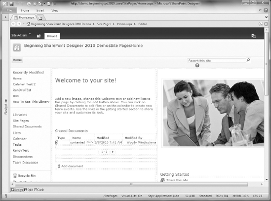
You can minimize the ribbon by double-clicking the active tab. You can display a tab when needed by clicking on its name. It overlays the design surface menu-style until you click an element, and then re-hides. You can restore the ribbon to normal operation by double-clicking any tab title. Task panes and their positioning are discussed later in this chapter.
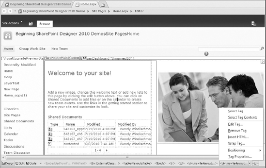
In addition to the design surface itself, the Page Editor has the following elements (see Figure 2-2):
Tab bar — Across the top of the Page Editor is a tab bar, which gives access to each file or summary view that is currently open in SharePoint Designer. Files that have been modified since being opened or last saved are indicated with an asterisk (*).
Page Mode toolbar — Below the design surface and to the left is the Page Mode toolbar. This selects which of the three editing modes to display.
Quick Tag Selector — To the right of the Page Mode toolbar is the Quick Tag Selector. Although, on the surface, it appears to be a simple HTML breadcrumb, displaying the hierarchy of tags nesting down to the currently selected element, it is much more than that. Clicking a tag in the Selector immediately selects that element in the current view (hence the name). In addition, each tag in the Selector provides a context menu (as shown in Figure 2-2), allowing you quickly to adjust the parameters of the tag, create a containing tag, or even to remove the tag without removing any child controls.
Status bar — The status bar tells you all about your page design experience, but like the Quick Tag Selector, the status bar is also your active partner in the editing process. In addition to being context-sensitive (the set of elements displayed on the status bar is dependent upon the current selection), many status segments also provide the option to edit the setting they are reporting.
The Design view offers a what-you-see-is-what-you-get (WYSIWYG) editing experience. It supports many traditional GUI document-editing functions:
Fonts, styles, and item placements correspond very closely to the final page rendering.
You can copy, cut, and paste, both within SharePoint Designer and between SharePoint Designer and other applications.
You can drag elements from one place and drop them elsewhere.
Note
This book assumes you already know these and other basics of using Microsoft Windows to edit documents. Unless otherwise specified, all "normal" Windows functions apply within SharePoint Designer, and will not be separately described.
Design view also supports the use of the ruler and grid options (with and without snap-to) typically found in graphics and page layout programs. In addition, a wide array of specialty tools is provided to improve your design experience. Some of them, such as Visual Aids and Table Tools, are described in this chapter, whereas others are covered later in the book.
The following sections discuss some of the features of the Design view.
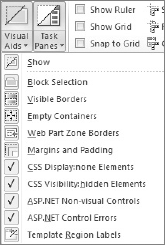
To assist you with your page designs, SharePoint Designer provides a number of visual aids. Visual aids provide a way for you to see and access page elements that may not normally be visible, such as ActiveX controls, content placeholders, or items with a hidden attribute. Figure 2-3 shows a page with all visual aids enabled.

To keep your workspace uncluttered, you can enable or disable specific types of visual aids, either by using the drop-down menu on the Visual Aids icon in the View tab (see Figure 2-4) or by clicking the Visual Aids segment in the status bar. You can turn all enabled visual aids off or on at once by clicking the ribbon icon directly or by clicking the Show link at the top of the menu.
Visual aids only appear in the Design and Split views, although the setting displays in the status bar and is configurable in Code view.
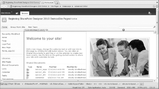
Although visual aids can make the design of a page much easier, they also can significantly affect the layout as seen in Design view. Turn off visual aids occasionally to verify precise positioning. Figure 2-5 shows the same page shown in Figure 2-3, with the visual aids turned off.
You can further improve the accuracy of your layout experience by setting the Design view to a specific set of dimensions. In the status bar, you can see the current dimensions of the window that the Design view represents. Click the dimensions entry to see the menu shown in Figure 2-6, which allows you to choose from several page sizes.
If the selected dimensions are smaller than the current design window, the width of the working area is reduced to the horizontal dimension selected. If the selected dimensions are larger than the current design window, the workspace is expanded horizontally, and the scroll bar at the bottom of the window is activated.
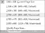
Several common page sizes are provided by default. You can add your own dimensions.
When you select a fixed page size, the dimension status shows a hash symbol. The Page Size menu is also available under the View menu.
Note
Even though fixing sizes and turning off visual aids give you a more accurate view of your page, they can't compensate for differences in rendering between browsers. Remember to use the Preview in Browser function periodically (discussed in Chapter 1) to give your pages a "real" test.
As noted earlier, SharePoint pages are very complicated beasts. As such, accidentally changing "the wrong thing" and rendering a page unusable is possible. Visual aids and Skewer Click are two ways SharePoint Designer 2010 helps you select the right thing. SharePoint Designer can also help prevent selecting the wrong thing by offering two different modes for editing pages — Safe mode and Advanced mode.
SharePoint opens most site pages (non-publishing web part pages, list and library form pages, and Wiki pages) and layout pages in safe mode by default. In this mode, many page elements are considered "off limits" for editing. The number of editing tools available is also reduced. For example, the main Layout and Style ribbon tabs are not shown in Safe mode. The Table Layout contextual tab is available, however.
The only things you can change in Safe mode are the contents of Wiki fields and web part zones — essentially the same elements that can be edited through the Web. You do, however, have much finer control over the contents of those areas in SharePoint Designer.
When editing in Safe mode, the mouse pointer turns into a null symbol when you move it over areas you are not permitted to change. In Code view, uneditable areas appear with highlighting, as shown in Figure 2-7.
Advanced mode brings the full power of SharePoint Designer's editing tools to bear. For example, in a site page, you are no longer limited to modifying the contents of a content zone. In particular, you can now override the contents of many of the default components (the <asp:ContentPlaceholder> tags) specified in your master page.
Warning
Overriding master page elements for specific pages via SharePoint Designer can result in significant inconsistencies in the look or operation of your site. This is why these operations are not considered "safe."
Master pages themselves are a special case. SharePoint Designer always opens master pages in Advanced mode because you use them to actually define the look and feel of your site. By definition, you need the functions available in Advanced mode to control the layout and style of these pages. See Chapter 3 for details about creating master pages and including content placeholders.
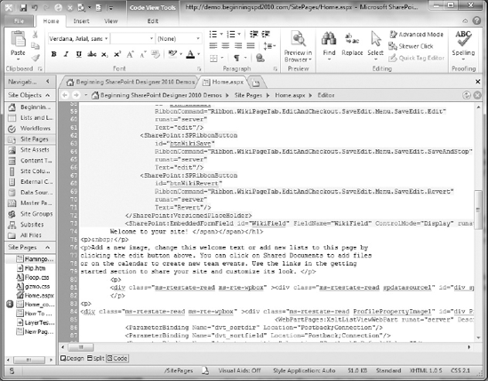
Although the SharePoint Designer Design view provides an easy and powerful way to create, lay out, and edit the pages of your site, at the end of the day, these pages remain what they have always been — plaintext HTML and script. Fortunately, SharePoint Designer is just as adept at helping you work with code as it is with page design. Figure 2-8 shows the same page you have seen in the prior shots in SharePoint Designer's Code view.
Although it may be difficult to see on a book page, Code view uses color coding to help you recognize tags, delimiters, parameters, inline text, comments, and many other code elements. In fact, Code view offers all the assistance typical of any modern development environment, and then some, as discussed in the following sections.
IntelliSense has been a part of Microsoft development tools for more than a decade. Usually manifesting as a pop-up, it detects what you are typing and offers suggestions for completing your task. Though originally limited to program code, in SharePoint Designer Code view, IntelliSense has been expanded far beyond that. It now includes such features as:
Automatic tag and brace closure
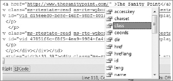
Parameter selection (as shown in Figure 2-9)
CSS statement completion
Automatic code hyperlinks
Programming code completion
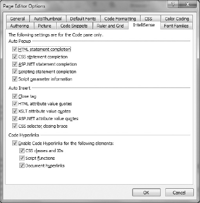
Not everyone wants or needs this level of automatic assistance. You can therefore enable or disable IntelliSense for each of the available elements. The IntelliSense tab (see Figure 2-10) of the Page Editor Options dialog provides a complete list of IntelliSense settings available.
IntelliSense in Code view further helps you by being sensitive to your settings for browsers, HTML, and CSS version. For example, the primary IntelliSense options shown in Figure 2-10 are the Authoring options that are available in a tab on the Page Editor Options dialog. You can access this dialog either by clicking one of the authoring mode indicators on the right side of the status bar (Standard, XHTML 1.0 S, and CSS 2.1 are the indicators, shown earlier in Figure 2-8), or by selecting File
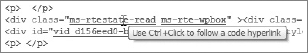
Notice that the bottom section of the IntelliSense tab shows options for Code Hyperlinks. These are not hyperlinks you create for your users. Rather, they are links created by SharePoint Designer to help you navigate within your code. When you hover over such a link, SharePoint Designer displays the tooltip shown in Figure 2-11, indicating that you can press the Ctrl key when you click in to open the target.
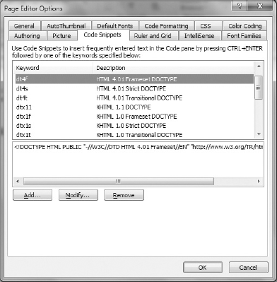
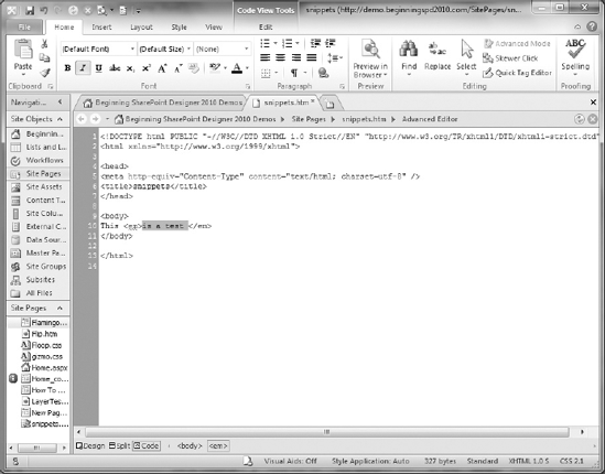
Another handy shortcut offered by Code view is code snippets. SharePoint Designer includes pre-defined snippets for such things as HTML document types, script blocks, and style sheet links. You can insert a snippet by pressing Ctrl+Enter and typing the snippet name/keyword, or by selecting the one you want from a list just like an IntelliSense parameter.
Watch IntelliSense in Action as You Create a Code Snippet
Open a site in SharePoint Designer.
Click the All Files section in the Site Objects list. Observe that the ribbon changes to the All Files tab.
In the New section of the All Files tab, click File, and select HTML.
Name the new file Snippet.html.
Click the filename to open the file.
Click Code in the Page Mode toolbar.
Click between the
<body>and</body>tags.Begin to type the following line of code:
<div class="|"><div>
While typing, observe the operation of IntelliSense as it offers to complete the tag for you.
As soon as the class parameter is highlighted by IntelliSense, press the Tab key. Observe that the cursor is placed between the "quotes." Also observe that SharePoint Designer creates red squiggled underlines to indicate that the code following the inserted text doesn't (yet) match the expected syntax for HTML.
Type the vertical bar/pipe symbol (|).
Use your right-arrow key to move the cursor outside of the quotes, and type the
>character. Notice that IntelliSense automatically adds the closing</div>tag and SharePoint Designer now recognizes the remaining page syntax as correct.Copy the typed text to the Clipboard.
Press Ctrl+Enter. Select the first item on the pop-up list (Customize List), which opens the Code Snippets tab (see Figure 2-12) of the Page Editor Options dialog.
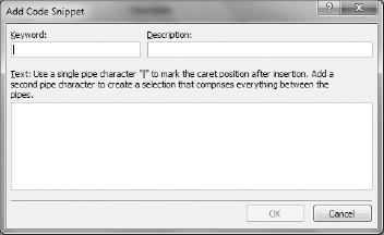
Click Add to summon the Add Code Snippet dialog (see Figure 2-13).
Type DIV into the Keyword field.
Type A fully built DIV tag into the Description field.
Paste your code into the Text box. (Alternatively, you can manually enter any desired text, but using copy and paste from a known-good source is more reliable.)
Click OK to save and close each currently open dialog.
Place your cursor on a blank line.
Press Ctrl+Enter. Notice that the snippet you created is now available on the list.
How It Works
If you find yourself frequently typing the same thing, maybe with minor variations, you can define your own code snippets to help you. You can define a text entry point with a pipe symbol, as shown in the exercise. If you surround some text with two pipe symbols, you define a range to be selected upon insertion of the snippet.
In addition to using the copy/paste/Ctrl+Enter method to create a snippet described in the exercise, you can directly add and edit snippets through the Code Snippets tab of the Page Editor Options dialog.
In the past, you might have gone back and forth between an application's Design and Code views, depending on what you needed to change. For example, after editing a piece of script in Code view, you would return to Design view to set some text formatting. Otherwise, you would need to enter or edit the formatting tags in code manually. In SharePoint Designer, that kind of toggling is much less necessary. SharePoint Designer allows you to use many of the same techniques for formatting text in Code view as in Design view.
Figure 2-14 shows that formatting options (bold, italic, and underline) are available while you are editing in Code view. In fact, they are fully active and interactive with your HTML.
Just as in Design view, selecting a formatting command from the toolbar applies that format to (or removes it from) your selection. Unlike Design view, Code view does not show you the item in its formatted state. Instead, you see the HTML tags that are applied to make that format happen.
In addition, the state of the toolbar icons follows the current HTML. In Figure 2-14, the highlighted text is inside an <em> (emphasis) tag, which is rendered in italic on a web page. Also, notice that the Quick Tag Selector for the emphasis tag is active.
The same holds true when adding elements to a page. You can easily drag an item from the Toolbox task pane into the Code view editing window. SharePoint Designer automatically creates and inserts the appropriate HTML, just as if you had dropped the item into position in Design view.
Warning
One quirk of SharePoint Designer is that immediately after you insert a snippet, some formatting options (for example, text alignment) are disabled. You must switch to Design view or Split view (see the following section) and then back to Code view to restore full visual coding functionality.
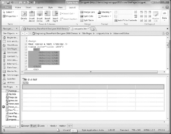
The Split view of the Page Editor provides all the advantages of both Design and Code view. Each half of the view behaves exactly like its dedicated view. Code view, for example, gives you IntelliSense, whereas Design view maintains rulers and any page sizes you have set. In Figure 2-15, a table row has been selected from the Quick Tag Selector. Notice the highlighting in both the Code and Design panes of the Split view.
As you make changes in the Design pane, you can immediately see the effect on your code. The reverse is not true. Changes you make as you are editing code are not visible in the Design pane right away. You must act to indicate to SharePoint Designer that you are done with your edits, such as by clicking in the Design pane or saving your file, before the edits are reflected. This is because while you are editing in the Code pane, much of the time your markup may be in a transitional state that does not have a valid rendering. By waiting until you explicitly select the Design view, SharePoint Designer helps avoid the confusion that can result from page elements jumping all over the place as the rendering engine tries to make sense of the invalid markup.
Note
Any styles you select are applied following the rules defined in the CSS tab of the Page Editor Options dialog, regardless of whether you use Design, Code, or Split view. See Chapter 6 for more information about using CSS styles in SharePoint Designer.
SharePoint Designer is a versatile, powerful application. Helping you control that power and versatility is the province of the ribbon tabs and task panes. Each ribbon tab and task pane controls a related set of functions. The following sections briefly discuss the common ribbon tabs and task panes, and how to manage them.
SharePoint Designer 2010 offers 17 task panes. With that many possible control elements in the application, showing them all at once is totally impractical. Assuming they fit at all, you would have no room left on the screen for the Page Editor to perform any work. Fortunately, SharePoint Designer provides a great deal of flexibility in their display.
Task panes can be individually shown, hidden, docked, or floating. The possible docking positions are the four edges of the SharePoint Designer window — above, below, right, and left of the design surface (which is always visible). You can move a visible task pane to any of these positions by dragging its title. Floated task panes may be within or outside of the SharePoint Designer application workspace. Figure 2-16 shows task panes in many of their possible visible states and positions.
You can place multiple task panes along the same edge by either "stacking" them, "paging" them, or both. Stacked task panes are arrayed along the docked edge. Paged task panes all occupy the same space, and are selectable via tabs in that space's title area, as shown by the Toolbox and Data Source Details task panes in Figure 2-16. If there is not enough room to display all the tabs, scroll icons will appear in the title area of the pane.
You can float task panes by dragging the pane's group either into the design surface, or completely off of the SharePoint Designer application window. You may also right-click the title bar and choose Float. When you first float docked, paged task panes, the entire block of pane pages will float as a unit. You can then float an individual pane.
You can resize a task pane by dragging its edge. If the pane is docked, the combination of panes at the docked edge will always take up the entire side of the window; however, you can adjust the proportions of two stacked task panes by dragging their shared edge. You can maximize a task pane to take up its entire docking zone, and restore it to its former size.You can show and hide individual task panes by selecting them from the Task Panes icon menu of the View ribbon tab. You can also hide a currently shown task pane by clicking the X icon in its title bar or right-clicking its tab and selecting Close.
Note
Some task panes are displayed automatically when you access features or functions that depend on them. However, any task pane may be displayed at will by selecting it from the Task Panes icon menu of the View ribbon tab.
After showing, hiding, and moving task panes around extensively, you may have a difficult time locating a particular item. SharePoint Designer offers a quick way to reset the task panes to a known state. If you select Reset Workspace Layout from the Task Panes icon menu of the View ribbon tab, the task panes are hidden, and when redisplayed, will appear in their default positions.
Although many task panes are in SharePoint Designer, they fall into a few functional categories. When you reset the workspace layout, each of the groups is set to appear in a separate block; the panes within each group are set to appear paged within that block. The following sections describe each category and list the task panes therein, along with (at least) a brief description of each. The detailed functions contained within the panes themselves are described where appropriate throughout this book.
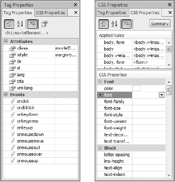
The Tag and CSS Properties panes show a grid of their respective type of properties and allow you to edit them. Properties that are changed from their default values are shown in bold font. The properties available vary depending upon the particular object currently selected on the design surface. Figure 2-17 shows the Tag Properties and CSS Properties panes.
CSS properties may come from a number of different sources. The CSS Properties pane therefore lists the sources that contribute to the current object.
Four task panes deal with the management of styles on your page. They are the Manage Styles, Apply Styles, Behaviors, and Layers task panes. Unlike the CSS Properties task pane, which modifies the specific properties of a single object, the task panes in this group deal with items that can apply to multiple objects.
Figure 2-18 shows the Manage Styles and Apply Styles task panes.
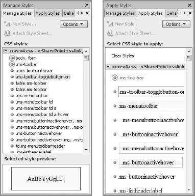
The Manage Styles task pane helps you manage the classes (style attribute groupings) that you can apply to various objects. The Apply Styles task pane enables you to apply specific style classes to the currently selected object.
The Behaviors task pane enables you to assign one or more behaviors to the currently selected object. Behaviors are small script or CSS attribute segments that perform specific actions when certain events take place, such as rolling the mouse pointer over the object.
Note
CSS behaviors were originally tied to Internet Explorer and implemented through a special "behavior" tag. That method was never adopted as an official standard by the W3C. The behaviors generated by this task pane, therefore, are browser-independent and implemented through standard CSS and JavaScript calls.
The Layers task pane manages <div> tags in your page, but not just any <div> tags. To be considered a layer in this task pane, the <div> must have a defined position type other than "none." Such layers are frequently used to lay out content and placeholders for content (see Chapter 3 for more details on placeholders).
TRY IT OUT Create a Hierarchy of Layers (tags), and Compare the Layers Task Pane to the Layout Ribbon Tab
On the File tab, select the Add Item page, then More Pages to advance to the next page (there are two "pages" of page items to choose from!).
Click the HTML icon button.
Click the Create button. The New HTML Page dialog opens.
Type LayerTest into the field provided. Leave the location to save to unchanged. (This is typically the SitePages library.)
Click the OK button. The page opens in Advanced mode because no SharePoint functions exist to protect on a plain HTML page.
Click the View ribbon tab.
Click the Design icon.
Select Reset Workspace Layout from the Task Panes icon menu.
Ensure that Visual Aids is on and that the Visible Borders aid is active. This will allow you to see the layers you are about to create.
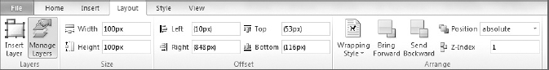
Click the Layout ribbon tab, shown in Figure 2-19.
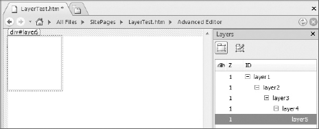
Click the Manage Layers icon. The Layers task pane appears. Observe that the pane is currently empty. Also notice that an Insert Layer icon is present in both the Layout ribbon tab and Layers task pane.
Click either Insert Layer button five times. This results in a display similar to that shown in Figure 2-20.
Observe that although the Layers task pane shows five layers, you can only see one box outline.
Using the Page Mode toolbar, switch to Code view briefly to observe in the HTML that, indeed, five nested
<div>tags are present, then return to Design view. Observe that the Quick Tag Selector also indicates the hierarchy of<div>tags.In the Layers task pane, double-click "layer1." Observe that you can now edit the name.
Type pageheading and press Enter.
In the Layout ribbon tab, select relative from the Position selector, and Left from the Wrapping Style selector.
Using the technique described in Steps 15 through 17, rename and reposition the remaining layers as shown in the following table.
OLD LAYER NAME
NEW LAYER NAME
layer2
body
layer3
menu
layer4
leftnav
layer5
maincontent
In the Layers task pane, drag the body layer below all the other layers listed. (Release the mouse button when the cursor changes to an arrow with a shadow box beneath it.) Observe that two separate layers are now visible on the design surface, and that the body layer is displayed first. Also notice that the listing of the "children" of the body layer has been "collapsed."
Click the + icon to re-expand the children of the body layer.
Drag the maincontent layer onto the body layer. The body layer becomes highlighted and the cursor changes to a shadow box with a + when the mouse is in the correct position.
Drag the leftnav layer into the body layer, above the maincontent layer. A fine line appears between the body layer and maincontent layer when the cursor is in the correct position.
Drag the menu layer into the pageheading layer.
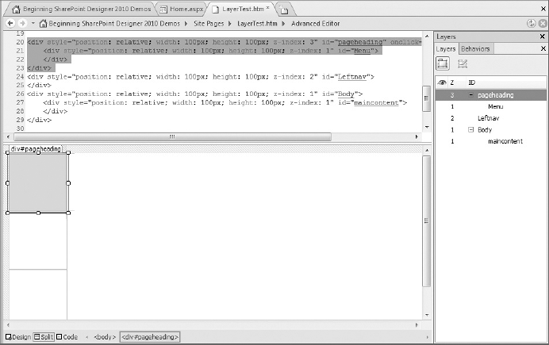
Switch to Code view. Observe the changes that have taken place in the code.
Click the pageheading layer in the Layers task pane. Observe that the entire pageheading
<div>and its contents are selected in the design surface.In the design surface, drag the selected text and drop it above the first shown
<div>tag (the "body" layer).Switch to Split view. Your screen should resemble that shown in Figure 2-21. Observe that only now is the visible position of the body layer shown after the pageheading layer.
How It Works
The Layout ribbon tab and the Layers task pane both control <div> tags that you can use to help you lay out a page, but each works with a different aspect. The Layout tab provides direct access to key attributes of an individual tag, whereas the Layers task pane is used mainly to configure the relationships between layers. Most of the functions provided by the Layout tab are also available through the Layers task pane by right-clicking the layer.
Why, you might ask, is the Layers task pane in the CSS Management group? The key lies in some of the names you gave the layers in the exercise. Div-based layers, along with CSS styles, form the foundation of modern website visual design. The default layers you inserted in this exercise have certain attributes hard-coded (declared inline, directly on the tag, shown in the Layout tab). Chapter 6 covers how you can use Cascading Style Sheets (CSS) instead of hard-coded values to provide central management of these attributes, and how SharePoint Designer can help you manage these styles. This can help you implement a more consistent look and feel to your sites.
The "internal" insertable elements are those items that are sourced from within the SharePoint Designer application. From a content perspective, these may still represent items that come from an external source (such as a database or web service). However, SharePoint Designer is the primary control mechanism for the objects themselves.
Three task panes are in this group. Two of them — Data Source Details and Conditional Formatting — relate to using data view web parts. Both task panes and their functions are described in more detail in Chapters 7 and 8.
The third task pane in this group is the Toolbox — a compendium of almost every individual element that can be added to a page. The primary exceptions to this are tables and SharePoint "web parts," which you add through the Insert ribbon tab (described later in this chapter).
The Toolbox task pane is organized into three collapsible sections, as shown in Figure 2-22.
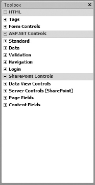
Each section represents a different class of objects that can be added to a page and is further broken down into related groups of individual controls. The sections are as follows:
HTML Controls, including client-side form elements. HTML controls are passive — they do not directly control functionality on the server.
ASP.NET Controls, which are client-side representations of server-side functionality. This may include database access or access to other components that reside on the server without "direct" access from the Web. Many of these controls resemble those in the HTML block, but maintain an active connection to the server.
SharePoint Controls, which are also ASP.NET controls, so they access server-side functionality. However, these are specific to accessing SharePoint functions, such as list fields or user profile information from SharePoint Server.
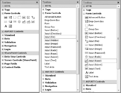
The tools in the Toolbox task pane can be displayed in three different modes:
Icons Only
Icons and Names
Names Only
You choose one of these modes by right-clicking the Title tab and selecting the desired mode from the context menu. You can also choose to expand or collapse all the Toolbox control groups from this menu. Figure 2-23 shows the same section of tools in each of the three views.
You can add a control to your page from the Toolbox in several ways:
Drag and drop
Double-click
Right-click
When you use the drag-and-drop method, you can drop the control in any valid place in your open document. Double-clicking a control in the Toolbox inserts the control at the current document text cursor position.
Right-clicking a control in the Toolbox displays two choices. The Insert option inserts the control at the current text cursor, just as double-clicking would. Certain controls, however, such as <div> or <span> tags, also activate the Wrap option. If you have a block of text highlighted when choosing this option, an opening tag will be inserted at the beginning of the block, and the corresponding closing tag will be inserted after the block.
Note
Not every control can be added in every context. When you attempt to drag a control into an invalid region, or in the wrong page mode, the mouse pointer will appear as a "null" symbol. Certain SharePoint controls are only listed if you are on appropriate page types (for example, publishing "layout pages" — see Chapter 5).
The task panes in the reporting group share a few unique characteristics (besides "reporting," that is). For example, they are the only task panes whose default position is docked to the bottom of the window. In addition, they are not limited in scope to a single document.
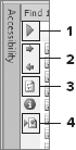
Each reporting pane has a toolbar along its left edge. Figure 2-24 shows the toolbar from the Accessibility task pane, which contains tools found across many of the reporting task panes. See the callouts for descriptions of the shared icons. Icons specific to a particular report type are described later in its respective section.
The icons shown in the figure are as follow:
Execute the report — Clicking this icon typically summons a dialog where you can select the desired scope and other options appropriate to the report type. This icon does not appear on the Hyperlinks report task pane.
Next and previous result — This icon advances your cursor to the next or previous result in the list. If the page containing that result is open, the text cursor advances to its position. If it is not, the corresponding page opens automatically. You may also open the page containing any given result by double-clicking the result line.
Refresh the results — Re-runs the report with the same options as the previous execution, updating the result set as needed.
Generate HTML report — This produces a web page containing the detailed results of the report. You may find this to be an easier-to-read presentation than the small task pane view. It also serves as a convenient checklist for addressing any issues discovered.
The Find 1 and Find 2 task panes are identical in function. As you might expect, they allow you to find or replace text. By having two of them, however, you can perform two independent searches and have them available to re-execute at your leisure.
When you click the Execute icon in a Find task pane, or press Ctrl+F, you summon the Find and Replace dialog, shown in Figure 2-25.
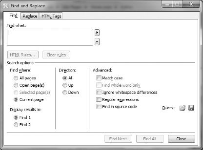
Notice that in the lower-left corner of this dialog, you can select which of the Find task panes will receive your results. The Find and Replace tabs of this dialog are very similar, except that in Replace, you have an extra block for the replacement text, as well as buttons to invoke the actual replacement.
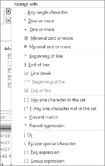
Because of the complex nature of page code, you can perform searches based on more than just static text. In the Find and Replace panes, you can enter regular expressions for the search text. Figure 2-26 shows the list of regular expression elements available.
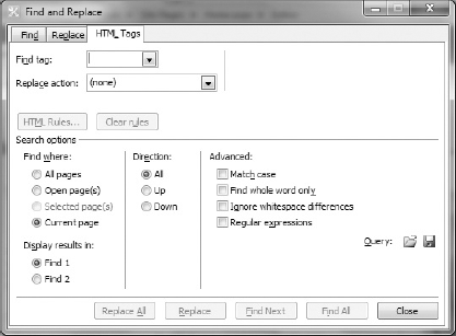
Finally, you can find and replace individual HTML elements without needing to define them with regular expression syntax using the HTML tab of the Find dialog, shown in Figure 2-27.
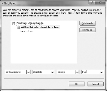
One of the most powerful elements of HTML Find is the HTML Rules builder. This allows you to select tags based on attributes, value strings, or virtually any other aspect of a tag. Figure 2-28 shows the HTML Rules builder with a simple attribute rule defined.
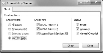
The Accessibility task pane report examines your file(s) for compliance with various standards. It then reports on design issues that may cause problems for people with limited vision. Figure 2-29 shows the options and standards you can include when running the Accessibility report.
The Accessibility report includes one icon not described at the beginning of this section. The circle containing the letter i will display a pop-up containing the details of the currently highlighted result item.
The Compatibility task pane produces reports on design issues that may cause problems with particular browser and CSS standards. As Figure 2-30 shows, the options available in this report are selected via dropdowns rather than with checkboxes (as were the Accessibility Checker report options).
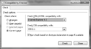
Because so many possible HTML and CSS standards exist, some of which are mutually exclusive, you can only explicitly check against one of each per report. In addition, you can tell the report to validate each individual page against its embedded type declaration, if any.
The Hyperlinks task pane reports on the status of hyperlinks used on the site. This report has several unique characteristics:
It always reports across the current web, not just the open page.
You have the opportunity to modify one or more hyperlinks without opening the individual pages in the editor (similar to the Find/Replace function).
A "preliminary" report is automatically executed upon the summoning of the task pane, so there is no "run" icon.
Several toolbar icons are unique to this task pane.
The unique toolbar icons are shown and called out in Figure 2-31, and described thereafter.
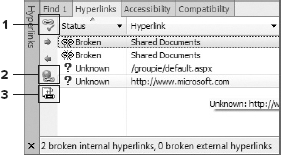
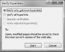
The Verify Hyperlinks icon crawls the links displayed and determines whether they are broken or valid. The options for this, shown in Figure 2-32, allow you to select whether to recheck hyperlinks that are already tested.
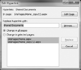
The Edit Hyperlink icon summons the dialog in Figure 2-33, which allows you to modify the currently selected link. You may edit only the current instance, or any or all other pages where it occurs throughout the current web.
The Show Internal icon toggles the display to include or exclude links to intrinsic SharePoint resources, such as those in the
_layoutsfolder.
The CSS Reports task pane shows styles in use, style sheet files, and references to styles that do not exist. Unlike the Compatibility reports, the CSS reports do not validate against any particular standard. See Chapter 6 for more information about using CSS in SharePoint and SharePoint Designer.
Unlike the internal insertable elements block, these task panes allow you to work with specific objects that were created outside of SharePoint Designer and bring them into the application. These are typically individual elements like images or blocks of text.
The Clip Art and Clipboard task panes form a special group and behave differently from the other task panes you have encountered so far. They always occupy the same space. Only one of them can be displayed at a time, and you can toggle between them via a drop-down menu in the task pane's title bar. They can be floated and docked like other task panes, but will not join any other pane in the same zone. Rather than docking within the design surface, they dock at the actual edge of the window; therefore, any elements other than the ribbon itself will be "inside" relative to this pane.
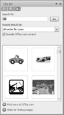
The Clip Art task pane allows you to search for and select images and other media from various sources. The results of your query are shown as a gallery of tiles within the task pane. Figure 2-34 shows an example result set from the Clip Art task pane.
The Clipboard task pane shows a history of items copied or cut from various Office applications. You can then specify which (if any) you want to paste into your document.
Regardless of whether you are using the Clipboard or Clip Art task panes, selecting one of the items therein will insert it at the current position of your text cursor.
As you learned in Chapter 1, the ribbon plays a very important role in modern Microsoft products. Each SharePoint artifact type will generally have its own ribbon tab. The items on these ribbon tabs are discussed as appropriate throughout the book.
Within this chapter, you have also already been using several ribbon tabs. In particular, the Home and View ribbon tabs have provided access to most of the tasks you have performed to this point. Many of the tools provided on these tabs are either self-explanatory, or are common across multiple Microsoft applications.
The Layout ribbon tab was also touched upon when controlling layers in conjunction with the Layers task pane. You can use the controls on this tab to adjust the size or positioning of virtually any element on your page.
The Styles ribbon tab and its various tools will be discussed in detail in Chapter 6.
The remainder of this chapter will be devoted to the many types of items you can add to your pages via the Insert ribbon tab. The Insert ribbon tab, shown in Figure 2-35, allows you to insert virtually any appropriate object onto your page.
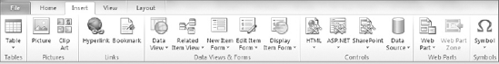
The Insert ribbon tab is like the Home, Layout, Style, and View ribbon tabs in that it is considered to have global, rather than contextual scope. That means that it is visible at all times when a document is open, rather than when a specific object is selected within the document. The Insert ribbon tab is broken into several blocks:
Tables — Inserts an HTML table of the specified size.
Pictures — Inserts pictures either by browsing to a file on your computer, or via the Clip Art task pane.
Links — Inserts hyperlinks to another location, or target bookmarks on the current page.
Data Views and Forms — Chapters 6 through 8 are dedicated to these objects, so they are not discussed further in this chapter.
Controls — Inserts essentially the same objects available through the Toolbox task pane, but grouped in a more flexible fashion.
Web Parts — Inserts SharePoint or ASP.NET components that represent some self-contained functionality.
Symbols — Provides easy access to special characters that may not be available directly from your keyboard.
Some of the objects you can insert, such as tables and pictures, have contextual ribbon tabs associated with them. These are described as appropriate in the sections that follow.
SharePoint Designer Design view supports creating traditional HTML tables either visually or through the entry of parameters. You can insert standard tables three ways:

Select Table
Click the Table icon and click within the displayed grid to visually select the initial number of rows and columns. While you do this, a "preview" insertion of the table shows you what your table will look like.
Highlight a block of text and select Table
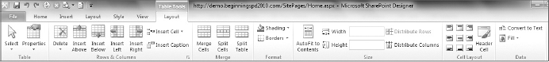
As long as your text cursor is within a table object on your page, the Table Tools Layout contextual ribbon tab will be visible. This tab is specific to working with tables, and other than its name, has nothing in common with the global Layout ribbon tab. Figure 2-37 shows the Table Tools Layout tab.
You can insert pictures in your page two ways. If you click the Picture icon in the Insert Ribbon tab, you get a standard Windows file browser dialog (entitled Picture). You can then browse your file system and network for any image files you may have available.
You can also use the Clip Art icon to summon the Clip Art task pane, which was described earlier in this chapter.
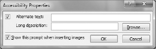
In either case, after you have selected the image you want to insert, by default, an Accessibility Properties dialog appears, as shown in Figure 2-38. This allows you to enter extra descriptive information that screen readers can detect and read.
At the bottom of the dialog is a checkbox you can activate to keep it from popping up every time.
Note
As you might gather from this dialog and the Accessibility reports, ensuring that your sites are usable by people of varying levels of physical ability is an important part of modern web design. Although you have the ability to avoid the Accessibility prompt, doing so is not recommended. Instead, take into consideration the purpose the picture is serving, and whether that purpose justifies the possibility of excluding a portion of your audience.
Also consider that in some jurisdictions and for some types of sites, designing for accessibility isn't just a good idea, it is the law.
After you have inserted a picture, regardless of its source, you have a great deal of control over it. Clicking on a picture activates the Picture Tools' Format contextual ribbon tab, shown in Figure 2-39.
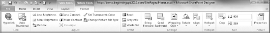
Most of the elements on this tab are similar to functions you would find in any image manipulation tool, and therefore not described here. However, a few of these tools are specific to the use of an image on a web page:
Hyperlink — This uses the entire image as a link to another location. Creation of hyperlinks is described in more detail later in this chapter.
Auto Thumbnail — Images can be very large files. Click this icon to reduce the picture's size for display, but store and link to the original image for viewing upon user request.
Restore — Undoes all changes you have made to the picture since your last save.
Set Transparent Color — This only operates on images in GIF format. By setting a color (typically the background color of the picture), you allow elements that may be behind the picture to show through. This can be useful for creating the effect of an irregularly shaped object "floating" on the screen.
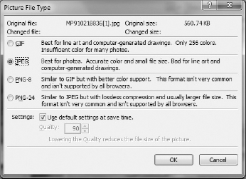
Change Picture File Type — Clicking this icon summons the Picture File Type dialog shown in Figure 2-40 and enables you to change the image to any of the types supported by SharePoint Designer and typical web browsers.
Wrapping Style — The wrapping style determines how the image flows in relation to the surrounding text. A selection of None means that the image is placed inline, with text stopping immediately before it, and resuming after it. Selecting Right or Left aligns the image to the indicated side of the page (or container), and text will flow along the opposite side of the picture.
Align — The Align option determines the vertical position of an image with respect to the text on its current line. Defining a Wrapping Style will supersede the value defined here for alignment.
Hotspot — A hotspot is a hyperlink that overlays a fragment of an image. A group of hotspots over the same image can resemble a geographical map, so such a collection is often referred to as an image map. You can draw oval, rectangular, or irregular polygonal hotspots at any position over an image. Each hotspot may be linked to a different location. If the image itself has a hyperlink defined, clicking any part of the image not contained within a hotspot will link to that default location. Hyperlinks for hotspots are defined in the same manner as other hyperlinks (see the next section).
Two icons are in the links section of the Insert ribbon tab. Both insert what, in HTML lingo, are called anchor tags (<a></a>). The parameters within the anchor determine whether it forms what is commonly called a hyperlink (an anchor that goes someplace), or a bookmark (an anchor that serves as a destination inside a page).
Bookmarks are the simpler of the two. Clicking the Bookmark button in the Insert ribbon summons the Bookmark dialog shown in Figure 2-41.
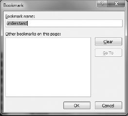
All a bookmark requires is a name. If you have text highlighted when you click the Bookmark button, that text will be used as the basis for the default name. The dialog will also show any other bookmarks already defined in the current page. Although no "content" is mandatory for a bookmark anchor, making the anchor tags surround the text of a page section heading is good practice.
To refer to a bookmark, you append a hash or pound sign (#), plus the name of the bookmark, to the name of the page when entering a URL. When such a link is clicked, the browser opens the indicated page and scrolls immediately to the position of the bookmark.
Inserting a hyperlink is a little more complicated. When you click the hyperlink button, you summon the Insert Hyperlink dialog, shown in Figure 2-42. This dialog is also used when you're defining image hyperlinks and hotspots as described earlier in this chapter.
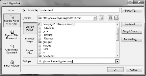
Just as with a bookmark, if you have text highlighted when you click the Hyperlink button, that text will be wrapped in the anchor tag. Unlike the bookmark, that anchor becomes the active hyperlink you can click on. This text is typically shown and editable in the Text to display field of the Insert Hyperlink dialog. If you are inserting a hyperlink on an image or for a hotspot, the Text to display field is grayed out and contains code representing the hotspot or image.
The bulk of the Insert Hyperlink dialog is dedicated to a file browser for the destination of your link. This operates much like the File Open and Save As dialogs, with icons to select different areas to browse, and a list of files and folders through which you may drill. The address of any file selected appears in the Address field of the dialog.
The buttons to the right of the file browser allow you to choose various options for your hyperlink:
Screen Tip — You may click the Screen Tip button to add some descriptive text that can show up on screen as a tooltip and is available for screen readers.
Bookmark — The Bookmark button allows you to browse any bookmark anchors that may have been defined within your selected target page.
Target Frame — A web page may be made up of several frames. Clicking the Target Frame button summons a dialog that lets you select among any frames that may be defined, or several special frame designations. These names are case-sensitive.
Parameters — You can add extra
GETparameters to the URL of your hyperlink. These take the form of a set of name/value pairs that is appended to the URL. This is also referred to as the query string. These parameters are appended to the URL following a question mark (?), and separated from one another by ampersands (&).
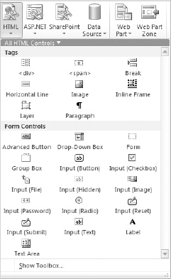
The Controls section of the Insert ribbon tab includes icons for HTML, ASP.NET, and SharePoint controls, as well as Data Sources (described in later chapters). These are the same controls you found in the Toolbox task pane described earlier in this chapter; however, in the ribbon context, they are presented in the form of individual drop-down galleries. The HTML gallery is shown in Figure 2-43.
The galleries have sections that can be displayed individually, or all at once. To select a section, you click on the small triangle in the gallery's title bar (next to All HTML Controls in the figure). If you right-click a displayed gallery, the context menu allows you to add a link to that gallery directly to the Quick Access Toolbar. This allows you to keep your ribbon minimized and insert objects from that gallery while other ribbon tabs are displayed.
The Web Parts section of the Insert ribbon tab contains two icons. The Web Parts icon displays a gallery that allows you to insert many of the web parts available on the currently open site. Unlike the Controls galleries, this gallery does not allow you to collapse to an individual class of web parts. In addition, the web parts displayed can vary considerably from site to site. Several types of web parts and how to manipulate them in SharePoint Designer are described in other chapters throughout this book.
A web part zone is a container on your page for web parts. SharePoint contains tools that allow your users to easily add web parts to a zone, delete them, or even move them from zone to zone — all within the web interface. Within SharePoint Designer, you have the option of limiting some or all of this functionality.
When you click the Web Part Zone button, if you have an ASPX page open, SharePoint Designer will also add any other supporting components the page may need to support its functionality. When you highlight a web part zone on the page, the Web Part Zone Tools
Zone Layout — A button that lets you determine whether the web parts added to the zone are arranged horizontally or vertically.
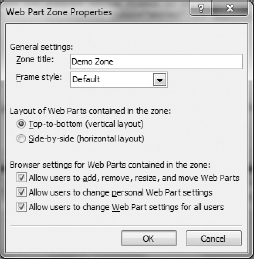
Properties — Summons the Web Part Zone Properties dialog, shown in Figure 2-44.
The Web Part Zone Properties dialog provides the same Title and Layout control that the ribbon tab contains, plus:
Frame style — Allows you to determine the default presentation of web parts added to the zone, such as whether to show a border, the web part's title, both, or neither. This can be overridden for individual web parts within the zone.
Browser Settings — Checkboxes that let you determine whether users can customize the contents of the zone — either for all users, or on a personalized basis — via the web interface.
The Symbols section simply contains the option to insert a character onto your page that may not appear on your keyboard. Clicking this icon displays a limited gallery for quick insertion, as well as a More Symbols menu item. The More Symbols item summons the Symbol dialog, shown in Figure 2-45.
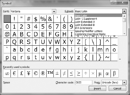
The Symbol dialog allows you to insert virtually any character, from any language, supported by your computer.
This chapter showed you how to use the page-editing tools of SharePoint Designer 2010. You learned about the Page Editor, and how to get around its various views. You discovered:
SharePoint Designer's user interface is very flexible and can be adapted to almost anyone's work style.
How to leverage IntelliSense and code snippets.
How to insert various objects onto a page.
In Chapter 3, you will learn how to apply these tools to customizing SharePoint master pages.