Chapter 4
More User Interface Fun
In Chapter 3, we discussed MVC and built an application using it. You learned about outlets and actions, and used them to tie a button control to a text label. In this chapter, we're going to build an application that will take your knowledge of controls to a whole new level.
We'll implement an image view, a slider, two different text fields, a segmented control, a couple of switches, and an iOS button that looks more like, well, an iOS button. You'll see how to set and retrieve the values of various controls. You'll learn how to use action sheets to force the user to make a choice, and how to use alerts to give the user important feedback. You'll also learn about control states and the use of stretchable images to make buttons look the way they should.
Because this chapter's application uses so many different user interface items, we're going to work a little differently than we did in the previous two chapters. We'll break our application into pieces, implementing one piece at a time, and bouncing back and forth between Xcode and the iPhone simulator, testing each piece before we move on to the next. Dividing the process of building a complex interface into smaller chunks makes it much less intimidating, as well as more like the actual process you'll go through when building your own applications. This code-compile-debug cycle makes up a large part of a software developer's typical day.
A Screen Full of Controls
As we mentioned, the application we're going to build in this chapter is a bit more complex than the one we created in Chapter 3. We'll still use only a single view and controller, but as you can see in Figure 4–1, there's a lot more going on in this one view.
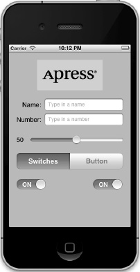
Figure 4–1. The Control Fun application, featuring text fields, labels, a slider, and several other stock iPhone controls
The logo at the top of the iPhone screen is an image view, and in this application, it does nothing more than display a static image. Below the logo are two text fields: one that allows the entry of alphanumeric text and one that allows only numbers. Below the text fields is a slider. As the user moves the slider, the value of the label next to it will change so that it always reflects the slider's current value.
Below the slider is a segmented control and two switches. The segmented control will toggle between two different types of controls in the space below it. When the application first launches, two switches will appear below the segmented control. Changing the value of either switch will cause the other one to change its value to match. Now, this isn't something you would likely do in a real application, but it does demonstrate how to change the value of a control programmatically and how Cocoa Touch animates certain actions without you needing to do any work.
Figure 4–2 shows what happens when the user taps the segmented control. The switches disappear and are replaced by a button. When the Do Something button is pressed, an action sheet pops up, asking if the user really meant to tap the button (see Figure 4–3). This is the standard way of responding to input that is potentially dangerous or that could have significant repercussions, since it gives the user a chance to stop potential badness from happening. If Yes, I'm Sure! is selected, the application will put up an alert, letting the user know that everything is OK (see Figure 4–4).
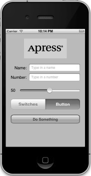
Figure 4–2. Tapping the segmented controller on the left side causes a pair of switches to be displayed. Tapping the right side causes a button to be displayed.
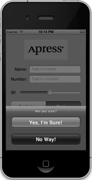
Figure 4–3. Our application uses an action sheet to solicit a response from the user.
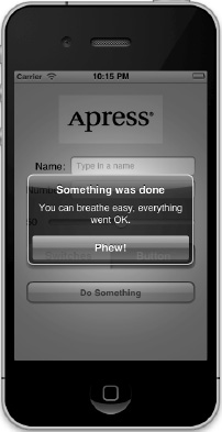
Figure 4–4. Alerts are used to notify the user when important things happen. We use one here to confirm that everything went OK.
Active, Static, and Passive Controls
Interface controls are in used in three basic modes: active, static (or inactive), and passive. The buttons that we used in the previous chapter are classic examples of active controls. You push them, and something happens—usually, a piece of code that you wrote fires.
Although many of the controls that you will use will directly trigger action methods, not all controls will. The image view that we'll be implementing in this chapter is a good example of a control being used statically. Even though a UIImageView can be configured to trigger action methods, in our application, the image view is passive—the user cannot do anything with it. Text fields and image controls are often used in this manner.
Some controls can work in a passive mode, simply holding on to a value that the user has entered until you're ready for it. These controls don't trigger action methods, but the user can interact with them and change their values. A classic example of a passive control is a text field on a web page. Although it's possible to create validation code that fires when the user tabs out of a field, the vast majority of web page text fields are simply containers for data that's submitted to the server when you click the submit button. The text fields themselves usually don't cause any code to fire, but when the submit button is clicked, the text field's data goes along for the ride.
On an iOS device, most of the available controls can be used in all three modes, and nearly all of them can function in more than one mode, depending on your needs. All iOS controls are subclasses of UIControl and, because of that, are capable of triggering action methods. Many controls can be used passively, and all of them can be made inactive or invisible. For example, using one control might trigger another inactive control to become active. However, some controls, such as buttons, really don't serve much purpose unless they are used in an active manner to trigger code.
There are some behavioral differences between controls on iOS and those on your Mac. Here are a few examples:
- Because of the multitouch interface, all iOS controls can trigger multiple actions depending on how they are touched. The user might trigger a different action with a finger swipe across the control than with just a tap.
- You could have one action fire when the user presses down on a button and a separate action fire when the finger is lifted off the button.
- You could have a single control call multiple action methods on a single event. You could have two different action methods fire on the touch up inside event, meaning that both methods would be called when the user's finger is lifted after touching that button.
NOTE: Although controls can trigger multiple methods on iOS, the vast majority of the time, you're probably better off implementing a single action method that does what you need for a particular use of a control. Though you won't usually need this capability, it's good to keep it in mind when working in Interface Builder. Connecting an event to an action in Interface Builder does not disconnect a previously connected action from the same control! This can lead to surprising misbehaviors in your app, where a control will trigger multiple action methods. Keep an eye open when retargeting an event in Interface Builder, and make sure to remove old actions before connecting to new ones.
Another major difference between iOS and the Mac stems from the fact that, normally, iOS devices do not have a physical keyboard. The standard iOS software keyboard is actually just a view filled with a series of button controls that are managed for you by the system. Your code will likely never directly interact with the iOS keyboard.
Creating the Application
Let's get started. Fire up Xcode if it's not already open, and create a new project called Control Fun. We're going to use the Single View Application template again, so create your project just as you did in the previous two chapters.
Now that you've created your project, let's get the image we'll use in our image view. The image must be imported into Xcode before it will be available for use inside Interface Builder, so we'll import it now. You can use the image named apress_logo.png in the project archives in the 04 - Control Fun folder, or you can use an image of your own choosing. If you use your own image, make sure that it is a .png image sized correctly for the space available. It should be fewer than 100 pixels tall and a maximum of 300 pixels wide so that it can fit comfortably at the top of the view without being resized.
Add the image to the Supporting Files folder of your project by dragging the image from the Finder to the Supporting Files folder in the project navigator. When prompted, check the checkbox that says Copy items into destination group's folder (if needed), and then click Finish.
Implementing the Image View and Text Fields
With the image added to your project, your next step is to implement the five interface elements at the top of the application's screen: the image view, the two text fields, and the two labels (see Figure 4–5).
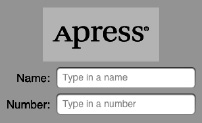
Figure 4–5. The image view, labels, and text fields we will implement first
Adding the Image View
In the project navigator, click BIDViewController.xib to open the file in Interface Builder, Xcode'snib editor. You'll see the familiar graph paper background and single gray view where you can lay out your application's interface.
If the object library is not open, select View  Utilities Show Object Library to open it. Scroll about one-fourth of the way through the list until you find ImageView (see Figure 4–6), or just type image view in the search field. Remember that the object library is the third icon on top of the library pane. You won't find Image View under any of the other icons.

Figure 4–6. The Image View element in Interface Builder's library
Drag an image view onto the view in the nib editor. Notice that as you drag your image view out of the library, it changes size twice. As the drag makes its way out of the library pane, it takes the shape of a horizontal rectangle. Then, when your drag enters the frame of the view, the image view resizes to be the size of the view, minus the status bar at the top. This behavior is normal and, in many cases, exactly what you want, as often the first image you place in a view is a background image. Release the drag inside the view, taking care to be sure that the new UIImageView snaps to the sides and bottom of the surrounding view. In this particular case, we actually don't want our image view to take the entire space, so use the drag handles to resize the image view to the approximate size of the image you imported into Xcode. Don't worry about getting it exactly right yet; we'll take care of that in the next section. Figure 4–7 shows our resized UIImageView.

Figure 4–7. Our resized UIImageView, sized to accommodate the image we will place here
Remember that if you ever encounter difficulty selecting an item in the nib editor, you can switch the nib editor's dock to list view by clicking the small triangle icon below the dock. Now, click the item you want selected in the list and, sure enough, that item will be selected in the nib editor.
To get at an object that is nested inside another object, click the disclosure triangle to the left of the enclosing object to reveal the nested object. In our case, to select the image view, first click the disclosure triangle to the left of the view. Then, when the image view appears in the dock, click it, and the corresponding image view in the nib editor will be selected.
With the image view selected, bring up the object attributes inspector by pressing 
 4, and you should see the editable options of the
 UIImageView class, as shown in Figure 4–8.
Figure 4–8. The image view attributes inspector. We selected our image from the Image popup at the top of the inspector, and this populated the image view with our image.
The most important setting for our image view is the topmost item in the inspector, labeled Image. Click the little arrow to the right of the field to see a popup menu listing the available images, which should include any images you added to your Xcode project. Select the image you added earlier. Your image should now appear in your image view.
Resizing the Image View
As it turns out, the image we used is a fair amount smaller than the image view in which it was placed. If you take another look at Figure 4–8, you'll notice that the image we used was scaled to completely fill the image view. A big clue that this is so is the Mode setting in the attributes inspector, which is set to Scale To Fill.
Though we could keep our app this way, it's generally a good idea to do any image scaling before runtime, as image scaling takes time and processor cycles. Let's resize our image view to the exact size of our image.
Make sure the image view is selected and that you can see the resize handles. Now select the image view one more time. You should see the outline of the image view replaced by a thick, gray border. Finally, press = or select Editor Size to Fit Content. This will resize the image view to match the size of its contents.
Now that the image view is resized, move it into its final position. You'll need to click off it, and then click it again to reselect it. Now drag the image view so the top hits the blue guideline toward the top of your view and it is centered according to the centering blue guideline (see Figure 4–9). Note that you can also center an item in its containing view by choosing Editor Alignment Align Horizontal Center in Container.
Figure 4–9. Once we have resized our image view to fit the size of its image, we drag it into position using the view's blue guidelines.
TIP: Dragging and resizing views in Interface Builder can be tricky. Don't forget about the hierarchical list mode, activated by clicking the small triangle icon at the bottom of the nib editor's dock. When it comes to resizing, hold down the option key, and Interface Builder will draw some helpful red lines on the screen that make it much easier to get a sense of the image view's size. This trick won't work with dragging, since the option key will prompt Interface Builder to make a copy of the dragged object. However, if you select Editor Canvas Show Bounds Rectangles, Interface Builder will draw a line around all of your interface items, making them easier to see. You can turn off those lines by selecting Show Bounds Rectangles a second time.
Setting View Attributes
Select your image view, and then switch your attention back over to the attributes inspector. Below the Image View section of the inspector is the View section. As you may have deduced, the pattern here is that the attributes that are specific to the selected object are shown at the top, followed by more general attributes that apply to the selected object's parent class. In this case, the parent class of UIImageView is UIView, so the next section is simply labeled View, and it contains attributes that any view class will have.
The Mode Attribute
The first option in the view inspector is a popup menu labeled Mode. The Mode menu defines how the view will display its content. This determines how the image will be aligned inside the view and whether it will be scaled to fit. Feel free to play with the various options, but the default value of Scale To Fill will work fine for now.
Keep in mind that choosing any option that causes the image to scale will potentially add processing overhead, so it's best to avoid those and size your images correctly before you import them. If you want to display the same image at multiple sizes, generally it's better to have multiple copies of the image at different sizes in your project, rather than force your iOS device to do scaling at runtime. Of course, there are times when scaling at runtime is appropriate; this is a guideline, not a rule.
Tag
The next item, Tag, is worth mentioning, though we won't be using it in this chapter. All subclasses of UIView, including all views and controls, have a property called tag, which is just a numeric value that you can set here or in code. The tag is designed for your use; the system will never set or change its value. If you assign a tag value to a control or view, you can be sure that the tag will always have that value unless you change it.
Tags provide an easy, language-independent way of identifying objects on your interface. Let's say you have five different buttons, each with a different label, and you want to use a single action method to handle all five buttons. In that case, you probably need some way to differentiate among the buttons when your action method is called. Sure, you could look at the button's title, but code that does that probably won't work when your application is translated into Swahili or Sanskrit. Unlike labels, tags will never change, so if you set a tag value here in Interface Builder, you can then use that as a fast and reliable way to check which control was passed into an action method in the sender argument.
Interaction Checkboxes
The two checkboxes in the Interaction section have to do with user interaction. The first checkbox, User Interaction Enabled, specifies whether the user can do anything at all with this object. For most controls, this box will be checked, because if it's not, the control will never be able to trigger action methods. However, image views default to unchecked because they are often used just for the display of static information. Since all we're doing here is displaying a picture on the screen, there is no need to turn this on.
The second checkbox is Multiple Touch, and it determines whether this control is capable of receiving multitouch events. Multitouch events allow complex gestures like the pinch gesture used to zoom in in many iOS applications. We'll talk more about gestures and multitouch events in Chapter 13. Since this image view doesn't accept user interaction at all, there's no reason to turn on multitouch events, so leave the checkbox unchecked.
The Alpha Value
The next item in the inspector is Alpha. Be careful with this one. Alpha defines how transparent your image is—how much of what's beneath it shows through. It's defined as a floating-point number between 0.0 and 1.0, where 0.0 is fully transparent and 1.0 is completely opaque. If you have any value less than 1.0, your iOS device will draw this view with some amount of transparency so that any objects underneath it show through. With a value of less than 1.0, even if there's nothing actually underneath your image, you will cause your application to spend processor cycles calculating transparency, so don't set Alpha to anything other than 1.0 unless you have a very good reason for doing so.
Background
The next item down, Background, is a property inherited from UIView, and determines the color of the background for the view. For image views, this matters only when an image doesn't fill its view and is letterboxed or when parts of the image are transparent. Since we've sized our view to perfectly match our image, this setting will have no visible effect, so we can leave it alone.
Drawing Checkboxes
Below Background are a series of Drawing checkboxes. The first one is labeled Opaque. That should be checked by default; if not, click to check that checkbox. This tells iOS that nothing behind your view needs to be drawn and allows iOS's drawing methods to do some optimizations that speed up drawing.
You might be wondering why we need to select the Opaque checkbox when we've already set the value of Alpha to 1.0 to indicate no transparency. The alpha value applies to the parts of the image to be drawn, but if an image doesn't completely fill the image view, or there are holes in the image thanks to an alpha channel, the objects below will still show through, regardless of the value set in Alpha. By selecting Opaque, we are telling iOS that nothing below this view ever needs to be drawn no matter what, so it does not need to waste processing time with anything below our object. We can safely select the Opaque checkbox, because we earlier selected Size To Fit, which caused the image view to match the size of the image it contains.
The Hidden checkbox does exactly what you think it does. If it's checked, the user can't see this object. Hiding an object can be useful at times, as you'll see later in this chapter when we hide our switches and button, but the vast majority of the time—including now—you want this to remain unchecked.
The next checkbox, Clears Graphics Context, will rarely need to be checked. When it is checked, iOS will draw the entire area covered by the object in transparent black before it actually draws the object. Again, it should be turned off for the sake of performance and because it's rarely needed. Make sure this checkbox is unchecked (it is likely checked by default).
Clip Subviews is an interesting option. If your view contains subviews, and those subviews are not completely contained within the bounds of its parent view, this checkbox determines how the subviews will be drawn. If Clip Subviews is checked, only the portions of subviews that lie within the bounds of the parent will be drawn. If Clip Subviews is unchecked, subviews will be drawn completely, even if they lie outside the bounds of the parent.
It might seem that the default behavior should be the opposite of what it actually is—Clip Subviews should be unchecked by default. Calculating the clipping area and displaying only part of the subviews is a somewhat costly operation, mathematically speaking, and most of the time, a subview won't lay outside the bounds of its superview. You can turn on Clip Subviews if you really need it for some reason, but it is off by default for the sake of performance.
The last checkbox in this section, Autoresize Subviews, tells iOS to resize any subviews if this view is resized. Leave this checked (since we don't allow our view to be resized, it really does not matter whether it's checked or not).
Stretching
Next up is a section simply labeled Stretching. You can leave your yoga mat in the closet though, because the only stretching going on here is in the form of rectangular views being redrawn as they're resized on the screen. The idea is that rather than the entire content of a view being stretched uniformly, you can keep the outer edges of a view, such as the bezeled edge of a button, looking the same even as the center portion stretches.
The four floating-point values set here let you declare which portion of the rectangle is stretchable by specifying a point at the upper-left corner of the view and the size of the stretchable area, all in the form of a number between 0.0 and 1.0, representing a portion of the overall view size. For example, if you wanted to keep 10% of each edge not stretchy, you would specify 0.1 for both X and Y, and 0.8 for both Width and Height. In this case, we're going to leave the default values of 0.0 for X and Y, and 1.0 for Width and Height. Most of the time, you will not change these values.
Adding the Text Fields
With your image view finished, it's time to bring on the text fields. Grab a text field from the library, and drag it into the View, underneath the image view. Use the blue guidelines to align it with the right margin and snug it just under your image view (see Figure 4–10).
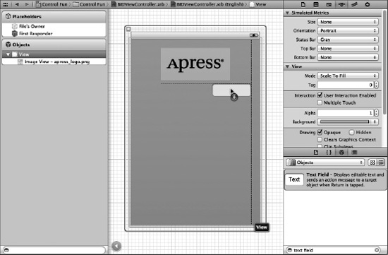
Figure 4–10. We dragged a text field out of the library and dropped it onto the view, just below our image view and touching the right blue guideline.
A horizontal blue guideline will appear just above the text field when you move it very close to the bottom of your image view. That guideline tells you when the object you are dragging is the minimum reasonable distance from an adjacent object. You can leave your text field there for now, but to give it a balanced appearance, consider moving the text field just a little farther down. Remember that you can always edit your nib file again in order to change the position and size of interface elements without needing to change code or reestablish connections.
After you drop the text field, grab a label from the library, and drag that over so it is aligned with the left margin of the view and vertically with the text field you placed earlier. Notice that multiple blue guidelines will pop up as you move the label around, making it easy to align the label to the text field using the top, bottom, or middle of the label. We're going to align the label and the text field using the middle of those guidelines (see Figure 4–11).
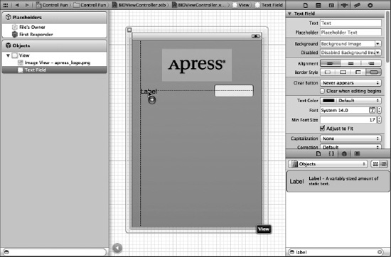
Figure 4–11. Aligning the label and text field using the baseline guide
Double-click the label you just dropped, change it to read Name: instead of Label (note the colon character at the end of the label), and press the return key to commit your changes.
Next, drag another text field from the library to the view, and use the guidelines to place it below the first text field (see Figure 4–12).
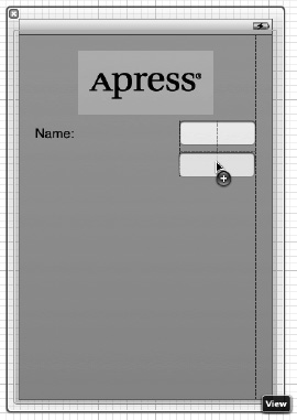
Figure 4–12. Adding the second text field
Once you've added the second text field, grab another label from the library, and place it on the left side, below the existing label. Again, use the middle blue guideline to align your new label with the second text field. Double-click the new label, and change it to read Number: (don't forget the colon).
Now, let's expand the size of the bottom text field to the left, so it snugs up against the right side of the label. Why start with the bottom text field? We want the two text fields to be the same size, and the bottom label is longer.
Single-click the bottom text field, and drag the left resize dot to the left until a blue guideline appears to tell you that you are as close as you should ever be to the label (see Figure 4–13). This particular guideline is somewhat subtle—it's only as tall as the text field itself, so keep your eyes peeled.
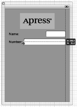
Figure 4–13. Expanding the size of the bottom text field
Now, expand the top text field in the same way so that it matches the bottom one in size. Once again, a blue guideline provides some help, and this one is easier to spot.
We're basically finished with the text fields except for one small detail. Look back at Figure 4–5. Do you see how the Name: and Number: are right-aligned? Right now, ours are both against the left margin. To align the right sides of the two labels, click the Name: label, hold down the shift key, and click the Number: label so both labels are selected. Now select Editor Align Right Edges.
When you are finished, the interface should look very much like the one shown in Figure 4–5. The only difference is the light-gray text in each text field. We'll add that now.
Select the top text field and press 4 to bring up the attributes inspector (see Figure 4–14). The text field is one of the most complex iOS controls, as well as one of the most commonly used. Let's take a walk through the settings, beginning from the top of the inspector.
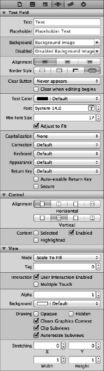
Figure 4–14. The inspector for a text field showing the default values
Text Field Inspector Settings
In the first field, Text, you can set a default value for the text field. Whatever you type here will show up in the text field when your application launches.
The second field, Placeholder, allows you to specify a bit of text that will be displayed in gray inside the text field, but only when the field does not have a value. You can use a placeholder instead of a label if space is tight, or you can use it to clarify what the user should type into this text field. Type in the text Type in a name as the placeholder for our currently selected text field, and then hit return to commit the change.
The next two fields, Background and Disabled, are used only if you need to customize the appearance of your text field, which is completely unnecessary and actually ill-advised the vast majority of the time. Users expect text fields to look a certain way. We're going to skip over these fields, leaving them set to their defaults.
Below these fields are three buttons for controlling the alignment of the text displayed in the field. We'll leave this setting at the default value of left-aligned (the leftmost button).
Next are four buttons labeled Border Style. These allow you to change the way the text field's edge will be drawn. The default value (the rightmost button) creates the text field style that users are most accustomed to seeing for normal text fields in an iOS application. Feel free to try all four different styles. When you're finished experimenting, set this setting back to the rightmost button.
Below the border setting is a Clear Button popup button, which lets you choose when the clear button should appear. The clear button is the small X that can appear at the right end of a text field. Clear buttons are typically used with search fields and other fields where you would be likely to change the value frequently. They are not typically included on text fields used to persist data, so leave this at the default value of Never appears.
The Clear when editing begins checkbox specifies what happens when the user touches this field. If this box is checked, any value that was previously in this field will be deleted, and the user will start with an empty field. If this box is unchecked, the previous value will remain in the field, and the user will be able to edit it. Leave this checkbox unchecked.
After that is a series of fields that let you set the font, font color, and minimum font size. We'll leave the Text Color at the default value of black. Note that the Text Color popup is divided into two parts. The right side allows you to select from a set of preselected colors, and the left side gives you access to a color well to more precisely specify your color.
The Font setting is divided into three parts. On the right is a control that lets you increment or decrement the text size, one point at a time. The left side allows you to manually edit the font name and size. Finally, click the T-in-a-box icon to bring up a popup window that lets you set the various font attributes. We'll leave the Font at its default setting of System 14.0.
Following the Font setting is a control that lets you set the minimum font size that the text field will use for displaying its text. Leave that at its default value for now.
The Adjust to Fit checkbox specifies whether the size of the text should shrink if the text field is reduced in size. Adjusting to fit will keep the entire text visible in the view, even if the text would normally be too big to fit in the allotted space. This checkbox works in conjunction with the minimum font size setting. No matter the size of the field, the text will not be resized below that minimum size. Specifying a minimum size allows you to make sure that the text doesn't get too small to be readable.
The next section defines how the keyboard will look and behave when this text field is being used. Since we're expecting a name, let's change the Capitalization popup to Words. This causes every word to be automatically capitalized, which is what you typically want with names.
The next three popups—Correction, Keyboard, and Appearance—can be left at their default values. Take a minute to look at each to get a sense of what these settings do.
Next is the Return Key popup. The return keyis the key on the lower right of the keyboard, and its label changes based on what you're doing. If you are entering text into Safari's search field, for example, then it says Search. In an application like ours, where the text fields share the screen with other controls, Done is the right choice. Make that change here.
If the Auto-enable Return Key checkbox is checked, the return key is disabled until at least one character is typed into the text field. Leave this unchecked, because we want to allow the text field to remain empty if the user prefers not to enter anything.
The Secure checkbox specifies whether the characters being typed are displayed in the text field. You would check this checkbox if the text field were being used as a password field. Leave it unchecked for our app.
The next section allows you to set control attributes inherited from UIControl, but these generally don't apply to text fields and, with the exception of the Enabled checkbox, won't affect the field's appearance. We want to leave these text fields enabled so that the user can interact with them. Leave the default settings in this section.
The last section on the inspector, View, should look familiar. It's identical to the section of the same name on the image view inspector we looked at earlier. These are attributes inherited from the UIView class, and since all controls are subclasses of UIView, they all share this section of attributes. As you did earlier for the image view, check the Opaque checkbox, and uncheck Clears Graphics Context and Clip Subviews, for the reasons we discussed earlier.
Setting the Attributes for the Second Text Field
Next, single-click the second text field in the View window, and return to the inspector. In the Placeholder field, type Type in a number, and make sure Clear When Editing Begins is unchecked. A little farther down, click the Keyboard popup menu. Since we want the user to enter only numbers, not letters, select Number Pad. This ensures that the users will be presented with a keyboard containing only numbers, meaning they won't be able to enter alphabetical characters, symbols, or anything other than numbers. We don't need to set the Return Key value for the numeric keypad, because that style of keyboard doesn't have a return key, so all of the other inspector settings can stay at the default values. As you did earlier, check the Opaque checkbox, and uncheck Clears Graphics Context and Clip Subviews.
Creating and Connecting Outlets
We are almost ready to take our app for its first test drive. For this first part of the interface, all that's left is creating and connecting our outlets. The image view and labels on our interface do not need outlets because we don't need to change them at runtime. The two text fields, however, are passive controls that hold data we'll need to use in our code, so we need outlets pointing to each of them.
As you probably remember from the previous chapter, Xcode 4 allows us to create and connect outlets at the same time using the assistant editor. Go into the assistant editor now by selecting the middle toolbar button labeled Editor or by selecting View Assistant Editor Show Assistant Editor.
Make sure your nib file is selected in the project navigator. If you don't have a large amount of screen real estate, you might also want to select View Utilities Hide Utilities to hide the utility pane during this step. When you bring up the assistant editor, the nib editing pane will be split in two, with Interface Builder in one half and BIDViewController.h in the other (see Figure 4–15). This new editing area—the one showing BIDViewController.h—is the assistant.
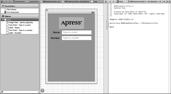
Figure 4–15. The nib editing area with the assistant turned on. You can see the assistant area on the right, showing the code from BIDViewController.h.
You'll see that the upper boundary of the assistant includes a jump bar, much like the normal editor pane. One important addition to the assistant's jump bar is a new set of “smart” selections, which let you switch between a variety of files that Xcode believes are relevant, based on what appears in the main view. By default, it shows a group of files labeled Top Level Objects, including your own source code for the controller class (since it's one of the top-level objects in the nib), as well as headers for UIResponder and UIView, since those are also represented at the top level of the nib. Take a few minutes to click around the jump bar at the top of the assistant, just to get a feel for what's what. Once you have a sense of the jump bar and files represented there, move on.
Now comes the fun part. Make sure BIDViewController.h is still showing in the assistant (use the jump bar to return there if necessary). Now control-drag from the top text field in the view over to the BIDViewController.h source code, right below the @interface line. You should see a gray popup that reads Insert Outlet, Action, or Outlet Collection (see Figure 4–16). Release the mouse button, and you'll get the same popup you saw in the previous chapter. We want to create an outlet called nameField, so type nameField into the Name field (say that five times fast!), and then hit return.
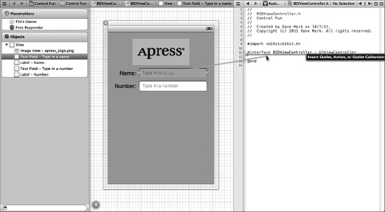
Figure 4–16. With the assistant turned on, we control-drag over to the declaration of nameField to connect that outlet.
You now have a property called nameField in BIDViewController, and it has been connected to the top text field. Do the same for the second text field, creating and connecting it to a property called numberField.
Closing the Keyboard
Let's see how our app works, shall we? Select Product Run. Your application should come up in the iPhone simulator. Click the Name text field. The traditional keyboard should appear. Type in a name. Now, tap the Number field. The numeric keypad should appear (see Figure 4–17). Cocoa Touch gives us all this functionality for free just by adding text fields to our interface.
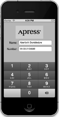
Figure 4–17. The keyboard comes up automatically when you touch either the text field or the number field.
Woo-hoo! But there's a little problem. How do you get the keyboard to go away? Go ahead and try. We'll wait right here while you do.
Closing the Keyboard When Done Is Tapped
Because the keyboard is software-based, rather than a physical keyboard, we need to take a few extra steps to make sure the keyboard goes away when the user is finished with it. When the user taps the Done button on the text keyboard, a Did End On Exit event will be generated, and at that time, we need to tell the text field to give up control so that the keyboard will go away. In order to do that, we need to add an action method to our controller class.
Select BIDViewController.h in the project navigator, and add the following line of code, shown in bold:
#import <UIKit/UIKit.h>


@interface BIDViewController : UIViewController

@property (strong, nonatomic) IBOutletUITextField *nameField;

@property (strong, nonatomic) IBOutletUITextField *numberField;


- (IBAction)textFieldDoneEditing:(id)sender;


@end
When you selected the header file in the project navigator, you probably noticed that the assistant we opened earlier has adapted to having a source code file selected in the main editor pane, and now automatically shows the selected file's counterpart. If you select a .h file, the assistant will automatically show the matching .m file, and vice versa. This is a remarkably handy addition to Xcode 4! As a result of this behavior, BIDViewController.m is now shown in the assistant view, ready for us to implement this method.
Add this action method at the bottom of BIDViewController.m, just before the @end:
- (IBAction)textFieldDoneEditing:(id)sender {

    [sender resignFirstResponder];

}
As you learned in Chapter 2, the first responder is the control with which the user is currently interacting. In our new method, we tell our control to resign as a first responder, giving up that role to the previous control the user worked with. When a text field yields first responder status, the keyboard associated with it goes away.
Save both of the files you just edited. Let's hop back to the nib file and trigger this action from both of our text fields.
Select BIDViewController.xib in the project navigator, single-click the Name text field, and press 6 to bring up the connections inspector. This time, we don't want the Touch Up Inside event that we used in the previous chapter. Instead, we want Did End On Exit, since that event will fire when the user taps the Done button on the text keyboard.
Drag from the circle next to Did End On Exit to the File's Owner icon, and connect it to the textFieldDoneEditing: action. You can also do this by dragging to the textFieldDoneEditing: method in the assistant view. Repeat this procedure with the other text field, save your changes, and then press R to run the app again.
When the simulator appears, click the Name field, type in something, and then tap the Done button. Sure enough, the keyboard drops away, just as you expected. All right! What about the Number field, though? Um, where's the Done button on that one (see Figure 4–17)?
Well, crud! Not all keyboard layouts feature a Done button. We could force the user to tap the Name field and then tap Done, but that's not very user-friendly, is it? And we most definitely want our application to be user-friendly. Let's see how to handle this situation.
Touching the Background to Close the Keyboard
Can you recall what Apple's iPhone applications do in this situation? Well, in most places where there are text fields, tapping anywhere in the view where there's no active control will cause the keyboard to go away. How do we implement that?
The answer is probably going to surprise you because of its simplicity. Our view controller has a property called view that it inherited from UIViewController. This view property corresponds to the View in the nib file. The view property points to an instance of UIView in the nib that acts as a container for all the items in our user interface. It has no appearance in the user interface, but it covers the entire iPhone window, sitting “below” all of the other user interface objects. It is sometimes referred to as a nib's container view because its main purpose is to simply hold other views and controls. For all intents and purposes, the container view is the background of our user interface.
Using Interface Builder, we can change the class of the object that view points to so that its underlying class is UIControl instead of UIView. Because UIControl is a subclass of UIView, it is perfectly appropriate for us to connect our view property to an instance of UIControl. Remember that when a class subclasses another object, it is just a more specific version of that class, so a UIControl is a UIView. If we simply change the instance that is created from UIView to UIControl, we gain the ability to trigger action methods. Before we do that, though, we need to create an action method that will be called when the background is tapped.
We need to add one more action to our controller class. Add the following line to your BIDViewController.h file:
#import <UIKit/UIKit.h>


@interface BIDViewController : UIViewController

@property (strong, nonatomic) IBOutletUITextField *nameField;

@property (strong, nonatomic) IBOutletUITextField *numberField;


- (IBAction)textFieldDoneEditing:(id)sender;


- (IBAction)backgroundTap:(id)sender;


@end
Save the header file.
Now, switch over to the implementation file and add the following method at the end of the file, just before @end:
- (IBAction)backgroundTap:(id)sender {

    [nameField resignFirstResponder];

    [numberField resignFirstResponder];

}
This method simply tells both text fields to yield first responder status if they have it. It is perfectly safe to call resignFirstResponder on a control that is not the first responder, so we can call it on both text fields without needing to check whether either is the first responder.
TIP: You'll be switching between header and implementation files a lot as you code. Fortunately, in addition to the convenience provided by the assistant, Xcode also has a key combination that will switch between counterparts quickly. The default key combination is ^ , although you can change it to anything you want using Xcode's preferences.
Save this file. Now, select the nib file again. Make sure your dock is in list mode (click the triangle icon to the bottom right of the dock to switch to list view). Single-click View so it is selected. Do not select one of your view's subitems. We want the container view itself.
Next, press 3 to bring up the identity inspector (see Figure 4–18). This is where you can change the underlying class of any object instance in your nib file.
Figure 4–18. We switched Interface Builder to list view, and then selected our view. We then switched to the identity inspector, which allows us to change the underlying class of any object instance in our nib.
The field labeled Class should currently say UIView. If not, you likely don't have the container view selected. Now, change that setting to UIControl. Press return to commit the change. All controls that are capable of triggering action methods are subclasses of UIControl, so by changing the underlying class, we have just given this view the ability to trigger action methods. You can verify this by pressing 6 to bring up the connections inspector. You should now see all the events that you saw when you were connecting buttons to actions in the previous chapter.
Drag from the Touch Down event to the File's Owner icon (see Figure 4–19), and choose the backgroundTap: action. Now, touches anywhere in the view without an active control will trigger our new action method, which will cause the keyboard to retract. Connecting to File's Owner like this is exactly the same as connecting to the method in the code. For a view controller nib file, the File's Owner is the view controller class, so that was just a slightly different way of achieving the exact same result.
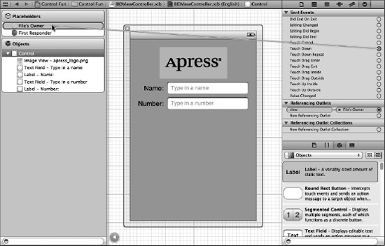
Figure 4–19. By changing the class of our view from UIView to UIControl, we gain the ability to trigger action methods on any of the standard events. We'll connect the view's Touch Down event to the backgroundTap: action.
NOTE: You might be wondering why we selected Touch Down instead of Touch Up Inside, as we did in the previous chapter. The answer is that the background isn't a button. It's not a control in the eyes of the user, so it wouldn't occur to most users to try to drag their finger somewhere to cancel the action.
Save the nib file, and then compile and run your application again. This time, the keyboard should disappear not only when the Done button is tapped, but also when you tap anywhere that's not an active control, which is the behavior that your users will expect.
Excellent! Now that we have this section all squared away, are you ready to move onto the next group of controls?
Adding the Slider and Label
Now it's time to add the slider and accompanying label. Remember that the value in the label will change as the slider is used. Select BIDViewController.xib in the project navigator so we can add more items to our application's user interface.
Before we place the slider, let's add a bit of breathing room to our design. The blue guidelines we used to determine the spacing between the top text field and the image above it are really suggestions for minimum proximity. In other words, the blue guidelines tell you, “Don't get any closer than this.” Drag the two text fields and their labels down a bit, using Figure 4–1 as a guide. Now let's add the slider.
From the object library, bring over a slider and arrange it below the Number text field, using the right-side blue guideline as a stopping point, and leaving a little breathing room below the bottom text field. Our slider ended up about halfway down the view. Single-click the newly added slider to select it, and then press 4 to go back to the object attributes inspector if it's not already visible (see Figure 4–20).
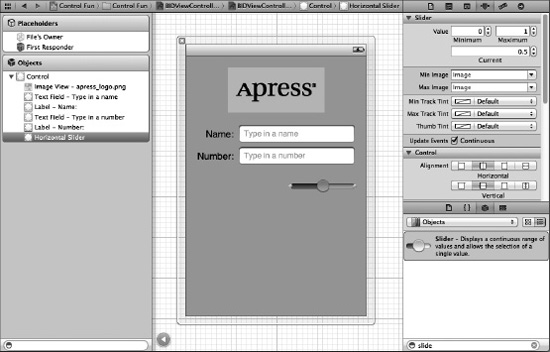
Figure 4–20. The inspector showing default attributes for a slider
A slider lets you choose a number in a given range. Use the inspector to set the Minimum value to 1.00, the Maximum value to 100.00, and the Current value to 50.00. Leave the Update Events, Continuous checkbox checked. This ensures a continuous flow of events as the slider's value changes. That's all we need to worry about for now.
Bring over a label and place it next to the slider, using the blue guidelines to align it vertically with the slider and to align its left edge with the left margin of the view (see Figure 4–21).
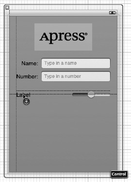
Figure 4–21. Placing the slider's label
Double-click the newly placed label, and change its text from Label to 100. This is the largest value that the slider can hold, and we can use that to determine the correct width of the slider. Since “100” is shorter than “Label,” we can make the label shorter. Resize the label by grabbing the right-middle resize dot and dragging to the left. Make sure you stop resizing before the text starts to get smaller. If it does start to get smaller, bring the resize dot back to the right until it returns to its original size. You can also automatically size the label to fit the text, as we discussed earlier, by pressing = or by selecting Editor Size to Fit Content.
Next, resize the slider by single-clicking the slider to select it and dragging the left resize dot to the left until the blue guidelines indicate that you should stop.
Now, double-click the label again, and change its value to 50. That is the starting value of the slider, and we need to change it back to make sure that the interface looks correct at launch time. Once the slider is used, the code we just wrote will make sure the label continues to show the correct value.
Creating and Connecting the Actions and Outlets
All that's left to do with these two controls is to connect the outlet and action. We need an outlet that points to the label so that we can update the label's value when the slider is used, and we're going to need an action method for the slider to call as it's changed.
Make sure you're using the assistant editor and editing BIDViewController.h, and then control-drag from the slider to just above the @end declaration in the assistant editor. When the popup window appears, change the Connection popup menu to Action, and then type sliderChanged in the name field. Hit return to create and connect the action.
Next, control-drag from the newly added label over to the assistant editor. This time, drag to just below the last property and above the first action method. When the popup comes up, type sliderLabel into the Name text field, and then hit return to create and connect the outlet.
Implementing the Action Method
Though Xcode has created and connected our action method, it's still up to us to actually write the code that makes up the action method so it does what it's supposed to do. Save the nib, then in the project navigator, single-click BIDViewController.m and look for the sliderChanged: method, which should be empty. Add the following code to that method:
- (IBAction)sliderChanged:(id)sender {

  UISlider *slider = (UISlider *)sender;

  int progressAsInt = (int)roundf(slider.value);

  sliderLabel.text = [NSString stringWithFormat:@"%d", progressAsInt];

}
The first line in the method assigns sender to a UISlider pointer so that the compiler will let us use UISlider methods and properties without warnings. We then retrieve the current value of the slider, round it down to the nearest integer, and assign it to an integer variable. The last line of code creates a string containing that number and assigns it to the label.
Save the file. Next, press R to build and launch your app in the iPhone simulator, and try out the slider. As you move it, you should see the label's text change in real time. Another piece falls into place. Now, let's look at implementing the switches.
Implementing the Switches, Button, and Segmented Control
Back to Xcode we go once again. Getting dizzy yet? This back and forth may seem a bit strange, but it's fairly common to bounce around between source code and nib files in Xcode, and testing your app in the iOS simulator while you're developing.
Our application will have two switches, which are small controls that can have only two states: on and off. We'll also add a segmented control to hide and show the switches. Along with that control, we'll add a button that is revealed when the segmented control's right side is tapped. Let's implement those next.
Back in the nib file, drag a segmented control from the object library (see Figure 4–22) and place it on the View window, a little below the slider.
TIP: To give you a sense of the spacing we're going for, take a look at the image view with the Apress logo. We tried to leave about the same amount of space above the image view as below the image view. We did the same thing with the slider: we tried to leave about the same amount of space above the slide as below. Just a suggestion from the boyeez.
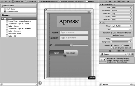
Figure 4–22. Dragging a segmented control from the library to the left side of the parent view. Next, we'll resize the segmented control so it stretches to the right side of the view.
Expand the width of the segmented control so that it stretches from the view's left margin to its right margin. Double-click the word First on the segmented control and change the title from First to Switches. After doing that, repeat the process with the Second segment, renaming it Button (see Figure 4–23).
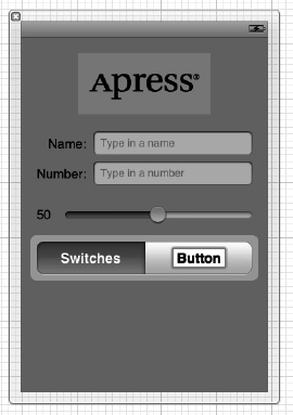
Figure 4–23. Renaming the segments in the segmented control
Adding Two Labeled Switches
Next, grab a switch from the library, and place it on the view, below the segmented control and against the left margin. Drag a second switch and place it against the right margin, aligned vertically with the first switch (see Figure 4–24).
TIP: Holding down the option key and dragging an object in Interface Builder will create a copy of that item. When you have many instances of the same object to create, it can be faster to drag only one object from the library and then option-drag as many copies as you need.
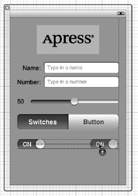
Figure 4–24. Adding the switches to the view
Connecting and Creating Outlets and Actions
Before we add the button, we'll create outlets for the two switches and connect them. The button that we'll be adding next will actually sit on top of the switches, making it harder to control-drag to and from them, so we want to take care of the switch connections before we add the button. Since the button and the switches will never be visible at the same time, having them in the same physical location won't be a problem.
Using the assistant editor, control-drag from the switch on the left to just below the last outlet in your header file. When the popup appears, name the outlet leftSwitch and hit return. Repeat with the other switch, naming its outlet rightSwitch.
Now, select the left switch again by single-clicking it. Control-drag once more to the assistant editor. This time, drag to right above the @end declaration before letting go. When the popup appears, change the Connection popup to Action, give it a name of switchChanged:, and hit return to create the new action. Repeat with the right switch, but instead of creating a new action, drag to the switchChanged:action that was just created and connect to it instead. Just as we did in the previous chapter, we're going to use a single method to handle both switches.
Finally, control-drag from the segmented control to the assistant editor, right above the @end declaration. Insert a new action method called toggleControls:.
Implementing the Switch Actions
Save the nib file and single-click BIDViewController.m. Look for the switchChanged: method that was added for you automatically, and add the following code to it:
- (IBAction)switchChanged:(id)sender {

  UISwitch *whichSwitch = (UISwitch *)sender;

  BOOL setting = whichSwitch.isOn;

  [leftSwitch setOn:setting animated:YES];

  [rightSwitch setOn:setting animated:YES];

}
The switchChanged: method is called whenever one of the two switches is tapped. In this method, we simply grab the value of sender, which represents the switch that was pressed, and use that value to set both switches. Now, sender is always going to be either leftSwitch or rightSwitch, so you might be wondering why we're setting them both. The reason is one of practicality. It's less work to just set the value of both switches every time than to determine which switch made the call and set only the other one. Whichever switch called this method will already be set to the correct value, and setting it again to that same value won't have any effect.
Adding the Button
Next, go back to Interface Builder and drag a Round Rect Button from the library to your view. Add this button directly on top of the leftmost button, aligning it with the left margin and vertically aligning its center with the two switches (see Figure 4–25).
Figure 4–25. Adding a round rect button on top of the existing switches
Now, grab the right-center resize handle and drag all the way to the right until you reach the blue guideline that indicates the right margin. The button should completely cover the two switches (see Figure 4–26).
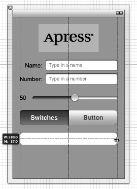
Figure 4–26. The round rect button, once placed and resized, will completely obscure the two switches.
Double-click the newly added button and give it a title of Do Something.
Connecting and Creating the Button Outlets and Actions
Control-drag from the new button to the assistant editor, just below the last outlet already in the header. When the popup appears, create a new outlet called doSomethingButton. After you've done that, control-drag from the button a second time to just above the @end declaration. This time, instead of creating an outlet, create an action called buttonPressed:.
If you save your work and take the application for a test drive, you'll see that the segmented control will be live, but it doesn't do anything particularly useful yet. We need to add some logic to make the button and switches hide and unhide.
We also need to mark our button as hidden from the start. We didn't want to do that before because it would have made it harder to connect the outlets and actions. Now that we've done that, let's hide the button. We'll show the button when the user taps the right side of the segmented control, but when the application starts, we want the button hidden. Press 4 to bring up the attributes inspector, scroll down to the View section, and click the Hidden checkbox. The button will disappear.
Implementing the Segmented Control Action
Save the nib file and single-click BIDViewController.m. Look for the toggleControls: method that Xcode created for us and add the following code to it:
- (IBAction)toggleControls:(id)sender {

    // 0 == switches index

    if ([sender selectedSegmentIndex] == 0) {

        leftSwitch.hidden = NO;

        rightSwitch.hidden = NO;

        doSomethingButton.hidden = YES;

    }

    else {

        leftSwitch.hidden = YES;

        rightSwitch.hidden = YES;

        doSomethingButton.hidden = NO;

    }

}
This code looks at the selectedSegmentIndex property of sender, which tells us which of the sections is currently selected. The first section, called switches, has an index of 0, a fact that we've written down in a comment so that when we later revisit the code, we know what's going on. Depending on which segment is selected, we hide or show the appropriate controls.
At this point, save and try running the application in the iOS simulator. If you've typed everything correctly, you should be able to switch between the button and the pair of switches using the segmented control, and if you tap either switch, the other one will change its value as well. The button, however, still doesn't do anything. Before we implement it, we need to talk about action sheets and alerts.
Implementing the Action Sheet and Alert
Action sheets and alerts are both used to provide the user with feedback. as follows:
- Action sheets are used to force the user to make a choice between two or more items. The action sheet comes up from the bottom of the screen and displays a series of buttons (see Figure 4–3). Users are unable to continue using the application until they have tapped one of the buttons. Action sheets are often used to confirm a potentially dangerous or irreversible action such as deleting an object.
- Alerts appear as a blue, rounded rectangle in the middle of the screen (see Figure 4–4). Just like action sheets, alerts force users to respond before they are allowed to continue using the application. Alerts are usually used to inform the user that something important or out of the ordinary has occurred. Unlike action sheets, alerts may be presented with only a single button, although you have the option of presenting multiple buttons if more than one response is appropriate.
NOTE: A view that forces users to make a choice before they are allowed to continue using their application is known as a modal view.
Conforming to the Action Sheet Delegate Method
Remember back in Chapter 3 when we talked about the application delegate? Well, UIApplication is not the only class in Cocoa Touch that uses delegates. In fact, delegation is a common design pattern in Cocoa Touch. Action sheets and alerts both use delegates so that they know which object to notify when they're dismissed. In our application, we'll need to be notified when the action sheet is dismissed. We don't need to know when the alert is dismissed, because we're just using it to notify the user of something, not to actually solicit a choice.
In order for our controller class to act as the delegate for an action sheet, it needs to conform to a protocol called UIActionSheetDelegate. We do that by adding the name of the protocol in angle backets after the superclass in our class declaration. Add the following protocol declaration to BIDViewController.h:
#import <UIKit/UIKit.h>


@interface BIDViewController : UIViewController <UIActionSheetDelegate>

@property (strong, nonatomic) IBOutlet UITextField *nameField;

@property (strong, nonatomic) IBOutlet UITextField *numberField;

. . .
Showing the Action Sheet
Let's switch over to BIDViewController.m and implement the button's action method. We actually need to implement another method in addition to our existing action method: the UIActionSheetDelegate method that the action sheet will use to notify us that it has been dismissed.
First, look for the empty buttonPressed: method that Xcode created for you. Add the following code to that method to create and show the action sheet:
- (IBAction)buttonPressed:(id)sender {


    UIActionSheet *actionSheet = [[UIActionSheet alloc]

        initWithTitle:@"Are you sure?"

        delegate:self

        cancelButtonTitle:@"No Way!"

        destructiveButtonTitle:@"Yes, I'm Sure!"

        otherButtonTitles:nil];

    [actionSheet showInView:self.view];

}
Next, add a new method just after the existing buttonPressed: method:
- (void)actionSheet:(UIActionSheet *)actionSheet

    didDismissWithButtonIndex:(NSInteger)buttonIndex

{

    if (buttonIndex != [actionSheet cancelButtonIndex])

    {

        NSString *msg = nil;


        if (nameField.text.length > 0)

        msg = [[NSString alloc] initWithFormat:

            @"You can breathe easy, %@, everything went OK.",

            nameField.text];

        else

            msg = @"You can breathe easy, everything went OK.";


        UIAlertView *alert = [[UIAlertView alloc]

                          initWithTitle:@"Something was done"

                          message:msg

                          delegate:self

                          cancelButtonTitle:@"Phew!"

                          otherButtonTitles:nil];

        [alert show];

    }

}
What exactly did we do there? Well, first, in the doSomething: action method, we allocated and initialized a UIActionSheet object, which is the object that represents an action sheet (in case you couldn't puzzle that one out for yourself):
UIActionSheet *actionSheet = [[UIActionSheet alloc]

           initWithTitle:@"Are you sure?"

           delegate:self

           cancelButtonTitle:@"No Way!"

           destructiveButtonTitle:@"Yes, I'm Sure!"

           otherButtonTitles:nil];
The initializer method takes a number of parameters. Let's look at each of them in turn.
The first parameter is the title to be displayed. Refer back to Figure 4–3 to see how the title we're supplying will be displayed at the top of the action sheet.
The next argument is the delegate for the action sheet. The action sheet's delegate will be notified when a button on that sheet has been tapped. More specifically, the delegate's actionSheet:didDismissWithButtonIndex: method will be called. By passing self as the delegate parameter, we ensure that our version of actionSheet:didDismissWithButtonIndex: will be called.
Next, we pass in the title for the button that users will tap to indicate they do not want to proceed. All action sheets should have a cancel button, though you can give it any title that is appropriate to your situation. You do not want to use an action sheet if there is no choice to be made. In situations where you want to notify the user without giving a choice of options, an alert view is more appropriate.
The next parameter is the destructive button, and you can think of this as the “yes, please go ahead– button, though once again, you can assign it any title.
The last parameter allows you to specify any number of other buttons that you may want shown on the sheet. This final argument can take a variable number of values, which is one of the nice features of the Objective-C language. If we had wanted two more buttons on our action sheet, we could have done it like this:
       UIActionSheet *actionSheet = [[UIActionSheet alloc]

           initWithTitle:@"Are you sure?"

           delegate:self

           cancelButtonTitle:@"No Way!"

           destructiveButtonTitle:@"Yes, I'm Sure!"

           otherButtonTitles:@"Foo", @"Bar", nil];
This code would have resulted in an action sheet with four buttons. You can pass as many arguments as you want in the otherButtonTitles parameter, as long as you pass nil as the last one. Of course, there is a practical limitation on how many buttons you can have, based on the amount of screen space available.
After we create the action sheet, we tell it to show itself:
[actionSheet showInView:self.view];
Action sheets always have a parent, which must be a view that is currently visible to the user. In our case, we want the view that we designed in Interface Builder to be the parent, so we use self.view. Note the use of Objective-C dot notation. self.view is equivalent to saying [self view], using the accessor to return the value of our view property.
Why didn't we just use view, instead of self.view? view is a private instance variable of our parent class UIViewController, which means we can't access it directly, but instead must use an accessor method.
Well, that wasn't so hard, was it? In just a few lines of code, we showed an action sheet and required the user to make a decision. iOS will even animate the sheet for us without requiring us to do any additional work. Now, we just need to find out which button the user tapped. The other method that we just implemented, actionSheet:didDismissWithButtonIndex, is one of the UIActionSheetDelegate methods, and since we specified self as our action sheet's delegate, this method will automatically be called by the action sheet when a button is tapped.
The argument buttonIndex will tell us which button was actually tapped. But how do we know which button index refers to the cancel button and which one refers to the destructive button? Fortunately, the delegate method receives a pointer to the UIActionSheet object that represents the sheet, and that action sheet object knows which button is the cancel button. We just need look at one of its properties, cancelButtonIndex:
if (buttonIndex != [actionSheet cancelButtonIndex])
This line of code makes sure the user didn't tap the cancel button. Since we gave the user only two options, we know that if the cancel button wasn't tapped, the destructive button must have been tapped, and it's OK to proceed. Once we know the user didn't cancel, the first thing we do is create a new string that will be displayed to the user. In a real application, here you would do whatever processing the user requested. We're just going to pretend we did something, and notify the user using an alert.
If the user has entered a name in the top text field, we'll grab that, and we'll use it in the message that we'll display in the alert. Otherwise, we'll just craft a generic message to show.
        NSString *msg = nil;


        if (nameField.text.length > 0)

            msg = [[NSString alloc] initWithFormat:

                @"You can breathe easy, %@, everything went OK.",

                nameField.text];

        else

            msg = @"You can breathe easy, everything went OK.";
The next lines of code are going to look kind of familiar. Alert views and action sheets are created and used in a very similar manner.
        UIAlertView *alert = [[UIAlertView alloc]

            initWithTitle:@"Something was done"

            message:msg

            delegate:nil

            cancelButtonTitle:@"Phew!"

            otherButtonTitles:nil];
Again, we pass a title to be displayed. We also pass a more detailed message, which is that string we just created. Alert views have delegates, too, and if we needed to know when the user had dismissed the alert view or which button was tapped, we could specify self as the delegate here, just as we did with the action sheet. If we had done that, we would now need to conform our class to the UIAlertViewDelegate protocol also, and implement one or more of the methods from that protocol. In this case, we're just informing the user of something and giving the user only one button. We don't really care when the button is tapped, and we already know which button will be tapped, so we just specify nil here to indicate that we don't need to be pinged when the user is finished with the alert view.
Alert views, unlike action sheets, are not tied to a particular view, so we just tell the alert view to show itself without specifying a parent view. After that, it's just a matter of some memory cleanup, and we're finished. Save the file. Then build, run, and try out the completed application.
Spiffing Up the Button
If you compare your running application to Figure 4–2, you might notice an interesting difference. Your Do Something button doesn't look like the one in the figure. And it doesn't look like the button on the action sheet or those in other iPhone applications, does it? The default round rect button doesn't really look that spiffy, so let's take care of that before we finish up the app.
Most of the buttons you see on your iOS device are drawn using images. Don't worry; you don't need to create images in an image editor for every button. All you need to do is specify a kind of template image that iOS will use when drawing your buttons.
It's important to keep in mind that your application is sandboxed. You can't get to the template images that are used in other applications on your iOS device or the ones used by iOS itself, so you must make sure that any images you need are in your application's bundle. So, where can you get these image templates?
Fortunately, Apple has provided a bunch for you. You can get them from the iPhone sample application called UICatalog, available from the iOS Developer Library:
http://developer.apple.com/library/ios/#samplecode/UICatalog/index.html
Alternatively, you can simply copy the images from the 04 - Control Fun folder from this book's project archive. Yes, it is OK to use these images in your own applications, because Apple's sample code license specifically allows you to use and distribute them.
So, from either the 04 - Control Fun folder or the Images subfolder of the UICatalog project's folder, add the two images named blueButton.png and whiteButton.png to your Xcode project.
If you tap one of the buttons in the project navigator, you'll see that there's not much to them. There's a trick to using them for your buttons.
Go back to the nib file you've been working on and single-click the Do Something button. Yeah, we know, the button is now invisible because we marked it as hidden, but you should have no problem seeing the ghost image. In addition, you can also click the button in the dock's list.
With the button selected, press 4 to open the attributes inspector. In the inspector, use the first popup menu to change the type from Rounded Rect to Custom. You'll see in the inspector that you can specify an image for your button, but we're not going to do that, because these image templates need to be handled a little differently.
Using the viewDidLoad Method
UIViewController, our controller's superclass, has a method called viewDidLoad that we can override if we need to modify any of the objects that were created from our nib. Because we can't do what we want completely in Interface Builder, we're going to take advantage of viewDidLoad.
Save your nib. Then switch over to BIDViewController.m and look for the viewDidLoad method. The Xcode project template created an empty version of this method for you. Find it, and add the following code to it. When you're finished, we'll talk about what the method does.
- (void)viewDidLoad{

    [super viewDidLoad];

    // Do any additional setup after loading the view, typically from a nib.

    UIImage *buttonImageNormal = [UIImage imageNamed:@"whiteButton.png"];

    UIImage *stretchableButtonImageNormal = [buttonImageNormal

                               stretchableImageWithLeftCapWidth:12 topCapHeight:0];

    [doSomethingButton setBackgroundImage:stretchableButtonImageNormal

                               forState:UIControlStateNormal];


    UIImage *buttonImagePressed = [UIImage imageNamed:@"blueButton.png"];

    UIImage *stretchableButtonImagePressed = [buttonImagePressed

                               stretchableImageWithLeftCapWidth:12 topCapHeight:0];

    [doSomethingButton setBackgroundImage:stretchableButtonImagePressed

                               forState:UIControlStateHighlighted];

}
This code sets the background image for the button based on those template images we added to our project. It specifies that, while being touched, the button should change from using the white image to the blue image. This short method introduces two new concepts: control states and stretchable images. Let's look at each of them in turn.
Control States
Every iOS control has four possible control states and is always in one, and only one, of these states at any given moment:
- Normal: The most common state is the normal control state, which is the default state. It's the state that controls are in when not in any of the other states.
- Highlighted: The highlighted state is the state a control is in when it's currently being used. For a button, this would be while the user has a finger on the button.
- Disabled: Controls are in the disabled state when they have been turned off, which can be done by unchecking the Enabled checkbox in Interface Builder or setting the control's
enabledproperty toNO. - Selected: Only some controls support the selected state. It is usually used to indicate that the control is turned on or selected. Selected is similar to highlighted, but a control can continue to be selected when the user is no longer directly using that control.
Certain iOS controls have attributes that can take on different values depending on their state. For example, by specifying one image for UIControlStateNormal and a different image for UIControlStateHighlighted, we are telling iOS to use one image when the user has a finger on the button and a different image the rest of the time.
Stretchable Images
Stretchable images are an interesting concept. A stretchable image is a resizable image that knows how to resize itself intelligently so that it maintains the correct appearance. For these button templates, we don't want the edges to stretch evenly with the rest of the image. End caps are the parts of an image, measured in pixels, that should not be resized. We want the bevel around the edges to stay the same, no matter what size we make the button, so we specify a left end cap size of 12.
Because we pass in the new stretchable image to our button, rather than the image template, iOS knows how to draw the button properly at any size. We could now go in and change the size of the button in the nib file, and it would still be drawn correctly. If we had specified the button image directly in the nib file, it would resize the entire image evenly, and our button would look weird at most sizes.
TIP: How did we know what value to use for the end caps? It's simple really: we copied from Apple's sample code.
Why don't you save the file and try out our app? The Do Something button should now look a little more iPhone-ish, but everything should work the same.
Crossing the Finish Line
This was a big chapter. Conceptually, we didn't hit you with too much new stuff, but we took you through the use of a good number of controls and showed you many different implementation details. You got a lot more practice with outlets and actions, and saw how to use the hierarchical nature of views to your advantage. You learned about control states and stretchable images, and you also learned how to use both action sheets and alerts.
There's a lot going on in this little application. Feel free to go back and play with it. Change values, experiment by adding and modifying code, and see what different settings in Interface Builder do. There's no way we could take you through every permutation of every control available in iOS, but the application you just put together is a good starting point and covers a lot of the basics.
In the next chapter, we're going to look at what happens when the user rotates an iOS device from portrait to landscape orientation or vice versa. You're probably well aware that many apps change their displays based on the way the user is holding the device, and we're going to show you how to do that in your own applications.