
Steppers
Sliders
Progress Views
Activity Indicator Views
Steppers display a minus/plus icon that users can click to increment a value by a fixed amount, up or down. By using a stepper, users can define a value without typing a specific number.
Sliders give users another way to input a specific value without any typing whatsoever. Both steppers and sliders can define minimum and maximum values to restrict users into choosing only valid numeric values. For many people, it’s easier to click to choose a value than to type that number itself.
Progress Views visually show how far a task needs to go before completion. A Progress View displays a bar and highlights part of that bar until the entire bar appears highlighted. By visually displaying the completion of a task, a Progress View makes it easy to see how much further a task needs to go before it’s done.
Activity Indicator views provide an animated display to let users know that a task is being worked on. Although an Activity Indicator View does not display how much further a task needs to go before it’s done, it does provide animation to make it obvious that a task is currently being worked on.
Steppers and sliders make it easy to input numeric data quickly and accurately. Progress Views make it easy to see how much further a task needs to go before it’s done, while Activity Indicator Views simply let users know that something is happening.
Using Steppers
Steppers store a value that users can increment by a fixed increment such as 1 or 2.5. You can define a minimum and maximum value that the stepper can represent such as a range between 1 and 10. Furthermore, you can define whether the stepper wraps or not. Wrapping means if you keep incrementing the stepper beyond its maximum value, it goes back to its minimum value. Likewise if you keep decrementing the stepper below its minimum value, it jumps to its maximum value. This can make it easy for users to choose different values without having to exhaustively step from one extreme value to the other.
- 1.
Create a new iOS project using the Single View App template (see Chapter 1) and name this new project StepperApp. This creates a single view for the user interface.
- 2.
Click the Main.storyboard file in the Navigator pane. Xcode displays the single view.
- 3.
Click the Library icon to open the Object Library window.
- 4.
Drag and drop a stepper anywhere on the view.
- 5.Choose View ➤ Inspectors ➤ Show Attributes Inspector, or click the Attributes Inspector icon at the top of the Inspector pane. The Inspector pane shows all attributes available for a stepper as shown in Figure 8-1.
 Figure 8-1
Modifying attributes for a stepper in the Inspector pane
The default settings for a stepper define its current value as 0, its minimum value as 0, its maximum value as 100, and its increment value as 1.
In addition, its Autorepeat option is selected, which means the user doesn’t need to click the stepper each time to increment or decrement its value. Instead, the user can simply hold down left mouse down over the stepper.
The Continuous check box is also selected, which means the value of the stepper constantly changes to reflect the latest value. If this Continuous check box is clear, then the value of the stepper only changes once the user stops clicking it.
The Wrap check box is clear, which means once the stepper reaches its minimum or maximum value, it won’t decrement or increment anymore. If the Wrap check box is selected, then the user can move past the maximum value defined (100) and return to 0 again, or move below the minimum value defined (0) and return to 100 again.
- 6.
Click the Library icon to open the Object Library window.
- 7.
Drag and drop a label near the stepper.
- 8.Click the Library icon to open the Object Library window and drag and drop a button near the stepper and label. At this point, your user interface should contain a stepper, a label, and a button as shown in Figure 8-2.
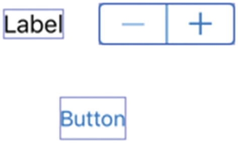 Figure 8-2
A stepper, label, and button on the user interface
- 9.
Choose Editor ➤ Resolve Auto Layout Issues ➤ Reset to Suggested Constraints at the bottom half of the submenu. This adds constraints to all your objects.
- 10.
Choose View ➤ Assistant Editor ➤ Show Assistant Editor, or click the Assistant Editor icon. Xcode displays the Main.storyboard and ViewController.swift file side by side.
- 11.
Move the mouse pointer over the label, hold down the Control key, and Ctrl-drag from the label to the ViewController.swift file underneath the “class ViewController” line.
- 12.
Release the Control key and the left mouse button. A popup window appears.
- 13.
Click in the Name text field, type labelValue, and click the Connect button. Xcode creates an IBOutlet variable as follows:
@IBOutlet var labelValue: UILabel!
- 14.
Move the mouse pointer over the stepper, hold down the Control key, and Ctrl-drag from the stepper to the ViewController.swift file underneath the IBOutlet line.
- 15.
Release the Control key and the left mouse button. A popup window appears.
- 16.Click in the Name text field, type stepperValue, and click the Connect button. Xcode creates an IBOutlet variable as follows:@IBOutlet var stepperValue: UIStepper!
- 17.
Move the mouse pointer over the stepper, hold down the Control key, and Ctrl-drag from the stepper to the ViewController.swift file above the last curly bracket at the bottom.
- 18.
Release the Control key and the left mouse button. A popup window appears.
- 19.Click in the Name text field, type stepperChanged, click in the Type popup menu and choose UIStepper, and click the Connect button. Xcode creates an IBAction method as follows:@IBAction func stepperChanged(_ sender: UIStepper) {}
- 20.
Move the mouse pointer over the button, hold down the Control key, and Ctrl-drag from the button to the ViewController.swift file above the last curly bracket at the bottom.
- 21.
Release the Control key and the left mouse button. A popup window appears.
- 22.Click in the Name text field, type changeStepper, click in the Type popup menu and choose UIButton, and click the Connect button. Xcode creates an IBAction method as follows:@IBAction func changeStepper(_ sender: UIButton) {}
- 23.Edit the stepperChanged IBAction method as follows:@IBAction func stepperChanged(_ sender: UIStepper) {labelValue.text = "(stepperValue.value)"}
This IBAction method retrieves the current value of the stepper, which is a number, and displays it as text. Then it puts this text into the label.
Note The “()” symbol is called string interpolation. You can place any value inside the parentheses to convert that value into a string.
- 24.
Choose View ➤ Standard Editor ➤ Show Standard Editor, or click the Standard Editor icon.
- 25.
Click the Run button or choose Product ➤ Run.
- 26.
Click the + icon on the stepper multiple times. Notice that each time you click the + icon of the stepper, its numeric value increases by 1 in the label.
- 27.
Click the – icon on the stepper multiple times. Notice that each time you click the – icon of the stepper, its numeric value decreases by 1 in the label.
- 28.
Choose Simulator ➤ Quit Simulator to return to Xcode.
The stepper increments by 1 and has a minimum value of 0 and a maximum value of 100 because of its default settings as displayed in the Attributes Inspector pane. We could change those settings in the Inspector pane but let’s change them using Swift code instead.
- 1.
Click the ViewController.swift file in the Navigator pane.
- 2.Edit the changeStepper IBAction method as follows:@IBAction func changeStepper(_ sender: UIButton) {stepperValue.minimumValue = -10stepperValue.maximumValue = -5stepperValue.stepValue = 0.5stepperValue.isContinuous = truestepperValue.autorepeat = truestepperValue.wraps = true}
Setting the stepper’s isContinuous, autorepeat, and wraps properties to true is equivalent to selecting the Continuous, Autorepeat, and Wraps check boxes in the Inspector pane.
- 3.
Click the Run button or choose Product ➤ Run. The Simulator window appears.
- 4.
Click the + icon on the stepper. Notice that the value in the label increases by 1 each time you click the + icon.
- 5.
Click the button. This runs the Swift code in the changeStepper IBAction method.
- 6.
Click the – and + icons in the stepper. Notice that it now increments or decrements by 0.5 because the Swift code defined its stepValue property to 0.5.
- 7.
Chose Simulator ➤ Quit Simulator to return to Xcode.
Using Sliders
Like a stepper, a slider lets the user choose a numeric value without typing a specific number. While a stepper forces users to increment/decrement values by a fixed amount, sliders make it easy for users to choose between a range of values quickly by simply changing the slider’s position.
One drawback of sliders is that they take up more space than steppers. Another drawback is that steppers let you define a fixed increment/decrement value, while a slider does not.
A thumb
A minimum track
A maximum track

The three parts of a slider
The minimum track and maximum track typically appear in different colors to make it easy to see the position of the thumb. However, you can define colors for the thumb, minimum, and maximum track to make them more visible.
- 1.
Create a new iOS project using the Single View App template (see Chapter 1) and name this new project SliderApp. This creates a single view for the user interface.
- 2.
Click the Main.storyboard file in the Navigator pane. Xcode displays the single view.
- 3.
Click the Library icon to display the Object Library.
- 4.
Drag and drop a label, a button, and a slider onto the view.
- 5.
Expand the width of the slider to make it longer.
- 6.
Choose Editor ➤ Resolve Auto Layout Issues ➤ Reset to Suggested Constraints in the bottom half of the submenu. This applies constraints to the label, button, and slider.
- 7.
Choose View ➤ Assistant Editor ➤ Show Assistant Editor, or click the Assistant Editor icon. Xcode displays the Main.storyboard and ViewController.swift file side by side.
- 8.
Move the mouse pointer over the label, hold down the Control key, and Ctrl-drag from the label to the ViewController.swift file underneath the “class ViewController” line.
- 9.
Release the Control key and the left mouse button. A popup window appears.
- 10.Click in the Name text field, type labelValue, and click the Connect button. Xcode creates an IBOutlet variable as follows:@IBOutlet var labelValue: UILabel!
- 11.
Move the mouse pointer over the slider, hold down the Control key, and Ctrl-drag from the slider to the ViewController.swift file underneath the IBOutlet line.
- 12.
Release the Control key and the left mouse button. A popup window appears.
- 13.Click in the Name text field, type sliderValue, and click the Connect button. Xcode creates an IBOutlet variable as follows:@IBOutlet var sliderValue: UISlider!
- 14.
Move the mouse pointer over the button, hold down the Control key, and Ctrl-drag from the button to the ViewController.swift file above the last curly bracket at the bottom of the file.
- 15.
Release the Control key and the left mouse button. A popup window appears.
- 16.Click in the Name text field, type changeSlider, click the Type popup menu and choose UIButton, and click the Connect button. Xcode creates an IBAction method as follows:@IBAction func changeSlider(_ sender: UIButton) {}
- 17.
Move the mouse pointer over the slider, hold down the Control key, and Ctrl-drag from the slider to the ViewController.swift file above the last curly bracket at the bottom of the file.
- 18.
Release the Control key and the left mouse button. A popup window appears.
- 19.Click in the Name text field, type sliderValueChanged, click the Type popup menu and choose UISlider, and click the Connect button. Xcode creates an IBAction method as follows:@IBAction func sliderValueChanged(_ sender: UISlider) {}
- 20.
Choose View ➤ Standard Editor ➤ Show Standard Editor, or click the Standard Editor icon in the upper right corner of the Xcode window.
- 21.
Click the ViewController.swift file in the Navigator pane to edit it.
- 22.Modify the sliderValueChanged method as follows:@IBAction func sliderValueChanged(_ sender: UISlider) {labelValue.text = "(sliderValue.value)"}The entire ViewController.swift file should look like this:import UIKitclass ViewController: UIViewController {@IBOutlet var labelValue: UILabel!@IBOutlet var sliderValue: UISlider!override func viewDidLoad() {super.viewDidLoad()// Do any additional setup after loading the view, typically from a nib.}@IBAction func changeSlider(_ sender: UIButton) {}@IBAction func sliderValueChanged(_ sender: UISlider) {labelValue.text = "(sliderValue.value)"}}
- 23.
Click the Run button or choose Product ➤ Run. The Simulator window appears.
- 24.
Drag the slider left and right. Notice that if you drag the slider thumb to the far left, the value 0 (zero) appears in the label, but if you drag the thumb to the far right, the value of 1.0 appears. That’s because the default minimum and maximum values of the slider are 0 and 1, respectively.
- 25.
Choose Simulator ➤ Quit Simulator to return to Xcode.
Modifying a Slider with Swift Code
.value – Defines the initial value displayed by the slider
.minimumValue – Defines the minimum value the slider can represent
.maximumValue – Defines the maximum value the slider can represent
.thumbTintColor – Defines the color of the thumb on the slider
.minimumTrackTintColor – Defines the color of the minimum track
.maximumTrackTintColor – Defines the color of the maximum track
- 1.
Make sure the SliderApp project is loaded in Xcode.
- 2.
Click the ViewController.swift file in the Navigator pane to edit the ViewController.swift file.
- 3.Modify the changeSlider IBAction method as follows:@IBAction func changeSlider(_ sender: UIButton) {sliderValue.minimumValue = 1sliderValue.maximumValue = 25sliderValue.value = 7sliderValue.minimumTrackTintColor = UIColor.redsliderValue.maximumTrackTintColor = UIColor.greensliderValue.thumbTintColor = UIColor.black}The entire ViewController.swift file should look like this:import UIKitclass ViewController: UIViewController {@IBOutlet var labelValue: UILabel!@IBOutlet var sliderValue: UISlider!override func viewDidLoad() {super.viewDidLoad()// Do any additional setup after loading the view, typically from a nib.}@IBAction func changeSlider(_ sender: UIButton) {sliderValue.minimumValue = 1sliderValue.maximumValue = 25sliderValue.value = 7sliderValue.minimumTrackTintColor = UIColor.redsliderValue.maximumTrackTintColor = UIColor.greensliderValue.thumbTintColor = UIColor.black}@IBAction func sliderValueChanged(_ sender: UISlider) {labelValue.text = "(sliderValue.value)"}}
- 4.
Click the Run button or chose Product ➤ Run. The Simulator window appears.
- 5.
Drag the slider left and right. Notice that the label displays a value between 0 and 1, which are the minimum and maximum values defined by the Attributes Inspector pane.
- 6.
Click the button. This runs the Swift code to modify the slider.
- 7.
Drag the slider left and right. Notice that the label now displays a value between 1 and 25. In addition, the slider appears with the thumb, minimum track, and maximum track displayed in different colors.
- 8.
Choose Simulator ➤ Quit Simulator to return to Xcode.
Using the Progress and Activity Indicator Views
The Progress View displays a horizontal bar that fills with color to visually show the progress of a task. When the Progress View is empty, that means the task hasn’t started yet. When the Progress View is completely filled with color, that means the task is completed. When the Progress View is partially filled, that indicates the task is partially completed.
However, it’s not always possible to know exactly when a task might be completed. In that case, the Progress View would appear stagnant, giving the illusion that nothing is happening or that the app may have crashed. When the completion of a task can’t be determined, it’s better to use the Activity Indicator View, which displays an animated spinner that shows something’s happening.
The Progress View shows how far a task has been completed, while an Activity Indicator View does not.
The Activity Indicator View constantly shows that something is happening, while a Progress View may not.
- 1.
Create a new iOS project using the Single View App template (see Chapter 1) and name this new project ProgressApp. This creates a single view for the user interface.
- 2.
Click the Main.storyboard file in the Navigator pane. Xcode displays the single view.
- 3.
Click the Library icon to display the Object Library.
- 4.Drag and drop a button and Activity Indicator View onto the user interface as shown in Figure 8-4.
 Figure 8-4
Dragging the Activity Indicator View from the Object Library window to the user interface
- 5.
Choose Editor ➤ Resolve Auto Layout Issues ➤ Reset to Suggested Constraints on the bottom half of the submenu. This will add constraints to all objects on the user interface.
- 6.
Click the Main.storyboard file in the Navigator pane.
- 7.
Choose View ➤ Assistant Editor ➤ Show Assistant Editor, or click the Assistant Editor icon in the upper right corner of the Xcode window. Xcode displays the Main.storyboard file side by side with the ViewController.swift file.
- 8.
Move the mouse over the Activity Indicator View, hold down the Control key, and Ctrl-drag to the ViewController.swift file underneath the IBOutlet line.
- 9.
Release the Control key and the left mouse button. A popup window appears.
- 10.
Click in the Name text field and type activityView, and click the Connect button. Xcode creates an IBOutlet as follows:
@IBOutlet var activityView: UIActivityIndicatorView!
- 11.
Move the mouse over the button, hold down the Control key, and Ctrl-drag to the ViewController.swift file above the last curly bracket at the bottom of the file.
- 12.
Release the Control key and the left mouse button. A popup window appears.
- 13.Click in the Name text field and type runButton, click in the Type popup menu and choose UIButton, and click the Connect button. Xcode creates an IBAction method as follows:@IBAction func runButton(_ sender: UIButton) {}
- 14.
Choose View ➤ Standard Editor ➤ Show Standard Editor, or click the Standard Editor icon in the upper right corner of the Xcode window.
- 15.
Click the ViewController.swift file in the Navigator pane.
- 16.
Add this line above the IBOutlet variables:
var counter = 0
- 17.Add this line inside the viewDidLoad function:activityView.hidesWhenStopped = true
- 18.Edit this runButton IBAction method as follows:@IBAction func runButton(_ sender: UIButton) {Timer.scheduledTimer(withTimeInterval: 1.0, repeats: true) { timer inself.activityView.startAnimating()self.counter += 1if self.counter >= 5 {self.activityView.stopAnimating()timer.invalidate()}}}
This code runs a timer that counts in 1-second increments. While the timer runs, it runs the startAnimating method to make the Activity Indicator View appear to spin around. As soon as the Activity Indicator View starts spinning, it appears on the screen.
After 5 seconds, the timer stops running and runs the stopAnimating method to make the Activity Indicator View stop spinning. As soon as it stops spinning, it disappears from the screen. The entire ViewController.swift file should look like this:import UIKitclass ViewController: UIViewController {var counter = 0@IBOutlet var activityView: UIActivityIndicatorView!override func viewDidLoad() {super.viewDidLoad()activityView.hidesWhenStopped = true// Do any additional setup after loading the view, typically from a nib.}@IBAction func runButton(_ sender: UIButton) {Timer.scheduledTimer(withTimeInterval: 1.0, repeats: true) { timer inself.activityView.startAnimating()self.counter += 1if self.counter >= 5 {self.activityView.stopAnimating()timer.invalidate()self.counter = 0}}}} - 19.
Click the Run button or choose Product ➤ Run. The Simulator screen appears.
- 20.
Click the button. The Activity Indicator View appears spinning around, then after 5 seconds, it disappears.
- 21.
Chose Simulator ➤ Quit Simulator to return to Xcode.
Using a Progress View
A Progress View gradually fills up to show the completion of a task. That means your app needs to know when a task will be completed. Since a Progress View visually displays progress, it’s best to make sure that the Progress View appears to fill up fairly quickly to give users feedback that the app is working and to show that the task is nearly completion. If the Progress View fills up too slowly, the app may appear frozen.
- 1.
Make sure the ProgressApp is loaded in Xcode.
- 2.
Click the Main.storyboard file in the Navigator pane. Xcode displays the single view.
- 3.
Click the Library icon to display the Object Library.
- 4.Drag and drop a label, a stepper, and a Progress View onto the user interface where the label appears above the Progress View and the stepper appears below the Progress View as shown in Figure 8-5.
 Figure 8-5
Organizing the Progress View in between the label and stepper
- 5.
Click the label and expand the width of the label until it stretches past both ends of the Progress View.
- 6.
Hold down the SHIFT key and click the label, Progress View, and stepper so handles appear around all three objects.
- 7.
Choose Editor ➤ Resolve Auto Layout Issues ➤ Reset to Suggested Constraints in the bottom half of the submenu. This sets constraints on the label, Progress View, and stepper.
- 8.
Move the mouse over the label, hold down the Control key, and Ctrl-drag to the ViewController.swift file underneath the IBOutlet line.
- 9.
Release the Control key and the left mouse button. A popup window appears.
- 10.
Click in the Name text field and type labelProgress, and click the Connect button. Xcode creates an IBOutlet as follows:
@IBOutlet var labelProgress: UILabel!
- 11.
Move the mouse over the Progress View, hold down the Control key, and Ctrl-drag to the ViewController.swift file underneath the “class ViewController” line.
- 12.
Release the Control key and the left mouse button. A popup window appears.
- 13.
Click in the Name text field and type progressView, and click the Connect button. Xcode creates an IBOutlet as follows:
@IBOutlet var progressView: UIProgressView!
- 14.
Move the mouse over the stepper, hold down the Control key, and Ctrl-drag to the ViewController.swift file underneath the IBOutlet line.
- 15.
Release the Control key and the left mouse button. A popup window appears.
- 16.Click in the Name text field and type stepperObject, and click the Connect button. Xcode creates an IBOutlet as follows:@IBOutlet var stepperObject: UIStepper!
- 17.
Move the mouse over the stepper, hold down the Control key, and Ctrl-drag to the ViewController.swift file above the last curly bracket at the bottom of the file.
- 18.
Release the Control key and the left mouse button. A popup window appears.
- 19.Click in the Name text field, type stepperChanged, click in the Type popup menu and choose UIStepper, and click the Connect button. Xcode creates an IBAction method as follows:@IBAction func stepperChanged(_ sender: UIStepper) {}
- 20.
Choose View ➤ Standard Editor ➤ Show Standard Editor, or click the Standard Editor icon in the upper right corner of the Xcode window.
- 21.
Click the ViewController.swift file in the Navigator pane.
- 22.Edit the stepperChanged IBAction method as follows:@IBAction func stepperChanged(_ sender: UIStepper) {labelProgress.text = "Completed (Int(stepperObject.value * 10)) of 10 tasks"progressView.progress = Float(stepperObject.value)}
The first line retrieves the value from the stepper, multiplies it by 10, and converts the value to an integer. The second line takes the value of the stepper, converts it to a Float value, and stores this value in the Progress View, which displays the value by filling the Progress View.
- 23.Edit the viewDidLoad method to add the following three lines:progressView.progress = 0stepperObject.stepValue = 0.1stepperObject.maximumValue = 1.0The first line sets the Progress View value to 0 so it appears on the user interface completely empty. The second line defines the stepper to increment values by 0.1. The third line defines the maximum stepper value as 1.0. The entire ViewController.swift file should look like this:import UIKitclass ViewController: UIViewController {var counter = 0@IBOutlet var labelProgress: UILabel!@IBOutlet var progressView: UIProgressView!@IBOutlet var stepperObject: UIStepper!@IBOutlet var activityView: UIActivityIndicatorView!override func viewDidLoad() {super.viewDidLoad()activityView.hidesWhenStopped = trueprogressView.progress = 0stepperObject.stepValue = 0.1stepperObject.maximumValue = 1.0// Do any additional setup after loading the view, typically from a nib.}@IBAction func runButton(_ sender: UIButton) {Timer.scheduledTimer(withTimeInterval: 1.0, repeats: true) { timer inself.activityView.startAnimating()self.counter += 1if self.counter >= 5 {self.activityView.stopAnimating()timer.invalidate()self.counter = 0}}}@IBAction func stepperChanged(_ sender: UIStepper) {labelProgress.text = "Completed (Int(stepperObject.value * 10)) of 10 tasks"progressView.progress = Float(stepperObject.value)}}
- 24.
Click the Run button or choose Product ➤ Run. The Simulator window appears.
- 25.Click the + icon on the stepper multiple times. Notice that each time you click the + icon on the stepper, the Progress View appears more filled and the label displays the progress as shown in Figure 8-6.
 Figure 8-6
Using the stepper to increase/decrease values in the label and the Progress View
- 26.
Choose Simulator ➤ Quit Simulator to return to Xcode.
Summary
When your app needs the user to input numeric data, a text field can work, but it might be clumsy, especially if you only want to accept a limited range of numeric values. To make it easy to input numeric data, use a stepper or a slider.
Both a stepper and slider can define a minimum and maximum value so that way the user can’t input numeric data below a minimum value or above a maximum value. A stepper has the added advantage of letting the user increment/decrement values by a fixed value.
A stepper takes up less space, but a slider makes it easier to change values from one extreme to another by simply dragging the thumb (circle) on the slider. Steppers force users to increment/decrement values so steppers can be much slower to define values if the range of acceptable values is large.
To display progress of a task, your app could display a message using a label, but it’s often easier to use a Progress View or Activity Indicator View instead. A Progress View can let users know how close a task is to completion, while an Activity Indicator View lets the user know that something is happening.
You can use Progress Views or Activity Indicator Views separately or together. An Activity Indicator View typically appears to display animation and then disappears when the task is done.
By using steppers and sliders, you can make it easy for users to input numeric data. By using Progress Views and Activity Indicator Views, you can make it easy for your app to let the user know when a task is working.