
Blender User Interface
THERE ARE SEVERAL DOCUMENTS and videos on the Blender user interface available over the net and in many diverse formats like books, DVDs, and magazines. Most of the documentation meant for new users provides information on what a specific button does or in which panel we could find a specific feature; in general, they cover, in a very trivial manner, a lot of useless, stuff in very large fonts that, in fact, are not really useful for new Blender users or students making the learning path hard, complex, stressful, and completely useless. This was the reason several people who wanted to use Blender gave up their attempt to use it.
In this book, we talk about those aspects we need to know to develop our project successfully. We will learn how animation studios develop their animation projects and the ways in which we can involve Blender in such a process. We will also provide in-depth technical lists about different types of editors, buttons, or properties and they will be provided as merely added information complementing the main idea.
We attempt to create here a comprehensible and solid learning path and focus on the important stuff, so once we know where to find things in the interface and how to use the different features, the rest will come with time and practice.
There is no magic rule that tells new users what they need to do at every moment, because as Blender evolves the position of some of the buttons are moved and some buttons that should not have been there in the first place are removed. Every project requires specific solutions as it evolves and grows on its own, and those solutions might vary depending on the version of Blender that is used.
In fact, has much of the 3D paradigms used in other applications such as Maya or 3ds Max are also found in Blender, but Blender also has its own principles. We need to understand those principles to build the foundation of our knowledge of Blender.
This chapter does not aim to give an in-depth explanation of each Blender button, panel, or feature, but aims to provide an overview of the most common editors, contexts, and workspaces within Blender to understand how this software could be introduced into the animation studios' workflow.
The current Blender user interface is modular and customizable, thanks to Open GL, allowing artists and other blender users to set it up and customize it to their needs or simply adapt it to their taste. That means we can join and split editors, open and collapse panels, drag and drop panels, or change all we need to accommodate our workspace layout to look exactly like we want. We talk more about the workspace layout later in Section 3.3.3.
This and the fact that Blender is also a cross-platform application officially supported by the most common desktop operating systems in the market, for example, Linux, Windows, or Mac OS X, makes Blender the perfect 3D application to get introduced to and to learn about because its user interface looks exactly the same on different machines with different hardware specifications.
This is also an advantage for colleges, universities, or freelances trying to teach Blender because this consistency opens relationships between teachers and students getting rid of useless old barriers and requirements like using the same operating system in order to use the same user interface. However, this doesn't get rid of other unknowns of the equation like keyboard shortcuts because, unlike the user interface, they are not the same over different operating systems and platforms.
We can say that the most recent Blender releases are the result of an in-depth refactor made from version 2.5 where the whole application was reviewed to improve code, appearance, and performance. That 2.5 refactor revolution followed what is referred to the three rules criteria, that consists of
- Nonoverlapping: This is based on the principle of having everything we need visible or easily accessible, for example, no boxes overlapping background context, control, or buttons.
- Nonblocking: This is based on the principle of avoiding pop ups of useless windows or messages disrupting the user's work with useless questions regarding actions or operators to execute, for example, Are you sure you want to add a Cube?
- Nonmodal: This is based on the principle of not changing commonly used methods. In other words, imagine we need to modify our object; those changes will not be visible until we click a confirmation button in a pop-up window. The aim is to avoid that and make the user focus on the work instead of the eventual tool itself.
3.1 Start-Up Blender
As mentioned earlier, the first look at Blender is probably intimidating. For those who are familiar with any other 3D software, the Blender user interface could have some similarities with those applications, especially the latest Blender versions. But that does not mean that other applications are fine and Blender is adapting its user interface to them.
Blender has been faithful to its principles ever since the first releases. If we compare the different Blender versions down the years, we will find that visuals have remained pretty much the same and work in the same way, as shown in Figure 3.1.
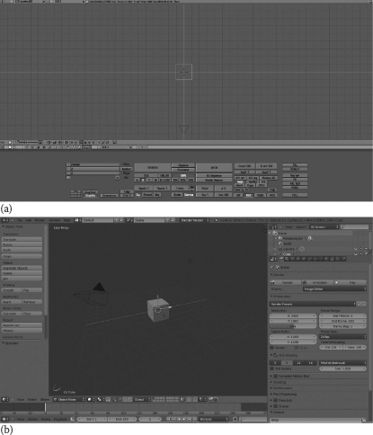
Blender user interface evolution along the years. Many of the paradigms of very old versions remain in the most recent versions. This picture represents the default layout for Blender 1.80 released in 2003 (a) and Blender 2.66.6 r56257 built in 2013 (b).
Of course, the 2.5 refactor revolution has meant an incredible step forward in user interface organization and user experience, but those who have had experience in using Blender will confirm that much of the current features were there even in the chaotic user interface of older Blender versions.
The first contact we have with the Blender user interface is called splash screen, that is, a small pop-up square that contains information on the Blender version and revision, a column with some useful links on the left and the latest or recently opened files on the right. We also can select the keymap preset in this screen like Blender or Maya. This option will change our relationship with Blender and the basic actions such Scale, Translate, or Rotate.
By default, the Blender keymap is selected, as shown in Figure 3.2. But didn't we say something about the paradigm of nonoverlapping and nonblocking pop up? Well, in fact, we're starting Blender and the splash screen is there to help in this initial state to speed up your work sessions with useful links to the most recently opened files.
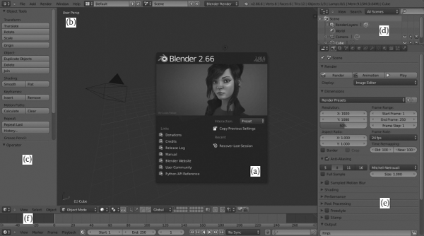
The Blender user interface by default. Customizable and easily adaptable to our needs thanks to Open GL. In this example, we see a basic workspace layout distribution: Splash screen (a), 3D View Editor (b) with Object/Mesh operators (c) internal panel. Outliner (d) with a tree of all objects and data inside the scene. Property Editor (e) panel with buttons and Timeline (f).
One thing that people don't know is that it has been common practice for Blender to use the artwork of Blender community artists on their splash screens. The featured artworks were those from contests organized by the Blender Foundation and served as a great opportunity to promote both artists' works and open-source projects.
Coming back to the Blender user interface, it is important that we understand some user interface concepts because we will refer to them later in the book. The Blender user interface is closely linked to elements like Editors, Headers, Context buttons, Regions, Panels, and Controls.
Editors in Blender refer to those areas of work in the determined production pipeline, what some animation studios call departments. For example, we have to open 3D View Editor for object/mesh editing or extrapolation to those animation studios, modeling department, NLA Editor for animation and strips managing, Node Editor to work with nodes and compositing, and UV/Image Editor for renders and UV Unwrap actions, and so on.
Sometimes there are divergences in the naming conventions regarding Editors, like in the Blender Wiki Documentation at wikiblender.org, where we sometimes see two names for the same concept: Editor and Window. I honestly prefer to call them Blender Editors, because I don't see each of these are as like a window if we define it as we know in the IT world.
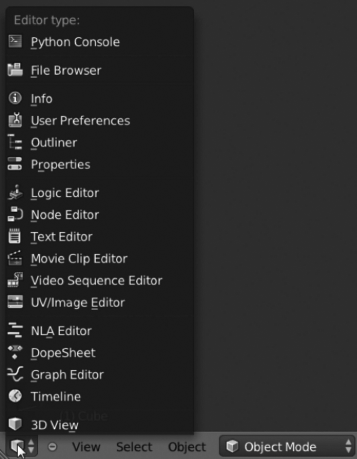
The Blender editors are 3D View, Timeline, Graphic Editor, DopeSheet, NLA Editor, UV/Image Editor, Video Sequence Editor, Movie Clip Editor, Text Editor, Node Editor, Logic Editor, Properties Editor, Outliner, User Preferences, Info Window, File Browser, and Console. We can switch between editors with the Editor Type Menu, as shown in Figure 3.3.
- Context buttons are those giving access to other options, and they are usually placed on the editor header. An example is the Properties panel that allows us to switch to different options for Scene, Materials, Modifiers, and more.
- Panels are those collapsible sections where control options are grouped.
- Regions are the spaces included in some editors where more panels and controls are placed. Sometimes the Blender user interface saves space by collapsing regions that are easily accessible by keys T and N also called the Tool Shelf and Properties Region.
- Controls are really the options allowing you to modify parameters and values or executing operators.
3.2 Controls and Buttons
In Blender, we call the elements that allow us to modify any value or setting controls. They display additional content or execute any specific function to confirm or refuse any operation. As mentioned earlier, Blender has been cleaning the face of the controls with respect to older versions since the 2.5 refactor revolution, making them comprehensible and sensitive to the user. There are a few control types:
Buttons: They execute operators and provide access to tools like Rotate or Scale, for example. We don't need to remember where the buttons are located because many of these buttons have a keyboard shortcut.
This shortcut speeds up your work session in Blender because you don't need to localize the right button and click on it every time you want to execute any specific function.
However, sometimes it is useful to remember where the button is placed in case of keyboard shortcut issues. We must remember now that keyboard shortcuts for these buttons may differ in the different Blender distros, depending on whether the release is for Linux, Windows, Mac OS, or any other operating system.
Buttons organization is the main headache for new Blender users. My teaching experience has shown that they are overwhelmed, even frightened, on their first approach to Blender, by the keyboard shortcuts. They usually wonder why the Blender user interface gives such importance to keyboard shortcuts, and they worry that they may not be able to remember the shortcuts or to locate the corresponding button in the user interface.
- Operation Buttons: As mentioned earlier, they apply the operator or function we want to execute, like Duplicate Objects. There is an interesting feature in the latest Blender releases that allows us to copy the Python command the operator executes by pressing Ctrl+C and then pasting it wherever we want to use it, say Python Console or any of our Python scripts or add-ons. For example: if we put our mouse over the button Translate, placed in the Tool Shelf panel, and we press Ctrl+C, we've now the Python command in the clipboard buffer. Then we can switch to Text Editor and paste using Ctrl+V, resulting in bpy.ops.transform.translate() being pasted within the text editor buffer.
- Toggle Buttons: By enabling these buttons, we make available other kind of buttons, normally a number button, which lets us control value of influence.
- Radio Buttons: This allows us to choose from different value selections.
- Number Buttons: They allow us to switch values of the properties, say Start Frame: 1. We can modify those values by clicking on the little arrows at the side of the button, for increasing or decreasing the value and also by dragging the ranged value for percentages, like 50%. We can also enter values manually by clicking on the button itself; if the button is labeled, this label disappears so we can enter our value, but will appear again after confirmation by pressing Enter or after cancellation of the edit by pressing Esc. As we noticed earlier, we can copy the value of any of these inputs by pressing Ctrl+C and paste it wherever we need, say on another number button, by pressing Ctrl+V.
- Checkboxes: As we can expect, they allow us to enable/disable options. Some are simple checkboxes that instruct Blender to activate any function and some display hidden content related to the context, making visible more controls and buttons.
- Sliders: These are used to enter a float value. The values can be limited by the source code, allowing us to enter from 0.0 to 100.0 but can also be unlimited so we can enter values from -∞ to +∞.
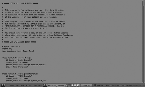
- Menus: These are the lists of elements that allow us to select one of them, like Render Presets.
3.3 Editor System
As we have discussed earlier, the Blender user interface may be strange the very first time we deal with it. When we start Blender, we see different windows, or again editors as I prefer to call them and they constitute the Blender environment. To understand this, we should get rid of the common concept of window as we know it. In Blender, we are not talking about window in this strict meaning, and we don't refer to the Blender window like these with the minimize, maximize, and close buttons we all know in the IT world.
When we start Blender, we have some editors within the main window and each one contains specific functions according to its purpose. For example, the default scene contains five basic editors: Info Window, 3D View, Timeline, Outliner, and Properties together with the splash screen we already know.
Each editor has its own functions and options, but they also have a couple of things in common. First, all editors have a header containing relevant information about the editor. Second, editors can be systematized, split, and joined, making the workspace layout customizable to our needs.
It's important to know that when we make a call to any operator using keyboard shortcuts, that will affect current selected editor. In other words, editors are automatically selected depending on where our mouse is. For example, if our mouse is over 3D View and we press key A, we are selecting or deselecting everything in our scene, but if our mouse is over Properties Editor and we press key A we open or close panels.
3.3.1 Editor's Header
Editor's headers contain important information about the editor purpose like icon buttons or menu lists, as shown in Figure 3.4. They do not have a fixed position over the editor because they could be at the top, like in the Outliner, or at the bottom like in the Timeline.
3D View Header. Showing or hiding headers of editors is really easy; it can be done by dragging and dropping the border on the small + (plus) button.
We can switch the header position by clicking RMB, right mouse button, over it and selecting the right option. The header itself can be made visible or hidden. To hide it, just drag the border and automatically a small + (plus) button will be visible. The opposite, that is to make the header visible, can be achieved by a click and drag on this small button.
We should not confuse those small + (plus) buttons in the header with the ones we have in the 3D View for Tool Shelf and Transformation panels visible on the left and right sides when those panels are collapsed.
3.3.2 Systematize Editors
The main purpose in using the nonoverlapping paradigm is to have a clean workspace layout to work with; that is, we can split or join editors and subdivide our main window into several editors and frames to customize the Blender's workspace to our needs. But, the paradigm of nonoverlapping is also broken by just a single case. In the latest Blender's releases, we have the option of splitting an editor and making it ft another window, intentionally made for multiple monitors support as we will see later in this section.
- Maximize editor: We have ways to maximize any editor and make it full screen. The maximized editor will obviously contain its internal panels and header. We can maximize editors then by using the View → Toggle Full Screen, or using one of the following keyboard shortcuts: Shif+Spacebar or Ctrl+↓ or Ctrl+↑ keys.
- Split editors: There are a couple of split editor widgets, on the left-bottom and top-right corners of each editor. If we want to split an editor into two, we can drag from any of those widgets; notice our cursor is a cross icon once we let the mouse hover over the widget, as shown in Figure 3.5.
- Join editors: To join and combine two editors, we can drag the same split editor widget and drag it over the editors we want to combine. The editors that combine become darker and a big lighter arrow indicates that the previous editor has filled in, as shown in Figure 3.5.
- Editors size: It's really easy to change our editor's size by dragging the editor's border with LMB, left mouse button.
- Switch editors' content: In Blender, we can switch editor's content using the editors split widgets again. In this case, to switch content between editors, we need to use Ctrl+LMB.
Open editor in a new window: Blender, allows us to open editors in a new window supporting multimonitors. This is what I meant earlier when I spoke of the broken nonoverlapping paradigm.
The paradigm is not broken if we move the recently opened window outside the Blender's main window, which is another monitor. We can open the selected editor in a new window by using Shif+LMB on the editor's split widgets and dragging.
The new window follows the same principles this section talks about; for example, maximize, split, join, resize, and open in a new window. The content of the editor in the new window is automatically updated if we manipulate the main Blender window, that is, if we open 3D View editor in a new window and move it to our right monitor using a Camera view, then we have in the left monitor our main Blender window and another 3D View editor using Side view for modeling, and all changes we make in the latest one are automatically reflected in our recently opened right-side window.
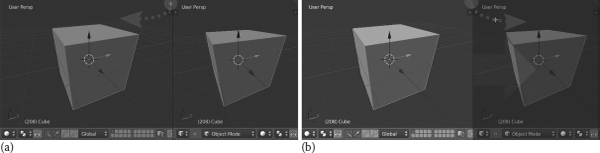
Editors' split and join. With the editors' split widgets, it is easy to customize the workspace layout to our needs. Click and drag to split editors (a) or to join and combine (b).
3.3.3 Workspace Layout
Animation studios have very different areas to cover when working on any project. Each of these areas requires a specific layout to work efficiently, and 3D applications are working hard to allow maximum customization. But, sometimes, it's hard to customize everything we need by ourselves. Blender offers several different layouts by default, so we can switch from one to another depending on the stage of our project.
Everyone of those default screens is what we call Workspace Layout. To switch our workspace layout, we have a dropdown located in the Info Window header together, the Scene dropdown, as shown in Figure 3.6.
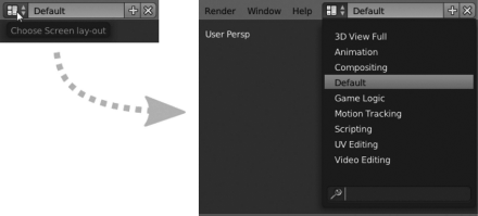
Workspace Layout options list. List of current available workspace layouts built-in within Blender.
The integrated workspace layouts Blender currently has are as follows:
- 3D View Full: By selecting this workspace layout, we have the 3D View Editor full sized in the window using the option Only Render. The Too Shelf panel, accessible with key T or by dragging the small + (plus) icon on the left, and the Transformation Panel, accessible with key N, or by dragging the small + (plus) icon on the right, are still working in this workspace.
- Animation: This workspace is designed for a fluid animation stage. When working with animations, we need certain kinds of editors helping in the process as configuring everything from scratch could be tedious for many people. Blender supports, by default, a very useful Animation workspace layout containing the following editors: DopeSheet, Graphic Editor, 3D View, Timeline, 3D View with hidden header and Camera View selected, Outliner, and Properties Editor.
- Compositing: This workspace is designed to offer more control over the final appearance of the scene, specially for color correction, lights, effects, and more. This workspace contains the following editors: Node Editor, UV/Image Editor, 3D View with Camera View selected, Properties Editor, and Timeline.
- Default: The default workspace layout is the one where we launch Blender. It contains the famous initial Blender s Cube. The default workspace is usually used for modeling stage. This workspace contains the following editors: 3D View with Tool Shelf open, Timeline, Outliner, and Properties Editor.
- Game Logic: This workspace is designed to work with Blender s Game Engine in games development. This workspace contains the following editors: Outliner, 3D View, Text Editor, Logic Editor, and Properties Editor.
- Motion Track: The Motion Track Editor has been added recently thanks to the Mango Project, and it's purposed to work with camera tracking. This workspace contains the following editors: Tree Movie Clip Editors (for graph view, dopesheet view, and editing clip preview) and Timeline.
- Scripting: The main purpose of this workspace is to offer a comfortable layout for documenting or script writing. This is useful to write new Blender scripts and to test whether they work as expected, for example, Blender add-ons or fixing Blender's bugs. This workspace contains the following editors: Text editor, 3D View, Outliner, Properties Editor, and Python Console.
- UV Editing: This is designed to control how textures map the objects and customize projections. This workspace contains the following editors: UV/Image Editor and 3D View with Tool Shelf open.
- Video Editing: The Video Editing workspace is targeted for postproduction tasks like cutting or joining animation pieces. This workspace contains the following editors: Graphic Editor, two Video Sequence Editors (preview and strip manager), and Timeline.
3.3.3.1 Configuring our Workspace Layout
Sometimes default workspace layouts built in Blender are not enough for our purpose. As we have already explained, we can configure our workspace layout to suit our needs by adding or deleting layouts.
- Add a new layout: In the workspace layout widget, we can add, based on our current layout, a new one to the list by clicking on the Add button plus-like icon. Then we can rename our recently created workspace layout as we desire.
- Delete layout: Close to the Add new workspace layout button there is another one, a cross-like icon, that we can use to delete the selected workspace layout. Blender will automatically switch its interface to the next workspace layout in the list. Take care to see that no confirmation pop-up message appears.
3.3.4 Scenes
It is very important we understand how scenes work in Blender. We will always be working on scenes, and if we can control their behavior, we can be more productive in our work. Scenes and workspace layouts are both very important bits to understand because they can change the entire Blender user interface and, hence, our approach to Blender. Scenes are independent and can store everything you can imagine, and can be totally different from one another; that is, we may have Scene.001 for modeling the main character in our project and Scene.002 for modeling props and environment objects. It's important to know that scenes don't remember the workspace layout; so, in our example, we will be in the same workspace layout even when we switch between scenes.
3.3.4.1 Configuring Our Scene
Like workspace layouts, our scenes can be configured as we need, not only by addition or deletion of scenes but also in their relationship with objects and data. We can configure our scene with the scene widget close to the workspace layout widget, as shown in Figure 3.7. Actually, both look the same.
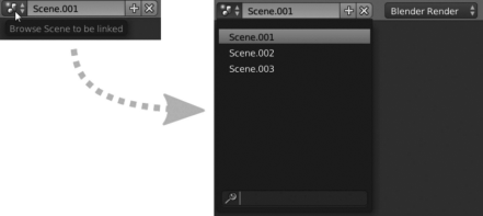
Select Scene dropdown. This widget allow us to switch between scenes, but at the same time, we might create new or delete current existing scenes.
- Add New Scene: We are able to add a new scene to our current project by clicking on the Add button plus-like icon. When we add a new scene, Blender offers us a small list with options to select the way we want to create our new scene. This is important because what we select here will determine how we must work with the future scene:
- New: This makes a new empty default scene and sets the render settings to its default state.
- Copy Settings: This makes the same as previous one but, in this case, copies the render settings from the base scene.
- Link Objects: The link objects generate a new scene linking objects in the old scene to those in the new one. That means that changes in those objects affect both scenes because objects are actually shared between both scenes.
- Link Object Data: The new scene makes a copy of the old scene Objects but links to the Object Data; for example, materials, mesh. That means, that changes in those objects are independent in each scene but changes in any of the object data are shared. To avoid that we need to make single-user from the Properties Editor, the Object Data.
- Full Copy: This makes a new a copy of the old scene, but nothing is shared. Objects are completely independent between scenes, and changes in the objects don't affect the other scene.
- Delete Scene: We can delete scenes by clicking the cross-like icon close to the Add scene button.
3.4 Editor Types
We already know that studios' productions are usually divided into several areas and stages, and for big studios into actual departments. Each of these areas requires specific solutions and features, but accommodating them in the user interface for any of the 3D applications in the market is not easy. Blender uses different editor types for different purposes according to the requirement of each work. We've identified these editors earlier in Section 3.1, but we will see them a little more in depth now.
3.4.1 3D View
The 3D View is where we do much of the work on modeling and scene creation. This editor is big and wide enough, but Blender has powerful tools to deal with everything we need to do in the 3D View. It's probably the editor we will spend more time with and, because of that, we need to know as much as possible about it. On a first and quick view at this editor, we can see we're dealing with something like a deep space with a grid floor and probably the famous Cube if we're in Blender's default scene, as shown in Figure 3.8. But this editor, like others, is comprised of different kinds of elements, as we already know, like a Header and a couple of panels; for example, the Transform Panel and Tool Shelf panel. We are going to check everything in depth so that we have a clear idea about where we are and what we are talking about.
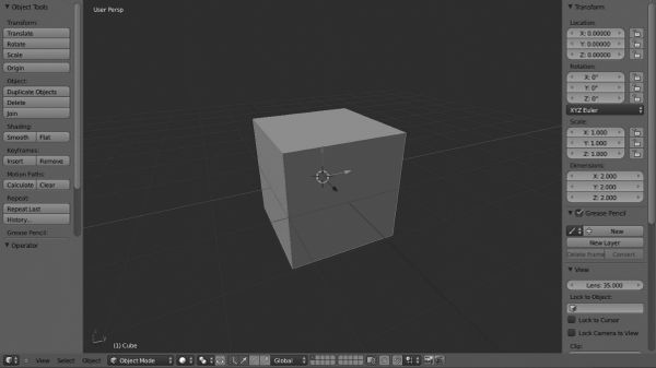
3D View Editor. The picture shows the editor in the Object Mode that determines the different options displayed in the header.
- 3D Viewport: This is the big space with the grid on the floor where the actual objects reside. We can build our scene, modeling our objects or rigging our characters there.
- Header: This contains very important information and, if I may say so, important buttons in the way of shortcuts making our workflow much more productive. Once we know and get used to shortcuts, we don't use frequently the elements placed in this header but sometimes it's still easier and faster to select a specific option from these elements rather than typing the shortcut commands. Some of the elements, the 3D View header contains, may change depending on the mode we are working on.
- Editor type selector: This button pops up a list of the different editor types that we can switch to.
- Hide menus: This is a small - (minus) button close to the Editor type selector that shows or hides the pulldown menus.
- Pulldown menus: This contains relevant options for 3D View management depending on the mode we are in.
- Object Mode: While in this mode we have View, Select, and Object menus.
- Edit Mode: While in this mode we have View, Select, and Mesh menus.
- Sculpt Mode: While in this mode we have View, Sculpt, Brush, and Hide/Mask.
- Vertex Paint: While in this mode we have View, Paint, and Brush.
- Texture Paint: While in this mode we have View and Brush.
- Weight Paint: While in this mode we have View, Weights, and Brush.
- Mode selector: This helps to switch between possible modes. Available modes in the 3D View are as described in the previous point 2c.
- Draw mode: Also known as Viewport shading, it determines how we see objects in our 3D View. Possible options are Texture, Solid, Wireframe, or Bounding box.
- Pivot Point: This modifies the object pivot point, also called the transformation center, on the 3D viewport. It's only visible while in Edit or Object Mode.
- Transform Manipulators: We can manipulate actions like Scale or Rotate thanks to these manipulators in the same way that we can make all of these in specific axes orientation. This is also possible by keyboard shortcuts, of course. These manipulators are only visible while in Edit or Object Mode.
- Layers: The Blender layers are such that they can remain visible even as we move objects between them. This is important to understand to set render settings in the right way for successful rendering. The layer selector is visible in all modes except Edit Mode.
- Lock to Scene: This option is visible in all modes except Edit Mode.
- Proportional editing object mode: This is only visible in the Edit and Object Modes.
- Snap: This controls the snapping tools that help in the modeling or transformation stage. It's only visible in the Edit or Object Modes.
- Open GL render active viewport: This is usually used for previews and quick views of what we are working on. This option is visible in all modes.
- Tool Shelf panel: This is the panel on the left that we can open or collapse by pressing the T key or using the small + (plus) button. It contains very useful operators to manage the required actions. Object tools, Mesh tools, Brushes, and more are located there depending on the mode we are in.
- Transformation panel: This is the panel on the right that we can open or collapse by pressing the N key or using the small + (plus) button. Transform properties and coords, Grease Pencil, Display, or Transform orientations are some of the features located in this panel.
3.4.2 Timeline
Working in animation projects requires us to adjust to specific timelines, not in a business context, but in an artistic one. Each scene is conceived to adjust to that timeline that is usually fixed by the project storyboard. We have in Blender an editor to help in such circumstances. The Timeline editor, as in Figure 3.9, is usually at the bottom of the Blender workspace layout and is very useful in providing information regarding our scene. We can get important information on frames or seconds our scene is composed of, active keyframes for any specific object, the start and the end of the current scene, or addition of markers for a better comprehension of our developed scene.
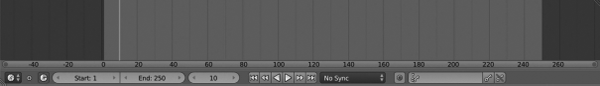
Timeline. We can get a lot of information from our scene, use the playback options, or just stick to predefined timelines in production. In complex animation films, it is usual to use markers within the Timeline editor.
We may also control our animation by using the playback controls in the Timeline editor.
- Header:
- Editor type selector: This button pops up with a list of the different editor types that we can switch to.
- Pulldown menus: These contain important options to operate with our animation. It's common for all the different modes. Available options are View, Marker, Frame, and Playback.
- Preview range: This is a small clock-like icons that help to bring some light to the current range for our scene.
- Start: This refers to the first frame of the range.
- End: This refers to the end frame of the range.
- Current frame: This is the number of frames we are manipulating at a determined moment. Changing its value moves the current frame line, also called time cursor, within the Timeline editor.
- Playback buttons: We can manage our animation scenes with these playback but tons. Available options are Jump to first/last frame of range, Jump to next/previous keyframe, Play reverse, Play normal, and Stop/pause when any of the play buttons are clicked.
3.4.3 Graphic Editor
The Graphic Editor, as in Figure 3.10, formerly known as IPO editor, deals with interpolation of keyframes using the well known F-Curves.
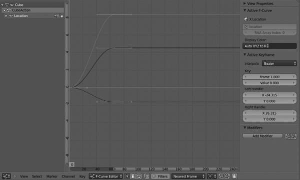
- Channel Box: This is the area on the left side and contains the list of channels and everything that is linked to animation data; that is, anything assigned to keyframes. We can filter what we can visualize by enabling or disabling the small checkboxes.
- Header:
- Editor type selector: This pops up a list of the different editor types that we can switch to.
- Hide menus: The small - (minus) button helps to hide the pulldown menus.
- Pulldown menus: This contains very useful options for markers, channels, or key administration. It's common for the different modes we can work in the Graphic Editor. Available options are View, Select, Marker, Channel, and Key.
- Mode selector: This helps switch between possible modes. In the Graphic Editor, we can work in Drivers and F-Curve Editor modes.
- Channels' visibility: We can decide here if we want to display channels for selected objects and data or also display channels for objects that are not visible. If Drivers mode is selected, then we also have an option to show only drivers that are disabled or have errors.
- Match F-Curve name: This is an option to display those F-Curves that match the search text that is our input. By clicking on the lens-like icon, an input field, where we can enter our text, is automatically displayed.
- Filters: If we enable this button, Blender offers us the possibility of filtering the curves we want to display according to the data type; that is, we can set the data type we want to display as scene-related animation data or world-related animation data, among others.
- Auto snap: This allows us to manage the snap settings. Options available are Nearest Marker, Nearest Frame, Time Step, and No Auto-Snap.
- Pivot Center: This is used for rotating or scaling. The available options are Individual Centers, 2D Cursor, and Bounding Box Center.
- Copy/Paste keyframes: These options are useful to copy/paste keyframes to the copy/paste buffer. It's also possible to do this with the shortcuts Ctrl+C and Ctrl+V.
- Create snapshot or Ghost: Creates a background aid F-Curve for the selected one.
3.4.4 DopeSheet
This editor is used to find out how a scene is structured. We can check everything that is happening in the scene using this editor. The dopesheet lists all actions or keys within the current scene, so animators can check their position in the timeframe, their length, and their relation to any other internal elements as shown in Figure 3.11.
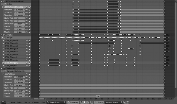
DopeSheet used in one of the scenes of the Platform Michelangelo Studio project RAT bProficiency. We can see the left column with animation channels and their respective keyframes stored in the Dope closed-up Sheet main editor. It is also interesting to notice a tree-like list of the whole animated data in the scene while in DopeSheet mode.
There are four interesting modes in the dope closed-up sheet, and each one is used specifically in very different contexts.
- Dope closed-up Sheet: This is used to edit and manage multiple actions by manipulating keyframes. All objects animated in the scene are listed here with their respective keyframes.
- Action Editor: This is used to edit and manage actions by manipulating keyframes. It is used to manipulate a single action at a time.
- Grease Pencil: All our sketches are edited with the grease pencil. Also keyframes are used to structure motion in a timeframe.
- Header:
- Editor type selector: This pops up a list of the different editor types that we can switch to.
- Pull-down menu: This contains important options to manage the action strips. The available options for DopeSheet mode are View, Select, Marker, Channel, and Key. The available options for Grease Pencil mode are the switches Key to Frame.
- Context selector: We can use the drop-down list to select the right mode. The available options are Dope closed-up Sheet, Action Editor, and Grease Pencil.
- Display summary: This displays the additional summary line.
- Channels filtering: These are some buttons to filter the elements we want to display. However, this is not available for Grease Pencil mode. The available options are Display only selected, Show hidden, and Show only errors.
- Browse action: This feature helps to select the action we want to display. We also have the option to create or delete such action, although only for Action Editor mode.
- Copy and Paste keyframes: These are a couple of buttons to copy and paste keyframes within the editor.
- Track tree: This is the left column where the channels with actions are listed. This tree contains elements that we may expand or collapse to show information like transformation axis and such. The list is dynamically updated according to the mode we are in.
- Main editor: This is where all the keyframes are located. When working on any channel containing animated data, strips and dots represent the action itself. We can deal with those keyframes and adapt to the horizontal keyframe scale. We also have a current frame line telling us where the active frame we are working on is.
- Header:
3.4.5 NLA Editor
To avoid the hard work of manipulating or fixing animations using the keyframe method, we can use the NLA editor to make it user-friendly We can manage a lot of interesting properties in our animations, tracks, and strips, to reorganize and fix everything we want in an easy manner. Figure 3.12 represents the NLA editor with a single animation track and strip.
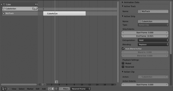
- Header:
- Editor type selector: This pops up a list of the different editor types that we can switch to.
- Pull-down menu: This contains important options to manage the animation strips. The available options are View, Select, Marker, Edit, and Add.
- Channels filtering: We have three buttons to filter the NLA editor data we want to display. They are Include channels related to selected objects and data, Include channels from objects and bones that are not visible, and finally Include animation data blocks with no NLA data.
- Filters: These show the options for whether channels related to certain types of data are included. By enabling this option, we have several other suboptions being displayed, such as elements related to animation data on Scene, World, Node, Object level, Mesh, Material, Lamp, Texture, and Camera.
- Time snap: This helps us to Snap to actual frames and seconds. The available options are Nearest Marker, Nearest Frame, Time Step, and No Auto-Snap.
- Tracks: The left panel is where we can manage our animation tracks like we deal with the outline elements. We can organize our animation tracks and strips easily from within this panel.
- Strips editor: This is where the actual animation strips are placed and we can adjust, snap them to build our animation project.
- Animation Data: The right panel, accessible with the N key, if hidden by default, is where we can manage all our track/strip data properties and customize the animation in order to get the final expected result.
3.4.6 UV/Image Editor
This editor is usually used to visualize rendered images or to deal with the UV unwrap technique to apply external textures to our objects.
We will see more about UV in Chapter 8.
3.4.7 Video Sequence Editor
Blender is a powerful tool. Although we are aware of it, not too many people know that Blender has its own editor to work on and manipulate video streaming and that we can combine the compositing nodes to work on both images or video tracks so the final movie is obtained after assembling the video strips within the Video Sequence Editor as shown in Figure 3.13.
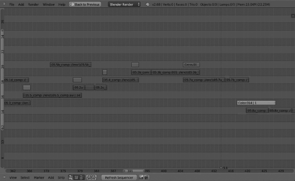
Many studios produce their final postproduction on external editors and assemble the final movie in really expensive software. We can't compare the VSE in Blender with such specific applications. Anyway the VSE is powerful enough to suit the needs of small and medium studios that might use this editor for very different purposes like making animatics, composing rough timelines, applying effects to determined scenes, or assembling small projects.
- Header:
- Editor type selector: This pops up a list of the different editor types that we can switch to.
- Pull-down menu: This contains important options to manage the strips. Available options are View, Select, Marker, Add, and Strip.
- Type of Sequencer View: We can select between three types of views. Depending on the selected view, we have available different options. The available views are Sequencer, Preview, and Both.
- Stripes: This is the editor where we can add and manage the strips. We have them separated by channels and use the same horizontal rule as other editors, incorporating the timeline at the bottom, where we may control where the strips start and where they end.
3.4.8 Text Editor
It is not usual for 3D applications, but Blender contains an internal text editor as part of its editor types. It is very useful for scripting and coding within the Blender interface; at the same time, we can check our recent script in action with Alt+P keys that parses the text in the text buffer to the internal Python interpreter. It also comes with some useful plug-ins that help us to write classes or functions, word completion, or browse variables along the text. But there are many other useful reasons for getting the internal text editor within the Blender architecture; that is, taking notes for a to-do list for your project, scheduling your work, writing documentation, and so on. For example, imagine a rigger writing technical notes that the animator could check whenever he wants regarding the rigging specifications and use. Figure 3.14 represents the text editor with a Python file open.
- Text buffer: This is where we write the text itself. Like any other editor; it's empty by default waiting for us to type and input our text. This text buffer is empty and doesn't allow you to type anything until you open a file or make a new file with the New button.
- Header:
- Editor type selector: This pops up a list of the different editor types that we can switch to.
- Pulldown menus: This contains specific information and options for text management like format, templates, copy and paste, save, and more.
- Text Id block textbox: We can select the text file we want to edit by browsing with the text Id block browser. A list of all our open files in buffer is displayed. Near this is the textbox which we can use to modify or input a new file name together with + (plus) and x (ex) buttons.
- Display options: We have three buttons to enable or disable Line number column on the left of the text, Word-wrap horizontally, and Syntax highlight, which is useful for scripting.
- Run script: This button is an alias of the Alt+P shortcut and basically executes the text buffer script we already have parsing it to the built-in Python interpreter. There is an option close to it to Register the script as a module on loading, so we don't need to load the script everytime we load Blender. If checked, Blender will load it automatically, for which our script should be a Python script.
3.4.9 Node Editor
When we need to post process or add any of the post effects to our renders, as in Figure 3.15, we need to deal with the Node editor, where we can use the Nodes for refining and texturing the material so that we improve the final composition. Here we give the final touch to the animation or render adding very different kinds of effects, settings, and values that determine the final output. That is directly related to the render time that Blender lets you spend for each still, because for complex projects with complex node trees, the render time increases as more resources are required for processing.
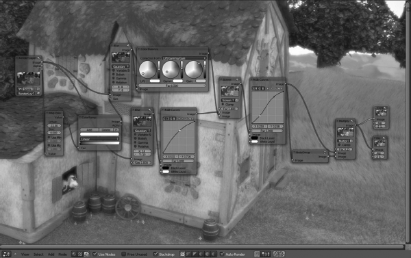
Node Editor. We can make the final postproduction composition updates and effects with a node tree within the Node Editor. This image represents the node tree for the project codenamed Mushroom.
- Header:
- Editor type selector: This pops up a list of the different editor types that we can switch to.
- Pulldown menu: This contains relevant options to manage the ongoing rendered frame. The available options are View, Select, Add, and Node.
- Node tree type: We can switch between three types to display our node tree, like Shader nodes, Texture nodes, and Compositing nodes:
- In Shader nodes mode, we have a few other options being displayed like Material datablock to be linked.
- In Texture nodes mode, we have options like Texture datablock to be linked, and the Type of data to take the texture from displayed with Object, World, and Brush as available options.
- Use Nodes: This enables the compositing node tree.
- Free Unused: This frees nodes that are not being used during the compositing process.
- Backdrop: This uses the active Viewer node as the background for the current compositing; for example, in Figure 3.15, it enables display of the landscape background.
- Channels: These are the channels that are used to draw, namely RGB, RGB and Alpha, Alpha, and more.
- Snap to: This is the type of element to snap node to. The available options are Node X/Y, Node Y, Node X, and Increment, Copy, and paste nodes
- Node board: We'd add here the kind of nodes we need at any time or combine them to obtain the desired result. Here we can also group nodes and check the result of this combination in real time if the Use Nodes and Backdrop options are enabled on this editor header.
3.4.10 Logic Editor
This editor is the one dealing with all the gaming features Blender includes. It works with each game object, so they store a number of logical components usually called Logic Bricks that guides directly the behavior of the objects in the scenes in the same way they do to others. Figure 3.16 represents the Logic editor by default.
- Header:
- Editor type selector: This pops up a list of the different editor types that we can switch to.
- Pulldown menu: This contains specific information and options for views and deal with logic bricks. The available options are View and Add, the latest one where we can work with Actuators, Controllers, and Sensors.
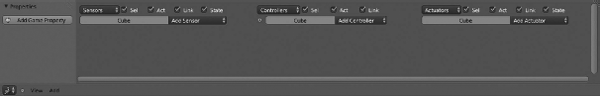
- Logic Bricks: Blender incorporates some prebuilt functions as blocks, also called bricks, that combine to create the logic of the game; that is, the way we control our main character, physics, or game targets. We found three kinds of logic bricks: Sensors, Controllers, and Actuators.
- Sensors: If we look in the Blender wiki, sensors are described as primitive event listeners, which are triggered by specific events such as collision, a key press, or mouse movement. That is a good definition in theory, but in other words, sensors are those elements Blender calls, when we execute any action as mentioned earlier, mouse movements. The sensors parse to Controllers anything that we make.
- Controllers: The controllers read the sensor output to execute actuators that are connected, if conditions are fine.
- Actuators: These are the logic bricks working with the game simulation directly.
- Properties panel: In the Logic Editor, properties are those elements accessing data values for the whole game or for particular objects.
3.4.11 Properties Editor
The properties editor is the one that stores different panels for different contexts. Those panels contain the specific options for each context.
In Blender, we have several contexts available and we can switch between them depending on the object we have selected in 3D view. The available contexts are Render, Render Layers, Scene, World, Object, Object Constraints, Modifiers, Object data, Material, Texture, Particle, and Physics by default (Figure 3.17).
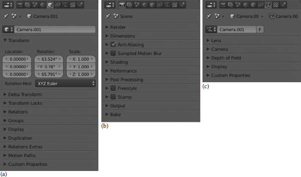
Properties Editor stores different panels with different options depending on the context that is determined by the type of object selected in the 3D view. The picture represents the Object context (a), the Render context (b), and the Object Data context (c).
There are some other contexts depending on the type of selected object like Bone and Bone Constraints, if we are working with bones and armatures.
3.4.12 Outliner
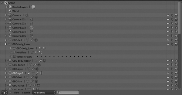
Some projects contain a lot of data, objects, datablocks, or scenes and keeping it organized is not an easy task. Blender has the Outliner Editor, that helps us to navigate through all the elements that our ongoing Blender session contains. With the Outliner, we can organize and programme our work, as shown in Figure 3.18; for example, view the current data tree, select or deselect objects, hide or show elements, make objects unselectable, allow objects to be rendered, delete objects, and more.
- Editor type selector: This pops up a list of the different editor types that we can switch to.
- Pull-down menu: This contains important options to work with Blender's objects and data. The available options are View and Search.
- Type of information to display: This allows us to filter the outliner display to show different objects, datablocks, or specific data. The available options are All Scenes, Current Scene, Visible Layers, Selected, Active, Same Types, Groups, Libraries, Sequence, Datablocks, User Preferences, and Key Maps.
- Live Search Filtering: This input is really useful to filter and fetch, within the Outliner, for the string we input.
3.4.13 User Preferences
Like any other software, Blender can be customized to match users' needs using the User Preferences editor as shown in Figure 3.19. There we can modify options for very different purposes like interface, add-ons, files, or system options. Modifying these settings will result in how Blender works. The available options are Interface, Editing, Input, Add-Ons, Themes, File, and System.
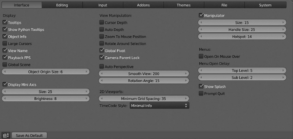
User Preferences. We can configure our Blender settings from this editor. Modifying these settings will result in a change in Blender's behavior.
- Header: The User Preferences editor's Header is pretty simple and only contains the Save As Default that makes the current file the default .blend file.
- Options: We can modify Blender's settings in seven different areas.
- Interface: Here we can configure how to display UI elements and their behavior. We have the chance to modify options for Display, View Manipulation, Auto Perspective, 2D Viewport, Manipulators, or Menus. For example, we can enable/disable if we want Blender to show the splash screen or if we want to display the Tooltips.
- Editing: In this panel, we can configure how some tools will react to our inputs; for example, enable Auto Keyframing or make new objects enter edit mode by default when we create them. As we see, configuring these options will determine how we work with Blender, that is, how Blender reacts to our inputs. Some options are Linkmaterial to, Undo steps, Grease Pencil, Keyframing, or Duplicate data.
- Add-ons: Blender add-ons are simply features that are not enabled in Blender by default, but the user might enable and use them within his working sessions. There are a lot of add-ons available not only in each Blender release but also over the net. Add-ons are available in different areas of Blender like Animation, Game Engine, Objects, Render, and more. Many of the add-ons are simply Python scripts written by users and incorporated within the Blender trunk code. Each user is able to write his own add-on script and make it available by installing it on this panel.
- Themes: If we want to modify Blender appearance and colors, we can modify the Blender theme and make it our own. We can modify every aspect of the user interface here with regard to the colors; for example, in 3D View we may modify color for active object edges, the selected vertex, the active bones, and everything we want. As before, we are able to modify everything in color for each of the Blender editors.
- File: It is also possible to modify settings for the file managing system, so we may set a temporary folder, configure relative paths, set default fonts location, or decide where we want our render output by default. We can also configure here the number of saved versions we want, compress the file if we want to, and do more.
3.4.14 Info Window
In Blender, the Info window is like any other editor; however, it only contains the header where Blender stores important and useful information and options to control our Blender' sessions, as shown in Figure 3.20.
- Editor type selector: This pops up a list of the different editor types that we can switch to.
- Pulldown menu: This contains important info and options for control of Blender and user experience. Available options are File, Add, Render, Window, and Help.
- Select workspace layout: This feature offers a drop-down menu with the different built-in layouts available as in Section 3.3.3. We may add or delete new layouts if desired.
- Select scene: This is a drop-down selector with all our available scenes so that we can switch from one to another as required. We may add or delete scenes in our current Blender session from within this widget as we saw in Section 3.3.4.
- Engine for rendering: This is the drop-down menu to select the render engine we want to use in the current Blender session. Available engines are Blender Render, Blender Game, and Cycles Render.
- Render progression bar: While rendering, Blender shows a progression bar close to the Engine to use for rendering the drop-down menu. This bar shows the progress in the status of the current render process.
- File info: The Info window also stores useful and important info for the current file relative to our scene and objects. So we have info like Blender version, number of vertices or faces or our meshes, number of objects and lamps, and probably the amount of memory our file consumes. All this info is important in order to know if we are going out of our hardware limits.
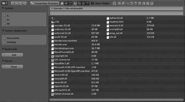
3.4.15 File Browser
The File Browser editor deals with file managing and operations like fetch and open or save and folders' structure such as create folder. Figure 3.21 represents the File Browse editor by default.
By default, the File Browser editor contains the following:
- Header:
- Editor type selector: This pops up a list of the different editor types that we can switch to.
- Move between folders: This widget contains four buttons that allows us to move between folders on the disk. They are Move to previous folder, Move to next folder, Move to parent directory, and Refresh the file list.
- Create new directory: This is a button to generate a folder in the current selected path. A confirmation message will appear after clicking this button and once confirmed we will be able to apply a name to the recently created directory.
- Display mode for the file list: This is a set of three buttons that sets the display mode for the elements within the current selected path. The modes available are Display as short list where Blender shows just the file or folder name and size on disk (only for files), Display as detailed list where Blender shows all those in the previous one plus the modification date, and finally, Display as thumbnails that makes Blender show the folder structure with bigger icons and file names below.
- Sort by: This allows us to sort the directory elements alphabetically, or by extension, modification date, time, and size.
- Show hidden: This enables or disables the option to make hidden files within the directory visible.
- File filtering: This funnel-like icon enables the option of filtering directory elements showing them according to several criteria. The available options are show folders, .blend files, .blend1, .blend2, etc., files, images, movies, script files, font files, sound files, and text files. We can combine and select as many filters as we want, so, for example, we can filter to list only folders and .blend files in the current directory.
- Side panel: This panel contains relevant options depending on the action we want to execute; that is, there are different tabs depending on whether we are saving or opening a file.
- If opening a file: The file browser editor's side panel contains tabs for System, System bookmarks, Bookmarks, Recent, and Open Blender File.
- If saving a file: The file browser editor's side panel contains tabs for System, System bookmarks, Bookmarks, Recent, and Save Blender File.
- System: This contains a list of available drives that we have to navigate within.
- System bookmarks: This includes default system favorite folders for easy access.
- Bookmarks: We have the option to add new bookmarks to access our projects easily. Just navigate to that folder and click the Add button. We can delete bookmarks in the same way by clicking the x (cross) button.
- Recent: This shows a list of the recently accessed directories.
- Open blender file: This allows us to deal with some important options before loading any blender (.blend) file and is visible when we select the Open file option either from the Info Window editor or by pressing Ctrl+O keys. Load UI allows us to load the workspace layout in the file because Blender saves that layout into the .blend file. Another option is the Trusted source that is useful when we are not sure if the file we are loading is safe or not.
- Save blender file: This deals with options for saving our session into the .blend file by selecting Save as from either the Info Window editor or by pressing Ctrl+Shif+S keys. Compress allows us to compress the saved file. Remap relative is useful to remap relative paths while saving in a different directory. Save copy makes a copy of the current system. Legacy mesh format is a bit complex and we deal with it later.
- File browser and folder navigation: We have here a list of all files and folders in the current directory. We can see the current directory path in the top input field close to the Open Blender File button. The input below shows the selected file name close to the icons - (minus) and + (plus) and Cancel. The latest version closes the File Browser editor returning to the previous Blender workspace.
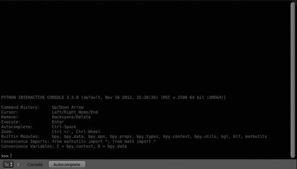
3.4.16 Console
To directly use Python with Blender, we can use the Console editor. It manages our Python commands directly over the Blender's core architecture. We can launch the Console editor by selecting from the editor type selector or using a keyboard shortcut by pressing Shif+F4. Figure 3.22 represents Console editor by default.
- Header:
- Editor type selector: This pops up a list of the different editor types that we can switch to.
- Pulldown menu: We can manage some features and settings for the console editor. The available options are those of Console.
- Autocomplete: This is accessible by pressing the button or just using Ctrl+Spacebar. Basically it suggests any expression and tries to autocomplete depending on the already typed characters; for example, typing bpy and enabling autocomplete option gives us the chance to use some of the bpy built-in modules.
- Console display: All results from our Python commands input will be the output in the console display. It's currently color mode enabled, so it helps us in the scripting process. Since Blender 2.5, Python 3.x has been accepted. Console displays the command prompt, that is, where we write our commands, in the way of ">>>" symbols.
3.5 Modes and Context
We can not only display different options in Blender depending on the mode we are in but also filter such options according to the context we are working in. In Blender, we can select the context we want to be working in from the Properties Editor, which shows the Context buttons as shown in Figure 3.23.
Context buttons. We can switch the context we are working in from these buttons. Each context displays its own options and features.
The different context types Blender allows us to work with are
Render: Everything related to rendering of our scene is located in this panel. We can configure a variety of settings affecting the final render result. Here we can decide if we need to render our scene like an animation generating a motion picture or merely as a static still.
We can modify the dimensions of the final result or the range of frames for the animation. We can also decide on the quality of our render by applying anti-aliasing or enabling compositing with nodes.
Some of the panels located in such context are Render, Layers, Dimensions, Anti-Aliasing, Sampled Motion Blur, Shading, Performance, Post Processing, Stamp, Output, and Bake.
Scene: From here we can modify general settings related to the scene like change the metrics, simplify subdivision to streamline computer processes, or even modify gravity, which is specially useful for simulations projects.
Some of the panels located in such a context are Scene, Audio, Units, Keying Set, Gravity, Simplify, and Color Management.
World: Our scene will also be affected by the settings we can modify in the World context. Here we find settings like the type of color we want for the horizon while we are in 3D View, enabling ambient occlusion, modifying the environment lighting, or applying indirect lighting and enabling a kind of fog denominated mist.
Some of the panels located in such a context are World, Ambient Occlusion, Environment Lighting, Indirect Lighting, Gather, Mist, and Stars.
Object: All those aspects that allow us to modify the appearance of our objects, primitives, or models, are located in the object context. Here we can modify our object's name, change its transformation properties, that is, Location, Rotation, and Scale. We also may lock such properties to avoid the object being translated, scaled, or rotated. Another interesting feature is that we can move our objects between layers or organize them in groups within this context.
Some of the panels located in such a context are Transform, Delta Transform, Transform Locks, Relations, Groups, Display, Duplication, Relations Extras, and Motion Paths.
Constraints: This is a very important context because it determines the relationship between our objects and how they operate between them and the environment. Constraints are just tools that modify our objects' behavior and sometimes enable some kind of relationship between them.
We find four big categories of constraints according to its purpose. They are Motion Tracking, Transform, Tracking, and Relationship. There are constraints that allow us to copy location, rotation, or scale and others to limit location, rotation, scale, or distance. Some are merely there to force our object to track another one if the latter modifies its transform properties.
- Motion Tracking: Camera Solver, Object Solver, and Follow Track.
- Transform: Copy Location, Copy Rotation, Copy Scale, Copy Transform, Limit Distance, Limit Location, Limit Rotation, Limit Scale, Maintain Volume, and Transformation.
- Tracking: Clamp To, Damped Track, Inverse Kinematics, Locked Track, Spline IK, Stretch To, and Track To.
- Relationship: Action, Child Of, Floor, Follow Path, Pivot, Rigid Body Joint, Script, and Shrinkwrap.
Modifiers: Even as constraints affect the behavior of our objects, modifiers change the appearance of our objects. There are four categories of modifiers depending on their purpose. They are Modify, Generate, Deform, and Simulate.
Some modifiers change the aspect of our objects by applying deformation like Armatures or Lattices. Others are used to generate new objects by using the first one as the base, like Mirror, Array, Bevel, Solidify, or the famous Subdivision Surface. Our objects may be targets of simulations and physics too, because of which we find modifiers like Cloth, Collision, Fluid Simulation, Particle System, Smoke, or Soft Body.
- Modify: UV Project, Vertex Weight Edit, Vertex Weight Mix, and Vertex Weight Proximity.
- Generate: Array, Bevel, Boolean, Build, Decimate, Edge Split, Mask, Mirror, Multiresolution, Remesh, Screw, Skin, Solidify, Subdivision Surface, and Triangulate.
- Deform: Armature, Cast, Curve, Displace, Hook, Laplacian Smooth, Lattice, MeshDeform, Shrinkwrap, Simple Deform, Smooth, Warp, and Wave.
- Simulation: Cloth, Collision, Dynamic Paint, Explode, Fluid Simulation, Ocean, Particle Instance, Particle System, Smoke, and Soft Body.
Object Data: This context focuses on modifying those properties related to our objects in Edit Mode. In fact, some of the panels located in this context are only available if we are in such a mode. From here we may add vertex groups, change the name of ObData, apply new shape keys, or add new UV maps.
Some of the panels located in such a context are Normals, Texture Space, Vertex Groups, Shape Keys, UV Maps, Vertex Colors, and Geometry Data.
Materials: Everything related to materials that we want to apply to our objects are here. In this context we can create our materials library that we can apply later to our objects. We can also modify all those parameters to get the material quality desired. From here we can modify color, intensity, and the kind of specular light and its intensity.
We also can modify the quantity of light emitted, the ambient light received by our objects, and the transparency or raytrace. From here we can also modify materials when our objects have applied a particles modifier. We can also select the kind of shadow projected and received or get rid of the shadows completely.
Some of the panels located in such a context are Preview, Difuse, Specular, Shading, Transparency, Mirror, Subsurface Scattering, Strand, Options, and Shadow.
Textures: As in the previous context, here we can work with the kind of texture we want to add to our objects, the type of map we want to apply to such texture, and how many influence should use. We can create new textures and add them to our library to use later in our objects and improve the quality of our work.
Some of the panels located in such a context are Mapping and Influence. Blender offers different kind of internal textures, also called procedural textures, namely, Blend, Clouds, Distorted Noise, Environment Map, Image or Movie, Magic, Marble, Musgrave, Noise, Point Density, Stucci, Voronoi, Voxel Data, Wood, and Ocean.
Particles: By default this is an empty context until a new particle system is added. We can then find parameters to modify such a system, because we can select between emitter and hair. Some parameters that will affect our particle system are the number of emissions, physics, children, as for example, if we want to render emissors, velocity, or if we want to apply such a particle system to the whole object, or just to any vertex group. The particle system context incorporates a very interesting panel called Force Field Settings where we can apply internal forces like Wind or Turbulence, for example.
Some of the panels located in such a context for the Emitter particles are Emission, Cache, Velocity, Rotation, Physics, Render, Display, Children, Field Weights, Force Field Settings, and Vertex Groups.
Some of the panels located in such context for the Hair particles are Emission, Hair dynamics, Render, Display, Childrens, Field Weights, Force Field Settings, and Vertex Groups.
- Physics.
3.6 Internationalization
Blender has been updated to support international languages for both the interface and tooltips. Even though the default language is English, we can enable our preferred language from the User Preferences editor under the System tab as shown in Figure 3.24. If we enable it, Blender shows three different settings:
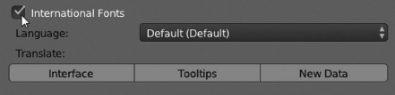
Internationalization options. We can switch to another language from the User Preferences editor.
- Language: We can select our language here.
- Interface: If we want Blender's user interface showing buttons and menus in our preferred language, we have to enable this option.
- Tooltips: As before, enabling this option shows all Blender's Tooltips in our preferred language.