So far, all the implemented user stories in the app are public and available to all users; now we are going to implement some personalized user stories of the app. Before adding personalization features, we need to add basic support for user management. Implementing user management is a task we must do, but it’s a tedious task for developers. Although there are a lot of high-quality open source libraries in different programming languages to handle user authentication, we still need to integrate those libraries with app code and manage back-end storage. It’s also very common for an app to allow users to log in using third-party providers, for example, Google or Facebook. To support this scenario, more libraries need to be integrated, which makes user management a harder task to finish.
Firebase provides an easy integration with user authentication for the web and mobile apps. Firebase manages user authentication data, so we don’t need to manage the storage ourselves. Firebase also supports logging in with third-party providers, including Google, Facebook, Twitter, and GitHub.
To support user management, we need to add UI for users to sign up and log in. This requires us to use form controls and other UI components. After reading this chapter, you should know how to integrate Firebase user management with Ionic apps. We start from these Ionic UI controls.
Ionic UI Controls
To gather users’ information, we need to use different input controls, including standard HTML form elements like inputs, checkboxes, radio buttons and selects; and components designed for mobile platforms, like toggles or ranges. Ionic provides out-of-box components with beautiful styles for different requirements.
Inputs
The component ion-input is for different types of inputs. This component supports the following properties.
type – The type of the input. Possible values are text, password, email, number, search, tel, or url. The default type is text.
value – The value of the input.
placeholder – The placeholder of the input.
disabled – Whether the input is disabled or not.
clearInput – Whether to show the icon that can be used to clear the text.
clearOnEdit – Whether to clear the input when the user starts editing the text. If the type is password, the default value is true; otherwise the default value is false.
accept – If the type is file, this property specifies a comma-separated list of content types of files accepted by the server.
autocapitalize – Whether the text should be automatically capitalized. The default value is none.
autocomplete – Whether the value should be automatically completed by the browser. The default value is off.
autocorrect – Whether auto-correction should be enabled. The default value is off.
autofocus –Whether the control should have input focus when the page loads.
debounce – The amount of time in milliseconds to wait to trigger the event ionChange after each keystroke. The default value is 0.
inputmode – The hint for the browser for the keyboard to display.
max – The maximum value.
maxlength – The maximum number of characters that the user can enter.
min – The minimum value.
minlength – The minimum number of characters that the user can enter.
step – The increment at which a value can be set. This property is used with min and max.
multiple – Whether the user can enter multiple values. It only applies when the type is email or file.
name – Name of the control.
pattern – A regular expression to check the value.
readonly – Whether the value can be changed by the user.
required – Whether the value is required.
spellcheck – Whether to check the spelling and grammar.
Radio buttons can be checked or unchecked. Radio buttons are usually grouped together to allow the user to make selections. A radio button is created using the component ion-radio. ion-radio supports properties color, checked, and disabled with the same meaning as the ion-checkbox. ion-radio also has a property value to set the value of the radio button. ion-radio supports the event ionSelect that fired when it’s selected.
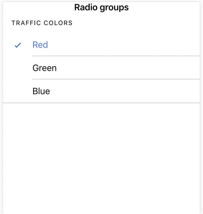
A radio buttons group is created by the component ion-radio-group, then all the descendant ion-radio components are put into the same group. Only one radio button in the group can be checked at the same time. In Listing 9-1, we create a group with three radio buttons.
Figure 9-1 shows the screenshot of the radio buttons.
Figure 9-1
Radio buttons
Selects
The component ion-select is similar to the standard HTML <select> element, but its UI is more mobile friendly. The options of ion-select are specified using ion-select-option. If the ion-select only allows a single selection, each ion-select-option is rendered as a radio button in the group. If the ion-select allows multiple selections, then each ion-select-option is rendered as a checkbox. Options can be presented using alerts or action sheets. Below are configuration options for ion-select.
multiple – Whether the ion-select supports multiple selections.
disabled – Whether the ion-select is disabled.
interface – The interface to display the ion-select. Possible values are alert, popover, and action-sheet. The default value is alert.
interfaceOptions – Additional options passed to the interface.
okText – The text to display for the OK button.
cancelText – The text to display for the cancel button.
placeholder – The text to display when no selection.
selectedText – The text to display when selected.
ion-select also supports the following events.
ionChange – Fired when the selection has changed.
ionCancel – Fired when the selection was canceled.
ionBlur – Fired when the select loses focus.
ionFocus – Fired when the select has focus.
The ion-select in Listing 9-2 renders a single selection select.
Figure 9-2 show the screenshot of a single selection select. Only one option can be selected at the same time.
Figure 9-2
Single selection
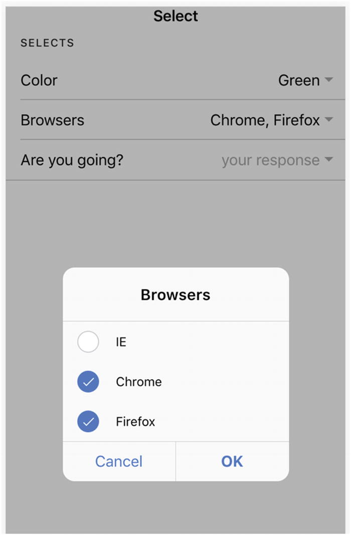
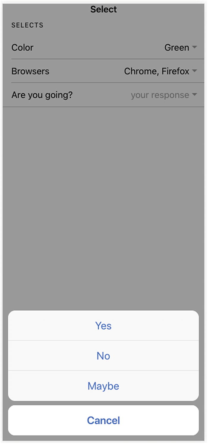
The ion-select in Listing 9-3 allows multiple selections. The ion-select-options don’t have a property value to set the value, so the value will be the text value.
Figure 9-4 shows the screenshot of using an action sheet to display options.
Figure 9-4
Use action sheet
Toggles
Like checkboxes, toggles represent Boolean values but are more user friendly on the mobile platforms. ion-toggle supports the same properties and events as ion-checkbox. See the code below for a sample of ion-toggle.
<ion-toggle [(ngModel)]="enabled"></ion-toggle>
Ranges
Range sliders allow users to select from a range of values by moving the knobs. By default, a range slider has one knob to select only one value. It also supports using dual knobs to select a lower and upper value. Dual knobs range sliders are perfect controls for choosing ranges, that is, a price range for filtering.
The component ion-range has the following properties. Standard properties, including color and disabled, are omitted.
min and max - Set the minimum and maximum integer value of the range. The default values are 0 and 100, respectively.
step - The value granularity of the range that specifies the increasing or decreasing values when the knob is moved. The default value is 1.
snaps - Whether the knob snaps to the nearest tick mark that evenly spaced based on the value of step. The default value is false.
pin - Whether to show a pin with current value when the knob is pressed. The default value is false.
debounce - How many milliseconds to wait before triggering the ionChange event after a change in the range value. The default value is 0.
dualKnobs - Whether to show two knobs. The default value is false.
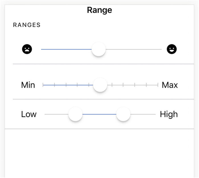
To add labels to either side of the slider, we can use the property slot of the child components of the ion-range. Labels can be texts, icons, or any other components.
The ion-range in Listing 9-5 uses two icons as the labels.
<ion-range min="1" max="5">
<ion-icon name="sad" slot="start"></ion-icon>
<ion-icon name="happy" slot="end"></ion-icon>
</ion-range>
Listing 9-5
Labels of ion-range
The ion-range in Listing 9-6 sets the property step and snaps.
<ion-range step="10" snaps="true" pin="true">
<ion-label slot="start">Min</ion-label>
<ion-label slot="end">Max</ion-label>
</ion-range>
Listing 9-6
Step and snaps
The last ion-range in Listing 9-7 has double knobs.
<ion-range dual-knobs="true" min="0" max="10000">
<ion-label slot="start">Low</ion-label>
<ion-label slot="end">High</ion-label>
</ion-range>
Listing 9-7
Double knobs
Figure 9-5 shows the screenshot of ranges created in Listings 9-5, 9-6, and 9-7.
Figure 9-5
Different kinds of ranges
Labels
Labels can be used to describe different types of inputs. ion-label is the component for labels. It supports different ways to position the labels relative to the inputs using the property position.
fixed - Labels are always displayed next to the inputs.
floating - Labels will float above the inputs if inputs are not empty or have focus.
stacked - Labels will always appear on the top of inputs.
We can add the property position to the ion-label to specify the position.
Toolbar
A toolbar is a generic container for text and buttons. It can be used as a header, sub-header, footer, or sub-footer. Toolbars are created using the component ion-toolbar.
Buttons in a toolbar should be placed inside of the component ion-buttons. We can use the property slot to configure the position of the ion-buttons inside of the toolbar.
secondary - On iOS, positioned to the left of the content; on Android and Windows phones, positioned to the right.
primary - On iOS, positioned to the right of the content; on Android and Windows phones, positioned to the far right.
start - Positioned to the left of the content in LTR, and to the right in RTL.
end - Positioned to the right of the content in LTR, and to the left in RTL.
In Listing 9-8, we have two ion-buttons at both sides of the ion-title.
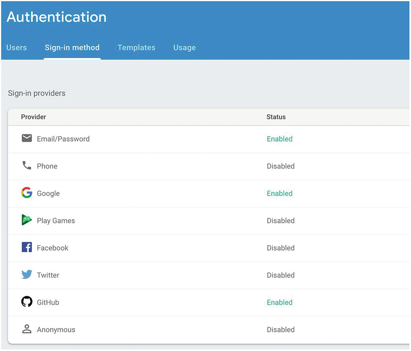
The simplest way to add user management is to allow users to log in using an email and password. Firebase already provides built-in support for email and password authentication. Firebase manages storage of users’ emails and passwords for the app. By using Firebase’s JavaScript library, it’s very easy to add email and password login. We first need to enable the email and password login for the Firebase project. In the Authentication section of the Firebase project, go to the Sign-in method tab and click Email/Password to enable it; see Figure 9-6. This is also the place to enable other third-party login methods.
Figure 9-6
Enable Email/Password login
Model for User Management
We first create models required for authentication; see Listing 9-9. The interface User represents logged-in users. It has four properties: uid, displayName, email, and photoURL. The property photoURL is the URL of user’s profile image. The interface EmailPasswordPair contains email and password, which is used for login requests. The interface NewAccount contains information for new users, which is used for sign-up requests.
export interface User {
uid: string;
displayName: string;
email: string;
photoURL?: string;
}
export interface EmailPasswordPair {
email: string;
password: string;
}
export interface NewAccount {
name: string;
email: string;
password: string;
}
Listing 9-9
Models for user management
AuthService
As usual, we start with the service for authentication. AngularFire2 already supports authentication with Firebase using the service AngularFileAuth. In the previous implementation of the top stories page, we already use the injected AngularFireDatabase object to retrieve data from the Hacker News database. AngularFire2 simplifies the way to work with Firebase. Now we need to use AngularFire2 to integrate the authentication for our app. However, AngularFire2 doesn’t provide a way to easily switch between different Firebase instances in the same app. The injected AngularFireDatabase instance can only easily access a single Firebase instance. To work around this limitation, we use the standard way of AngularFire2 instance to access the app’s Firebase instance but use another way to manually create the AngularFireDatabase instance for Hacker News API.
In the current constructor of TopStoriesEffects, we simply use db: AngularFireDatabase to inject the instance of AngularFireDatabase. Now that we have two Firebase databases to work with, we need to distinguish between these two AngularFireDatabase instances. This is done by using a custom injection token for the Hacker News database. HACKER_NEWS_DB in Listing 9-10 is the injection token.
import { AngularFireDatabase } from '@angular/fire/database';
import { InjectionToken } from '@angular/core';
export const HACKER_NEWS_DB = new InjectionToken<AngularFireDatabase>('Hacker News db');
Listing 9-10
Injection token for Hacker News database
In the app’s root module, we need to declare the provider of this AngularFileDatabase instance. In Listing 9-11, we create a new AngularFileDatabase object and provide it with the token HACKER_NEWS_DB. The constructor of AngularFireDatabase requires five parameters.
1.
An option object to configure AngularFire2. The object environment.hackernews_db only contains a single property databaseURL as we only use the database feature for Hacker News.
2.
A name for the Firebase app.
3.
The database URL. Since we already specified the database URL in the option object, we can use null here.
4.
Angular platform id.
5.
AngularNgZone object.
The values of the last two parameters need to be injected by the Angular injector. Here we use the Angular factory service provider to create the AngularFireDatabase instance.
import { NgModule, NgZone, PLATFORM_ID } from '@angular/core';
import { HACKER_NEWS_DB } from './hackernews-db';
@NgModule({
declarations: [
MyApp,
],
providers: [
{
provide: HACKER_NEWS_DB,
useFactory: (platformId: Object, zone: NgZone) =>
new AngularFireDatabase(environment.hackernews_db, 'HackerNews', null, platformId, zone),
deps: [PLATFORM_ID, NgZone]
},
]
})
export class AppModule {
}
Listing 9-11
Create AngularFileDatabase object
The constuctor of TopStoriesEffects needs to be updated to use @Inject(HACKER_NEWS_DB) private db: AngularFireDatabase for injection.
After updating the existing AngularFireDatabase instance to use a different injection token, we can use the default way to access the app’s database. The Firebase configuration of this app is copied to the file environment.ts; see Listing 9-12.
To use the authentication in Firebase, we also need to import the module AngularFireAuthModule. Listing 9-13 is the implementation of AuthService. The injected AngularFireAuth object is the primary object to interact with Firebase authentication. In the method create, the method createUserAndRetrieveDataWithEmailAndPassword creates a new user account and returns information about the created user. The method login uses signInWithEmailAndPassword to log in with an email and password. The method signInWithEmailAndPassword returns a Promise<firebase.auth.UserCredential> object, so we need to chain the returned Promise object with result => result.user to extract the firebase.User object. The method logout uses the method signOut to log out the current user. All these methods return Promise objects.
import { Injectable } from '@angular/core';
import { AngularFireAuth } from '@angular/fire/auth';
import { EmailPasswordPair, NewAccount } from '../../models/user';
We continue to use NgRx to manage a state related to authentication. We define different actions related to login, sign-up, and logout; see Listing 9-14. For each group of actions, there are three actions for the scenarios when the request is sent, success result is received, and failure result is received, respectively. For example, the action Login means the login request with payload of type EmailPasswordPair; LoginSuccess means the login succeeds; LoginFailure means the login fails with an error as the payload.
import { Action } from '@ngrx/store';
import { User, EmailPasswordPair, NewAccount } from '../../models/user';
export enum AuthActionTypes {
Login = '[Auth] Login',
LoginSuccess = '[Auth] Login Success',
LoginFailure = '[Auth] Login Failure',
Signup = '[Auth] Sign Up',
SignupSuccess = '[Auth] SignUp Success',
SignupFailure = '[Auth] SignUp Failure',
Logout = '[Auth] Logout',
LogoutSuccess = '[Auth] Logout Success',
LogoutFailure = '[Auth] Logout Failure',
}
export class Login implements Action {
readonly type = AuthActionTypes.Login;
constructor(public payload: EmailPasswordPair) {}
}
export class LoginSuccess implements Action {
readonly type = AuthActionTypes.LoginSuccess;
constructor(public payload: User) {}
}
export class LoginFailure implements Action {
readonly type = AuthActionTypes.LoginFailure;
constructor(public payload: any) {}
}
export class Signup implements Action {
readonly type = AuthActionTypes.Signup;
constructor(public payload: NewAccount) {}
}
export class SignupSuccess implements Action {
readonly type = AuthActionTypes.SignupSuccess;
}
export class SignupFailure implements Action {
readonly type = AuthActionTypes.SignupFailure;
constructor(public payload: any) {}
}
export class Logout implements Action {
readonly type = AuthActionTypes.Logout;
}
export class LogoutSuccess implements Action {
readonly type = AuthActionTypes.LogoutSuccess;
}
export class LogoutFailure implements Action {
readonly type = AuthActionTypes.LogoutFailure;
constructor(public payload: any) {}
}
export type AuthActions = Login | LoginSuccess | LoginFailure
| Signup | SignupSuccess | SignupFailure
| Logout | LogoutSuccess | LogoutFailure;
Listing 9-14
Actions
We also define states and related reducer functions. The state for the feature auth contains three sub-states. The first one is for the authentication status, which has properties loggedIn, user, and logoutError. This is used to control UI elements related to authentication. The second one is for the login page, which has properties loading and error. The last one is for the sign-up page, which also has the properties loading and error. The reducer functions for these three states are very simple and straightforward.
Listing 9-15 shows the state and reducer function for the authentication status. For the action LoginSuccess, the state property loggedIn is set to true, while the property user is set to the logged-in user.
import { User } from '../../models/user';
import { AuthActions, AuthActionTypes } from '../actions/auth';
export interface State {
loggedIn: boolean;
user: User | null;
logoutError: any;
}
export const initialState: State = {
loggedIn: false,
user: null,
logoutError: null,
};
export function reducer(state = initialState, action: AuthActions): State {
For the state and reducers of the login page and sign-up page, please refer to the full source code with this book.
Listing 9-16 show the state of the feature auth and its selectors. The AuthState is composed of the three aforementioned states. The ActionReducerMap is also a mapping from these three states to their reducers. Selectors are used by UI components to retrieve data from the states.
The actual logic related to sign-up, login, and logout is added to the AuthEffects in Listing 9-17. For effects login$, signup$, and logout$, the corresponding method in AuthService is invoked to perform the task and dispatch actions based on the result. Because all the methods in AuthService return Promise objects, we simply create new Observables from the Promise objects and use map or mergeMap to convert the results into actions. Errors are captured using catchError and converted to actions. For the effect loginSuccess$, the method navigate of Router is used to navigate to the path / after a successful login. The @Effect({dispatch: false}) means this effect doesn’t dispatch actions to the store.
mergeMap(createdUser => of<Action>(new SignupSuccess(), new LoginSuccess(createdUser))),
catchError(error => of(new SignupFailure(error)))
)
)
);
@Effect({dispatch: false})
loginSuccess$ = this.action$.pipe(
ofType(AuthActionTypes.LoginSuccess),
tap(() => this.router.navigate(['/']))
);
@Effect()
logout$ = this.action$.pipe(
ofType(AuthActionTypes.Logout),
mergeMap(() =>
from(this.authService.logout())
.pipe(
map(user => new LogoutSuccess()),
catchError(error => of(new LogoutFailure(error)))
)
)
);
}
Listing 9-17
AuthEffects
Sign-Up Page
Now we can create the sign-up page for users to create new accounts. The sign-up page contains inputs for name, email, and password.
Let’s start from the template of the sign-up component in Listing 9-18. In the ion-header, we use the component ion-toolbar to show the title and an ion-button to go back to the home page. In the component, we use two-way bindings [(ngModel)] to bind ion-inputs to properties of the user model object. #signupForm="ngForm" sets a reference to the ngForm object with name signupForm, so we can access its state to set the enable status of the sign-up button.
The component SignupPage in Listing 9-19 is very simple. The properties name, email, and password are used to bind inputs in the template. The Observable loading$ represents the loading status, and error$ represents errors that occurred in the sign-up. These two Observables controls the status of the login button and the ion-item to display errors, respectively. When the button is clicked, the action Signup is dispatched with values in the form.
Figure 9-7 shows the screenshot of the sign-up page.
Figure 9-7
Sign-up page
Login Page
We create a new page for users to log in. This page contains the form for users to input email and password, and a button to log in. It also contains a button to show the sign-up page; see Listing 9-20.
The LoginPage in Listing 9-21 is similar to the SignupPage in Listing 9-19. It has the properties email and password to bind the inputs in the page. It also has Observables loading$ and error$ to control the components status. When the button is clicked, the action Login is dispatched.
import { Component } from '@angular/core';
import * as fromAuth from '../reducers';
import { select, Store } from '@ngrx/store';
import { Observable } from 'rxjs/Observable';
import { EmailPasswordPair } from '../../models/user';
In the sign-up page, we asked the user to input both name and email, but when the user is logged in using email, the name was not displayed. This is because we didn’t save the user’s name after the sign-up. Firebase also stores the user’s basic profile information, including the user’s display name and the profile photo URL. We need to update the user’s profile to set the display name after sign-up. In Listing 9-22, the method createUserAndRetrieveDataWithEmailAndPassword() creates a new user and returns a Promise with the new firebase.auth.UserCredential object. The property user of firebase.auth.UserCredential is the firebase.User object. Then the method updateProfile() of the firebase.User object is invoked to update the user’s display name.
It’s tedious for users to register different accounts for various online services or apps. Many services or apps allow users to log in using existing accounts of popular third-party services, for example, Twitter or Facebook. Apart from the email/password authentication, Firebase provides support for common third-party providers, including Google, Twitter, Facebook, and GitHub. It’s very easy to add support for logging in using third-party providers.
Before we can use those third-party service providers, we need to enable them in the Firebase console. In the Sign-in method tab of the Authentication section, we can enable all supported sign-in providers.
Google sign-in can be enabled without additional settings.
For Twitter sign-in, we need to register the app on Twitter and get the API key and secret for the app. When enabling Twitter sign-in, we need to fill the API key and secret. After it’s enabled, we set https://<auth_domain>/__/auth/handler as the Callback URL for the Twitter app.
Facebook sign-in is similar to Twitter sign-in; we also need to register the app on Facebook to get the app ID and secret to enable it. After enabling it, we also need to set the OAuth redirect URI to the same one as Twitter app’s Callback URL.
GitHub sign-in is also very similar. We first register the app on GitHub to get the client id and secret, then enable it in the Firebase console, and finally set the Authorization callback URL of the GitHub app.
Integrating Firebase third-party login with web apps is very easy. With the method signInWithPopup, a browser window is popped up to the provider’s login page and asks the user to authorize the access. After the access is granted, the popup window is closed, and we can get the authentication information from the result. When we do the testing on browsers, this popup authentication method works fine. But when we try to run the app on emulators or devices, we find it failed with error code auth/operation-not-supported-in-this-environment. We need an additional configuration for Firebase authentication to run on the Cordova platform.
We first need to add an Android app and iOS app for the project in the Firebase console. Then we need to enable Dynamic Links in the Firebase console. If Dynamic Links is enabled, you should see the Dynamic Link Domain like xyz.app.goo.gl. The following Cordova plugins need to be installed for the project. Listing 9-23 shows the required plugins. For the last plugin cordova-plugin-customurlscheme, the variable URL_SCHEME should be the package ID of your app.
The configuration in Listing 9-24 needs to be added to the config.xml of Cordova. <DYNAMIC_LINK_DOMAIN> and <AUTH_DOMAIN> should be replaced with values for your app.
After these configurations, we can integrate Firebase authentication in Cordova. Listing 9-25 shows the updated AuthService with the new method logInWithProvider. The type LoginProvider specifies the supported third-party service providers. The function createProvider creates the Firebase provider objects for login. In the method logInWithProvider, we use the method signInWithRedirect to log in using the provider. If the login is successful, the method getRedirectResult returns the firebase.auth.UserCredential object to get the authenticated user.
We also need to add a new action for login with third-party providers and a new effect to handle the action. Listing 9-26 shows the updated template of the login page to include icons for different providers. The function loginWithProvider dispatches the action to log in with providers.
mergeMap(user => of<Action>(new LoginSuccess(user), new favoritesActions.Load())),
catchError(error => of(new LoginFailure(error)))
)
)
);
Listing 9-27
Effect to handle action for login with third-party providers
Figure 9-8 shows the screenshot of the final login page.
Figure 9-8
Login page
Summary
In this chapter, we discussed how to add user management to the example app with Firebase. For email/password login, we used Ionic 4 forms for users to sign up and log in. For third-party login, we used Cordova plugins to support login with service providers. In the next chapter, we’ll implement the user story to manage users’ favorites.