When implementing those user stories for the app, we already use many Ionic built-in components. There are still some Ionic components that are useful but not included in the app. We are going to discuss several important components, including action sheet, popover, slides, tabs, modal, and menu. After reading this chapter, you should know how to use these components.
Action Sheet
An action sheet is a special kind of dialog that lets user choose from a group of options. It’s like the component ion-alert we mentioned before, but only buttons are allowed in an action sheet. It can also be used as menus. An action sheet contains an array of buttons. There are three kinds of buttons in action sheets: destructive, normal, or cancel. This can be configured by setting the property role to destructive or cancel. Destructive buttons usually represent dangerous actions, for example, deleting an item or canceling a pending request. Destructive buttons have different styles to clearly convey the message to the user, and they usually appear first in the array buttons. Cancel buttons always appear last in the array buttons.
Just like alerts and loading indicators, there are two Ionic components for action sheets. The component ion-action-sheet-controller is responsible for creating, presenting, and dismissing action sheets. The component ion-action-sheet is the actual component displayed to the user. Action sheets are created using the method create() of ion-action-sheet-controller. The method create() takes an options object with the following possible properties.
header - The title of the action sheet.
subHeader - The subtitle of the action sheet.
cssClass - The extra CSS classes to add to the action sheet.
backdropDismiss - Whether the action sheet should be dismissed when the backdrop is tapped.
buttons - The array of buttons to display in the action sheet.
Each button in the of array of buttons is a JavaScript object with the following possible properties.
text - The text of the button.
icon - The icon of the button.
handler - The handler function to invoke when the button is pressed.
cssClass - The extra CSS classes to add to the button.
role - The role of the button. Possible values are destructive, selected, and cancel.
The return value of create() is a Promise<HTMLIonActionSheetElement> instance. After the promise is resolved, we can use methods present() or dismiss() of HTMLIonActionSheetElement to present or dismiss the action sheet, respectively. When the action sheet is dismissed by user tapping the backdrop, the handler of the button with role cancel is invoked automatically. When working with Angular, we can use the service ActionSheetController from Ionic Angular.
Action sheets also emit different life-cycle related events.
ionActionSheetDidLoad - Emitted after the action sheet has loaded.
ionActionSheetDidUnload - Emitted after the action sheet has unloaded.
ionActionSheetDidPresent - Emitted after the action sheet has presented.
ionActionSheetWillPresent - Emitted before the action sheet is presented.
ionActionSheetWillDismiss - Emitted before the action sheet is dismissed.
ionActionSheetDidDismiss - Emitted after the action sheet is dismissed.
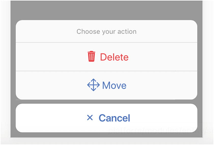
Listing 12-1 shows an action sheet with three buttons.
Figure 12-1 shows the screenshot of the action sheet.
Figure 12-1
Action sheet
Popover
A popover floats on top of the current page. Popovers are created by wrapping existing components. We use the method create() of the component ion-popover-controller to create popovers. The method create() has only one parameter, which is a JavaScript object containing the following properties.
component - The component that’s wrapped in the popover.
componentProps - The data object to pass to the popover component.
showBackdrop - Whether to show the backdrop.
backdropDismiss - Whether the backdrop should be dismissed when clicking outside of the popover.
cssClass - Extra CSS classes to add.
event - The click event object to determine the position of showing the popover.
The return value of create() is a Promise<HTMLIonPopoverElement> instance. The popover can be dismissed by invoking dismiss() of the resolved HTMLIonPopoverElement instance. The method dismiss() can accept an optional object that passed to the callback function configured by onDidDismiss() of the HTMLIonPopoverElement instance. This is how data is passed between the component wrapped by the popover and the component that creates the popover.
Now we use an example to demonstrate how to pass data when using popovers; see Listing 12-2. The component contains some text, and we want to use a popover to change the font size. In the PopOverComponent, we use the injected PopoverController instance to create a new HTMLIonPopoverElement. When invoking create(), the component to show is FontSizeChooserComponent, and we pass the current value of fontSize to the component in the componentProps. The event object of the click event is passed as the value of the property event, so the popover is positioned based on the position of the click event. If no event is passed, the popover will be positioned in the center of the current view. We use present() to show the popover. We then use onDidDismiss() to add a callback function to receive the updated value of fontSize from the popover.
import { Component, OnInit } from '@angular/core';
import { PopoverController } from '@ionic/angular';
import { FontSizeChooserComponent } from '../font-size-chooser/font-size-chooser.component';
The template of PopOverComponent is very simple. It has a button to create the popover. The font size of the <div> element is updated using the directive ngStyle. See Listing 12-3.
In the FontSizeChooserComponent, the injected NavParams can be used to retrieve the popover instance and data object passed to it. The popover instance is used to dismiss the popover and pass the current value of fontSize. See Listing 12-4.
Figure 12-2 shows the screenshot of the font size chooser.
Figure 12-2
Font size chooser
Slides
The slides component is a container for multiple views. The user can swipe or drag between different views. Slides are commonly used for tutorials and galleries.
Slides are created using components ion-slides and ion-slide. ion-slides is the container component for ion-slide components inside of it. When creating the ion-slides, we can use the property options to configure it. Ionic slides uses Swiper as its implemenation. The property options takes the same value as in the Swiper API (http://idangero.us/swiper/api/). The property pager controls whether to show the pagination bullets.
After the slides component is created, we can also programmatically control the slide transitions using the following methods.
slideTo(index, speed, runCallbacks) - Transition to the slide with the specified index.
slideNext(speed, runCallbacks) - Transition to the next slide.
slidePrev(speed, runCallbacks) - Transition to the previous slide.
getActiveIndex() - Get the index of the active slide.
getPreviousIndex() - Get the index of the previous slide.
length() - Get the total number of slides.
isBeginning() - Get whether the current slide is the first slide.
isEnd() - Get whether the current slide is the last slide.
startAutoplay() - Start autoplay.
stopAutoplay() - Stop autoplay.
In Listing 12-6, we create an ion-slides component with the reference variable set to slides. It contains three ion-slide components.
<ion-slides #slides>
<ion-slide>
Slide 1
</ion-slide>
<ion-slide>
Slide 2
</ion-slide>
<ion-slide>
Slide 3
</ion-slide>
</ion-slides>
<div>
<ion-button (click)="prev()">Prev</ion-button>
<ion-button (click)="next()">Next</ion-button>
</div>
Listing 12-6
Slides
It has two buttons to go to the previous or next slide. The component SlidesComponent in Listing 12-7 has a @ViewChild property slides that binds to an ElementRef object. The property nativeElement returns the ion-slides element. The property loaded is used to check whether the slides component is loaded. The method componentOnReady returns a Promise that resolved when the component is ready. The method isValid() is required to check whether the Slides component is ready to use.
import { Component, ViewChild, ElementRef, OnInit } from '@angular/core';
@Component({
selector: 'app-slides',
templateUrl: './slides.component.html',
styleUrls: ['./slides.component.css']
})
export class SlidesComponent implements OnInit {
@ViewChild('slides') slidesElem: ElementRef;
loaded = false;
slides: any;
ngOnInit() {
this.slides = this.slidesElem.nativeElement;
this.slides.componentOnReady().then(() => {
this.loaded = true;
});
}
prev() {
if (this.isValid()) {
this.slides.slidePrev();
}
}
next() {
if (this.isValid()) {
this.slides.slideNext();
}
}
isValid(): boolean {
return this.loaded && this.slides != null;
}
}
Listing 12-7
SlidesComponent
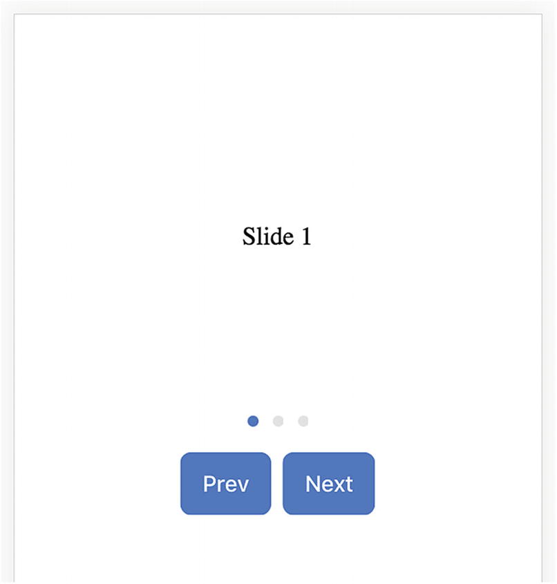
Figure 12-3 shows the screenshot of the slides component.
Figure 12-3
Slides
Tabs
Tabs are commonly used components for layout and navigation. Different tabs can take the same screen estate, and only one tab can be active at the same time.
Tabs components are created using the component ion-tabs, while individual tabs are created using ion-tab. ion-tabs supports the standard properties color and mode and the following special properties.
tabbarHidden - When this property is true, hide the tab bar.
tabbarLayout - The layout of the tab bar. Possible values are icon-top, icon-start, icon-end, icon-bottom, icon-hide, title-hide.
tabbarPlacement - The position of the tab bar. Possible values are top and bottom.
tabbarHighlight - Whether to show a highlight bar under the selected tab. The default value is false.
Once ion-tabs is created, we can get the ion-tab instance of this component. The component ion-tabs instance provides different methods to interact with the tabs.
select(tabOrIndex) - Select a tab by its index or its ion-tab instance.
getTab(index) - Get the ion-tab instance by the index.
getSelected() - Get the selected ion-tab instance.
Each ion-tab also supports the following properties to configure it.
active - Whether the tab is active.
href - The URL of the tab.
label - The title of the tab.
icon - The icon of the tab.
badge - The badge to display on the tab button.
badgeStyle - The color of the badge.
disabled - Whether the tab button is disabled.
show - Whether the tab button is visible.
tabsHideOnSubPages - Whether the tab is hidden on subpages.
ion-tab also emits the event ionSelect when it’s selected.
In the template file of Listing 12-8, we create an ion-tabs with the reference name set to tabs. Each ion-tab has its title and icon. The first tab has a button to go to the second tab.
In the TabsComponent of Listing 12-9, we use the decorator @ViewChild to get the reference to the ion-tabs element and use its method select() to select the second tab.
import { Component, OnInit, ViewChild, ElementRef } from '@angular/core';
Modals take up the whole screen space to present the UI to users. Modals are commonly used to gather information from users before they can continue. The ion-modal components are created using the method create(opts) of the component ion-modal-controller. The parameter opts is an options object to configure the modal. The following options are supported when creating modals.
component - The component to show in the modal.
componentProps - Parameters passed to the component.
showBackdrop - Whether to show the backdrop or not. The default value is true.
backdropDismiss - Whether the modal should be dismissed by tapping on the backdrop. The default value is true.
enterAnimation - The animation to use when the modal is presented.
leaveAnimation - The animation to use when the modal is dismissed.
The usage pattern of ion-modal-controller and ion-modal is similar to ion-popover-controller and ion-popover. We can use ion-modal-controller to show the same font-size chooser; see Listing 12-10.
To close the modal, we can get the reference to the ion-modal using the property data.modal of NavParams.
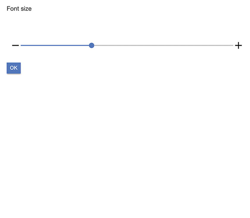
Figure 12-5 shows the screenshot of FontSizeChooserComponent opened with a modal.
Figure 12-5
FontSizeChooserComponent opened with a modal
Menu
The component ion-menu creates menus that can be opened by clicking a button or swiping. ion-menu has the following properties.
contentId - The id of the content component.
menuId - The id of the menu.
side - The side of the view to place the menu. Possible values are start and end. The default value is start.
type - The display type of the menu. Possible values are overlay, reveal, and push. The default value depends on the platform.
disabled - Whether the menu is disabled. The default value is false.
swipeEnabled - Whether swiping should be enabled to open the menu. The default value is true.
persistent - Whether the menu should persist on child pages. The default value is false.
Menu Toggle and Button
The component ion-menu-toggle can toggle the open or close status of a menu. The property menu of ion-menu-toggle specifies the id of the menu to toggle. We can also use start or end as the value of this property. The property autoHide specifies whether the toggle should be hidden when the corresponding menu is not active.
The component ion-menu-button is actually an ion-menu-toggle that wraps an ion-button with a menu icon.
Menu Controller
Using ion-menu-toggle is generally enough to control the visibility of the menu. However, when there are multiple menus at both sides, or the visibility of the menu depends on complex logic, it’s better to use ion-menu-controller. It has the following methods.
open(menuId) - Open the menu with specified id or side.
close(menuId) - Close the menu with specified id or side. If no menuId is specified, then all open menus will be closed.
toggle(menuId) - Toggle the menu with a specified id or side.
enable(shouldEnable, menuId) - Enable or disable the menu with a specified id or side. For each side, when there are multiple menus, only one of them can be opened at the same time. Enabling one menu will also disable other menus on the same side.
swipeEnable(shouldEnable, menuId) - Enable or disable the feature to swipe to open the menu.
isOpen(menuId) - Check if a menu is opened.
isEnabled(menuId) - Check if a menu is enabled.
get(menuId) - Get the ion-menu instance with a specified id or side.
getOpen() - Get the opened ion-menu instance.
getMenus() - Get an array of all ion-menu instances.
isAnimating() - Check if any menu is currently animating.
Listing 12-11 shows the template of using menus. We create two menus at the start and end side. The ion-menu-button toggles the menu at the start side. If the property contentId is not specified for the ion-menu, it looks for the element with the attribute main in its parent element as the content.
The MenuComponent in Listing 12-12 uses MenuController to open the menu at the end side.
import { Component } from '@angular/core';
import { MenuController } from '@ionic/angular';
@Component({
selector: 'app-menu',
templateUrl: './menu.component.html',
styleUrls: ['./menu.component.css']
})
export class MenuComponent {
constructor(private menuCtrl: MenuController) { }
openEnd() {
this.menuCtrl.open('end');
}
}
Listing 12-12
MenuComponent
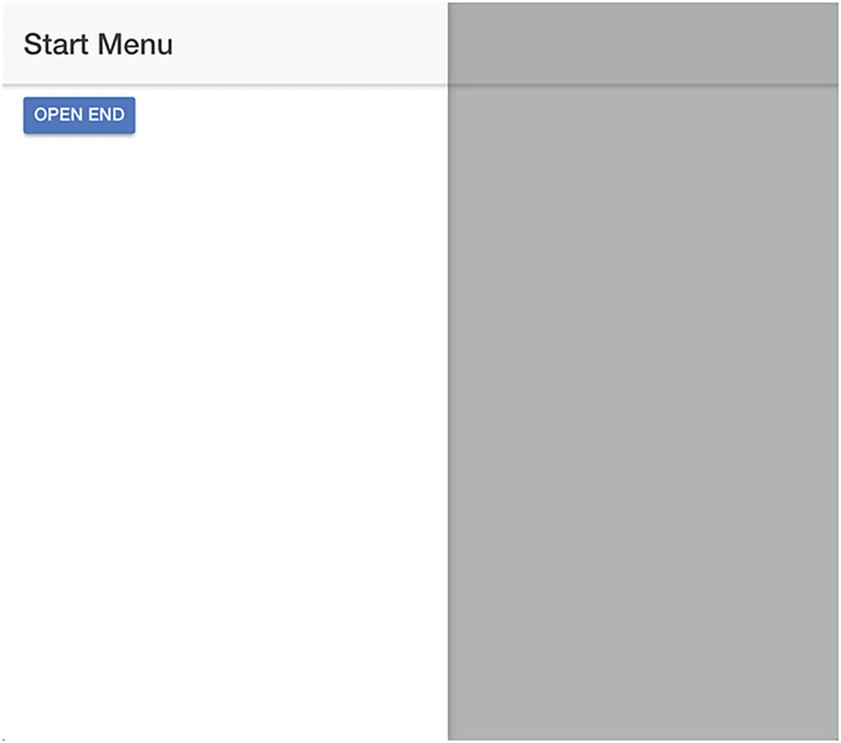
Figure 12-6 shows the screenshot when the start menu is opened.
Figure 12-6
Start menu opened
Summary
In this chapter, we discussed how to use other common Ionic 4 components that are not used in the example app, including action sheet, popover, slides, and tabs. For each component, we provided a concrete example to demonstrate the usage. In the next chapter, we’ll discuss some advanced topics in Ionic 4.