
We are now ready to create dialog that our NPC will state to the character. To do this, we will first create a Widget Blueprint that will be responsible for housing all parent variables of the NPC, such as the dialog in the game, so that we can simply pull dialog anytime we need it by calling the dialog variable within the function. This process will be better than the hardcoding text in UMG because it will allow us to need only a single dialog UMG that we will dynamically place text into.
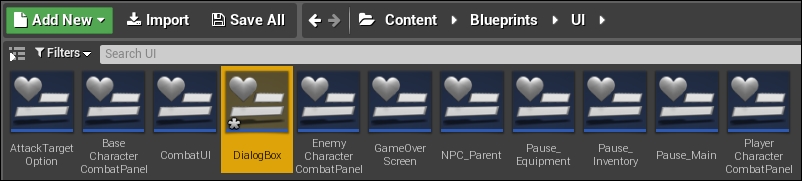
So let's first create a new Widget Blueprint by navigating to Content Browser | Content | Blueprints | UI and then selecting Add New | User Interface | Widget Blueprint. Then, name it NPC_Parent:

Once created, open the new Widget Blueprint and then navigate to the graph. From here, head to the My Blueprint panel and select + to the right of Variables; this will create a new variable. Name this variable NPCDialog and make it public by clicking the eye to the right of the variable name:

In the Details panel, change Variable Type to Text since we will be using text to display dialog. Also, click on the square icon to the right of Variable Type to make the variable a text array:

Next, scroll down to the Default Value tab within the Details panel to the area that contains elements of an array. By default, it does not have elements:

In Details | Default Value, click on + next to elements to add an element that will create a text box next to the element 0. Put a value in this element by writing some text. You can write any form of text you want here; since at one point I plan to have the NPC give the player information, I will make the dialog say You can check out your Character Status by pressing P when you are outside of battle:

Since our NPC is a shop owner, they can greet us, for example, by saying Greetings. I am Roy, the shop owner, what can I do for you? You can add this text as a second element in the NPCDialog array:

Whenever we need a new NPC variable that we may not want hardcoded, we can go back to this Widget Blueprint and add dialog like we did just now. Next, we can create the actual dialog for our NPC by navigating back to our Content Browser. Since we may end up having many different characters using the same dialog box just with different text in it, we may want to create another Widget Blueprint that just has a basic window and a button to exit the dialog box. In Content Browser, navigate to Content | Blueprints | UI and then select Add New | User Interface | Widget Blueprint. Then, name it DialogBox:
Open the new Widget Blueprint. From here, navigate to File | Reparent Blueprint and reparent it to NPC_Parent, which holds all our variables:

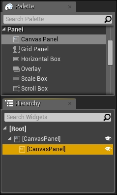
Since dialog boxes are rarely the size of the entire screen, we are going to create a Canvas Panel within our default Canvas Panel by navigating to Panel | Canvas Panel and dragging the new Canvas Panel within the parent Canvas Panel:
Rename this new Canvas Panel CanvasPanel_DialogBox. Also, anchor this Canvas Panel to the middle of the screen:

You may also want to resize the text box to hold a decent amount of text. I will resize this text box to have a Size X value of 1024 and Size Y value of 512. You should also center the box by setting Position X to -1024/2 which is equal to -512, and Position Y to -512/2 which is equal to -256:

Within CanvasPanel_DialogBox, add an image from Palette | Common | Image that we can use to add a background color in a similar way to what we did for the pause menu:

In the Details panel, rename this image BGColor and position and resize it so that it is in the middle of the screen. This can easily be done by choosing a center anchor:

Resize and position this to be the same as the Canvas Panel, that is, the Size X value as 1024, Size Y value as 512, Position X value as -512, and Position Y value as 256:

Lastly, under Details | Appearance | Color and Opacity, adjust the color to be the same as the other menus. In this case, we can select the color picker and pass in the linear hex value of 267FFFFF:

Next, let us insert an exit button to leave this menu by selecting and dragging a button from Palette | Common | Button into CanvasPanel_DialogBox:

Rename this button Button_Exit and position it towards the right-hand side of your Canvas Panel by first changing the size of your button to match the size of the pause menu buttons, which have the Size X value as 300 and the Size Y value as 100. Then, position the button in the bottom-right of the Canvas Panel, by changing the anchor to bottom-right aligned. Then, use simple positions such as the one that gives 20 pixels of padding, that is, Position X as -320 and Position Y as -120. You will also notice that the button is behind BGColor; simply change the ZOrder value to 1:


Now that you have a button created and positioned, add a Text Block to it. Rename the text TextBlock_Exit and under Details | Appearance | Font, change the font size to 48. Also, change the content of the Text Block to Exit:

Program the button to exit as well, just like you did in the previous menu creations, by selecting the button, scrolling down to OnClicked in Details | Events, and then clicking on the + button. This will open up Event Graph and populate the OnClicked event for the exit button. Drag out the Out pin from the OnClicked event and select Remove from Parent located under Widget:

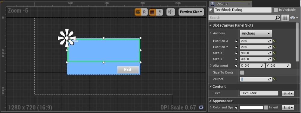
Navigate back to the Designer view and add a Text Block to CanvasPanel_DialogBox, name it TextBlock_Dialog, and have it take up most of the Canvas Panel. For this, we can position the Text Block to have a padding of 20 pixels by giving Position X a value of 20 and Position Y a value of 20. We can also set the size of the Text Block giving Size X a value of 986 and Size Y a value of 300. Lastly, set the ZOrder value to 1:
At this point, we are finished with creating the dialog box template. We can now move on to creating dialog boxes for our NPC.