Chapter 5: Descriptive Analysis Using SAS Enterprise Guide
Segmentation and Profile Analysis
Introduction
In Chapter 1, you learned the importance of setting a clear objective. In Chapter 2, you looked at types and sources of data, using examples across a variety of industries. In Chapter 3, you were introduced to the concept of descriptive and predictive analysis. In Chapter 4, you learned how to prepare data for analysis. Now, you’re ready to start making the data actionable. Beyond profiling and correlations, you can begin to craft analyses that improve your marketing actions or generate new product ideas. Exploring the data with a business goal in mind is one of the best ways to leverage the power of descriptive analysis.
Throughout this chapter, you will focus on a specific case study from the publishing industry. With slight modifications, this process can work in a variety of industries. So, while you work through this analysis, think about how you can adapt it for your own industry.
Project Overview
The leadership team at DMR Publishing Company is interested in understanding the drivers of revenue within its business. For the past year, it has gathered U.S. customer data that consists of revenues, numbers of magazines or journals, and three demographic variables. For this analysis, you will use SAS Enterprise Guide 6.1.
The project has five steps:
1. Initiate the project in SAS Enterprise Guide 6.1.
2. Import and view the data.
3. Explore the data.
4. Segment and profile the data.
5. Perform correlation analysis.
Project Initiation
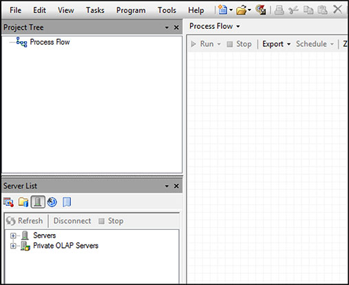
Open the project (Figure 5.1) by double-clicking the SAS Enterprise Guide icon. Click New Project. You will see an area on the left called the Project Tree. The Project Tree is where you can track each process and output in the project. The Process Flow area on the right is where you will build your process, in the form of a flowchart.
Figure 5.1: SAS Enterprise Guide 6.1 Work Area
Because whole books on SAS Enterprise Guide basics are available, this book focuses on what is required for typical marketing analysis. For an excellent general reference, see The Little SAS Book for Enterprise Guide by Lora D. Delwiche and Susan J. Slaughter (2010).
Exploratory Analysis
First, import the spreadsheet that contains the customer data.
Importing the Data
Depending on your systems and storage, you may want to seek help from your IT department for access to the data. In our example, the DMR Publishing customer data is stored in the SASUSER library in the form of a Microsoft Excel spreadsheet. As shown in Figure 5.2, click File ▶ Import Data. When the input data window opens, click the up arrow to browse to the folder in which the spreadsheet, DMR Customer Base, is stored. Highlight the spreadsheet and click Open.
Figure 5.2: Import Data into SAS Enterprise Guide

A menu will open to allow you to manage the import of the data. With regard to Steps 1 through 4, you are not adjusting anything in this process, so click Finish. Once the spreadsheet is imported, a window will open that displays the data set.
Viewing the Data
The data appears to be in good condition and self-explanatory. Note that most data will require some cleaning. For information about this important process, see Cody's Data Cleaning Techniques Using SAS by Ron Cody (2008).
You will see seven variables, a few of which require definitions:
• The CUSTOMER_ID is a unique ID number that helps the company track the customer. You won’t be using it in this analysis.
• CUSTOMER_SUBSCRIPTION_COUNT is the total number of current magazine and journal subscriptions held by the customer.
• CUSTOMER_REVENUE is the total revenue for the last year
TIP: Once the data is imported, you should save the project. Look for the icon on the top menu bar. The first time you do so, a menu will open and ask you to select a location and name the project. Once the project has been named, you can click that icon anytime, and the project will be saved under the same name.
Exploring the Data
Once you have viewed the data to your satisfaction, close the data set by clicking the X in the upper right-hand corner of your screen. You can reopen it any time by right-clicking or double-clicking the data set icon that appears in both the Project Tree and the main work area.
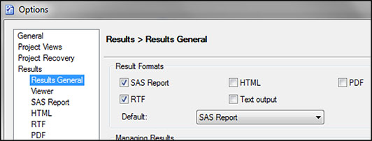
Before you create reports, let’s look at a helpful SAS Enterprise Guide option that allows you to send all output to a rich text format (RTF) file. Click Tools ▶ Options ▶ Results. When the Results section opens, you have several options for the format of the output data, as shown in Figure 5.3. The default is SAS Report. This default may be sufficient, but if you have Microsoft Word on your computer, you might click the box next to RTF near the top. This option allows you to share the documents in Microsoft Word format with all default settings that work well for most reports. You can also select PDF, HTML, or Text Output. You can explore these selections to see which works best for your projects.
Figure 5.3: Format Options for Results
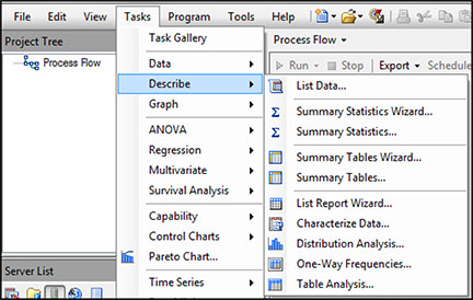
To view the data characteristics, you have several options. The fastest and simplest is to place your cursor on the data set in the work area and select Tasks ▶ Describe ▶ Characterize Data (Figure 5.4). This task is designed to give you a complete overview of every variable in your data set, in a useful format.
Figure 5.4: Task Menu in SAS Enterprise Guide to Characterize Data
When the first menu appears, click Finish.
NOTE: If you have a categorical variable with more than 30 levels, such as zip code, Enterprise Guide will limit the output to the most frequent 30 levels. This option can be changed.
Once the process is complete, you can view the output by clicking on a tab at the top of the work area. If you have Microsoft Word on your computer, then you can access the RTF output by clicking the Microsoft Word icon. It will open the results in Microsoft Word outside of the project.
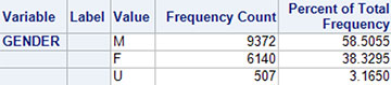
Output 5.1 is an example of the output of categorical variables in a frequency table. The results shown in Output 5.2 are fairly self-explanatory: males, with a count of 9,372, represent 59% of the sample; females, with a count of 6,140, represent 38% of the sample. Approximately 3% of the file has an unknown value (U) for gender.
Output 5.1: Categorical Data Analysis of Gender
Output 5.2 provides results for continuous or interval variable AGE.
Output 5.2 Interval or Continuous Data Analysis of Age
![]()
For AGE, the following measures are available:
• N is the number of customers.
• NMiss is the number of missing values for Age. The value here is zero because missing values are represented by the value ‘U’ in our data set.
• Total equals the value if you sum age. It has no meaning in our analysis.
• Min and Max are the lowest value and the highest value.
• Mean equals the mathematical average or arithmetic mean (with missing value stripped).
• Median is the age of the customer at 50% of the file when sorted by age; it is the middle number when the observations are put in order.
• StdMean equals the standard error variation of the mean.
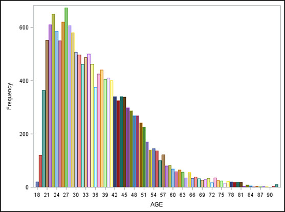
The graph in Output 5.3 shows the general distribution of the customer base by age. You can see that most of the customers are younger, with a heavy concentration between ages 21 and 40. In addition, there appear to be some outliers, or extreme values, represented by a few customers older than age 90. Outliers can cause problems with some types of analyses, especially regression models.
Output 5.3: General Distribution of a Company’s Customer Base by Age
Segmentation and Profile Analysis
The next step is to partition the customer base by CUSTOMER_REVENUE to compare the characteristics of the customers with the highest revenue to the rest of the customers.
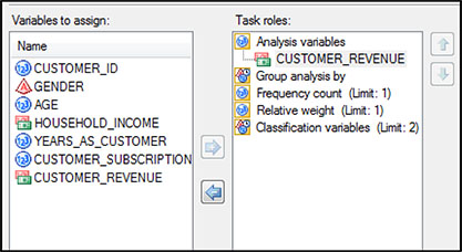
Highlight the DRM Customer Base data set and select Task ▶ Describe ▶ Distribution Analysis. A window will open in which you can select the variables. Click CUSTOMER_REVENUE and move it to the area below Analysis Variables (Figure 5.5). In the left-hand column, select Tables. Check the box next to Quantiles. Click Run.
Figure 5.5: Selection of Variable for Distribution Analysis of Customer Revenue
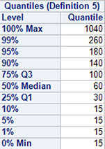
Output 5.4, captured from the RTF Output, shows the quantiles of the CUSTOMER_REVENUE distribution. A standard method that companies use to understand the drivers of revenue is to compare the characteristics of the top 25% of customers to the bottom 75%, on the basis of revenue. According to the Q3 value at the 75th percentile, anyone with more than $100 in revenue is in the top 25%.
Output 5.4: Quantiles of a Customer-Based Revenue Distribution
Next, you will create a binary variable that will allow you to split the file between the top 25% and the bottom 75% for analysis.
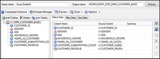
To create a new variable, use Advanced Expression function within the Query Builder. Right-click the DMR Customer Base data set, then select Query Builder (Figure 5.6). Put your curser on the data set name, t1. (DMR_CUSTOMER_BASE, in the left-hand column), and drag it, together with all the variables, over to the right side under Select Data.
Figure 5.6: Creation of a Binary Variable with Query Builder
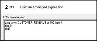
In the same window, click Computed Columns, then New, and finally, select Advanced Expression and click Next. A new window will open. In the empty box under Enter an Expression, type “case when CUSTOMER_REVENUE gt 100 then 1 else 0 end” as shown in Figure 5.7. Click Next.
Figure 5.7: Use of Build Advanced Expression, CR_TOP_25PCT, within Query Builder
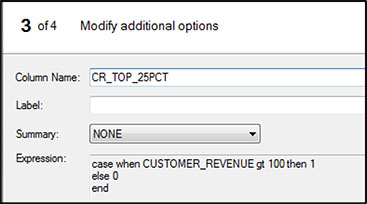
In window 3 of 4 of the Expression Builder, put CR_TOP_25PCT in the space next to Column Name (Figure 5.8) and click Finish.
Figure 5.8: Assign Column Name to Computed Variable CR_TOP_25PCT
When this window closes, you are back in the Computed Columns window. Click Close. Complete the task by clicking Run.
CR_TOP_25PCT is your new binary variable that allows you to split the customer base between the top 25% and bottom 75% in revenue generation.
Now, you are ready to do the analysis. With your curser on the new data set, click Tasks ▶ Describe ▶ Summary Statistics.
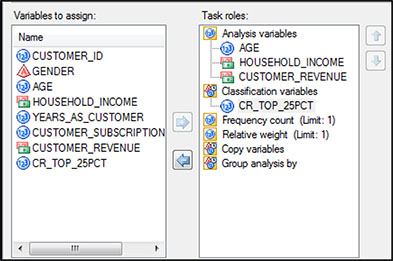
When the window opens, slide AGE, HOUSEHOLD_INCOME, and CUSTOMER_REVENUE into the slots under Analysis variables (Figure 5.9). Slide the new binary variable CR_TOP_25PCT into the slot under Classification variables. Check the boxes next to Mode and Sum. Then, select Percentiles on the left and check the box next to Median. Click Run.
Figure 5.9: Selection of Continuous Variables for Profiling
Next, look in the left-hand column and under Data, and click Statistics (Figure 5.10). Under Basic, on the right, set the Maximum decimal to 0. Uncheck the boxes next to Minimum and Maximum.
Figure 5.10: Selection of Basic Statistics on Variables for Profiling
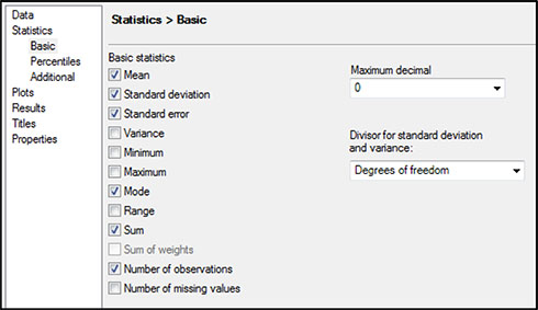
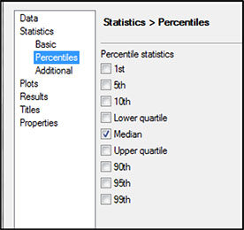
Next, select Percentiles on the left, and check the box next to Median (Figure 5.11). Click Run.
Figure 5.11: Selection of Percentiles on Variables for Profiling
The resulting table offers much insight into what is driving profitability (Output 5.5).
Output 5.5: Profiles for Continuous Variables by Revenue Group (Top 25% and Bottom 75%)
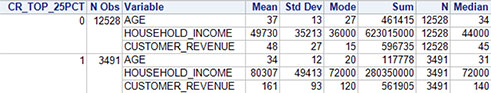
According to the results, both demographic variables, AGE and HOUSEHOLD_INCOME, vary between the two groups:
• Age—The mean age of the top 25% of revenue generators is 34, compared with 37 for the bottom 75%. As shown on the right hand side of the display, the median varies by a similar amount at 31 and 34, respectively. The mode shows that the most common values for age are even lower at 27 and 20, respectively.
• Household income—Based on the mean, income appears to be more than 60% higher for the top 25%, with $80K as opposed to $49K. The median shows about the same amount of increase with $72K and $44K, respectively. The mode value of $72K for the top 25% is exactly double the mode value of $36K for the lower 75%.
• Customer revenue—The mean revenue per customer in the top 25% is $161 annually, as opposed to $48 annually from the bottom 75%. Another measure of interest comes from the sum. We want to know what percentage of the revenue is generated by the best 25% of the customer base. The result shows that the top 25% of customers bring in only slightly less revenue, $562K, than the bottom 75% with $597K. In other words, the best 25% of the customers generates almost half of the total revenue.
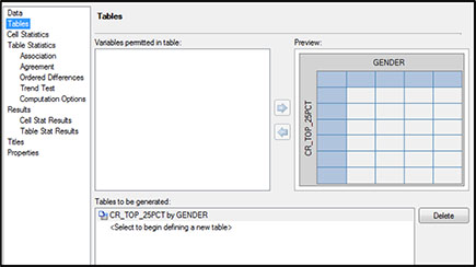
Gender can also be profiled to reveal whether a variation exists between the top 25% and the rest of the customer base. Because it is a categorical variable, you will use a frequency analysis. Place your cursor on the same data set you used for the Summary Statistics. Go to Tasks ▶ Describe ▶ Table Analysis. In the first window, drag GENDER and CR_TOP_25PCT into the boxes under Table variables as shown in Figure 5.12.
Figure 5.12: Selection of Categorical Variables for Profiling Gender and the Top 25% of Customers Based on Revenue
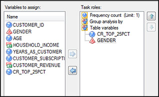
Next, click Tables in the upper left-hand menu (Figure 5.13). Drag CR_TOP_25PCT into the area to the left of the table. Drag GENDER into the area at the top of the table (see Figure 5.12). Click Table Statistics ▶ Association, then click Chi-square tests. Click Run.
Figure 5.13: Construction of Table Showing Gender by the Top 25% of Customers Based on Revenue
The results in Output 5.6 show that GENDER does differ between the top 25% and bottom 75% of customers based on revenue. A slightly greater number of females (F) are in the top 25% (24%, as opposed to 76%) than males (M; 21%, as opposed to 79%). The unknowns (U) show a ratio of male to female, but represent only a small number.
Output 5.6: Profiles for Categorical Variables by Revenue Group (Top 25% and Bottom 75%)
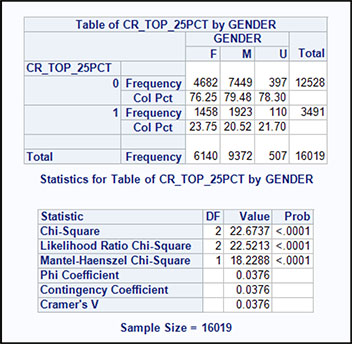
The level of statistical significance is shown in the bottom table of Output 5.6. For the Chi-Square statistic, p < .0001. Therefore, a statistically significant relationship exists between GENDER and CUSTOMER_REVENUE. The conclusion is that females are more likely than males and unknowns to be in the top 25% based on revenue.
Correlation Analysis
Another simple but powerful way to examine the relationship between revenue and the continuous demographic variables (AGE and HOUSEHOLD_INCOME) is correlation analysis. This technique enables you to look at CUSTOMER_REVENUE as a continuous variable.
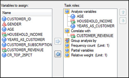
With the cursor on the data set, click Tasks ▶ Multivariate ▶ Correlations. In the window that will open, drag AGE, HOUSEHOLD_INCOME, and YEARS_AS_CUSTOMER into the area on the right under Analysis Variables (Figure 5.14). Drag CUSTOMER_REVENUE under Correlate with. Click Run.
Figure 5.14: Selection of Continuous Variables for Correlation Analysis
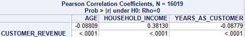
The results show that CUSTOMER_REVENUE has significant positive correlation for HOUSEHOLD INCOME, with a Pearson correlation coefficient of .38 (Output 5.7).
The p values for AGE and YEARS_AS_CUSTOMER also show significance. However, the Pearson correlation coefficients for these variables are each less than .10. Therefore, the significance is mainly due to the large sample size.
Output 5.7: Results for Correlation Analysis of Customer Revenue with Age, Household Income, and Years as Customer
Notes from the Field
Viewing data frequencies and distributions gives you a view of the data that is useful for understanding the underlying trends. Correlation analysis is powerful for detecting early relationships that can lead to ideas for predictive analysis.
Correlation analysis can also be helpful in detecting data problems. For example, if two variables show a high correlation coefficient (> 60%), they might be related in some way not otherwise known.
When descriptive analysis is the first step in a bigger project, you might want to discuss your preliminary findings with your client or stakeholders. They may have knowledge about or insights into market trends, potential data issues, and correlations that can be useful for you to incorporate in your analysis.