
Chapter 3: Overview of Descriptive and Predictive Analyses
Introduction
In this chapter, you will learn about different types of descriptive and predictive analyses that are commonly used in business today. Once your source data sets are loaded and you have all the supporting documents necessary to access and understand the data, you are ready to start your analysis.
Descriptive analysis consists of tables, charts, and graphs that unveil data patterns, trends, and relationships that can inform your strategies, decisions, and actions. Predictive analysis tools like regression, decision trees, and neural networks give you the power to prioritize and optimize a broad range of marketing, risk, and process decisions.
You will see examples of each type of analysis with guidelines to determine when to use descriptive analysis and when to use predictive analysis. The goal of this chapter is to help you see opportunities to increase your competitive advantage by interpreting both descriptive and predictive analyses and taking appropriate business actions.
Descriptive Analyses
The purpose of descriptive analysis is to reveal the characteristics of your data. It can describe a single point in time or cover a trend over multiple time intervals. When first receiving data, you should start with a simple descriptive analysis such as a frequency for categorical variables, and a distribution analysis for continuous variables. Both sets of results can be displayed with tables and graphs.
Frequency Distributions
A frequency distribution is a representation of the basic shape or distribution of a variable in a data set. The frequency distribution can be displayed in a table or a graph. The components of the table are different depending on whether you are viewing a class variable or a continuous variable.
The examples in this section are calculated on data taken from automobile research.
Class Variables
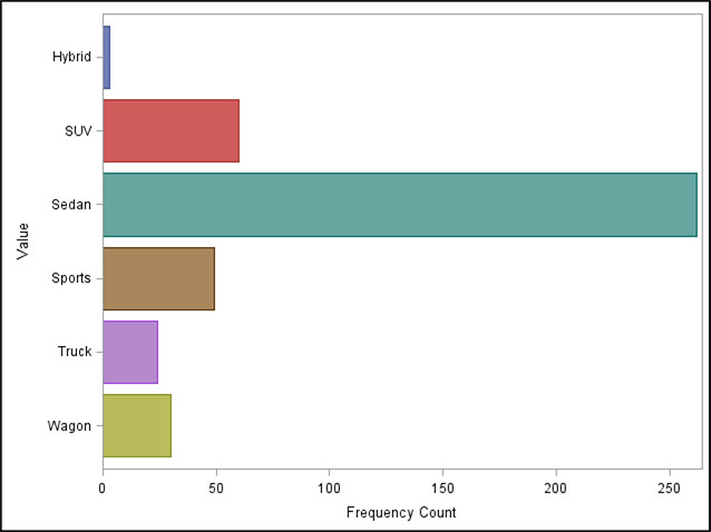
A frequency distribution table for a class variable typically displays counts and percentages. Table 3.1 shows a simple frequency analysis in a table that displays the frequency counts and percentages of the variable Type (of car). You can easily see that 262 cars, or 61.2%, of the cars represented by this data are sedans.
Table 3.1: Frequency Distribution Table for the Class Variable Type (of Car)
| Value | Frequency Count | Total Frequency (%) |
| Sedan | 262 | 61.2150 |
| SUV | 60 | 14.0187 |
| Sports | 49 | 11.4486 |
| Wagon | 30 | 7.0093 |
| Truck | 24 | 5.6075 |
| Hybrid | 3 | 0.7009 |
Figure 3.1 shows the same information in a bar chart. Although you can’t see exact percentages in the bar chart, this view can be easier for a quick comparison. You may want to use both because some people prefer tables, while others prefer visual displays of data such as charts.
Figure 3.1: Frequency Distribution Bar Chart for the Class Variable Type (of Car)
Continuous Variables
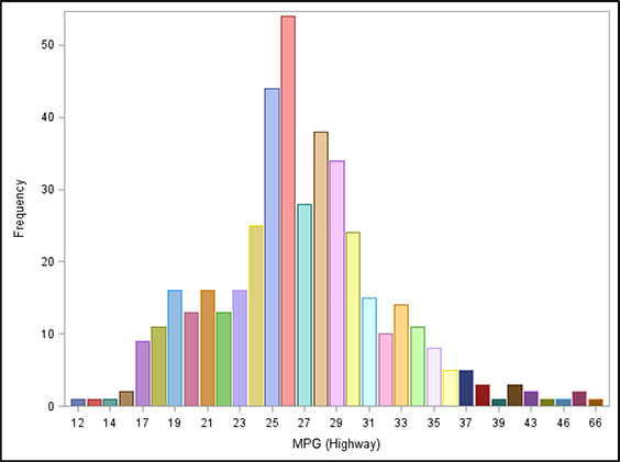
A frequency distribution table for a continuous variable typically displays population measures, such as the values for mean, median, minimum, and maximum. Table 3.2 displays the values for the variable miles per gallon (MPG) on the highway. You can read the number of total observations in the data (428). No values are missing. The total of 11,489 is the sum of MPG for the whole set of cars represented here. For the variable MPG_Highway, the total may not be meaningful. On the other hand, if it were a variable representing bank account balances, the sum would represent the total balances for the population. This value could be of interest to a financial institution. Additional values represented in the table are the mean MPG with a value of 26.84. The minimum is 0, and the maximum is 66.
Table 3.2: Frequency Distribution for the Continuous Variable MPG (Highway)
| Category | Measure |
| Number (Nonmissing) | 428.00 |
| Number Missing | 11.00 |
| Total Number | 489.00 |
| Minimum | 12.00 |
| Mean | 26.84 |
| Median | 26.00 |
| Maximum | 66.00 |
| Standard Mean | 0.28 |
Figure 3.2 displays the frequency distribution in a bar chart. The values are bucketed to show the underlying nature of the data. When you view the frequency distribution bar chart of a continuous variable, you learn additional information, such as the skewness of the distribution.
Figure 3.2: Frequency Distribution Bar Chart for the Continuous Variable Miles per Gallon (Highway)
Cluster
Cluster analysis, or clustering, is a data-driven process that groups observations into clusters that favor similarity within each cluster while favoring dissimilarity between clusters. The precise method used to calculate the similarities and differences will vary, depending on the goal of your analysis.
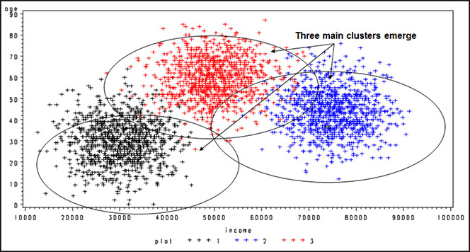
Figure 3.3 shows clusters that are not mutually exclusive. For example, one observation can populate more than one cluster. This cluster analysis shows segmentation by age and income. Notice that three groups form:
• low income and low age
• high income and medium age
• medium income and high age
Figure 3.3: Example of Cluster Analysis with Clusters That Are Not Mutually Exclusive
For use in marketing, the usual goal of cluster analysis is to separate people or companies into mutually exclusive groups. With SAS Enterprise Miner, clusters can be built into mutually exclusive segments, which are useful when segmenting a group of customers of companies. Chapter 7 includes an example of clustering into mutually exclusive segments.
Decision Tree
Generating a decision tree is another method of understanding data relationships that can be used for both descriptive analytics and predictive analytics. Tree analysis sequentially partitions the data to maximize the differences in the dependent variable on the basis of the independent variables. It is also known as a classification tree. The true purpose of the tree is to classify the data into distinct groups, or branches, that create the strongest differentiation in the values of the dependent variable.
Decision trees are good at identifying segments with a desired behavior such as response or activation. This identification can be quite useful when a company is trying to understand what is driving market behavior. It also has an advantage over regression in its ability to detect nonlinear relationships that can be useful for identifying interactions for inputs into other modeling techniques.
A decision tree is “grown” through a series of steps and rules that offer great flexibility. In Figure 3.4, the tree differentiates between responders and nonresponders. The top node provides details of the size and the performance of an overall marketing campaign in which offers were mailed to 10,000 potential customers and yielded a response rate of 2.6%. When examining the results, you can see that the first split is on gender. This split implies that the greatest difference between responders and nonresponders is their gender. Males are much more responsive (3.2%) than females (2.1%). So you can describe the responders as more heavily male. From a predictive standpoint, after one split you would consider males the better target group. For additional descriptive and predictive insights, you can split the tree within each gender to find additional subgroups that further discriminate between responders and nonresponders. In the next split, the two gender groups or nodes are considered separately.
Figure 3.4: Example of a Decision Tree for Target Marketing
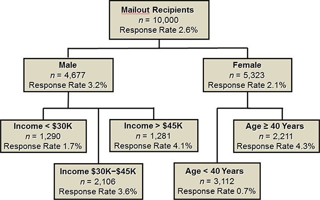
The second-level split from the male node is on income. This implies that income level varies the most between responders and nonresponders among the male customers. For female customers, the greatest difference is among age groups. So you can describe males with high incomes as among the best responders. You can describe females over age 40 as among the best responders. For predictive use, say that you decide to mail only to groups for which the response rate has been more than 3.5%; then, the offers would be directed to males who make more than $30,000 a year and to females older than age 40.
A definite advantage of decision trees over other techniques is their ability to explain the results. So if you develop a complex logistic model for scoring but it seems very hard to explain, a tree model might be helpful. Use the same variables from the complex model to build a tree model. Although the outcome is never identical, the tree does uncover key drivers in the market. Because of their broad applicability, decision trees will continue to be a valuable tool for all kinds of target modeling.
Predictive Analyses
Today, numerous tools are available for developing predictive models. Some use statistical methods such as linear regression and logistic regression. Others use nonstatistical or blended methods, such as neural networks, classification trees, and regression trees. Much debate rages about which is the best method.
The steps surrounding the model processing are more critical to the overall success of the project than the technique used to build the model. This is the reason that the focus here is on regression. Logistic regression is available in any statistical software package, and it appears to perform as well as other methods, especially when used over a period of months or years.
Linear Regression
In business, linear regression is useful for numerous measures that are in units of dollars or time. Simple linear regression analysis is a statistical technique that quantifies the relationship between two continuous variables: the dependent variable (the variable you are trying to predict) and the independent, or predictive, variable.
For example, Jake’s Web Design tracked its advertising expenses and resulting sales for 15 months. The values are shown in Table 3.3.
Table 3.3: Small Business Advertising Costs and Sales Revenue for 15 Months, in U.S. Dollars
| Month | Cost of Advertising | Sales Revenue |
| January | 120 | 1,503 |
| February | 160 | 1,755 |
| March | 205 | 2,971 |
| April | 210 | 1,682 |
| May | 225 | 3,497 |
| June | 230 | 1,998 |
| July | 290 | 4,528 |
| August | 315 | 2,937 |
| September | 375 | 3,622 |
| October | 390 | 4,402 |
| November | 440 | 3,844 |
| December | 475 | 4,470 |
| January | 490 | 5,492 |
| February | 550 | 4,398 |
| March | 120 | 1,503 |
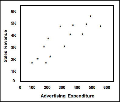
Figure 3.5 is a graphical representation of the 14 months of data from Table 3.1. It represents sales figures, together with the U.S. dollar amount that was spent on advertising for Jake’s Web Design. You can see a definite relationship between the two variables, sales and advertising expenditure; as the advertising expenditure increased, the sales also increased.
Figure 3.5: Scatterplot Example of a Simple Linear Regression of a Small Business’s Sales Revenue on Advertising Expenditures, in U.S. Dollars
The goal of the model is to predict sales revenue on the basis of advertising expenditures. This technique works by finding the line that, when drawn through the data, minimizes the squared error from each point (Figure 3.6).
Figure 3.6: Scatterplot Example, with Regression Line and Error Distance, of a Simple Linear Regression of a Small Business’s Sales Revenue on Advertising Expenditures, in U.S. Dollars
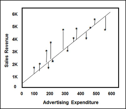
A regression analysis results in an equation that defines the relationship between the independent variables and the dependent variable. In our example shown in Figure 3.6, the equation sales = 866.59 + 7.81 × advertising indicates that the amount of expected sales is $866.59 plus 7.81 times the amount spent on advertising. A key measure of the strength of the relationship is the R2. It measures the amount of the overall variation in the data that is explained by the model. This particular regression analysis results in an R2 of 70%, meaning that 70% of the variation in Sales Revenue is explained by the variation in Advertising Expenditure in the regression model.
Multiple linear regression uses two or more independent, or predictive, variables to predict a continuous outcome variable. In Figure 3.7, credit card balances are a function of payment amount and customer age.
Figure 3.7: Example of Multiple Linear Regression of Credit Card Balance on Payment Amount and Customer Age
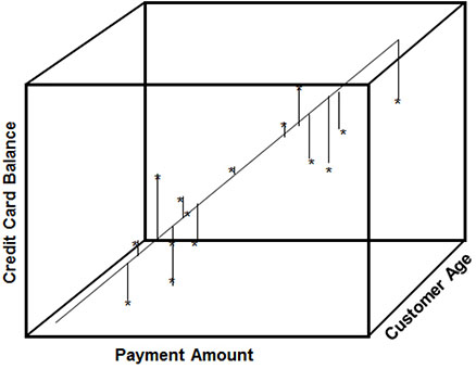
The equation credit card balances = 2.1774 + 9.4966 × payment amount + 1.2494 × customer age illustrates the predicted amount of credit card balances based on the customer’s age and regular payment amount.
Logistic Regression
Logistic regression resembles linear regression. The key difference is that the dependent variable is not continuous; it is discrete, or categorical. The discrete nature of the dependent variable makes it particularly useful in marketing because marketers often try to predict a discrete action, such as a response to an offer or a default on a loan.
Technically, logistic regression can be used to predict outcomes for two or more levels. When you build targeting models for marketing, however, the outcome is often bi-level. In these models, you predict the probability of one of these levels, and that probability must be from 0 to 1. A linear function of the predictor variables, however, is anywhere from negative infinity to positive infinity. Because logistic regression is a linear function of the predictor variables, a logit transformation is used to account for the difference between the two scales.
The goal in this section is to avoid heavy statistical jargon, but because logistic regression is a popular and powerful method for predictive analysis, an overview of the method is included. Remember that logistic regression resembles linear regression in the actual model processing.
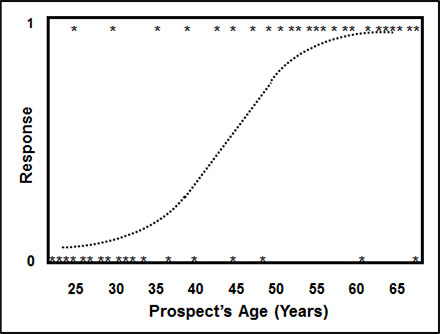
Figure 3.8 shows a relationship between response (0/1) and prospect’s age. The goal is to predict the probability of response to a catalog that sells high-end gifts using the prospect’s age. Notice how the data points have a value of 0 or 1 for response. On the prospect’s age axis, the values of 0 for response are clustered around the lower values for prospect’s age. Conversely, the values of 1 for response are clustered around the higher values for prospect’s age. A sigmoidal function, or s curve, is formed by averaging the 0s and 1s for each value of prospect’s age. You can see that older prospects respond at a higher rate than younger prospects.
Figure 3.8: Example of Simple Logistic Regression of Response (1 = Yes, 0 = No) to Sales Catalog on Prospect’s Age (Years)
The following steps detail the construction of the logit function in simple language. This logistic regression example does not duplicate the data represented in the above graph, but it conveys the general idea:
1. For each value of prospect’s age, calculate a probability (p) by averaging the values of response.
2. For each value of prospect’s age, calculate the odds by using the formula p/(1 - p).
3. The final transformation calculates the log of the odds: log (p/(1-p)).
4. The parameter estimates are derived using maximum likelihood estimation, which produces the parameter estimates that are most likely to occur given the data. The parameter estimates are related to the log of the odds as follows: log (p/(1 - p)) = β0 + β1X1 + β2X2 + … + βnXn, where β0 …βn are the parameter estimates and X1 … Xn are the predictive variables.
5. After the parameter estimates, also called coefficients or weights (βs), are derived, the final probability is calculated using the following formula: P = exp(β0 + β1X1 + β2X2+ … + βnXn)/(1 + exp (β0 + β1X1 + β2X2+ … + βnXn)). This formula is also written in a simpler form as follows: p = 1/(1 + exp (-(β0 + β1X1 + β2X2+ … + βnXn))).
6. The process considers the average value for response at each value of age. Values for p are bounded by 0 and 1. Using a link function, you derive a model using maximum likelihood. The result is log (p / (1 - p)) = 1.233 + 6.39 x prospect’s age and p = 1/(1 + e-(1.23+6.39xprospect’s age)).
The formula enables you to estimate the response rate, given the value for prospect’s age.
This example is a simple one; logistic regression models typically have numerous predictive variables.
Neural Networks
Neural network processing differs greatly from regression in that the process does not follow any statistical distribution. Instead, a neural network is modeled after the function of the human brain. The process is one of pattern recognition and error minimization. You can think of it as ingesting information and learning from each experience.
Neural networks are made up of nodes that are arranged in layers. This construction varies, depending on the type and complexity of the neural network. Figure 3.9 illustrates a simple neural network with one hidden layer. Before the process begins, the data is split into training and testing data sets. (A third group is sometimes held out for final validation.) Then weights or “inputs” are assigned to each of the nodes in the first layer. During each iteration, the inputs are processed through the system and compared with the actual value. The error is measured and fed back through the system to adjust the weights. In most cases, the weights improve in their ability to predict the actual values. The process ends when a predetermined minimum error level is reached.
Figure 3.9: Neural Network Schema Showing Flow of Data
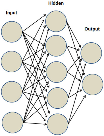
One specific type of neural network commonly used in marketing uses sigmoidal functions to fit each node. Recall that the sigmoidal function is the same function used in logistic regression. You might think about this type of neural network as a series of “nested” logistic regressions. This technique is powerful in fitting a binary, or two-level, outcome, such as a response to an offer or a default on a loan.
One of the advantages of a neural network is its ability to pick up nonlinear relationships in the data. This ability to pick up nonlinear relationships allows users to fit some types of data that would be difficult to fit by using regression. One drawback, however, is its tendency to overfit the data. Overfitting can cause the model to deteriorate more quickly when applied to new data. If this is the method of choice, be sure to carefully validate your data. Another disadvantage to consider is that the results of a neural network are often difficult to interpret.
Modeling Process
The modeling process has four main stages:
1. Define the objective.
2. Develop the model.
3. Implement the model.
4. Track and monitor the model.
Define the Objective
Defining the objective is the main theme of Chapter 1 because it is the most important step in the model building process. You can develop a perfect model using perfect data. But if it doesn’t meet your business objective, it is a waste of time and money. Make sure the objective of the model is in alignment with your overall business goals.
Develop the Model
The model development process comprises five steps.
1. Select the data.
2. Explore the data.
3. Modify the data and variables.
4. Build the model.
5. Assess the model.
If you follow this sequence, you will likely be successful in your model-building efforts.
Step 1: Select the Data
Once you have defined your objective, you need to get data for developing your model. Be sure it correlates with the business purpose for building the model. The data can come from a variety of sources. In some cases, data will need to be combined. The specific details of the data selection are highly specific to the project. To learn about many sources for data construction, see Chapter 4.
Step 2: Explore the Data
Once your data is available for analysis, you can use visual tools to view the distribution and completeness of the data. Several tables and graphs can display the data values and show you where data is incomplete or missing.
Step 3: Modify the Data and Variables
In this step, you can partition your data into training, test, and validation data sets. On the basis of your findings in your data exploration step, you can impute missing values and filter outliers.
To ensure the best fit for regression and neural network models, you may want to transform or segment continuous variables. To use class variables in a regression or neural network model, you need to make them numeric. The best way to do so is to create indicator variables for any variables with character or non-sequential values. For an example of this technique, see Chapter 9.
For continuous variables, you can select certain transformations to provide a better fit for your model. SAS Enterprise Miner gives you the option of letting the software pick the best transformation, as is demonstrated in Chapter 9. For more detail on variable transformations, see Data Mining Cookbook (Parr-Rud 2001, 85–97).
Step 4: Build the Model
The process of building the model is greatly streamlined within SAS Enterprise Miner. But it is still good to understand the underlying processes so that you are well prepared to uncover anomalies and errors.
Selection Method
Earlier in the chapter, you learned about three modeling techniques: decision tree, regression, and neural networks. Each of these techniques offers unique considerations when you are determining your selection method.
For the decision tree model, the variables are split into discrete groups; therefore, you don’t have to do any variable transformations or define a selection process. You can interactively build a tree if you are looking to select the variables that you want to enter the model. For information about building a tree interactively, see Decision Trees for Analytics Using SAS Enterprise Miner (DeVille and Neville 2013).
The order in which the variables are selected may affect the final outcome of the model. Many selection methods exist. Each one has its advantages and disadvantages. Depending on your particular business problem or resource situation, one method might be preferred over another.
For more detail on selection options for regression, see Data Mining Cookbook (Parr-Rud 2001, 104–105).
Optimal Number of Variables
A common question in relation to the model-building process is, what is the optimal number of variables?
The answer depends on the situation. Most models that predict well have 7 to 15 variables. In certain situations, using every variable might be optimal. Although the model might be large and difficult to interpret, the extra variables do not detract from the power or fit of the model. In some businesses where analytic resources are scarce and CPU power is abundant, using every variable is often the best option.
Multicollinearity
Another common question raised among predictive modelers is, should I worry about multicollinearity?
Multicollinearity exists when two or more independent, or predictive, variables are correlated with each other. This situation makes interpretation of the model equation difficult and is a common occurrence in scientific and medical research. However, when you develop a model for use in marketing or risk management, the interpretation of the model equation is not necessary for the model to be useful. So if the models are slightly correlated, it is not a problem. Moreover, if you use the sequential selection methods described in Step 4, then the correlation of the variables will be minimized. For more information on selection options for regression, see Data Mining Cookbook (Parr-Rud 2001, 106–108).
Step 5: Assess the Model
At this point, you are ready to evaluate your model. The main tool for evaluating the power of the model is the decile and lift analyses.
Gains Table
The gains table is a favorite among marketers and risk managers for evaluating and comparing models (Table 3.4). The most common type of assessment method in marketing and risk is decile analysis, which looks at the model performance in 10% groupings, or deciles. Within each decile, the gains table compares the model performance to the expected result that would have occurred if the names had been selected randomly–in essence, without the benefit of a model. The random result can also be referred to as the average performance.
Table 3.4: Gains Table Displaying Deciles Measure of Model Performance
| Decile | Number of Records | Mean Predicted Response (%) | Mean Actual Response (%) | Cumulative Mean Actual Response (%) | Number of Responders (% of Total) | Cumulative Total Responders (%) | Lift | Cumulative Lift |
| 1 | 8,468 | 7.52 | 7.53 | 7.53 | 638 (24.08) | 24.08 | 241 | 241 |
| 2 | 8,467 | 5.08 | 5.04 | 6.29 | 427 (16.12) | 40.20 | 161 | 201 |
| 3 | 8,466 | 4.00 | 4.44 | 5.67 | 376 (14.19) | 54.40 | 142 | 181 |
| 4 | 8,467 | 3.19 | 2.92 | 4.98 | 247 (09.32) | 63.72 | 93 | 159 |
| 5 | 8,463 | 2.65 | 2.40 | 4.47 | 203 (07.66) | 71.39 | 77 | 143 |
| 6 | 8,472 | 2.29 | 2.03 | 4.06 | 172 (06.49) | 77.88 | 65 | 130 |
| 7 | 8,466 | 2.02 | 2.08 | 3.78 | 176 (06.64) | 84.52 | 66 | 121 |
| 8 | 8,467 | 1.79 | 1.62 | 3.51 | 137 (05.17) | 89.69 | 52 | 112 |
| 9 | 8,467 | 1.59 | 1.62 | 3.30 | 137 (05.17) | 94.87 | 52 | 105 |
| 10 | 8,476 | 1.36 | 1.60 | 3.13 | 136 (05.13) | 100.00 | 51 | 100 |
| Total | 84,679 | NA | 3.13 | NA | 2,649 (100.00) | NA | NA | NA |
You create the deciles by sorting the file by its score or probability (high to low) and by then dividing it into 10% groupings. Each decile can display a number of calculations including quantities, mean performance, and lift.
You see that Table 3.4 offers a lot of information. The following list describes each column in order, from left to right:
1. Decile: Ordered from 1 to 10, decile 1 is the best performing decile and decile 10 is the worst performing decile based on response rate.
2. Number of Records: The value for records is the number of people or other data points in the population. Each decile is approximately 10% of the population.
3. Mean Predicted Response (%): Column 3 displays the average response rate predicted by the model.
4. Mean Actual Response (%): Column 4 displays the average actual response rate reflected in the data.
5. Cumulative Mean Actual Response (%): The average actual response rate is reflected in the data cumulative down through each decile.
6. Number of Responders (% of Total): Column 6 displays the count of responders in each decile.
7. Cumulative Total Responders (%): Column 7 displays the cumulative count of responders down through each decile.
8. Lift: Column 8 displays the model efficiency at each decile (further explanation below).
9. Cumulative Lift: Column 9 displays the cumulative model efficiency down through each decile (further explanation below).
Lift is a measure of the model’s ability to beat the random approach or average performance. Lift is another way of describing the model’s efficiency. The higher the lift, the more powerful the model. The lift in Decile 1 is 241. This means that the model performance is 2.41 times better than random or average in the top decile.
Cumulative lift shows the efficiency of a group of deciles starting with the best. For example, if we look at the top three deciles: if you mailed a random 30% of the file, you would expect to get 30% of the potential responders. Looking at column 6 in the top three deciles, the model captures (638 + 427 + 376) / 2649 = 54.40% of the potential responses. So the cumulative lift is 54.40/30*100 = 181. This result is equivalent to saying that you get an 81% higher-than-average response rate at a 30% depth of file, or that the model does 1.81 times better than average at 30% depth of file.
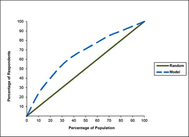
Gains Chart
A gains chart is a graphical representation of the cumulative percentage of a target group as compared to a random or average result at each decile, or 10% of the file. It is an excellent visual tool for showing the power of a model (Figure 3.10). For example, at 50% of the file, you can capture 71% of the responders, which represents a 45% increase in responses over a random selection.
Figure 3.10: Gains Chart Comparing Percentage of Responders for the Model with Percentage of Random Selection of the General Population
C Statistic
The C statistic is useful in providing a quick assessment of the model fit. It is a function of the percent concordant, percent discordant, percent tied, and total pairs. They are defined as follows:
• Percent Concordant: For all pairs of observations with different values of the dependent variable (response = 1/0), a pair is concordant if the observation with target value (response = 1) has a higher predicted event probability than the observation with the nontarget value (response = 0).
• Percent Discordant: For all pairs of observations with different values of the dependent variable (response = 1/0), a pair is discordant if the observation with target value (response = 1) has a lower predicted event probability than the observation with the nontarget value (response = 0).
• Percent Tied: For all pairs of observations with different values of the dependent variable (response = 1/0), a pair is tied if the observation with target value (response = 1) has an equal predicted event probability to the observation with the nontarget value (response = 0). In other words, it is neither concordant nor discordant.
• Pairs: This number is the total of possible paired combinations with different values of the dependent variable. The C statistic is defined as (nc + 0.5(t – nc – nd))/t, where t = the total number of pairs with different response values, nc = the number of concordant pairs, and nd = the number of discordant pairs.
Implement the Model
Model implementation is not a step in the model-building process per se, but discussing how to implement the model correctly is important for one reason: a perfectly good model will look like a bad model if not implemented correctly.
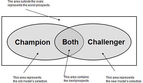
In many situations, a model is developed to replace an existing model. The old model might not be performing, or perhaps some new predictive information is available that can be incorporated into a new model. Whatever the reason, you will want to compare the new model, or the “challenger,” to the existing model, or “champion.” Again, depending on your goals, various ways exist to select your group of names for testing.
In Figure 3.11, the entire population is represented by the rectangle. The ovals represent the names selected by each model. If your “champion” model is still performing well, you might decide to mail the entire set of names selected by the “champion” and to mail a sample of names from the portion of the “challenger” oval that was not selected by the “champion.” This technique allows you to weight the names from the sample so that you can track and compare both models’ performance. If you want to estimate the performance of the population without the benefit of any model (for comparison purposes), you should mail a sample of names not selected by either model.
Figure 3.11: Comparison of Champion with Challenger in Prospect Selection
Maintain the Model
At this point, you have invested much time and many resources in creating a powerful model. Now you can ensure its longevity and usefulness by documenting and tracking it. Since the mid-1990s, I have worked with numerous modelers, marketers, and managers to develop and implement predictive models. Shockingly, often little is known about what models exist within the corporation, how they were built, and how they have been used to date. After all the time and effort spent developing and validating a model, the extra effort to document and track the model’s origin and utilization is certainly worthwhile. You begin by determining the expected life of the model.
Model Life
The life of a model depends on several factors. One of the main factors is the target. If you are modeling response, you can redevelop the model within a few months. If the target is risk, then you may not know how the model performs for a couple of years. If the model has an expected life of several years, then you may be able to track the performance along the way.
Some predictive models are developed on data with performance appended. If the performance window is three years, it should contain all the activity for the three-year period. In other words, if you want to predict bankruptcy over a three-year period, you will take all names that are current for time, T. The performance will then be measured in the time period from T + 6 to T + 36 months. So when the model is implemented on a new file, the performance can be measured or benchmarked at each six-month period.
If the model is not performing as expected, then the choice has to be made whether to continue use, rebuild, or refresh.
When a model begins to degrade, the decision must be made to rebuild or refresh the model. To rebuild means to start from scratch. You would use new data, build new variables, and rework the entire process. To refresh means to keep the current variables and rerun the model on new data.
Refreshing the model usually makes sense, unless an opportunity emerges to introduce new predictive information. For example, if a new data source becomes available, then incorporating that information into a new model might make sense. If a model is very old, testing the building of a new one might be advisable. Finally, if strong shifts occur in the marketplace, then a full-scale model redevelopment may be warranted, as happened in the credit card industry when low introductory rates were launched. In that event, the key drivers for response and balance transfers were changing with the drop-in rates.
Model Log
A model log is a record that, for each model, contains information such as development details, key features, and an implementation log. It tracks models over the long term with details such as the following:
• Model Name: Select a name that reflects the objective or product. Combining it with a number allows for tracking redevelopment models. Note the version number if applicable.
• Time of Model Development: Documenting the time range in which the model is developed allows you to track the entire model development process in relation to general business activities. This can be helpful when you are tracking hundreds of models within your organization.
• Model Developer: Because model development is as much an art as a science, models can have certain characteristics based on the person who developed the model.
• Overall Objective. The reason or purpose of the model is critical for ongoing relevance and tracking.
• Model Type: The technique used to build the model can include linear regression, logistic regression, decision tree, neural network, or ensemble models.
• Specific Target: The specific group of interest or value estimated assists in model deployment and comparison.
• Model Development Campaign Data: The campaign data used for model development identifies model details based on campaign characteristics.
• Model Implementation Campaign Data: The campaign data used for the first model implementation identifies model details based on campaign characteristics.
• Model Implementation Launch Date: Store the first date of the model implementation campaign.
• Score Distribution (Validation): The mean, standard deviation, minimum and maximum values of score characterize the structure of the validation sample.
• Score Distribution (Implementation): The mean, standard deviation, minimum and maximum values of score characterize the structure of the implementation sample.
• Selection Criteria: The score cut-off or depth of file represents the selection criteria
• Selection Business Logic: The business justification for the selection criteria helps define the model.
• Pre-Selects: The cuts prior to scoring are essential for accurate model implementation.
• Expected Performance: Note the expected rate of the target variable, such as response, approval, or other targeted action, which matches the specific target of the model.
• Actual Performance: Compare the actual rate of the target variable—such as response, approval, or other targeted action—to the expected performance.
• Model Details: The model details are characteristics about the model development that might be unique or unusual.
• Key Drivers: Key predictors in the model are the variables with the most power in the model.
A model log saves hours of time and effort because it serves as a quick reference for managers, marketers, and analysts to see what’s available, how models were developed, who the target audience is, and more.
For best results, use a spreadsheet with a separate sheet for each model. One sheet might look something like Table 3.5. A new sheet should be added each time a model is used. Each sheet should include the all of the elements in the log. If one model is a modification of another model, that can be noted in the version number.
Table 3.5: Sample Model Log as Tool for Organizing Important Tracking Details
| Log Item | Detail |
| Name of Model | R2000 V1 |
| Time of Model Development | MM/YY–MM/YY |
| Model Developer | Name |
| Overall Objective | Increase response |
| Type of Model | Logistic regression |
| Specific Target | Responders with > $10 purchase |
| Model Development Campaign (Date) | Spring Campaign (MM/YY) |
| First Campaign Implementation (Date) | Fall Campaign MM/YY |
| Model Implementation Launch Date | MM/DD/YY |
| Score Distribution (Validation) | Mean = .037, SD = .00059, Min = .0001, Max = .683 |
| Score Distribution (Implementation) | Mean = .034, SD = .00085, Min = .0001, Max = .462 |
| Selection Criteria | Deciles 1 through 5 |
| Selection Business Logic | Expected response > .06 |
| Preselects | Age 25-65; Minimum risk screening |
| Expected Performance | $25,500 |
| Actual Performance | $26,243 |
| Execution Details | Sampled lower deciles for model validation and redevelopment |
| Key Drivers | Date of last purchase, population density |
This document will save you time and prevent errors and duplicate efforts. When combined with other model logs, it can be used as a reference library for all modeling projects within your department or company.
Notes from the Field
Big data is a driving force in business today. It’s only getting bigger, so the pressure to use big data to gain or maintain a competitive advantage is only going to increase. This trend and the complexity it entails make the right kind of analysis critical.
When you are first introduced to a data set or you are given a new business challenge or opportunity, it’s tempting to leap ahead and build that fancy predictive model. But you should always begin by really understanding the underlying data patterns and how the different data characteristics relate to one another. If your goal is to develop a predictive model, then the initial insights gleaned from the descriptive analysis will provide clues for building your variables and data interactions. Descriptive analysis may also alert you to underlying data problems, like missing values and data biases, earlier in the process. If you are working with a client or team, you may get some benefit from sharing your early findings from the descriptive analysis with stakeholders who may have additional business insights or suggestions.