
After completing this chapter, you will be able to
Differentiate between business communities that consume BI.
Understand the typical progression of BI.
Determine the best BI tools for your needs.
As described in Chapter 1, business intelligence (BI) is a general term used to describe the development of insights from one or more tools that allow information workers and decision-makers in a company to understand what has happened in the past and to compare past events to what is happening now. With these insights, they can set appropriate goals for the company, monitor ongoing progress towards those goals, and take corrective action whenever necessary. This chapter focuses on the reporting and analysis tools that make these insights possible. In turn, these tools rely on a supporting infrastructure of trusted data, described in Chapter 3.
If you’re a business user, your primary interaction with a BI solution is with the presentation layer. However, the Microsoft stack includes a variety of tools with overlapping capabilities that can seem confusing at first glance. This chapter can help you understand how these tools support different scenarios, how your choice of which tool to use can change over time, and how to select the right tool for the task at hand.
If, on the other hand, you’re a BI developer or SharePoint administrator, this chapter can help you develop and support a successful BI implementation. You need to understand the different ways that users can interact with data, now and in the future, and the implications of tool selection for the overall architecture.
This chapter starts by examining the analysis needs of business user communities and how the Microsoft reporting and analysis tools serve these communities. It then reviews the typical progression of competency with BI within a company and how that progression affects the mix of tools for business users. Finally, it provides a guide to selecting the right tool for the community and analytical requirements applicable to you.
When it comes to BI, business users are likely to have different information needs, depending on their technical skills, the types of decisions they make, and how they need to save and share their insights. In several different ways, business users with common characteristics can be grouped into separate user communities. By understanding the needs of these business user communities from a variety of perspectives, you can select the tools that best support those needs.
One common way to differentiate business users is to separate them into two communities—casual users and power users. Casual users might be department managers, executives, or even external stakeholders such as customers or suppliers. Casual users tend to be infrequent users of BI, perhaps once per week or less, whereas power users are often daily users of BI.
Because casual users spend less time with BI, their skill level with BI tools is much lower than that of power users. Therefore, the interfaces to such tools must be simple so that they can find the information they need on their own. For these users, a web-based reporting application works well. The tools that help a casual user interact with data and develop insights tend to be very simple and focused on specific sets of data.
But making tools simple for casual users often makes them too simple for power users, who typically require access to a wide variety of data and need more on-demand analytical capabilities. Power users spend enough time working regularly with BI tools that they develop advanced technical skills. These users, typically business analysts and analytical modelers, need tools that give them the ability to explore the data without restraint.
Another way to distinguish casual users and power users is by assessing their familiarity with the data. It’s quite possible that a person can be quite knowledgeable about the data in his or her own department and thus qualify as a power user, requiring a more analytical BI tool for daily work. It’s also possible that this same person has access to data in another department but is less familiar with that data. For that situation, this user needs a basic reporting tool that simplifies information access.
In their book Business Intelligence: Making Better Decisions Faster, Elizabeth Vitt, Michael Luckevich, and Stacia Misner break down the casual users down into two groups—information users and information consumers, as shown in the following illustration, in which the pyramid shows the relative size of all three groups of business user communities.
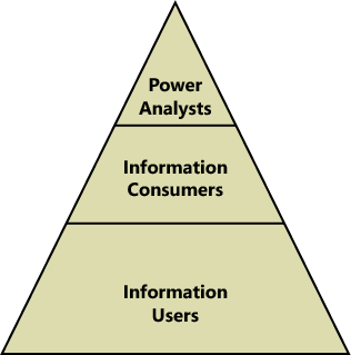
The largest community consists of information users, who rely on standard reports that BI developers publish to a central location. These reports may be accessible either online or in print, depending on the distribution mechanism that the report administrators implement. For this business user community, SQL Server Reporting Services is a good solution, either running as an independent application or integrated with SharePoint Server 2010. It provides a scalable online environment for viewing reports that administrators can secure, and it can deliver reports in a variety of formats on a scheduled basis via email or to a network file share.
Information consumers are the second community of casual users. They tend to explore the data more than the information users, but they lack the expertise necessary to query a database directly. They can get the information they need by working with interactive reports that include parameters for filtering and sorting or that include options to change the visibility of selected report elements. Interactive reports can also include the ability to drill down to more detail, either by displaying the details in the same report or by opening a separate report for the details. Again, Reporting Services is the best choice for meeting the needs of this community. With a proper understanding of information consumers’ needs, a report author can incorporate a variety of interactive features into reports.
At the top of the pyramid, power analysts are the smallest community. Power analysts might use existing reports as a starting point for analysis, but they also need the ability to define and execute their own queries. In some cases, they might even build reports for the other communities. For example, a power user can use Report Builder 3.0 to create a report based on their own queries and then publish the entire report (or even individual elements of the report, called report parts) for the other user communities to access. Information consumers can build up a customized report from these report parts without knowing anything about how to construct a query or how to design the report part.
As flexible as Reporting Services is, it’s still a reporting tool and has limited support for the type of ad hoc analysis that power analysts frequently perform. A more commonly used tool for analysis is Microsoft Excel 2010. A power analyst can group and filter data in a pivot table and create additional calculations to supplement analysis of the data. If analysis requires integrating data from multiple data sources, the power analyst can use PowerPivot for Excel.
The position of a business user within the organizational hierarchy and the decision-making associated with that position often play a role in the type of information and the BI tool that the user requires. The higher the business user is in the hierarchy, the more likely that the user is an information consumer as described in the preceding section. Furthermore, the higher in the hierarchy a user is, the more likely it is that the information that user relies on is already cleansed and highly processed, is already compatible with data from different sources, and has been restructured for reporting and analysis.
Because this information has long-term value and is vital to strategic planning, a solid BI infrastructure exists to automate the necessary cleansing and processing. Usually this information is provided to upper management in a summarized, structured format with limited analytical capabilities. Reporting Services can be useful as a delivery mechanism for this type of information online, in print, or via email. Other online viewing options include dashboards and scorecards in SharePoint Server 2010 or PerformancePoint Services.
As business users move closer to the operations of the business, their information needs diverge, depending on the type of work a user performs. People at this level of the organizational hierarchy can be information users, information consumers, or power analysts.
The information requirements of these users differ from those of upper management because these users often combine official corporate data from a BI system with other data either created manually or obtained from external sources. This combination of data might occur only occasionally or might be an ongoing exercise. Either way, this type of quick and dirty data mash-up typically has only short-term value, so it’s not a candidate for a formal BI implementation. On the other hand, it’s a perfect scenario for PowerPivot for Excel, which very easily accommodates this type of ad hoc data integration.
Microsoft has another way of grouping users, which focuses instead on how users work with BI and how much collaboration they require. These BI communities, and the BI tools designed for each community, are shown in the following illustration. As you can see in this diagram, some overlap of tools exists between communities.

Some popular ways to deliver BI to all employees in a company are to provide access to metrics that show progress towards organizational goals or to compare a current state to historical trends. Ideally, users of organizational BI can break down this information to see how their individual departments contribute to current conditions. Because the intended audience of information is the entire company, you can anticipate that the audience consists largely of information users and information consumers. Therefore, an organizational BI solution needs to support only online viewing, with limited interaction.
Typically, this information comes from approved data sources that have been staged, transformed, and restructured into a data warehouse. Ideally, this data has also been incorporated into an Analysis Services cube to provide both faster reporting to all business users and more flexible analysis for the power analysts.
Whether the data is stored in a relational database or a cube, the three primary tools for consuming this data at the organizational level are Excel Services, PerformancePoint Services, and Reporting Services. Excel Services and PerformancePoint Services require a SharePoint Server 2010 installation, with scalability achieved by setting up a SharePoint farm to distribute the workload. Reporting Services can be integrated into a SharePoint farm or can run independently. All these services require IT support to install and configure the environment.
In organizational BI solutions, business users tend to be consumers of published content rather than contributors. Content contributors are usually BI developers, IT professionals, and, in some cases, power analysts. The prevailing concept in organizational BI is to centralize content by using defined standards for layout, naming conventions, and color schemes. This BI can be consumed as is or can be used as base components by power users, who aggregate these with other content suitable for a targeted audience.
Each of the tools discussed in this section solves specific problems for organizational BI, starting with the most commonly implemented tool. The following descriptions of each tool aren’t intended to be comprehensive; they focus on the features that address specific challenges that organizations face when implementing BI.
Many organizations start with standard reports by implementing Reporting Services. If it’s set up to run in SharePoint integrated mode, Reporting Services relies on the same security model and centralized storage that SharePoint uses, which makes it easier to administer. Report administrators can control how reports execute to balance performance against timeliness of data, either by setting up a report to run on-demand to view current data or to use caching to execute it in advance and minimize the wait time for viewing.
Having reports available in a SharePoint document library also makes it easier for business users to find information for online viewing. Users have only one place to go for all corporate information, whether that information is in the form of Reporting Services reports, Excel workbooks, or other content. The interface is simple for users to access because reports are stored like any other content on the SharePoint server, making it a good option for information delivery to a wide audience of casual users. (Even if you run Reporting Services in native mode—without SharePoint Server 2010—the interface remains easy to use.) As an alternative, reports can be sent directly to users via email as often as necessary.
Reporting Services is also popular for its ability to produce pixel-perfect reports. The report author, typically an IT professional, has a high degree of control over the appearance and behavior of report elements to produce just the right layout, whether users view the report online or export it to another format. Also, with some advance thought about the types of questions that a user might ask when viewing a report, the report author can build in parameters for filtering and can add interactive features that lead the user to additional answers.
Crossing over into the team and personal BI communities, Reporting Services also supports a variety of export formats, allowing any user to save the report in a print-ready format such as a Portable Document Format (PDF) file or to incorporate information into a Word document. Moreover, the user can reuse the information in a report simply by using a Web Part to include it in a dashboard. Users with more advanced skills can export report data for further analysis into Excel or can set up a report as a data feed for ongoing analysis with PowerPivot for Excel. In addition, BI developers can incorporate reports into PerformancePoint Services dashboards. And reusability doesn’t stop there. In companies with mature BI implementations, application developers can embed Reporting Services content in custom analytical applications through application programming interfaces (APIs).
Although Reporting Services can produce some reports with complex calculations, it is limited in what it can do. It isn’t meant to be a replacement for Excel. On the other hand, Excel isn’t meant to be a corporate reporting solution. Although it provides a lot of formatting options and can handle complex calculations, Excel does not support the same control over formatting that’s available in Reporting Services and it has limits on the amount of data that can be stored in a workbook. (If you’re creating workbooks with PowerPivot for Excel, the limits are much higher.) However, sharing Excel workbooks through Excel Services can be a reasonable reporting alternative for organizations that aren’t using Reporting Services.
Excel Services runs as a SharePoint Server 2010 service application. The advantage of using Excel Services is that organizations can take advantage of the SharePoint infrastructure to deliver information contained in workbooks to a wide audience, which is a much better approach than sending them to users through the email system. Users don’t need to have Excel or any other type of application or plug-in installed on their computer; they just need to use a supported browser—Internet Explorer or Mozilla Firefox on a computer running a Windows operating system, or Safari on a non-Windows system. And because the workbooks are stored in SharePoint, the users need only to learn how to use one interface to access any corporate content.
Excel Services also provides a more secure and scalable approach than email distribution. Administrators and content owners can control whether users can only view a document online or whether they can download it. It’s also possible to restrict viewing to certain sheets or selected items in the workbook when it’s important to hide intellectual property or the detailed data behind a particular cell value. Furthermore, the Excel Services calculation engine handles all the complex calculations for multiple concurrent users, thus sparing hardware resources on the user’s computer.
When an Excel workbook sources data from an Analysis Services cube, Excel Services supports drilling, filtering, and sorting data in a pivot table. Although the user cannot replace dimensions on the pivot table’s rows, columns, or filter axes, the interactivity is still better than Reporting Services can support. For organizational BI, in which dissemination of information is a higher priority than supporting analysis, this limitation of Excel Services should not be an obstacle.
The workbook author can configure the report to accept parameters from the user for another type of interactivity. When the user views the workbook in Excel services, the user can type in the parameter values, which can in turn be input values for a calculation. This feature allows the user to dynamically change workbook content using a simple interface.
Another benefit of Excel Services is the reusability of information contained in workbooks for the team and personal BI communities. Users can reference cell values in an Excel workbook published to SharePoint to create status indicators, which are a very simple type of key performance indicator (KPI) having only three possible levels. Also, by using Excel Web Access Web Parts, more advanced users can use workbooks, in whole or in part, in dashboards. Parameters in the workbook can be connected to Filter Web Parts, allowing users to change content for multiple Web Parts on the same dashboard page with a single filter. In addition, an Excel workbook can provide source data for a Chart Web Part.
BI developers can take advantage of Excel workbooks in several ways. Data in a workbook can be a data source for various content types in PerformancePoint Services, while a workbook itself can display in a PerformancePoint Services dashboard. For customized web-based analytical applications, application developers can use the Excel Services REST API or the ECMAScript object model to display and interact with workbooks as described in Chapter 4.
Companies with a clearly defined performance management strategy use PerformancePoint Services to communicate progress towards established goals. The basic dashboard capabilities in SharePoint Server 2010 might be the first step that some companies take as they develop corporate performance analytics, but PerformancePoint Services is preferred for its advanced dashboard functionality. It also includes components such as scorecards, analytical reports, strategy maps, and filters that BI developers and power analysts can use with either PerformancePoint or SharePoint dashboards.
The best data source for PerformancePoint Services components is an Analysis Services cube, which delivers the best performance for viewing and interacting with content. With respect to the analytical grid, analytical charts, and decomposition tree, a cube is the only type of data source these reports can use. The analytical reports are the best way to support drilling and pivoting in a web browser environment. BI developers can structure dashboards to simplify the use of analytical reports for casual users who might feel overwhelmed by the functionality these reports provide, but the decomposition tree cannot be built in advance. Power analysts who fully understand the data source and the tool’s capabilities will appreciate the support for ad hoc analysis in these report types.
Apart from the analytical components in PerformancePoint Services, dashboards and scorecards are simple enough for the casual user to explore. A benefit of using PerformancePoint content types to build dashboards and scorecards is the ability for the BI developer to integrate multiple data sources so that business users can see related content in one location. For example, rather than opening an Excel workbook to see the established organizational goals and then opening a Reporting Services report to see the current status from an operations data source, the user can instead see the goals and the status side by side in one report, no matter where the source data is actually stored.
Although plenty of advantages are gained by using PerformancePoint Services, some disadvantages must be pointed out: First, the formatting options are limited as compared to Reporting Services or Excel. Second, developers can use PerformancePoint Services dashboards to combine a lot of content built for other purposes and can reuse many PerformancePoint content types in SharePoint dashboards, but that’s it. The only other way to reuse content built for PerformancePoint Services is to build custom applications by using the PerformancePoint Services API.
An easy way to get started with BI is to focus on a single community within an organization, which might be preferable because it’s faster to deliver initially than an organization-wide initiative. The target community might be an entire department or perhaps a small team within a department. Or it could be a project team in which multiple departments are represented, or it could even be a group of people external to the organization, such as customers.
The key differentiators between team BI and organization BI are the scope of the information provided to the target audience and a greater participation in the content development process by the team community. Consequently, the ideal BI infrastructure provides an opportunity for the team to use the information collaboratively as they work toward a common goal.
Like organizational BI, data for a team BI solution often comes from approved, cleansed, and processed sources and is quite possibly stored in an Analysis Services cube. However, the scope of the data tends to be more limited. For example, a data mart built from a single data source might be the primary data of interest for team BI.
Team BI solutions can use the same tools that are prevalent in organizational BI. In addition, team BI might also include SharePoint BI, Visio Services, and PowerPivot for SharePoint as additional options for creating and sharing content. Casual users can easily view content produced with any of these tools within SharePoint as part of a dashboard or as individual documents stored in a document library. Power analysts and BI developers typically share responsibility for creating and managing content for team BI.
Let’s start by reviewing the three new tools added to the mix, and then we can revisit the other tools to learn how their usage changes when implemented for team BI communities.
SharePoint Server 2010 includes several features that make it ideal for team BI, especially for teams without much existing infrastructure already in place. In fact, once IT has given a team access to a SharePoint site, power analysts on the team can manage content for consumption by the team BI community with relatively little effort. The ease of implementation translates to simple capabilities, but for teams that are new to BI, these simple capabilities might be all that casual users need.
Another benefit of SharePoint BI is the ability to combine content in a single location from team members who are using different tools. That way, no one is forced into learning a new tool for content creation or investing in the hardware, software, and processes necessary to support even a small data mart before the migration to a new tool or process is absolutely necessary.
To get started quickly, a SharePoint site collection owner can create a specialized site type called Business Intelligence Center. It includes a set of libraries and supports content types specific to BI, such as Excel workbooks and dashboards. It can also store reports if Reporting Services is configured to run in SharePoint integrated mode. In addition, the Business Intelligence Center includes a special document library for data connections that power analysts and BI developers can use to create new workbooks, reports, Visio diagrams, and PerformancePoint content.
SharePoint BI also includes a special type of SharePoint list for storing status indicators which, as explained earlier in this chapter, are a simple type of KPI. Status indicators are simple enough for business users to use for reporting progress on activities just by updating fixed values manually or by finding a KPI stored in an Analysis Services cube. More adventurous users can also build a status indicator from an Excel workbook or a SharePoint list. It’s important to note that these status indicators are really intended as a baby step into the world of performance management. Users can view them only in status indicator lists and dashboards. They can’t be reused in any other tool that has a KPI capability.
We’ve already mentioned SharePoint dashboards as a way to present workbooks, reports, and PerformancePoint components. Dashboards can include all kinds of other content, such as status indicators, Visio Services diagrams, Chart Web Parts, and Filter Web Parts. They’re supposed to be simple enough to enable anyone to build a dashboard page, but in reality, power analysts and BI developers are the creators of dashboards.
Chart Web Parts provide a way for more advanced users to display data visually if using a workbook or using Reporting Services isn’t an option. It supports only a few data sources, but it can be a quick way to add a chart to a dashboard. The chart can display data from another Web Part on the same dashboard page or from a SharePoint list, a Business Data Catalog, or an Excel workbook. It’s not reusable by any other tool.
Filter Web Parts on the dashboard make it easy to customize content on a dashboard page for each user. The same filter value can update multiple Web Parts on the same page. Working with dashboard pages is not difficult when merely adding a group of Web Parts. However, it can be a bit more challenging to configure correctly when attempting to link these Web Parts together for use with a filter, especially if the Web Parts come from different data sources. For this reason, constructing anything but the simplest of dashboards is usually a task assigned to a BI developer.
Visio Services provides a whole new to way visualize data. It supports live connections to data sources for use in web-based Visio diagrams that display information ranging from a color-coded status about projects to the current state of processes, to the availability of servers, and so on. Conceptually, the purpose of a Visio diagram is similar to that of a dashboard because it helps business users see trends and outliers at a glance.
Visio diagrams are accessible in a document library or can be added to a SharePoint dashboard by using a Visio Web Access Web Part, so they are just as easy for users to consume as any other content available in SharePoint. Like Excel Services with workbooks, Visio Services does not require users to have Visio installed on their computers before they can view a diagram published to SharePoint.
The development of Visio diagrams is in the realm of a specialist who understands how to build Visio diagrams and how to connect the data to the diagram properly by using the desktop application Visio 2010. Supported data sources for Visio Services include SQL Server, SharePoint lists, Excel Services, Access, and any source accessible with an OLE DB or ODBC provider. No other tool provides functionality like Visio Services, so the diagrams are not reusable for team BI outside of SharePoint unless the team develops a custom application.
PowerPivot for SharePoint is a service application that relies on Excel Services to execute queries and render PowerPivot for Excel workbooks on demand and includes management capabilities unique to PowerPivot workbooks. It requires a separate installation and configuration process on a SharePoint farm. Its purpose is to provide a link between self-service BI and team BI.
Business users, usually power analysts, can publish their PowerPivot for Excel workbooks to SharePoint, either in a standard document library or in a specialized document library that displays thumbnail images of workbooks to enable users to find the workbook they want without first opening it. Just as with Excel workbooks, administrators and workbook owners can control access and restrict users to online viewing only, thereby protecting the data contained in the workbook.
Beyond enabling the sharing of information with other team members and supporting concurrent access in a scalable environment, PowerPivot for SharePoint has several other benefits for business users. PowerPivot workbooks do not maintain live connections to the data sources, so a periodic refresh is necessary to keep the information as current as possible. PowerPivot for SharePoint can manage the data refresh process on a schedule and send out notifications if a problem occurs. In addition, PowerPivot for SharePoint can become a data source for another PowerPivot workbook, a Reporting Services report, and any other tool that can use Analysis Services as a data source.
PowerPivot for SharePoint has features for IT professionals as well. Often, any information that gets managed by users rather than IT can go undetected. A user might create a report to answer a one-time question, and then, under certain circumstances, the report suddenly can become a mission-critical application that IT knows nothing about. PowerPivot for Excel gives users the freedom to compile information as they see fit, while publishing the results to SharePoint allows IT to use management features in PowerPivot for SharePoint to maintain some oversight over the users’ activities. IT can see what data sources are being used, which workbooks are popular, and how many server resources are necessary to render a report for the team community. When appropriate, IT can recommend a proper BI solution to take the place of a PowerPivot workbook.
Excel Services can be just as important to a team BI community as it is to an organizational community, if not more so. To support this community and encourage power users to develop content, IT can supply a set of data source connection files in a data connections library.
As with Excel Services, a good strategy for IT (or power analysts) to adopt in support of team BI is to create and publish reusable content that users can access for team content development. In the case of Reporting Services, three types of content support this strategy: shared data sources, shared datasets, and report parts.
Shared datasets contain the query strings necessary to retrieve data from a data source and hide the technical details from the user who can take the dataset and build up a report completely from scratch, using the Report Builder 3.0 authoring tool. This tool is much simpler to use than the report designer used by BI developers, providing enough flexibility and freedom for power analysts to construct a report according to their needs but also providing wizards to guide less-technical users through the process of building simple report layouts.
The use of report parts is another option available to further simplify the report development process for users who might otherwise fall into the category of information user. Report parts, as mentioned earlier in this chapter, are individual elements in a report, such as a map, a chart, or a table, which can be published independently of the original report in which they were created. Report Builder 3.0 includes a Report Part Gallery that users can browse to locate items they would like to include in a report and arrange in any way they like. Everything necessary for the report part to work gets added to the report along with the report part, so the user doesn’t need to know how to set up data sources, datasets, or parameters in order to build a report successfully by using report parts. If the user has enough technical skill to create a Word document, that user probably is capable of building a report entirely from report parts.
A team BI community can use PerformancePoint Services for department-focused dashboards and scorecards. As with report parts, an IT professional or a designated power user can construct individual components, such as data sources, KPIs, filters, scorecards, and reports that users can use in a SharePoint dashboard, which would be easier to construct for the more advanced information user or power analyst than a PerformancePoint dashboard.
The whole point of building BI infrastructures that contain a data warehouse, data mart, or Analysis Services cube is to allow users to get information when they need it, on a self-service basis. But in many companies, users still rely on standard reports that have limited interactivity. The reports might have parameters that allow users to filter the reports, or they might allow the users to drill down into more detail. Regardless, these reports are typically built to answer one question but not necessarily the next question that the user might have. So when these new questions arise, users wind up going back to IT to get those reports.
As an alternative, users start looking outside the approved sources because they need to get information to make decisions. They may get information from wherever they can find it internally; they may get it from external business partners; and maybe they’ll find some data on industry trends that they can download from an Internet site. In short, they wind up manually compiling a lot of data. The bottom line is that the data they need for decision-making on a day-to-day basis is not getting integrated into the corporate system, and that’s the problem that self-service BI is intended to solve.
Due to the overlap with organizational and team BI communities, we’ve already touched on the tools commonly used by this community: Excel, PowerPivot for Excel, Report Builder, and Visio. Casual users are more likely to use Excel and Report Builder, while power users may use any of these tools as applicable to the task at hand. A user can use any of these tools to create a document for personal reference or can share the document with a team BI community by publishing it to a SharePoint document library.
How would a user decide which tool to use? Let’s review the characteristics of the documents produced by each tool.
Excel is a tool commonly preferred by users of all skill levels for ad hoc reporting and analysis. Users can retrieve data from data sources and combine it with manual data. A user can import data and then manipulate the data by creating charts, sorting, filtering, and applying a wide range of calculations from simple to complex. Casual users might use Excel for simple summing and averaging of data, whereas power users might create complex forecasting models. Power users can also create PivotTables from raw data or from Analysis Services data sources for analysis using aggregate functions to summarize data grouped on rows and columns and using filters and slicers to focus on a subset of data. Although the creation of a PivotTable is generally a task for the power user, a casual user can easily explore a PivotTable that has already been created.
Excel is ubiquitous in many organizations, so most users already have a passing familiarity with this tool. Even if they don’t create the workbooks themselves, they can access workbooks from SharePoint and, as long as they have the right permissions, download workbooks for personal use. Then they can apply calculations, filter the data, and make other changes to the data without affecting the original workbook.
As flexible as Excel can be, it can also be a challenge to combine data from multiple data sources for analysis and to keep the data refreshed. That’s where PowerPivot for Excel comes in. It can also use reports as one of its data sources. As another plus, PowerPivot can handle much more data than Excel. Like standard Excel, it’s good for interactive exploration of data.
Users don’t need to understand relationships between tables created by drawing together data from disparate sources, and PowerPivot can recommend relationships based on its analysis of the contents of data from each source. Calculations can be added by using Data Analysis Expressions (DAX), as described in Chapter 5. This language is Excel-like, which makes it easier for users to create calculations if they’re already comfortable with Excel functions. PowerPivot for Excel does make self-service BI easier, but primarily for power users. Casual users benefit most from PowerPivot for Excel when power users publish workbooks to SharePoint.
Report Builder is a desirable tool for users who want to produce a specific type of report layout and also want to store reports in a centralized location, whether for personal use or for sharing with others. Even if a user creates a report for personal consumption, the user can subscribe to the report to receive a report with fresh data on a regular schedule.
Visio is the only tool that provides data-driven diagrams. Of all the self-service BI tools, Visio is least likely to be used for personal consumption. For example, if a user is monitoring the status of a process, it’s easier to build a simple report by using one of the other tools. It’s more likely that a power user or BI developer will use Visio to create diagrams to publish to SharePoint for sharing with a team BI community.
The Microsoft vision for BI can be summarized simply as the delivery of the right information at the right time in the right format to users at all levels of a company. It’s a noble goal, and the Microsoft tools can indeed help companies attain this goal, but not from day one. Instead, the democratization of BI across the organization occurs incrementally. The length of time required depends on many factors, such as the corporate culture overall, management’s attitude towards BI, and a support system for users, among others.
An understanding of the typical progression that many companies experience as they expand their use of BI can help in many ways. It can affirm that your company is moving in the right direction, and it can also show you the possibilities that remain for further progression. It can also help you determine which tools are best suited for your current stage and help you prepare for the next.
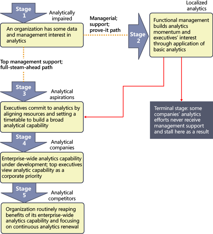
Wayne Eckerson developed the Business Intelligence Maturity Model for The Data Warehousing Institute™ (TDWI) as a means for organizations to benchmark their deployments against other companies. At a high level, the model identifies six stages that mark the progression of BI from a cost center to a strategic asset. As shown in the following illustration, by plotting the typical user adoption rate along the six stages of the model, Eckerson’s research revealed a bell curve in most organizations in stages 2 and 3. It’s important to understand that companies don’t necessarily follow a linear progression from stages 0 to 5. Stages often overlap, and the length of time that a company remains in a particular stage can vary.
Note
You can download a poster illustrating the Business Intelligence Maturity Model from http://tdwi.org/pages/posters/business-intelligence-maturity-model.aspx . You can also use TDWI’s online assessment tool to benchmark your company’s BI maturity by completing the survey at http://tdwi.org/pages/assessments/benchmark-your-bi-maturity-with-tdwis-new-assessment-tool.aspx .

Notable aspects of the model are the Gulf and the Chasm, which highlight the reality that BI implementations are not likely to proceed smoothly from one stage to another. As Eckerson discussed these findings with BI implementers, he discovered that the inclusion of these two obstacles in the model validated their experience that setbacks in BI implementations and flagging enthusiasm for pursuing pervasive BI are a normal part of the process. Perseverance pays off for teams that can stay focused on the steps necessary to expand the capabilities of their BI infrastructure.
Even within the same company, it’s very likely that each department will mature at different rates. That’s okay. The good news is that wherever people are, they have tools to support them, they can transition to higher levels of maturity over time, and the tools can adapt accordingly. Each successive step in the maturation process translates into greater business value.
In this section, we provide an overview of the characteristics of each stage of the BI Maturity Model and describe the tools that are useful in each stage.
In the prenatal stage, a company has yet to create a data warehouse to support information requirements. Instead, all reports are sourced from operational systems, with no consolidation of information across systems without special processes in place. That is, there are no formal Extract, Transform, and Load (ETL) processes. Financial applications often have the richest set of reports available in the company and are the primary source for management reports. At this point, the available reports are static and focus on historical events to help users understand what has happened. Any changes desired by users require customization by IT, but it’s not uncommon for such requests to take weeks or months to fulfill.
To transition from the rigid reporting system typical of this stage to a formal BI solution, many companies start by reproducing their existing reports in Reporting Services. Although the problems associated with responding to requests for customization don’t go away, with some forethought, parameterization of reports can enable users to make changes to the report content, which in some cases might forestall the need for one-off report development.
When users can’t get what they need from the operational reports, they often develop their own solutions, which leads to a proliferation of reports based on spreadsheets or Microsoft Access databases that users have cobbled together. Such user-developed data collections are also described as spreadmarts, shadow systems, or skunkworks projects.
Executives often enlist analysts to compile briefing books based on these informal data collections. The focus begins to shift from trying to understand what has happened in the past to attempting to understand how past results might influence what happens in the future.
What starts as a compilation of official data for a specific need can grow into a mission-critical solution that people come to rely on, yet it’s unmanaged, unsecured, and unauditable. It can take a lot of manual labor to gather and manipulate the data, leaving little time to analyze the data collected before a decision from the user is required. The concern of each user in this stage is to produce information that supports personal decision-making. Little regard is given to reconciling results with other users producing comparable information, and no official system of record exists to resolve results that disagree.
In this stage, Excel and Access are popular tools. For organizations that have yet to implement a formal BI environment, PowerPivot for Excel can simplify the effort of gathering and integrating data. But it doesn’t solve the more serious problem resulting from a lack of IT oversight.
The Gulf is the first obstacle that must be overcome before moving into real BI. Prior to this obstacle, executives likely view any efforts to promote BI as just another variation of operational reporting. To progress, they need to understand how BI is necessary to improved business processes and decision-making at all levels of the organization. According to an Aberdeen Group study, one of the benefits of a collaborative BI environment is a 30 percent improvement in business processes as compared to other companies without such an environment. Executive support is critical to experiencing similar improvements.
Users need to understand how the next step in the BI progression can shift their workload from mundane data-gathering tasks to analysis tasks that are much more valuable in the long run to employers. If users remain unconvinced, a company can get stuck in the Gulf. Even after crossing the Gulf, companies find that spreadmarts are difficult to completely eradicate and often persist through into the Teenager stage.
To successfully cross the Gulf, BI developers should take an iterative and incremental approach, focusing on small projects that are easier to implement rather than trying to build a solution to be all things to all people. Ideally, the first effort should focus on a single source system that contains well-understood data sources. Frequent prototype reviews with users can help the team stay focused on the requirements of this first official BI project. BI developers must remain diligent to counteract scope-creep as user requests continue to outpace IT’s ability to deliver new information.
Fortunately, the Microsoft platform can help here. It’s very easy to prototype and develop solutions from those prototypes in an iterative fashion, working closely with the user community to get it right. One option is to build prototypes with Analysis Services to build a model and then use Excel to validate it with users. Another option is to let users model their data the way they want to see it using PowerPivot for Excel. In the latter case, IT can take the design and reproduce it in Analysis Services.
At last, the company begins to demonstrate progress with BI, with the first project typically focused on a single subject area. Most companies in this stage have no previous experience with managing BI projects, so the early projects focus on building a data mart without attempting to align metrics with corporate objectives.
The novelty of BI in this stage can generate excitement among users, who are motivated to abandon their labor-intensive past for the new and improved way of finding answers to their questions. Power users who understand the business well can learn the new tools quickly so that they can drill into trends over time, to determine why things happened the way they did.
If an organization has yet to start with Reporting Services, this stage is a common place to introduce it to users. The first set of reports is usually based on department-level standard reports developed in earlier stages with parameterization and drilldown capabilities built in to enable casual users to successfully explore the data. Behind the scenes, the BI team builds a data mart and possibly an Analysis Services cube as data sources for these reports.
To support the ad hoc analysis requirements of power users, the BI team gives users access to cubes using Excel. In addition, these users continue to use PowerPivot for Excel to get answers to questions that can’t be answered by the data mart.
Having successfully implemented BI at a department level during the Child stage, many companies next take steps in an attempt to prevent each department from setting up its own data mart. In the Teenager stage, the company establishes a formal data warehouse not only to consolidate resources but also to bring consistency to BI processes and company metrics. By adding experienced BI practitioners to the team or by engaging consultants, the company begins to formalize BI across departments and to adopt best practices.
During this stage, the BI solution grows to accommodate more casual users, but this growth also results in an increased demand for standard parameterized reports that can be filtered and dashboards that can be tailored to specific audiences. Also during this stage, the use of BI expands to include KPIs to help management monitor progress towards goals.
Reporting Services continues to be a dominant technology in this stage, with greater emphasis on developing reports that can be used in multiple ways by the addition of parameters, including filters that tailor information to the user. Team BI communities also begin to emerge, with power users publishing shared datasets and report parts that enable casual users to build their own versions of reports. To promote collaboration, the BI solution expands to include the use of SharePoint for dashboards and possibly PerformancePoint Services for scorecards.
Unfortunately, the Chasm is a more challenging obstacle to cross than the Gulf. If the problem of spreadmarts and independent data marts across the company have not been addressed by this point, the next step in the maturation process might be exceedingly difficult to obtain. Any change in the company’s business strategy can also pose problems for the BI team, but ironically, that’s when the organization needs BI most of all.
To successfully move to the next stage, developing a flexible architecture for the company’s BI solutions is mandatory. As difficult as it might be, the company must commit a key group of users to the development of a common glossary for terms and calculations used in reports, workbooks, and other BI-related documents. Support from the top down is necessary. One characteristic of the Chasm is the inevitable struggle between team BI and organizational BI communities. In the end, corporate IT standards must prevail so that the departmental BI systems can properly align at the corporate level.
During this stage, self-service BI is perceived to be the goal by many users, but over-reliance on this approach to information management can lead to chaos, with unmanaged reports proliferating throughout the company. Reports developed by one person might be useful to another, but if that other user can’t find what they need, time is wasted to develop a duplicate report.
To counteract this type of problem, the BI team needs to focus on building datasets, interactive reports, report parts, and dashboards that address the range of broad questions that users ask regularly. In particular, this is the very type of problem that the self-service BI features in Reporting Services and PowerPivot for SharePoint are intended to solve. These tools can be introduced during the Teenager stage, but they can’t solve the unification problem, which is typically not a technical challenge but an organizational behavior challenge.
When a company can successfully define standards, a common set of terms, and consistent rules, it’s ready to develop an enterprise data warehouse and move to the Adult stage, which yields several significant advancements in BI capabilities. The enterprise data warehouse transitions the use of BI from the support of departmental objectives to the support of organizational objectives. Performance management expands beyond the use of dashboards for monitoring processes to include scorecards that enable individuals to see how their respective decisions impact corporate performance.
The addition of real-time data feeds, as well as forecasting and modeling tools, enables users not only to analyze the past to better understand what happened but also to apply that knowledge to the current situation and to anticipate the future. This maturation of BI capabilities enables proactive management of the company based on predictive analytics as an alternative to the reactive management approach in earlier stages in which only historical analysis was possible.
Furthermore, the flexibility previously missing in the BI solution architecture finally arrives. Abstraction layers insulate users from changes to the underlying system as alignment of sources continues to occur. Users can now repurpose data and reports to suit their needs rather than wait for BI developers to respond to a new report request.
The Microsoft platform continues to support the BI requirements of a company in the Adult stage. The BI team can roll out PerformancePoint Services, if it hasn’t already been implemented in an earlier stage, in support of the new performance management activities. In addition, Analysis Services supports the development of forecasting models, the results of which can be accessed in any of the self-service BI tools.
In terms of tool usage, most of the time casual users still want prepackaged content to monitor events or conditions relevant to their daily tasks. This can be accomplished through dashboards presenting a combination of scorecards, reports, and Excel workbooks. Each of these tools can present a view of the current state, support filtering to allow the user to focus on particular items of interest, and provide the ability to drill down to more detail. The enterprise search capability in SharePoint provides these users with another way to find relevant content. If users still need to create something themselves, they can use Report Builder to create data mash-ups from reusable components in Reporting Services, SharePoint lists, and PowerPivot workbooks published to SharePoint.
In the final stage, companies establish a BI center of excellence to promote and sustain best practices for the current platform, to support user adoption, and to drive innovation. Rather than maintain the centralized management of BI that emerged in the Adult stage, the company allows departments to assume control once again over BI processes with the mandate that these departmental-level projects adhere to the standards and best practices defined at the corporate level.
BI becomes a strategic asset in this stage as well and transitions to a service-oriented architecture. Developers can then use web services to embed BI into line-of-business applications. The provision of BI to external stakeholders can also become a revenue stream for the company. When this happens, the company continues to make large investments in BI to ensure high levels of service to the external stakeholders.
The entire Microsoft BI stack is in use by the time a company reaches this stage. In addition, the Microsoft platform is fully extensible. Developers can use APIs for any tool in the stack to enable customization at every point of the information management process and can embed that customization into applications. Even without customization and with no additional configuration necessary, Reporting Services can provide data feeds as a service to enable a company to surface data from cubes, mining models, or relational data warehouses.
Another way to view the progression of BI is provided by a road map developed by Thomas H. Davenport and Jeanne G. Harris in their book Competing on Analytics: The New Science of Winning. The purpose of this road map is to provide a realistic view of the stages a company often experiences in its quest to derive value from analytics and to outline a strategy for successfully transitioning to higher stages. As shown in the following illustration, the analytics road map proposed by Davenport and Harris consists of five stages that follow a progression similar to the one in the maturity model described in the previous section, but one that’s more compressed and leads to a more specific outcome. Whereas the maturity model views the end state for BI as a pervasive technology and potential revenue stream, the road map assumes that the goal for BI is to produce a distinct competitive advantage.
In the first stage, operational data is not ready for analysis. Reporting directly from operational data is fraught with problems and suffers from data quality issues. To progress to the next stage, management needs to be convinced that better decision-making results from access to better data. Meanwhile, some technically savvy business users begin compiling data for personal analysis. Excel is often the tool of choice at this stage.
The work begun by the independent analysts begins to show promise in this stage as they develop new insights that have value for the company. One of two things happens at this point: Either executive management agrees that it’s time to start formally investing in BI, and the company moves to the next stage, or management remains unconvinced and needs more evidence of successful outcomes from analysis before making the commitment.
As a result, the focus of this stage is to gradually build out a BI infrastructure at a local level with minimal investment, such as a department-level single-subject data mart. Despite the lack of support from executive management, the BI team can use this stage to develop experience before tackling the more comprehensive projects in the next stage. In addition, the department making the investment in BI benefits from the business process improvements resulting from the better analytical capabilities. According to the analytics road map, a company could be in this stage from one to three years.
The BI components in the Microsoft stack are a good starting point for a department-level data mart that could also include a complementary cube to support analysis. Reporting Services can deliver standard reports to department users and provide data feeds for power users to use in PowerPivot for Excel for deeper analysis.
When a company is ready to commit to analytics at the corporate level, the focus shifts from the tactical BI solutions found at the department level to a company-wide performance management solution. The challenge at this stage is the integration of various tools and processes implemented across departments and to reach agreement regarding the metrics against which to measure progress. In general, the road map indicates the length of time for this stage can be a few months or up to two years.
In this stage, the Microsoft stack scales from a departmental deployment to an enterprise deployment. The Reporting Services platform remains in place for broad distribution of standard reports. SharePoint and PerformancePoint Services now become tools for monitoring and reporting performance management results. Power users can also now share PowerPivot for Excel workbooks by publishing them to SharePoint and thereby promote collaborative analysis.
To move into this stage, the company must establish analytics as a priority and the corporate culture must support an ongoing process of experimentation. Management encourages analysts to develop and test hypotheses and to discover new areas worth exploring. The purpose of analytics in this stage is to discover how to use information assets to differentiate the company from its competitors in the marketplace. During this stage, the tools for analysis become more advanced and developers are tasked with embedding analytics into business processes.
Here the BI team can exploit the full range of capabilities in the Microsoft BI stack, including the data mining features in Analysis Services. In addition, developers can integrate BI into the line-of-business applications.
At this stage, analytics aren’t just helping management run the company better, as evidenced by strong financial performance, but the insights derived from analytics also create a competitive advantage in the marketplace. The use of BI is now widespread across the company and executive management is fully committed to continued investment in BI technologies.
Additional tools are not a major factor in this stage. Instead, the implementation of the Microsoft tools in earlier stages can help foster an environment that enables business users at all levels of the organization to find the right information at the right time.
Throughout this chapter, we’ve identified various characteristics of the user tools, including their appropriateness for different types of users and the suggested level of BI maturity at which each tool can be adopted. We’ve also pointed out some of the advantages and disadvantages of each tool to help you understand the implications of selecting a tool before you get started on a project. Now we’ll summarize this information and provide some additional pointers so that you have a quick reference for all the tools in one convenient location.
The table that follows provides a summary of the tools, with a breakdown of the primary user of each tool by business user community and by BI community. Additionally, the table identifies whether the business user (who can be either a casual user or a power analyst), the power analyst, or the BI developer is responsible for creating content with the tool. Last, the table identifies where the content for the tool can be reused.
|
Tool |
BI community |
Content author |
Reusability |
|---|---|---|---|
|
Excel |
Self-service and Personal BI |
Business User |
|
|
PowerPivot for Excel |
Self-service and Personal BI |
Business User |
PowerPivot for SharePoint |
|
Excel Services |
|
Business User |
|
|
PowerPivot for SharePoint |
Team BI |
Business User |
|
|
Report Builder (Reporting Services) |
|
Business User |
|
|
Report Designer (Reporting Services) |
|
BI Developer |
|
|
SharePoint BI |
Team BI |
|
Content not reusable in other tools |
|
PerformancePoint Services |
|
|
|
|
Visio |
Self-service and Personal BI |
BI Developer |
Visio Services |
|
Visio Services |
Team BI |
BI Developer |
|
Note
In the Content Author column in the preceding table, the BI Developer is omitted in some rows but can often be the primary content author with the respective tool. We’ve elected to identify the BI Developer in this table only when the BI Developer is most likely to have the primary role for creating the content.
Excel is a very popular tool, and many, if not most, analysts are already using it. Excel is familiar even to casual users and for this reason gets used for everything from simple To Do lists to complex financial analysis.
Use this tool to:
Retrieve data from a source without having query language skills.
Analyze data (that is, group, filter, drill down) containing fewer than one million records.
Create pivot tables and charts with limited formatting options.
Apply complex calculations to data.
Publish workbooks to Excel Services to share insights.
Store data for use in SharePoint:
Status indicator
Chart Web Part
Visio Web Drawing
PerformancePoint Services KPI or filter
Component in a SharePoint or PerformancePoint Services dashboard
PowerPivot for Excel provides power users with a tool that uses familiar Excel features while supporting more advanced analysis.
Use this tool to:
Analyze small or large amounts of data (millions of records).
Integrate multiple data sources when no data mart exists or when analysis needs to incorporate data not found in the data warehouse.
Create pivot tables and charts with limited formatting options.
Apply complex calculations to data.
Reproduce the analytical capabilities that Analysis Services supports without waiting for IT to build a cube.
Publish workbooks to PowerPivot for SharePoint to share insights.
Store data for use in SharePoint:
Status indicator
Chart Web Part
Visio Web Drawing
PerformancePoint Services KPI or filter
Component in a SharePoint or PerformancePoint Services dashboard
Chapter 5, provides more information about using this tool.
Excel Services is a SharePoint service application that enables users to share Excel workbooks in a secure, centralized location. The interface is simple for casual users to find and access information.
Use this tool to:
Enable users to share large workbooks outside of email, even to users who don’t have Excel installed.
Display data in a dashboard-like layout using a familiar interface.
Provide casual users with collaborative workbook editing and limited analysis capabilities in a browser environment.
Protect intellectual property in Excel workbooks.
Embed complex calculation capabilities in custom applications.
You can learn more about this tool in Chapter 4.
PowerPivot for SharePoint is another SharePoint service application that uses Excel Services to display PowerPivot for Excel workbooks and provides management oversight of activity related to these workbooks. Because PowerPivot for SharePoint relies on Excel Services, the familiar, simplified interface helps casual users interact easily with the workbooks and to use the workbooks as a data source using self-service BI tools such as Report Builder or Excel.
Enable users to work collaboratively on analytical data compiled in a PowerPivot for Excel workbook.
Automate the process of refreshing the data sources in a workbook.
Provide users with a data source for self-service BI tools.
Discover data sources used in workbooks and monitor workbook usage.
Refer to Chapter 5 to learn how to work with PowerPivot for SharePoint.
Reporting Services is the best option for delivering standard report content to a wide audience either online or via email. When integrated with SharePoint, it relies on the same storage and security mechanisms but retains all the features available in native mode.
Casual users can easily access reports and, in some cases, might build their own reports. Power users can participate in the content development process.
Casual users can use Report Builder 3.0 to:
Build reports from published report parts using drag-and-drop.
Build reports from shared datasets (with no need to know the query details) and design a simple table, matrix, or chart by using a wizard.
Apply basic formatting to a report.
Power users can use Report Builder 3.0 to perform the same tasks as casual users and to:
Connect to data sources and create queries to retrieve data for a report.
Create and publish shared datasets and report parts for use by casual users.
Build reports using any of the same features supported in the Report Designer available in Business Intelligence Development Studio:
Pixel-perfect layout of table, matrix, list, or chart objects
Design for online viewing or print format
Geospatial mapping
Interactive features–sort, filter, drill down, drill through, document maps, tooltips
Provide a data source of PowerPivot for Excel.
Create an entire dashboard layout, displaying data from multiple sources on a single page when the following characteristics are desired:
Fine control over the appearance
Interactive features already available in Reporting Services
Distribution of dashboard in print or other formats
Support for subscriptions
Create content with a specific layout or interactive features for use in a SharePoint or PerformancePoint Services dashboard or in a custom application.
BI developers can use Report Designer to perform the same tasks as power users. However, although Report Designer allows the BI developer to publish report parts, it does not provide access to published report parts to use when designing a new report. Report Designer also allows the Report Developer to work with multiple reports in the same session, whereas Report Builder allows users to work with only one report at a time.
Report consumers can access reports in SharePoint to:
View and interact with a report online.
Export a report to a variety of formats, including data feeds.
Subscribe to a report for scheduled delivery by email or to a network file share.
SharePoint BI accommodates a variety of sources, which allows power users or BI developers to consolidate information in a single location even when a formal BI implementation is not yet in place and to change out content when the company eventually develops a data warehouse or Analysis Services cube.
Use this tool to:
Set up status indicators to track performance using a simple interface and optionally to add to a dashboard.
Develop Chart Web Parts to add data visualization to a dashboard if other tools are not preferred.
Build a simple dashboard to display, and optionally filter, information from multiple sources on a single page (such as workbooks, reports, Visio Web Drawings, PerformancePoint Services content, and other content types).
Chapter 8, provides more information about working with SharePoint’s BI features.
PerformancePoint Services is yet another SharePoint service application that supports the development of content types used in performance-management solutions that users access in SharePoint. BI developers typically produce the complete solutions using the Dashboard Designer tool, although power users might also use this stool to contribute content.
Use this tool to:
Create data sources for use when developing KPIs, scorecards, reports, and filters.
Develop both simple and advanced KPIs.
Create scorecards to display KPIs in asymmetrical or hierarchical structures for use in either a SharePoint or a PerformancePoint dashboard.
Build an analytic grid report or analytic chart report to support browser-based interactive pivoting, drilling, and filtering of data in an Analysis Services cube.
Provide access to the decomposition tree visualization by creating a scorecard, analytic grid report, or analytic chart report.
Build a strategy map as a supplement to a scorecard to illustrate relationships between objectives, goals, and KPIs.
Design filters to use in a SharePoint or PerformancePoint Services dashboard.
Develop a dashboard containing one or more pages by using PerformancePoint content types (scorecard, strategy map, analytic reports, and filters).
For more details, see Chapter 7.
Visio Services is the final SharePoint service application that we cover in this book. It enables users to securely share Visio diagrams for viewing in a browser. Because designing data-driven Visio diagrams requires a solid understanding of Visio and the data sources, BI developers most likely will be responsible for content development rather than users.
Use Visio 2010 to:
Produce web diagrams, optionally linked to a data source, to illustrate a business process, condition, or other scenario.
Build a PivotDiagram as a data-visualization tool for hierarchical data.
Use Visio Services to:
Enable users to share Visio diagrams with users who don’t have Visio installed.
Embed diagrams in custom applications.
See Chapter 6, to learn more about these tools.
The goal of this chapter is to describe how the various BI tools can work separately or together in different scenarios, for different user communities, and at different stages of maturity with BI capabilities. Don’t be overly concerned if you or business users in your company want to start using a certain tool before the maturity model or road map says you’re ready for that stage. The whole point of BI is to empower users to access information in any way possible. Just make sure that users aren’t trying to use a tool that requires greater technical skills than they possess. If they’re willing to learn, support them in their efforts, but don’t turn them loose without support, because they might simply give up on all BI out of frustration. For the same reason, don’t implement a tool if the necessary infrastructure isn’t yet in place or if it doesn’t provide the specific functionality that you need. At this point, you should have a better understanding of how the tools available in the Microsoft BI stack work together to support your goals for delivering information to users at all levels of your company, and you should feel better prepared to select a tool. The next chapter explains what you need to do to establish the back-end infrastructure to better support many of these tools.