
After completing this chapter you will be able to:
Understand the basic concepts of BI dashboards in SharePoint.
Understand how SharePoint supports the concurrent use of multiple BI products.
Create a SharePoint dashboard that uses several different Microsoft BI products and features.
Users in organizations often need to gain insights from data across many different sources. They may need to look at sales data alongside orders data or forecast data. While the requirement itself seems straightforward, the data often resides in many different places—or the people who analyze the data perform that analysis in different ways, using different products. You don’t always have a clear “one size fits all” answer to the question of which product to use to best visualize a particular data source. You might also need to determine which product to use based on the maturity of an organization, its capabilities, or simply the user’s comfort level with the technology.
For example, one user might use Reporting Services to show insights about customer trends, and another might use Excel Services to show how a particular customer segment lines up with cost projections. Management in the organization might actually want to see both analyses side by side, to help answer a business-critical question. The simplest way to do this would be to allow these products to work in a side-by-side fashion, providing integrated views of the data, rather than forcing yet another user to copy each BI report and regenerate it using a single tool.
One of the strengths of SharePoint is that it gives users the ability to bring data and insights from different products together in a holistic way. Whether the data comes from a SQL Server data source, from an Analysis Services cube, from within a SharePoint list, from an Excel file, or from any one of a number of other places, the Microsoft BI stack with SharePoint gives you the tools to easily view insights from the various data sources in a single integrated view. BI developers can choose to use any of the products described in this book, because through SharePoint, all the products can deliver side-by-side analyses to help business users gain deeper insights while still allowing individual users to use the products that make the most sense to them, based on the specific data being used or on their comfort level with a particular product or technology.
The concept of a dashboard is probably very familiar to most readers. At the simplest level, a dashboard brings visualizations of data and status together into a single place, so users can easily—usually at a glance—view how a particular business effort is doing. Dashboards are suitable for many different purposes, including measuring status against goals, monitoring progress, and managing business process. The best dashboards provide a way to take action on the information they show, such as quickly sending an alert or email to the right individual if something needs to be done.
Dashboards can be constructed from many different types of content: charts, icons showing status (usually referred to as key performance indicators, or KPIs), key numbers and statistics, fully interactive reports, tables, or just about any other visualization that shows how well an organization is tracking toward its goals.
You can use all the products discussed in this book to create meaningful views. The previous chapters have provided a good overview of when to use the individual products and how to get started with them. This chapter focuses on what the end user sees, by first walking through some straightforward examples that show how to gather insights created using each product, and then combining those insights onto a single dashboard page so that end users can consume the information easily.
While you can use each product discussed in this book to create a single full-page report that functions much like a dashboard, you can also combine views from each product into a single dashboard page.
Here are the three primary tools you can use to do this:
PerformancePoint Dashboard Designer . PerformancePoint is a different dashboard experience altogether. You should distinguish the dashboard experience described in Chapter 7, from the Web Part experience explained in this chapter. You can use a PerformancePoint dashboard to display PerformancePoint objects in a browser. The authoring tool, PerformancePoint Dashboard Designer, is a OneClick application available when PerformancePoint Services is configured. Dashboard Designer allows you to build integrated BI solutions that bring the published results of the other authoring tools together into interactive dashboards. To learn more about Dashboard Designer, see Chapter 7.
SharePoint page/dashboard user interface . You can use the SharePoint interface for all the other dashboard-building products. For example, using the native SharePoint user interface, you can customize Web Parts, SharePoint KPIs, and SharePoint pages to combine insights from such products as Excel Services, Visio Services, and more. This chapter discusses the basic elements, such as Web Parts, Web Part pages, filters, and SharePoint KPIs.
SharePoint Designer . Using SharePoint Designer, you can fully customize pages in SharePoint, making it easy to add a custom look-and-feel while taking advantage of advanced functionality such as configuring custom behaviors for alerts or workflows. SharePoint Designer is the premier tool for creating great no-code customized solutions. It’s mentioned here for completeness, but this chapter doesn’t cover it in any detail. See the Microsoft product page at http://sharepoint.microsoft.com/en-us/product/Related-Technologies/Pages/SharePoint-Designer.aspx for more information about SharePoint Designer.
Report Builder is another available tool for BI developers; it is the report authoring environment for creating reports with SQL Reporting Services. Discussion of Report Builder features is out of scope for this book, but if you’d like more information about Report Builder, see “Getting Started with Report Builder 3.0,” at http://technet.microsoft.com/en-us/library/dd220460.aspx .
It is not Microsoft’s intention to confuse customers with several different dashboards. Often, the BI tools that you should use depend on the specific problems that you are trying to solve, the BI maturity level of your organization (see Chapter 2), the expertise of people who build or use the dashboard, and other considerations, such as the KPI functionality offered by a SharePoint Web Part dashboard versus a KPI authored in PerformancePoint Dashboard Designer.
Basically, you don’t want to use a jackhammer when all you need is a small ping hammer to help users make decisions. The functionality of many of these tools overlaps. You might decide which tool to use based on your familiarity or proficiency with the tool. In any case, the following guidelines can be helpful when choosing which dashboard-creation technology to use.
Note
The following are high-level suggestions that stem from a generalized dashboard-usage perspective only. See the individual chapters for more in-depth explanations of the strengths of each product and when to use it.
Use Performance Point to create comprehensive KPIs, scorecards, reports, filters, and dashboards when:
You want to include any of the following multidimensional data sources:
SQL Server Analysis Services
Note
An Analysis Services cube is a multidimensional data source that is ideal for a rich KPI. Analysis Services KPIs, discussed in Chapter 3, can be imported into a scorecard by using the PerformancePoint Scorecard Wizard.
PowerPivot model
You want to include tabular data sources such as the following:
SharePoint list
Excel Services
SQL Server table
Excel workbook
Custom data source
You need visualizations that allow you to drill down, such as decomposition trees to see the underlying data for a particular value.
Need more advanced KPIs that support the following:
Multiple data sources with which KPIs can perform calculations
More complex visualizations (such as gauges)
A large number of states—important when you want to display and communicate the current state of your business as well as its desired future state (or multiple forecasts)
You want dynamic hierarchies that refresh when the data source is updated.
You want Time Intelligence features that allow you both to filter and to create variations on the filter that allow the user to select a single “current date.”
You want to create or include any of the following reports or report features in your dashboard:
Note
Some reports or report features are created Dashboard Designer, while others are already created in another BI tool, such as SQL Server Reporting Services. The distinction is discussed in Chapter 7.
Analytic chart
Analytic grid
KPI details
Show details
Decomposition tree
Reporting Services report
ProClarity Analytics Server Page report
Use “native” dashboard tools, such as Excel Services, SharePoint dashboard pages, KPIs, and filters, when:
You want to include any of the following data sources:
Analysis Services
PowerPivot
SQL Server
Excel workbook
Visio diagram
The BI reports or logic are already based in Excel (often the case, given Excel’s widespread usage).
The needs around your KPIs are fairly simple and don’t have more than a few states (up to 5 states).
You need KPIs on a page or series of pages, have very simple KPI needs, and don’t want to spend the time creating and managing more complex solutions such as a Performance Point scorecard or workbook file.
You need to prototype a solution quickly. (For example, experienced Excel users can build a full report faster in Excel, using conditional formatting, and so on.)
You need a solution that can be manipulated on-the-fly. (It’s easy to edit Excel reports or use the SharePoint user interface to tweak dashboard pages with little or no training.)
The lightest-weight dashboard authoring tool is a simple web browser that takes advantage of the user interface that SharePoint has provided to build dashboard pages that use Web Parts.
Web Parts are logical containers in SharePoint pages that can display content. The Web Part framework in SharePoint provides easy drag-and-drop interactivity, includes a Settings page, and includes other user-interface features to make configuring pages fairly simple. Web Part pages are generally essential for creating a dashboard-like experience in SharePoint. You would typically use Web Parts when you need to display content from different files or products (such as Excel Services, Visio Services, Reporting Services, and so on) in a page, when you want to display that content side by side with other SharePoint content, or when that content needs to interact with other SharePoint entities in the same page (such as lists or other Web Parts).
PerformancePoint dashboard pages are ordinary Web Part pages that contain various components as connected Web Parts. The Filter, Scorecard, Report, and Stack Web Part are discussed in more detail in the section Create a Dashboard in Chapter 7.
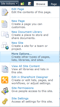
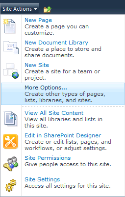
Go to the SharePoint site where you want to add your dashboard page, expand the Site Actions drop-down list, and choose More Options, as shown in the following illustration.
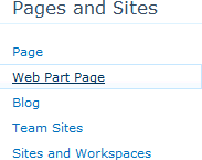
When the Create page opens, on the right-hand side of the page, under Pages And Sites, choose Web Part Page.
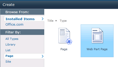
Alternatively, depending on whether Silverlight is enabled, you might see a slightly different user interface. On the Create page, in the Browse From list, choose Filter By Page and then choose the Web Part Page option as shown in the following illustration. Then click Create (on the right-hand side of the page).
Now you must make some choices. As shown in the following illustration, you need to select your preferred page layout, enter a name for the page, and specify where to store the page.
Accept the defaults, and name the page WebPartPage. Feel free to experiment with the different layout options available—whatever you find pleasing. The Save Location is the document library where SharePoint stores your new page.
Click Create to display a new blank Web Part page, as shown in the following illustration.


To make the dashboard more interesting, you can use the next exercise to get some data from an Excel workbook and show it on the page by using the Excel Web Access Web Part. Before doing that though, you need an Excel workbook.
You can use almost any workbook to do this. The following example walks you through the steps to create a simple workbook that works with some of the filters you can add to the page in later sections of this chapter.
The workbook creation process has two parts. First you need to add a pivot table connected to OLAP data in Analysis Services, and then you can generate a chart from that data.
Start the data connection wizard in Excel, click the Data tab, click From Other Sources, and select From Analysis Services, as shown in the following illustration.
Complete the Data Connection Wizard to connect to the Contoso Retail DW database, select the Sales cube, and click Finish.
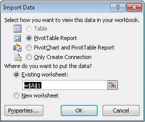
In the Import Data dialog box, choose PivotTable Report to create a new pivot table report in your sheet.
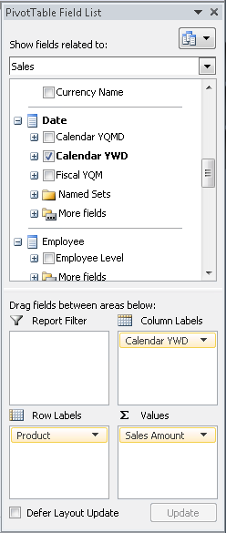
In the PivotTable Field List dialog box, choose Sales from the topmost filter to see only those fields relevant for the Sales data.
Scroll through the field list, selecting the check box next to the following fields: Sales Amount, Product, and Calendar YWD. This adds the primary data to the spreadsheet that we are working with.
Drag the Calendar YWD field from the Column Labels area to the Report Filter area, as shown in the following before-and-after illustrations.


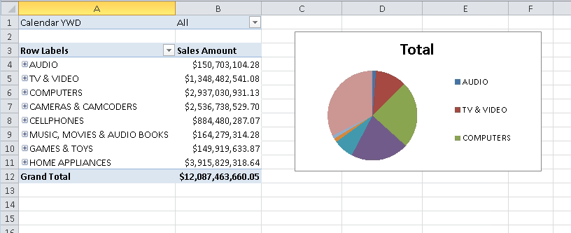
You should end up with a pivot table in your workbook, as shown in the following illustration.

Continuing with the same file you created in the preceding procedure, make sure your cell selection is located in the pivot table, and on the Insert tab, click Pie to choose a Pie chart.
To format the chart so that it looks a little better in the report, move the chart and then grab its corner to resize it so that it fits next to your pivot table.
Optionally, choose a chart style that you like from the chart ribbon.
On the Chart Analyze tab, in the Field group, click Hide All.
You should now have a finished report that resembles the following illustration.
Save the workbook to SharePoint, and view it in a browser by using Excel Services.

When you view the workbook on the server, make sure the pivot table refreshes and that all your data connectivity is working. If it isn’t, see the section External Data Configuration in Chapter 4, for some steps that should help.
Because the ultimate goal is to end up with multiple Web Parts on a dashboard page, you need a way to filter the data on the page at the same time. You can use a SharePoint filter to do this. A SharePoint filter is yet another Web Part on the page that takes a given value and sends it to other Web Parts on the page. Then, based on the value provided by the SharePoint filter Web Part, the other Web Parts can change or filter the data they display. This simple mechanism enables users to choose a given value and then see all the different Web Parts on the page get filtered by their choice. SharePoint filters are created either in a SharePoint Web Part page user interface or in SharePoint Designer.
Before configuring the Excel Services Web Parts so that they can be filtered, you need to make some simple modifications to the workbook file so that it can be filtered in the dashboard. You must modify the workbook so that it can accept a filter value and recalculate based on that value. You do this by specifying workbook parameters.
A workbook parameter is a single cell in Excel that accepts input values when the file is loaded on the server. This provides a way to modify a cell’s contents even in read-only or view-only permission situations, without allowing the rest of the workbook to be edited. Workbook parameters are single-cell named ranges that don’t contain any formulas.
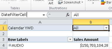
In the following exercise, the goal is to allow users to change the date filter for the pivot table. First you need to give it a name.
In column B of row 1, select the date filter cell (showing “All” in the following illustration) on the pivot table, type DateFilterCell in the box to the left of the formula bar, and press Enter. Now you can refer to that cell by name, which makes it easy to specify it as a parameter later.
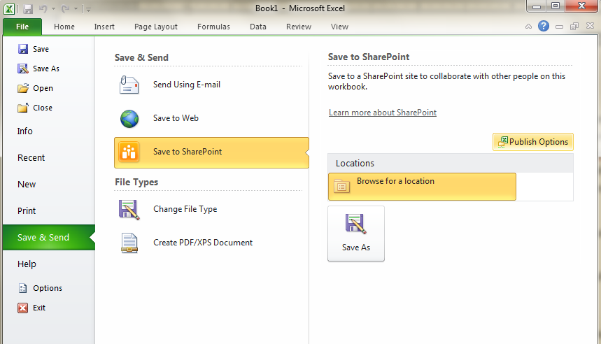
Click File, click Save & Send, and then click Save To SharePoint.
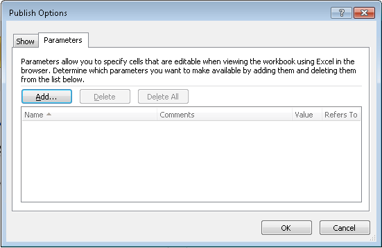
Click Publish Options (as shown in the right pane of the preceding illustration) to open the Publish Options dialog box, and then, to define the workbook parameters, click the Parameters tab, shown in the following illustration.
In the Publish Options dialog box, click Add to display the Add Parameters dialog box, shown in the following illustration, where you can choose which single-cell named ranges to add as parameters.
In the Add Parameters dialog box, select the DateFilterCell cell that you defined earlier and click OK.
Click OK to close the Publish Options dialog box.
Save the file in SharePoint. (If you opened the file directly from SharePoint, you can simply click Save, or you can click Save As to overwrite the earlier version of the file.)

The workbook you just saved in SharePoint now allows users to set values in the DateFilterCell cell even if the workbook is in read-only or view-only mode. Changing the cell value triggers a refresh of both the pivot table and pivot chart. You’ll use this parameter later when we associate it with a SharePoint filter.
Now it’s time to show the pivot table and chart in separate Web Parts on the dashboard page. The first step is to add the Excel Web Access Web Parts to the page and configure them.
From the Page tab of your browser, navigate to the Web Part page you created before. (Remember that it might be in the Site Assets library of your site, depending on where you saved it.)
Pick a zone, and then click Add A Web Part to expand the top of the page so that you can choose which Web Part to add.
As shown in the preceding illustration, select Business Data in the Categories area, choose Excel Web Access in the Web Parts area, and then click Add to add the Web Part to the page in the zone you selected previously.
You should now have an empty Excel Web Access Web Part on the page. You can use this Web Part to load and display Excel workbooks using Excel Services.


Now you can configure the Web Part to display the workbook you created earlier.
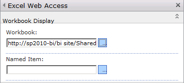
In the Select A Workbook page, shown in the preceding illustration, click the Click Here To Open The Tool Pane link to expand the tool pane for the Web Part, displaying all the configuration options.
Under the Workbook Display area, click the blue button to browse for a workbook to display. A webpage dialog box opens, enabling you to navigate within SharePoint to pick a workbook. Use that dialog box to select the workbook you saved in SharePoint from the previous steps, or just type the URL to the workbook directly.
You should end up with a URL for the workbook you want to display, as shown in the following illustration.
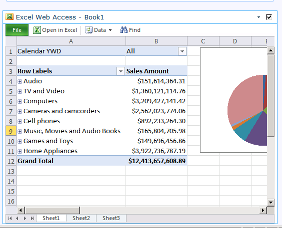
Scroll down to the bottom of the Web Part properties tool pane, and click OK. You should now see your workbook displayed in the Web Part, as shown in the following illustration.
Notice that the workbook looks just like an Excel file at this point. You can click the sheet tabs, see the chart, interact with the pivot table, and so forth.
You can control what the Web Part actually shows—for example, you can have it show only the chart.
Click the drop-down arrow and select Edit Web Part, as shown in the following illustration, to open the Web Part Properties tool pane.
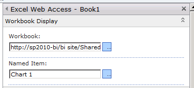
In the tool pane, under Named Item, type in Chart 1. (This works only if you have created a workbook with at least one chart in it and have not changed the default name of the chart. If you did rename your chart, type the name you gave to the chart.)
Click either OK or Apply at the bottom of the Web Part Properties tool pane, and the Web Part displays the chart named Chart 1, as shown in the following illustration.

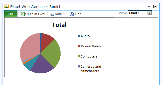
Notice that the Web Part no longer displays this page as a spreadsheet. Instead, it displays each item, one at a time, in the Web Part. This viewing mode is referred to as the Named Item View. When users expand the View drop-down list, they can choose to display any of the other items in the workbook.

The Named Item View is the view used in most Web Parts, because most people just want to see the parts of a workbook that are interesting and related in a dashboard. This is also the mode that is used when the workbook author publishes only a selection of items from Excel (as described in the “To publish and Excel file” procedure in Chapter 4). That is, because the workbook author chose to display only certain items rather than full sheets, each item appears in Named Item View.
Therefore, in the case where the author chose to show only a set of items from the workbook, the Web Part shows whichever is the first item in the workbook (sorted alphabetically)—even if you don’t specify the name of an item in the Named Item Web Part Text box. However, you can also specify which item should appear first in the workbook by using the Named Item text box in the Web Part properties task pane.
Open the Web Part properties tool pane again. Notice that many properties that can affect how the workbook is displayed are listed. You won’t explore all the properties here, but generally, you can find properties for controlling whether the toolbar is visible, what commands are on the toolbar (if it is visible), whether or not the Named Item drop-down list is displayed, and what types of interactivity you want to allow for the Web Part (such as sorting, filtering, recalculation, and so on).
For now, turn the toolbar off. Under Type Of Toolbar, choose None from the drop-down list, as shown in the following illustration.

Then scroll down and expand the appearance section. Notice the width and height controls. These controls are used frequently for adjusting dashboards that have many objects on the page, to get the right look and feel. You need to adjust these to make the Web Part fit the displayed Excel content in a way that doesn’t show unnecessary scrollbars. Finally, click OK to close the Web Part Properties tool pane.

Repeat the steps in the preceding section, but this time set the Named Item to PivotTable1 to display the pivot table you created earlier. Notice that in the Excel client you can see the name of each item in the ribbon for that item. Feel free to add any other Web Parts to the page as well.
On the ribbon at the top of the SharePoint page, click Stop Editing. Until now, the Web Part page has displayed in Edit mode. This mode shows all the various zones, drop-downs for displaying edit menus, editing ribbons, and so forth. When you click Stop Editing, the Web Part page displays in the way that visitors to the site will see it. This page has many other settings that you can use to make the page cleaner (such as turning off Web Part titles). You can freely experiment with these options to learn how they modify the look and feel of the page.
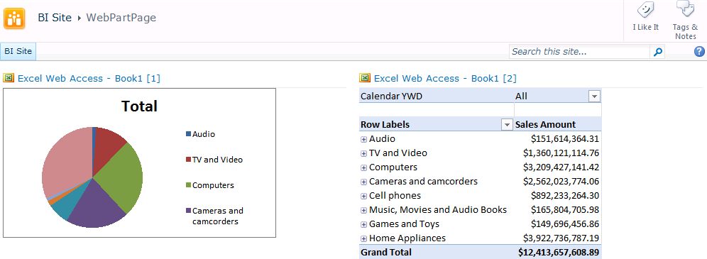
As shown in the preceding illustration, our example has two Web Parts on the page—one showing a chart and the other showing a pivot table. Both come from the same workbook. However, at this point, when you drill down on the pivot table, the chart does not update. This is because each Web Part loads its own copy of the workbook—that is, it gets its own session on the server. Each session is completely separate, so changes from one session don’t affect other sessions. This is the reason why you can have a single Web Part page viewable by many users at the same time, yet one user’s operations (filter, sort, drill, and so on) affect only that user.
Note
The example in this section is for illustrational purposes only. It’s intended to show how you can have multiple Web Parts interacting on the same page. In a real-world scenario, the power of multiple Web Parts becomes apparent when you have items from different workbook files that can be viewed side by side, rather than items from the same file.
The next section shows you how to put a single filter on the page that enables both the chart and the pivot table to update.
SharePoint provides many different kinds of filters right out of the box. You can also add new custom filters to SharePoint—but that is beyond the scope of this book. The filters that ship as part of SharePoint can take data from many different sources, including a SharePoint list, a predefined set of values, Analysis Services, user-entered values, and many more.
This section focuses on using an Analysis Services filter. The goal is to allow users to select a date from Analysis Services and then see other Web Parts on the page update to reflect the chosen date.
Because you want to use the Analysis Services filter in SharePoint, you first need to provide it with the Analysis Services connection information. The ideal way to do that is to reuse the same connection that the workbook uses. SharePoint and other Office products (like Excel) provide features for connection reuse, sharing, and management. While most of those topics are out of scope for this book, the following “bare minimum” procedure shows you how to easily reuse the connection you created earlier for the workbook.
The goal here is to save the connection information from the Excel workbook as a separate connection file (an .odc file) to SharePoint so that other workbooks, Visio files, or SharePoint filters can easily reuse the same connection.
Open the Excel workbook that contains the pivot table and chart you have been working with in this chapter.
On the Data tab, click Connections, as shown in the following illustration.
The Workbook Connections dialog box opens.
For each connection (only one is shown in the preceding illustration, but there could be more if you have more connections in your workbook), select the connection and then click Properties.
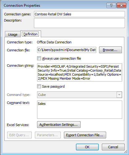
In the Connection Properties dialog box, click the Definition tab, as shown in the following illustration.
Click Export Connection File to open the File Save dialog box.
In the File Save dialog box, type the path to the SharePoint site where you are creating your dashboard, and press Enter to save your file.
When the dialog box displays the SharePoint user interface, as shown in the following illustration, you can choose where to save your file. In this case, you should save it in a Data Connection Library (if you have one); if not, in the Document Libraries list, simply double-click Shared Documents to save it there.
Type the name of the file that you want to use—Contoso Retail DW Sales in this case—and click Save.


Now the data connection information is neatly packaged up as a file that you can reuse for other workbooks, diagrams, or, in this case, for filters on the page. Now you can add the Analysis Services filter.
Many types of filters are available in SharePoint, but for this example, the goal is to let users filter by date (the year), in the same Analysis Services cube that the workbook is using.
Navigate to the dashboard page in your browser, and make sure it is in Edit mode. (You might need to click the Page tab on the webpage and then click Edit Page to get to Edit mode.)
Click the Add a Web Part link in the left-column zone of the page.
Under Categories, choose Filters. Under Web Parts, choose SQL Services Analysis Services Filter, and then click Add.

You should now have an empty filter on the page, ready to be configured.
Now you need to configure the filter to get the right data from Analysis Services. At this point, it is connected to the cube but isn’t getting the date values. The goal is to grab values from the same date field that the pivot table and chart use so that you can pass those values to the other Web Parts on the page.
In the filter Web Part, as shown in the preceding illustration, click the Open The Tool Pane link to open the properties task pane for that filter.
Under the Pick a Data Connection From section, select A SharePoint Data Connection Library, and then click the Browse icon next to the Office Data Connection File text box.
Use the SharePoint dialog box to navigate to where you saved the .odc file earlier, select it, and click OK to close the dialog box.
In the properties task pane, in the Dimension drop-down list, choose Date. (You might have to wait a few seconds for the Dimension combo box to enable, because the page needs to refresh and populate the drop-down list from Analysis Services.)
Choose Calendar YWD from the Hierarchy drop-down list, as shown in the following illustration.
Click Ok to close the task pane.


The filter is now connected to Analysis Services. If you expand the filter, you can see the same calendar year date choices as you saw in our pivottable in Excel.
At this point, you have a filter that allows users to choose date values from Analysis Services on the page, but changing the selected date has no effect on the rest of the dashboard. To make the filter meaningful, you need to connect it to the other Web Parts on the page so that it can pass the selected date value and so that the other Web Parts can filter their data accordingly.
In the Web Part containing your chart, click the drop-down arrow that appears at the upper-right corner of the Web Part page. This displays a drop-down list containing options for the Web Part.
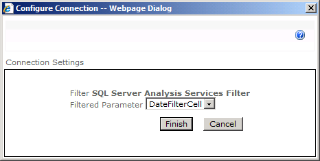
From the drop-down list, choose Connections | Get Filter Values From | SQL Server Analysis Services Filter, as shown in the following illustration. The Configure Connection -- Webpage Dialog dialog box opens. (You might need to allow pop-up windows in your browser to view this dialog box.) This dialog box shows all the available workbook parameters to which you can send the filter value. In this example, there is only one: the DateFilterCell parameter you created earlier.
In the Configure Connection -- Webpage Dialog dialog box, shown in the following illustration, make sure that the DateFilterCell parameter is selected and then click Finish to accept the parameter.
The filter is now be connected to the Web Part and should refresh automatically after the dialog box closes. Depending on your server’s settings, you might be prompted to continue with a data refresh in the Excel Web Access Web Part. The Excel Services administrator can control this setting. (It is a Trusted File Location setting–see the Server Security section in Chapter 4 for more information.)
Repeat Steps 1–3 to connect the filter to the Web Part that shows the pivot table.
Click Stop Editing, as shown in the following illustration, to take the page out of edit mode.


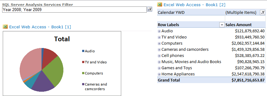
The filter is now connected and should work. To test it, expand the filter drop-down list, choose values (you can choose multiple values), and notice how both of the Excel Services-based Web Parts update.
SharePoint natively provides some simple KPIs and some detailed views of them, along with some Web Parts to integrate them into dashboards. Other products, like Excel or PowerPivot, have KPIs or formatting that you can use to create KPIs. But if you don’t need a full spreadsheet, don’t have more advanced calculations for KPIs, don’t want to spend the time developing Performance Point KPIs, and just want something quick and simple, SharePoint KPIs might be the way to go.
SharePoint KPIs are stored as items in a list (like most things in SharePoint). This list is a special type of list—a status list.
Navigate to the site where your Web Part page is located.
From the Site Actions menu, choose More Options.
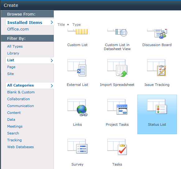
From the Create dialog box, under the Filter By section in the left-hand side of the dialog box, select List, and then select Status List in the main dialog box section. On the far right-hand side of the dialog box, give your new list a name, and click Create. A new, empty status list appears in the browser.
Four basic types of KPIs can be added to your list. The KPIs can be based on values from a SharePoint list, values from a cell in an Excel spreadsheet (recalculated using Excel Services when the user views the KPI), KPIs stored and managed in Analysis Services, and a KPI that has a goal, threshold, and current value that are manually entered and updated. In this exercise, we want to create a KPI based on Analysis Services data.
Expand the New drop-down list on the toolbar in your status list, and choose SQL Server Analysis Services Based Indicator to open the New Item dialog box.
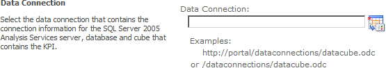
In the New Item dialog box, click the browse icon next to the Data Connection text box.
Note
You might see some red text under the text box shown in the preceding illustration, warning you about your connection not being encrypted. You can ignore this text because you’re most likely learning about these technologies in a test environment. In general, when setting up solutions in a production environment, make sure that your configuration is in compliance with whatever local security policies your company might have in place.
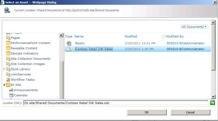
In the Select an Asset – Webpage dialog box that enables you to browse and choose a data connection file, choose the Contoso Retail DW Sales.odc file you used in Step 3 of the procedure To configure the Analysis Services filter, earlier in this chapter.
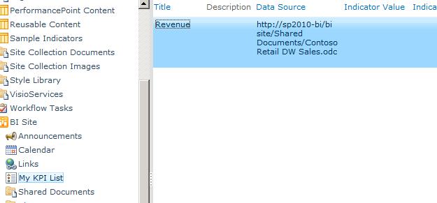
Select Revenue under the Status List section from the right-hand side of the dialog box, and leave the Include Child Indicators check box selected.
Type Revenue for the name of your KPI in the Name text box, and then click OK to close the dialog box and create the KPI. You should end up with a single KPI in your list, as shown in the following illustration.


The next step is to add a detailed view of this KPI to the existing dashboard.
Navigate to your dashboard page, and on the Page tab, click Edit Page to put the page into edit mode.
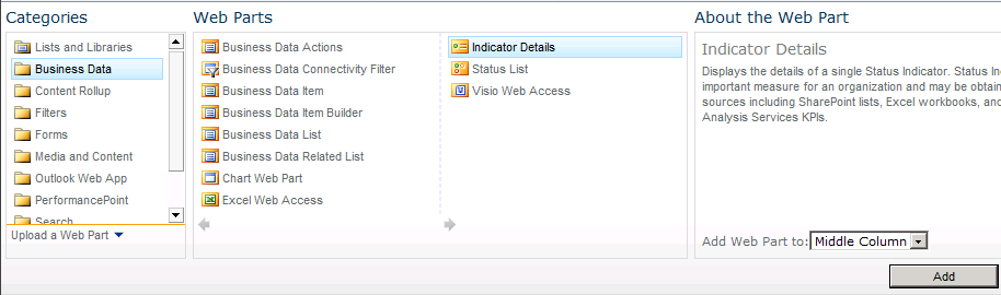
In the middle column of the page, click the Add A Web Part link. Under Categories, choose Business Data, select Indicator Details under Web Parts, and click Add to add the Web Part to the dashboard.
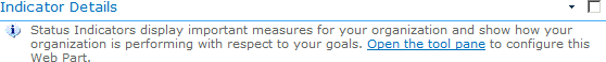
SharePoint adds an unconfigured KPI Details Web Part to the page. Click the Open The Tool Pane link to display the Indicator Details tool pane.
In the Indicator Details pane, click the icon next to the Status List text box to open the Select An Asset Web Page dialog box.
In the Select An Asset Web Page dialog box, browse to and select the Revenue KPI that you created in the preceding exercise, and click OK.
Click OK to close the properties tool pane for the Web Part.


You have now added a SharePoint KPI, based on data provided by Analysis Services.

To really bring the dashboard together, you want to connect the KPI to the Analysis Services filter on the page. Then, when users filter by a certain time frame, the KPI updates to reflect the filtered time period.
In the Indicator Details Web Part, click the drop-down arrow at the upper-right corner of the Web Part to display the options menu.
From the drop-down list, choose Connections | Get Filter Parameter From | SQL Server Analysis Services Filter.
In the Configure Connection—Webpage Dialog dialog box, expand the drop-down list and choose the [Date].[Calendar YWD] value, which is the expression value that the Analysis Services filter is currently using.
On the Page tab, as shown in the following illustration, click Stop Editing to take the page out of edit mode.
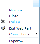


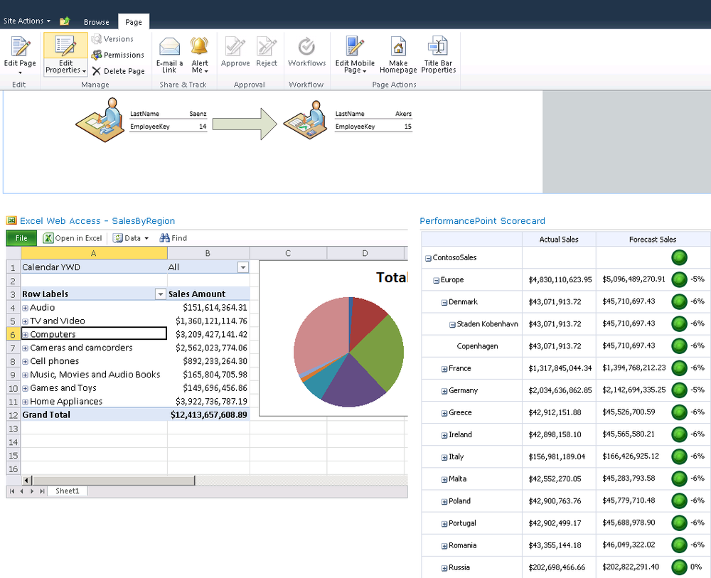
You have now connected your KPI to your Analysis Services filter, and users can now filter the entire dashboard page by a selected calendar year. Notice that the values of the chart, pivot table, and KPI change whenever you change the filter value on the page. Your dashboard should now resemble the following illustration.
Your result might not match the preceding illustration exactly. For example, toolbars may appear for some Web Parts, so you might want to clean up the overall look-and-feel of your dashboard. You have many ways to do this—for example, you can change the size of the chart in Excel workbook or change the size of the web part using the properties tool pane. You can also use the properties tool panes to disable features you aren’t interested in showing, and by dragging Web Parts to different zones on the page, you can clean up the look-and-feel of the page. If you create a rough design for the dashboard ahead of time, you can also choose different templates to get different zone layouts when you create the initial dashboard page.
Visio Services allows you to embed Visio Web Drawings in other SharePoint pages. Using the Visio Web Access Web Part, you can embed either static or data-driven Visio Web Drawings in SharePoint pages.
The Visio Web Drawing is a new Visio file type (*.vdw) that allows diagrams to be rendered in full fidelity in the browser using Visio Services on SharePoint 2010.
You can easily connect your diagrams to one or more data sources, including Microsoft Excel, SQL Server, and SharePoint Server lists, by using the Data Selector and Automatic Link wizards.
You can keep the data in your diagrams up to date by using the Automatic Refresh feature.
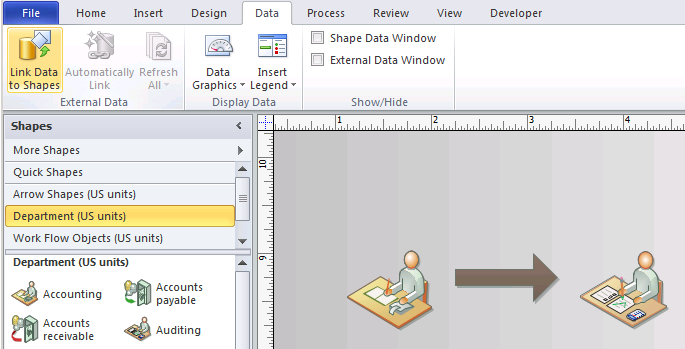
In this example, store managers at Contoso are also responsible for the accounting. As part of the workflow, the managers must send their paperwork to the auditor.
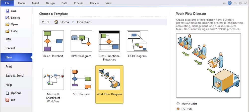
Open Visio 2010 Premium, click File, and then click New. The templates categories appear.
Under Template Categories, select Flowchart, and then Work Flow Diagram.
Click Create. A blank Visio diagram appears, with the Shapes section on the left.
Click Department (US Units) and drag the Accounting shape and then the Auditing shape into the display pane. Now click Arrow Shapes (US Units), and drag an arrow into the center of the display pane, as shown in the following illustration.
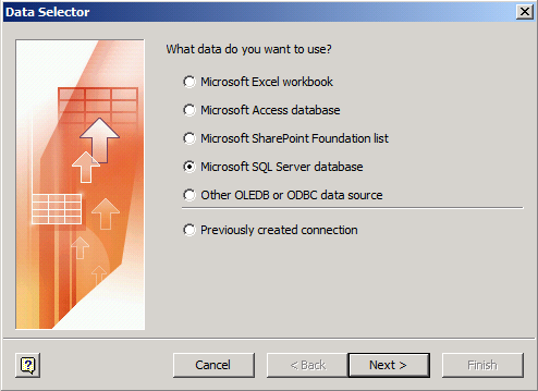
On the Data tab, click Link Data To Shapes. Then on the Data Selector page, select Microsoft SQL Server database and click Next.
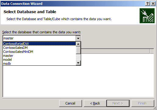
On the Connect To Database Server page, in the Server Name field, type SP2010-BI. Keep the default credentials (Use Windows Authentication), as shown in the following illustration, and click Next.
On the Select Database And Table page, select the ContosoRetailDW database and then select the DimEmployee table, as shown in the following illustration.
Click Next, and then click Finish to create an ODC file automatically named SP2010-BI ContosoRetailDW DimEmployee.odc.
Note
If you already have an ODC file, a warning message appears, asking whether you want to replace the existing file.
If you want the diagram to auto-refresh in a SharePoint pages, you should select the Always Attempt To Use The File To Refresh Data option shown in the following illustration.
Click Next to see the Select Data Connection page, as shown in the following illustration, and then click Next again.
On the Connect To Data page, shown in the following illustration, you can select the data that you want to be available for your data-driven drawings. You can choose from the available columns and rows of Employee dimension data. Your Data Selector should resemble the following illustration after you complete Steps 10 and 11 of this procedure. To learn more about dimension table data, see Chapter 3.
Click Select Columns to open the Select Columns dialog box, as shown in the following illustration, click Uncheck All in the dialog box, and then select the following columns:
EmployeeKey
FirstName
LastName
Title
EmailAddress
Phone
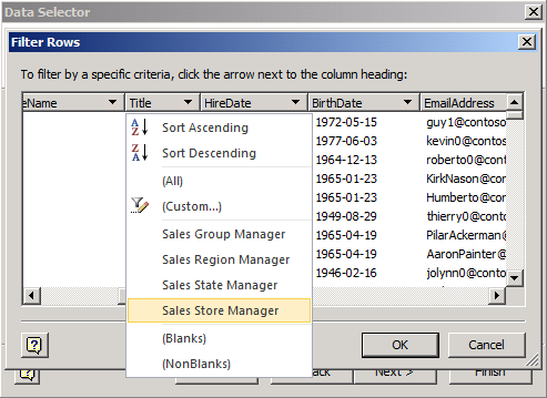
On the Connect To Data page, shown in Step 9 of this procedure, click Select Rows and then expand the Title drop-down list. To filter the results of your query, in the Title drop-down list, select Sales Store Manager.
Click Next, and then click Finish to close the wizard. An External Data section appears under your Visio drawing, as shown in the following illustration.


Drag the first record (14, Miguel), shown in the preceding illustration, onto the Accounting shape on the left of the diagram. The diagram is now linked or “bound” to data that will refresh and remain current. You have the option to show more data by right-clicking the diagram and selecting Edit Data Graphic.

On your Business Intelligence Center site, click Libraries, and then click Create.
Note
The Business Intelligence Center is a site collection template that you can create after farm configuration. The Business Intelligence Center provides a good place to store all of your business intelligence assets, such as Visio diagrams, Visio Web Drawings, PerformancePoint Dashboard elements, and more.
The Create page, shown in the following illustration, opens when you click Create.
Double-click the Visio Process Repository. You can now upload the diagram you created previously. Be sure to upload the Visio file you saved as a Visio Web Drawing (.vdw file).
Type AccountingWorkflow for your title and URL.
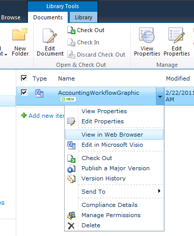
When the file appears in your Visio Process Repository, expand the AccountingWorkflowGraphic drop-down menu, and select View In Web Browser.


The diagram is now viewable and appears in your browser, as shown in the following illustration.

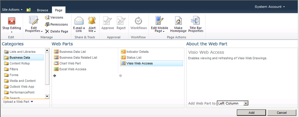
On the WebPartPage, click Add A Web Part.
As shown in the following illustration, under Categories, select Business Data, select the Visio Web Access Web Part, and then click Add.
An embedded Visio Web Drawing container appears in the Web Part location. You can use this to select your published Visio Web Drawing.
Click the Click Here To Open The Tool Pane link.
In the Web Drawing URL text box, as shown in the following illustration, type the URL for the Web Drawing, or click the Browse icon to navigate to the SharePoint folder where the drawing is located. After the URL is in the input field, click Apply at the bottom of the configuration panel.
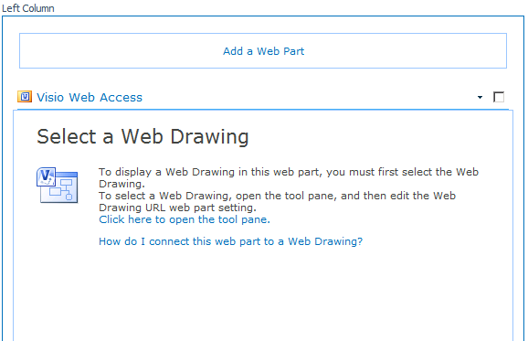

You can now customize the Visio Web Access Web Part with the features below the Web Drawing URL, or you can simply click OK or click Apply to see your Web Drawing embedded in the page.
Because PerformancePoint in 2010 is part of the SharePoint infrastructure, you can share dashboard Web Parts across sites. That means you can create a dashboard from within SharePoint by using PerformancePoint objects that have already been published to SharePoint lists.
Important
PerformancePoint Dashboard Designer terminology is a little different from that of SharePoint Designer. In the section Which Dashboard Tool Should I Use? earlier in this chapter, we point out where those differences are and try to differentiate clearly between a SharePoint dashboard and a PerformancePoint dashboard.
Note
Before you can add a Web Part from an existing PerformancePoint object, such as a scorecard or KPI, you must have already created the objects in PerformancePoint Dashboard Designer.
After you create your dashboard in Dashboard Designer, you can publish your completed PerformancePoint dashboard to your SharePoint Dashboards library. After you publish, all of your dashboard objects are essentially placed within the SharePoint Web Part gallery and are then usable in any way that you want.
Note
Although you can create Web Part pages in SharePoint Designer by using SharePoint 2010 filters, you can create connections between PerformancePoint Web Parts only in a browser.
Here’s a high level view of the steps you need to follow, based on two possible methods. We assume that you have looked at Chapter 7 and have an understanding of the elements of Dashboard Designer and of PerformancePoint dashboards. The procedure in this section uses a very simple example to show that you can add available PerformancePoint Web Parts to a SharePoint dashboard.
Method 1:
Configure SharePoint.
Configure a PerformancePoint-enabled site.
Method 2 . Simply create a site collection using the Business Intelligence Center template (on the Enterprise tab).
Let’s build a dashboard with PerformancePoint!
After running the Farm Configuration wizard to get your service applications running, create a site collection from the Enterprise template tab, and then open the Business Intelligence Center.
Navigate to your site collection. You can locate it by going to Central Administration and clicking Application Management and then clicking Site Collection List. Highlight the URL, and paste it into a browser.
Click the Start Using PerformancePoint Services link.
As shown in the following illustration, on the TeamBI tab of the TeamBI page, click Run Dashboard Designer. Dashboard Designer is a ClickOnce application.


The screen shown in the following illustration appears.

Next, let’s create the dashboard.
Note
The steps in this procedure are intentionally very high level. You can review all these steps in more detail in Chapter 7.
In Dashboard Designer, create a data source.
Create the dashboard items (KPI, scorecard, reports, and filters).
Important
Different from a SharePoint filter, in PerformancePoint a filter is a Web Part object, created using Dashboard Designer, that modifies the data presented in a published PerformancePoint dashboard. The available filters include Custom Table (or a tabular data source), MDX Query, Member Selection, Named Set, Time Intelligence, and Time Intelligence Connection Formula. Display filters, such as List, Tree, and Multi-Select Tree, give users intuitive controls to navigate hierarchies and values. To learn more about creating filters in Dashboard Designer, see Chapter 7. You can create a PerformancePoint filter “natively” in SharePoint if it was previously created in Dashboard Designer.
Assemble the dashboard by adding what you have created in the way of KPIs, scorecards, reports, and filters.
Preview, test, and deploy the dashboard.

Next, let’s add some Web Parts.
Just as you would in Excel Services and Visio Services, click Add A Web Part on the Web Parts page.
Select the PerformancePoint Scorecard Web Part. This is an empty scorecard Web Part from which you can point to the published scorecard. PerformancePoint objects are stored in lists, in a trusted location.
Type in the location and click OK. The PerformancePoint Scorecard dialog box should appear in the Web Part, as shown in the preceding illustration.


To complete the dashboard, add some KPIs. You can use the standard connection framework in SharePoint to associate PerformancePoint filters with standard SharePoint Web Parts.
As a result of creating the Web Parts without positioning, your page will look like the following image.
You can see how the Web Parts are interactive when published by clicking on Stop Editing in the Page tab. Note in this image that we have selected Denmark to cascade and drill in on the PerformancePoint Scorecard Web Part.
This chapter looks at some of the basic features that SharePoint includes for creating dashboards and includes step-by-step walkthroughs to help get you started.
Microsoft has many products that can help you achieve great BI. Sometimes you might want to choose one product instead of another—for technical reasons, because of BI maturity, or to meet the comfort level of a particular user. One of the strengths of SharePoint is its ability to store documents related to many BI reports or solutions, and it can also surface BI functionality from many different features and products. So even if your company discovers insights by using different tools or features, you can use SharePoint to bring them together and enjoy the advantage of using them in a single place. In particular, SharePoint dashboards are extremely useful for bringing all the data and insights together into one place.
|
To |
Do this |
|---|---|
|
Determine if you want to create a dashboard “native” to SharePoint or a PerformancePoint dashboard |
See the section Which Dashboard Tool Should I Use? |
|
Create a page where you can surface reports, KPIs, and other BI insights side by side—when the initial reporting was created with different features or products |
Create a dashboard page in SharePoint. See the section Dashboard (Web Part) Pages in SharePoint. |
|
Surface Excel-based reporting in a dashboard in SharePoint |
Create Excel reports that show the desired BI insights. See the section Create the Excel Workbook. Add and configure Excel Web Access Web Parts on your dashboard page. See the section Show the Workbook in Web Parts. |
|
View diagrams as part of a larger dashboard BI solution |
Add Visio Web Drawings to your dashboard page. See the section Add a Visio Web Drawing. |
|
Filter an entire dashboard page (including multiple Web Parts on the page) by the same value or set of values |
Add a SharePoint Filter to the page, and connect it to the appropriate Web Parts. See the sections Add the Filter to the Dashboard and Configure the Filter. |
|
Add a Visio Web Part to the dashboard |
Click Add a Web Part in the WebPartPage and navigate to a VDW file. Click OK. See the Add a Visio Web Drawing section in this chapter. |
|
Add a “native” KPI to a SharePoint dashboard page |
In general, you can use Excel Services or Performance Point to surface KPIs. The simplest type of KPI is natively part of SharePoint. See the section Add SharePoint KPIs in this chapter. |
|
Create a Web Part derived from a PerformancePoint Report or Scorecard |
Review the high-level steps for creating a PerformancePoint Web Part in section Add a PerformancePoint Web Part. |