
Chapter 9. Sprucing Up Your Site’s Navigation
It’s safe to say that without links there’d be no Web. The ability to be on one page, then click something onscreen and suddenly see a page on a computer half a world away is what makes the Web so useful. Links are also how your visitors navigate their way around your website. That’s why web designers agonize over making their links look good and work properly.
In this chapter, you’ll learn how to style links to make them stand out from other text. You can also make your links provide visual cues so your site’s visitors can see where they are—and where they’ve been. You’ll learn how to use CSS to create onscreen buttons and navigation bars just like the pros use. And in the tutorial section, you’ll get some hands-on experience creating a full set of navigation features that work in all browsers.
Selecting Which Links to Style
As always in CSS, you have to select something before you can style it. For links, you need to tell CSS not only what you want to style, but also when you want that style to apply. Web browsers keep track of how a visitor interacts with links, and then displays that link differently depending on the link’s status, or state. When you use a CSS link selector, you can target a specific link state as well.
Understanding Link States
Most browsers recognize four basic link states: an unvisited link, a link that’s been visited already (meaning the URL is stored in the browser’s history), a link that the visitor’s mouse is poised over, and a link that’s being clicked. As described in Chapter 3 (Pseudo-Classes and Pseudo-Elements), CSS gives you four pseudo-class selectors to accompany these states—:link, :visited, :hover, and :active. Using them, you can apply different formatting to each state, so there’s no doubt in your visitor’s mind whether he’s been there or done that.
Note
Internet Explorer 8, Firefox, Safari, and Opera also recognize a pseudo-class called :focus. Links get :focus when mouse-averse visitors use the keyboard to tab to them. This pseudo-class is also fun to use with form text fields, as you’ll see on Tutorial: Styling a Form.
Suppose you want to change the text color for an unvisited link from boring browser blue to vivid orange. Add this style:
a:link { color: #F60; }Once someone has clicked that link, its state changes to visited, and its color changes to the purple used by most browsers. To change that color to deep red, use this style:
a:visited { color: #900; }Tip
When you want to provide a style that applies to all link states—for example, use the same font and font size for all link states—then style the HTML <a> tag by creating a generic a selector. You can then use the specific link state styles—a:visited, for example—to change the color or in some other way customize the look of just that state.
The :hover pseudo-class offers many creative possibilities. (You’ll learn quite a few later in this chapter.) It lets you completely alter the look of a link when a visitor moves her mouse over it. If you’ve used cumbersome JavaScript to make graphic buttons change when a mouse hovers over them, you’ll love being able to create the same effect with CSS alone. But to start with a simple example, this style changes the color of a link as a mouse passes over it:
a:hover { color: #F33; }Tip
Be careful when adding CSS properties to the :hover pseudo-class. Properties that change the size of the hovered element might affect other elements around it. For example, if you increase the font size of a hovered text link, when you mouse over the link, the text will grow, pushing other elements out of the way. The effect can be jarring.
And finally, for those obsessive-compulsive designers who leave no design stone unturned, you can even change the look of a link for the few milliseconds when a visitor is actually clicking it. Here’s how:
a:active {color: #B2F511; }In most cases, you’ll include at least :link, :visited:, and :hover styles in your style sheets for maximum design control. But for that to work, you must specify the links in a particular order: link, visited, hover, and active. Use this easy mnemonic to remember it: LoVe/HAte. So here’s the proper way to add all four link styles:
a:link { color: #F60; }
a:visited { color: #900; }
a:hover { color: #F33; }
a:active {color: #B2F511; }
If you change the order, the hover and active states won’t work. For example, if you put a:hover before a:link and a:visited, then the color change won’t take effect when hovering.
Note
Why does the order matter? That would be thanks to our friend the cascade (see Chapter 5). All those styles have the same specificity, so the order in which they appear in the code determines the style that wins out. A link can be both unvisited and hovered over. So if the a:link style comes last in the code, then it wins, and the color from a:hover never gets applied.
Targeting Particular Links
The styles in the previous section are basic a tag styles. They target certain link states, but they style all links on a page. What if you want to style some links one way and some links another way? A simple solution is to apply a class to particular link tags. Say you have a bunch of links within the body of an article, some of which point to sites that you want to highlight (for example, links to websites belonging to your friends, business associates, or sponsors). You may want to identify these links so people know they’re special and are more likely to click them. In this case, you can apply a class to these external links, like this:
<a href="http://www.hydroponicsonline.com" class="sponsor">Visit this great
resource</a>
To style this link in its own way, you’d create styles like this:
a.sponsor:link { color: #F60; }
a.sponsor:visited { color: #900; }
a.sponsor:hover { color: #F33; }
a.sponsor:active {color: #B2F511; }
Leaving off the a and only specifying the class works too:
.sponsor:link { color: #F60; }
.sponsor:visited { color: #900; }
.sponsor:hover { color: #F33; }
.sponsor:active {color: #B2F511; }
Now only those links with a class of “sponsor” will get this formatting.
Note
These examples change only the links’ color, but that’s just to make it simple for demonstration purposes. You can use any CSS property to format links. As you’ll see in the next section, you have lots of creative ways to style links.
Grouping links with descendent selectors
If a bunch of links appear together in one area of a page, you can also save time by using descendent selectors. Say you have five links that lead to the main sections of your site. They represent your main navigation bar, and so you want to give them a distinctive look. Just wrap those links in a <div> tag and apply a class or ID to it like this: <div id="mainNav">. Now you have an easy way to identify and format just those links:
#mainNav a:link { color: #F60; }
#mainNav a:visited { color: #900; }
#mainNav a:hover { color: #F33; }
#mainNav a:active {color: #B2F511; }
Using descendent selectors, it’s easy to style links differently for different areas of a web page. (See Using Descendent Selectors in Chapter 15 for a thorough discussion of the power of descendent selectors.)
Tip
It’s very common to use bulleted lists to present links (you’ll see an example of this technique on Using Unordered Lists). In this case, you can add an ID or class to the <ul> tag for the list—<ul id="mainNav">, for example—then create descendent selectors like #mainNav a:link to style them.
Styling Links
Now that you know how to create a selector that targets links, how should you style them? Any way you want! There aren’t any CSS properties intended just for links. You have full access to all CSS properties, so you’re limited only by your imagination. Just make sure your links look like links. Not that they need to be blue and underlined, but links must look different from non-link text so visitors know they can click them.
If you make a link look like a button—adding a border, including a background, and making it change color when moused over—most people will understand they can click it. Likewise, links that appear in long passages of text should look clearly distinct. You can make links stand out by bolding the text, keeping the traditional underline, coloring the background, or adding a hover style. You can even add a graphic (like an arrow) that provides a clear visual cue that clicking the text takes you somewhere else.
Tip
Unless you set an <img> tag’s border attribute to 0, web browsers usually add a border around linked images. To prevent this from happening, add this basic style to your style sheets: img { border: none; }.
Underlining Links
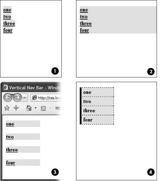
Since the beginning of the Web, vibrant blue, underlined text has signaled, “Click here to go there.” But that underline and color are often the first two things a designer wants to change. Underlines are such a common way to mark a link that they’re boring. (See #1 in Figure 9-1). Fortunately, you can do several things to eliminate or improve on the standard underline, while still ensuring that your links are identifiable:
Remove the underline entirely. To eliminate the regular underline, use the text-decoration property and the none value:
a {text-decoration: none;}Of course, removing the underline completely can confuse your visitors. Unless you provide other visual cues, your links look exactly the same as all the other text (#2 in Figure 9-1). So if you go this route, then make sure you highlight the links in some other way, like making link text bold (#3 in Figure 9-1), coloring the background, adding an informative graphic (Underlining Links), or making the link look like a button (Creating a Button).
Underline when mousing over. Some designers remove underlines for all links, highlight them in some other way, and then add the underlines back when the visitor moves his mouse over the link, as shown in #4 in Figure 9-1. To do so, simply remove the underline for links, and then reintroduce it using the :hover pseudo-class:
a { text-decoration: none; background-color: #F00; } a:hover { background-color: transparent; text-decoration: underline; }Use a bottom border. You can’t control the color, width, or style of a regular link underline. It’s always a solid, 1-pixel line in the same color as the link text. For greater variety, use the border-bottom property instead, like #5 in Figure 9-1. Hiding the normal underline and adding a dashed-line border looks like this:
a {
  text-decoration: none;
  border-bottom: dashed 2px #9F3;
}
You can alter the style, width, and color of the border. To put more space between the text and the border, use the padding property.
Use a background image. You can customize the look of links even further by using a graphical line. For example, #6 in Figure 9-1 uses a graphic that looks like a hand-drawn line. There’s a similar technique for underlining headlines in the Chapter 8 tutorial (Replacing Borders with Graphics). Start by creating an underline graphic using a program like Fireworks or Photoshop, which have brush tools that simulate the look of a crayon, felt-tip marker, or whatever. Next, create a style for the link that removes the normal underline and adds a background image. Make sure the graphic repeats horizontally and is positioned at the bottom of the link. You may also need to add a little bottom padding to position the line. Here’s an example:
a {
  text-decoration: none;
  background: url(images/underline.gif) repeat-x left bottom;
  padding-bottom: 5px;
}
It’s best to use this technique for short, one- to-three-word links, since if the link runs longer than a single line, then Windows Internet Explorer 6 and 7 add the graphic to only the bottom of the last line (IE 8 gets it right).

Creating a Button
You can also make links look like the buttons in the dialog boxes and toolbars you see in computer programs. Buttons look great in navigation bars, but you can also use them for any small (one- or two-word) links on your pages. Your main allies in this task are the border, background-color, and padding properties. With them, it’s easy to create a wide range of boxy-looking buttons (see Figure 9-2).
Say you added a class to a link that you’d like to style as a button: <a href="stale.html” class="button">Free Donuts Here!</a>. To add a basic black outline around this link (like the top-left image in Figure 9-2), you’d create this style:
a.button {
  border: solid 1px #000;
}
You can get fancier by adding a background color as well, like so:
a.button {
  border: solid 1px #000;
  background-color: #333;
}
Note
In these examples, both a.button or .button would work for style names. In the case of a.button, the style only applies to <a> tags with the class button, while .button applies to any tag with that class name. If you want to make sure the style only applies to a particular tag, then add the tag name to the beginning. Adding the tag name is also a helpful reminder when looking over your CSS code—it provides a valuable clue as to what the style is intended to format. When you see a.button, it’s clear that the style is aimed at particular links.

Mind you, all four borders don’t need to be the same width, type, or color. You don’t even have to have four borders. One common design technique is to add a beveled look to a button using four different border colors, as shown at top right in Figure 9-2. Creating the beveled look isn’t difficult, but you need to remember what makes something look three-dimensional—the light source. Imagine a light shining on one of the four sides; that side is the lightest, while the side opposite is the darkest (since the raised button is blocking the light and putting that side into a “shadow”). The other two sides should have shades in between the “lit” and “shadow” borders. Here’s the CSS used to create the beveled design in the top-right corner of Figure 9-2:
a.button {
  background: #B1B1B1;
  color: #FFF;
  font-weight: bold;
  border-width: 4px;
  border-style: solid;
  border-top-color: #DFDFDF;
  border-right-color: #666;
  border-bottom-color: #333;
  border-left-color: #858585;
}
Keep in mind that you can (and probably should) create a :hover state for your buttons as well. That way, your buttons can react when a visitor moves her mouse over the link, providing useful visual feedback. In the case of a beveled button, reversing the various colors—make a dark background lighter, a light border darker, and so on—is very effective.
Using Graphics
Adding graphics to links is one of the easiest and most visually exciting ways to spruce up your site’s navigation. There are any number of possible techniques and designs, but none of the good ones involve an HTML <img> tag. Instead, you can easily add attractive and informative imagery to any link using the CSS background-image property. You can see several examples in Figure 9-3. (You’ll also learn more advanced techniques for using images to create graphical buttons and rollovers starting on CSS-Style Preloading Rollovers.)

If you need a refresher on background-image and related properties, flip back to Background Images. Meanwhile, here are a few things to keep in mind when you use images with links:
Don’t forget. no-repeat. Normally a background graphic tiles repeatedly in the background. With many graphics, that effect looks awful for links (see #2, Figure 9-3). Unless you’re using a subtle pattern like a gradient fill, remember to set the repeat option to stop the tiling like this: background-repeat: no-repeat;.
Control placement with background-position. To place an image accurately in the background, use the background-position property (Keywords). When you want to place an image on the far-right edge of a link but centered vertically on the line, use this CSS: background-position: right center.
For more accurate placement, use a specific value such as pixels or ems. These units of measurement make it easy to scoot a graphic a couple of pixels away from the left edge of the link. By combining these units with a percentage value, you can easily center a graphic vertically within a link but place it an exact amount away from the left edge: background-position: 10px 50%;.
Tip
In positioning background images, the first value is the horizontal placement (left to right); the second is vertical placement (top to bottom).
Unfortunately, there’s no way to exactly place an image from the right or bottom edges. So if you want to move an image in from the right edge a bit, then you have two options: First, in your image-editing program, you can add empty space to the right edge of the graphic. The amount of empty space you add should be equivalent to how much you want to indent that graphic from the right. Once you’ve created the graphic, use the background-position property to place the graphic on the right edge of the element: for example, background-position: right top;. Or you can use percentage values: background-position: 90% 75%; places the point that lies 90 percent from the left edge of the image on top of the point 90 percent from the left edge of the styled element. As you can imagine, this method doesn’t provide complete accuracy, so you’ll need to experiment a little. (See background-repeat for more on how percentage positioning works.)
Padding gives you room. If you’re using an image or icon to mark a link (like #3, #5, and #6 in Figure 9-3), then make sure to add padding on the side the image is on to move the link text out of the way. For instance, the third example in Figure 9-3 has 30 pixels of left padding to prevent the word “Home” from overlapping the picture of the house, while a little right padding makes room for the globe and checkmark in #5 and #6.
Note
Since the <a> tag is an inline element, adding top and bottom padding (or, for that matter, top and bottom margins) has no effect. See Displaying Inline and Block-Level Boxes for the reason why. You can, however, turn a link into a block-level element so that it can accept top and bottom padding and margins. You’ll see this technique later in this chapter.
Use the pseudo-classes. Don’t forget the :hover and :visited pseudo-classes. They can add great dynamic effects and provide helpful feedback about your links. You can swap in a different background graphic for any of these pseudo-classes. So you could, for example, have a dim light bulb graphic in the background of a normal link but change that graphic to a lit bulb when the mouse travels over it. Or don’t use a graphic for the background of unvisited links, but once they’re visited add a checkmark graphic to clearly identify their used status (see #6 in Figure 9-3).
Should you decide to use a graphic for a link’s :hover state, keep in mind that browsers don’t download the graphic until your visitor’s mouse actually hovers over the link, so there’ll be a noticeable delay before the graphic appears. Once the graphic is downloaded, however, the delay goes away. See CSS-Style Preloading Rollovers for a technique to prevent this awkward problem.
Building Navigation Bars
Every site needs good navigation features to guide visitors to the information they’re after—and help them find their way back. Most sites are organized in sections, such as Products, Contact Info, Corporate Blog, and so on. This structure lets visitors know what information to expect and where they can find it. Much of the time, you find links to a site’s principle sections in a navigation bar. CSS makes it easy to create a great-looking navigation bar, rollover effects and all.
Using Unordered Lists
At heart, a navigation bar is nothing more than a bunch of links. More specifically, it’s actually a list of the different sections of a site. Back in Chapter 1, you learned HTML’s mission is to provide meaningful structure to your content. Accordingly, you should always use a tag that’s appropriate to the meaning of that content. For a list of items, that’s the <ul> or unordered list tag—the same one you use to create bulleted lists. It doesn’t matter whether you want your list to have no bullets or to stretch horizontally across the top of the page: You can do all that by styling the <ul> tag with CSS. Figure 9-4 shows an example.

The HTML for a nav bar is straightforward. There’s a single link inside each individual list item. Also, you need a way to style just that unordered list. (You don’t want actual lists of items to look like navigation bars.) Applying a class or id to the <ul> tag is a good approach:
<ul class="nav">
<li><a href="EB9780596806736_2.html">Home</a></li>
<li><a href="news.html">News</a></li>
<li><a href="reviews.html">Reviews</a></li>
</ul>
The CSS varies a bit depending on whether you want a horizontal of vertical navigation bar. In either case, you need to do two things:
Remove the bullets. Unless the navigation bar is supposed to look like a bulleted list, remove the bullets by setting the list-style-type property to none:
ul.nav {
  list-style-type: none;
}
Eliminate padding and margins. Since browsers indent list items from the left, you need to remove this added space as well. Some browsers do the indenting using padding, and others use margin, so you need to set both to 0:
ul.nav { list-style-type: none;padding-left: 0;margin-left: 0;}
These two steps essentially make each list item look like any plain old block-level element, such as a paragraph or headline (except that a browser doesn’t insert margins between list items). At this point, you can begin styling the links. If you want a vertical navigation bar, read on; for horizontal nav bars, see Horizontal Navigation Bars.
Vertical Navigation Bars
A vertical navigation bar is just a bunch of links stacked one on top of the next. Removing the bullets, left margin, and padding (as explained in the previous section) gets you most of the way there, but you need to know a few additional tricks to get things looking right:
Display the link as a block.
Since the <a> tag is an inline element, it’s only as wide as the content inside it. Buttons with different length text (like Home and Our Products) are different widths. The staggered appearance of different width buttons stacked on top of each other doesn’t look good, as you can see in #1 in Figure 9-5. In addition, top and bottom padding and margins have no effect on inline elements. To get around these limitations, style the link as a block element:
ul.nav a {
  display: block;
}
The block value not only makes each button the same width, but it also makes the entire area of the link clickable. That way, when your visitors click areas where there’s no link text (like the padding around the link), they still trigger the link. (Internet Explorer 6 and earlier has problems with this technique, so look for the fix on Horizontal Navigation Bars.)
Constrain the width of the buttons.
Making links block-level elements also means they’re as wide as the tag they’re nested in. So when they’re just sitting in a page, those links stretch the width of the browser window (see #2 in Figure 9-5). You have several ways to make them a little narrower. First you can just set the width of the <a> tag. If you want each button to be 8 ems wide, for example, then add that to the width property:
Figure 9-5. In just four easy steps you can turn an unordered list of links into an attractive navigation bar.ul.nav a { display: block;width: 8em;}Setting a width for any of the tags that wrap around those links—such as the <li> or <ul> tags—also works.
If the button text occupies only one line, you can also center the text vertically so there’s equal space above and below the link text. Just add a height to the link and set its line-height property to the same value: a { height: 1.25em; line-height: 1.25em; }.
Note
You may not need to set an explicit width if the nav bar is inside a page layout element that itself has a width. As you’ll read in Part III, it’s easy to create a sidebar that hugs the left (or right) edge of a page. The sidebar has a set width, so plopping the unordered list nav bar inside it automatically constrains the width of the buttons.
Unfortunately, when you don’t set an explicit width for the <a> tag, Internet Explorer 6 and earlier has a couple of problems with these links. First, IE 6 displays large gaps between each link (see #3 in Figure 9-5).
In addition, another IE 6 bug appears whenever you set a link to display as a block. Even though other browsers make the entire block area clickable, IE 6 still limits clicking to just the text inside the link—in other words, if you add a hover effect, to make the background color of a button light up, for example, in IE 6 the background only lights up when you mouse over the text, not over the empty area of the button.
Fortunately, these two problems are easy to fix. In fact, if you set an explicit width on the <a> tags in the nav bar, then you’ve already taken care of this IE bug. Skip the next step.
Fix the Internet Explorer 6 bug.
To remove this space and make the entire area clickable, add the IE-only property of zoom to the link:
ul.nav a { zoom: 1; }You can read more about this little trick in the box on Tutorial: Multiple-Column Layouts, but basically, you can solve many IE 6 (and some IE 7 bugs) simply by adding zoom: 1 to an element. There’s no CSS-based reason for it—just a way to change how IE renders page elements.
Adding the zoom property won’t affect any other browsers—they simply ignore any CSS they don’t understand. You could hide this style from other browser if you wanted to by using either the * html hack discussed on 3-Pixel Gaps—for example, * html ul.nav a { zoom: 1 ; }. Alternatively, you can put this kind of invalid CSS code into IE-only style sheets using the IE conditional comments technique discussed on Isolate CSS for IE with Conditional Comments.
Now that all this busywork is out of the way, you can style the buttons to your heart’s content. Add padding, background colors, margins, images, or whatever tickles your artistic fancy. If you want to spread the buttons out so they don’t touch, then add a bottom (or top) margin to each link.
Horizontal Navigation Bars
CSS lets you turn a set of stacked list items into a side-by-side presentation of links, like the one shown back in Figure 9-4. This section shows you two common ways to create a horizontal navigation bar from a list. The first—using the display: inline property—is easy, but it can’t create equal-size buttons. If a uniform look is what you crave, then turn to the floated <ul> method described on Using floats for horizontal navigation.
Whichever method you use, start by removing the bullets and left space from the <ul> tag, as illustrated in #1 in Figure 9-6.

Using display: inline
The simplest method of creating a horizontal navigation bar involves changing the display property of the list items from block to inline. It’s easy to do using CSS.
Make the list items inline elements.
Inline elements don’t create a line break before or after them as block-level elements do. Setting the display property of the <li> tags to inline makes them appear one beside the other (see #2 in Figure 9-6).
ul.nav li { display: inline; }You need to make sure you don’t have too many buttons, though. If they won’t all fit side by side, some will drop down below the first row.
Style the links.
You can remove the underline beneath the links and add a border around them instead. You can also add background color or a background image to provide visual depth. Add padding if you need more room around each link’s text. If you want some space between each button, then apply a right margin. The following style gives links a button-like appearance, as shown in #3 and #4 in Figure 9-6:
ul.nav a { border: 1px dashed #000; border-bottom: none; padding: 5px 15px 5px 15px; margin-right: 5px; background-color: #EAEAEA; text-decoration: none; color: #333; }Add top and bottom padding to the <ul> tag.
Because <a> tags are inline elements, adding top and bottom padding doesn’t actually increase the height of a link. Instead, that padding just causes borders and backgrounds on links to overlap elements above and below the link, like the example shown way back in Figure 7-6. In Internet Explorer, the padding can also make top borders on your links disappear. In this case, the <a> tag’s padding is also making the border on the bottom of the <ul> tag appear a little above and behind the links (circled in image #3 in Figure 9-6).
The solution is to add padding to the <ul> tag, which creates space to accommodate the links’ overflowing backgrounds and borders. For the <ul> tag’s bottom padding, use the same value as the link’s bottom padding. To determine the <ul> tag’s top padding value, add 1 pixel to the link’s top padding. (If you’re using ems, just make sure the <ul> tag’s top padding is greater than the top padding used for the link.) For example, the <ul> tag style to accompany the links in step 2 would look like this:
ul.nav {
  margin-left: 0;
  list-style: none;
  padding-left: 0;
  padding-top: 6px;
  padding-bottom: 5px;
  border-bottom: 1px dashed #000;
}
As you can see in #4 in Figure 9-6, the bottom padding lets the bottom border of a <ul> fit in place nicely. One problem with this approach is that there’s always a gap between each button, so if you want buttons whose sides touch, then you need to float the links or set a negative right margin on them. Read on for another solution.
Using floats for horizontal navigation
Although the display: inline technique for creating a horizontal nav bar is simple, it has one fundamental flaw: There’s no way to create equally sized buttons. Setting a width on either the <li> or <a> tags has no effect, because they’re inline elements. To get around this problem, you need to use a little trickier solution—floats.
Note
Nav bars made up of floated elements are hard to center horizontally in the middle of a page. When you need to do that, the inline method described on the previous page is better.
Adding a left float to the <li> tags removes them from the normal top-down flow of elements:
ul.nav li { float: left; }The floated list items (along with their enclosed links) slide right next to each other, just like the images in the photo gallery tutorial on Tutorial: Creating a Photo Gallery. (You can just as easily float them right if you want those buttons to align to the right edge of the screen or containing sidebar.)
Add display: block to the links.
Links are inline elements, so width values (as well as top and bottom padding and margins) don’t apply to them. Making a browser display the links as block elements lets you set an exact width for the button and add a comfortable amount of white space above and below each link:
ul.nav a { display: block; }Style the links.
Add background colors, borders, and so on. This part of the process is identical to step 2 on Using display: inline.
Add a width.
If you want the nav buttons to have identical widths, set a width for the <a> tag. When you set the width property, it’s a good idea to use em units because they scale. That way, the link text won’t get bigger than the buttons if a visitor increases the browser’s font size. The exact width you use depends on how much text is in each button. Obviously for a link like Corporate Philosophy, you need a wider button.
If you want each button to be simply the width of the text inside, don’t set a width. You can, however, adding left and right padding to give the text some breathing room.
Add overflow: hidden to the <ul> tag style.
If it has a border, background color, or image, you should need to “contain the float”—that is, the floated list items inside the <ul> will appear to pop out of the bottom of the list (and outside the <ul> tags border or background color).
ul.nav {
  overflow: hidden;
}
Finally, Internet Explorer 6 isn’t too happy with this, so it simply ignores this instruction, unless you coax it.
Add zoom: 1 for IE 6:
ul.nav {
  overflow: hidden;
  zoom: 1;
}
See step 3 on Horizontal Navigation Bars, for a brief rundown on this bit of magic.
Here are the styles required to create the navigation bar pictured in Figure 9-7. Notice that the buttons are the same width, and the button text is centered.
ul.nav {
  margin-left: 0px;
  padding-left: 0px;
  list-style: none;
  border-bottom: 1px dashed #000;
  overflow: hidden;
  zoom: 1;
}
ul.nav li {
  float: left;
}
ul.nav a {
  width: 12em;
  display: block;
  border: 1px dashed #000;
  border-bottom: none;
  padding: 5px;
  margin-right: 5px;
  background-color: #EAEAEA;
  text-decoration:none;
  color: #333;
  text-align: center;
}
Advanced Link Techniques
If you’ve mastered the basic :hover principle and know how to add a background image to a link, you’re probably hungry for more elaborate ways to spruce up your site’s navigation. In the following sections, you’ll meet a few of the most popular techniques.
Big Clickable Buttons
The :hover pseudo-class is a great way to add an interactive feel to a web page. But what if you want to highlight an area that’s bigger than just a two-word navigation link? Suppose you have a list of news stories in a sidebar. Each item includes the title on one line, followed by a paragraph summary of the story. And suppose you want to highlight the area around both title and summary when a visitor mouses over them (see Figure 9-8).
Fortunately, Internet Explorer 7 and above, Firefox, Safari, Chrome, and Opera all understand the :hover pseudo-class when applied to all kinds of elements, not just links. So if you want to highlight a paragraph when the mouse moves across it, you can do so like this:
p:hover { background-color: yellow;}
Look ma, no link! You can even apply hover effects to larger regions, like a div containing headlines, photos, and text paragraphs. So, if each news item in a page’s sidebar is wrapped in a <div> tag and has a class of newsItem applied to it, this style changes the background color of each:
.newsItem:hover { background-color: #333; }Sadly, Internet Explorer 6 (and earlier) doesn’t understand this style at all. That browser can display a hover effect only when it’s applied to a link. And since the link tag is an inline element, you can’t (at least according to the rules of HTML) wrap it around a block-level element. So you can’t wrap both the headline of a story and the paragraph summary in the same link—exactly what you need to do to make both the title and summary change appearance when hovered over.
You’re not out of luck, though. You just need to apply a little creative thinking. Don’t put the title and summary into separate tags. Instead, keep them together in the link and use CSS to make the title look like a headline. Here’s an example of marking up some HTML to achieve this effect. This snippet represents a single list item inside an unordered list:
<li class="story">
<a href="virgo.html"><span class="title">Virgo: It's Your Month!</span>
The stars are aligned in your favor. Next month? Not so much.</a>
</li>
In this case, both the title and summary are together inside the link, so you can highlight both with the same style:
li.story a:hover {
  background-image: url(highlight.gif);
}
In HTML, the story title (“Virgo, It’s Your Month!”) is wrapped in a <span> tag. You can make text look like a block-level headline with just a few simple rules:
.story span.title {
  display: block;
  text-weight: bold;
  font-size: 150%;
}
The key here is the block value, which makes the browser treat the text inside the span like its own headline with a line break before and after. Now, even though the title and summary look like they’re separate block-level tags, they’re still just part of the same inline <a> tag.
Note
You can also use JavaScript to create a better, more flexible, “big link.” You can find a tutorial at www.creativepro.com/article/view-source-make-your-links-unforgettable.
CSS-Style Preloading Rollovers
In the bad old days, making a graphical link change to another graphic when moused over required JavaScript. With CSS, you can achieve similar effects with the :hover pseudo-class and a background image. However, there’s one problem with the CSS method: Unless your visitor has already downloaded the rollover graphic, there’s a noticeable delay while the browser sucks down the new graphic and displays it. The delay happens only the first time the visitor hovers over the link, but still, waiting for graphics to load is very 20th century.
The JavaScript solution can avoid this problem thanks to a technique called preloading which automatically downloads the rollover graphic well before it’s needed. But CSS doesn’t give you that option, so you need to enlist another clever maneuver called CSS Sprites (it was originally called the Pixy method), which utilizes a single graphic to create different states for the same button.
Note
To read about the original Pixy method (the predecessor to what you’re about to learn), visit http://wellstyled.com/css-nopreload-rollovers.html. The evolved CSS Sprites method is now used widely by companies like Yahoo and Google, not just for rollover effects but to optimize the download speed of websites. You can read more about that at www.mezzoblue.com/archives/2009/01/27/sprite_optim.
Here’s how to implement the method:
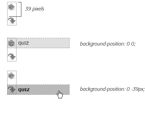
In your favorite image-editing program, create one image with different versions of the button.
You might create a regular state, a rollover state, and maybe even a “you are here” state. Place the images one on top of the other, with the regular link image on top and the rollover image below.
Measure the distances from the top of the entire graphic to the top of each image.
In Figure 9-9 (top) the rollover image’s top edge is 39 pixels from the top of the graphic.
Create a CSS style for the regular link. Include the image in the background and place it at the left top of the style (Figure 9-9, middle).
Your style may look something like this:
a { background: #E7E7E7 url(images/pixy.png) no-repeat left top; }Create the :hover style.
Here’s the trick: Use the background-position property to shift the graphic upwards, so the first image disappears and the rollover image becomes visible (Figure 9-9, bottom).
a:hover { background-position: 0 -39px; }
Besides preventing the dreaded download delay, this technique helps you keep your navigation graphics organized in a single file.
Tip
CSS gives you other ways to preload the image. You can place the image into the background of an element that’s covered by another element. Say your site’s logo appears in the top-left corner of the web page. You could place the rollover image in the top-left corner of the page’s background: body { background: url(rollover.gif) no-repeat left top; }. When the page loads, the rollover graphic is sitting in the background of the page, but your visitors won’t see it because it’s covered by the logo. Another method is to place the rollover image inside a <div> that you position off the page using CSS positioning (see Hiding Parts of a Page). In either case, the browser downloads the image and the CSS rollover won’t have any delays.
Note
Some websites take this technique to the extreme. Yahoo, Amazon, and Google (among many others) often put together dozens of little images into a single file and display only the portion of the file containing the desired button. You can see an example from Amazon here: www.flickr.com/photos/mezzoblue/3217540317.
On a more manageable level, the website of one well-known designer uses a single graphic to manage the 15 different buttons on her navigation bar. You can read about her technique at http://veerle-v2.duoh.com/blog/comments/the_xhtml_css_template_phase_of_my_new_blog_part_2/. You can also see this technique in action in this chapter’s tutorial, in step 8 on Tutorial: Creating a Navigation Bar.
Sliding Doors
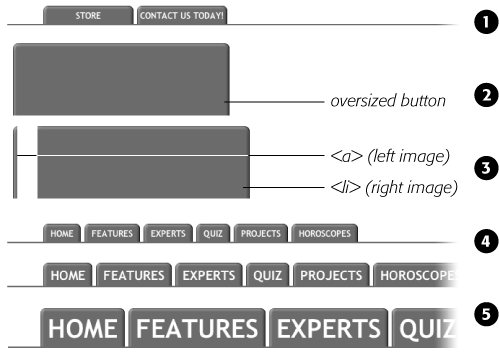
Ever since Amazon popularized them years back, tabbed navigation buttons have become one of the most common ways to highlight the organization of a site. With good reason, too: Selecting a tab to open a new “folder” of information is a metaphor everyone recognizes. You have many ways to create tab buttons. Most basically, you can use border and background colors around links to create a tab appearance (see Figure 9-7). This technique uses just CSS—no images.
But using graphics can really add depth and visual interest to your buttons. One common method is to create a tab made up of a single graphic—text added to a button graphic in a graphics program like Photoshop or Fireworks. However, updating a bunch of button images every time you change your site’s navigation can get old quick. Furthermore, having different graphics for each button slows down the loading time of your site.
A slicker technique is to put a tab graphic in the background of each link and use regular HTML for the text. That way, updating your site’s navigation is a simple matter of updating some text in a web page. Even someone with zero Photoshop experience can manage it. The only time a single graphic for a tab doesn’t work well is when the text on each link varies in length. If one tab reads “Store,” and the other reads “Contact Us Today!” the Store tab suffers from empty space and the Contact tab looks a little cramped (see #1 in Figure 9-10).
What you need in that case is a way to have the tab graphic shrink-wrap itself around the link text. Luckily, designer Douglas Bowman has come up with a creative technique that does just that. Dubbed the Sliding Doors method, it involves creating one very wide and tall tab graphic in your image editing program (#2 in Figure 9-10), and then slicing that image into two graphic files (#3 in Figure 9-10). The very thin graphic is the left edge of the tab. It should be only wide enough to reveal the sloping left edge of the tab. The second graphic is very wide—wider than you imagine any tab on the page would ever get—and forms the tab’s main body and right edge.
Note
Douglas Bowman’s Sliding Doors technique is a classic in CSS design. You can find his original article at the A List Apart website: www.alistapart.com/articles/slidingdoors. There’s also a follow-up article covering more advanced techniques at www.alistapart.com/articles/slidingdoors2.
Now here’s the tricky part. Since a tag can have only one background image, you need to apply the graphics as backgrounds to two different tags. Start by creating an unordered list and turning it into a horizontal navigation bar as described on Horizontal Navigation Bars. At this point, each <a> tag is nested inside one <li> tag, so you’ve got two tags to play with.
First, add the wide background image to the <li> tag and place it at the top-right corner of the tag. Do that by adding the following property to the style formatting for that button’s <li> tag:
background: url(images/right_tab.gif) no-repeat right top;
The Sliding Doors technique capitalizes on the fact that a background image never extends outside of the box created by its tag. In other words, even though this image is really, really wide and tall, you won’t see any part of the graphic that extends outside the region of the <li> tag—either below it or outside its left edge.
Note
If you like this technique, but aren’t good at using Photoshop to create graphics, you can pick up free tab designs at www.exploding-boy.com/2005/12/15/free-css-navigation-designs and www.exploding-boy.com/2005/12/21/more-free-css-navigation-menu-designs.
Next, place the thin, left-hand graphic in the top-left background of the <a> tag by adding this property to the style for the link:
background: url(images/left_tab.gif) no-repeat left top;
Because the <a> tag is nested inside of the <li> tag, its background appears above the <li> tag’s background. That left side tab graphic sits on top of the really wide tab graphic, creating the illusion of a single graphic. At this point, type whatever text you want for each link, in the process expanding the <li> tag and exposing more of the extra-wide graphic (see #4 in Figure 9-10).
Styling Particular Types of Links
Web designers link to all sorts of things: other web pages on their sites, web pages on other sites, Adobe Acrobat files, Word documents, and Zip archive files, to name a few. To help guide your site’s visitors, you might want to supply clues to let them know where a link leads before they click it. Advanced selectors are a great way to do just that. Although this technique uses selectors from CSS 3 (the next, as yet-to-be-finished CSS standard) almost all browsers currently understand these selectors.
Note
Internet Explorer 6 doesn’t understand these selectors (of course). However, the market share of that browser continues to plummet (as of this writing less than 17 percent), and you can still use this technique without harming the usability of your site. The majority of visitors will get the enhanced presentation, while IE 6 users will get the regular view of the site.
Links to other websites
You can easily create a style that identifies links to other websites using an attribute selector. As you read on Attribute Selectors, attribute selectors let you style HTML tags that have a particular attribute—for example, an <img> tag with the alt attribute set to Our Company. You can also style tags whose attributes begin with certain values. Any link that points outside your site must be an absolute URL (see Controlling Repetition), meaning it must begin with http://—for example, http://www.yahoo.com. So to create a style that only affects links using an absolute URL, you use this selector:
a[href^='http://']
The ^= translates to “begins with,” so this selector matches links like <a href="http://www.google.com/">, <a href="http://www.sawmac.com/missing/css2e/">, and so on.
You could style these any way you’d like, but one common technique is to add a small image next to the link—an icon indicating an external link. You’ll see this in action on Adding a Background Image to a Link of this chapter’s tutorial.
If you happen to use absolute links to point to other pages in your site, then you’ll need to add another style to “turn off” the styling—otherwise, you’ll end up highlighting those links as external links, when in reality they’re just links within your site. This second style just uses a more detailed version of the selector listed above. For example, if your site is located at www.mysite.com, then you can create a selector that applies to those links like this: a[href^='http://www.mysite.com']. Putting this all together, if you want to add a globe icon next to external links, but not for links within your site, you can create these two styles:
a[href^='http://'] {
  background: url(images/globe.png) no-repeat center right;
  padding-right: 15px;
}
a[href^='http://www.mysite.com'] {
  background: none;
  padding-right: 0;
}
Note
If you want to get really fancy with your CSS, you can combine the attribute selector with the CSS 3 :not( ) selector to create a single style that will affect all absolute URLs except ones pointing to your own site:
a[href^='http://']:not(a[href^='http://www.mysite.com'])
This crazy-looking selector translates to “select all links that begin with http://, but not the ones that begin with http://www.mysite.com.” The downside of this technique is that no version of Internet Explorer (not even 8) understands the :not( ) selector, so pretty much the majority of the web surfing population won’t see any affect from this style.
Email links
Email links are another special kind of link. Normally, email links look just like any other link—blue and underlined. However, they don’t act like any other link. Clicking one launches a visitor’s email program, and some people find starting up a new program while browsing a website really distracting, so let ‘em know it’s for email.
The same basic technique described for external links above applies. Since all email links begin with mailto:, you can create a selector like the following to create a style to format just email links:
a[href^='mailto:']
You’ll see an example of this in action in the tutorial on Adding a Background Image to a Link.
Links to specific types of files
Some links point to files, not other web pages. You often see a company’s annual report up online as a downloadable PDF file or a Zip archive of files (like the tutorials for this book) on a website. Links to those types of files usually force the browser to download the file to the visitor’s computer, or, for PDF files, launch a plug-in that lets you view the file within the browser. It can be a real drag to click a link, only to find out that it’s actually started a 100MB download!
You can identify specific file types in much the same way as external links or email links. But instead of looking for specific information at the beginning of the link’s URL, you can find it at the end. For example, a link to a PDF document might look like this <a href="annual_report.pdf">, while a link to a ZIP archive could look like this: <a href="tutorials.zip">. In each case, the specific file type is identified by an extension at the end of the URL—.pdf or .zip.
CSS 3 provides an attribute selector that lets you find attributes that end with specific information. So to create a style for links to PDF files, use this selector:
a[href$='.pdf']
$= means “ends in,” so this selector means select all links whose href attribute ends in .pdf. You can create similar styles for other types of files as well:
a[href$='.zip'] /* zip archive */
a[href$='.doc'] /* Word document */
You’ll see examples of this technique in the tutorial on Tutorial: Creating a Navigation Bar.
Tutorial: Styling Links
In this tutorial, you’ll style links in a variety of ways, like adding rollovers and background graphics.
To get started, download the tutorial files from this book’s companion website at www.sawmac.com/css2e. Click the tutorial link and download the files. All the files are enclosed in a Zip archive, so you need to unzip them first. (You’ll find detailed instructions on the website.) The files for this tutorial are contained inside the 09 folder.
Basic Link Formatting
Launch a web browser and open the file 09 → links → links.html.
This page contains a variety of links (circled in Figure 9-11) that point to other pages on the site, links to pages on other websites, and an email address. Start by changing the color of the links on this page.
Open links.html in a text editor and place your cursor between the opening and closing <style> tags.
The page already has an external style sheet attached to it with some basic formatting, plus the <style> tags for an internal style sheet.
Note
As you’ve done before (Tutorial: Selector Sampler), you’ll put the styles for this exercise into an internal style sheet for easy coding and previewing. When done, it’s best to move the styles to an external style sheet.
Add a new style to the internal style sheet:
<style type="text/css">
a {color: #207EBF;}</style>This style is about as generic as it gets. It will apply to all <a> tag on the page. It’s a good place to start, since it sets up the overall look of links for the page. You’ll add more styles that will let you pinpoint links in specific areas of the page. Now, time to remove that boring old underline beneath the link.
Add text-decoration: none; to the style you just created.
This removes the underline, but also makes the link less visible on the page. Remember you should always do something to make links stand out and seem clickable to your site’s visitors.
Figure 9-11. Here’s a basic web page with links in their standard browser configuration—underlined and blue (or purple, if they’re links to previously visited pages). In this case, some links point to other pages on the site, some point to other sites, and one is an email address. In this tutorial, you’ll style each of these links differently.Add font-weight: bold; to the a style.
Now links appear in bold (other text may appear bold, too). Next you’ll replace the underline, but you’ll do it a bit more creatively, using a border instead of the text-decoration property.
Add a border declaration to the style, so it looks like this:
a { color: #207EBF; text-decoration: none; font-weight: bold;border-bottom: 2px solid #F60;}The links really stand out, and using a border instead of the normal underline applied to links lets you change the line’s color, size, and style (Figure 9-12, left). Now you’ll change the look of visited links.
Add a :visited pseudo-class style for visited links:
a:visited {
 color: #6E97BF;
}
This style changes the look of visited links to a lighter, grayer shade of the main link color—a subtle way to draw attention away from an already visited page. If you preview the page, click one of the links (try one in the middle part of the page) and then return to the links.html page. You should see the link get lighter in color. You’ll also notice that it stays bold and continues to have the orange underline you assigned to the a style in step 6. That’s the cascade in action (Chapter 5)—the a:visited style is more specific than a plain a selector, so its color property overrides the color assigned by the a style.
Time to take it a step further by adding a rollover effect, so the link’s background changes color when the mouse moves over it.
Add a :hover pseudo-class style to the style sheet:
a:hover {
  color: #FFF;
  background-color: #6E97BF;
  border-bottom-color: #6E97BF;
}
This pseudo-class applies only when the mouse is over the link. The interactive quality of rollovers lets visitors know the link does something (Figure 9-12).


Adding a Background Image to a Link
The email link at the bottom of the page looks no different than the other links on the page (Figure 9-13, top). You have other plans for that mailto link, however. Since it points to an email address, clicking it doesn’t take a visitor to another page, but instead launches an email program. To provide a visual cue emphasizing this point, you’ll add a cute little email icon.
Add a descendent selector to the internal style sheet of the links.html file:
#legal a {
  color: #666666;
  border: none;
  background: url(images/email.gif) no-repeat left center;
}
The email link’s inside a <p> tag with an ID of legal, so this style affects only this link, and the color declaration makes it gray. The border: none setting removes the underline defined by the a style you created in step 6—you’re going for a subtle look here. The background property adds an image on the left edge of the link. Finally, the no-repeat value forces the graphic to appear just a single time. Trouble is, the graphic lies directly underneath the link, so it’s hard to read the text (circled in the middle image in Figure 9-13).
Add 20 pixels of left padding to the #legal a style you just created:
padding-left: 20px;
Remember that padding adjusts the space between content and its border. So adding some left padding moves the text over 20 pixels but leaves the background in place. One last touch: move the entire link a little away from the copyright notice.
Add 10 pixels of left margin to the style, so it finally ends up like this:
#legal a { color: #666666; border: none; background: url(images/email.gif) no-repeat left center; padding-left: 20px;margin-left: 10px;}This small visual adjustment makes it clear that the icon is related to the link and not part of the copyright notice (Figure 9-13, bottom).
Tip
You can also use an advanced attribute selector, as described on Attribute Selectors, to highlight all email links this way. You’ll see those selectors used in the next section.

Highlighting Different Links
At times you may want to indicate that a link points to another website. In this way, you can give your visitors a visual clue that there’s additional information elsewhere on the Internet or warn them that they’ll exit your site if they click the link. Also, you may want to identify links that point to downloadable files or other non-web-page documents.
On the web page you’re working on, the right-hand “Resources” sidebar contains different types of links that you’ll highlight with icons—a different icon for each type of link. First, you’ll set up a basic style that applies to all of those links.
Add this style to the links.html internal style sheet:
#resources a {
  border-bottom: none;
}
Since all of the links you want to format are inside a <div> with the ID resources, the descendent selector #resources a, targets just those links. This style gets rid of the underline that the generic link style added (step 6 on Adding a Background Image to a Link added).
Next, you’ll add an icon next to external links.
Add another style at the end of the links.html internal style sheet:
a[href^='http://'] {
  background: url(images/globe.png) no-repeat right top;
}
This style uses the advanced attribute selector discussed on Attribute Selectors. Basically, it targets any link that begins with http://. As with the email link style you created earlier, this style adds a background image. It places the image at the right side of the link.
Note
In this section, you’re using advanced attribute selectors to style the different links in the page’s sidebar. Most browsers understand these styles—with the exception of IE 6. If you want to create similar styles that work with IE 6, your best bet is to use class styles—.externalLink, for example—and then manually apply class names to links that point outside your site: <a class="externalLink” href="http://www.twitter.com">. This method will take a lot of work, however, since you need to add classes to each type of link—external, PDF files, Word docs, and so on. Unless your client or boss demands it, it’s better to be forward-looking and use these CSS 3 selectors—the dwindling community of IE 6 users will still be able to click the links, they just won’t see the icons.
However, this style has a similar problem as the email link style—the image sits underneath the link’s text. Fortunately, the solution is the same—just add some padding to move the image out of the way of the text. In this case, though, instead of adding left padding, you’ll add right padding (since the icon appears on the right side of the link). In addition, since every link in the resources box will have a similarly sized icon, you can save some code by adding the padding to the #resources a style you created in step 1.
Edit the #resources a style so that it looks like this:
#resources a { border-bottom: none;padding-right: 22px;}If you save the page and preview it in a web browser, you’ll see small globe icons to the right of the bottom two links in the sidebar. Time to format the other links.
Add three more styles to the internal style sheet:
a[href$='.pdf'] {
  background: url(images/acrobat.png) no-repeat right top;
}
a[href$='.zip'] {
  background: url(images/zip.png) no-repeat right top;
}
a[href$='.doc'] {
  background: url(images/word.png) no-repeat right top;
}
These three styles look at how the href attribute ends; identifies links to either Adobe Acrobat files (.pdf), Zip archives (.zip), or Word documents (.doc); and assigns a different icon in each case.
Finally, add a hover state for the resources links:
#resources a:hover {
  color: #FFF;
  background-color: #6E97BF;
}
This style both changes the color of the text and adds a background color (see Figure 9-14).
You can find a finished version of this tutorial in the 09_finished/links/links.html file.

Tutorial: Creating a Navigation Bar
In this exercise you’ll turn a plain old list of links into a spectacular navigation bar, complete with rollover effects and a “You are here” button effect.
In a text editor, open 09 → nav_bar → nav_bar.html.
As you can see, there’s not much to this file yet. There’s an internal style sheet with the basic “reset styles” discussed on Starting with a Clean Slate, and one rule setting up some basic properties for the <body> tag. The HTML consists of an unordered list with six links. It looks like example #1 in Figure 9-15. Your first step is to add some HTML so you can target your CSS to format the links in this list.
Locate the opening <ul> tag and add id="mainNav” to it, so it looks like this:
<ul id="mainNav">
The ID attribute identifies this list as the main navigation area. Use this ID to build descendent selectors to format only these links—and not just any old link on the page.
Below the body style in the internal style sheet, add a new style:
#mainNav {
  margin: 0;
  padding: 0;
  list-style: none;
}
This style applies only to a tag with an ID of mainNav—in this case, the <ul> tag. It removes the indent and bullets that browsers apply to unordered lists, as shown in #2 in Figure 9-15. Next, you’ll start formatting the links.
Add a descendent selector to format the links in the list:
#mainNav a {
  color: #000;
  font-size: 11px;
  text-transform: uppercase;
  text-decoration: none;
}
This style defines the basic text formatting for the links. It sets the color and font size, makes all letters uppercase, and removes the line usually found underneath links (# 3 in Figure 9-15). Now start making the links look like buttons.
To the #mainNav a style, add the following border and padding properties:
border: 1px dashed #999;
padding: 7px 5px;
If you preview the file now, you’ll see a few problems (#4 in Figure 9-15): The borders overlap and the boxes aren’t the same width. That’s because the <a> tag is an inline element, so the width of the box is just as wide as the text in the link. In addition, top and bottom padding don’t add any height to inline boxes, so the borders overlap. (See Displaying Inline and Block-Level Boxes for a discussion of inline boxes.) You can fix these problems by changing how a browser displays these links.
Add display: block; to the #mainNav a style.
You’ve changed the basic display of the <a> tag so that it acts like a paragraph or other block-level element, with the links neatly stacked one on top of the other. The only problem now is that they also extend the full length of the browser window—a little too wide for a button. You can fix this by constraining the width of the <ul> tag’s style.
Note
If you preview the page in Internet Explorer 6 or earlier, you’ll notice a gap between each nav button. Remain calm. You’ll fix this bug in step 1 on Fixing the IE Bugs.
In the internal style sheet, locate the #mainNav style and add width: 175px; to it.
With the list’s width now set to 175 pixels, the links still expand, but they’re limited to the width of their container (the <ul> tag). In many cases, you’ll have a list of links inside some layout element (like a sidebar) that already has a set width, so you’ll be able to skip this step. (You’ll learn how to add sidebars in Part III.)
Now for the fun part.
Add background properties to the #mainNav a style, like so:
#mainNav a { color: #000; font-size: 11px; text-transform: uppercase; text-decoration: none; border: 1px dashed #999; padding: 7px 5px; display: block;background-color: #E7E7E7;background-image: url(images/nav.png);background-repeat: no-repeat;background-position: 0 2px;}These lines add a gray background color to the links and a nonrepeating image at the left edge of each button (#5 in Figure 9-15). You still have a couple of things to fix: The link text overlaps the icon, and the border between each button is 2 pixels thick. (Technically, the borders are still just 1 pixel thick, but the bottom and top borders of adjoining links are creating a 2-pixel line.)
Remove the bottom border and adjust the padding for the #mainNav a style, so it looks like this:
#mainNav a { color: #000; font-size: 11px; text-transform: uppercase; text-decoration: none; border: 1px dashed #999;border-bottom: none;padding: 7px 5px 7px 30px;display: block; background-color: #E7E7E7; background-image: url(images/nav.png); background-repeat: no-repeat; background-position: 0 2px; }The text of each link sits clear of the icon and the borders look great…except for one thing. The last link’s bottom border is now gone. (Sometimes CSS feels like two steps forward, one step back!) But you have a few ways to fix this snafu. One way is to create a class style with the proper border-bottom setting and then apply it to just that last link. But it would be easier to apply a bottom border to the <ul> tag containing the list of links. (Since there’s no padding on that tag, there’s no space separating the top of the <ul> from the top of that first link.)
Add a bottom border to the #mainNav style so that it looks like this:
#mainNav { margin: 0; padding: 0; list-style: none; width: 175px;border-bottom: 1px dashed #999;}There you have it: A basic navigation bar using borders, padding, background color and images (#6 in Figure 9-15).

Adding Rollovers and Creating “You Are Here” Links
Now it’s time to add some interactive and advanced features to this nav bar. First, you’ll add a rollover effect to the buttons in your main navigation bar. That way, the buttons change to show your visitor which button she’s about to click.
It’s also considerate to let your visitor know which page of your site she’s on. Using the same HTML nav bar you already have, you can make this bit of interactivity happen automatically. You simply make the button’s format change to match the page’s section. Sounds simple, but it does require a little planning and setup, as you’ll see in the following steps.
The rollover effect is easy, so get that out of the way first:
In the nav_bar.html file, add the following style to the end of the style sheet:
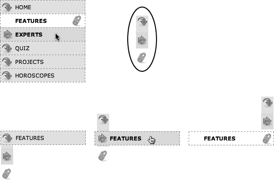
#mainNav a:hover {
  font-weight: bold;
  background-color: #B2F511;
  background-position: 3px 50%;
}
This style sets the button’s hover state. It makes the text inside the button bold, and changes the background color to a vibrant green. In addition, it uses the CSS Sprites technique discussed on CSS-Style Preloading Rollovers. The same image is used as in step 8 on Tutorial: Creating a Navigation Bar—however, that image actually holds three different icons (see Figure 9-16). In this case, the image is centered within the button, displaying the middle icon in the file.
Now, moving the mouse over any of the buttons instantly changes its look. (Open the page in your web browser and try it yourself.)
Figure 9-16. With some basic CSS, it’s easy to create interactive rollover effects for navigation buttons. You can even automatically highlight the section of the site in which the current page is located. To speed up the download of your navigation bar graphics, you can use the CSS Sprites method described on CSS-Style Preloading Rollovers. Basically you use one image (circled at top right) and adjust its position for different states of each button (bottom row).Next, make your navigation bar more informative by highlighting the button that matches the section in which the page is located. To do so, you need to identify two things in the nav bar’s HTML: the section a page belongs to and the section each link points to. For this example, assume that the page you’re working on is the home page.
Locate the <body> tag, and then add id = “home”, like so:
<body id="home">
Now that you know what section this page belongs to, you can use a descendent selector to create special CSS rules that apply only to tags on pages within the Features section. Next, you need to identify the section each link applies to, which you accomplish by adding some IDs to those links.
In the nav bar’s HTML code, locate the Home link, and then add id="homeLink” so the tag looks like this:
<a href="/index.html"
id="homeLink">Home</a>This ID uniquely identifies this link, providing the information you need to create a style that applies only to that link.
You need to ID the other links in the navigation bar as well.
Repeat step 3 for each of the other links using the following IDs: featureLink, expertLink, quizLink, projectLink, and horoscopeLink.
You’re done with the HTML part of this exercise. Now it’s time to create some CSS. Because you’ve ID’d the page and the link, it’s easy to create a descendent selector to highlight the Features link.
Add another style to the page’s style sheet:
#home #homeLink {
  background-color: #FFFFFF;
  background-position: 97% 100%;
  padding-right: 15px;
  padding-left: 30px;
  font-weight: bold;
}
You’ve seen all these properties before. Again, you’re using the CSS Sprites method to adjust the position of the background image. This time, the image is moved over to the right 97 percent (that is, the point 97 percent across the image is matched up with the point 97 percent across the button), and the bottom of the image is placed at the bottom of the button. In other words, it displays the icon at the bottom of the image (see Figure 9-16). See Percentage Values for a discussion of how percentage values work with background-images.
The most interesting part is the selector—#home #homeLink. It’s a very specific selector that applies only to a link with an ID of homeLink that’s also inside a <body> tag with an ID of home. If you change the ID of the page to quiz, for example, the link to the Home page is no longer highlighted.
Preview the page in a browser to see the effect: The Home link now has a white background and a paperclip icon. To make this work for the other links, you need to expand this selector a little…OK, make that a lot.
Edit the selector for the style you just added, like so:
#home #homeLink,#feature #featureLink,#expert #expertLink,#quiz #quizLink,#project #projectLink,#horoscope #horoscopeLink {background-color: #FFFFFF; background-position: 97% 100%; padding-right: 15px; padding-left: 30px; font-weight: bold; }Yes, that’s a lot of CSS. But your set-up work here has a big payoff. This style now applies to every link in the nav bar, but only under certain conditions, which is exactly how you want it to behave. When you change the id attribute of the <body> tag to quiz, the link to the Quiz gets highlighted instead of the link to the Features section. Time to take your work for a test drive.
Note
This long-winded selector is an example of the group selector discussed on Constructing Group Selectors.
Change the id attribute of the <body> tag to feature like this:
<body id="feature">
Preview the page, and wham! The Feature link is now highlighted with a white background and a paperclip icon (Figure 9-16). The secret at this point is to just change the ID in the <body> tag to indicate which section of the site a page belongs to. For a horoscope page, change the id to id="horoscope” in the <body> tag.
Note
Ready to take this design further? Try adding a rollover effect to complement the style you created in step 6. (Hint: Use the :hover pseudo-class as part of the selector like this: #quiz #quizLink:hover. ) Also try adding a different graphic for the Home link. (You have a home.png file in the images folder to use.)
Fixing the IE Bugs
What would a CSS tutorial be if there weren’t any Internet Explorer bugs to fix? Unfortunately, the navigation bar doesn’t work quite right in Internet Explorer 6 or earlier (it’s fine in IE 7 and 8). First, an annoying gap appears between each button. In addition, only the text—not the entire area of the button—is clickable (Figure 9-17). In other browsers, moving the mouse over any part of the background (including the empty space to the right of the link text) highlights the link. Fortunately, the fix is simple.

Edit the #mainNav a style by adding zoom: 1. The final style should look like this:
#mainNav a { text-decoration: none; color: #000000; font-size: 11px; text-transform: uppercase; border: 1px dashed #999999; border-bottom: none; padding: 7px 5px 7px 30px; display: block; background-color: #E7E7E7; background-image: url(images/nav.png); background-repeat: no-repeat; background-position: 0 2px;zoom: 1;}As discussed in the box on Got Layout?, this weird little bit of code is enough to fix IE 6. Go figure.
If you have Internet Explorer 6, preview the page in it.
The navigation bar should now work as well in that browser as it does in more savvy browsers like Internet Explorer 8, Firefox, Opera, and Safari.
To see the completed version of this navigation bar, see the file 09_finished → nav_bar → nav_bar_vertical.html.
Note
In many cases, when creating specific styles targeted to just Internet Explorer, it’s a good idea to isolate them from your other styles. Not that they’re contagious, but they usually include nonsense CSS that for weird reasons smoothes out IE kinks. You don’t want to read your style sheet later and get confused about why you included some bizarre CSS. In fact, the preferred method is to put IE-only styles in external style sheets and attach them using Microsoft’s conditional comments feature. Get the full story on Isolate CSS for IE with Conditional Comments.
From Vertical to Horizontal
Suppose you want a horizontal navigation bar that sits at the top of the page. No problem—you did most of the hard work in the last part of this tutorial. Just modify that page a little to spread the buttons along a single line. (You’ll use the nav_bar.html file you just completed, so if you want to keep the vertical nav bar, then save a copy of the file before proceeding.)
Make sure you’ve completed all the steps above to create the vertical navigation bar, and have the file nav_bar.html open in your text editor.
Now you’ll see how easy it is to change the orientation of a navigation bar. Start by cleaning up some of the work you already did. You need to remove the width you set for the <ul> tag in step 7 on Using floats for horizontal navigation. That width prevented the nav buttons from spanning the entire length of the page. But since the <ul> needs to spread out much wider to contain the side-by-side buttons, this width has to go.
Find the #mainNav style, and then remove the width: 175px; declaration.
And now it’s time for the big secret of vertical nav bars—placing the buttons side by side.
Add a new style to your style sheet (directly below the #mainNav style is a good spot):
#mainNav li {
  float: left;
  width: 12em;
}
This style applies to the <li> tag (the list items that hold each link). The first declaration floats the tag to the left. In this way, each <li> tag attempts to wrap around to the right side of the previous <li> tag. (You saw the same effect in the photo gallery tutorial on Tutorial: Creating a Photo Gallery.) Also, setting the width of the <li> tag defines the width of each button. Here, a value of 12ems provides enough space to contain the longest link name—Horoscopes. When you’re working with longer links, you need to increase this value.
Tip
Using an em value for the width of the buttons used to be considered a best practice among web designers, since em values adjust to changes in the browsers font size. So if a visitor chose to increase the font size, the em-width button would also grow in size. However, most web browsers these days use a “page zoom” feature, so that when you enlarge the text, you’re actually enlarging the entire page—zooming in—so even buttons and other elements whose widths are defined in pixels, grow in size. So nowadays, you see more designers using pixel values for everything.
If you preview the page now, you’ll see the basics are complete. All that’s left are some cosmetic enhancements (see the circled areas of #1 in Figure 9-18). First, the bottom border you created in step 10 on Adding Rollovers and Creating “You Are Here” Links runs the entire length of the <ul> tag—wider than the navigation buttons themselves. Even stranger, that bottom border is no longer on the bottom—it’s on top of the navigation buttons! In addition, since the buttons sit side by side, their left and right borders combine to make a 2-pixel border between each button. You’ll fix that problem now.
In the #mainNav a style change border-bottom: none; to border-left: none;.
This change removes the left border so that the borders don’t double up between buttons and at the same time adds a border to the bottom of each button. But that <ul> tag’s bottom border is still on top of the buttons, and now the nav bar is missing a border on the far left button (see circled areas of #2 in Figure 9-18). No problem—just change the border on the <ul> tag.
Locate the #mainNav style and change border-bottom: 1px dashed #999999; to border-left: 1px dashed #999999;.
If you preview the page now, you’ll see that the border above the buttons is gone, but there’s still no left border (#3 in Figure 9-18). You’re witnessing one of the complications of using floats. That is, floating the list items removes them from the normal flow of the document, so web browsers no longer see them as part of the <ul> tag, and the <ul> tag shrinks down to nearly no height—that’s the reason the ul’s bottom border appeared on top as well. (If this whole scenario sounds confusing, it is. That’s why there’s an entire section of Chapter 12 dedicated to dealing with the issue—see Overcoming Float Problems for the details.)
Fortunately, while the problem is complex, the solution is simple. Add one CSS property to the bulleted list.
Add two properties to the end of the #mainNav style (changes are in bold):
#mainNav { margin: 0; padding: 0; list-style: none; border-left: 1px dashed #999999;overflow: hidden;zoom: 1; /* for IE 6 */}The overflow: hidden forces the unordered list to expand. Why does this property work? See the detailed coverage on Clearing and Containing Floats. The zoom: 1 is for your old nemesis, Internet Explorer 6.
Finally, that paperclip aligned to the right edge of the “You are here” button looks funny (#4 in Figure 9-18). You’ll switch its position to the left edge of the button.
Locate the “You are here” style you created in step 6 on Adding Rollovers and Creating “You Are Here” Links. (It’s the one with the crazy, long-winded selector.) Change its background position from 97% 100% to 3px 100%. The style should now look like this:
#home #homeLink, #feature #featureLink, #expert #experLink, #quiz #quizLink, #project #projectLink, #horoscope #horoscopeLink { background-color: #FFFFFF;background-position: 3px 100%;padding-right: 15px; padding-left: 30px; font-weight: bold; }Preview the page, and you’ll find a fully functional horizontal navigation bar (#5 in Figure 9-18). And guess what? It works perfectly even in Internet Explorer 6.
To see the finished version, open the file 09_finished → nav_bar → nav_ bar_horizontal.html.
