
Chapter 13. Positioning Elements on a Web Page
When the World Wide Web Consortium introduced CSS Positioning, some designers understandably thought they could make web pages look just like print documents created in programs like PageMaker, InDesign, or Quark XPress. With just a couple of CSS properties, CSS Positioning lets you position an element in a precise location on a page—say 100 pixels from the top of the page and 200 pixels from the left edge. The pixel-accurate placement possible with CSS-P (as it was called way back when) seemed to promise that, at last, you could design a page simply by putting a photo here, a headline there, and so on.
Unfortunately, the level of control designers expected from CSS-P never materialized. There have always been differences in how various browsers display CSS positioned elements. But, even more fundamentally, the Web doesn’t work like a printed brochure, magazine, or book. Web pages are much more fluid than printed pages. Once a magazine rolls off the press, readers can’t change the page size or font size. About the only way they can change the look of the magazine is to spill coffee on it.
Web visitors, on the other hand, can tinker with your handcrafted presentation. They can increase their browsers’ font size, potentially making text spill out of precisely placed and sized layout elements. But the news isn’t all bad: As long as you don’t try to dictate the exact width, height, and position of every design element, you’ll find CSS’s positioning properties powerful and helpful. You can use these properties to make a text caption appear on top of a photo, create multicolumn page layouts, place a logo anywhere on the page, and much more.
How Positioning Properties Work
The CSS position property lets you control how and where a web browser displays particular elements. Using position, you can, for example, place a sidebar anywhere you wish on a page or make sure a navigation bar at the top of the page stays in place even when visitors scroll down the page. CSS offers four types of positioning:
Absolute. Absolute positioning lets you determine an element’s location by specifying a left, right, top, or bottom position in pixels, ems, or percentages. (See Chapter 6 for more on picking between the different units of measurement.) You can place a box 20 pixels from the top and 200 pixels from the left edge of the page, as shown in Figure 13-1, middle. (More in a moment on how you actually code these instructions.)
In addition, absolutely positioned elements are completely detached from the flow of the page as determined by the HTML code. In other words, other things on the page don’t even know the absolutely positioned element exists. They can even disappear completely underneath absolutely positioned items, if you’re not careful.
Relative. A relatively positioned element is placed relative to its current position in the HTML flow. So, for example, setting a top value of 20 pixels and left value of 200 pixels on a relatively positioned headline moves that headline 20 pixels down and 200 pixels from the left from wherever it would normally appear.
Unlike with absolute positioning, other page elements accommodate the old HTML placement of a relatively positioned element. Accordingly, moving an element with relative positioning leaves a “hole” where the element would have been. Look at the dark strip in the bottom image of Figure 13-1. That strip is where the relatively positioned box would have appeared, before it was given orders to move. The main benefit of relative positioning isn’t to move an element, but to set a new point of reference for absolutely positioned elements that are nested inside it. (More on that brain-bending concept on When Absolute Positioning Is Relative.)
Fixed. A fixed element is locked into place on the screen. It does the same thing as the fixed value for the background-attachment property (Using Background Property Shorthand). When a visitor scrolls the page, fixed elements remain onscreen as paragraphs and headlines, while photos disappear off the top of the browser window.
Fixed elements are a great way to create a fixed sidebar or replicate the effect of HTML frames, where only a certain portion (frame) of the page scrolls. You can read about how to create this effect on Creating CSS-Style Frames Using Fixed Positioning.
Figure 13-1. CSS offers several ways to affect an element’s placement on a web page. The static option, top, is the way browsers have presented content since the beginning of the Web. They simply display the HTML in top-to-bottom order. Absolute positioning (middle) removes an element from the page flow, placing it on top of the page, sometimes overlapping other content. Relative positioning (bottom) places an element relative to where it would normally appear on the page and leaves a hole (the dark background here) where that element would’ve been without relative positioning.Static positioning simply means the content follows the normal top-down flow of HTML (see Figure 13-1, top). Why would you want to assign an element static positioning? The short answer: You probably never will.

To change the positioning of any element, simply use the position property followed by one of the four keywords: absolute, relative, fixed, static. To create an absolutely positioned element, add this property to a style:
position: absolute;
Static is the normal positioning method, so unless you’re overriding a previously created style that already has a position of absolute, relative or fixed, you won’t need to specify that. In addition, static elements don’t obey any of the positioning values discussed next.
Setting a positioning value is usually just part of the battle. To actually place an element somewhere on a page, you need to master the various positioning properties.
Setting Positioning Values
The display area of a web browser window—also called the viewport—has top, bottom, left, and right edges. Each of the four edges has a corresponding CSS property: top, bottom, left, and right. But you don’t need to specify values for all four edges. Two are usually enough to place an item on the page. You can, if you want, place an element 10ems from the left edge of the page and 20ems from the top.
Note
Internet Explorer 6 sometimes misplaces elements that are positioned with the bottom or right properties. See the box on Stacking Elements.
To specify the distance from an edge of a page to the corresponding edge of the element, use any of the valid CSS measurements—pixels, ems, percentages, and so on. You can also use negative values for positioning like left: –10px; to move an element partly off the page (or off another element) for visual effect, as you’ll see later in this chapter (Breaking an Element Out of the Box).
After the position property, you list two properties (top, bottom, left, or right). If you want the element to take up less than the available width (to make a thin sidebar, for example), then you can set the width property. To place a page’s banner in an exact position from the top and left edges of the browser window, create a style like this:
#banner {
  position: absolute;
  left: 100px;
  top: 50px;
  width: 760px;
}
This style places the banner as pictured in Figure 13-2, top.

Here’s another example: placing an element so it always remains a fixed distance from the right side of the browser. When you use the right property, the browser measures the distance from the right edge of the browser window to the right edge of the element (Figure 13-2, middle). To position the banner 100 pixels from the right edge of the window, you’d create the same style as above, but simply replace left with right:
#banner {
  position: absolute;
  right: 100px;
  top: 50px;
  width: 760px;
}
Since the position is calculated based on the right edge of the browser window, adjusting the size of the window automatically repositions the banner, as you can see in Figure 13-2, bottom. Although the banner moves, the distance from the right edge of the element to the right edge of the browser window remains the same.
Technically, you can specify both left and right position properties as well as both top and bottom and let a browser determine the width and height of the element. Say you want a central block of text positioned 100 pixels from the top of the window and 100 pixels from both the left and right edges of the window. To position the block, you can use an absolutely positioned style that sets the top, left, and right properties to 100 pixels. In a browser window, the left edge of the box starts 100 pixels from the left edge of the window, and the right edge extends to 100 pixels from the right edge (Figure 13-3, top). The exact width of the box, then, depends on how wide the browser window is. A wider window makes a wider box; a thinner window, a thinner box. The left and right positions, however, remain the same.
Unfortunately, though, Internet Explorer 6 (and earlier) doesn’t get this right (see Figure 13-3, bottom). That browser displays the left position correctly, but simply ignores any right value. So until IE 6 isn’t around anymore, you’re better off sticking with either left or right and using the width property to specify the width of an absolutely positioned element.
The width and height properties, which you learned about in Chapter 7, work exactly the same way for positioned elements. To place a 50 X 50 pixel gray box in the top-right corner of the browser window, create this style:
.box {
  position: absolute;
  right: 0;
  top: 0;
  width: 50px;
  height: 50px;
  background-color: #333;
}
The same caveat mentioned on Calculating a Box’s Actual Width and Height applies here as well: Be careful with setting heights on elements. Unless you’re styling a graphic with a set height, you can’t be sure how tall any given element will be on a page. You might define a sidebar to be 200 pixels tall, but if you end up adding enough words and pictures to make the sidebar taller than 200 pixels, then you end up with content spilling out of the sidebar. Even if you’re sure the content fits, a visitor can always pump up the size of her browser’s font, creating text that’s large enough to spill out of the box. Furthermore, when you specify a width and height in a style and the contents inside the styled element are wider or taller, strange things can happen. (See the box on Stopping the Float for a discussion of how to use the CSS overflow property to control this situation.)
When Absolute Positioning Is Relative
So far, this chapter has talked about positioning an element in an exact location in the browser window. However, absolute positioning doesn’t always work that way. In fact, an absolutely positioned element is actually placed relative to the boundaries of its closest positioned ancestor. Simply put, if you’ve already created an element with absolute positioning (say a <div> tag that appears 100 pixels down from the top of the browser window), then any absolutely positioned elements with HTML inside that <div> tag are positioned relative to the div’s top, bottom, left, and right edges.

Note
If all this talk of parents and ancestors doesn’t ring a bell, then turn to The HTML Family Tree for a refresher.
In the top image of Figure 13-4, the light gray box is absolutely positioned 5ems from the top and left edges of the browser window.

There’s also a <div> tag nested inside that box. Applying absolute positioning to that <div> positions it relative to its absolutely positioned parent. Setting a bottom position of 0 doesn’t put the box at the bottom of the screen; it places the box at the bottom of its parent. Likewise, a right position for that nested <div> refers to the right of the edge of its parent (Figure 13-4, bottom).
Whenever you use absolute positioning to place an element on the page, the exact position depends upon the positioning of any other tags the styled element is nested in. Here are the rules in a nutshell:
A tag is positioned relative to the browser window if it has an absolute position and it’s not inside any other tag that has absolute, relative, or fixed positioning applied to it.
A tag is positioned relative to the edges of another element if it’s inside another tag with absolute, relative, or fixed positioning.
When (and Where) to Use Relative Positioning
You get one big benefit from placing an element relative to another tag: If that tag moves, the positioned element moves along with it. Say you place an image inside an <h1> tag, and you want the image to appear on the right edge of that <h1> tag. If you simply position the image in an exact spot in the browser window on the left edge of the <h1> tag, you’re taking your chances. If the <h1> moves, the absolutely positioned image stays glued to its assigned spot. Instead, what you want to do is position the image relative to the <h1> tag, so that when the headline moves, the image moves with it (bottom two images in Figure 13-5).
Note
Use the background-image property (see Background Images) to place an image into the background of an <h1> tag. But if the graphic is taller than the <h1> tag, or you want the graphic to appear outside the boundaries of the headline (see the example third from the top in Figure 13-5), then use the relative positioning technique described here.
You could use the position property’s relative value to place the image, but that has drawbacks, too. When you set an element’s position to relative and then place it—maybe using the left and top properties—the element moves the set amount from where it would normally appear in the flow of the HTML. In other words, it moves relative to its current position. In the process, it leaves a big hole where it would’ve been if you hadn’t positioned it at all (Figure 13-1, bottom). Usually that’s not what you want.
A better way to use relative positioning is to create a new positioning context for nested tags. For instance, the <h1> tag in the example at the beginning of this section is an ancestor of the <img> tag inside it. By setting the position of the <h1> tag to relative, any absolute positioning you apply to the <img> tag is relative to the four edges of the <h1> tag, not the browser window. Here’s what the CSS looks like:
h1 { position: relative; }
h1 img {
  position: absolute;
  top: 0;
  right: 0;
}
Setting the image’s top and right properties to 0 places the image in the upper-right corner of the headline—not the browser window.
In CSS, the term relative doesn’t exactly mean the same thing as in the real world. After all, if you want to place the <img> tag relative to the <h1> tag, your first instinct may be to set the image’s position to relative. In fact, the item that you want to position—the image—gets an absolute position, while the element you want to position the element relative to—the headline—gets a setting of relative. Think of the relative value as meaning “relative to me.” When you apply relative positioning to a tag, it means “all positioned elements inside of me should be positioned relative to my location.”
Stacking Elements
As you can see in Figure 13-6, absolutely positioned elements sit “above” your web page and can even reside on top of (or underneath) other positioned elements. This stacking of elements takes place on what’s called the z-index. If you’re familiar with the concept of layers in Photoshop, Fireworks, or Adobe InDesign, then you know how the z-index works: It represents the order in which positioned elements are stacked on top of the page.
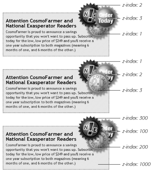
To put it another way, think of a web page as a piece of paper and an absolutely positioned element like a sticky note. Whenever you add an absolutely positioned element to a page, it’s like slapping a sticky note on it. Of course, when you add a sticky note, you run the risk of covering up anything written on the page below.
Normally, the stacking order of positioned elements follows their order in the page’s HTML code. On a page with two absolutely positioned <div> tags, the <div> tag that comes second in the HTML appears above the other <div>. But you can control the order in which positioned elements stack up using the CSS z-index property. The property gets a numeric value, like this:
z-index: 3;
The larger the value, the closer to the top of the stack an element appears. Say you have three absolutely positioned images, and parts of each image overlap. The one with the larger z-index appears on top of the others (see Figure 13-6, top). When you change the z-index of one or more images, you change their stacking order (Figure 13-6, middle).
Note
It’s perfectly OK to have gaps in z-index values. In other words, 10, 20, 30 does the exact same things as 1, 2, 3. In fact, spreading out the numerical values gives you room to insert more items into the stack later. And, when you want to make sure nothing ever appears on top of a positioned element, give it a really large z-index, like this: z-index: 10000;. But don’t get too carried away: Firefox can only handle a maximum z-index of 2147483647.
Hiding Parts of a Page
Another CSS property often used with absolutely positioned elements is visibility, which lets you hide part of a page (or show a hidden part). Say you want a label to pop into view over an image when a visitor mouses over it. You make the caption invisible when the page first loads (visibility: hidden), and switch to visible (visibility: visible) when the mouse moves over it. Figure 13-7 shows an example.
The visibility property’s hidden value is similar to the display property’s none value (see the note on Adding Borders), but there’s a fundamental difference. When you set an element’s display property to none, it literally disappears from the page without a trace. However, setting the visibility property to hidden prevents the browser from displaying the element’s contents, but leaves an empty hole where the element would have been. When applied to absolutely positioned elements that are already removed from the flow of the page, visibility: hidden and display: none behave identically.
The most common way to switch an element from hidden to displayed and back again is with JavaScript. But you don’t have to learn JavaScript programming to use the visibility property (or, for that matter, the display property). You can use the :hover pseudo-class (see Pseudo-Classes and Pseudo-Elements) to make an invisible element visible.
Note
For a basic CSS method of adding pop-up tool tips—additional information that appears when someone mouses over a link—check out: http://psacake.com/web/jl.asp. You also have many JavaScript options to choose from: the jQuery Tooltip plug-in is a full-featured and easy-to-use JavaScript tooltip based on the jQuery framework: http://bassistance.de/jquery-plugins/jquery-plugin-tooltip.
Powerful Positioning Strategies
As explained at the beginning of this chapter, you can run into trouble when you try to use CSS positioning to place every element on a page. Because it’s impossible to predict all possible combinations of browsers and settings your visitors will use, CSS-controlled positioning works best as a tactical weapon. Use it sparingly to provide exact placement for specific elements.
In this section, you’ll learn how to use absolute positioning to add small but visually important details to your page design, how to absolutely position certain layout elements, and how to cement important page elements in place while the rest of the content scrolls.

Positioning Within an Element
One of the most effective ways to use positioning is to place small items relative to other elements on a page. Absolute positioning can simulate the kind of right alignment you get with floats. In the first example in Figure 13-8, the date on the top headline is a bit overbearing, but with CSS you can reformat it and move it to the right edge of the bottom headline.
In order to style the date separately from the rest of the headline, you need to enclose the date in an HTML tag. The <span> tag (ID Selectors: Specific Page Elements) is a popular choice for applying a class to a chunk of inline text to style it independently from the rest of a paragraph.
<h1><span class="date">Nov. 10, 2006</span> CosmoFarmer Bought By Google</h1>
Now it’s a matter of creating the styles. First, you need to give the containing element—in this example, the <h1> tag—a relative position value. Then, apply an absolute position to the item you wish to place—the date. Here’s the CSS for the bottom image in #1 of Figure 13-8:
h1 {
  position: relative;
  width: 100%;
  border-bottom: 1px dashed #999999;
}
h1 span.date {
  position: absolute;
  bottom: 0;
  right: 0;
  font-size: .5em;
  background-color: #E9E9E9;
  color: black;
  padding: 2px 7px 0 7px;
}
Some of the properties listed above, like border-bottom, are just for looks. The crucial properties are bolded: position, bottom, and right. Once you give the headline a relative position, you can position the <span> containing the date in the lower-right corner of the headline by setting both the bottom and right properties to 0.
Note
Internet Explorer 6 and earlier can get the placement of an element wrong when you use the bottom or right properties. In this example, the width: 100%; declaration in the h1 tag style fixes the problem, as discussed in the box on Tutorial: Multiple-Column Layouts.

Breaking an Element Out of the Box
You can also use positioning to make an item appear to poke out of another element. In the second example in Figure 13-8, the top image shows a headline with a graphic. That is, the <img> tag is placed inside the <h1> tag as part of the headline. Using absolute positioning and negative top and left property values moves the image to the headline’s left and pushes it out beyond the top and left edges. Here’s the CSS that produces that example:
h1 {
  position: relative;
  margin-top: 35px;
  padding-left: 55px;
  border-bottom: 1px dashed #999999;
}
h1 img {
  position: absolute;
  top: -30px;
  left: -30px;
}
The basic concept is the same as the previous example, but with a few additions. First, the image’s top and left values are negative, so the graphic actually appears 30 pixels above the top of the headline and 30 pixels to the left of the headline’s left edge. Be careful when you use negative values. They can position an element partially (or entirely) off a page or make the element cover other content on the page. To prevent a negatively positioned element from sticking out of the browser window, add enough margin or padding to either the body element or the enclosing, relatively positioned tag—the <h1> tag in this example. The extra margin provides enough space for the protruding image. In this case, to prevent the image from overlapping any content above the headline, add a significant top margin. The left padding of 55 pixels also moves the text of the headline out from under the absolutely positioned image.
As in the previous example, Internet Explorer is ready to make trouble. What’s worse, adding width: 100% doesn’t even fix things this time. Since there’s padding on the <h1> tag, setting its width to 100 percent actually makes the <h1> wider than 100 percent of the page (see Calculating a Box’s Actual Width and Height for the reason why). There’s a solution, but it uses a nonstandard CSS property—zoom. Simply add zoom: 1 to the <h1> tag style:
h1 {
  position: relative;
  margin-top: 35px;
  padding-left: 55px;
  border-bottom: 1px dashed #999999;
  zoom: 1;
}
Note
The zoom property doesn’t cause harm in other browsers, although it prevents your CSS from validating correctly (External Style Sheets). You can use Internet Explorer’s conditional comments to hide the nonstandard property, as discussed on Isolate CSS for IE with Conditional Comments. An even better solution is to create a separate external style sheet just for IE (see Using Multiple Style Sheets).
Using CSS Positioning for Page Layout
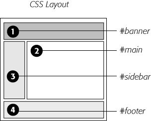
As mentioned on When (and Where) to Use Relative Positioning, trying to position every last element on a page in exact spots in a browser window is usually an exercise in frustration. Using absolute positioning judiciously, you can build many standard web page layouts (like the ones you saw in the last chapter). This section shows you how to build a three-column, fluid layout using absolute positioning. The page will have a banner, left and right sidebars, a main content area, and a footer for copyright notices.
Note
This section teaches you a generic approach to absolute positioning that you can apply to almost any page layout. For a real hands-on exercise in creating a layout with absolute positioning, turn to the tutorial on Enhancing a Page Banner.
Whenever you use absolute positioning, keep this rule of thumb firmly in mind: Don’t try to position everything. To achieve a good layout, you usually have to use absolute positioning on only a couple of page elements.
Here’s a simple technique you can use to figure out which elements need positioning. Say you want to build a three-column design, like Figure 13-9, right. First, study how the different sections of the page follow the normal HTML flow, without any CSS positioning (Figure 13-9, left). Then, for each layout element on your page, ask yourself, “Would this be in the right place if I didn’t position it at all?”

Here’s a walk through the page elements in the left image of Figure 13-9:
The banner. The banner (1) is at the top of the page. That’s right where you want it, so it doesn’t require absolute positioning. You can use a combination of margins and padding to scoot the content around a little (maybe add some white space above or to the left of the banner).
The content wrapper. This <div> is a special element that holds all other elements on the page (2). Since it holds the page’s contents, just ask yourself whether you want the contents to appear below the banner. You do, so you don’t need to apply absolute positioning here either.
The main content. The main part of the page is also directly under the banner (3). You’ll have to indent it on the left and right sides to make room for the sidebars, but you don’t need absolute positioning to do that.
The left sidebar. In Figure 13-9, left, it appears way down the page underneath the main content (4). Is that where it should be? Definitely not, so this section needs absolute positioning.
The right sidebar. Instead of appearing on the right as its name implies, this one (5) appears way down the page below the left sidebar. Here again, you need absolute positioning to put this element in its rightful place—under the banner and on the right side of the page.
The footer. In the left image, the footer appears at the bottom of the page (6)—just where you want it, so no need for any special positioning.
Note
It’s usually a bad idea to use absolute positioning to place a footer at the bottom of the browser window. If the page’s content runs longer than the height of the browser window, then the footer scrolls along with—and rides on top of—other page elements when your visitor scrolls. A better solution is fixed positioning, as described on How Positioning Properties Work.
Now that you know how to decide where to use CSS positioning in your design, here’s an overview of the process for building a three-column layout:
Add <div> tags for each section of the page.
These tags let you divide the page’s content into different layout containers for the banner, sidebar, and so on. As with float layouts discussed in the previous chapter, you’ll add IDs to these container divs so you can create specific CSS styles to format each part of the page (like <div id="banner">).
The left image in Figure 13-9 shows the order in which the different <div> tags for a three-column layout appear in the HTML. One nice thing about absolute positioning is that you don’t have to worry (as you do with float layouts) about the order of the <div> tags in the HTML. The HTML for any absolutely positioned element can appear anywhere in the flow of the file—directly after the opening <body> tag, just before the closing </body> tag, or somewhere in between. It’s the positioning properties that determine where an absolutely positioned element appears onscreen, not its place in the HTML.
Wrap all the HTML for the main content, sidebars, and footer in another <div> tag.
This <div> (Figure 13-9, #2) gathers all of those content sections in one wrapper. Add an ID to the tag so you can style it (<div id="contentWrapper">, for example). This <div> provides a context for positioning the sidebars, as you’ll see next.
Give the wrapper <div> a relative position.
Use the position property and the relative value to create a style like this:
#contentWrapper { position: relative; }Remember, if you don’t supply a top, left, bottom, or right value for a relatively positioned element, then it appears where it normally would—in this case, directly below the banner. The relative position does change the positioning of elements inside the <div>. Now when you use absolute positioning to place the sidebars—that’s the next step—you can set top values relative to the wrapper, not the browser window. That way, if you add more content to the banner and make it taller, the wrapper <div> and everything inside it moves neatly down the page. Without the <div>, your sidebars would be placed relative to the top of the browser window and you’d have to adjust their top values to accommodate the change.
Apply absolute positioning and set widths on the sidebars.
Since all other content on the page fits fine where it is, you need to position only the sidebars. Since you’re positioning the sidebars relative to the wrapper <div> that you set up in step 3, you can simply use top and left positions of 0 for the left sidebar and top and right positions of 0 for the right sidebar.
#leftSidebar {
  position: absolute;
  left: 0;
  top: 0;
  width: 175px;
}
#rightSidebar {
  position: absolute;
  right: 0;
  top: 0;
  width: 180px;
}
The widths constrain the sidebar boxes. When you don’t set a width, the sidebars expand to fill as much space as possible, leaving no room for the page’s main content.
Adjust margins on the main content.
Since the left and right sidebars have absolute positioning, they’re removed from the flow of the page. The main content doesn’t even know they exist, so it simply goes about its business and flows right under them. But since the main content is in the right place on the page—below the banner—you don’t need to reposition it. All you have to do is scoot it in a bit from the left and right edges to clear the sidebars.
To do so, apply left and right margins to the main content <div>. Set the value of each margin to equal or greater than the sidebar’s width:
#mainContent {
  margin-left: 185px;
  margin-right: 190px;
}
In this code, the margins are slightly larger than the widths of each sidebar. It’s usually a good idea to increase the margins a little so that there’s some visual space between the different elements of the page.
Handsome though it is, this layout has an Achilles’ heel. Whenever you use absolutely positioned columns (like these sidebars), the columns can potentially grow to cover up part of a footer or other lower HTML elements (see Figure 13-10). Unlike with float-based layouts, where you can clear an element and force it to appear below a floated column, CSS gives you no way to clear the bottom of a positioned column. The best you can do is find a workaround, as in the next step.
If necessary, add margins to the footer to prevent the sidebars from covering it up.
Your other option: just make sure that any absolutely positioned columns are never taller than the main content. When the main content is long enough, it pushes the footer down below the columns, and you avoid the problem.
Tip
If you like to live on the edge of web innovation, you can try a JavaScript solution to this problem: www.shauninman.com/plete/2006/05/clearance-position-inline-absolute.php.
You can modify this basic page layout technique in any number of ways. Remove the right sidebar and eliminate the right-margin on the main content <div>, and you’ve got a two-column layout. Or eliminate the left sidebar instead to create a two-column layout, but with the thinner column on the right. You can also use this basic design in a fixed-width layout. Just set a width for the banner and a width for the content wrapper <div> like this:
#banner, #contentWrapper { width: 760px; }Creating CSS-Style Frames Using Fixed Positioning
Since most web pages are longer than one screen, you may want to keep some page element constantly visible—like a navigation panel, search box, or your site logo. HTML frames were once the only way to keep important fixtures handy as other content scrolled out of sight. But HTML frames have major drawbacks. Since each frame contains a separate web page file, you have to create several HTML files to make one complete web page (called a frameset). Not only are framesets time consuming for the designer, they also make your site hard for search engines to search. And HTML framesets can also wreak havoc for visitors who use screen readers due to vision problems or those who want to print pages from your site.

Nevertheless, the idea behind frames is still useful, so CSS offers a positioning value that lets you achieve the visual appearance of frames with less work. You can see a page created using the fixed value in Figure 13-11.
Note
Fixed positioning doesn’t work with Internet Explorer 6 or earlier. However, with just a little extra CSS (described in step 5 on Creating CSS-Style Frames Using Fixed Positioning), you can make the page look fine in IE 6 (although the “fixed” elements end up scrolling along with everything else). And since Internet Explorer 7 and later do recognize fixed positioning, you can use this technique and get similar results for almost all of your site’s visitors.

Fixed positioning works much like absolute positioning in that you use the left, top, right, or bottom properties to place the element. Also like absolutely positioned elements, fixed positioning removes an element from the flow of the HTML. It floats above other parts of the page, which simply ignore it.
Here’s how you can build the kind of page pictured in Figure 13-11, which has a fixed banner, sidebar and footer, and a scrollable main content area:
Add <div> tags with ID attributes for each section of the page.
You can have four main <div> tags with IDs like banner, sidebar, main, and footer (Figure 13-12). The order in which you place these tags in the HTML doesn’t matter. Like absolute positioning, fixed positioning lets you place elements on a page regardless of their HTML order.
Add your material to each <div>.
In general, use the fixed divs for stuff a visitor should always have access to in the areas you wish to be locked in place. In this example, the banner, sidebar, and footer contain the site logo, global site navigation, and copyright notices.
The main content goes into the remaining <div> tag. Don’t add too much information to a fixed <div>, however. If a fixed sidebar is taller than the visitor’s browser window, he won’t be able to see the entire sidebar. And since fixed elements don’t scroll, there’ll be no way (short of buying a bigger monitor) for that visitor to see the sidebar content that doesn’t fit in his browser window.
Create styles for all fixed elements.
The left, right, top, and bottom values are relative to the browser window, so just determine where on the screen you’d like them to go and plug in the values. Specify a width for the elements as well.
Note
Unlike absolute positioning, fixed positioning is always relative to the browser window, even when an element with fixed positioning is placed inside another tag with relative or absolute positioning.
The styles to position the elements numbered 1, 3, and 4 in Figure 13-12 look like this:
#banner {
  position: fixed;
  left: 0;
  top: 0;
  width: 100%
}
#sidebar {
  position: fixed;
  left: 0;
  top: 110px;
  width: 175px;
}
#footer {
  position: fixed;
  bottom: 0;
  left: 0;
  width: 100%;
}
Create the style for the scrollable content area.
Since fixed-positioning elements are removed from the flow of the HTML, other tags on the page have no idea the fixed position elements are there. So, the <div> tag with the page’s main content, for example, appears underneath the fixed items. The main task for this style is to use margins to move the contents clear of those areas. (The concept is the same as for absolutely positioned layouts, as discussed on Stacking Elements.)
#main {
  margin-left: 190px;
  margin-top: 110px;
}
Fix the layout for Internet Explorer 6 and earlier.
IE 6 doesn’t understand fixed positioning. It treats fixed elements like static elements, in that it doesn’t try to place them in exact spots on the page. Depending on how you’ve ordered your HTML, in IE 6 your page may just look weird, with big margins between the banner and sidebar or worse—the navigation bar and banner may end up below the main content.
The trick is to tell IE 6 to treat the fixed elements like absolutely positioned elements, which takes those elements out of the flow of the page and places them in their rightful places in the browser window.
* html #banner { position: absolute; }
* html #sidebar { position: absolute; }
Note
These styles use the * html hack to hide their properties from browsers other than IE 6 and earlier (see the box on Wrap Content with Floating Elements). You can also use IE’s conditional comments (Isolate CSS for IE with Conditional Comments).
You’ll notice that the #footer style isn’t listed. You don’t want to position the footer absolutely—otherwise it’ll travel up the browser window when scrolled, sitting directly on top of the other scrolling content.
In this case, it’s best to have the footer appear at the bottom of the page and scroll up into view, just as any unpositioned footer would. (That’s why, as mentioned in step 1, you should put the HTML for the footer below the HTML for the main content so it appears at the bottom of the page in IE 6.)
This technique doesn’t make IE 6 handle fixed positioning correctly, but it at least places the banner and sidebar in their proper places when the page loads. When someone using IE 6 scrolls the page, the banner and sidebar scroll off the top of the window like other content. In other words, in IE 6 your page works like any ordinary web page, and in IE 7 or 8, Firefox, Safari, and Opera it works even better.
Tutorial: Positioning Page Elements
This tutorial lets you explore a few different ways to use absolute positioning, like creating a three-column layout, positioning items within a banner, and adding captions on top of photos. Unlike the previous chapter, where you wrapped chunks of HTML in <div> tags and added ID or class names to them, in these exercises most of the HTML work has already been done for you. You can focus on honing your new CSS skills.
To get started, download the tutorial files located on this book’s companion website at www.sawmac.com/css2e/.
Enhancing a Page Banner
First, you’ll make some small but visually important changes to a page banner. You’ll create styles that refer to HTML tags with IDs or classes applied to them. (Again, that part has been taken care of for you.)
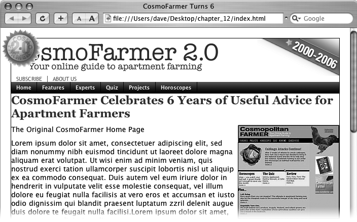
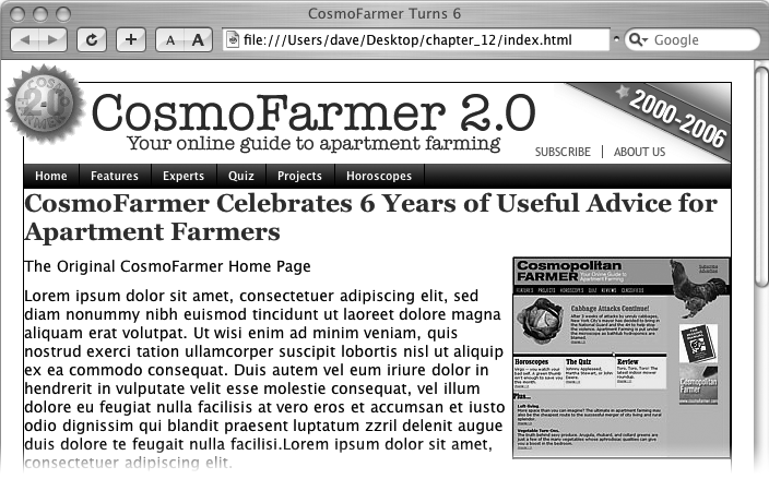
Launch a web browser and open the file 13→index.html.
On this CosmoFarmer.com web page (Figure 13-13), start by repositioning several parts of the banner.
Open the index.html file in a text editor. Place your cursor between the opening and closing <style> tags.
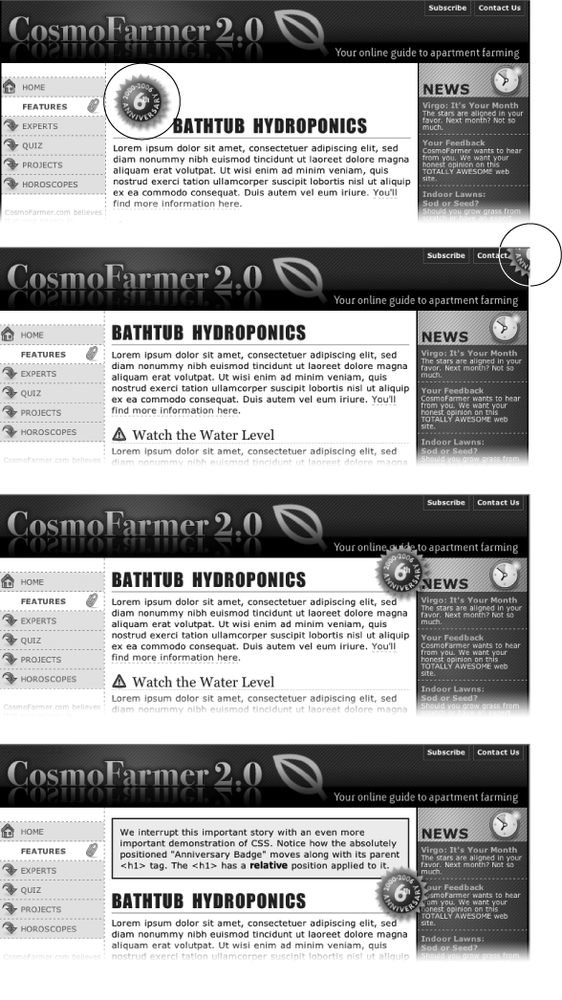
Along with the <style> tags for an internal style sheet, the page already has an attached external style sheet with some basic formatting. Start by moving the small CosmoFarmer 2.0 badge to the left side of the banner. To help break up the boxy look that’s typical of CSS designs, break this graphic out of the banner’s borders, so it looks like a slapped-on sticker.
In the internal style sheet, add this new style:
#banner #badge {
  position: absolute;
  left: -18px;
  top: -18px;
}
The graphic is inside of a <div> with an ID of banner, and the graphic itself has an ID of badge. This style positions the top left corner of the graphic 18 pixels to the left and 18 pixels above the top of the page.
Preview the page now, and you’ll see a couple of problems. First, the graphic hangs off the edge of the page but you really want it to hang off the edge of the banner area. You’ll tackle that problem now.
Add this style above the one you just created:
#banner {
  position: relative;
}
It’s good practice to place the CSS code for styles that control a general section of a page (like this #banner style) above the code for styles that format just parts of that section (like the style you created in step 3). Also, grouping styles for related sections makes it easier to find styles when you need to analyze or edit a page’s CSS. In this case, the #banner style goes first in the internal style sheet because it applies to a large chunk of HTML. But you should keep the #banner #badge style near it as you add more styles to the page. (You can read more about techniques for organizing your CSS on Organizing Styles and Style Sheets.)
The #banner style creates a new positioning context for any nested tags. In other words, the relative setting makes any other positioned elements inside this tag place themselves relative to the edges of the banner. This change in positioning shifts the placement of the style you created in step 3. Now it’s 18 pixels above and to the left of the banner box. The badge still hangs off the page just a little bit, so you’ll add some margins around the page to accommodate the graphic.
Add a style for the body tag. Place it in the internal style sheet above the other two styles you created:
body {
  margin: 20px;
}
This margin adds enough space around the edges of the page so the entire graphic is visible (Figure 13-14). But now you have another problem—the CosmoFarmer logo is partially hidden underneath the badge. Overlapping elements is one of the hazards of absolute positioning. In this case, you can fix the problem by adding a little margin to the logo.
Figure 13-14. Making a graphic break out of a box, like the CosmoFarmer badge in the upper-left corner of this banner, is a cinch with absolute positioning. By crossing over the borderlines of the banner, the graphic helps soften the boxy look of the rest of the banner and lends dynamic energy to the design.Add a new style for the logo to the internal style sheet. Place it below the other styles you’ve created so far:
#banner #logo {
  margin-left: 60px;
}
Like the badge graphic, the logo already has an ID applied to it—logo. This style moves the logo far enough to the right so that it’s out of the way of the absolutely positioned graphic. However, a weird thing happens if you view this in Internet Explorer 6 and 7: When you mouse over the navigation bar, the logo jumps back to where it was before. Huh? Fortunately, the problem is easily fixed.
Edit the #banner #logo style you just created by changing its positioning to relative:
#banner #logo { margin-left: 60px;position: relative;}Adding relative positioning doesn’t actually move the logo anywhere—that would happen only if you added a left, top, right, or bottom value. For reasons known only to Microsoft, though, it knocks IE upside the head and makes it behave.
The banner is looking good so far, but the two links—Subscribe and About Us—look awkward sandwiched between the logo and the nav bar. There’s plenty of space in the right side of the banner, so you’ll move them there. (The links are actually an unordered list that gets its formatting from the page’s external style sheet. See Using Unordered Lists for details on how to turn an unordered list into a horizontal navigation bar.)
Add this new style to the bottom of the internal style sheet:
#banner ul {
  position: absolute;
  right: 60px;
  bottom: 5px;
}
This style is a descendent selector that targets unordered lists inside the banner. (There’s just one list in this case.) Since the <ul> is absolutely positioned, it’s removed from the flow of the page, letting the nav bar scoot up just under the banner.
Also, remember this tag is inside the banner, which you earlier set to a relative position. Accordingly, the Subscribe and About Us links are positioned relative to the tag. They’re placed an exact amount from the right and bottom edges of the banner…unless you’re viewing this in—you guessed it—Internet Explorer 6 or earlier. As discussed on Tutorial: Positioning Page Elements, IE 6 has problems positioning elements using the bottom coordinates of relatively positioned elements (like this banner). It ends up using the bottom coordinates of the entire page. Luckily, the fix is easy.
Edit the #banner style you created in step 4 and add zoom: 1;.
#banner {
  position: relative;
  zoom: 1;
}
These lines are more nonsense code that all browsers except Internet Explorer just ignore (see the box on Stopping the Float for the details).
Preview the page in a web browser.
The finished banner should look like Figure 13-15. This exercise is a good example of using absolute positioning to achieve small, subtle changes that add a lot to a page’s visual appeal.

Adding a Caption to a Photo
In Chapter 8, you learned one way to add a caption to a photo (Adding a Caption). In the examples from that chapter, the captions sat underneath the photos, which is what you want most of the time. But someday, you may want to add a caption directly on a photo, like the subtitles TV news shows love to display across the lower third of the screen.
Open index.html in your text editor.
Notice the graphic of the original CosmoFarmer home page. Currently it’s aligned to the right using the align attribute of the <img> tag, but that’s so 2001. You’ll align it using CSS instead, but first you need to edit some HTML.
Locate the <img> tag that inserts the graphic old_home.jpg, and then delete the HTML code align="right”.
Here’s what the entire tag looks like. You want to remove the part that’s bolded:
<img src="images/old_home.jpg" alt="The Original Cosmo Home Page" height="186"
align="right"/>Now that you’ve gotten rid of the old HTML, you need to create a container—a <div> tag—to hold the CSS for both the image and its caption.
Immediately before the <img> tag, add <div class="figure">. After the closing </p> of the caption (which appears right after the <img> tag), add the closing </div>. When you’re done, the HTML should look like this:
<div class="figure"><img src="images/old_home.jpg" alt="The Original Cosmo Home Page" height="186"/> <p>The Original CosmoFarmer Home Page</p></div>All the code for the photo and caption are in one box that you can align and format as a unit.
Create a style to format the newly added <div>:
#main .figure {
  float: right;
  width: 200px;
  margin-bottom: 2px;
  margin-left: 10px;
}
The properties in this style should be old news by now (especially if you read Chapter 8). This style aligns the box to the right edge of the page, and the bottom and left margins add a little space between the photo box and the text that wraps around it.
The plan is to move the caption paragraph out of the normal flow of the page and place it on top of the photo. To do so, you’ll position the caption relative to the edges of the photo. However, since the <img> tag is self-closing (meaning it doesn’t have both an opening and closing tag), you must position the caption relative to another element. Here’s another use of the figure <div> you just added—to provide the positioning context for the caption.
Add position: relative to the style you just created:
#main .figure { float: right; width: 200px; margin-bottom: 2px; margin-left: 10px;position: relative;}Now you can position the caption relative to the <div>, which for all intents and purposes is the same as positioning it relative to the photo.
Add a new style after the #main .figure style you created in the last step:
#main .figure p {
  position: absolute;
  width: 168px;
  left: 10px;
  bottom: 10px;
  background-color: #FFF;
}
This new style positions the paragraph 10 pixels from the bottom and 10 pixels from the left edge of the <div> tag. The width property constrains the paragraph so it doesn’t span across the entire photo, and background-color makes the text legible. All that’s left are a few formatting details to improve the look of the caption.
Edit the style you just created, so that it looks like this:
#main .figure p { position: absolute; width: 168px; left: 10px; bottom: 10px; background-color: #FFF;border: 1px dashed #666666;font-size: 13px;font-weight: bold;text-align: center;padding: 5px;margin: 0;}You need to attend to one small detail. It’s something you may never notice, but some browsers position the caption just a few pixels lower than other browsers. (To see for yourself, check the page out in IE and then in Firefox.) Browsers position inline elements (like images) differently relative to the baseline of other elements around them (Displaying Inline and Block-Level Boxes). At any rate, the fix is simple: Using CSS, force the image to display as a block-level element.
Add one more style to the internal style sheet:
#main .figure img {
  display: block;
}
Preview the page. The caption should appear centered across the lower portion of the photo, as in Figure 13-16.

Laying Out the Page
Now it’s time to turn your attention to the structure of this page. As it is now, you need to scroll down the page to read the latest news in the sidebar and scroll even farther to see the ads. (Advertisers hate that.) In this section, you’ll use absolute positioning to create a three-column flexible layout that brings all content up to the top of the page (and keeps your sponsors from canceling their accounts).
Before you get started, get an overview of the page structure—see Figure 13-17. Each section of the page is wrapped in its own <div> tag, with an appropriate ID applied. The page’s main contents, sidebar, ads, and copyright notice are enclosed in a <div> with the ID contentWrapper (#4 in Figure 13-17). All of the tags in the page’s body are wrapped in a <div> with an ID of wrapper (1). That may seem like a lot of <div> tags, but they each serve an important purpose.
Your mission is to arrange the three <divs> (sidebar, main, and adverts) into three columns. You need to use absolute positioning on only two elements—the sidebar and the advertising section (see #6 and #7 in Figure 13-17). You’ll take them out of the normal flow of the page (where they appear near the bottom) and stick them at the left and right edges of the page just below the banner. Absolute positioning also causes those elements to float above the page, and on top of the main content area (see #5). To make room for the sidebars, you have to add a little margin to the left and right of the main area.
Create a style for the <div> tag that encloses the main contents of the page (#3 in Figure 13-17). Add it as the last style in the internal style sheet:
#contentWrapper {
  clear: both;
  position: relative;
}
Figure 13-17. The secret to absolutely positioned layouts—less is more. Using the minimum amount of positioning to get the job done isn’t only less work, it also creates less troubleshooting for different browsers. You usually need to position only a couple of elements to create a basic page layout. Use padding or margins to handle other spacing issues (like moving an item a few pixels to the left).The clear property helps the #contentWrapper clear the navigation bar, which was created using a left float. (As explained on Overcoming Float Problems, you should always clear elements that need to appear under a float.)
The position property comes in handy for placing the sidebars. Setting its value to relative lets you position both sidebars relative to the four edges of the content wrapper, not the four edges of the browser window. (See step 3 on Using CSS Positioning for Page Layout for more on why this is useful.)
Create a style for the left sidebar, placing the CSS code under the style you created in step 1:
#sidebar {
  position: absolute;
}
This style takes the sidebar out of the normal flow of the page, but it doesn’t yet position it anywhere. It’s still near the bottom of the page, but if you view it in a browser, you’ll see it’s floating on top of the advertisements. To position it, use the top and left properties.
Add top and left properties to the style you just created by:
#sidebar { position: absolute;top: 15px;left: 0;}Since this sidebar is positioned relative to the content wrapper <div>, a left position of 0 places it flush with the left edge. The top value is determined by aesthetic judgment (otherwise known as trial and error). A top value of 0 would make the sidebar touch the bottom of the nav bar; the 15 pixels of space bring the sidebar’s top more in line with the story headline.
One thing is missing: Most of the time when you position something, you also want to give it a width. That’s true in this case, since at this point the sidebar spreads almost across the entire page, covering nearly all of the content.
Add a width to the #sidebar style.
The final style looks like this:
#sidebar { position: absolute; top: 15px; left: 0;width: 170px;}Next, repeat the process to position the advertising area of the page.
Add an #adverts style to the bottom of the style sheet:
#adverts {
  position: absolute;
  top: 15px;
  right: 5px;
  width: 125px;
}
This style works just like the one for the sidebar, except that you place the ads relative to the right edge of the page. That works much better than trying to put the ads at some point relative to the left edge of the page. When you specify a right value, the ads always stay the same distance from the right edge of the content wrapper. If you change the width of the browser window, the ads stay in position.
At this point, the page should look like Figure 13-18, with both the sidebar and ads covering the main story of the page. Adjust that main area’s margins to prevent this overlap.
Below the #adverts style you just created, add a style for the main story area of the page:
#main {
  margin-left: 170px;
  margin-right: 135px;
}
This #main style indents the main story area so that it clears the left and right sidebars. Now just a few design enhancements remain.
Add some padding and borders to the #main style:
#main { margin-left: 170px; margin-right: 135px;padding: 0 15px 15px 20px;border: 1px solid #666666;border-top: none;border-bottom: none;}The padding adds some space inside of the div, so the text doesn’t touch the sidebars or the bottom of the div. You can actually achieve the same thing by increasing the left and right margins from the previous step, but this way you also get to add a nice border to the left and right edges of the div, helping to visually divide the three columns.
Notice the little productivity shortcut in this style. First, the border style declaration sets up a border on all four edges of the div; next, the last two declarations turn off the border at the top and bottom. You can achieve the exact same effect with two style declarations (border-left and border-right), but then you’d have to repeat the values (1px solid #666666). If you want to change the color, thickness, or style of both borders, then you have to edit two properties. This way, only one declaration takes care of both the left and right borders.
The layout is nearly complete. There’s just one last thing: When you preview the page in IE 6, you see the left sidebar is off by a lot—185 pixels too far to the right to be exact! Yep, another IE bug. Fortunately, there’s an easy fix. To make the left sidebar line up and fly right (#4 in Figure 13-17), give its containing <div> tag that mysterious IE-only property known as layout (see the box on Tutorial: Multiple-Column Layouts).
Add a width to the #contentWrapper style:
#contentWrapper { position: relative; clear: both;width: 100%;}The page now falls correctly into three columns (Figure 13-19), with fewer steps than the modifications you made to the banner. Preview the page in a web browser and expand the browser window. You’ll see the page’s flexible design lets it fit any width window.
Figure 13-19. Building a flexible, three-column design with absolute positioning requires just a few steps, but the basic concept breaks down to this: Position the two outer columns, and indent the left and right margins of the middle column.If fixed-width designs are your cup of tea, the basic structure of this page makes it easy to set a fixed width. Just set a width for the <div> that wraps all of the other tags on the page (#1 in Figure 13-17) like this:
#wrapper {
  width: 760px;
  margin: 0 auto;
}
The margin property here, centers the layout in the middle of the page. If you prefer to have the layout hug the left side of the browser window, just leave the margin property out.


A completed version of this tutorial is in the 13_finished folder.