
Chapter 8. Adding Graphics to Web Pages
No matter how much you gussy up your text or fiddle with borders and margins, nothing affects the appearance of your site more than the images you add to it. And once again, CSS gives you more image control than HTML ever dreamed of. You can work with graphics in CSS on two fronts: the <img> tag and the background-image property (which lets you place an image in the background of any tag on a page).
This chapter delves into some of the creative ways you can deploy images with CSS. The best way to learn how to use graphics in CSS is to see them in action, so this chapter has three—count ‘em, three—tutorials. By creating a photo gallery web page and using images for overall page styling, you’ll be an image-slinging pro in no time.
CSS and the <img> Tag
The venerable <img> tag has been the workhorse of photo-heavy websites since the beginning of the World Wide Web. Even sites without photos use it to add logos, navigation buttons, and illustrations. While CSS doesn’t have any properties specifically aimed at formatting images, you can take advantage of the CSS properties you’ve already learned to enhance your site’s graphics. For example, the border property is a quick and simple way to frame an image or unify the look of a gallery of photos. Here’s a rundown of the CSS properties most commonly used with images:
Borders. Use one of the many border properties (Adding Borders) to frame an image. You’ll see an example of this in the tutorial on Tutorial: Creating a Photo Gallery. Since each border side can be a different color, style, and width, you’ve got lots of creative options.
Padding. The padding property (Control Space with Margins and Padding) adds space between a border and an image. By putting a little breathing room between a photo and its frame, padding simulates the fiberboard mat that’s used in traditional picture frames to surround and offset the image. And by setting a background color, you can even change the color of the “mat.”
Float. Floating an image moves it to either the left or right edge of the page, or—if the image is contained in another layout element such as a sidebar—to the left or right edge of the image’s containing element. Text and other page elements then wrap around the image. You can even float multiple images to create a flexible, multi-row image gallery. You’ll see an example of this technique in the tutorial on Tutorial: Creating a Photo Gallery.
Margins. To add space between an image and other page content, use the margin property. When you float an image, the text that wraps around it is usually uncomfortably close to the image. Adding a left margin (for right-floated images) or right margin (for left-floated images) adds space between text and the graphic.
In most cases, you won’t create a style for the <img> tag itself. Formatting this tag is using too broad a brush, since it formats all images on your page—even those with very different functions, such as the logo, navigation buttons, photos, and even graphic ads. You wouldn’t, after all, want the same black frame around all of those images. Instead, you should use a class style, such as .galleryImage or .logo, to apply the style selectively.
Another approach is to use a descendent selector to target images grouped together in one section of a page. If you have a gallery of photos, you can place all of the photos inside a <div> tag with an ID name of gallery, and then create a style for just the images inside that <div>, like this: #gallery img.
Background Images
The background-image property is the key to making visually stunning websites. Learn how to use it and its cousin properties, and you can make your site stand head and shoulders above the rest. For an example of the power of background images, check out www.csszengarden.com (Figure 8-1). The HTML for both the pages shown here is exactly the same; the visual differences are accomplished by using different background images. How’s that for CSS power?
If you’ve built a few websites, you’ve probably used an image for the background of a page—perhaps a small graphic that repeats in the background of the browser window creating a (hopefully) subtle pattern. That time-honored HTML method used the <body> tag’s background attribute. But CSS does the same job better.
Note
In the next few pages, you’ll meet three background image properties by learning the individual CSS code for each one. Later in the chapter, you’ll learn a shorthand method that’ll save you a lot of typing.

The background-image property adds a graphic to the background of an element. To put an image in the background of a web page, you can create a style for the <body> tag:
body {
  background-image: url(images/bg.gif);
}
The property takes one value: the keyword url, followed by a path to the graphic file enclosed in parentheses. You can use an absolute URL like this—url(http://www.cosmofarmer.com/image/bg.gif)—or a document- or root-relative path like these:
url(../images/bg.gif) /* document-relative */
url(/images/bg.gif) /* root-relative */
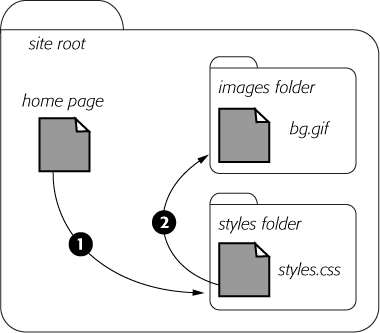
As explained in the box on the next page, document-relative paths provide directions in relation to the style sheet file, not the HTML page you’re styling. These will be one and the same, of course, if you’re using an internal style sheet, but you need to keep this point in mind if you’re using an external style sheet. Say you’ve got a folder named styles(containing the site’s style sheets) and a folder named images (holding the site’s images). Both these folders are located in the site’s main folder along with the home page (Figure 8-2). When a visitor views the home page, the external style sheet is also loaded (step 1 in Figure 8-2). Now, say the external style sheet includes a style for the <body> tag with the background image property set to use the graphic file bg.gif in the images folder. The document-relative path would lead from the style sheet to the graphic (step 2 in Figure 8-2). In other words, the style would look like this:
body {
  background-image: url(../images/bg.gif);
}
This path breaks down like this: ../ means “go up one level” (that is, up to the folder containing the styles folder); images/ means “go to the images folder,” and bg.gif specifies that file.
In the examples so far, the path isn’t enclosed in quotes as in HTML, but quotes are fine, too. In CSS, all three of the following code lines are kosher:
background-image: url(images/bg.gif);
background-image: url("images/bg.gif");
background-image: url('images/bg.gif'),Controlling Repetition
One problem with the old HTML background attribute is that the graphic always tiles, filling up the entire background of a web page. (Not only that, it’s being phased out from current HTML standards.) Fortunately, CSS gives you far greater control. Using the background-repeat property you can specify how (or if at all) an image tiles:
background-repeat: no-repeat;
The property accepts four values: repeat, no-repeat, repeat-x, and repeat-y:
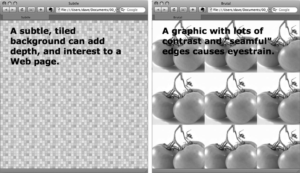
repeat is the normal setting for background images that you want to display from left to right and top to bottom until the entire space is filled with a graphic (Figure 8-3).
no-repeat displays the image a single time, without tiling or repetition. It’s a very common option, and you’ll frequently use it when placing images into the background of tags other than the body. You can use it to place a logo in the upper corner of a page or to use custom graphics for bullets in lists, to name a couple. (You’ll see the bullet example in action in the tutorial on Using Graphics for Bulleted Lists.) In another example, you’ll use it at the top of a <div> tag to create a rounded edge at the top of a box (Giving the Sidebar Personality).
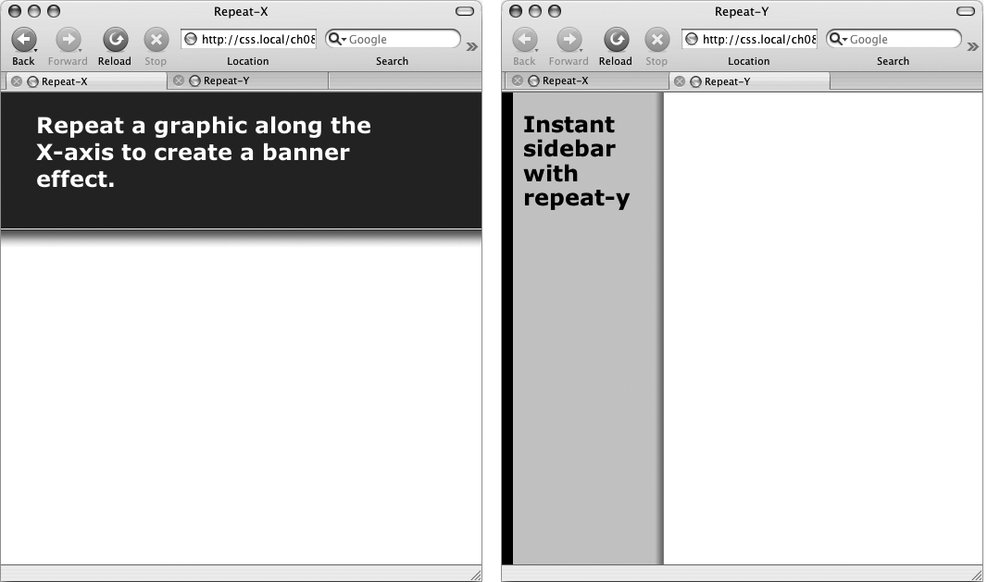
repeat-x repeats an image horizontally along the x-axis (the horizontal width of the page, if your geometry is rusty). It’s perfect for adding a graphical banner to the top of a web page (Figure 8-4, left) or a decorative border along the top or bottom of a headline. (See Adding an Image to the Page Background in the tutorial for an example of this effect.)
repeat-y repeats an image vertically along the y-axis (the vertical length of the page). You can use this setting to add a graphic sidebar to a page (Figure 8-4, right) or to add a repeating drop shadow to either side of a page element (like a sidebar).
Positioning a Background Image
Placing and tiling a background image is just half the fun. With the background-position property, CSS lets you control the exact placement of an image in a number of ways. You can specify both the horizontal and vertical starting points for a graphic in three ways—keywords, exact values, and percentages.
Keywords
You get two sets of keywords to work with. One controls the three horizontal positions—left, center, right—and the other controls the three vertical positions—top, center, bottom (Figure 8-5). Suppose you want to place a graphic directly in the middle of a web page. You can create a style like this:
body {
  background-image: url(bg_page.jpg);
  background-repeat: no-repeat;
  background-position: center center;
}
To move that graphic to the top-right corner, just change the background position to this:
background-position: right top;
Note
If you’ve decided to tile an image (by setting background-repeat to one of the values listed in the previous section), then the background-position property controls the starting point of the first tile. So, for example, if you use the repeat option, you’ll still see the entire background filled by the image. It’s just that the position of the first tile changes based on which background-position setting you used.
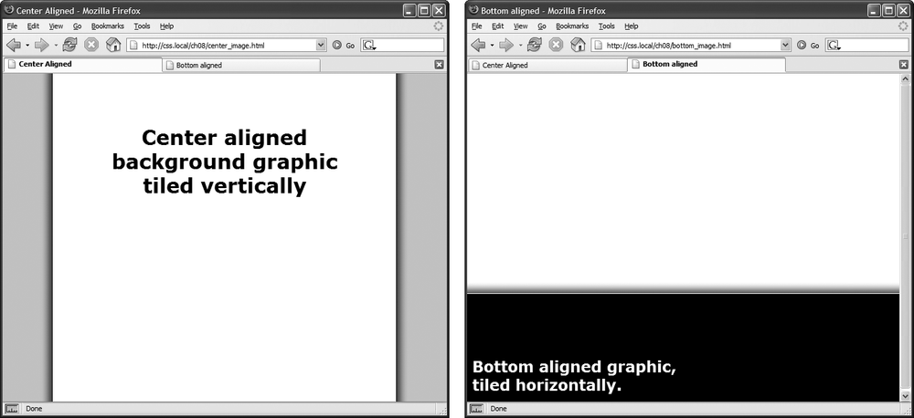
Keywords are really useful when you want to create vertical or horizontal banners. If you wanted a graphic that’s centered on a page and tiled downwards in order to create a backdrop for content (Figure 8-6, left), then you’d create a style like this:
body {
  background-image: url(background.jpg);
  background-repeat: repeat-y;
  background-position: center top;
}
Likewise, using the bottom, center, or top keywords you can position a horizontally repeating image using repeat-x (Figure 8-4, left) in a particular place on the page (or within a styled element). Use the technique shown on the right side of Figure 8-6, to position a line under headlines in the tutorial on Replacing Borders with Graphics.
Tip
You can actually add a background image to both the <html> and <body> tags. If you tile both images horizontally and place <body> tag’s image at the top and the <html> tag’s image on the bottom, you can achieve the effect of two stripes cutting across the top and bottom of the page—no matter how tall the page is. And it works in all current browsers, even IE 6!
Precise Values
You can also position background images using pixel values or ems. You use two values: one to indicate the distance between the image’s left edge and the container’s left edge, and another to specify the distance between the image’s top edge and the style’s top edge. (Put another way, the first value controls the horizontal position, the second value controls the vertical position.)
Say you want custom bullets for a list. If you add a background image to the <li> tag, the bullets often don’t line up exactly (see Figure 8-7, top). So you can just nudge the bullets into place using the background-position property (Figure 8-7, bottom). If the list would look better with, say, the bullets 5 pixels farther to the right and 8 pixels farther down, then add this declaration to the style defining the background image:
background-position: 5px 8px;
You can’t specify distances from the bottom or right using pixel or em measurements, so if you want to make sure an image is placed in the exact bottom right corner of the page or a styled element, then use keywords (bottom right) or percentages, as discussed next. However, you can use negative values to move an image off the right edge or above the top edge, hiding that portion of the image from view. You may want to use negative values to crop out part of a picture. Or, if the background image has lots of extra white space at the top or left edge, you can use negative values to eliminate that extra space.
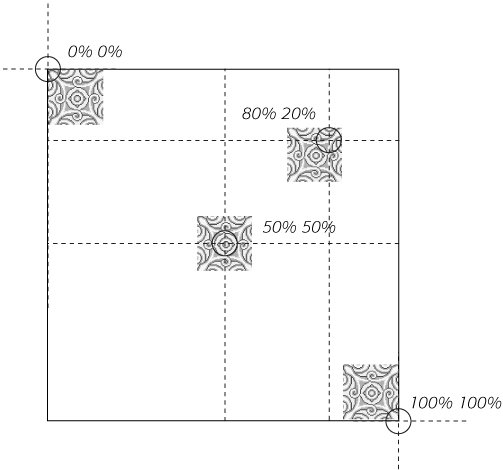
Percentage Values
Finally, you can use percentage values to position a background image. Using percentages in this manner is tricky, and if you can achieve the effect you’re after with the keyword or precise values discussed previously, then use them. But you have to use percentages to position an element in a spot that’s proportional to the width of an element. For example, if you want to place a graphic three-quarters of the way across a headline and you don’t know the width of the element.
Note
Percentage values are also useful for a little trick often used with float-based layouts to give left and right sidebars background colors or graphics that span the entire height of a web page.
As with pixel or em values, you supply two percentages: one to indicate the horizontal position and the second to indicate the vertical position. What the percentage is measuring is a little tricky. In a nutshell, a percentage value aligns the specified percentage of the image with the same percentage of the styled element. What?
The best way to understand how percentage values work is to look at a few examples. To position an image in the middle of a page (like the one shown in the center of Figure 8-8) you’d write this:
background-position:50% 50%;
This declaration places the point on the image that’s 50 percent from its left edge directly on top of the point that’s 50 percent from the left edge of the page (or whatever element you’ve styled with the background image). The declaration also aligns the point on the image that’s 50 percent from its top with the point that’s 50 percent from the top edge of the page or styled element. In other words, the center of the image is aligned with the center of the element. This means that, when using percentages, the exact point on the image that’s being aligned can be a moving target. (That’s because your styled element’s positioning percentages can change if your visitors resize their browsers.)
Note
Positioning an image vertically in the background of a page using percentages won’t necessarily put the image in the correct spot if the page content doesn’t fill the entire height of the browser window. See the box on Precise Values for the solution to this problem.
As with pixel and em values, you can specify negative percentage values, though the results can be hard to predict. You can also mix and match pixel/em values with percentage values. For example, to place an image that’s 5 pixels from the element’s left edge, but placed in the middle of the element’s height, you could use this:
background-position: 5px 50%;
Avoid mixing percentages or pixels/ems with keywords: top 50px, for example. Some browsers can handle this combination, but some can’t.
Note
Although background images can raise the visual quality of your web pages, they usually don’t show up if your visitor prints the page. Most browsers can print out the backgrounds, but it usually requires extra work on your visitor’s part. If you plan to have your visitors print pages from your site, then you may want to keep using the <img> tag to insert mission-critical images like your site logo or a map to your store.
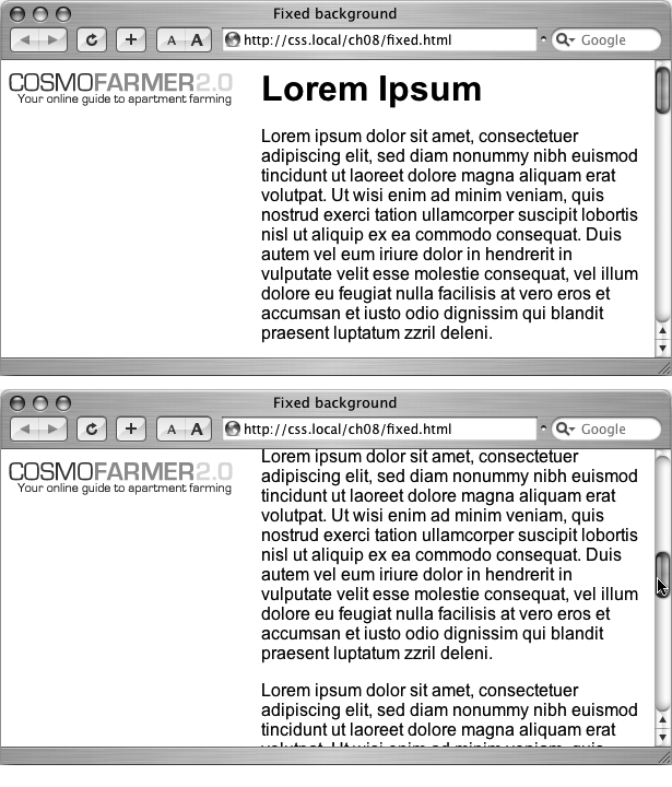
Fixing an Image in Place
Normally, if there’s a background image on a web page and the visitor has to scroll down to see more of the page, the background image scrolls as well. As a result, any pattern in the background of the page appears to move along with the text. Furthermore, when you have a nonrepeating image in the background, it can potentially scroll off the top of the page out of view. If you’ve placed the site’s logo or a watermark graphic in the background of the page, then you may not want it to disappear when visitors scroll.
The CSS solution to such dilemmas is the background-attachment property. It has two options—scroll and fixed. Scroll is the normal web browser behavior; that is, it scrolls the background image along with the text and other page content. Fixed, however, keeps the image in place in the background (see Figure 8-9). So if you want to place your company’s logo in the upper-left corner of the web page, and keep it there even if the viewer scrolls, then you can create a style like this:
body {
  background-image: url(images/logo.gif);
  background-repeat: no-repeat;
  background-attachment: fixed;
}
The fixed option is also very nice when using a repeating, tiled background. When you have to scroll, the page’s text disappears off the top, but the background doesn’t move: The page content appears to float gracefully above the background.
Using Background Property Shorthand
As you can see from the examples in the previous section, to really take control of background images you need to harness the power of several different background properties. But typing out background-image, background-attachment, and so on again and again can really take its toll on your hands. But there’s an easier way—the background shorthand property.
You can actually bundle all the background properties (including the background-color property you learned about last chapter) into a single line of streamlined CSS. Simply type background followed by the values for background-color, background-image, background-attachment, and background-position. The following style sets the background to white and adds a nonrepeating fixed background image smack dab in the middle of the page:
body {
  background: #FFF url(bullseye.gif) fixed center center no-repeat;
}
You don’t need to specify all of the property values either. You can use one or any combination of them. For example: background: yellow is the equivalent of background-color: yellow. Any property value you leave out simply reverts to its normal behavior, so say you specified only an image:
background: url(image/bullseye.gif);
That’s the equivalent of this:
background: url(image/bullseye.gif) scroll left top repeat;
Because the background property is so much faster to type, and it achieves all the same ends as its long-winded siblings, use it liberally when adding background images (and colors) to your styles.
Tutorial: Enhancing Images
A photo gallery is a perfect example of an eye-catching web page. This tutorial brings together a variety of image styling techniques. You’ll format images with frames and captions, create a photo gallery that’s flexible enough to look great in a variety of window sizes, and use background images to create professional-looking drop shadows.
To get started, you need to download the tutorial files located on this book’s companion website at www.sawmac.com/css2e/. Click the tutorial link and download the files. All of the files are enclosed in a Zip archive, so you need to unzip them first. (There are detailed instructions on the website.) The files for this tutorial are in the 08 folder.
Framing an Image
Launch a web browser and open the file 08 → image_ex → image.html.
You’ll be working on a basic web page from the fictional (just in case you thought it was real) website CosmoFarmer.com (Figure 8-10). In this case, there’s already an external style sheet attached to the page, adding some basic text formatting.
Open the file styles.css in the image_ex folder in your favorite text editor.
This file is the external style sheet used by the image.html file. You’ll start by adding a class style to this stylesheet, then applying a class to the <img> tag in the HTML file.
Scroll to the bottom of the file and then type the following:
img.figure {

}
The selector img.figure targets any <img> tag with the figure class applied to it. You’ll use this to selectively format only the images you want. (You could also just name the style .figure—the only difference is that that style would then apply to any tag with the class figure, not just images.)
Add float and margin properties to the style you just created, like so:
float: right;
margin-left: 10px;
margin-bottom: 10px;
The right float moves the image to the right side of the page, letting the text move up and wrap around the photo’s left edge. The left and bottom margins give the photo a little breathing room and move it away from the text. Next, you’ll add a border and some padding to make the image look more like a real snapshot.
Add border and padding, so that the finished style looks like this:
img.figure { float: right; margin-left: 10px; margin-bottom: 10px;border: 1px solid #666;padding: 10px;}If you save this file and then preview the web page right now, you won’t see a change, since the class style has no effect until you’ve added the class to a tag.
Save and close the styles.css file and open the image.html file. Locate the <img> tag and add class="figure” so the tag looks like this:
<img src="../
images/grass.jpg" alt="Apartment Grass" width="200" height="200"
class="figure">
Now that image takes on all of the formatting properties you defined for the .figure class style.
Preview the page in a web browser. It should look like the right image in Figure 8-10.
You can find the completed version of this exercise, image.html in the 08_finished → image_ex folder.

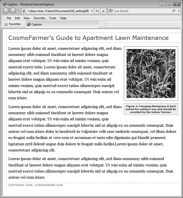
A picture may be worth a thousand words, but sometimes you still need a few words to explain a picture. So in the next part of this tutorial, you’ll add a caption below the photo.
Adding a Caption
You’ll frequently want to add a caption to an image or photo to provide more information about the subject, where the photo was taken, and so on. Instead of just floating the image, as you did in the previous exercise, you want the caption text to float as well. The best way to float both is to wrap the image and the text in a container—a <div> tag—that’s floated as a single unit. This method keeps the photo and its related text together. If you decide later that you want to change their layout—perhaps float them to the left—no problem: You simply change the formatting for the entire container.
In a text editor, open the file 08 → caption_ex → caption.html.
Begin by adding a little HTML to create the container.
Locate the <img> tag in the code, and add <div class="figure"> before that tag.
This marks the beginning of the container. Now close the <div> to indicate the end of the container.
Find the closing </p> tag of the paragraph directly after the image and type </div>. The code should now look like this:
<div class="figure"><img src="../ images/grass.jpg" alt="Creeping Bentgrass" width="200" height="200"/> <p>Figure 1: Creeping Bentgrass is best suited for outdoor use and should be avoided by the indoor farmer.</p></div>As with the previous tutorial, you’ll edit an existing external style sheet (styles.css) that’s linked to this web page.
Open the file 08 → caption_ex → styles.css.
Because this is an external style sheet, you’ll notice there’s no <style> tag. That tag is necessary only for internal style sheets.
Scroll to the bottom of the file and add the following style to the end:
.figure img {
  border: 1px solid #666;
  padding: 10px;
}
This descendent selector affects any <img> tag inside any other tag with the figure class applied to it—in this case, the <div> you just added. Since you’re using a descendent selector here (and in step 7), you don’t need to add a class to the <img> tag. As a result, you save a little typing, cut down on HTML code, and make the page load faster for your site’s visitors.
Next, you’ll format the <div> so that it floats the photo and caption text to the right edge of the page.
Add this style to the styles.css file:
.figure {
  float: right;
  width: 222px;
  margin: 15px 10px 5px 10px;
}
You’ve already used the float: right property in the previous tutorial, and the margin adds a little white space around all four edges of the <div>. But what’s the width for, you ask? Although the photo has a set width (200 pixels; see step 3) the caption paragraph doesn’t. When you don’t set a width, the paragraph makes the <div> expand wider than the photo. In this case, you want the caption to be just as wide as the photo and its frame.
The 222 pixels comes from a little math used to calculate the entire area taken up by the photo on the page: While the photo is only 200 pixels wide, the 10 pixels of left and right padding as well as the image’s 1-pixel left border and 1-pixel right border make the entire width of the photo equal to 222 pixels from border to border. Next, spruce up the look of the caption text.
Add the following style to the styles.css style sheet:
.figure p {
  font: bold 1em/normal Verdana, Arial, Helvetica, sans-serif;
  color: #333;
  text-align: center;
}
This style uses some of the properties you learned about in Chapter 6 to create a center-aligned, bold, and gray caption using the Verdana font. Fortunately, the font shorthand property in the first line lets you roll four different properties into a single style declaration.
Again, you’re taking advantage of a descendent selector (.figure p) to target just the caption paragraph. To make the caption stand out even more, add a background color and border.
Add three properties to the .figure p style, like so:
.figure p { font: bold 1em/normal Verdana, Arial, Helvetica, sans-serif; color: #333; text-align: center;background-color: #e6f3ff;border: 1px dashed #666;padding: 5px;}The purpose of the background-color, border, and padding properties should be clear—to create a colored box around the caption. Now it’s time to preview your work.
Save both the caption.html and styles.css files and preview the caption.html file in a web browser.
(Now you see one reason why it’s easier to develop a design using an internal style sheet—you need to work in and save only one file instead of two.)
The page looks great: The photo and caption float to the right, and the caption stands out boldly. There’s one small problem, though: If you look at the left and right edges of the paragraph, you’ll notice they’re indented slightly and aren’t as wide as the photo. Here’s an example of one of the many head-scratching situations you’ll find as you work with CSS.
In this case, you’ve run into a problem with the cascade. The caption text is inside a <p> tag, and, as it happens, there’s a tag style for the <p> tag in the styles.css file. When you look at that style, you see it sets margins—10 pixels on the top and bottom and 8 pixels on the left and right. You want to override those margins, and you can do so by adding new margins to a more specific style. (See “Specificity: Which Style Wins” on Specificity: Which Style Wins for a discussion of specificity and the cascade.) Fortunately, you already have a more specific style—.figure p—so you need only add margins to that style to override the margins from the more generic p style.
Add a margin property to the .figure p style, like so:
.figure p { font: bold 1em/normal Verdana, Arial, Helvetica, sans-serif; color: #333; text-align: center; background-color: #e6f3ff; border: 1px dashed #666; padding: 5px;margin: 10px 0 0 0;}This removes margins on all sides of the caption except the top, which adds 10 pixels of space between the caption and the photo above.
Save the caption.html and styles.css files. Preview caption.html file in a web browser.
The page should now look like Figure 8-11 (You can find a completed version of this page in the 08_finished → caption_ex folder.)
Tutorial: Creating a Photo Gallery
Folks used to rely on the HTML <table> tag to create rows and columns for holding the pictures in a photo gallery. But you can achieve the same effect with a little CSS and far less HTML.
Open the file 08 → gallery_ex → gallery.html.
First, a quick review of the HTML used to construct the photo gallery. The page contains six photos and photo captions. Each photo and caption is contained in a <div> with a class named figure applied to it. This <div> functions just like the similar <div> used in the previous exercise for adding a caption. The photo itself is contained in another <div> with a class of photo:
Figure 8-11. With the use of a containing <div>, a right float, and a little style, it’s easy to add captions to photos.<div class="figure"> <div class="photo"> <img src="../ images/dandelion.jpg" alt="Dandelion" height="200" width="200"/> </div> <p>Figure 6: The dandelion: scourge of the apartment farmer. </p> </div>
Locate the <link> tag near the top of the file, place your cursor after that tag, and then press Enter (Return) to create a new blank line.
The <link> tag attaches an external style sheet containing some basic formatting.
Add an internal style sheet. Then add two new styles, as follows:
<style type="text/css">
.photo img {
  border: 1px solid #666;
  background-color: #FFF;
  padding: 4px;
}

.figure p {
  font: 1.1em/normal Arial, Helvetica, sans-serif;
  text-align: center;
  margin: 10px 0 0 0;
}
</style>
These two styles add a border to each image in the gallery, and set the font, alignment, and margins of the captions. They use descendent selectors to target just the images and paragraphs inside the gallery.
All of the images and captions are themselves wrapped in one <div> with an ID of gallery, since enclosing the group of photos in another <div> provides even more formatting options. You could set a specific width for the gallery or add a border around it. But that enclosing <div> also provides another way to target the photos and paragraphs using descendent selectors. For example, #gallery img and #gallery p are also valid descendent selectors in this case. The main difference between the two approaches is the specificity of the styles (see Specificity: Which Style Wins). Because #gallery img is more specific than .photo img, its formatting options override the .photo img style.
Next, place the photos side by side.
Add the following style to the internal style sheet you just created:
.figure {
  float: left;
  width: 210px;
  margin: 0 10px 10px 10px;
}
This style floats each photo/caption pair to the left. In effect, it places the photos side-by-side until there’s no more room in the row. The browser then drops the next photos down a row, until all of the photos are displayed one row on top of the next. The width is the total width of the photo plus padding and borders. In this example, it’s 200 pixels for the photo, 8 pixels for left and right padding, and 2 pixels for left and right borders.
Note
In this fictitious photo gallery, each picture is the same width. In the real world, you may have pictures of varying sizes. See the box below for a trick that lets you arrange rows of pictures of different widths. Using different height images won’t work (as you’ll see in step 5). When you’ve got images with differing heights, stick with HTML tables (or you can use the advanced, doesn’t-apply-to-all-browsers technique described in the tip on Adding Drop Shadows).
Save the file and preview the gallery.html page in a web browser. It should look like the left image in Figure 8-12.
Adjust the width of your browser window to make it thinner and wider and watch how the images reflow into the space. Aha—something’s not quite right. The second row of images has two empty spaces where photos should be. This problem occurs because the caption for the second image on the first line is taller than the other captions on the line. Images that jump down to another row bump into that caption and can’t get by it. (You can read more about this float property snafu on Clearing and Containing Floats.) Fortunately, there’s a simple fix to this dilemma.
Tip
There is a way to avoid that weird display problem noted in step 5, as well as create a gallery that can handle different height images. Instead of using the float property, you can use display: inline-block on the .figure style. This will treat each image/caption pair as a block (a box with height and width) but also as an inline element (so the blocks can sit side-by-side). In addition, you can use the vertical-align property to make the picture tops align. The .figure style from step 4 could then be rewritten like this:
.figure {
  display: inline-block;
  vertical-align: top;
  width: 210px;
  margin: 0 10px 10px 10px;
}
The downside to this very simple and useful technique: It won’t work in IE 6, IE 7, or Firefox 2. Hey, but at least it works in everything else, including IE 8!
Return to your text editor and the gallery.html file. Locate the .figure p style and add a height to it. The finished style should look like this:
.figure p { font: 1.1em/normal Arial, Helvetica, sans-serif; text-align: center; margin: 10px 0 0 0;height: 5em;}Adding this property sets a uniform height for each caption. In this case, it’s tall enough to accomodate the lines of caption text. (If you needed more text, you’d just increase the height.)
Save the file and preview the page in a web browser. See the right side of Figure 8-12.
If you resize the browser window, the gallery reformats itself. With a wider window you can fit four or even five images on a row, but if you make it smaller you’ll see only one or two images per row.
Adding Drop Shadows
Your gallery looks good, but you can make it even more impressive. Adding drop shadows under each photo lends the page an illusion of depth and a realistic 3-D quality. But before you fire up Photoshop, you’ll be glad to know there’s no need to add individual drop shadows. Instead, you can make CSS automatically add a shadow to any image you want.

Note
CSS 3 provides a new CSS property—box-shadow—which can automatically add drop shadows to any style. It’s cool, customizable, and easy to use, but only works in a few browsers. You can read about it on Font Freedom.
First you need a drop shadow graphic—just an image with fuzzy right and bottom black edges. There’s one in the 08 → gallery_ex folder, but you can make your own in Photoshop, Fireworks, or any other image editing program that has a blur or drop shadow filter. (In Fireworks, for example, you’d create a white box and apply the drop shadow filter to it. Then save the file in PNG8 format.)
In a text editor, open the gallery.html file you completed in the previous exercise.
First, add a background image to the <div> tag that surrounds each image.
Add this style to the gallery page’s internal style sheet:
.photo {
  background: url(drop_shadow.gif) right bottom no-repeat;
}
This .photo style adds a background image—drop_shadow.gif—to the lower-right corner of the photo <div>. The no-repeat value means the graphic won’t tile.
If you preview the page now, you won’t see much. That’s because the drop shadow appears in the background. On top is the photo itself, which you styled in step 3 on Tutorial: Creating a Photo Gallery to have a white background, a black border, and 4 pixels of padding. What you need is a way to reveal that background image.
One clever technique pioneered by Richard Rutter (www.clagnut.com) is to move the image up and to the left a little—essentially moving it outside of its containing <div> tag. CSS provides a mechanism known as positioning that lets you control the exact placement of an element. You’ll learn more about positioning in Chapter 13, but for now you need to add only three properties to the .photo img style you created in step 3 on Tutorial: Creating a Photo Gallery to reveal the drop shadow.
Note
Negative margins are another way to achieve the drop shadow shift. For details, see http://1976design.com/blog/archive/2003/11/14/shadows.
Locate the .photo img style, and add three positioning properties, like so:
.photo img { border: 1px solid #666; background-color: #FFF; padding: 4px;position: relative;top: -5px;left:-5px;}In a nutshell, these three properties simply move the photo up and to the left 5 pixels, exposing the underlying drop shadow graphic of the <div>. In fact, the very reason for using the <div> to contain the photo here is to provide an element to hold the drop shadow image.
Save the file and preview the page. It should look like Figure 8-13.
Each image has its own drop-shadow, and you didn’t even have to open Photoshop!
Note
The graphic you used here is around 375 X 375 pixels, so it accommodates images only up to that size. You can use this same technique for larger images, but you’ll need to create your own drop shadow.
You can use this drop-shadow method on any graphic, not just those inside a gallery. The key is surrounding the <img> tag with a container <div>, applying a drop shadow graphic to that <div>, and offsetting the <img> tag with negative top and left placement. Use this same effect to add a drop shadow to any box element, such as a sidebar or pull quote.
You can find a completed version of this tutorial in the 08_finished → gallery_ex folder.
Note
You may have noticed that the drop shadows you just created have abrupt left and top endings. They don’t fade like actual drop shadows. To learn how to create more sophisticated drop shadows, check out www.alistapart.com/articles/cssdrop2 and www.ploughdeep.com/onionskin.

Tutorial: Using Background Images
The CSS background-image property is the secret weapon of modern web design. It can turn a ho-hum, text-heavy web page into a dazzling swirl of imagery (see Figure 8-14). Since you can use it to add an image to the background of any HTML tag, the designs you can create are limited only by your imagination. The drop shadow example in the previous tutorial is just one example of creative background image use. Other common background image frills include applying a page background and adding custom bullets to unordered lists. You’ll explore some of these common tasks in this tutorial.
Adding an Image to the Page Background
Whether it’s an intricate pattern, a logo, or a full-screen photograph, images appear in the background of many a web page. In fact, adding an image to the background of a page is probably the most common application of the background-image property.
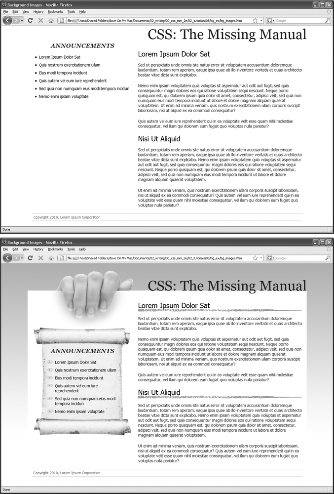
In your text editor, open the file 08 → bg_ex → bg_images.html.
This page is a basic two-column layout: a very simple page, with some text formatted on a white background (Figure 8-14, top). To start, you’ll add a background image to the page. The page has an external style sheet with the basic formatting, but so you don’t have to wade through all the styles in that file, you’ll add an internal style sheet for the steps in this tutorial.
Click between the opening and closing <style> tags. Add the following style:
body {
  background-image: url(images/bg_page.png);
  background-repeat: repeat-x;
  background-color: #FFF;
}
The first line of code points to the image—bg_page.png—you want to display on the page. The file is stored in the images folder. This graphic is a gradient that starts as light blue at the top and fades to white at the bottom. The graphic isn’t as tall as the page content, so without further instructions, it would tile over and over across and down the page. At a certain point down the page, that light blue would reappear and fade once again downward to white. To prevent this unsightly snafu, you’ve set the background-repeat property so that the image tiles from left to right in order to fit any width of browser window, but doesn’t tile down the page. The last line of code sets the page’s background color to match the end of the gradient, so the image fades seamlessly into the page’s background color.
Save the file and preview it in a web browser.
The background graphic’s blue gradient drips down the page. Not bad looking, but the blue also appears in the text’s background. You can make the text pop by giving its background a different color.
Return to your text editor and the bg_images.html file. Add another style for the <div> containing the content of the page:
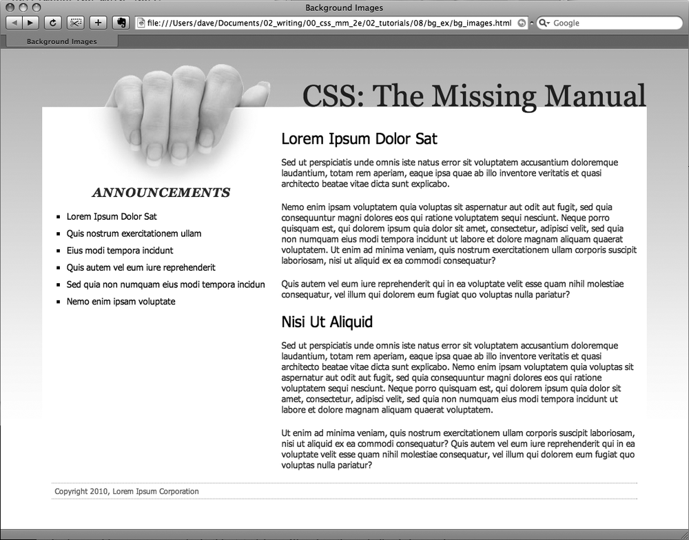
#wrapper {
  background-color: #FFF;
}
Figure 8-14. Using background images, you can make an already well-organized page (top) look much spiffier (bottom). Since you can add images to the background of any tag on a page, the possible placement of graphics on a page are nearly limitless.The wrapper div is a fixed width, centered in the middle of the page, containing all of the page’s text. This style gives it a white background, but with the help of an image, you can do better than that.
Edit the style you created in step 4 by adding a background image:
#wrapper { background-color: #FFF;background-image: url(images/bg_main.jpg);background-position: left top;background-repeat: no-repeat;}These three lines of code add a background image to the top left of the <div>; the no-repeat option for the background-repeat property means the image only appears a single time. If you save the file and preview it in a web browser, you’ll now see the picture of a hand acting like it’s holding the page. Very cool. The only problem is the text is too far up, covering up the image. You’ll next push down the big, top headline and the left sidebar.
Add two more styles to the internal style sheet:
#banner {
 margin-top: 48px;
}
#announcement {
 margin-top: 115px;
}
The first line just adds a bit of padding, pushing down the banner containing the headline until it just touches the top of the white page, while the second style moves the left sidebar down enough to clear the picture of the hand. The page should now look like Figure 8-15.
Replacing Borders with Graphics
The border property is a useful tool in your design arsenal, but the limited number of border styles CSS offers can get boring. A hand-drawn line with a little texture would catch your visitors’ attention better than a plain, straight one. You can skip the border property and add any kind of line you want as a background image—easy as pie. In this part of the tutorial, you’ll replace the underline below each <h2> tag in the main text area with a custom graphic that looks like a hand-drawn line.
Return to your text editor and the bg_images.html file. Add a style for the <h2> tags inside the main <div> tag:
#main h2 {
  background-image: url(images/underline.png);
  background-repeat: no-repeat;
}
The background-image property specifies which graphic to use in the background of <h2> tags inside an tag with an ID of main; while the no-repeat value makes sure graphic only appears a single time.
Figure 8-15. CSS lets you combine a background color and a background image, which comes in really handy in this example. The main text area has a white background color that helps separate the text from the fading gradation in the page’s background. In addition, a graphic of a hand holding a piece of paper adds depth to the design.If you preview the file now, you’ll see that the underline doesn’t exactly line up. In fact, it isn’t under at all. It’s above the headlines!
Add the following style declaration to the #main h2 style below the background-repeat property:
background-position: left bottom;
You’ve changed the graphic’s starting location so it appears at the left edge and bottom of the <h2> tags. If you preview the page now, though, you may not notice much improvement. The underline runs into the headline text.
But there’s an easy fix. Since the bottom value used here puts the graphic at the bottom of the block created by the <h2> tag, you need only to increase the overall height of the block to move the line down a bit. You’ll do this with a little bottom padding.
Edit the #main h2 style one last time, so that it looks like this:
#main h2 { background-image: url(images/underline.png); background-repeat: no-repeat; background-position: left bottom;padding-bottom: 7px;}Padding, as you’ll recall from page 153, is the space between the border (the edge of the background as well) and the content. It also increases the overall height of the box—in this case by adding 7 pixels of bottom padding. Now, the line graphic is placed at the bottom of the h2 block, but in the empty space created by the bottom padding.
Save the file and preview the page in a web browser.
Each <h2> tag has the hand-drawn underline. Next you’ll tackle the sidebar box, making it look a little less boxy and jazzing up the bulleted lists.
Using Graphics for Bulleted Lists
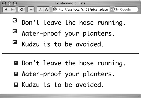
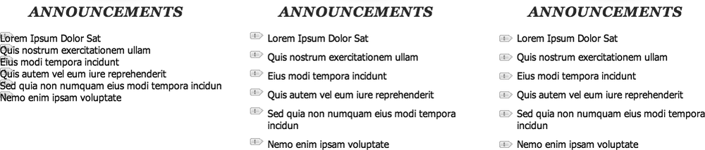
The average bullet used for unordered lists is a black dot—not very inspiring. But you can use the background-image property to replace those drab bullets with any image you want. The first step is to hide the bullets that normally appear beside list items.
Return to your text editor and the images.html page. And add a style for formatting the list items in the left sidebar.
#announcement li {
  list-style: none;
}
The bulleted list is inside a <div> with an ID of announcement, so this descendent selector targets just the list items (<li> tags) inside that div. The style removes the bullet. Now add the graphic.
Add the following two properties to the #announcement li style:
background-image: url(images/bullet.png);
background-repeat: no-repeat;
You’ve seen these two properties before. They add an image to the background and turn off repeating so that the graphic appears only once.
If you preview the page, you’ll see that the bullets currently overlap the list text and the list items are a little jammed together (Figure 8-16, left). A little padding and margin will fix this.
Add two more properties to the #announcement li style:
padding-left: 25px;
margin-bottom: 10px;
The left padding adds empty space, effectively moving the text out of the way in order to display the new bullet icon. The bottom margin adds just a bit of breathing room between each list item (Figure 8-16, middle).
There’s just one final flaw. The bullet image is a tad too high on the line, causing the tip of the icon to stick out too far above the text. But you can easily fix that with the background-position property.
Finish this style by adding background-position: 0px 4px;. The completed style should look like this:
#announcement li { list-style: none; background-image: url(images/bullet.png); background-repeat: no-repeat;background-position: 0 4px;padding-left: 25px; margin-bottom: 10px; }This last style declaration positions the bullet icon to the far left (that’s the 0) and 4 pixels from the top (4px) of the list item. It moves the icon down just a smidgen, enough to make the bullet look perfect.
Note
As discussed on Tutorial: Text Formatting in Action, this kind of exact positioning is precisely why you should use the background property instead of the list-style-image property for adding graphic bullets to your lists.
Save the file and preview the page in your browser.
The list should now have 3-D tabs with red exclamation marks instead of dreary black circles (Figure 8-16, right).
Giving the Sidebar Personality
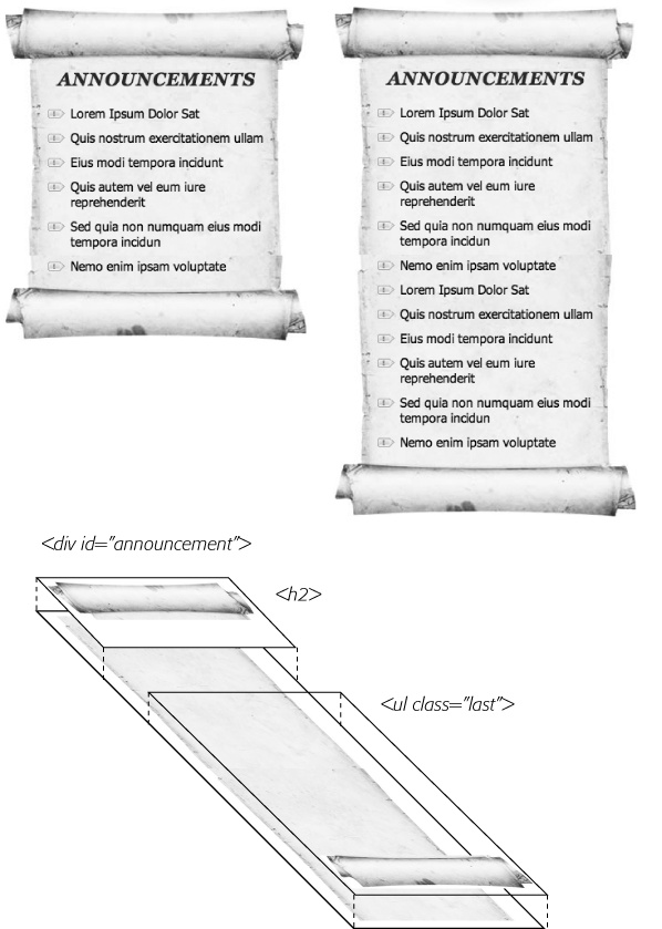
At this point, the sidebar looks pretty good. The text is nicely formatted, and the bullets look great, but the sidebar gets a little lost in the sea of white. Adding a background image can make the sidebar stand out in a whimsical way. You could use a single image—the scroll image pictured in the bottom image of Figure 8-14—in the background of the <div> tag, but in order to make sure the text fit exactly on the scroll, you’d have to limit the amount of content you put in the sidebar—too much text and it won’t fit on top of the single image; too little, and there will be too much empty space on the graphic.
A more flexible approach would let the image grow as the sidebar acquires more content (see Figure 8-17, top). Fortunately, this little trick isn’t so hard—it just requires three different images and three different styles. In this example, there’s one <div> with the ID announcement—that’s the sidebar—and it contains an <h2> tag (with the text “Announcements”) and a bulleted list (a <ul> tag). Basically, you attach the top of the image to an HTML element at the top of the sidebar (the <h2> tag in this example), the bottom of the image to the last HTML element of the sidebar (the <ul> tag), and an image that tiles vertically in the <div> that creates the sidebar (see Figure 8-17, bottom).
Return to your text editor and the bg_images.html file. Locate the #announcement style you added in step 6 on Replacing Borders with Graphics and add one additional property:
#announcement {background: url(images/scroll_middle.jpg) repeat-y center top;margin-top: 115px; }This line adds a background image to the <div> tag that scrolls vertically (repeat-y) and centers the image in the div. The image tiles seamlessly so that as the div gets taller, the background image appears to grow. But, if you preview the page now, you’ll see that the bulleted list sticks out on the both the left and right sides of the sidebar image. To make the bulleted list fit on the scroll, you need to add some left and right margin.
Locate the #announcement li style you created earlier and add two properties to the end so that it looks like this:
#announcement li { list-style: none; background-image: url(images/bullet.png); background-repeat: no-repeat; background-position: 0 4px; padding-left: 25px; margin-bottom: 10px;margin-left: 30px;margin-right: 40px;}These properties move both the left and right edges of each bulleted item in enough to clear the edges of the background image. Next, you’ll add the top of the scroll by placing a background image behind the <h2> tag in the sidebar.
At the bottom of the internal style sheet, add the following descendent selector style for the sidebar’s <h2> tag:
#announcement h2 {
  background: url(images/scroll_top.jpg) no-repeat center top;
}
Here an image is only placed a single time in the center and top of the tag. But if you preview the page right now, it doesn’t look quite right (see Figure 8-18). You can’t see the entire scroll top, and the heading text overlaps it in an unrealistic way. Basically, the <h2> tag isn’t tall enough to display all of the graphic. Also, you need to add some space above the text to push it down below the graphic. The padding property comes to the rescue.
Edit the style you added in the last step so it looks like this:
#announcement h2 { background: url(images/scroll_top.jpg) no-repeat center top;padding-top: 70px;}The 70 pixels of top padding does two things: pushes the text down to clear the scroll’s top edge and makes the <h2> element tall enough to display the entire image. In fact, the text, “Announcements” isn’t actually sitting on top of the style’s background image at all—it’s sitting on top of the background image placed on the <div>.
Note
The technique used here is for a fixed-width box. That means if you change the width of the sidebar, you’ll need to recreate the graphics at the same width to match. For a few techniques that let you create rounded corners with more flexibility—and require more CSS and HTML code—visit these pages:
Next, you need to add the bottom image to the <ul> tag. But first, you’ll modify the HTML a bit.
Locate the <ul> tag (it’s below the <div id="announcements"> and <h2> tag) and add class="last”:
<div id="announcement">
<h2>Announcements</h2>
<ul class="last">
Why add a class? As pictured in Figure 8-17, the bottom image (the end of the scroll) must be attached to the last tag in the sidebar; that’s how the image appears at the bottom of the scroll. Now, you could just create a style like #announcement ul, which will work in this case, but if you ever want to remove the bulleted list and replace it with paragraphs of text, you’ll need to recreate the style. If you use a class and create a style like #announcement .last, then whenever you change the HTML in the sidebar, you just add class="last” to the last tag in the sidebar. (You can do the same for the <h2> tag. For example, you can create a class named #announcement .first and add class="first” to which every tag comes first inside the <div>.)
In the page’s internal style sheet, add one last style:
#announcement .last {
  background: url(images/scroll_bottom.jpg) no-repeat center bottom;
  padding-bottom: 65px;
}
Like the other styles in this part of the tutorial, here you’re adding a single image to the background of an element. However in this case, the image is being placed at the bottom of the <ul> tag. Since there are quite a few list items, the <ul> tag is actually pretty tall—taller than the background image—so you need to place it at the bottom of the tag, in order for it to appear at the bottom of the <div>.
Save the file and preview it in a web browser.
The sidebar should look like the bottom image of Figure 8-14…unless you’re using IE 6 or IE 7. In those browsers, you don’t actually see anything except the tiled background—no headline, no bullets, and no top and bottom parts of the scroll. Behold another IE browser bug. It’s a variant of the “peekaboo” bug described on Stopping the Float. Thankfully, this bug has been fixed in IE 8, and there’s a way to fix it for IE 6 and IE 7.
Return to the bg_images.html file and add zoom: 1 to #announcement style in the internal style sheet. The final version should look like this:
#announcement { background: url(images/scroll_middle.jpg) repeat-y center top; margin-top: 115px;zoom: 1;}This weird, IE-only property adds what’s called layout, which ends up fixing this problem and many just like it. It’s a bit of CSS voodoo that shouldn’t really do anything…but it does (gotta love web design). You learned more about layout and using the zoom property to fix IE bugs on Stopping the Float.

Going Further
The page is done, but for an extra challenge take the internal style sheet you incorporated in this tutorial and move it into the external style sheet—styles.css—that’s attached to this page. One way is to simply cut the styles from the internal style sheet and paste them into the external style sheet. However, in some cases, the same style name appears in both style sheets (the external style sheet, for example, has a #announcement style used to provide the layout information for the sidebar).
Try to end up with an external style sheet that doesn’t repeat style names—you can do this by copying the properties from the internal style sheet (for example, copy the properties for #announcement) and pasting them into the appropriate style in the external style sheet (for example, pasting the properties into the #announcement style in the styles.css file).
You’ll find finished examples of this tutorial—both the finished, two style sheet version and the single external style sheet version—in the folder 08_finished/bg_ex and 08_finished/bg_ex_further folders.