
Chapter 6. Formatting Text
Most websites still rely on words to get their messages across. Sure, people like to look at photos, movie clips, and Flash animations, but it’s the reading material that keeps ‘em coming back. People are hungry for Facebook updates, news, gossip, how-to articles, recipes, FAQs, jokes, information lists, and even 140 character tweets. With CSS, you can—and should—make your headlines and body text grab a visitor’s attention as compellingly as any photo.
CSS offers a powerful array of text-formatting options, which let you assign fonts, color, sizes, line spacing, and many other properties that can add visual impact to headlines, bulleted lists, and regular old paragraphs of text (see Figure 6-1). This chapter reveals all, and then finishes up with a tutorial where you can practice assembling CSS text styles and put them to work on an actual web page.
Formatting Text
The first thing you can do to make text on your website look more exciting is to apply different fonts to headlines, paragraphs, and other written elements on your pages. To apply a font to a CSS style, you use the font-family property:
font-family: Arial;
Note
In real life, when you put a CSS property into action, you must, of course, include all the other necessities of a complete style declaration block and style sheet, as described in Chapter 2: p { font-family: Arial; }, for example. When you see examples like font-family: Arial;, remember that’s just the property in isolation, distilled down for your book-reading benefit.

Choosing a Font
Choose a font that makes your text eye-catching (especially if it’s a headline) and readable (especially if it’s main body text), as discussed in the figure on the previous page. Unfortunately, you can’t use just any font you want. Well, actually you can use any font you want, but it won’t show up on a viewer’s computer unless she’s installed the same font on her system. So that handcrafted font you purchased from the small font boutique in Nome Alaska won’t do you any good on the Web—unless each person viewing your site has also bought and installed that font. Otherwise, your visitors’ web browsers will show your text in a default font, which is usually some version of Times.
Note
For one cutting edge method of using any font you’d like there’s Cufon: http://wiki.github.com/sorccu/cufon/about. This JavaScript-based solution lets you convert one of your fonts into a file that you can then use to replace HTML text. Although the technology behind Cufon is complex, it’s quite easy to use.
One solution is to specify the font you’d like to use, as well as a couple of back-up choices. If your viewer’s computer has your first-choice font, then that’s what she’ll see. But when the first font isn’t installed, the browser looks down the list until it finds a font that is. The idea is to specify a list of similar-looking fonts that are common to a variety of operating systems, like so:
font-family: Arial, Helvetica, sans-serif;
In this example, a web browser first looks to see if the Arial font is installed; if it is, then that font is used; if not, the browser next looks for Helvetica, and if that isn’t installed, then it finally settles for a generic font—sans-serif. When you list a generic font type (like sans-serif or serif), the viewer’s browser gets to choose the actual font. But at least you can define its basic character.
Also, if the font’s name is made up of more than one word, you must enclose it in quote marks:
font-family: "Times New Roman", Times, serif;
Here are some commonly used combinations organized by the type of font, including a generic font type at the end of each list.
Serif fonts
Serif fonts are best for long passages of text, as it’s widely believed that the serifs—those tiny “feet” at the end of a letter’s main strokes—gently lead the eye from letter to letter, making text easier to read. Examples of serif fonts are Times, Times New Roman, Georgia, and the font in the main body paragraphs of this book.
“Times New Roman”, Times, serif
Georgia, “Times New Roman”, Times, serif
Baskerville, “Palatino Linotype”, Times, serif
“Hoefler Text”, Garamond, Times, serif
Examples of these fonts are in Figure 6-2.

Sans-serif fonts
Sans-serif fonts are often used for headlines, thanks to their clean and simple appearance. Examples of sans-serif fonts include Arial, Helvetica, Verdana, and Formata, which you can see in the gray boxes in this book.
Arial, Helvetica, sans-serif
Verdana, Arial, Helvetica, sans-serif
Geneva, Arial, Helvetica, sans-serif
Tahoma, “Lucida Grande”, Arial, sans-serif
“Trebuchet MS”, Arial, Helvetica, sans-serif
“Century Gothic”, “Gill Sans”, Arial, sans-serif
Examples of these sans-serif fonts are in Figure 6-3.

Monospaced and fun fonts
Monospaced fonts are often used to display computer code (like the CSS snippets you see throughout this book). Each letter in a monospaced font is the same width (these were traditionally used on typewriters to line up data into tidy columns).
“Courier New”, Courier, monospace
“Lucida Console”, Monaco, monospace
“Copperplate Light”, “Copperplate Gothic Light”, serif
“Marker Felt”, “Comic Sans MS”, fantasy
Examples of these font lists are pictured in Figure 6-4.
Additional fonts to consider
There are literally thousands of fonts, and every operating system ships with many more fonts than are listed here. However, here are a few fonts that are very common on both Macs and PCs, so you might want to give them a go:
Arial Black
Arial Narrow
Impact

Be careful with Arial Black and Impact: They only have a single weight and don’t include an italic version. Accordingly, if you use these fonts make sure to set the font-weight and the font-style (coming up on Capitalizing) to normal. Otherwise, if the text is bolded or italicized, the browser will make its best (read: ugly) guess at what the text should look like.
Tip
You can find a lot more information on which fonts are installed on which systems, including Macs, Windows, and Linux, at www.codestyle.org/css/font-family. For another good resource for thinking outside the normal set of web fonts, visit http://unitinteractive.com/blog/2008/06/26/better-css-font-stacks.
Adding Color to Text
Black-and-white is great for Casablanca and Woody Allen films, but when it comes to text, a nice skyline blue looks much sharper and classier than drab black. Coloring your text with CSS is easy. In fact, you’ve used the color property in a few tutorials already. You have several different ways to define the exact color you want, but they all follow the same basic structure. You type color: followed by a color value:
color: #3E8988;
In this example, the color value is a hexadecimal number indicating a muted shade of teal (more in a moment on what hexadecimal is).
Every graphics program from Fireworks to Photoshop to the GIMP lets you select a color using hexadecimal or RGB values. Also, the color pickers built into Windows and Macs let you use a color wheel or palette to select the perfect color and translate it into a hexadecimal or RGB value.
Note
If your color design sense needs some help, you can find lots of attractive, coordinated collections of colors as well as great color-related resources at www.colourlovers.com.
Hexadecimal color notation
The most common color system used by web designers is hexadecimal notation. A color value—like #6600FF—actually contains three hexadecimal numbers—in this example 66, 00, FF—each of which specify an amount of red, green, and blue, respectively. As in the RGB color system described next, the final color value is a blend of the amounts of red, green, and blue specified by these numbers.
RGB
You can also use the RGB—red, green, blue—method familiar in computer graphics programs. The color value consists of three numbers representing either percentages (0–100 percent) or numbers between 0–255 for each hue (red, green, and blue). So when you want to set the text color to white (perhaps to set it off from an ominous dark page background), you can use this:
color: rgb(100%,100%,100%);
or
color: rgb(255,255,255);
Note
If all these numbers and digits have your head spinning, then you can always fall back on the classic HTML color keywords. (Just don’t expect your site to win any awards for originality.) There are 17 colors—aqua, black, blue, fuchsia, gray, green, lime, maroon, navy, olive, orange, purple, red, silver, teal, white, and yellow. In CSS, you add them to your style like so: color: fuchsia;.
Changing Font Size
Varying the size of text on a web page is a great way to create visual interest and direct your visitors’ attention to important areas of a page. Headlines in large type sizes capture your attention, while copyright notices displayed in small type subtly recede from prominence.
The font-size property sets text size. It’s always followed by a unit of measurement, like so:
font-size: 1em;
The value and unit you specify for the font size (in this example, 1em) determine the size of the text. CSS offers a dizzying selection of sizing units: keywords, ems, exs, pixels, percentages, picas, points, even inches, centimeters, and millimeters.
Units of measurement commonly used with printed materials—picas, points, inches, and so on—don’t work well on web pages because you can’t predict how they’ll look from one monitor to the next. But you may have occasion to use points when creating style sheets for printer-friendly pages, as described on Creating Print Style Sheets. Only a few of the measurement units—pixels, keywords, ems, and percentages—make sense when you’re sizing text for a computer monitor. The rest of this section explains how they work.
Using Pixels
Varying pixel values are the easiest to understand, since they’re completely independent from any browser settings. When you specify, for example, a 36-pixel font size for an <h1> tag, the web browser displays text that’s 36 pixels tall, period. Web designers cherish pixel values because they provide consistent text sizes across different types of computers and browsers. (Well, not all web designers. See the box below for one limitation of pixel sizing.)
To set a pixel value for the font-size property, type a number followed by the abbreviation px:
font-size: 36px;
Using Keywords, Percentages, and Ems
Three ways of sizing text with CSS—keywords, percentages, and ems—work by either adding to or subtracting from the text size already on the viewer’s browser screen. In other words, if you don’t specify a text size using CSS, a web browser falls back on its pre-programmed settings. In most browsers, text inside a non-header tag is displayed 16 pixels tall—that’s called the base text size.
Web surfers can adjust their browsers by pumping up or dropping down that base size. In Internet Explorer, for example, you can choose View → Text Size and select an option such as Larger or Smaller to adjust the text size on the screen; in Firefox 2, it’s View → Text Size → Increase (or Decrease); in Firefox 3, it’s View → Zoom; and in Safari the menu options are View → Make Text Smaller and View → Make Text Bigger.
When you resize text with CSS, the browser takes the base text size (whether it’s the original 16 pixels or some other size the viewer ordered) and adjusts it up or down according to your keyword, em, or percentage value.
Keywords
CSS provides seven keywords which let you assign a size that’s relative to the base text size: xx-small, x-small, small, medium, large, x-large, and xx-large. The CSS looks like this:
font-size: large;
The medium option is the same as the browser’s base font size. Each of the other options decreases or increases the size by a different factor. In other words, while each size change is supposed to be a consistent increase or decrease from the previous size, it isn’t. Basically xx-small is the equivalent of 9 pixels (assuming you haven’t adjusted the base font size in your browser); x-small is 10 pixels, small is 13 pixels, large is 18 pixels; x-large is 24 pixels, and xx-large is 32 pixels.
Keywords are pretty limited: You have only seven choices. When you want more control over the size of your text, turn to one of the other font-sizing options discussed next.
Percentages
Like keywords, percentage values adjust text in relationship to the font size defined by the browser, but they give you much finer control than just large, x-large, and so on. Every browser has a pre-programmed base text size, which in most browsers is 16 pixels. You can adjust this base size in your browser’s preferences. Whatever setting has been chosen, the base text size for a particular browser is equivalent to 100 percent. In other words, for most browsers, setting the CSS percentage to 100 percent is the same as setting it to 16 pixels.
Say you want to make a particular headline appear two times the size of average text on a page. You simply set the font size to 200 percent, like so:
font-size: 200%;
Or, when you want the text to be slightly smaller than the default size, use a value like 90 percent to shrink the font size down a bit.
The above examples are pretty straightforward, but here’s where it gets a little tricky: Font size is an inherited property (see Chapter 4), meaning that any tags inside of a tag that has a font size specified inherit that font size. So the exact size of 100 percent can change if a tag inherits a font-size value.
For example, at the lower left of Figure 6-5, there’s a <div> tag that has its font size set to 200 percent. That’s two times the browser’s base text size, or 32 pixels. All tags inside that <div> inherit that text size and use it as the basis for calculating their text sizes. In other words, for tags inside that <div>, 100 percent is 32 pixels. So the <h1> tag inside the <div> that has a font size of 100 percent displays at two times the base-text size for the page, or 32 pixels.

Ems
Once you understand percentages, you know everything you need to understand ems. The two work exactly the same way, but many web designers use ems because of its roots in typography.
The word em comes from the world of printed (as in paper) typography, where it refers to the size of a capital letter M for a particular font. As it’s worked its way into the Web world, an em in CSS no longer means the same thing as in typography. Think of it as referring to the base text size. That is, a value of 1em means the same thing as a value of 100 percent, as described in the previous section. You can even say it the opposite way: A percentage value is just an em multiplied by 100: 5em is 50 percent, .75em is 75 percent, 3em is 300 percent, and so on.
For example, this CSS does the exact same thing as font-size: 200%;.
font-size: 2em;
Note
As with pixel values, there’s no space between the number and the word em. Also, even if you specify more than one em, you never add an s to the end: 2.5em, never 2.5ems.
When it comes to inheritance, ems also work just like percentage values. See the upper right of Figure 6-5 for an example. The bottom paragraph is set to .75em, which, since the <p> tag inherits the 2em (32 pixel) setting from the <div> tag, works out to .75 x 32, or 24 pixels. Inside the <p> tag are two other tags that also have a font-size setting of .75em. The innermost tag, a <strong> tag, is set to .75em or, in essence, 75 percent of its inherited size. There’s a lot of math to this one: 32 pixels (inherited from the <div> tag) x .75 (inherited from the <p> tag) x .75 (inherited from the <em> tag) x .75 (the <strong> tag’s own font size). The result of this brainteaser is a text size of roughly 14 pixels.
Note
Internet Explorer 6 and earlier sometimes has problems displaying text when only em units are used. You have two ways around this: Either stick with percentage values or set the font size for the body of the page to a percentage and then use em units to size other text. For some mysterious reason, this trick seems to fix the bugs in IE 6.
Tip
You can make type stand out on a page in many different ways. Making certain words larger than others or making some text darker, lighter, or brighter visually sets them apart from the surrounding text. Contrast is one of the most important principles of good graphic design; it can help highlight important messages, guide a reader’s eye around a page, and generally make understanding a page easier. For a quick overview of typographic contrast, check out this page: www.creativepro.com/story/feature/19877.html.
Formatting Words and Letters
Although you’ll spend a lot of time fine-tuning the color, size, and fonts of the text on your web pages, CSS also lets you apply other common text-formatting properties (like bold and italics) as well as some less common ones (like small caps and letter spacing).
Note
CSS lets you combine multiple text properties, but don’t get carried away. Too much busy formatting makes your page harder to read. Worst of all, your hard work loses its impact.
Italicizing and Bolding
Web browsers display type inside the <em> and <i> tags in italicized type and text inside the <strong>, <b>, <th> (table header), and header tags (<h1>, and so on) in bold type. But you can control these settings yourself—either turn off bold for a headline or italicize text that normally isn’t—using the font-style and font-weight properties.
To italicize text, add this to a style:
font-style: italic;
Alternatively, you can make sure text isn’t italicized, like so:
font-style: normal;
The font-weight property lets you make text bold or not. In fact, according to the rules of CSS, you can actually specify nine numeric values (100–900) to choose subtle gradations of boldness (from super-extra-heavy [900] to nearly-invisible-light [100]). Of course, the fonts you use must have nine different weights for these values to have any visible effect for your website’s visitors. And since there aren’t any fonts that work this way with web browsers yet, you have far fewer options for this property to worry about. So, for now, to make text bold:
font-weight: bold;
And to make text un-bold:
font-weight: normal;
Note
Since headlines are already displayed as bold type, you may want to find another way of highlighting a word or words that are strongly emphasized or bolded inside a headline. Here’s one way:
h1 strong { color: #3399FF; }This descendent selector changes the color of any <strong> tags (usually displayed as bold) that appear inside a <h1> tag.
Capitalizing
Capitalizing text is pretty easy—just hit the caps lock key and start typing, right? But what if you want to capitalize every heading on a page, and the text you’ve copied and pasted from a Word document is lowercase? Rather than retyping the headline, turn to the CSS text-transform property. With it, you can make text all uppercase, all lowercase, or even capitalize the first letter of each word (for titles and headlines). Here’s an example:
text-transform: uppercase;
For the other two options, just use lowercase or capitalize.
Because this property is inherited, a tag that’s nested inside a tag with text-transform applied to it gets the same uppercase, lowercase, or capitalized value. To tell CSS not to change the case of text, use the none value:
text-transform: none;
Small caps
For more typographic sophistication, you can also turn to the font-variant property, which lets you set type as small-caps. In small cap style, lowercase letters appear as slightly downsized capital letters, like so: Pomp And Circumstance. While difficult to read for long stretches of text, small caps lend your page an old-world, bookish gravitas when used on headlines and captions. To create small-cap text:
font-variant: small-caps;
Decorating
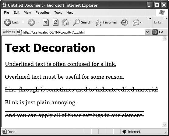
CSS also provides the text-decoration property to add various enhancements to text. With it, you can add lines over, under, or through the text (see Figure 6-6), or for real giggles you can make the text blink like a No Vacancy sign. Use the text-decoration property by adding one or more of the following keywords: underline, overline, line-through, or blink. For example, to underline text:
text-decoration: underline;
You can also combine multiple keywords for multiple effects. Here’s how to add a line over and under some text:
text-decoration: underline overline;
But just because you can add these not-so-decorative decorations to text, doesn’t mean you should. For one thing, anyone who’s used the Web for any length of time instinctively associates any underlined text with a link and tries to click it. So it’s not a good idea to underline words that aren’t part of a link. And blink is like a neon sign flashing “Amateur! Amateur! Amateur!” (On top of that most browsers don’t make text blink, even if you ask for it.)
Note
You can get a similar effect to underlining and overlining by adding a border to the bottom or top of an element (see Adding Borders). The big advantage of borders is that you can control their placement, size, and color to create a more attractive design that doesn’t look like a link.
The overline option simply draws a line above text, while line-through draws a line right through the center of text. Some designers use this strike-through effect to indicate an edit on a page where text has been removed from the original manuscript. Coupled with the a:visited selector, you can also create a cool effect where previously visited links are crossed out like a shopping list.
Finally, you can turn off all decorations by using the none keyword like this:
text-decoration: none;
Why do you need a text-decoration property that removes decorations? The most common example is removing the line that appears under a link. (See Underlining Links.)
Letter and Word Spacing
Another way to make text stand out from the crowd is to adjust the space that appears between letters or words (see Figure 6-7). Reducing the space between letters using the CSS letter-spacing property can tighten up headlines, making them seem even bolder and heavier while fitting more letters on a single line. Conversely, increasing the space can give headlines a calmer, more majestic quality. To reduce the space between letters, you use a negative value like this:
letter-spacing: -1px;
A positive value adds space between letters:
letter-spacing: 10px;
Likewise, you can open up space (or remove space) between words using the word-spacing property. This property makes the space wider (or narrower) without actually affecting the words themselves:
word-spacing: 2px;
With either of these properties, you can use any type of measurement you’d use for text sizing—pixels, ems, percentages—with either positive or negative values.
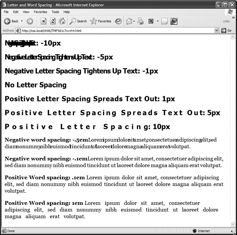
Unless you’re going for some really far-out design effect—in other words, totally unreadable text—keep your values small. Too high a negative value, and letters and words overlap. To keep the message of your site clear and legible, use both letter and word spacing with care.
Formatting Entire Paragraphs
Some CSS properties apply to chunks of text rather than individual words. You can use the properties in this section on complete paragraphs, headlines, and so on.
Adjusting the Space Between Lines
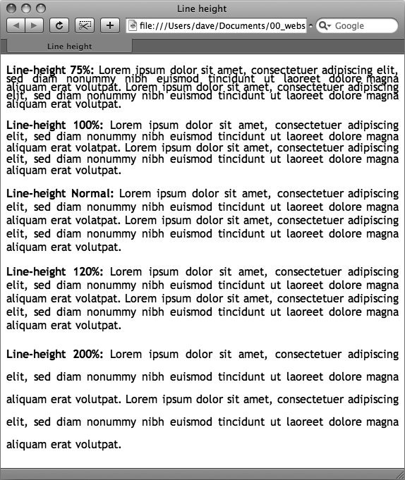
In addition to changing the space between words and letters, CSS lets you adjust the space between lines of text using the line-height property. The bigger the line height, the more space that appears between each line of text (see Figure 6-8).
Line spacing by pixel, em, or percentage
Just as with the font-size property, you can use pixels, ems, or percentages to set the size of line height:
line-height: 150%;
In general, percentages or ems are better than pixels, because they change according to, and along with, the text’s font-size property. If you set the line height to 10 pixels and then later adjust the font size to something much larger (like 36 pixels), because the line height remains at 10 pixels, your lines then overlap. However, using a percentage (150 percent, say) means the line-height spacing adjusts proportionally whenever you change the font-size value.
The normal line-height setting for a browser is 120 percent. So, when you want to tighten up the line spacing, use a value less than 120 percent. To spread lines apart, use a value greater than 120 percent.
Note
To determine the amount of space that appears between lines of text, a web browser subtracts the font size from the line height. The result—called leading—is the amount of space between lines in a paragraph. Say the font size is 12 pixels, and the line height (set to 150 percent) works out to 18 pixels. 18 minus 12 equals 6 pixels, so the browser adds 6 pixels of space between each line.
Line spacing by number
CSS offers one other measurement method specific to line height, which is simply a number. You write it like this:
line-height: 1.5;
There’s no unit (like em or px) after this value. The browser multiplies this number by the font size to determine the line height. So if the text is 1em and the line-height value is 1.5, then the calculated line height is 1.5em. In most cases, the effect is no different from specifying a value of 1.5em or 150 percent. But sometimes this multiplication factor comes in handy, especially since nested tags inherit the line-height value of their parents.
For example, say you set the line-height property of the <body> tag to 150 percent. All tags inside the page would inherit that value. However, it’s not the percentage that’s inherited; it’s the calculated line height. So, say the font size for the page is set to 10 pixels; 150 percent of 10 is 15 pixels. Every tag would inherit a line height of 15 pixels, not 150 percent. So if you happened to have a paragraph with large, 36 pixel text, then its line height—15 pixels—would be much smaller than the text, making the lines squish together in a hard-to-read mess.
In this example, instead of using a line-height of 150 percent applied to the <body> tag, you could have all tags share the same basic proportional line-height by setting the line-height to 1.5. Every tag, instead of inheriting a precise pixel value for line height, simply multiplies its font size by 1.5. So in the above example of a paragraph with 36-pixel text, the line height would be 1.5 x 36 or 54 pixels.
Aligning Text
One of the quickest ways to change the look of a web page is with paragraph alignment. Using the text-align property, you can center a paragraph on a page, align the text along its left or right edge, or justify both left and right edges (like the paragraphs in this book). Normally, text on a page is left aligned, but you may want to center headlines to give them a formal look. Languages that read from right to left, like Hebrew and Arabic, require right-alignment. To change the alignment of text, use any of the following keywords—left, right, justify, center:
text-align: center;
Justified text looks great on a printed page—mainly because the fine resolution possible with printing allows for small adjustments in spacing and because most programs used to layout printed material can hyphenate long words (thus attempting to equally distribute the number of characters per line). This prevents large, unsightly gaps or rivers of white space flowing through the paragraphs. Web pages are limited to much coarser spacing because of the generally low resolution of monitors and because web browsers don’t know how to hyphenate long words. So when you use the justify option, the space between words can vary significantly from line to line, making the text harder to read. When you want to use the justify option on your web pages, test it thoroughly to make sure the text is attractive and readable.
Indenting the First Line and Removing Margins
In many books, the first line of each paragraph is indented. This first-line indent marks the beginning of a paragraph when there are no spaces separating paragraphs. On the Web, however, paragraphs don’t have indents but are instead separated by a bit of space—like the paragraphs in this book.
If you have a hankering to make your web pages look less like other web pages and more like a handsomely printed book, take advantage of the CSS text-indent and margin properties. With them, you can add a first-line indent and remove (or increase) the margins that appear at the beginning and ends of paragraphs.
First-line indents
You can use pixel and em values to set the first-line indent like this:
text-indent: 25px;
or
text-indent: 5em;
A pixel value is an absolute measurement—a precise number of pixels—while an em value specifies the number of letters (based on the current font size) you want to indent.
Tip
You can use negative text-indent values to create what’s called a hanging indent, where the first line starts further to the left than the other lines in the paragraph. (Think of it as “hanging” off the left edge.)
You can also use a percentage value, but with the text-indent property, percentages take on a different meaning than you’ve seen before. In this case, percentages aren’t related to the font size; they’re related to the width of the element containing the paragraph. For example, if the text-indent is set to 50 percent, and a paragraph spans the entire width of the web browser window, then the first line of the paragraph starts half the way across the screen. If you resize the window, both the width of the paragraph and its indent change. (You’ll learn more about percentages and how they work with the width of elements on Margins, Padding, and Percentages.)
Controlling margins between paragraphs
Many designers hate the space that every browser throws in between paragraphs. Before CSS, there was nothing you could do about it. Fortunately, you can now tap into the margin-top and margin-bottom properties to remove (or, if you wish, expand) that gap. To totally eliminate a top and bottom margin, write this:
margin-top: 0;
margin-bottom: 0;
To eliminate the gaps between all paragraphs on a page, create a style like this:
p {
  margin-top: 0;
  margin-bottom: 0;
}
As with text-indent, you can use pixel or em values to set the value of the margins. You can also use percentages, but as with text-indent, the percentage is related to the width of the paragraph’s containing element. Because it’s confusing to calculate the space above and below a paragraph based on its width, it’s easier to stick with either em or pixel values.
Note
Because not all browsers treat the top and bottom margin of headlines and paragraphs consistently, it’s often a good idea to simply zero out (that is, eliminate) all margins at the beginning of a style sheet. To see how this works, turn to Starting with a Clean Slate.
For a special effect, you can assign a negative value to a top or bottom margin. For example a –10px top margin moves the paragraph up 10 pixels, perhaps even visually overlapping the page element above it. (See step 4 on Adding the Finishing Touches of the tutorial for an example.)
Formatting the First Letter or First Line of a Paragraph
CSS also provides a way of formatting just a part of a paragraph using the :first-letter and :first-line pseudo-elements (see Figure 6-9). Technically, these aren’t CSS properties, but types of selectors that determine what part of a paragraph CSS properties should apply to. With the :first-letter pseudo-element, you can create an initial capital letter to simulate the look of a hand-lettered manuscript. To make the first letter of each paragraph bold and red you could write this style:
p:first-letter {
  font-weight: bold;
  color: red;
}
To be more selective and format just the first letter of a particular paragraph, you can apply a class style to the paragraph—.intro, for example:
<p class="intro">Text for the introductory paragaph goes here...</p>
Then you could create a style with a name like this: .intro:first-letter.
The :first-line pseudo-element formats the initial line of a paragraph. You can apply this to any block of text like a heading (h2:first-line) or paragraph (p:first-line). As with :first-letter, you can apply a class to just one paragraph and format only the first line of that paragraph. Say you wanted to capitalize every letter in the first line of the first paragraph of a page. Apply a class to the HTML of the first paragraph—<p class="intro”>—and then create a style like this:
.intro:first-line { text-transform: uppercase; }
Note
For some strange reason, the Safari web browser doesn’t understand the text-transform property (Capitalizing) when it’s used with the :first-line pseudo-element. In other words, you can’t use CSS to capitalize the letters of a paragraph’s first line in Safari.
Styling Lists
The <ul> and <ol> tags create bulleted and numbered lists, like lists of related items or numbered steps. But you don’t always want to settle for the way web browsers automatically format those lists. You may want to swap in a more attractive bullet, use letters instead of numbers, or even completely eliminate the bullets or numbers.
Types of Lists
Most web browsers display unordered lists (<ul> tags) using round bullets, and numbered lists (<ol> tags) using…well…numbers. With CSS, you can choose from among three types of bullets—disc (a solid round bullet), circle (a hollow round bullet), or square (a solid square). There are also six different numbering schemes—decimal, decimal-leading-zero, upper-alpha, lower-alpha, upper-roman, or lower-roman (see Figure 6-10). You select all these options using the list-style-type property, like so:
list-style-type: square;
or
list-style-type: upper-alpha;

Note
If you feel like rushing a fraternity or sorority, you can also replace numbers with Greek letters—α, β, γ—using the lower-greek option.
Most of the time, you use this property on a style that’s formatting an <ol> or <ul> tag. Typical examples include an ol or ul tag style—ul { list-style-type: square; }—or a class you’re applying to one of those tags. However, you can also apply the property to an individual list item (<li> tag) as well. You can even apply different types of bullet styles to items within the same list. For example, you can create a style for a <ul> tag that sets the bullets to square, but then create a class named .circle that changes the bullet type to circle, like this:
.circle { list-style-type: circle; }You can then apply the class to every other item in the list to create an alternating pattern of square and circular bullets:
<ul>
<li>Item 1</li>
<li class="circle">Item 2</li>
<li>Item 3</li>
<li class="circle">Item 4</li>
</ul>
At times you’ll want to completely hide bullets, like when you’d rather use your own graphic bullets (see Graphic Bullets). Also, when a site’s navigation bar is a list of links, you can use an <ul> list, but hide its bullets (see the example on Using Unordered Lists). To turn off the bullets, use the keyword none:
list-style-type: none;
Positioning Bullets and Numbers
Web browsers usually display bullets or numbers hanging to the left of the list item’s text (Figure 6-11, left). With CSS, you can control the position of the bullet (somewhat) using the list-style-position property. You can either have the bullet appear outside of the text (the way browsers normally display bullets) or inside the text block itself (Figure 6-11, right):
list-style-position: outside;
or
list-style-position: inside;
Tip
You can adjust the space between the bullet and its text—increase or decrease that gap—by using the padding-left property (see Control Space with Margins and Padding). To use it, you create a style that applies to the <li> tags. This technique works only if you set the list-style-position property to the outside option (or don’t use list-style-position at all).

In addition, if you don’t like how web browsers indent a list from the left edge, then you can remove that space by setting both the margin-left and padding-left properties to 0 for the list. To remove the indent from all lists, you could create this group selector:
ul, ol {
  padding-left: 0;
  margin-left: 0;
}
Or, you could create a class style with those properties and apply it to a particular <ul> or <ol> tag. The reason you need to set both the padding and margin properties is that some browsers use padding (Firefox, Mozilla, Safari) and some use margin (Internet Explorer) to control the indent. (You’ll learn more about the margin and padding properties in the next chapter.)
Browsers normally display one bulleted item directly above another, but you can add space between list items using the margin-top or margin-bottom properties on the particular list items. These properties work for spacing list items exactly the same way they work for spacing paragraphs, as explained on Formatting the First Letter or First Line of a Paragraph. You just need to make sure that the style applies to the <li> tags by creating a class style and applying it individually to each <li> tag. Or, better yet, create an <li> tag style or descendent selector. The style should not apply to the <ul> or <ol> tag. Adding margins to the top or bottom of those tags simply increases the space between the entire list and the paragraphs above or below it—not the space between each item in the list.
Graphic Bullets
If you’re not happy with squares and circles for your bullets, create your own. Using an image-editing program like Photoshop or Fireworks, you can quickly create colorful and interesting bullets. Clip art collections and most symbol fonts (like Webdings) provide great inspiration.
Tip
For a listing of loads of sites with free icons and bullets, check out this page: www.cssjuice.com/38-free-icon-checkpoints/.
The CSS list-style-image property lets you specify a path to a graphic on your site, much as you’d specify a file when adding an image to a page using the src attribute of the HTML <img> tag. You use the property like this:
list-style-image: url(images/bullet.gif);
The term url and the parentheses are required. The part inside the parentheses—images/bullet.gif in this example—is the path to the graphic. Notice that, unlike HTML, you don’t use quotation marks around the path.
Note
When specifying a graphic in an external style sheet, the path to the image is relative to the style sheet file, not the web page. You’ll learn more about how this works in the box on Controlling Repetition, as you start to use images with CSS.
While the list-style-image property lets you use a graphic for a bullet, it doesn’t provide any control over its placement. The bullet may appear too far above or below the line, requiring you to tweak the bullet graphic until you get it just right. A better approach—one you’ll learn in Chapter 8—is to use the background-image property. That property lets you very accurately place a graphic for your bulleted lists.
Note
As with the font property (see the box on Controlling margins between paragraphs), there’s a shorthand method of specifying list properties. The list-style property can include a value for each of the other list properties—list-style-image, list-style-position, and list-style-type. For example, ul { list-style: circle inside; } would format unordered lists with the hollow circle bullet on the inside position. When you include both a style type and style image—list-style: circle url(images/bullet.gif) inside;—web browsers use the style type circle in this example—if the graphic can’t be found.
Tutorial: Text Formatting in Action
In this tutorial, you’ll gussy up headlines, lists, and paragraphs of text using CSS’s powerful formatting options.
To get started, you need to download the tutorial files located on this book’s companion website at www.sawmac.com/css2e/. Click the tutorial link and download the files. All of the files are enclosed in a ZIP archive, so you’ll need to unzip them first. (Go to the website for detailed instructions on unzipping the files.) The files for this tutorial are contained inside the folder named 06.
Setting Up the Page
First, you’ll get your style sheet started and add styles to format the body text.
Launch your web browser and open the file 06 → text.html (see Figure 6-12).
It’s not much to look at—just a collection of headlines, paragraphs and a lone bulleted list—but you’ll turn it into something far better looking.
Open the file text.html in your favorite text editor.
Start by adding an internal style sheet to this file. (Yes, external style sheets are better, but it’s perfectly OK to start your design with an internal sheet. See the box on Tutorial: Selector Sampler.)
In the <head> of the web page, click directly after the closing </title> tag. Hit Enter (Return), and then type <style type="text/css">. Press Enter twice and type </style>.
Now that the basic style tags are in place, you’ll add the CSS reset discussed on Starting with a Clean Slate. Instead of typing it all out, you’ll just copy and paste the CSS from an external style sheet.
Open the file reset.css. Copy all of the code from that file and paste it between the opening and closing <style> tags you added in the previous step.
If you preview the text.html file in a web browser now, you’ll see that the text looks nearly the same—in other words, all of the basic HTML formatting the browser applied has been removed, so you can start with a clean slate.
Next, you’ll create a style that defines some general properties for all text on the page.
Press Enter and type body {.
This is a basic tag selector that applies to the <body> tag. As discussed in Chapter 4, other tags inherit the properties of this tag. You can set up some basic text characteristics like font, color, and font size for later tags to use as their starting point.
Press Enter again, and then add the following three properties:
color: #002D4B;
font-family: Arial, Helvetica, sans-serif;
font-size: 62.5%;
These three instructions set the color of the text to a dark blue, the font to Arial (or one of 2 others depending on which font is installed—see Serif fonts), and the font size to 62.5 percent.
Note
Why set the page’s base font to 62.5 percent? It just so happens that 62.5 percent times 16 pixels (the normal size of text in most web browsers) equals 10 pixels. With 10 pixels as a starting point, it’s easy to compute what other text sizes will look like on the screen. For example, 1.5em would be 1.5 x 10 or 15 pixels. 2em is 20 pixels, and so on—easy multiples of ten. For more on this interesting discovery and more font-sizing strategies, visit http://clagnut.com/blog/348/.
Complete this style by pressing Enter, and typing a closing bracket to mark the end of the style.
At this point, your completed style should look like this:
body {
  color: #002D4B;
  font-family: Arial, Helvetica, sans-serif;
  font-size: 62.5%;
}
Your style sheet is complete.
Save the page, and open it in a web browser to preview your work.
The text on the page changes color and font…it also gets really small. Don’t worry, that’s the 62.5 percent font size you set in step 6. That’s just the starting point for all text, and you’ll easily increase the size of text by defining em sizes for the other tags.
Formatting the Headings and Paragraphs
Now that the basic text formatting is done, it’s time to refine the presentation of the headlines and paragraphs.
Return to your text editor and the text.html file. Click at the end of the closing brace of the body tag selector in the internal style sheet, press Enter (Return) to create a new line, and then type #main h1 {.
This is a descendent selector (The HTML Family Tree). It provides more specific direction than a basic HTML tag selector. In this case, the selector tells the web browser “apply the following formatting to any <h1> tag inside another tag with the ID name main.” If you look at the page’s HTML, you’ll see that there’s a <div> tag with an ID of main (<div id="main">). As you’ll learn later, it’s very common in CSS-based designs to group HTML tags inside of <div> tags. You can then position individual div tags to create columns and other complex page layouts. It’s also common to use descendent selectors like this one to pinpoint your formatting choices by affecting just the tags in certain areas of the page.
Hit Enter, and then type these three CSS properties:
color: #FF6600;
font-family: "Arial Black", Arial, Helvetica, sans-serif;
font-size: 4em;
You’ve just changed the color of the <h1> tag as well as the font. You’ve also set the font size to 4em, which for most browsers (unless the visitor has tweaked his browser’s font settings) comes out to 40 pixels tall. That’s all thanks to the 62.5 percent size you set for the body back at step 6. That smooth move made the base font size 10 pixels tall, so 4 x 10 comes out to 40 pixels.
Finally, complete this style by hitting Enter and typing the closing brace.
The completed style should look like this:
#main h1 {
  color: #FF6600;
  font-family: "Arial Black", Arial, Helvetica, sans-serif;
  font-size: 4em;
}
Save the file, and preview it in a web browser.
Next, spruce up the appearance of the other headings and paragraphs.
Return to your text editor and the text.html file. Click after the closing brace of the h1 tag , hit Enter, and add the following two styles:
#main h2 {
  font: bold 3.5em "Hoefler Text", Garamond, Times, serif;
  border-bottom: 1px solid #002D4B;
  margin-top: 25px;
}
Here you have another descendent selector that only applies to <h2> tags inside another tag with the ID main (you’re probably getting the hang of these now). The font property used here is shorthand that combines the more long-winded font-weight, font-size, and font-family (see the box on Controlling margins between paragraphs). In other words, this one line makes the headline bold, 3.5ems tall, and specifies a font.
In addition, this style adds a decorative border below the headline and a bit of space between the headline and the tag above it (in other words, it adds some space between the “CSS The Missing Manual” and the “Exploring Typographic Possibilities” headlines). You’ll read more about borders on Adding Borders, and margins in the next chapter.
Time to tackle more headlines.
Add another style below the one you added in the last step:
#main h3 {
  color: #F60;
  font-size: 1.9em;
  font-weight: bold;
  text-transform: uppercase;
  margin-top: 25px;
  margin-bottom: 10px;
}
This style dishes out some of the usual formatting—color, size, boldness—and also uses the text-transform property (Capitalizing) to make all of the text in the <h3> headlines uppercase. Finally, it adds a bit of space above and below the headlines using the margin properties.
Next, you’ll improve the look of the paragraphs.
Add one more style to the page:
#main p {
  font-size: 1.5em;
  line-height: 150%;
  margin-left: 150px;
  margin-right: 50px;
  margin-bottom: 10px;
}
This style introduces the line-height property, which sets the spacing between lines. A percentage of 150 adds a little more space between lines in a paragraph than you’d normally see in a web browser. This extra breathing room gives the text a lighter, airier quality and makes the sentences a little easier to read (but only if you speak Latin).
The style also increases the font size to 1.5em (15 pixels for most browsers) and indents the paragraph from the left and right edges of the page. You’ll notice that there’s a lot of typing going on for the margin properties—fortunately, as you’ll read on Colliding Margins in the next chapter, there’s a margin shortcut property that requires much less typing to control the four margins of an element.
Time to try out a more advanced selector type
Add the following style to your style sheet:
#main p:first-line {
  font-weight: bold;
  color: #999;
}
The :first-line pseudo-element (Styling Paragraph Parts) affects just the first line of a paragraph. In this case, just the first line of text for each of the paragraphs inside the main div will be bold and gray.
Save the page and open it in a web browser to preview your work.
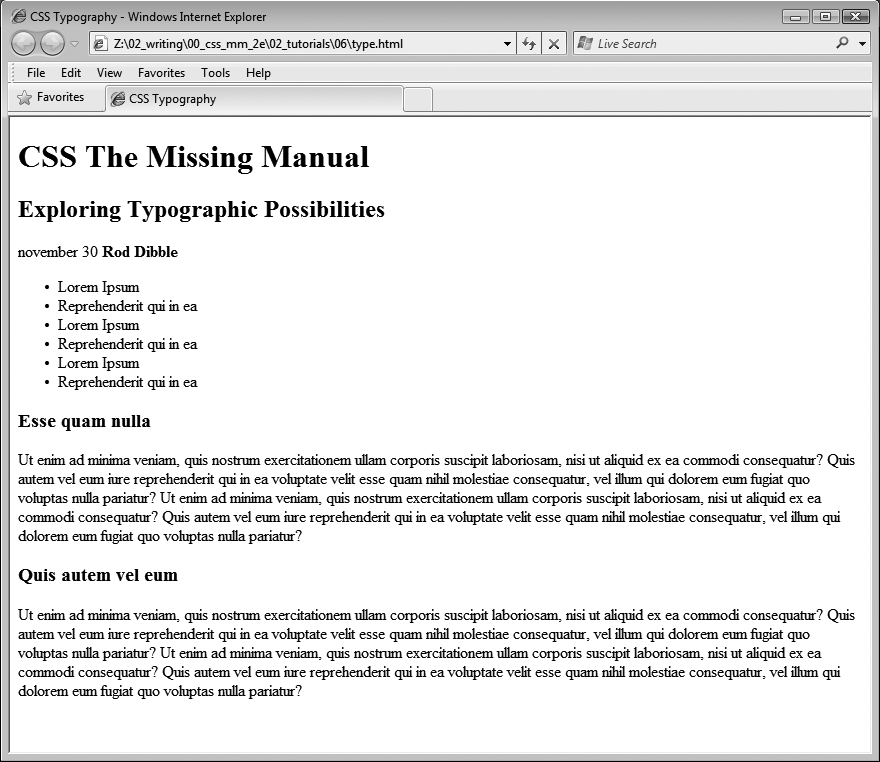
At this point, the page should look like Figure 6-13.
Figure 6-13. The page is starting to come together. The headlines, paragraphs, and basic text settings are in place. Depending on which fonts you have on your computer, you may notice slight differences between your design and the one pictured here. Specifically, if you’re on Windows, the “Exploring Typographic Possibilities” headline will use either Garamond or Arial. This screenshot, taken on a Mac, uses the “Hoefler Text” font family specified in step 5 on Formatting the Headings and Paragraphs.

Formatting Lists
This page has a single bulleted list. The plan is to move the list over to the right edge of the page and have the text following it wrap around it. CSS makes this little trick easy.
Return to your text editor and the text.html file. Add the following style at the end of the page’s internal style sheet:
#main ul {
  margin: 50px 0 25px 50px;
  width: 150px;
  float: right;
}
When formatting lists, you’ll usually create styles for two different elements: the list itself (either the <ul> tag for bulleted lists or the <ol> tag for numbered lists) and the individual list items (the <li> tag). This style controls the entire list.
There are a few things happening in this style. First, the margin property uses the shorthand method. This one line sets all four margins around the list, replacing the four individual margin properties (margin-top, margin-right, and so on). The four values are ordered like this: top, right, bottom, left. So for this style, 50 pixels of space gets added above the list, 0 space on the right, 25 pixels on the bottom, and 50 pixels on the left.
The width property (discussed in detail on Determining Height and Width) makes the entire list 150 pixels wide. If any particular list item has more text than will fit within that space, it wraps to another line. The float property is the real magic—in this case, float: right means move the list over to the right edge of the page. This property also causes the text following the list to wrap around the left side of the list. It’s a cool trick, and you’ll learn a lot more about floats on Wrap Content with Floating Elements.
You’ll control the look of the individual list items next.
Add one more style to the internal style sheet in the text.html file:
#main li {
  color: #207EBF;
  font-size: 1.5em;
  margin-bottom: 7px;
 }
Nothing new here: just changing the color and size and adding space below each list item. Time to check out your progress.
Save the page and preview it in a web browser.
The page should now look like Figure 6-14.
Fine-Tuning with Classes
Sometimes you want even more control over how a style is applied. For example, while you might want most paragraphs in one section of the page to look the same, you might also want one or two paragraphs to have their own unique look. In this tutorial, the paragraph of text near the top of the page—“November 30 Rod Dibble”—contains some unique information—a publication date and author. You want it stand out from the other paragraphs, so you’ll add a class to the HTML and create a class style.

Locate the HTML for that paragraph —<p>november 30 <strong>Rod Dibble</strong></p> —and add class="byline” to the opening <p> tag. The HTML should look like this:
<p class="byline">november 30 <strong>Rod Dibble</strong></p>
Now it’s a simple matter of creating a class style that overrides the generic formatting of the other paragraphs on the page.
In the internal style sheet near the top of the page, add a style for that paragraph:
#main .byline {
  color: #FFFFFF !Important;
  font-size: 1.6em;
  margin: 5px 0 25px 50px;
}
This style tweaks the color, size, and placement of just that one paragraph. Note that if you’d just named that style .byline—a basic class selector—it wouldn’t work. Thanks to the rules of the cascade described in the last chapter, .byline is less specific (less powerful) than the #main p style you created in step 7 on Formatting the Headings and Paragraphs, so it wouldn’t be able to override the color, size, and margins specified by #main p. However, #main .byline is more specific and successfully formats that top paragraph.
That paragraph still needs some work. It would be great if the name stood out more. The HTML in this case provides just the hook you need.
Add another style to the style sheet:
#main .byline strong {
  color: #207EBF;
  text-transform: uppercase;
  margin-left: 5px;
}
If you look at the HTML in step 1 above, you’ll see that the name—Rod Dibble—is inside a <strong> tag. The <strong> tag is used to emphasize text and mark it as important. But that doesn’t mean you have to let it be bold, the way web browsers normally display that tag. Instead, this descendent selector targets the <strong> tag but only when it appears inside another tag with the class .byline, and only if all of that is inside yet another tag with the ID main—whew, that’s pretty specific.
This style turns the text blue, makes it uppercase and adds a bit of space on the left side (nudging the name over just a bit from the “November 30” text).
Adding the Finishing Touches
For the last bit of design, you’ll incorporate a few design touches that format the page and that main div so they both look better. Then you’ll finish up with a cool bit of text formatting.
Return to your text editor and the text.html file.
First, you’ll add a background color and image to the page.
Locate the body style near the top of the internal style sheet and add one new property so that it looks like this (changes are in bold):
body { font-size: 62.5%; font-family: Arial, Helvetica, sans-serif; color: #002D4B;background: #E1EEFD url(images/bg_body.png) repeat-x;}The background property is a powerful tool for any web designer. You’ve already used it a couple of times in earlier tutorials; it lets you add color and insert and control the placement of an image to the background of any tag. You’ll learn the ins and outs of this property on Determining Height and Width, but for now this line changes the background color of the page to light blue and adds a dark blue stripe to the top of the page.
Next you’ll spruce up the main div.
Add another style in between the body style and the #main h1 style:
#main {
  width: 740px;
  margin: 0 auto;
  padding: 0 10px;
  border: 4px solid white;
  background: transparent url(images/bg_banner.jpg) no-repeat;
}
In other words, click after the closing } for the body style, hit Enter and type the code above. You don’t necessarily have to put the style in that spot for it to work, but for organizational purposes putting the style that controls the div before the other styles that format tags inside that div seems to make sense.
Note
You’ll learn strategies for organizing your style sheets on Using Multiple Style Sheets.
The width property sets an overall width of this div (and the content inside it), essentially turning this page into a 740-pixel-wide document. The margin property values here—0 auto—put 0 pixels of space above and below the div and set the left and right margins to auto, which centers the div in the middle of the browser window. The padding property adds space inside the box, pushing content inside the div away from the border line. Finally, you’ve placed an image into the background of the div.
Those last two styles didn’t have anything to do with text formatting, but if you preview the page, you’ll see that they make it look a lot better…except for those two top headlines. The first headline isn’t bold enough, and the second should fall below the newly added graphic.
Add one last style right after the #main h1 style:
#main h1 strong {
  font-size: 150px;
  color: white;
  line-height: 1em;
  margin-right: -1.25em;
}
The HTML for the headline looks like this:
<h1><strong>CSS</strong> The Missing Manual</h1>
The “CSS” is enclosed inside <strong> tags, so this descendent selector formats only that text (in that sense, it’s like the style you added in step 3 on Adding the Finishing Touches that took advantage of a <strong> tag embedded within a paragraph). The text size is pumped way up, it’s color changed, and line height is adjusted so that it fits inside the top of the page. You’ll notice that the line height is set to 1em—as you read on HTML to Forget, an em is based on the current font size of the element, so in this case the line height will translate to 150 pixels—that’s the font size of this style.
The one cool trick is the margin-right property, which is set to a negative value: –1.25em. Since a positive margin pushes elements away, a negative margin actually pulls elements on top of each other. In this case, the rest of the text in the headline—“The Missing Manual”—is scooted over 1.25 em, which is 1.25 times the font size (150 pixels), on top of the “CSS” text.
Note
Negative margins are perfectly legal (although tricky) CSS. They’re even used for some pretty advanced CSS layout, as described on Using Negative Margins to Position Elements.
Save the file and preview it in a web browser.
It should look like Figure 6-14. You can compare your work to the finished text.html page located in the 06_finished folder.
Congratulations! You’ve explored many of the text formatting properties offered by CSS, and turned ho-hum HTML into an attractive, attention-getting design. In the next chapter, you’ll explore graphics, borders, margins, and other powerful CSS design options offered by CSS.
