
Chapter 11. Introducing CSS Layout
CSS leads a double life. As great as it is for formatting text, navigation bars, images, and other bits of a web page, its truly awesome power comes when you’re ready to lay out entire web pages. While HTML normally displays onscreen content from top to bottom, with one block-level element stacked after another, CSS lets you create side-by-side columns and position images or text anywhere on the page (even layered on top of other page elements), so you can create much more visually interesting web pages.
There’s a lot to CSS layout. The next two chapters cover two of the most important CSS techniques in detail. This chapter provides a brief overview of the principles behind CSS layout and a handful of useful guidelines for approaching your own layout challenges.
Types of Web Page Layouts
Being a web designer means dealing with the unknown. What kind of browsers do your visitors use? Do they have the latest Flash Player plug-in installed? But perhaps the biggest issue designers face is creating attractive designs for different display sizes. Monitors vary in size and resolution: from 15-inch, 640 X 480 pixel notebook displays to 30-inch monstrosities displaying, oh, about 5,000,000 X 4,300,000 pixels. Not to mention the petite displays on mobile phones.
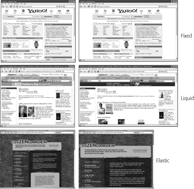
Web layouts offer several basic approaches to this problem. Nearly every page design you see falls into one of two types—fixed width or liquid. Fixed-width designs give you the most control over how your design looks but can inconvenience some of your visitors. Folks with really small monitors have to scroll to the right to see everything, and those with large monitors end up with wasted space that could be showing more of your excellent content. Liquid designs, which grow or shrink to fit browser windows, make controlling the design more challenging but offer the most effective use of the browser window. An elastic design combines some advantages of both.
Fixed Width. Many designers prefer the consistency of a set width, like the page in Figure 11-1, top. Regardless of the browser window’s width, the page content’s width remains the same. In some cases, the design clings to the left edge of the browser window, or, more commonly, it’s centered in the middle. With the fixed-width approach, you don’t have to worry about what happens to your design on a very wide (or small) monitor.
Many fixed-width designs are below 1,000 pixels wide, letting the window and the space taken up by scrollbars and other parts of the browsers “chrome” fit within a 1024 X 768 pixel monitor. A very common width is 960 pixels. The great majority of websites are a fixed width.
Note
For examples of fixed-width designs, visit www.alistapart.com, www.espn.com, or www.nytimes.com.
Liquid. Sometimes it’s easier to roll with the tide instead of fighting it. A liquid design adjusts to fit the browser’s width—whatever it may be. Your page gets wider or narrower as your visitor resizes the window (Figure 11-1, middle). While this type of design makes the best use of the available browser window real estate, it’s more challenging to make sure your design looks good at different window sizes. On very large monitors, these types of designs can look ridiculously wide, creating very long, difficult to read lines of text.
Note
For an example of a liquid layout, check out http://maps.google.com.
Elastic. An elastic design is really just a fixed-width design with a twist—type size flexibility. With this kind of design, you define the page’s width using em values. An em changes size when the browser’s font size changes, so the design’s width is ultimately based on the browser’s base font size (Keywords). By changing the browser’s font size, you can change the width of the page and the elements on it. It’s kind of like zooming into the design (Figure 11-1, bottom).
Elastic designs are losing favor these days in large part because the newest versions of the most popular browsers have replaced the normal “increase text size” command with a “page zoom” command. For example, in Internet Explorer 8, Firefox 3, Safari 4, Opera, and Chrome, pressing Ctrl-+ enlarges everything on the page (pretty much the same effect you get with an elastic design).
In the tutorials at the end of next chapter, you’ll create a fixed-width design and a liquid design.
Note
The max-width and min-width properties offer a compromise between fixed and liquid designs. See the box on Using Negative Margins to Position Elements.
How CSS Layout Works
As discussed in Chapter 1, in the early days of the Web, HTML’s limitations forced designers to develop clever ways to make their websites look good. The most common tool was the <table> tag, which was originally intended to create a spreadsheet-like display of information composed of rows and columns of data. Designers used HTML tables to build a kind of scaffolding for organizing a page’s contents (see Figure 11-2). But because the <table> tag wasn’t meant for layout, designers often had to manipulate the tag in unusual ways—like placing a table inside the cell of another table—just to get the effect they wanted. This method was a lot of work, added a bunch of extra HTML code, and made it very difficult to modify the design later. But before CSS, that’s all web designers had.
If you’re a longtime <table> tag jockey, you need to develop a new mindset when you begin to use CSS for layout. First, forget about rows and columns—that notion is important only when working with tables. In table-based layout, you took your HTML and put it into individual table cells. Each cell acted like a box on the page holding a headline, an image, text, or a combination.
CSS has a rough equivalent of a table cell—the <div> tag. As with table cells, a <div> tag is a container for content that you want to position in one area of the page. In addition, as you’ll see, CSS designs often nest a div inside another div, much like you’d nest tables within tables to get certain effects—but the CSS method uses a lot less HTML code.

The Mighty <div> Tag
Web page layout involves putting chunks of content into different regions of the page. With CSS, the element most commonly used for organizing content is the <div> tag. As you read on HTML to Forget, the <div> tag is an HTML element that has no inherent formatting properties (besides the fact that browsers treat the tag as a block with a line break before and after it). Instead, it’s used to mark a logical grouping of elements or a division on the page.
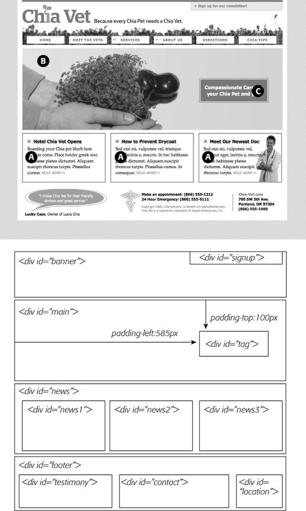
You’ll typically wrap a <div> tag around a chunk of HTML that belongs together. The elements comprising the logo and navigation bar in Figure 11-3 occupy the top of the page, so it makes sense to wrap a <div> tag around them. At the very least, you would include <div> tags for all the major regions of your page, such as the banner, main content area, sidebar, footer, and so on. But it’s also possible to wrap a <div> tag around one or more additional divs. One common technique is to wrap the HTML inside the <body> tag in a <div>. Then you can set some basic page properties by applying CSS to that wrapper <div>. You can set an overall width for the page’s content, set left and right margins, center all of the page’s content in the middle of the screen, and add a background color or image to the main column of content.
Once you’ve got your <div> tags in place, add either a class or ID to each one, which becomes your handle for styling each <div> separately. For parts of the page that appear only once and form the basic building blocks of the page, designers usually use an ID. The <div> tag for a page’s banner area might look like this: < div id="banner">. You can use an ID only once per page, so when you have an element that appears multiple times, use a class instead. If you have several divs that position photos and their captions, for example, then wrap those tags in a div and add a class like this: <div class="photo">. (For more on knowing when to use a div, read the box below.)
Once you have the divs in place and have accurately identified them with IDs or class names, you can then create CSS styles to position those <divs> on the page using either floats (Chapter 12) or absolute positioning (Chapter 13).
Techniques for CSS Layout
At this point in the evolution of CSS, layout comes in two flavors—floats and absolute positioning. The vast majority of web pages use the CSS float property for layout. You’ve already encountered this seemingly simple property in Chapter 8, where the float property was introduced as a way of positioning an image within a column of text by either floating the image to the left or right side. The same concept applies to divs: By setting the width on a div and floating it to the left or right, you can create a column (the text following the div ends up wrapping around the floated div as if it were another column). By using the float property with multiple divs, you’re able to achieve multi-column layouts. Taking this technique further, you can quickly create complex, multicolumn layouts by placing floated divs within floated divs.
Absolute positioning lets you place an element anywhere on the page with pixel-level accuracy. You can place an element 100 pixels from the top edge of the browser window and 15 pixels in from the left edge, for example. Page layout programs like InDesign and Quark Xpress work this way. Unfortunately, the fluid nature of web pages and some of the weird characteristics of absolute positioning make it difficult to achieve total layout control with this technique. As you’ll read in Chapter 13, it is possible to lay out a page using absolute positioning, but, in general, this technique is better suited to smaller tasks like positioning a logo in a particular location of the page.
Don’t worry if this sounds rather abstract right now, you’ll see all of these techniques in action in the next two chapters.
Note
There are a couple of other ways to do CSS layout as well, but they’re limited to Internet Explorer 8, Firefox, Safari, and other current browsers. In other words, these other techniques won’t work for the vast majority of web surfers on IE 6 and 7. However, we do introduce these up-and-coming techniques on Child Selectors in Chapter 16.
Layout Strategies
Web page layout with CSS is more of an art than a science; there’s no one formula to follow for marking up your content with HTML and creating your CSS. What works for one design might not for another. Though that might not be a comforting thought—“Hey, I bought this book to learn this darn stuff”—CSS layout is something you’ll learn through experience, learning how the different CSS properties work (especially floats and absolute positioning), reading about different layout techniques, following tutorials like the ones in the next two chapters, and lots of practice.
However, there are definitely some strategies you can adopt as you approach CSS layout. These are more like guidelines than hard or fast rules, but as you begin to see your projects through the initial visual design, start with these tips in mind.
Start with Your Content
Many designers like to jump right into the good stuff—colors, fonts, icons, and images. But beginning with the visual design is putting the cart before the horse. The most important elements of a web page are the contents: headlines, paragraphs of text, stunning photographs, navigational links, Flash movies, and such are what people will come to your site for. They want to read, learn, and experience what your site has to offer. Content is king, so you think of what you want to say before you tackle how it should look. After all, it won’t do you much good to create a fantastic, 3-D looking sidebar box if you don’t have anything meaningful to put in that box.
In addition, a page’s message should dictate its design. If you decide that your home page needs to sell the services of your company and highlight the excellent customer service you offer, you might decide that a large photo of your friendly staff is important, as well as a quote from a satisfied customer. Since both of these elements are important to the page’s message, you can craft the visual message by making both the picture and the quote prominent and compelling.
Mock Up Your Design
Even if you feel more comfortable hand-coding HTML and CSS in your favorite text editor than drawing in a graphics program, avoid starting with code. It’s fairly easy to use a graphics program like Photoshop, Illustrator, or Fireworks to create a visual design. These programs give you the freedom to explore different colors, fonts, images, and positioning without spending the time required to code the HTML and CSS. You can experiment rapidly with new design ideas until you hit upon something you love.
If you’re not a wiz with graphics programs, even just drawing boxes to indicate different placement of page elements can help you refine your thinking about how the page should be laid out. It’s a lot easier to change a two-column design to a four-column design by resizing boxes in Illustrator than by rewriting HTML and CSS. Even simple pencil and paper sketches are a great way to get a feel for where content should go, how big it should be, and the general color tone (light or dark).
Tip
Yahoo offers a free Stencil Kit (http://developer.yahoo.com/ypatterns/wireframes) that you can use in Illustrator, Visio, OmniGraffle, and other graphics programs to create web page mockups. The supplied user interface elements, like buttons, form fields, windows, and navigation buttons, can make sketching out a page layout as simple as dragging and dropping icons.
Identify the Boxes
Once you’ve created a visual mockup, it’s time to think of how to create the HTML markup and CSS to achieve your design goal. This process usually involves envisioning the different structural units of a page and identifying elements that look like individual boxes. For example, in Figure 11-3, there are quite a few elements that look like boxes: most obviously the three announcement boxes near the bottom (marked as A in Figure 11-3). Each box is usually a good candidate for a separate <div> tag (unless there’s a more appropriate HTML tag, as discussed in the box on Techniques for CSS Layout).
Often a visual clue in your mockup can help you decide if a div is needed. For example, a border line drawn around a headline and several paragraphs of text indicates you’ll need to surround that group of HTML tags with a <div> tag that has a border applied to it.
In addition, whenever you see chunks of text sitting side by side (like the three chunks of content in the footer in Figure 11-3), you know you’ll need to have each group in its own div tag—HTML tags don’t usually sit side by side, so you have to use some layout mojo (like the float technique covered in the next chapter) to make that happen.
It’s also common to group divs that sit side by side in columns within another div. For example, in the bottom half of Figure 11-3 you can see the basic set of <div> tags that provide the page’s structure. The “news” and “footer” divs are containers for their own set of divs. While this isn’t always a necessity, it can provide flexibility. For example, you can reduce the main area (the photo of the hand and the tagline) in width and move the news div to the right side to form its own column. The news items could then be stacked on top of each other rather than sitting side by side.
Go with the Flow
Tags don’t normally sit side by side or layer on top of each other. Normally, HTML tags act pretty much like text in a word-processing program: filling the entire width of the page and flowing from top to bottom. Each block level tag—headline, paragraph, bulleted list, and so on—stacks on top of the next block level tag. Since that’s the “business as usual” approach of HTML tags, you usually don’t have to do any kind of positioning if you plan on stacking one div on the next.
For example, in Figure 11-3, four divs—“banner,” “main,” “news,” and “footer”—span the entire width of their container (the <body> tag) and sit one on top of the other. Because this is the normal way block-level tags work, you don’t need to do anything special with the CSS for those four divs to stack on top of each other.
Remember Background Images
You’ve no doubt seen tiled images filling a web page’s background, or subtle gradients adding depth to a banner. But the background-image property (Background Images) provides another way to add photos to a page without resorting to the <img> tag. Not only does putting an image into the background of an existing HTML tag save the few bytes of data required by the <img> tag, but it also simplifies some layout challenges.
For example, in Figure 11-3, the central image of the hands holding the Chia Pet (B) is actually just a background image. This makes placing another div—the one with the tagline “Compassionate care…” (C) really easy, since it’s just sitting on top of the background of its parent div. Likewise, the picture of the doctor lower right of the page is just a background image placed in that div—adding some right padding pushes the text in that div out of the way of the photo.
Note
There are downsides to using photos in the background of divs (or any HTML tag). First, web browsers usually don’t print backgrounds—so if you’ve got a page with a map containing driving directions to your business, insert the map with the <img> tag and not as a background image. Likewise, search engines don’t search CSS, so if you think the image can help attract traffic to your site, use an <img> tag and include a descriptive alt attribute.
Pieces of a Puzzle
This tip can be filed under “creative problem solving” or “if I stare at this design long enough I’ll come up with some crazy solution.” Often, what looks like a single, unified whole is actually composed of multiple pieces. For example, in the tutorial in Chapter 8, a sidebar that looked like a paper scroll was actually constructed of three background images in three separate HTML tags (see Figure 8-17). Likewise, the “sliding doors” trick discussed on Sliding Doors uses a similar technique to piece together a single, flexible tab (see Figure 9-10).
You can see a simple example of this in Figure 11-3, even though at first glance it looks like one big white box full of content. Actually there are four stacked divs, each with a white background. So, if you’re having trouble seeing how to put together one large element on a page—a very large graphic, a rainbow that spans several columns, or just a solid background color that appears to span multiple areas of a page—think about how you could achieve the same look breaking the large unit into smaller pieces that are joined like parts in a jigsaw puzzle.
Layering Elements
If you’re a Photoshop, Illustrator, or Fireworks fan, you’re probably used to the notion of layers. Layers let you create separate canvases that float on top of each other to build one unified image. In these programs, it’s easy to make a logo float on top of a headline of text, or place a photo over another photo. If you want a web page that has this kind of effect, you have a couple of choices.
Often the easiest way to layer something on top of a photo is to put the image into the background of another tag (see the tip on the previous page). Because the background image is behind the tag, anything inside that tag—text, another photo—will sit on top of the photo.
But what if you want to layer a photo on top of some text? In that case, you’ll turn to the only CSS property that lets you layer elements—the position property. You’ll learn all about that property in Chapter 13, since to position something on top of something else requires absolute positioning.
Don’t Forget Margins and Padding
Finally, sometimes the simplest solution is the best. You don’t always need fancy CSS to move a page element into place. Remember that padding and margins (Control Space with Margins and Padding) are just empty space, and by using those properties you can move elements around the page. For example, the tagline box (C in Figure 11-3) is positioned simply by setting the top and left padding of the parent div. As you can see in the diagram in the bottom half of Figure 11-3, the tagline is placed inside another div (<div id="main">). That div doesn’t actually have any content besides the tagline—the photo is just a background image—so adding padding moves the tagline div down and to the right.