
Chapter 14. CSS for the Printed Page
Not everyone likes to sit in front of a computer and read. More and more, web surfers are printing out pages for offline reading. Plenty of folks enjoy websites while sitting at the dinner table, on a train, or lying on the grass in a park on a sunny day. Printing out a receipt after making an online purchase is common as well. So what becomes of your carefully crafted designs when the ink hits the paper? White text on a black background can waste gallons of toner, and some browsers may not even print the background. Do visitors really need to see your site’s navigation bar on the printed page? Probably not.
web designers used to solve this dilemma by creating separate printer-friendly versions of their sites—essentially creating a duplicate site formatted just for printing. Not only is that a lot more work than building one version of the site, it also means changing multiple files each time a page needs editing. Fortunately, CSS offers a better way—the ability to make a page look one way when displayed on a screen and a different way when printed (see Figure 14-1). The secret? Media style sheets.
How Media Style Sheets Work
The creators of CSS were pretty thorough when they envisioned all the different ways people might view websites. They knew while most people view the Web using a computer and monitor, sometimes people want to print out a page. In addition, new web surfing devices like mobile phones, handhelds, and televisions have their own unique requirements when it comes to web design.
To accommodate these different methods of surfing, CSS lets you create styles and style sheets that specifically target a particular media type. CSS recognizes 10 different media types: all, braille, embossed, handheld, print, projection, screen, speech, tty, and tv. The browser applies the style sheet only when that media type is active. In other words, the browser can apply one style sheet for the screen and a different one when printing. Many of these media types are for very specialized applications like a Braille reader for the blind, a speech reader (for those who want or need to hear a page in spoken form), or a teletype machine. Most of these types don’t yet work in the real world, as there are no devices programmed to understand them. You should be aware, however, of three: all, screen, and print.
All applies to every type of device. When a style or style sheet applies to all media types, every device accessing the page uses those same styles. Printers and monitors alike attempt to format the page the same way. (Styles actually work this way already when you embed them in the page or link them from an external style sheet, so you don’t need to specify "all media types” when adding a style sheet to a page.)
Screen styles display only on a monitor. When you specify the screen media type, the browser ignores those styles when it prints the page. This media type lets you isolate styles that look good on screen but awful on paper, like white text on a black background.
Print styles apply only when the page is printed. Print styles let you create styles that use printer-friendly font sizes, colors, graphics, and so on.
One approach is to build styles with your monitor in mind first, and then attach them using one of the methods described below (methods like internal or external, linked or imported). At the outset, these styles work for both the monitor and the printer. Then, you create a style sheet that applies only when printing. It overrides any of the main styles that negatively affect the look of the page when printed. You’ll learn this technique starting on Creating Print Style Sheets. Alternatively, you can create two different media style sheets—one for screen and the other for print—and attach them to your web pages, as described next.
Tip
Another popular technique is to create three style sheets: one for the printer, one for the screen, and a third with styles that should appear both on a monitor and when printed. You specify the media types for the printer and screen style sheets and attach the third, shared set of styles as you would normally (see Specifying the Media Type for an External Style Sheet).

How to Add Media Style Sheets
Media style sheets are simply CSS style sheets: They can be either internal or external. However, when you want a web browser to apply the styles for only a particular device such as a screen or printer, you need to add the style sheet to your web page in a slightly different way than usual.
Specifying the Media Type for an External Style Sheet
To attach an external style sheet while specifying a particular media type, use the <link> tag with a media attribute. To link a style sheet that should be used only for printing, add this HTML to your web page:
<link rel="stylesheet" type="text/css" media="print" href="print.css"/>
Note
Technically, the rules of CSS also let you define a media type when using the @import method of attaching an external style sheet (see Tutorial: Creating Your First Styles), like so: @import url(print.css) print;. But since Internet Explorer refuses to understand this code, you should avoid using it.
If you don’t specify any media, a web browser assumes you’re targeting all media, so it uses the style sheet for screen display, printing, and so on. In addition, you can specify multiple media types by separating them with commas. A linked external style sheet targeting multiple media might look like:
<link rel="stylesheet" type="text/css" media="screen, projection, handheld"
href="screen.css"/>
You probably won’t need to specify more than one until browsers start recognizing multiple media types.
Tip
When you build and test printer style sheets, leave off the media="print” attribute and turn off any screen-only style sheets. For example, change media="screen” to media="speech”. This technique lets you view the page in a web browser but have it display as if it were formatted for a printer. Once the printer style sheet looks good, make sure to set its media type to print and turn on any screen-only style sheets.
Specifying the Media Type Within a Style Sheet
You can also include media-specific styles directly inside a style sheet using the @media directive. Maybe you want to add a couple of print-specific styles to an internal style sheet. Or perhaps you’d like to keep all your styles in a single external style sheet and just add a few printer-only styles. You can do so using the @media directive, like so:
@media print {
  /* put your styles for the printer in here */
}
Be careful to include that closing brace (on the last line), otherwise the directive won’t work. Here’s an example of using @media to include two printer-only styles:
@media print {
  h1 {
    font-size: 24pt;
  }
  p {
    font-size: 12pt;
  }
}
Technically, it doesn’t really matter whether you put all styles in a single file and use the @media method or put media-specific styles in their own external style sheets (like screen.css, and printer.css). Putting all your printer-only styles in their own external style sheet named something like printer.css makes it a lot easier to find and edit styles for print only.
Creating Print Style Sheets
First, see how pages on your site print before embarking on a print-specific redesign. Often, all the information on a web page prints without problems, so you may not have to add a printer style sheet to your site. But in some cases, especially when using heavy doses of CSS, pages look awful printed. For example, since web browsers don’t print background images unless instructed to, you might end up with large blank spaces where those background images were. But even if a page looks the same in print as it does on the screen, you have many ways to improve the quality of the printed version by adding custom printer-only styles (see Figure 14-2).

Tip
A quick way to see how a page will print without wasting a lot of paper and toner is to use your browser’s Print Preview command. On Windows this is usually available from a web browser’s File → Print Preview menu. On Macs, you usually first choose File → Print, and then click Preview in the window that appears. Using Print Preview you can check to see whether a page is too wide to fit on one page and see where page breaks occur.
Using !important to Override Onscreen Styling
As mentioned earlier, it’s often useful to create a style sheet without specifying a media type (or by using media="all”). When you’re ready to define some print-specific rules, you can just create a separate style sheet to override any styles that don’t look good in print.
Say you’ve got an <h1> tag that’s styled to appear blue onscreen, and you’ve also chosen rules controlling letter spacing, font weight, and text alignment. If the only thing you want to change for your printed pages is to use black rather than blue, then you don’t need to create a new style with a whole new set of properties. Just create a main style sheet that applies in both cases and a print style sheet that overrides the blue color for the <h1> tag.
One problem with this approach is that you need to make sure the printer styles actually do override the main style sheet. To do this successfully, you have to carefully manage the cascade. As discussed in Chapter 5, styles can interact in complex ways: Several styles may apply to the same element, and those styles’ CSS properties can merge and override each other. There’s a surefire way to make sure one property trumps all others—the !important declaration.
When you add !important after the value in a CSS declaration, that particular property overrides any conflicts with other styles. Add this rule to a print style sheet to ensure that all <h1> tags print black:
h1 {
  color: #000 !important ;
}
This h1 style overrides even more specific styles, including #main h1, h1.title, or #wrapper #main h1 from the main style sheet.
Reworking Text Styles
You may not necessarily want to have text look the same onscreen as it does in print. A good place to start when creating a printer style sheet is by modifying the font-size and color properties. Using pixel sizes for text doesn’t mean much to a printer. Should it print 12-pixel type as 12 dots? If you’ve got a 600 DPI printer, that text will be illegibly small. And while bright green text may look good onscreen, it may come out a difficult-to-read pale gray when printed.
Pixels and ems (Using Pixels) make sense for onscreen text, but the measurement of choice for printing is points. Points are how Word and other word-processing programs measure font sizes, and they’re what printers expect. In practice, most web browsers translate pixel and ems to something more printer friendly anyway. The base onscreen font size for most browsers—16-pixels—prints out as 12 points. But there’s no consistent way to predict how every browser will resize text, so for maximum printing control, set the font size specifically to points in your print style sheets.
To make all paragraphs print in 12-point type (a common size for printing), use the following rule:
p {
  font-size: 12pt;
}Likewise, screen colors don’t often translate well when printed on a black-and-white laser printer. Crisp black text on white paper is much easier to read, for instance, than light gray letters. What’s more, as you’ll see in the next section, white text on a black background—though very legible onscreen—often doesn’t print well. To make text most readable on paper, it’s a good idea to make all text print black. To make all paragraph text black, add this style to your print style sheet:
p {
  color: #000;
}
As mentioned on the previous page, if your print style sheet competes with styles from another attached style sheet, then use !important to make sure your printer styles win:
p {
  font-size: 12pt !important;
  color: #000 !important;
}
To make sure all text on a page prints black, use the universal selector (Constructing Group Selectors) and !important to create a single style that formats every tag with black text:
* { color: #000 !important; }Of course, this advice applies only if your site is printed out in black and white. If you think most visitors to your site use color printers, then you may want to leave all the text color in or change the colors to be even more vibrant when printed.
Styling Backgrounds for Print
Adding background images and colors to navigation buttons, sidebars, and other page elements adds contrast and visual appeal to your web pages. But you can’t be sure if the background will come through when those pages are printed. Because colored backgrounds eat up printer ink and toner, most web browsers don’t normally print them, and most web surfers don’t turn on backgrounds for printing even if their browser has this feature.
In addition, even if the background does print, it may compete with any text that overlaps it. This is especially true if the text contrasts strongly with a colorful background on a monitor but blends into the background when printed on a black-and-white printer.
Note
White text on a black background used to pose the biggest problem—your visitor would end up with a blank white page. Fortunately, most current web browsers have the smarts to change white text to black (or gray) when printing without backgrounds.
Removing background elements
The easiest way to take care of backgrounds is to simply remove them in your print style sheet. Say you reverse out a headline so that the text is white and the background is a dark color. If the style that creates that effect is named .headHighlight, then duplicate the style name in your print-only style sheet, like this:
.headHighlight {
  color: #000;
  background: #FFF;
}
This style sets the background to white—the color of the paper. In addition, to get crisp printed text, this style sets the font color to black.
Leaving background elements in
If you don’t want to get rid of the background, you can leave it in and hope that visitors set their browsers to print them. If you leave background elements in your print style sheet and text appears on top of them, then make sure the text is legible with the backgrounds on and off.
Another thing to consider when using background images: Do you need the image to print out? Say you place a company’s logo as a background image of a <div> tag used for the banner of a page. Because the logo is in the background, it may not print. Your company or client may not be happy when every page printed from their site lacks a logo. In this case, you’ve got a few options. You can insert the logo as a regular <img> tag instead of a background image. This technique works, but what if the logo looks great on a full-color monitor but no good at all when printed on a black-and-white printer? Another technique is to leave the logo in as a background image and add another, more printer-friendly logo using the <img> tag. You then hide that <img> tag onscreen but show the printer-friendly logo when printed. Here’s how:
Add the <img> tag to your HTML in the spot where you want it to appear when printed:
<img src="logo.png" height="100" width="100" id="logo" />
Then, in the main style sheet (the one that applies when the page is displayed on screen), add a style that hides that image:
#logo { display: none; }In the print style sheet, add one last style to display the image:
#logo { display: inline; }
Now that logo won’t appear on screen, but will when printed.
Tip
If you want to be absolutely sure that a background image prints, there’s another tricky CSS workaround for overcoming a browser’s reluctance to print background images. You can find it here: http://web-graphics.com/mtarchive/001703.php
Hiding Unwanted Page Areas
Web pages are often loaded with informational and navigational aids like navigation bars, sidebars full of helpful links, search boxes, and so on. These elements are great for surfing the Web, but don’t do much good on a piece of paper. Your web pages may also contain ads, movies, and other doodads that people don’t like to waste expensive ink and toner on. You can do your visitors a favor by stripping these onscreen frills out of the content they really want to print.
As you learned in the third part of this book, one way to lay out a page is to wrap <div> tags around different layout elements—banner, main navigation, content, copyright notice, and so on. By styling each <div> using floats or absolute positioning, you can place various page elements right where you want them. You can use that same structure to create a print-only style sheet that hides unwanted elements using the display property.
By setting the display value to none, you can make a web browser remove a styled element from a page. So to prevent a sidebar from printing, simply redefine that style in a print style sheet and set its display property to none:
#sidebar {
display: none;
}For most pages, you want the print style sheet to display only the most basic informational elements—like the logo, the main content, and a copyright notice—and hide everything else. You can easily hide multiple elements with a group selector, like so:
#banner, #mainNav, #sidebar, #ads, #newsLinks {
display: none;
}Remember, these styles go into your print style sheet, not the main style sheet. Otherwise, you’d never see the navigation, banner, or other important areas of your page onscreen. However, at times you might want to hide something from your main style sheet and reveal it only when printed.
Say you place your site’s logo as a background image inside the banner area of a page. You may want to do this to have text or links appear on top of an empty area of the logo graphic. You (or your boss or client) certainly want the logo to appear on any printed pages, but since not all browsers print background images, you can’t be sure the logo will appear when printed. One solution is to insert an <img> tag containing a modified, printer-friendly version of the logo graphic; add an ID to the image; create an ID style in the main style sheet with the display property set to none; and then set the display property for the same ID style in the print style sheet to block. Voilà! The logo appears only when printed.
Adding Page Breaks for Printing
Version 2.1 of the Cascading Style Sheet standard includes many CSS properties aimed at better formatting a printed web page: from setting the orientation of the page to defining margins and paper size. (You can see the full list at www.w3.org/TR/CSS21/page.html.) Unfortunately, today’s web browsers recognize very few of these print styles.
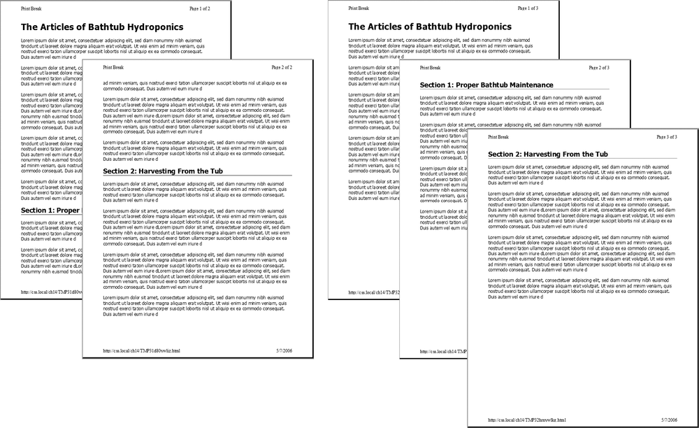
Two widely recognized properties are page-break-before and page-break-after. Page-break before tells a browser to insert a page break before a given style. Say you want certain headings to always appear at the top of a page, like titles for different sections of a long document (see Figure 14-3). You can add page-break-before: always to the style used to format those headings. Likewise, to make an element appear as the last item on a printed page add page-break-after: always to that element’s style.
The page-break-before property is also useful for large graphics, since some browsers let images print across two pages, making it a little tough to see the whole image at once. If you have one page with three paragraphs of text followed by the image, then the browser prints part of the image on one page and the other part on a second page. You don’t want your visitors to need cellophane tape to piece your image back together, so use the page-break-before property to make the image print on a new page, where it all fits.
Here’s a quick way to take advantage of these properties. Create two class styles named something like .break_after and .break_before, like so:
.break_before { page-break-before: always; }
.break_after { page-break-after: always; }You can then selectively apply these styles to the elements that should print at the top—or bottom—of a page. If you want a particular heading to print at the top of a page, then use a style like this: <h1 class="break_before">. Even if the element already has a class applied to it, you can add an additional class like this: <h1 class="sectionTitle break_before">. (You’ll learn about this useful technique in the next chapter on Use Multiple Classes to Save Time.)
Tutorial: Building a Print Style Sheet
In this tutorial, you’ll create a print style sheet. To make the printed version of a web page look better, you’ll add styles that remove unwanted page elements and backgrounds, change text formatting, and print the URLs attached to any links on the page.
To get started, download the tutorial files from this book’s companion website at http://www.sawmac.com/css2e/. Click the tutorial link, and then download the files. All of the files are in a Zip archive, so you need to unzip them first. (You’ll find detailed instructions on the website.) The files for this tutorial are in the 14 folder.
Remove Unneeded Page Elements
To get started, you first need to understand how the page is laid out so you can decide which elements you want printed.
Launch a web browser and open 14 → print.html.
This web page is a float-based layout consisting of several <div> tags (see Figure 14-4). In all likelihood, anyone printing this page is most interested in the main content—the large central body of text. Printing the navigation bar and sidebar is just a waste of toner, so your print style sheet should hide these parts of the page.
In a text editor, create a new file named print.css and save it along with the main style sheet in the css folder inside the 14 folder.
In your new print style sheet, the first order of business is to hide the navigation bar and other parts of the page that you don’t want to print.
Using the display property, create a new group selector that hides the navigation elements and sidebar, like so:
#sidebar, #navWrapper, #footerNav { display: none; }With the display property set to none, web browsers hide those elements so they won’t print. But first you need to attach this external style sheet to your web page so browsers can find it.
In your text editor, open 14 → print.html.
This page already has an attached style sheet—main.css. This external style sheet provides all of the formatting for the page when it’s displayed in a browser. Also, since the style sheet is attached using the <link> tag with no media attribute specified, it applies when the page is printed as well. Your print style sheet, then, needs to override any styles from the main.css file that won’t look good in print. The first step in that process is attaching the print style sheet after the main.css file in the html of this page.
Locate the <link> tag in the head of the page used to attach the global.css file. Insert a blank line after that tag, and then add the following:
<link href="css/print.css" rel="stylesheet" type="text/css" media="print" />
If properties from two styles with the same name conflict, the properties from the style sheet last linked on the page wins, so this <link> must go after the other <link>. That way, if the main.css file has a class named .copyright that creates white, 10-pixel type on a black background, you can create another style named .copyright in the print style sheet with black, 12-point type on a white background. Even though the two styles share the same name, the properties from the print style sheet win because it’s the last one linked. (See Specificity: Which Style Wins for more detail on this cascading rule.)
Save the print.css and print.html files, and then preview print.html in a web browser.
The page should look no different than it did in step 1 above. That’s because you haven’t printed it yet. You can see the effect of the print style sheet by using your browser’s Print Preview command.
If you’re using Windows, choose File → Print Preview. Mac fans should choose File → Print, and then, in the Print window that appears, click the Preview button.
In the Print Preview window, you’ll see that the right sidebar and navigation have disappeared. But the design still doesn’t look that great. The main content doesn’t fill the page as it should. You’ll fix that—and a few other things—next.

Adjusting the Layout
Currently, the main content and the footer copyright notice don’t fit the printed page correctly: The main content stops short of the right edge of the page, while the copyright is indented from the left edge. Both would look better if they filled the entire printable area.
Two styles are currently controlling the layout. In Figure 14-4, you can see that the page is divided into several areas, each created with a separate <div> tag. The #mainWrapper and #footer are both used to center and set a width of 900 pixels for the main content area and the footer area. In addition, the #main style has a set width, while the #footerMain style has a left margin. Since you don’t know what size paper this page might be printed on, you should get rid of all widths and remove any margins.
Return to your text editor and the print.css file. Add one new group style to remove widths and margins of the areas of the page that will be printed:
#banner, #mainWrapper, #footer, #main { width: auto; margin: 0; padding: 0; }The first declaration—width:auto—affects several areas of the page. It overrides the 900-pixel width setting for the main text and footer in the main.css file and leaves the exact width up to the web browser. Auto simply lets the <div> fill the entire available width, so no matter the paper size—letter, A4, or whatever—the content fills the width of the printed page. The two other declarations, margin and padding, remove any space around these divs.
The copyright content, contained inside a <div> with the ID footerMain, doesn’t have a set width, but it does have a left margin—that indent will look strange when printed, so you should get rid of it.
Add another style to the print.css style sheet:
#footerMain { margin: 0; }While you’ve hidden the right sidebar, which is positioned using a float, the main content is still floated—it doesn’t have to be for the printed page.
Add another style to the print.css style sheet:
#main { float: none; }Other problems can arise when printing a float-based layout. As described on Clearing and Containing Floats, floated elements can pop out of the bottom of their containers, preventing backgrounds and borders from showing properly. One solution: add the declaration overflow: hidden; to the containing block’s style. However, hiding overflowing content can sometimes cause printed material to not show up. So, you need to turn that off for two styles:
Add another style to the print.css style sheet:
#mainWrapper, #footer { overflow: visible; }This style ensures that content inside those two divs is fully displayed.
There are also a few background colors and images sprinkled throughout the page. Sometimes background images and colors print out, but often they don’t. It all depends on the browser and the visitor’s settings. Some browsers don’t print background elements at all; others can print them but give folks the option of turning them on or off. Printing backgrounds is useful when it’s important for the printed page to look just like the screen version. But when you have backgrounds that would only be a distraction and a waste of ink, do your visitors a favor and disable them.
Add another style to the print.css style sheet:
html, body, #banner, #footerWrapper { background: #FFF; }When viewed onscreen, this page has various background colors and images. The banner, for example, has a background image for the “About Us” tag and the footer area has a purple background color. This style sets the background color of the page and banner to white and removes the graphic. (See Removing background elements for the story on why the background image disappears as well.)
The banner area containing the site logo also doesn’t look very good in print. That area is too tall, since it was expanded to hold a background image that won’t appear in print. So you’ll adjust the height—and while you’re at it, you’ll improve the overall look of this top section by centering the logo and adding lines above and below it.
Add a new style to the print.css file:
#banner { height: auto; text-align: center; border-bottom: 2pt solid #000; border-top: 2pt solid #000; padding: 10pt 0; margin-bottom: 15pt; }
The first property eliminates the height of the banner, letting it size itself based on the content of the <div>. In other words, it will just be as tall as the logo graphic inside it. The text-align property centers the logo for a refined, classic look. The border settings add lines above and below the logo, while the padding adds space between the logo and the borders. Note these styles use pt (points), since that’s a more normal way of measuring items for print.
Feel free to save this file, preview the print.html file in a web browser, and use the Print Preview function to see how the printed version’s coming along.
Reformatting the Text
While colored text and pixel-sized fonts may work on the screen, laser printers understand point sizes better. Also, solid black text looks better on white paper. In this section, you’ll adjust the text accordingly to look better in print.
In the print.css file, add the following CSS rule:
* { color: #000000 !important; }This style is the CSS equivalent of a sledgehammer. It essentially tells every tag to use black text no matter what. The * (universal selector) is a quick way of specifying a style for every single element on a page, while the !important declaration cancels out any conflicts caused by the cascade. So even though * isn’t a very specific style, the color property here trumps the same property in much more specific styles like #main h1 or #nav #mainNav a.
Next you’ll set new font sizes for the text.
Add the following three styles:
h1 { font-size: 30pt !important; } h2 { font-size: 16pt !important; } p, li { font-size: 11pt !important; }These styles make each of these tags use a more printer-friendly font size. The addition of !important makes these sizes always apply to those tags regardless of any style conflicts with the main.css style sheet.
Note
In this case, h1, h2, p, and li are the only tags that print from the print.html page. Your pages may require you to redefine text sizes for other tags like blockquote, other headlines and so on.
Just for fun, add a couple of styles to change the font size of the copyright notice and add a borderline above it.
Add the following two styles:
#footerMain { margin-top: 15pt; border-top: 1pt solid #000; padding-top: 5pt; } #footerMain p { font-size: 9pt !important; }The CSS properties in these styles should all be old hat by now. They adjust space above the footer, add a borderline, add some space between the border and the copyright, and make the copyright notice text smaller. Notice the !important declaration in the #footerMain p style. You need to add this because the p style from step 2 has !important as well. Because #footerMain p has greater specificity (see Specificity: Which Style Wins for more on this concept) than p, its !important declaration wins out.
Displaying URLs
For a final flourish, you’ll add one more style that prints the URL next to the text of each link on the page. That way, the onscreen text “Click here to find out more” will print as “Click here to find out more (http://www.outmore.com)” so anyone reading the printed version can visit the site referenced by the link. This technique uses some advanced CSS that Internet Explorer 6 and 7 doesn’t understand, but it doesn’t do any harm in those browsers, either. And it is a great enhancement for visitors who print from your site with IE 8, Firefox and Safari.
Add one last style to the print.css style sheet:
a:after { content: " (" attr(href) ") "; }In the content: line, this style adds the URL (the attr(href) part) at the end of each link (the a:after part).
Save the print.css file. In your browser, open print.html and print it.
The printed page should look something like Figure 14-5—a simple, barebones, just-the-facts page.
You’ll find a completed version of the page in the 14_finished folder.
