
Chapter 15. Improving Your CSS Habits
At this point, we’ve covered most aspects of Cascading Style Sheets. With the addition of CSS-based layout, which you learned about in Part III, you’re now an unstoppable web-designing machine. But even after you’ve mastered all the properties CSS offers, nailed those annoying browser bugs, and learned great tricks for producing beautiful web pages, you can still stand to learn a few techniques that’ll make your CSS easier to create, use, and maintain.
This chapter covers some recommendations for creating and using CSS. None of them count as “must know” CSS essentials, but they can make your CSS work go faster, leading to less frustration and greater productivity.
Adding Comments
When it’s time to edit a style sheet weeks, months, or even years after creating it, you may find yourself wondering, “Why did I create that style? What does it do?” As with any project, when building a website, you should keep notes of what you did and why. Fortunately, you don’t need a pad of paper to do this. You can embed your notes right into your style sheets using CSS comments.
A CSS comment is simply a note contained within two sets of characters, /* and */. As with HTML comments, CSS comments aren’t read or acted on by a web browser, but they do let you add helpful reminders to your style sheets. Say you created a style intended to solve an Internet Explorer bug:
* html .imagefloat {
    display: inline;
}
At the time you wrote the style, you knew what you were doing, but will you still remember three months later? Add a comment and it’ll be easy for you or someone else who needs to work on the site to figure out what the style does and why it was created:
/* Fix IE 6 double-margin bug */
* html .imageFloat {
display: inline;
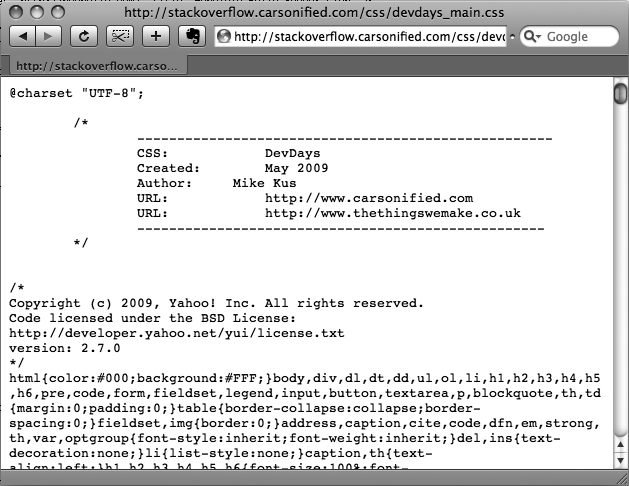
}If you have a lot to say, comments can span multiple lines as well. Just begin with /*, type all the comments you’d like, then end with */. This is handy when adding background information at the beginning of a style sheet, as pictured in Figure 15-1.
Organizing Styles and Style Sheets
You’ve learned a lot in this book about creating styles and style sheets. But when you’re designing a site that’s meant to last, you can incorporate a few other steps to help you out in the future. The day will come when you need to change the look of the site, tweak a particular style, or hand off your hard work to someone else who’ll be in charge. In addition to leaving notes for yourself and others, a little planning and organization within your CSS will make things go more smoothly down the road.
Name Styles Clearly
You’ve already learned the technical aspects of naming different types of selectors—class selectors begin with a. (period) to identify the styles as a class, and ID styles begin with the # symbol. In addition, the names you give IDs and classes must begin with a letter and can’t contain symbols like &, *, or !. But beyond those requirements, following some rules of thumb can help you keep track of your styles and work more efficiently:
Name styles by purpose not appearance
It’s tempting to use a name like .redhighlight when creating a style to format eye-catching, fire-engine-red text. But what if you (or your boss or your client) decide that orange, blue, or chartreuse look better? Let’s face it: a style named .redhighlight that’s actually chartreuse is confusing. It’s better to use a name that describes the purpose of the style. For example if that “red” highlight is intended to indicate an error that a visitor made while filling out a form, then use the name .error. When the style needs to alert the visitor of some important information, a name like .alert would work. Either way, changing the color or other formatting options of the style won’t cause confusion, since the style’s still intended to point out an error or alert the visitor—regardless of its color.
Don’t use names based on position
For the same reason you avoid naming styles by appearance, you should avoid naming them by position. Sometimes a name like #leftSidebar seems like an obvious choice—“I want all this stuff in a box placed at the left edge of the page!” But it’s possible that you (or someone else) will want the left sidebar moved to the right, top, or even bottom of the page. All of a sudden, the name #leftSidebar makes no sense at all. A name more appropriate to the purpose of that sidebar—like #news, #events, #secondaryContent, #mainNav—serves to identify the sidebar no matter where it gets moved. The names you’ve seen so far in this book—#gallery, .figure, .banner, #wrapper and so on—follow this convention.
The temptation is to use names like #header and #footer(for elements that always appear at the top or bottom of the page, for example) since they’re so easily understood, but you can often find names that are better at identifying the content of an element—for example, #branding instead of #header. On the other hand, sometimes using a name with position information does make sense. For example, say you wanted to create two styles, one for floating an image to the left side of a page and another for floating an image to the right side. Since these styles exist solely to place an image to the left or right, using that information in the style names makes sense. So .floatLeft and .floatRight are perfectly legitimate names.
Avoid cryptic names
Names like .s, #s1, and #s2 may save you a few keystrokes and make your files a bit smaller, but they can cause trouble when you need to update your site. You could end up scratching your head, wondering what all those weird styles are for. Be succinct, but clear: .sidebar, #copyright, and #banner don’t take all that much typing, and their purpose is immediately obvious.
Note
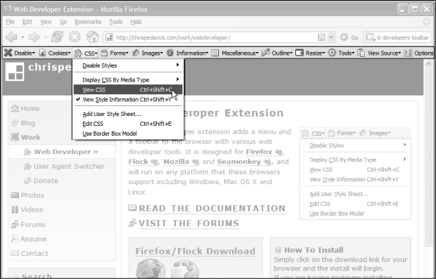
For more tips on naming styles, check out www.stuffandnonsense.co.uk/archives/whats_in_a_name_pt2.html. You can also learn a lot from checking out the naming conventions used on other sites. The Web Developer’s Toolbar, discussed in the box in on Eliminating Browser Style Interference, gives you a quick way to reveal the style names.
Use Multiple Classes to Save Time
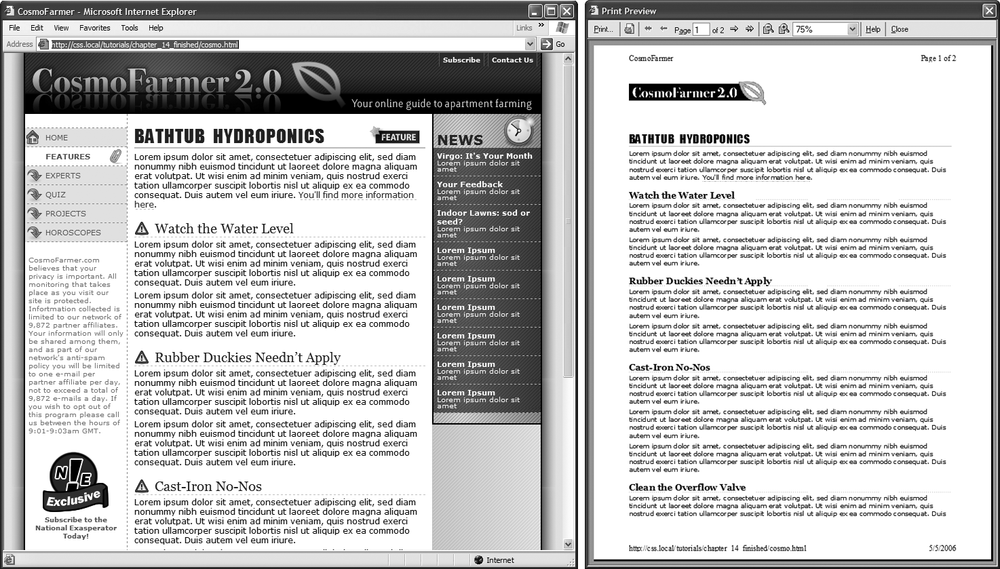
Often, two or more items on a web page share many similar formatting properties. You may want to use the same border styles to create a frame around a bunch of images on a page. But there may be some formatting differences between those items as well. Maybe you want some images to float to the left and have a right margin, while some photos float to the right and have a left margin (Figure 15-2).
The most obvious solution is to create two class styles, each having the same border properties but different float and margin properties. You then apply one class to the images that should float left and another to the images that should float right. But what if you need to update the border style for all of these images? You’ll need to edit two styles, and if you forget one, the images on one side of the page will all have the wrong frames!
There’s a trick that works in all browsers that not all designers take advantage of—multiple classes applied to the same tag. This just means that when you use the class attribute for a tag, you add two (or more) class names like this: <div class="note alert">. In this example, the <div> tag receives formatting instructions from both the .note style and the .alert style.
Say you want to use the same border style for a group of images, but some of the images you want floating left and others you want floating right. You’d approach the problem like this:
Create a class style that includes the formatting properties shared by all the images.
This style could be called .imgFrame and have a 2-pixel, solid black border around all four edges.
Create two additional class styles, one for the left floated images and another for the right floated images.
For example, .floatLeft and .floatRight. One style would include properties unique to one set of images (floated left with a small right margin), while the other style includes properties specific to the second group of images.
Apply both classes to each tag, like so:
<img src="photo1.jpg" height="100" class="imgFrame floatLeft" />
or
<img src="photo1.jpg" height="100" class="imgFrame floatRight" / >
At this point, two classes apply to each tag, and the web browser combines the style information for each class to format the tag. Now if you want to change the border style, then simply edit one style—.imgFrame—to update the borders around both the left and right floated images.
Note
You can list more than two classes with this method; just make sure to add a space between each class name.
This technique is useful when you need to tweak only a couple of properties of one element, while leaving other similarly formatted items unchanged. You may want a generic sidebar design that floats a sidebar to the right, adds creative background images, and includes carefully styled typography. You can use this style throughout your site, but the width of that sidebar varies in several instances. Perhaps it’s 300 pixels wide on some pages and 200 pixels wide on others. In this case, create a single class style (like .sidebar) with the basic sidebar formatting and separate classes for defining just the width of the sidebar—for example, .w300 and .w200. Then apply two classes to each sidebar: <div class="sidebar w300">.
Organize Styles by Grouping
Adding one style after another is a common way to build a style sheet. But after a while, what was once a simple collection of five styles has ballooned into a massive 150-style CSS file. At that point, quickly finding the one style you need to change is like looking for a needle in a haystack. (Of course, haystacks don’t have a Find command, but you get the point.) If you organize your styles from the get-go, you’ll make your life a lot easier in the long run. There are no hard and fast rules for how to group styles together, but here are two common methods:
Group styles that apply to related parts of a page. Group all the rules that apply to text, graphics, and links in the banner of a page in one place. Then group the rules that style the main navigation in another, and the styles for the main content in yet another.
Group styles with a related purpose. Put all the styles for layout in one group, the styles for typography in another, the styles for links in yet another group, and so on.
Using comments to separate style groups
Whatever approach you take, make sure to use CSS comments to introduce each grouping of styles. Say you collected all the styles that control the layout of your pages into one place in a style sheet. Introduce that collection with a comment like this:
/* *** Layout *** */
or
/* --------------------------
            Layout
--------------------------- */
As long as you begin with /* and end with */, you can use whatever frilly combination of asterisks, dashes, or symbols you’d like to help make those comments easy to spot. You’ll find as many variations on this as there are web designers. If you’re looking for inspiration, then check out how these sites comment their style sheets: www.wired.com, www.mezzoblue.com, and http://keikibulls.com. (Use the Web Developer’s Toolbar described in the box on Eliminating Browser Style Interference to help you peek at other designers’ style sheets.)
Tip
For a method of naming comments that makes it easy to find a particular section of a style sheet you’re editing, check out www.stopdesign.com/log/2005/05/03/css-tip-flags.html.
Using Multiple Style Sheets
As you read in Chapter 14, you can create different style sheets for different types of displays—maybe one for a screen and another for a printer. But you may also want to have multiple onscreen style sheets, purely for organizational purposes. This takes the basic concept from the previous section—grouping related styles—one step further. When a style sheet becomes so big that it’s difficult to find and edit styles, it may be time to create separate style sheets that each serve an individual function. You can put styles used to format forms in one style sheet, styles used for layout in another, styles that determine the color of things in a third, another style sheet for keeping your Internet Explorer hacks, and so on. Keep the number of separate files reasonable since having, say, 30 external CSS files to weed through may not save time at all.
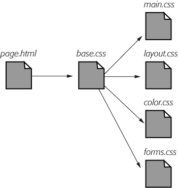
At first glance, it may seem like you’ll end up with more code in each web page, since you’ll have that many more external style sheets to link to or import—one line of code for each file. Ah, but there’s a better approach: Create a single external style sheet that uses the @import directive to include multiple style sheets. Figure 15-3 illustrates the concept.
Here’s how to set up this type of arrangement:
Create external style sheets to format the different types of elements of your site.
For example a color.css file with styles that control the color of the site, a forms.css file that controls form formatting, a layout.css file for layout control, and a main.css file that covers everything else (see the right side of Figure 15-3).
Note
These suggestions are just a few possibilities. Organize your styles and style sheets in whatever way seems most logical and works best for you. For more suggestions, check out this article on modular CSS design: www.contentwithstyle.co.uk/content/modular-css.
Create an external style sheet and import each of the style sheets you created in step 1.
You can name this file base.css, global.css, site.css, or something generic like that. This CSS file won’t contain any rules. Instead use the @import directive to attach the other style sheets like this:
@import url(main.css);
@import url(layout.css);
@import url(color.css);
@import url(forms.css);
That’s the only code that needs to be in the file, though you may add some comments with a version number, site name, and so on to help identify this file.
Note
For a better way to attach an “IE-only” style sheet, see Isolate CSS for IE with Conditional Comments.
Finally, attach the style sheet from step 2 to the HTML pages of your site using either the <link> tag or the @import method. (See Linking a Style Sheet Using HTML for more on using these methods.) For example:
<link rel="stylesheet" href="base.css" type="text/css" />
Now, when a web page loads, the browser loads base.css, which in turn tells the browser to load the four other style sheets.
It may feel like there’s a whole lot of loading going on here, but once the browser has downloaded those files and stored them in its cache, it won’t have to retrieve them over the Internet again. (See the box on the next page.)
There’s another benefit to using a single external style sheet to load several other style sheets: If you decide later to further divide your styles into additional styles sheets, then you won’t have to muck around with the HTML of your site. Instead, just add one more @import directive to that gatekeeper style sheet (see step 2). If you decide to take all the styles related to type out of the main.css file and put them in their own type.css file, then you won’t need to touch the web pages on your site. Simply open the style sheet with all of the @import directives in it and add one more: @import url(type.css).
This arrangement also lets you have some fun with your site by swapping in different style sheets for temporary design changes. Say you decide to change the color of your site for the day, month, or season. If you’ve already put the main color-defining styles into a separate color.css file, then you can create another file (like summer_fun.css) with a different set of colors. Then, in the gatekeeper file, change the @import directive for the color.css file to load the new color style file (for example, @import url(summer_fun.css)).
Eliminating Browser Style Interference
When you view a web page that hasn’t been “CSS-ified” in a web browser, HTML tags already have some minimal formatting: headings are bold, the <h1> tag is bigger than other text, links are underlined and blue, and so on. In some cases, different web browsers apply slightly different formatting to each of these elements. You may experience some frustrating “it almost looks the same in Internet Explorer and Firefox and Safari” moments.
Note
Firefox actually uses a CSS style sheet to format HTML tags. To see it on a Mac, locate the Firefox application file, right-click it and then select “Show package contents.” Then navigate to Contents → MacOS → res and open the html.css file in a text editing program. In Windows, you’ll find that file at C:Program FilesMozilla Firefox eshtml.css. As you can see, it takes a lot of styles to make regular HTML look boring.
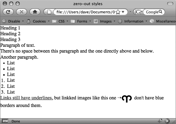
As discussed on Starting with a Clean Slate, to deal with these browser differences, it’s a good idea to “zero out” the formatting for commonly used tags so your audience can see the beautiful styling you worked so hard to create (see Figure 15-5). All you have to do is set up some basic styles at the beginning of your style sheet that remove the offensive formatting.
Here are some things you may want to do to make browsers stop meddling with your designs:
Remove padding and margins. Browsers add top and bottom margins to most block-level elements—the familiar space that appears between <p> tags, for example. This can cause some weird display issues like when the exact margin amount is inconsistently applied across browsers. A better approach is to remove padding and margins from the block-level tags you use, and then purposely add the amount you want by creating new styles.
Apply consistent font sizes. While text inside a <p> tag is displayed as 1em, web browsers apply different sizes to other tags. You can force all tags to be 1em to begin with, and then create additional styles with specific font sizes for the different tags. That way, you stand a much better chance of getting consistent font sizes across browsers.
Improve table borders and create consistent table cells. As you read on Creating Borders, applying a border to a table cell usually creates an unpleasant gap between cell borders and doubles up the borders between cells. You should get rid of both the space and the extra borders. In addition, the <th> and <td> tag are given different alignments and font weights.
Remove borders from linked images. Internet Explorer, Firefox, and other browsers add a colored border around any image inside of a link. If you’re like most people, you find this border both unattractive and unnecessary. Remove it and start fresh.
Set consistent list indents and bullet types. Different browsers indent bulleted and numbered lists in different ways, and you’ll even find the type of bullet used can vary between browsers. It’s good to set a consistent indent and bullet type.
Remove quote marks from quoted material. If you ever use the <q> tag to identify a quote (<q>To err is human</q> for example), then you may have noticed that some browsers (Firefox, Safari) automatically add quote marks (' ') around the quote and some (Internet Explorer 6 and 7) don’t. And even within the browsers that do add quote marks, the type of mark added varies; for example, IE 8 inserts single quotes (' '), while Firefox adds double quotes (” “). For a consistent presentation, it’s best to remove these quote marks.
To put these ideas into action, here are a few basic styles you can add at the beginning of your style sheet:
html, body, h1, h2, h3, h4, h5, h6, p, ol, ul, li, pre, code, address, variable, form, fieldset, blockquote {
  padding: 0;
  margin: 0;
  font-size: 100%;
  font-weight: normal;
}
table {
  border-collapse: collapse;
  border-spacing: 0;
}
td, th, caption {
  font-weight: normal;
  text-align: left;
}
img, fieldset {
  border: 0;
}
ol {
  padding-left: 1.4em;
  list-style: decimal;
}
ul {
  padding-left: 1.4em;
  list-style:square;
}
q:before, q:after {
  content:'';
}
The first two styles here are group selectors that apply the same formatting to every one of the tags listed. Add these styles to the beginning of your style sheet, and then, further down the style sheet, override them on a case-by-case basis. After zeroing out the margins and font-size for the <h1> tag, you may want to give the <h1> tag a specific top margin value and font size. Just add another style, like so:
h1 {
    margin-top: 5px;
    font-size: 2.5em;
}
Thanks to the cascade (see Chapter 5), as long as this h1 style appears in the style sheet after the group selector (the reset style that removes the margins and changes the font size), the new values take precedence.
You’ll find the file reset.css in the 15 folder inside the tutorials folder. Just copy the code from that file into your own style sheets.
Note
Web luminary Tantek Celic is often credited with introducing the very useful technique of undoing the standard web browser formatting of HTML. You can see his basic set of undo styles at http://tantek.com/log/2004/undohtml.css.
Using Descendent Selectors
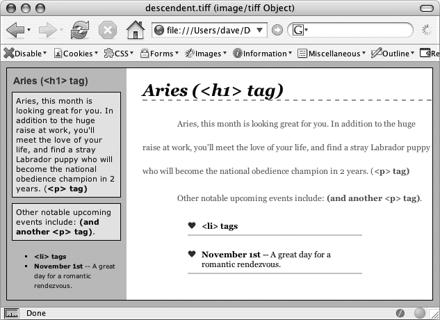
Classes and IDs are great for marking specific tags for styling. For example, you can add a class to a paragraph—<p class="intro">—and pinpoint just that one paragraph with its own look as determined by the .intro class style. Trouble is, it’s so easy to add a class or ID to a tag, lots of designers tend to add classes and IDs to everything (well, almost everything). The pros even have a diagnosis for this disease—classistis. Adding a class to every tag is not only a waste of your time, it also makes your HTML slower to download. Most important, there’s a better way to exert pinpoint control over your tags without resorting to too many classes or IDs—descendent selectors.
Descendent selectors are a powerful tool for efficient website building. As discussed in Chapter 3, they let you pinpoint the tags you want to style with greater accuracy than tag styles, with less work than class styles. Most of the time you want to format all the links in a navigation bar the same way, but that doesn’t mean you want to format all of the links in the entire page the same way. What you need is a way to say (in CSS), “Format only the links in the nav bar this way”—without having to apply a class style to each of those links. In other words, you need the ability to format the same HTML in different ways depending on where it’s located—and that’s exactly what descendent selectors offer (see Figure 15-6).
Compartmentalize Your Pages
One of your biggest allies in using descendent selectors effectively is the <div> tag. Since this HTML tag lets you create logical divisions in a page, you can use it to identify different layout elements like a banner, a sidebar, a column of text, and so on. As discussed on The Mighty <div> Tag, you can organize the content of your page into different areas by wrapping HTML in a <div> tag.
Group the title of a story and a list of links used to navigate the story’s pages like this:
<div><h2>The CosmoFarmer Revolution</h2> <ul> <li><a href="page1.html">Page 1</a></li> <li><a href="page2.html">Page 2</a></li> <li><a href="page3.html">Page 3</a></li> </ul></div>
After adding the <div>, identify it for CSS purposes with either a class or ID attribute: <div class="pullQuote"> or <div id="banner">. When you want to include the same type of layout element more than once on a page—multiple pull quotes in a single story perhaps—use a class. For regions that appear only once per page—like the banner—an ID is the common choice.
Suppose the list of links in the HTML above appears twice on a page—at the beginning of the text and at the end. You’d apply a class to it like this:
<div class="storyNav">
  <h2>The CosmoFarmer Revolution</h2>
  <ul>
    <li><a href="page1.html">Page 1</a></li>
    <li><a href="page2.html">Page 2</a></li>
    <li><a href="page3.html">Page 3</a></li>
  </ul>
</div>
Note
You don’t always need to add a <div> tag to style a group of elements. If the HTML above had only an unordered list of links and didn’t include the <h2> tag, then you could just as easily skip the <div> tag and simply add a class to the unordered list: <ul class="storyNav">.
Once you identify each <div> on a page, it becomes very easy to use a descendent selector to target tags inside a particular <div>. Say you want to create a unique look for each of the links in the above HTML. You’d create a descendent selector like this:
.storyNav a {
  color: red;
  background-color: #ccc;
}
Now links will appear as red text on a light gray background, but only when they appear inside another tag with the storyNav class applied to it. Best of all, if you want to add another link (like page4.html) to this list, then you don’t have to lift a finger to format it like the other links. The browser handles all of that automatically when it applies the descendent selector.
Formatting other tags inside that <div> is a simple matter of creating a descendent selector that begins with the class name—.storyNav, for instance—followed by a space and the tag you want to style. To format the <h2> that appears inside the <div>, create the descendent selector .storyNav h2.
Identify the Body
Because descendent selectors provide such specific targeting of styles, you can easily create styles that not only apply to one particular area of a page, but also apply only to particular types of pages on your site. Say you want to style the <h1> tag differently on the home page than on other pages of the site. An easy way to distinguish <h1> tags on the home page is to add a class or ID to the <body> tag of the home page:
<body id="home">
or
<body class="home">
You can style the <h1> tag on the home page using a descendent selector: #home h1 (if you’re using an ID) or .home h1 (if you’re using a class). With this technique, you can create entirely different looks for any tag on any particular page of your site. One approach is to identify the section of the site each page is in. Say your site is divided into four sections—news, events, articles, and links. On each page within a section, add either a class or ID to the <body> tag. So each page in the news section might have the following HTML: <body class="news">, while pages in the events section would have <body class="events">.
Note
Another common CSS technique is to use a class to identify the type of layout you want for a particular page (like a one-, two-, or three-column design).
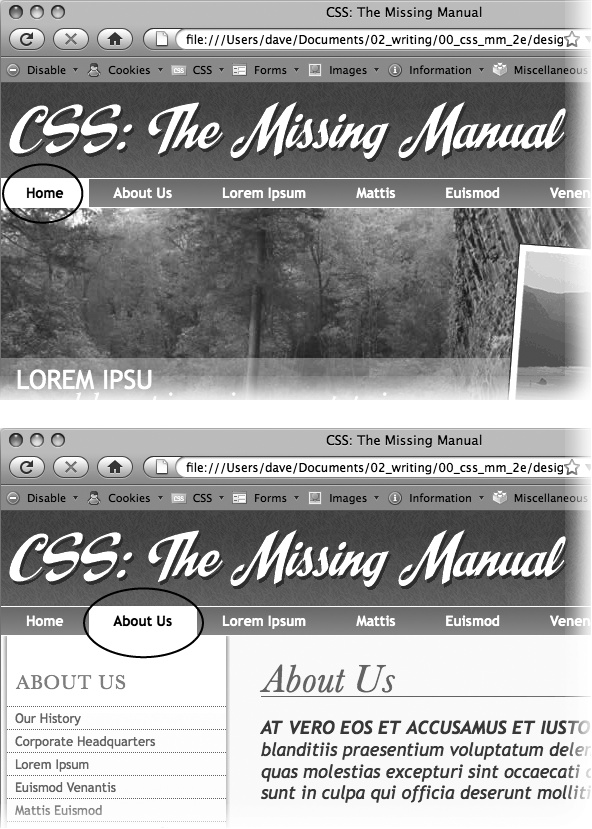
One great use for identifying a page’s section in the site is to highlight that section’s button in a navigation bar. The highlighted button acts as a kind of “you are here” marker, as shown in Figure 15-7 If a page is in the news section of your site, you can highlight the “news” button so visitors can tell immediately which section they’re in.
Here’s how to format a navigation button differently depending on which section of your site it’s in:
Add an identifier to the <body> tag indicating the section the page is in.
For example, <body id="home">. Do the same thing for each section, so pages in the news section of the site would have code like this: <body id="news">.
Add a navigation bar to the page.
Step-by-step instructions are on Using Unordered Lists.
Identify each link within the navigation bar.
For a link to the home page, you might have this code: <a href="/index.html” id="homeLink">Home</a>. The ID lets you identify that particular link as the one going to the home page. (You could do the same thing using a class instead of an ID.) Repeat for the other links: <a href="/news/” id="newsLink">News</a> and so on.
At this point, you have enough information in your HTML to uniquely format each section’s link using CSS. In this example, you know that the Home page link is nested inside a <body> tag with the ID of home only on the Home page.
Create a descendent selector to format each section’s link differently when the link is inside a page for that section.
For the home page in this example, the descendent selector would look like this:
#home #homeLink
Figure 15-7. Using descendent selectors, you can highlight a button in a navigation bar simply by changing the class or ID applied to the <body> tag. In this example, when the body tag has the ID home applied to it, the Home button lights up (circled, top). Change the ID to about, and the About button highlights (circled, bottom).This selector formats the #homeLink only when it’s inside another tag with the ID #home. In most cases, you’ll want the look of the “you are here” button to be the same for each section of the site, so you can use a group selector (Adding Rollovers and Creating “You Are Here” Links) to group all the descendent selectors for each section’s button. That way, you can apply the same formatting to each button without creating separate rules for each button. A group selector to highlight the current section’s navigation button with a light yellow background may look like this:
#home a#homeLink,
#news a#newsLink,
#articles a#articlesLink,
#links a#linksLink {
  background-color: #FBEF99;
}
Using the same technique, make additional styles to apply different looks for the links when you hover over them, click them, or when they’ve been visited. See Highlighting Different Links for the details.
These few examples are just some of the ways you can take advantage of descendent selectors. They can make your style sheets a little more complex. You’ll have styles like #home .navbar a, for example, instead of a simple class like .navLink. But once the styles are set up, you’ll need to do very little further formatting. HTML pasted into different areas of the page automatically gets formatted in strikingly different ways. Almost like magic.
Managing Internet Explorer Hacks
Browsers don’t always behave the way you, or the rules of CSS, expect. Browsers like Safari, Firefox, and Internet Explorer 8 handle CSS quite well and display CSS-based web pages consistently and predictably. Getting your designs to work in Internet Explorer 6 and 7 for Windows is much more of a challenge. Although these browsers are old by today’s standards, they still make up the majority of web browsers in use.
Throughout this book, you’ve seen some of the most horrific Internet Explorer bugs—and their solutions. There’s the double-margin bug (Anatomy of a Style) and IE 5’s box model problem (Controlling the Tap with the Overflow Property). Techniques for managing these problems include the * html hack (Wrap Content with Floating Elements). But knowing the techniques isn’t enough. You’ve got to consider your entire Web audience and make sure your IE fixes don’t get in the way and spoil the fun for other viewers.
Tip
You can find a list of pages describing various CSS bugs in many different browsers at http://css-discuss.incutio.com/?page=BrowserBugs.
Design for Contemporary Browsers First
Because Internet Explorer 6 and 7 are still very common, many web designers use one of those browsers for testing their site design. When they find a problem with the way the page looks in this browser, they manipulate their CSS until the page looks fine. Unfortunately, because IE 6 and 7 don’t always get CSS right, the “solutions” designers use for that browser cause more modern, CSS-savvy browsers like IE 8, Firefox, and Safari to display pages incorrectly.
The backward-looking approach of designing for Internet Explorer 6 or 7 would be fine if everyone visits your site on Windows with Internet Explorer 6 or 7 for the rest of eternity. But as more people upgrade to Internet Explorer 8 or switch to state-of-the-art browsers like Firefox or Safari, your fine-tuned IE 6 pages will begin to break. A better approach is to design with Internet Explorer 8, Firefox, Safari, or Chrome in mind. Make sure your CSS works in those browsers, and you can be reasonably confident that you’re using CSS correctly. Then, after your site looks great in those browsers, it’s time to fix the problems that crop up in Internet Explorer 7 and 6.
Tackling all those problems may sound like an overwhelming task, but take heart. You’ll repeatedly encounter the same set of bugs, which in turn require the same set of fixes. So once you become an old hand at identifying and fixing the peek-a-boo bug or the double-margin bug, it won’t be hard for you to add the necessary hacks to fix your pages for older versions of Internet Explorer.
Note
For more terrifying information on how Internet Explorer can mangle your carefully designed web pages visit www.positioniseverything.net/explorer.html and www.positioniseverything.net/ie-primer.html.
Isolate CSS for IE with Conditional Comments
The * html hack in Chapter 7 (Wrap Content with Floating Elements) is one way to send the “this’ll fix your stupid bug” styles to just Internet Explorer 6 and earlier without adversely affecting other browsers. But as your style sheets get larger, all those little fixes start to create clutter. Even if you isolate those changes into one part of your style sheet, you may still end up inserting some invalid CSS code (like zoom: 1) that prevents your main CSS file from validating.
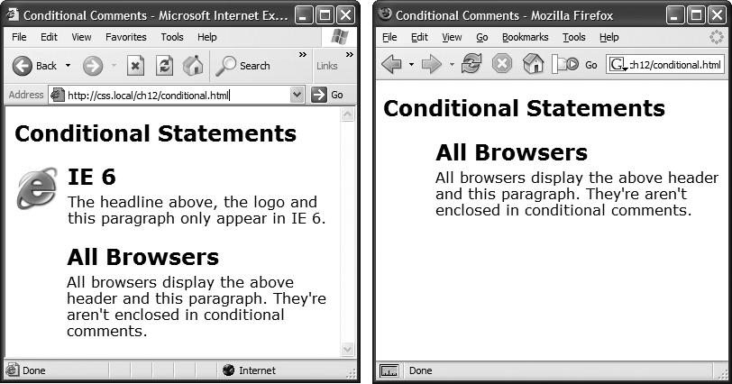
Another way to collect IE-only styles in a single place is to use Internet Explorer’s conditional comments feature (Figure 15-8). This Microsoft invention provides a way of inserting HTML that only Internet Explorer understands. Other browsers simply see the code as an HTML comment and ignore it.
Conditional comments can even target different versions of IE. You can put all of your IE 6–only styles in a single external style sheet (like IE6_styles.css) and use a conditional comment to link it to IE 6 browsers only. This approach also makes it a snap to eliminate those styles when IE 6 finally goes the way of the dinosaurs. Just remove the external style sheet. Your non-IE visitors will benefit too. When you use conditional comments, other browsers don’t download those external style sheets at all. As a result, your site opens and runs faster for these lucky folks.
Here’s the basic structure of a conditional comment:
<!--[if IE]>
Some HTML code that only applies to IE goes here.
<![endif]-->
The <!--[if IE]> is the condition itself. It translates to: “If this browser is Internet Explorer, then process the following HTML.” So any Internet Explorer browser acts on the HTML that comes after this line of code and stops when it gets to the <![endif]--> statement. In this way, you can add any HTML—text, images, styles, and even links to external style sheets—to Internet Explorer only.
Conditional comments and IE 8
Internet Explorer 8 understands CSS much better than earlier versions, so you may have to hide some IE hacks from that browser as well. Fortunately, conditional comments also let you specify which version of Internet Explorer the style sheet applies to. Say you want to have a particular style sheet load only for Internet Explorer 6 or earlier. Add the following conditional comment to your web page’s head:
<!--[if lte IE 6]>
<link href="IE_styles.css" rel="stylesheet" type="text/css" />
<![endif]-->
Or, using the @import method:
<!--[if lte IE 6]>
<style type="text/css">
@import url(IE_styles.css)
</style>
<![endif]-->
The lte stands for “less than or equal to,” so if lte IE 6 means “if this browser is version 6 or earlier of Internet Explorer.”
Conditional comments and the cascade
Use whatever method you prefer for linking an external style sheet (Linking a Style Sheet Using HTML), but add any conditional comments after any other linked style sheets. Most IE hacks tend to redefine styles already present in the style sheet—styles that work for other browsers. And, due to the nature of the cascade, rules defined later in a page can override earlier defined styles. To make sure your redefined IE-only styles successfully take hold in Internet Explorer, they should appear after any other style sheets attached to the page.
Here’s the code you might use to link: a) a style sheet for all browsers, b) a style sheet just for IE 7, and c) a style sheet for version 6 or earlier of IE:
<link href="global_styles.css" rel="stylesheet" type="text/css" />
<!--[if IE 7]>
<link href="IE7_styles.css" rel="stylesheet" type="text/css" />
<![endif]-->
<!--[if lte IE 6]>
<link href="IE6_styles.css" rel="stylesheet" type="text/css" />
<![endif]-->
Note
For more information on Internet Explorer’s conditional comments, visit the source: http://msdn.microsoft.com/en-us/library/ms537512(VS.85).aspx.