
5. Font Properties
In This Chapter
Understanding Typography on the Web
![]() Adjusting Font Size for Understudy Fonts
Adjusting Font Size for Understudy Fonts
![]() Using Condensed and Expanded Fonts
Using Condensed and Expanded Fonts
Setting Multiple Font Values at the Same Time
Typography is one of your most powerful tools for presenting organized, clean-looking documents. It’s also the best tool for presenting chaotic, grungy-looking documents.
The fonts you use go a long way toward getting your message across in just the way you want—whether that message is classical, grunge, or anything in between. I often say that fonts are to type what voice is to speech. Typeface, font weight, italic, and other typographic effects not only help designers to guide a visitor’s eye around the page, but they also add a layer of meaning.
CSS gives you the ability to control the appearance of fonts, also known as letterforms, in your Web pages. You can set the font family, boldface, and italic attributes, and the limited font sizes available with HTML tags. CSS3 refines the ability to download font files (called Web fonts) from your server and apply them to the text in your Web page, giving you the power to use virtually any font you want in your designs.
Getting Started
In this chapter, we’ll be styling the first chapter of Lewis Carroll’s Alice’s Adventures In Wonderland. Code 5.1 shows an expurgated version of the HTML, with all but the first paragraph stripped out. We’ll start adding to the CSS file font-properties.css starting with Code 5.2, add to it in each section, and present it in full in Code 5.11.
Code 5.1. The HTML code for this chapter is taken from Chapter 1 of Alice’s Adventures in Wonderland ![]() . You’ll be adding CSS code to this external style sheet throughout the chapter to build the final CSS file font-properties.css shown at the end of the chapter in “Putting it All Together.”
. You’ll be adding CSS code to this external style sheet throughout the chapter to build the final CSS file font-properties.css shown at the end of the chapter in “Putting it All Together.”
<!DOCTYPE html>
<html lang="en">
<head>
<meta charset="utf-8">
<title>
Alice’s Adventures In Wonderland | Chapter I
</title>
<link href="../css/font-properties.css" type="text/css" rel="stylesheet" media="all">
</head>
<body id="chapter1" class="book aaiw chapter">
<hgroup>
<h1>Alice’s Adventures in Wonderland</h1>
<h2>By <cite>Lewis Carroll</cite></h2>
</hgroup>
<article>
<h2>Chapter I
<span class="chaptertitle">Down the Rabbit-Hole</span>
</h2>
<p>Alice was beginning to get very tired of sitting by her sister on the bank, and of having nothing to do: once or twice she had peeped into the book her sister was reading, but it had no pictures or conversations in it, "and what is the use of a book," thought Alice, "without pictures or conversations?"</p>
<article>
<footer>
<nav>
<a href="EB9780133132762_6.html">Table of Contents</a>
<a href="AAIWL-ch02.html" class="next">The Pool of Tears</a>
</nav>
</footer>
</body>
</html>
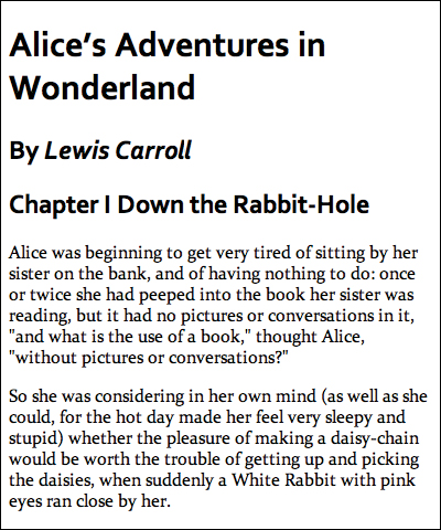
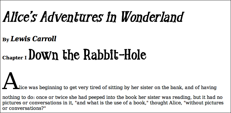
![]() This is what your Web page (Code 5.1) looks like before any CSS is applied to it. In this chapter you will be adding font styling.
This is what your Web page (Code 5.1) looks like before any CSS is applied to it. In this chapter you will be adding font styling.
Understanding Typography on the Web
A type family (commonly referred to in Web design as a font family) is a category of typefaces that have similar characteristics. Each character within a font is referred to as a glyph. The advantages of HTML text compared to text in Flash or in graphics are that it is easy to edit if changes are required, and it can adjust to the width of the screen on which it is viewed. In addition, content is often stored within databases and then output as HTML text.
However, HTML text has some severe design limitations. By and large, most of the textual control is left up to the visitor’s browser, and you cannot currently do some things, such as run text vertically rather than horizontally, without using CSS transformations (Chapter 12), which are not cross-browser yet.
What seems more stifling is that until recently you were limited to the fonts available on the visitor’s machine. But this is no longer true. You now have tens of thousands of fonts to choose from using Web fonts.
Specifying the character set
In the previous chapter, you found that when you create an HTML5 document, you need to specify the character set in use by your page. A character set is simply a list or repertoire of characters with a unique code or name that the browser will recognize to display the text. These codes are agreed upon as international standards. You do not need to concern yourself with them, except when you choose the character set you use for your own Web pages.
You specify the character set in the head of your HTML page using a meta tag. The most popular international character set is the UTF-8 (8-bit Unicode Transformation Format) character set:
<meta charset="utf-8">
Alternatively, if you are writing only in English, another common character set is the ISO 8859-1 character set:
<meta http-equiv="Content-Type" content="text/html; charset=ISO-8859-1" />
Both UTF-8 and ISO 8859-1 work about the same for English, but UTF-8 supports other alphabets. I highly recommend sticking with UTF-8. Web sites (even your local newspaper) are often translated on the fly into different languages.
One other important point: if you specify a character in your HTML that doesn’t exist in the specified character set, the browser generally will display an error marker in place of the character ![]() . If that happens, you can often encode the character yourself, as explained in the upcoming section Encoding HTML character entities.
. If that happens, you can often encode the character yourself, as explained in the upcoming section Encoding HTML character entities.

![]() This glyph, or one like it, will appear in place of any characters that the browser does not recognize as a part of the character set.
This glyph, or one like it, will appear in place of any characters that the browser does not recognize as a part of the character set.
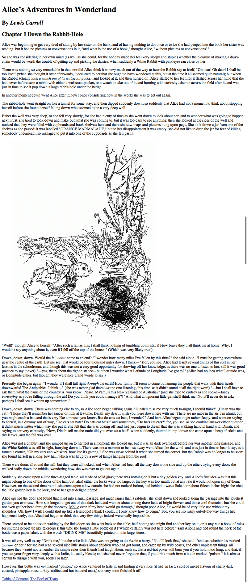
Generic font families
CSS defines five generic font families into which most fonts can be categorized (Table 5.1).
Table 5.1. Generic Font Families
• Serif—A serif is the small ornamentation at the end of a letter that gives it a distinguishing quality. Serifs are holdovers from the days of stonecutting and pen strokes. Serifs often improve legibility by making individual letters stand out from their neighbors.
Serif fonts are generally best suited for the display of larger text onscreen (14px or larger) or for smaller printed text. They are not so good for smaller text on a screen, because the serifs often obscure the letter. Serif fonts often portray a more conservative feel.
• Sans-serif—As you might guess, sans-serif fonts are those fonts without serifs.
Although the characters are less distinctive, sans-serif fonts work better for smaller text on a screen. Sans-serif fonts often portray a more modern and often casual feel.
• Monospace—Although monospace fonts can have serifs or not, their distinguishing feature is that each letter occupies the same amount of space. The lowercase letter l, for example, is much thinner than the uppercase letter M. In non-monospace fonts, the letter l occupies less space than the M, but a monospace font adds extra space around the l so that it occupies the same amount of space as the M.
Monospace fonts work best for text that has to be exactly (but not necessarily quickly) read—such as programming code—in which typos can spell disaster. Although easier to scan, monospace fonts can become monotonous for reading large amounts of text. Monospace fonts often give a technical or typewritten feel to text.
• Cursive—Cursive fonts attempt to mimic cursive or calligraphic handwriting, usually in a highly stylized manner with the letters generally appearing partially or completely connected.
Cursive fonts are best reserved for decoration and large headlines; they are not as readable in large chunks of text. Cursive fonts give an energetic and expressive feel to text.
• Fantasy—Decorative fonts that don’t fit into any of the preceding categories are referred to as fantasy fonts. These fonts usually are extremely ornamental but are still letters, so exclude dingbats or picture fonts, illustrations, or icons.
Like cursive fonts, fantasy fonts are best reserved for decoration. You should use fantasy fonts sparingly and choose them carefully to reinforce the look and feel of your Web site, since each fantasy font invariably has a strong personality.
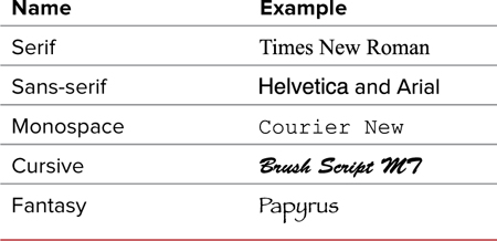
Dingbats
Although it does not have an official CSS designation, there is another important category of fonts to consider. Dingbats, also called symbol or picture fonts, do not represent numbers or letters, but are instead a collection of icons or pictograms each corresponding to a letter on the keyboard. The most common example of this font type is Webdings, which is installed on most computers. Webdings is a collection of common international symbols ![]() . Although other dingbat fonts are not commonly installed on most computers, if you use dingbats as Web fonts, as described later in this chapter, you can be relatively sure that you will get what you want, replacing some graphic icons with dingbat icons.
. Although other dingbat fonts are not commonly installed on most computers, if you use dingbats as Web fonts, as described later in this chapter, you can be relatively sure that you will get what you want, replacing some graphic icons with dingbat icons.

![]() Examples of dingbats. These are drawn from the dingbat font, Webdings.
Examples of dingbats. These are drawn from the dingbat font, Webdings.
Encoding HTML character entities
An alternative to dingbat fonts are HTML character entities ![]() . These are a collection of specialized glyphs that, instead of being represented by a single letter, are represented by code that begins with an ampersand (&) and ends with a semicolon (;). For example, the ampersand is represented in the code as:
. These are a collection of specialized glyphs that, instead of being represented by a single letter, are represented by code that begins with an ampersand (&) and ends with a semicolon (;). For example, the ampersand is represented in the code as:
&
![]() Examples of a few common character entities. These can be coded into HTML to ensure that they are represented accurately in the final output.
Examples of a few common character entities. These can be coded into HTML to ensure that they are represented accurately in the final output.
For many characters (such as the ampersand), this is the only way to display them consistently across browsers and operating systems. For a full list of HTML and Unicode character values, see Appendix B.
Setting a Font-Stack
The font-family property lets you determine the visual effect of your message by choosing the font for displaying your text (Table 5.2). The typeface you use to display your text can make a powerful difference in how readers perceive your message ![]() . Whether you use a serif, sans-serif, monospace, cursive, or fantasy typeface can speak volumes before your visitor even reads the first line of text.
. Whether you use a serif, sans-serif, monospace, cursive, or fantasy typeface can speak volumes before your visitor even reads the first line of text.
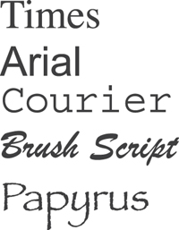
![]() Examples of different typefaces. What voice do you hear?
Examples of different typefaces. What voice do you hear?
To define the font family for an element
1. Add the font-family property to your CSS rule. Type the property name font-family, followed by a colon. In this example, font-family is applied to the body tag, which will set the font for the entire page (Code 5.2).
font-family:
2. Define the name of the primary font you want to use, followed by a comma. This name is not case sensitive. Fonts that contain a space in their names must be enclosed in quotation marks, either single or double ("Times New Roman" or 'times new roman' will both work).
Constantia,
Code 5.2. Styles added to font-properties.css—Two separate typefaces are applied to the page ![]() .
.
/*** font-properties.css ***/
body { font-family: Constantia, Georgia, "Times New Roman", serif; }
h1, h2, h3, h4, h5, h6, .byline {
font-family: Corbel, Helvetica, Arial, sans-serif; }
h2 .chaptertitle {
font-family: Corbel, Helvetica, Arial, sans-serif; }
![]() The body copy is displayed in Constantia, Georgia, or Times New Roman, depending on which is available on the visitor’s computer. However, headers are displayed in Corbel, Helvetica, or Arial, also depending on availability.
The body copy is displayed in Constantia, Georgia, or Times New Roman, depending on which is available on the visitor’s computer. However, headers are displayed in Corbel, Helvetica, or Arial, also depending on availability.
3. Define a list of alternative fonts, called understudy fonts, separated by commas. You can include as many as you want. These fonts will be used (in the order specified) if the previous font in the list is not available on the visitor’s computer. See “Why Include Understudy Fonts and Generic Font Families” in this chapter for more details.
Georgia, "Times New Roman",
4. Define the generic font family. After the last understudy font, type the name of the generic font family for the particular style of font you’re using. Table 5.1 lists generic values for font families. Although including this value is optional, doing so is a good idea.
serif;
5. Add typeface overrides. After a font is set for the body of the page, it will be used in all text throughout the entire Web page, with the exception of text in forms. You need to add another font-family declaration to your CSS only if you want to change the font for a particular element. This is because properties cascade to their child elements, as described in Chapter 4.
The exception to the cascade rule are form elements such as input, text, area, button, and so on, which require their fonts to be set in the form element to cascade down.
font-family: Corbel, Helvetica, Arial, serif;
If you will be using bold, italic/oblique, and/or bold italic/oblique versions of the font, be sure that the font family supports all of these typefaces. If not, the text will not display properly, or worse, the browser will try to synthesize these versions. Either way, the results will not look professional.
Try to choose fonts with a similar size. Different fonts will have different relative sizes even if set to the same font size.
Some typefaces are easiest to read on a screen; others look better when printed. Always consider the destination when choosing your fonts.
 Using Web Fonts
Look around the Web, and what do you see? You usually see five fonts: Arial, Georgia, Verdana, Trebuchet MS, and Times New Roman. This situation came about for one simple reason: Arial, Georgia, Verdana, Trebuchet MS, and Times New Roman are preinstalled on virtually every Mac and PC.
I am sick of them.
Don’t get me wrong—these are great fonts, easy to read at many sizes. But as I said earlier, typography adds a language to text that goes far beyond the written word.
Web-based typography is mired in using Times for serif fonts and Helvetica/Arial for sans-serif fonts. This arrangement mutes the power of typography, and all Web pages begin to look the same.
You can find a list of Web-safe fonts on my Web site, www.webtypographynow.com/websafefonts. It lists these fonts, and includes examples of what they should look like and which similar-looking fonts can be used as replacements ![]() .
.
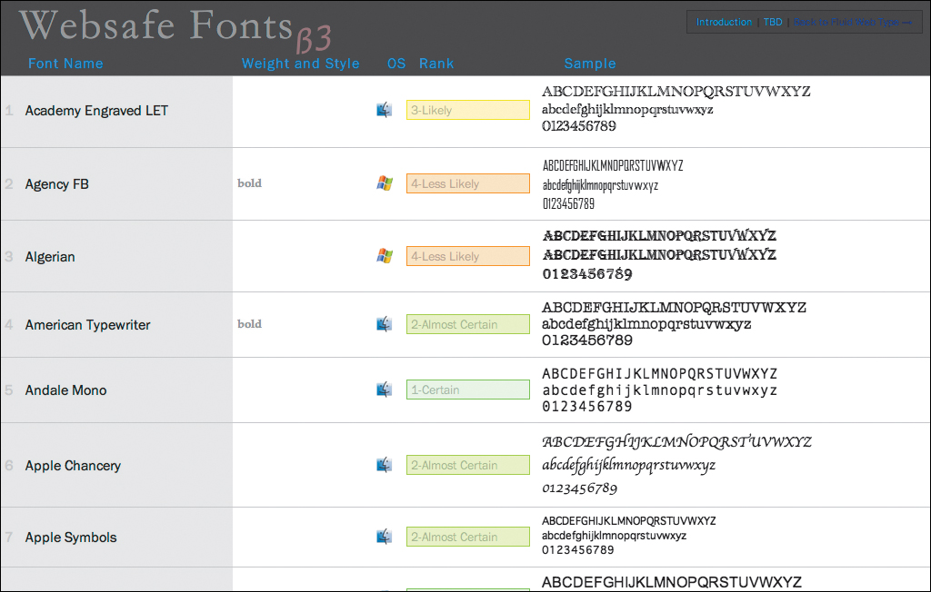
![]() The list of Web-safe fonts on www.webtypographynow.com/websafefonts includes a visual example of each typeface. You can sort the list by name, available weights and styles, operating system availability, and rank.
The list of Web-safe fonts on www.webtypographynow.com/websafefonts includes a visual example of each typeface. You can sort the list by name, available weights and styles, operating system availability, and rank.
But there is new hope. Two factors are changing the way designers think about their typefaces. The first is that dozens of fonts are commonly preinstalled on Macs and PCs. The second, and most profound change, is that all the major browsers now support the use of downloadable Web fonts.
Web fonts is a recent development in Web design that allows you to include fonts in your Web designs by linking to a font file on your server. Although this seems simple (and it is), this ability has been a long time in coming and will revolutionize Web typography.
Web font formats
For years it has been technically feasible to download a font just as you would an image and use it in your design. However, browser developers have only recently added this feature. The good news is that you can now download Web fonts to the vast majority of Web users. The bad news is that different browsers use different file formats (Table 5.3).
Table 5.3. Browser Font File Compatibility
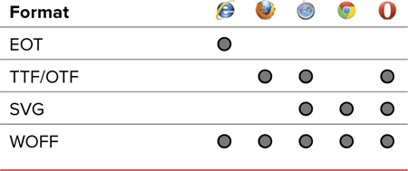
Here is a list of the file formats:
• TTF/OTF. TrueType and OpenType fonts are the type you are most likely to have on your computer. They are commonly used today and represent the majority of fonts sold. That said, they have no built-in security to prevent their unlicensed use.
• EOT. Embedded OpenType is a format developed by Microsoft in the late 1990s to allow secure downloadable fonts for the Web. However, because the technology was proprietary for many years and EOT fonts were hard to create, the format didn’t catch on. Because it is the only format supported by IE and has been supported since IE4, it has gained new life for implanting Web fonts for IE.
• SVG. A separate W3C standard from CSS, Scalable Vector Graphics can include font information. Some browsers, such as Safari mobile, support only this format.
• WOFF. Web Open Font Format may be the new kid on the block, developed in mid-2009, but it is already becoming the frontrunner as the default Web font file format with support in all major Web browsers. This format includes some protection for the font—such as licensing—but is not nearly as cumbersome as EOT.
Setting a better font stack with Web fonts
When deploying Web fonts in your design, the key is to include links to multiple font files; the browser will then use the format that works for it. The good news is that, with a bit of clever coding, this can easily be accomplished. To learn how to download or convert fonts to these multiple font file formats, see “Using Font Squirrel to Convert Font Files” in this chapter.
Let’s look again at the font stack and how to leverage Web-safe fonts and Web fonts to create a design that rises above the visual monotony that you commonly see on the Web.
Code 5.3. Added to font-properties.css—I’ve added Web fonts for the body copy (Déjà vu Serif) and the title copy (Little Trouble Girl), ![]() .
.
/*** font-properties.css ***/
@font-face {
font-family: 'BodyCopy';
src: url('../fonts/DVS/DejaVuSerif.eot'),
src: url('../fonts/DVS/DejaVuSerif.eot?#iefix') format('embedded-opentype'),
url('../fonts/DVS/DejaVuSerif.woff') format('woff'),
url('../fonts/DVS/DejaVuSerif.ttf') format('truetype'),
font-weight: normal;
font-style: normal;
font-stretch: normal; }
@font-face {
font-family: 'BodyCopy';
src: url('../fonts/DVS/DejaVuSerif-Bold.eot'),
src: url('../fonts/DVS/DejaVuSerif-Bold.eot?#iefix') format('embedded-opentype'),
url('../fonts/DVS/DejaVuSerif-Bold.woff') format('woff'),
url('../fonts/DVS/DejaVuSerif-Bold.ttf') format('truetype'),
font-weight: bold;
font-style: normal;
font-stretch: normal; }
@font-face {
font-family: 'BodyCopy';
src: url('../fonts/DVS/DejaVuSerif-Italic.eot'),
src: url('../fonts/DVS/DejaVuSerif-Italic.eot?#iefix') format('embedded-opentype'),
url('../fonts/DVS/DejaVuSerif-Italic.woff') format('woff'),
url('../fonts/DVS/DejaVuSerif-Italic.ttf') format('truetype'),
font-weight: normal;
font-style: italic;
font-stretch: normal; }
@font-face {
font-family: 'BodyCopy';
src: url('../fonts/DVS/DejaVuSerif-BoldItalic.eot'),
src: url('../fonts/DVS/DejaVuSerif-BoldItalic.eot?#iefix') format('embedded-opentype'),
url('../fonts/DVS/DejaVuSerif-BoldItalic.woff') format('woff'),
url('../fonts/DVS/DejaVuSerif-BoldItalic.ttf') format('truetype'),
font-weight: bold;
font-style: italic;
font-stretch: normal; }
@font-face {
font-family: 'TitleCopy';
src: url('../fonts/LTG/littletroublegirl.eot'),
src: url('../fonts/LTG/littletroublegirl.eot?#iefix') format('embedded-opentype'),
url('../fonts/LTG/littletroublegirl.woff') format('woff'),
url('../fonts/LTG/littletroublegirl.ttf') format('truetype'), }
body { font-family: 'BodyCopy', Constantia, Georgia, 'Times New Roman' serif; }
h1 { font-family: 'TitleCopy', Corbel, Helvetica, Arial, sans-serif; }
h2 .chaptertitle { font-family: 'TitleCopy', Corbel, Helvetica, Arial, sans-serif; }

![]() The page is now looking a bit more distinctive typographically by including fonts that are not often seen on the Web.
The page is now looking a bit more distinctive typographically by including fonts that are not often seen on the Web.
To define a Web font to your font stack
1. Add the font face rule to your CSS. Begin by typing the @font-face rule, where you will define the name and location of the font file you want to use in your designs (Code 5.3).
@font-face {
2. Define the name of your font family. Type the name of the font family you want to import. This can actually be anything you choose, as long as you reference it consistently in your font stack.
font-family: 'BodyCopy';
Many developers choose to use just the name of the font, but I recommend creating a name that indicates how the font is used in the design. Then, if the typeface is changed, you don’t have to change the font name everywhere it is referenced.
Remember: if you want to use a font name with two or more words separated by a space, put the whole name in quotes.
3. Define the source of the EOT format of the font file for older versions of Internet Explorer. Add your font file sources. Always begin with the EOT file for use in Internet Explorer, but do not add a format attribute.
src: url('../fonts/DVS/DejaVuSerif.eot'),
4. Define the source for newer versions of Internet Explorer. Because of a bug in Internet Explorer versions earlier than IE9, you need to define the source of the EOT file again and include a little code trick after the path: ?#iefix. This prevents older versions of IE from causing problems with loading the correct format.
src: url('../fonts/DVS/DejaVuSerif.eot?#iefix') format('embedded-opentype'),
5. Define the source of the WOFF, TrueType or OpenType, and SVG format of the font file. Now add the location of your WOFF and TTF/OTF font files. Each browser will use the one best suited for it.
url('../fonts/DVS/DejaVuSerif.woff') format('woff'),
url('../fonts/DVS/DejaVuSerif.ttf') format('truetype'),
6. Optional Add weight, style, and stretch associated with this font. This will mean the font is used only if these properties are also applied with the specific value. For the exact values, see the relevant sections for each in this chapter.
font-weight: normal;
font-style: normal;
font-stretch: normal }
7. Add the Web font name to your font stack. To leverage a downloaded Web font and trigger its download, place the name you gave it at as the first value of the font stack.
font-family:'BodyCopy', Constantia, Georgia, "Times New Roman", serif;
8. Add @font-face for different weights, styles, and stretch. Particularly if you will be using italic or bold text, you must define the font files for each of these, as well as the normal/regular style.
9. Add @font-face for different typefaces. You can use multiple typefaces; in this case I’m including one for the titles.
Although the SVG format can be used as a Web font, I tend not to include it as it is known to cause problems in some older Web browsers.
For this example, I’ve loaded a lot of different font files. Although they are not huge—the ones I used are 20–35 KB and could be reduced in size by sub-setting the font. However, the file sizes can add up quickly, so be careful not to bloat your page size.
Once loaded, though, the font files are cached, so they will not be downloaded again for subsequent pages that use them.
For more information on Windows fonts, see www.microsoft.com/typography/fonts/. For a more detailed examination of Web fonts and Web typography in general, check out my book Fluid Web Typography (www.webtypographynow.info).
Using Font Squirrel to Convert Font Files
1. Legal. While you might assume that you can use a purchased font as a Web font, that is rarely the case. Most fonts have usage restrictions outlined in their End User License Agreements (EULA). If the EULA does not specifically state that you can use a font for @font-face linking, you can’t do so legally. To be sure, check with the font vendor before proceeding.
2. Technical. How do you get all of those different font formats? Currently, even if licensed to do so, most font foundries or resellers do not provide these formats.
One great resource I use regularly is the Font Squirrel Web site (www.fontsquirrel.com), which provides an index to over 500 freely licensed, downloadable Web fonts. Each is complete with all the font formats as well as sample CSS code ![]() .
.
The site also provides an insanely useful tool—the @font-face Kit Generator ![]() —that can convert any OTF or TTF file into EOT, SVG, and WOFF formats (www.fontsquirrel.com/fontface/generator). It’s easy to use and fast. Just make sure that your EULA is in order before using it.
—that can convert any OTF or TTF file into EOT, SVG, and WOFF formats (www.fontsquirrel.com/fontface/generator). It’s easy to use and fast. Just make sure that your EULA is in order before using it.
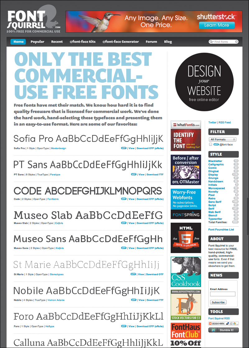
![]() Font Squirrel (www.fontsquirrel.com) offers over 500 free fonts that are ready for use in your Web site.
Font Squirrel (www.fontsquirrel.com) offers over 500 free fonts that are ready for use in your Web site.
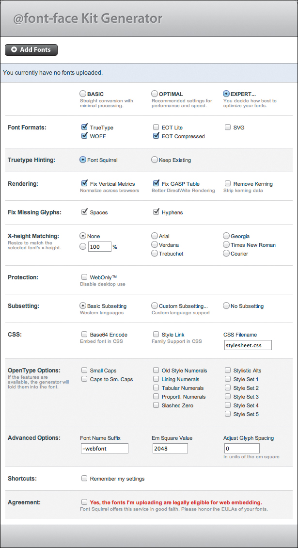
![]() Use the @font-face Kit Generator (www.fontsquirrel.com/fontface/generator) to convert any licensed fonts for use on the Web.
Use the @font-face Kit Generator (www.fontsquirrel.com/fontface/generator) to convert any licensed fonts for use on the Web.
Web font service bureaus
Another up-and-coming option for adding specific fonts to a Web design is Web font service bureaus (WFSB). They provide licensed fonts for your use (generally at a cost) but retain the actual files on their own servers while allowing you to reference them in your code. Some enable this with a straightforward CSS link; others use their own proprietary methods, generally incorporating JavaScript.
The advantages to using WFSBs include:
• Fonts are licensed, so you don’t have to worry about violating a EULA and getting sued.
• Fonts are hosted on the bureaus’ servers, which means you are taking up less bandwidth on your own servers.
• Browser support is handled by the bureau, as are potential updates and upgrades.
However, there are disadvantages as well:
• Since the fonts are on a third-party server, you are depending on someone else’s system to always be fast and reliable.
• If you do not have a copy of the font on your own computer, you will not be able to create graphical comps to show clients.
• Price scales vary from service to service. Some charge a one-time fee; others require a yearly subscription. If you forget to pay, your font goes bye-bye.
Web font service bureaus are growing and changing, while new bureaus are still coming online. Without doubt the most popular and fastest growing is Google Web Fonts, which provides hundreds of free fonts. However, don’t overlook the paid services, which often offer higher quality fonts at reasonable prices.
Tables 5.4 and 5.5 list some of the best Web font service bureaus along with some factors to consider when choosing one:

Table 5.5. Web Font Service Bureaus
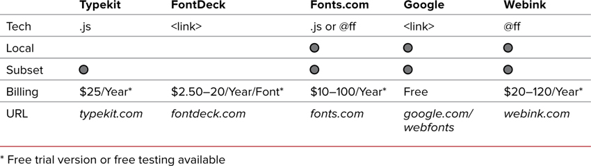
• Technology used: Although I’ve described how to use @font-face (@ff) to use Web fonts, most WFSBs will provide either a link to an external CSS file (<link>) on their server or JavaScript code (.js) that serves a similar function. The problem is that, unless you are using @font-face, you have no control over the font name, and are forced to use the WFSBs naming. Additionally, JavaScript may cause load issues. My preference is for WFSBs that use @font-face.
• Local version: Many WFSBs do not provide a local version to design and develop offline. This is especially problematic if you are creating comps in Photoshop or Fireworks.
• Sub-setting: Some WFSBs will allow you to reduce the font file size (thus speeding load times) by removing characters from the font that you will not be using.
• Price and billing: Billing systems are not consistent between WFSBs. Most will charge a flat fee or base the fee on the number of fonts used, number of downloads, or the amount of bandwidth used. Consider how these factors may affect your final cost before choosing a bureau.
For more details on Web fonts and Web font service bureaus, visit www.webtypographynow.com ![]() .
.
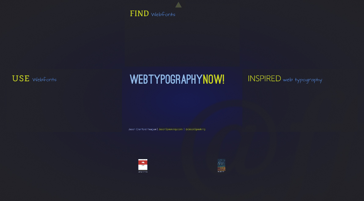
![]() Web Typography NOW! (www.webtypographynow.com) presents the latest techniques, resources, and inspiration for Web designers.
Web Typography NOW! (www.webtypographynow.com) presents the latest techniques, resources, and inspiration for Web designers.
Setting the Font Size
With CSS, you can specify the size of the text on the screen using several notations or methods ![]() , including the traditional print-based point-size notation, percentage, absolute size, and even a size relative to the surrounding text (Table 5.6).
, including the traditional print-based point-size notation, percentage, absolute size, and even a size relative to the surrounding text (Table 5.6).
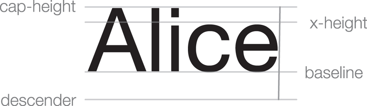
![]() The height (size) of a font is measured from the descender to the ascender (usually the cap height). The x-height is the height of lowercase letters.
The height (size) of a font is measured from the descender to the ascender (usually the cap height). The x-height is the height of lowercase letters.
Fonts can be set as either absolute sizes, which define the size based against a standard length measurement, or relative sizes, which are in relation to defaults set for the browser.
To define the font size for an element
1. Add the font size property to your CSS. Type the property name font-size, followed by a colon (Code 5.4).
font-size:
2. Define the font size.
100%;
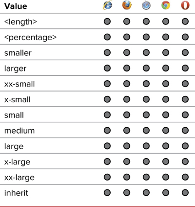
Type a value for the font size, which could be any of the following options:
• A relative or absolute length unit (often, the font size in pixels or ems). See “Values and Units Used in This Book” in the Introduction for more detail.
• An absolute size keyword relative to the default page size: xx-small, x-small, small, medium, large, x-large, and xx-large.
• A relative size keyword of smaller or larger to describe the font size in relation to its parent element.
• A percentage representing how much larger (values over 100%) or smaller (values less than 100%) the text is relative to the size of its parent element.
Code 5.4. font-properties.css—I’ve defined the default size of text on the page as 100% (the default size the user has set) and then set other font sizes on the page relative to that font size ![]() .
.
/*** font-properties.css ***/
body { font-size: 100%; }
h1 { font-size: 3em; }
h2 { font-size: 1em; }
h2 cite { font-size: 1.5em; }
h2 .chaptertitle { font-size: 3em; }
em { font-size: 1.1em; }
figcaption { font-size: .875em; }
article p:first-of-type:first-letter { font-size: 5em; }
footer a { font-size: 1em; }
![]() The font size helps determine its legibility on the page. Titles are usually larger than body copy; but some text, such as the <strong> and <em> tags, may need a little more attention.
The font size helps determine its legibility on the page. Titles are usually larger than body copy; but some text, such as the <strong> and <em> tags, may need a little more attention.
The value you use will depend on your need; however, it is generally recommended to set relative font sizes to allow visitors final control of how large they are displayed.
3. Add font size overrides as needed.
h1 { font-size: 3em; }
The only reason you would need to reset the font-size is if you need to increase or decrease it compared to the size set in the body. If you are using ems to set size, which I recommend, then remember that this is relative to the size of the parent. So a size of 2em would be twice as large as the parent, whereas a size of .5em would be half the size.
Avoid defining screen media font sizes using points or other absolute font sizes because these tend to render inconsistently across platforms. However, they’re fine to use for print style sheets.
When setting font sizes, your best strategy is to set a relative-length size for the <body> tag (such as 100%), and then use absolute font sizes (such as small) or relative font sizes (such as larger) to adjust the size. Doing so ensures the most consistent and versatile page viewing regardless of the actual media used (computer screen, printed page, handheld, and so on.)
Adjusting Font Size for Understudy Fonts
Font sizes are measured based on the height of capital letters, but it is the lowercase letters that often vary the most from font to font. If you are relying on understudy fonts, your font sizes might look very different, even though the same physical size is set ![]() . To help alleviate this, CSS3 introduces the font-size-adjust property, which allows you to set the font size relative to lowercase letters rather than uppercase.
. To help alleviate this, CSS3 introduces the font-size-adjust property, which allows you to set the font size relative to lowercase letters rather than uppercase.
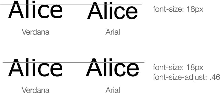
![]() Verdana has a much taller x-height than Arial (top), but using font-size-adjust, you can set the lowercase letters to use the same height, ensuring greater consistency regardless of which font the browser uses.
Verdana has a much taller x-height than Arial (top), but using font-size-adjust, you can set the lowercase letters to use the same height, ensuring greater consistency regardless of which font the browser uses.
To do this, you specify a numeric value that lowercase fonts should be sized to as a multiple of the font size (Table 5.7). For example, if the font size is 18 pixels and you set a font-size-adjust of .5, lowercase letters will be sized at 9 pixels. As a result, all the fonts will have the same apparent size relative to each other, even if their x-heights vary greatly.
Table 5.7. Font-Size-Adjust Values
To adjust the font size for an element
1. Add the font size adjust property to your CSS. Type the property name font-size-adjust, followed by a colon (Code 5.5).
font-size-adjust:
2. Define a size value.
.5;
Type a value to adjust the font size by:
• A numeric value of 0 or greater as a multiplier for the current font-size to adjust the text size based on the x-height.
• None, to leave the font-size unadjusted
Code 5.5. Styles added to font-properties.css—The font size has been adjusted so that lowercase letters are half the size of uppercase letters.
body { font-size-adjust: .5; }
You can calculate these values by dividing the set font-size by the font’s x-height, or you can just “eyeball” it until the value for the font-size-adjust appears to have no effect on the font size of the primary font.
Font-size-adjust will adjust the size of all your glyphs (capitals as well as lowercase), but does so relative to the lowercase letters rather than uppercase.
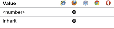
Making Text Italic
Two kinds of styled text that are often confused are italic and oblique. An italic font is a special version of a particular font, redesigned with more pronounced serifs and usually a slight slant to the right. An oblique font, on the other hand, is simply a font that is slanted to the right but otherwise identical to the normal version.
Using the font-style property (Table 5.8), you can define a font as italic, oblique, or normal. When a font is set to italic but does not have an explicit italic version, the font defaults to oblique ![]() .
.
![]() Italic or oblique? To really tell the difference, take a careful look at the letter “i” in both words.
Italic or oblique? To really tell the difference, take a careful look at the letter “i” in both words.
To set font-style for an element
1. Add the font-style property to your CSS. Type the property name font-style (Code 5.6), followed by a colon (:).
font-style: italic;
2. Define a style value. Type a value for the font-style. Your options are:
• italic, which displays the type in an italic version of the font
• oblique, which slants the text to the right
• normal, which overrides any other styles set
h2 strong { font-style: normal; }
Code 5.6. Styles added to font-properties.css—The h1 and h2 tags both have italic set for them with this being overridden in the strong tag within an h2 ![]() . We also need to change the font-style in the @font-face rule. This does not actually italicize the downloaded font, it just tells the browser to use this in place of an italicized version.
. We also need to change the font-style in the @font-face rule. This does not actually italicize the downloaded font, it just tells the browser to use this in place of an italicized version.
/*** font-properties.css ***/
h1 { font-style: italic; }
h2 { font-style: normal; }
h2 cite { font-style: italic; }
figcaption { font-style: italic; }
![]() Italics are often used to help set off text or to add emphasis, as with the chapter title.
Italics are often used to help set off text or to add emphasis, as with the chapter title.
3. Add style overrides as needed. You can override italics or oblique by setting the font style for a child element to normal.
Many browsers do not differentiate between italic and oblique but will simply use the fonts’ italic version (if available), even when they are set to oblique.
If an italicized or oblique version of the typeface does not exist, many browsers will attempt to synthesize one by slanting the normal version of the font to the right. This rarely looks good and should be avoided.
Many Web designers underline words to draw visual attention to them. I recommend using italic or oblique text instead. Underlining often causes the page to look cluttered. More important, underlined text might be confused with hypertext links.
Italicized text generally fits into a more compact space than non-italic text (called roman in traditional typesetting terms) and could be used to save screen space. But be careful—at small point sizes, italic can be difficult to read on the screen.
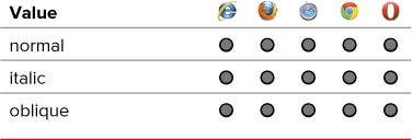
Setting Bold, Bolder, Boldest
CSS provides several options that allow you to set different levels of boldness for text. Many fonts have various weights associated with them; these weights have the effect of making the text look more or less bold (Table 5.9). CSS can take advantage of this feature ![]() .
.
![]() The difference between normal and bold text is evident here.
The difference between normal and bold text is evident here.
To define bold text in a CSS rule
1. Add the font weight property to your CSS. Type the property name font-weight (Code 5.7), followed by a colon (:).
font-weight:
2. Define the weight.
bold;
Type the value for the font-weight property, using one of the following options:
• bold, which sets the font to boldface
• bolder or lighter, which sets the font’s weight to be bolder or lighter relative to its parent element’s weight
• A value from 100 to 900, in increments of 100, which increases the weight, based on alternative versions of the font that are available
• normal, which overrides other weight specifications
Code 5.7. font-properties.css—The author’s name is bold to make it stand out ![]() .
.
/*** font-properties.css ***/
.byline .author {
font-weight: bold; }
![]() The author’s name is bold to stand out.
The author’s name is bold to stand out.
Use font-weight to add emphasis to text, but use it sparingly. If everything is bold, nothing stands out.
Using Condensed and Expanded Fonts
Although the bold and italic versions of fonts are most common, many fonts have versions that are condensed (narrower) or extended (wider) ![]() . The font-stretch property allows you to reference particular font widths (Table 5.10). Some fonts include font widths that stretch or compress the font and are different from bold, which simply makes the letterform consistently thicker. Most fonts will not have these properties, but for those that do, using font-stretch will be the best way to access them.
. The font-stretch property allows you to reference particular font widths (Table 5.10). Some fonts include font widths that stretch or compress the font and are different from bold, which simply makes the letterform consistently thicker. Most fonts will not have these properties, but for those that do, using font-stretch will be the best way to access them.
![]() Condensed and expanded fonts.
Condensed and expanded fonts.
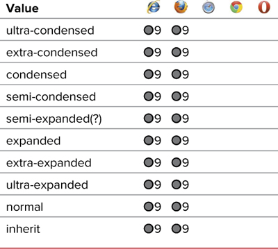
Table 5.10. Font-Stretch Values
To define condensed or extended fonts in a CSS rule
1. Add the font-stretch property to your CSS. Type the property name font-stretch (Code 5.8), followed by a colon (:).
font-stretch:
2. Define the weight.
condensed;
Type the value for the font-stretch property, using one of the following options:
• A value from Table 5.10.
• normal, which overrides other weight specifications
Code 5.8. Added to font-properties.css—The author’s name is set in condensed text ![]() .
.
h2 cite { font-stretch: condensed; }
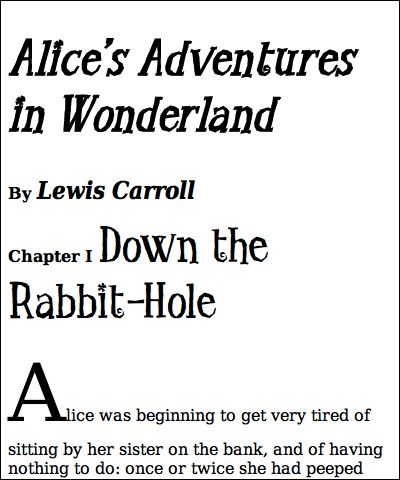
![]() The author’s name is condensed.
The author’s name is condensed.
Creating Small Caps
Small caps (sometimes referred to as mini-caps) are useful for emphasizing titles (Table 5.11). With small caps, lowercase letters are converted to uppercase but in a slightly smaller size than regular uppercase letters ![]() .
.
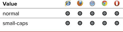
Table 5.11. Font-Variant Values
![]() With small caps, all the letters are uppercase, but the first letter is larger than the others.
With small caps, all the letters are uppercase, but the first letter is larger than the others.
To set small caps for an element
1. Add the font variant property to your CSS. Type the property name font-variant (Code 5.9), followed by a colon (:).
font-variant:
2. Define a value for the variant.
small-caps;
Type the value of the font-variant property, using one of the following options:
• small-caps, which sets lowercase letters as smaller versions of true uppercase letters
• normal, which overrides other font-variant values that might be inherited
Code 5.9. Styles added to font-properties.css—Small caps are applied to both header 1 and header 2, but disabled in the strong element within the h2. Note that the font-variant declaration was changed in the @font-face to small-caps rule so that the downloaded font will display in the h1 ![]() .
.
h1 { font-variant: small-caps; }
h2 { font-variant: small-caps; }
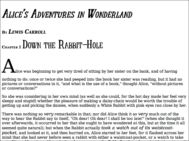
![]() Using small caps for the title is an elegant way to set it off from the rest of the text.
Using small caps for the title is an elegant way to set it off from the rest of the text.
Small caps are best reserved for titles or other special text; they can be hard to read at smaller sizes.
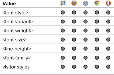
Setting Multiple Font Values at the Same Time
Although you can set font properties independently, it is often useful, not to mention more concise, to put all font elements in a single declaration (Table 5.12). To do this, use the shorthand font property.
To define several font attributes simultaneously in a rule
1. Add the font property to your CSS. Type the property name font (Code 5.10), followed by a colon (:). Then type the values in the same order that they are typed in the remaining steps of this exercise.
font:
2. Optional Define a style value. Type a font-style value, followed by a space. (See “Making Text Italic” in this chapter.)
italic
Code 5.10. Changes to font-properties.css—Wherever possible, the font properties have been combined into the shorthand font property. This requires that the size, font family, and at least one of the other font properties are defined ![]() .
.
/*** font-properties.css ***/
body { font: normal 100%/1.5 'BodyCopy',
Constantia, Georgia, "Times New Roman",
serif; }
h1 { font: italic bold small-caps 5em/.9
'TitleCopy', Corbel, Helvetica, Arial,
sans-serif; }
![]() This version should look similar to the previous section except for the space between lines of text.
This version should look similar to the previous section except for the space between lines of text.
3. Optional Define a weight value. Type a font-weight value, followed by a space. (See “Setting Bold, Bolder, Boldest” in this chapter.)
bold
4. Optional Define a variant value. Type a font-variant value, followed by a space. (See “Creating Small Caps” in this chapter.)
small-caps
5. Define a size value. Type a font-size value. (See “Setting the Font Size” in this chapter.)
100%
6. Optional Define a line height value. Type a forward slash (/), a line-height value, and a space. (See “Adjusting Text Spacing” in Chapter 6.)
/.9
7. Define a font family value. Type a font-family value and closing semicolon. (See “Setting a Font Stack” in this chapter.)
'TitleCopy', Corbel, Helvetica, Arial, sans-serif;
The font shorthand property is a real time-saver, and I try to use it as often as possible. It not only takes less time to type and edit, but can reduce the size of your code and speed up your load time.
Code editing software, such as Coda and Dreamweaver, tend to default to the individual properties rather than the shorthand.
If you don’t want to set a particular style, variant, or weight value in the list, just leave it out. The browser will use its default value instead. However, you do have to include at least one value, even if it’s just normal.
If you need to override a value set by the font shorthand property, it’s generally best to use the full property (such as font-style, font-variant, font-weight, and font-family).
Putting It All Together
Code 5.11 shows the final results for font-properties.css, It brings together the Web fonts at the top (they must always be placed at the top of the CSS file or <style> tag), and then the styles and weights are listed. Wherever possible, font values have been combined into the font shorthand property.
Code 5.11. Final font-properties.css
/*** fontproperties.css ***/
@font-face {
font-family: 'BodyCopy';
src: url('../fonts/DVS/DejaVuSerif.eot'),
src: url('../fonts/DVS/DejaVuSerif.eot?#iefix') format('embedded-opentype'),
url('../fonts/DVS/DejaVuSerif.woff') format('woff'),
url('../fonts/DVS/DejaVuSerif.ttf') format('truetype'),
font-weight: normal;
font-style: normal; }
@font-face {
font-family: 'BodyCopy';
src: url('../fonts/DVS/DejaVuSerif-Bold.eot'),
src: url('../fonts/DVS/DejaVuSerif-Bold.eot?#iefix') format('embedded-opentype'),
url('../fonts/DVS/DejaVuSerif-Bold.woff') format('woff'),
url('../fonts/DVS/DejaVuSerif-Bold.ttf') format('truetype'),
font-weight: bold;
font-style: normal; }
@font-face {
font-family: 'BodyCopy';
src: url('../fonts/DVS/DejaVuSerif-Italic.eot'),
src: url('../fonts/DVS/DejaVuSerif-Italic.eot?#iefix') format('embedded-opentype'),
url('../fonts/DVS/DejaVuSerif-Italic.woff') format('woff'),
url('../fonts/DVS/DejaVuSerif-Italic.ttf') format('truetype'),
font-weight: normal;
font-style: italic; }
@font-face {
font-family: 'BodyCopy';
src: url('../fonts/DVS/DejaVuSerif-BoldItalic.eot'),
src: url('../fonts/DVS/DejaVuSerif-BoldItalic.eot?#iefix') format('embedded-opentype'),
url('../fonts/DVS/DejaVuSerif-BoldItalic.woff') format('woff'),
url('../fonts/DVS/DejaVuSerif-BoldItalic.ttf') format('truetype'),
font-weight: bold;
font-style: italic; }
@font-face {
font-family: 'BodyCopy';
src: url('../fonts/DVS/DejaVuSerifCondensed-BoldItalic.eot'),
src: url('../fonts/DVS/DejaVuSerifCondensed-BoldItalic.eot?#iefix') format('embedded-opentype'),
url('../fonts/DVS/DejaVuSerifCondensed-BoldItalic.woff') format('woff'),
url('../fonts/DVS/DejaVuSerifCondensed-BoldItalic.ttf') format('truetype'),
font-weight: bold;
font-style: italic;
font-stretch: condensed; }
@font-face {
font-family: 'TitleCopy';
src: url('../fonts/LTG/littletroublegirl.eot'),
src: url('../fonts/LTG/littletroublegirl.eot?#iefix') format('embedded-opentype'),
url('../fonts/LTG/littletroublegirl.woff') format('woff'),
url('../fonts/LTG/littletroublegirl.ttf') format('truetype'), }
body {
font: normal 100%/1.5 'BodyCopy', Constantia, Georgia, "Times New Roman", serif;
font-size-adjust: .5; }
h1 {
font: italic bold small-caps 5em/.9 'TitleCopy', Corbel, Helvetica, Arial, sans-serif; }
h2 {
font-size: 1em;
font-style: normal;
font-variant: small-caps; }
h2 cite{
font-size: 1.5em;
font-variant: normal;
font-weight: bold;
font-style: italic;
font-stretch: condensed;
}
h2 .chaptertitle {
font: normal 3em 'TitleCopy', Corbel, Helvetica, Arial, sans-serif; }
em {
font-size: 1.1em; }
figcaption {
font-size: .875em;
font-style: italic;
font-stretch: condensed;
font-weight: bold;
}