
12. Transformation and Transition Properties
Although the use of transform and transition properties is still somewhat controversial, the ability to apply these changes to elements without using JavaScript will be a boon for Web designers and developers. Think of these as temporal styles that not only change the appearance of an element—as do other styles—but also change that element’s appearance over time and space.
The styles presented in this chapter are extremely new, at least by Web standards. Although Webkit has had them in one form or another for a while and Firefox and Opera have started adopting them, it is only recently that many of them have been added to Internet Explorer and that work has started toward making them part of the standard CSS3 canon. I’d approach these with some caution while making sure they degrade gracefully in older browsers, but I can’t wait to see how you use them.
Getting Started
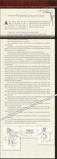
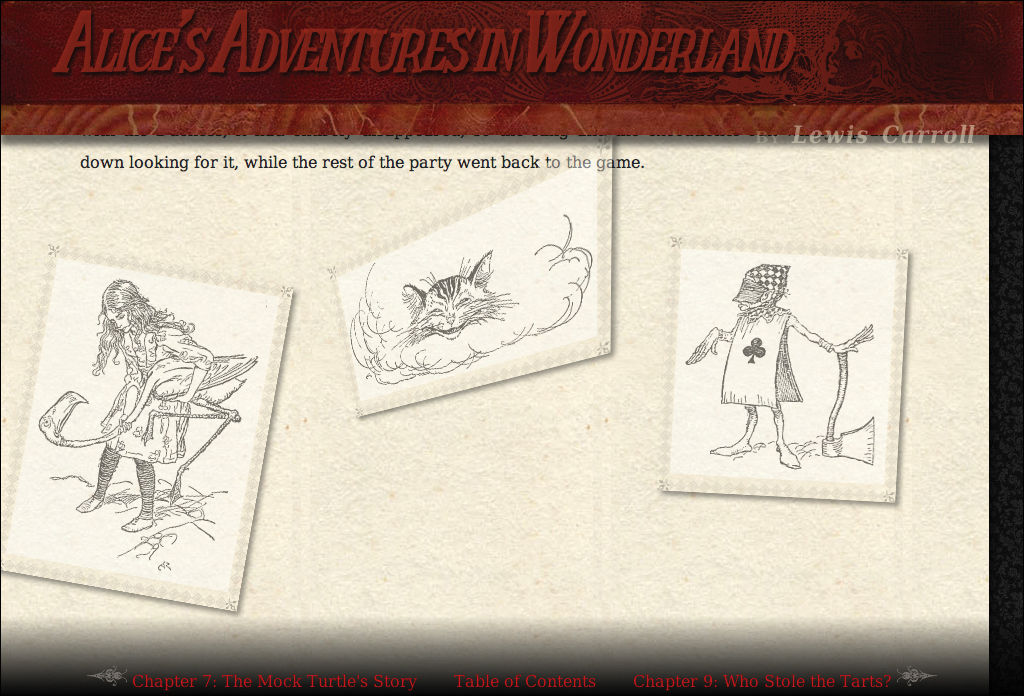
For this chapter’s example, I’ll be using the text and images from Chapter 8 of Alice’s Adventures in Wonderland (Code 12.1A), which includes several black-and-white figures that I’ve collected into a “gallery” so that we can play around with using transforms and transitions on them. We’ll be building the CSS file transformation-transition-properties.css (Code 12.1B) in this chapter. Start out by adding a few styles that position the images in our figure (IDed as f1, f2, and f3). See the finished version of this CSS file in the section “Putting It All Together” at the end of the chapter.
Code 12.1A. The HTML5 code for Chapter 12 is similar to the previous chapter. It links to the final CSS from Chapters 5, 6, 7, 8, 9, 10, and 11, as well as a new file we will be building in this chapter called transformation-transition-properties.css.
<!DOCTYPE html>
<html lang="en">
<head>
<meta charset="utf-8">
<title>Alice’s Adventures In Wonderland | Chapter VIII</title>
<link href="../css/font-properties.css" type="text/css" rel="stylesheet" media="all">
<link href="../css/text-properties.css" type="text/css" rel="stylesheet" media="all">
<link href="../css/color-background-properties.css" type="text/css" rel="stylesheet" media="all">
<link href="../css/list-table-properties.css" type="text/css" rel="stylesheet" media="all">
<link href="../css/ui-generatedcontent-properties.css" type="text/css" rel="stylesheet" media="all">
<link href="../css/box-properties.css" type="text/css" rel="stylesheet" media="all">
<link href="../css/visualformatting-properties.css" type="text/css" rel="stylesheet" media="all">
<link href="../css/transformation-transition-properties.css" type="text/css" rel="stylesheet" media="all">
</head>
<body id="chapter8" class="book aaiw chapter">
<header class="page">
<hgroup>
<h1>Alice’s Adventures in Wonderland</h1>
<h2>By <cite>Lewis Carroll</cite></h2>
</hgroup>
</header>
<article>
<h2>Chapter VIII
<span class="chaptertitle">The Queen's Croquet-Ground</span>
</h2>
<p>A large rose-tree stood near the entrance of the garden: the roses growing on it were white, but there were three gardeners at it, busily painting them red. Alice thought this a very curious thing, and she went nearer to watch them, and just as she came up to them she heard one of them say <q>Look out now, Five! Don't go splashing paint over me like that!</q></p>
...
<p>The Cat's head began fading away the moment he was gone, and by the time he had come back with the Duchess, it had entirely disappeared; so the King and the executioner ran wildly up and down looking for it, while the rest of the party went back to the game.</p>
<div class="gallery">
<figure id="f1" class="illo bw-illo" style="width: 300px;">
<img src="../images/illos/p0103-image.png" width="300" height="400" alt="Playing croquet" title="" />
</figure>
<figure id="f2" class="illo bw-illo" style="width: 380px;">
<img src="../images/illos/p0106-image.png" width="380" height="179" alt="The cat" title="" />
</figure>
<figure id="f3" class="illo bw-illo" style="width: 286px;">
<img src="../images/illos/p0109-image.png" width="286" height="300" alt="The Executioner" title="">
</figure>
</div>
</article>
<aside>
<h2>About the Author</h2>
<p><b>Charles Lutwidge Dodgson</b> (7 January 1832 – 14 January 1898), better known by the pseudonym Lewis Carroll was an English author, mathematician, logician, Anglican deacon and photographer. His most famous writings are Alice's Adventures in Wonderland and its sequel Through the Looking-Glass, as well as the poems "The Hunting of the Snark" and "Jabberwocky", all examples of the genre of literary nonsense. He is noted for his facility at word play, logic, and fantasy, and there are societies in many parts of the world (including the United Kingdom, Japan, the United States, and New Zealand) dedicated to the enjoyment and promotion of his works and the investigation of his life.</p>
</aside>
<footer>
<nav>
<a href="AAIWL-ch07.html" class="prev">The Mock Turtle's Story</a>
<a href="EB9780133132762_6.html">Table of Contents</a>
<a href="AAIWL-ch09.html" class="next">Who Stole the Tarts?</a>
</nav>
</footer>
</body>
</html>
Code 12.1B. Starting transition-properties.css—We’re adding some positioning (Chapter 11) and width (Chapter 10) styles for the figures in the figure gallery  .
.
/*** transition-properties.css ***/
div.gallery {
position: relative;
width: 100%;
height: 500px;
padding: 20px; }
div.gallery figure {
width: auto;
position: absolute;
opacity: .5;
z-index: 0; }
div.gallery figure:hover {
opacity: 1;
z-index: 999; }
div.gallery figure#f1 {
left: -10%; }
div.gallery figure#f2 {
left: 25%; }
div.gallery figure#f3 {
right: -10%; }
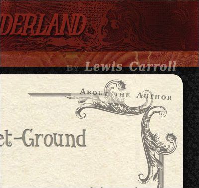
How the page looks at the start of this chapter. Notice that the gallery of images is still very grid-like in its appearance.
 Transforming an Element
Transforms permits you to manipulate elements beyond the basic position properties, allowing you to finally break out of the rectangular layout grid with values to rotate, scale, skew, and move elements.
Transform values have three basic value types that you might use:
• Angle can be defined in degrees (90deg), grads (100grad), or radians (1.683rad). Negative values and values greater that 360deg are allowed but are translated into positive values.
• Number can be any integer or decimal value, positive or negative. Numbers are generally used as multipliers.
• Length is a length value, as defined in the introduction of this book. This can include relative values (em, px, %) or absolute values (in, mm, cm).
Many transform values can take multiple parenthetical values, separated by a comma:
scale(2,1.65)
Generally, two or three values will represent the X, Y, and Z axes. If only one value is included, it is assumed that it should be applied to all three.
As with many advanced CSS3 properties, transformations are currently implemented using extensions to browsers.
Transformations are a bit of a cheat, though. Yes, they enable you to create incredibly cool designs. However, each transform “value” shown in Table 12.1 (for 2D) and Table 12.2 (for 3D) could actually be a property in and of itself because each takes its own parenthetical values. But instead, they are all associated with the transform property, and we’ll have to live with that.
Table 12.1. 2D Transform Values
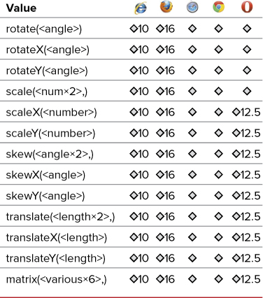
Table 12.2. Transform-Origin Values
2D transformations
Currently, the most stable and widely available transformations are in two dimensions, but this is a good starting point .
The 2D transformations. It sounds like a ’70s funk band’s name.
Code 12.2. Added to transition-properties.css— When applied to Code 12.1, several transformations give the aside a jaunty angle and break up the grid containing the images 
 . Notice that four lines of code are required for maximum cross-browser compatibility.
/*** transition-properties.css ***/
aside {
-webkit-transform: rotate(-2deg);
-moz-transform: rotate(-2deg);
-ms-transform:
-o-transform: rotate(-2deg);
transform: rotate(-2deg); }
div.gallery figure {
-webkit-transform-origin: left 25%;
-moz-transform-origin: left 25%;
-o-transform-origin: left 25%;
transform-origin: left 25%; }
div.gallery figure#f1 {
-webkit-transform: scale(.75) rotate(10deg);
-moz-transform: scale(.75) rotate(10deg);
-o-transform: scale(.75) rotate(10deg);
transform: scale(.75) rotate(10deg); }
div.gallery figure#f3 {
-webkit-transform: scale(.75) rotate(3deg);
-moz-transform: scale(.75)rotate(3deg);
-o-transform: scale(.75) rotate(3deg);
transform: scale(.75) rotate(3deg); }
At the top of the page, the aside title is at a slight angle.
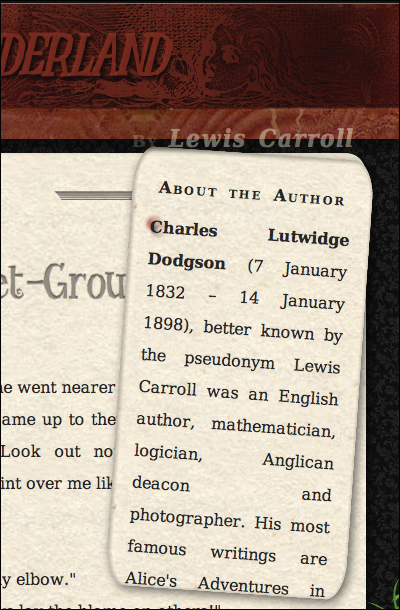
When expanded, the angle is more noticeable.
To add a 2D transformation to an element
1. Add the transform property:
-webkit-transform:
-moz-transform:
-ms-transform:
-o-transform:
transform:
The exact order is not important, although standard CSS should always come last (Code 12.2).
2. Specify the transition type and value.
rotate(-2deg);
For each property, add the same transform value (Table 12.1) with its relevant parenthetical value:
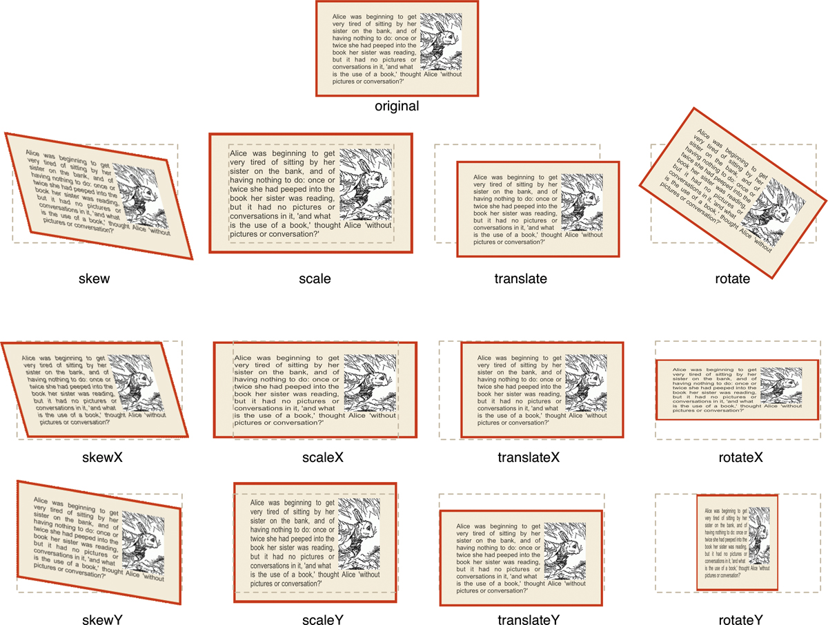
• rotate() with an angle value to rotate the element. Positive values turn the element clockwise, whereas negative values turn the element counterclockwise.
• rotateX() or rotateY() with an angle value to turn the element around the X or Y axis. Positive values turn the element clockwise, whereas negative values turn the element counterclockwise.
• scale(), scaleX(), or scaleY() with numeric values that act as multipliers to the width (X) and/or height (Y) of the element. Positive numbers increase element size. Negative values will still increase size but also reflect the element along its axis. Decimal numbers decrease scale.
• skew(), skewX(), or skewY() with angle values that skew the element along the X and/or Y axis of the element. Positive values skew up and to the left, whereas negative values skew down and to the right.
• translate(), translateX(), or translateY() with length values that offset the element along the X axis and/or Y axis of the element. Positive values offset down and to the right, whereas negative values offset up and to the left.
• matrix() is a 3×3 matrix of values that can be used as a shorthand to represent any of the preceding transformations alone or in combination.
3. Add more transformations as needed.
transform: scale(.75) rotate(3deg);
You can include multiple transformation values separated by a space.
4. Specify the transformation origin, if it is not the center of the element.
-webkit-transform-origin: 0, 25%;
-moz-transform-origin: 0, 25%;
-o-transform-origin: 0, 25%;
transform-origin: 0, 25%;
By default, all transformations use the center of the element as the point of origin. Thus, a rotate transform will rotate around the middle of the element.
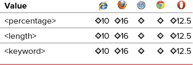
To change this, add the transform() property with one or two values for the X and Y location of the origin (Table 12.2) as a percentage, length, or a keyword (Table 12.3). If you specify only a single value, it is used for both X and Y values. Positive values move the origin up and to the left of the element, whereas negative values move the origin down and to the right of the center of the element.
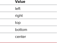
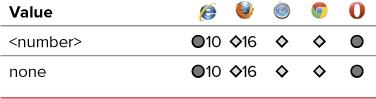
Table 12.3. Transform-Origin Keywords
3D transformations
As of this writing, 3D transitions are supported only in Safari and Chrome, although that can rapidly change as new versions of Firefox are released. As a result, I don’t advocate the use of 3D transitions except when you know the only browser in use supports these properties—for example, in iOS applications or pages created for iPhone, iPod touch, or iPad display. That said, because this is a standard under development by the W3C, you should also include the standard CSS3 syntax for future compatibility.
To transform an element in three dimensions
1. Add the transform style property to your CSS declarations and specify the style.
-webkit-transform-style: flat;
-moz-transform-style: flat;
transform-style: flat;
Add transform-style to the elements being transformed (Code 12.3), which allows you to specify whether child elements should be set flat against the parent element or treated separately in their own 3D spaces (Table 12.4). Although transform-style does work in Internet Explorer, it does so using the CSS3 syntax, not its own browser extension.
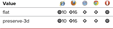
Table 12.4. Transform-Style Values
Code 12.3. Added to transition-properties.css— When applied to Code 12.1, this code gives the middle image in the gallery a slight 3D spin that will look like  .
.
/*** transition-properties.css ***/
div.gallery figure {
-webkit-transform-style: flat;
-moz-transform-style: flat;
transform-style: flat;
-webkit-perspective: 5000;
-moz-perspective: 5000;
perspective: 5000;
-webkit-perspective-origin: 25% 25%;
-moz-perspective-origin: 25% 25%;
perspective-origin: 25% 25%;
-webkit-backface-visibility: visible;
-moz-backface-visibility: visible;
backface-visibility: visible; }
div.gallery figure#f2 {
-webkit-transform: perspective(250px) scale3d(.5,.75,1.5) rotate3d(-3,-3,-8,18deg);
-moz-transform: perspective(250px) scale3d(.5,.75,1.5) rotate3d(-3,-3,-8,18deg);
-o-transform: perspective(250px) scale3d(.5,.75,1.5) rotate3d(-3,-3,-8,18deg);
transform: perspective(250px) scale3d(.5,.75,1.5) rotate3d(-3,-3,-8,18deg); }
2. Add the perspective style property to your CSS declarations and specify the perspective value .

At the bottom of the page, our photo gallery is now a little more jumbled looking.
-webkit-perspective: 500;
-moz-perspective: 500;
perspective: 500;
Perspective works like the transform perspective() value described later in this chapter but applies a perspective to an element’s positioned children, not the element itself (Table 12.5).
Table 12.5. Perspective Values
3. Add the transform style property to your CSS declarations and one or two values  .
.
In Webkit browsers, the middle image now appears to be rotated in a 3D space.
-webkit-perspective-origin: 25% 25%;
-moz-perspective-origin: 25% 25%;
perspective-origin: 25% 25%;
Add perspective-origin with one or two values that specify an origin point for the perspective property (not the transform value), defining the X and Y position at which the viewer appears to be viewing an element’s children (Table 12.6). Perspective-origin keywords are the same as transform-origin keywords (Table 12.3).
Table 12.6. Perspective-Origin Values
4. Add the backface visibility property to your CSS declarations and one value.
-webkit-backface-visibility: visible;
-moz-backface-visibility: visible;
backface-visibility: visible;
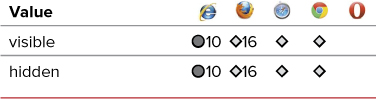
Add backface-visibility for the special case in which two elements are placed back to back (like a playing card) and need to be flipped together. This property will hide the back of flipped elements using rotateZ or rotate3D (Table 12.7).
Table 12.7. Backface-Visibility Values
5. Add the transform property to your CSS declarations for the different browser extensions, including Opera.
-webkit-transform:
-moz-transform:
-o-transform:
transform:
3D transformations use the same properties as 2D transformations; only the values are different.
6. Establish the perspective.
perspective(250px)
To create a three-dimensional transformation, a three-dimensional perspective property should be established in the element to define a depth. Values start at 0 with lower values giving a more pronounced perspective than higher values, thereby creating a three-dimensional foreshortening.
scale3d(.5,.75,1.5) rotate3d(-3,-3,-8,-18deg);
For each browser-specific property, add the same transform value (Table 12.8) with its relevant parenthetical value:
• rotate3d() requires three numbers to define the X, Y, Z axes, and an angle value to turn the element around those axes. Positive values turn the element clockwise, whereas negative values turn the element counterclockwise.
• rotateZ() uses an angle value to turn the element around the Z axis. Positive values turn the element clockwise, whereas negative values turn the element counterclockwise.
• scale3d() requires three numeric values that act as multipliers to the width (X) and/or height (Y) and depth (Z) of the element. Positive numbers increase element size. Negative values increase size and reflect the element along that axis. Decimal numbers decrease scale.
• scaleZ() adds a numeric value that acts as a multiplier to the depth (Z) of the element. Positive numbers increase element size. Negative values will increase size and reflect the element along that axis. Decimal numbers decrease scale.
• translate3d() requires three length values that offset the element along the X, Y, and/or Z axes of the element. Positive values offset down, to the right, and forward (larger), whereas negative values offset up, to the left, and backward (smaller).
• translateZ() adds a length value that offsets the element along the Z axis of the element. Positive values offset forward, whereas negative values offset backward. Unlike the X and Y values, a percentage is not allowed with Z.
• matrix3d() is a 4×4 matrix of 16 values that can be used as shorthand to represent any of the preceding transformations alone or in combination.
Table 12.8. 3D Transform-Style Values
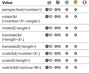
Notice that the 3D transformations work in Internet Explorer with version 10, but do not require a browser extension. Instead, they work with the standard CSS3 syntax.
I find 3D transformations a bit mind-blowing when it comes to figuring out what does what. Don’t worry if they don’t seem intuitive at first. Experimentation is the best remedy for confusion.
Adding Transitions Between Element States
Despite users’ expectations to see change and movement on the screen, CSS and HTML have few controls that allow you to design interactivity, and those that do exist have been binary up to this point:
• A link is one color or another.
• A text field is one size or another.
• A photo is transparent or opaque.
No in-betweens have existed in the past from one state to the next, and no transitions. This has led to most Web pages feeling abrupt, with elements shifting and changing ungracefully.
What we need is a quick and easy way to add simple transitions to a page, and that’s where CSS transitions come into the picture.
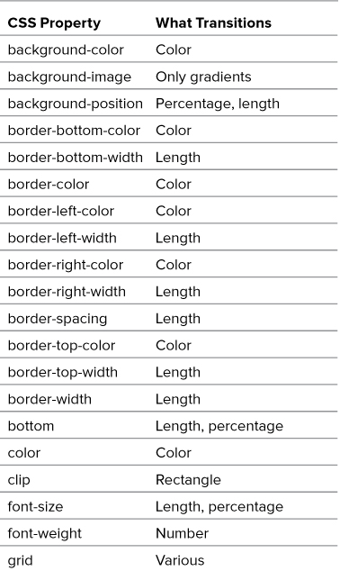
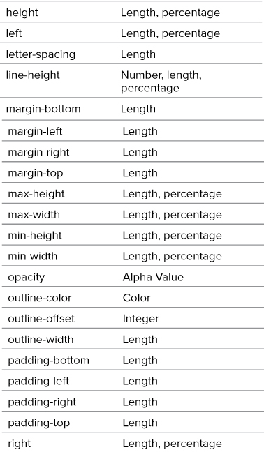
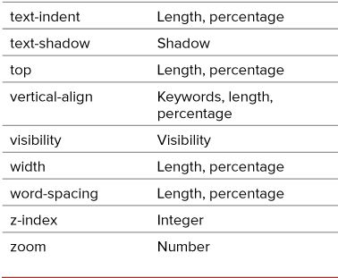
What can be transitioned?
Almost any CSS property that has a color, length, or position component—including many of the new CSS3 properties—can be given a transition, changing it from one style to another style over time.
Table 12.9 shows a list of the CSS properties available and the values that can be transitioned. (One exception is box-shadows.)
Table 12.9. CSS Properties with Transitions
For a transition to occur, there has to be a state change in the element using one of the link or dynamic pseudo-classes discussed in Chapter 4. Transitions work by changing a style between different element states over a period of time . For example, the color value of the default state of an element will pass through intermediate colors in the spectrum before appearing as the color value for the hover state .
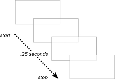
A transition is like several frames in a movie, changing gradually over time rather than instantly. With opacity, the transition is from transparent to opaque.
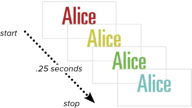
With color, the transition is from one color to another on the color wheel.
To add a transition effect between states
1. Add the transition property.
-webkit-transition:
-moz-transition:
-o-transition:
transition:
Include versions for the browser extensions including Webkit, Mozilla, Opera, and standard CSS3, including the standard property at the bottom of the list (Code 12.4).
Code 12.4. Added to transition-properties.css— When applied to Code 12.1, transitions are now applied to the color, opacity, and transformations, resulting in a gradual rather than instant change . Notice that I also added a hover state for the figures. You can’t have a transition without a style change, and the easiest way to add a change is with the :hover pseudo-class.
/*** transition-properties.css ***/
aside, figure, a {
-webkit-transition: color .25s ease-in, opacity .5s ease, -webkit-transform .25s ease-in-out 0;
-moz-transition: color .25s ease-in, opacity .5s ease, -moz-transform .25s ease-in-out 0;
-o-transition: color .25s ease-in, opacity .5s ease, -o-transform .25s ease-in-out 0;
transition: color .25s ease-in, opacity .5s ease, transform .25 ease-in-out 0; }
div.gallery figure#f1:hover, div.gallery figure#f2:hover, div.gallery figure#f3:hover {
-webkit-transform: rotate(0);
-moz-transform: rotate(0);
-o-transform: rotate(0);
transform: rotate(0);
cursor: pointer; }
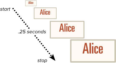
With the scale transform, the transition is through sizes.
2. Add values for each transition.
color .25s ease-in
Choose from the following values (Table 12.10):
• A transition-property from Table 12.11 indicates which specific CSS property is affected.
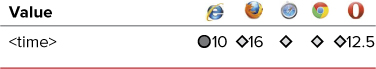
• transition-duration sets how long the transition should take from beginning to end, generally in seconds (Table 12.12). This is optional, and the default will be 0.
• transition-timing-function defines the behavior of the transition’s speed as it progresses (Table 12.13). This value is not required, and defaults to linear when not set.
• transition-delay specifies how long the duration should pause before starting (Table 12.14). This is optional and defaults to 0 if not set.
Table 12.10. Transition Values

Table 12.11. Transition-Property Values
Table 12.12. Transition-Duration Values
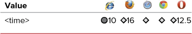
Table 12.13. Transition-Timing-Function Values
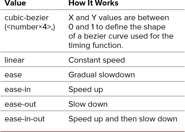
Table 12.14. Transition-Delay Values
3. Add more transitions as needed.
, opacity .5s ease, transform .25 ease-in-out 0;
You can add as many transitions as you want, separated by commas. If you are setting a transition for the transform value, be sure to use the browser extension version with the right transition browser extension, as shown here.
The example shown in this section uses the transition shorthand, but each of these properties can be set separately, using the transition-property, transition-duration, transition-timing-function, and transition-delay properties. Of course, you will need to set all of these properties independently for all three browser extensions as well as the standard CSS version, which can lead to a lot of code. Still, using these properties can be useful to override a particular value.
Putting It All Together
The completed code for transition-properties.css should look something like Code 12.5.
Code 12.5. Final transition-properties.css
/*** transition-properties.css ***/
aside, figure, a {
-webkit-transition: color .25s ease-out, opacity .5s ease .1s, -webkit-transform .25s ease-in-out;
-moz-transition: color .25s ease-out, opacity .5s ease .1s, -moz-transform .25s ease-in-out;
-o-transition: color .25s ease-out, opacity .5s ease .1s, -o-transform .25s ease-in-out;
transition: color .25s ease-out, opacity .5s ease .1s, transform .25 ease-in-out; }
aside {
-webkit-transform: rotate(-2deg);
-moz-transform: rotate(-2deg);
-o-transform: rotate(-2deg);
transform: rotate(-2deg); }
div.gallery {
position: relative;
width: 100%;
display: block;
overflow: visible;
height: 300px; }
div.gallery figure:hover {
opacity: 1;
z-index: 999; }
div.gallery figure {
position: absolute;
opacity: .5;
z-index: 0;
width: auto;
-webkit-transform-origin: left 25%;
-moz-transform-origin: left 25%;
transform-origin: left 25%;
-webkit-transform-style: flat;
-moz-transform-style: flat;
transform-style: flat;
-webkit-perspective: 5000;
-moz-perspective: 5000;
perspective: 5000;
-webkit-perspective-origin: 25% 25%;
-moz-perspective-origin: 25% 25%;
perspective-origin: 25% 25%;
-webkit-backface-visibility: visible;
-moz-backface-visibility: visible;
backface-visibility: visible; }
div.gallery figure#f1 {
top: -60px;
left: -5%;
-webkit-transform: scale(.5) rotate(10deg);
-moz-transform: scale(.5) rotate(10deg);
-o-transform: scale(.5) rotate(10deg);
transform: scale(.5) rotate(10deg); }
div.gallery figure#f2 {
top: 60px;
left: 25%;
-webkit-transform: perspective(250px) scale3d(.5,.75,1.5) rotate3d(-3,-3,-8,18deg);
-moz-transform: perspective(250px) scale3d(.5,.75,1.5) rotate3d(-3,-3,-8,18deg);
-o-transform: perspective(250px) scale3d(.5,.75,1.5) rotate3d(-3,-3,-8,18deg);
transform: perspective(250px) scale3d(.5,.75,1.5) rotate3d(-3,-3,-8,18deg); }
div.gallery figure#f3 {
right: -10%;
-webkit-transform: scale(.75)rotate(3deg);
-moz-transform: scale(.75)rotate(3deg);
-o-transform: scale(.75) rotate(3deg);
transform: scale(.75) rotate(3deg); }
div.gallery figure#f1:hover, div.gallery figure#f2:hover, div.gallery figure#f3:hover {
-webkit-transform: rotate(0);
-moz-transform: rotate(0);
-o-transform: rotate(0);
transform: rotate(0);
cursor: pointer; }
aside, figure, a {
-webkit-transition: color .25s ease-in, opacity .5s ease, -webkit-transform .25s ease-in-out 0;
-moz-transition: color .25s ease-in, opacity .5s ease, -moz-transform .25s ease-in-out 0;
-o-transition: color .25s ease-in, opacity .5s ease, -o-transform .25s ease-in-out 0;
transition: color .25s ease-in, opacity .5s ease, transform .25 ease-in-out 0; }
div.gallery figure#f1:hover, div.gallery figure#f2:hover, div.gallery figure#f3:hover {
-webkit-transform: rotate(0);
-moz-transform: rotate(0);
-o-transform: rotate(0);
transform: rotate(0);
cursor: pointer; }