
6. Text Properties
In This Chapter
Text is everywhere and is used for everything from the ingredients in breakfast cereal to an ode to a Grecian urn. It is the best system that humans have ever devised for recording complex thoughts. Many people think of text as simply a way to record words, but typography adds a voice to the meaning of the words. Typography affects how text appears by controlling not only the shapes and sizes of the letters used (the font), but also the spaces between letters, words, lines, and paragraphs.
Unfortunately, many of the challenges of typography on the Web have come about as a result of a need to circumvent the limitations of the medium. The challenge of Web typography is to improve screen text legibility, as well as to guide the viewer’s attention to important content. It’s a difficult balancing act, but this chapter prepares you with the right tools.
Getting Started
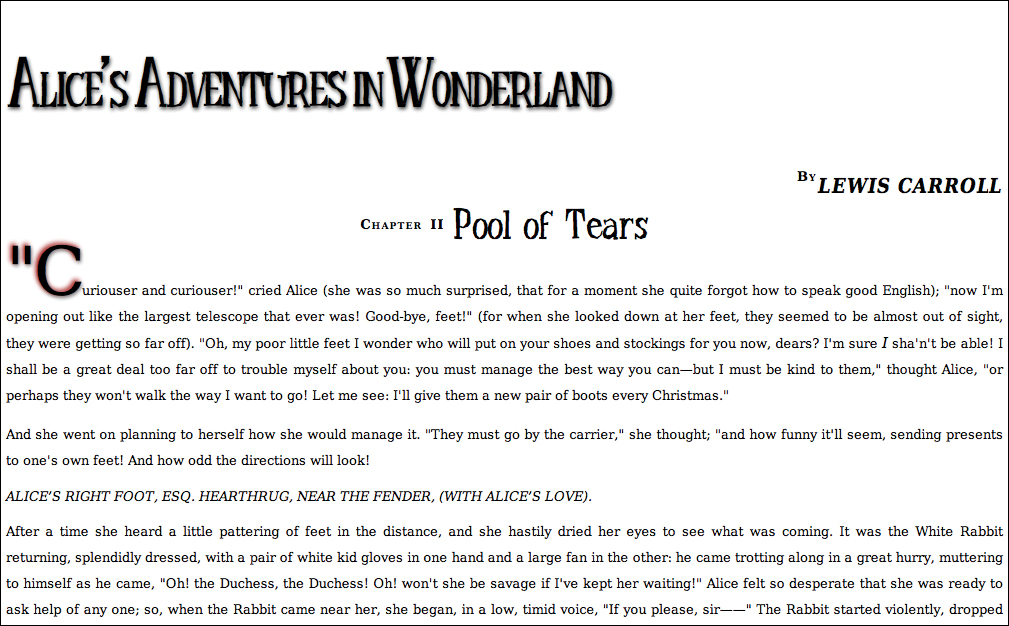
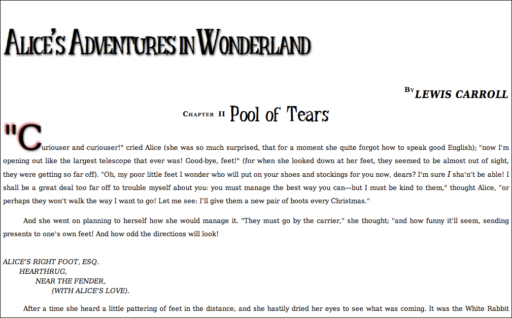
I’ll be pulling the sample code for this chapter from Chapter II of Alice’s Adventures in Wonderland. An expurgated version is shown in Code 6.1. I’ve included the address label that is a part of the chapter so we can play around with text spacing. This code links to the final CSS code from Chapter 5 and also links a new file—text-properties.css—that we will be building in this chapter and is presented in full at the chapter’s end.
Code 6.1. The HTML5 code used for the examples in this chapter.
<!DOCTYPE html>
<html lang="en">
<head>
<meta charset="utf-8">
<title>Alice’s Adventures In Wonderland | Chapter II</title>
<link href="../css/font-properties.css" type="text/css" rel="stylesheet" media="all">
<link href="../css/text-properties.css" type="text/css" rel="stylesheet" media="all">
</head>
<body id="chapter2" class="book aaiw chapter">
<section>
<header class="pageheader">
<hgroup>
<h1>Alice’s Adventures in Wonderland</h1>
<h2>By <cite>Lewis Carroll</cite></h2>
</hgroup>
</header>
<article>
<h2>Chapter II
<span class="chaptertitle">Pool of Tears</span>
</h2>
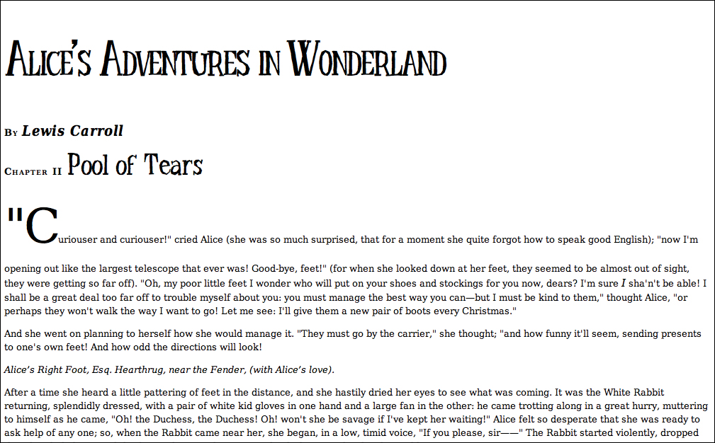
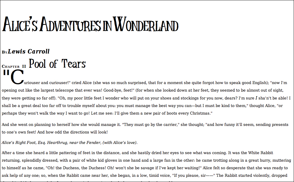
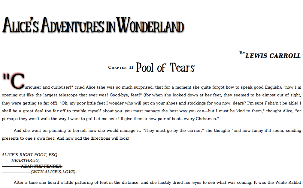
<p>Curiouser and curiouser!" cried Alice (she was so much surprised, that for a moment she quite forgot how to speak good English)...</p>
<p>And she went on planning to herself how she would manage it...</p>
<address>
Alice’s Right Foot, Esq.<br />
Hearthrug,<br />
near the Fender,<br />
(with Alice’s love).<br />
</address>
</article>
<footer>
<a href="AAIWL-ch03.html">Chapter I: Down the Rabbit Hold</a>
<a href="TOC.html">Table of Contents</a>
<a href="AAIWL-ch03.html">Chapter III - A Caucus-race and a Long Tale</a>
/footer>
</body>
</html>
Code 6.2. Added to text-properties.css—Space has been compressed in the level 1 heading (the book title) to create a cramped effect  . The chapter name has been spaced out; however, the spacing was overridden in the chapter number (“Chapter II”), so it appears normal. I’ve also closed up the spacing after the first letter in the first paragraph, which is being set as a drop cap.
/*** text-properties.css ***/
h1 {
letter-spacing: -.05em; }
h2 {
letter-spacing: 2px; }
h2 .chaptertitle {
letter-spacing: 0; }
h2 + p:first-letter {
letter-spacing: -.05em; }
Code 6.2 applied to Code 6.1: By changing its spacing, the book title takes on a slightly more distinctive, logo-like appearance, and spacing out the chapter title makes it stand out slightly.
Adjusting Text Spacing
CSS gives you the ability to easily adjust text spacing, including the space between individual letters (tracking), words, and lines of text in a paragraph (leading). Of course, you could apply non-breaking spaces and the line break tag to get a similar effect in straight HTML, but these “kludges” are difficult to implement, control, and change. With CSS, you have exact control over these elements.
Adjusting the space between letters (tracking)
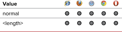
Tracking is the amount of space between letters in a word, which, in CSS, is controlled with the letter-spacing property (Table 6.1). More space between letters often improves text readability. On the other hand, too much space can hamper reading by making individual words appear less distinct.
Table 6.1. Letter-Spacing Values
To define tracking
1. Add the letter-spacing property to your CSS rule. Type letter-spacing in the CSS declaration list, followed by a colon (:) (Code 6.2).
letter-spacing:
2. Specify the amount of space between your letters.
-.05em;
Type a value for the letter-spacing property, using either of the following:
• A positive or negative length value, such as -.05em, which sets the distance between letters. For more information, see “Values and Units Used in This Book” in the Introduction.
• normal, which overrides inherited spacing attributes.
Tracking should not be confused with kerning. Although both can add space between letters to improve legibility, they work in different ways. See the sidebar “Tracking or Kerning?”
Generally, setting letter spacing in ems is preferred because it spaces the letters based on font size. When the text size is changed, the letter spacing automatically adjusts with it.
A positive value for letter-spacing adds space between letters; a negative value closes the space. A value of 0 does not add or subtract space but prevents justification of the text. (See “Aligning Text Horizontally” in this chapter.)
Code 6.3. Added to text-properties.css— When applied to Code 6.1, The words in the level 1 heading are spaced almost on top of each other, but this works because the words are visually separated by the capital letters  . The words in the chapter title class are spaced out. The copy (body text) is slightly spaced out, which has the overall effect of lightening the page by creating more white space.
/*** text-properties.css ***/
h1 { word-spacing: -.1em; }
h2 { word-spacing: 3px; }
p { word-spacing: .075em; }
.pageheader h2 {
word-spacing: -.3em; }
.pageheader h2 .cite {
word-spacing: 0; }
Code 6.3 applied to Code 6.1: The space between the words has been changed for effect in the titles and slightly increased to lighten the copy.
Adjusting space between words
Just as tracking and word spacing adjustments can both help and hinder legibility, adding a little space between words on the screen using the word-spacing property (Table 6.2) can make your text easier to read. But too much space interrupts the path of the reader’s eye across the screen and interferes with reading.
Table 6.2. Word-Spacing Values

To define word spacing
1. Add the word-spacing property to your declaration list. Type word-spacing in the CSS declaration list, followed by a colon (:) (Code 6.3).
word-spacing:
2. Specify the amount of space between words.
-.1em;
Set the value for word-spacing, using one of the following:
• A positive or negative length value, representing the amount of space between words (-.1em, for example). For more information, see “Values and Units Used in This Book” in the Introduction.
• normal, which overrides inherited values.
Like letter spacing, use word spacing very sparingly. Generally, the natural word spacing has been optimized for readability. Changing that spacing often does more harm than good.
Adjusting space between lines of text (leading)
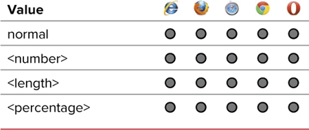
Anyone who has typed a term paper knows that they are usually double-spaced to make reading easier and allow space for comments. The leading between lines also can be increased for a dramatic effect by creating negative space between the text. The line-height property (Table 6.3) adds space between the text baselines (the bottoms of most letters).
To define leading
1. Add the line-height property to your rule. Type line-height in the CSS declaration list, followed by a colon (:) (Code 6.4).
line-height:
2. Specify the space between lines of text.
1.5;
Type a value for line-height, using one of the following options:
• A number to be multiplied by the font size to get the spacing value (2.0 for double-spacing, for example). Although a value of 2 works, it will not validate properly, so always include the decimal.
• A length value, such as 24px. The space for each line of text is set to this size regardless of the designated font size. So if the font size is set to 12px and the line height is set to 24px, the text will be double-spaced. See “Values and Units Used in This Book” in the Introduction.
• A percentage, which sets the line height proportionate to the font size used for the text.
• normal, which overrides inherited spacing values.
Code 6.4. Added to text-properties.css—The default line-height has been set in the body to be 1.5, but paragraph copy has been set to 2em. That will double-space the text  .
.
/*** text-properties.css ***/
body { line-height: 1.5; }
p { line-height: 2em; }
h2 + p:first-letter {
line-height: 24px; }
Code 6.4 applied to Code 6.1: The line height in the paragraphs has been loosened to make it easier to read and scan.
Adding space between lines of text enhances legibility—especially with large amounts of text. Generally, a line height of 1.5 to 2 times the font size is appropriate.
To double-space text, set the line-height value to 2 or 200%. Likewise, a value of 3 or 300% results in triple-spaced text.
You can use a percentage value lower than 100% or length values smaller than the font size to smash lines together. Although this effect may look neat in moderation, it won’t ingratiate you with your readers if they can’t actually read the text.
Line height can also be defined at the same time as the font size using the font shorthand property. (See “Setting Multiple Font Values at the Same Time” in Chapter 5.)
Setting Text Case
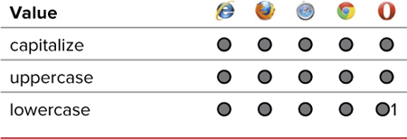
When you’re dealing with dynamically generated output, such as from a database, you can never be sure whether the text will appear in uppercase, lowercase, or a combination of the two. With the text-transform property (Table 6.4), you can control the ultimate case of the text no matter how it begins.
Table 6.4. Text-Transform Values
To define the text case
1. Add the text-transform property to your CSS. Type text-transform in the CSS declaration list, followed by a colon (:) (Code 6.5).
text-transform:
2. Specify the text case.
uppercase;
Type one of the following text-transform values to specify how you want the text to be treated:
• capitalize sets the first letter of each word to uppercase.
• uppercase forces all letters to uppercase.
• lowercase forces all letters to lowercase.
• none overrides inherited text-case values and leaves the text unaltered.
Code 6.5. Added to text-properties.css—The text-transform property lets you take control of the text case .
/*** text-properties.css ***/
address {
text-transform: uppercase; }
.pageheader h2 cite {
text-transform: uppercase; }
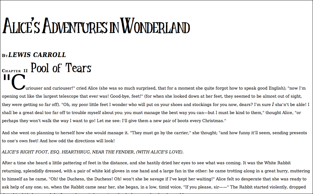
Code 6.5 applied to Code 6.1: Lewis Carroll’s name under the book title is all in caps (as opposed to small caps, explained in Chapter 5).
The text-transform property is best reserved for formatting dynamically generated text. If the names in a database are all uppercase, for example, you can use text-transform to make them more legible.
Keep in mind that capitalize will capitalize all letters in the text, even words such as “of” and “the” that should remain lowercase. In reality, capitalize is primarily useful for names.
DON’T TYPE YOUR TEXT IN ALL CAPS. When HTML text is in caps, it makes it a lot harder to control in CSS. Plus, anyone using an assistive device for reading will hear this as shouting. It’s better to use normal text plus text transform to style text as uppercase.
 Adding a Text Drop Shadow
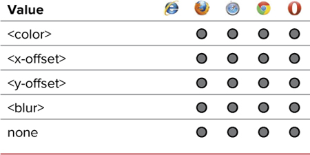
The drop shadow is a time-honored method for adding depth and texture to two-dimensional designs. Most browsers support the text-shadow property, part of CSS3 (Table 6.5), which allows you to define the color, offset (x and y), spread, and blur for any text drop shadow. Although this property will not currently work in other browsers, neither will it interfere with them.
To define the text shadow
1. Add the text-shadow property to your CSS rule. Type text-shadow in the CSS declaration list, followed by a colon (:) (Code 6.6).
text-shadow:
2. Specify the x, y offset. Type a space followed by two positive or negative length values separated by a space.
2px 3px
The first value is the vertical distance to offset the shadow (positive is down; negative is up). The second value is the horizontal offset (positive is right; negative is left).
3. Specify the amount of blur. Type a space and then a positive length value for the amount of blur to apply to the shadow. All negative values will be treated as 0.
5px
Code 6.6. Added to text-properties.css—The text-shadow property allows you to set the x,y offset and the blur radius.
/*** text-properties.css ***/
h1 {
text-shadow: 2px 3px 5px rgba(0,0,0,.75); }
article h2 {
text-shadow: 0px 1px 1px rgba(255,255,255,.6), 0px -1px 1px rgba(0,0,0,.6); }
h2 + p:first-letter {
text-shadow: -3px -3px 6px rgba(153,0,0,.9), 2px 3px 5px rgba(0,0,0,.5); }
Code 6.6 applied to Code 6.1: Shadows give the illusion of depth to the page.
Although this is a “shadow,” you can use any color for it. Therefore, if your text is on a dark background, you could use a light color to create a drop “glow.”
In Chapter 11, you’ll learn how to set a box-shadow that works a lot like the text-shadow property but is applied to the element’s box.
4. Specify the color. Type a space and then a color value for the shadow.
rgba(0,0,0,.75);
For more information on color values, see “Choosing Color Values” in Chapter 7.
5. Add more shadows. You can add multiple shadows (as many as you want) to any block of text. To do so, you can add another text-shadow declaration to the rule, or add a comma followed by another definition.
text-shadow: -3px -3px 6px rgba(153,0,0,.9),
2px 3px 5px rgba(0,0,0,.5);
You can set the value to none to override a shadow that was previously set in the CSS.
Text shadow effects
Although it may seem like a simple effect, the text shadow offers a lot of power to designers beyond producing simple three-dimensional shadows. Because the shadow can be any color and you can stack numerous shadows on top of each other, you can create a wide variety of great special effects with them.
Here are just a few examples that I created classes for:

Blur
Blur creates the illusion that the text is out of focus. Stack shadows with the same color as the text, but with increasing amounts of blur to make the text look blurry.
.blur {
background-color: #ccc;
color: rgba(0,0,0,1),;
text-shadow: 0px 0px 2px rgba(0,0,0,1),
0px 0px 4px rgba(0,0,0,1),
0px 0px 8px rgba(0,0,0,1);}

Letterpress
Letterpress text looks as if old-style print press letters were used. To create the effect, use low contrast or no-contrast between the text and background colors, and then add a drop shadow with 1px offset down and white with 30% opacity. If you are using dark colors, use up and black with 30% opacity.
.letterpress {
background-color: #333;
color: #222;
text-shadow: 0px 1px 1px rgba(255,255,255,.3),
0px -1px 1px rgba(0,0,0,.3);}

Emboss
Emboss reverses the letterpress effect, giving the illusion that the text is rising off of the page.
.emboss {
background-color: #ccc;
color: #ccc;
text-shadow: -1px -1px 1px rgba(255, 255, 255, 0.75),
1px 1px 1px rgba(0, 0, 0, 0.75); }
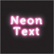
Neon Glow
The neon glow effect gives a soft, colorful glow to text, as if it is made from neon tubes. To create this effect, use white text and then stack drop shadows with increasing blur, starting with white and shifting to the desired neon color.
.neon {
background-color: #000;
color: #fff;
text-shadow: 0 0 5px #fff,
0 0 10px #fff,
0 0 15px #fff,
0 0 20px #ff2d95,
0 0 30px #ff2d95,
0 0 40px #ff2d95,
0 0 50px #ff2d95,
0 0 75px #ff2d95;
letter-spacing: 5px; }

Fire
The fire effect creates the illusion of heat coming off the letters. To create the effect, start with white text, and then stack shadows, going from white to yellow to orange to red, while increasing the y-offset and blur with each.
.fire {
background-color: #333;
color: #fff;
text-shadow: 0px -1px 4px white,
0px -2px 10px yellow,
0px -10px 20px orange,
0px -18px 40px red; }

3D Text Blocks
The 3D text block effect creates the illusion that the letters have depth and mass, like lettering in retro science-fiction movies. To create the effect, start with white text and then stack successively darker shadows, increasing the increment by 1px for as many levels as you want to achieve the desired depth. The offset will depend on the direction you want the text to be angled.
.d3 {
background-color: #ccc;
color: #fff;
text-shadow: 0px 1px 0px #999,
0px 2px 0px #888,
0px 3px 0px #777,
0px 4px 0px #666,
0px 5px 0px #555,
0px 6px 0px #444,
0px 7px 0px #333,
0px 8px 7px #001135; }
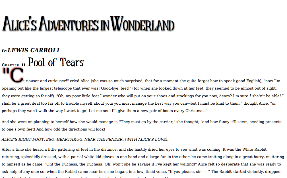
Code 6.7. Added to text-properties.css—The h2 in the header is right justified , whereas paragraphs are fully justified.
/*** text-properties.css ***/
body { text-align: left; }
h2 { text-align: center; }
header h2 {
text-align: right; }
p { text-align: justify;
text-align-last: left;
text-justify: distribute; }
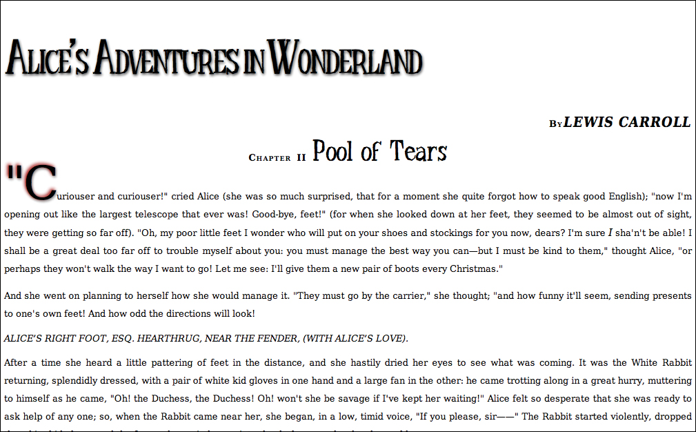
Code 6.7 applied to Code 6.1: Although it’s a bit zig-zaggy with left-, right-, center-, and fully-justified text, we’ll be changing the title and byline formatting later in this book when I talk about positioning.
Aligning Text Horizontally
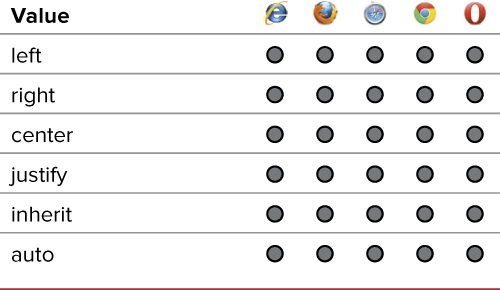
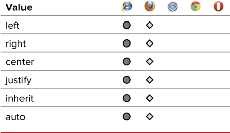
Traditionally, text is aligned at its left margin (left justified) or fully justified, which aligns the text at both the left and right margins (often called newspaper style). In addition, for emphasis or special effect, text can be centered on the screen or even right justified. The text-align property (Table 6.6) gives you control of the text’s alignment and justification.
Although the text-align property was not updated for CSS3, two new properties were added that can directly affect it. The text-align-last property allows you to treat the justification in the last line of a block of text separately from the rest of the block (Table 6.7). This is especially useful for realizing interesting design effects, such as square blocks of text, created by allowing full justification of the last text line.
Table 6.7. Text-Align-Last Values
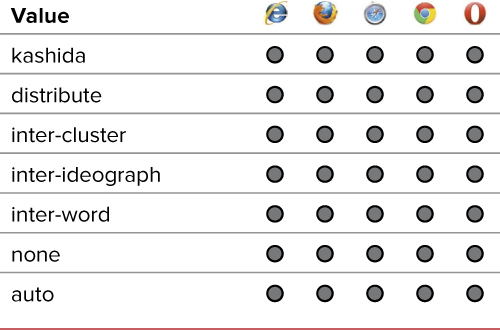
Additionally, when you are justifying text, you can now specify the justification method used, which is especially useful for text in non-Western languages (Table 6.8).
Table 6.8. Text-Justify Values
To define text alignment and spacing, and justify the last line of text
1. Add the text-align property to your CSS. Type text-align in the CSS declaration list, followed by a colon (:) (Code 6.7) and then specify the horizontal alignment.
text-align: center
Use one of the following alignment styles:
• left to align the text on the left margin.
• right to align the text on the right margin.
• center to center the text within its area.
• justify to align the text on both the left and right margins.
• inherit makes the text take its parents’ alignment.
• auto uses the default alignment, generally left.
2. If you want the last line of a paragraph to be treated differently from the rest of the text, add the text-align-last property. Type text-align-last in the CSS declaration list, followed by a colon (:) (Code 6.7) and specify how text in the last line of a block of text is treated:
text-align-last: center;
Use one of the following alignment styles:
• left to align the text in the last line to the left margin.
• right to align the text in the last line to the right margin.
• center to center the text within the width of the text area.
• justify to align the text on both the left and right margins, adding extra space between words and letters.
• inherit to make the text take its parents’ alignment.
• auto to use the default alignment (generally left alignment).
You should also include the -moz extension version for full compatibility.
-moz-text-align-last: center;
3. If you are using justified text (text-align: justify), add the text-justify property. Type text-justify in the CSS declaration list, followed by a colon (:) (Code 6.7) and specify how justified text is treated:
text-justify: distribute;
Use one of the following justification styles:
• kashida to justify text in cursive scripts by elongating their connections.
• distribute to add space between words and letters.
• inter-cluster to add space in content that has no inter-word spacing, such as many Asian languages.
• inter-ideograph to add space between words or block scripts as with certain Asian scripts.
• inter-word to add space between words only.
• none to disable justification.
• auto to use the default alignment (generally left alignment).
Fully justifying text may produce some strange results on the screen because spaces between words must be added to make each line the same length. In addition, opinions differ as to whether full justification helps or hinders readability.
Aligning Text Vertically
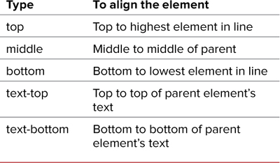
Using the vertical-align property, you can specify the vertical position of one inline element relative to the elements above or below it . This means that the vertical-align property (Table 6.9) can be used only with inline tags and table tags—that is, tags without a break before or after them, such as the anchor (<a>), image (<img>), emphasized text (<em>), strong text (<strong>), and table data (<td>) tags.
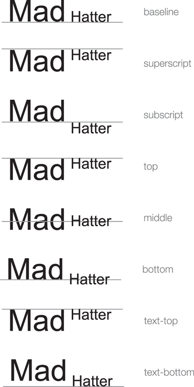
The different alignment types. The lines are shown only as guides.
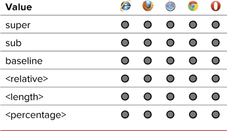
Table 6.9. Vertical-Align Values
To define vertical alignment
1. Add the vertical align property to your rule. Type vertical-align in the declaration list, followed by a colon (:) (Code 6.8).
vertical-align:
Code 6.8. Added to text-properties.css—Use vertical-align with relative or absolute values, depending on the results you desire .
/*** text-properties.css ***/
h2 .chaptertitle {
vertical-align: super; }
.pageheader h2 cite {
vertical-align: -.6em; }
Code 6.8 applied to Code 6.1: The chapter number and “by” in the byline have been moved up relative to the text to which they refer.
2. Specify the vertical alignment.
super;
Type a value for the vertical text alignment using one of these options:
• super superscripts the text above the baseline.
• sub subscripts the text below the baseline.
• baseline places the text on the baseline (its default state).
• A relative value from Table 6.10 that sets the element’s alignment relative to its parent’s alignment. To align the top of your text with the top of the parent element’s text, for example, you would use text-top.
Table 6.10. Setting an Element’s Position Relative to the Parent Element
• A percentage value that raises or lowers the element’s baseline proportionate to the parent element’s font size (25%, for example).
Superscript is great for footnotes that can be hyperlinked to notes at the bottom of the current page or to another Web page.
The sup and sub tags can also be used for superscript and subscript, but should not be used for design (as in this case) but for footnotes or mathematical notation.
If you are creating a multicolumn layout, you might encounter problems with vertical alignment when it doesn’t appear where it should be. In those cases, a good fallback is to use relative positioning, as explained in Chapter 10.
Indenting Paragraphs
Indenting the first word of a paragraph several spaces (five spaces, traditionally) is the time-honored method of introducing a new paragraph.
On the Web, however, indented paragraphs haven’t worked because most browsers compress multiple spaces into a single space. Instead, paragraphs have been separated by an extra line break.
Using the text-indent property (Table 6.11), you can specify extra horizontal space at the beginning of the first line of text in a paragraph and restore the traditional paragraph style.
Table 6.11. Text-Indent Values
To define text indentation
1. Add the text indent property to your CSS. Type text-indent in the CSS declaration list, followed by a colon (:) (Code 6.9).
text-indent:
2. Specify the amount of indentation.
3em;
Type a value for the indent, using one of the following options:
• A length value such as 3em creates a nice, clear indent. (See “Values and Units Used in This Book” in the Introduction.)
• A percentage value indents the text proportionate to the parent’s (paragraph) width (10%, for example).
If you are using indentation to indicate paragraphs, you should set the margin and padding of paragraphs to 0 to override the <p> tag’s natural tendency to add space between paragraphs. You’ll learn more about margins and padding in Chapter 8.
Code 6.9. Added to text-properties.css—Although you can indent any block of text, indentation is generally associated with paragraphs, and I’ve set all of the paragraphs to indent 3em . However, the first paragraph in a section is generally not indented; therefore, I’ve set the first paragraph after a header to always have an indention of 0.
/*** text-properties.css ***/
p { text-indent: 3em; }
header + p {
text-indent: 0; }

Code 6.9 applied to Code 6.1: All paragraphs except the first paragraph are indented a space that is equivalent to two letters. The indent space will adjust with the font size.
Because indenting is more common in the print world than the online world, you may want to consider using indents for only the printer-friendly versions of your page.
Controlling White Space
As you’ve learned, browsers traditionally collapsed multiple spaces into a single space unless a <pre> tag was used. CSS lets you allow or disallow that space collapsing, as well as designate whether text can break at a space (similar to the <nobr> tag) using the white-space property (Table 6.12).
Table 6.12. White-Space Values
An excellent example of this is the mouse tail poem from Chapter 3 of Alice’s Adventures in Wonderland. This poem is shaped like a curvy mouse tail . If the white-space property value is assigned pre for the poem class, all those spaces collapse . However, if it’s assigned a value of nowrap, the spaces and line breaks are ignored, and the text stretches as far to the right on the page as necessary .
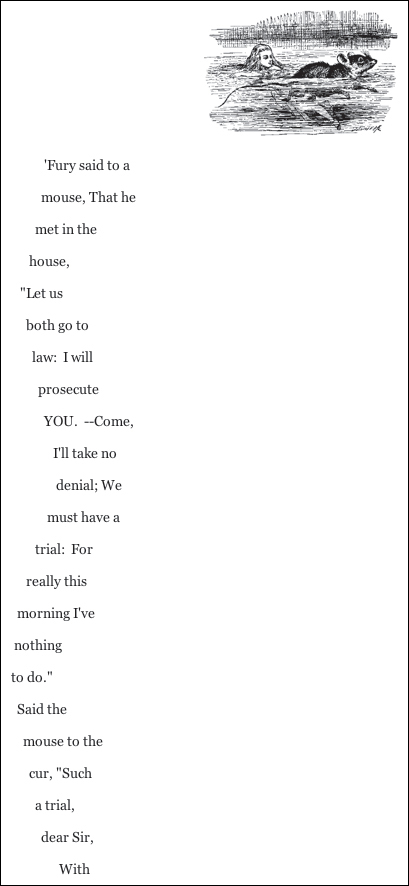
The pre value keeps all spaces so the poem retains its distinctive mouse tail shape rather than collapsing.
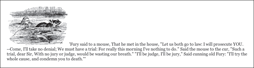
Without the pre value, the spaces collapse along with the mouse tail.
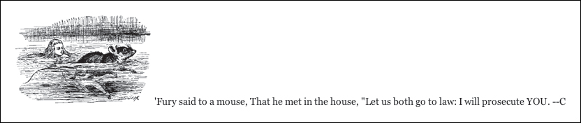
With the no-wrap value, the poem stretches vertically across the window, forcing a horizontal scroll to accommodate its width.
To define white space
1. Add the white space property to your CSS rule. Type white-space in the CSS declaration list, followed by a colon (:) (Code 6.10).
white-space:
2. Specify how you want white space treated.
pre;
Type one of the following options:
• pre preserves multiple spaces.
• nowrap prevents line wrapping without a <br> tag.
• normal allows the browser to determine how spaces are treated. This setting usually forces multiple spaces to collapse into a single space.
Do not confuse the <nobr> and <pre> tags with the white-space property values of nowrap and pre. Although they basically do the same thing, the no break tag is being phased out (deprecated) and should not be used.
The text content of any tag that receives the nowrap value runs horizontally as far as necessary regardless of the browser window’s width. The user may be forced to scroll horizontally to read all the text, so this setting is usually avoided.
Code 6.10. Added to text-properties.css—The address tag is set up to preserve the HTML text as it appears in the code by setting the white-space to pre. This is useful for formatting the note that Alice is sending to her foot in the formatting that the author intended  .
.
/*** text-properties.css ***/
.asis { white-space: pre; }
Code 6.10 applied to Code 6.1: The note has been set along a diagonal by adding spaces. These would collapse if not for the pre value applied to it.
Code 6.11. Added to text-properties.css—I use text decoration to set up a class called .strike that can be used to strike out unwanted text and to turn off the unwanted underline on hypertext links . Don’t worry, though. We’ll add underlining back with more control using the border-bottom property in Chapter 10.
/*** text-properties.css ***/
a { text-decoration: none; }
.strike {
text-decoration: line-through; }
Code 6.11 applied to Code 6.1: The address has been struck out.
Code 6.11 applied to Code 6.1: The links in the footer of the page are no longer underlined.
Decorating Text
Using the text-decoration property (Table 6.13), you can adorn text in one of three ways: underline, overline, or line-through. Used to add emphasis, these decorations attract the reader’s eye to important areas or passages on your Web page.
Table 6.13. Text-Decoration Values
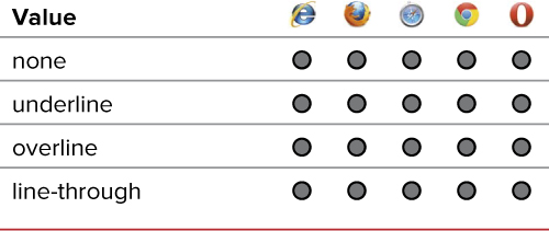
To decorate (or undecorate) text
1. Add the text decoration property. Type text-decoration in the CSS declaration list, followed by a colon (:) (Code 6.11).
text-decoration:
2. Specify the text decoration you want (or not).
none;
Type a value for the text-decoration property. Choose one of the following:
• underline places a line below the text.
• overline places a line above the text.
• line-through places a line through the middle of the text (also called strikethrough).
• none overrides decorations set elsewhere.
You can also type a space and add another text-decoration value (Table 6.13). As long as the first value is not none, you can use multiple text decorations by adding more values in a list separated by spaces, as follows:
overline underline line-through
Ding dong, the blink is dead. With CSS3, the blink value has been officially removed as a text decoration option, and the <blink> HTML tag is long gone. Now if you want to annoy your visitors with blinking text, you’ll have to use Adobe Flash.
Text decorations are applied across an entire text block element rather than on a letter-by-letter basis. This means that a child element cannot override the text decoration set by its parent.
Although a child element cannot override its parent’s text decoration, child elements can have additional text decoration added to them. In the example, notice that the emphasis tag uses strikethrough, which is added to the underlining already supplied by the paragraph tag.
Striking through text is useful for text that you want to show as deleted. For example, I’ve used strikethrough in online catalogs that include sale prices. I show the original price in strikethrough with the sale price next to it. That said, using the <del> tag is a better option because it communicates deletion.
Honestly, the only time I use text decoration is to turn off hypertext link underlining. Underlining is just too indiscriminate, placing a hard line under the text in the same color as the text. Some work is being done to provide more underline control to set the space, color, and style of the underline.
Coming Soon!
Several text properties are still under development by the W3C and have yet to be substantially implemented in browsers. You may see them soon, but at the time of this writing I can’t give a specific way to implement them across browsers:
Outlining text—Adding an outline around the text (also called a text stroke) is another way to make text distinctive, most often for titles. Webkit already includes a rudimentary property for this, but the syntax is likely to change in the final W3C version.
Kerning—Remember that letter spacing is not kerning. The new font-kerning property will provide some rudimentary kerning capabilities.
Hanging punctuation—One common problem in typography is what to do when alphanumeric characters are not present at the beginning of a block of text, as with quotation marks. The hanging-punctuation property will allow you to define how these characters are treated, either placing them in the edge of the text block or outside.
Text line decoration—As mentioned in my explanation of the text-decoration property, several new associated properties are being developed to style the text decoration, including text-line-color, text-line-style, text-line-skip, and text-underline-position.
To follow the development of these styles, visit the CSS3 Text Module at www.w3.org/TR/css3-text.
Putting It All Together
Code 6.12 Shows the final results for the file text-properties.css, which we have been building this chapter.
Code 6.12. text-properties.css in its entirety.
/*** text-properties.css ***/
body {
line-height: 1.5; }
h1 {
letter-spacing: -.05em;
word-spacing: -.1em;
line-height: .9em;
text-shadow: 2px 3px 5px rgba(0,0,0,.75); }
h2 {
letter-spacing: 2px;
word-spacing: 3px;
line-height: 1em;
text-align: center; }
header h2 {
text-align: right; }
article h2 {
text-shadow: 0px 1px 1px rgba(255,255,255,.6), 0px -1px 1px rgba(0,0,0,.6); }
h2 .chaptertitle {
letter-spacing: 0;
vertical-align: middle; }
p {
line-height: 2em;
text-align: justify;
text-indent: 3em; }
h2 + p {
text-indent: 0; }
h2 + p:first-letter {
letter-spacing: -.05em;
line-height: 24px;
text-shadow: -3px -3px 6px rgba(153,0,0,.9), 2px 3px 5px rgba(0,0,0,.5); }
address, blockquote {
text-transform: uppercase;
white-space: pre; }
a {
text-decoration: none; }
.delete {
text-decoration: line-through; }
.pageheader h2 {
word-spacing: -.3em;
text-align: right; }
.pageheader h2 cite {
word-spacing: 0;
text-transform: uppercase;
vertical-align: -.6em; }