
14. Responsive Web Design
In This Chapter
Designing with Progressive Enhancements
Resetting Browser Default Styles
Adjusting CSS for Internet Explorer
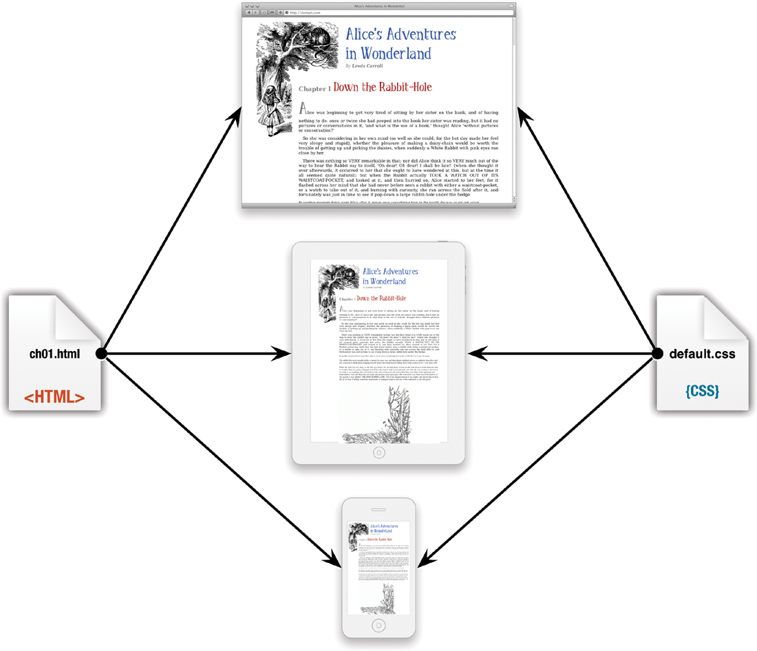
Web design is at a crossroads. For most of this book, I showed designs and examples presented in a computer-based browser. However, more and more web content is being delivered to smart phone- and tablet-based browsers. It may surprise you to learn that web surfing via these mobile devices may soon overtake and surpass the computer. For Web designers, the problem is that one size does not fit all.
You can use several strategies to deal with the various devices—ignoring them is not a viable strategy—but the best of these solutions is simply to use the same HTML code with layout and content adjusted using CSS and media queries.
In this chapter, you’ll learn the basic techniques for responsive design, including resetting styles, adjusting CSS for Internet Explorer, and how to easily adjust your page design to fit the device it is delivered to.
Getting Started
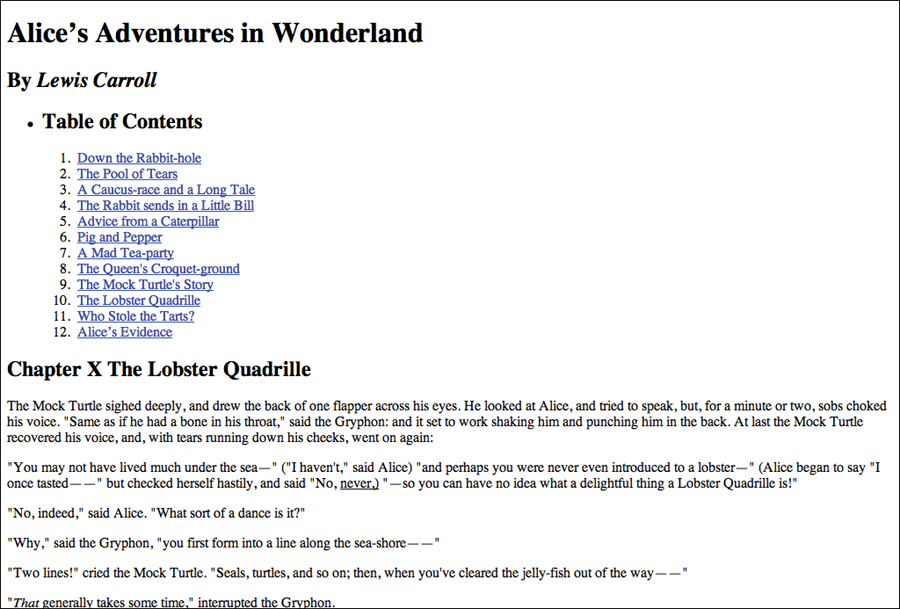
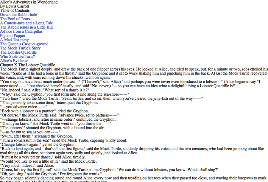
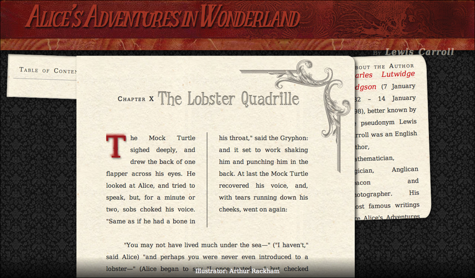
This chapter uses Chapter 10 from Alice’s Adventures in Wonderland with the styles added in Chapters 5–13. It includes the Table of Contents and the aside that you placed in columns in Chapter 13. Now we’ll need to figure out how they are treated when the screen size is smaller.
Code 14.1. The HTML5 code you’ll be using in this chapter 
 .
.
<!DOCTYPE html>
<html lang="en">
<head>
<meta charset="utf-8">
<title>Alice’s Adventures In Wonderland | Chapter X</title>
</head>
<body id="chapter10" class="book aaiw chapter">
<header class="page">
<hgroup>
<h1>Alice’s Adventures in Wonderland</h1>
<h2>By <cite>Lewis Carroll</cite></h2>
</hgroup>
</header>
<section>
<nav class="toc">
<ul class="menu">
<li><h2>Table of Contents</h2></li>
<ol class="drop">
<li><a href="AAIWL-ch01.html">Down the Rabbit-hole</a></li>
<li><a href="AAIWL-ch02.html">The Pool of Tears</a></li>
<li><a href="AAIWL-ch03.html">A Caucus-race and a Long Tale</a></li>
<li><a href="AAIWL-ch04.html">The Rabbit sends in a Little Bill</a></li>
<li><a href="AAIWL-ch05.html">Advice from a Caterpillar</a></li>
<li><a href="AAIWL-ch06.html">Pig and Pepper</a></li>
<li><a href="AAIWL-ch07.html">A Mad Tea-party</a></li>
<li><a href="AAIWL-ch08.html">The Queen's Croquet-ground</a></li>
<li><a href="AAIWL-ch09.html">The Mock Turtle's Story</a></li>
<li><a href="AAIWL-ch010.html">The Lobster Quadrille</a></li>
<li><a href="AAIWL-ch011.html">Who Stole the Tarts?</a></li>
<li><a href="AAIWL-ch012.html">Alice’s Evidence</a></li>
</ol>
</ul>
</nav>
<article>
<h2>Chapter X
<span class="chaptertitle">The Lobster Quadrille</span>
</h2>
<p>The Mock Turtle sighed deeply, and drew the back of one flapper across his eyes. He looked at Alice, and tried to speak, but, for a minute or two, sobs choked his voice. "Same as if he had a bone in his throat," said the Gryphon: and it set to work shaking him and punching him in the back. At last the Mock Turtle recovered his voice, and, with tears running down his cheeks, went on again:</p>
...
</article>
<aside>
<h2>About the Author</h2>
<p><b><a href="#">Charles Lutwidge Dodgson</a></b> (7 January 1832 – 14 January 1898), better known by the pseudonym Lewis Carroll was an English author, mathematician, logician, Anglican deacon and photographer. His most famous writings are Alice's Adventures in Wonderland and its sequel Through the Looking-Glass, as well as the poems "The Hunting of the Snark" and "Jabberwocky", all examples of the genre of literary nonsense. He is noted for his facility at word play, logic, and fantasy, and there are societies in many parts of the world (including the United Kingdom, Japan, the United States, and New Zealand) dedicated to the enjoyment and promotion of his works and the investigation of his life.</p>
</aside>
</section>
<footer>
Illustrator: Arthur Rackham
</footer>
</body>
</html>
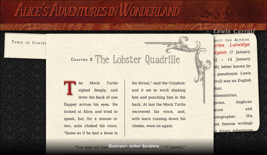
The Web page (Code 14.1) before responsive design is applied.
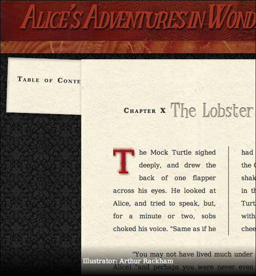
When the page width is reduced, the design simply scrolls horizontally off the page.
What Is Responsive Design?
Clearly, a one-for-all strategy will not work . A layout that works in one device may become cramped and unusable in another. Instead, our design must be responsive, changing as needed based on the user’s context as generally determined by the device she is using and its available screen resolution. Most responsive designs will then use break points where the interface needs to radically change for different contexts and adapt to make smaller adjustments for specific devices .
One size does not fit all. The style sheet that looks good on a computer screen does not look as good on a tablet or smart-phone.
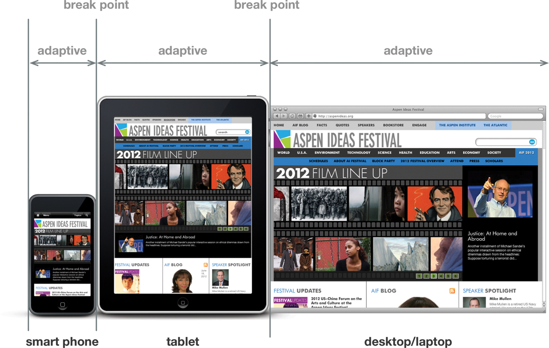
Responsive design uses break points when the interface needs to change radically, and adaptive design to make minor adjustments for different devices.
To do this, we’ll use media queries to “ask” the device about itself, and then deliver styles accordingly  . The server will contain an assortment of style sheets, which are then assembled to match the capabilities of the device.
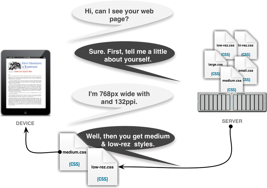
Small, medium, or large? Let the device tell you.
The approach that is often called “responsive design” is actually a combination of techniques used to create Web pages that optimize themselves to the end user’s environment, regardless of her browser, version, or device.
A responsive design includes:
• Progressive enhancement: This is not a specific code to be deployed, but a general design philosophy that you will need to apply to your development decisions. It’s built on the idea that designs should scale up or down depending on the environment they are displayed in.
• Resetting styles: To ensure that the default browser styles interfere as little as possible with the end design, we will manually reset margins, padding, and other default style values. This has to be done only once per site, but ensures better conformity across all browsers and devices.
• Conditional styles for Internet Explorer: Although recent versions of Internet Explorer have come a long way in adopting CSS standards, you may need to adjust your design for older IE versions.
• Adaptive styles: Adaptive styles replace pixel perfection with more fluid relative sizes, allowing the layout to stretch and shrink within the confines of the screen dimensions. For example, you would need to make interface changes between an iPhone and an iPad because they have substantially different contexts. However, an iPhone and an Android smart phone share similar contexts, so you could maintain similar designs; but their exact sizes may vary, requiring some design adaptation.
• Break points: Adaptive styles get you only so far. Responsive design uses specific break points at which point the design is more radically adjusted, generally between small devices (such as smart phones), medium devices (tablets), large devices (computer monitors), and extra-large devices (high-definition televisions).
Designing with Progressive Enhancements
It’s clear that not all browsers are created equal, so why should we expect all Web sites to treat them that way? For years Web designers have tried to design to the lowest common denominator (such as Internet Explorer), and ignore new features in the belief that they had to create the same, pixel-perfect experience in all browsers.
Pixel perfection is a user-experience philosophy that dictates that a Web design must look exactly the same on every version of every browser.
In contrast, progressive enhancement is a design philosophy that recommends using newer technologies (such as CSS3) even though the design may not look exactly the same in every browser. What’s more important is that on every target device, the design ultimately looks as good as possible with as little extra design and coding work as possible .
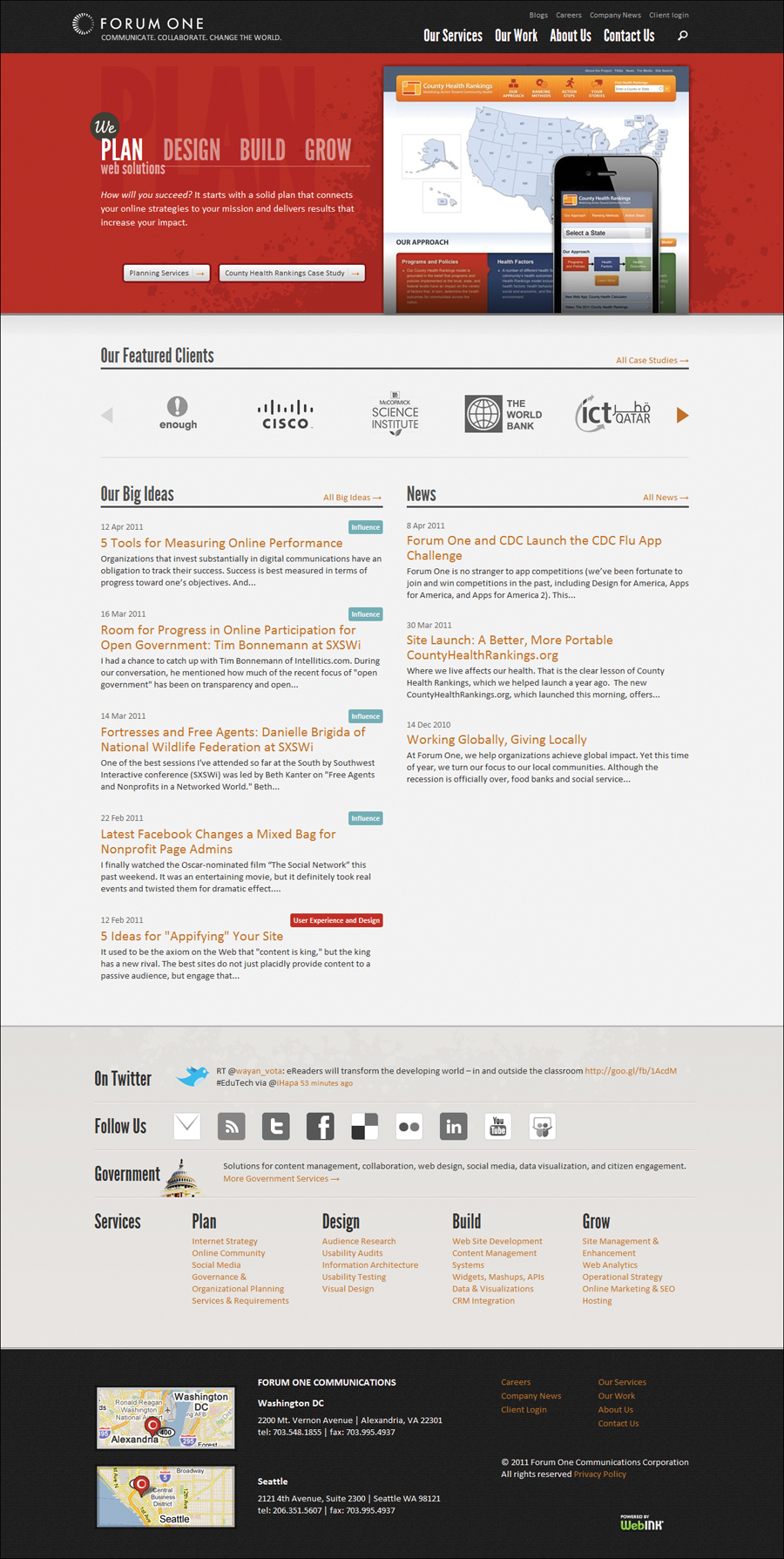
Forum One uses progressive enhancement to style its pages using CSS to add rounded corners to buttons, gradients, and shadows. This is how forumone.com looks in Chrome.
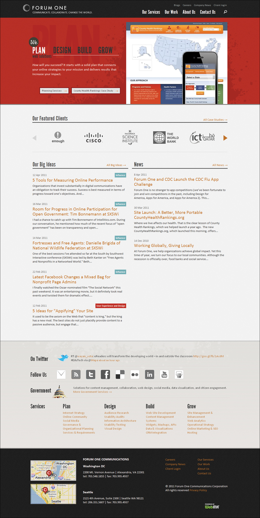
This is the same page in Internet Explorer 7. Notice that the buttons are no longer rounded and that the gradient is missing from the bottom of the portfolio image. These small touches add texture to the design, but are not essential to the site’s content or functionality.
How does it work?
Using progressive enhancement is critical when designing across multiple browsers and across multiple devices, because when it comes to designing for smart phones and tablets, the desire to create pixel-perfect designs can actually be counter-productive. Responsive design relies on the fact that the designs will automatically adjust to devices.
However, designing this way will take some special considerations. I recommend that you follow these simple guidelines:
• Basic content is accessible to all browsers: A design may look different from browser to browser and device to device, but all of the same content is available, regardless of its presentation. However, be careful not to add styles that will prevent content from appearing. For example, you might think it looks cool to put white text on a white background with a text-shadow to make it pop. But what happens when the browser does not support text shadows? The text disappears.
• Basic functionality is accessible to all browsers: An interaction may not act exactly the same in all contexts, but the user can perform a function with the same outcome. For example, you can enhance menus with CSS transitions, drop-downs, and other flourishes; just make sure that every user can still use the same navigation.
• Enhanced layout is provided by externally linked CSS: The content should be kept separate from the code used to style it. In other words, always place all styles in external style sheets (see Chapter 3).
• The end user’s styles should be honored: Many Web surfers have customized styles set for their browser—often because of vision impairments—that allow them to use the Web most effectively. You shouldn’t get in the way of those styles.
Graceful degradation
This means that you can use styles like border-radius, box-shadow, text-shadow, and others that may not work in older browsers, as long as they do not prevent the user from using the site and all of its functionality when they do not appear. The design may not look equally polished in all situations, but the site still performs all necessary tasks.
Graceful degradation might require you to use conditional styles for older versions of Internet Explorer, but generally, it should not take nearly as much extra work as pixel perfection.
Why should I use progressive enhancement?
Pixel perfection has a strong track record in Web design, and it may take a while to convince clients and other teammates that progressive enhancement is a better way. However, I generally find these arguments do the trick:
• Faster to develop—Rather than spending time kludging together a bunch of images for rounded corners, drop shadows, and other effects, a few lines of code take care of it all.
• Cheaper to maintain—Changing code is much more cost effective than reworking, recutting, and redeploying images.
• Better looking—Since the styles are native to the browser, they will display more precisely than images that are shoehorned in.
If these arguments don’t sway your client, then compare a budget for designing with progressive enhancements to a pixel perfect budget. Usually the relative costs will convince even the most stubborn client to approve progressive enhancement.
The world of Web design is becoming an increasingly complex place to live. Just as computer screens get larger, browsers get more consistent, and connection speeds get faster, the landscape is undergoing a seismic shift to accommodate the smaller screens and slower speeds of mobile devices. The number of different screen sizes and resolutions is constantly growing . I won’t even bother to list the most common mobile devices in this book, because they will probably change between now and the time the book is published.
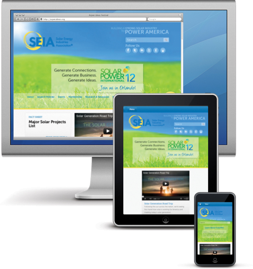
The Solar Energy Industries Association uses a responsive design multi-screen strategy that allows the same Web page to appear optimally across a wide range of screen sizes and user contexts.
• Mobile app: You could build separate applications to run in the various devices. Unfortunately, since each device will require separate design and development, this can get expensive, or require you to ignore possible users.
• Mobile site: You can build a site—with a separate URL—customized for mobile devices. Generally, these are built separately from the general Web site, take more design and development time, and are generally designed for the lowest-level browser.
• Responsive design site: You can build a site that adapts to its environment using media queries. It may require a little extra work to adapt the design to different “break points,” but these sites will likely run efficiently on the widest number of devices.
Resetting Browser Default Styles
In Chapter 2, you learned about browser default styles. Recall that browser developers set the default styles applied by HTML tags. Before you get too far into the responsive design weeds, start by resetting those default styles to make sure they are the same regardless of the browser you are designing for.
Far too many Web sites are designed by default . The designers and developers allow the browser to have the final word on how the content is displayed. Additionally, all browser default styles are not the same. CSS resets were developed to level the playing field and help prevent “vanilla” designs .
A page with no CSS applied.
The same page with the simple reset applied.
The exact CSS reset you choose will depend on your design needs. I like to keep my reset simple, adding styles to specific tags only as needed. However, several styles are inconsistent or (in my opinion) poorly set in most browsers.
Redefining important CSS properties (generally to none or 0) provides a few benefits:
• Reduces bad styles. Undoes some of the questionable and downright annoying styles added by browsers, and eliminates the styles that simply do not work. One example is using an outline to highlight items that are in focus, such as form fields. Although highlighting is useful for keyboard navigation, you should design this yourself.
• Eliminates design by default. Sets a level playing field from which to begin a design. Rather than allowing the browser to dictate your page appearance, you take control.
• Makes browser styles consistent. Ensures that values across all browser types and versions are the same. Because browsers slightly vary their default style values, a good reset will allow your designs to appear with greater consistency regardless of how your visitor is viewing it.
To use a CSS reset, simply add the desired code at the very top of your CSS code. That’s it. The code does the rest.
A simple CSS reset
The easiest way to reset styles is to use the universal selector and set the default styles you want applied to all tags, as shown in Code 14.2. Remember that you want to keep your CSS reset compact. Code 14.3 does the same thing but removes all spaces and returns.
This is a quick way to reset the most important styles, but it has one drawback: IE6 does not recognize the universal selector. If you are concerned about supporting IE6, you will want to include all the HTML tags in the selector list. The advantage of using the universal selector, other than compactness, is that it will always apply itself to new HTML tags as they become available.
Code 14.2. cssreset-simple.css—This version of the CSS uses the universal selector to reset the browser default values of several key properties, including margin, padding, border, outline, line-height, vertical-align, and text-decoration.
/*** cssreset-simple.css ***/
* { margin: 0;
padding: 0;
border: 0;
outline: 0;
font-size: 100%;
font-style: normal;
font-weight: normal;
line-height: 1;
vertical-align: baseline;
text-decoration: none; }
Code 14.3. cssreset-simple.css—The same code as Code 14.2, but compressed by removing all line breaks and spaces.
/*** cssreset-simple.css ***/
*{margin:0;padding:0;border:0;outline:0; font-size: 100%;font-style: normal;font-weight: normal;line-height: 1;vertical-align:baseline;text-decoration:none;}
Code 14.4. cssreset-YUI2.css—Developed by Yahoo, the YUI2 reset does a more thorough job of overriding specific browser default styles.
/*** cssreset-YUI2.css ***/
body,div,dl,dt,dd,ul,ol,li,h1,h2,h3,h4,h5,h6,pre,form,fieldset,input,textarea,p,blockquote,th,td {
margin:0;
padding:0; }
table {
border-collapse:collapse;
border-spacing:0; }
fieldset,img {
border:0; }
address,caption,cite,code,dfn,em,strong,th,var {
font-style:normal;
font-weight:normal; }
ol,ul {
list-style:none; }
caption,th {
text-align:left; }
h1,h2,h3,h4,h5,h6 {
font-size:100%;
font-weight:normal; }
q:before,q:after {
content:''; }
abbr,acronym {
border:0; }
YUI2: Reset CSS
Yahoo developed the YUI2: Reset CSS to remove and neutralize inconsistencies in the default styling of HTML elements, create a level playing field across browsers, and—according to their documentation—provide a sound foundation upon which you can explicitly declare your intentions (developer.yahoo.com/yui/reset/).
This CSS reset (Code 14.4) addresses the styles of many specific HTML tags by zeroing them out, as well as resolving some problems with font sizes, weights, and the use of quotation marks
Eric Meyer’s reset
Partially in response to Yahoo, noted Web pundit Eric Meyer developed his own CSS reset script. According to his blog, he felt that the Yahoo code went too far in some areas and not far enough in others. This script (Code 14.5) is useful for resetting typographic styles (meyerweb.com/eric/tools/css/reset/).
Applying styles globally to every tag puts a burden on the browser’s rendering engine. This is mostly an argument against using the universal selector (*), which applies the styles to every tag. However, I have not seen any data showing exactly that this lag occurs, nor have I detected any noticeable degradation in my own tests, even on complex pages.
Code 14.5. cssreset-ericmeyer.css—Developed by Eric Meyer, this reset is simpler than the Yahoo Reset.
/*** cssreset-ericmeyer.css ***/
/* v1.0 | 20080212 */
html, body, div, span, applet, object, iframe,
h1, h2, h3, h4, h5, h6, p, blockquote, pre,
a, abbr, acronym, address, big, cite, code,
del, dfn, em, font, img, ins, kbd, q, s, samp,
small, strike, strong, sub, sup, tt, var,
b, u, i, center,
dl, dt, dd, ol, ul, li,
fieldset, form, label, legend,
table, caption, tbody, tfoot, thead, tr, th, td {
margin: 0;
padding: 0;
border: 0;
outline: 0;
font-size: 100%;
vertical-align: baseline;
background: transparent;
}
body {
line-height: 1;
}
ol, ul {
list-style: none;
}
blockquote, q {
quotes: none;
}
blockquote:before, blockquote:after,
q:before, q:after {
content: '';
content: none;
}
/* remember to define focus styles! */
:focus {
outline: 0;
}
/* remember to highlight inserts somehow! */
ins {
text-decoration: none;
}
del {
text-decoration: line-through;
}
/* tables still need 'cellspacing="0"' in the markup */
table {
border-collapse: collapse;
border-spacing: 0;
}
Adjusting CSS for Internet Explorer
Although Internet Explorer no longer has the dominant position it once held over the Web, it is still a major player and not to be ignored. However, you will face problems if you have to support IE6, IE7, and IE8 in quirks mode (see the sidebar “What Is Quirks Mode?”
IE9 and 10 have changed this by adding full CSS3 and HTML5 compatibility and are quickly replacing older versions of the browser. However, the reality is that you will likely need to include code to tailor your design to Internet Explorer for some time to come.
Fortunately, Internet Explorer allows us to add conditional styles that will be applied only to Internet Explorer, even only to specific versions of Internet Explorer. Internet Explorer (and only Internet Explorer) has the ability to interpret conditional statements (if this ... then do that) that are ignored by other browsers . This allows you to insert links to style sheets that can tailor your CSS for any version of Internet Explorer and create designs that respond to those special conditions.
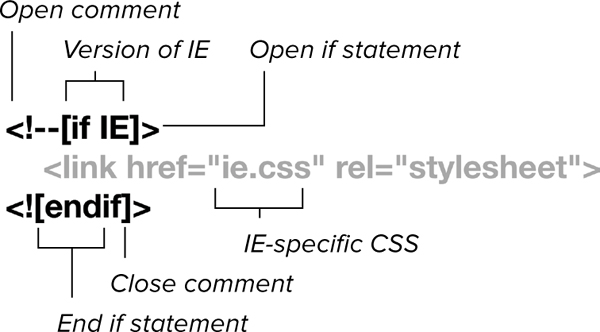
General syntax for conditional statements. Anything placed between the comments will be used only by the specified versions of Internet Explorer.
To set up conditional styles for Internet Explorer
1. Add a conditional comment, specifying the version of IE you want to target. Within an HTML comment, use an if statement within square brackets and specify which version of Internet Explorer the CSS overrides should be used with (Code 14.6):
<!--[if IE]>
Table 14.1 shows the possible logical operators you can include for targeting specific browsers or a range of browser versions.
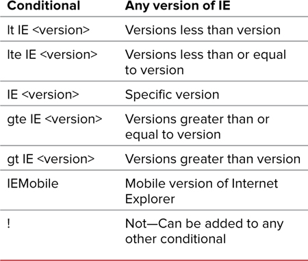
Using just IE will cause the CSS to be used in any version of Internet Explorer. Adding a space followed by a number will specify the version number. For example, IE 6 allows CSS to be used only in Internet Explorer 6 regardless of the doctype.
2. Add the IE-specific CSS for the browser version(s). This value will override previous values for that property for standard CSS. This can be embedded in the head of your document using the <style> tag or imported using the <link> tag or @import rule:
<style type="text/css" media="all">
@import url("../css/ie-fix.css");
</style>
Code 14.6. Add this code to the head of Code 14.1. It loads a specialized style sheet (Code 14.7) that corrects a color problem in the header for Internet Explorer, and makes those new HTML5 tags all block level so that they will properly respond to styles. It also loads the JavaScript file you created in Chapter 2 (Code 2.3) that “teaches” the new HTML5 tags to older versions of Internet Explorer .
<!--[if IE ]>
<style type="text/css" media="all">
@import url("../css/ie-fix.css");
</style>
<![endif]-->
<!--[if lte IE 8]>
<script type="text/javascript" src="../script/HTML5forIE.js"></script>
<![endif]-->
Code 14.7. ie-fix.css—Styles are used to override styles from previous CSS files to display the page as well as possible in Internet Explorer.
/*** ie-fix.css ***/
/*** color & background properties ***/
header h1 {
color: rgb(255,153,153); }
/*** box properties ***/
article,aside,canvas,details,dialog,eventsource,figure,footer,header,hgroup,mark,menu,meter,nav,output,progress,section,time,video { display: block; }
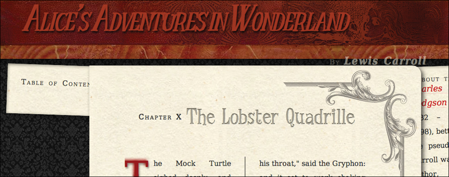
The header in most modern browsers. The header is a dark red set against a textured background for contrast, but Internet Explorer does not support text shadows.
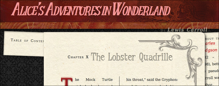
The header in Internet Explorer. Although it looks much the same, the header is now a brighter red, since the text shadow property is not available.
3. Close the conditional comment. Close your conditional comment with an endif in brackets:
<![endif]-->
Because IE9 is promising HTML5 and CSS3 compatibility, I recommend setting your IE conditional to “let IE 8,” which will apply the overrides only to versions of Internet Explorer less than or equal to 8.
Although you can add specific code for different versions of Internet Explorer, try to keep the number of links and imports to a minimum. The more external files you bring in, the longer it will take your Web page to load.
Add an exclamation mark before any of the conditionals and it becomes a “not” (for example, !lt IE 9 = not less than version 9).
Adapting to the Environment
Break points can most easily be thought of as small, medium, and large screen sizes. At first, you may want to create entirely different style sheets for each break point style sheet and apply them separately. However, the fact is that most styles will be the same between the style sheets, so the simplest thing to do is put the common styles in small, and then use the medium and large style sheets to override those styles needed to scale the design up.
However, between those break points, different devices have different dimensions, so your styles should use relative lengths to ensure that they stretch to accommodate . This is referred to as adaptive design.

0–739 pixels is the small range. 740–979 pixels is medium range. 980 and above is large.
• small.css (Code 14.8): Applied to all devices. Contains all of the general styles to be applied to the design with layout for small devices .
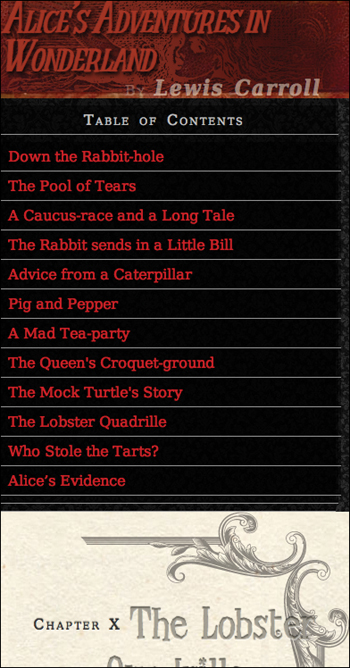
Small. Code 14.8 applied to Code 14.12.
• medium.css (Code 14.9): Applied to tablets and computer screens. Contains override styles used to scale the design up for medium screen sizes .
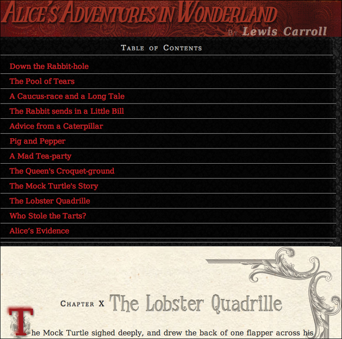
Medium. Code 14.9 applied to Code 14.12.
Code 14.8. small.css contains all of the default styles used in the site plus layout styles for smaller screens. To save space, I’ve added the styles from Chapters 5–10 using @import to bring those other files into this one, but generally this technique is not recommended (see Chapter 3 for details).
/*** small.css – Default Styles ***/
@import url("../css/font-properties.css");
@import url("../css/text-properties.css");
@import url("../css/color-background-properties.css");
@import url("../css/list-table-properties.css");
@import url("../css/ui-generatedcontent-properties.css");
h1 {
font-size: 3em; }
p {
width: 94%; }
nav.toc{
color: rgba(255,255,255,.75);
margin: 0;
padding: 0;
width: 93%; }
nav.toc ol, nav.toc ul, nav.toc li {
background: rgba(0,0,0,.5);
border-bottom: 1px solid rgb(153,153,153);
list-style: none;
margin: 0 0 0 -4%;
padding: .5em 5%;
width: 100%; }
aside {
padding: 5%;
width: 91%; }
Code 14.9. medium.css provides adaptive styles for medium-size devices, which in this case means changing the header size.
/*** Medium Device Styles ***/
h1 { font-size: 4em; }
• large.css (Code 14.10): Applied to computer screens. Contains override styles used to scale the design up for larger screen sizes  .
.
Large. Code 14.10 applied to Code 14.12.
• print.css (Code 14.11): Applied to print designs  .
.
Print. Code. 14.11 applied to Code 14.12.
Code 14.10. large.css contains adaptive styles for larger devices. Since Chapters 11–13 were built with a large screen in mind, I’m importing those styles into large.
/*** Large Device Styles ***/
@import url("../css/box-properties.css");
@import url("../css/visualformatting-properties.css");
@import url("../css/transformation-transition-properties.css");
@import url("../css/design-interface.css");
h1 {
font-size: 5em; }
nav.toc {
color: rgba(0,0,0,.75);
Code 14.11. print.css includes some simple styles to make the page better for printing, as seen in Chapter 3.
/*** For Print ***/
body {
padding: 1em;
color: rgb(0,0,0);
background: white url(../chapters/alice23a.gif) no-repeat 0 0;
padding: 200px 0 0 175px; }
header.page, article {
margin: 1em 0;
background: none;
}
h1,h2,h3 { color: black; }
h2.chaptertitle { color: red; }
h2 cite { color: black; }
p { font: normal 12pt/2 Constantia, palatino, times, "times new roman", serif;
text-indent: 3em; }
nav { display: none; }
To set up a simple responsive design with CSS media queries
1. Add the viewport meta tag (Code 14.12):
<meta name="viewport" content="width=device-width, initial-scale=1, maximum-scale=1, minimum-scale=1, user-scalable=no">
This sets up the file for responsive design, ensuring that the design is appropriately scaled to the user’s device and prevents the user from zooming in, which might cause problems and annoyances because the design is already scaled for best fit. If you are worried that some users will want to zoom in, you can instead set user-scalable to yes.
2. Add a link to small.css
<link type="text/css" rel="stylesheet" media="all" href="css/small.css" />
This file contains the base level and default styles that should be applied to any environment, as well as the styles to make the design best fit within a smaller mobile device such as a smart phone.
3. Add a conditional link that will cover the older versions of IE—not including mobile versions, which get the small version of the CSS—loading large.css:
<!--[if (lt IE 9)&(!IEMobile)]> ...<![endif]-->
Since older versions of Internet Explorer can’t use media queries, we want to make sure that they are styled for the computer screen.
Code 14.12. The final HTML showing all of the structure for the page.
<!DOCTYPE html>
<html lang="en">
<head>
<meta charset="utf-8">
<meta name="viewport" content="width=device-width, initial-scale=1, maximum-scale=1, minimum-scale=1, user-scalable=no">
<title>Alice’s Adventures In Wonderland | Chapter X</title>
<link type="text/css" rel="stylesheet" media="all" href="../css/cssreset.css" />
<!--[if lte IE 8]>
<script type="text/javascript" src="../script/HTML5forIE.js"></script>
<![endif]-->
<!--[if IE ]>
<style type="text/css" media="all">
@import url("../css/ie-fix.css");
</style>
<![endif]-->
<link type="text/css" rel="stylesheet" media="all" href="../css/small.css" />
<!--[if (lt IE 9)&(!IEMobile)]>
<style type="text/css" media="all">
@import url("../css/medium.css");
@import url("../css/large.css");
</style>
<![endif]-->
<!--[if gte IE 9]><!-->
<style type="text/css" media="screen and (min-width: 740px) and (min-device-width: 740px), (max-device-width: 800px) and (min-width: 740px) and (orientation:landscape)">
@import url("../css/medium.css");
</style>
<!--<![endif]-->
<!--[if gte IE 9]><!-->
<style type="text/css" media="screen and (min-width: 980px) and (min-device-width: 980px)">
@import url("../css/medium.css");
@import url("../css/large.css");
</style>
<!--<![endif]-->
<link type="text/css" rel="stylesheet" media="print" href="../css/print.css" />
</head>
<body id="chapter10" class="book aaiw chapter">
<header class="page">
<hgroup>
<h1>Alice’s Adventures in Wonderland</h1>
<h2>By <cite>Lewis Carroll</cite></h2>
</hgroup>
</header>
<section>
<nav class="toc">
<ul class="menu">
<li><h2>Table of Contents</h2></li>
<ol class="drop">
<li><a href="AAIWL-ch01.html">Down the Rabbit-hole</a></li>
<li><a href="AAIWL-ch02.html">The Pool of Tears</a></li>
<li><a href="AAIWL-ch03.html">A Caucus-race and a Long Tale</a></li>
<li><a href="AAIWL-ch04.html">The Rabbit sends in a Little Bill</a></li>
<li><a href="AAIWL-ch05.html">Advice from a Caterpillar</a></li>
<li><a href="AAIWL-ch06.html">Pig and Pepper</a></li>
<li><a href="AAIWL-ch07.html">A Mad Tea-party</a></li>
<li><a href="AAIWL-ch08.html">The Queen's Croquet-ground</a></li>
<li><a href="AAIWL-ch09.html">The Mock Turtle's Story</a></li>
<li><a href="AAIWL-ch010.html">The Lobster Quadrille</a></li>
<li><a href="AAIWL-ch011.html">Who Stole the Tarts?</a></li>
<li><a href="AAIWL-ch012.html">Alice’s Evidence</a></li>
</ol>
</ul>
</nav>
<article>
<h2>Chapter X
<span class="chaptertitle">The Lobster Quadrille</span>
</h2>
<p>The Mock Turtle sighed deeply, and drew the back of one flapper across his eyes. He looked at Alice, and tried to speak, but, for a minute or two, sobs choked his voice. "Same as if he had a bone in his throat," said the Gryphon: and it set to work shaking him and punching him in the back. At last the Mock Turtle recovered his voice, and, with tears running down his cheeks, went on again:</p>
...
</article>
<aside>
<h2>About the Author</h2>
<p><b><a href="#">Charles Lutwidge Dodgson</a></b> (7 January 1832 – 14 January 1898), better known by the pseudonym Lewis Carroll was an English author, mathematician, logician, Anglican deacon and photographer. His most famous writings are Alice's Adventures in Wonderland and its sequel Through the Looking-Glass, as well as the poems "The Hunting of the Snark" and "Jabberwocky", all examples of the genre of literary nonsense. He is noted for his facility at word play, logic, and fantasy, and there are societies in many parts of the world (including the United Kingdom, Japan, the United States, and New Zealand) dedicated to the enjoyment and promotion of his works and the investigation of his life.</p>
</aside>
</section>
<footer>
Illustrator: Arthur Rackham
</footer>
</body>
</html>
4. Add a style tag with media queries with breaking points at a minimum width of 740 pixels for computer monitors, or a maximum width of 800 pixels and a landscape orientation for tablets.
<style type="text/css" media="all and (min-width: 740px) and (min-device-width: 740px), (max-device-width: 800px) and (min-width: 740px) and (orientation:landscape)">... </style>
This means that both the small and medium style sheets are applied to the design, tailoring it to tablet-size devices in landscape orientation.
5. Add a style tag for devices with screens over 980 pixels and import both the medium and large style files:
<style type="text/css" media="all and (min-width: 980px) and (min-device-width: 980px)">... </style>
This means that all three style sheets are loaded, with the large style overriding previous styles.
6. Finally, add a link to print.css:
<link type="text/css" rel="stylesheet" media="print" href="css/print.css" />
This file formats the Web page for printing, as explained in Chapter 4.