
1. Understanding CSS3
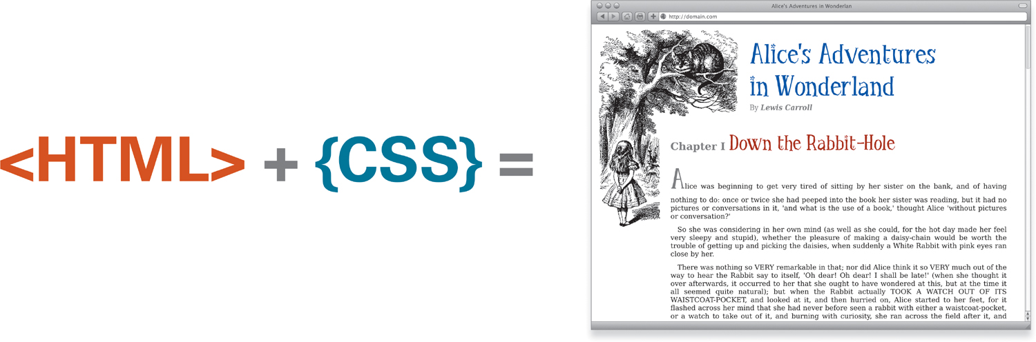
Cascading Style Sheets, or CSS, is a language used to specify the visual appearance of a Web page—in contrast to HTML (HyperText Markup Language), which is a markup language that defines the structure of a document for distribution on the Web. HTML tells a Web browser how the content is organized on the page, whereas CSS tells the browser how it should look.
CSS3—an abbreviation for CSS Level 3—is the next generation of this style language that adds several new capabilities. CSS3 has taken its place alongside HTML5 at the forefront of all cutting-edge Web design.
What Is a Style?
Word processors allow writers to change text appearance word-by-word or paragraph-by-paragraph, as well as in an entire document by means of styles.
Styles combine multiple properties—such as weight, font family, italicization, color, and size—that you want to apply to similar text types—titles, headers, captions, and so on—and they group these properties under a common name.
For example, suppose you want to format all the section titles in your document in bold, Georgia font, italic, orange, and 16 point. You could assign all those attributes to a style called Chapter Title  .
.
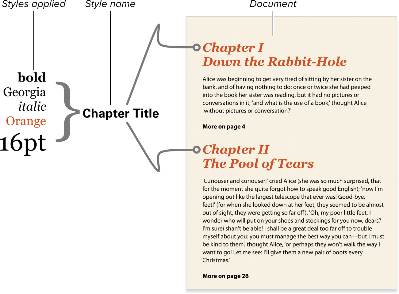
Styles applied to section titles in a word-processing page.
Whenever you type a chapter title, you only need to use the Chapter Title style, and all those attributes are applied to the text in one fell swoop. Even better, if you later decide that you really want all of those titles in 18 point instead of 16 point, you can just change the definition of Section Title. The word processor automatically changes the appearance of all the text marked with that style throughout the document.
What Are Cascading Style Sheets?
Cascading Style Sheets bring the same style-setting convenience to the Web that you have in most word processors. You can set the CSS in one central location to affect the appearance of specific HTML tags, on a single Web page, or across an entire Web site.
Although CSS works with HTML, it is not HTML. Rather, CSS is a separate style sheet language that enhances the abilities of HTML (a markup language) by allowing you to redefine the way that existing tags display their contents.
For example, the level 1 header tag container, <h1>...</h1>, allows you to apply styles to a section of HTML text and turn it into a header. But the exact display of the header is determined by the viewer’s browser, not by the HTML code.
Using CSS, you can change the nature of the header tag so that it is displayed as you want it to look—for example, bold, Times font, italic, orange and 36 pixels (px) . As when using word processor styles, you could choose to change the styling of the <h1> tag (for example, change the text size to 18 px) and automatically change the text size of all h1 elements on the affected Web page.
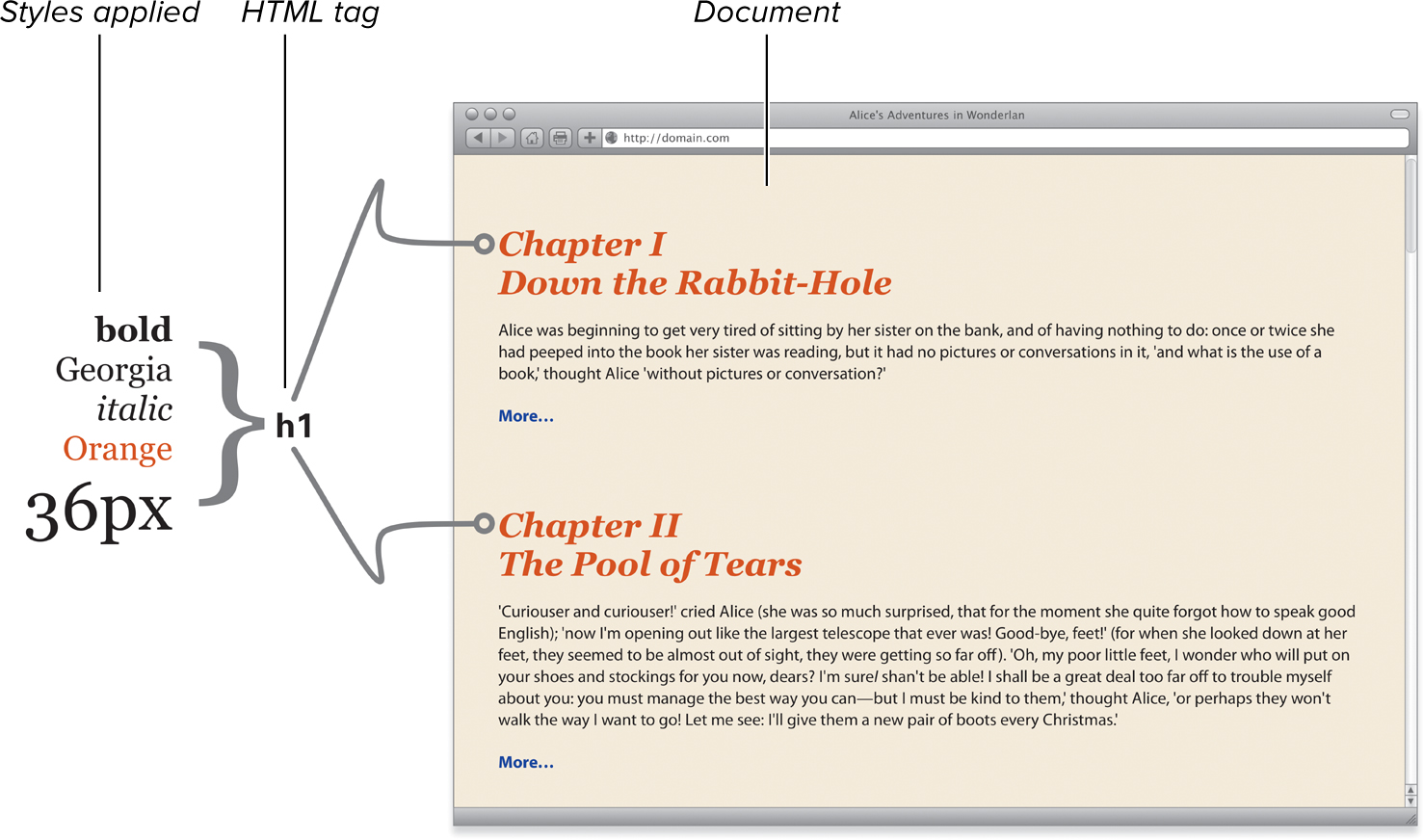
Styles applied to an HTML tag.
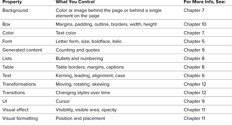
Table 1.1 shows some of the things you can do with CSS and where to find more information in this book.
How does CSS work?
When a visitor loads a Web page, either by typing in the URL address or clicking a link, the server (the computer that stores the Web page) sends the HTML file to the visitor’s computer along with any files linked to or embedded in the HTML file. Regardless of where the CSS code is, the visitor’s browser will interpret it and apply it to the HTML to render the Web page using that browser’s particular rendering engine. Then the results are displayed in the browser window  .
.
The code used to create the Web page is downloaded, interpreted, and rendered by the browser to create the final display.
The interpretation by the browser’s rendering engine is where your headaches begin. The World Wide Web Consortium (W3C) has gone to great lengths to create specifications by which browser developers should render the Web code. Nonetheless, bugs, omissions, and misinterpretations still creep in. As a result, no two browsers render a Web page in exactly the same way. For the most part, these differences go unnoticed by most users, but occasionally the differences are glaring and require that you do some extra work to get the page to look right with the broadest range of browsers.
You always face the possibility that your page will be rendered without the CSS because of an error or because the software in use—such as many mobile device browsers—does not accommodate CSS. You should always consider how your page will look without the CSS styles, and make sure that the page will still make structural sense, as shown in  and
and  .
.
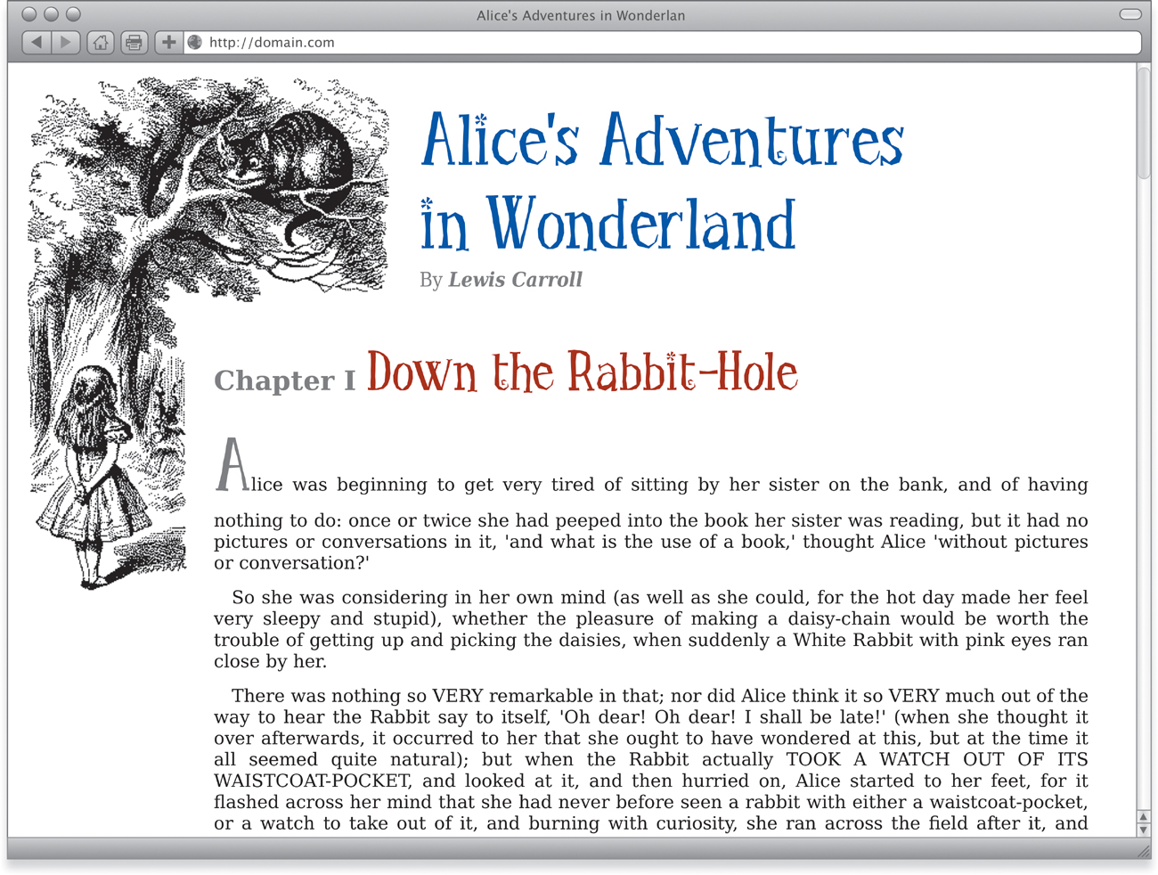
An HTML page using CSS to add an image in the background. Position the content down and to the right, and format the text.
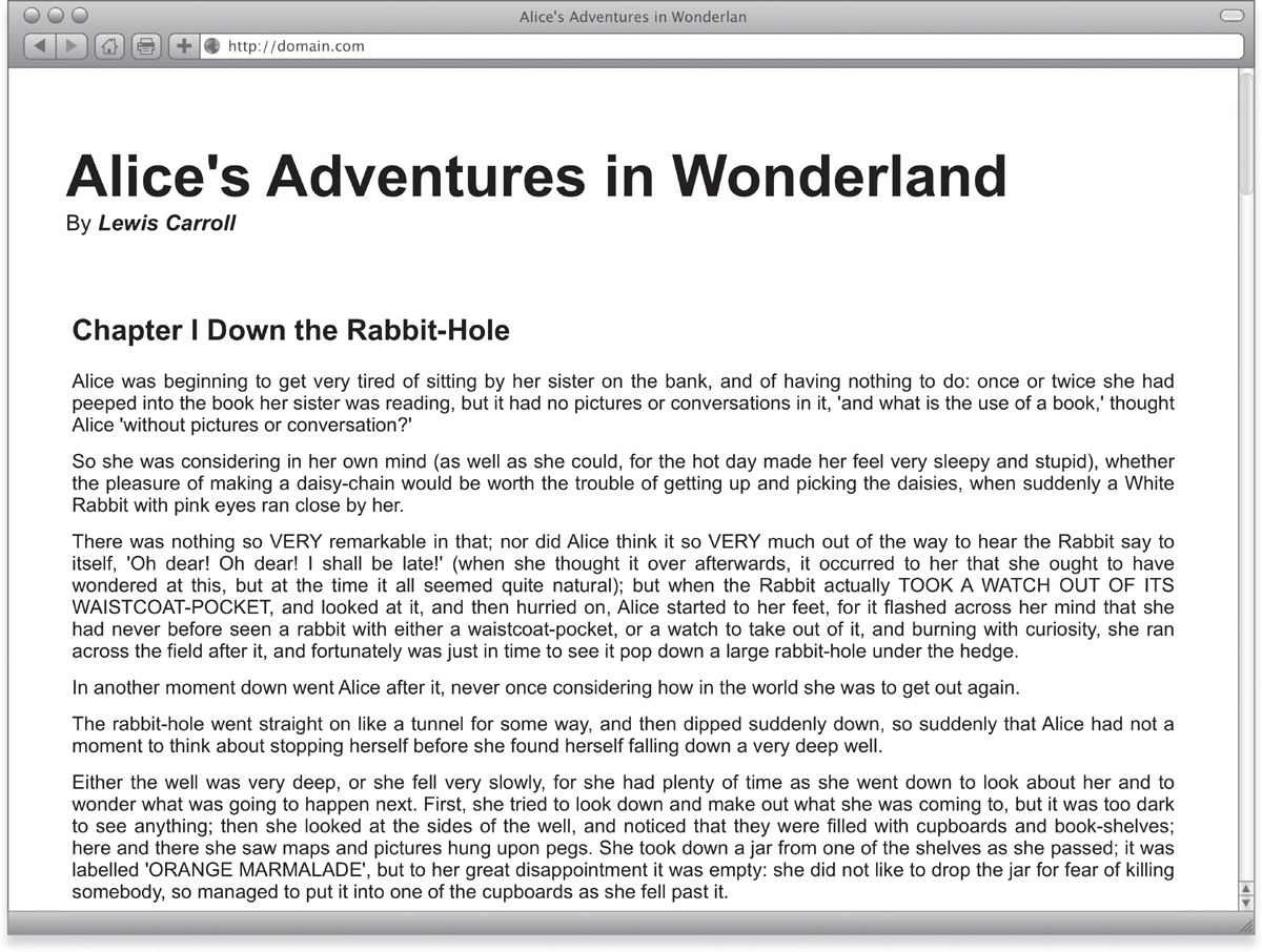
The same code displayed without the benefit of CSS. The page still displays but without the formatting shown in  .
.
The Evolution of CSS
Over the years, CSS has evolved into its current form under the guidance of the W3C, but the process has often been slow. Although CSS is a standard—created by the W3C’s CSS Working Group—it is up to each browser to interpret and implement that standard. This has led to uneven implementation, with some browsers more compliant than others .
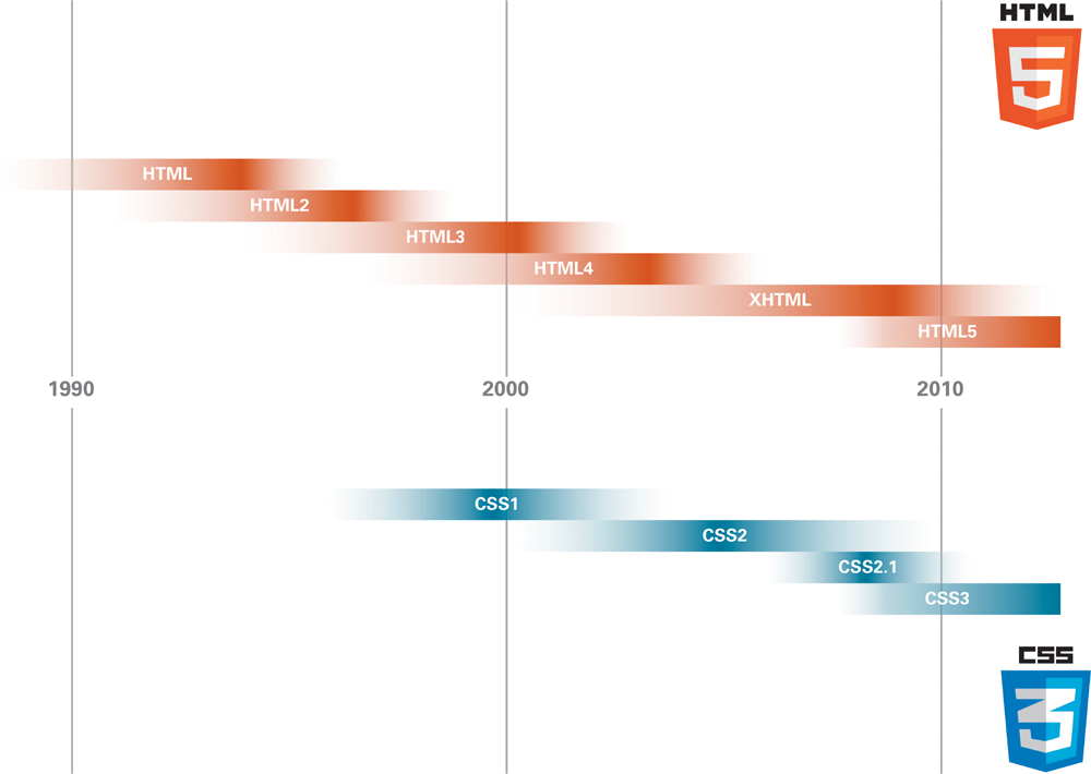
The evolutionary paths of HTML and CSS have not been particularly even or steady over the years. This timeline is not meant to be an exact historical chart, but does provide a general recountal of when each version of the standard was in its prime.
Even more troublesome is that, although the standard strives to be as clear and specific as possible, different browsers will implement the specifications with slightly different quirks.
All modern browsers (Internet Explorer, Firefox, Safari, Opera) support the important capabilities of CSS3; but even after years of development, CSS3 remains a work in progress. Many features—such as transitions, transformations, and animation—are still not implemented or are underdeveloped in some browsers.
CSS Level 1 (CSS1)
The W3C released the first official version of CSS in 1996. This early version included the core capabilities associated with CSS, such as the ability to format text, set fonts, and set margins. Netscape 4 and Internet Explorer 3 and 4 supported Level 1.
Web designers needed a way to position elements on the screen precisely. CSS1 was already released, and CSS Level 2 was still in the future, so the W3C released a stopgap solution: CSS-Positioning. This standard proposed that the parties concerned could debate the details for awhile before the CSS-P standard became official. Netscape and Microsoft jumped on these proposals, however, and included the preliminary ideas in version 4 of their browsers.
CSS Level 2 (CSS2)
The CSS2 spec came out in 1998 and is the most widely adopted by browser makers. Level 2 includes all the attributes of the previous two versions, plus an increased emphasis on international accessibility and the capability to specify media-specific CSS.
In 2006, the W3C published an updated version: CSS Level 2.1, that corrected some errors, clarified a few issues, and included specifications for features that were already implemented in some browsers. CSS2.1 effectively replaced CSS2.
CSS Level 3 (CSS3)
Unlike CSS1 and 2, a single, comprehensive CSS3 does not exist. Instead, rather than trying to release the entire specification at once, the CSS Working Group split the spec into a series of modules, each with its own developmental timeline. To read more about the ongoing work, check out www.w3.org/Style/CSS/current-work.
While knowing the differences among the CSS versions may be interesting, it isn’t necessary for using styles on the Web. However, you do need to know which styles are supported by the browsers you’re designing for. Although all modern browsers support most of the CSS Level 2 specification, older browsers support combinations of older versions of CSS. See Appendix A for details on which CSS properties each browser supports.
CSS and HTML
When HTML was created, style properties were defined directly in the code. However, rather than just adding more and more tags and properties to HTML, the W3C introduced Cascading Style Sheets to fill the design void in straight HTML, allowing the Web to become semantic in structure. (See the sidebar “What Is the World Wide Web Consortium?”)
Take the <strong> tag, for example. In HTML, this common tag does one thing and one thing only: It makes text “stronger,” usually by displaying it in bolder font. However, using CSS, you can “redefine” the <strong> tag so that it not only makes text bolder, but also adds more emphasis by displaying text in all caps and in a specific font. You could even set the <strong> tag to not make text bold .

The HTML <strong> tag is used to make text stand out; but using CSS, you can style that text any way you see fit.
Although both HTML and CSS have evolved over the years, they have rarely evolved in tandem. Instead, each standard has pretty much followed its own path. It’s a happy accident that both CSS3 and HTML5 have hit prime time at the same time, creating the new foundation and framework for modern Web sites.
The power of CSS comes from its ability to mix-and-match rules from multiple sources to tailor your Web pages’ layouts to your exact needs. In some ways, it resembles computer programming—which is not too surprising, because a lot of this stuff was created by programmers, rather than Web designers. But once you get the hang of it, “speaking” CSS becomes as natural as putting together a sentence .
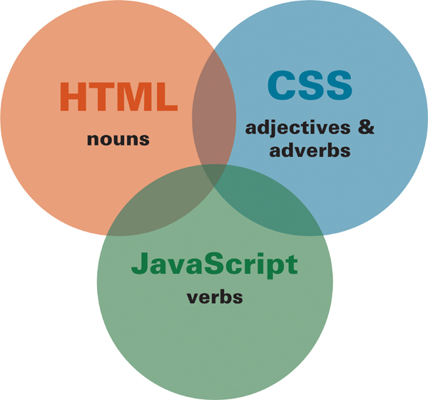
The three core Web technologies—HTML, CSS, and JavaScript—work similarly to parts of speech. HTML provides the nouns, CSS the adjectives and adverbs, and JavaScript adds the verbs.
Types of CSS Rules
The best thing about Cascading Style Sheets is that they are amazingly simple to set up. They don’t require plug-ins or fancy software—just text files with rules in them. A CSS rule defines what the HTML should look like and how it should behave in the browser window.
CSS rules come in four types, each with specific uses:
• HTML selector: The text portion of an HTML tag is called the selector. For example, h1 is the selector for the <h1> tag. The HTML selector is used in a CSS rule to redefine how the tag displays. (See “(Re)Defining HTML Tags” in Chapter 3). For example:
h1 { color: red; }
will style:
<h1>...</h1>
• Class selector: A class is a “free agent” rule that can be applied to any HTML tag at your discretion. You can name the class almost anything you want. Because a class can be applied to multiple HTML tags, it is the most versatile type of selector. (See “Defining Reusable Classes” in Chapter 3.) For example, the class:
.myClass { font: bold 1.25em times; }
will style the tag:
<h1 class="myClass">...</h1>
• ID selector: Much like class selectors, ID rules can be applied to any HTML tag. ID selectors, however, should be applied only once to a particular HTML tag on a given page to create an object for use with a JavaScript function. For example, the ID:
#myObject1 { position: absolute; top: 10px; }
will style the tag:
<h1 id="myObject1">...</h1>
• Universal selector: The universal selector is a stand-in selector represented by an asterisk (*) that is used when you want to apply a style regardless of the exact selector in use. This is especially helpful when you are using contextual styles and don’t know the exact context. For example, the universal selector:
article * strong { position: absolute; top: 10px; }
will style the strong tag in:
<article><p><strong>...</strong></p></article>
as well as in:
<article><blockquote><strong>...</strong></blockquote></article>
The Parts of a CSS Rule
A CSS rule consists of properties and their values, which together are referred to as a declaration . A single CSS rule can have multiple declarations, each separated by a semicolon (;). All rules, regardless of their locations or types, have the following structural elements:
• Selectors are the alphanumeric characters that identify a rule. A selector can be an HTML tag selector, a class selector, an ID selector, a universal selector (discussed in Chapter 3), or a combination of those basic selectors to create context-based styles (discussed in Chapter 4).
• Properties identify what is being defined. Several dozen properties are available. Each is responsible for an aspect of the page content’s behavior and appearance.
• Values are assigned to a property to define its nature. A value can be a keyword such as “red,” a number, or a percentage. The type of value used depends solely on the property to which it is assigned.
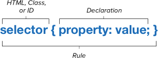
The basic syntax of a CSS rule. You start with a selector (HTML, Class, or ID). Then add a property, a value for that property, and a semicolon, which together are called a declaration. You can add as many definitions as you need as long as they are separated by a semicolon.
Don’t confuse the selector of an HTML tag with its attributes. In the following tag, for example:
<img src="picture.gif">
img is the selector, and src is a property.
Although you don’t have to include a semicolon with the last definition in a list, experience shows that adding this semicolon can prevent future headaches. For example, if you forgot to put in the required semicolon before the addition and you later decide to add a new definition to the rule, you may cause the rule to fail completely. What’s worse, not only will that one definition fail, but all the definitions in the rule won’t be applied.
CSS Browser Extensions
In addition to supporting the specified CSS properties set by the W3C, a browser developer will occasionally introduce browser-specific properties. This is often done for one of two reasons:
• A spec is still under development by the W3C but the browser developer wants to start using the style now.
• The browser developer wants to try a new idea but doesn’t want to wait for the W3C to accept it and begin work on it, which can take years.
Sometimes the exact syntax of the official CSS specification will be slightly different from the “sandbox” version created for a specific browser.
To avoid confusion and ensure forward compatibility of CSS code, each rendering engine has adapted its own prefix to use with CSS properties that are extensions unique to that browser. The prefixes for each browser are shown in Table 1.2.
Table 1.2. CSS Browser Extensions
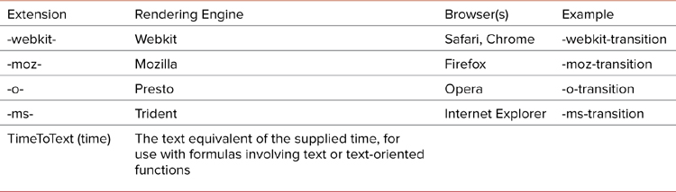
These CSS extensions sometimes overlap and conflict when different browsers promote their own solutions. The good news is that due to the nature of CSS, you can include versions of each of the properties for individual browsers, so that the browser will use whichever version suits it . Throughout the book, I include browser CSS extensions, when appropriate, so that you can ensure the widest interoperability of your styles.
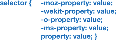
The browser CSS extensions can all be included to ensure a style is applied when available to a particular browser.
Most browser manufacturers will drop an extension version of a style within two releases after they adopt the official version. This practice allows designers to catch up before their style sheets stop working.
New in CSS3
This is a particularly exciting time to be a Web designer because we are about to get an entirely new box of tools. A lot of new CSS3 capabilities are ready for prime time and they will explode your creativity.
This slim volume covers the breadth of CSS3, much of which remains unchanged since CSS2/2.1. If you are an old hand at CSS, look for the “New in CSS3” mark to quickly find the good, new stuff.

The “New in CSS3” mark.
Here’s a brief peak at what’s new:
• Animations—Move objects without using JavaScript.
• Borders—Multiple border colors on a side, border images, and rounded corners can be applied.
• Backgrounds—Multiple backgrounds can be added to a single element, backgrounds can be more precisely positioned, backgrounds can be extended and clipped to the inside or outside of a border, and backgrounds can be resized.
• Color—Color opacity settings, gradients in backgrounds, and HSL color values are available.
• Text—Text shadows, text overflow, and word wrapping are available.
• Transformations—Scale, skew, move, and rotate an element in 2D or 3D space.
• Transitions—Use simple dynamic style transitions.
• Box—Add drop shadows, place user-resizable boxes, and set overflow separately in horizontal and vertical directions. Use outline offset to set the space between the outline and the border, and apply box model specifications to set how width and height are applied to a box.
• Content—Styles can add content to an element.
• Opacity—Elements can be transparent.
• Media queries—Style pages can be based on the viewport size, color, aspect ratio, resolution, and other important design considerations.
• Web fonts—These update and extend the ability to link to fonts for use in a design.
Not everything in the CSS3 specification is ready for use, though. When it would be “jumping the gun” to use new features right now, I’ve added a section near the end of some chapters called “Coming Soon!” that includes quick overviews of what to expect in the future.