

A compositor is, first and foremost, an artist, so this chapter focuses on the art of compositing. There are two levels of artistic excellence. First is the achievement of competent photo-realism, the objective of every digital composite. But beyond replicating reality in a convincing manner, there is also artistic enhancement—going beyond simply professionally assembling the elements provided and adding your own artistic panache to make the shot look cool. Good artistic design makes for good visual effects shots.
Digital compositing can be defined as taking several disparate elements that were photographed separately and integrating them into a single shot such that the various elements appear to have been shot together at the same time under the same lighting with the same camera. This journey begins by color correcting the elements so that they appear to be together in the same “light space.” Then there are film and lens attributes that have to be made to match. Finally, the finished composite is sweetened by the addition of special operations designed to enhance realism and improve artistic appeal.
9.1 COLOR CORRECTING
The single most important aspect of a convincing digital composite is color correcting the various layers to all appear to have been photographed together in the same light space. There are several aspects to color correcting and it is easy to chase your tail, so here we will walk through a methodical step-by-step procedure that teases the issues apart and tackles them one at a time. A methodical approach saves time and gives better results.
The first step in the color correction of a composite is for the background plate to be color corrected. This is often referred to as color grading, and many visual effects facilities have a specific pipeline set up to ensure that the background plates for a related group of shots are all color graded similarly in order to maintain visual continuity. After the background is color graded the compositor adds the various layers on top and color corrects them to match the color graded background plate.
Whether you are compositing CGI or bluescreen elements, each element will need some level of color correcting. The CGI elements usually need less attention because they were originally created using the background plate as a reference and should be fairly close to begin with. The bluescreen elements, however, were shot with no way to ensure that they matched the background so they are usually wildly off and require a great deal of love.
9.1.1 The Black and White Points
The starting point for an effective color correcting procedure is to get the black and white points correct because it also results in matching the contrast. The reason these have to be set first is that if they are wrong, then all other color corrections become much harder to judge. To make matters worse, if other color corrections are done first, when the black and white points are finally set correctly you will then have to go back and refine all the other color corrections. Better to start with the black and white points set correctly first.
Strictly speaking, the black point and white point have a very specific meaning in the world of color science. But this is not a book on color science, so we will bend the meaning to our purposes. For the purpose of color correcting a composite, the black point shall henceforth be defined as the black that would appear in a completely unexposed part of the picture. While these will be the darkest pixels in the image, they should not actually be set right at code value zero since that can introduce clipping in the blacks. The white point is defined as the pixel value of a white T-shirt in bright sunlight.* The white point should not be set to code value 255 as that would leave no pixel values above it for highlights. The white point should be more like 230 to 240 or so, leaving a little “headroom” for the shiny bits of the picture.
A problem with the black and white points is that one or both layers of the composite may not have either of them in the picture. It is entirely possible to have a picture that has no totally black parts. Think of a sky cloud shot. It is also possible to have a picture with no white points in frame. Think of a black cat eating licorice in a coal bin. If there are no actual black or white points in one or both layers of the composite then you would still follow the steps in the order outlined below, but with a lot more procedural estimation (guessing).
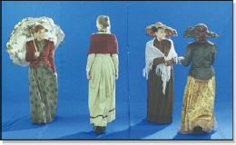
Figure 9-1 Bluescreen
Figure 9-2 Background
Pretend for a moment that the two layers you are trying to match both have black and white points within the picture. Our case study begins with the bluescreen in Figure 9-1 which is to be composited over the color graded background in Figure 9-2. The uncolor corrected raw composite is shown in Figure 9-3. The foreground layer is too green and the contrast is too low. Our work is cut out for us.
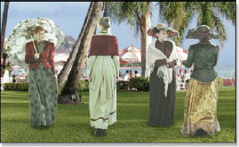
Figure 9-3 Raw composite
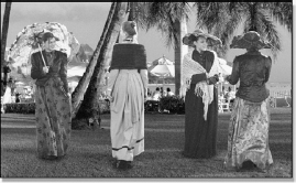
Figure 9-4 Monochrome composite
An ancient Chinese trick for color correcting digital composites is to make a monochrome version like Figure 9-4 for adjusting the grayscale of an image, which is the black and white points as well as the gamma. We will talk about gamma in a minute. The reason this helps is because it gets the color out of the way and lets the eye focus on the grayscale, or the luminance parts of the picture, which is what gamma and the black and white points are all about. It is a divide and conquer strategy designed to pare down and simplify the task.
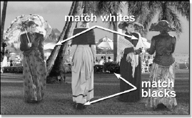
Figure 9-5 Check blacks and whites
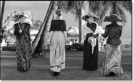
Figure 9-6 Match blacks and whites
The next step is to inspect the monochrome composite to identify the black and white points in both the foreground and background. In Figure 9-5 the black point for the background plate was found under the shady bush between the ladies and the black point for the foreground layer was found under the black sole of a shoe. The white point for the background plate was found to be the white awning and for the foreground layer it is the white shawl in direct sunlight (about the same as our white T-shirt).
Keep in mind that the background plate has already been color graded and we need to match the foreground layer to that. The black point in the background was measured and found to be code value 10, while the foreground black point was 22. The white point in the background awning measured 240 and so did the shawl in the foreground. Code value 240 is a bit hot for a white point, but it is a brightly lit outdoor shot and we don’t want to start a dust-up with the art director, so we will go with it.
The white point is good on our foreground layer but we do need to bring the black point down to about code value 10 to match the background. How this is done depends on the color correcting tools your compositing system offers, but Figure 9-7 illustrates how this would be done using the “Universal Color Corrector,” the Levels tool in Adobe Photoshop. The inset closeup shows that the black level has been set to pull the Input Level from 14 down to zero, which will shift code value 22 down to around 10. This increases the contrast of the foreground and we now have a fine match between the foreground and background in Figure 9-6. Keep in mind that when the black point was lowered like this it had a small effect on the white point so it should be rechecked and touched up if necessary.
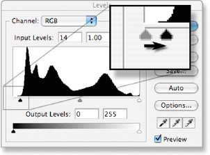
Figure 9-7 Adjusting the blacks
If one of the layers doesn’t have one of the black or white reference points all is not lost. It is uncommon for a picture to be missing a black point, but let’s say the foreground did not have a good white point. Look around the picture for the lightest element you can find. Maybe it appears to be an 80% gray (remember, we are working with the monochrome version here). Search the background plate for what appears to be another 80% gray and match them. Look for similar elements in both layers, like skin tones. Assuming a skin tone in the background and foreground are in the same lighting they would be about the same brightness, also assuming the two characters had the same skin type, of course. You are definitely guessing—I mean estimating—but it is better than just eyeballing it. At least you tried to be scientific about it.
9.1.2 Gamma
After setting the black and white points, the next step is gamma correction. While the gamma adjustment mostly effects the midtones of a picture, its affect does spread all the way up and down the entire grayscale of an image. Still working with the monochrome version, adjust the gamma of the foreground layer for best match. Unfortunately, there is no slick procedural way to set this unless both the foreground and background layers were photographed with chip charts (Figure 9-8) to be used for color reference, which did happen once in 2003. That’s what I heard, anyway.
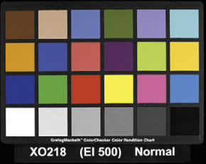
Figure 9-8 Chip chart
The thing to know about adjusting the gamma is that it can shift your black and white points, so be sure to go back and check them after any gamma correction. A gamma correction alters all pixel values between 0 and 255, but does not alter 0 or 255 themselves. Since your black point is hopefully not at zero or your white point at 255 they will be shifted a bit after the gamma correction. Note that the black point will be shifted more than the white point.
9.1.3 Color
We now have the grayscale set correctly for our case study so it is time to turn the color back on and check the color (Figure 9-9). Yikes! The girls are green! No worries, we will have that fixed in a jiffy. There are a couple of approaches to getting the color of the foreground to match the background. The problem with trying to match color like this is that you really don’t know what color the foreground objects are supposed to be unless you were on the set when the thing was filmed. Maybe someday, but for now you will need another approach. The next best approach is careful observation of known color elements in the picture.
Occasionally there will be known gray objects in the picture. Their pixel values can be read and used to adjust the RGB values until they are equal.
Caution—it is not true that equal RGB values will create a neutral gray in all situations. Some display devices have a color bias, so in order to get a neutral gray to the eye the RGB values need to be biased. Another situation is when the lighting in a shot is not neutral. If the lighting were a bit yellow, for example, then to get a neutral gray to the eye it would have to have a bit of yellow in it.
Whoa, did you see that big caution just above? Maybe you better not make the RGB values equal so much as make the gray object appear a neutral gray to the eye. There might be a known gray object in the background plate that you can use as a reference. Measuring its RGB values might reveal, for example, that a neutral gray in the background has a bit more red than green or blue, so the foreground gray should have a similar red bias.
When sampling pixel values of a photographic image to be used for setting the color of another image you should run a small blur over the image being sampled. The natural grain or noise in the sampled image introduces variations at the pixel level that can give you false RGB readings. To address this issue some color sampling tools (the good ones) have an option to sample more than a one-pixel spot. They are, in effect, running a little blur over the spot you are sampling.
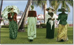
Figure 9-9 Color check

Figure 9-10 Color corrected composite
One other technique is to use the skin tones, assuming there are some in the shot. We are very sensitive to the color of skin tones so adjusting the color until the skin tones look right can be very effective. Even if you use gray objects to balance the color be sure to check the skin tones carefully. The “skin tone” method was used to color correct Figure 9-9 to get the color corrected composite in Figure 9-10.
(Download the folder at www.compositing VFX.com/CH09/Figure 9-10 to get the ladies and their background and try your hand at color correcting them to match.)
Changing the color of a shot can change its brightness, causing you to go back to the beginning of the color correction procedure and start over. One color has much more affect on the apparent brightness of a picture than the others, and that color is green. Change the green level just a bit and the brightness changes a lot. Change the red or blue and the brightness is hardly affected at all. The idea here is to change the color of a shot without disturbing the green channel, which is not hard to do if you use the patented “constant green” method of color correction.
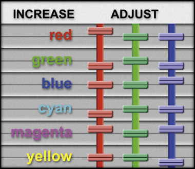
Figure 9-11 Constant green method of color correction
Figure 9-11 shows how to adjust the RGB color sliders to increase any primary or secondary color without disturbing the green level. For example, to increase cyan, lower the red. To decrease any of these colors just move the sliders in the opposite direction shown here. For the overly green shot in Figure 9-9, instead of lowering green, the red and blue were raised.
9.1.4 Color Adjustments
When confronted with a layer that needs the color, or hue, corrected to match the other layers of the shot, the next question is which color correction adjustment should be used? Your composing software might offer lift, gamma, gain, contrast, hue, saturation, brightness, color curve adjustments and others, any of which might be used to correct the color problem. How can we choose which one to use? The first order of business is to be clear on exactly what each of these different adjustments does to the code values of the image and its appearance.
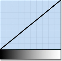
Figure 9-12 Reference
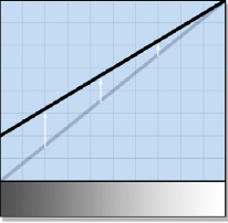
Figure 9-13 Lift
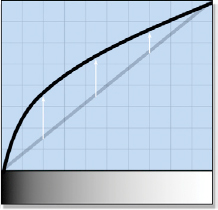
Figure 9-14 Gamma
Figure 9-12 is the basic reference setup for demonstrating each color correction operation. The gradient across the bottom shows the pixel brightness from black to white and the graph plots their code values. Figure 9-13 shows the lift operation and how it affects the gradient. It has its largest visual impact in the darks so it is often referred to as “adjusting the darks” but don’t be fooled—as you can see it also affects the midtones and whites, but to lesser degrees. Figure 9-14 shows the effect of a gamma adjustment which is usually referred to as “adjusting the midtones.” While its effects are mostly in the midtones, it also affects the darks a lot and the lights a little and it does not introduce clipping. Of course, the lift and gamma adjustments can go in the other direction to darken the image.
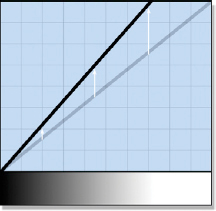
Figure 9-15 Gain (scale RGB)
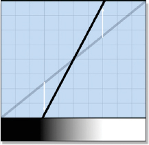
Figure 9-16 Contrast
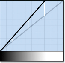
Figure 9-17 Brightness
Figure 9-15 shows the gain operation which is also known as scale RGB because the gain operation actually does scale the RGB values. While it does affect the entire range of pixel values, its greatest impact is in the whites. Watch out for clipping, unless you scale the RGB values down. The contrast adjustment in Figure 9-16 both raises the whites and lowers the blacks so it can introduce clipping at both ends. There is no clipping danger if the contrast is lowered. Figure 9-17 shows the brightness operation which looks a lot like gain (Figure 9-15) because they are mathematically identical. The only difference is that typically gain allows you to adjust each color individually while brightness adjusts them all together as one.
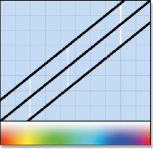
Figure 9-18 Saturation
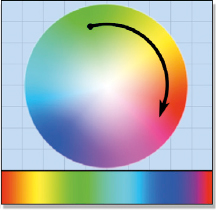
Figure 9-19 Hue
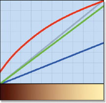
Figure 9-20 Color curves
Figure 9-18 is an attempt to illustrate saturation but the graph is only suggestive, not literal. A saturation increase moves the RGB values of a pixel further apart, suggested by the three graph lines moving apart. Most saturation operations are smart enough to prevent clipping. The hue adjustment in Figure 9-19 indicates how it actually rotates the pixel values around the color wheel. A green pixel will move to yellow then to red and so on. Figure 9-20 shows three color curves, one for red, green, and blue that can be individually adjusted to affect any portion of the color space any way you want. Color curves are very powerful, but hard to control.
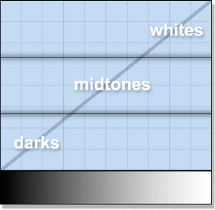
Figure 9-21 Zones
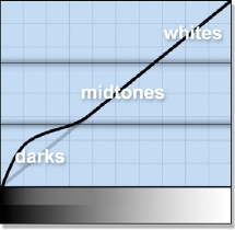
Figure 9-22 Darks only
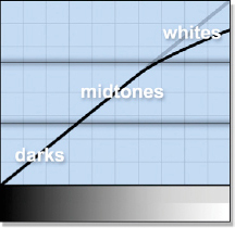
Figure 9-23 Whites only
There is a more elaborate type of color corrector illustrated by Figure 9-21 which splits the range of adjustments into three “zones”—the darks, the midtones, and the whites. First, the zone to be affected is selected and then all color corrections are limited to that zone and gently blended into the next. Figure 9-22 illustrates increasing the brightness in the darks. The gradient across the bottom of the graph is split to show the effect of the change. The bottom half of the graph is the “before” and the top half is the “after.” Figure 9-23 illustrates a lowering of the whites with the gradient showing the change.
Now that we know how each adjustment will affect the code values of our pixels the next question becomes which adjustment to use under what circumstances to fix the color of a shot? Remember, we already have the black and white points set as well as an overall gamma correction. At this point we are only concerned about the overall hue of the shot—in this case the green ladies in Figure 9-9.
To decide which color correction operation to use we first need to determine where in the image the color needs to be changed—the darks, the midtones, or the whites. If it is only in the darks, then use the lift. If it is only in the midtones, use the gamma. If it is only in the whites, use the gain. Use these operations on a per-channel basis and don’t forget that they also affect the other parts of the image, but to a lesser degree. For example, if the darks had too much red then lower the lift of the red channel. If the whites had too little blue then increase the gain of the blue channel. If the midtones were too green then increase the gamma of the red and blue channels. Remember, we want to leave the green channel alone as much as possible to avoid affecting the overall brightness.
9.1.5 Pre-balancing the Color Channels
The process of color correcting a layer to match the background is made much more difficult if the layer starts way off. Pre-balancing the color channels means to view and adjust the composite one channel at a time to blend it better with the background. While this method is not really suitable for final color correction, it can get things in a much better starting position, which will make the final color correction faster and easier.
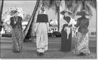
Figure 9-24 Green channel before
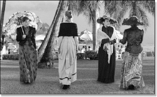
Figure 9-25 Green channel after
Figure 9-26 shows just the green channel of the composite before color correction while Figure 9-27 shows the same channel after. After all three color channels have been individually color corrected then the image viewer is set to show the full color RGB image to do the final adjustments. You will be pleasantly surprised at how close this procedure can get you to a finished color correction.
9.1.6 Gamma Slamming
Visual effects shots are typically developed on a workstation with the picture displayed on the workstation monitor. However, after the shot is finished it goes off to film, video, digital cinema, or some other display device. Those other display systems have different characteristics and color spaces than the workstation monitor which can exaggerate even small differences between the layers of a composite. The shot may also go to a colorist, which may increase the contrast or “stress” the shot in other ways. This can cause the different layers of a composite to visually “pull apart” and become noticeable. Gamma slamming can be used to prevent this embarrassing development by exaggerating any small discrepancies so you can find them before the client does.
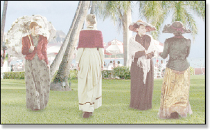
Figure 9-26 Gamma up to 3.0
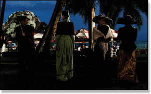
Figure 9-27 Gamma down to 0.2
The procedure is to add a gamma adjustment to the final composite which will be used for viewing purposes only, not as part of the shot. With some compositing systems you can adjust the gamma of the image viewer instead. The gamma is “slammed” from one extreme to the other to “stress” the image and see if any of the layers pull apart visually. Figure 9-26 shows our case study composite with the gamma slammed all the way up to 3.0, blowing out the shot. At this extreme any difference in the blacks between the foreground and background layers would become very noticeable. Figure 9-27 shows the gamma slammed down to 0.2. If the midtones or highlights did not match between the two layers that would show up here. Gamma slamming should be done on every composite you do.
Figure 9-28 Original shot
Figure 9-29 Clipped pixels revealed
One other important use for gamma slamming is to detect clipped pixels in a shot. Again, we really should not have any pixels in a photorealistic visual effects shot that have RGB values of exactly zero or 255. Recall from the gamma correction discussion above that the gamma operation does not touch the pixels with RGB values of zero or 255. By slamming the gamma way down to 0.01, for example, almost all of the RGB values less than 255 get pulled down towards black. This leaves on the screen only those pixels with RGB values of 255—the clipped pixels.
The original shot in Figure 9-28 was captured with a high-resolution digital still camera so the image is riddled with clipped pixels due to the high dynamic range of the scene content (the bright lights). A severe gamma correction of 0.01 was applied to it to create Figure 9-29 which reveals all the clipped pixels in the shot. Not only does this show you where the clipped pixels are, but it also shows which channels are clipped. Where there are white pixels all three RGB values must be code value 255 so all three channels are clipped. The pixels that appear red must have red values at 255 but the others channels are lower, so only the red channel is clipped there. Yellow pixels must have red and green at 255 so they are both clipped, and so on through the colors.
If the original images you are given to work with are already clipped there is nothing you can do. However, you need to make sure that you did not introduce any new clipped pixels into the shot. Slam the gamma on the original image and compare it with your finished composite to make sure you have not added to the problem.
9.2 MATCHING LAYER ATTRIBUTES
In addition to a convincing color correction on all of the layers of the composite there are a host of additional layer attributes that need to be matched. You will be combining two or more layers of film (or video) and each layer will have its own grain (or noise) that will have to match the rest of the shot. This goes double for CGI or a digital matte painting that has no grain to begin with. If any one of the layers was photographed through a lens it will have a depth of field and lens distortion imparted to it that needs to be dealt with. And, of course, shadows are a key visual cue that must be consistent between the various layers of a composite.
9.2.1 Grain Structure
Film has a very noticeable grain structure that is part of its unique look. Many consider it one of film’s major charms. Compositors consider it a royal pain in the arse. The reason it is a problem is that the grain structure of all of the layers of a composite must match. If the layer being added has no grain, such as CGI or a digital matte painting, then it is easy enough to add grain. However, if it is another layer of film, such as a bluescreen element, it already has its own grain. If its grain structure does not match the background it is much more difficult to fix. If a film element is scaled up or down its grain structure goes with it and it will no longer match the rest of the shot. Many times a digital matte painting is created using a frame from the film as the base, so now it has grain “frozen” into the picture. All of these grain issues must be addressed.
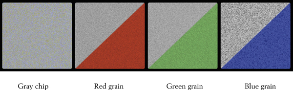
Figure 9-30 Film grain structure
Figure 9-30 is a gray chip from an actual piece of digitized film to show the film’s grain structure. There are two key points here. The first is that the grain pattern on each channel is unique. It is not one grain pattern embossed into all three layers, it is three unique grain patterns. The second point is that while the red and green grain is similar, the blue grain is considerably “grainer.” The film’s grain will vary with different kinds of film stock and different exposures of the film. The grain can vary in both the size of the grain particles and their contrast—how much they vary from dark to light. The blue channel grain will be both larger and have more contrast than the red and green channels as you can see in Figure 9-30.
If the grain of a layer of film is a problem, then why not just degrain it and regrain to match? Because degraining film is very difficult. If a blur or median filter is used the picture turns soft. There are special degrain programs out there but they are pricey and tend to soften the picture, but not as badly as a simple blur. If you don’t have sophisticated degrain tools there is one trick that can help. Since most of the picture detail is in the red and green channels but most of the grain is in the blue channel, you can usually improve the situation by blurring just the blue channel.
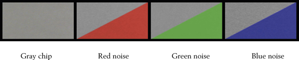
Figure 9-31 Video noise structure
Video does not have grain, but perversely it has noise, which is the video version of grain, shown in Figure 9-31. Even more perversely, it is again the blue channel that has the highest level of noise. Like film grain, the video noise pattern is unique for each channel. The good news is that video noise is almost always much less than film grain. The exception stems from low light shots where the videographer has cranked up the video camera’s gain to brighten the picture, which dramatically increases the video noise level. Whether film or video, the digital compositor’s mission is to match the grain or noise between all layers of the composite.
9.2.2 Depth of Field
All lenses, whether they are on film or video or digital cameras, have a depth of field. That is, a zone where the picture is in focus and everything in front and behind that zone is out of focus. Cinematographers use this very deliberately when selecting lenses for a shot in order to keep the item of interest in sharp focus and everything else out of focus. The eye ignores the out of focus parts so this is an important cinematographer’s tool for keeping your eye where he wants it. This makes the depth of field a very important part of the storytelling in addition to being an essential element of a technically correct composite.
Your mission as a digital compositing artist is to introduce the correct depth of field to each layer that you add to the shot by defocusing it as needed. You inspect the scene carefully, estimate where the new layer is relative to the other objects in the shot, and then set its depth of field appropriately. If the element moves front to rear you may have to animate the defocus. While something out of focus is blurry, a blur is not a defocus. Some compositing programs acknowledge this with an honest “depth of field” or “defocus” operation. Use ’em if you got ’em. The rest of us must use a blur and hope that nobody notices. Of course, if you apply a blur to an element to defocus it the grain will be wiped out so it will have to be restored with a regrain operation.
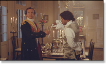
Figure 9-32 Medium
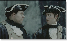
Figure 9-33 Closer

Figure 9-34 Closeup
In general, the depth of field gets shallower the closer the focused target is to the lens. Here are some examples of this starting with Figure 9-32. This medium shot has the two characters in focus but the far wall is out of focus (note the flowers in the background). The depth of field is even more noticeable in Figure 9-33 where the two chaps are chatting over a very blurry background. The closeup in Figure 9-34 has such a shallow depth of field that the lady’s far shoulder is actually out of focus. An extreme closeup of a face might have the nose and eyes in focus but the ears might be out of focus!
9.2.3 Shadows
The eye notices the lack of shadows immediately, so they are an essential element of a convincing composite. Nothing integrates two layers together like having the shadow of one layer cast on the other. Nothing reveals a bad composite like their absence. Any existing shadows in the background plate should be studied for clues as to the direction, sharpness, and density for making your faux shadows. If there are no shadows to study then think about the nature of the lighting in the shot as a guide to the nature of the shadows that would be cast.
Shadows are not simple things. They have an inner core and an outer edge, and there is the all-important contact shadow. In this section we will take a look at creating a progressively more realistic shadow to see what makes up a good shadow. The shadow is applied to the background layer prior to the composite by multiplying it by each shadow mask. Let’s take a look.

Figure 9-35 Bad mask
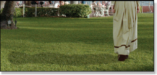
Figure 9-36 Bad shadow
We start with the bad mask in Figure 9-35 producing the bad shadow in Figure 9-36. What makes this shadow bad is that the mask is one solid density throughout. As a shadow falls away from its contact point it gets lighter because progressively more ambient light is falling on it. The mask should be denser near its contact point then fade off the further out it goes.

Figure 9-37 Better mask

Figure 9-38 Better shadow
Figure 9-37 is a better mask that creates a better shadow in Figure 9-38. A spline shape was used and the inner and outer splines that are normally used to make motion blur were used to good effect to fade off the shadow the further it gets from its base. But if you look closely at the feet in Figure 9-38 they still don’t look like they are in solid contact with the ground. The reason is that as the shadow goes under the feet, which are supposed to be in contact with the ground, the shadow should be extremely dense. This dense shadow at the point of contact is called a contact shadow.
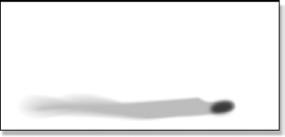
Figure 9-39 Best mask
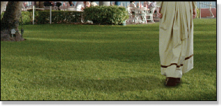
Figure 9-40 Best shadow
A contact shadow has been added to make the best mask in Figure 9-39, which makes the best shadow in Figure 9-40. Compare Figure 9-38 with Figure 9-40 and you can see how much more firmly the feet are in contact with the ground.
So where do you get your shadows? There are three places where you might get them. First is from the bluescreen plate itself. If there are shadows in it and you are using a fine digital keyer, and you are a master at tweaking it, the keyer can lift the shadows and composite them for you. At least that is what the manual says. The second possible source is to use the compositing matte. It can often be squashed and stretched and blurred to make a decent shadow. The third and last place to get a shadow is to roto one by hand.
9.2.4 Lens Distortion
All cameras, whether film, video, or digital still, capture their scenes through a lens, and even the finest prime lenses introduce lens distortion into the picture. Sometimes it is minimal and doesn’t create a problem, other times it is hugely problematic and gets in your face. Although perhaps a bit overdone for dramatic impact, Figure 9-41 does show the nature of a typical lens distortion. Sometimes the cinematographer will actually shoot a grid chart like this so us visual effects folks can figure out the lens distortion and factor it into the shots. More on that interesting idea in a bit.
Lens distortion ruins our day in three different ways. The first is motion tracking. Imagine tracking two or three points on a plate as the camera panned from left to right. Referring to Figure 9-41, instead of the points moving smoothly in a rigid flight formation across the frame they would drift apart then drift back together as they moved through different regions of the lens distortion. This will confuse the motion tracker and give you bad track data. The second problem is the shape distortions on objects. Figure 9-42 shows three frames of a camera pan. If an element fits perfectly over the main cluster of buildings in the center of frame 1, by the time the camera moved to frame 3 the buildings would be distorted and the element would no longer fit. The third problem is that you are required to match these lens distortions in your composites. Because CGI is rendered with mathematically perfect lenses it has no lens distortion, so you will have to put it in.
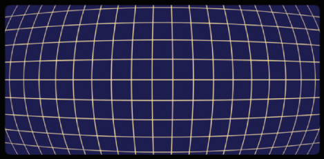
Figure 9-41 Lens distortion
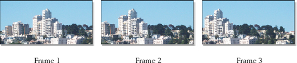
Figure 9-42 Lens distortion on moving footage
(To see a movie illustrating lens distortion download www.compositing VFX.com/CH09/Figure 9-42.mov)
The general solution to lens distortion is to undistort the plate. There are programs and tools that are specifically designed to figure out the lens distortion and flatten out the plate. These tools are especially effective if a grid chart was photographed with the same lens that was used for your shot. Don’t laugh. It has happened. Once the plate is flattened you can then do your motion tracking and compositing on nice flat elements, and then redistort the finished composite to reintroduce the original lens distortion. Very nice. And if you are doing a camera pan on a flat element such as a matte painting be sure to introduce a little lens distortion. If you don’t, instead of looking like the camera is panning around a real scene it will look like someone is sliding a flat postcard in front of the screen.
One thing to watch out for is zoom lenses. A prime lens is difficult enough to cope with and it has a single fixed focal length and unchanging lens distortion. The zoom lens has a constantly varying lens distortion as it racks through the zoom providing infinite challenges to the lens undistort tools.
9.3 SWEETENING THE COMPOSITE
Once you have done a yeoman job of color correcting and matching layer attributes of a shot, there are several things that can be done to “sweeten” the composite. These are the things that turn a good composite into a great composite. They not only subtly enhance the photo realism but they add an artistic flourish to the shot that makes your work stand out.
9.3.1 Light Wrap
In the real world light bounces around everywhere ricocheting off everything and landing on everything else. This we call interactive lighting. Interactive lighting is difficult to do in a 2D composite because it is a 3D phenomenon. The CGI folks have tons of built-in support for this that they refer to as “global illumination models.” But their world is 3D so they can compute the 3D interaction of light between the various surfaces in a scene. We cannot. We have to fake it. Following is a truly great fake.
As we saw in the chapter on bluescreen compositing, the edges of the talent get spill light from the bluescreen that contaminates them. Light from the backing color seems to “wrap” around the edges of the talent. The same thing would happen if the talent were standing in the middle of a cornfield. The difference is that the cornfield light would look natural and nice as it softly lights the edges of the talent, so nobody would be trying to remove it. In fact, if the talent were composited into the cornfield without this edge lighting it would look somehow odd and not belonging. The light wrap is a simulation of this natural edge lighting phenomenon.
Our case study of the light wrap technique begins with the original composite in Figure 9-43. Note how the gray sphere looks just pasted on top of the background and does not look at all like it is in the same “light space.” The first step is to create the light wrap mask that is shown in Figure 9-45. Note how it is dense at the outer edge then fades off towards the inside. To make this mask, simply start with the matte used to composite the foreground (Figure 9-44), give it a good blur, invert it (swap black and white), and then multiply the inverted version by the original matte. The results will look like Figure 9-45.
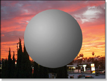
Figure 9-43 Original

Figure 9-44 Matte
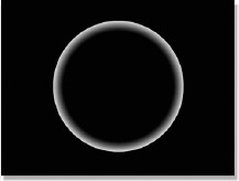
Figure 9-45 Mask
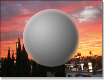
Figure 9-46 Final
Figure 9-47 Light wrap

Figure 9-48 Soft BG
The next step is to create the light wrap element itself, shown in Figure 9-47. Make a very blurry version of the background plate (Figure 9-48) and then multiply it by the mask from Figure 9-45. The reason for the big blur on the background plate is to blend away any fine detail. If the fine detail is not eliminated the edges of the foreground will simply appear semi-transparent. Not what we want.
Note how the light wrap element in Figure 9-47 is dark around the bottom where there is no light from the background. Also, both the color and the brightness of the background light are captured in the light warp element. The last step is to simply screen the light wrap element from Figure 9-47 over the original composite in Figure 9-43 to produce the final composite in Figure 9-46. The gray sphere now looks like it has light from the background plate lighting up its edges. Sweet.
The light wrap is supposed to be a subtle effect, more felt than seen. For purposes of expository impact I have grossly exaggerated the effect in this case study. Hopefully you won’t in your composites. You can control the width of the light wrap by how big the blur is when you make the mask, and how bright it is by lowering its brightness before it is screened. We don’t want to suddenly see a bunch of glowing composites out there!
9.3.2 Edge Blend
The edges in the background plate have a certain sharpness that must be matched by the edges of the composited elements. In film a “sharp” edge might be 3 to 5 pixels wide. For high definition video it might be 2 or 3 pixels, and for NTSC it will typically be about 1 pixel. If there are depth of field issues then the edges can be many pixels wide. Very often when pulling a matte for a bluescreen the matte edges become “hardened” (sharp edged), so when the foreground is composited with this sharp-edged matte its edges become too sharp compared with the rest of the background. Something must be done.
That something is edge blending. The basic idea is to create a thin mask that goes all around the perimeter of the foreground layer, and then use this mask to gently blur just the edges of the composite. This is a completely different look and much more natural than just blurring the matte before compositing. Composite with your best matte, and then edge blend the finished composite.

Figure 9-49 Original composite
Figure 9-50 Matte
Figure 9-51 Edge blended
Figure 9-52 Edge mask
Our case study begins with the original composite in Figure 9-49 whose edges are deemed too sharp for the rest of the picture. To create the edge mask in Figure 9-52, start with the matte used to composite the foreground and run an edge detect on it. The edge detect produces a thin mask that runs around the perimeter of the matte, but, most importantly, this mask straddles the edge between the foreground and the background. This is key, because we want to actually mix the foreground and background pixels across the edge. The last step is to apply a modest blur to the original composite that is masked with the edge mask from Figure 9-52. This is another one of those “felt, but not seen” treatments. View the finished composite from a normal viewing distance to judge whether the effect has been over- or underdone.
For high-resolution work like feature film or HDTV video the width of the edge mask should be two or three pixels. For NTSC a normal composite would not require edge blending unless the element was defocused. Check to see if the edge blended region has lost too much grain. If yes, then use the same edge mask to regrain the edge blended region. Now the question is, which to do first—edge blend or light wrap? The answer is…light wrap first, edge blend second.
9.3.3 Layer Integration
Very often a beginning compositor will just slap A over B and call it done. While the results may be reasonably photo-unrealistic, they will certainly be uninspiring. As artists, we need to add our artistic touch to the shot. One way to do that is to integrate the layers with each other so that the foreground is not just on the background but is in the background. The basic idea is to design the shot so that some portion of the foreground layer is situated behind some element of the background. This puts it in the background.
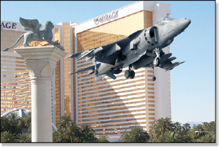
Figure 9-53 Jet on the background
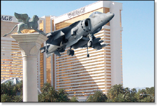
Figure 9-54 Jet in the background
Our case study begins with the big budget action stunt blockbuster in Figure 9-53 where Arnold Schwarzenegger is dropping in to his favorite Las Vegas casino for a little light gambling. Arnie’s jump jet is competently composited over the background, but with a small shift in the jet’s position to the left it is now behind the foreground column in Figure 9-54. This places the jet within the background plate, which helps to sell the composite. It is also more visually interesting. So look around the background plate to see if there is an opportunity to integrate the foreground layer into the background in an artistic and interesting way. This is why we get the big bucks.
9.3.4 Artistic Embellishment
When working on a visual effects shot you will be given the background plate and the one or two (or 10) foreground layers that are to be composited together. Of course, you will do a technically competent, even artistic job and pull excellent mattes, color correct everything well, manage the lens distortion, and do your light wrap and edge blending. But there is another level to aspire to where you add your own small artistic embellishments to a shot to add interest and detail.
Figure 9-55 picks up where we left off with Arnie’s landing above. A couple of embellishments have been added: a dust layer created by lifting some smoke out of the studio’s elements library then color corrected to fit in, plus a rare Las Vegas desert seagull was lifted out of another shot from the same movie. Adding small artistic embellishments like this adds your personal creative signature to a shot and endears you to the client. Of course, be sure not to get carried away with this and clutter up the shot or run over schedule.

Figure 9-55 Dust and gull added
9.4 A CHECKLIST
There is a lot to think about and remember when preparing a visual effects shot so here is a checklist to help you out. I recommend you go through the checklist when first setting up a shot to help you plan what you are going to include. When the shot is done go through the checklist again to make sure you have addressed everything.
9.4.1 Color Correction
• Do the black and white points match? (check with grayscale)
• Does the gamma match? (check with grayscale)
• Did you do a gamma slamming check?
• Do the fleshtones look realistic?
• Does the overall color match between the layers?
• Have I checked for clipped pixels?
9.4.2 Lighting
• Does the shot need light wrap?
• Does the shot need shadows?
• Do the shadows have reasonable density and falloff?
• Is any atmospheric haze needed?
• Does the shot need any interactive lighting?
9.4.3 Layer Attributes
• Is the edge sharpness consistent between all layers?
• Does the shot need edge blending?
• Have any depth of field issues been addressed?
• Does the grain or noise match between all layers?
• Have I accounted for any lens distortion?
• Are the layers integrated as much as possible?
• Can I add any small artistic embellishments?
* The “white T-shirt in bright sunlight” white point is not very scientific. The scientific definition of the white point is a 90% diffuse reflective surface. But that is what a white T-shirt in bright sunlight would be, and the T-shirt is a lot easier to envision.