© The Author(s), under exclusive license to APress Media, LLC, part of Springer Nature 2022
J. M. RhodesCreating Business Applications with Microsoft 365https://doi.org/10.1007/978-1-4842-8823-8_16

16. Dynamically Setting Object Properties in Power Apps Based on a SharePoint List

Jeffrey M. Rhodes1  
(1)
Colorado Springs, CO, USA
 

This chapter focuses on some techniques needed to build a “wizard” type of system where the user selects a topic and then is presented with a set of steps to perform the task or submit a request. To make this work effectively, we want to store the Actions and associated steps externally (SharePoint in this case). This keeps us from having to edit and republish our application whenever we add or delete Actions. For this to work, though, we need to be able to dynamically set button text and load each step as we go along. More specifically, we have an indefinite number of Actions that in turn have some number of steps, each with information and possibly attachments. Getting this all working gives us the building blocks that we would need to create the rest of the system.

SharePoint Lists

As is our standard practice by this point, we start with our data source(s) in SharePoint . Figure 16-1 shows the Actions list.

A screenshot of the actions window has columns for title, description, and order with data underneath.

Figure 16-1

Actions SharePoint List

Since we will be filtering on the Title later, we tell SharePoint that it must be unique. We will use this as the text of our button and the Description as the Tooltip. The Order allows us to position the buttons as desired.

Once the user selects the action, we want her to be able to go through its associated steps, which can include attachments as mentioned. Figure 16-2 shows that we add Action as a lookup column and bring along its Description and ID. We will focus on the Budget action in later screens.

A screenshot of the steps window has columns for title, action, action description and I D, details, and step num with data underneath. The first two rows are highlighted.

Figure 16-2

Steps SharePoint List

We will display the Title as well as the Details, which we configure as rich text so we can have formatting and images. The StepNum column gives us the order of the steps and allows us to insert and reorder down the line as desired. We are now ready to move to Power Apps .

Power Apps: Actions Screen

As with previous examples, we create a blank Canvas app and connect it to our Actions (Figure 16-1) and Steps (Figure 16-2) lists. Figure 16-3 shows the basic design from there. We have added Button1 through Button6. To make it easier to test, we will click on the button and have it display some text to ensure we have the right button. Once we select the right button, we click the Begin button to launch the StepsScreen to see our steps.1

A screenshot has 6 buttons under the tree view panel in 2 columns and 3 rows. Button 1 is highlighted on the right pane.

Figure 16-3

Power Apps Design with Buttons 1–6

Our first challenge is how to set the Text and Tooltip properties. As we discussed in our opening chapter about programming environments, Power Apps is different in this regard from most other tools in that we can’t look though our buttons and directly set these properties. Instead, the best approach I could come up with was to store the reference to each button within our data source. Listing 16-1 shows our code in response to the OnStart event .2
ClearCollect(
    col,
    AddColumns(
        Actions,
        "ButtonRef",
        Switch(
            Order,
            1,
            Button1,
            2,
            Button2,
            3,
            Button3,
            4,
            Button4,
            5,
            Button5,
            6,
            Button6,
            Button1
        )
    )
)
Listing 16-1

OnStart Code to Create our col Collection

As we have seen previously, ClearCollect() creates a new collection (col in this case). The second parameter is the record or table to put into col. We copy our entire Actions list into col, but we also want to add a new column named ButtonRef. 3 The AddColumns() method takes the source (Actions), column name (ButtonRef), and the values of the column. For the values, we use the Switch() statement to decide what we based on the Order column of the list. When the Order is 1, we want Button1, when it is 2, we want Button2, and so on.4

How does this new col collection help us? Figure 16-4 show how we can use it together with the LookUp() method to set the Text property of each button.

A cropped screenshot has 6 buttons in 2 columns and 3 rows under the tree view option. Buttons 1 through 4 are labeled as writing, budget, pay, and training.

Figure 16-4

Text Property of the Action Buttons

LookUp(col, ButtonRef = Self).Title
To understand this code, we note that the Self keyword is the reference to the object (e.g., Button1 for the first button, Button2 for the next, etc.). Since we added the reference to each row, we can search for the matching row and then read the Title value. We use similar logic for the Tooltip property:
LookUp(col, ButtonRef = Self).Description
Since we have extra buttons (5 and 6 in our example), we can use the fact that the lookup comes back blank to set the Visible property:
!IsBlank(LookUp(col, ButtonRef = Self))
Our next task is to handle on the OnSelect event for each button. As discussed earlier, we show the action in a label for debugging purposes and then click the Begin button to actually display the steps. This is shown in Figure 16-5.

A screenshot has 4 buttons in 2 columns for writing, budget, pay, and training. A cursor points to the pay button.

Figure 16-5

Clicking on an Action Button

When the user clicks a button (Button3 with a Text of “Pay” in our example), we set the selectedAction variable to Self.Text 5:
Set(selectedAction, Self.Text)
Our label then has this expression for the Text property:
"You clicked on " & selectedAction
This will help us ensure we have clicked the right one. Both it and the NavigateButton (Begin) have this for the Visible property so that they do not show until a button has been clicked:
!IsBlank(selectedAction)
Our last task on this screen is to control what happens when we click the NavigateButton. This is shown in Listing 16-2.
Set(
    selectedActionItem,
    LookUp(
        Actions,
        Title = selectedAction
    )
);
Navigate(StepsScreen)
Listing 16-2

OnSelect Code for the NavigateButton

We create a new variable, selectedActionItem, which is the entire row of our Actions list that corresponds to the selected button. We look it up via the Title column matching our selectedAction variable . Once this is set, we navigate to the StepsScreen. Note that we could put this code in each of our buttons instead for a cleaner experience (e.g., to avoid the Begin button).

Power Apps: Steps Screen

Before the Steps screen displays , we need to perform the logic in Listing 16-3. We do that by handling the screen’s OnVisible event .
Set(
    currentStepNum,
    1
);
ClearCollect(
    colSteps,
    Filter(
        Steps,
        'Action:ID'.Id = selectedActionItem.ID
    )
)
Listing 16-3

OnVisible Code for the StepsScreen

We initialize a currentStepNum variable to be 1 since we will always begin on the first step. We then create a new collection, colSteps, that will be just the items in our Steps list that match our currently selected action.6 We will then be able to use colSteps for our other controls.

Figure 16-6 shows what displays after we click on the Budget button (Button2). You might want to refer to the Steps list in Figure 16-2.

A screenshot has the details of the budget section. The components are supervisor approval, manager approval, sufficient funds, and credit card.

Figure 16-6

Step 1 of 2

Starting at the top, we have an Action label, a StepTitle label and a Home icon for returning to the ActionsScreen. Most of the middle of the screen is our StepDetails HTML text control. At the bottom left, we have an AttachmentsGallery to display any attachments that have been added in SharePoint . Finally, we have PrevBtn and NextBtn controls to go backward and forward.

Our Action label has this Text property:
selectedAction & ":"

We just use our previously defined selectedAction variable (Budget in Figure 16-6).

Getting our hands on the information for each step is trickier. Let’s say that we had ten steps. Our currentStepNum variable will have the current step. But Power Apps collections cannot go to an arbitrary value (2, 3, 4, etc.). However, we can use the FirstN() method to limit the number of rows we read. So if we are on step 4, we read four rows. We then use the Last() method to read the last one we have (e.g., the fourth row). Using this logic, here is the Text for the StepTitle label:
Last(FirstN(colSteps, currentStepNum)).Title
As we go across left to right, here is the OnSelect for the Home icon:
Navigate(ActionsScreen)
The HtmlText for our StepDetails is very similar to what we used for the StepTitle:
Last(FirstN(colSteps, currentStepNum)).Details
We had to do a bit more work to display our attachments. Since there are potentially multiple attachments for each step, we need to use a gallery control. However, our colSteps collection does not bring over the attachments. So we need to go back to the Steps list for the Items property in our AttachmentsGallery:
LookUp(Steps, ID = Last(FirstN(colSteps, currentStepNum)).ID).Attachments
We match up ideas to find the right item in our list and then find its attachments collection. We have a delegation warning once again as discussed in Footnote 6. Since we want the user to see the file name AND be able to open it, we need to add an HTML text control and then set its HtmlText property to be:
If(
    IsBlank(ThisItem.DisplayName),
    "",
    "<a href='" & ThisItem.AbsoluteUri & "'>" & ThisItem.DisplayName & "</a>"
)

If there is no attachment ( DisplayName is blank), we don’t display anything. Otherwise, we use our handy anchor HTML tag and set its href property to the AbsoluteUri property and show its DisplayName.

Moving to our navigation button, we want to disable the PrevBtn if we are on the first step. We do that by using this expression for the DisplayMode property:
If(
    currentStepNum > 1,
    DisplayMode.Edit,
    DisplayMode.Disabled
)
It will be enabled (Edit) if we are on a higher step and disabled if on step 1. Notice how this button is disabled back in Figure 16-6. Here is the code for OnSelect:
If(
    currentStepNum > 1,
    Set(
        currentStepNum,
        (currentStepNum - 1)
    )
)

Just to be on the safe side, we check that we are on a step higher than 1. If so, we subtract 1 from the currentStepNum variable . As we see from the preceding code, this will immediately cause the StepTitle, StepDetails, and AttachmentsGallery to load the previous step’s values.

The NextBtn is always enabled, so we don’t have to edit its DisplayMode. However, we do change its Text to “Submit” if we are on the last step:
If(
    currentStepNum < CountRows(colSteps),
    ">>",
    "Submit"
)
To figure out if we are on the last step, we use the CountRows() method on our colSteps collection. This is shown in Figure 16-7. Notice how the NextBtn has a text of “Submit” and the PrevBtn is enabled.

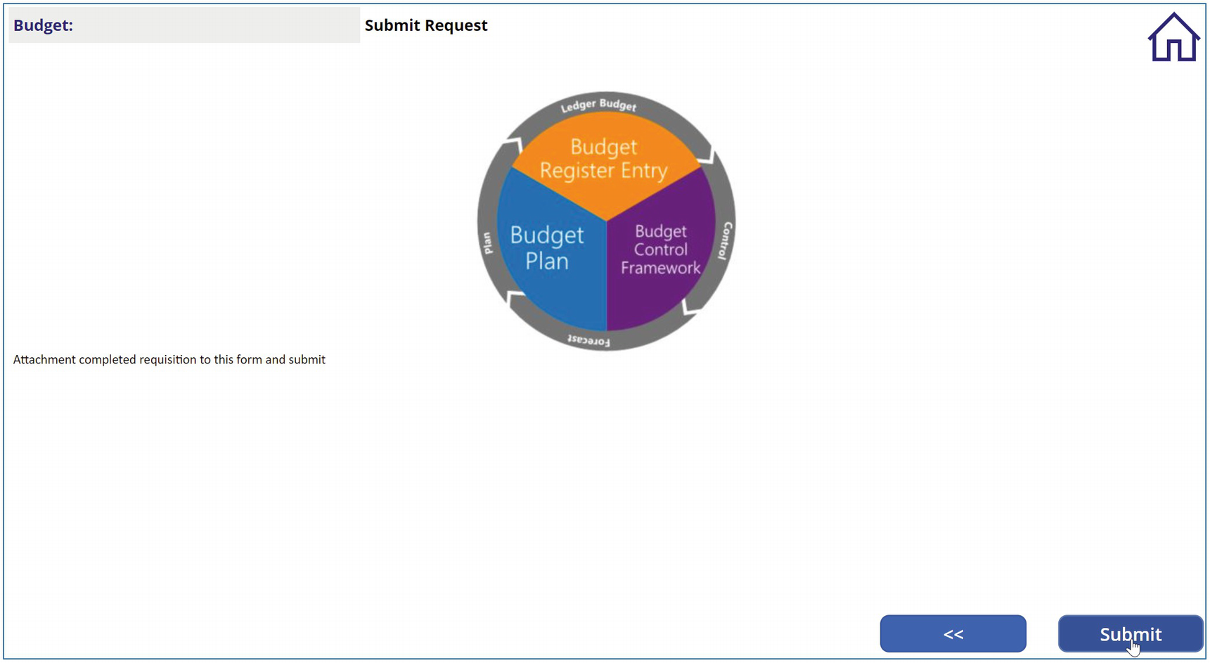
A screenshot of a donut chart has budget register entry, budget plan, and budget control framework on the inside. The outside highlights the ledger budget, control, forecast, and plan.

Figure 16-7

Step 2 of 2

The NextBtn OnSelect code is similar to that of the PrevBtn:
If(
    currentStepNum < CountRows(colSteps),
    Set(
        currentStepNum,
        (currentStepNum + 1)
    ),
    Notify(
        "Submitting Info Now",
        NotificationType.Information
    )
)

If the currentStepNum is less than the number of steps, then it adds 1 to currentStepNum. Otherwise, it calls the Notify() method as a placeholder for more logic such as emailing the information or presenting a screen for filling more data.

Summary

This chapter explored key techniques like dynamically setting button text and keeping track of the current step needed to create a “wizard ” with Power Apps. We learned how to make any attachments available via a link in an HTML text control and how to control our “next” and “previous” buttons to make the user’s experience seamless. We will continue to explore key technologies for this type of system in the next chapter, when we learn how to copy upload user attachments to a SharePoint document library and email links to them.

..................Content has been hidden....................

You can't read the all page of ebook, please click here login for view all page.
Reset
3.145.186.147