
Power BI is a powerful tool for visualizing data. Of particular relevance for this book is its ability to use SharePoint lists as a data source. In this chapter, we will demonstrate how to use Power BI to display SharePoint survey data. This is particularly useful for a long-running survey such as for a help desk. The ability of Power BI to slice the data and separate out more recent submissions is crucial to spotting trends and addressing any issues.
SharePoint's Default Visualization
As shown in Figure 4-1, SharePoint’s built-in graphical summary displays all results. If the survey has been in place for the past five years, seeing recent trends are impossible. In addition, there is no way to click on the Very Dissatisfied responses, for example, and drill down into their comments or other information.

A Summary report of satisfaction survey shows the parameter options from very dissatisfied to very satisfied for 2 questions.
SharePoint’s graphical survey summary
Connecting to Our SharePoint Results

A screenshot for the context menu of get data drop-down menu shows all share point online lists. A box contains site U R L along with the implementation radio buttons activated for 1.0.
Getting Data from a SharePoint List

A table for the Satisfaction survey with 4 columns and 12 rows with load, transform data and cancel buttons at the bottom. A list of display options are shown at the left
Selecting a SharePoint Survey List in Power BI Desktop

A demonstration of available options under the transform data drop-down menu. The option is found under the table tools of the top menu bar.
Transform Data in Power BI Desktop
Power BI gives us a nice interface to filter our data, rename columns, and much more. It shows all the actions in APPLIED STEPS so we can view, edit, or remove them later (see Figure 4-6). Better yet, these steps are re-accomplished on the live data each time we refresh the data. You might notice in Figure 4-4 that the column names are truncated as in How satisfied are_x0. It will be most convenient to rename them to the full text of the associated question. To do that, we right-click on the column and select Rename. We then copy in the full question from SharePoint.

A drop-down menu under the author shows a list of columns. It points to the title with a check mark alongside. The ok and cancel buttons are there at the bottom.
Expanding a Record column into individual elements

A table presents a list of submitter, editor, and days passed. On the right, it has the property for the name and a list of applied steps.
Expanded and custom columns in Power BI Query Editor
Visualizing Our Data

A pie chart depicts the percentage of dissatisfied, neutral, satisfied, very satisfied, and dissatisfied reviews. On the right, the fields for satisfaction point to the details and I d to the values for the number of responses.
Pie Chart Visualization in Power BI

Four pie charts show the data for satisfied, dissatisfied, neutral, very satisfied and dissatisfied reviews in the survey. A table at the bottom right presents a list of comments along with the submitter and the date.
Completed visualizations showing pie chart per question, slicer of the survey date, and table of additional information

Four pie charts show the number of responses on the scale of satisfied, neutral to dissatisfied. The cursor hovers over the dissatisfied data of one chart showing the percentage of response as 16.67.
Drilling down on a Dissatisfied result in Power BI

Four pie charts for various survey questions show the data for a range of time from June 2018 to May 2022. It has a list of options on the navigation pane at the left.
Published Power BI Report
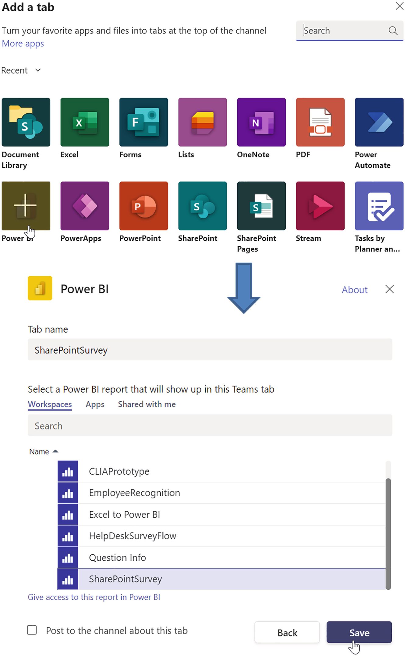
A screenshot indicates adding a tab in Power B I. Under the workspaces tab is a list of names from which the SharePoint survey is highlighted.
Adding Power BI as a Tab in a Teams Channel

A list of icons appears under the data analysis and regional information menus. The mouse cursor highlights Power B I under data analysis.
Adding Power BI to a SharePoint Page
Summary
In this chapter, we used SharePoint survey responses as our data source within Power BI. We transformed our data and added a Days Passed custom column that allowed us to easily create filters to show the most current week, month, quarter, and year if desired. We also saw how to customize the colors of our data to match up with our expectations that green is good, red is bad, and yellow is in-between. Finally, we learned how to display our reports in Teams or SharePoint.