
Adding in multiple answers, multiple lines of text, and Yes/No responses leads to some additional challenges in visualizing data. This chapter looks at some of these challenges and how to address them.
JSON and HTML Data Formats

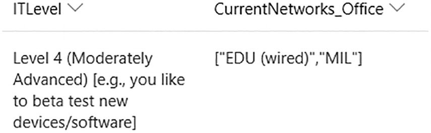
A screenshot shows 2 questions. Single choice on I T level with second out of 5 options selected. Multi choice on currently used office networks with second and fourth out of 7 options checked.
Form questions that generate JSON and HTML
A screenshot of the data in SharePoint with I T level and current networks office.
SharePoint display of the data showing the complete answer text and JSON format

A screenshot of visual projection capability and current L M S programming data. It features 4 lines of H T M L code in 2 columns.
HTML Format in Power BI for multiline text in SharePoint
Working with the Data in Power BI

A screenshot shows SharePoint online lists with site U R L. Implementation option 1.0 selected. Advanced options, o k, and cancel are visible at the bottom.
Connecting to a SharePoint list with the 1.0 implementation
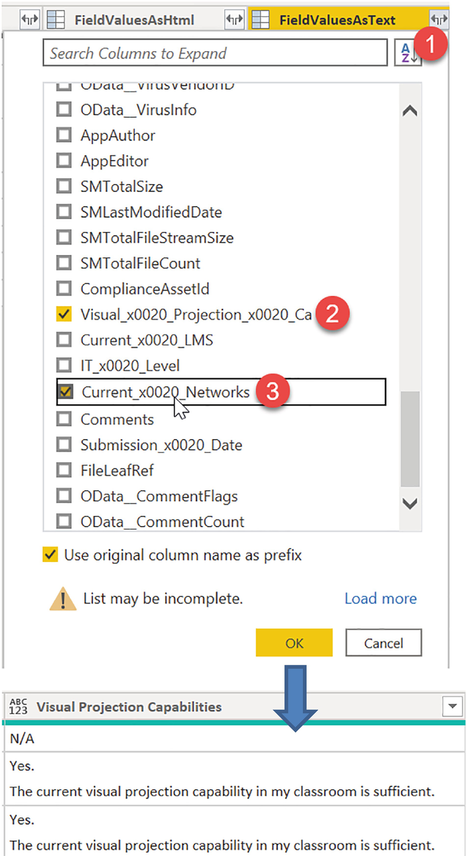
A screenshot of field value as text with several options in the center pane. A downward arrow from the o k button points to visual projection capabilities.
Retrieving Field Values as Text

A screenshot of replace values with 2 panes for value to find and replace with. Advanced options, o k, and cancel are visible at the bottom.
Replacing null JSON values in Power BI

A screenshot of an I T level with option extract and first characters highlighted in the right pane.
Extracting the first seven characters of the IT Level column

A screenshot of the current office networks with option parse and J S O N highlighted in the top pane.
Parsing JSON data in a multiple response column

A screenshot of the current office networks with option expand to new rows highlighted in the top left and each I D circled in the list below.
Expanding multiple responses into separate rows
We do this for each of the multiple response columns. In our example, we started with 270 rows of data. After expanding all the columns, we ended up with 1,227,676 rows! Luckily, Power BI can handle this extra data just fine.
Visualizing the Data in Power BI

A screenshot of current network 308753 with a pie chart in the center pane and a box of visualizations with several options in the right pane.
Erroneous results when using Count

A screenshot of current network 261 with a pie chart in the center pane and a box of visualizations with several options in the right pane.
Correct results when using Count (Distinct)

A screenshot of a matrix with 6 pie charts in the center pane and a box of visualizations with several options in the right pane.
Using a Matrix without stepped layout instead of a Table
Working with Yes/No Data

A screenshot of C F A M daily check with a part of the daily status check questionnaire in the center pane.
Daily Check form showing Yes/No data

A screenshot of a dashboard featuring 11 completed tasks with the most recent date of check in the bottom right.
Dashboard showing most recent Daily Check data

A screenshot of a dashboard with timeframe. It features 11 tasks. Several pie charts and a date range tracker are visible in the right pane.
Dashboard showing Daily Check data over time

A screenshot of advanced editor, C F A M daily check programming data. The changed type is highlighted at two places in the code.
Using the Advanced Editor to reference a previous step

A screenshot of add conditional column with the option most recent date and others. Option O K and cancel in the bottom right.
isMostRecentDate conditional column

A screenshot of page level filter with the options: select all, false, and true.
isMostRecentDate page-level filter

A screenshot of attribute and value columns shows 8 wired or wireless attributes. A pop-up in the right pane with Unpivot only selected columns points at the value column.
Unpivoting Yes/No columns leading to Attribute and Value columns

A screenshot of a stacked bar chart of operational, completed on the left. A screenshot of visualizations with several options on the right.
Configuring the stacked bar chart

A screenshot of visualizations with several options: y axis, x axis, legend, gridlines, zoom slider, bars, colors.
Configuring custom data colors
Summary
This chapter introduced us to several tools and techniques that help us work with some of the more complicated data types and still accurately and effectively display our data and get the insights that we need.