
Good day, my dear readers! We’re now at Chapter 3.
In the previous chapter, we learned the basics of modeling a game asset and some tips for creating a game environment. In this chapter, we will get started with how to shade and put colors in your game asset to give more life to it. We’ll cover color theory and the UV workspace, which allows us to put a 2D image onto a 3D object. The next chapter covers creating your own textures.
Now, without further ado, let’s get started!
Color Fundamentals
Before we start our discussion of Blender’s features that are related to texturing your game asset, let’s first discuss the fundamentals of colors.
Colors are there to enhance your design, not to be your design. Even without them, your asset must show its design. In creating characters for anime or comics, there is this tip by which you can tell that the character has a powerful image or is created with a nice back story if when you black it out or when you can only see the silhouette of that character, you can tell which character it is. I believe this can also be applicable to game assets. You can tell that you created well your game asset if when you black it out, without any color and just its silhouette, you can recognize it apart from other assets.
There’s a lot of things to study when it comes to color. We will just discuss some of the important parts that can help us efficiently design a game environment.
Color Theory
Color theory encompasses a multitude of definitions, concepts, and design applications. However, there are three basic categories of color theory that are logical and useful: the color wheel, color harmony, and the context of how colors are used.
The first color wheel has been attributed to Sir Isaac Newton, who arranged red, orange, yellow, green, blue, indigo, and violet into a natural progression on a rotating disk. As the disk spins, the colors blur together so rapidly that the human eye sees white. From there, the organization of color has taken many forms, from tables and charts to triangles and wheels.
As of now, there is no substantive evidence that supports a universal of color theory.
A color wheel is an abstract illustrative organization of color hues around a circle, which shows the relationship between primary colors, secondary colors, tertiary colors, and so on. The Itten color wheel consist of twelve colors, which are three primary, three secondary, and six tertiary. The influence of psychoanalysis is apparent in Itten’s color theory, as he was one of the first to associate different colors with specific emotions and to study the impact of color on our moods.
Discussion about primary colors results in a lot of debates now because of the appearance of different types of color systems. Now, what we called primary colors, secondary colors, and tertiary colors depend on what color system are you using.

Color Wheel
Color Meaning
Colors have different psychological meanings, depending on how you use them. Besides the usual cultural meanings attached to colors, we can even see color personality, which links the meaning of color to an individual’s personality. Knowing this, we need to be conscious of what meaning we’re conveying. We need to learn how we can use colors appropriately.
It’s not the colors themselves that have specific meaning but rather the culturally assigned meanings to them. Since we have culturally assigned meaning to them, it is important to know our target audience so that we can research the meanings of certain colors related to their culture and tradition.
Warm Colors: Pertaining to colors like red, orange, and yellow. They are associated with passion, energy, impulsiveness, happiness, coziness, and comfort. They can easily draw attention and have the advantage of being inviting and harmonious.
Cool Colors: Pertaining to colors like blue, green, and violet. They are associated with calm, trust, and professionalism. They are also associated with sadness and melancholy. They do have an advantage of being professional and harmonious but can turn off people by the coolness they radiate.
Red: Color of fire and blood. It is emotionally intense. Associated with energy, war, danger, strength, power, determination, action, confidence, courage, vitality, passion, desire, and love. It can enhance metabolism, increase respiration, and raise blood pressure. Has a high visibility and advances to the foreground. Red is also a magical and religious color. It symbolizes super-human heroism to the Greeks and is the color of the Christian crucifixion. Red was almost as rare as purple in ancient days, a fact that may explain its magic and power. A fun fact about the influence of this color red is the international color for stop, but when you also hear the word “red-light district,” it pertains to stores that sell sex and pornography. Red is also the color of good luck in Asia, especially in China; and in East Asian stock markets, red is used to denote a rise in stock prices. But take note, in North American stock markets, red is used to denote a drop in stock prices. Red captures attention. It is one of the most visible colors, second to yellow.
Yellow: Color of the sun. Bright yellow attracts attention, though it can also be distracting when overused. Associated with joy, happiness, wisdom, and intellectual energy. It stimulates mental activity and generates muscle energy. It produces a warming effect and is often used to evoke cheerfulness or pleasant feelings. Shades of yellow can become dingy, lessening the pleasing effect. Yellow is the most luminous of all colors of the spectrum. It’s the color that captures our attention more than any other color. Fun facts about the influence of this color are that yellow is the color of traffic lights and signs indicating caution all over the world. In Japan, it represents courage while in China, adult movies are referred to yellow movies (I wonder why). In Russia, a colloquial expression for an insane asylum used to be a yellow house while in some areas in Mexico, bright marigold yellow may be associated with death. Yellow has a high light reflectance value and therefore it acts as a secondary light source.
Blue: Color of the sky and sea. Slows metabolism, breathing, and heart rate. It is also seen as a masculine color. Associated with trust, loyalty, wisdom, intelligence, expertise, confidence, stability, and depth. Creates a calming effect and suppresses appetite and has been considered to be beneficial to both mind and body. Fun facts about this color are that Greeks believe that blue wards off “the evil eye.” Dark blue is the color of mourning in Korea. Shades of blue are described as shallow or deep instead of light or dark in China. Also, in Belgium, blue is for baby girl and pink is for baby boy. Lastly, “Prince Charming” is called “The Blue Prince” in Italy and Spain.
Orange: Combines the energy of red with the happiness of yellow. It’s not as aggressive as red and calls to mind healthy food. Associated with joy, sunshine, the tropics, enthusiasm, happiness, fascination, creativity, determination, attraction, success, encouragement, stimulation, and strength. Can increase appetite and evokes thoughts of fall and harvest. Fun facts about this color are that it symbolizes autumn. Orange is the color of life rafts, hazard cones, and high-visibility police vests globally. Orange (saffron) is a sacred and auspicious color in Hinduism; and in the United Kingdom, orange stands for the Northern Irish Protestants and has very strong religious and political significance.
Green: Color of nature. It symbolizes growth, hope, freshness, and fertility. In countries with green money such as the United States, it evokes thoughts and feelings of financial wealth. Associates with healing, stability, endurance, harmony, safety, life, and well-being. Sometimes signifies a lack of experience and is often used to indicate the safety of drugs and medical products in advertising. Fun facts about the color green are that in China, green may symbolize infidelity. A green hat symbolizes that a man’s wife is cheating on him. In Israel, green may symbolize bad news. In Japan, the words for blue and green, which are “ao” were the same until after World War II when the nihonggo word Midori, which means green, was already thought of as a separate color, not just as a shade of blue.
White: Associated with light, goodness, purity, innocence, and virginity. It usually has positive connotations and is seen as safe and clean.
Purple: Combines the stability of blue and the energy of red. It conveys wealth and extravagance, and it seen as the color of royalty. Symbolizes power, nobility, luxury, and ambition. Associated with wisdom, dignity, independence, creativity, mystery, and magic. This color seldomly occurs in nature and some may consider it artificial. Light purple is seen as feminine. Purple is also popular with children. In Catholic culture, purple is associated with death; while in some Islamic nations, it is associated with prostitution. Also, purple is the most powerful visible wavelength of electromagnetic energy. This explains why purple is associated with supernatural energy and cosmos than with the physical world. Fun facts about this color are that the “Purple Heart” is the American award for bravery. In Italy, most performing artists would not go on stage if they had to wear anything purple. Also, purple is the hardest color for the eye to discriminate.
Black: Associated with power, elegance, formality, death, evil, and mystery. It denotes strength and authority. Seen as formal and elegant, it brings forth feelings of fear and the unknown.
Gray: Color of sorrow, detachment, and isolation. It connotes responsibility and conservative practicality. It’s a neutral color and creates noninvasive feelings. Associated with security, maturity, and dependability. It can be used to reduce the intense energy of another color and to emphasize a willingness to comply.
Brown: Color of the Earth. Tends to blend into the background. Associated with material things, order, and convention. Its connection to Earth gives stability. Can convey solid and wholesome feelings.
Usually, warmer colors advance into the foreground while cooler colors reside in the background. It’s because warmer colors attract more attention than cooler ones. By mixing warm and cool colors, you can create depth in your design.
Color Harmony
In order to create the best color combination for our design, we need to understand the word harmony . By definition, harmony is the combination of simultaneously sounded musical notes to produce chords and chord progressions having a pleasing effect. Applying to colors, color harmony means a combination of colors to produce a balance and pleasing color effect. So, how can we achieve that? We can achieve this by using this term, which is also very familiar with many of us: the color scheme.
Color Scheme
There are two ways to create a color scheme. One is with the color scheme that is based on the color wheel; and the one way is that many of us are familiar with: monochromatic, analogous, complementary, etc., and the color scheme based on nature.
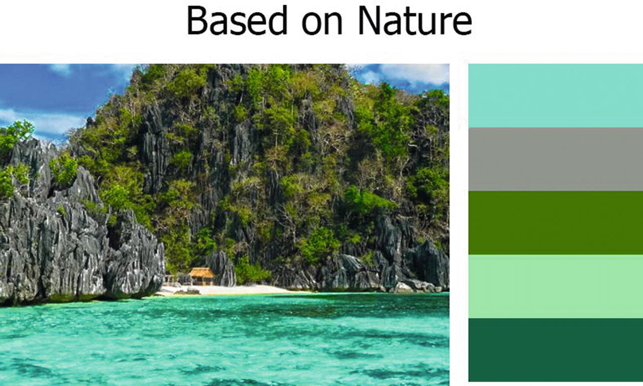
Color schemes based on nature are simply color schemes produced from nature itself. It sounds simple, right? Yeah. But creating it was actually a little bit complex. Creating a scheme based on nature involves not just understanding colors but also understanding lighting. We’re dealing with nature itself and nature has these unbeatable light sources: sun, moon, and stars. You cannot cut them off.
A color scheme based on nature can also be classified as a custom color scheme. There are other ways to create a custom color scheme; but make note that when creating your own color scheme, you need to keep in mind things like chroma, hue, value, and saturation – creating a custom color scheme means you are not using the formal rules.
Custom Color Scheme
As you can see in Figure 3-2, I base the color in a picture on nature, but even though it was based on a picture, or let’s say a customized color scheme, I make sure there’s still a pattern in my color scheme. You will notice that the shades of my color palette have something to do with green, and then I also choose something with shades of gray. Gray is a neutral color, just like white and black, so it can balance with any color.
Color schemes based on color wheels or traditional color schemes are based on formal rules. There are six types of these color schemes: monochromatic, analogous, complementary, split-complementary, tetradic, and triadic.
Monochromatic Color Scheme
It looks clean and elegant. Effective at establishing an overall mood. Tends to be very unified and harmonious. It is based on different tones of the same color. It is the simplest color scheme to create, since it was taken from the same color, making it harder to create a jarring or ugly scheme. This scheme is easy to create but can also be boring if it isn’t created properly. Adding in a strong neutral like white and black can help keep things interesting.
Take a look at Figure 3-2 to see a sample of a monochromatic scheme.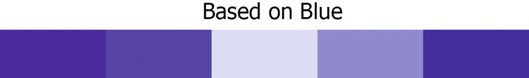 Figure 3-3
Monochromatic Color Scheme
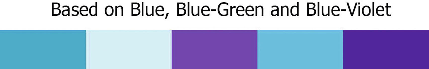
Analogous Color Scheme
It is similar to a monochromatic scheme, but it offers more nuances as it draws from a wider band on the color wheel. Often found in nature. Harmonious and pleasing to the eye. It can also be very versatile. It is based on colors adjacent to each other on the color wheel. This color scheme is another easy one to create next to a monochromatic color scheme since it was created based on three colors next to each other on the color wheel. In traditional color wheels, analogous have the same chroma level, but by using tones, tints, saturation, values, shades, and lightness, we can add interest to these schemes and make our design more interesting.
Now, take a look at Figure 3-4 to see our example for an analogous color scheme.
Analogous Color Scheme
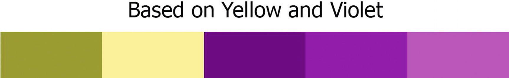
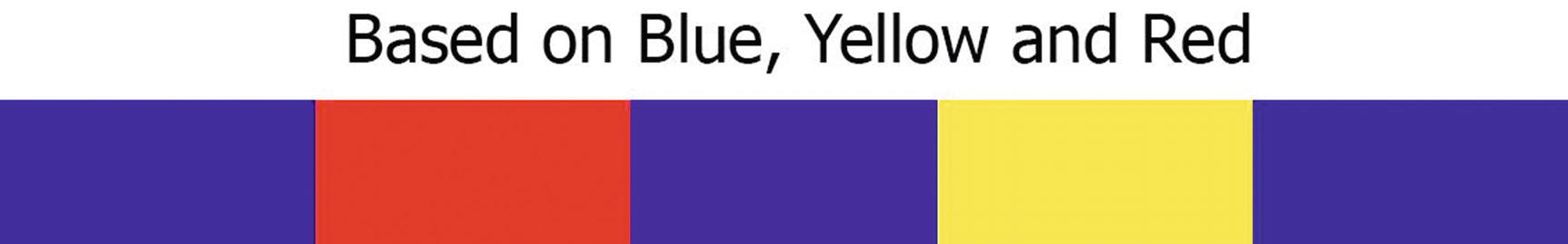
Complementary Color Scheme
This is created by combining colors from opposite sides in the color wheel. It looks best when a warm color is used against a cool color. Creates an intrinsically high level of contrast and creates a dramatic look. The colors intensify each other and are extremely eye-catching and vibrant. I just want to note that using colors with their exact opposites with the same chromas and/or values can be visually jarring.
Take a look at Figure 3-5 to see our example for a complementary color scheme.
Complementary Color Scheme
Split-Complementary Color Scheme
It offers high contrast without the strong tension of complementary colors. It adds more complexity than a regular complementary color scheme. They have more variety then complementary color schemes though they’re less vibrant and attention grabbing. Created by choosing one color and then two more colors that are adjacent to the complementary color of the initial color.
Take a look at Figure 3-6 to see our example for a split-complementary color scheme.
Split-Complementary Color Scheme
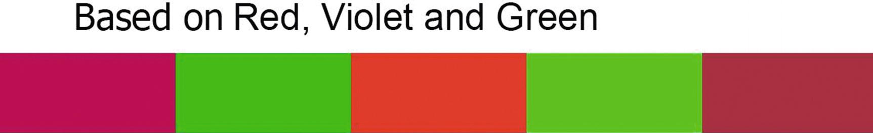
Triadic Color Scheme
It offers a strong visual contrast while still retaining harmony and a richness of color. It can be vibrant even when the colors are unsaturated, and it has stability because each color in the triad balances the other two. Uses three colors equally spaced around the color wheel.
Now, take a look at Figure 3-7 to see our example for this color scheme.
Triadic Color Scheme
Tetradic Color Scheme
It can be hard to harmonize and may look unbalanced. Makes for a rich color scheme with lots of variation. Created by choosing colors at the corners of a rectangle inscribed on the color wheel.
Let’s take a look at Figure 3-8 to see our example for a tetradic color scheme.
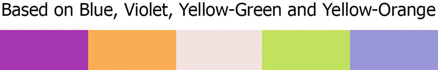
Tetradic Color Scheme
To decide your color scheme, you must think of what message you want to convey in your design. Usually, when you decide on a color scheme, you begin with the dominant color.
Colors can be presented in different spaces using different attributes, and these attributes can help us create more pleasing designs. These attributes are the values, hues, saturations, tones, intensities, tints, and chromas.
Hue, Saturation, Values (HSV) and Others
Hue is the actual color of an object. Violet, blue, and red are examples of a hue. Hues can be more specifically described as the dominant wavelength and is the first item we refer to when adding in the three components of color. It essentially refers to a color having full saturation.
Saturation is the degree of purity of a hue. It is similar to chroma, though not quite the same thing. Pure hues are highly saturated. When gray is added, the color becomes desaturated. Saturation defines the brilliance and intensity of a color. When a pigment hue is “toned,” both white and black (gray) are added to the color to reduce saturation. It is also described as how much of a given hue is in a filter.
Highly saturated colors or pure hues are perceived as more dynamic, but too many saturated colors can compete and cause eye fatigue. Desaturated colors lend themselves to performance and efficiency. Desaturated bright colors are perceived as friendly and professional, while desaturated dark colors are perceived as serious and professional.
Value or Luminance is a measure of the amount of light reflected from a color and is basically how light or dark a hue is. Adding white to a hue makes it lighter and increases its value or luminance. This can also be said that it is something that refers to the lightness and darkness of a color. It indicates the quantity of light reflected. Adding black lowers the value.
Chroma is the colorfulness of an area being judged as a proportion of the brightness of a similarly illuminated area that appears white or highly transmitting.
Chroma and saturation are often used interchangeably but are defined distinct concepts by the Commission Internationale de I’Eclairage (CIE), whose terminology is widely accepted as standard in science and technology.
Intensity is the brightness or dullness of a color.
Shade is the result of adding black to a hue to produce a darker hue. Shade is equal to pure hue plus black. High saturations have a lot of one particular hue, are very chromatic, and we call colors in that range shades.
Tint is the result of adding white to a hue to produce a lighter hue. Tint equates to a pure hue plus white. Also, tints tend to allow a lot of light to pass through them. Low saturation is closer to a white light and colors in that ranges are called tints.
Tone is the result of adding gray to a hue. Tone is equal to pure hue plus gray.
Because all color is relative, nothing is objectively a tint or a shade.
Now that we’re done with the color attributes, let’s talk about the color system.
Color Systems
Additive Color System (RGB)
This color system is what we usually find in computer monitors, etc., as I mentioned before. RGB stands for red, green, and blue. To create colors on a computer screen, we have to add light since the light source comes from within, instead of reflecting the light coming from the outside of the system. When there is no light, we see black and as we add more color, we move toward white.
It also be noted that variability with screen brightnesses, lightning conditions, and hue and contrast settings will render the exact same color differently from one computer monitor or gadget’s screen to another.
Color is light. Light is electromagnetic radiation, and over a range of wavelengths, it makes an impression on the human eye. This range of wavelengths is the visual spectrum. When light hits an object, some wavelengths are absorbed. When all the wavelengths in the visual spectrum are absorbed, we see black. When all are reflected, we see white. When some are absorbed and some are reflected, we see different colors.
Subtractive Color System (CMYK)
This color system refers to full-color printing. CMYK stands for cyan, magenta, yellow, and black. When we see colors in physical objects, we’re seeing reflective light. When we see red, it’s because all the other wavelengths of light have been absorbed and only the red is reflected. This is a subtractive system because in order to produce color, we’re removing all the wavelengths of light whose colors we don’t want to see. As we add more colors to the system, more light is absorbed and the overall color gets darker. Subtractive systems start with white and continue to add color until the result is black.
Let’s take a look at Figure 3-9 to see the chart that can reflect the RGB and CMYK color systems.
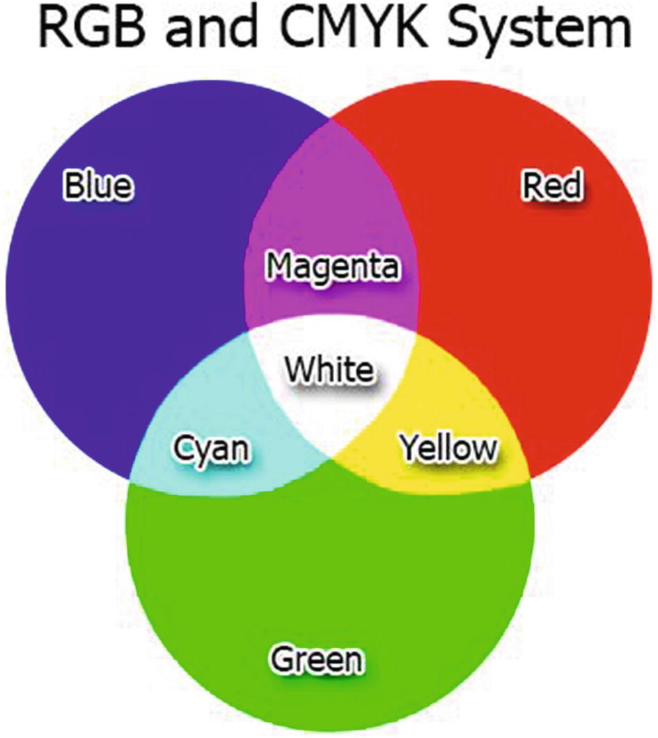
RGB and CMYK system
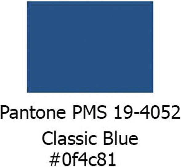
Pantone Matching System (PMS)
This is a system of thousands of numbered swatches. Most corporate colors, like logos, are identified with a number from this system. Pantone colors are also called spot colors.
This is similar to picking paint or hardware because you refer to the swatches of colors. It can be used both digitally and in prints.
Take a look at Figure 3-10 to see a sample of a Pantone code and color.
PMS Color system
RYB Color System
RYB stands for red, yellow, and blue. It is the basic among the basics. Oh, what does it mean? It is usually the first color system we learned when we were young, though I don’t know if all of us have the same experience with it; but for most it’s a yes. It is like how mixing blue and yellow can produce the color green.
The concept of RYB and RGB lies in the perspective at which light comes to you. RYB is more applicable in traditional arts like painting since the concept of paint is that color absorbs every color but one that is reflecting. This means that red absorbs every color except red, blue absorbs every color except blue, and yellow absorbs every color except yellow. In this case, when you add colors together, what you are doing is adding to the amount of colors that the paint will absorb. You can also call this a subtractive color system because when you add different colors together, what you are actually doing is subtracting the amount of light that the paint can reflect.
HSL Color System
Although the RGB system can easily help us generate colors, they are not recommended for us artists to use. Instead, HSL or hue, saturation, and lightness is the one we use for finding the right color for our design. In the hue/saturation wheel, the angle around the circle defines the hue and the radius defines the saturation. Then, how we can see the lightness? It depends on the slider of the software you are using.
Take a look at Figure 3-11 to see an example of a hue/saturation wheel.
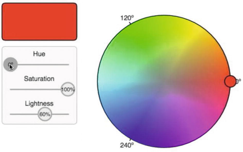
Hue/Saturation Color Wheel
You can see in Figure 3-11 that this hue/saturation color wheel is the same as the color wheel we see in most digital art software. Just like I said before, it was the recommended system for us. Let’s try to understand it further.
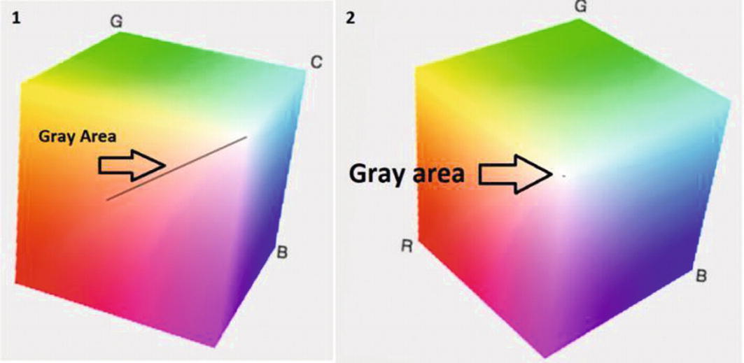
RGB Cube conversion to HSL
I guess you already feel cheated by scientists and mathematicians here, right? Well, they do lots of formulas in order to create this one but let’s leave it out here for now. We’re just into the fundamentals of color in this section.
The concept of the lightness in the hue/saturation wheel is like this: Think of that Hue/Saturation circle as a 3D object. Extend that circle into a cylinder. The lightness defines what slice we take out from that cylinder. If it was 50 percent, you take it out at the middle of the cylinder. If you want a lighter color, you need to move up the lightness of that cylinder, and if you want it to be darker, you will move down the cylinder. If 0 percent means a dark color, 100 percent means a brighter color, so what kind of effect do you think the color has if you gave lightness a value of 50 percent? I’ll let you think about it.
A small dose of color that contrasts with your main color will draw attention and also make sure to use a variety of tones, values, and levels of saturation for the sake of people with limited color vision.
We are now done with the color fundamentals. Next stop, we’ll start to discuss the technical stuff, Blender stuff.
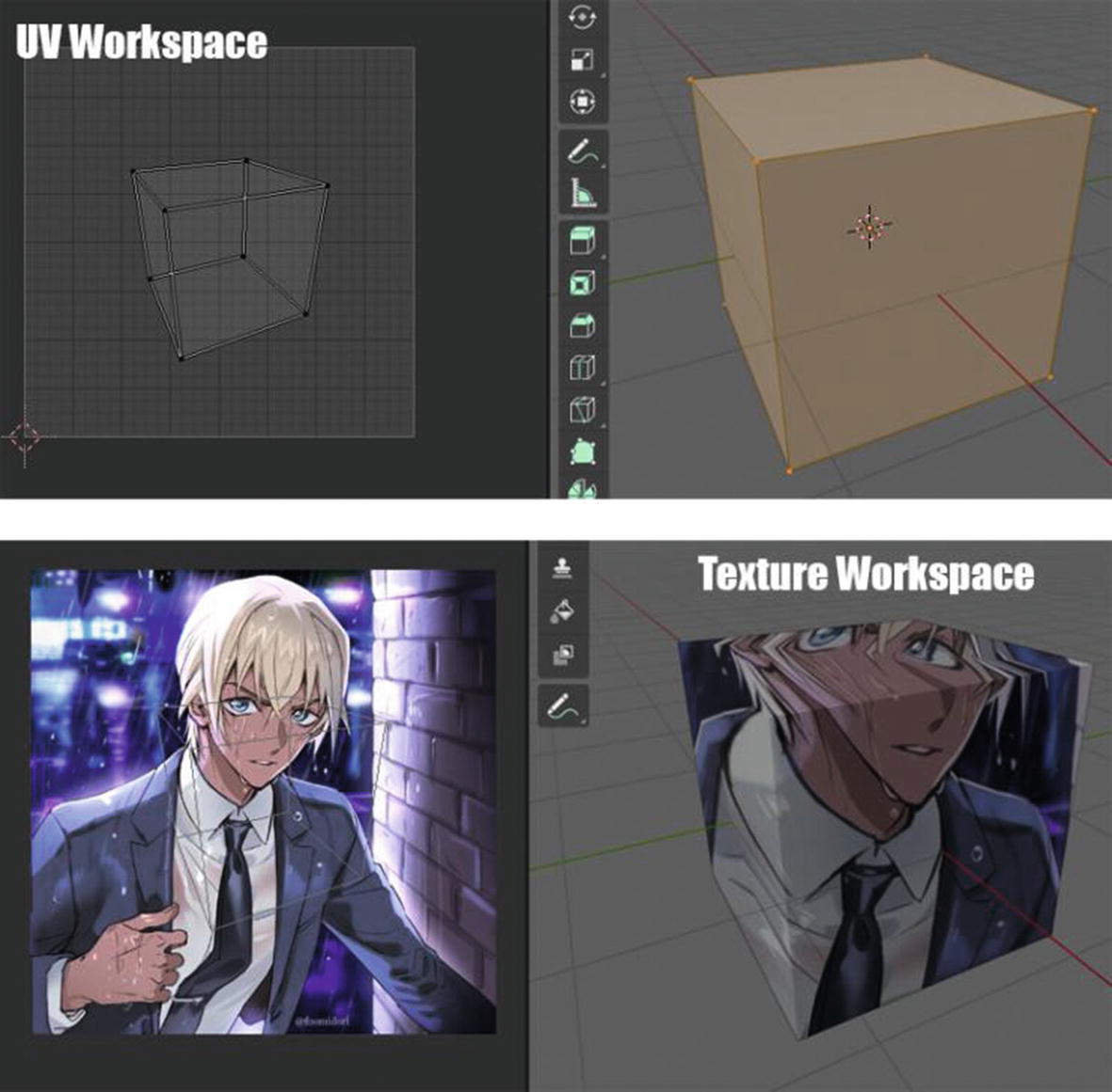
UV Workspace
There are two ways in applying a shade in your mesh. One is using nodes with shader workspace and the other is by using textures or images. When applying these textures and images, or baking textures, you need to do this UV mapping process so that your 3D software can convert the 2D images you are importing as part of the 3D world. This is where the UV workspace is useful.
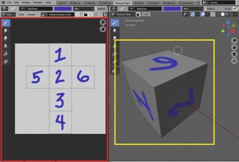
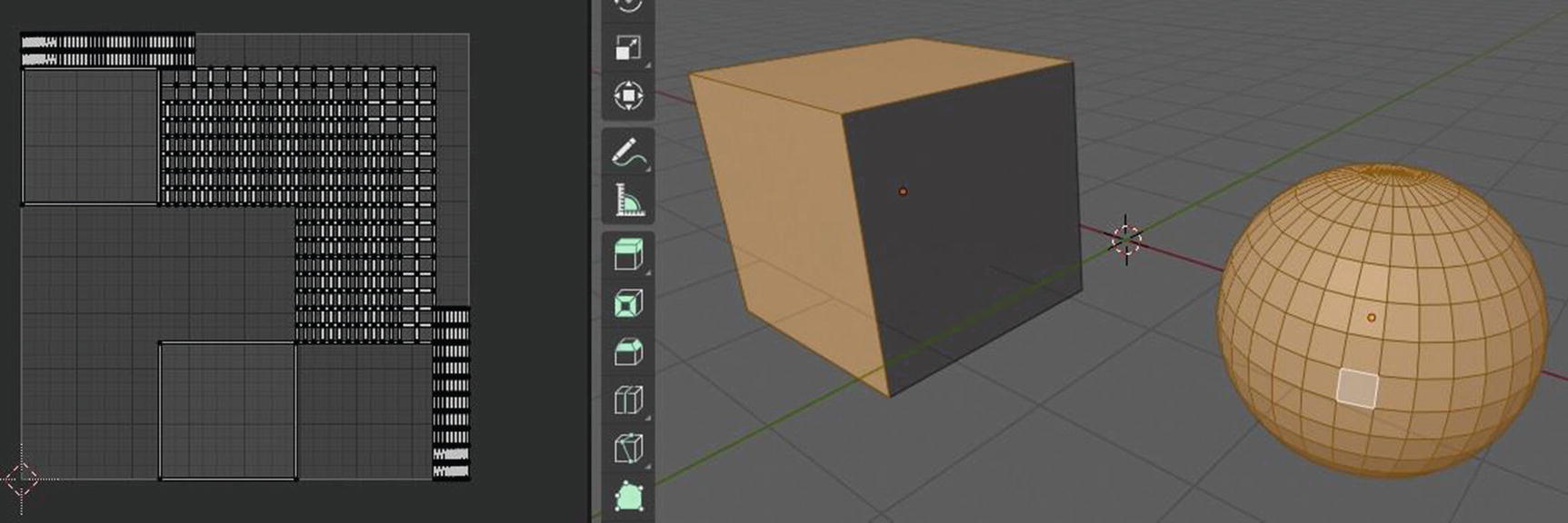
Left: UV Layout, Right: Mesh Cube
I add a texture so it can easily understand what’s going on here. What you can see in the left side, which is also inside the red rectangle, is the UV layout. Blender created the UV layout from our mesh cube using the UV workspace’s UV editor. You can think of it like smoothly cutting of the cube in order to make it a flat one so we can prepare it for texturing.
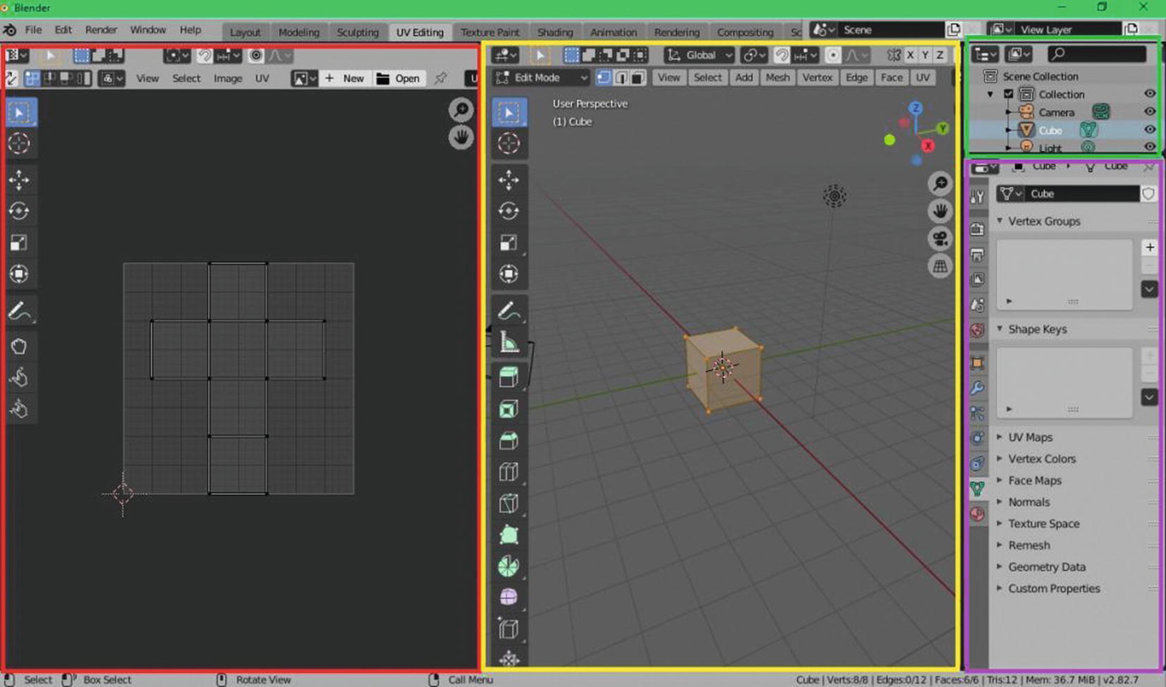
UV Workspace: UV Editor (Red), 3D Viewport(Yellow), Outliner(Green), Properties(Violet)
We have four editors present in the UV workspace: the UV editor, the 3D viewport, the properties, and the outliner. Let’s start with the 3D viewport.
3D Viewport in UV Workspace
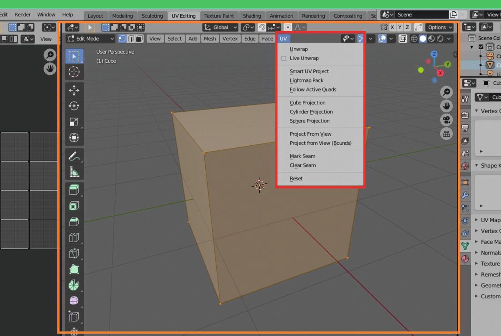
3D viewport default setup in UV workspace
As you can see, the default setup of 3D viewport is in edit mode and solid shading. For this part, our discussion will be focusing on the one that is inside the red rectangle, which is the UV menu since it’s the only one directly related to the features of UV mapping that are in a 3D viewport.
In the UV menu, you can see that we have thirteen tools: Unwrap, Live Unwrap, Smart UV Project, Lightmap Pack, Follow Active Quads, Cube Projection, Cylinder Projection, Sphere Projection, Project from View, Project from View (Bounds), Mark Seam, Clear Seam and Reset. Let’s start with Unwrap.
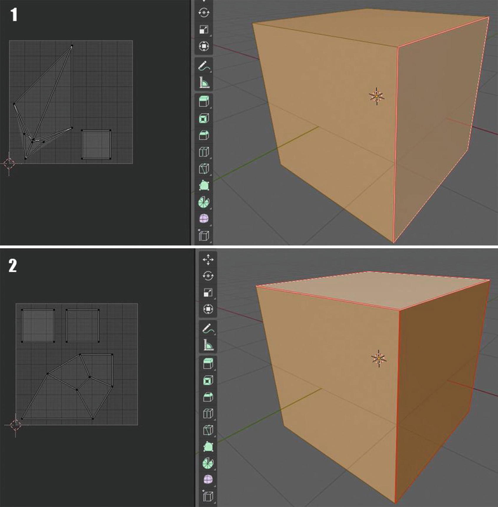
Unwrap
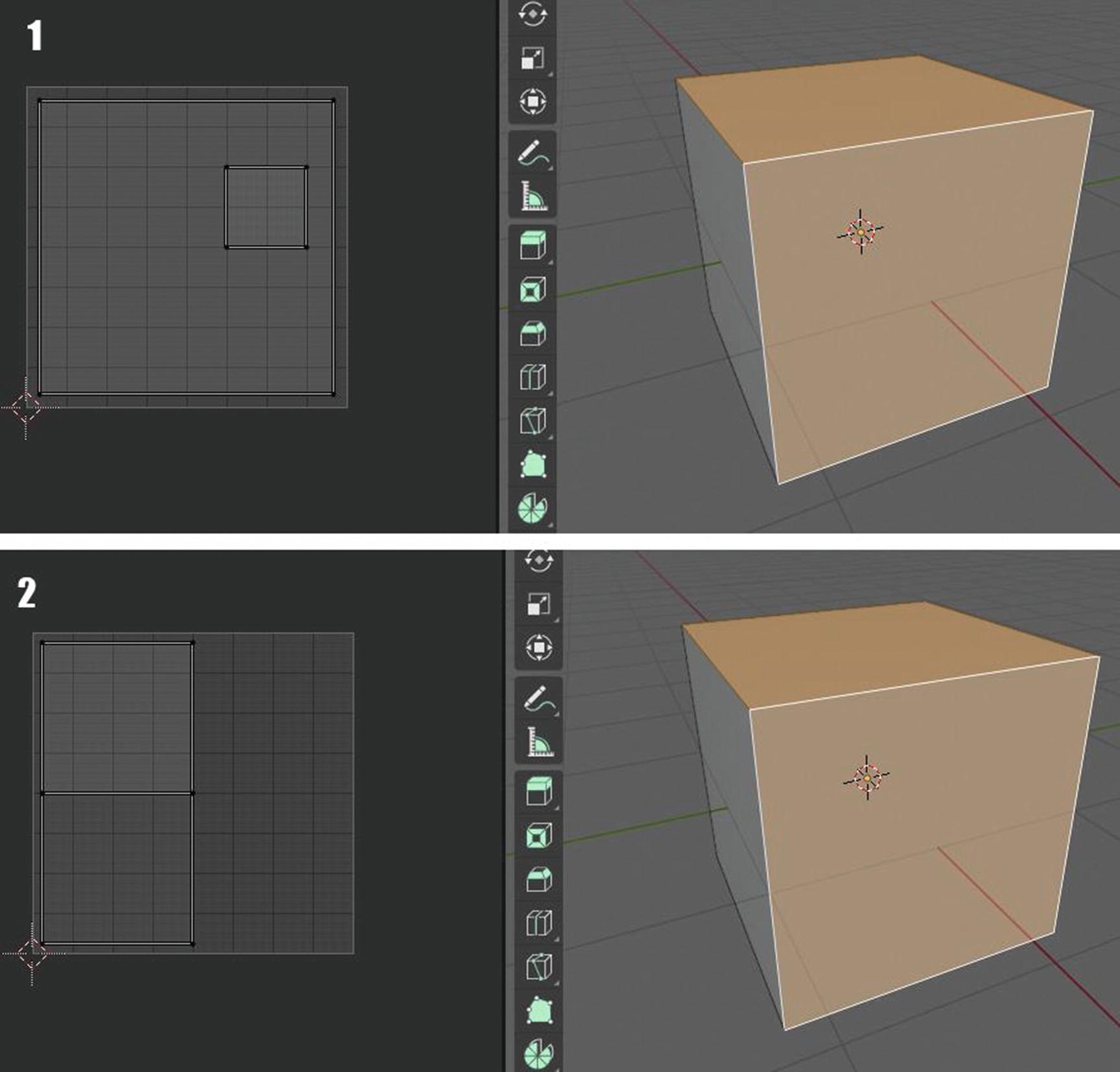
Unwrap at work
We can see in Figure 3-16 how unwrap tool works. In image 1, the top photo, the unwrap tool isn’t used yet. As you can see, there are things overlapping in the UV layout. This kind of UV layout can cause a problem when we do our texturing, especially UV layouts are also been exported to be used in game engines. In image 2, we can see how the unwrap tool fix the problem of the overlapping.Unwrap tool is the basic tool for UV mapping. You just need to select the part where you want to put your texture and then click unwrap, but this tool also takes a lot of time, especially when it was used in complicated mesh. That’s why we have another tool which is called Live Unwrap.
Live Unwrap
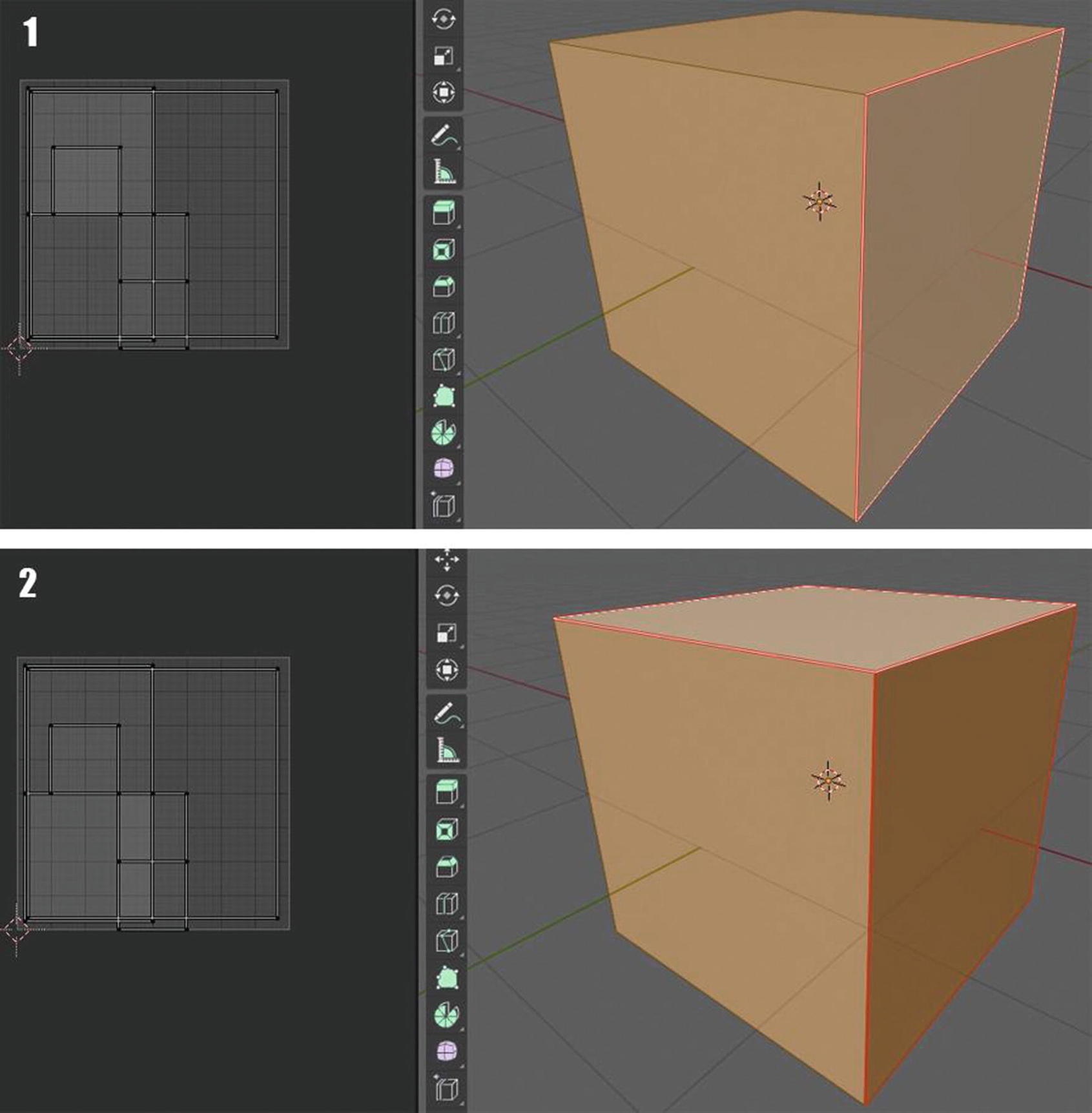
Without Live Unwrap
With Live Unwrap
You can see here that without using the live unwrap, after we add the seam (which are the red marks in the edges of the cube), nothing changes in the UV layout of our cube unless you unwrap it again. Without live unwrap, what you will always do is add seams and then unwrap them again after adding the seams, which will slow you down when doing it with complicated meshes.
Now, let’s take a look at Figure 3-18 where we use the live unwrap.
You can see here an automatic change in the UV layout as we add seams. This is how live unwrap helps us speed up our project.
But what if I want to make a UV layout in an easy and faster way than what we have above? Well, we have that. It’s the purpose of Smart UV Project.
Smart UV Project
Smart UV project is a script projection that unwraps the selected faces of a mesh. It operates on all selected mesh objects, and it can be used to unwrap selected faces or all faces. Before this, it was called an archimapper. It examines the shape of your object, the faces selected, and their relation to one another, and then creates a UV map based on this information and settings that we give.
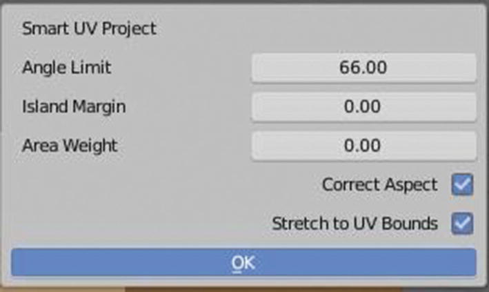
Smart UV Project Settings
In Smart UV project settings, what we have are Angle Limit, Island Margin, Area Weight, Correct Aspect, and Stretch to UV Bounds.
The angle limit controls how faces are grouped. Indicating a higher value will create many small groups of faces but less distortion while indicating a lower value creates a few groups of faces and more of distortion. The island margin controls how closely UV islands, or the squares you can see in the UV layout/UV map, are packed together. Zero means no spaces between the UV islands and as the number increases, space increases too.
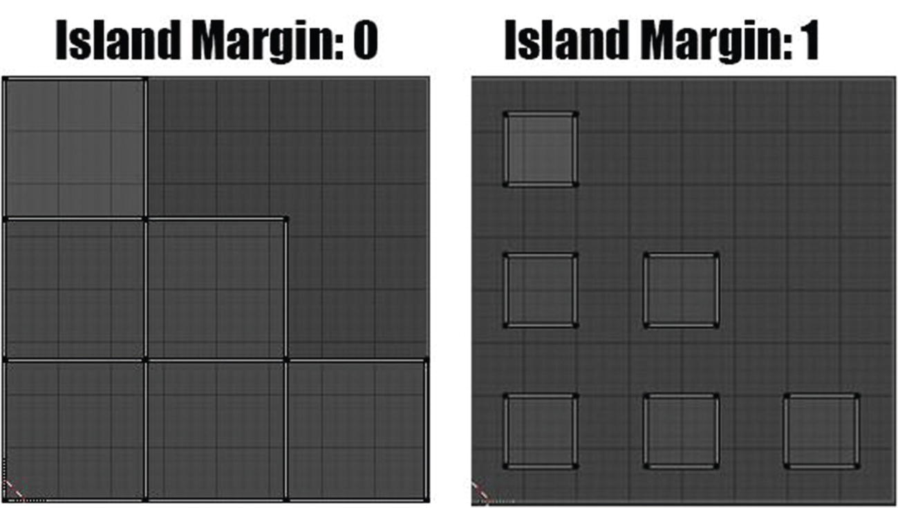
Island Margin at work
You can see at Figure 3-20 the effect of its value. It is recommended to use a value more than 0 for margins for islands. It will help you with baking and texture bleeding. The margin is a buffer for mipmaps in games and the bakes need a little extra room to fill in the areas between islands. Even when you use texture paint, you will need to bake the maps afterward.
Area weight is the weight projection’s vector by faces with larger areas. Correct aspect is enabled by default. As long as it was enabled, The map UVs will take the image aspect ratio into account in the process of mapping. Lastly, stretch to UV bounds, which is also enabled by default, stretches the final output to texture bounds.
Let’s now discuss our fourth tool we have in 3D viewport for our UV, which is the lightmap pack.
Lightmap Pack
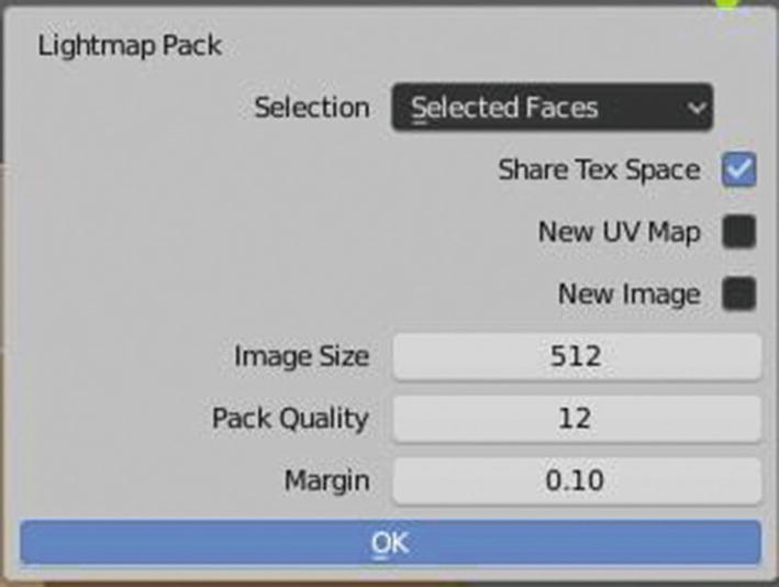
Lightmap Pack Settings
What we have in Lightmap Pack settings are Selection, which contains Selected Faces and All Faces, Share Tex Space, New UV Map, New Image, Image Size, Pack Quality, and Margin.
New UV Map
You can see in Figure 3-22 that there is no overlapping UV island in the UV layout and it was neatly placed in the UV editor. This was thanks to the share tex space settings for lightmap pack.
New image assigns a new image for every mesh but only if shared tex space is enabled. Image size sets the size of the image. Pack quality does prepacking before the more complex box packing, and margin controls how closely the UV islands are packed together. Higher values will add more spaces between the islands.
Wait, for sure you are wondering what does “packing” mean in pack quality? Okay, then. Packing quality controls how efficiently laid-out UV islands are on the texture. Low-pack quality means more texture space but faster unwrap while high-pack quality means the UV islands are better optimized and can use the entire texture but has a slower unwrapping time.
So, now let’s move on to the fifth tool, which is follow active quads.
Follow Active Quads
Follow active quads follows UVs from active quads along continues face loops. This tool takes the selected faces and lays them out by the following continues face loops, even if the mesh face is irregularly shaped. It does not respect the image size so you may might have to scale them to fit the image area. Just to be clear, the active quads that are being followed here are the active quads in the UV space, not in the 3D space.
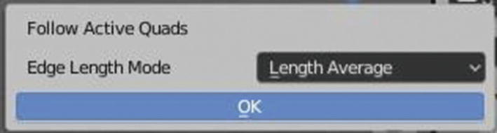
Follow Active Quads settings
As you can see in Figure 3-23, follow active quads only have simple settings. Their edge length mode settings set the mode on how the UV space will be calculated. They have two options: even and length and length average. Even means the UVs will space evenly, and length average means the average space of the UVs’ edge length of each loop, and this is the default one to use. Length is the same as length average.
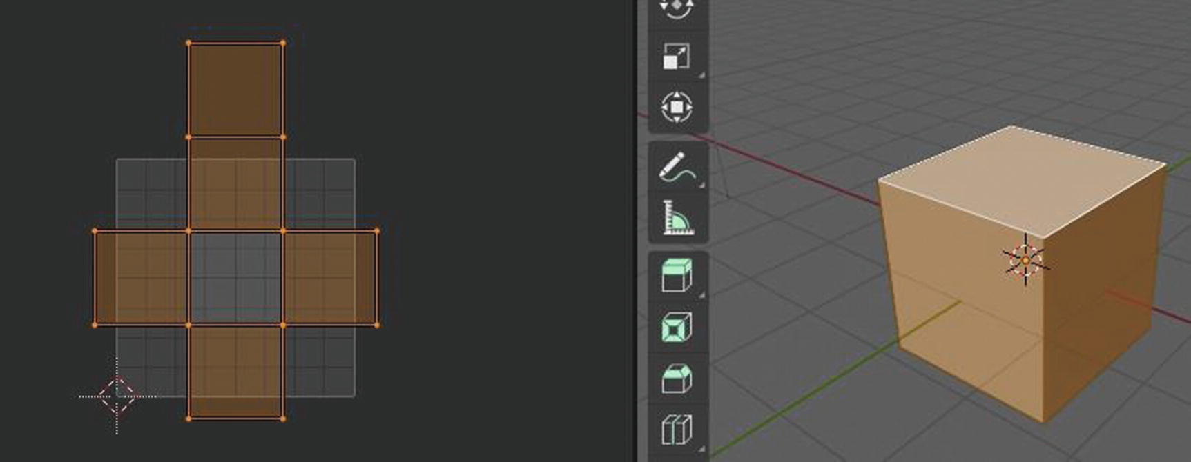
Follow Active Quads at work
You cannot see many effects if you will look at it them in UV workspace but, you can clearly see their effects when you apply a texture, even just a simple image texture.
Okay, as you can see in Figure 3-24, our UV layout is taking space even outside the image area. That is the reason why we need to scale it down to fit in the area. Sometimes, you will see an error that there is no selected face. Remember that this tool focuses only on the selected faces, so make sure you are selecting it by faces, not by vertices or edges.
The actual creation of UVs are done through a projection technique. Think of it as a projector showing a movie on a screen. The concept is the same, except in a 3D application like Blender, there are different UV projection types available to you. These are based on single geometric shapes and oftentimes are a great starting point to lay out UVs for a single object.
Now, let’s proceed to our next tool, which is cube projection.
Cube Projection
Cube projection projects the UV vertices of the mesh over the six faces of a cube, which is then unfolded. It projects the mesh onto the six separates planes, creating six UV islands.

Cube Projection settings
What we can see on Cube Projection settings are Cube Size, Correct Aspect, Clip to Bounds and Scale to Bounds. First, let’s talk about cube size.
Cube size sets the size of the cube to be projected onto. Correct aspect, when enabled, will take an image aspect ratio into consideration during UV mapping. Clip to bounds makes sure that any UVs that lie outside the 0 to 1 range will be clipped to that range by being moved to the UV space border it is closest to. Last, scale to bounds scales a UV map larger than the 0 to 1 range to fit inside.
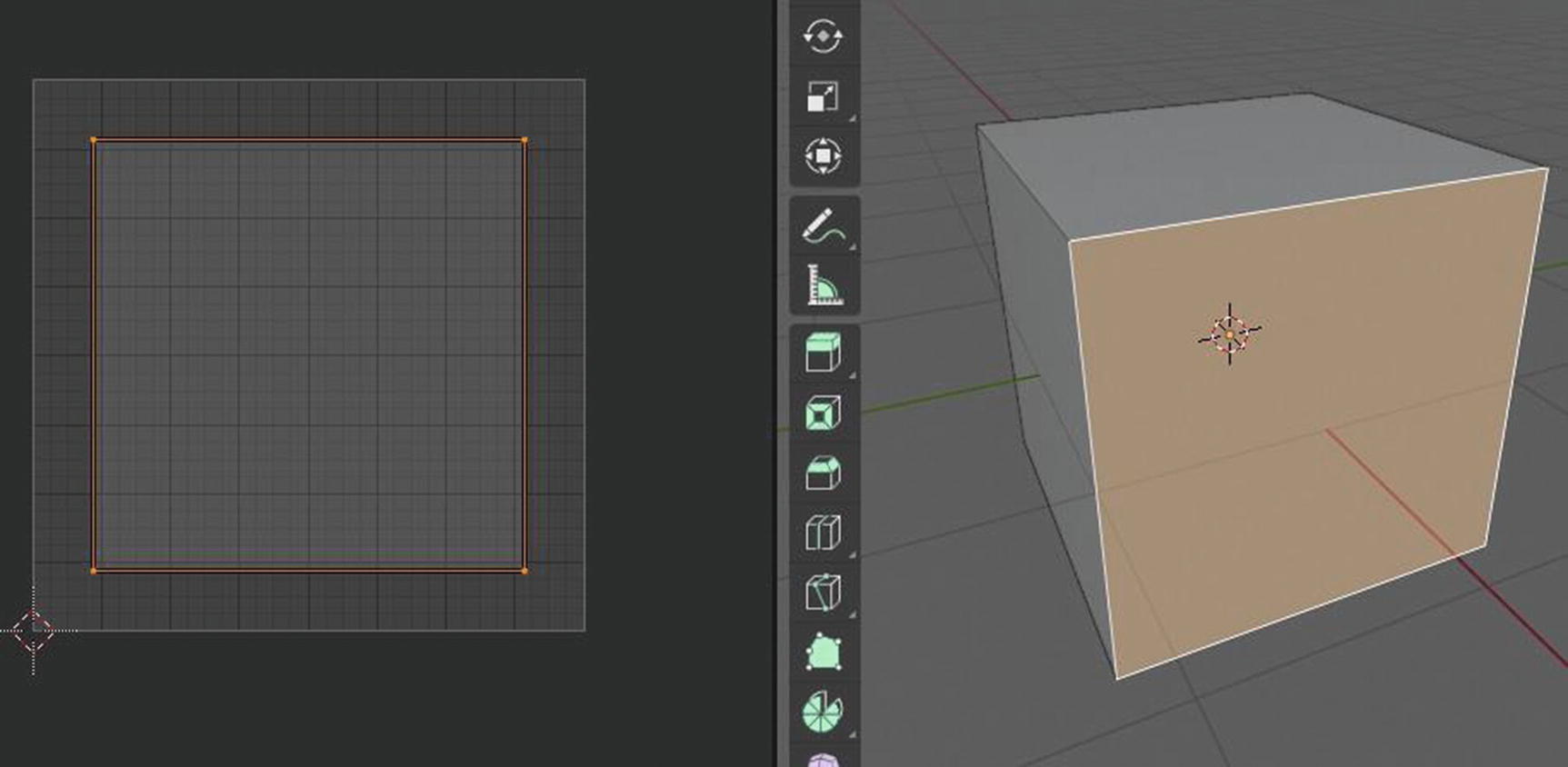
Cube Projection at work in UV workspace
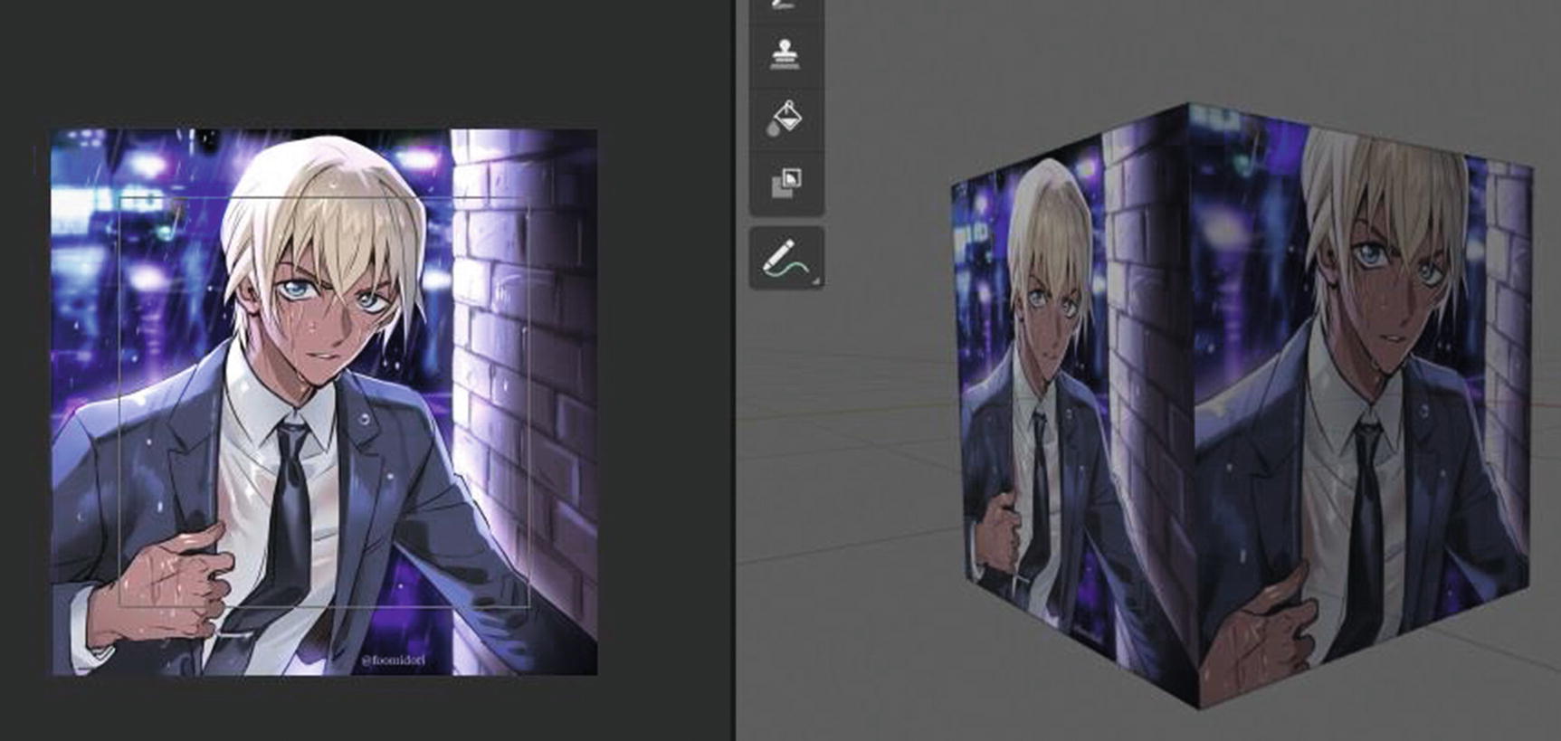
Cube Projection at work in Texture workspace
As you can see in Figure 3-26, I select the face in the UV editor and scale it down. You can see its effect in Figure 3-27. The other image, where the UV face that we scaled down is linked, gives an impact that it was much closer than the other one. You can also notice that I only select one face for cube projection. I did that to show you some differences that you can notice in Figure 3-27. You can notice it in my mesh cube; even though the two faces have the same image textures, they do have different layouts. The reason is because of how we apply the cube projection and its settings. You should see that in the face I select for cube projection, the image texture seems to be closer than the other one. That is the effect of the smaller cube size.
So, let’s now proceed to the next tool, which is the cylinder projection.
Cylinder Projection
Cylinder projection projects the UV vertices of the mesh over the curved wall of the cylinder. It is the same way in the cube projection. The difference is that this is for a cylinder while the other is for a cube.
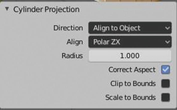
Cylinder Projection settings
What we can see in Cylinder Projection settings are Direction, Align, Radius, Correct Aspect, Clip to Bounds, and Scale to Bounds.
Direction is to indicate how the UV layout, or the texture that will be used on in the mesh, will be viewed. It has three options: View on Equator, View on Poles, and Align to Object.
View on equator is used if the view is looking at the equator by using a vertical axis. View on poles is used when viewing from the top by using an axis that is straight down from the view, and align to object if used when you want to calculate the axis base on the object.
Align settings select which axis is up. It has two options, which are Polar XY, which sets Polar 0 on the X-axis; and Polar ZY, which sets Polar 0 on the Y-axis.
Radius setting sets the radius of the cylinder to use. Once again, since these three are already discussed in the cube projection, correct aspect, when enabled, will take the image aspect ratio into consideration during UV mapping. Clip to bounds makes sure that any UVs that lie outside the 0 to 1 range will be clipped to that range by being moved to the UV space border it is closest to. Last, scale to bound scales a UV map larger than the 0 to 1 range to fit inside.
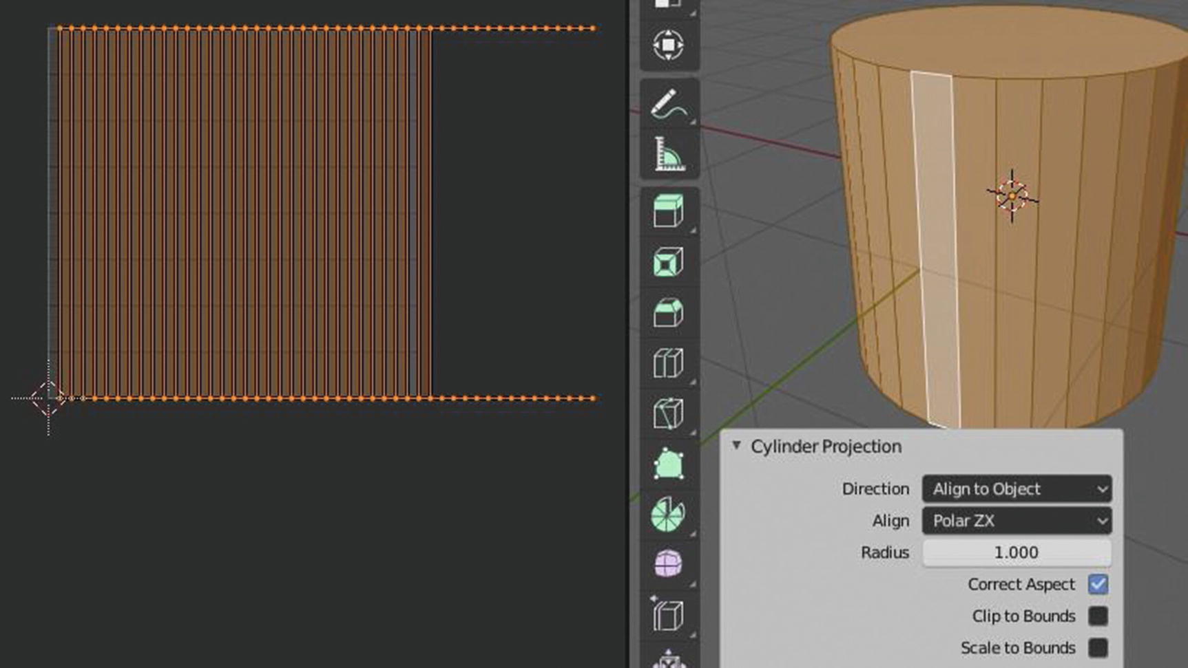
Cylinder Projection at work in UV Workspace
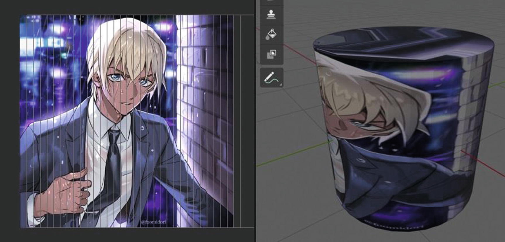
Cylinder Projection at work in Texture Workspace
I used align to object as my direction and you can see its effect in the UV layout. Because the UV islands that represent the top and bottom part of the cylinder are outside the image area and there are also overlapping UV islands, you can see in Figure 3-30 the effect on the texture. Of course, this is just showing you that even though these tools seem to be shortcuts that can help you make your project a lot easier, don’t forget about the minor details that can have big effects in the future. When we are in the UV editor part and in the sample project, we will discuss how these problems will be solved.
Sphere Projection
Sphere projection projects the UV vertices of the mesh over the curved surface of a sphere. Its function is like the first two, cube and cylinder projection, but again for sphere. Its settings are almost the same as cylinder projection except that it doesn’t have settings for radius.
Now, let’s proceed to the next tool, which is the project from view.
Project from View
Project from view projects the UV vertices of the mesh as seen in the current 3D view. It takes the current view in the 3D viewport and flattens the mesh as it appears in the UV map.

Project from View settings
What we have here as the settings of Project from View are Orthographic, Camera Bounds, (and the popular three) Correct Aspect, Clip to Bounds, and Scale to Bounds.
Orthographic applies an orthographic projection when enabled. Camera bounds maps UVs to the camera region taking resolution and aspect into consideration. Correct aspect, when enabled, will take the image aspect ratio into consideration during UV mapping. Clip to bounds makes sure that any UVs that lie outside the 0 to 1 range will be clipped to that range by being moved to the UV space border it is closest to. Last, Scale to bounds scales a UV map larger than the 0 to 1 range to fit inside.
Project from View at work
You can see in Figure 3-32 how exactly project from view copies the 3D view of the mesh to its UV layout, and you can see its effect on the texture. This is recommended if you use a real-life photo and you want to make it 3D.
Project from view (bounds) works the same as project from view except that scale to bound is already enabled by default.
Let’s now move on to mark seam.
Mark Seam
First, what it a seam? If you will think of it like sewing, this is the mark where we put the cloth together. But for unwrapping, this mark indicates where the mesh will be unwrapped. It’s like cutting of your mesh. And just a note, the more seams you have, the less stretching there is, but it can affect the texturing process. It’s better to have least stretching but at the same time few seams.
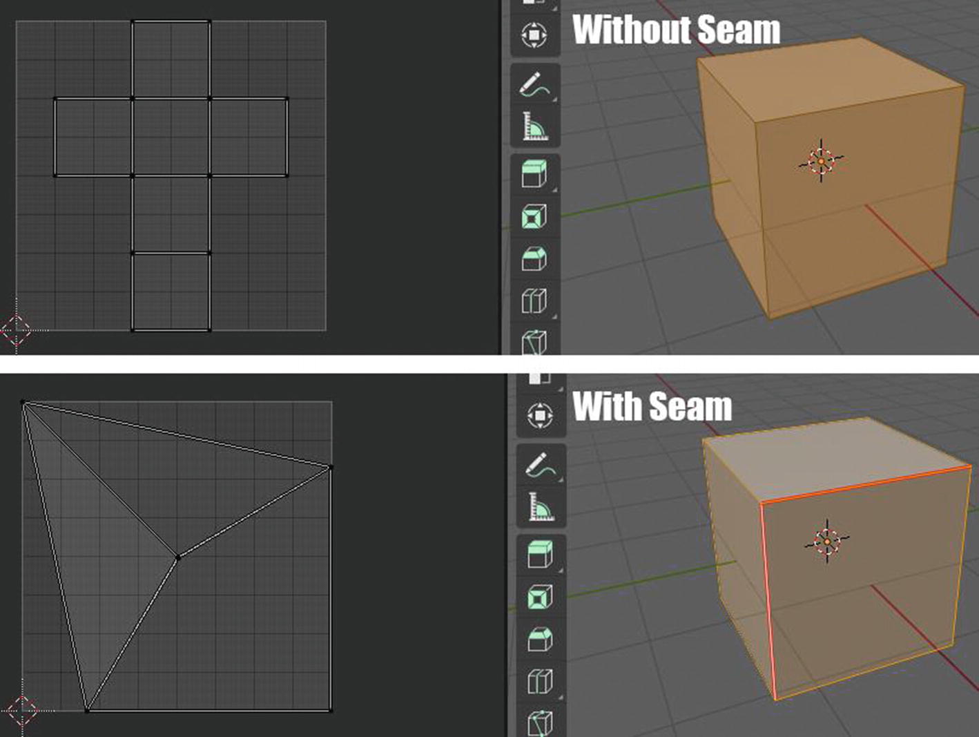
Mark Seam at work
Depending on where you put your seam, it also affects the UV layout of your mesh and what will happen to your texture.
Next will be clear seam, which is obviously used to clear all the marks of the seam in the mesh; and last, reset, which resets the UV projection and each face to fill the UV grid, giving the face the same mapping.
We’re now done with the features of UV that can be found in the 3D viewport. Now, let’s move on to the UV editor.
The UV Editor of UV Workspace
This is the heart of the UV workspace. This is where all the UV mapping happens and where you can edit your UV layout.

The UV editor is divided into three regions: Image area, Toolbar, and Header. The tool settings are not specific to UV editor but they have an important role related to the toolbar. It also has a side bar that can be found in the left side when you press “N” on your keyboard, but by default, it was hidden.
The image area is simply the area where you can see the UV layout and edit it. This where the UV mapping process happens.
Now, let’s proceed with the UV editor’s toolbar together with the tool settings.
UV Editor’s Toolbar and the Tool Settings
Unlike in other workspaces like modeling and layout, the settings of the tools that can be seen in the tool settings aren’t the same as the settings that can be seen in the pop-up menu settings of a tool. And only move, rotate, scale and transform have pop-up menu settings.
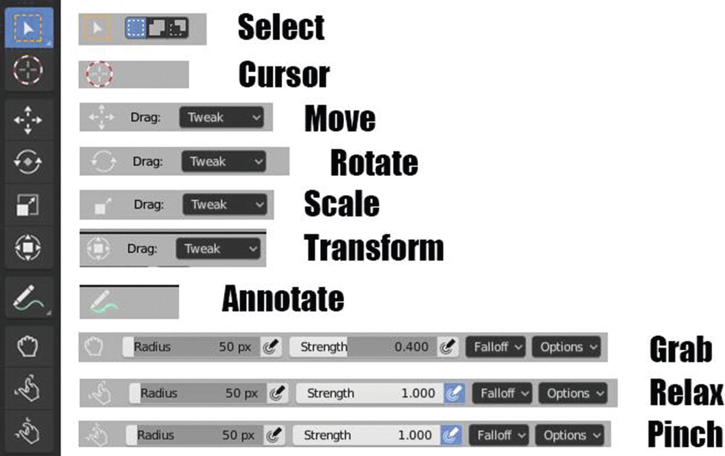
The toolbar and tool settings for different tools
The tools that we have here are the Select, Cursor, Move, Rotate, Scale, Transform, Annotate, Grab, Relax, and Pinch – but wait. If you will notice, there are small triangles for Select tool and Annotate. Remember what it means? Yes. There is a pop-up menu that holds other options for this tool. Now that this is already clear, let’s start discussing the tools of the UV editor.
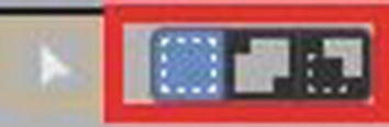
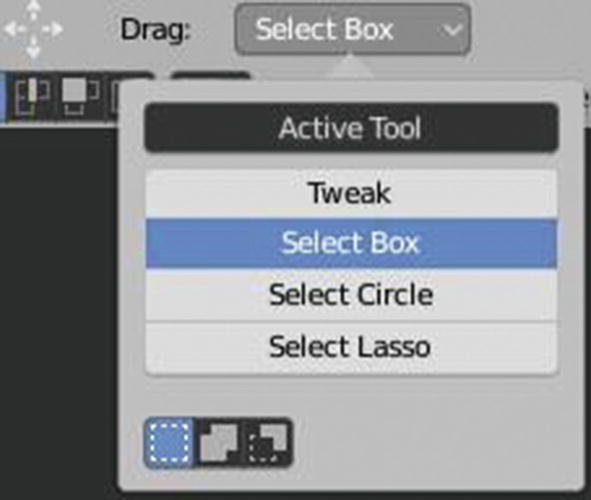
First stop is the selection tool, which is by default set in with box select tool. This selection tool can help you select the UV vertices in a box selection way. There are three other options there. They are the tweak tool, which is the simple form of selection; circle select tool, which selects the UV vertices using the circle selection way; and lasso select tool, which selects the UV vertices using the lasso selection.
You cannot see any settings for the tweak tool. For the box select and lasso select, they have the same settings.
Box Select and Lasso Select settings
The first box from the right side is the default mode. This means it’s just the normal selection mode. When you enable the one in the middle, if you have a current selection of UV vertices and you use your selection tool, it will not affect the current but only extend the existing selection. When you enable the one on the rightmost side, if you have a current selection and you use your selection tool, it will deselect the current selected UV vertices.
The circle select tool has the same settings as the box and lasso select tools with a few differences because it has a setting for radius. This setting for radius affects the cursor circle of the circle select tool.
Now, let’s proceed to the other tools we have like cursor tool, which sets the cursor location; move tool, which moves any selected elements; rotate tool, which rotates any selected elements; scale tool, which scales any selected element; and transform tool, which has the combination of scale, rotate, and move tool.
The cursor tool doesn’t have any settings while move, rotate, scale, and transform have similar simple settings.
Move, Rotate, Scale, and Transform settings in Tool settings bar
You can see in Figure 3-37 that its settings are quite simple. It only has four selections for what selection tool you will use and what mode selection you want to apply. By default, they have box selection.
We also have four options for Annotate: Annotate, Annotate Line, Annotate Polygon, and Annotate Eraser. Annotate is the basic one and helps you make notes in your project. Annotate line helps you create notes including lines. Annotate polygon helps you create notes including shapes; and annotate eraser helps you undo or erase all of the annotation you made in your projects.
Now, we’re already into these three tools that are specific to UV editor: Grab, Relax, and Pinch. I said “specific to UV editor” since those previous tools I mention, though they are part of the tools in UV editor, can be found in other editors or workspaces like in modeling and layout.
Grab, relax, and pinch both sculpt UV vertices using brush. The only difference lies in its effect. The grab brush/tool moves the UV vertices around. Relax brush/tool makes UVs more evenly distributed, while the pinch brush/tool moves UVs toward the brush’s center.
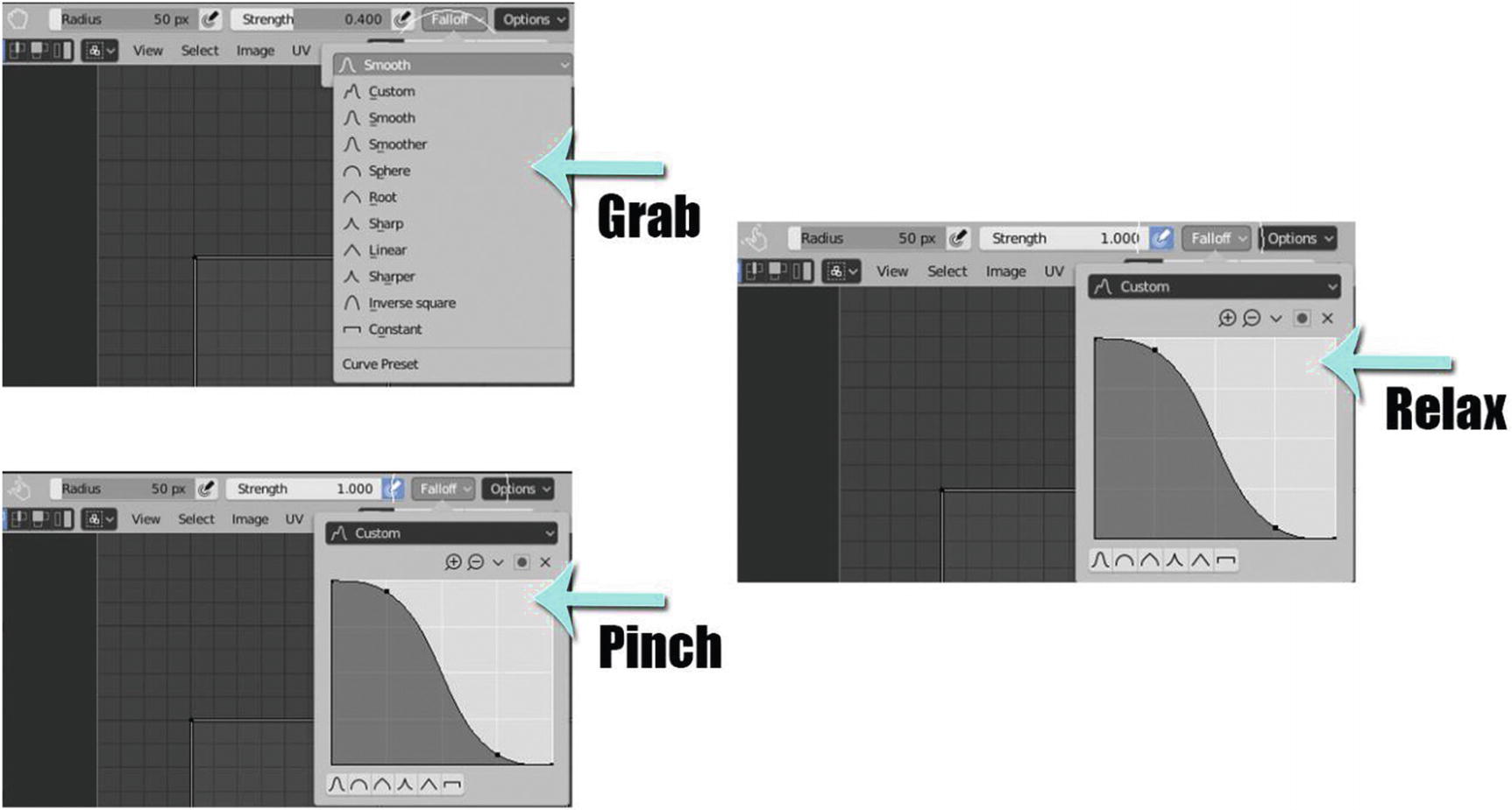
Grab, Relax, and Pinch settings
You can see in Figure 3-38 that grab settings have a slight difference in the settings of relax and pinch, but overall, they have similar settings. Let’s start discussing these settings.
Size Pressure (the icon beside the radius) is for enabling brush sensitivity for size when using a graphic tablet.
Strength controls how much each application of the brush affects the UVs. You can also change the strength by holding “Shift + F,” and then, the same with the radius, just drag your mouse to any direction.
Strength Pressure (the icon beside the strength) is for enabling brush sensitivity for strength when using a graphic tablet.
Falloff allows you to control the strength falloff of the brush. The falloff is mapped from the center of the brush, which is the left part of the curve, toward its borders, which is the right part of the curve. Changing the shape of the curve can make the brush softer or harder.
Options contain three selections for UV sculpting. These are lock borders, which locks the boundary of UV islands from being affected by the brush when enabled; sculpt all islands, which when enabled will allow you to edit all islands and not only the islands nearest to the brush center when the sculpt stroke was started; and display cursor, which hides the sculpt cursor when enabled.

Grab, Relax, and Pinch at work
You can see that in grab, the UV vertices were just simply moving, with the brush effect. In the relax tool, you can see that the UV vertices are getting separated slowly from each other while in the pinch tool, the vertices are moving toward each other.
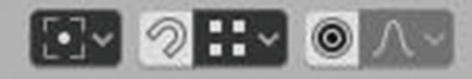
Pivot, Snapping, Proportional Editing
From the left side, we have settings for pivot, snapping, and proportional editing.
Pivot settings are used for you to manipulate the UV islands in an easier way. We have four options here: Bounding Box Center, Median Point, 2D Cursor, and Individual Origins. Unlike when you use pivot in objects and in the 3D viewport, you cannot see much of the effect of pivot or the effect of the pivot isn’t visible enough in the UV islands. Since we don’t have any “center,” the orange dot in UV islands indicates its center.
Snapping settings are used for you to set snapping when editing the UV vertices. Snapping is helpful in allowing you to easily align vertices to each other within a desired parameter. We have two options here: Increments and Vertex. When you choose increments, it will snap to increments of a grid while vertex will snap to vertices. You can also choose this in settings if the snapping settings will affect the move tool, rotate tool, or scale tool.
Proportional editing settings are sets of options of falloff types. I already mentioned before that falloff is mapped from the center of the brush (or tool), which is the left part of the curve, toward its borders, which is the right part of the curve; and changing the shape of the curve can make the effect of the brush, or the tool you are using; like move, softer; or harder. We already have predefined curved as choices here: Smooth, Sphere, Root, Inverse, Sharp, Linear, Constant, and Random.
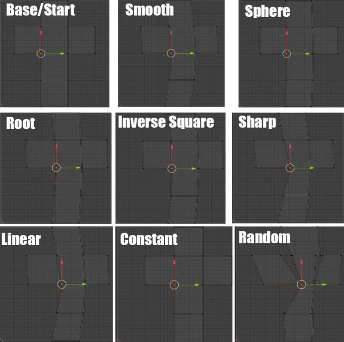
Proportional Editing at work in UV islands
By default, these three are disabled. So, it’s up to you if you will use these tools for your UV mapping process or not.
Now, we’re already done with the toolbar and its tool settings. Let’s now move on to the header!
UV Editor’s Header
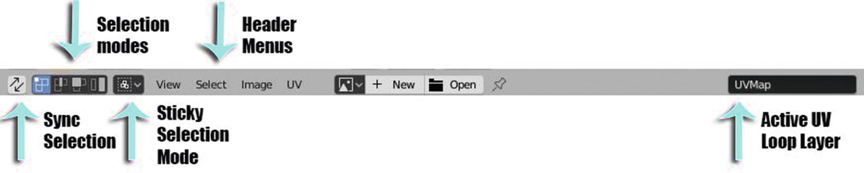
UV Editor’s Header
Sync selection keeps the UV and mesh part selections in sync.
Selection modes help you choose how you will edit your UV islands, if by vertices, by edge, by faces or by UV islands.
Sticky selection modes controls how the UVs are selected when the sync selection is disabled.
Active UV loop layer displays the current UV map you are editing.
In View menu, there are many self-explanatory options. I’ll just talk about some of the more useful ones here. Frame Selected helps you easily zoom in to your selected element. You can also do this by pressing “Numpad.”
Frame All helps you easily zoom out or go back to the normal view or the default view of the UV editor. You can also do this by pressing the “Home” key on your keyboard.
Frame All Fit will frame all and fit it to your screen. It’s like the easiest way of zooming in. You can also do this by holding “Shift + home.”
Center View to Cursor will turn the center of the view to where your current 3D cursor is locating.
Last, Area is for how you want your UV editor to be customized. It has five options: horizontal split, where it will split the UV editor into two UV editors horizontally; vertical split, where it will split the UV editor into two UV editors vertically; duplicate area into new window, where Blender will open another window with UV editor in it; toggle maximize area, where Blender will maximize the area of the UV editor and hide other editors that are in the UV workspace like Outliner, Properties, and 3D viewport; and Toggle Fullscreen Area, where Blender will have the UV editor take up the full screen, hiding everything except the image area by default.
Box Select Pinned (Ctrl + B), which allows you to have a box selection with pinned UV vertices
Less (Ctrl Numpad -), which deselects the UV vertices at the boundary of each selection region.
More (Ctrl Numpad +), which selects more UV vertices connected to the initial selection.
Selected Pinned (Shift P), which selects all pinned UV vertices.
Select Linked (Ctrl L), which selects all UV vertices that are linked to the active UV map.
Select Split(Y), which selects only entirely selected faces.
Select Overlap, which selects overlapping UV vertices.
You might notice that mostly, those in the header menus are common tools/commands that can be seen the workspaces. These are only some specifics, but still, for the sake of at least a review, I will briefly discuss these header menus.
Now let’s proceed to the most interesting item on the Image menu. Open Cached Render (Alt + R) means reading all the current scene’s view layers from cache.
Last, we have the UV menu. I’ll only cover a few of these commands, the rest being mostly familiar to you now. First is transform. What we have here are options for transforming elements like Move (G), Rotate (R), Resize (S), and Shear (Shift Ctrl Alt S). Mirrors have options for mirroring selected UV vertices. They have three options. First is Copy Mirrored UV Coords, which allows you to copy mirror UV coordinates on the X-axis based on a mirrored mesh, X-Axis, and Y-axis which allow you to mirror selected items around one or more axes. Snap provides you choices for snapping. We have six choices here: Selected to Pixels, Selected to Cursor, Selected to Cursor (offset), Selected to Adjacent Unselected, Cursor to Pixels, and Cursor to Selected. Snap to Pixels helps you snap to the nearest pixel data. We have three options for this one: Disabled, Corner, and Center.
Many of the commands in the header menu are like those tools that we already have discussed, like in the toolbar, etc. So, we don’t need to memorize everything, do we? What we need is just to be familiar with everything.
Before I end up the part of UV workspace and proceed to the texture workspace, let me discuss one more thing – and those are the UDIM features of Blender.
UDIM in Blender
What is UDIM? UDIM stands for U DIMinesion, which is based on a tile system where each tile is a different texture in the overall UDIM texture array. Basically, each tile consists of its own UV space and has its own image assigned to that tile. Tiles are managed in the UDIM tiles panel where they can have a generated image assigned to them. Generally, you create several textures of different resolutions, like, for example, you have a 4k resolution texture for the major details and 2k or 1k textures for less-important details. This are helpful in big projects, and it can help you speed up the texturing process.

UDIM Grid setting in Sidebar region

UDIM Grid
But that is not exactly how UDIM works. Still, my UV layout is in one tile located in the bottom left part of the image area. So, what do we need to do?
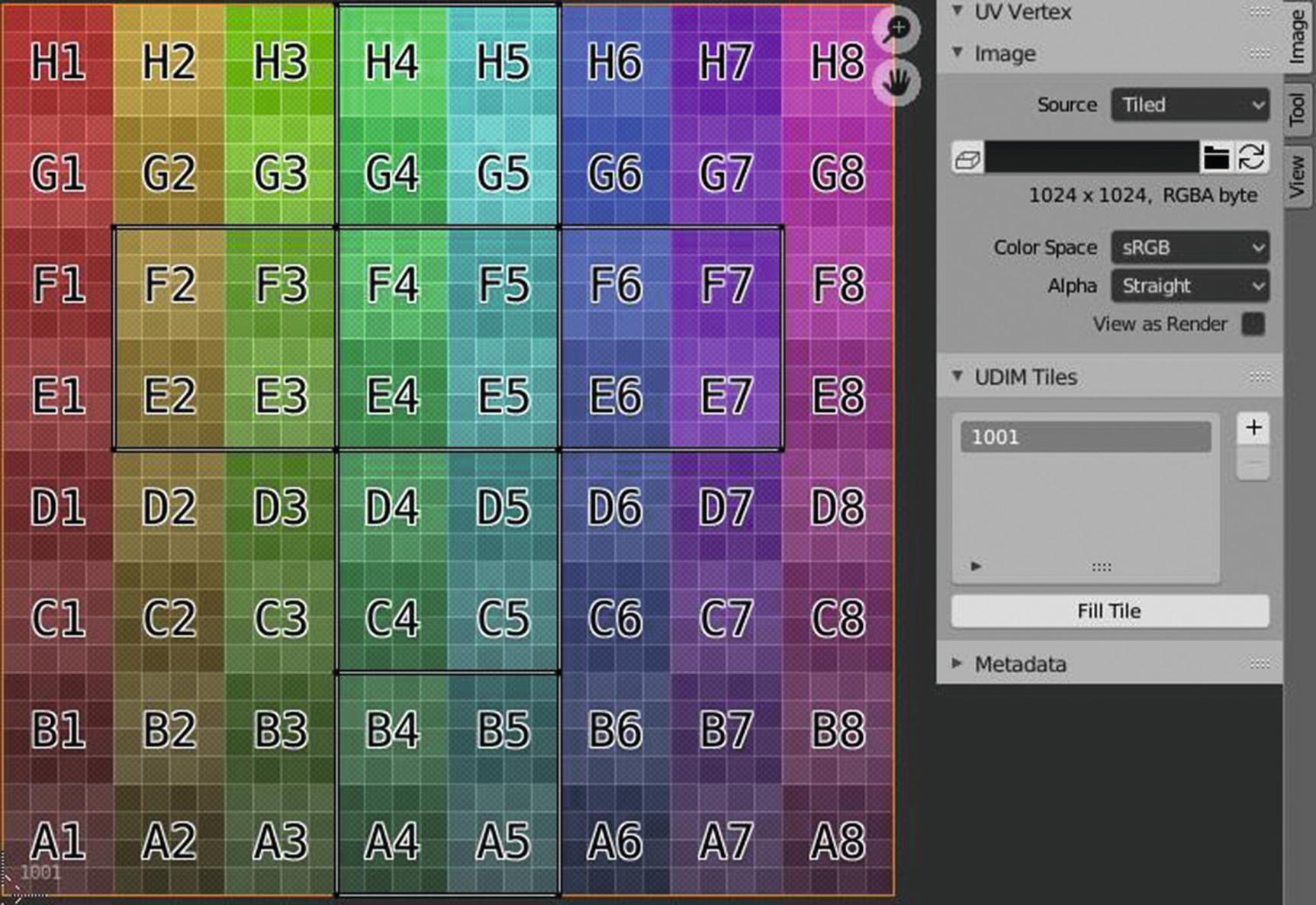
UDIM Tiles
You can see in our sidebar region that we have new settings, such as the panel for UDIM tiles. Let’s now try to add new tiles.
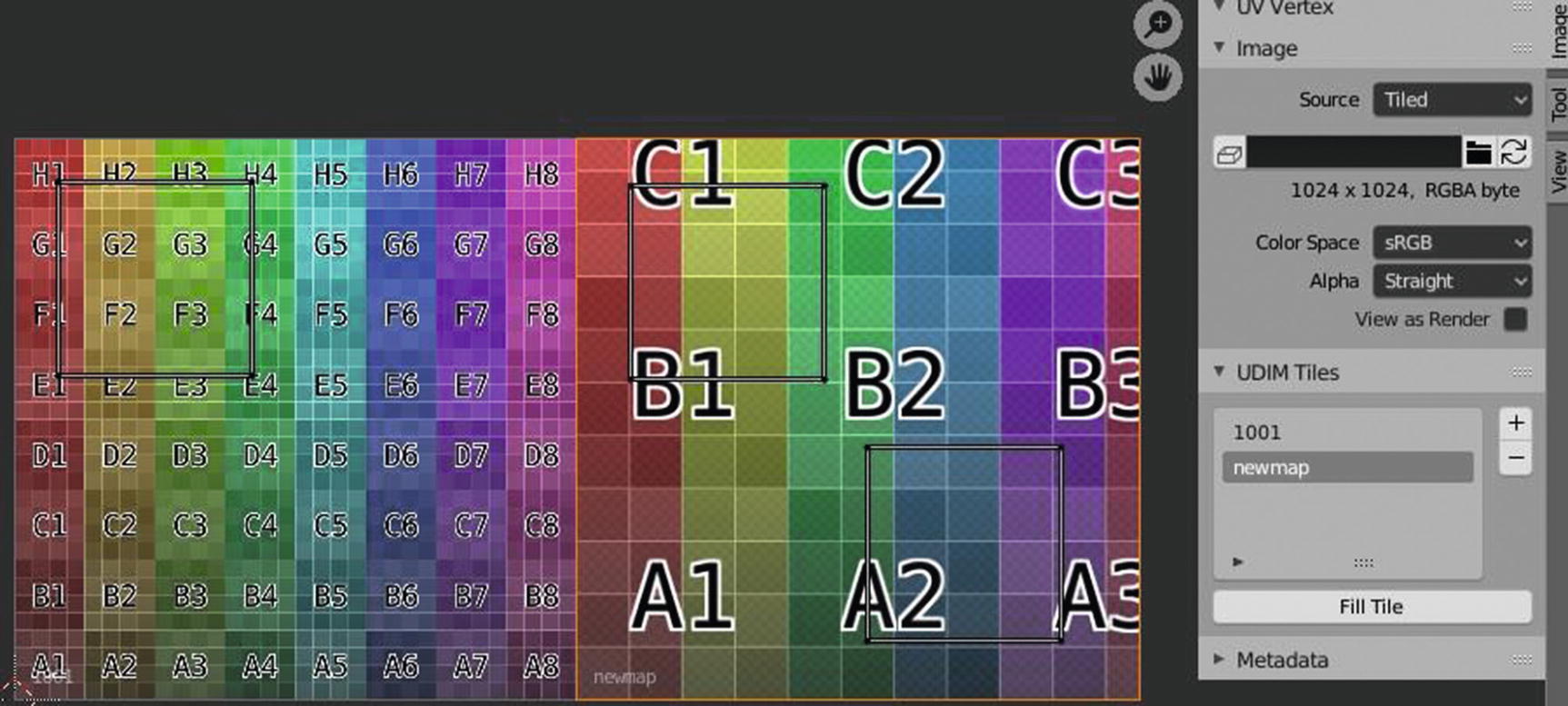
UDIM Tiles
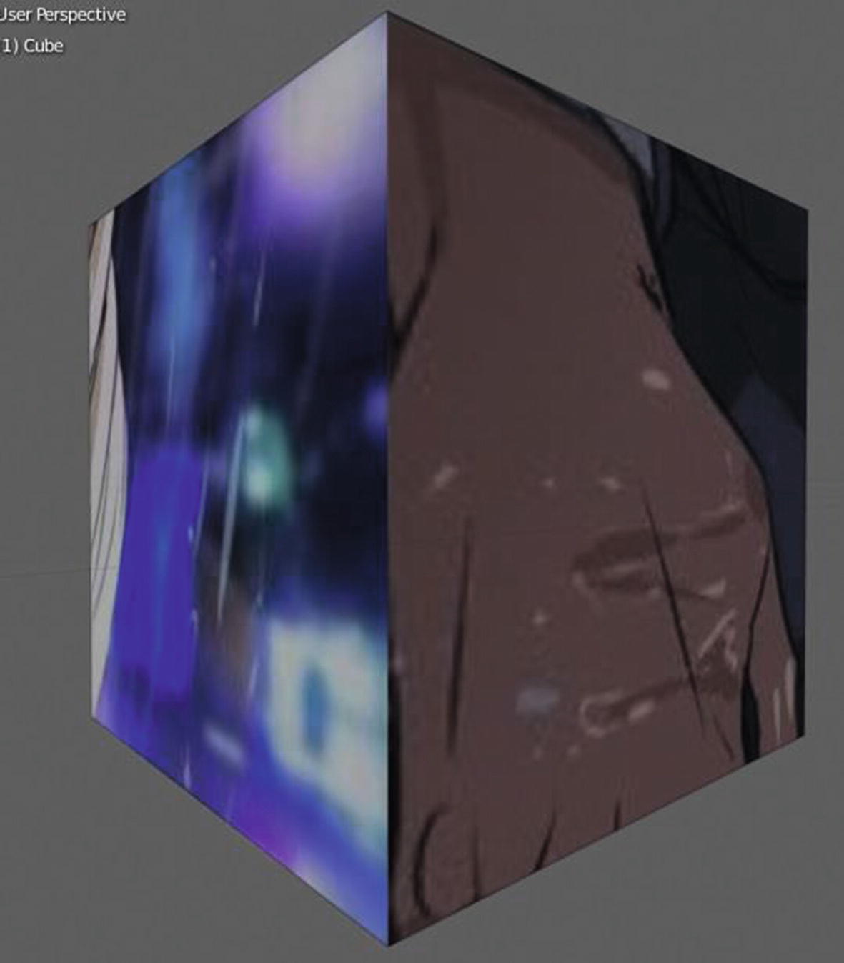
Effect on the Textured cube
You can see that there are differences in quality between the right side and the left side of the cube. The UV island of the face that is on the right side of the cube is in the 340 x 340 pixel, while the UV island of the face that is on the left side of the cube is in the 1024 x 1024 pixel. You can see its effect on the quality of the texture, but this canned feature of UDIM can help too in some cases. For instance, there are parts of your game assets that needed to have detailed texture, but some parts of it that don’t. You can use this kind of UV mapping and texturing process to make things easier not only for you but also for the future user of your game assets.
If you want to create a multiple UV map, which is also helpful in big projects, you can do this in the Properties ➤ Object Data ➤ UV maps panel, and just click the plus button to add a UV map and minus button to delete an existing map.
So now we’re finally done with the UV workspace. The next chapter will cover the texture paint workspace and contains a sample project where you can use your UV workspace and texture paint workspace skills together.