
Good day, dear readers! Are you still having fun? Now we’re in Chapter 4 of the book. Here we’ll create our own textures to apply to 3D objects in the game environment. This chapter will finish with a sample project, where you can combine your skills from Chapter 3 with the skills you learn in this chapter.
Texture Paint Workspace
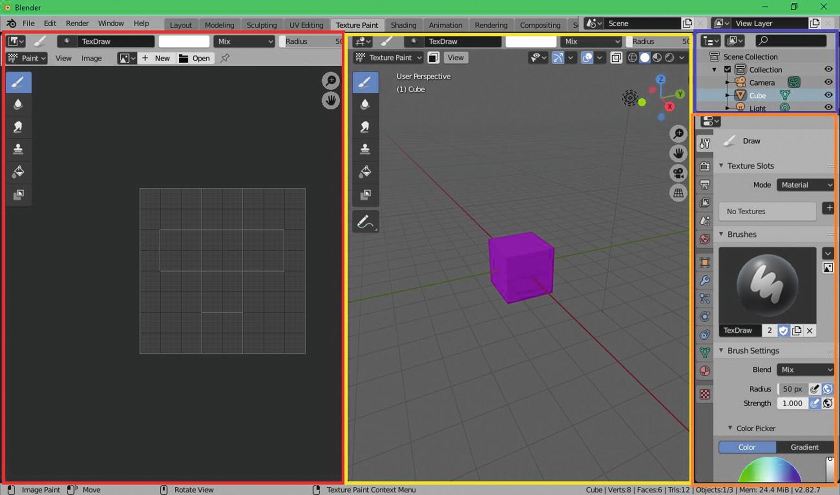
Texture Paint Workspace (Red: Image Editor, Yellow: 3D viewport, Blue: Outliner, Orange: Properties)
As you can see in Figure 4-1, we have image editor on the leftmost side, the 3D viewport in the middle, outliner in the top rightmost side, and properties in the bottom rightmost side. You can also notice that our 3D viewport here is in texture paint mode and our properties also have different kind of settings. Because of that, we have a lot of things to discuss here. First, we will start with our 3D viewport.
3D Viewport in Texture Paint Workspace
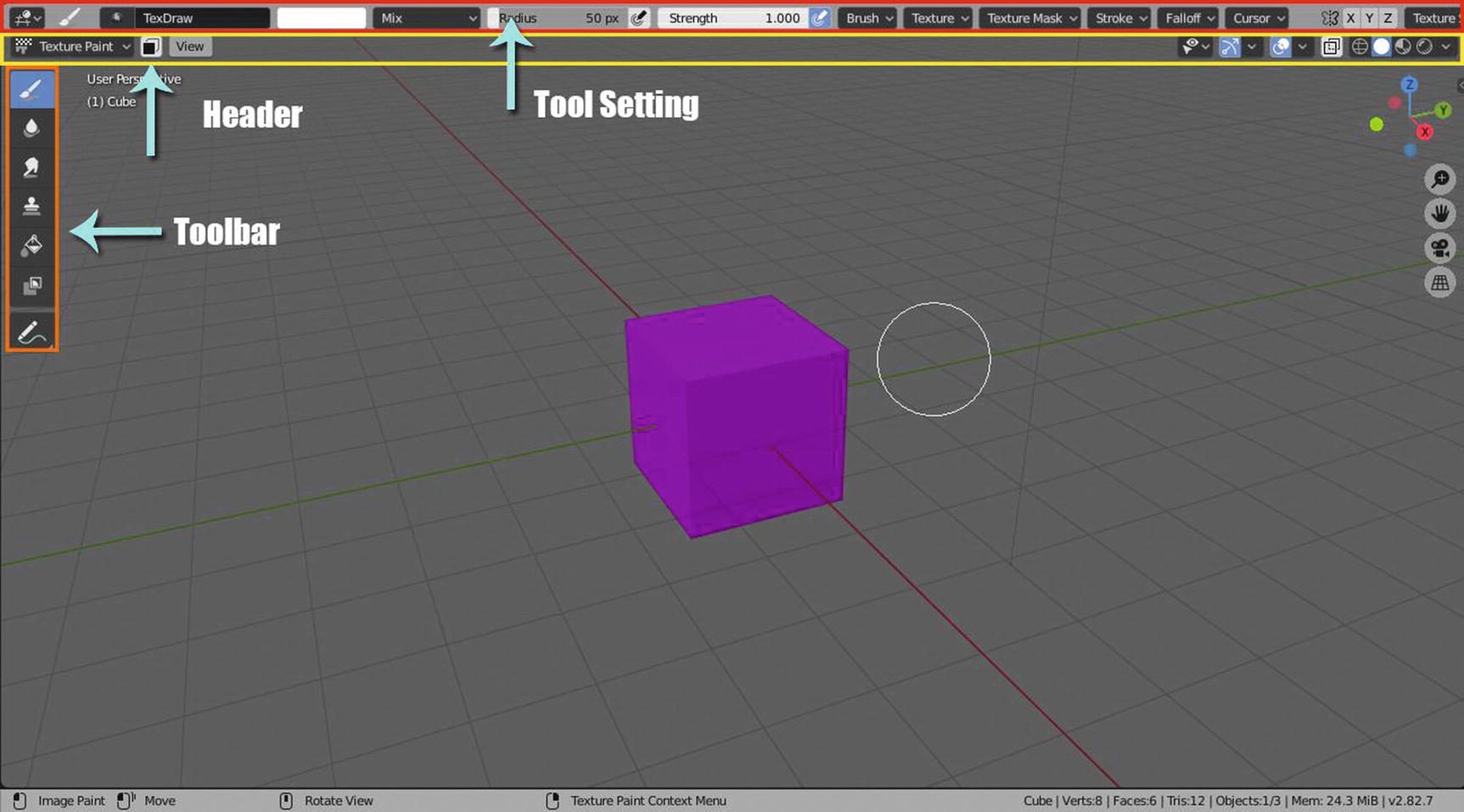
3D viewport in Texture Paint Mode (Toggle Maximize)
I already used toggle maximize here in order for me to show the whole editor since just dragging the border will not help to show all the tools/commands in its header. What we see in the header of 3D viewport here are just the common commands, so we will just be focusing on the toolbar and the tool settings. The settings that you can see in the tool settings, as well as in the properties, are related to the current active tool in your toolbar. This means, it will change depending on the tool you are currently using.
So, let’s get started!
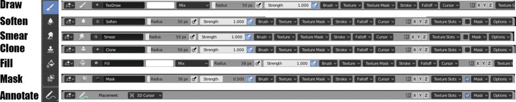
Tools settings
As you can see in Figure 4-3, draw and fill have the same settings. Actually, all of the tools from draw and mask have almost all the same settings; draw and fill have only a color picker and blending mode. Another thing you notice is that annotate has fewer settings. Note that this tool is only for leaving notes.
Let’s have a brief discussion of our tools.
Draw tool is for normal brushing; soften tool uses a blur effect to soften or sharpen an image; smear takes the colors under the cursor and blends them in the direction you move the mouse; and clone copies the colors from the specified image, and you can do this by pressing Ctrl + left mouse button to create your source or reference to clone to. Fill is used to fill large areas of the image with the brush color and mask maps an image to the mesh and uses image intensity to mask out certain parts of the mesh during painting.
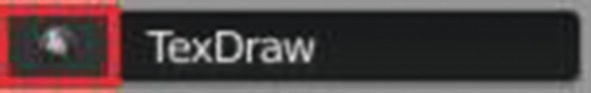
Search box and Brush name
When you click it, you can see a list of Blender brushes available for the tool you are currently using. By default, you only have one, but you can download some Blender brushes online from Blenderkit add-ons, etc. These settings are available in all texture paint tools except in annotate tools.
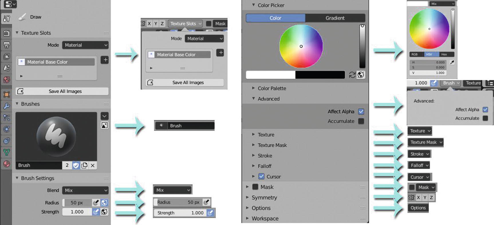
Next, we have the color picker , which is available only to the draw tool and fill tool. This allows you to choose your own color. You can choose color directly from the wheel or by getting the RGB value, HSV value, or HEX value. Since the color picker also has the eyedropper tool, you can use this to pick a color outside the color picker either from the picture imported in the Blender, from the available textures in your current project, or from the Blender UI itself.
Next stop is the blending mode , which is by default set to mix. This tool is only available in the draw tool and fill tool since those two are the only tools that have the color picker. I love this part since this makes me feel I’m using 2D software for digital painting. This blending mode helps you create different effects for your colors or texture. We have 24 options available for our Blending mode, which are Mix, Darken, Multiply, Color Burn, Linear Burn, Lighten, Screen, Color Dodge, Add, Overlay, Soft Light, Hard Light, Vivid Light, Linear Light, Pin Light, Difference, Exclusion, Subtract, Hue, Saturation, Color, Value, Erase Alpha, and Add Alpha. These blending modes are similar to what you can see in software like GIMP and Photoshop.
So now, let’s discuss each type of blending mode.
Blending Mode
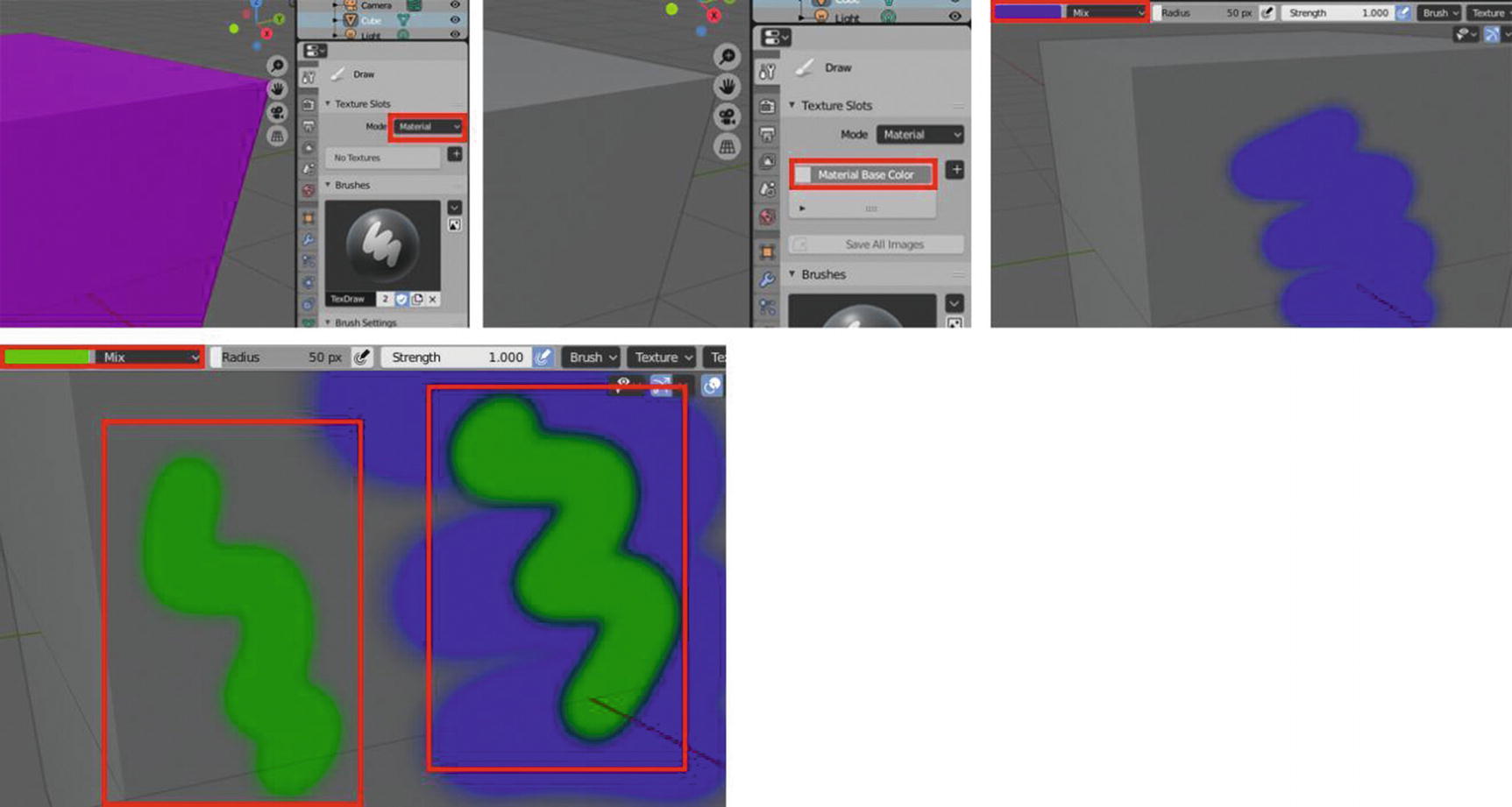
Blending mode works with Mesh Base color using Mix Blend mode
In Figure 4-5, notice that I applied the material base color. As I paint the color blue with the mix blending mode, you can’t see its effect at a glance. But when I apply a second color, which is the green color in the place where the blue color is, you can see an effect around the green color compared to the other one that is directly painted on the mesh. This is what I mean by the effects of some blending modes aren’t very visible in the base color of the mesh.
Now, one aspect is already clear. Let’s proceed in discussing some basics of the blending mode. When you are using 2D software, we have three things to consider when working with blending modes: Base color, Blend Color, and Result color. Base color is the original color of the image, blend color is the color applied with the painting tool to the base layer, and the result color is the color resulting from the blend. In Blender, we have the same concept but we just need to modify some things since we don’t have layers here.
For our base color, it would be the base color of the mesh object, but for us to have clearer vision in our examples, we would also assume that the first color we use to paint in the mesh is also our base color because most of the blend mode doesn’t easily show its effect by just using the base mesh color. The blend colors are the colors we will choose to paint in the mesh. (Colors?) Yes. Since we are dealing with 3D painting and texturing, of course we will have more than two colors to blend. Our result color will still be the same, the output color after all the painting we’ve done.
So, let’s start discussing each of the blending modes. First, we’ll talk about the mix blend mode.
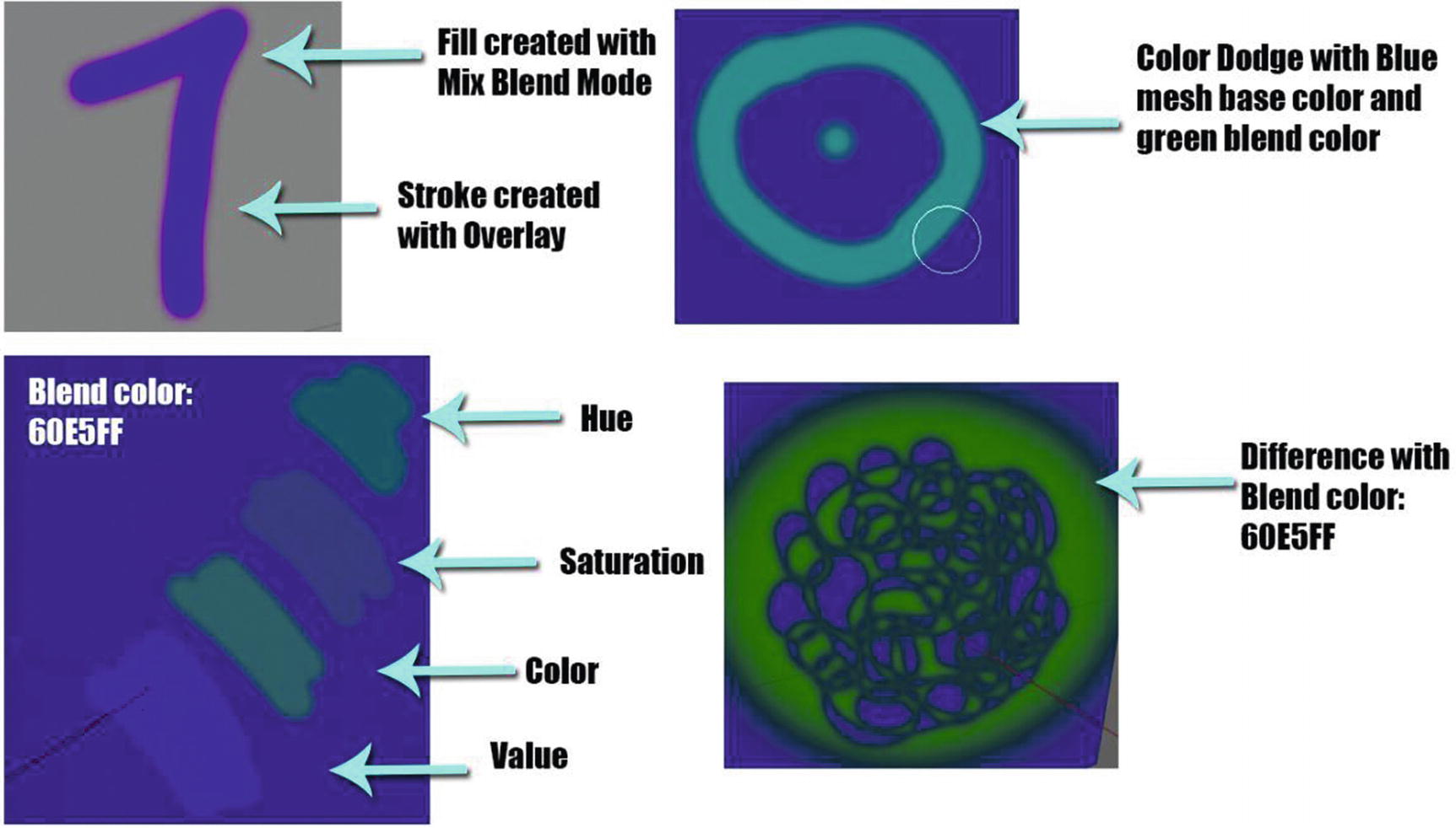
Mix Blend Mode
The mix blend mode is like the normal mode in Photoshop. It only does the normal texture blending mode in Blender, but if our base color and our blend color have quite large differences in values, it gives quite an effect that you can notice in the sides of the blend color.

You can notice that in Figure 4-6, mix blend mode is like the normal mode in Photoshop. But you can see that in its edges, they have the soft blur effect that depends on the color or saturation, then turns into a burn effect.
Before we move on to our next blend mode, the blending mode in general has some categories. One of them is darken. Those blend modes under this category will turn its result color darker. In this blending mode, if you paint a white color, or any lighter color than the base color, it will become invisible or rather you will not see it applied, and anything that is darker than white, or darker than the base color, is going to have some darkening effect.
Now that we have it, let’s proceed to our next blending mode, which is one of the darken blend modes, darken.
Darken Blend Mode
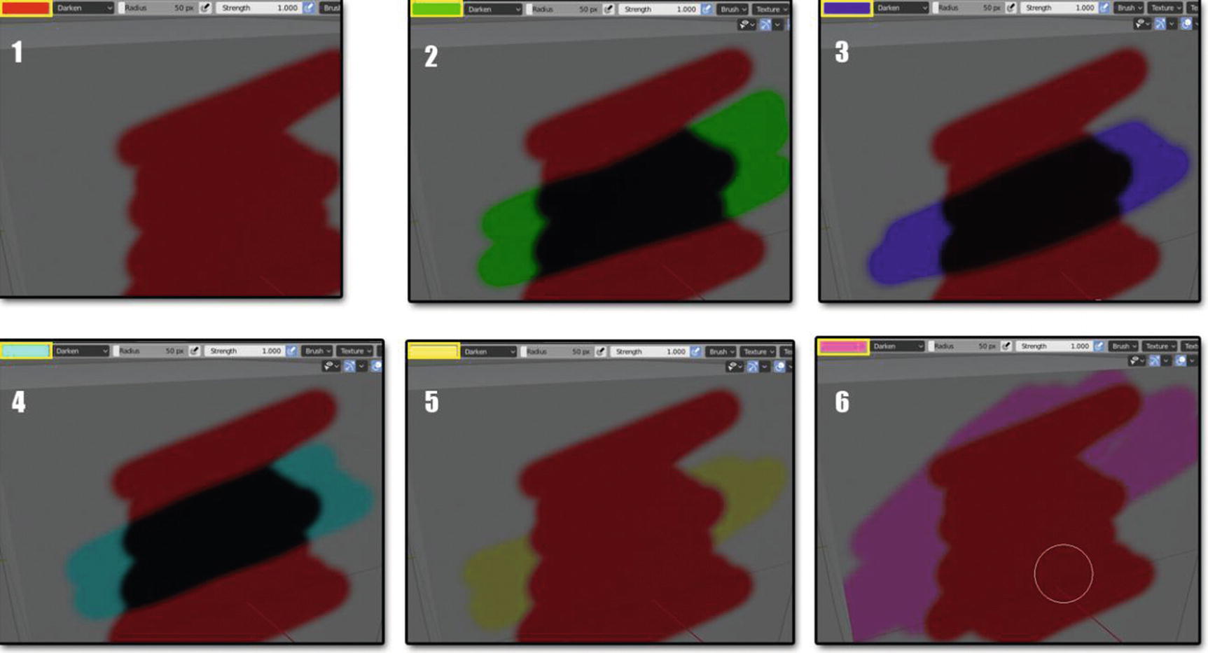
Darken Blending mode works
Our base color used in Figure 4-7 is the color red. You can see in different images how darken blend mode works. You can see in that when we use the green, blue, and light blue colors as our blend color, we have a darker color as a result color, while when we use the pink and peach color that are lighter than red, we didn’t see any effect. This proves that any color that is lighter than the base color will not have any effect on our base color and will only affect the background of the base color, while any color that is darker than our base color will affect both the outside and the inside of the base color.
Okay. This might get a little confusing because of many technical things. For both darken and multiply, these are the rules applied: when the blend color is lighter than the base color, it will become invisible . If the blend color is also a color white, it will also become invisible. When the blend color is darker than the base color, you will see a result color. If the blend color is darker than the color white, you will see a result color. This also be applied in the next two-blend mode, which is color burn and linear burn, but of course, there are also some differences in effects.
Let’s now proceed to multiply blend mode, which is also part of the darken blend mode.
Multiply Blend Mode
Multiply blend mode multiplies the luminosity of the base color by the blend color. The output color or the resulting color is always a darker color. White produces no change while black pixels remain.

Multiply Blending mode works
You see that its effect is the same as in the darken blend mode. Their difference lies in how they calculate the luminosity of the colors, but their rules between the darker and lighter colors are the same. As you can see in Figure 4-8, the color green, which is darker than the color blue, results in a darker color. The light blue blend color doesn’t have an effect on our base color since it is lighter than our base color; and last, the peach color has a minimal effect on our base color since it is a little darker than white.
If that is already clear, let’s now proceed to our next blend mode, which is the color burn.
Color Burn Blend Mode
Color burn blend mode is part of the category of darken blend modes that gives you a darker result than Multiply by increasing the contrast between the base and the blend colors, resulting in more highly saturated midtones and reduced highlights.
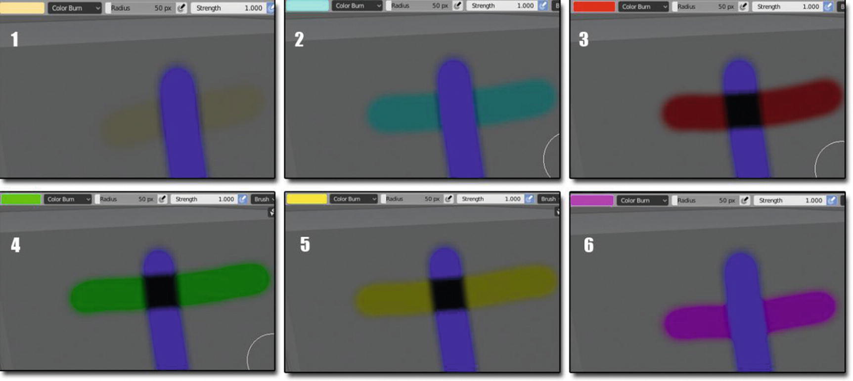
Color Burn Blending mode works
You can see in image Figure 4-9 that in these blending modes, lighter colors don’t affect the base color while the darker colors have an impact. Unlike in multiply and darken, there are some instances where lighter colors can affect the base color: for example, it is darker than white and isn’t lighter than the base color. Here in color burn, as long as it is lighter than the base color, it will not affect the base color.
Next stop is the linear burn blend mode.
Linear Burn Blend Mode
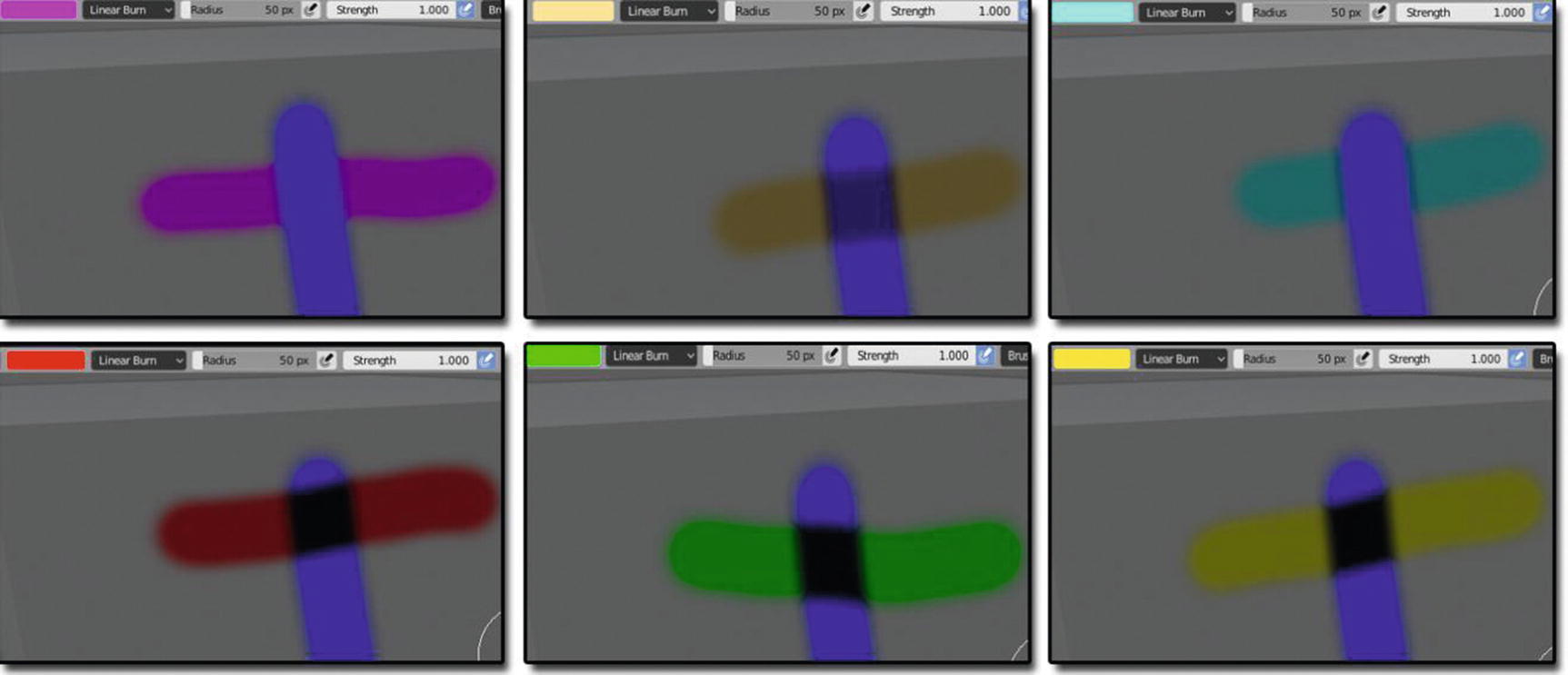
Linear Burn Blending mode works
Its result color is the same as Color Burn at first glance, but if you look at it closely, you will see the real effect of the Linear Burn. At some point, it is darker than the Darker Blend mode, Multiply Blend Mode, and Color Burn Blend mode.
Okay. We will have now the blending modes, which are the opposite of the darken blend modes, the lighten blend modes. These modes will turn result colors to brighter colors. When you paint black, it will become invisible and anything that is brighter than black is going to have some darkening effect.
Now, let’s start with the lighten blend mode.
Lighten Blend Mode
Lighten blend mode takes a look at the base color and blend colors, and it keeps whichever one of the two is the lightest. If the blend colors and the base colors are the same, then no change is applied. Lighten looks at the three RGB channels separately when blending the pixels.
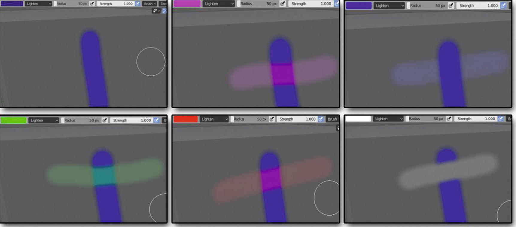
Lighten Blending mode works
You can notice that the dark blue doesn’t have an effect at all – like it’s invisible. You can’t see anything. When I applied the blue color, it only affected the mesh or the outside of the base color. When I chose white as my blend color, you notice that it looks like a solid color when I paint it across our base color unlike the others, which look like a highlighter color. You see in this mode that the lighter the blend color is, the more visible the result color will be.
Now, let’s proceed to our next lighten blend mode, which is the screen blend mode.
Screen Blend Mode
Screen blend mode is where the resulting color is always a brighter color. It can produce many different levels of brightening depending on luminosity values of the blend colors.
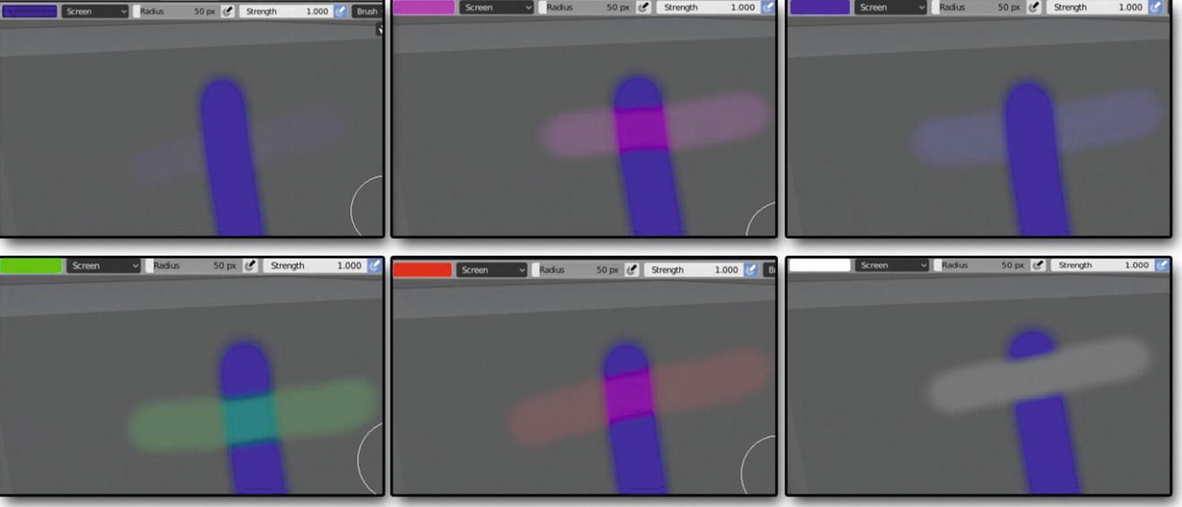
Screen Blending mode works
Unlike in lighten blend mode, that part of the dark blue at least has a bit of effect here, though it isn’t that visible, but still for the other five colors, pink, blue (which is the same as the base color), green, red, and white, it is the same as the lighten.
Let’s move on to the other lighten blend mode, which is the color dodge.
Color Dodge Blend Mode
Color dodge blend mode gives you a brighter effect than screen blending by decreasing the contrast between the base color and the blend colors, resulting in saturated midtones and blown highlights.
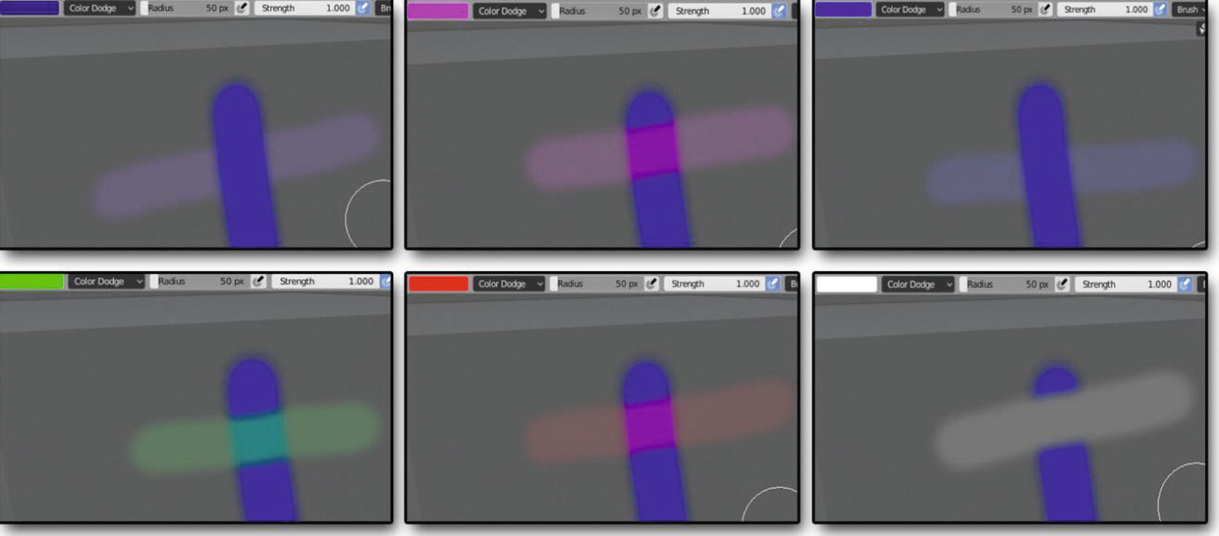
Color Dodge Blending mode works
Again, as you can see, the effect on the darker blue here is that it is much more visible compared to the other two, which are the screen and lighten. You can notice that their differences lie in how these lighten blend modes treat the darker colors because they have the same rule when it comes to light colors like pink, which has the same color of the base color and white color.
Now, let’s proceed to the last lighten blend mode but not the last blend mode, add.
Add Blend Mode
Add blend mode produces a similar but stronger result than screen or color dodge. This blending mode looks at the color information in each channel and brightens the base color to reflect the blend color by increasing the brightness.
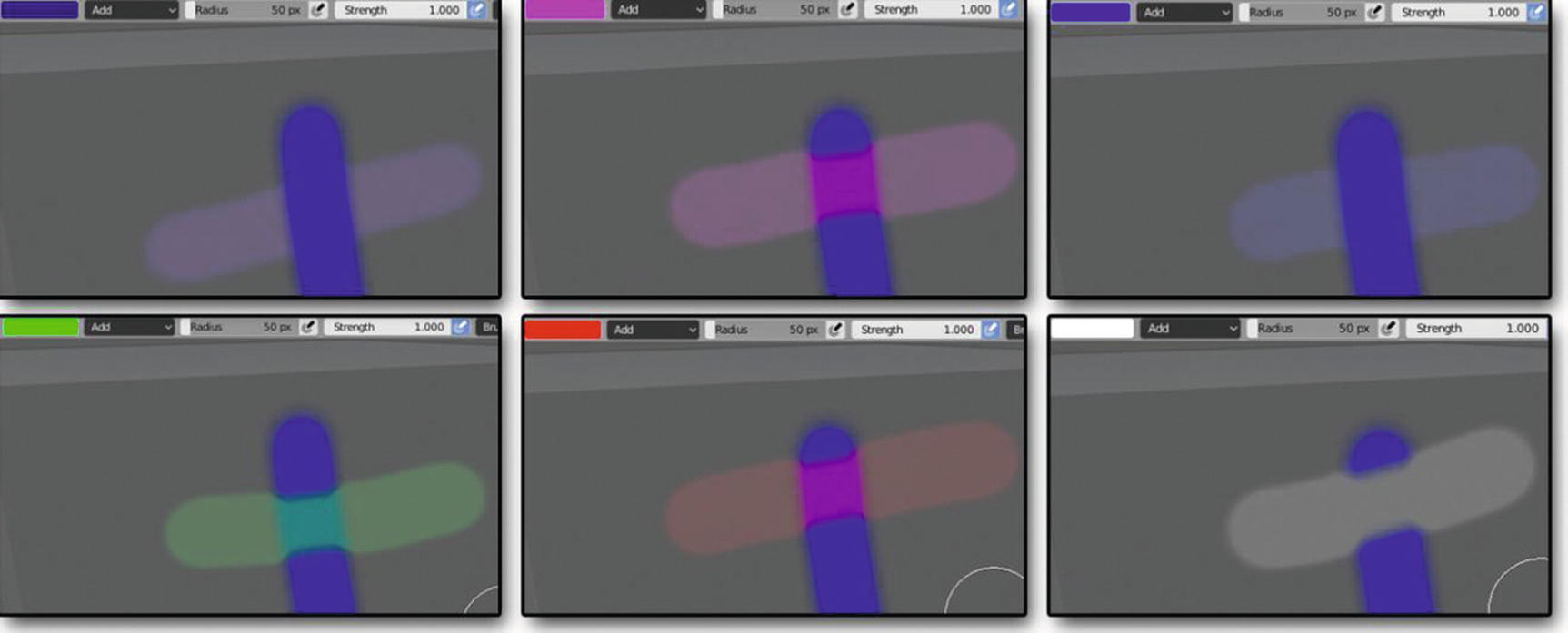
Add Blending mode works
You can see in Figure 4-14, though add blend mode has the same rule with the other lighten blend mode, its impact is still different. Its result looks more visible than the other three.
So, we’re done with the lighten blend mode. We’ll now proceed to another set of blend modes, which are called contrast blending modes. In this kind of mode, the rule was if you paint a color with 50% gray with this mode, it will become invisible. This mode creates contrast by both lightening and darkening the result colors by using complementary blending modes to create the blend.
Now that we already know how it works, let’s start the discussion of each blending mode under this category.
Overlay Blend Mode
First stop is the overlay blend mode. This mode is a combination of multiply and screen with the base color always shining through. Overlay uses the screen at half strength on colors lighter than 50% gray while it uses multiply at half strength on colors darker than 50% gray.
Another way of thinking about overlay is by thinking of shifting midtones. Dark blend colors shift the midtones to darker colors, and light tones shift the midtones to brighter colors.
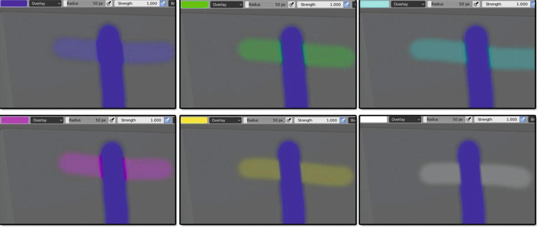
Overlay Blending mode works
Notice something at the sides of the color blue? There is some effect in the part where we paint with the overlay blend mode. It seems that the effect doesn’t only in the color that can be seen, but also these blending mode create a texture like effect that can be seen in the sides of the color stroke.
Now, let’s proceed to our next contrast blending mode, which is soft light.
Soft Light Blend Mode
Soft light blend mode is very much like overlay. It applies either a darkening or lightening effect depending on the luminance values, but in a much more subtle way. You can think of soft light as a softer version of overlay without the harsh contrast.
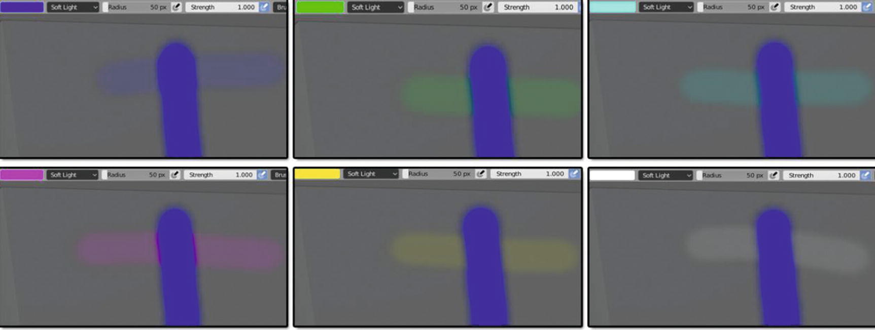
Soft Light Blending mode works
In our example in Figure 4-16, we see more of a lightening effect in soft light blend mode, though we can see some darkening in part of the white color. Well, as I stated above, it applies lightening or darkening depending on the luminance values of the colors.
Hard Light Blend Mode
At the next stop, we have the hard light blend mode, which combines the multiply and screen blending modes using the brightness values of the blend colors to make its calculations. The results with hard light tend to be intense. It sounds like it would have something in common with soft light, but it does not. It is more closely related to overlay.
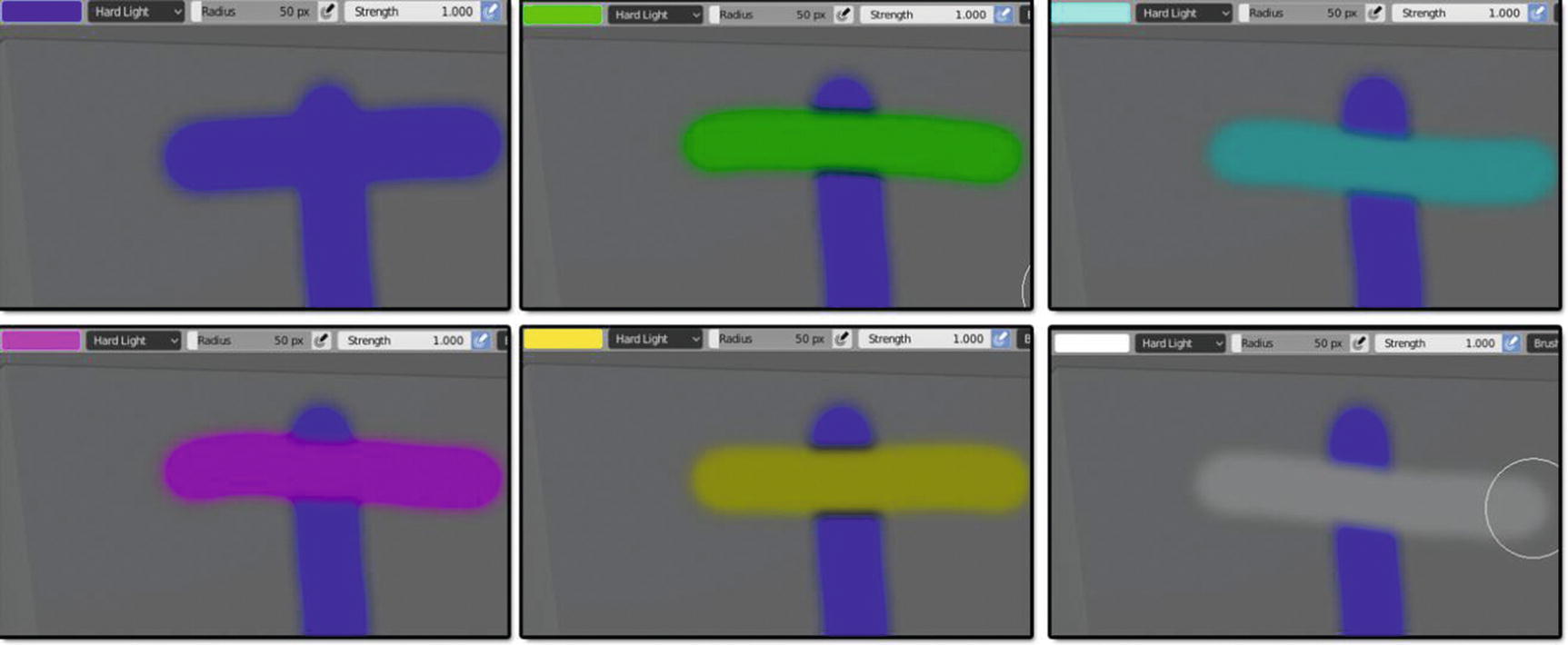
Hard Light Blending mode works
If you look at Figure 4-17, you can see that our result colors look more like the result color for mix blend mode except that you don’t see any burn-like effect on the sides in any of our result color examples. This might be the reason why the resulting colors of hard light tend to be intense.
So, let’s now proceed with our next contrast blend mode, which is vivid light.
Vivid Light Blend Mode
Vivid light blend mode is like an extreme version of overlay and soft light. Anything darker than 50% gray is darkened, and anything lighter than 50% gray is lightened .
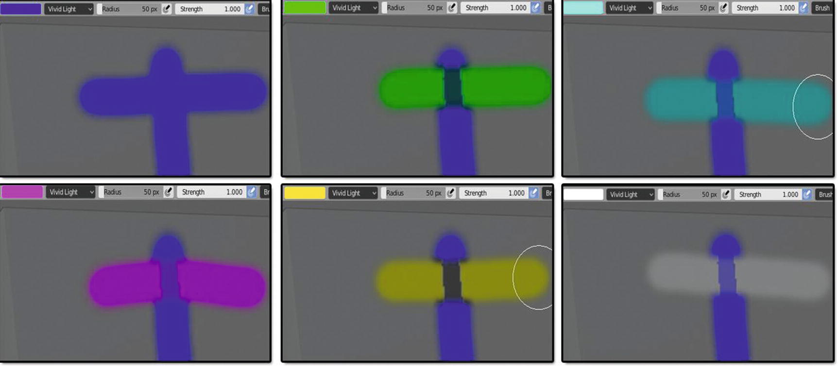
Vivid Light Blending mode works
Here, we can see a visible texture effect in the middle of the blue color. But wait, you can only see the effect of vivid light using a color either lighter or darker than the base color, but you cannot see its effect if you use a blend color with the same color of the base color, unlike soft light and overlay. You can also see that its color is as intense as hard light here.
So, now, let’s proceed to the linear light blend mode.
Linear Light Blend Mode
Linear light blend mode uses a combination of the add blending mode on lighter pixels and a linear burn on darker pixels.
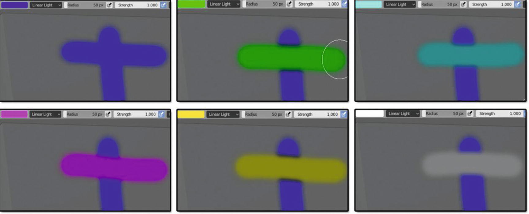
Linear Light Blending mode works
In our result color in Figure 4-19, linear light has the same effect as hard light. They have the same intensities, and you can’t easily see their difference.
Now, let’s proceed to the last contrast mode we have here, pin light.
Pin Light Blend Mode
Pin light blend mode is an extreme blending mode that performs a darken and lighten blending mode simultaneously. It can result in patches or blotches, and it completely removes all midtones.
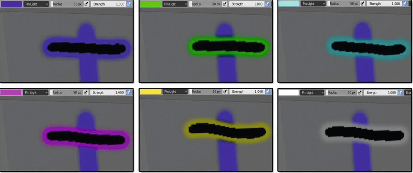
Pin Light Blending mode works
It’s very clear and visible in Figure 4-20. The effect, or should we say, the texture-like effect, which might be the blotches or patches of pin light. It’s very clear to see the difference of this mode to other contrast blend modes.
Let’s discuss the last category of blending mode that we will have here, inversion blending modes. This mode looks for variations between the base and blend colors to create the blend.
Now that it was already given, let’s start discussing the blend mode that is under this category. Let’s start with the difference.
Difference Blend Mode
Difference blend mode uses the difference of the base color and blend pixels as the resulting color. White color inverts the base color while black produces no change. Dark gray colors apply a slight darkening effect.
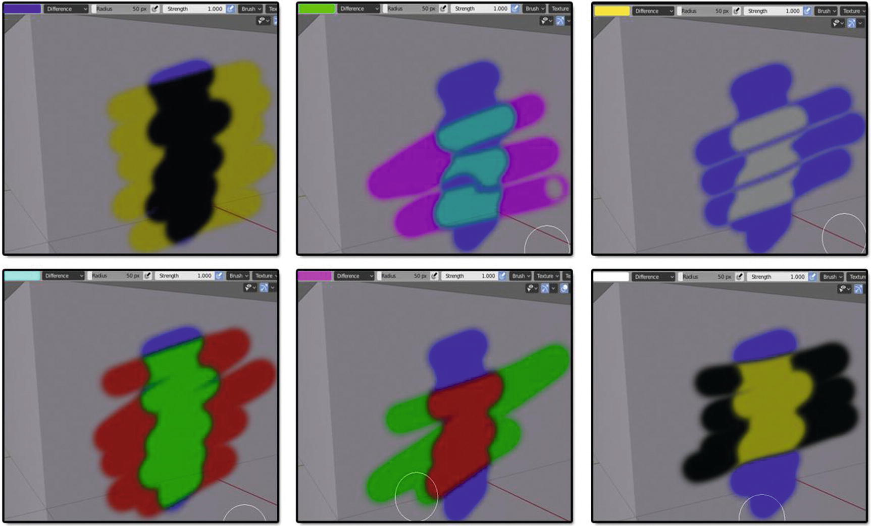
Difference Blending mode works
Remember that our base color is the mesh base color, and we are only using the blue color for us to have a clearer vision of what’s going on with our blend modes. See that when we use the color blue, it turns a resulting color of yellow and turns the blue color painted in the mesh to black. The green color results in pink and turns the blue color to light blue. The yellow color results in the blue color and turns the blue color to white. The light blue color results in red and turns the blue color to green. The pink color results in green and turns the blue color to red. Last, the white color results in black and turns the blue color to yellow. This is the example of how this blend mode uses the differences of the base color and blend colors .
Let’s now proceed to our next inversion blend mode, which is exclusion.
Exclusion Blend Mode
Exclusion blend mode is very similar to difference. Blending with white inverts the base color values, while blending with black produces no change . However, blending with 50% gray produces 50% gray.
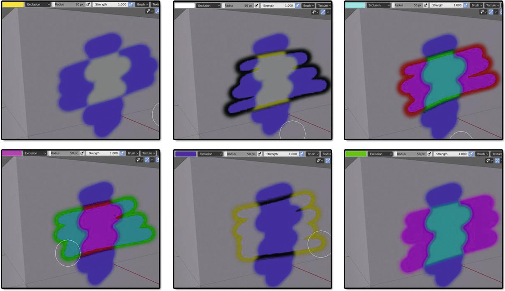
Exclusion Blending mode works
As you can see in Figure 4-22, exclusion has a different kind of effect more than the effect on its color. For example, in the part where I used the color pink as a blend color together with the blue, it results in a light blue color with a green stroke effect on the outside while a red stroke plus a pink fill in the part that hit the blue color results. This effect also shows in the part where I used the color white, light blue, and blue. This didn’t show when I used the color green and yellow, but in the part of color yellow, the part that hit the color blue looks like it has been erased.
You can see here that this blend mode has an interesting effect that is worth learning.
Now, let’s proceed to our last contrast blending mode, but not the last blend mode to discuss, which is the Subtract Blend Mode.
Subtract Blend Mode
Subtract blend mode subtracts pixel values from the base color. This blending mode drastically darkens pixels by subtracting brightness. Black has no effect . Only as the blend values get brighter does the result get darker.

Subtract Blending mode works
We can see in Figure 4-23 that the result color we produce using the subtract blend mode is the opposite of the color we’ve chosen. It is just like white to black, green to pink, or yellow to blue.
Now, we’re done with the three contrast blend modes. We still have six blend modes to discuss: Hue, Saturation, Color, Value, Erase Alpha, and Add Alpha. Let’s keep going !
Hue Blend Mode
Hue blend mode preserves the luminosity and saturation of the base color while adopting the hue of the blend color.
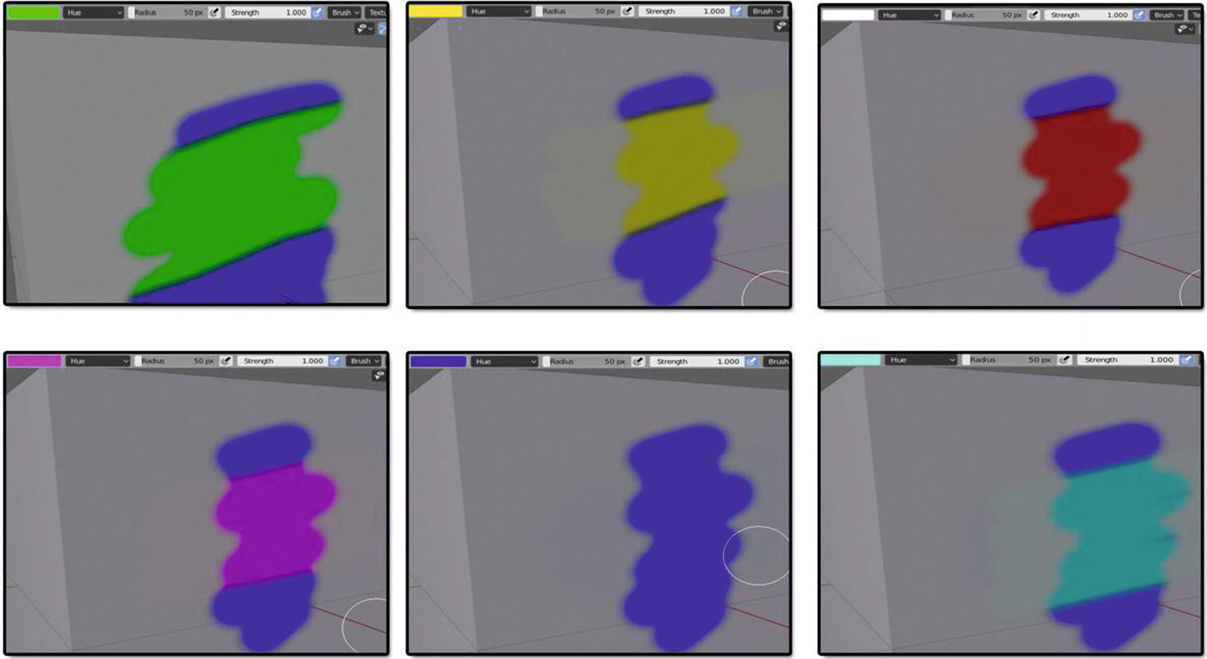
Hue Blending mode works
As you can see in Figure 4-24, it seems this blend mode doesn’t have any effect on base mesh color but if you look closely on the part where I used the light blue, white, and yellow colors, it does have an effect but it’s not that visible. But also, you can notice how white turns to red rather than another white. This is because there is no white in a hue or black. It is only RGB. Hue is like turning the color wheel so it changes colors but doesn’t change the saturation. The saturation is like moving from the center to the edge of the color wheel, and the value is adjusting the slider on the side of the color wheel, making everything darker or lighter.
Now, let’s move on to our next blend mode, which is saturation.
Saturation Blend Mode
Saturation blend mode preserves the luminosity and hue of the base color while adopting the saturation of the blend colors. A black-and-white blend color also turns the image into grayscale because the base color doesn't have saturation.
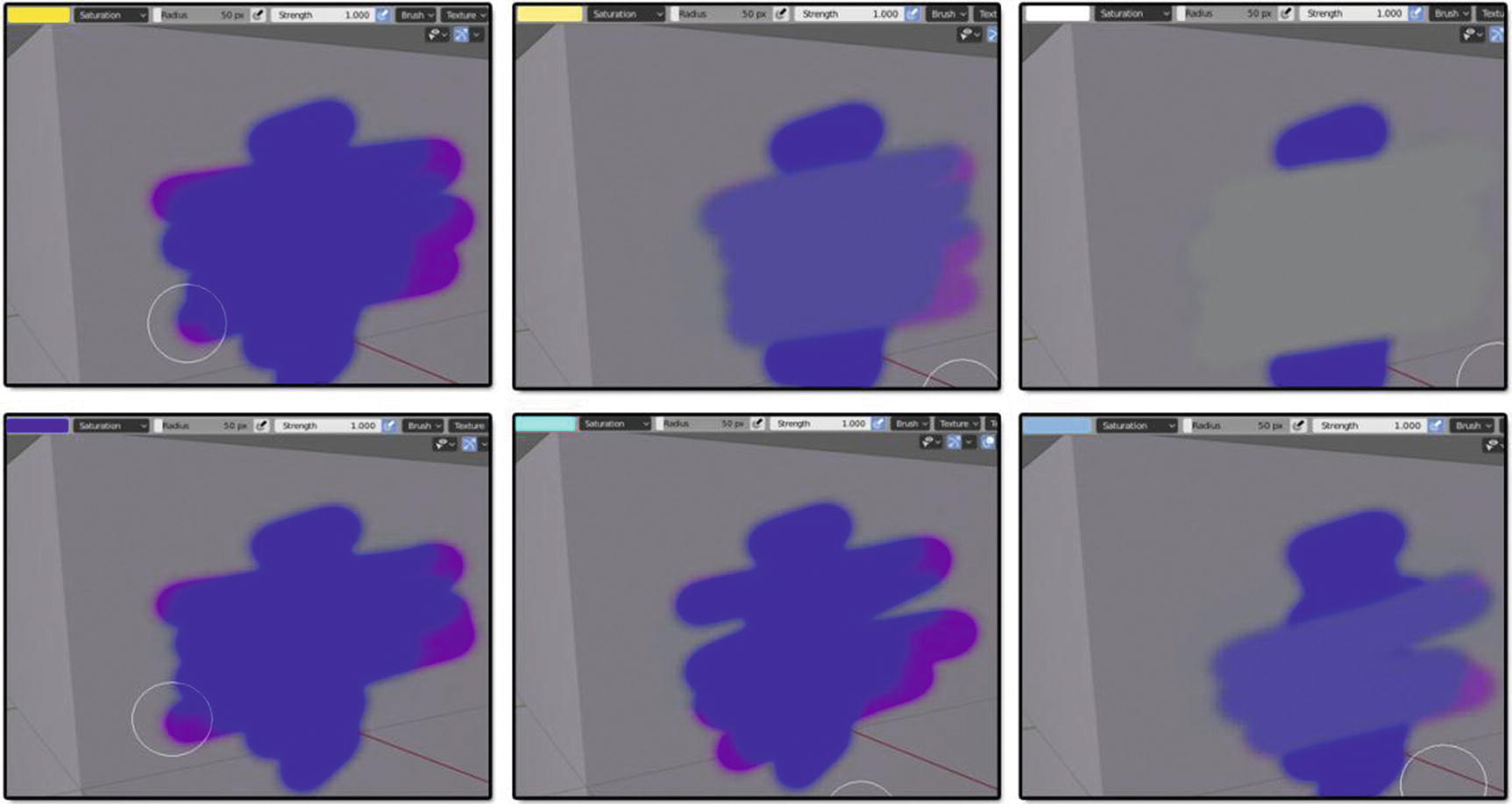
Saturation Blending mode works
Quite an effect, right? Here, we can say that when you choose a pure hue as a blend color, we can only get an effect the same as you can see in the two images placed on the left side of Figure 4-25, where I used blue and yellow as blend colors. You see that it has a result color where we have a blue color and a pink color mix in on the sides. But as we choose a color where its saturation value is lesser for the blend color, the result output has a slight change too. It became lighter, as you can see in our example. However, when we use white as a blend color, we cannot see any effect at all. Again, this happens because I’m just using the hue, or the RGB, value without using the saturation value in it; but unless you change the saturation of the color to differe from the saturation of the first color you use, you will see some big differences.
Now, let’s take a look in our next blend mode, which is color.
Color Blend Mode
Color blend mode preserves the luminosity of the base color while adopting the hue and saturation of the blend color.
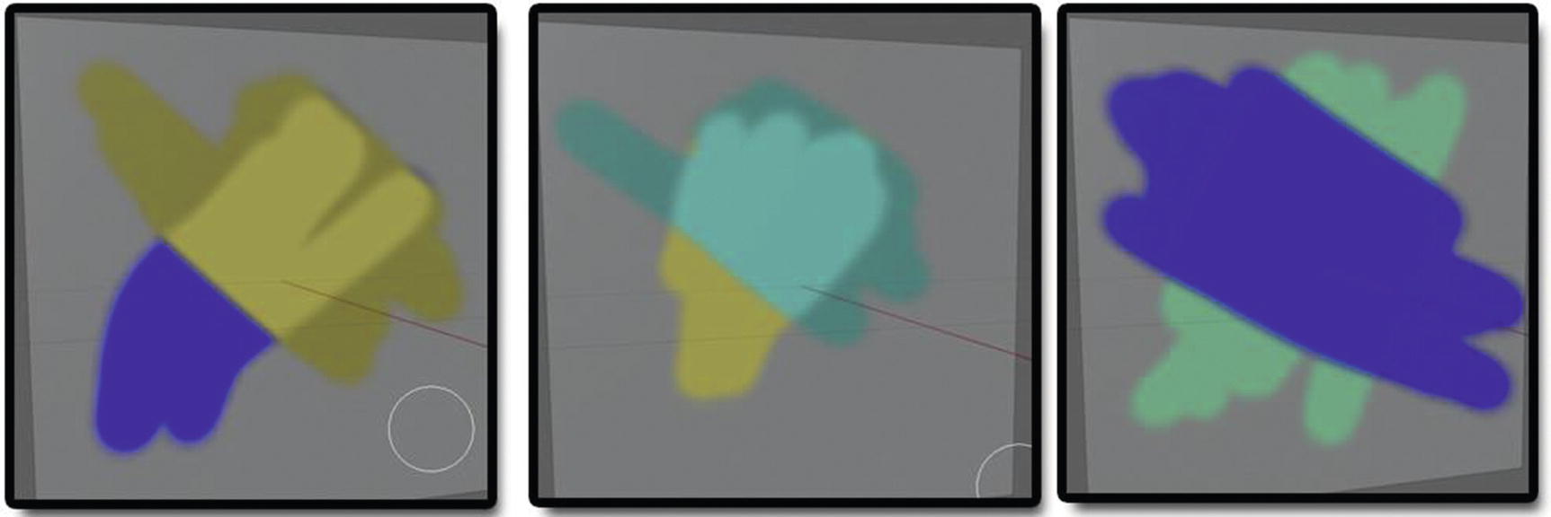
Color Blending mode works
As you can see in Figure 4-26, this blend mode has an effect of a highlighter. Well, depending on the combination of saturation of colors you use, it also determines the effect you will have in your output.
Let’s now proceed to our next blend mode, which is value.
Value Blend Mode
Value blend mode preserves the luminosity of the base color while adopting the value of the blend colors.
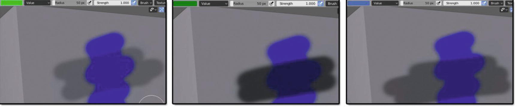
Value Blending mode works
As you can see in Figure 4-27, most of the result colors from this blend mode are close to a gray color.
Now let’s have these two special blend modes, which are erase alpha and add alpha.
Erase Alpha and Add Alpha Blend Modes
Erase alpha and add alpha are different from the rest because their effects aren’t about the color. Its more about the textures. When you use erase alpha , it erases or makes the texture invisible while when you use add alpha, it adds or brings back what’s been erased or hidden with erase alpha.
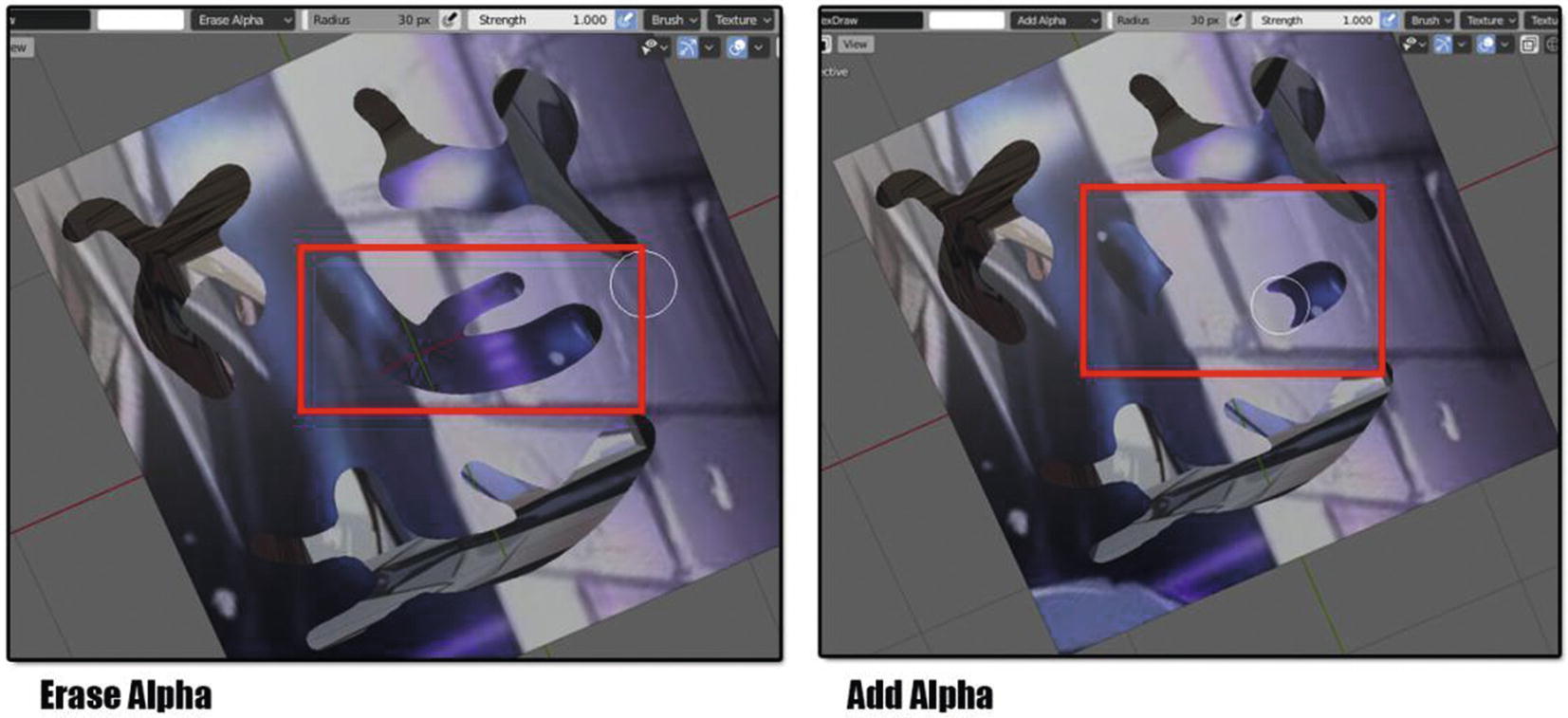
Erase and Add alpha Blending modes work
Its already clear in Figure 4-28 how erase alpha makes the texture invisible while add alpha makes the texture visible again.
Some examples of how Blending Mode works
Now we’re done with the blending modes. We will be going back to the settings that can be found in the header.
Tool Settings
Let’s now proceed to the one tool next to the blending mode and that is the radius.
Radius settings simply refer to the size of the brush of your tools. This setting is available in all texture paint workspace tools except in annotate tools. Beside the radius is an icon with an image of a small pen. This is for enabling brush sensitivity in size when using a graphic tablet. Next, we have strength, which is for indicating how powerful the effect of the brush is when applied. Beside strength is also an icon with an image of a small pen. This is for enabling brush sensitivity for strength when using a graphic tablet.
Brush
Advance Brush settings
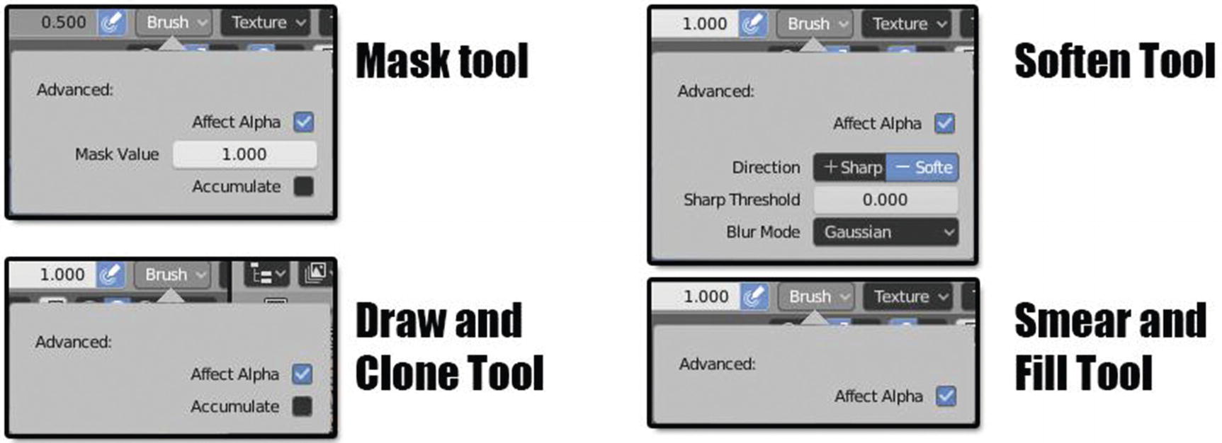
For the draw and clone tool, we have two options: accumulate, which allows a stroke to accumulate on itself when enabled; and affect alpha, which allows changes to the alpha channel while painting when enabled.
For the smear and fill tool, we only have affect alpha.
For the mask tool, we have both affect alpha; accumulate; and another one, which is mask value, for indicating the vertex weight when the brush is applied.
For the soften tool, aside from affect alpha, we have direction, which indicates the direction of your brush. We have two options here: soften and sharp. Soften is used to paint a blur effect while sharpen enhances the contrast of the image as you paint it over. Sharp threshold indicates the threshold value limit of where the sharpening will be applied. Blur mode controls how neighboring pixels are weighted when calculating that difference.
Texture

Texture settings
View Plane: the current view angle is used to project brush texture onto the model.
Tiled: It will tile the texture across the screen so moving the brush appears to move separately from the texture.
3D allows the brush to take full advantage of procedural textures.
Random picks random texture coordinates from each dab.
Stencil works by projecting the paint from the viewport space on the mesh canvas.
We also have settings for angle, which set the rotation angle of the brush; offset which offsets the texture map placement in the X-, Y-, and Z-axes; and size, which sets the scale of the texture in each axis.
Texture Mask
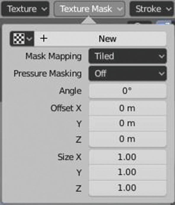
Texture Mask settings
So, the settings that we have for texture mask are almost the same as what we have for texture settings except the part of pressure masking. So, let’s just discuss this part.
Pressure masking allows us to clip the mask result based on pressure, creating areas of no paint when low pressure is applied to the brush. It has three options: Off, Ramp, and Cutoff. Off means deactivating the pressure masking. Ramp means distributing the mask effect above the pressure value, and cutoff means simply to select between zero and one based on the stylus pressure.
Stroke
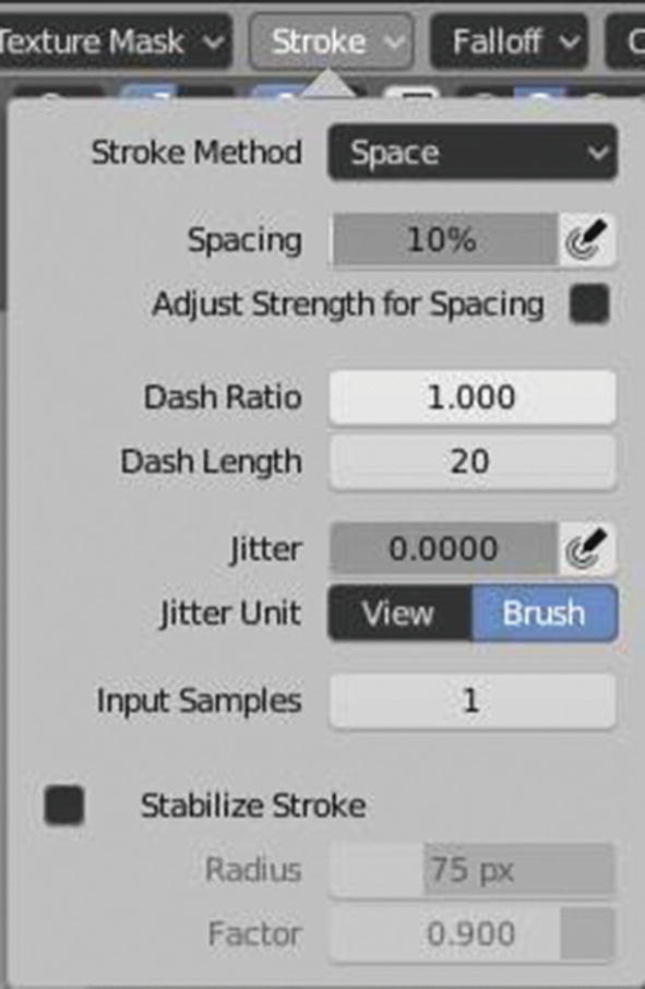
Stroke settings
Dots apply paint on each mouse move step.
Drag Dots leave only one dab on the canvas, which can be placed by dragging.
Space creates brush strokes as a series of dots.
Airbrush: the flow of the brush continues as long as the mouse click is held.
Anchored creates a single dab at the brush location.
Line lets you define a line in a screen space by clicking and dragging.
Curve defines a curve in a screen space.
Spacing represents the percentage of the brush radius. This is only available under the Space, Line, and Curve Stroke methods. Adjust strength for spacing attenuates the brush strength according to spacing. It is only available under the Space, Line, and Curve stroke methods. Dash ratio is the ratio of samples in a cycle that the brush is enabled. This is only available under the pace stroke method. Dash length is the length of a dash cycle measured in stroke samples. This is also only available in space stroke methods.
Jitter jitters the position of the brush while painting. This option is available under all stroke methods. The pen-like icon next to Jitter is for enabling brush sensitivity for Jitter when using your graphic tablet. Jitter unit controls how the brush Jitter is measured. We have two options here: View and Brush. These options are also available under all stroke methods. Next, we have input samples where the recent mouse locations, which are the input samples, are averaged together to smooth brush strokes. This option is available under all stroke methods. Stabilize stroke makes the stroke lag behind the cursor and applies a smoothed curve to the path of the cursor when enabled. There are two settings under this option: Radius and Factor. Radius sets the minimum distance from the last point before a stroke continues and factor sets the amount of smoothing. Stabilize stroke is available under space, dots, and airbrush stroke methods.
We also have draw curve, which is under the curve stroke method. It executes the curved stroke. Rate, which is under airbrush stroke method sets interval between paints for airbrush, and edge to edge, which is under the anchored stroke method, determines the brush location and orientation by a two-point circle where the first click is one point and dragging places the second point opposite from the first.
Falloff

Falloff settings
We have ten curve presets here: Custom, Smooth, Smoother, Sphere, Root, Sharp, Linear, Sharper, Inverse Square, and Constant. By default, the mask tool is set to smooth while fill, draw, smear, soften, and clone tools are set to custom. So, at first glance, you will think they have different settings, but that’s not the case.
Enabling normal falloff means as faces point away from the view, the brush strokes fade away to prevent harsh edges. Angle is the angle at which the falloff begins.
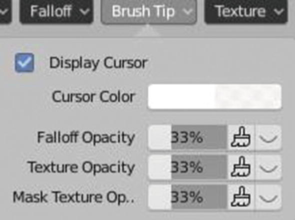
Cursor
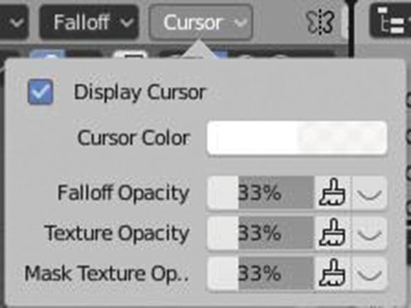
Cursor settings
Display cursor allows you to see the special cursor that helps you by displaying the information about the brush. Cursor color sets the color of the brush ring while performing a stroke. Falloff opacity sets the opacity for the falloff. Texture opacity sets the opacity for the Texture, and mask texture opacity sets the opacity for the texture mask .
The cursor settings are the same for our Draw, Fill, Smear, Soften, Clone, and Mask tools.
Symmetry
Symmetry settings
This setting will help you mirror what you are doing in one part of the mesh to the other side, depending on what axis you choose. It is just like the mirror modifier for our modeling.
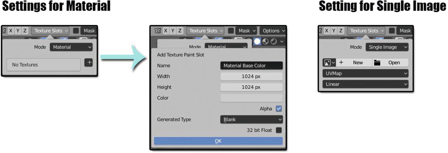
Texture Slot
Next is the texture slot . Texture slot is where you add the texture or material base color for your mesh. This is the most important setting since you cannot start your project without a material base color or a texture in it. These are also available in all tools except for annotate tools.
Texture Slots settings
First, we have mode where you can choose a mode of texture you want to have. We have two types of mode: Material and Single Image. Material mode is the one we called material base color or what is created inside Blender while the single image is the one that is a texture or something imported from outside Blender.
To create a material base color, first you will add one by clicking the plus icon. Whatever you choose here, the next settings will be the ones in the middle of Figure 4-37. You will be asked for a name or label for your base color, width and height for the pixel resolution of your base color, color for the main color, and generated type for what kind of image you want your material to be. For a generated type, we have three options: Blank, which generates a blank image; UV Grid, which generates a grid to test UV mappings; and Color, which generates improved UV grid test UV mappings.
For single image, we only have simple settings. New means new texture, and open means to open or browse texture. The UVMap is something related to our UV editing since this texture will directly flatten to the mesh and means Blender will also automatically create a UV map for this one. The last one is the interpolation, which has two sets of option: Linear and Closest. These two have lots of formulas to explain so I leave it with that.
Mask

Mask settings
This is another setting for masking. This is for if you ever don’t want to paint on some part, but you want to freely paint on the other parts of the mesh. By using this mask setting, you can cover up for that part you want to avoid, being able to paint on it and freely paint on the other parts. You can even use this to trace on an image.

So, in image 1 of Figure 4-39, we applied the mask. In image 2, we painted over the mask using mix blend, and in image 3, you can see the result of what I did using the mask setting.
This is just one of the uses of masking.
Basically, this is how mask settings work. The new button is for saving the result of the masking you created in the Blender, like in image 3 of Figure 4-39. Open is for browsing the image for masking, UV layer again is for directing Blender so that the result of what we did in the mask setting has a UV layout created automatically, and the display color is for the color you want to use for the masking. It will affect the output so make sure to choose wisely.
Options

Options settings
So what we have here are bleed, which extends paint beyond the faces UVs to reduce seams; and dither, which is the amount of dithering when painting on byte images; occlude, which only paints onto the faces directly under the brush when enabled; backface culling, which ignores faces pointing away from the view; cavity mask, which masks painting according to the mesh geometry cavity; screen grab size, which is the size to capture the image for re-projecting; quick edit, which edits a snapshot of the viewport in an external image editor; apply, which projects an edited image back onto the object; and apply camera image, which projects an edited render from the active camera back onto the object.
Annotation Stroke Placement
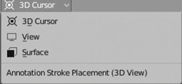
Annotation Stroke Placement settings
We have three options for this setting: 3D cursor that draws strokes at the 3D cursor location, view that sticks strokes to the view, and surface that sticks strokes to the surface.
Properties
Tool Settings compared to Properties
See that almost all of the settings that can be found in tool settings can also be found in properties aside from the two, color palette and workspace, so let’s just discuss these two so we won’t leave anything behind in the settings.
Color Palette
Color palette is where you can store or create swatches for your project. This is important as a reference color so you don’t need to memorize or list down the color code of the list of colors you are going to use or have already used. What you will just do is to use the eyedropper and pick it up in the color palette. This will be more convenient, making you more at ease while doing your project.
This is only available in fill and draw tools.
Workspace

Workspace Panel
Now that we’re already done with the tools and settings in the 3D viewport, we’re going to proceed in the tools and settings that we have in the image editor .
Image Editor in Texture Paint Workspace
Image editor is another place where you can do painting for your texture. Here, your 3D mesh is in its flattened image, just like how it was in UV editing. As you do your painting, you can see your output in the 3D viewport on the right side. Our image editor is in paint mode, which is the mode applicable for texture painting.
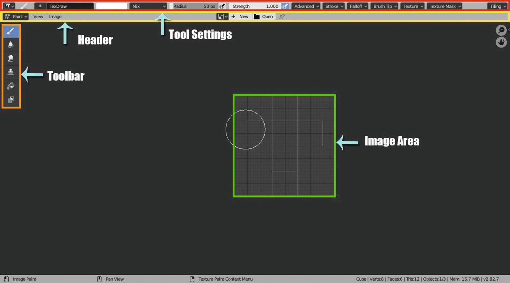
Image Editor in Texture Paint Workspace
I use toggle maximize (Ctrl + Spacebar) to show the whole image editor in Figure 4-44. What we have here are toolbar, tool settings, header, and image area.
Image area, just like in UV editor, is where you can paint the 2D equivalent of your mesh.
Our header only has the select menu for editor mode, view, and image menus, and new and open buttons for image or texture.
Adjust Last Operation is for you to control if you want to disable or enable the last operation features, which helps you easily trace back what your last activity was using one tool.
Update Automatically allows you to enable or disable this feature that allows you to update other affected window spaces automatically to reflect changes during interactive operations.
Show Metadata allows you to enable or disable the features that display metadata properties of the image.
Display Texture Paint UVs display overlays of texture paint UV layers.
Show Same Material displays only faces with the currently displayed image assigned.
The image menu is the same as what we have with the UV editor menu. And yes, most of the header menus in Blender have the same commands or tools under it.
Just like in 3D viewport, our tool settings are connected to our tools so it changes depending on the tools that are currently active. Thankfully, most of the tools have the same settings. And most of them are the same settings as the ones in the 3D viewport.
So, let’s get started!
Tool Settings
Take a look at Figure 4-45 to see our tools together with their tool settings.
We have Draw, Soften, Smear, Clone, Fill, and Mask. Unlike in 3D viewport, we don’t have an annotate tool here.
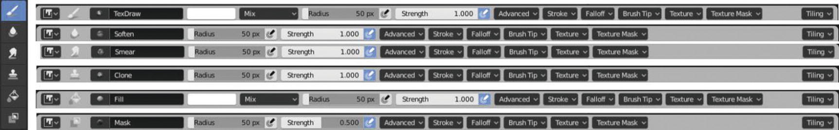
Image editor’s Toolbar and Tool settings
Advanced Settings

Advanced Settings
Our draw tool has accumulate that allows a stroke to accumulate on itself when enabled and this can also be seen in the clone and mask tool.
Mask tool has a mask value that is for indicating the vertex weight when a brush is applied.
Fill tool has a fill threshold that is for the threshold above which filling is not propagated.
Our Clone tool has an image where it can browse an image for cloning; and alpha, which is for the opacity of the clone image display.
Soften tool has direction, which indicates the direction of your brush. We have two options here: Soften and Sharp. Soften is used to paint a blur effect while sharpen enhances the contrast of the image as you paint it over. Sharp threshold indicates the threshold value limit of where the sharpening will be applied. Kernel radius, which sets the radius of kernel, is used for softening and sharpening in pixels. Blur mode controls how neighboring pixels are weighted when calculating that difference.
Stroke setting is the same as what we have in the 3D viewport.
Brush Tip
Brush Tip Settings
(Wait a minute. It seems I already saw these settings before. Ah! In cursor settings in 3D viewport!) Yes. The cursor settings in the 3D viewport are called brush tips in the image editor, but still they have the same function .
Texture and texture mask settings are the same as what we have in the 3D viewport.
Tiling
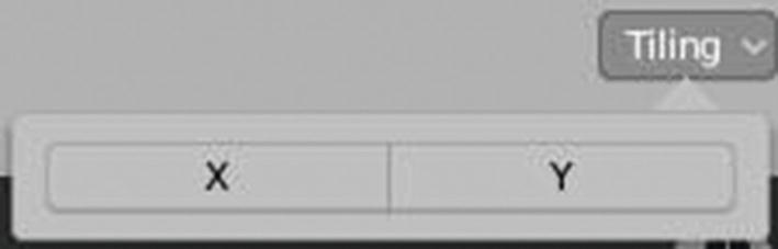
Tiling Settings
So simple right? It’s because its purpose was for helping you create tiling for your textures, either in the X-axis or Y-axis.
We’re already discussed the image editor. Since its settings are almost the same as what we have in the 3D viewport, we don’t need to discuss it in depth.
We already know that the texture paint workspace, or Blender itself, gives us two ways to paint our texture. We can do it in 3D way (in 3D viewport) or in 2D way (image editor). The tools are the same, so it’s a matter of when’s its convenient and when we want to be creative. Let’s begin our sample project !
Sample Project
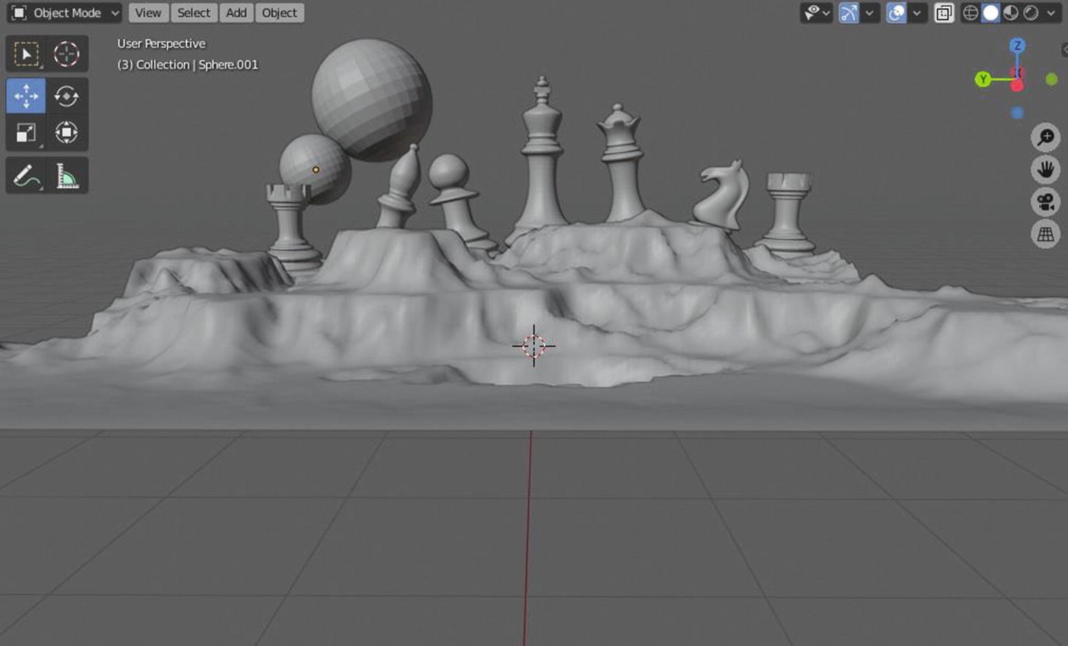
Sample Project to be Textured
Before we have our game assets textured, we first need it to have a UV layout.
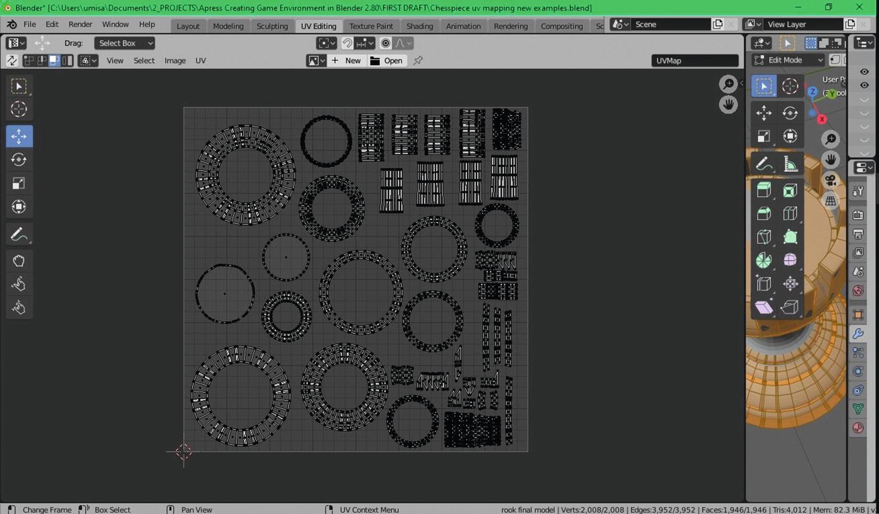
UV Mapping
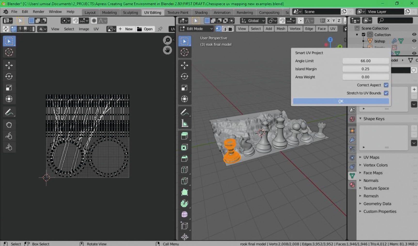
UV Mapping process
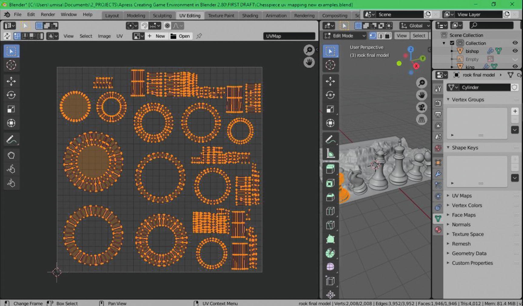
UV Mapping process 2
Even though we already have a UV layout presented after the Smart UV project, we need to take a look at some things like overlapping UVs. We can so this by going to Select menu ➤ Select Overlap.

UV Mapping process 3
UV Mapping process 4
UV Mapping process 5
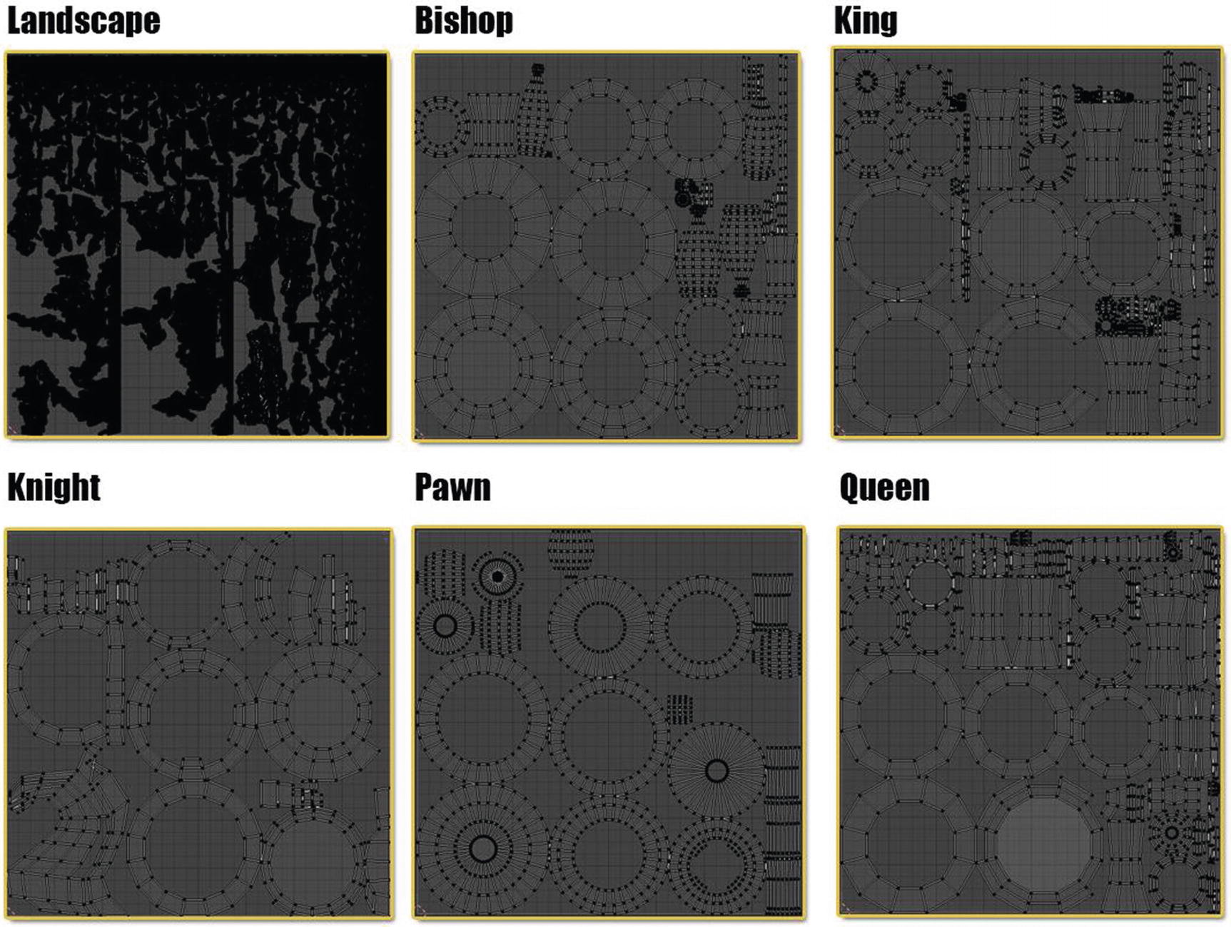
You can see the different UV layouts created from the Smart UV project in this sample project that we have. For the landscape, remember that what we used in creating the landscape is an add-on and by default already has many vertices that result in having a lot of UVs presented in the UV layout. In this case, to make sure we don’t have overlapping UVs, just use the select overlap; but we should avoid these kinds of crowded UVs as much as possible.

UV Mapping process 6
What you can see here is that I use the sphere projection for UV mapping of our two spheres. Since there are also some overlapping issues here, I move some of the UV faces.

UV Mapping process 7
Minimal Stretching - It means that a UV map is appropriate to the face size on the mesh so that when you add texture, it isn’t stretched.
No Overlapping UV islands - Overlapping UV islands will result in undesirable results in textures. For example, the texture you use will not be exactly show in the mesh if you have overlapping UVs.
Using UV Square Add-on to straighten any distorted islands - It will allow you to align UV islands to grids, and it makes things so much easier to straighten out and fit together.
Enough space between islands for edge padding when using mipmaps in a game engine.
As average-sized islands are possible, compare to each other to avoid big or too-small texel density differences. - Texel density is the resolution of the texture on a mesh.
Filling the square UV space completely without wasted space. - This is important for the resolution of a texture.
Convenient and readable in 2D if ever that people will use a 2D program at any stage for this an asset.
When seaming, the best place to put it is in areas that are not going to be seen easily, which means the bottom edges or the back sides.
Supporting edges can really help clean up difficult seams, especially for hard surface objects. This helps stop stretching the UV at these edges.
Poles can cause texture distortions so try to avoid adding seams on edges that end with poles.
Things like clothes often have natural seams in them, and you would be in the right 80% of the time just using those natural seams.
Now, we’re done with UV mapping, let’s proceed with texturing.
Texturing
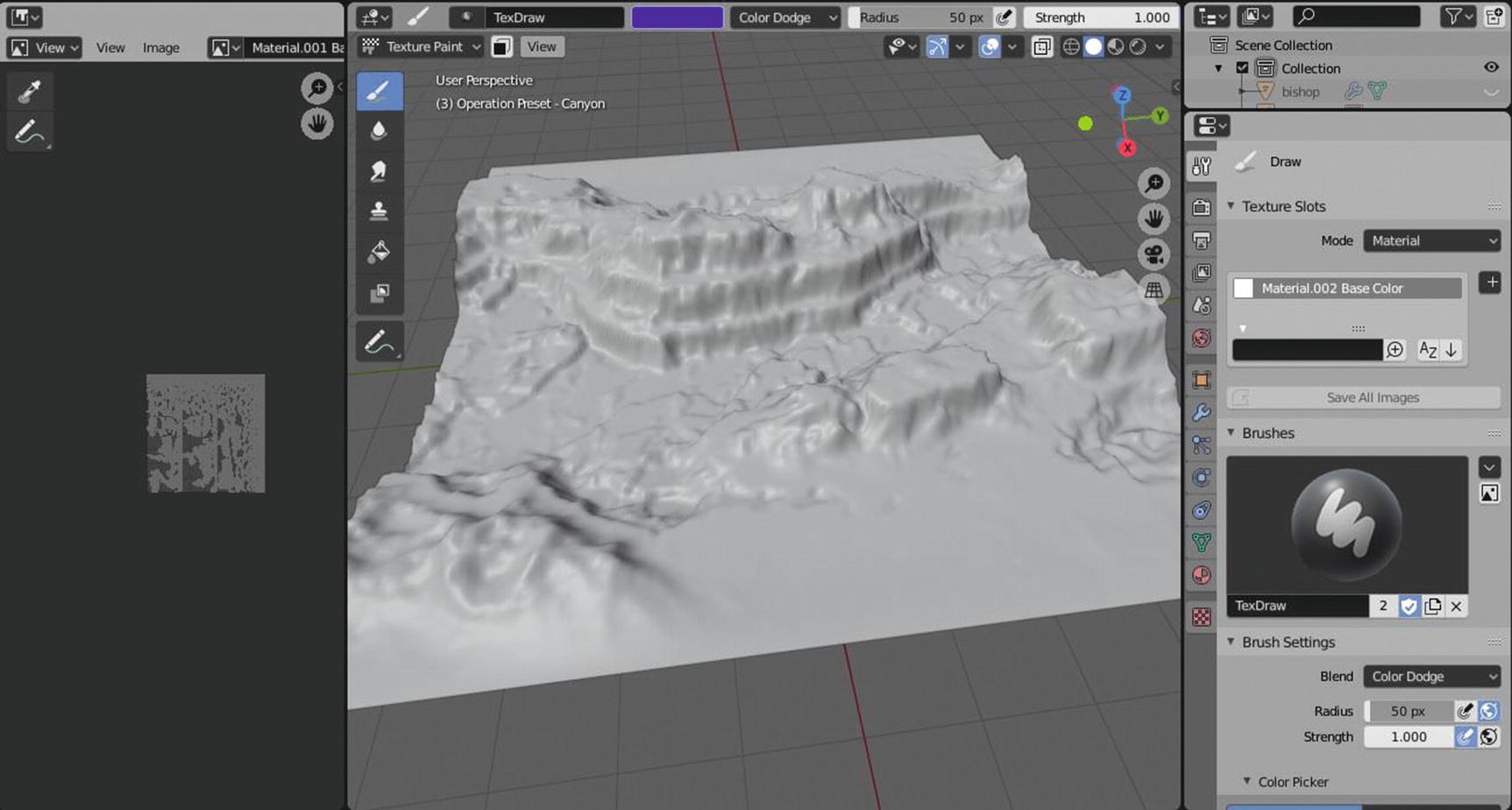
Landscape Texturing Process
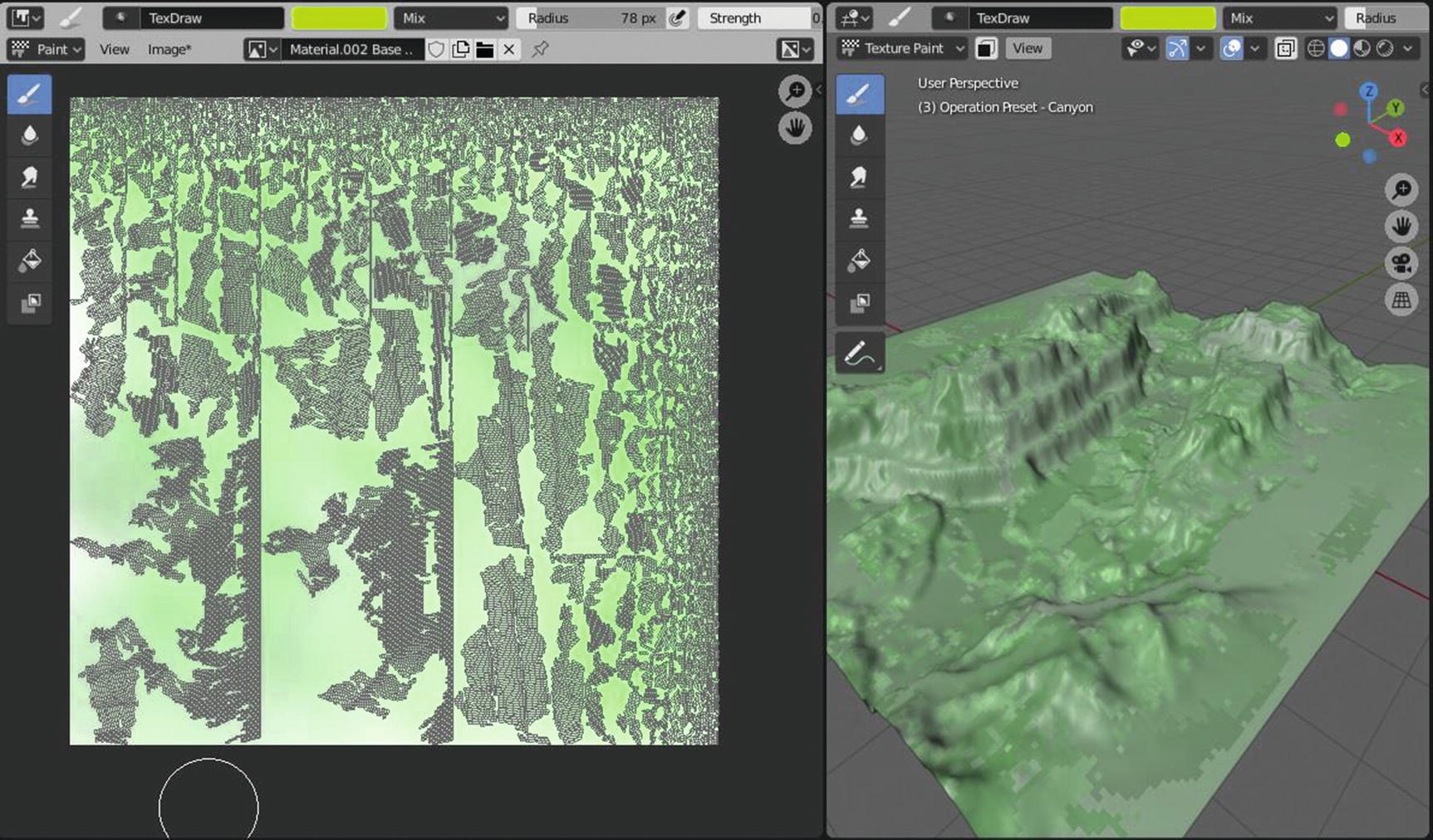
Landscape Texturing Process
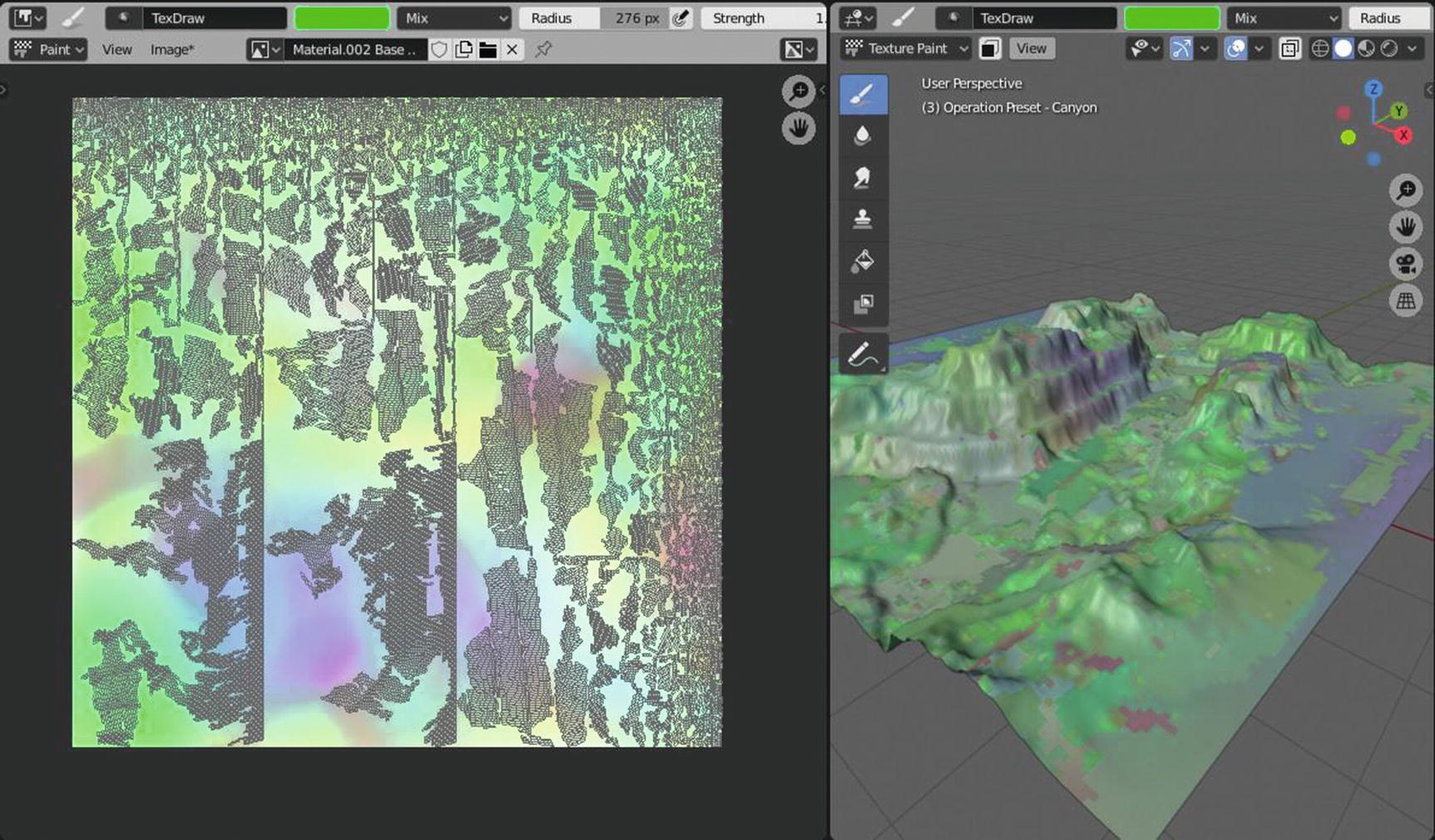
Landscape Texturing Process
In the meantime, this is the output for our landscape. What I did here is I only used mix blending mode and just changed the radius and strength from time to time according to my own preferences. It depends on the other assets and processes, and this might be enhanced for the sake of our overall design.
Let’s now proceed to texture our chess pieces.
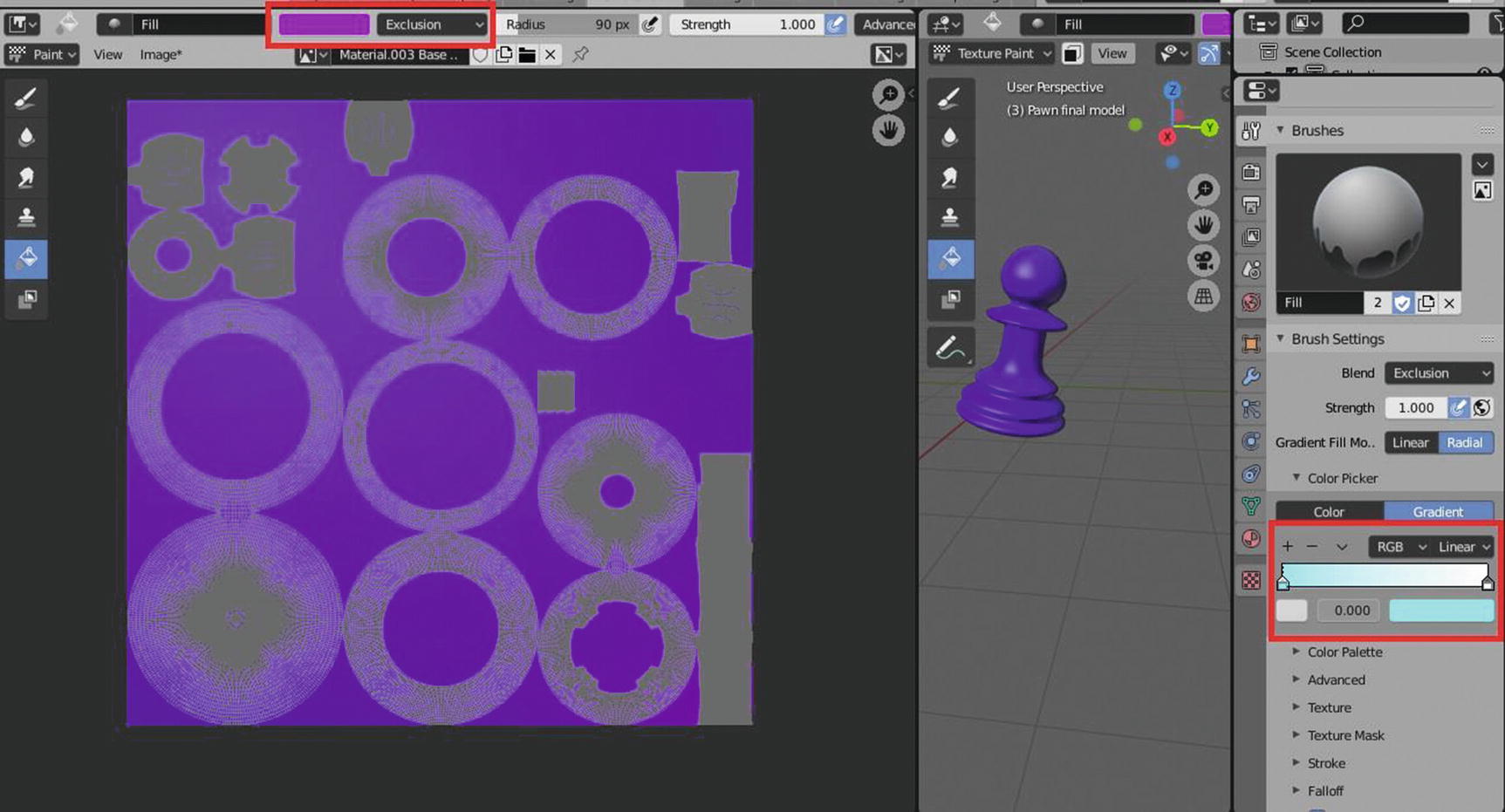
Chess Piece Texturing Process

Chess Piece Texturing Process
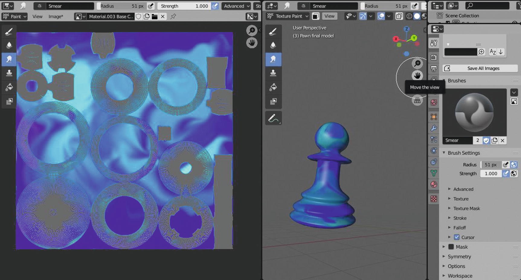
Chess Piece Texturing Process

Chess Piece Texturing Process
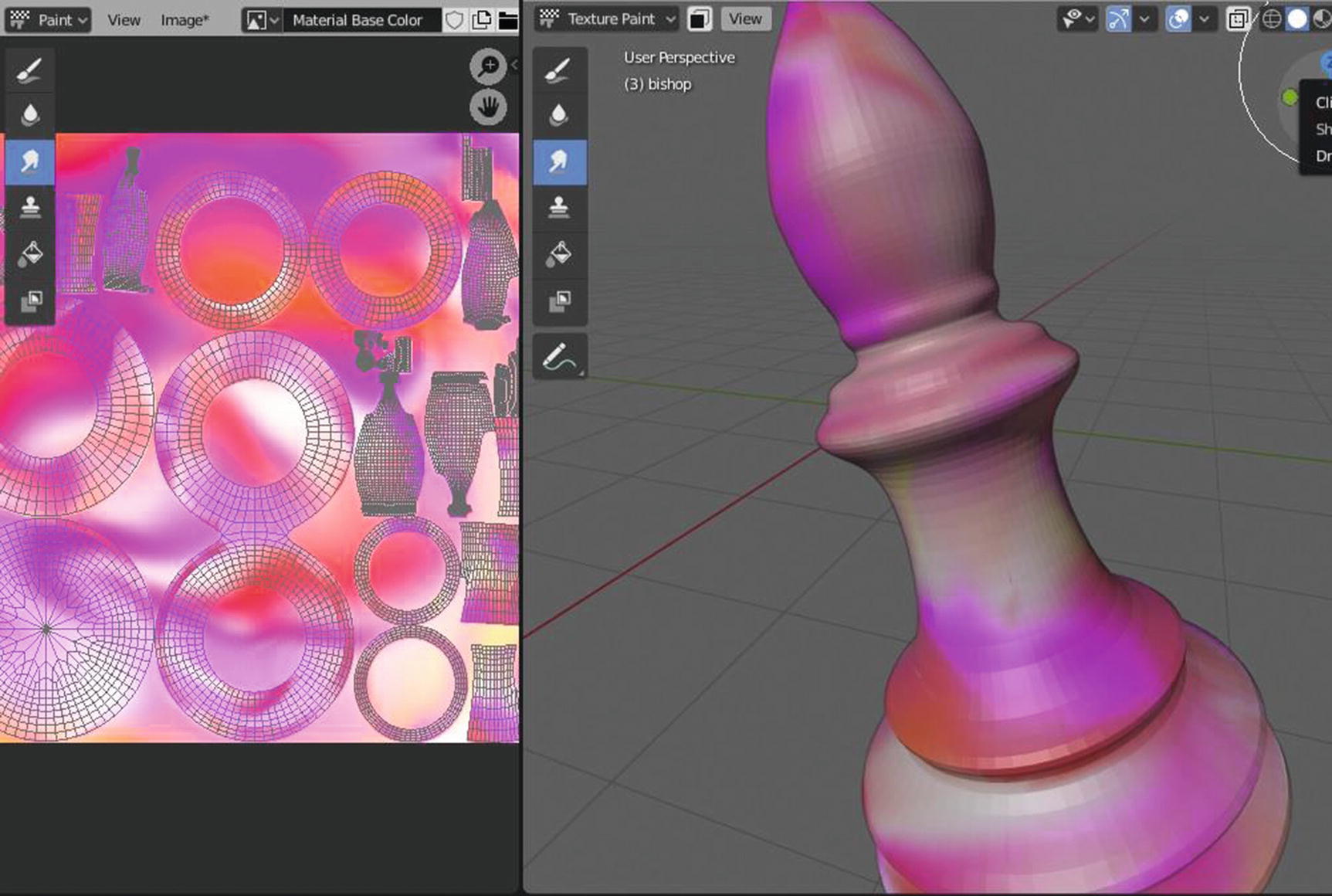
Chess Piece Texturing Process
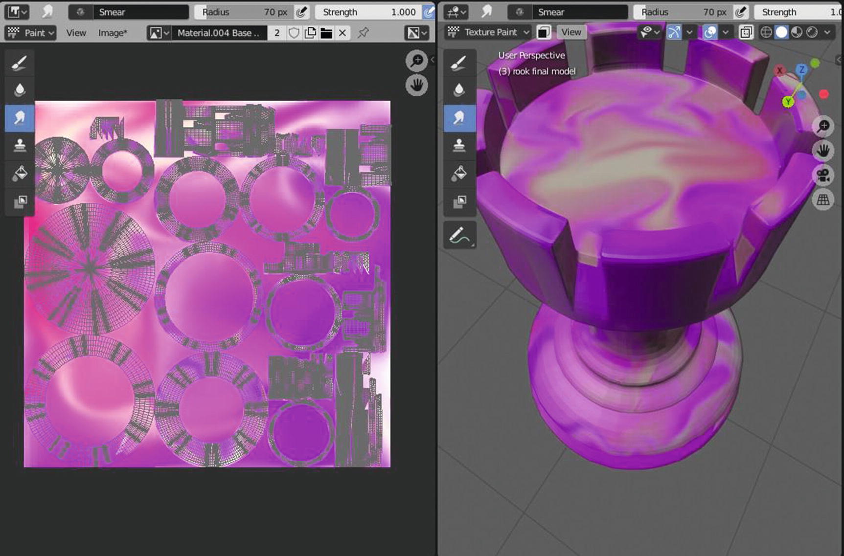
Next, we have our rook. I use the same process with the rook. I use the fill tool to create a gradient color with red, pink, and purple; then I add white colors using the draw tool with a lighten blend mode. For the finale, I use a smear tool directly to the mesh to blend the colors and smoothen the edges that were created by the corners of the UVs.
Chess Piece Texturing Process

Chess Piece Texturing Process

Chess Piece Texturing Process
For the knight, I used the same material as we used in the landscape. For the rest of the assets, we use the same method: Using the fill tool, choose a gradient for applying the first blend color and then use the draw tool together with another blend mode such as color dodge to create effects. Then use the smear tool for blending colors and smoothing sharp edges created by UV layouts in the textures.
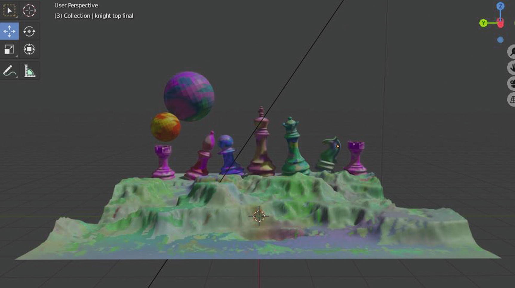
Final Output for Texturing process
Now, let’s proceed to our next chapter and continue learning!