
Learning Objectives
By the end of this chapter, you will be able to:
- Create and customize line plots, bar plots, histograms, scatterplots, and box-and-whisker plots using a functional approach
- Develop a programmatic, descriptive plot title
- Describe the advantages of using an object-oriented approach to create Matplotlib plots
- Create a callable figure object containing a single axis or multiple axes
- Resize and save figure objects with numerous subplots
- Create and customize common plot types using Matplotlib
This chapter will cover various concepts that fall under data visualization.
Introduction
Data visualization is a powerful tool that allows users to digest large amounts of data very quickly. There are different types of plots that serve various purposes. In business, line plots and bar graphs are very common to display trends over time and compare metrics across groups, respectively. Statisticians, on the other hand, may be more interested in checking correlations between variables using a scatterplot or correlation matrix. They may also use histograms to check the distribution of a variable or boxplots to check for outliers. In politics, pie charts are widely used for comparing the total data between or among categories. Data visualizations can be very intricate and creative, being limited only by one's imagination.
The Python library Matplotlib is a well-documented, two-dimensional plotting library that can be used to create a variety of powerful data visualizations and aims to "...make easy things easy and hard things possible" (https://matplotlib.org/index.html).
There are two approaches to creating plots using Matplotlib, the functional and the object-oriented approach.
In the functional approach, one figure is created with a single plot. Plots are created and customized by a collection of sequential functions. However, the functional approach does not allow us to save the plot to our environment as an object; this is possible using the object-oriented approach. In the object-oriented approach, we create a figure object and assign an axis or numerous axes for one plot or multiple subplots, respectively. We can then customize the axis or axes and call that single plot or set of multiple plots by calling the figure object.
In this chapter, we will use the functional approach to create and customize line plots, bar plots, histograms, scatterplots, and box-and-whisker plots. We will then learn how to create and customize single-axis and multiple-axes plots using the object-oriented approach.
Functional Approach
The functional approach to plotting in Matplotlib is a way of quickly generating a single-axis plot. Often, this is the approach taught to beginners. The functional approach allows the user to customize and save plots as image files in a chosen directory. In the following exercises and activities, you will learn how to build line plots, bar plots, histograms, box-and-whisker plots, and scatterplots using the functional approach.
Exercise 13: Functional Approach – Line Plot
To get started with Matplotlib, we will begin by creating a line plot and go on to customize it:
- Generate an array of numbers for the horizontal axis ranging from 0 to 10 in 20 evenly spaced values using the following code:
import numpy as np
x = np.linspace(0, 10, 20)
- Create an array and save it as object y. The snippet of the following code cubes the values of x and saves it to the array, y:
y = x**3
- Create the plot as follows:
import matplotlib.pyplot as plt
plt.plot(x, y)
plt.show()
See the resultant output here:

Figure 2.1: Line plot of y and x
- Add an x-axis label that reads 'Linearly Spaced Numbers' using the following:
plt.xlabel('Linearly Spaced Numbers')
- Add a y-axis label that reads 'y Value' using the following line of code:
plt.ylabel('y Value')
- Add a title that reads 'x by x cubed' using the following line of code:
plt.title('x by x Cubed')
- Change the line color to black by specifying the color argument as k in the plt.plot() function:
plt.plot(x, y, 'k')
Print the plot to the console using plt.show().
Check out the following screenshot for the resultant output:
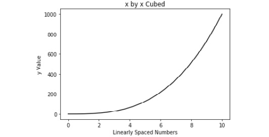
Figure 2.2: Line plot with labeled axes and a black line
- Change the line characters into a diamond; use a character argument (that is, D) combined with the color character (that is, k) as follows:
plt.plot(x, y, 'Dk')
See the figure below for the resultant output:
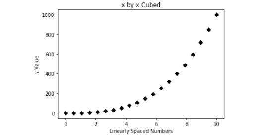
Figure 2.3: Line plot with unconnected, black diamond markers
- Connect the diamonds with a solid line by placing '-' between 'D' and 'k' using the following:
plt.plot(x, y, 'D-k')
Refer to the following figure to see the output:
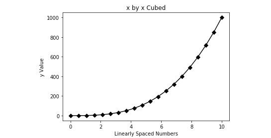
Figure 2.4: Line plot with connected, black diamond markers
- Increase the font size of the title using the fontsize argument in the plt.title() function as follows:
plt.title('x by x Cubed', fontsize=22)
- Print the plot to the console using the following code:
plt.show()
- The output can be seen in the following figure:
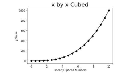
Figure 2.5: Line plot with a larger title
Here, we used the functional approach to create a single-line line plot and styled it to make it more aesthetically pleasing. However, it is not uncommon to compare multiple trends in a single plot. Thus, the next exercise will detail plotting multiple lines on a line plot and creating a legend to discern the lines.
Exercise 14: Functional Approach – Add a Second Line to the Line Plot
Matplotlib makes adding another line to a line plot very easy by simply specifying another plt.plot() instance. In this exercise, we will plot the lines for x-cubed and x-squared using separate lines:
- Create another y object as we did for the first y object, but this time, square x rather than cubing it, as follows:
y2 = x**2
- Now, plot y2 on the same plot as y by adding plt.plot(x, y2) to the existing plot.
Refer to the output here:
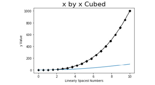
Figure 2.6: Multiple line plot of y and y2 by x
- Change the color of y2 to a dotted red line using the following code:
plt.plot(x, y2, '--r')
The output is shown in the following figure:
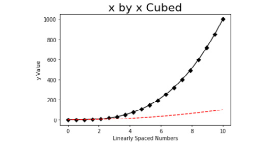
Figure 2.7: Multiple line plot with y2 as a red, dotted line
- To create a legend, we must first create labels for our lines using the label argument inside the plt.plot() functions.
- To label y as 'x cubed', use the following:
plt.plot(x, y, 'D-k', label='x cubed')
- Label y2 as 'x squared' using the following code:
plt.plot(x, y2, '--r', label='x squared')
- Use plt.legend(loc='upper left') to specify the location for the legend.
Check out the following screenshot for the resultant output:
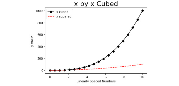
Figure 2.8: Multiple line plot with a legend
- To break a line into new lines, we use '
' at the beginning of a new line within our string. Thus, using the following code, we can create the title displayed here:
plt.title('As x increases, x Cubed (black) increases at a Greater Rate than x Squared (red)', fontsize=22)
Check the output in the following screenshot:
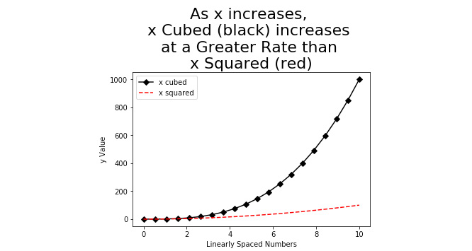
Figure 2.9: A multiple line plot with a multi-line title
- To change the dimensions of our plot, we will need to add plt.figure(figsize=(10,5)) to the top of our plt instances. The figsize arguments of 10 and 5 specify the width and height, respectively.
To see the output, refer to the following figure:
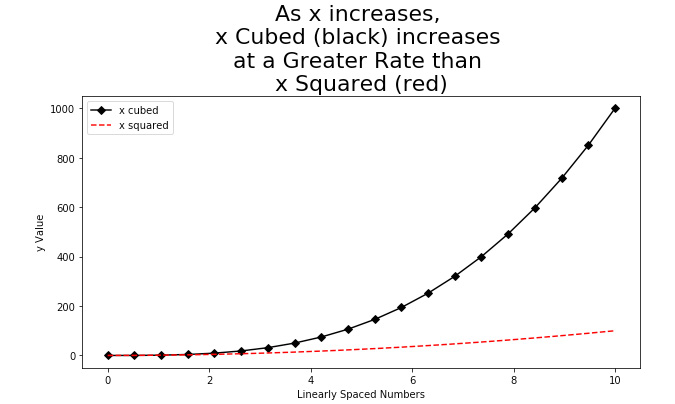
Figure 2.10: A multiple line plot with increased figure size
In this exercise, we learned how to create and style a single- and multi-line plot in Matplotlib using the functional approach. To help solidify our learning, we will plot another single-line plot with slightly different styling.
Activity 2: Line Plot
In this activity, we will create a line plot to analyze month-to-month trends for items sold in the months January through June. The trend will be positive and linear, and will be represented using a dotted, blue line, with star markers. The x-axis will be labeled 'Month' and the y-axis will be labeled 'Items Sold'. The title will say 'Items Sold has been Increasing Linearly:'
- Create a list of six strings for x containing the months January through June.
- Create a list of six values for y containing values for 'Items Sold' that start at 1000 and increase by 200 in each value, so the final value is 2000.
- Generate the described plot.
Check out the following screenshot for the resultant output:
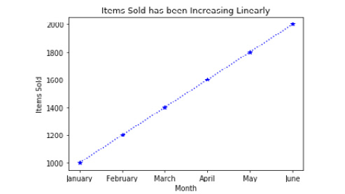
Figure 2.11: Line plot of items sold by month
Note
We can refer to the solution for this activity on page 333.
So far, we have gained a lot of practice creating and customizing line plots. Line plots are commonly used for displaying trends. However, when comparing values between and/or among groups, bar plots are traditionally the visualization of choice. In the following exercise, we will explore how to create a bar plot.
Exercise 15: Creating a Bar Plot
In this exercise, we will be displaying sales revenue by item type:
- Create a list of item types and save it as x using the following code:
x = ['Shirts', 'Pants','Shorts','Shoes']
- Create a list of sales revenue and save it as y as follows:
y = [1000, 1200, 800, 1800]
- To create a bar plot and print it to the console, refer to the code here:
import matplotlib.pyplot as plt
plt.bar(x, y)
plt.show()
The following screenshot shows the resultant output:
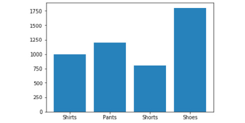
Figure 2.12: Bar plot of sales revenue by item type
- Add a title reading 'Sales Revenue by Item Type' using the following code:
plt.title('Sales Revenue by Item Type')
- Create an x-axis label reading 'Item Type' using the following:
plt.xlabel('Item Type')
- Add a y-axis label reading 'Sales Revenue ($)', using the following:
plt.ylabel('Sales Revenue ($)')
The following screenshot shows the output:
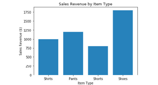
Figure 2.13: Bar plot with customized axes and title
- We are going to create a title that will change according to the data that is plotted. For this example, it will read "Shoes Produce the Most Sales Revenue". First, we will find the index of the maximum value in y and save it as the index_of_max_y object using the following code:
index_of_max_y = y.index(max(y))
- Save the item from list x with an index equaling that of index_of_max_y to the most_sold_item object using the following code:
most_sold_item = x[index_of_max_y]
- Make the title programmatic as follows:
plt.title('{} Produce the Most Sales Revenue'.format(most_sold_item))
Check the following output:
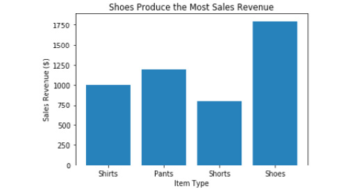
Figure 2.14: Bar plot with a programmatic title
- If we wish to convert the plot into a horizontal bar plot, we can do so by replacing plt.bar(x, y) with plt.barh(x, y).
The output is shown in the following screenshot:
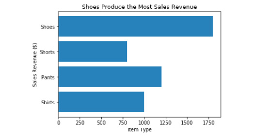
Figure 2.15: Horizontal bar plot with incorrectly labeled axes
Note
Remember, when a bar plot is transformed from vertical to horizontal, the x and y axes need to be switched.
- Switch the x and y labels from plt.xlabel('Item Type') and plt.ylabel('Sales Revenue ($)'), respectively, to plt.xlabel('Sales Revenue ($)') and plt.ylabel('Item Type').
Check out the following output for the final bar plot:
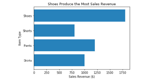
Figure 2.16: Horizontal bar plot with correctly labeled axes
In the previous exercise, we learned how to create a bar plot. Building bar plots using Matplotlib is straightforward. In the following activity, we will continue to practice building bar plots.
Activity 3: Bar Plot
In this activity, we will be creating a bar plot comparing the number of NBA championships among the five franchises with the most titles. The plot will be sorted so that the franchise with the greatest number of titles is on the left and the franchise with the least is on the right. The bars will be red, the x-axis will be titled 'NBA Franchises', the y-axis will be titled 'Number of Championships', and the title will be programmatic, explaining which franchise has the most titles and how many they have. Before working on this activity, make sure to research the required NBA franchise data online. Additionally, we will rotate the x tick labels 45 degrees using plt.xticks(rotation=45) so that they do not overlap, and we will save our plot to the current directory:
- Create a list of five strings for x containing the names of the NBA franchises with the most titles.
- Create a list of five values for y containing values for 'Titles Won' that correspond with the strings in x.
- Place x and y into a data frame with the column names 'Team' and 'Titles', respectively.
- Sort the data frame in descending order by 'Titles'.
- Make a programmatic title and save it as title.
- Generate the described plot.
Note
We can refer to the solution for this activity on page 334.
Line plots and bar plots are two very common and effective types of visualizations for reporting trends and comparing groups, respectively. However, for deeper statistical analyses, it is important to generate graphs that uncover characteristics of features not apparent with line plots and bar plots. Thus, in the following exercises, we will run through creating common statistical plots.
Exercise 16: Functional Approach – Histogram
In statistics, it is essential to be aware of the distribution of continuous variables prior to running any type of analysis. To display the distribution, we will use a histogram. Histograms display the frequency by the bin for a given array:
- To demonstrate the creation of a histogram, we will generate an array of 100 normally distributed values with a mean of 0 and a standard deviation of 0.1, and save it as y using the following code:
import numpy as np
y = np.random.normal(loc=0, scale=0.1, size=100)
- With Matplotlib imported, create the histogram using the following:
plt.hist(y, bins=20)
- Create a label for the x-axis titled 'y Value' using the following code:
plt.xlabel('y Value')
- Title the y-axis 'Frequency' using the following line of code:
plt.ylabel('Frequency')
- Print it to the console using plt.show():
- See the output in the following screenshot:
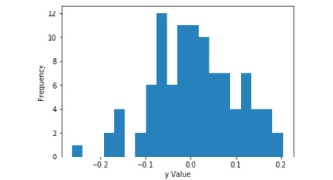
Figure 2.17: Histogram of y with labeled axes
Note
When we look at a histogram, we often determine whether the distribution is normal. Sometimes, a distribution may appear normal when it is not, and sometimes a distribution may appear not normal when it is normal. There is a test for normality, termed the Shapiro-Wilk test. The null hypothesis for the Shapiro-Wilk test is that data is normally distributed. Thus, a p-value < 0.05 indicates a non-normal distribution while a p-value > 0.05 indicates a normal distribution. We will use the results from the Shapiro-Wilk test to create a programmatic title communicating to the reader whether the distribution is normal or not.
- Use tuple unpacking to save the W statistic and the p-value from the Shapiro-Wilk test into the shap_w and shap_p objects, respectively, using the following code:
from scipy.stats import shapiro
shap_w, shap_p = shapiro(y)
- We will use an if-else statement to determine whether the data is normally distributed and store an appropriate string in a normal_YN object.
if shap_p > 0.05:
normal_YN = 'Fail to reject the null hypothesis. Data is normally distributed.'
else:
normal_YN = 'Null hypothesis is rejected. Data is not normally distributed.'
- Assign normal_YN to our plot using plt.title(normal_YN) and print it to the console using plt.show().
Check out the final output in this screenshot:
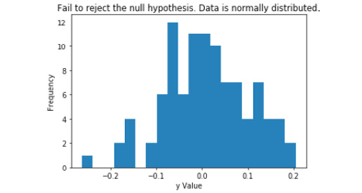
Figure 2.18: A histogram of y with a programmatic title
As mentioned previously, histograms are used for displaying the distribution of an array. Another common statistical plot for exploring a numerical feature is a box-and-whisker plot, also referred to as a boxplot.
Box-and-whisker plots display the distribution of an array based on the minimum, first quartile, median, third quartile, and maximum, but they are primarily used to indicate the skew of a distribution and to identify outliers.
Exercise 17: Functional Approach – Box-and-Whisker plot
In this exercise, we will learn how to create a box-and-whisker plot and portray information regarding the shape of the distribution and the number of outliers in our title:
- Generate an array of 100 normally distributed numbers with a mean of 0 and a standard deviation of 0.1, and save it as y using the following code:
import numpy as np
y = np.random.normal(loc=0, scale=0.1, size=100)
- Create and display the plot as follows:
import matplotlib.pyplot as plt
plt.boxplot(y)
plt.show()
For the output, refer to the following figure:
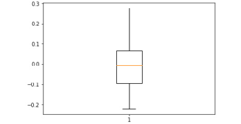
Figure 2.19: Boxplot of y
Note
The plot displays a box that represents the interquartile range (IQR). The top of the box is the 25th percentile (i.e., Q1) while the bottom of the box is the 75th percentile (that is, Q3). The orange line going through the box is the median. The two lines extending above and below the box are the whiskers. The top of the upper whisker is the "maximum" value, which is calculated using Q1 – 1.5*IQR. The bottom of the lower whisker is the "minimum" value, which is calculated using Q3 + 1.5*IQR. Outliers (or fringe outliers) are displayed as dots above the "maximum" whisker or below the "minimum" whisker.
- Save the Shapiro W and p-value from the shapiro function as follows:
from scipy.stats import shapiro
shap_w, shap_p = shapiro(y)
- Refer to the following code to convert y into z-scores:
from scipy.stats import zscore
y_z_scores = zscore(y)
Note
This is a measure of the data which shows how many standard deviations each datapoint is from the mean.
- Iterate through the y_z_scores array to find the number of outliers using the following code:
total_outliers = 0
for i in range(len(y_z_scores)):
if abs(y_z_scores[i]) >= 3:
total_outliers += 1
Note
Because the array, y, was generated to be normally distributed, we can expect there to be no outliers in the data.
- Generate a title that communicates whether the data, as well as the number of outliers, is normally distributed. If shap_p is greater than 0.05, our data is normally distributed. If it is not greater than 0.05, then our data is not normally distributed. We can set this up and include the number of outliers with the following logic:
if shap_p > 0.05:
title = 'Normally distributed with {} outlier(s).'.format(total_outliers)
else:
title = 'Not normally distributed with {} outlier(s).'.format(total_outliers)
- Set our plot title as the programmatically named title using plt.title (title) and print it to the console using:
plt.show()
- Check the final output in the following screenshot:
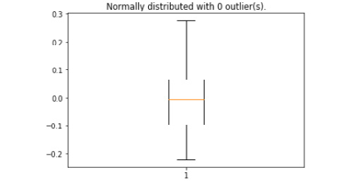
Figure 2.20: A boxplot of y with a programmatic title
Histograms and box-and-whisker plots are effective in exploring the characteristics of numerical arrays. However, they do not provide information on the relationships between arrays. In the next exercise, we will learn how to create a scatterplot – a common visualization to display the relationship between two continuous arrays.
Exercise 18: Scatterplot
In this exercise, we will be creating a scatterplot of weight versus height. We will, again, create a title explaining the message of the plot being portrayed:
- Generate a list of numbers representing height and save it as y using the following:
y = [5, 5.5, 5, 5.5, 6, 6.5, 6, 6.5, 7, 5.5, 5.25, 6, 5.25]
- Generate a list of numbers representing weight and save it as x using the following:
x = [100, 150, 110, 140, 140, 170, 168, 165, 180, 125, 115, 155, 135]
- Create a basic scatterplot with weight on the x-axis and height on the y-axis using the following code:
import matplotlib.pyplot as plt
plt.scatter(x, y)
- Label the x-axis 'Weight' as follows:
plt.xlabel('Weight')
- Label the y-axis 'Height' as follows:
plt.ylabel('Height')
- Print the plot to the console using plt.show().
Our output should be similar to the following:
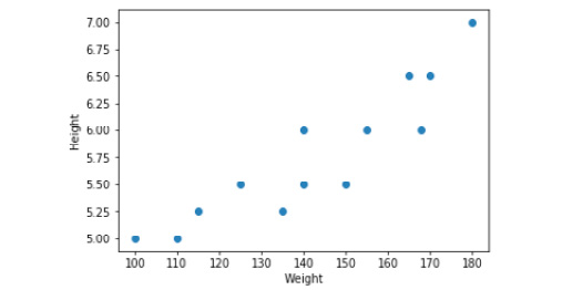
Figure 2.21: Scatterplot of height by weight
- We want our plot title to inform the reader about the strength of the relationship and the Pearson correlation coefficient. Thus, we will calculate the Pearson correlation coefficient and interpret the value of the coefficient in the title. To compute the Pearson correlation coefficient, refer to the following code:
from scipy.stats import pearsonr
correlation_coeff, p_value = pearsonr(x, y)
- The Pearson correlation coefficient is an indicator of the strength and direction of the linear relationship between two continuous arrays. Using if-else logic, we will return the interpretation of the correlation coefficient using the following code:
if correlation_coeff == 1.00:
title = 'There is a perfect positive linear relationship (r = {0:0.2f}).'.format(correlation_coeff)
elif correlation_coeff >= 0.8:
title = 'There is a very strong, positive linear relationship (r = {0:0.2f}).'.format(correlation_coeff)
elif correlation_coeff >= 0.6:
title = 'There is a strong, positive linear relationship (r = {0:0.2f}).'.format(correlation_coeff)
elif correlation_coeff >= 0.4:
title = 'There is a moderate, positive linear relationship (r = {0:0.2f}).'.format(correlation_coeff)
elif correlation_coeff >= 0.2:
title = 'There is a weak, positive linear relationship (r = {0:0.2f}).'.format(correlation_coeff)
elif correlation_coeff > 0:
title = 'There is a very weak, positive linear relationship (r = {0:0.2f}).'.format(correlation_coeff)
elif correlation_coeff == 0:
title = 'There is no linear relationship (r = {0:0.2f}).'.format(correlation_coeff)
elif correlation_coeff <= -0.8:
title = 'There is a very strong, negative linear relationship (r = {0:0.2f}).'.format(correlation_coeff)
elif correlation_coeff <= -0.6:
title = 'There is a strong, negative linear relationship (r = {0:0.2f}).'.format(correlation_coeff)
elif correlation_coeff <= -0.4:
title = 'There is a moderate, negative linear relationship (r = {0:0.2f}).'.format(correlation_coeff)
elif correlation_coeff <= -0.2:
title = 'There is a weak, negative linear relationship (r = {0:0.2f}).'.format(correlation_coeff)
else:
title = 'There is a very weak, negative linear relationship (r = {0:0.2f}).'.format(correlation_coeff)
print(title)
- Now, we can use the newly created title object as our title using plt.title(title).
Refer to the following figure for the resultant output:
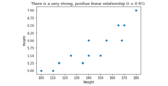
Figure 2.22: Scatterplot of height by weight with programmatic title
Up to this point, we have learned how to create and style an assortment of plots for several different purposes using the functional approach. While this approach of plotting is effective for generating quick visualizations, it does not allow us to create multiple subplots or store the plot as an object in our environment. To save the plot as an object in our environment, we must use the object-oriented approach, which will be covered in the following exercises and activities.
Object-Oriented Approach Using Subplots
Using the functional approach of plotting in Matplotlib does not allow the user to save the plot as an object in our environment. In the object-oriented approach, we create a figure object that acts as an empty canvas and then we add a set of axes, or subplots, to it. The figure object is callable and, if called, will return the figure to the console. We will demonstrate how this works by plotting the same x and y objects as we did in Exercise 13.
Exercise 19: Single Line Plot using Subplots
When we learned about the functional approach of plotting in Matplotlib, we began by creating and customizing a line plot. In this exercise, we will create and style a line plot using the functional plotting approach:
- Save x as an array ranging from 0 to 10 in 20 linearly spaced steps as follows:
import numpy as np
x = np.linspace(0, 10, 20)
Save y as x cubed using the following:
y = x**3
- Create a figure and a set of axes as follows:
import matplotlib.pyplot as plt
fig, axes = plt.subplots()
plt.show()
Check out the following screenshot to view the output:
Figure 2.23: Callable figure and set of axes
Note
The fig object is now callable and returns the axis on which we can plot.
- Plot y (that is, x squared) by x using the following:
axes.plot(x, y)
The following figure displays the output:
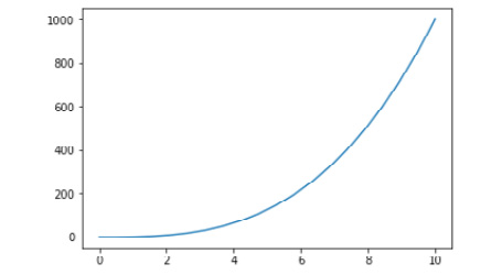
Figure 2.24: Callable line plot of y by x
- Style the plot much the same as in Exercise 13. First, change the line color and markers as follows:
axes.plot(x, y, 'D-k')
- Set the x-axis label to 'Linearly Spaced Numbers' using the following:
axes.set_xlabel('Linearly Spaced Numbers')
- To set the y-axis to 'y Value' using the following code:
axes.set_ylabel('y Value')
- Set the title to 'As x increases, y increases by x cubed' using the following code:
axes.set_title('As x increases, y increases by x cubed')
The following figure displays the output:
Figure 2.25: Styled, callable line plot of y by x
In this exercise, we created a plot very similar to the first plot in Exercise 13, but now it is a callable object. Another advantage of using the object-oriented plotting approach is the ability to create multiple subplots on a single figure object.
In some situations, we want to compare different views of data side by side. We can accomplish this in Matplotlib using subplots.
Exercise 20: Multiple Line Plots Using Subplots
Thus, in this exercise, we will plot the same lines as in Exercise 14, but we will plot them on two subplots in the same, callable figure object. Subplots are laid out using a grid format and are accessible using [row, column] indexing. For example, if our figure object contains four subplots organized in two rows and two columns, we would index reference the top-left plot using axes[0,0] and the bottom-right plot using axes[1,1], as shown in the following figure.

Figure 2.26: Axes index referencing
In the remaining exercises and activities, we will get a lot of practice with generating subplots and accessing the various axes. In this exercise, we will be making multiple line plots using sublots:
- First, create x, y, and y2 using the following code:
import numpy as np
x = np.linspace(0, 10, 20)
y = x**3
y2 = x**2
- Create a figure with two axes (that is, subplots) that are side by side (that is, 1 row with 2 columns), as follows:
import matplotlib.pyplot as plt
fig, axes = plt.subplots(nrows=1, ncols=2)
The resultant output is displayed here:
Figure 2.27: A figure with two subplots
- To access the subplot on the left, refer to it as axes[0]. To access the plot on the right, refer to it as axes[1]. On the left axis, plot y by x using the following:
axes[0].plot(x, y)
- Add a title using the following:
axes[0].set_title('x by x Cubed')
- Generate an x-axis label using the following line of code:
axes[0].set_xlabel('Linearly Spaced Numbers')
- Create a y-axis label using the following code:
axes[0].set_ylabel('y Value')
The resultant output is displayed here:
Figure 2.28: Figure with two subplots, where the left has been created
- On the right axis, plot y2 by x using the following code:
axes[1].plot(x, y2)
- Add a title using the following code:
axes[1].set_title('x by x Squared')
- Generate an x-axis label using the following code:
axes[1].set_xlabel('Linearly Spaced Numbers')
- Create a y-axis label using the following code:
axes[1].set_ylabel('y Value')
The following screenshot displays the output
Figure 2.29: Figure with both subplots created
- We have successfully created two subplots. However, it looks like the y-axis of the plot on the right is overlapping the left-hand plot. To prevent the overlapping of the plots, use plt.tight_layout().
The figure here displays the output:
Figure 2.30: A figure with two non-overlapping subplots
Using the object-oriented approach, we can display both subplots just by calling the fig object. We will practice object-oriented plotting further in Activity 4.
Activity 4: Multiple Plot Types Using Subplots
We have learned uptil now how to build, customize, and program line plots, bar plots, histograms, scatterplots, and box-and-whisker plots using the functional approach. In exercise 19, we were introduced to the object-oriented approach, and in exercise 20, we learned how to create a figure with multiple plots using subplots. Thus, in this activity, we will be leveraging subplots to create a figure with multiple plots and plot types. We will be creating a figure with six subplots. The subplots will be displayed in three rows and two columns (see Figure 2.31):

Figure 2.31: Layout for subplots
Once we have generated our figure of six subplots, we access each subplot using 'row, column' indexing (see Figure 2.32):
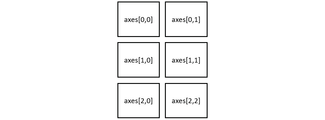
Figure 2.32: Axes index referencing
Thus, to access the line plot (that is, top-left), use axes[0, 0]. To access the histogram (that is, middle-right), use axes[1, 1]. We will be practicing this in the following activity:
- Import Items_Sold_by_Week.csv and Weight_by_Height.csv from GitHub and generate a normally distributed array of numbers.
- Generate a figure with six empty subplots using three rows and two columns that do not overlap.
- Set the plot titles with six subplots organized in three rows and two columns such that do not overlap.
- On the 'Line', 'Bar' and 'Horizontal Bar' axes, plot 'Items_Sold' by 'Week' from 'Items_Sold_by_Week.csv'.
- In the 'Histogram' and 'Box-and-Whisker' axes, plot the array of 100 normally distributed numbers.
- In the 'Scatter' axis, plot weight by height with 'Weight_by_Height.csv'.
- Label the x- and y-axis in each subplot.
- Increase the size of the figure and save it.
Note
The solution for this activity can be found on page 338.
Summary
In this chapter, we used the Python plotting library Matplotlib to create, customize, and save plots using the functional approach. We then covered the importance of a descriptive title and created our own descriptive, programmatic titles. However, the functional approach does not create a callable figure object and it does not return subplots. Thus, to create a callable figure object with the potential of numerous subplots, we created, customized, and saved our plots using the object-oriented approach. Plotting needs can vary analysis to analysis, so covering every possible plot in this chapter is not practical. To create powerful plots that meet the needs of each individual analysis, it is imperative to become familiar with the documentation and examples found on the Matplotlib documentation page.
In the subsequent chapter, we will apply some of these plotting techniques as we dive into machine learning using scikit-learn.