
Chapter 7. Showing Complex Data: Trees, Charts, and Other Information Graphics
Information graphics—including maps, tables, and graphs—communicate knowledge visually rather than verbally. When done well, they let people use their eyes and minds to draw their own conclusions; they show, rather than tell.
These are my favorite kinds of interfaces. However, poor tools or inadequate design can sharply limit what you can do with them, and many information-rich interfaces just don’t quite work as well as they could.
The patterns in this chapter will help you make the best of the tools you have, and introduce you to some useful and interesting innovations in interactive information graphics. The ideas described in this introduction can help you sort out which design aspects are most important to you in a given interface.
The Basics of Information Graphics
Information graphics simply means data presented visually, with the goal of imparting knowledge to the user. I’m including tables and tree views in that description because they are inherently visual, even though they’re constructed primarily from text instead of lines and polygons. Other familiar static information graphics include maps, flowcharts, bar plots, and diagrams of real-world objects.
But we’re dealing with computers, not paper. You can make almost any good static design better with interactivity. Interactive tools let the user hide and show information as she needs it, and they put the user in the “driver’s seat” as she chooses how to view and explore that information.
Even the mere act of manipulating and rearranging the data in an interactive graphic has value—the user becomes a participant in the discovery process, not just a passive observer. This can be invaluable. The user may not end up producing the world’s best-designed plot or table, but the process of manipulating that plot or table puts her face to face with aspects of the data that she may never have noticed on paper.
Ultimately, the user’s goal in using information graphics is to learn something. But the designer needs to understand what the user needs to learn. The user might be looking for something very specific, such as a particular street on a map, in which case she needs to be able to find it—say, by searching directly, or by filtering out extraneous information. She needs to get a “big picture” only to the extent necessary to reach that specific data point. The ability to search, filter, and zero in on details is critical.
On the other hand, she might be trying to learn something less concrete. She might look at a map to grasp the layout of a city rather than to find a specific address. Or she may be a scientist visualizing a biochemical process, trying to understand how it works. Now overviews are important; she needs to see how the parts interconnect with the whole. She may want to zoom in, zoom back out again, look at the details occasionally, and compare one view of the data to another.
Good interactive information graphics offer users answers to these questions:
How is this data organized?
What’s related to what?
How can I explore this data?
Can I rearrange this data to see it differently?
How can I see only the data that I need?
What are the specific data values?
In these sections, keep in mind that the term information graphics is a very big umbrella. It covers plots, graphs, maps, tables, trees, timelines, and diagrams of all sorts; the data can be huge and multilayered, or small and focused. Many of these techniques apply surprisingly well to graphic types that you wouldn’t expect.
Before describing the patterns themselves, let’s set the stage by talking about some of the questions posed in the previous list.
Organizational Models: How Is This Data Organized?
Organizational Models: How Is This Data Organized?
The first thing a user sees in any information visualization is the shape you’ve chosen for the data. Ideally, the data itself has an inherent structure that suggests this shape to you. Table 7-1 shows a variety of organizational models. Which of these fits your data best?
|
Diagram | ||
|
Linear |
List, single-variable plot | |
|
Tabular |
Spreadsheet, multicolumn list, Sortable Table, Radial Table, Multi-Y Graph, other multivariable plots | |
|
Hierarchical |
Tree, Cascading Lists, Tree Table, Treemap, Radial Table, directed graph | |
|
Network of interconnections |
Directed graph, flowchart, Radial Table | |
|
Geographic (or spatial) |
Map, schematic, scatter plot | |
|
Textual |
Word cloud, directed graph | |
|
Other |
Plots of various sorts, such as parallel coordinate plots, Treemap, etc. |

Try these out against the data you’re trying to show. If two or more might fit, consider which ones play up which aspects of your data. If your data could be both geographic and tabular, for instance, showing it as only a table may obscure its geographic nature—a viewer may miss interesting features or relationships in the data if it’s not shown as a map, too.
Preattentive Variables: What’s Related to What?
The organizational model you choose tells the user a lot about the shape of the data. Part of this message operates at a subconscious level; people recognize trees, tables, and maps, and they immediately make some assumptions about the underlying data before they even start to think consciously about it. But it’s not just the shape that does this. The look of the individual data elements also works at a subconscious level in the user’s mind: things that look alike must be associated with each other.
If you’ve read Chapter 4, that should sound familiar—you already know about the Gestalt principles. (If you jumped ahead in the book, this might be a good time to go back and read the introduction to Chapter 4.) Most of those principles, especially similarity and continuity, will come into play here, too. I’ll tell you a little more about how they work.
Certain visual features operate preattentively: they convey information before the viewer pays conscious attention. Take a look at Figure 7-1 and find the blue objects.

I’m guessing that you can do that pretty quickly. Now look at Figure 7-2 and do the same.
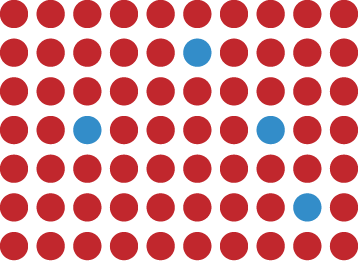
You did that pretty quickly too, right? In fact, it doesn’t matter how many red objects there are; the amount of time it takes you to find the blue ones is constant! You might think it should be linear with the total number of objects—order-N time, in algorithmic terms—but it’s not. Color operates at a primitive cognitive level. Your visual system does the hard work for you, and it seems to work in a “massively parallel” fashion.
On the other hand, visually monotonous text forces you to read the values and think about them. Figure 7-3 shows exactly the same problem with numbers instead of colors. How fast can you find the numbers that are greater than one?

When dealing with text such as this, your “search time” really is linear with the number of items. But what if we still used text, but made the target numbers physically larger than the others, as in Figure 7-4?

Now we’re back to constant time again. Size is, in fact, another preattentive variable. The fact that the larger numbers protrude into their right margins also helps you find them—alignment is yet another preattentive variable.
Figure 7-5 shows many known preattentive variables.

This concept has profound implications for text-based information graphics, like the table of numbers shown earlier in Figure 7-3. If you want some data points to stand out from the others, you have to make them look different by varying their color, size, or some other preattentive variable. More generally, you can use these variables to differentiate classes or dimensions of data on any kind of information graphic. This is sometimes called encoding.
When you have to plot a multidimensional data set, you can use several different visual variables to encode all those dimensions in a single static display. Consider the scatter plot shown in Figure 7-6. Position is used along the x- and y-axes; color hue encodes a third variable. The shape of the scatter markers could encode yet a fourth variable, but in this case, shape is redundant with color hue. The redundant encoding helps a user visually separate the three data groups.
All of this is related to a general graphic design concept called layering. When you look at well-designed graphics of any sort, you perceive different classes of information on the page. Preattentive factors such as color cause some of them to “pop” out of the page, and similarity causes you to see those as connected to each other, as though each was on a transparent layer over the base graphic. It’s an extremely effective way of segmenting data—each layer is simpler than the whole graphic, and the viewer can study each in turn, but relationships among the whole are preserved and emphasized.

Navigation and Browsing: How Can I Explore This Data?
A user’s first investigation of an interactive data graphic may be browsing—just looking around to see what’s there. He may also navigate through it to find some specific thing he’s seeking. Filtering and searching can serve that purpose too, but navigation through the “virtual space” of a data set is often better. Spatial Memory (Chapter 1) kicks in, and the user can see points of interest in context with the rest of the data.
There’s a famous mantra in the information visualization field: “Focus plus context.” A good visualization should permit a user to focus on a point of interest, while simultaneously showing enough stuff around that point of interest to give the user a sense of where it is in the big picture.
Here are some common techniques for navigation and browsing:
- Scroll and pan
If the whole data display won’t fit on-screen at once, you could put it in a scrolled window, giving the user easy and familiar access to the off-screen portions. Scrollbars are familiar to almost everyone and are easy to use. However, some displays are too big, or their size is indeterminate (thus making scrollbars inaccurate), or they have data beyond the visible window that needs to be retrieved or recalculated (thus making scrollbars too slow to respond). Instead of using scrollbars in those cases, try setting up buttons that the user has to click to retrieve the next screenful of data. Other applications do panning instead, in which the information graphic is “grabbed” with the cursor and dragged until the point of interest is found, like in Google Maps.
These are appropriate for different situations, but the basic idea is the same: to interactively move the visible part of the graphic. Sometimes Overview Plus Detail can help the user stay oriented. A small view of the whole graphic can be shown with an indicator rectangle showing the visible “viewport”; the user might pan by dragging that rectangle, in addition to using scrollbars or however else it’s done.
- Zoom
Zooming changes the scale of the section being viewed, whereas scrolling changes the location. When you present a data-dense map or graph, consider offering the user the ability to zoom in on points of interest. It means you don’t have to pack every single data detail into the full view—if you have lots of labels, or very tiny features (especially on maps), that may be impossible anyway. As the user zooms in, those features can emerge when they have enough space.
Most zooms are triggered with a mouse click or button press, and the whole viewing area changes scale at once. But that’s not the only way to zoom. Some applications create nonlinear distortions of the information graphic as the user moves the mouse pointer over the graphic: whatever is under the pointer is zoomed, but the stuff far away from the pointer stays the same scale. See the Local Zooming pattern for more information.
- Open and close points of interest
Tree views typically let users open and close parent items at will, so they can inspect the contents of those items. Some hierarchically structured diagrams and graphs also give users the chance to open and close parts of the diagram “in place,” without having to open a new window or go to a new screen. With these mechanisms, the user can explore containment or parent/child relationships easily, without leaving that window. The Cascading Lists pattern (Chapter 5) describes another effective way to explore a hierarchy; it works entirely on single-click opening and closing of items.
- Drill down into points of interest
Some information graphics just present a “top level” of information. A user might click or double-click on a map to see information about the city she just clicked on, or she might click on key points in a diagram to see subdiagrams. This “drilling down” might reuse the same window, use a separate panel on the same window, or bring up a new window. This technique is similar to opening and closing points of interest, except that the viewing occurs separately from the graphic and is not integrated into it.
If you also provide a search facility for an interactive information graphic, consider linking the search results to whichever of the aforementioned techniques is in use. In other words, when a user searches for the city of Sydney on a map, show the map zooming and/or panning to that point. The search user thus gets some of the benefits of context and spatial memory.
Sorting and Rearranging: Can I Rearrange This Data to See It Differently?
Sometimes just rearranging an information graphic can reveal unexpected relationships. Look at Figure 7-7, taken from the National Cancer Institute’s online mortality charts. It shows the number of deaths from lung cancer in the state of Texas. The major metropolitan regions in Texas are arranged alphabetically—not an unreasonable default order if you’re going to look up specific cities, but as presented, the data doesn’t lead you to ask very many interesting questions. It’s not clear why Abilene, Alice, Amarillo, and Austin all seem to have similar numbers, for instance; it may just be chance.
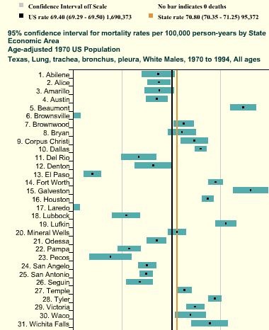
But this chart lets you reorder the data into numerically descending order, as in Figure 7-8. Suddenly the graph becomes much more interesting. Galveston is ranked first—why is that, when its neighbor, Houston, is further down the scale? What’s special about Galveston? (OK, you need to know something about Texas geography to ask these questions, but you get my point.) Likewise, why the difference between neighbors Dallas and Fort Worth? And apparently the Mexico-bordering southern cities of El Paso, Brownsville, and Laredo have less lung cancer than the rest of Texas; why might that be? You can’t answer these questions with this data set, but at least you can ask them.

People who can interact with data graphics this way have more opportunities to learn from the graphic. Sorting and rearranging puts different data points next to each other, thus letting users make different kinds of comparisons—it’s far easier to compare neighbors than widely scattered points. And users tend to zero in on the extreme ends of scales, as I did in the preceding example.
How else can you apply this concept? The Sortable Table pattern talks about one obvious way: when you have a many-columned table, users might want to sort the rows according to their choice of column. This pattern is pretty common. (Many table implementations also permit rearrangement of the columns themselves, by dragging.) Trees might allow reordering of their child nodes. Diagrams and connected graphs might allow spatial repositioning of their elements, while retaining their connectivity. Use your imagination!
Consider these methods of sorting and rearranging:
Alphabetically
Numerically
By date or time
By physical location
By category or tag
By popularity—heavily used versus lightly used
User-designed arrangement
Completely random (you never know what you might see)
For a subtle example, take a look at Figure 7-9. Bar charts that show multiple data values on each bar (known as stacked bar charts) might also be amenable to rearranging—the bar segments nearest the baseline are the easiest to evaluate and compare, so you might want to let users determine which variable is next to the baseline.
The light blue variable in this example might be the same height from bar to bar. Does it vary, and how? Which light blue bars are the tallest? You really can’t tell until you move that data series to the baseline—that transformation lines up the bases of all those blue rectangles. Now a visual comparison is easy: light-blue bars 6 and 12 are the tallest, and the variation seems loosely correlated to the overall bar heights.

Searching and Filtering: How Can I See Only the Data That I Need?
Sometimes you don’t want to see an entire data set at once. You might start with the whole thing and narrow it down to what you need—filtering—or you might build up a subset of the data via searching or querying. Most users won’t even distinguish between filtering and querying (though there’s a big difference from, say, a database’s point of view). The user’s intent is the same: to zero in on whatever part of the data is of interest, and get rid of the rest.
The simplest filtering and querying techniques offer users a choice of which aspects of the data to view. Checkboxes and other one-click controls turn parts of the interactive graphic on and off. A table might show some columns and not others, per the user’s choice; a map might show only the points of interest (e.g., restaurants) selected by the user. The Dynamic Queries pattern, which can offer very rich interaction, is a logical extension of simple filter controls such as these.
Sometimes simply highlighting a subset of the data, rather than hiding or removing the rest, is sufficient. That way a user can see that subset in context with the rest of the data. Interactively, you can do this with simple controls, as described earlier. The Data Brushing pattern describes a variation of data highlighting; it highlights the same data in several data graphics at once.
Look at Figure 7-10. This interactive ski-trail map can show four categories of trails, coded by symbol, plus other features such as ski lifts and base lodges. When everything is “turned on” at once, it’s so crowded that it’s hard to read anything! But users can click on the trail symbols, as shown, to turn the data “layers” on and off. The screenshot on the left shows no highlighted trails; the one on the right switches on the trails rated black diamond with a single click.

Searching mechanisms vary heavily from one type of graphic to another. A table or tree should permit textual searches, of course; a map should offer searches on addresses and other physical locations; numeric charts and plots might let users search for specific data values or ranges of values. What are your users interested in searching on?
When the search is done and results obtained, you might set up the interface to show the results in context, on the graphic—you could scroll the table or map so that the searched-for item is in the middle of the viewport, for instance. Seeing the results in context with the rest of the data helps the user understand the results better. The Jump to Item pattern in Chapter 5 is a common way to search and scroll in one step.
The best filtering and querying interfaces are:
- Highly interactive
They respond as quickly as possible to the user’s searching and filtering. (Don’t react to individual keystrokes if it significantly slows down the user’s typing, however.)
- Iterative
They let a user refine the search, query, or filter until she gets the desired results. They might also combine these operations: a user might do a search, get a screenful of results, and then filter those results down to what she wants.
- Contextual
They show results in context with surrounding data, to make it easier for a user to understand where they are in a data space. This is also true for other kinds of searches, as it happens; the best text search facilities show the search terms embedded in sentences, for instance.
- Complex
They go beyond simply switching entire data sets on and off, and allow the user to specify nuanced combinations of conditions for showing data. For instance, can this information graphic show me all the items for which conditions X, Y, and Z are true, but A and B are false, within the time range M–N? Such complexity lets users test hypotheses about the data, and explore the data set in creative ways.
The Actual Data: What Are the Specific Data Values?
Several common techniques help a viewer get specific values out of an information graphic. Know your audience—if they’re only interested in getting a qualitative sense of the data, there’s no need for you to spend large amounts of time or pixels labeling every little thing. But some actual numbers or text is usually necessary.
Since these techniques all involve text, don’t forget the graphic design principles that will make text look good: readable fonts, appropriate font size (not too big, not too small), proper visual separation between unrelated text items, alignment of related items, no heavy-bordered boxes, and no unnecessary obscuring of data.
- Labels
Many information graphics put labels directly on the graphic, such as town names on a map. Labels can also identify the values of symbols on a scatter plot, bars on a bar graph, and other things that might normally force the user to depend on axes or legends. Labels are easier to use. They communicate data values precisely and unambiguously (when placed correctly), and they’re located in or beside the data point of interest—no going back and forth between the data point and a legend. The downside is that they clutter up a graphic when overused, so be careful.
- Legends
When you use color, texture, line style, symbols, or size on an information graphic to represent values (or categories or value ranges), the legend shows the user what represents what. You should place the legend on the same page as the graphic itself so the user’s eyes don’t need to travel far between the data and the legend.
- Axes, rulers, scales, and timelines
Whenever position represents data, as it does on plots and maps (but not on most diagrams), these tell the user what values those positions represent. They are reference lines or curves on which reference values are marked. The user has to draw an imaginary line from the point of interest to the axis, and maybe interpolate to find the right number. This is more of a burden on the user than direct labeling. But labeling clutters things when the data is dense, and many users don’t need to derive precise values from graphics; they just want a more general sense of the values involved. For those situations, axes are appropriate.
- Datatips
This chapter describes the Datatips pattern. Datatips, which are tool tips that show data values when the user hovers over a point of interest, have the physical proximity advantages of labels without the clutter. They only work in interactive graphics, though.
- Data Spotlight
Like Datatips, a data spotlight highlights data when the user hovers over a point of interest. But instead of showing the specific point’s value, it displays a “slice” of the data in context with the rest of the information graphic, often by dimming the rest of the data. See the Data Spotlight pattern.
- Data brushing
A technique called data brushing lets users select a subset of the data in the information graphic and see how that data fits into other contexts. You use this with two or more information graphics; for instance, selecting some outliers in a scatter plot causes those same data points to be highlighted in a table showing the same data. For more information, see the Data Brushing pattern in this chapter.
The Patterns
Because this book is about interactive software, most of these patterns describe ways to interact with the data: moving through it; sorting, selecting, inserting, or changing items; and probing for specific values or sets of values. A few of them deal only with static graphics: information designers have known about Multi-Y Graph and Small Multiples for a while now, but they translate well to the world of software.
And don’t forget the patterns elsewhere in this book. From Chapter 2, recall Alternative Views, which can help you structure an interactive graphic. Chapter 3 offers Annotated Scrollbar and Animated Transition, which help users to stay oriented within large and complex data spaces. If your graphic is a table, you might also use some of the patterns in Chapter 5, such as Row Striping, Alphabet Scroller, and Jump to Item.
The first group of patterns can be applied to most varieties of interactive graphics, regardless of the data’s underlying structure. (Some are harder to learn and use than others, so don’t throw them at every data graphic you create—Data Brushing and Local Zooming in particular, are “power tools,” best for sophisticated computer users.) These six interactive tools permit users to focus on certain parts of the data set while maintaining the context of the entire graphic.
The remaining patterns are ways to construct complex data graphics for multidimensional data—data that has many attributes or variables. They encourage users to ask different kinds of questions about the data, and to make different types of comparisons among data elements.
Overview Plus Detail

What
Place an overview of the graphic next to a zoomed “detail view.” As the user drags a viewport around the overview, show that part of the graphic in the detail view.
Use when
You’re showing a large data set in a large information graphic—especially an image or a map. You want users to stay oriented with respect to the “big picture,” but you also want them to zoom down into the fine details. Users will browse through the data, inspect small areas, or search for points of interest. High-level overviews are necessary for finding those points of interest, but users don’t need to see all available detail for all data points at once—zooming in on a small piece is sufficient for getting fine detail.
Why
It’s an age-old way of dealing with complexity: present a high-level view of what’s going on and let the users zoom from that view into the details as they need to, keeping both levels visible on the same page for quick iteration.
Edward Tufte uses the terms micro reading and macro reading to describe a similar concept for printed maps, diagrams, and other static information graphics. The user has the large structure in front of her at all times, while being able to peer into the small details at will: “The pace of visualization is condensed, slowed, and personalized.” Similarly, users of Overview Plus Detail can scroll methodically through the content, jump around, compare, contrast, move quickly, or move slowly.
Finally, the overview can serve as a “You are here” sign. A user can tell at a glance where she is in the context of the whole data set by looking for the viewport on the overview.
How
Show an overview of the data set at all times. It can be an inset panel, as in the example at the top of the pattern (see Figure 7-11 at the top of the pattern). It could also be a panel beside the detail view, or even another window, in the case of a multiwindow application such as Photoshop.
On that overview, place a viewport. They’re usually red boxes by convention, but they don’t have to be—they just need to be visible at a glance, so consider the other colors used in the overview panel. If the graphic is typically dark, make it light; if the graphic is light, make it dark. Make the viewport draggable with the pointer, so users can grab it and slide it around the overview.
The detail view shows a magnified “projection” of what’s inside the viewport. The two should be synchronized. If the viewport moves, the detail view changes accordingly; if the viewport is made smaller, the magnification should increase. Likewise, if the detail view has scrollbars or some other panning capability, the viewport should move along with it. The response of one to the other should be immediate, within one-tenth of a second (the standard response time for direct manipulation).
Examples
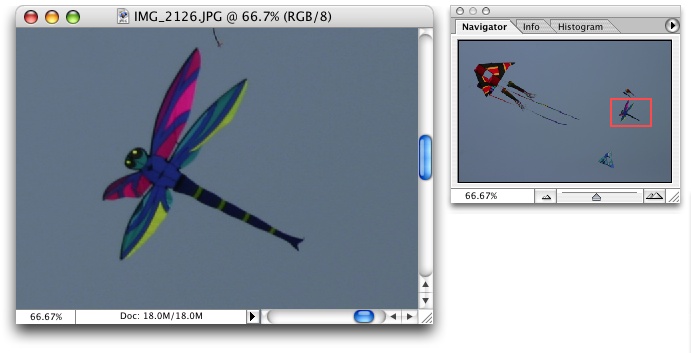
Photoshop places the image canvas (the “detail view”) on the left and the overview on the right. The Navigator window shows the whole image, with a red box showing the size and scroll position of the image’s canvas window (see Figure 7-12).
Google Finance uses an interactive overview panel to let the user adjust the time period shown on the graph. Note the grab handles on the viewport sides and the year labels that tell the user what timescale the overview uses (see Figure 7-13).

The New York Times also uses a timeline to drive its infographic about environmental change (see Figure 7-14). Users select events on the timeline to see details about them. A Pyramid navigation pattern is also at work here: the user can jump to the next item by clicking the Next button in the upper right.

In other libraries
http://patternbrowser.org/code/pattern/pattern_anzeigen.php?4,226,17,0,0,247
http://quince.infragistics.com/Patterns/Overview%20Plus%20Detail.aspx
The broad concept of “overview and detail” can be found in numerous books on information visualization, including those by Edward Tufte, mentioned earlier.
Datatips
What
As the mouse rolls over a point of interest on the graphic, put the data values for that point into a tool tip or some other floating window.
Use when
You’re showing an overview of a data set, in almost any form. More data is “hidden behind” specific points on that graphic, such as the names of streets on a map or the values of bars in a bar chart. The user is able to “point at” places of interest with a mouse cursor or a touch screen.
Why
Looking at specific data values is a common task in data-rich graphics. Users will want the overview, but they might also look for particular facts that aren’t present in the overview. Datatips let you present small, targeted chunks of context-dependent data, and they put that data right where the user’s attention is focused: the mouse pointer. If the overview is reasonably well organized, users will find it easy to look up what they need, and you won’t need to put it all on the graphic. Datatips can substitute for labels.
Also, some people might just be curious. What else is here? What can I find out? Datatips offer an easy, rewarding form of interactivity. They’re quick (no page loading!), they’re lightweight, and they offer intriguing little glimpses into an otherwise invisible data set.
If you find yourself trying to use a Datatips to show an enlargement of the data that it’s hovering over, rather than data values, consider using the Local Zooming pattern instead.
How
Use a tool tip–like window to show the data associated with that point. It doesn’t have to be technically a “tool tip”—all that matters is that it appears where the pointer is, it’s layered atop the graphic, and it’s temporary. Users will get the idea pretty quickly.
Inside that window, format the data appropriately. Denser is usually better, since a tool tip window is expected to be small; don’t let the window get so large that it obscures too much of the graphic while it’s visible. And place it well. If there’s a way to programmatically position it so that it covers as little content as possible, try that.
You might even want to format the Datatips differently depending on the situation. An interactive map might let the user toggle between seeing place names and seeing latitude/longitude coordinates, for example. If you have a few data sets plotted as separate lines on one graph, the Datatips might be labeled differently for each line, or have different kinds of data in them.
Many Datatips offer links that the user can click on. This lets the user “drill down” into parts of the data that may not be visible at all on the main information graphic. The Datatips is beautifully self-describing—it offers not only information, but also a link and instructions for drilling down.
An alternative way of dynamically showing hidden data is to reserve some panel on or next to the graphic as a static data window. As the user rolls over various points on the graphic, data associated with those points appears in the data window. It’s the same idea, but using a reserved space rather than a temporary Datatips. The user has to shift her attention from the pointer to that panel, but you never have a problem with the rest of the graphic being hidden. Furthermore, if that data window can retain its data, the user can view it while doing something else with the mouse.
In contemporary interactive infographics, Datatips often work in conjunction with a Data Spotlight mechanism. The spotlight shows a slice through the data—for example, a line or set of scattered points—while the Datatips shows the specific data point that’s under the mouse pointer.
Examples
The San Francisco Crimespotting feature uses both Datatips (see Figure 7-16) and a Data Spotlight. All incidents of theft are highlighted on the map (via the spotlight), but a Datatips describes the particular incident at which the user is pointing. Note also the link to the raw data about this crime.

Some data sets are so dense or text-rich that they can’t easily be labeled at all. The graph from IBM’s Many Eyes project, shown in Figure 7-17, depends upon Datatips to communicate critical labels to the user. The Datatips offers plenty of space to express the text and numbers of interest—far more than labels can. It also tells the user that clicking on this part of the graph will highlight the relevant data—again, a Data Spotlight in action.

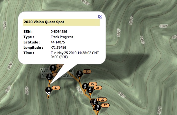
So many geographic information graphics are built upon Google Maps that it deserves a particular mention. Its API makes it fairly easy to create Datatips specialized to the application’s needs, such as the SPOT Adventures example at the top of the pattern (Figure 7-15) and in the example in Figure 7-18.

Data Spotlight

What
As the mouse rolls over an area of interest on the graphic, highlight that slice of data and dim the rest.
Use when
The graphic contains so much information that it tends to obscure its own structure. It might be difficult for a viewer to pick out relationships and trace connections among the data because of its sheer richness.
The data itself is structurally complex—it might have several independent variables and complicated “slices” of dependent data such as lines, areas, scattered sets of points, or systems of connections. (If the rolled-over data is merely a point or a simple shape, a Datatips is a better solution than a Data Spotlight. They’re often used in conjunction with each other, though.)
Why
A Data Spotlight untangles the threads of data from each other. It’s one way that you can offer “focus plus context” on a complex infographic: a user eliminates some of the visual clutter on the graphic by quieting most of it, focusing only on the data slice of interest. However, the rest of the data is still there to provide context.
It also permits dynamic exploration by letting a user flick quickly from one data slice to another. She can see both large differences and very small differences that way—as long as the Data Spotlight transitions quickly and smoothly (without flicker) from one data slice to another as the mouse moves, even very tiny differences will be visible.
Finally, Data Spotlight can be fun and engaging to use.
How
First, design the information graphic so that it doesn’t initially depend on a Data Spotlight. Try to keep the data slices visible and coherent so that a user can follow what’s going on without interacting with the graphic. (Someone may print it, after all.)
To create a spotlight effect, make the spotlighted data either a light color or a saturated color, while the other data fades to a darker or grayer color. Make the reaction very quick on rollover to give the user a sense of immediacy and smoothness.
Besides triggering a spotlight when the mouse rolls over data elements, you might also put “hot spots” onto legends and other references to the data.
Consider a “spotlight mode.” In this, the Data Spotlight waits for a longer initial mouse hover before turning itself on. Once in that mode, the user’s mouse motions cause immediate changes to the spotlight. This means the spotlight effect won’t be triggered accidentally, when a user just happens to roll the mouse over the graphic. The Crimespotting example (shown in Figure 7-20) does this.
An alternative to the mouse rollover gesture is a simple mouse click or finger tap. This lacks the immediacy of rollovers, but it works on touchpads and it isn’t as subject to accidental triggering. However, you may want to reserve the mouse click for a different action, such as drilling down into the data.
Use Datatips to describe specific data points, describe the data slice being highlighted, and offer instructions where necessary.
Examples
The San Francisco Crimespotting project puts a Data Spotlight on the different types of crimes found in this geographic area. When the user hovers the mouse over a single data element—a crime report—or over the legend that describes the crime types (shown in Figure 7-20), all reports of that type are highlighted with light circles. The rest of the graphic is darkened, in the style of a lightbox.

The Washington Post’s interactive “Top Secret” graphic looks fine by itself, but the chart is complicated and may be hard for a passive viewer to follow (see Figure 7-21). The Data Spotlight lets the user easily see the information associated with a particular agency.

Sometimes a graphic can’t easily show all the available data. The Radial Table graphic from the Wall Street Journal, shown in Figure 7-22, uses a variety of interactive tools to let the user explore the tracking-data connections among websites. Clicking on a cell shows specific relationships; rolling over nonclicked cells shows a “ghost” of the relationship lines. The “Show all” command makes a graphic that looks interesting, but doesn’t give the user much actionable information—the limited interactive views are far more interesting!

Dynamic Queries

What
Provide ways to filter the data set immediately and interactively. Employ easy-to-use standard controls, such as sliders and checkboxes, to define which slices or layers of the data set get shown. As the user adjusts those controls, show the results immediately on the data display.
Use when
You’re showing the user a large, multivariate data set, of any shape, with any presentation. Users need to filter out some of the data in order to accomplish any of several objectives—to get rid of irrelevant parts of the data set, to see which data points meet certain criteria, to understand relationships among the various data attributes, or simply to explore the data set and see what’s there.
The data set itself has a fixed and predictable set of attributes (or parameters, variables, dimensions, whatever term you prefer) that are of interest to users. They are usually numeric and range-bounded; they might also be sortable strings, dates, categories, or enumerations (sets of numbers representing non-numeric values). Or they might be visible areas of data on the information display itself that can be interactively selected.
Dynamic Queries can also apply to search results. Faceted searches might use a dynamic query interface to let users explore a rich database of items, such as products, images, or text.
Why
First, Dynamic Queries are easy to learn. No complicated query language is necessary at the user’s end; well-understood controls are used to express common-sense Boolean expressions such as “price > $70 AND price < $100”. They lack the full expressive power of a query language—only simple queries are possible without making the UI too complicated—but in most cases, that’s enough. It’s a judgment call you have to make.
Second, the immediate feedback encourages open-ended exploration of the data set. As the user moves a slider thumb, for instance, she sees the visible data contract or expand. As she adds or removes different subsets of the data, she sees where they go and how they change the display. She can concoct long and complex query expressions incrementally, by tweaking this control, then that, then another. Thus, a continuous and interactive “question and answer session” is carried on between the user and the data. The immediate feedback shortens the iteration loop so that exploration is fun and a state of flow is possible. (See Chapter 1, Incremental Construction.)
Third—and this is a little subtler—the presence of labeled dynamic-query controls clarifies what the queryable attributes are in the first place. If one of the data attributes is a number that ranges from 0 to 100, for instance, the user can learn that just by seeing a slider that has 0 at one end and 100 at the other end.
How
The best way to design a dynamic query depends on your data display, the kinds of queries you think should be made, and your toolkit’s capabilities. As mentioned, most programs map data attributes to ordinary controls that live next to the data display. This allows querying on many variables at once, not just those encoded by spatial features on the display. Plus, most people know how to use sliders and buttons.
Other programs afford interactive selection directly on the information display. Usually the user draws a box around a region of interest and the data in that region is removed (or retained while the rest of the data is removed). This is manipulation at its most direct, but it has the disadvantage of being tied to the spatial rendering of the data. If you can’t draw a box around it—or otherwise select points of interest—you can’t query on it! See the Data Brushing pattern for the pros and cons of a very similar technique.
Back to controls, then: picking controls for dynamic queries is similar to the act of picking controls for any kind of form—the choices arise from the data type, the kind of query to be made, and the available controls. Some common choices include:
Sliders to specify a single number within a range.
Double sliders or slider pairs to specify a subset of a range: “Show data points that are greater than this number, but less than this other number.”
Radio buttons or drop-down (combo) boxes to pick one value out of several possible values. You might also use these to pick entire variables or data sets. In either case, “All” is frequently used as an additional metavalue.
Checkboxes or toggles to pick an arbitrary subset of values, variables, or data layers.
Text fields to type in single values, perhaps to be used in a Fill-in-the-Blanks context (see Chapter 8). Remember that text fields leave more room for errors and typos than do sliders and buttons, but are better for precise values.
Examples
The example in Figure 7-24 shows a set of six filters for a treemap (see the Treemap pattern in this chapter). The checkboxes, filters 1 and 2, screen out entire swaths of data with two very simple canned queries: is this item available, and does it have a picture?
The remaining filters use double sliders. Each has two independently movable slider “thumbs” that let a user define a range. The Price slider sets a range of about $80 to about $1,000 (admittedly not very realistic), and as the user moves either end of the range, the whole treemap shifts and changes to reflect the new price range. The same is true for the other sliders.

The San Francisco Crimespotting project (see Figure 7-25) offers a set of simple, comprehensible toggles to show crime data for different times of day—dark, light, commute, swing shift, and so on. The user can also choose specific times of day with the clock-like control. To narrow down the calendar dates, a long bar chart (itself a data display) permits a range selection via a double slider, in addition to standard calendar drop downs.

In other libraries
http://patternbrowser.org/code/pattern/pattern_anzeigen.php?4,231,17,0,0,252
http://www.infovis-wiki.net/index.php?title=Dynamic_query
Both the name and the concept for Dynamic Queries originated in the early 1990s with several seminal papers by Christopher Ahlberg, Christopher Williamson, and Ben Shneiderman. You can find some of these papers online, including the following:
Data Brushing

What
Let the user select data items in one view; show the same data selected simultaneously in another view.
Use when
You can show two or more information graphics at a time. You might have two line plots and a scatter plot, or a scatter plot and a table, or a diagram and a tree, or a map and a timeline, whatever—as long as each graphic is showing the same data set.
Why
Data Brushing offers a very rich form of interactive data exploration. First, the user can select data points using an information graphic itself as a “selector.” Sometimes it’s easier to find points of interest visually than by less direct means, such as Dynamic Queries—outliers on a plot can be seen and manipulated immediately, for instance, while figuring out how to define them numerically might take a few seconds (or longer). “Do I want all points where X > 200 and Y > 5.6? I can’t tell; just let me draw a box around that group of points.”
Second, by seeing the selected or “brushed” data points simultaneously in the other graphic(s), the user can observe those points in at least one other graphical context. That can be invaluable. To use the outlier example again, the user might want to know where those outliers are in a different data space, indexed by different variables—and by learning that, she might gain immediate insight into the phenomenon that produced the data.
A larger principle here is coordinated or linked views. Multiple views on the same data can be linked or synchronized so that certain manipulations—zooming, panning, selection, and so forth—done to one view are simultaneously shown in the others. Coordination reinforces the idea that the views are simply different perspectives on the same data. Again, the user focuses on the same data in different contexts, which can lead to insight.
How
First, how will users select or “brush” the data? It’s the same problem you’d have with any selectable collection of objects: users might want one object or several, contiguous or separate, selected all at once or incrementally. Consider these ideas:
Drawing a rubber-band box around the data points (this is very common)
Single selection by clicking with the mouse
Selecting a range (if that makes sense) by Shift-clicking, as one can often do with lists
Adding and subtracting points by Ctrl-clicking, also like lists
Drawing an arbitrary “lasso” shape around the data points
Inverting the selection via a menu item, button, or key
If you go exclusively with a rubber-band box, consider leaving the box on-screen after the selection gesture. Some systems, such as Cornerstone, permit interactive resizing of the brushing box. Actually, the user can benefit from any method of interactively expanding or reducing the brushed set of points, because she can see the newly brushed points “light up” immediately in the other views, which creates more possibility for insight.
As you can see, it’s important that the other views react immediately to Data Brushing. Make sure the system can handle a fast turnaround.
If the brushed data points appear with the same visual characteristics in all the data views, including the graphic where the brushing occurs, the user can more easily find them and recognize them as being brushed. They also form a single perceptual layer (see the section Preattentive Variables: What’s Related to What? on page 283). Color hue is the preattentive variable most frequently used for brushing, probably because you can see a bright color so easily even when your attention is focused elsewhere.
Examples
The screenshots shown in both Figures Figure 7-26 and Figure 7-27 are taken from Cornerstone, a statistics and graphing package. The three windows in Figure 7-27 represent a scatter plot, a histogram of the residuals of one of the plotted variables, and a table of the raw data. All views afford brushing; you can see the brushing box around two of the histogram’s columns. Both plots show the brushed data in red, while the table shows it in gray. If you “brushed” a car model in the table, you would see the dot representing that model appear in red in the top plot, plus a red strip in the histogram.

Maps lend themselves well to Data Brushing, because data shown in a geographic context can often be organized and rendered in other ways as well. The following three examples show map-based Data Brushing: images in a filmstrip-like line (from Flickr, Figure 7-28), GPS tracker locations in chronological order (from SPOT Adventures, Figure 7-29), and Foursquare checkins by a person going from one social event to another, also in chronological order (from Weeplaces, Figure 7-30). In all three examples, selection of items in the linear view causes the items to “light up” in the map view. Flickr and SPOT also do the reverse—they let the user select items on the map itself, so they light up in the linear view.


In other libraries
http://quince.infragistics.com/Patterns/Data%20Brushing.aspx
This pattern, called Linked Multiples, is a generalization of Data Brushing:
http://patternbrowser.org/code/pattern/pattern_anzeigen.php?4,225,17,0,0,246
Local Zooming

What
Show all the data in a single dense page, with small-scale data items. Wherever the mouse goes, distort the page to make those data items large and readable.
Use when
You’re showing a large data set using any organizational form—plots, maps, networks, or even tables—on either a large or a small screen. The user is able to “point at” places of interest with a mouse cursor or a touch screen.
Users will browse through the data or search for points of interest within that organizational structure (e.g., finding a date in a calendar). High-level overviews are necessary for finding those points of interest, but users don’t need to see all available detail for all data points at once—zooming in is sufficient for getting fine detail.
Some forms of Local Zooming, especially fisheye lenses, are appropriate only if your users are willing to learn a new interaction technique to gain proficiency with a particular application. Using Local Zooming can require patience.
Why
Ordinary zooming works well for most high-density information graphics, but it takes away context: a fully zoomed view no longer shows an overview of the whole data set. Local Zooming focuses on local detail while retaining context. The user remains in the same conceptual space.
One possible cost of Local Zooming, however, is distortion of that conceptual space. Notice how the introduction of a fisheye—a type of local zoom that maintains topological continuity between the zoomed area and the rest of the view—changes the landscape in Figure 7-31. Suddenly the overview doesn’t look the same as it did before: landmarks have moved, and spatial relationships have changed (“It used to be halfway down the right side of the screen, but it’s not there anymore”).
Other kinds of Local Zooming don’t introduce distortion, but instead hide parts of the overview. With a virtual magnifying glass, for instance, the user can see the zoomed area and part of the larger context, but not what’s hidden by the magnifying glass “frame.”
The Overview Plus Detail pattern is a viable alternative to Local Zooming. It too offers both detail (focus) and a full overview (context) in the same page, but it separates the two levels of scale into two side-by-side views, rather than integrating them into one distorted view. If Local Zooming is too difficult to implement or too hard for users to interact with, fall back to Overview Plus Detail.
The Datatips pattern is another viable alternative. Again, you get both overview and detail, but the information shown isn’t really a “zoom” as much as a description of the data at that point. And a Datatips is an ephemeral item layered over the top of the graphic, whereas Local Zooming can be an integral part of the graphic and can therefore be printed and screen-captured.
How
Fill all the available space with the whole data set, drawn very small. Stretch it to fill the window dynamically (see the Liquid Layout pattern in Chapter 4). Remove detail as necessary. If text is an important element, use tiny fonts where you can; if the text still won’t fit, use abstract visual representations such as solid rectangles or lines that approximate text.
Offer a local zoom mode. When the user turns it on and moves the pointer around, enlarge the small area directly under the pointer.
What the enlargement actually looks like depends on the kind of information graphic you use—it doesn’t have to be literal, like a magnifying glass on a page. The DateLens, in Figure 7-31, uses both horizontal and vertical enlargement and compression. But the TableLens, in Figure 7-32, uses only a vertical enlargement and compression because the data points of interest are whole rows, not a single cell in a row. A map or image, however, needs to control both directions tightly in order to preserve its scale. In other words, don’t stretch or squish a map. It’s harder to read that way.
Local zoom lenses can be finicky to drive, because the user might be aiming at very tiny hit targets. They don’t look tiny—they’re magnified under the lens!—but the user actually moves the pointer through the overview space, not the zoomed space. A small motion becomes a big jump. So when the data points are discrete, like table cells or network nodes, you might consider jumping directly from one focal point to another.
It should be noted that fisheye views are an “advanced maneuver” in data visualization. Fisheye views distort the area immediately around the zoom to achieve topological continuity with the rest of the graphic. (The DateLens is a fisheye, but the other examples in this pattern are not.) This distortion can cause discomfort for the user who moves it around a lot, for instance.
Examples
The DateLens, shown in Figure 7-31 at the top of the pattern, was a calendar application that worked on both the desktop and a mobile device. (It was experimental, and support for it ceased back around 2004.) It shows an overview of your calendar—each row is a week—with blue blocks where your appointments are. For details, click on a cell. That cell then expands, using an Animated Transition (Chapter 3), to show the day’s schedule. In this design, the entire graphic compresses to allow room for the focused day, except for the row and the column containing that cell. (That actually provides useful information about the week’s schedule and about other weeks’ Thursday appointments.)
The Inxight TableLens permitted the user to open arbitrary numbers of rows and move that “window” up and down the table. Figure 7-32 shows four magnified rows. Note that the only enlargement here is in the vertical direction.

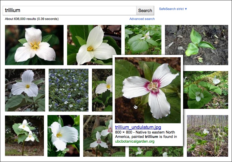
The Mac OS dock does a simple version of Local Zooming (Figure 7-33), as does Google Images (Figure 7-34).

Cartifact’s map lenses—literal ones, yet remarkably beautiful—allow the user to set both the magnification level and the drawing style inside the lens (see Figure 7-35). These remove much of the user’s need to keep zooming into the map for detail, then back out again for context, then back in again for more detail. The alternate drawing styles (aerial, Cartifact, historic, and 3D oblique) let the user see one area in several complementary ways, without affecting the entire map.

Sortable Table

What
Show the data in a table, and let the user sort the table rows according to the cell values in a selected column.
Use when
The interface shows multivariate information that the user may want to explore, reorder, customize, search through for a single item, or simply understand on the basis of those different variables.
Why
Giving the user the ability to change the sorting order of a table has powerful effects. First, it facilitates exploration. A user can now learn things from the data that she may never have been able to otherwise. How many of this kind? What proportion of this to that? Is there only one of these? What’s first or last? Suddenly it becomes easier to find specific items, too; a user need only remember one attribute of the item in question (e.g., its last-edited date), sort on that attribute, and look up the value she remembers.
Furthermore, if the sort order is retained from one invocation of the software to another, this is a way for the user to effectively customize the UI for her preferred usage patterns. Some users want the table sorted first to last, some last to first, and some by a variable no one else thinks is interesting. It’s good to give a user that kind of control.
Finally, the clickable-header concept is familiar to many users now, and they may expect it even if you don’t provide it.
How
Choose the columns (i.e., the variables) carefully. What would a user want to sort by or search for? Conversely, what doesn’t need to be shown in this table? What can be hidden until the user asks for more detail about a specific item?
The table headers should have some visual affordance that can be clicked on. Many have beveled, button-like borders, or blue underlined text. You should use up or down arrows to show whether the sort is in ascending or descending order. (And the presence of an arrow shows which column was last sorted on—a fortuitous side effect!) Consider using rollover effects, such as highlighting or cursor changes, on the headers to reinforce the impression of clickability.
Use a stable sort algorithm. This means that if a user sorts first by name and then by date, the resultant list will show ordered groups of same-date items that are each sorted by name within the group. In other words, the current sort order will be retained in the next sort to the extent possible—subtle, but very useful.
If your UI technology permits, you might let users reorder columns by dragging and dropping.
Examples
Inxight’s TableLens is a table whose rows compress down into tiny bars, the lengths of which represent the values of the table cells. (Users can click on specific rows to see ordinary-looking table rows, but that’s not what I want to talk about here.) One of the wonderful things about this visualization is the ability to sort on any column—when the data is highly correlated, as in this example, the user can see that correlation before her eyes.
The data set shown in Figure 7-37 comprises houses for sale in Santa Clara County, California. In this screenshot, the user has clicked on the Bedroom column header, thus sorting on that variable: the more bedrooms, the longer the blue bar. Previously, the stable-sorted table had been sorted on Square Foot (representing the size of the house), so you see a secondary “saw-tooth” pattern there; all houses with four bedrooms, for instance, are sorted by size. The Baths variable almost mirrors the Square Foot attribute, and so does Price, which indicates a rough correlation. And it makes intuitive sense—the more bedrooms a house has, the more bathrooms it’s likely to have, and the bigger it’s likely to be.
You can imagine other questions that can be answered by this kind of interactive graphic. Does zip code correlate to price? How strong is the correlation between price and square footage? Do certain realtors work only in certain cities? How many realtors are there? And so on.

Radial Table

What
Show a table or list of items as a circle instead of a column. Draw connections among items through the interior of the circle.
Use when
You have a long list or table of items and you need to show arbitrary relationships among them: flows, connections, affinities, similarities, and even numerical values (encoded by the thickness of the connection).
Why
A circular presentation enables free-form connection lines to be visualized far more easily than a line or column of elements would permit. Such connections have a shorter, straighter distance to travel when drawn between points on an arc than points on a line, and viewers can usually see patterns in the data more easily. (This is not always the case. If you can, try out different types of connection visualizations to see if it’s true for your particular data sets.)
Even when there are no connections to draw, some kinds of tabular data might be easier to see when drawn as a circle—very long data sets with both large-scale and small-scale features, for instance. Large-scale features might include groups and clusters, upper levels of a hierarchy, or labels for large numbers of items. See the examples for illustrations.
From the website of Circos, a creator of radial table designs, comes this explanation:
Within the circle, the resolution varies linearly, increasing with radial position. This makes the center of the circle ideal for compactly displaying summary statistics or indicating points of interest (i.e. low resolution data) which the reader can then follow outward to explore the data in greater detail (i.e. high resolution data).[7]
Finally, radial information graphics can be beautiful. When drawn skillfully, these kinds of visualizations are fresh, attractive, and engaging.
How
Bend the linear table or list into a circle and put the text labels around the outside of the circle (if you need them). Some Radial Table place the x-axis on one half of the circle and the y-axis on the other half; this is useful if your data table is trying to show connections between two one-dimensional sets of items.
If the original table shows multiple columns of dependent data—numbers, bars, pictograms, scatter plots, and so on—arrange those either inside or outside the circle, depending on the visual scale and interrelatedness of these features. Large-scale, convergent features should go inside; small-scale, detailed, divergent features should go outside, where they have more space.
If the items in the table are categorized, you could encode those categories as groups separated by gaps, or in different colors, or as arcs parallel to the circle (either inside or outside the data axis).
Inside the circle, draw relationships among the items. Those relationships might take the shape of free-form lines or arcs between table cells. The line color and thickness can encode additional variables about the relationships, such as source or destination (color), and volume or strength (thickness). Sometimes these relationships need to be drawn so thickly that they’re hard to distinguish from each other. Here are some ways to deal with that problem:
Eliminate superfluous lines; draw only what you want viewers to focus on.
Use drawing algorithms that can cluster lines together and keep them visually organized.
If the graphic is interactive, use techniques such as Data Spotlight and Dynamic Queries to let the user see chosen subsets of the lines.
You may need to explain how to interpret a Radial Table. These graphics can be very useful to the patient and informed viewer, but their meaning may not be immediately apparent to a viewer who is naive or not motivated to spend time studying the graphic carefully. If your users are likely to move on without understanding the Radial Table, consider simplifying it or using an easier alternative rendering.
Examples
SolidSX Software Explorer is an application that draws Radial Table of software packages. Figure 7-39 shows dependencies, calls, and hierarchical relationships among code elements in a library. Note the containing arcs around the outside of the circle (showing the static hierarchy), and the call-graph lines within the circle, which are carefully drawn for clarity.

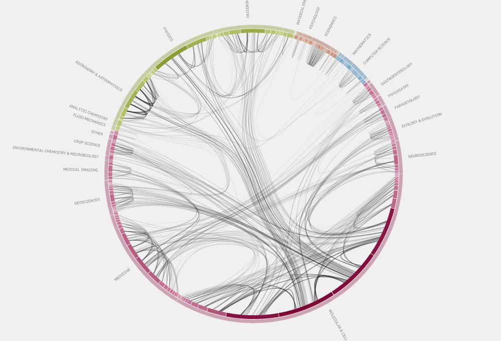
From the Eigenfactor Project and Moritz Stefaner comes an elegant diagram of citation patterns among branches of science, shown in Figure 7-40. There are many connections, but they are drawn so well that the viewer can follow them with some degree of success. The diagram shows which fields of science are more insular than others (e.g., economics) and which are better connected.
The genetics diagram in Figure 7-41 demonstrates that the curved format can be effective in illustrating data patterns other than connections. The diagram could have been “unrolled” into a horizontal strip-chart format, but this version is more compact and arguably more readable than a long, thin linear chart. Note that the line charts on the inside of the table are a larger-scale feature than the tiny multicolored slivers around the outside of the circle, so they are appropriately shown inside the circle.

In other libraries
http://patternbrowser.org/code/pattern/pattern_anzeigen.php?4,217,17,0,0,238
For many more examples, visit the Circos and Visual Complexity websites:
Multi-Y Graph

Use when
You present two or more graphs, usually simple line plots, bar charts, or area charts (or any combination thereof). The data in those graphs all share the same x-axis, often a timeline, but otherwise they describe different things, perhaps with different units or scale on the y-axis. You want to encourage the viewer to find “vertical” relationships among the data sets being shown—correlations, similarities, unexpected differences, and so on.
Why
Aligning the graphs along the x-axis first tells the viewer that these data sets are related, and then it lets her make side-by-side comparisons of the data. In Figure 7-42, the proximity of the two graphs makes visible the correlations in the curves’ shapes; you can see that spikes in the bottom graph generally line up with interesting features in the top graph, and the grid lines enable precise observation. For instance, the vertical grid line between 1990 and 1991 lines up peaks in both curves.
You could have done this by superimposing one graph upon the other. But by showing each graph individually, with its own y-axis, you enable each graph to be viewed on its own merits without visual interference from the other.
Also, these data sets have very different Y values: one ranges from zero to nearly 150, while the other ranges from –30 to +20! You couldn’t put them on the same y-axis anyhow without the first one looking like a flat line. You’d need to draw another y-axis along the left side, and then you’d need to choose a scaling that doesn’t make the graph look too odd. Even so, direct superimposition encourages the viewer to think that the data sets use the same Y scale, and to compare them on that basis—“apples to apples,” instead of “apples to oranges.” If that’s not the case, superimposing them can be misleading.
How
Stack one graph on top of the other. Use one x-axis for both, but separate the y-axes into different vertical spaces. If the y-axes need to overlap somewhat, they can, but try to keep the graphs from visually interfering with each other.
Sometimes you don’t need y-axes at all; maybe it’s not important to let the user find exact values (or maybe the graph itself contains exact values, such as labeled bar charts). In that case, simply move the graph curves up and down until they don’t interfere with each other.
Label each graph so that its identity is unambiguous. Use vertical grid lines if possible; they let viewers follow an X value from one data set to another, for easier comparison. They also make it possible to discover an exact value for a data point of interest (or one close to it) without making the user take out a straightedge and pencil.
Examples
Google Trends allows a user to compare the use frequency of different search terms. The example in Figure 7-43 shows two sports-related terms that are comparable in volume, so they’re easy to compare in one simple chart. But Google Trends goes beyond that. Relative search volume is illustrated on the top chart, while the bottom chart shows news reference volume. The metrics and their scales are different, so Trends uses two separate y-axes.

The example in Figure 7-44 shows an interactive multi-Y graph constructed in MATLAB. You can manipulate the three data traces’ y-axes, color-coded on the left, with the mouse—you can drag the traces up and down the graph, “stretch” them vertically by sliding the colored axis end caps, and even change the displayed axis range by editing the y-axis limits in place. Here’s why that’s interesting: you might notice that the traces look similar, as though they were correlated somehow—all three drop in value just after the vertical line labeled 1180, for instance. But just how similar are they? Move them and see.

Your eyes are very, very good at discerning relationships among data graphics. By stacking and superimposing the differently scaled plot traces shown in Figure 7-45, a user might gain valuable insight into whatever phenomenon produced this data.

The information graphics in a multi-Y display don’t need to be traditional graphs. The weather chart shown in Figure 7-46 uses a series of pictograms to illustrate expected weather conditions; these are aligned with the same time-based x-axis that the graph uses. (This chart hints at the next pattern, Small Multiples.)
In other libraries
http://quince.infragistics.com/Patterns/Multi-Y%20Graph.aspx
Small Multiples

What
Create many small pictures of the data using two or three data dimensions. Tile them on the page according to one or two additional data dimensions, either in a single comic-strip sequence or in a 2D matrix.
Use when
You need to display a large data set with more than two dimensions or independent variables. It’s easy to show a single “slice” of the data as a picture—as a plot, table, map, or image, for instance—but you find it hard to show more dimensions than that. Users might be forced to look at one plot at a time, flipping back and forth among them to see differences.
When using Small Multiples, you need to have a fairly large display area available. Mobile devices rarely do this well, unless each individual picture is very tiny. Use this pattern when most users will be seeing these on a large screen or on printed paper.
That being said, sparklines are a particular type of Small Multiples that can be very effective at tiny scales, such as in running text or in a column of table cells. They are essentially miniature graphs, stripped of all labels and axes, created to show the shape or envelope of a simple data set.
Why
Small Multiples are data-rich—they show a lot of information at one time, but in a comprehensible way. Every individual picture tells a story. But when you put them all together, and demonstrate how each picture varies from one to the next, an even bigger story is told.
As Edward Tufte put it in his classic book, Envisioning Information (Graphics Press), “Small multiple designs, multivariate and data bountiful, answer directly by visually enforcing comparisons of changes, of the differences among objects, of the scope of alternatives.” (Tufte named and popularized Small Multiples in his famous books about visualization.)
Think about it this way. If you can encode some dimensions in each individual picture, but you need to encode an extra dimension that just won’t fit in the pictures, how could you do it?
- Sequential presentation
Express that dimension varying across time. You can play them like a movie, use Back/Next buttons to page one at a time, and so on.
- 3D presentation
Place the pictures along a third spatial axis, the z-axis.
- Small multiples
Reuse the x- and y-axes at a larger scale.
Side-by-side placement of pictures lets a user glance from one to the other freely and rapidly. She doesn’t have to remember what was shown in a previous screen, as would be required by a sequential presentation (although a movie can be very effective at showing tiny differences between frames). She also doesn’t have to decode or rotate a complicated 3D plot, as would be required if you place 2D pictures along a third axis. Sequential and 3D presentations sometimes work very well, but not always, and they often don’t work in a noninteractive setting at all.
How
Choose whether to represent one extra data dimension or two. With only one, you can lay out the images vertically, horizontally, or even line-wrapped, like a comic strip—from the starting point, the user can read through to the end. With two data dimensions, you should use a 2D table or matrix—express one data dimension as columns, and the other as rows.
Whether you use one dimension or two, label the Small Multiples with clear captions—individually if necessary, or otherwise along the sides of the display. Make sure the users understand which data dimension is varying across the multiples, and whether you’re encoding one or two data dimensions.
Each image should be similar to the others: the same size and/or shape, the same axis scaling (if you’re using plots), and the same kind of content. When you use Small Multiples, you’re trying to bring out the meaningful differences between the things being shown. Try to eliminate the visual differences that don’t mean anything.
Of course, you shouldn’t use too many Small Multiples on one page. If one of the data dimensions has a range of 1 to 100, you probably don’t want 100 rows or columns of small multiples, so what do you do? You could bin those 100 values into, say, five bins containing 20 values each. Or you could use a technique called shingling, which is similar to binning but allows substantial overlap between the bins. (That means some data points will appear more than once, but that may be a good thing for users trying to discern patterns in the data; just make sure it’s labeled well so that they know what’s going on.)
Some small-multiple plots with two extra encoded dimensions are called trellis plots or trellis graphs. William Cleveland, a noted authority on statistical graphing, uses this term, and so do the software packages S-PLUS and R.
Examples
The North American climate graph, at the top of the pattern in Figure 7-47, shows many encoded variables. Underlying each small-multiple picture is a 2D geographic map, of course, and overlaid on that is a color-coded “graph” of some climate metric, such as temperature. With any one picture, you can see interesting shapes in the color data; they might prompt a viewer to ask questions about why blobs of color appear over certain parts of the continent.
The Small Multiples display as a whole encodes two additional variables: each column is a month of the year, and each row represents a climate metric. Your eyes have probably followed the changes across the rows, noting changes through the year, and comparisons up and down the columns are easy, too.
The example shown in Figure 7-48 uses the grid to encode two independent variables—ethnicity/religion and income—into the state-by-state geographic data. The dependent variable, encoded by color, is the estimated level of public support for school vouchers (orange representing support, green opposition). The resultant graphic is very rich and nuanced, telling countless stories about Americans’ attitudes toward the topic.

A more abstract two-dimensional trellis plot, also called a coplot in William Cleveland’s Visualizing Data, is shown in Figure 7-49. Created with the R software package, this example shows a quantity measured along four dimensions: latitude, longitude, depth, and magnitude. The values along the depth and magnitude dimensions overlap—this is the shingling technique mentioned earlier.

In other libraries
http://patternbrowser.org/code/pattern/pattern_anzeigen.php?4,298,17,0,0,319
http://quince.infragistics.com/Patterns/Small%20Multiples.aspx
See also the works by Edward Tufte and William Cleveland listed earlier.
Treemap

What
Express multidimensional and/or hierarchical data as rectangles of various sizes. You can nest those rectangles to show the hierarchy, and color or label them to show additional variables.
Use when
Your data is tree-shaped (hierarchical). Alternatively, it may be multivariate—each item has several attributes, such as size and category, which permit items to be grouped according to those attributes. Users want to see an overview of many data points—maybe hundreds or thousands—and they’re using screens large enough to accommodate a large display.
Your users should be patient and motivated enough to learn to use an unusual interface. Treemap are not always easy to read, especially for people who haven’t seen them before. Furthermore, they work better on-screen than they do on paper, because Datatips, Dynamic Queries, and other interactive mechanisms can help users understand the data.
Why
Treemap encode many data attributes into a single dense diagram. By taking advantage of position, size, containment, color hue and/or value, and labeling, a treemap packs a lot of information into a space that encourages the human visual system to seek out trends, relationships among variables, and specific points of interest.
Look at the SmartMoney treemap in Figure 7-50, which shows the past 52 weeks’ performance of more than 500 publicly traded stocks. Section size illustrates the relative sizes of different market sectors and of companies within those sectors—the blocks of solid color are individual companies. You can instantly see that in the past year, the big gainers in bright green were from the Technology and Consumer Cyclicals categories, and the losers in red have been in the Financial and Energy categories.
This treemap makes it very easy to get an instant overview and to spot outliers. It encourages you to see relationships between size and color, size and position, and position and color—all of which give you different kinds of insight into the market. It would take you forever to get that insight from a long table of stock prices.
How
The critical step in designing a treemap is deciding which data attributes are encoded by which visual variables:
- Rectangle size
Usually this encodes a numeric value, such as size, price, or percentage. Make each rectangle’s area proportional to that number. If the number has too great a range, you’ll end up with some enormous rectangles and some microscopic rectangles, in which case you could either let the user zoom in on them for a closer look, or filter out the large ones to let the small ones scale up. Dynamic Queries (earlier in this chapter) are often used for that. Refer back to Figure 7-24 for an example of Dynamic Queries used in conjunction with a treemap.
- Grouping and nesting
If your data is already inherently hierarchical, like a taxonomic tree or a filesystem, you should group and nest the rectangles accordingly. If not, see whether the data items have a natural grouping or categorization that is meaningful to the user. Do they have several possible categorizations? You might consider giving the user a choice on how to group them. Do they have no obvious categorization at all? Then you could take a numeric attribute, such as price, and bin it into categories ($0 to $5, $5 to $10, etc.). Or you could not group the data items at all. But consider whether some other type of information graphic may be more appropriate; grouping is one of the treemap’s strengths.
- Color
You can use color to represent a numeric or otherwise ordered value, as in the SmartMoney example in Figure 7-50, or another categorization. For a numeric value, choose two colors for the “endpoints” of the range of possible values, such as red and green, white and blue, yellow and red, and so on; shades of color between those endpoints represent values in between. For a categorization, use a different hue to represent each category. (If the shades are too similar, though, viewers may assume an ordering where there isn’t one.)
- Position
A rectangle’s position within the treemap is partially dictated by where it belongs in the hierarchy or categorization. But within a category, you might still have freedom to decide where a given rectangle goes. Some treemaps place the largest rectangles in the upper left of a category, and then space-fill the rest of the category so that the smallest rectangles are in the lower right. This establishes a nice rhythm on the page, and it helps the user to visually compare the number of small or large rectangles in each main category. In this case, position doesn’t encode yet another variable; instead, it’s redundant with size and grouping. But other treemap implementations do encode an order—by age, or alphabetical by name, for example. It depends on how many variables you want to encode at once.
Most treemaps allow users to drill down to the actual data items. Mouse rollovers, for instance, usually produce largish tool tips that describe the item in full (see the Datatips pattern in this chapter). You’ll usually have to elide some text anyway to fit the descriptions into the treemap blocks, so this is a good thing to do. Furthermore, a single or double click often brings the user to some other page or window about that item.
As for implementation, it is not trivial to write code to lay out a treemap in a pleasing way. Fortunately, many algorithms exist for drawing a treemap. Some are in academic papers; some are in open source software or freeware; and others are in products. The different algorithms vary according to how they choose the rectangles’ aspect ratios (i.e., the proportion between width and height; the squarer, the better), how they fill the space for a given category, and their stability with respect to data changes.
You may need to explain how to interpret a Treemap. These graphics can be very useful to the patient and informed viewer, but their meaning isn’t immediately apparent to a viewer who is naive or not motivated to spend time studying the graphic carefully. If your users are likely to move on without understanding the Treemap, consider simplifying it or using an easier alternative rendering.
Examples
The now-defunct Newsmap illustrated the “news landscape” as described by Google News (see Figure 7-51). At any given moment, the Newsmap could collect Google’s top headlines and draw a treemap in which the largest blocks represented the most reported-on stories. The encodings here are:
Block size: “popularity” of news item; how many news outlets reported this story
Color hue: topic
Top-level grouping: also topic
Color value (darkness/lightness): age
Because the headline’s text size is proportional to block size, which in turn is proportional to popularity, your eyes are immediately drawn to the biggest news items. (What did you read first? Perhaps the “False warnings” headline, then “Please Work for Free!”?) The treemap is thus an automatically constructed visual hierarchy.

From the Hive Group comes a small collection of similar treemap visualizations: items available for purchase from Amazon, world population data, and so on. Figure 7-52 shows a list of articles recently promoted via Digg.
Some encodings—block size, color hue, grouping—are settable by the user via the bar on the top (“Group by,” “Size represents,” “Color represents”). That kind of customizability is really handy in this type of application. After all, there are many data attributes associated with each article—too many to be encoded by the available three or four visual variables. The treemap designers didn’t know which attributes each user would be most interested in. They made a good default guess, and put in a simple, learnable UI to allow users to do their own thing.

In other libraries
http://patternbrowser.org/code/pattern/pattern_anzeigen.php?4,215,17,0,0,236
http://quince.infragistics.com/Patterns/Treemap.aspx
Ben Shneiderman invented the treemap in 1990, and he and his colleagues at the University of Maryland have been refining the technique for some time now. A history of the treemap, along with many links to papers and implementations, can be found at http://www.cs.umd.edu/hcil/treemap-history/.