Chapter 10. Going Mobile
If you have ever designed anything for the Web, you are already a mobile designer. Congratulations!
That’s the reality of a world full of iPhones, other kinds of smartphones, ebook readers, tablet computers, and entire countries where people reach the Internet primarily through their phones. All these users will see your sites through browsers that are small, slow, quirky, and hard to interact with. They will use your sites in environmental conditions—and mindsets—that are entirely different from what they would experience if they were sitting quietly at a comfortable desk, in front of a large screen.
Even if you don’t choose to become an expert at mobile design, you can still treat mobile design consciously and thoughtfully. A relatively small investment of knowledge, design work, and time can go a long way toward improving the mobile experience of the sites you design.
For many sites, it will make sense for you to create a separate version of the site aimed at mobile users (or, at least, users of small screens). You would present a scaled-down, focused version of your site that answers the needs of users who are out moving around. In this chapter, we won’t go into the technical details of platform detection and how to present the correct design for the user’s situation (e.g., different CSS stylesheets)—but the knowledge is out there and fairly easy to find.
Other sites will want to supply all of their functionality via the mobile site, but all of it would be tailored to the small screen and other mobile constraints. Again, many people view the Internet exclusively through their mobile device, and they’ll want all your site’s features. You may choose to do two separate and parallel designs, one for mobile and one for the desktop.
If you create tools and applications for large screens, instead of websites, this chapter may not apply to you at all. You and your organization may wish to evaluate whether your tools (or some subset thereof) could be re-created as apps on mobile devices and still be useful. Know your users—understand their needs, tasks, and contexts of use. Creating mobile apps is a nontrivial investment, but it may be worth it for you.
The Challenges of Mobile Design
When you design for a mobile platform, you face challenges that you don’t encounter when your user can be presumed to be sitting quietly in front of a large screen and keyboard.
- Tiny screen sizes
Mobile devices just don’t offer much space to present information or choices. Sadly, you don’t have the luxury of sidebars, long header menus, big images that don’t do anything, or long lists of links. You need to strip your design down to its essence—take away all the extra stuff you can. Leave the most important functions on the front page and either discard the rest or bury them deeper in the site.
- Variable screen widths
It’s hard to make a design that works well on three different screens that are 128 pixels wide, 320 pixels wide, and 600+ pixels wide—and there might be some in between, too. Scrolling down a mobile page isn’t terribly onerous (which is why width gets special mention, not height), but a design needs to use the available screen width intelligently. Some sites end up creating different versions—with different logo graphics, different navigation options, and so on—for the smallest keypad devices, and another for the iPhone-size class of touch devices (around 320 pixels wide).
For an excellent discussion of design and technical issues related to screen width, see the following mobiForge article. A search for more recent articles may help you as well.
http://mobiforge.com/designing/story/effective-design-multiple-screen-sizes - Touch screens
As of this writing, most mobile web access comes from devices with touch screens. Keypad devices obviously should be served too, since they constitute the majority of existing mobile devices, but you may want to bias the design toward the touch screen experience. Links on keypad devices can be navigated with keys fairly easily, as long as you follow good overall design principles (restricted content, linearized layout, etc.).
It’s hard to touch small targets accurately with fingers. Make your links and buttons large enough to hit easily; at a minimum, make important hit targets at least 1 cm on each side, and put some space between them. This reduces the available space for other content, of course.
- Difficulty of typing text
No one likes typing text on a touch screen or keypad. You should design interaction paths through your site or tool in such a way that typing is unnecessary or very limited. Use Autocompletion (Chapter 8) in text fields whenever possible, for instance, and prefill form fields whenever you can do so reliably. Remember that numbers are much easier than text in some contexts, however.
- Challenging physical environments
People use their phones and other devices in all kinds of places: outside in the bright sun, in dark theaters, in conference rooms, cars, buses, trains, planes, stores, bathrooms, and in bed. Think about the ambient light differences, to begin with—tasteful gray text on a gray background may not work so well in direct sun. Think also about ambient noise differences: assume that some users won’t hear the device at all, and that others might find sudden noises jarring and inappropriate.
Finally, think about motion. Tiny text is hard to read when the device (or the user) is moving around. And a tiny hit target on a touch screen device will be hard to use under the best of circumstances, but it can be nearly impossible on a rocking and jolting bus! Again, design for “fat fingers,” and design so that mistakes are easily corrected.
- Social influences and limited attention
Most of the time, mobile users won’t spend lots of time and attention on your site or app. They’ll be looking at your design while doing other things—walking, riding in a vehicle, talking with other people, sitting in a meeting, or (God forbid) driving. Occasionally a mobile user will focus his full attention on the device, such as when playing a game, but he won’t do it as often as someone sitting at a keyboard will. Therefore, design for distracted users: make the task sequences easy, quick, and reentrant. And make everything self-explanatory.
Another assumption you can make is that lots of mobile users will be engaging in conversations or other social situations. They may pass around the device to show people something on-screen. They may have people looking over their shoulder. They may need to suddenly turn off the sound if it’s not socially acceptable to have a noisy device—or they may turn it up to let others hear something. Does your design behave well in these situations? Can it support graceful social interaction?
How to Approach a Mobile Design
How to Approach a Mobile Design
In his book Mobile Design and Development (O’Reilly, http://oreilly.com/catalog/9780596155452/), Brian Fling tells a difficult truth: “Great mobile products are created, never ported. Start by understanding your users and the benefits the medium has to offer.”
If you’re simply trying to take a site’s usual content and cram it into a 320 x 480 window, stop. Take a big step back and look at the whole picture.
1. What do users in a mobile context actually need?
A person who is out and about with a mobile device may only want to use your site (or app) in particular ways; she won’t have the same range of needs that a user of the full site will have. Design for use contexts such as these:
“I need to know this fact right now, quickly.”
“I have a few minutes to spare, so entertain me.” (See the Microbreaks pattern in Chapter 1.)
“Connect me socially.”
“If there’s something I need to know right now, tell me.”
“What’s relevant to the place I’m in right now?”
2. Strip the site or app down to its essence
Don’t be afraid to take away all that other stuff—the extra content, eye-catching features, sidebars, pull quotes, ads, images, site maps, social links, and so on. Focus tightly on the few tasks that mobile users will need from your site, use minimal branding, and chuck the rest.
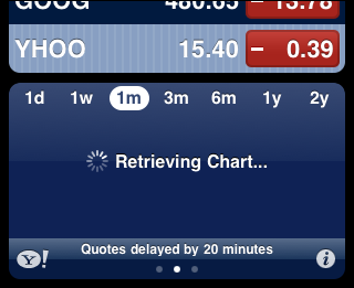
In fact, make sure that even on the home page (for a website) or the first working page of an app, relevant content appears high on the screen. That means getting rid of the “layer cake effect” of logos, ads, tabs, and headers that stack up on the screen. See Figure 10-1 for a poor example; the only piece of content that a user really cares about is the score at the bottom of the screen! (If the user rotated the phone sideways, the score wouldn’t even be visible above the fold.)

Having reduced the site to its minimal form, you should then make sure that a user who really needs the full nonmobile site can get it. Put a link to the full site in an obvious place. Remember that many of the world’s people can get web access only through their phones, so you can’t count on them just going to the full site on their large screen—they may not have one.
Alternatively, you might create the two “separate and parallel” designs mentioned earlier, in which all the site’s functions and information are presented in the mobile site (meaning the user never has to go to the full nonmobile site). You may still need to strip down the home page or main screen. Instead of having a flat and broad navigational hierarchy in which the home page has a zillion links directly to other pages, you may need to reorganize the site so that the hierarchy is somewhat narrower and deeper. This lets you put fewer options on the home page, which means less clutter on a small screen. (Of course, you’ll have to balance that against the time it takes for a user to jump from page to page!)
3. If you can, use the device’s hardware
Mobile devices offer wonderful features that you don’t get on the desktop. Location, camera, voice integration, gestural input, haptic feedback such as bumps and vibrations, and other features may be available to you. Some devices multitask so that your app can be running in the background while the user is doing other things; can you use that?
4. Linearize your content
This goes back to the width problem. Many devices simply don’t give you enough pixels in the width dimension to do any interesting side-by-side layouts. Instead of forcing the issue, just accept that one way or another, your content will end up being laid out vertically. Order the mobile site’s content so that it “reads well” when laid out this way. See the Vertical Stack pattern in this chapter.
(Several writers have pointed out that this linearization of content also makes the mobile site’s content more accessible to screen readers and other types of devices. This is a nontrivial point. Can your main site, in fact, be linearized this way? Does it make sense if you read the content in its HTML order, with no CSS styling or layout?)
5. Optimize the most common interaction sequences
Once you’ve decided which tasks your typical mobile users will want to perform, and you’ve narrowed down the site to only the most relevant content, try to make those tasks as easy as possible by following these heuristics:
Eliminate typing, or reduce it to as few characters as possible.
Use as few page loads as possible, and don’t inflate pages with unnecessary bytes. Download times can be very slow; most parts of the world are still outside the reach of high-bandwidth wireless Internet facilities.
Reduce scrolling and sideways dragging, except where it eliminates page loads and typing. In other words, prefer one long vertical page to many small pages if you have to present a lot of content.
Reduce the number of taps it takes a user to reach the desired information or accomplish a task. Tapping large hit targets—or using hardware buttons—is better than typing by a long shot, but try to reduce them anyway.
For more information on mobile design guidelines and an analysis of mobile usability tests done on various websites, see the Nielsen Norman Group’s study “Usability of Mobile Websites,” at http://www.nngroup.com/reports/mobile.
Dan Saffer’s book Designing Gestural Interfaces (O’Reilly, http://oreilly.com/catalog/9780596518394/) discusses the common gestures used in touch screens, among other topics relevant to mobile devices.
Finally, the Design For Mobile pattern library, at http://patterns.design4mobile.com, contains many good patterns in addition to those found in this book.
Some Worthy Examples
Here are some mobile versions of home pages that manage to meet most of the design constraints listed in the preceding section, while retaining the branding and personality of each site. Figure 10-2 shows examples of each.
- JetBlue.com
If someone is accessing JetBlue’s website from a mobile device, it’s a really good bet that he’s actually traveling on JetBlue that day! He may be trying to get information about his flight, for instance. That’s exactly what the JetBlue mobile site offers. The first items are the most useful to a traveler: flight information, check-in, and alerts, with further options for booking flights and in-flight entertainment. The page is simple and linear, and the items are easy to read and tap.
- RuthsChris.com
Mobile users who go to restaurant sites probably want to see locations, peruse menus, or make a reservation. This simple site does those tasks with style. (The site would be even better if the device’s browser knew the current location so that the user could tell the site to “find the restaurants closest to me.”)
- Boston.com
This news site has a clean design and packs useful information into a small space: the weather, the baseball score, leading headlines, and the first 20 or so words of each article. The site satisfies mobile users’ needs to fill up a minute here and a minute there of “found time.” The entire area of each article summary can be tapped, making the summaries easy to navigate.
- Fidelity.com
People who watch the financial markets compulsively will find current data on the three big U.S. market indexes at the top of the mobile page, plus a way to search for specific quotes and navigation links into other timely topics (such as news, watch lists, and personal portfolios). Useful information is surfaced right on the home page, and a much deeper data set is easily available from the choices given.

The Patterns
In the introduction, we talked about the need to structure content in a vertical column for maximum flexibility. The Vertical Stack pattern goes into more detail.
A mobile application needs a way to show its top-level navigational structure. A persistent toolbar across the top or bottom of each app page is one standard way to organize a mobile interface; tabs and full-page menus are two other common ways. Less obvious, yet worth mentioning, are the Filmstrip and Touch Tools patterns.
Mobile web pages often use the Bottom Navigation pattern for their global menus, preferring to use valuable top-of-page space for more immediately relevant content.
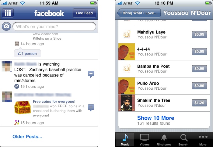
Lists are everywhere in the mobile world—lists of apps, pictures, messages, contacts, actions, settings, everything! Both web pages and applications should present well-designed lists that look good and are usable. Ordinary text lists are often adequate, and Carousel and Thumbnail Grid work beautifully in mobile designs. (See Chapter 5 for those patterns and more discussion of list design.) Consider using a Thumbnail-and-Text List as well, because they’re usually simpler than Carousel and Thumbnail Grid. Sometimes an Infinite List suits the needs of mobile designs.
The remaining patterns are a grab bag of topics related to mobile design.
Vertical Stack
What
Order the mobile page’s content in a vertical column, with little or no use of side-by-side elements. Let text elements line-wrap, and let the page scroll down past the bottom of most device screens.
Use when
Most mobile web pages that must work on devices of different sizes should use this pattern, especially if they contain text-based content and forms. (Immersive content, such as a full-screen video or game, won’t generally use this because it doesn’t usually scroll like a text-based page does.)
When going from one page to another is expensive—as is the case with web pages, which take time to download—this pattern is applicable. On the other hand, an app that resides on the device can go from page to page almost instantly, since the content doesn’t have to be downloaded. For these, it makes more sense to structure the content into single screenfuls so that the user never has to scroll vertically—she can just tap or swipe. But vertical scrolling of a long page is preferable to interminable waits for downloads.
Why
Devices come in different widths. You can’t always anticipate what the actual width in pixels will be, unless you detect the screen width at runtime or build apps for particular devices. (You can create optimized designs for single devices or standard device-specific widths, but not everyone has the resources to do so.)
A fixed-width design that’s too big for the physical device can scroll sideways or be zoomed, but these designs are never as usable as those that let the user simply scroll down.
Font sizes may also change unbeknownst to you, and as in the Liquid Layout pattern, a Vertical Stack with line-wrapped text elements will adjust gracefully when this happens.
How
Lay out the page’s content in a scrolling vertical column. Put the most important items on top and less important items farther down so that most users can see the important stuff.
Useful content—from the user’s perspective, that is—should show up in the first 100 pixels (or less) of this Vertical Stack. This top part of the screen is precious real estate. Don’t waste it with too-tall logos, ads, or endless toolbars all stacked up into a “layer cake” that pushes all the useful content off the bottom of the page! That annoys users to no end.
Put form labels above their controls, not next to them, to save horizontal space. You will need all the space you can get to show text fields and choice controls with adequate width.
Put buttons side by side only if you’re really sure their total width will never be wider than the visible screen. If the buttons contain long text that might be subject to localization or font enlargements, forget it.
Thumbnail images can fit beside text fairly easily, and it’s common to do this in lists of articles, contacts, books, and so on—see the Thumbnail-and-Text List pattern. Make sure the design degrades well when the screen width is reduced to 128 pixels (or whatever the realistic minimum happens to be when you create your design).
Examples
The sites for ESPN, the Washington Post, and REI (Figure 10-4) demonstrate three styles of using a Vertical Stack. ESPN places only the most immediately relevant content on the home page, preferring to put the rest behind menu items on the bottom of the page. The Washington Post puts it all out there; the stack shown in the figure is just a small fragment of the entire page! REI simply shows a menu of all the available places and ways to shop, with no ads or teasers on its home page.

Filmstrip

What
Arrange top-level pages side by side, and let the user swipe them back and forth to view them one at a time.
Use when
You have pages of content that are conceptually parallel, such as the weather in different cities or the scores in different sports. Users won’t mind swiping through these pages, going through several before reaching the one they’re looking for, because they are all potentially interesting.
This pattern can sometimes be a viable alternative to other navigation schemes for mobile apps, such as toolbars, tabs, or full-page menus.
Why
Each item to be displayed can occupy the entire screen; no space needs to be used for tabs or other navigation.
Since the user can’t jump straight to a desired screen—he has to swipe through others to get there—this pattern encourages browsing and serendipity.
Swiping seems to be a very satisfying gesture for some users.
A disadvantage of this pattern is that it doesn’t scale very well; you can’t use too many top-level pages, or users might get irritated at having to swipe too many times to get to a desired page. Another disadvantage is lack of transparency. A new user, just seeing your app for the first time, cannot easily see that swiping is how he gets from one page to another.
How
Essentially, a Filmstrip is like a Carousel (see Chapter 5) for a mobile application’s main pages. One difference is that a Carousel usually shows metadata—information about the item or page—and context, such as fragments of the previous and next pages. Mobile apps that use Filmstrip as a top-level organizing device don’t generally do that.
If you want to give the user a clue that multiple top-level pages exist, and that he can swipe between them, use a dot indicator like the Weather app uses at the bottom of its screen.
Examples
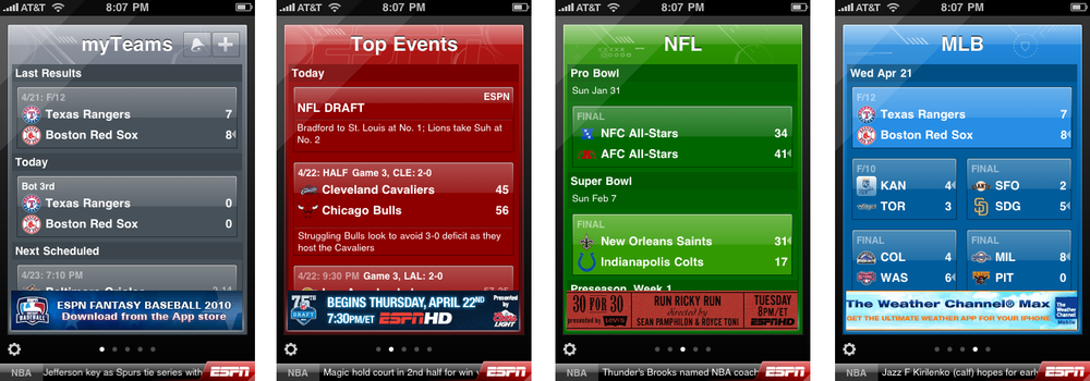
The iPhone’s built-in Weather app (shown in Figure 10-5, at the top of the pattern) uses a Filmstrip to show the weather in the various geographic locations that the user chooses.
Likewise, ESPN’s iPhone app structures its main pages as a Filmstrip. The user swipes back and forth between football, baseball, basketball, and other sports scores (see Figure 10-6).
Touch Tools

What
Show tools only in response to a touch or key press, and put them in a small, dynamic overlay atop the content.
Use when
You are designing an immersive or full-screen experience, such as videos, photos, games, maps, or books. To manage that experience, the user will sometimes need controls—navigation tools, media player tools, information about the content, and so forth. The tools require significant space, but are only needed sometimes.
Why
The content is allowed to dominate the experience most of the time. The user isn’t distracted by controls taking space and attention away from the content. Remember that in a mobile context, space and attention are even more precious resources than usual.
The user controls the experience by choosing when to show the tools.
How
Show the unadorned content using the full screen. When the user touches the device’s screen or presses a particular key or softkey, show the tools.
Many apps only show Touch Tools when the user touches a certain region of the screen. This way, the user doesn’t accidentally bring up the tools just by ordinary handling of the device. Also, you can bring up different tools when different regions of the screen are touched—the Stanza book reader does this, for instance. See the example in Figure 10-9.
Show the tools in a small, translucent area that appears to float above the content. The translucency makes the tools look ephemeral (which they are).
Remove the tools after a few seconds of nonuse, or immediately if the user taps the screen outside the bounds of the tools. It can be annoying to wait for the tools to go away by themselves.
Examples
The video player on the iPhone shows Touch Tools when the user taps the indicated area of the screen (see Figure 10-8). They go away again after about five seconds of nonuse.

Stanza, one of the many ebook readers on smartphones and other touch screen devices, also uses Touch Tools. Most of the time, the full screen is used to show book text. But when the user taps the center of the screen, extra information and controls appear—book title, author, chapter and page, settings, search, viewing mode, and a menu of yet more tools. To explain this and the page-turning gestures, a first-time reader is shown an explanatory dialog. See Figure 10-9.

Bottom Navigation

Use when
A mobile website needs to show some global navigation links, but these links represent low-priority paths through the interface for many users.
Your highest priority on the site’s front page is to show fresh, interesting content.
Why
The top of a mobile home page is precious real estate. You should generally put only the two or three most important navigation links there—if any at all—and devote the rest of the front page to content that will interest most users.
A user looking for navigational links can easily scroll to the bottom of a page, even when those links are far below the fold.
How
Create a set of vertically arranged menu items on the bottom of the page. Make them easy to tap with a finger on touch screens—stretch them across the full width of the mobile page, and make the text large and readable.
This pattern is closely related to the Sitemap Footer pattern in Chapter 3. In a mobile application, you probably aren’t trying to fit an entire site map into the footer—you only have room for a few well-chosen links. But the idea is similar: instead of taking up too much top-of-page space for navigation, you can push it to the bottom of the page, where real estate is less valuable.
Examples
NPR puts an extensive footer across the bottom of each of its pages (see Figure 10-11). It includes standard navigational links, a search box, the full-size site, a link to download an app, and a font size control.
Amazon uses a simpler, shorter Bottom Navigation system. See the screenshot in Figure 10-10 at the top of the pattern.
In contrast, Google uses a more web-like footer on many of its mobile properties (see Figure 10-12). These links are smaller and look more like the brand, but they are far harder to hit with clumsy fingertips.


Thumbnail-and-Text List

What
Present a selectable list of items, with each item containing a thumbnail image, some text, and possibly smaller text as well. If appropriate, use bold colors, icons, and other visual differentiators.
Use when
You need to show lists of articles, blog entries, videos, applications, or other complex content. Many or all of these have associated images. You want to invite the user to click on these items and view them.
Why
Thumbnail images improve text-only lists because they look appealing, help identify items, and establish a generous height for the list items.
Reading conditions on mobile devices are rarely ideal. By adding colorful images, you can improve the visual differentiation among items, which helps people scan and parse the list quickly.
Many news and blog websites have converged on this design pattern as a way to show links to their articles. They look more appealing, and more “finished,” than similar sites that only list article titles or text fragments.
How
Place a thumbnail image next to the text of the item. Most sites and apps put the thumbnail on the left.
In addition to picture thumbnails, you can include other visual markers, such as five-star ratings or icons representing people’s social presence.
Don’t be afraid to use bright or saturated colors. You probably wouldn’t design so much visual stimulation in a desktop context, but in a mobile context, it works. Even if the colors seem garish, don’t worry—small screens can handle strong colors better than large screens can!
Examples
Many news sites use this pattern to show their articles. Yahoo! News and Boston.com offer good examples. Special-interest journalism sites such as Mashable also use Thumbnail-and-Text List effectively for their feature articles. See Figure 10-14.

Videos and other media fit this pattern naturally. As shown in Figure 10-15, YouTube, IMDb, and Kobo show thumbnails representing their videos, movies, and books. Note the rating stars on the YouTube and Kobo listings (and on the iPhone app store, in Figure 10-13 at the top of the pattern). These help a user scan down a list and pick out items with more stars.
IMDb also shows user ratings, but it eschews stars in favor of plain text, and it doesn’t draw the eye—it just blends in with the rest of the text. Note also that the subdued and tasteful colors of the Kobo book reader look beautiful, but don’t help differentiate items as strongly as the bolder colors used by YouTube or the app store.

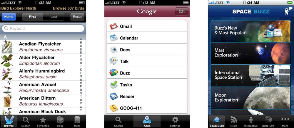
Finally, many apps show Thumbnail-and-Text List of other, diverse kinds of items: birds (from iBird Explorer), products (the Google iPhone app), and menu items in a complex information architecture (Buzz Aldrin’s Portal to Science and Space Exploration); see Figure 10-16.
Infinite List

Use when
You need to show long lists of email messages, search results, an archive of articles or blog posts, or anything else that is effectively “bottomless.”
Users are likely to find desired items near the top, but they sometimes need to search further.
Why
The initial loading of a screenful or two of items is fast, and the user doesn’t get stuck waiting for a very long initial page load before she sees anything useful.
Each subsequent loading of a new chunk of items is also fast, and it’s under user control—the user decides when (and whether) she needs to load more items.
Since the new items are just appended to the current page, the user never has to context-shift by going to a new page to see new items, as she would with paginated search results.
How
When the page or list is initially sent to the mobile device, truncate the list at a reasonable length. That length will vary greatly with item size, download time, and the user’s goal—is she reading everything (as with Facebook), or just scanning a large number of items to find the one she wants (as with search results)?
At the bottom of the scrolled page, put a button that lets the user load and show more items. Let the user know how many more will be loaded.
Alternatively, you could use no button at all. After the user has loaded and can view the first chunk of items, silently start loading the next chunk. Append them to the visible list when they’re ready, and the user has scrolled down to the end of the original list. (This is your clue that the user may want to see more. If the user doesn’t scroll down, don’t bother getting more items.)
In software engineering, this well-known approach to managing lists of undefined length is often called lazy loading.
Examples
Several iPhone applications use Infinite List, including Mail (Figure 10-17), as well as iTunes and third-party apps such as Facebook (Figure 10-18). The iTunes button only loads 10 more items, which seems like too small a number for an eager music listener, but the Mail app loads many screenfuls of new messages; it seems to balance download time and quantity fairly well. The Facebook app, like the full-size Facebook page, loads up the first several pages of updates and then lets the user load more.
You can also do this with a web page. Gmail Buzz loads a few screenfuls of updates and then offers a “Load more” button; so does Mashable (see Figure 10-19).

Generous Borders
What
On devices with touch screens, put large margins and whitespace around buttons, links, and any other tappable control.
Use when
You need to use buttons with text labels, or a list of items, or ordinary text-based links—in short, any touch target that isn’t already large on the screen.
Why
Touch targets must be large enough for clumsy fingers to hit successfully. In particular, they need to be tall enough, which is challenging for buttons and links that consist only of text.
How
Surround each touch target with enough inner margin, border, and surrounding whitespace to make a sufficiently large hit target for fingertips.
One trick is to make the whitespace immediately surrounding a target tappable. The button will look the same size, thus fitting into your visual design as expected, but you gain a few pixels of sensitivity in each direction around the button. Dan Saffer, in Designing Gestural Interfaces, uses the term iceberg tips for controls such as these—they are bigger than they appear.
Exactly how big to make these targets is a very good question. Ideally, you want a size that ends up large enough on the physical device to be manipulated by most people—many of whom will have large fingers. Some others will not have great control over their fingertips. Yet others will be using their mobile devices in challenging conditions: bad light, moving vehicles, little attention to spare.
So ultimately, how big should you make your targets? It depends on whom you ask. There’s no consensus on minimum target size, but different references make these claims:
3/4 x 3/4 inches, separated by 1/8 inch (http://www.sapdesignguild.org/resources/TSDesignGL/Index.htm)
1 x 1 cm square (Nokia’s S60 5th Edition C++ Developer’s Library v2.1, among others)
44 x 44 pixels on an iPhone (iPhone Human Interface Guidelines)
And there’s more. See Luke Wroblewski’s discussion at http://www.lukew.com/ff/entry.asp?1085 for even more information.
Examples
The IMDb application for the iPhone reliably puts plenty of margin space around its touch targets. The whole application has a relaxed, uncramped feeling, as shown in Figure 10-21.

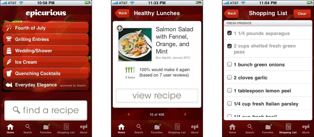
The Epicurious app is similar, though its visual styling is quite different. The buttons for key actions—“find a recipe,” “view recipe”—are quite large and distinctive, as shown in Figure 10-22.
Text Clear Button

Use when
Whenever a text field is needed in the mobile interface, consider using a Text Clear Button. It is especially valuable for fields that hold long strings of text, such as search strings, URLs, and multiline text.
Why
Erasing long strings of text letter by letter is slow and error-prone. Don’t force your users to do this.
Some mobile platforms have no facility for cut, copy, and paste. A cut operation may suffice for erasing text—so would the selection of all of a text field’s contents—but even if those exist it’s easier just to tap a single target to erase the field.
How
Put a simple “X” or “Clear” button into the text field. A button beside the text field can also work, though you’d want to usability-test it to find out whether users see it or not—they may see it as a “Go” or “Search” button instead.
If the platform offers a “Clear” button as a built-in feature for text fields, use it. I have watched users struggle to clear text fields when this feature was not provided, on early versions of Android—it’s painful to watch people erase a long search field letter by letter by letter. I’ve also watched people use iPhone apps that didn’t use its standard clear button; these users had a strong expectation that the “X” button would appear in text fields, and were unhappy when it wasn’t provided.
Examples
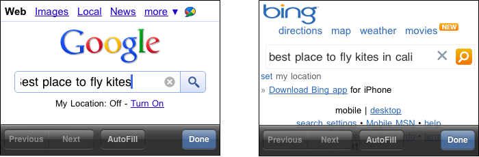
There aren’t many varied examples of this pattern to show as of this writing. Figure 10-24 shows the websites of two large search engines that insert a Text Clear Button into their search fields.
Loading Indicators
What
While a page or page section is loading, show a progress indicator in the place where it will be (or where the user tapped or clicked).
Use when
The user has to wait for content to load, especially in a page that changes dynamically in response to user interaction.
Why
Loading new content can be slow and erratic over mobile connections.
You should always show as much of a partially loaded page as you can, so the user can actually see something useful.
In general, progress indicators make loading times appear faster to a user. She is reassured that something is actually happening in response to a gesture, especially when that indicator appears where the gesture occurred.
How
Show as much of the page as can be loaded quickly, but if part of it takes a long time, such as a graphic or video, show a lightweight animated progress indicator where the graphic will appear. (The mobile platform may supply a default indicator.)
When the user initiates an action that causes part of the page to be reloaded—or loads a whole new page—show a progress indicator in situ on the page.
Examples
Flickr’s mobile website uses loading indicators very skillfully. When the user taps a picture thumbnail to see the whole picture, the thumbnail is overlaid by a Flickr logo that moves until the new image is ready to show (see Figure 10-26).

When an iPhone installs a new app, the app’s icon literally shows a miniature progress bar to show how far it’s gotten with the download (see Figure 10-27). It’s cute, and its meaning is unmistakable.

Richly Connected Apps

What
Inside your mobile app put direct links to other apps, such as the phone dialer, map, or browser. “Prefill” them with data from the user’s current context.
Use when
The mobile app shows data that is “connectable” in obvious ways, such as phone numbers and hyperlinks.
More subtly, your app may offer ways to capture images (via the device camera), sound, or video. It may even be aware of social networking conventions, such as Facebook or Twitter usernames. In all cases, your app might direct the user to another app to perform these device-based functions.
Why
A user can only see one mobile app at a time, even when multiple apps are being used at once, and it’s annoying to switch between them by hand.
Mobile devices often have enough context and available functionality to offer intelligent paths between apps.
As of this writing, mobile devices have no good way to arbitrarily shuffle small amounts of information from one application to another. On the desktop, you can type easily, or use copy and paste, or even use the filesystem. You don’t have those options on a mobile platform. So, you need to support moving that data automatically.
How
In your app, keep track of data that might be closely associated with other apps or services. When the user taps or selects that data, or uses special affordances that you provide, open another app and handle the data there.
Here are some examples. Consider all the ways that data in your app can connect directly to other mobile functions.
Phone numbers connect to the dialer.
Addresses connect to the map, or to the contacts app.
Dates connect to the calendar.
Email addresses connect to the email app.
Hyperlinks connect to the browser.
Music and videos connect to media players.
In addition, you might be able to do such things as take a picture, or use a map, entirely within the context of your application.
You can do some of this on a desktop, but the walled-garden nature of many mobile devices makes it easier to launch the “right” app for certain kinds of data. You don’t have to decide which email reader to use, or which address or contact management system, and so on. Plus, many mobile devices supply a phone dialer, a camera, and geographic location services.
Examples
The Freedom Trail application for the iPhone, shown in Figure 10-28, explicitly illustrates its links to other apps. The user chooses whether to follow them for more information, or just to stay within the app; this transparency is useful and refreshing.
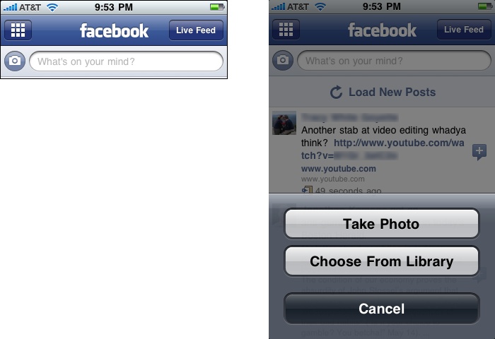
The Facebook app for iPhone connects to the camera on the device (see Figure 10-29). The integration is close; users can take a picture and immediately post it to Facebook, without ever seeming to leave the Facebook app. Facebook can also reach the preexisting photos on the iPhone.
The iPhone’s map application (Figure 10-30) connects to the contacts app to add a person’s address to her contact info, and to email and MMS for sharing a location. (Of course, many other applications, both mobile and otherwise, also have “Email this” or “Share this” features. See the Sharing Widget pattern in Chapter 9, for example.)

Streamlined Branding

What
Use your organization’s logo, colors, and other brand elements on the mobile site or app, but keep them small on the screen and fast to load.
Use when
All mobile apps or sites that are associated with a company or organization should use this.
Why
Users need to be able to identify your app or site as yours. In usability testing, people respond well to reliable, familiar branding, especially when the brand is already known outside of the mobile context.
Mobile screens don’t have much space to spare for elements that aren’t actual content.
Mobile network connections can be slow, and heavyweight images don’t download fast enough.
How
Create a small version of your logo, no taller than around 50 pixels, so that it takes up as little vertical space as you can get away with. If you’re creating different designs for different screen sizes or platforms, consider making different versions of the logo for each.
Apply your brand’s colors and font families in the mobile design. A basic text interface may function well enough, but it won’t look professional or polished.
Avoid using very large and complex images as stylistic elements. Download time is as important in a mobile context as on the desktop (and often more so). If you’re working in HTML, depend on stylesheets when you can, rather than handcrafted images.
Strong contrast and large, readable text will help people use your mobile site when the conditions are poor (bright light, motion, distraction). Even if your brand calls for visual subtlety and small, tasteful text, do what needs to be done for the sake of usability—adapt the brand look to the platform.
Examples
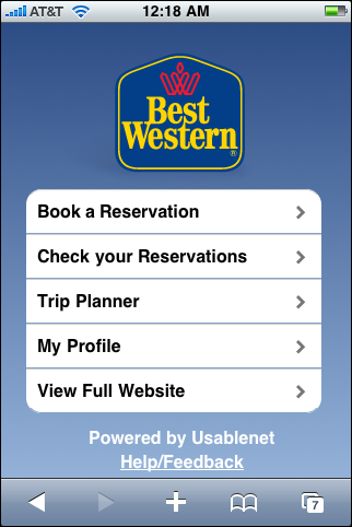
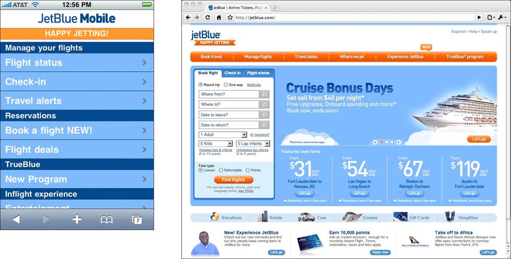
There are good examples of this pattern all over the mobile web. Going back to the first example given in this chapter, JetBlue pares down its branding to a look that is polished and recognizable, but works well on even a tiny mobile device (see Figure 10-32).
Fandango’s mobile site also takes a minimalist approach (see Figure 10-33). Like JetBlue, Fandango uses a polished-looking logo and style, but the site loads fast and can be used on tiny screens. None of the bandwidth-hogging images, ads, or video is loaded onto the mobile device.

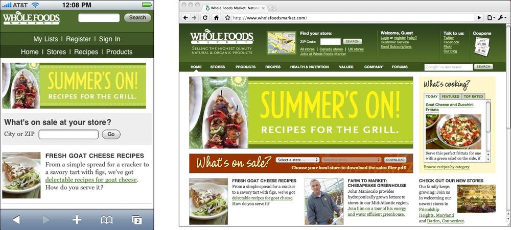
Whole Foods maintains a very consistent brand look across its full-page and mobile sites. But its mobile site consumes more above-the-fold space than necessary with top navigation, and it downloads several large images, making it slower than it could be (see Figure 10-34).
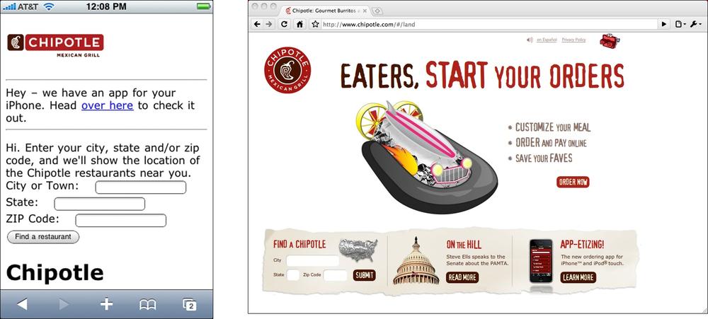
Chipotle’s mobile website shows how not to do mobile branding (see Figure 10-35). The brand is strong enough on the main site, but none of it shows up on the mobile site except for a too-small version of the logo! The site uses only a neutral font and colors. (To be fair, the site does supply an iPhone app that has stronger branding, but it’s not likely that a very occasional customer will bother with the hassle of downloading it if the website fills her needs.)