Chapter 2. Organizing the Content: Information Architecture and Application Structure
At this point, you know what your users want out of your application or site. You’re targeting a chosen platform: the Web, the desktop, a mobile device, or some combination. You know which idiom or interface type to use—a form, an e-commerce site, an image viewer, or something else—or you may realize that you need to combine several of them. If you’re really on the ball, you’ve written down some typical scenarios that describe how people might use high-level elements of the application to accomplish their goals. You have a clear idea of what value this application adds to people’s lives.
Now what?
You could start making sketches of the interface. Many visual thinkers do that at this stage. If you’re the kind of person who likes to think visually and needs to play with sketches while working out the broad strokes of the design, go for it.
But if you’re not a visual thinker by nature (and sometimes even if you are), hold off on the interface sketches. They might lock your thinking into the first visual designs you put on paper. You need to stay flexible and creative for a little while, until you work out the overall organization of the application.
It can be helpful to think about an application in terms of its underlying data and tasks. What objects are being shown to the users? How are they categorized and ordered? What do users need to do with them? And now that you’re thinking abstractly about them, how many ways can you design a presentation of those things and tasks?
These lines of inquiry may help you think more creatively about the interface you’re designing.
Information architecture (IA) is the art of organizing an information space. It encompasses many things: presenting, searching, browsing, labeling, categorizing, sorting, manipulating, and strategically hiding information. Especially if you’re working with a new product, this is where you should start.
The Big Picture
Let’s look at the very highest level of your application first. From the designer’s perspective, your site or application probably serves several functions: a software service—maybe several services—sharing information, selling a product, branding, social communication, or any number of other goals. Your home page or opening screen may need to convey all of these. Via text and imagery, users should be directed to the part of your site or app that accomplishes their purposes.
At this level, you’ll make decisions about the whole package. What interaction model will it use? The desktop metaphor? The simpler model of a traditional website? Or a richly interactive site that splits the difference? Is it a self-contained device such as a mobile phone or digital video recorder, for which you must design the interactions from scratch? The interaction model establishes consistency throughout the artifact, and it determines how users move through and among the different pieces of functionality. I won’t go into more detail at this level, because almost all of the patterns in this book apply at smaller scales.
Now let’s look at a smaller unit within an application or site: pages that serve single important functions. In an application, this might be a main screen or a major interactive tool; in a richly interactive website, it might be a single page, such as Gmail’s main screen; in a more static website, it might be a group of pages devoted to one process or function.
Any such page will primarily do one of these things:
Show one single thing, such as a map, book, video, or game
Show a list or set of things
Provide tools to create a thing
Facilitate a task
Most apps and sites do some combination of these things, of course. A website might show a feature article (1), a list of additional articles (2), with a wiki area for members to create pages (3), and a registration form for new members (4). That’s fine. Each of these parts of the site should be designed using patterns and tools to fit that particular organizing principle.
This list mirrors some of the work done by Theresa Neil with application structures in the context of rich Internet applications (RIAs). She defines three types of structures based on the user’s primary goal: information, process, and creation.[2]
This list gives us a framework within which to fit the idioms and patterns we’ll talk about in this and other chapters.
Show One Single Thing
Show One Single Thing
Is this really what your page does? The whole point of the page’s design is to show or play a single piece of content, with no list of other pieces that users could also see, no comments, and no table of contents or anything like that?
Lucky you!
All you really need, then, is to manage the user’s interaction with this one thing. The IA is probably straightforward. There might be small-scale tools clustered around the content—scrollers and sliders, sign-in box, global navigation, headers and footers, and so forth—but they are minor and easily designed. Your design might take one of these shapes:
A long, vertically scrolled page of flowed text (articles, books, and similar long-form content).
A zoomable interface for very large, fine-grained artifacts, such as maps, images, or information graphics. Map sites such as Google Maps provide some well-known examples.
The “media player” idiom, including video and audio players.
As you design this interface, consider the following patterns and techniques to support the design:
Alternative Views, to show the content in more than one way.
Many Workspaces, in case people want to see more than one place, state, or document at one time.
Deep-linked State, in Chapter 3. With this, a user can save a certain place or state within the content so that he can come back to it later or send someone else a URL.
Sharing Widget and other social patterns, in Chapter 9.
Some of the mobile patterns described in Chapter 10, if one of your design goals is to deliver the content on mobile devices.
Show a List of Things
This is what most of the world’s digital artifacts seem to do. Lists are everywhere! The digital world has converged on many common idioms for showing lists, most of which are familiar to you—simple text lists, menus, grids of images, search results, lists of email messages or other communications, tables, trees. There are more, of course.
Lists present rich challenges in information architecture. How long is the list? Is it flat or hierarchical, and if it is a hierarchy, what kind? How is it ordered, and can the user change that ordering dynamically? Should it be filtered or searched? What information or operations are associated with each list item, and when and how should they be shown?
Because lists are so common, a solid grasp of the different ways to present them can benefit any designer. It’s the same theme again—by learning and formalizing these techniques, you can expand your own thinking about how to present content in different and interesting ways.
A few patterns for designing an interface around a list are described in this chapter (others are in Chapter 5). You can build either an entire app or site, or a small piece of a larger artifact, around one of these patterns. They set up a structure that other display techniques—text lists, thumbnail lists, and so on—can fit into. Other top-level organizations not listed here might include calendars, full-page menus, and search results.
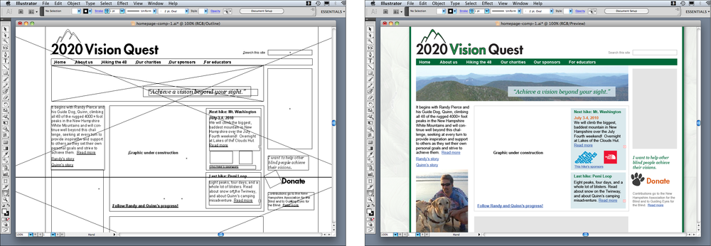
Feature, Search, and Browse is the pattern followed by countless websites that show products and written content. Searching and browsing provide two ways for users to find items of interest, while the front page features one item to attract interest.
Blogs, news sites, email readers, and social sites such as Twitter all use the News Stream pattern to list their content, with the most recent updates at the top.
Picture Manager is a well-defined interface type for handling photos and other pictorial documents. It can accommodate hierarchies and flat lists, tools to arrange and reorder documents, tools to operate directly on pictures, and so on.
Once you’ve chosen an overall design for the interface, you might look at other patterns and techniques for displaying lists. These fit into the patterns mentioned earlier; for instance, a Picture Manager might use a Thumbnail Grid, a Pagination, or both to show a list of photos—all within a Two-Panel Selector framework. See Chapter 5 for a thorough discussion.
Provide Tools to Create a Thing
Builders and editors are the great dynastic families of the software world. Microsoft Word, Excel, PowerPoint, and other Office applications, in addition to Adobe Photoshop, Illustrator, In Design, Dreamweaver, and other tools that support designers are all in this category. So are the tools that support software engineers, such as the various code editors and integrated development environments. These have long histories, large user bases, and very well established interaction styles, honed over many years.
Most people are familiar with the idioms used by these tools: text editors, code editors, image editors, editors that create vector graphics, and spreadsheets.
Chapter 8 of the previous edition of this book discusses how to design different aspects of these tools. But at the level of application structure or IA, the following patterns are often found:
Canvas Plus Palette describes most of these applications. This highly recognizable, well-established pattern for visual editors sets user expectations very strongly.
Almost all applications of this type provide Many Workspaces—usually windows containing different documents, which enable users to work on them in parallel.
Alternative Views let users see one document or workspace through different lenses, to view various aspects of the thing they’re creating.
“Blank Slate Invitation” is named and written about in Designing Web Interfaces (http://oreilly.com/catalog/9780596516253/) by Bill Scott and Theresa Neil (O’Reilly), and is a profoundly useful pattern for builders and editors. It is closely related to the Input Hints pattern in Chapter 8.
Facilitate a Single Task
Maybe your interface’s job isn’t to show a list of anything or create anything, but simply to get a job done. Signing in, registering, posting, printing, uploading, purchasing, changing a setting—all such tasks fall into this category.
Forms do a lot of work here. Chapter 8 talks about forms at length and lists many controls and patterns to support effective forms. Chapter 6 defines another useful set of patterns that concentrate more on “verbs” than “nouns.”
Not much IA needs to be done if the user can do the necessary work in a small, contained area, such as a sign-in box. But when the task gets more complicated than that—if it’s long, or branched, or has too many possibilities—part of your job is to work out how the task is structured.
Much of the time, you’ll want to break the task down into smaller steps or groups of steps. For these, a Wizard might work well for users who need to be walked through the task.
A Settings Editor is a very common type of interface that gives users a way to change the settings or preferences of something—an application, a document, a product, and so on. This isn’t a step-by-step task at all. Here, your job is to give users open access to a wide variety of choices and switches and let them change only what they need, when they need it, knowing that they will skip around.
The Patterns
Several of the patterns in this chapter are large-scale, defining the interactions for large sections of applications or sites (or sometimes the entire thing). Some of these, including Picture Manager, Canvas Plus Palette, and Feature, Search, and Browse, are really clusters of other patterns that support each other in well-defined ways—they are “guilds” of smaller-scale patterns.
The last three patterns are more “meta,” in the sense that they can apply to the other patterns in the preceding list. For instance, almost any content, document, or list can be shown in more than one way, and the ability to switch among those Alternative Views can empower users.
Likewise, a user may want to instantiate the interface more than once, to maintain several trains of thought simultaneously—consider the tabs in a browser window, all showing different and unrelated websites. Offer the Many Workspaces pattern to these users.
Many patterns, here and elsewhere in the book, contribute in varying degrees to the learnability of an interface. Multi-Level Help sets out ways to integrate help into the application, thus supporting learnability for a broad number of users and situations.
Feature, Search, and Browse
What
Put three elements on the main page of the site or app: a featured article or product, a search box, and a list of items or categories that can be browsed.
Use when
Your site offers users long lists of items—articles, products, videos, and so on—that can be browsed and searched. You want to engage incoming users immediately by giving them something interesting to read or watch.
Why
These three elements are found together on many, many successful sites. Once you are attuned to them, you can find them just about everywhere.
Searching and browsing go hand in hand as two ways to find desired items: some people will know what they’re looking for and zero in on the search box, while others will do more open-ended browsing through the lists and categories you show them.
Featured items are how you “hook” the user. They’re far more interesting than just category lists and search boxes, especially when you use appealing images and headlines. A user who lands on your page now has something to read or experiment with, without doing any additional work at all—and he may find it more interesting than whatever he originally came for.
How
Place a search box in a prominent location, such as an upper corner, or in a banner across the middle top of the site. Demarcate it well from the rest of the site—use whitespace to set it off, and use a different surrounding background color if necessary.
Try to eliminate all other text fields above the fold (except the sign-in box, if you have one), to make sure users don’t confuse those with the search box. People looking for a search box tend to zero in on the first text field they come across. Make sure they find the right one!
Set aside Center Stage (see Chapter 4) for the featured article, product, or video. Very near it, and still above the fold, place an area for browsing the rest of the site’s content. Most sites show a list of topics or product categories. These might be links to pages devoted to those categories. Or they might change the current page’s content, replacing the feature with a list of items in that category; see the Two-Panel Selector pattern in Chapter 5.
If the category labels open in place to show subcategories, the list behaves like a tree. Some sites, such as Amazon, turn the category labels into menus: when the pointer rolls over the label, a menu of subcategories appears.
Choose the features well. Features are a good way to sell items, advertise specials, and call attention to breaking news. However, they also define what your site is about. The items you choose to feature say a lot about the site’s values. Features that talk about altruistic or charitable efforts have a very different appeal from those that advertise specific products. As always, know your users. What will they want to know about? What will capture their attention and hold them at your site?
As the user browses through categories and subcategories, help him “stay found” with the Breadcrumbs pattern (Chapter 3).
Examples
This pattern applies well to websites such as news outlets (CNET, Figure 2-2), publishers (Lulu), knowledge bases (About.com, Figure 2-3), and, of course, e-commerce sites (Amazon, Figure 2-4; and EMS, at the top of the pattern in Figure 2-1).

News Stream

What
Show time-sensitive items in a reverse chronological list, with the latest items at the top. Update it dynamically, and combine the items from different sources or people into one single stream.
Use when
Your site or app uses one or more communication channels, such as blogs, email, social site updates, or news sites, to deliver timely content to users.
This channel may be personal—a user “owns” it, like an email client or Facebook friends list—or public, such as a website or public Twitter stream.
Why
People can keep up with a news stream easily, since the latest items reliably appear on top with no effort on the part of the user. They can check in often and be assured of seeing what they need to see.
People go to many sites or apps each day to keep up with their friends’ activities, engage in conversations, or follow topics or blogs of interest. When multiple “news” sources can be blended in one place, it’s easier to keep track of it all.
This pattern supports the Microbreaks behavior pattern in Chapter 1. A glance at a News Stream application can give a user lots of useful information (or entertainment) with very little time or effort.
From the perspective of a publisher, such as a website, having a News Box (Chapter 9) or the equivalent on your main page lets visitors see what’s new and noteworthy at your organization. Large organizations in particular may have many initiatives going on that would interest visitors: new products, blog entries, videos, news articles, charity work, and other content.
How
List incoming items in reverse chronological order. If the technology permits, “push” new items onto the top of the list without waiting for the user to request an update, but offer a way for the user to get an immediate update or refresh anyway.
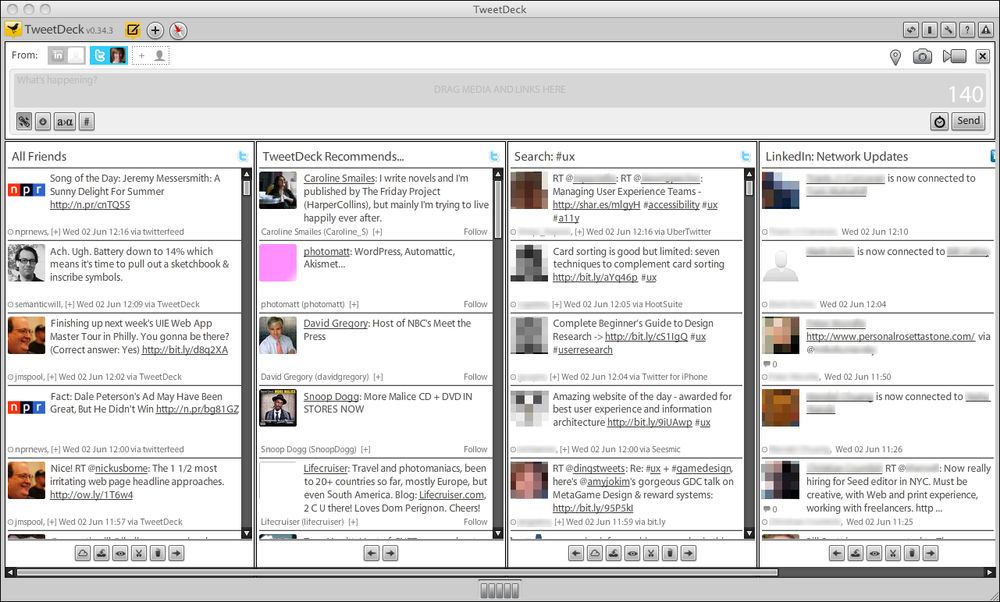
Very busy streams can be split up into manageable substreams by topic, sender, source, search terms, or other factors—you could let the user choose which one(s) to show. Services such as Facebook, FriendFeed, Twitter, and some RSS readers show clickable lists of these substreams to the left or right of the incoming content (thus implementing the Two-Panel Selector pattern). Others, such as Tweetdeck, use Many Workspaces to show multiple parallel panels of incoming content.
Information shown with each item might include:
- What
For short micro-updates, show the whole thing. Otherwise, show a title, a teaser that’s a few words or sentences long, and a thumbnail picture if one is available.
- Who
This might be the person who wrote an update, the blog where an article was posted, the author of said article, or the sender of an email. Actual person names humanize the interface, but balance this against recognition and authoritativeness—the names of news outlets, blogs, companies, and so forth are important, too. Use both if that makes sense.
- When
Give a date or timestamp; consider using relative times, such as “Yesterday” and “Eleven minutes ago.”
- Where
If an item’s source is a website, link to that website. If it comes from one of your organization’s blogs, link to that. (But here’s another interpretation of “where”: can you get geolocation data about the item, and show it on a map?)
When there’s more to an item than can be shown easily in the list display, show a “More” link or button. You might design a way to show the entire contents of an item within the News Stream window. The News Stream is a list, so you can choose among Two-Panel Selector, One-Window Drilldown, and List Inlay. Examples abound of each model.
Give the user ways to respond immediately to incoming items. Stars, thumbs-up, liking, and favoriting are available in some systems—these all provide low-effort feedback and “handshaking” among people who don’t have time to write out long replies. But allow those long replies to be written, too! By placing controls and text fields immediately next to an item in a News Stream, you encourage responsiveness and interaction. This is usually a good thing in social systems.
Sharing of items, either privately via email or semipublicly via a provided social service, is also common in these interfaces. See the Sharing Widget pattern in Chapter 9.
News Stream designs for mobile devices are fairly straightforward as of this writing. Almost all of them devote the full screen to a single list—often a Thumbnail-and-Text List (Chapter 10) with richly formatted text—and users can drill down to an item by simply tapping or clicking it in the list.
Many News Stream services, including Twitter and Facebook, use the Infinite List pattern (see Chapter 10) for both their mobile and full-screen designs. This pattern lets users load a page or two of the most recent updates, and gives the option of loading more to go “backward in time.”
Some resources use the term activity stream for a very closely related concept: the time-ordered stream of actions (usually social actions) performed by a single entity such as an individual, system, or organization. This is a useful concept, and it doesn’t really conflict with the News Stream pattern, which talks about the stream of activities that are of interest to an individual or group of users, not generated by them. News Stream will usually have multiple diverse sources.
Examples
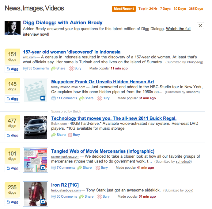
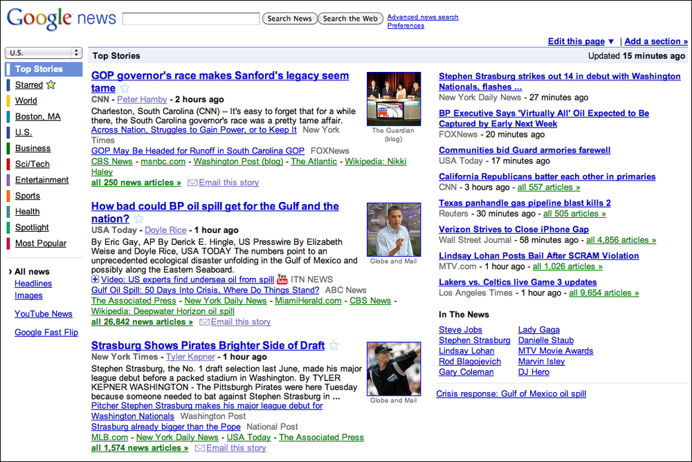
Digg (Figure 2-6) and Google News (Figure 2-7) are both public News Stream. Their purposes and designs are very different, but they share some of the features talked about in this pattern. Digg shows all incoming items in one large list; Google News splits them into topics, within which the most recent news articles are shown first. (Drilling down into the topic shows a page with a single list.) Both show comparable item information: title, teaser, linked source, and a relative timestamp. They use human names: Digg shows the submitter’s name, while Google News shows the article author’s name. And on both sites, you can mark items of interest—with a “digg” in one, a star in the other—and share them via email.
The previous two examples show public News Stream; the next two show personal News Stream.
Social networking services, news aggregators, and private communications (such as email) provide plenty of examples of personal News Stream. In Figures Figure 2-8 and Figure 2-9 we see Facebook and Google Reader, which is an RSS-based aggregator. They both use a single reverse chronological list of items, each of which shows a linked source, title and teaser (when appropriate), author name, and relative timestamp. Users can “like” items, share them, and follow links to read more.
But note the differences, too. Google Reader lets the user split a potentially huge combined stream into substreams, based on source and topic; these are displayed in a selectable tree list on the left, thus making the window a Two-Panel Selector. Facebook doesn’t give the user this option by default, as of this writing. Instead, it automatically (and unpredictably) switches between a filtered “Top Stories” view, and a “Most Recent” view that shows everything. However, Facebook excels at the immediate response. Posting a short comment to a Facebook entry is almost as easy as thinking about it.


Picture Manager
What
Use thumbnails, item views, and a browsing interface to create a familiar structure for managing photos, videos, and other pictorial items.
Use when
People use your software to work with lists or collections of pictorial things: photos, drawings, video clips, and so on. The list might be in a web page, or in an application, or both. It might allow editing by the owner of the content, or it might simply show the content to the public for browsing, viewing, and comments.
Why
This is a distinct style of application that many people recognize. It is also a guild of patterns—a set of patterns linked together and supporting each other in predictable ways. Once someone sees a Thumbnail Grid of images or videos in the right context, she knows what to expect: browse, click to view, set up slideshows or playlists, and so on.
Patterns and other components that often play parts in this guild include:
Tabs and Collapsible Panels
Trees or outlines
Search box
Social comments and discussion
How
Set up two principal views: a Thumbnail Grid of the items in the list, and a large view of a single item. Users will go back and forth between these. Design a browsing interface and associate it with the Thumbnail Grid to let users explore a large collection easily.
The Thumbnail Grid
Use this pattern to show a sequence of items. Many Picture Manager show a small amount of metadata with each item, such as its filename or author, but do this with care, as it clutters the interface. You might offer a control to adjust the size of the thumbnails. There may also be a way to sort the items by different criteria, such as date, label, or rating, or to filter it and show only the starred items (for instance).
When a user clicks on an item, show it immediately in the single-item view. Applications often let the user traverse the grid with the keyboard—for example, with the arrow keys and space bar. (See the Keyboard Only pattern in Chapter 1.)
If the user owns the items, offer ways to move, reorder, and delete items at this level in the interface. This implies having a multiple-selection interface, such as Shift-select, checkboxes, or lassoing a group of items with the pointer. Cut, copy, and paste should also work in applications.
You can offer slideshow or playlist functionality to all users at the Thumbnail Grid level.
The single-item view
Show a large view of the selected image (or a player, for a video). Display metadata—information about the item—next to it. This view can be next to the Thumbnail Grid if the window is large, or it might replace the area used by the grid. In practice, this means choosing between a Two-Panel Selector and a One-Window Drilldown. See Chapter 5 for these list-related patterns.
If the interface is a website or is otherwise web-connected, you might choose to offer social features at this level. Comments, liking or thumbs-up, and sharing might be here; see the Sharing Widget and other patterns in Chapter 9. Likewise, tagging or labeling can also be done here, either privately or publicly. An “other items you may like” feature is sometimes found in web-based public collections.
Editing features for individual items will live here, also. For instance, a photo manager might offer simple functionality such as cropping, color and brightness adjustment, and red-eye reduction. Metadata properties could be edited here, too. If a full editor is too complex to present here, give the user a way to launch a “real” editor. (Adobe Bridge, for example, lets the user launch Photoshop on a photo.) Use Button Groups to maintain a simple, comprehensible visual grouping of all these features.
Link the item to the previous and next items in the list by providing “previous” and “next” buttons, especially if you use One-Window Drilldown to display the single-item view (which also requires a “back” button). See the Pyramid navigational pattern in Chapter 3.
The browsing interface
The contents of the Thumbnail Grid should be driven by a browsing interface that might be complex, simple, or nearly nonexistent, depending on the nature of the application.
At minimum, most interfaces should offer a search box, either to search an individual user’s items or to search all public items (or both).
Private photo and video management interfaces—especially desktop apps such as Picasa and iPhoto—should let the user browse the filesystem for images stored in different directories. If users can group items into albums, sets, projects, or other types of collections, these should be available in a browsing interface, too. Most also permit favoriting or starring of items.
Most apps and sites show the browsing interface above or to the left of the Thumbnail Grid. For highly interactive software, they relate to each other as a Two-Panel Selector: when the user selects a category or folder (or enters a search term), the contents immediately show up in the Thumbnail Grid next to the browsing interface.
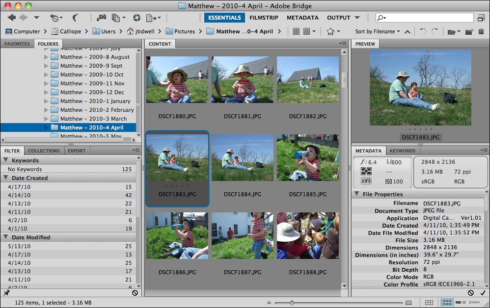
Filters are sometimes found here. Adobe Bridge puts filters into its browsing interface; more than 10 properties can be used to slice through a large collection of items, including keywords, modification date, camera type, and ISO.
Websites that host public collections, such as YouTube and Flickr, sometimes use the entire home page as a browsing interface. Sites such as these are faced with an interesting choice: when a signed-in user who “owns” content visits the home page, should she see her own personal collections, or the featured content that the rest of the public sees? Or both?
Examples
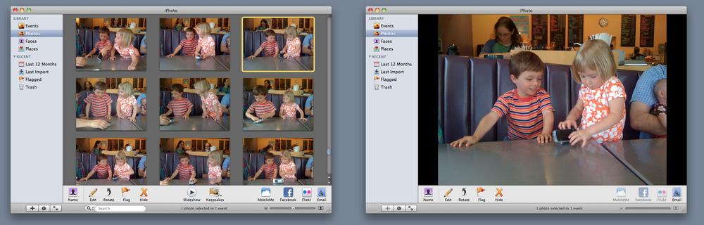
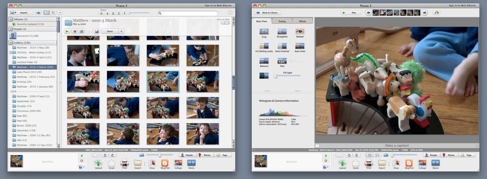
Picasa and Adobe Bridge, along with iPhoto (shown in Figure 2-10), are desktop applications for managing personal collections of images. Their browsing interfaces—all Two-Panel Selector—vary in complexity from iPhoto’s very simple design to Adobe Bridge’s numerous panels and filters. Picasa (Figure 2-11) and iPhoto use One-Window Drilldown to reach the single-item view, while Adobe Bridge (Figure 2-12) puts all three views together on one page.
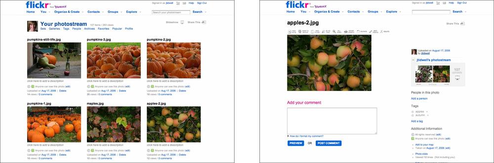
Flickr’s design (Figure 2-13) has been mimicked by many other web-based image and video collections. Browsing images at Flickr is different from browsing in a private, desktop-based application—sets, pools, groups, and users’ public collections are the means by which one explores the Flickr universe. Social elements are critical to Flickr’s vitality, too. But you can still see a Thumbnail Grid, a single-item view reached via One-Window Drilldown, item details, and a Pyramid navigational pattern (previous, next, up).
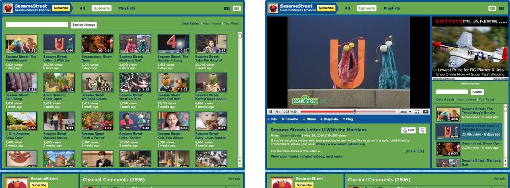
Even video sites fit this pattern. When you view someone’s YouTube channel, you can choose to see either a Thumbnail Grid, or a list beside a video player (the default). (Both options are shown in Figure 2-14.) Clicking a thumbnail brings you to the page for that video, where detailed information and discussion are shown. Visitors can browse by looking at playlists, the latest videos added, the most-viewed videos, and the top-rated videos; a search box is also provided, as it is everywhere.
TED’s browsing interface is more complex (see Figure 2-15). Its home page offers a dynamically changeable infographic made up of thumbnails of different sizes. By toggling fields on and off, visitors can narrow down the field of videos and find the ones they want. Rolling over a thumbnail gives item details. Clicking on it brings you to a single-item view, which looks a lot like YouTube’s.

In other libraries
The Image Browser pattern at Welie.com describes some aspects of a Picture Manager:
http://welie.com/patterns/showPattern.php?patternID=image-browsing
Dashboard

What
Arrange data displays into a single information-dense page, updated regularly. Show users relevant, actionable information, and let them customize the display as necessary.
Use when
Your site or application deals with an incoming flow of information from something—web server data, social chatter, news, airline flights, business intelligence information, or financials, for example. Your users would benefit from continuous monitoring of that information.
Why
This is a familiar and recognizable page style. Dashboards have a long history, both online and in the physical world, and people have well-established expectations about how they work: they show useful information, they update themselves, they usually use graphics to display data, and so on.
A dashboard is also a guild of interlocking patterns and components. Many online dashboards use these in predictable ways:
Tabs and Collapsible Panels
Lists and tables of various kinds (see Chapter 5)
Information graphics (see Chapter 7)
How
Determine what information users need or want to see. This isn’t as simple as it sounds, because you need an editorial eye—you can’t just splatter the screen with confusing or unimportant data, or people won’t be able to pick out the parts that matter. Remove, or at least deemphasize, information that doesn’t help the user.
Use a good visual hierarchy (see Chapter 4) to arrange lists, tables, and information graphics on the page. Try to keep the main information on one page, with little or no scrolling, so people can keep the window on-screen and see everything at a glance. Group related data into Titled Sections, and use tabs only when you’re confident that users won’t need to see the tab contents side by side.
Use One-Window Drilldown to let users see additional details about the data—they should be able to click on links or graphics to find out more. Datatips work well to show individual data points when the pointer rolls over an information graphic.
Choose appropriate and well-designed information graphics for the data you need to show. Gauges, dials, pie charts, and 3D bar charts look nice, but they are rarely the best way to show comparative information at a glance—simple line and bar charts express data better, especially time-based data. When numbers and text are more relevant than graphics, use lists and tables. Row Striping is a common pattern for multicolumn data tables.
People will try to get actionable information from the dashboard at a glance, without looking hard at every element on the page. So, when you show text, consider highlighting keywords and numbers so that they stand out from surrounding text.
Should your users be able to customize their dashboard displays? Many dashboards do offer customization, and your users may expect it. One way to customize a dashboard page is to rearrange the sections—iGoogle and My Yahoo! both offer Movable Panels to users, in addition to choosing which gadgets get shown.
Examples
My Yahoo! is a portal-style dashboard, showing weather, news, email, and other personalized information to a signed-in user (see Figure 2-17). This is the kind of window that someone would check frequently throughout the day or week. It can be rearranged via Movable Panels, and a user can decide which sections and widgets to show.

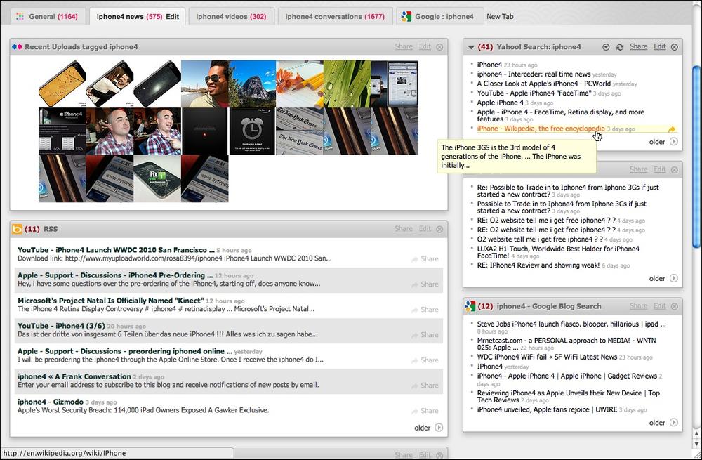
Netvibes offers fully customizable dashboards that can be hooked up to a broad-based web search (see Figure 2-18). With this, someone can stay abreast of conversations, pictures, and articles about a fast-moving topic. A tool tip shows the first few words of an article, which can help the user to decide whether to click through or not.
Google Analytics is more like the Fitbit example in Figure 2-16 at the top of the pattern—it uses information graphics to show a visual snapshot of a system. In Figure 2-19, the system is a website, and the dashboard illustrates log data.

In other libraries
http://quince.infragistics.com/Patterns/Dashboard.aspx
http://patternry.com/p=information-dashboard/
Dashboard is one of the canonical RIA screen layouts described by Bill Scott and Theresa Neil. An article in UX Magazine explains these layouts:
http://www.uxmag.com/design/rich-internet-application-screen-design
Finally, you may be interested in Stephen Few’s book, Information Dashboard Design: The Effective Visual Communication of Data (O’Reilly, http://oreilly.com/catalog/9780596100162/).
Canvas Plus Palette
What
Place an iconic palette next to a blank canvas; the user clicks on the palette buttons to create objects on the canvas.
Use when
You’re designing any kind of graphical editor. A typical use case involves creating new objects and arranging them on some virtual space.
Why
This pair of panels—a palette with which to create things, and a canvas on which to put them—is so common that almost every user of desktop software has seen it. It’s a natural mapping from familiar physical objects to the virtual on-screen world. And the palette takes advantage of visual recognition: the most common icons (paintbrush, hand, magnifying glass, etc.) are reused over and over again in different applications, with the same meaning each time.
How
Present a large empty area to the user as a canvas. It might be in its own window, as in Photoshop (Figure 2-20), or embedded in a single page with other tools. The user just needs to see the canvas side by side with the palette. Place additional tools—property panels, color swatches, and so on—to the right or bottom of the canvas, in small palette-like windows or panels.
The palette itself should be a grid of iconic buttons. They can have text in them if the icons are too cryptic; some GUI-builder palettes list the names of GUI components alongside their icons, for instance. So does Visio, with its palettes of complex visual constructs tailored for specific domains. But the presence of icons is necessary for users to recognize the palette for what it is.
Place the palette to the left or top of the canvas. It can be divided into subgroups, and you may want to use Module Tabs or Collapsible Panels to present those subgroups.
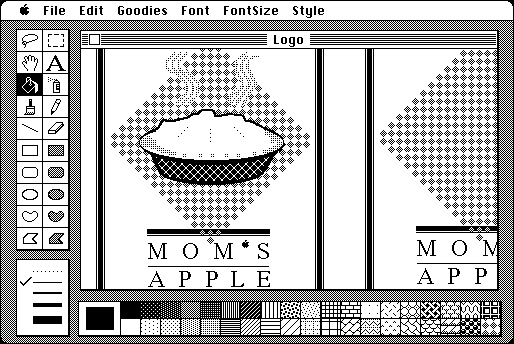
Most palette buttons should create the pictured object on the canvas. But many builders have successfully integrated other things, such as zoom mode and lassoing, into the palette. This started early; MacPaint mixed its modes into its palette (see Figure 2-24) and people have learned what the arrow, hand, and other icons do.
The gestures used to create items on a palette vary from one application to another. Some use drag-and-drop only; some use a single click on the palette and a single click on the canvas; and some use One-off Modes, Spring-Loaded Modes (see the previous edition of this book for both of these patterns), and other carefully designed gestures. I have always found that usability testing in this area is particularly important, since users’ expectations vary greatly.
Examples
The Raven vector editor (Figure 2-21), by Aviary, and Sumo Paint (Figure 2-22) are two web-based graphic editors that follow this pattern faithfully.


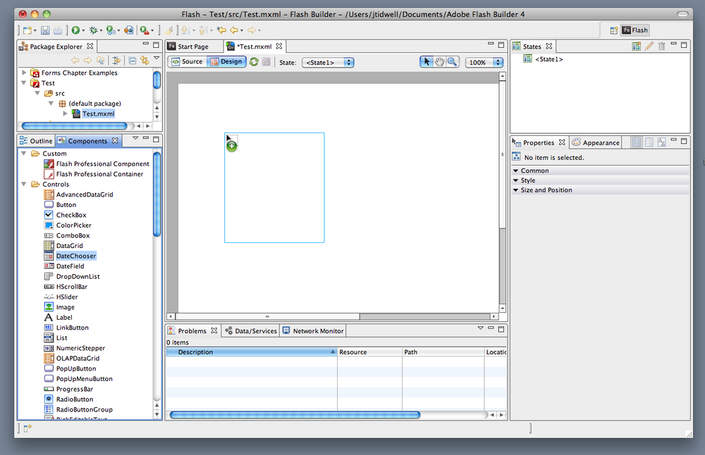
Adobe Flash Builder places its palette of Flex UI components at the lower left, as shown in Figure 2-23. Next to the icons, the palette shows text labels that clarify exactly what kind of component will be created for each palette item. Users of this application are assumed to be skilled enough to know the approximate names of the components they need. (Also shown is a drag operation from the palette to the canvas.)
Taking a trip back in time, let’s look at one of the interfaces that popularized this pattern: MacPaint (see Figure 2-24). The pattern hasn’t changed much since 1984—the basic elements are all there, in the same spatial configuration used by contemporary software such as Photoshop. Photoshop and other visual builders, in fact, still use many of MacPaint’s icons more than 20 years later.
In other libraries
Palette/Canvas is one of the canonical RIA screen layouts described by Bill Scott and Theresa Neil. An article in UX Magazine explains these layouts:
http://www.uxmag.com/design/rich-internet-application-screen-design
Wizard
Use when
You are designing a UI for a task that is long or complicated, and that will usually be novel for users—not something that they do often or want much fine-grained control over (such as the installation of a software package). You’re reasonably certain that the designer of the UI will know more than the user does about how best to get the task done.
Tasks that seem well suited for this approach tend to be either branched or very long and tedious—they consist of a series of user-made decisions that affect downstream choices.
The catch is that the user must be willing to surrender control over what happens when. In many contexts, that works out fine, since making decisions is an unwelcome burden for people doing certain things: “Don’t make me think, just tell me what to do next.” Think about moving through an unfamiliar airport—it’s often easier to follow a series of signs than it is to figure out the airport’s overall structure. You don’t get to learn much about how the airport is designed, but you don’t care about that.
But in other contexts, it backfires. Expert users often find Wizard frustratingly rigid and limiting. This is particularly true for software that supports creative processes such as writing, art, or coding. It’s also true for users who actually do want to learn the software; Wizard don’t show users what their actions really do, or what application state gets changed as choices are made. That can be infuriating to some people. Know your users well!
Why
Divide and conquer. By splitting up the task into a sequence of chunks, each of which can be dealt with in a discrete “mental space” by the user, you effectively simplify the task. You have put together a preplanned road map through the task, thus sparing the user the effort of figuring out the task’s structure—all he needs to do is address each step in turn, trusting that if he follows the instructions, things will turn out OK.
But the very need for a Wizard indicates that a task may be too complicated. If you can simplify a task to the point where a short form or a few button clicks can do the trick instead, that’s a better solution. (Keep in mind, too, that Wizard are considered a bit patronizing in some Asian cultures.)
How
“Chunking” the task
Break up the operations constituting the task into a series of chunks, or groups of operations. You may need to present these groups in a strict sequence, or not; sometimes there is value in breaking up a task into steps 1, 2, 3, and 4 just for convenience.
A thematic breakdown for an online purchase may include screens for product selection, payment information, a billing address, and a shipping address. The presentation order doesn’t much matter because later choices don’t depend on earlier choices. Putting related choices together just simplifies things for people filling out those forms.
You may decide to split up the task at decision points so that choices made by the user can change the downstream steps dynamically. In a software installation Wizard, for example, the user may choose to install optional packages that require yet more choices; if she chooses not to do a custom installation, those steps are skipped. Dynamic UIs are good at presenting branched tasks such as this, because the user never has to see anything that’s irrelevant to the choices she made.
In either case, the hard part of designing this kind of UI is striking a balance between the sizes of the chunks and the number of them. It’s silly to have a 2-step Wizard, and a 15-step Wizard is tedious. On the other hand, each chunk shouldn’t be overwhelmingly large, or you’ve lost some benefits of this pattern.
Physical structure
Wizard that present each step in a separate page, usually navigated with Back and Next buttons, are the most obvious and well-known implementation of this pattern. They’re not always the right choice, though, because now each step is an isolated UI space that shows no context—the user can’t see what went before or what comes next. But an advantage of such Wizard is that they can devote each page to that step completely, including illustrations and explanations.
If you do this, allow the user to move back and forth at will through the task sequence. Offer a way for the user to step backward, or to otherwise change her mind about an earlier choice. Additionally, many UIs show a selectable map or overview of all the steps, getting some of the benefits of a Two-Panel Selector. (In contrast to that pattern, a Wizard implies a prescribed order—even if it’s merely suggested—as opposed to completely random access.)
If you instead choose to keep all the steps on one page, you could use one of several patterns from Chapter 4:
Titled Sections, with prominent numbers in the titles. This is most useful for tasks that aren’t heavily branched, since all steps can be visible at once.
Responsive Enabling, in which all the steps are present on the page, but each one remains disabled until the user has finished the previous step.
Responsive Disclosure, in which you wait to show a step on the UI until the user finishes the previous one. Personally, I think this is the most elegant way to implement a short Wizard. It’s dynamic, compact, and easy to use.
Good Defaults (from Chapter 8) are useful no matter how you arrange the steps. If the user is willing to turn over control of the process to you, odds are good she’s also willing to let you pick reasonable defaults for choices she may not care much about, such as the location of a software installation.
Examples
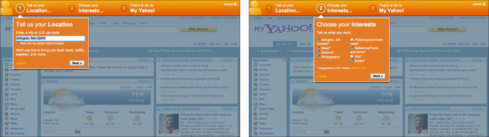
The My Yahoo! example in Figure 2-25 illustrates many good features of a contemporary Wizard. It uses a “lightbox” technique to focus attention on the modal dialogs; it lays out a clear Sequence Map (Chapter 3) of steps to show the user what will happen; it’s short, easy to use, and visually interesting; and it has a Cancel button in the upper right, as an Escape Hatch from the whole thing.
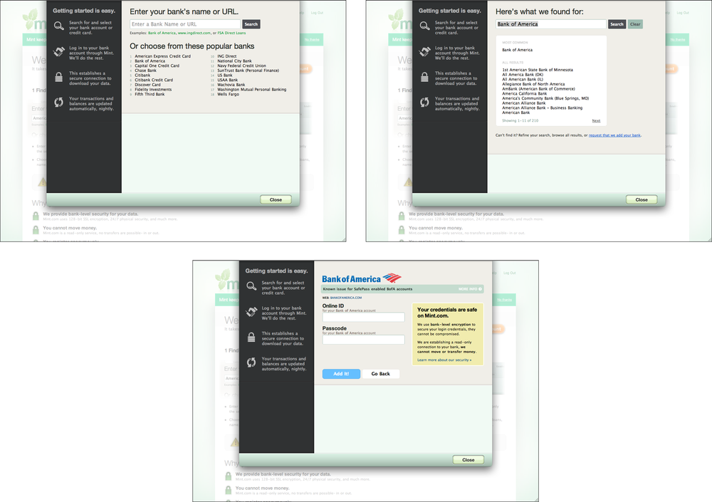
Mint’s add-a-bank dialog (see Figure 2-26) doesn’t use a numbered sequence of steps, nor does it use a permanent Next button. But it still has the quintessential Wizard quality of leading the user through a relatively complex series of steps, one screen at a time. Also, the list of steps on the lefthand side (which can’t be clicked) gives the user an overview of what to expect.
The Microsoft Office designers have done away with many of its Wizard, but a few remain—and for good reason. Importing data into Excel is a potentially bewildering task. The Import Wizard (see Figure 2-27) is an old-school, traditional application Wizard with Back/Next buttons, branching, and no sequence map. But it works. Each screen lets you focus on the step at hand, without worrying about what comes next.

In other libraries
http://ui-patterns.com/patterns/Wizard
http://www.welie.com/patterns/showPattern.php?patternID=wizard
http://patternry.com/p=one-page-wizard/
http://patternry.com/p=multiple-page-wizard/
http://quince.infragistics.com/Patterns/Wizard.aspx
Wizard is one of the canonical RIA screen layouts described by Bill Scott and Theresa Neil. An article in UX Magazine explains these layouts:
http://www.uxmag.com/design/rich-internet-application-screen-design
Settings Editor
What
Provide an easy-to-find, self-contained page or window where users can change settings, preferences, or properties. Divide the content into separate tabs or pages, if you need to manage large numbers of settings.
Use when
You are designing any of the following applications or tools, or something similar:
An application that has app-wide preferences.
An operating system, mobile device, or platform that has system-wide preferences.
A site or app for which a user must sign in—users will need to edit their accounts and profiles.
An open-ended tool to create documents or other complex work products. Users may need to change a document’s properties, an object within a document, or another item.
A product configurator, which allows people to customize a product online. (This is really a different pattern, however, with slightly different requirements and constraints. See the Product Configurator pattern at http://www.welie.com/patterns/showPattern.php?patternID=product-configurator.)
Why
Though both use forms, a Settings Editor is distinct from a Wizard, and it has very particular requirements. A user must be able to find and edit a desired property without being forced to walk through a prescribed sequence of steps—random access is important.
To aid findability, the properties should be grouped into categories that are well labeled and make immediate sense.
Another important aspect of Settings Editor design is that people will use it for viewing existing settings, not just changing them. The design needs to communicate the values of those settings at a glance.
Experienced users have strong expectations for preference editors, account settings, and user profiles being in familiar places and behaving in familiar ways. Break these expectations at your own peril!
How
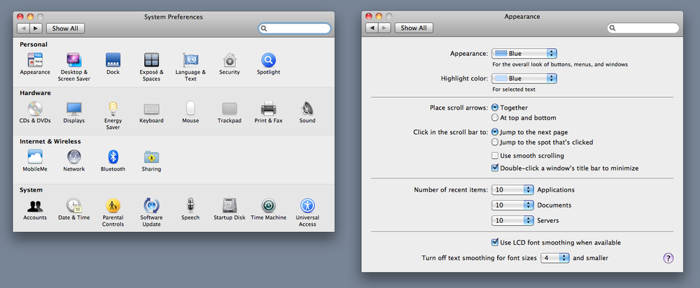
First, make it findable. Most platforms, both mobile and desktop, have a standard place to find application-wide preferences—follow the conventions, and don’t try to be overly clever. Likewise, websites where people sign in usually put links to account settings and profiles where the username is shown, often in the upper-right or -left corner.
Second, group the properties into pages, and give those pages names that make it easy to guess what’s on them. (Sometimes all the properties or settings fit on one page, but not often.) Card-sorting exercises with representative users can help you figure out the categories and their names. An outrageously large number of properties may require a three-or four-level hierarchy of groups, but be careful that users don’t get frustrated at having to click 53 times to reach commonly needed properties.
Third, decide how to present these pages. Tabs, Two-Panel Selector, and One-Window Drilldown (Chapter 5) with an extensive page “menu” on the top page seem to be the most common layouts for Settings Editor.
The design of the forms themselves deserves an entire chapter. See Chapter 8 for patterns and techniques used in forms.
Finally, should you immediately apply changes that the user makes, or offer Save and Cancel buttons? That may depend on the type of settings you’re working with. Platform-wide settings seem to be applied immediately when changed; settings on websites mostly use Save buttons; and application settings and preferences can go either way. It may not be a huge usability issue in any case. Follow an established convention if there is one, or see what the underlying technology requires; test it with users if you still have open questions.
Examples
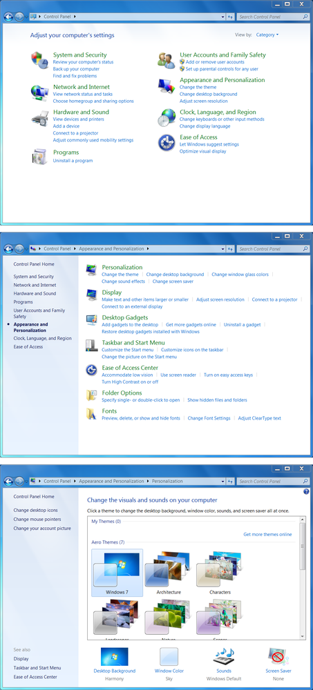
Windows 7 offers the “outrageously large number of properties” that require a deep hierarchy of pages. The screenshots in Figure 2-29 illustrate the journey from the top of the Settings Editor down to the page that lets you change the desktop theme. (There’s one more level, too—if you want to change the desktop icons or some other obscure thing, you need to launch a dialog from a link on the last screen.)
The designers mitigated some of the problems with a deep hierarchy, however. For instance, they put a list of shortcuts on the top-level page; these are probably the items users look for most often. They put a search box on the top and clickable Breadcrumbs beside it. And by putting lists of items on the top two levels, they show users which items fall into which categories.
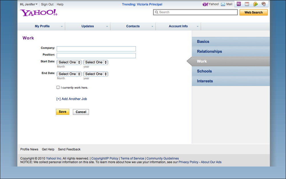
Yahoo! (Figure 2-30) and Facebook (Figure 2-31) both use tabs to present the pages of their profile editors. The Yahoo! example is actually two-level; see the tabs across the top.

Amazon has one single link for all account-related information: “Your Account” (see Figure 2-32). This Menu Page (Chapter 3) lists account settings alongside order information, credit card management, digital content, and even community and wish-list activity. The clean, tight page organization is terrific—if I have any questions about what’s going on with my relationship to Amazon, I know I can find it somewhere on this page. (Contrast this to Facebook, which habitually obscures certain profile information behind complicated design.)

Alternative Views

What
Let the user choose among alternative views that are substantially different from the default view.
Use when
You’re building something that views or edits a complex document, list, website, map, or other content. Maybe you already provide some customizability—font size, language, sort order, zoom level, and so forth—but those lightweight changes don’t go far enough to accommodate all the things people typically do with it.
You may face design requirements that directly conflict with each other. You can’t find a way to show both feature set A and feature set B at the same time, so you need to design both separately and let the user choose between them.
Why
Try as you might, you can’t always accommodate all possible usage scenarios in a single design. For instance, printing is typically problematic for websites because the information display requirements differ—navigation and interactive gizmos should be removed, for instance, and the remaining content reformatted to fit the printer paper.
There are several other reasons for Alternative Views:
Users have preferences with regard to speed, visual style, and other factors.
A user might need to temporarily view data through a different “lens” or perspective in order to gain insight into a problem. Consider a map user switching between views of street information and topographic information (see Figure 2-33 at the top of the pattern).
If a user is editing a slideshow or website, for instance, he may do most of his editing while using a “structural” view of the document, containing editing handles, markers for invisible content, layout guides, private notes, and so on. But sometimes he will want to see the work as an end user would see it.
How
Choose a few usage scenarios that cannot easily be served by the application’s or site’s normal mode of operation. Design specialized views for those scenarios, and present them as alternatives within the same window or screen.
In these alternative views, some information might be added and some might be taken away, but the core content should remain more or less the same. A common way to switch views is to change the rendering of a list; file finders in both Windows and Mac OS let users switch from lists to Thumbnail Grid to Tree Table to Cascading Lists to Carousel, for instance.
If you need to strip down the interface—for use by a printer or screen reader, for instance—consider removing secondary content, shrinking or eliminating images, and cutting out all navigation but the most basic.
Put a “switch” for the mode somewhere on the main interface. It doesn’t have to be prominent; PowerPoint and Word used to put their mode buttons in the lower-left corner, which is an easily overlooked spot on any interface. Most applications represent the alternative views with iconic buttons. Make sure it’s easy to switch back to the default view, too. As the user switches back and forth, preserve all of the application’s current state—selections, the user’s location in the document, uncommitted changes, undo/redo operations, and so on—because losing them will surprise the user.
Applications that “remember” their users often retain the user’s alternative-view choice from one use to the next. In other words, if a user decides to switch to an alternative view, the application will just use that view by default next time. Websites can do this by using cookies; desktop applications can keep track of preferences per user; an app on a mobile device can simply remember what view it used the last time it was invoked. Web pages may have the option of implementing Alternative Views as alternative CSS pages. This is how some sites switch between ordinary pages and print-only pages, for example.
Examples
In Figures Figure 2-34 and Figure 2-35, two graphic editors, Microsoft PowerPoint and Adobe Illustrator, show different views of a work product. In the slideshow, the user normally edits one slide at a time, along with its notes, but sometimes the user needs to see all the slides laid out on a virtual table. (Not shown is a third view, in which PowerPoint takes over the screen and actually plays the slideshow.) In the website example, Illustrator shows an “outline” view of the graphic objects in the document—most useful if you have a lot of complex and layered objects—and the normal, fully rendered view of the artwork. The outline view speeds up work considerably.

News sites and blogs often show lots of “extras” in the margins around an article, many of which are animated or interactive. But some sites considerately provide a print view—a version of the article that has none of that extra stuff. The formatting is simple, and the branding is minimal. The example in Figure 2-36 is from CNN.

In other libraries
http://quince.infragistics.com/Patterns/Alternative%20Views.aspx
Many Workspaces
What
Use multiple top-level tabs, tab groups, and windows so that users can view more than one page, project, file, or context at a time. Let users place these workspaces side by side if possible.
Use when
You’re building an application that views or edits any type of content—websites, documents, images, or entire projects that include many files.
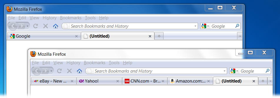
Designers of conventional websites don’t generally need to think about this. All the common browsers supply perfectly good implementations of this pattern, using tabs and browser windows (as shown in Figure 2-37 at the top of the pattern).
Applications whose central organizing structure is a personal News Stream may not need Many Workspaces, either. Email clients, personal Facebook pages, and so forth only show the one News Stream that matters to the user; multiple windows don’t add much value. That being said, email clients often let a user launch multiple email messages in different windows. Some Twitter applications can show several filtered streams side by side—they might show a search-based feed, then a feed from a custom list, then a feed of popular retweets, for instance. (See the TweetDeck example in Figure 2-38.)
Why
People multitask. They go off on tangents, abandon trains of thought, stop working on task A to switch to task B, and eventually come back to something they left hanging. One way or the other, they will multitask, so you might as well support it directly with a well-designed interface for doing so.
Side-by-side comparisons between two or more items can help people learn and gain insight. Let users pull up pages or documents next to each other without having to laboriously switch context from one to another.
This pattern directly supports some Chapter 1 patterns, such as Prospective Memory (a user may leave a window open as a self-reminder to finish something) and Safe Exploration (because there’s no cost in opening up an additional workspace while leaving the original one where it is).
How
Choose one or more ways to show multiple workspaces. Many well-known applications use the following:
Tabs
Separate operating-system windows
Columns or panels within a window
Split windows, with the ability to adjust the splitters interactively
If you deal with fairly simple content in each workspace—such as text files, lists, or News Stream—split windows or panels work fine. More complex content might warrant entire tab pages or windows of their own so that a user can see a larger area at once.
The most complicated cases that I’ve seen involve development environments for entire coding projects. When a project is open, a user might be looking at several code files, stylesheets, command windows (where compilers and other tools get run), output or logfiles, or even visual editors. This means that many, many windows or panels can be open at once.
(And then, perhaps, the user might temporarily switch to another project, with another set of open files and editors! Some development environments can support that.)
When users close some web browsers, such as Chrome, the set of workspaces (all open web pages, in tabs and windows) gets automatically saved for later use. Then when the user restarts the browser, her entire set of previously opened web pages is restored, almost as she left it. This is especially nice when the browser or machine has crashed. Consider designing in this feature, as it would be a kindness to your users.
Examples
TweetDeck is a News Stream–type application that can show many streams at once: filtered Twitter feeds, non-Twitter sources, and so on. The example in Figure 2-38 shows several typical TweetDeck columns. This maintains the spirit of a News Stream by keeping all the updates visible at once; had these columns been in different tabs or windows, a user wouldn’t be able to see all the updates as they happen.
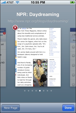
On tiny mobile screens, you don’t have room to show anything side by side. Safari on the iPhone has solved this problem by letting the user open up to eight websites at a time, then using a Carousel to shuffle between them (see Figure 2-39). A user swipes to the right and left to reach the other windows.
Multi-Level Help
What
Use a mixture of lightweight and heavyweight help techniques to support users with varying needs.
Use when
You’re designing a complex application. Some users may need a full-fledged help system, but you know most users won’t take the time to use it. You want to support the impatient or occasional user too, to the extent you can. In particular, you might need to tailor your design for intermediate-to-expert users—but how will you help beginners become experts?
Why
Users of almost any software artifact need varying levels of support for the tasks they’re trying to accomplish. Someone approaching it for the first time ever (or the first time in a while) needs different support than someone who uses it frequently. Even among first-time users, enormous differences exist in commitment level and learning styles. Some people want to read a tutorial, some won’t; most find tool tips helpful, but a few find them irritating.
Help texts that are provided on many levels at once—even when they don’t look like traditional “help systems”—reach everyone who needs them. Many good help techniques put the help texts within easy reach, but not directly in the user’s face all the time, so users don’t get irritated. However, the techniques need to be familiar to your users. If they don’t notice or open a Collapsible Panels, for instance, they’ll never see what’s inside it.
How
Create help on several levels, including some (but not necessarily all) of the help types in the following list. Think of it as a continuum: each requires more effort from the user than the previous one, but can supply more detailed and nuanced information.
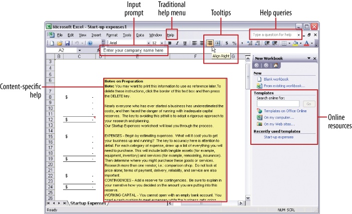
Captions and instructions directly on the page, including patterns such as Input Hints and Input Prompt (both found in Chapter 8). Be careful not to go overboard with them. If done with brevity, frequent users won’t mind them, but don’t use entire paragraphs of text—few users will read them.
Tool tips. Use them to show very brief, one-or two-line descriptions of interface features that aren’t self-evident. For icon-only features, tool tips are critical; users can take even nonsensical icons in stride if a rollover says what the icon does! (Not that I’d recommend poor icon design, of course.) Tool tips’ disadvantages are that they hide whatever’s under them and that some users don’t like them popping up all the time. A short time delay for the mouse hover—for example, one or two seconds—removes the irritation factor for most people.
Hover Tools (Chapter 6). These can display slightly longer descriptions, shown dynamically as the user selects or rolls over certain interface elements. Set aside areas on the page itself for this, rather than using a tiny tool tip.
Longer help texts contained inside Collapsible Panels (see Chapter 4).
Introductory material, such as static introductory screens, guided tours, and videos. When a new user starts the application or service for the first time, these materials can immediately orient him toward his first steps (see the Instant Gratification pattern in Chapter 1). Users might also be interested in links to help resources. Offer a toggle switch to turn off the introduction—users will eventually stop finding it useful—and offer a way back to it elsewhere in the interface, in case a user wants to go back and read it later.
Help shown in a separate window, often in HTML via browsers, but sometimes in WinHelp or Mac Help. The help resource is often an online manual—an entire book—reached via menu items on a Help menu, or from Help buttons on dialog boxes and HTML pages.
“Live” technical support, usually via email, the Web, Twitter, or telephone.
Informal community support. This applies only to the most heavily used and invested software—the likes of Photoshop, Linux, Mac OS X, or MATLAB—but users may consider it a highly valuable resource. Use social networking resources for these, or more traditional online forums.
Examples
Firefox is “merely” a web browser, and a free one at that, but its help systems are stellar. Help is offered at most of the levels described in the preceding list, so both beginners and experts are well supported. All of the following examples come from Firefox so that you can see the range of help that can be offered for one product.
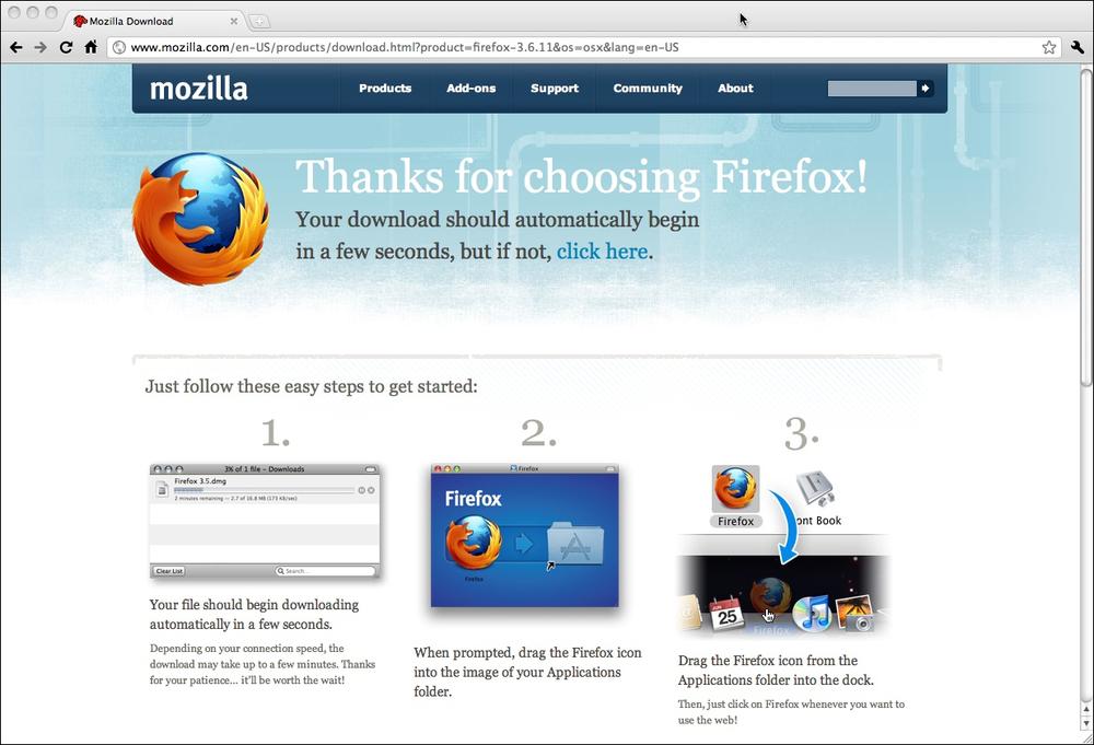
When you visit Firefox’s site in order to download the browser, you are greeted by an outline of the install process and a very clear call to action, as shown in Figure 2-41.
When you launch it for the first time, you see an introductory screen that may intrigue the user: easy ways to customize the Firefox look, connections to social media, and links to help resources (see Figure 2-42). The page also confirms for the user that the install was successful; if the user needs to do anything more, such as get security updates, the introductory page will say so.

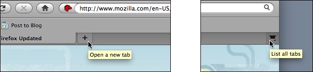
Each tool on the browser window has a tool tip (see Figure 2-43). The basic buttons—back, next, reload, home—will be familiar to almost all users, but the more obscure items may need to be explained.
The main text fields use Input Prompt to describe themselves (see Figure 2-44). This is a more appropriate choice than Input Hints (which would be displayed beside the text fields) because it keeps the window clean and uncluttered. Furthermore, not much knowledge is lost when a user starts typing into the text field, erasing the prompt. See the pattern descriptions for Input Hints and Input Prompt in Chapter 8.

Some dialogs attempt to describe themselves, as shown in Figure 2-45.

Other dialogs offer links to the formal help system; an appropriate help page is displayed in a browser window when the user clicks the round purple button in the lower-left corner (see Figures Figure 2-46 and Figure 2-47).


Finally, if all other sources of help are exhausted, a user can turn to the wider user community for advice. We’ve now moved beyond the realm of software design per se, but this is still product design—the user experience extends beyond the bits installed on users’ computers. It includes the interactions they have with the organization, its employees or other representatives, and its website (see Figure 2-48).
Community building like this happens only for products in which users become deeply invested, perhaps because they use the product every day at work or at home—as is the case with Firefox—or because they have some emotional attachment to it.

[2] “Rich Internet Screen Design,” in UX Magazine: http://www.uxmag.com/design/rich-internet-application-screen-design.