Chapter 5. Lists of Things
This chapter covers only one topic: how to display lists of items in an interactive setting. Just items. Actual data—complex and highly structured data sets—isn’t covered until Chapter 7.
Why do lists merit their own chapter, you may ask?
Consider the many types of items that get shown in lists: articles, pages, photos, videos, maps, books, games, movies, TV shows, songs, products, email messages, blog entries, status updates, forum posts, comments, search results, people, events, files, documents, apps, links, URLs, tools, modes, actions. (Add your own!)
Practically every moderately complex interface or website ever designed includes lists. This chapter will help you think about them logically and clearly, understand different design aspects, and make good trade-offs when designing interfaces that use lists.
Since so many other interface design topics overlap with this one, this chapter will often refer to other chapters and patterns. Menus are handled in Chapter 6, complicated data in Chapter 7, and links and other navigational mechanisms in Chapter 3. Mobile platforms have very specific design constraints, so Chapter 10 will be referred to as well. But there’s still a lot left over.
Use Cases for Lists
Before jumping into a design, it’s useful to analyze the use cases for a list. What will people need to do with it? Which of these scenarios apply?
- Getting an overview
What impression will someone get from the list as a whole? In some cases, a user should be able to skim down the list and understand what it’s about. Sometimes that requires more than just words; it may require images or careful visual organization to convey that impression.
- Browsing item by item
Will the user peruse items, either randomly or in order? Does he need to click on items to open them? If so, it should be easy to go back to the list and find another item, or move directly to the next one.
- Searching for a specific item
Is the user looking for something in particular? He should be able to find it quickly, with a minimum of clicks, scrolling, and back-and-forth.
- Sorting and filtering
If someone is looking for an item or group of items with a specific characteristic (e.g., “anything with a date between X and Y”) or is looking for general insight into a set of data, sorting and filtering functions might help. This is addressed in more detail in Chapter 7.
- Rearranging, adding, deleting, or recategorizing items
Consider a Picture Manager containing the user’s photos: the user owns the list and the items within it. Most apps and sites that show personal collections permit direct manipulation of those lists so that the user can drag items around into a desired order or grouping scheme. He should also be able to select multiple items at a time for moving, editing, or deleting; a design should either use the platform standards for multiple selection (e.g., Shift-select), or supply checkboxes beside each item to permit the user to select an arbitrary subset.
Back to Information Architecture
We discussed information architecture—the design of information, independent of its visual representation—in Chapter 2. Let’s return to it for a minute. If you have a list of things to show in a page, what are the salient nonvisual characteristics of that list?
- Length
How long is the list? Can it fit in the space you’ve designed for it?
Could the list sometimes be “bottomless”? For example, web search results often constitute such a long list that the user will never reach the end; likewise for items taken from a very large and deep archive.
- Order
Does the list have a natural order, such as alphabetical or by time?
Would it make sense for a user to change the sorting order of the list? If so, what would the user sort on?
If you choose to put a list into an order, would it actually make more sense as a grouping scheme, or vice versa? As an example, think about a blog archive: the articles are naturally ordered by time, and most blogs categorize them by month and year, rather than offering a flat ordered list. Someone looking for a particular article might remember that “it was before article X but after article Y,” but not remember exactly which month it was published. A monthly grouping thus makes it hard to find that article; a time-ordered flat list of titles might work better.
- Grouping
Do the items come in categories? Is it a natural categorization that users will immediately understand? If not, how can you explain it, either verbally or visually?
Do these categories come in larger categories? More broadly, do the items fit into a multi-level hierarchy, such as files in a filesystem?
Are there several potential categorizations? Would they fit different use cases or user personas? And can users create their own categories for their own purposes?
- Item types
What are the items like? Are they simple, or are they rich and complex? Are they just stand-ins for larger things, such as headlines for articles or thumbnails for video clips?
Are the items in a list very different from each other (e.g., some are simple and some are complex)? Or are they homogeneous?
Does each item have an image or picture associated with it?
Does each item have a strict field-like structure? Would it help the user to know that structure, or possibly even sort the list based on different fields? (Email messages typically have a strict and sortable structure—timestamp, from field, subject, and so on—and this structure typically is shown in lists of messages.)
- Interaction
Should you show the whole item at once in the list, or can you just show a representation of the item (such as its name or the first few sentences) and hide the rest?
What is the user supposed to do with those items? Should they be looked at? Should they be selected for inspection, or for performing tasks on them? Or are they links or buttons to be clicked on?
Does it make sense for the user to select multiple items at a time?
- Dynamic behavior
How long does it take to load the whole list? Can it be more or less immediate, or will there be a noticeable delay as the list is put together somewhere and finally shown to the user?
Will the list change on the fly? Should you show the updates as they happen? Does this mean inserting new items at the top of the list automatically?
The answers to these questions may suggest a variety of design solutions to you. Of course, a solution should also take into account the type of content (blogs should look different from, say, contact lists), the surrounding page layout, and implementation constraints.
Some Solutions
The interaction questions listed in the preceding section set the tone for almost all the other decisions. For instance, a fully interactive list—multiple selection, drag-and-drop, editing items, and so on—tends to dominate the interface. You may be building a Picture Manager, an email client, or some other full-fledged application that people use to manage and enjoy content that they own.
In this and other types of interfaces, a common requirement is to show only item names or thumbnails in a list—just a representation of each item—and then display the whole item when the user selects one from the list. There are at least three ways to do this.
- “When the user selects an item from a list, where should I show the details of that item?”
Two-Panel Selector shows the item details right next to the list. It supports the overview and browsing use cases quite well because everything’s visible at once; the surrounding page stays the same, so there’s no awkward context switch or page reload.
List Inlay shows the item details embedded in the list itself. The details only open up when the user requests them with a click or tap. This pattern supports the overview and browsing use cases, too—though an overview is harder if lots of items are open—and searching on item contents can be done smoothly by automatically opening matched items.
One-Window Drilldown replaces the list’s space with the item details. This is often used for small spaces that cannot accommodate a Two-Panel Selector, such as mobile screens or small module panels. It does lead to “pogo sticking” between the list screen and the item screen, though, so browsing and searching are not so easy.
Now let’s shift our attention to the items themselves. How much detail should you show with each item, assuming the user will click through to see the whole thing? Again, you have three main use cases to serve: get a quick overview, browse the list, and find items of interest. For really focused tasks, such as finding a person’s phone number in a long contact list, all that’s needed is the item name. But for a broader, more browsing-oriented experience—news articles on a web page, for instance—more information makes an item more interesting (up to a point, anyway). And if you have visuals associated with each item, show thumbnails!
- “How can I show a list with heavy visuals?”
Use fat rows. Instead of just one line per item, give each item row several lines’ worth of text. Enhance it with a small graphic or image thumbnail, if available, and use rich text formatting to express a miniature visual hierarchy within each row. See the Grid of Equals pattern in Chapter 4 for the basis of this pattern.
Thumbnail-and-Text List, in Chapter 10, is a specialization of fat rows for a mobile device.
Thumbnail Grid is a common pattern for pictorial objects. A 2D grid of small pictures is visually powerful; it dominates the page and draws attention. Text data is often shown with the thumbnails, but it tends to be small and less important than the pictures. Again, see the Grid of Equals pattern for a generalization.
Carousel is an alternative to Thumbnail Grid that can use less space on the page. It is strictly linear, not 2D, and the user must actively scroll through it to see more than a few objects. Depending on its design, a Carousel implementation might actually give you more space to show the selected or center object than a Thumbnail Grid.
Highly structured, homogeneous sets of items work well in a table layout, with a column for each field of interest to users. Such a table might offer sorting via a Sortable Table, or a “Sort by” drop down for a simpler implementation. Row Striping can help a viewer’s eyes travel across a single item’s row, from left to right and back again. Tables are lists, but they’re also complex data graphics that can be filtered and visualized with sophisticated tools. So for other table-related patterns, I refer you to Chapter 7.
Very long lists can be difficult to design, especially on web pages. Certainly there are technical challenges around loading times and page length, but interaction design might be even harder—how does a user browse and move through such a list? How can he find something specific, especially if a text search doesn’t behave as desired? The following techniques and patterns apply to all the previously listed ways to show a list and its items (except maybe a Carousel, which has tighter constraints):
- “How can I manage a very long list?”
Pagination lets you load the list in sections, putting the onus on the user to load those sections as needed. This is, of course, quite common in websites—it’s easy to design and implement. Pagination is most useful when the user is likely to find the desired item(s) in the first page, since many people won’t bother going to subsequent pages anyway. You could also resort to Pagination when loading the whole list will result in a ridiculously long page or take a ridiculously long time. A good Pagination control shows the user how many pages of items there are, as well as letting a user jump among those pages.
Infinite List is a single-page alternative to Pagination. The first section of a long list gets loaded, and at the bottom the user finds a button that loads and appends the next section. The user stays on one page. Common in mobile designs, this pattern can be found in Chapter 10. Don’t discount it for regular web pages, however! This pattern is useful when you don’t actually know how long the list will be, or when it’s “bottomless.”
A variant on Infinite List has the list automatically loading itself as the user scrolls down. See the Continuous Scrolling pattern at the following page:
When a very long alphabetized list is kept in a scrolled box, consider using an Alphabet Scroller. Related to Annotated Scrollbar (Chapter 3), this device shows the alphabet arrayed along the scrollbar itself; the user can then jump directly to a desired letter.
Direct searching via a “Find” field may be critical for helping your users to find specific items. Also, filtering a list—screening out entire classes of items that don’t meet certain criteria—can help shorten a list to a manageable size.
So far, this section has talked mostly about flat lists: those that have no categories, containment, or hierarchy. However a list might be rendered, you may still want to break it up into categories for clarity.
- “How can I show a list that’s organized into categories or hierarchies?”
Titled Sections (Chapter 4) work well for a single level of containment. Just separate the list into sections with titles, and perhaps allow the user to sort the list within a single section so as not to disrupt the categorization. If you only have a few sections, try an Accordion—this lets the user close list sections that she doesn’t need.
For two or more levels of hierarchy, basic trees are the standby solution. These are normally presented with indented hierarchy levels, and with icons such as pluses and minuses (commonly found on Windows) or rotating triangles. The levels can be closed and opened by the users or automatically by the interface as needed. Many UI toolkits offer tree implementations.
Cascading Lists take a tree’s vertically oriented hierarchy and turn it on its side, with a series of columns that list all the possibilities at every level of the hierarchy. Popularized by Mac OS, this pattern allows very effective browsing and overviews of hierarchies at the cost of large amounts of space. (It does not work in a small window or screen.)
When the items are heavily structured and you want to present them in a table but they come organized in a hierarchy, consider a Tree Table. Literally, it combines a tree with a table, and it’s exactly what it sounds like.
The Patterns
First are the three patterns that place item details next to, inside, or on a different page from the list itself:
The next few patterns cover ways to show lists of various sorts—image-based lists (Thumbnail Grid and Carousel), tables (Row Striping), long lists (Pagination, Jump to Item, Alphabet Scroller), and hierarchies (Cascading Lists and Tree Table). If you’re using a table or Tree Table, consider making it a Sortable Table (see Chapter 7).
Finally, New-Item Row lets a user add items to a list however that list may be rendered.
Two-Panel Selector

What
Put two side-by-side panels on the interface. In the first one, show a list of items that the user can select at will; in the second one, show the content of the selected item.
Use when
You have a list of items to show. Each item has interesting content associated with it, such as the text of an email message, a long article, a full-sized image, contained items (if the list is a set of categories or folders), or details about a file’s size or date.
You want the user to see the overall structure of the list and keep that list in view all the time, but you also want him to be able to browse through the items easily and quickly. People won’t need to see the details or content of more than one item at a time.
Physically, the display you’re working with is large enough to show two separate panels at once. Very small cell phone displays cannot cope with this pattern, but many larger mobile devices can.
Why
This is a learned convention, but it’s an extremely common and powerful one. People quickly learn that they’re supposed to select an item in one panel to see its contents in the other. They might learn it from their email clients, or from Windows Explorer, or from websites; whatever the case, they apply the concept to other applications that look similar.
When both panels are visible side by side, users can quickly shift their attention back and forth, looking now at the overall structure of the list (“How many more unread email messages do I have?”), and now at an object’s details (“What does this email say?”). This tight integration has several advantages over other physical structures, such as two separate windows or One-Window Drilldown:
It reduces physical effort. The user’s eyes don’t have to travel a long distance between the panels, and he can change the selection with a single mouse click or key press rather than first navigating between windows or pages (which can take an extra mouse click).
It reduces visual cognitive load. When a window pops to the top, or when a page’s contents are completely changed (as happens with One-Window Drilldown), the user suddenly has to pay more attention to what he’s now looking at; when the window stays mostly stable, as in a Two-Panel Selector, the user can focus on the smaller area that did change. There is no major “context switch” on the page.
It reduces the user’s memory burden. Think about the email example again: when the user is looking at just the text of an email message, there’s nothing on-screen to remind him of where that message is in the context of his inbox. If he wants to know, he has to remember, or navigate back to the list. But if the list is already on-screen, he merely has to look, not remember. The list thus serves as a “You are here” signpost (see Chapter 3 for an explanation of signposts).
It’s faster than loading a new page for each item, as can happen with One-Window Drilldown.
How
Place the selectable list on the top or left panel, and the details panel below it or to its right. This takes advantage of the visual flow that most users who read left-to-right languages will expect (so try reversing it for right-to-left language readers).
When the user selects an item, immediately show its contents or details in the second panel. Selection should be done with a single click. But while you’re at it, give the user a way to change his selection from the keyboard, particularly with the arrow keys—this helps reduce both the physical effort and the time required for browsing, and contributes to keyboard-only usability (see Keyboard Only in Chapter 1).
Make the selected item visually obvious. Most GUI toolkits have a particular way of showing selection (e.g., reversing the foreground and background of the selected list item). If that doesn’t look good, or if you’re not using a GUI toolkit with this feature, try to make the selected item a different color and brightness than the unselected ones—that helps it stand out.
What should the selectable list look like? It depends—on the inherent structure of the content, or perhaps on the task to be performed. For instance, most filesystem viewers show the directory hierarchy, since that’s how filesystems are structured. Animation and video editing software use interactive timelines. A GUI builder may simply use the layout canvas itself; selected objects on it then show their properties in a property editor next to the canvas.
A Two-Panel Selector has identical semantics to tabs: one area for the selectors, and one area next to it for the content of the selected thing. Likewise, a List Inlay is like an Accordion (Chapter 4), and One-Window Drilldown is like a Menu Page (Chapter 3).
When the select-and-show concept is extended through multiple panels to facilitate navigation through a hierarchical information architecture, you get the Cascading Lists pattern.
Examples
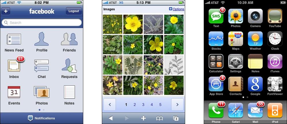
Many email clients use this pattern to show a list of email messages next to the currently selected message (see Figure 5-2). Such listings benefit from being nearly as wide as the whole window, so it makes sense to put the listing on top of the second panel, not to its left. (Also, this example shows the use of a third selector panel on the left that lets the user choose which mailbox to work in.)

Like many other Picture Manager, Picasa (Figure 5-3) lists the various image folders and categories in its Two-Panel Selector. The result is a second list, of images. When the user selects an image, the whole window is replaced; see One-Window Drilldown.

One-Window Drilldown

What
Show a list or menu of items in a single window. When the user selects an item from the list, show the details or contents of that item in the window, replacing the list.
Use when
You have a list of items to show. Each item has interesting content associated with it, such as the text of an email message, a long article, a full-size image, or details about a file’s size or date.
You have very little space to work with—not enough for a Two-Panel Selector or a List Inlay. For instance, the design might be intended for a very small mobile screen, or for a self-contained web page sidebar or widget.
Alternatively, the list items and contents might just be large. You might need the entire screen or window to show the list, and again to show the contents of an item. Online forums tend to work this way, requiring the whole width of the page to list conversation topics and a separate scrolled page to show the conversations themselves.
Why
In a very constrained space, this may be the only reasonable option for presenting a list and item details. It gives each view the entire available space to “spread out” on the page.
Like Menu Page in Chapter 3, however, this pattern has the benefit of simplicity. A list of items (or links) is easy to understand: to see more of an item, you click or tap on it and thus “drill down” one level. Then you can come back up to the main list or menu to go to another item.
How
Create the list using whatever layout or format you find best—simple text names, multiline “fat rows” with text formatting, trees or outlines, and Thumbnail Grid all work fine, as do other formats. Vertically scroll it if necessary to fit it into the available space.
When the user clicks, taps, or otherwise selects one of the list items, replace the list display with a display of the item details or contents. On it, place a Back or Cancel button that brings the user back to the list screen (unless the platform supplies hardware buttons for such).
The item screen may offer additional navigational possibilities, such as drilling down further into the item details, stepping down into an item contained within that item (as in a hierarchy), or going “sideways” to the previous or next item in the list (as discussed in the next paragraph). In each case, replace the previous screen with the new one, and make sure the user can easily step back to the previous screen.
One disadvantage of this pattern is that to go from item to item, the user must “pogo-stick” between the list page and the item page. It takes a lot of clicks or taps to see more than a few items, and the user certainly can’t flick between them quickly (as with Two-Panel Selector) or compare them easily (as with List Inlay). You can mitigate this problem by using Back and Next links to connect the user directly to the previous and next items in the list—see the Pyramid pattern in Chapter 3.
Examples
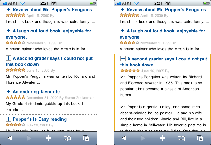
Examples abound in mobile designs, as shown in Figure 5-4. Contrast this mobile version of a mail client with its desktop counterpart shown in the Two-Panel Selector pattern. For instance, the One-Window Drilldown approach requires more text to be shown in the list, so the user has enough context to identify messages and triage them.
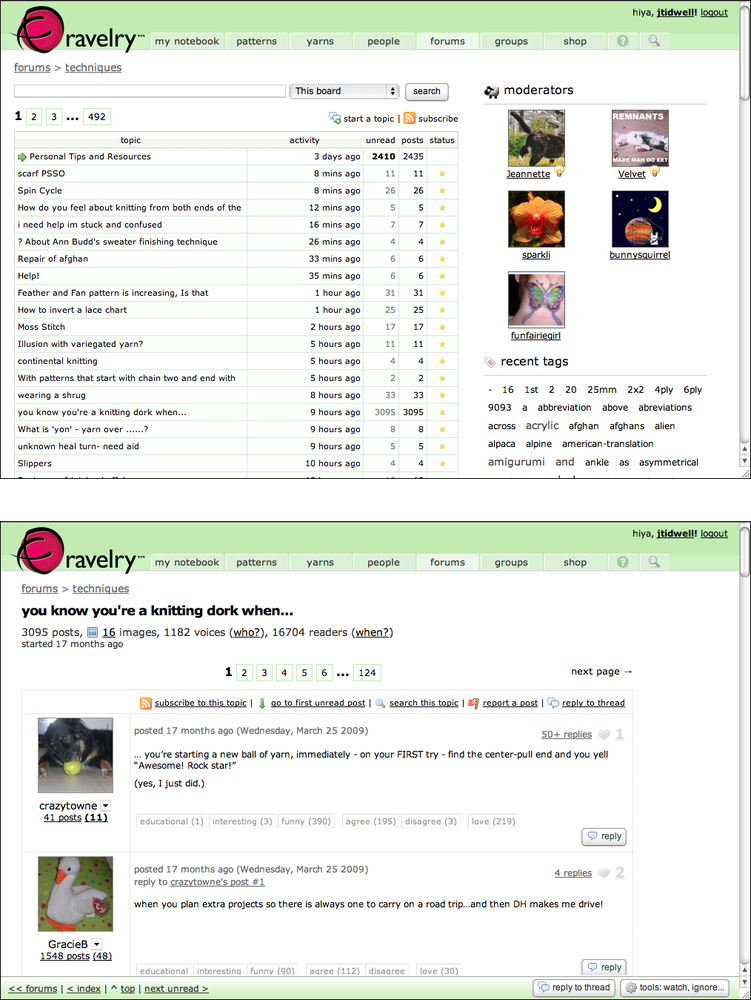
You can find One-Window Drilldown in full-size applications and web pages, too. Forums and communities tend to use it a lot—topics are listed on one page, and discussion threads are on their own pages. Ravelry demonstrates this approach, as do about six million other online forums (see Figure 5-5).
The Picasa desktop application, a Picture Manager uses a Two-Panel Selector beside a Thumbnail Grid for its browsing interface (see Figure 5-6). But once the user clicks a photo, Picasa replaces the entire contents of the window (except the bottom toolbar) with a new layout—one that shows the photo itself in Center Stage, with a set of tools next to it.

In other libraries
http://quince.infragistics.com/Patterns/One-Window%20Drilldown.aspx
List Inlay

What
Show a list of items as rows in a column. When the user selects an item, open that item’s details in place, within the list itself. Allow items to be opened and closed independently of each other.
Use when
You have a list of items to show. Each item has interesting content associated with it, such as the text of an email message, a long article, a full-size image, or details about a file’s size or date. The item details don’t take up a large amount of space, but they’re not so small that you can fit them all in the list itself.
You want the user to see the overall structure of the list and keep that list in view all the time, but you also want her to browse through the items easily and quickly. Users may want to see two or more item contents at a time, for comparison.
The list of items has a vertically oriented, columnar structure.
Why
A List Inlay shows an item’s details within the context of the list itself. The user can see the surrounding items, which might help in understanding and using the item contents.
Also, a user can see the details of multiple items at once. This is not possible in Two-Panel Selector, One-Window Drilldown, rollover windows, or most other ways of displaying item details. If your use cases call for frequent comparison of two or more items, this might be the best option.
Because a List Inlay is neatly contained within a vertical column, it can be combined well with a Two-Panel Selector to present a three-level containment hierarchy. Consider an email client or RSS reader, for instance—the messages or articles might be viewed in a List Inlay, while the item containers (mailboxes, groupings, filters, etc.) are shown next to it in a Two-Panel Selector structure.
How
Show list items in a column. When the user clicks on one, open the item in place to show the details of that item. A similar gesture should close the item back up again.
When an item is opened, enlarge the item’s space downward, pushing the subsequent items down the page. Other items do the same when opened. A scrolled area should be used to contain this ever-changing vertical structure, since it could get very tall indeed!
To close the details panel, use a control that clearly indicates its purpose (e.g., “Close” or “X”). Some implementations of List Inlay only put that control at the end of the details panel, but users may need it at the top if the panel is long and they don’t want to move down the whole thing. Put a closing control very near the original “open” control (or replace one with the other). This at least ensures that the user’s pointer won’t move very far if she wants to open an item, glance at it, close it, and move on.
Use an Animated Transition as the item opens and closes, to keep the user oriented and to focus attention on the newly opened item.
If your application permits the user to edit items, you could use a List Inlay to open an editor instead of item details (or in addition to them).
A list that uses List Inlay works the same way as an Accordion: everything lies in a single column, with panels opening and closing in situ within it. Likewise, a Two-Panel Selector works like a set of tabs, and One-Window Drilldown is like a Menu Page (Chapter 3).
Examples
Google Reader (Figure 5-8) uses a List Inlay within the context of a Two-Panel Selector. It has a multi-level hierarchy of containers to present; the containers are shown in the tree selector on the left, but the list of articles takes up Center Stage and the user can then open them in place to read them.

Rather than forcing the user to pogo-stick back and forth from the list of book reviews to the actual text of each review, Amazon’s mobile site lets users read them in a List Inlay. The list of items on the left tempts the user with short teasers from each review, and when a user is interested enough to keep reading, she can tap the title to read the whole thing (Figure 5-9). The existence of plus and minus controls signals to the user that these items expand.
In other libraries
http://www.patternry.com/p=inline-expand/
Bill Scott and Theresa Neil identified this technique in their book, Designing Web Interfaces (O’Reilly, http://oreilly.com/catalog/9780596516253/). List Inlay are one of a set of inlay techniques that includes Dialog Inlays and Detail Inlays.
The Accordion pattern exists in many pattern libraries, including this one. Much of the design advice proffered for Accordion can apply equally well to List Inlay. (There really isn’t a huge practical difference between them.)
Thumbnail Grid
What
Arrange a list of visually interesting items into a “small multiples” grid of thumbnail images. Let the user select one or more thumbnails to view or manage those items.
Use when
The list items have small visual representations that uniquely identify them: images, logos, screen captures, reduced photos, and so forth. These tend to be similar in size and style. The list may be long, and it may be divided into Titled Sections (Chapter 4).
You want to show a little bit of metadata (information about the item) with each one, such as its name and date, but you don’t need to show a lot of that—the picture should take up most of the space devoted to the item.
Users will want an overview of the whole list, and they may need to scan it quickly to find a particular item of interest. Users may also need to select one or more items at a time for moving, deleting, or viewing.
Why
A Thumbnail Grid is a dense, attractive presentation of large numbers of items. Related to Grid of Equals (Chapter 4), this pattern creates a visual hierarchy that shows the list items as peers, and a strong grid tends to draw the eye to that part of the page.
It might be easier to show the list items in text form, but sometimes pictures can be recognized and differentiated more easily than text.
Thumbnails that are roughly square make easy targets for fingertips (on touch screens) and for indirect pointing devices as well. This pattern works well on mobile devices with relatively high-resolution touch screens, such as iPhones.
How
Arrange the item thumbnails into a 2D grid. Scale the thumbnails so that they’re approximately the same size, to keep the grid tidy. Place the text metadata close to the thumbnail, but in small print in order to maintain the thumbnail’s visual prominence.
Some Thumbnail Grid look much nicer when the thumbnails all have similar width and height. If you’re working with graphics that come in different sizes or aspect ratios (the ratio of width to height), or if they’re large, some image processing will need to be done to construct thumbnails. Try to find a size and aspect ratio that works reasonably well with all of them, even if some images will be cropped to fit it. (Reducing image size is easy; cropping appropriately is not. Be careful to preserve the image’s integrity by choosing the most relevant piece of the image to show, when possible.)
An exception is if you’re dealing with images whose size and proportion are useful information to the viewer. For instance, a set of personal photos will contain some that are in a landscape format and some in a portrait (vertical) format. There’s no need to crop these to match an idealized thumbnail—the user will want to see which photos are which!
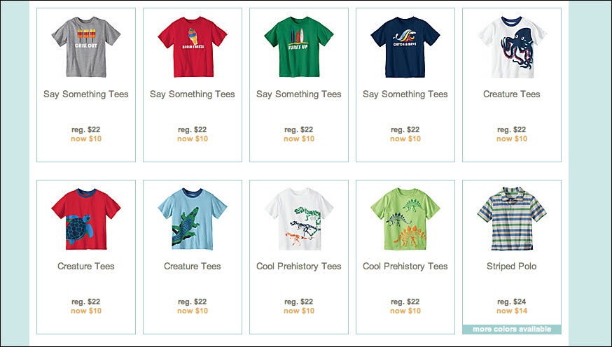
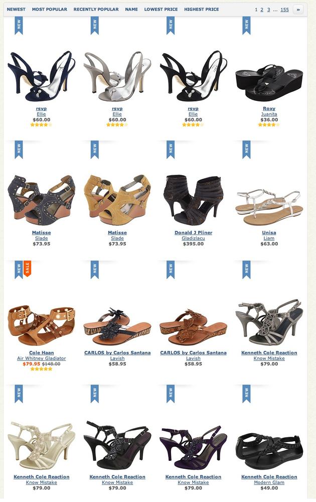
On the other hand, a thumbnail gallery of products (such as shoes or shirts) should all have the same height and width, with the products presented consistently within those photos.
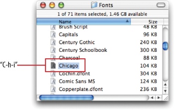
Examples
Mac OS Finder displays a variety of thumbnail types for a file directory listing (see Figure 5-11). When a file is an image, a shrunken version of that image is shown; for directories, a simple folder; for files without an available visual, just the file type (e.g., “DOC”) over a generic icon. The thumbnail grid is not at all uniform, so it doesn’t look as clean as the others in this pattern, but the size and style variations communicate useful information to the user.

AIGA’s design archives (Figure 5-12) and YouTube (Figure 5-13) are two Picture Manager that show no text information and lots of text information, respectively.


Zappos (Figure 5-14) and Hanna Andersson (Figure 5-10, at the top of the pattern) demonstrate nicely designed Thumbnail Grid for product galleries. Uniformity is beautiful here—the similarities and differences between products show up with stunning clarity, and a strong visual rhythm exists on the page.
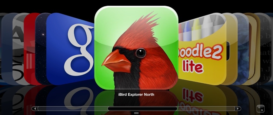
Mobile devices need Thumbnail Grid in many contexts: to show applications, features, and images themselves. Note the relative sizes of the thumbnails in Figure 5-15; the Google Images and iPhone home screen examples are just big enough to be touched easily by human fingertips. The Facebook example is more relaxed, with more space around each item.
In other libraries
Carousel

What
Arrange a list of visually interesting items into a horizontal strip or arc, and let the user scroll or swipe the image thumbnails back and forth to view them. Enlarge the center item, if appropriate.
Use when
The list items have visual representations that uniquely identify them: images, logos, screen captures, reduced photos, and so forth. These tend to be similar in size and style. The list is flat (i.e., not divided into categories or containers).
You want to show a little bit of metadata (information about the item) with each one, such as its name and date, but you don’t need to show a lot of that—the picture should take up most of the space devoted to the item.
Each item is potentially of interest. Users will browse the items casually; they won’t normally search for a specific item, or need to get an overall look at the entire list at once. If someone does look for a specific item, he won’t mind moving past many items before finding the one he’s looking for. You may be able to order the items with the most interesting ones first, or in chronological order.
You don’t have enough vertical space for a Thumbnail Grid, and you may not have a lot of horizontal space either, but you need to make this list look interesting and attractive.
Why
A Carousel offers an engaging interface for browsing visual items, encouraging the user to inspect the items that are in view and to see what’s next. A user can’t easily jump to a certain point deep in the list, so he has to scroll through everything—this pattern thus encourages browsing and serendipity.
Carousel are compact vertically, so they may be a better solution than a Thumbnail Grid for a small space. Horizontally, they can be either compact or spread out.
If a particular implementation focuses attention on a central item or selection, such as by enlarging it, this pattern delivers “focus plus context”—users get a detailed view of one item, while also seeing the ones immediately around it. See Chapter 7 for more discussion of this principle.
How
First, create thumbnails for each item shown in the Carousel. See the Thumbnail Grid pattern for issues related to thumbnail size and proportion (keeping in mind that Carousel impose even stricter restraints—thumbnails of different size or aspect ratio tend to look more awkward in Carousel than in Thumbnail Grid). Place the text metadata close to the thumbnail, but in small print in order to maintain the thumbnail’s visual prominence.
In a horizontal scrolling widget, arrange the thumbnails horizontally, either randomly or in an order that makes obvious sense to the user (such as by date). Show a small number of them—fewer than 10—and hide the rest on either side. Put large arrows on the left and right for paging through the Carousel; each click on an arrow should move more than one item. Animate this scrolling for extra visual interest.
If users will want to move quickly through a long list, as though they are looking for something in particular, put a scrollbar below the Carousel in addition to the arrows. You may find that users do this a lot; if so, consider restructuring the list as a more conventional vertical list, and add a “find” capability.
You may choose to enlarge the central item in the Carousel to draw attention to it. This gives the Carousel single-selection semantics—the enlarged item is clearly the selected one, and you can then do dynamic things based on that selection, such as showing text details about it, or offering video controls if the items are video thumbnails.
Some Carousel are straight; some are curved or circular. These usually use the trick of a 3D perspective, in which items shrink and are partially obscured as they drift farther away from the center.
In the mobile design space, the Filmstrip pattern (Chapter 10) is a variant on a Carousel. Only one item at a time is shown on the small screen, and the user swipes or scrolls back and forth to see other items.
Examples
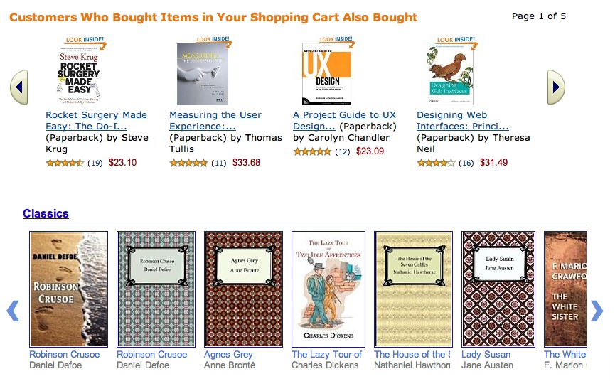
Many websites use a basic, linear Carousel for browsing products. Amazon and Google Books show book covers this way (see Figure 5-17); note the different amounts of text metadata and the implications for design. How much information should be provided with each book? How tightly packed should the book covers be?
Apple and Flickr (Figures Figure 5-18 and Figure 5-19) provide horizontal scrollbars along with their Carousel. These may contain a lot of items, so a scrollbar is needed for fast progress through them. Note that Apple’s Carousel uses an Annotated Scrollbar (Chapter 3) to help users find product categories. The horizontal aspect of this list makes for a graceful presentation of the product names, but it wouldn’t scale much beyond a small handful of categories—it’s quite unusual to present a categorized list in a Carousel. Flat lists usually work better.

Figure 5-20 (Figure 5-20) is essentially a media Carousel that enlarges the central, selected item. Compare it to a curved Carousel in an Android app (Figure 5-21); these are similar in behavior, but very different in visual styling.

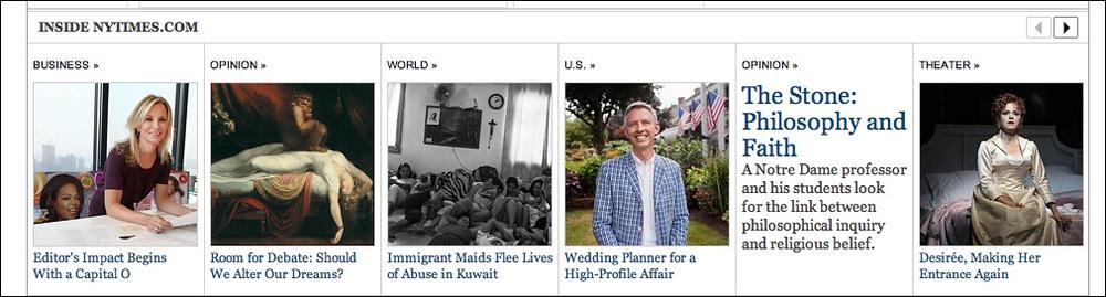
The New York Times presents some of its feature articles in a Carousel (see Figure 5-22). These are the kinds of articles that may tempt a user to look at each one and browse slowly; it wouldn’t work for all of the Times’ countless daily articles, since people mostly skim the headlines and cherry-pick articles of interest. Features are different, however.
Row Striping

Use when
Your interface presents data in a large multicolumn table, but the table’s rows are difficult to separate visually. Users will need to look up specific data items in the table.
Why
Blocks of gentle color define and delineate the information contained inside them, even when you can’t use whitespace to separate the data into “chunks.” Cartographers and graphic designers have known this color-block technique for ages. (Remember that colored backgrounds are also effective for defining page sections and articulating a visual hierarchy. See Chapter 4 for more information.)
When someone looks at a large data table with a single background color, she will tend to see the columns as coherent objects due to proximity—the table entries in a column are closer to one another than they are to the other entries in their rows. But you want the viewer to read the table “row-wise” as well as column-wise. By coloring adjacent rows differently, you turn the rows into coherent visual objects, too. (This takes advantage of the Gestalt principles of continuity and closure; again, see Chapter 4.)
Specifically, Row Striping helps a user:
Follow a row from left to right and back again, without confusing the rows
See the “footprint” of the table itself, as separate from its containing page
However, Row Striping introduces more visual noise into the page. Some users in some contexts may find that it slows them down or that it makes the table harder to use.
Two studies on Row Striping, also known as zebra striping, indicate that it has a small but noticeable benefit for lookup speed and accuracy—under some conditions. The tables for which lookup improved were fairly large, with many rows and several widely spaced columns; a smaller table showed no benefit one way or the other. The researchers also noted that when asked about it, users said they preferred Row Striping! See the two articles at the following URLs for discussions of these studies, and for links to the original research performed by Formulate Information Design:
How
Pick a pair of quiet, low-saturation colors that are similar in value but not identical. (In other words, one needs to be a wee bit darker than the other.) Good choices are light blue and white, beige and white, or two similar shades of gray—assuming the text on top of them is dark. Generally, one of the colors is your page’s background color.
Alternate the color from row to row. If the rows are thin, you could also experiment with grouping the rows—the first three are white, the next three are blue, and so on—but the research described a few paragraphs up found that users preferred single-line striping.
This pattern virtually eliminates the need for horizontal lines between the rows (though you could use them if they are very thin and inconspicuous). If your columns are aligned with one another, you don’t need vertical lines between them, nor a heavy border around the table—the viewer’s sense of visual closure will kick in, and the row colors will define the edges of the table for you. However, if row striping isn’t working well for your users, you might try very thin horizontal lines instead, since they have a similar effect of forcing the eye to see horizontal groups instead of vertical groups.
Examples
The JetBlue example at the top of the pattern (Figure 5-23) shows several lines per row. The data itself is multiline and carefully formatted; some row separation other than whitespace was needed here. Lightweight horizontal rules may have worked too, but Row Striping makes coherent shapes out of the rows.
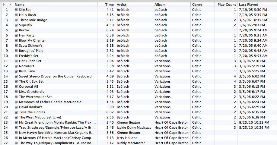
Single-row striping is more common. iTunes uses it to good effect, as shown in Figure 5-24.
The Excel ledger spreadsheet shown in Figure 5-25 permits the user to change gridline styles, and Row Striping is among the possibilities. This sheet makes it fairly easy to follow the lines from left to right and back again.

But look what happens when the gray row backgrounds are stripped away, as shown in Figure 5-26. The columns suddenly become much stronger visually, and each row is harder to read from left to right. Some designers, however, find this design to be cleaner and more pleasing. There’s no absolutely correct answer about whether to use Row Striping or not.

In other libraries
This technique is also known in many places as “alternating row colors” or “zebra striping.” Descriptions abound on the Web:
http://ui-patterns.com/patterns/AlternatingRowColors
http://www.welie.com/patterns/showPattern.php?patternID=zebra-table
http://quince.infragistics.com/Patterns/Alternating%20Row%20Colors.aspx
Pagination
What
Break up a very long list into pages, and load them one at a time. Provide controls for the user to navigate the list—next, previous, first, and last pages.
Use when
You’re showing a list that might be very, very long. Most users will either look for a particular item or browse the top of the list for relevant items (e.g., with search results); in any case, they won’t really want to see the entire list.
The technology you’re using doesn’t support loading the entire list into a single page or scrolled area, for any of the following reasons:
Loading the whole list would take too much time, and you don’t want to make the user wait. This might be the case over a slow Internet connection or with a slow backend server.
Rendering the list would take too much time.
The list is effectively “bottomless,” and implementing an Infinite List or a continuously scrolling list (which both handle bottomless lists) isn’t feasible for some reason.
Why
Pagination breaks a list into chunks that a user can easily take in without being overwhelmed. Furthermore, it puts the choice to see more into the user’s hands—do you want to load more items from the list, or is this page of items enough for you?
This pattern also has the advantage of being very common on the Web, especially (though not exclusively) for search results. It’s easy to implement, and may come prebuilt in some systems.
How
First, you’ll need to decide how many items will be in each page. Base this on the amount of space each item takes up, the screen sizes users are likely to have (don’t forget to consider mobile platforms), the time it takes to load or show the items, and the likelihood that the user will find one or more desired items in the first page.
This is fairly important: the first page should be enough! The odds are good that most users won’t go beyond that first page of items, so if they can’t find what they’re looking for in that first page, they may get discouraged. (If you’re dealing with a search facility, make sure that it returns high-quality results at the top of that first page.)
On pages that users may linger over, such as lists of products or videos, consider letting the user set the number of items per page. Some people are irritated by having to page back and forth to see all the items of interest.
Next, you’ll need to decide how to present the pagination controls. They’re usually found at the bottom of the page, but some designs also have them at the top—if a user really does need to go to a subsequent page of items, there’s no need to make him scroll all the way down the page.
Consider these elements in the pagination control:
Previous and Next links, with arrows or triangles for emphasis. Disable the Previous link when the user is on the first page and the Next link when the user is on the last page (if there is a known last page).
A link to the first page. This should always be visible; remember that the first page is supposed to contain the most relevant items.
A sequence of numbered links to pages. Don’t link the page the user is on, of course; instead, show it in a contrasting color and type size to give the user a “You are here” navigational clue.
Ellipses to cut out parts of the sequence if there are too many pages to reasonably show in the control—more than 20, for instance. Again, keep the first page, and the last page if the list isn’t “bottomless.” Keep the pages immediately before and after the user’s current page. Elide the rest.
Optionally, the total number of pages (if known). You could do this in several ways, such as showing text like “Page 2 out of 45,” or simply showing the last page as a numbered link at the end of the pagination control. See the examples for some ideas.
Examples
Digg and Google both do an excellent job of including all the elements and cues from the preceding list. The screenshots in Figure 5-28 show the most interesting pagination control states: first and last pages for only a small number of items, and the first, middle, and last pages for a very large number of items. Note that Digg uses ellipses to manage large numbers, and Google simply omits the beginning and end of the range. Digg knows exactly how many pages of items there are, whereas Google’s list is sometimes bottomless. (The last Google example shows the last page of a search that wasn’t bottomless—it only returned 21 pages of results.)
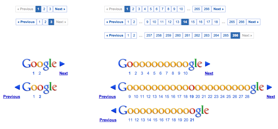
Figure 5-29 shows a gallery of examples from all over the Web. Notice which ones are easier to parse visually—Which link is which? Where should I click next?—and which ones give you sufficient information about your location and the total number of pages. Also note the size of the click targets. How accurate does the user have to be with her mouse or fingertip?

In other libraries
http://www.welie.com/patterns/showPattern.php?patternID=paging
http://ui-patterns.com/patterns/Pagination
http://www.patternry.com/p=search-pagination/
http://quince.infragistics.com/Patterns/Paging.aspx
The Yahoo! pattern library has two versions of the Pagination pattern, one for search and one for other types of items:
http://developer.yahoo.com/ypatterns/navigation/pagination/item.html
http://developer.yahoo.com/ypatterns/navigation/pagination/search.html
Jump to Item
What
When the user types the name of an item into a table or tree, jump straight to that item and select it.
Use when
The interface uses a scrolling list, table, drop down, combo box, or tree to present a long list of items. These items are sorted, either alphabetically or numerically. The user wants to select one particular item quickly and accurately, and preferably with the keyboard.
This pattern is often used in file finders, long lists of names, and drop-down boxes for state or country selection. You can also use it for numbers—such as years or dollar amounts—or even calendar time, such as months or days of the week.
Why
People aren’t good at scanning down long lists of words or numbers for a particular item. But computers are. Let them do what they’re good at!
Another nice thing about this technique is that it lets the user keep her hands on the keyboard. As she moves through a form or dialog box, she might find it nice to select from a list simply by typing the first few characters of the item she wants—the system then picks the item for her, and she can continue on to the next thing. No scrolling or clicking is necessary; the user’s hand never has to move from the keyboard to the mouse.
How
When the user types the first letter or number of the item she’s looking for, jump to the first item that matches what the user typed: automatically scroll the list so that the item is visible, and select it.
As the user types more characters in rapid succession, keep changing the selection to the first exact match for the whole user-typed string. If there is no match, stay put at the nearest match, and don’t scroll back to the top of the list. You may want to beep at the user to tell her that there’s no match—some applications do, some don’t.
Examples
A variant of Jump to Item is used by GNU Emacs’ incremental-search facility (see Figure 5-31). After the user enters i-search mode via Ctrl-S, each character typed brings the user to the first instance of that cumulative string in the document. It doesn’t matter that the original material wasn’t sorted.
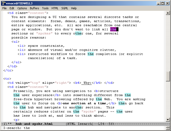
Once an occurrence of the string has been found, the user can find subsequent ones by pressing Ctrl-S repeatedly. In some ways, this incremental search is more convenient—and certainly faster—than typical desktop “Find” dialog boxes, which don’t update continuously as you type the search string.
Furthermore, Emacs can highlight all other instances of that string in the document in addition to scrolling to the first one. This gives the user lots of extra contextual information about the search she’s conducting. Is it a common string, or not? Are they clustered together, or scattered?
Alphabet Scroller

Use when
Users will be searching for very specific items in a long list, which is usually rendered as a scrolled list, table, or tree. You want to make item finding as easy and quick to achieve as possible.
Why
Alphabet scrollers are not common, but their use is self-explanatory. They provide an interactive map to the list content, in much the same way as an Annotated Scrollbar (Chapter 3). They’re closely related to Jump to Item—both enable immediate jumping to a point in an ordered list.
This pattern probably arose from physical books (such as dictionaries) and notebooks (such as address books) that use tabs to mark points in the alphabet.
How
Place a long alphabetized list into a scrolled area. Along the scrollbar, show the letters of the alphabet; when the user clicks on a letter, scroll the list to that point (see Figure 5-32, at the top of the pattern).
There are multiple operational examples of alphabetized lists working this way, but there is no reason why another ordering—by number or by date, for example—couldn’t also work well. Consider expanding this pattern beyond the alphabet!
Examples
The iPhone offers what is probably the best-known example of this pattern. Figure 5-33 shows its built-in Contacts app.

Cascading Lists
What
Express a hierarchy by showing selectable lists of the items in each hierarchy level. Selection of any item shows that item’s children in the next list.
Use when
The list items are arranged in a hierarchy. The hierarchy might be deep, and it might have many items on each level. A tree (outline) would work, but the user would have to scroll up and down a lot to see all the items, and he wouldn’t get a good overview of the items at higher levels in the hierarchy.
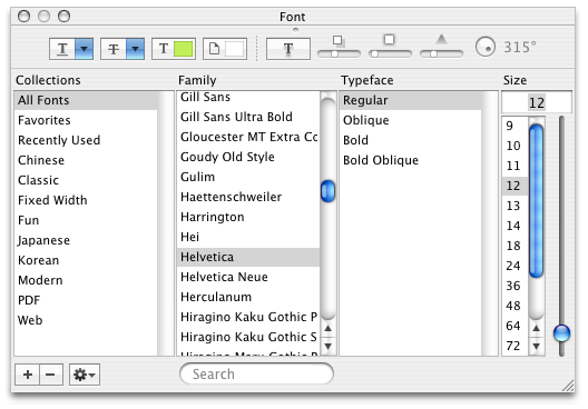
The hierarchy may be a literal one, such as a filesystem, or a conceptual one—this pattern is often used to let a user navigate and choose items within categories or make a series of interdependent choices, as with the fonts in the example in Figure 5-34 at the top of the pattern.
Why
By spreading the hierarchy out across several scrolled lists, you show more of it at once. It’s that simple. Visibility is helpful when you’re dealing with complex information structures. Also, laying the items out in lists organizes them nicely—a user can more easily keep track of what level he’s dealing with than he could with an outline format, since the hierarchy levels are in nice, predictable, fixed-position lists.
How
Put the first level of the hierarchy in the leftmost list (which should use single-selection semantics). When the user selects an item in it, show that item’s children in the next list to the right. Do the same with the child items in this second list; show its selected item’s children in the third list. And so on.
Once the user reaches items with no children—the “leaf” items, as opposed to “branches”—you might want to show the details of the last-selected item at the far right. An image file typically displays a thumbnail; you might instead offer a UI for editing an item, reading its content, or whatever is appropriate for your particular application.
A nice thing about this pattern is that you can easily associate buttons with each list: delete the current item, move up, move down, and so on. Many toolkits will let you do this in tree controls via direct manipulation, but for those that don’t have built-in tree controls, this is a viable alternative.
Examples
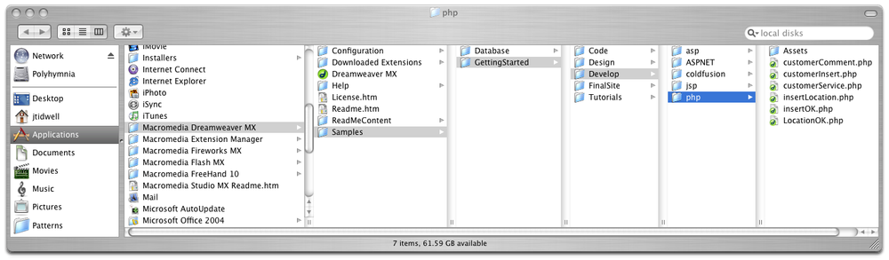
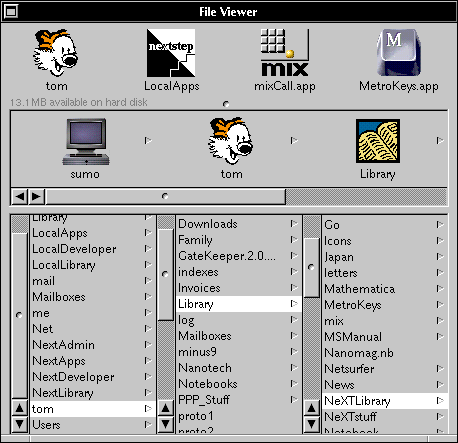
The Mac OS Finder screenshot shown in Figure 5-35 is an extreme example, with seven levels. But it shows that the pattern scales well, letting the user drill down into deep filesystem hierarchies while staying oriented. (Warning: this can be confusing for people who aren’t familiar with this pattern and the concept of a hierarchy.)
NeXTSTEP originally used this technique in its own File Viewer, circa 1990 or so. The example in Figure 5-36 is from http://www120.pair.com/mccarthy/nextstep/intro.htmld/Workspace.html.
In other libraries
http://quince.infragistics.com/Patterns/Cascading%20Lists.aspx
Tree Table

What
Put item fields in table-like columns, but use an indented outline structure in the first column to illustrate the tree structure.
Use when
The items in a list are highly structured, with specific attributes that are of interest to users. You can show them in a multicolumn list or table. But the items are primarily organized as a hierarchy, so you also want a tree to display them most of the time.
Your users are relatively sophisticated with respect to interface usage; this is not an easy pattern for naive computer users to understand (and the same can be said about most hierarchical views, including trees and Cascading Lists).
Why
Combining the two data-viewing approaches into one view gives you the best of both worlds, at the cost of some visual and programming complexity. You can show the hierarchy of items, plus a matrix of additional data or item attributes, in one unified structure.
How
The examples show what you need to do: put the tree (really an outline) in the first column, and the item attributes in the subsequent columns. The rows—one item per row—are usually selectable. Naturally, this can be combined with Sortable Table to produce a more browsable, interactive structure. Sorting on the columns disrupts the tree ordering, so you’ll need to provide an extra button or some other affordance to re-sort the table into the order required by the tree.
This technique seems to have found a home in email clients and news readers, where threads of discussion form tree-like structures.
Examples
The Firefox browser once used a distinctive-looking Tree Table in one of its dialog boxes. The separators—horizontal lines—help to visually group the items in different categories, which isn’t a bad idea at all (see Figure 5-38).

In other libraries
New-Item Row
Use when
The interface contains a table, list, tree view, or any other vertical presentation of a set of items (one item per row). At some point, the user needs to add new items to it. But you don’t have a lot of room to spare on the UI for extra buttons or options, and you want to make item creation very efficient and easy for the user.
Why
By letting the user type directly into the end (or the beginning) of the table, you put the act of creation into the same place where the item will ultimately “live.” It’s conceptually more coherent than putting it in some other part of the UI. Also, it makes the interface more elegant than having an entirely different UI for item creation—it uses less screen real estate, it reduces the amount of navigation that needs to be done (thus eliminating a “jump” to another window), and it’s less work for your users.
How
Give the user an easy and obvious way to initiate a new object from the first empty table row. A single mouse click in that row might start editing, for instance, or the row might contain a “New Whatever” pushbutton, or it might contain a dummy item as shown at the top of the pattern in Figure 5-39.
At that point, the UI should create the new item and put it in that row. Each column in the table (if it’s a multicolumn table) should then be editable, thus letting the user set up the values of that item. The cells could have text fields in them, or drop-down lists, or whatever else is necessary to set the values quickly and precisely. As with any form-like user input, Good Defaults (Chapter 8) help save the user work by prefilling those values; the user doesn’t have to edit every column.
There are still some loose ends to clean up, though. What happens if the user abandons the new item before finishing? You can establish a valid item right from the beginning—if the user abandons the edits at any time, the item exists until the user goes back and deletes it. Again, Good Defaults help by prefilling valid values if there are multiple fields.
Depending on how it’s implemented, this pattern can resemble Input Prompt (Chapter 8). In both cases, a dummy value is set up for the user to edit into a real value, and that dummy value is worded as a “prompt” that shows the user what to do.
Examples
Excel’s built-in spreadsheet templates, such as the one shown in Figure 5-40 for budgeting, mark the New-Item Row very clearly by putting a blue box around the entire row. The PowerPoint outline view shown in Figure 5-41 affords creation of new slides by typing into the bottom row, but the interface is subtler and hard to notice. (I went looking for this feature before I found it; I never knew beforehand that it existed.)

