Chapter 3. Getting Around: Navigation, Signposts, and Wayfinding
The patterns in this chapter deal with the problem of navigation. How do users know where they are now, where to go next, and how to get there from here?
I call navigation a “problem” because navigating around a website or application is like commuting. You have to do it to get where you need to go, but it’s dull, it’s sometimes infuriating, and the time and energy you spend on it just seems wasted. Couldn’t you be doing something better with your time, such as playing a game or getting some actual work done?
The best kind of commuting is none at all. Having everything you need right at your fingertips without having to travel somewhere is pretty convenient. Likewise, keeping most tools “within reach” on an interface is handy, especially for intermediate-to-expert users (i.e., people who have already learned where everything is). Sometimes you do need to put lesser-used tools on separate screens, where they don’t clutter things up; sometimes you need to group content onto different pages so that the interface makes sense. All this is fine, as long as the “distances” that a user must travel remain short.
So, less is better. Let’s talk terminology for a minute and come back to this concept.
Staying Found
Let’s say you’ve built a large website or application that you’ve had to break up into sections, subsections, specialized tools, pages, windows, wizards, and so forth. How do you help users navigate?
Signposts are features that help users figure out their immediate surroundings. Common signposts include page and window titles, web page logos and other branding devices, tabs, and selection indicators. Patterns and techniques such as good global and local navigation links, Sequence Map, Breadcrumbs, and Annotated Scrollbar—all described in this chapter—tell users where they currently are, and often where they can go with only one more jump. They help a user to stay “found” and to plan his next steps.
Wayfinding is what people do as they find their way toward their goal. The term is pretty self-explanatory. But how people actually do it is quite a research subject—specialists from cognitive science, environmental design, and website design have studied it. These common-sense features help users with wayfinding:
- Good signage
Clear, unambiguous labels anticipate what you’re looking for and tell you where to go; signs are where you expect them to be, and you’re never left standing at a decision point without guidance. You can check this by walking through the artifact you’re designing and following the paths of all the major use cases. Make sure that each point where a user must decide where to go next is signed or labeled appropriately. Use strong “calls to action” on the first pages that a user sees.
- Environmental clues
You’d look for restrooms in the back of a restaurant, for instance, or a gate where a walkway intersects a fence. Likewise, you would look for an “X” close button at the top right of a modal dialog and logos in the upper-left corner of a web page. Keep in mind that these clues are often culturally determined, and someone new to the culture (e.g., someone who’s never used a given operating system before) will not be aware of them.
- Maps
Sometimes people go from sign to sign or link to link without ever really knowing where they’re going in a larger frame of reference. (If you’ve ever found your way through a strange airport, that’s probably what you did.) But some people might prefer to have a mental picture of the whole space, especially if they’re there often. Also, in badly signed or densely built spaces, such as urban neighborhoods, maps may be the only navigational aids people have.
In this chapter, the Clear Entry Points pattern is an example of careful signage combined with environmental clues—the links should be designed to stand out on the page. A Sequence Map, obviously, is a map; you can use Overview Plus Detail (Chapter 7) to show maps for virtual spaces, too. Modal Panel sort of qualifies as an environmental clue, since the ways out of a modal panel take you right back to where you just were.
I’ve compared virtual spaces to physical ones here. But virtual spaces have the unique ability to provide a navigational trump card, one that physical spaces can’t (yet) provide: the Escape Hatch. Wherever you are, click on that link, and you’re back to a familiar page. It’s like carrying a wormhole with you. Or a pair of ruby slippers.
The Cost of Navigation
When you walk into an unfamiliar room, you look around. In a fraction of a second, you take in the shape of the room, the furnishings, the light, the ways out, and other clues; very quickly, you make some assumptions about what this room is and how it relates to why you walked in. Then you need to do what you came in to do. Where? How? You might be able to answer immediately—or not. Or maybe you’re just distracted by other interesting things in the room.
Similarly, bringing up a web page or opening a window incurs a cognitive cost. Again, you need to figure out this new space: you take in its shape, its layout, its contents, its exits, and how to do what you came to do. All of this takes energy and time. The “context switch” forces you to refocus your attention and adjust to your new surroundings.
Even if you’re already familiar with the window (or room) you just went into, it still incurs a cost. Not a large cost, but it adds up—especially when you figure in the actual time it takes to display a window or load a page.
This is true whether you’re dealing with web pages, application windows, dialog boxes, or device screens. The decisions that users make about where to go are similar—labels still need to be read or icons decoded, and the users will still make leaps of faith by clicking on links or buttons they’re not sure about.
Furthermore, loading time affects people’s decisions. If a user clicks through to a page that takes too long to load—or fails to load altogether—he may be discouraged, and may just close the page before he finds what he came for. (So, how many viewers is that sidebar video player costing you?) Also, if a site’s pages take a chronically long time to load, users will be less likely to explore that site.
There’s a reason that companies like Google work very hard to keep page loads as fast as possible: latency costs viewers.
Keep Distances Short
Keep Distances Short
Knowing that there’s a cost associated with jumping from page to page, you can understand now why it’s important to keep the number of those jumps down. When a common task requires many page jumps, try to reduce it to one or two.
But the real efficiency gains come from the structure of the application. One of the nastiest things a designer can do is force a user to go into multiple levels of subpages, dialogs, and so forth every time he needs to accomplish a simple and everyday task. (Worse is to lead him there, tell him he can’t accomplish it because of some missing precondition, and send him back to square one.)
Can you design your application so that the most common 80% of use cases can be done in one page, without any context switches? (Or perhaps only one?)
This is hard to do with some kinds of applications. Is a certain tool too big to put on your main page? Try shrinking it: eliminate controls, shorten labels, turn words into pictures, or use specialized form controls that save space. Is it too distracting when combined with everything else on the main page? Again, try shrinking it, isolating it with whitespace, or putting it in an out-of-the-way spot. Can you use progressive disclosure to gradually show more content on the same page? Can you use Module Tabs or an Accordion to hide some content by default?
Sometimes it’s appropriate to bury functionality inside pages that take more than one jump to get to, such as that extra 20% of tasks left over from the 80% you made easily available. It could also be that on your application, simplicity of presentation is more important than saving one or two jumps. You could put little-used functionality behind an extra “door” (also using the 80/20 rule). As always, experiment with different designs, and usability-test them if you have any doubts.
Navigational Models
What is the navigational model for your site or app? In other words, how do the different screens (or pages, or spaces) link to each other, and how do users move between them?
First, some more terminology.
Global navigation is what’s found on every main screen. It usually takes the form of menus, tabs, and/or sidebars, and this is how users move around the formal navigational structure of the site. (In an earlier version of this book, global navigation was defined as a pattern. But by now, it’s so common and well understood that it really doesn’t need to be called out as such anymore.)
Utility navigation, also found on every main screen, contains links and tools related to noncontent aspects of the site or application: sign-in, help, print, Settings Editor (see Chapter 2), language tools, and so on.
Associative and inline navigation embed links in or near the actual content. As the user reads or interacts with the site, these links present options that might be immediately relevant to the user. They tie content together thematically.
Now let’s look at a few models found in typical sites and apps:
- Hub and spoke
Most often found on mobile devices, this architecture (Figure 3-1) lists all the major parts of the site or app on the home screen, or “hub.” The user clicks or taps through to them, does what she needs to do, and comes back to the hub to go somewhere else. The “spoke” screens focus tightly on their jobs, making careful use of space—they may not have room to list all the other major screens. The iPhone home screen is a good example; the Menu Page pattern found on some websites is another.
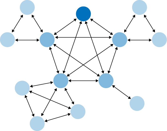
- Fully connected
Many websites follow this model. There’s a home page or screen, but it and every other page link to all the others—they each have a global navigation feature, such as a top menu. The global navigation may be a single level (as shown in Figure 3-2, with only five pages), or it might be deep and complex, with multiple levels and deeply buried content. As long as the user can reach any page from any other with a single jump, it’s fully connected.
- Multi-level
This is also common among websites (see Figure 3-3). The main pages are fully connected with each other, but the subpages are only connected among themselves (and usually to the other main pages, via global navigation). You’ve seen this on sites that have subpages listed only in sidebars or subtabs—users see these on menus that only show up after they’ve clicked the link for the main page or category. It takes two or more jumps to get from one arbitrary subpage to another. Using drop-down menus, the Fat Menus pattern, or the Sitemap Footer pattern with a multi-level site converts it to a fully connected one, which is preferable.
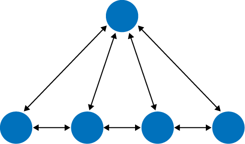
- Stepwise
Slideshows, process flows, and Wizard (see Chapter 2) lead the user step by step through the screens in a prescribed sequence (see Figure 3-4). Back/Next links are prominent on the page.
- Pyramid
A variant on the stepwise model, a pyramid uses a hub page or menu page to list an entire sequence of items or subpages in one place (see Figure 3-5). The user picks out any item, jumps to it, and then has the option to use Back/Next links to step through other items in order. He can go back to the hub page anytime. See the Pyramid pattern in this chapter for more.
- Pan-and-zoom
Some artifacts are best represented as single large spaces, not many small ones. Maps, large images, large text documents, information graphics, and representations of time-based media (such as sound and video) fall into this category. Chapter 7 discusses these in more detail. Panning and zooming are still navigation—so offer controls for panning (moving horizontally or vertically), zooming in and out, and resetting to a known position and state. Figure 3-6 shows an example of pan-and-zoom.
- Flat navigation
Some types of applications need little or no navigation at all. Consider Canvas Plus Palette applications such as Photoshop, or other complex apps such as Excel—these offer tons of tools and functions that are easily reached via menus, toolbars, and palettes. Tools that don’t act immediately upon the work may be accessible via Modal Panel or step-by-step progressions. These types of applications seem to be qualitatively different from the other navigation styles listed here: the user always knows where he is, but he may not easily find the tools he needs because of the sheer number of features available at one time.
- Modal panel
This brings a user to a screen with no navigation options other than acknowledging its message, completing its form, or clicking the panel away (Figure 3-7). Modal panels often show up layered on top of a full screen or page, and are used for small, focused tasks that require the user’s full attention. See the Modal Panel pattern for more discussion.
- Clear entry points
How does a user know where to start in a complex site or app? The Clear Entry Points pattern shows him where to go first (see Figure 3-8). For first-time and infrequent users, it removes some of the burden of learning the site.
- Bookmarks
Bookmarks (Figure 3-9), permalinks, deep links, and Deep-linked State are all ways for a user to conveniently navigate to a point of his choice, anytime he wants, even if it’s deep inside a navigational structure. These give him a way to avoid traversing many links to get to a desired page or state.
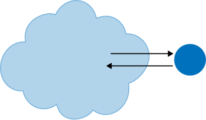
- Escape hatch
When a user is hopelessly entangled in an app, reaches an error state, or gets deep-linked into a page that he has no context for understanding, he needs an escape hatch (Figure 3-10), a well-labeled link to get back to a known place. See the Escape Hatch pattern.


There are three things to notice about these navigational models. The first is that they’re mix-and-match—an app or site might combine several of these, especially Modal Panel, Clear Entry Points, bookmarks, and Escape Hatch, which are very local and don’t affect the site-wide navigation strategy.
The second thing is that some of these mechanisms actually restrict a user’s navigation options. Most of the time, open access and short jumps are good things. But when a user is in the middle of a full-screen slideshow, she doesn’t want to see a complicated global navigation menu! She would rather just focus on the slideshow itself, so Back/Next controls and an Escape Hatch are all that’s necessary. The presence of full navigation options is not without cost: it takes up space, clutters the screen, incurs cognitive load, and signals to the user that leaving the page doesn’t matter.
Third, all these mechanisms and patterns can be rendered on-screen in different ways. A complex site or app might use tabs, or menus, or a sidebar tree view to show the global navigation on each page—that’s something you don’t need to decide until you start laying out the page. Likewise, a modal panel might be done with a lightbox or an actual modal dialog—but you can postpone that until you know what needs to be modal and what doesn’t.
Visual design can come later in the design progression, after the information architecture and navigational models.
Design Conventions for Websites
It’s a fine thing to separate the navigational model from its visual design. Doing so can help you think more flexibly and deliberately about how to design the pages themselves. But websites have certain conventions regarding visual placement of navigational features, and it’s probably unwise to ignore them.
Global navigation is almost always shown at the top or left of a web page, sometimes both. Rarely, it can be found on the right—this placement can cause problems with page size and horizontal scrolling, unless the designer uses a Liquid Layout (see Chapter 4).
Two relatively new approaches to global navigation are found in the Fat Menus and Sitemap Footer patterns. In these, the whole structure of a hierarchical site is laid out for the user to see, at the cost of screen space in the header or footer. As explained earlier, these patterns turn a multi-level navigational model into a fully connected one.
When a site’s visitors are typically signed-in members, that site may offer a set of utility navigation links in its upper-right corner. Users tend to look there for tools related to their presence on the site: account settings, user profile, logout, help, and so on. See the Sign-in Tools pattern for more.
A common form of associative navigation—when links are embedded in or near the content itself, linking items together thematically—is a “Related Articles” section or panel. News sites and blogs use this a lot: when a user reads an article, a sidebar or footer shows other articles that talk about similar topics or are written by the same author.
Tags, both user-defined and system-defined, can help support associative navigation and related articles or links. Tag clouds support topical findability on some sites, especially where the number of articles is very large and the topics fine-grained. (On smaller sites and blogs, they don’t work as well.) A more common navigational technique is to list an article’s tags at the end; each tag is a link leading to a whole set of articles that share that tag.
When a site takes advantage of social media, even more navigation options come into play. The front of a site may have a News Box, which links users to the items posted most recently. Content Leaderboard show the most frequently shared or commented pieces, while Recent Chatter directs users to ongoing conversations. And Social Links and Sharing Widget connect users directly to social media services. See Chapter 9 for these patterns.
The Patterns
To recap, this chapter talks about several aspects of navigation: overall structure or model, knowing where you are, figuring out where you’re going, and getting there efficiently.
The first set of patterns address the navigational model, and are more or less independent of screen layout:
Combining layout and model on conventional websites, we get these patterns:
The next few patterns work well as “You are here” signposts (as can a well-designed global navigation). Sequence Map, Breadcrumbs, and Annotated Scrollbar also serve as interactive maps of the content. Annotated Scrollbar is intended more for pan-and-zoom models than for multiple interconnected pages.
Animated Transition helps users stay oriented as they move from one place to another. It’s a visual trick, nothing more, but it’s very effective at preserving a user’s sense of where he is and what’s happening.
Clear Entry Points
What
Present only a few main entry points into the interface; make them task-oriented and descriptive. Use clear calls to action.
Use when
You’re designing a site or app that has a lot of first-time or infrequent users. Most of these users would be best served by reading a certain piece of introductory text, doing an initial task, or choosing from a very small number of frequently used options.
However, if the purpose is clear to basically everyone who starts it, and if most users might be irritated by one more navigation step than is necessary (like applications designed for intermediate-to-expert users), this may not be the best design choice.
Why
Some applications and websites, when opened, present the user with what looks like a morass of information and structure: lots of tiled panels, unfamiliar terms and phrases, irrelevant ads, or toolbars that just sit there disabled. They don’t give the hesitant user any clear guidance on what to do first. “OK, here I am. Now what?”
For the sake of these users, list a few options for getting started. If those options match a user’s expectations, he can confidently choose one and begin working—this contributes to immediate gratification. If not, at least he knows now what the site or app actually does, because you’ve defined the important tasks or categories up front. You’ve made the application more self-explanatory.
How
When the site is visited or the application started, present these entry points as “doors” into the main content. From these starting points, guide the user gently and unambiguously into the application until he has enough of a context to continue by himself.
Collectively, these entry points should cover most of the reasons most users would be there. There might only be one or two entry points, or many; it depends on what fits your design. But you should phrase them with language first-time users can understand—this is not the place for application-specific tool names.
Visually, you should show these entry points with emphasis proportional to their importance.
On the home page or starting page, most sites will additionally list other navigation links—global navigation, utility navigation, and so on—and these should be smaller and less prominent than the Clear Entry Points. They’re more specialized, and don’t necessarily lead you directly into the heart of the site, any more than a garage door leads you directly into the living room. The Clear Entry Points should serve as the “front doors.”
Examples
The top of Apple’s main iPad page (Figure 3-12) needs to do only a few things: identify itself, make the iPad look inviting, and direct the user toward resources for buying one or learning more. The global navigation recedes visually, compared to the strong, well-defined entry points. On the rest of the page, more text and links make the page denser, but this is all the user sees above the fold.

Fireworks and other applications show a startup dialog when the application is started (see Figure 3-13). This orients a new or infrequent user to the possibilities for action; creating something new, opening an existing document, or reading help resources are the most common items to be found here. (Appropriately, this startup dialog has a checkbox that lets the user turn it off for future startups. Expert users may not want to bother with such a dialog, since it adds one more step—and no value—to the process of getting started on their work.)

In other libraries
http://quince.infragistics.com/Patterns/Clear%20Entry%20Points.aspx
Menu Page
What
Fill the page with a list of links to content-rich pages in your site or app. Show enough information about each link to enable the user to choose well. Show no other significant content on the page.
Use when
You’re designing a home page, starting screen, or any other screen whose purpose is to be just a “table of contents”—to show where users can go from here. You may not have room for featured content (such as an article, video, or promotion), or you may simply want to let the user pick a link with no distractions.
Mobile apps and sites especially need Menu Page to make the best use of their small screens.
If your (full-size) site needs to “hook” visitors into staying on the page, it may be better to use some of the page space for promotional items or other interesting content, and a Menu Page wouldn’t be the right design choice. Likewise, a site that needs to explain its value and purpose should use the space to do that instead.
It takes some audacity to design a Menu Page, because you must be very confident that:
Why
With no distractions, users can focus all their attention on the available navigation options. You get the entire screen (or most of it, anyway) to organize, explain, and illustrate those links, and can thus direct users to the most appropriate destination page for their needs.
How
If you’re creating a mobile design, Menu Page are one of your principal tools for designing sites or apps with many levels of functionality. Keep list labels short, make targets large enough to tap easily (for touch screens), and try not to make hierarchies too deep.
The rest of this applies to full-size sites and apps.
First, label the links well, and provide just enough contextual information for users to decide where to go. This isn’t necessarily easy. Visitors may find it very helpful to have a description or teaser with each link, but that could take up a lot of space on the page. Likewise for thumbnail images—they can look great, but how much value do they add?
Look at Figures Figure 3-15 and Figure 3-16. Visitors to the MIT site already know the meanings of these links—they’re the names of academic programs—so extra information is unnecessary. The designer is thus able to pack in more links above the fold. The result is an information-dense, useful page.
On the other hand, the articles in the AIGA resources page do benefit from descriptive text and images. The titles alone aren’t necessarily enough to persuade a visitor to click through. (Keep in mind, too, that a user who clicks through and finds that the destination page isn’t what he wanted will get frustrated quickly. Make sure your descriptions are accurate and fair!)
Second, consider the visual organization of the list of links. Do they come in categories, or perhaps a two-or three-level hierarchy? Is it ordered by date? Express that organizational scheme in the list. See Chapter 5 for more discussions on this topic.
Third, don’t forget a search box.
Finally, reconsider whether you have anything else to say on this page. Home page space, in particular, is quite valuable for drawing in users. Is there an interesting article teaser you can put there? A work of visual art? A News Box (see Chapter 9)? If such things would annoy more than intrigue, continue designing a pure Menu Page.
Examples
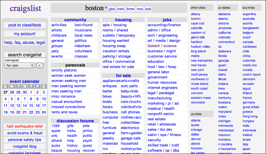
In the website for MIT (Figure 3-15), the “Education” page shows very little explanatory text and a whole lot of links. When a user reaches this point in the website, she’s probably looking for a specific department or resource, and she isn’t looking for, say, an explanation of what MIT is about. The whole point of this page is to move the visitor along to a page that answers a well-defined need. (The same is true of the Craigslist example in Figure 3-14 at the top of the pattern.)

The AIGA website contains many resources for design professionals. The site presents several top-level categories for those resources, as shown in the global navigation, but the landing page for each of those categories is a Menu Page (Figure 3-16). The articles are shown with thumbnail images and summary text; the rich format gives the viewer enough of a context to decide whether to invest time in clicking through to the article.

Last, the Museum of Modern Art uses large images and little text on this Menu Page (see Figure 3-17). This page is intriguing enough to hook a user on its own, without featuring any particular content at all.

In other libraries
The Directory Navigation pattern at the following URL describes one specialized use of a Menu Page:
http://welie.com/patterns/showPattern.php?patternID=directory
Pyramid

What
Link together a sequence of pages with Back/Next links. Create a parent page that links to all of the pages in this sequence, and let the user view them either in sequence or out of order.
Use when
The site or application contains a sequence of items that a user would normally view one after another, such as a slideshow, a wizard, chapters in a book, or a set of products. Some users would rather view them one at a time and out of order, however, and they need to be able to pick from a full list of the items.
Almost all Picture Manager (see Chapter 2) use a Pyramid navigational model. Sometimes people need to look at pictures individually; sometimes they would rather browse by walking through the whole sequence. Pyramid support both use cases.
Why
This pattern reduces the number of clicks it takes to get around. It improves navigation efficiency, and it expresses a sequential relationship among the pages.
Back/Next (or Previous/Next) links or buttons are all well and good. People know what to do with them. But a user doesn’t necessarily want to be locked into a page sequence that he can’t easily get out of: having gone seven pages in, will he need to click the Back button seven times to get back where he started? Not fun!
By putting a link back to the parent page on each sequence page, you increase the user’s options. You’ve now got three main navigation options instead of two—Back, Next, and Up. You haven’t made it much more complex, but a casually browsing user (or one who’s changed his mind in midstream) will need far fewer clicks to go where he wants to go. It’s more convenient for users.
Likewise, chaining together a set of unconnected pages is kind to users who actually want to see all the pages. Without the Back/Next links, they would be “pogo sticking” to the parent page all the time; they might just give up and leave.
How
List all the items or pages, in order, on the parent page. Render the list in a way that suits the types of items you’re dealing with (see Chapter 5), such as a Thumbnail Grid for photos, or a rich text list for articles. A click on an item or link brings the user to that item’s page.
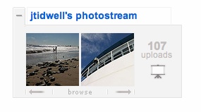
On each item page, put Back/Next links. Many sites show a small preview of the next item, such as its title or a thumbnail (Flickr does this, as shown in Figure 3-19). In addition, put in an Up link to bring the user back to the parent page, and label it with “Back to <Page Title Here>” or something similar.
One Pyramid variation turns a static linear sequence into a loop by linking the last page back to the first without going back to the parent. This can work, but does the user know she’s looped all the way back around? Does she recognize the first page in the sequence? Not necessarily. If the order of a sequence is important, you should link the last page to the parent page, since it tells the user that she’s seen all there is to see.
Examples
Flickr’s item page is a classic Pyramid example. This Picture Manager shows pictures in a sequence called a photostream, which can be seen in its entirety by clicking the labeled link at the top of this widget (see Figure 3-19). The two thumbnails show the previous and next pictures in the photostream.
The New York Times interactive feature shown in Figure 3-20 is another Picture Manager. The parent page shows an irregular Thumbnail Grid of clickable pictures; the item page (shown in Figure 3-21) contains arrow buttons to traverse the series of photos. Note that this shows the user where she is in the sequence—“121 of 176”—which is a nice touch. There is no “Up” button, but the only other control in that panel, “Close,” returns the user to the parent page. (It thus makes an interesting use of a Modal Panel.)

Modal Panel

What
Show only one page, with no other navigation options, until the user finishes the immediate task.
Use when
The app or site has gotten into a state from which it shouldn’t or can’t proceed without input from the user. In a document-centric application, for instance, a “save” action might need the user to supply a filename if one wasn’t already given. In other contexts, the user may need to sign in before proceeding, or acknowledge an important message.
If the user simply initiates a minor action that may need further input, try to find a way to ask for that input without a modal panel. You could show a text field right below the button that the user clicked, for example, and leave it “hanging” there until the user comes back to it—there’s no need to hold up the whole site or app until that input is given. Let the user do something else, and then return to the question at a later time.
Why
A modal panel cuts off all other navigation options from the user. He can’t ignore it and go somewhere else in the app or site: he must deal with it here and now. When that’s done, he gets sent back to where he was before.
It’s an easy model to understand—and to program—though it was overused in applications of past years. A modal panel is disruptive. If the user isn’t prepared to answer whatever the modal panel asks, it interrupts his workflow, possibly forcing him to make a decision about something he just doesn’t care about. But when used appropriately, a modal panel channels the user’s attention into the next decision that he needs to make. There are no other navigation possibilities to distract him.
How
In the same space on the screen where the user’s attention lies, place a panel, dialog box, or page that requests the needed information. It should prevent the user from bringing up other pages in that application. This panel ought to be relatively uncluttered, in keeping with the need to focus the user’s attention onto this new task with minimal distractions.
Remember that this is a navigation-related pattern. You should carefully mark and label the ways out, and there shouldn’t be many of them; one, two, or maybe three. In most cases, they are buttons with short, verbish labels, such as “Save” or “Don’t save.” There is usually a “Close” or “X” button in the upper right. Upon clicking a button, the user should be taken back to the page he came from.
The lightbox effect is a very effective visual presentation of a modal panel. By dimming most of the screen, the designer highlights the bright modal panel and focuses attention on it. (For this to work, the modal panel needs to be large enough for the user to find it effortlessly. I’ve seen modal panels that were so small and off-center that it was hard to find them in a large browser window.)
Instead of layering a modal panel on top of another page, some websites simply use pages with extremely limited navigation. Sign-in and registration screens are commonly done this way: global and local navigation are stripped out, and all that’s left are the exits (Cancel, Continue, etc.) and an Escape Hatch.
Operating systems and GUI platforms usually offer OS-level modal dialog boxes. These are best used in traditional desktop applications—websites should avoid them in favor of lighter-weight overlay techniques, which are easier for the designer to control and less disruptive to the user.
Examples
SlideShare uses a lightbox to draw attention to its login dialog. If you try to do something on SlideShare that requires you to be signed in, the modal panel in Figure 3-23 appears. There are only three ways to deal with it: sign in, register, or click the familiar “X” button in the upper-right corner. This is very typical of many lightbox-highlighted modal panels on the Web.

Likewise, Kayak uses a similar lightbox for a modified search—but this one actually points to the link that launched it, which helps the user connect her gesture with the resultant modal panel (see Figure 3-24). It’s a nice touch.

The “shade” form of a Mac modal dialog box draws attention to itself as it drops down from the window title bar (animated, of course). These and other application-level modal dialogs actually prevent the user from interacting with the rest of the application, so the user is forced to finish or dismiss this thread of work before doing anything else (see Figure 3-25).

In other libraries
http://quince.infragistics.com/Patterns/Modal%20Panel.aspx
http://patternry.com/p=overlay/
See also the Dialog Overlay pattern in Designing Web Interfaces by Bill Scott and Theresa Neil (O’Reilly, http://oreilly.com/catalog/9780596516253/). Other types of overlays are described in that chapter as well.
Deep-linked State

What
Capture the state of a site or app in a URL that can be saved or sent to other people. When loaded, it restores the state of the app to what the user was seeing.
Use when
The site or app’s content is something large and interactive, such as a map, book, video, or information graphic. A specific desired point or state might be hard to find, or it may take many steps to get there from a typical starting point. The app may have many user-settable parameters or states, such as viewing modes, scales, data layers, and so on—these may add to the complexity of finding a particular point and seeing it in the “right” way.
Why
Deep-linked State gives the user a way to jump directly to a desired point and application state, thus saving time and work. It behaves like a “deep link” directly into a piece of content on a conventional site—or a permalink to a blog entry—in the sense that you end up with a URL pointing directly to the desired content. But it can be more complex than a permalink, because it can capture both application state and content position.
This pattern is useful for saving a state that the user might want to re-create later, especially if he can “bookmark” it using well-known mechanisms (like browser bookmarks, sites such as Delicious, etc.). It’s also handy for sharing with other people, and that’s where it really shines. A URL representing a Deep-linked State can be emailed, tweeted, posted to a social network, discussed in a forum, published in a blog entry, and talked about in any number of ways. It might make a statement, or go viral, or become a “socially mediated object.”
How
Track the user’s position in the content, and put that into a URL. Track supporting data there as well—comments, data layers, markers, highlighting, and so on—so that reloading the URL will bring it all back.
Consider what other parameters or interface states you might want users to save: zoom levels, magnification, viewing modes, search results, and so on. Not all of these should necessarily be captured, since loading the Deep-linked State shouldn’t trample on settings that a user doesn’t want changed. Work carefully through some usage scenarios to figure this out.
URLs are the best format for saving Deep-linked State: they are universally understood, portable, short, and supported by a vast variety of tools, such as bookmarking services. (If you’re dealing with nonweb applications, you may need to be more creative.) Other formats can also be used, such as XML; a text-based format is generally much easier to manage than a binary format.
As a user moves through the content and changes various parameters, immediately put the updated URL in the browser’s URL field so that it can be easily seen and captured. Not everyone will think to find it there, so you might also design a “Link” feature whose existence tells the user, “Here’s how you create a link to this screen.” Some sites offer to generate a JavaScript fragment that not only captures position and state, but also lets users embed the whole thing into another website.
Examples
Google Books captures a large amount of state in its URLs (see Figure 3-27): the position in the book, the viewing mode (single page, two-up, thumbnails), the presence of toolbars, and even search results. It does not capture magnification level, which makes sense, as that’s a very individual setting. The URL as seen in the “Link” tool is actually redundant—the URL shown by the browser itself is exactly the same.

Many Eyes, the visualization tools published by IBM, gives visitors the ability to put together their own custom information graphics, based on plot types and data sets offered by the site (see Figure 3-28). They’re highly interactive and rich. To share one of these visualizations, you can either generate JavaScript for it (for embedding), or create a snapshot image.

Its interface doesn’t advertise it, but YouTube lets you put a timestamp into the
URL for a video. When loaded, this brings the viewer directly to the specified time in
the video. The site http://youtubetime.com
explains how to do it (see Figure 3-29): add #t=XmYs to the
end of the URL, where X is the number of minutes and
Y the number of seconds.

Escape Hatch

What
On each screen that has limited navigation options, place a button or link that clearly gets the user out of that screen and back to a known place.
Use when
You’ve got pages that constitute some sort of serial process, such as a wizard, or any pages that lock the user into a limited navigation situation, such as a Modal Panel. These might be pages that users can reach out of context, as they could do via search results.
(Figure 3-10 sometimes aren’t necessary when you have Sequence Map or Breadcrumbs on a page. Users who understand them can use those to get back to some known place.)
Why
Limited navigation is one thing, but having no way out is quite another! If you give the user a simple, obvious way to escape from a page, no strings attached, he’s less likely to feel trapped there.
This is the kind of feature that helps people feel like they can safely explore an app or site. It’s sort of like an undo feature—it encourages people to go down paths without feeling like they’re committing to them. See the Safe Exploration pattern in Chapter 1.
Now, if these are pages that users can reach via search results, it’s doubly important that Figure 3-10 be put on each page. Visitors can click these to get to a “normal” page that tells them more about where they actually are.
How
Put a button or link on the page that brings the user back to a “safe place.” This might be a home page, a hub page in a hub-and-spoke design, or any page with full navigation and something self-explanatory on it. Exactly what it links to will depend upon the application’s design.
Examples
Websites often use clickable site logos as home-page links, usually in the upper left of a page. These provide an Escape Hatch in a familiar place, while helping with branding.
In some dialogs, a Cancel button or the equivalent can serve this purpose. These also let the user say, “I’m done with this; forget I ever started it.”
Have you ever called a company—say, your bank—and had to work your way through a set of phone menus? They can be long, confusing, and time-consuming. If you find yourself in the wrong menu, you may just hang up and try again from the top. But many phone menu systems have a hidden Escape Hatch that they don’t tell you about: if you dial “0” at any point, you might be connected to a human operator.
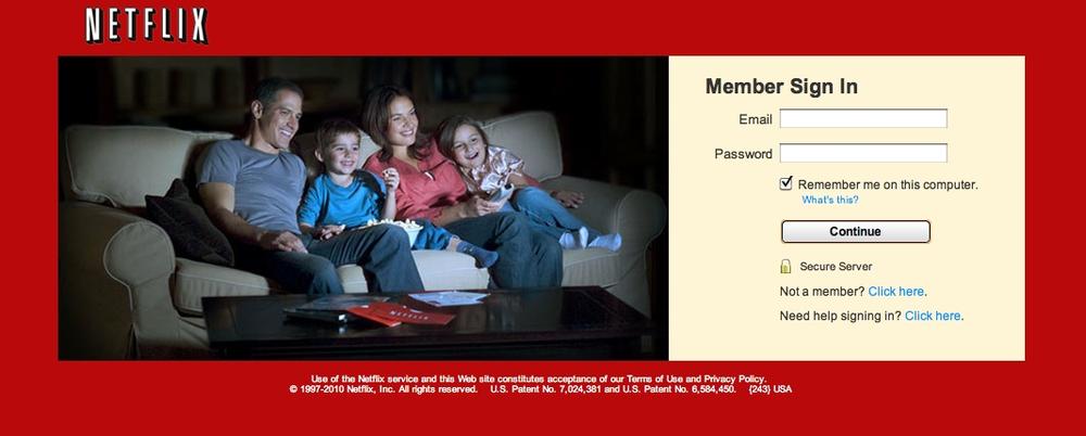
Many websites have certain pages that limit navigation options, such as Modal Panel and pages without global navigation. The Netflix login screen is one example. If a user finds herself here and doesn’t want to log in, she can click on the Netflix logo to go back to the home page (see Figure 3-31).
Sometimes literalism works. Google Labs offers features that aren’t ready for release, and they occasionally break. In the example shown in Figure 3-32, Google Maps gives the user an explicit “escape hatch” URL to use when things go wrong.

In other libraries
These two patterns are named “Home Link.” The concept is very similar to Escape Hatch.
Fat Menus
What
Display a long list of navigation options in drop-down or fly-out menus. Use these to show all the subpages in site sections. Organize them with care, using well-chosen categories or a natural sorting order, and spread them out horizontally.
Use when
The site or app has many pages in many categories, possibly in a hierarchy with three or more levels. You want to expose most of these pages to people casually exploring the site, so they can see what’s available. Your users are comfortable with drop-down menus (click to see them) or fly-outs (roll over them with the pointer).
Why
Fat Menus make a complex site more discoverable. They expose many more navigation options to visitors than they might otherwise find.
By showing so many links on every page, you make it possible for a user to jump directly from any subpage to any other subpage (for most subpages, anyhow). You thus turn a multi-level site—where subpages aren’t linked to the subpages in other site sections—into a fully connected site.
Fat Menus are a form of progressive disclosure, an important concept in user interface design. Complexity is hidden until the user asks to see it. A visitor to a site that uses these can look over the menu headings to get a high-level idea of what’s there, and when he’s ready to dive in, he can open up a Fat Menus with a gesture. He isn’t shown millions of subpages before he’s ready to deal with them.
If you’re already using menus in your global navigation, you might consider expanding them to Fat Menus if surfacing more links makes the content more attractive to casual browsers. People won’t have to drill down into categories and subcategories of your site hierarchy in order to discover interesting pages—they’ll see them there, right up front.
How
On each menu, present a well-organized list of links. Arrange them into Titled Sections (Chapter 4) if they fit into subcategories; if not, use a sorting order that suits the nature of the content, such as an alphabetical or time-based list.
Use headers, dividers, generous whitespace, modest graphic elements, and whatever else you need to visually organize those links. And take advantage of horizontal space—you can spread the menu across the entire page if you wish. Many sites make excellent use of multiple columns to present categories. If you make the menu too tall, it might go right off the end of the browser page. (The user controls how tall the browser is; guess conservatively.)
The best sites have Fat Menus that work stylistically with the rest of the site. Design them to fit well into the color scheme, grid, and so on of the page.
Some menu implementations don’t work well with accessibility technology such as screen readers. Ensure that your Fat Menus can work with these. If they can’t, consider switching to a more static strategy, such as a Sitemap Footer.
Examples
The Fat Menus on the Starbucks website are very well designed (see Figure 3-34). Each menu is a different height but the same width, and follows a strict common page grid (they’re all laid out the same way). The style blends in with the site, and the generous whitespace makes it easy to read. Ads are worked into the design, but not obnoxiously. The nonrectangular shape adds a polished look.

As shown in Figure 3-35, Slate’s menus are less readable and more crowded (in keeping with the overall style of the site). These don’t take full advantage of horizontal space, either. But the idea of using them to show featured articles is clever—the knowledgeable user can skim a large number of headlines by rolling over the menus.

The American Red Cross doesn’t merely float its menus over the top of the page (see Figure 3-36). When the user rolls over any top-level menu item, the resultant Fat Menus actually replaces a carousel-style rotating news panel, taking its space in the page. The menu is the same for all the top-level menu items, so all the subpages in every category are visible at once.

WebMD uses an alphabetical sorting order for its long, flat list of health topics, as shown in Figure 3-37.

Sitemap Footer
What
Place a site map into the footer of every page in a site. Treat it as part of the global navigation, complementary to the header. Abridge the site map if you need to make it fit into a compact space.
Use when
The site you’re designing uses a generous amount of space on each page, and you don’t have severe constraints on page size or download time. You don’t want to take up too much header or sidebar space with navigation.
The site has more than a handful of pages, but not an outrageously large number of categories and “important” pages (things that users will look for). You can fit a reasonably complete site map—at least for pages that aren’t in the header—into a strip no taller than about half of a browser window.
There may be a global navigation menu in the page header, but it doesn’t show all levels in the site hierarchy—maybe it only shows the top-level categories. You prefer a simple, well-laid-out footer instead of Fat Menus, perhaps because of implementation ease or accessibility issues.
Why
Sitemap Footer make a complex site more discoverable. They expose many more navigation options to visitors than they might otherwise have.
By showing so many links on every page, you make it possible for a user to jump directly from any subpage to any other subpage (or major page, anyhow). You thus turn a multi-level site—where subpages aren’t linked to the subpages in other site sections—into a fully connected site. The footer is where the user’s attention lands when she reads to the end of a page. By placing interesting links there, you entice the user to stay on the site and read more.
Finally, showing users the whole site map gives them a strong sense of how the site is constructed and where they might find relevant features. In complex sites, that could be valuable.
You may find yourself trying to choose between a Sitemap Footer design and a Fat Menus design. In conventional websites, a Sitemap Footer would be easier to implement and debug because it doesn’t depend on anything dynamic: instead of showing fly-out menus when the user rolls over items or clicks on them, a Sitemap Footer is just a set of static links. It’s also easier to use with screen readers and it doesn’t require fine pointer control, so it wins on accessibility as well.
On the other hand, the footer may be ignored by busy or casual users who focus only on the page content and the headers. Usability-test if you have any doubts, and watch the click metrics to see if anyone even uses the Sitemap Footer.
How
Design a page-wide footer that contains the site’s major sections (categories) and their most important subpages. Include utility navigation, tools such as language choice or Social Links (Chapter 9), and other typical footer information such as copyright and privacy statements.
This might constitute a complete site map for your site, or it might not. The idea is to cover most of what visitors need to find, without overloading the header or sidebar navigation.
In practice, what often happens is that the global navigation options at the top of the page reflect a more task-oriented design—it tries to answer visitors’ immediate questions regarding “What is this about?” and “Where do I find X right this second?” Meanwhile, the Sitemap Footer shows the actual hierarchical structure of the site itself. This two-part arrangement appears to work well.
If your site deals with content that itself requires complex navigation—such as a large set of products, news articles, music, videos, books, and so on—you could use the top of the page for content navigation and the Sitemap Footer for almost everything else.
Here are some features that can often be found in Sitemap Footer:
Major content categories
Information about the site or organization
Partner or sister sites—for example, sites or brands owned by the same company
Community links, such as forums
Help and support
Contact information
Current promotions
Donation or volunteer information, for nonprofits
Examples
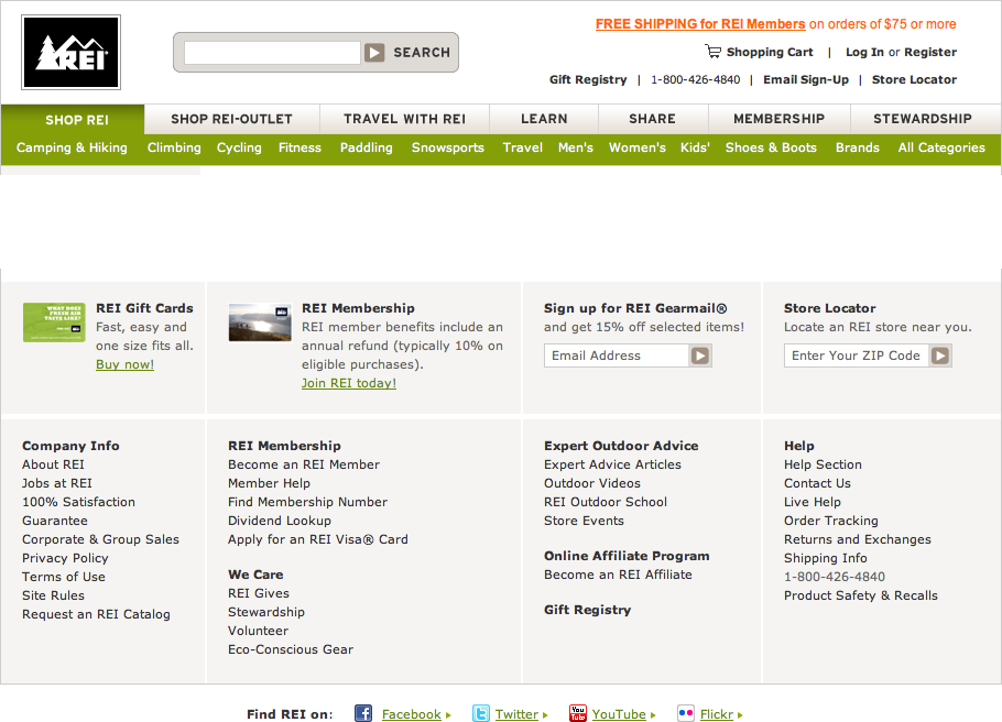
REI’s website demonstrates the difference between task-oriented top-of-page global navigation and an effective Sitemap Footer (see Figure 3-39). Shopping, learning, and travel dominate the header, as they should—these are what most site visitors come for. The footer handles secondary tasks that are nevertheless important: “about” information, customer support, membership, and so on.
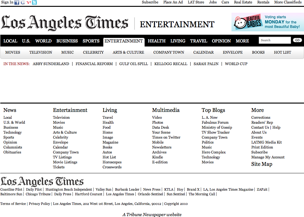
The Los Angeles Times footer shows much of the same content as the double tab in the header, but flattened and organized somewhat differently (see Figure 3-40).
The Wall Street Journal has an immense footer (see Figure 3-41). This is probably larger than you’ll want to make yours.

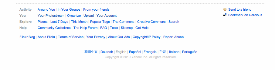
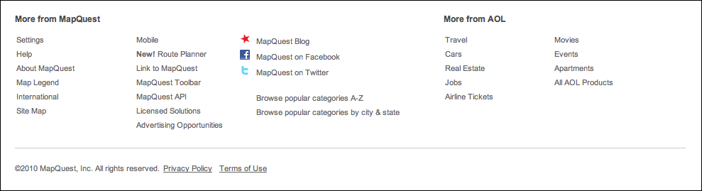
Flickr, as always, is minimalist (see Figure 3-42). It eschews the column structure that most other sites use for their Sitemap Footer, and uses rows instead. MapQuest uses columns, but it also does a lovely job in a small amount of space (see Figure 3-43).
In other libraries
http://welie.com/patterns/showPattern.php?patternID=sitemap-footer
http://ui-patterns.com/patterns/FatFooter
The name “Fat Footer” has sometimes been used for this pattern, with a slightly expanded definition. For some wonderful examples, see the Smashing Magazine article titled “Informative and Usable Footers in Web Design”:
http://www.smashingmagazine.com/2009/06/17/informative-and-usable-footers-in-web-design/
Sign-in Tools
What
Place utility navigation related to a signed-in user’s site experience in the upper-right corner. Show tools such as shopping carts, profile and account settings, help, and sign-out buttons.
Use when
Sign-in Tools are useful for any site or service where users often sign in.
Why
This pattern is purely convention; the upper-right corner is where many people expect such tools to be, so they will often look there. Give users a successful experience by putting these tools where they expect them to be.
How
Reserve space near the upper-right corner of each page for Sign-in Tools. Place the user’s sign-in name there first (and possibly a small version of her avatar, if it exists), unless the name and avatar are already present elsewhere on the page. Make sure each tool works exactly the same on every page in the site or app.
Cluster together tools such as the following:
Sign-out button or link (this is important, so make sure it’s here)
Account settings
Profile settings
Site help
Customer service
Shopping cart
Personal messages or other notifications
A link to personal collections of items (e.g., image sets, favorites, or wish lists)
Home
Don’t make this space too large or loud, lest it dominate the page—it shouldn’t. This is utility navigation; it’s there when a user needs it, but is otherwise “invisible” (well, not literally). For some items, you can use small icons instead of text—shopping carts, messages, and help all have standard visuals you can use, for instance. See the examples in this pattern for some of them.
The site search box is often placed near the Sign-in Tools, although it needs to be in a consistent spot regardless of whether anyone is signed in.
When no user is signed in, this area of the page can be used for a sign-in box—name, password, call to action, and possibly tools for retrieval of forgotten passwords.
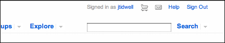
Examples
Figure 3-45 shows an assortment of Sign-in Tools from Mint, Twitter, Amazon, and Gmail. These are visually unobtrusive, but findable simply because they’re in the correct corner of the page or window.
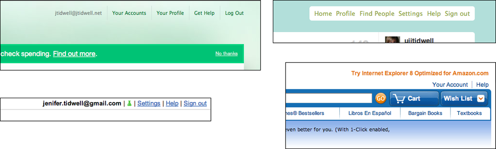
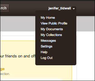
Scribd uses almost all of the tools listed in this pattern (see Figure 3-46). Since there are so many of them, a drop-down menu seems appropriate to keep them from cluttering the corner of the page. iTunes also uses a drop down (see Figure 3-47).

Sequence Map

What
On each page in a sequence, show a map of all the pages in order, including a “You are here” indicator.
Use when
You design a written narrative, a process flow, a Wizard, or anything else through which a user progresses page by page. The user’s path is mainly linear.
If the navigation topology is large and hierarchical (as opposed to linear) you may want to consider using Breadcrumbs instead. If you have a large number of steps or items and their order doesn’t matter much, this morphs into a Two-Panel Selector (Chapter 5) or Overview Plus Detail (Chapter 7).
Why
Sequence Map tell a user how far he’s come through a series of steps—and, more importantly, how far he has yet to go before he’s finished. Knowing this helps him decide whether to continue, estimate how long it will take, and stay oriented.
Sequence Map also serve as navigational devices. If someone wants to go back to a previously completed step, he can do so by clicking that step in the map.
How
Near an edge of the page, place a small map of the pages in the sequence. Make it one line or column if you can, to keep it from competing visually with the actual page content. Give the current page’s indicator some special treatment, such as making it lighter or darker than the others; do something similar with the already-visited pages.
For the user’s convenience, you might want to put the map near or next to the main navigation controls, usually Back and Next buttons.
How should you label each page’s indicator on the map? If the pages or steps are numbered, use the numbers—they’re short and easy to understand. But you should also put the page titles in the map. (Keep the titles short, so the map can accommodate them.) This gives the user enough information to know which pages to go back to, and anticipate what information he’ll need in upcoming pages.
Examples
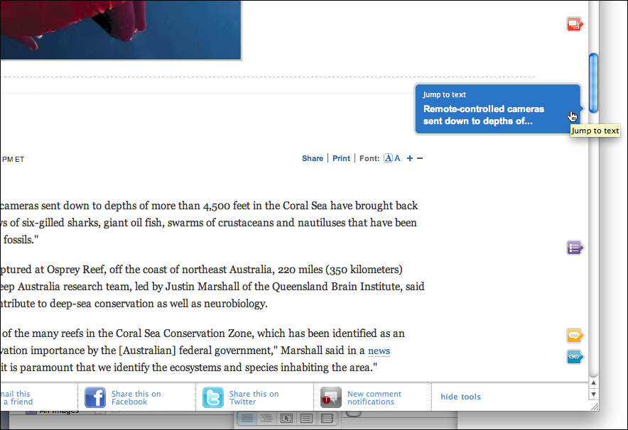
The slideshow shown in Figure 3-49 has a Sequence Map at the bottom. It allows viewers to move somewhat randomly through the images, though most users will probably use the Prev and Next buttons at the top.

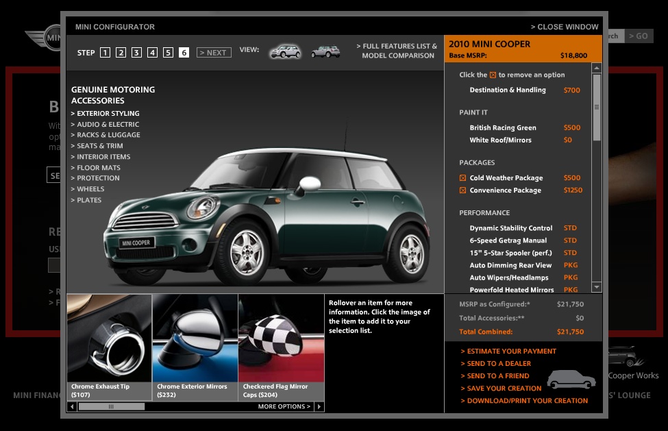
The Mini Cooper product configurator (see Figure 3-50) is a cross between a Settings Editor and a Wizard in that it lets the user move back and forth at will, but organizes the pages in a numbered sequence. The Sequence Map at the top is a critical control for “playing” with the app, for moving among the various pages and exploring different options.
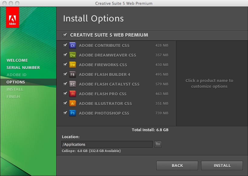
Installation wizards usually require a lot of steps. The one shown in Figure 3-51, from Adobe, has a typical Sequence Map on the lefthand side. Its steps are disabled when they’re irrelevant or bypassed, such as this trial installation that has no Adobe ID.
Breadcrumbs

What
On each page in a deep navigational hierarchy, show a list of all the parent pages, up to the main or home page.
Use when
Your application or site has a hierarchical structure with two or more levels. Users move around via direct navigation, browsing, filtering, searching within the site, or deep-linking into it from elsewhere. Global navigation alone isn’t sufficient to show a “You are here” signpost, because the hierarchy is too deep or large.
Alternatively, your site or app may have a set of browsing and filtering tools for a large data set, such as products being sold online. The products are categorized in a hierarchy, but that categorization doesn’t necessarily match the way people will look for those products.
Why
Breadcrumbs show each level of hierarchy leading to the current page, from the top of the application all the way down. In a sense, they show a single linear “slice” of the overall map of the site or app.
So, like a Sequence Map, Breadcrumbs help a user figure out where he is. This is especially handy if he’s jumped abruptly to somewhere deep in the tree, as he would by following search results or a faceted browsing tool. Unlike a Sequence Map, though, Breadcrumbs don’t tell the user where he’s headed next. They deal only with the present.
Some texts tell you that Breadcrumbs—so named for the Hansel and Gretel story, in which Hansel drops breadcrumbs on a forest trail to mark his way home—are most useful for telling the user how he got to where he is from the top of the site or app. But that’s only true if the user has drilled straight down from the top, with no sidetracking, or following other branches, or dead ends, or searching, or linking directly from other pages…not likely.
Instead, Breadcrumbs are best for telling you where you are relative to the rest of the app or site—it’s about context, not just history. Look at the Target example in Figure 3-52. Faceted browsing—searching for items with certain characteristics—brought me to this page deep in the Target website. (A keyword search could have done the same.) But now that I’m here, I can see where I am in the product hierarchy and I know what else I can look at. I can use the Breadcrumbs to look at all of Target’s stand mixers and do some comparison shopping.
Finally, Breadcrumbs are usually clickable links or buttons. This turns them into a navigational device in their own right.
How
Near the top of the page, put a line of text or icons indicating the current level of hierarchy. Start with the top level; to its right, put the next level and so on down to the current page. Between the levels, put a graphic or text character to indicate the parent/child relationship between them. This is usually a right-pointing arrow, triangle, greater-than sign (>), slash (/), or right angle quotes (»).
The labels for each page should be the page titles. Users should recognize them if they’ve been to those pages already; if not, the titles should at least be self-explanatory enough to tell the user what those pages are about. The labels should be links to those pages.
Some Breadcrumbs show the current page as the last item in the chain; some don’t. If yours do, make them visually different from the rest of the items, since they’re not links.
Examples
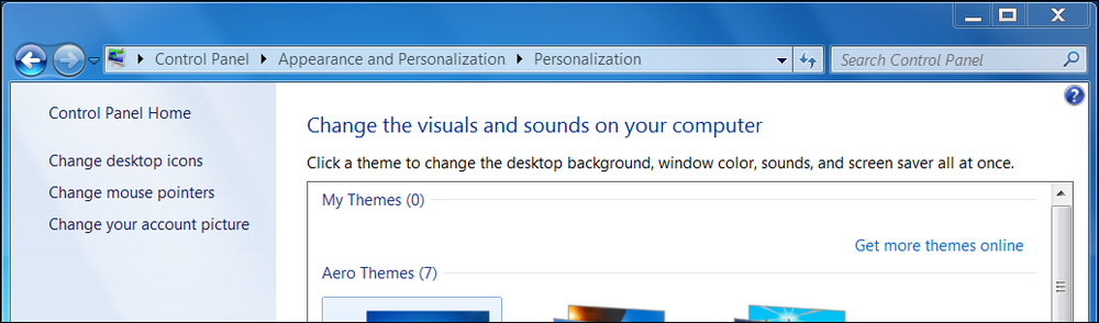
The Windows 7 control panel is a hierarchical Settings Editor that can be three levels deep. The screenshot in Figure 3-53 shows the Personalization settings within the Appearance and Personalization category (which has at least six subcategories in addition to Personalization).
Online communities such as the one shown in Figure 3-54 often have deep hierarchies: forum categories, forums, subforums, yet more subforums, and threads. Breadcrumbs help users understand and traverse this hierarchy.

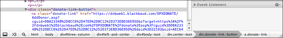
Figure 3-55 shows an example of Breadcrumbs used outside a “page” context. The Chrome developer tools, among many other such tools for software developers, provide a way for users to manage very deep hierarchical structures (in this case, nested structural tags in an HTML page). Breadcrumbs are invaluable here for keeping track of where one is in that structure.
In other libraries
http://developer.yahoo.com/ypatterns/navigation/breadcrumbs.html
http://ui-patterns.com/patterns/Breadcrumbs
http://www.welie.com/patterns/showPattern.php?patternID=crumbs
http://patternry.com/p=breadcrumbs/
http://quince.infragistics.com/Patterns/Breadcrumbs.aspx
http://www.smashingmagazine.com/2009/03/17/breadcrumbs-in-web-design-examples-and-best-practices-2/
Annotated Scrollbar
Use when
You’re designing either a document-centric application or a pan-and-zoom interface, such as a map or large visualization. Users will scan this document or graphic for items of note, such as specific page numbers or landmarks. They might have trouble keeping track of where they are and where to go next as they scroll.
Why
Even though the user remains within one navigational space as she scrolls through the content, signposts are still useful. When scrolling quickly, it’s really hard to read the text flying by (or impossible, if the screen can’t refresh quickly enough), so some other indicator of position is necessary. Even if she stops briefly, the part of the document she can see may not contain anything she can orient herself by, like headers.
Why a scrollbar? Because that’s where the user’s attention is focused. If you put signposts there, the user will see them and use them as she scrolls, rather than trying to look at two different screen areas at once. You can put signposts close to the scrollbar and still get the same effect; the closer, the better.
When the scrollbar shows indicators in the scrollbar track itself, you get something that behaves just like a one-dimensional Overview Plus Detail (Chapter 7). The track is the overview; the scrolled window is the detail.
How
Put a position indicator on or near the scrollbar. Either static or dynamic indicators might work—static indicators are those that don’t change from second to second, such as blocks of color in the scrollbar track (see the tkdiff screenshot in Figure 3-57). Make sure their purpose is clear, though; such things can baffle users that aren’t used to seeing graphics in the scrollbar track!
Dynamic indicators change as the user scrolls, and they are often implemented as tool tips. As the scroll position changes, the tool tip shown next to the scroll thumb changes to show information about the content there. This will vary with the nature of the application. Microsoft Word, for instance, puts page numbers and headers in these tool tips.
In either case, you’ll need to figure out what a user will most likely be looking for, and thus what you need to put into the annotations. The content structure is a good starting point. If the content is code, you might show the name of the current function or method; if it’s a spreadsheet, show the row number, and so on. Also consider whether the user is currently performing a search—the scrollbar annotation should show where the search results are in the document.
Examples
The tkdiff application shown in Figure 3-57 visually highlights the differences between two versions of a text file: newly added sections are marked in green, changed sections are in blue, and deleted sections are in red. An Annotated Scrollbar serves as an overall map, thus making large file “diffs” easier to comprehend.
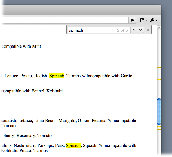
Chrome annotates its scrollbar with search results (see Figure 3-58). When you search for a word on a web page, Chrome highlights the found words on the page with yellow, and places a yellow indicator in the scrollbar wherever they are found. This way, the user can scroll directly to those points in the document.
In other libraries
http://quince.infragistics.com/Patterns/Annotated%20Scrollbar.aspx
Animated Transition
Use when
Users move through a large virtual space, such as an image, spreadsheet, graph, or text document. They might be able to zoom in to varying degrees, pan or scroll, or rotate the whole thing. This is especially useful for information graphics, such as maps and plots. (See Chapter 7 for more about information graphics.)
Alternatively, the interface might have sections that can be closed and opened again, either by the system or by the user—such as trees with closable parent nodes, standalone windows that open and close, or an interface built with Collapsible Panels (Chapter 4). Animated Transition might also be used when users jump from one separate page to another.
Why
All of these transformations can disrupt a user’s sense of where she is in the virtual space. Zooming in and out, for instance, can throw off her spatial sense when it’s done instantaneously, as can rotation and the closing of entire sections that prompts a re-layout of the screen. Even scrolling down a long page of text, when it’s jumpy, can slow down the reader.
But when the shift from one state to another is visually continuous, it’s not so bad. In other words, you can animate the transition between states so that it looks smooth, not discontinuous. This helps keep the user oriented. We can guess that it works because it more closely resembles physical reality—when was the last time you instantly jumped from the ground to 20 feet in the air? Less fancifully, an animated transition gives the user’s eyes a chance to track a location while the view changes, rather than trying to find the location again after an abrupt change.
When done well, Animated Transition bolster your application’s cool factor. They’re fun.
How
For each type of transformation that you use in your interface, design a short animation that “connects” the first state with the second state. For zoom and rotate, you might show the in-between zoom or rotate levels; for a closing panel, you might show it shrinking while the other panels expand to take up the space it leaves behind. To whatever extent possible, make it look like something physical is happening.
But this pattern is a double-edged sword. Beware of making the user motion-sick! The animations should be quick and precise, with little or no lag time between the user’s initiating gesture and the beginning of the animation. Limit it to the affected part of the screen; don’t animate the whole window. And keep it short. My preference would be to keep it well under a second, and research shows that 300 milliseconds might be ideal for smooth scrolling. Test it with your users to see what’s tolerable.
If the user issues multiple actions in quick succession, such as pressing the down arrow key many times to scroll, combine them into one animated action. Otherwise, the user might sit there through several seconds’ worth of animation as the punishment for pressing the down arrow key 10 times. Again: keep it quick and responsive.
Some of the types of transitions listed by the Yahoo! pattern library (http://developer.yahoo.com/ypatterns/richinteraction/transition/ and Designing Web Interfaces are as follows:
Brighten and dim
Expand and collapse
Fade in, fade out, and cross-fade
Self-healing
Slide
Spotlight
In other libraries
For more discussion and tons of great examples of the Animated Transition in the preceding list, see the Transition cluster of patterns at the Yahoo! Design Pattern Library:
http://developer.yahoo.com/ypatterns/richinteraction/transition/
In addition, Scott and Neil’s Designing Web Interfaces contains an entire chapter on transitions. It covers some of the same ground as the Yahoo! site, but it’s worth reading.