Chapter 6. Doing Things: Actions and Commands
This chapter is devoted to the “verbs” in the interface. We’ve spent a lot of pages talking about overall structure and flow, visual layout, and “nouns”—such as windows, text, links, and static elements in pages. Chapter 7 spends even more pages on nouns, and Chapter 8 handles traditional (and a few nontraditional) controls and widgets: things that let users supply information and set state, but that don’t actually do much.
So now let’s talk about buttons and menus.
Sounds exciting, doesn’t it? Probably not. Desktop interfaces have used menu bars as long ago as the first Macintosh, and buttons for even longer. What we think of as “buttons” are only a visual rendering of a physical device that long predated GUIs.
It’s true that there is a lot of history here, and there are many best practices to follow. The standard platform style guides, such as those for Windows and Macintosh, will generally get you pretty close to a workable UI. Most users depend upon learned conventions to negotiate menus and find buttons, so it behooves you to follow those conventions, even when they feel restrictive or nonsensical.
Common functionality such as cut, copy, and paste also carries lots of historical baggage—if it could be reinvented now, it would probably work differently—but even moderately experienced desktop computer users have learned how it’s “supposed to work.” The same is true for pop-up menus (context menus), which some users seem to look for everywhere, and other users never think to look for at all. Drag-and-drop isn’t as bound by history, but it absolutely has to work the way users intuitively expect it to, or the illusion of direct manipulation is broken.
That being said, you can do many things to make your interface less dull and more usable. Your goals should be to make the right actions available, label them well, make them easy to find, and support sequences of actions. There are a few creative ways to do it.
First, I’ll list the common ways actions are rendered to the user:
- Buttons
Buttons are placed directly onto the interface, without requiring the user to perform any action to see them, and are usually grouped semantically. (See the Button Groups pattern.) They’re big, readable, obvious, and extremely easy to use for even the most inexperienced computer users. But they take up a lot of space on the interface, unlike menu bars and pop-up menus. On landing pages, such as corporate home pages and product startup pages, calls to action are usually represented as single, large, eye-catching buttons—this is entirely appropriate for their purpose, which is to attract attention and say, “Click me!”
- Menu bars
Menu bars are standard on most desktop applications. They generally show an application’s complete set of actions, organized in a mostly predictable way (such as File, Edit, or View). Some actions operate on the entire application, and some operate only on individually selected items. Menu bars often duplicate functionality found in context menus and toolbars because they are accessible—screen readers can read them, users can reach them via keyboard accelerators, and so on. (Accessibility alone makes menu bars indispensable in many products.) Menu bars appear in some web applications, especially productivity software, drawing programs, and other products that emulate desktop apps.
- Pop-up menus
Also known as context menus, pop-up menus are raised with a right-mouse click or some similar gesture on panels or items. They usually list context-specific, common actions, not all the actions that are possible on the interface. Keep them short.
- Drop-down menus
Users raise these menus by clicking on a drop-down control such as a combo box. However, drop-down controls are intended for selecting choices on a form, not for performing actions. Avoid using them for actions.
- Toolbars
The canonical toolbar is a long, thin row of iconic buttons. Often they have other kinds of buttons or controls on them too, such as text fields or Dropdown Chooser (see Chapter 8). Iconic toolbars work best when the portrayed actions have obvious visual renderings; when the actions really need to be described with words, try other controls, such as combo boxes or buttons with text labels. Cryptic icons are a classic source of confusion and unusability.
- Links
Buttons 9don’t need borders. Thanks to the Web, everyone understands that colored text (especially blue text) usually indicates a clickable link. In a UI area where actions are expected but where you don’t need to draw attention or clutter the page, you can use simple clickable “link” text for actions instead of buttons. When the user rolls the mouse over the text, change the cursor and underline the text to reinforce the impression of clickability.
- Action panels
These are essentially menus that the user doesn’t need to post; they’re always visible on the main interface. They are a fine substitute for toolbars when actions are better described verbally than visually. See the Action Panel pattern.
- Hover tools
If you want to show two or more actions for each item on an interface but you don’t want to clutter the page with lots of repeated buttons, you can make those buttons invisible until the mouse hovers over the item. (This is great for mouse-driven interfaces, but it doesn’t work well for touch screens.) See the Hover Tools pattern for more.
Then there are invisible actions, which don’t have any labels at all to announce what they do. Users need to know (or guess) that they’re there, unless you put written instructions on the UI. Therefore, they don’t help with discovery at all, since users can’t read over them to find out what actions are possible. With buttons, links, and menus, the UI actions are available for inspection, so users learn from those. In usability tests, I’ve seen many users look at a new product and methodically walk down the menu bar, item by item, just to find out what it can do.
That being said, you almost always need to use one or more of the following invisible actions. People often expect to be able to double-click on items, for example. However, the keyboard (or the equivalent) is sometimes the only means of access for visually impaired users and people who can’t use a mouse. In addition, the expert users of some operating systems and applications prefer to work by typing commands into a shell and/or by using its keyboard actions.
- Double-clicking on items
Users tend to view double-clicking as either “open this item” or “do whatever the default thing is with this item,” depending on context. In a graphical editor, for instance, double-clicking on an element often means opening a property sheet or specialized editor for it. Double-clicking an application’s icon in most operating systems launches that application. Double-clicking a piece of text might edit it in place.
- Keyboard actions
Keyboard shortcuts, such as the well-known Ctrl-S to save, should be designed into most desktop applications for accessibility and efficient use. The major UI platforms, including Windows, Mac, and some Linux environments, each have style guides that describe the standard shortcuts—and they’re all very similar. Additionally, menus and controls often have underlined access keys, which let users reach those controls without mouse-clicking or tabbing. (Press the Alt key, and then press the key corresponding to the underlined letter, to invoke these actions.)
- Drag-and-drop
Dragging and dropping items on an interface usually means either “move this here” or “do this to that.” In other words, someone might drag a file onto an application icon to say, “Open this file in that application.” Or she might drag that file from one place in a file finder to another place, thus moving or copying the item. Drag-and-drop is context-dependent, but it almost always results in one of these two actions.
- Typed commands
Command-line interfaces generally allow free-form access to all the actions in the software system, whether it’s an operating system or an application. I consider these kinds of actions “invisible” because most command-line interfaces (CLIs) don’t easily divulge the available commands. They’re not very discoverable, though they’re quite powerful once you learn what’s available—much can be done with a single well-constructed command. As such, CLIs are best for users committed to learning the software very well.
Pushing the Boundaries
Some application idioms give you freedom to design nonstandard buttons and controls. Visual editors, media players, applications intended mostly for experts, instant messaging, games, and anything that’s supposed to be fun and interesting all have users who might be curious enough to figure out how to use unusual but well-designed interface elements.
Where can you be more creative? Consider the items on the first list in the preceding section; visible buttons and menus are easier to use than invisible actions, such as keyboard shortcuts. Generalizing from that, actions could be:
Clickable icons
Clickable text that doesn’t look like a button
Something that reacts when the mouse pointer rolls over it
Some object that looks like it may be manipulated by the user
Something placed on almost any piece of screen real estate
But how much creativity can you get away with before the application becomes too hard to figure out?
For a real-life example, we’ll look at the GarageBand application, shown in Figure 6-1. There’s a lot going on in this interface. Some objects are obviously buttons, such as the player controls—rewind, play, fast forward, and so forth—and the scrollbar arrows. You will find some sliders and knobs, too.

But look harder at the far right of the window, between the red line and the wood-grain edge. To your eyes, what pieces of the interface look clickable? Why? If you want, you can look ahead to Figure 6-2 and cheat. (And if you already know GarageBand, please bear with me.)
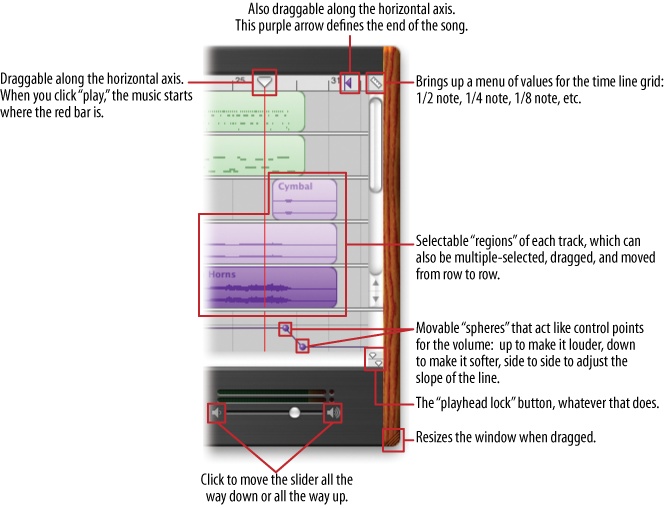
Figure 6-2 shows which objects on the interface perform actions. You clearly couldn’t have known what they all do, since this book doesn’t give you the benefit of tool tips, rollover cursors, or experimentation. But did you figure out that some of these objects could be clicked or manipulated? I’m guessing you did.
How? You probably know that interfaces that look like this offer a lot of functionality through direct manipulation, so you have good grounds for assuming that every interesting visual feature does something. You might know that sliders, such as the volume slider at the bottom, sometimes have “jump buttons” at the ends—and you might have recognized the volume slider itself from iTunes. You might guess that tiny squarish icons tend to be buttons, often for presentation-related actions; Word and PowerPoint use a lot of them. You might have seen a vertical line topped with an inverted triangle in some other context—maybe movable, maybe not. But didn’t this triangle look like it was movable?
When an object looks like it might let you do something, such as click it or drag it, we say it “affords” performing that action. Traditional raised-edge buttons afford pushing; a slider thumb affords dragging; a text field affords typing; a blue underlined word affords clicking. And anything that reacts to the mouse cursor affords something, although you can’t necessarily tell what!
Figure 6-2 points out the affordances in the GarageBand interface. This is an important concept. In software interfaces, the user doesn’t get many sensory clues about what can be tweaked or handled: visuals give most of the clues, and mouse rollovers do the rest. Use them to communicate affordances well.
Here’s some specific design advice:
Follow conventions whenever possible. Reuse UI concepts and controls that people already know, such as the volume sliders in the example.
Use pseudo-3D shading and drop shadows to make things look “raised.”
When the mouse pointer hovers over items that can be clicked or dragged, turn the pointer into something different, such as a finger or a hand.
Use tool tips, or some other descriptive text, to tell the user what the objects under the mouse pointer do. If you don’t need them, that’s great—you have a self-describing design—but many users expect tool tips anyway.
The Patterns
The first patterns in this chapter talk about three of the many ways to present actions. When you find yourself reflexively putting actions on an application’s menu bar or pop-up menu, stop for a moment and consider using one of these instead.
Prominent “Done” ButtonButton” improves the single most important button on many web pages and dialog boxes. Smart Menu Items is a technique for improving some of the actions you put on menus; this is a very general pattern, useful for many kinds of menus (or buttons or links).
We’d like it if all the user-initiated actions in an application could be completed instantly, but that’s not reality. Preview shows the user what’s going to happen before a time-consuming action is committed. Progress Indicator is a well-known technique for letting the user know what’s going on while an operation proceeds, while Cancelability refers to a UI’s ability to stop an operation when the user asks it to.
The last three patterns—Multi-Level Undo, Command History, and Macros—all deal with sequences of actions. These three interlocking patterns are most useful in complex applications, especially those whose users are committed to learning the software well and using it extensively. (That’s why the examples come from complex software such as Linux, Photoshop, Word, and MATLAB.) Be warned that these patterns are not easy to implement. They require the application to model a user’s actions as discrete, describable, and sometimes reversible operations, and such a model is very hard to retrofit into an existing software architecture. The Command pattern in the classic book Design Patterns (Addison-Wesley Professional) is one good place to look for implementation advice.
And that’s as close as this book gets to implementation details. We’ll now return to the realm of interface design.
Button Groups
What
Present related actions as a small cluster of buttons, aligned and with similar graphic treatments. Create multiple groups if there are more than three or four actions.
Use when
There are many actions to show on the interface. You want to make sure they are all visible all the time, but you need to visually organize them so that they’re not chaotic or hard to sort out. Some of these actions are similar to each other—they have similar or complementary effects, for instance, or they operate with similar semantics—and they can thus be assembled into groups of two to five.
Button Groups can be used for app-wide operations (such as Open or Preferences), item-specific actions (Save, Edit, Delete), or any other scope. Actions with different scope ought not to be grouped together, however.
Why
Button Groups help make an interface self-describing. Well-defined clusters of buttons are easy to pick out of a complex layout, and because they’re so visible, they instantly communicate the availability of those actions. They announce, “These are the actions you’ve got to work with in this context.”
The Gestalt principles discussed in Chapter 4 apply here. Proximity hints at relatedness; if the buttons are all together, they probably do similar things. So does visual similarity; if you make all the buttons the same dimensions, for instance, they look like they belong together. Conversely, button groups that are separated in space—or that are different in shape—imply unrelated groups of actions.
Proper sizing and alignment help the Button Groups form a larger composite visual shape (this is the principle of closure).
How
Make a group out of the buttons in question. Label them with short but unambiguous verbs or verb phrases, and don’t use jargon unless users expect it. Do not mix buttons that affect different things or have different scope; separate them into different groups.
All buttons in the group should have the same graphic treatment: borders, color, height and/or width, icon style, dynamic effects, and so on. You can line them up in a single column, or arrange them in a single row if they aren’t too wide.
(However, treat them differently if one action is a “primary” action, such as a Submit button on a web form. A primary action is an action that you want most users to take, or that most users will expect to take. Give that button a stronger graphic treatment to make it stand out among the others.)
If all the buttons in a group act on the same object or objects, put the Button Groups to the left or right of those objects. You could put them below the objects instead, but users often have a “blind spot” at the bottom of complex UI elements such as multicolumn lists and trees—the buttons may not be seen at all. To make them more visible, keep the rest of the interface clean and uncluttered. If you have a specific design that works better with the buttons at the bottom, usability-test it and find out. If there are enough buttons and if they have icons, you could also put them on a toolbar or toolbar-like strip at the top of the page.
By using Button Groups, you’re trying to avoid a crowded mess of buttons and links, or perhaps a long and plodding list of actions with no apparent differentiation at all. With this pattern, you create a miniature visual hierarchy of actions: the user can see at a glance what’s related and what’s important.
Examples
Standard tools for WYSIWYG editors are often grouped by function. The two examples shown in Figure 6-4, from Word and Flash Builder, show some common tools in groupings that actually aid recognition.
As shown in Figure 6-5, iTunes places Button Groups at each of the four corners of the main window, plus the standard title bar buttons (such as close and minimize). When the user browses the Music Store, even more actions are contained in the web-page-like third panel (not shown)—links constitute many of the actions there—and a button for each song in the table.

There are no fewer than 13 buttons on this interface, and I’m not even counting the four scrollbar buttons or the three clickable table headers. There’s a lot to do here, but thanks to careful visual and semantic organization, the interface is never overwhelming.

In other libraries
http://quince.infragistics.com/Patterns/Button%20Groups.aspx
Hover Tools
What
Place buttons and other actions next to the items they act upon, but hide them until the user hovers the pointer over them.
Use when
There are many actions to show on the interface. You want a clean, uncluttered look most of the time, but you have to put those actions somewhere, preferably on or next to the items they act upon. You’ve already allocated the space to show those actions, but they just make things too crowded and busy if they’re all visible all the time.
Hover Tools are commonly used in list interfaces, in which many small items—photos, messages, search results, and so on—are displayed in a column or list. The user can perform a number of actions on each one.
You don’t intend the interface to be used with fingertips, as with a touchpad device—you’re certain that almost all users will interact with your UI via a mouse. (If your UI is a web page, consider carefully whether it should behave differently on a touchpad versus a desktop or laptop platform.)
Why
Hover Tools reveal themselves exactly when and where they’re needed. They stay out of sight otherwise, allowing the UI to remain clean and uncluttered. They appear when the user requests them, and by appearing in response to the user’s gesture, they draw attention to themselves.
Pop-up (right-click) menus, pull-down menus, and menu bars also meet these criteria, but they are not discoverable enough for some kinds of interfaces—they’re best used on traditional desktop applications, not web-based interfaces. (And sometimes they’re not the best choice on traditional applications, either.) Hover Tools are more easily discoverable because the gesture that produces them—a rollover—is so simple and natural.
Unfortunately, Hover Tools currently don’t work so well on touch devices. A rollover with a mouse is an easy, natural act that leads to discovery; but on a touchpad, the only way a user can see the Hover Tools is if she actually touches the hover area, which is a more committing act. It doesn’t help much with discovery at all.
How
Design each item or hover area with enough space to show all the available actions. Hide the ones that clutter the interface too much, and show them only when the user hovers the mouse pointer over the area in question.
Respond quickly to the hover, and don’t use an Animated Transition—simply show the tools immediately, and hide them immediately when the user moves the pointer away. Likewise, never enlarge the hover area or otherwise rearrange the page when the user hovers the pointer over it. The idea is to make the hover action as lightweight and quick as possible so that the user can easily reach the necessary tools.
If the hover area is an item in a list, you may wish to highlight the item by changing its background color or drawing a border around it. The act of showing tools will draw the user’s eyes to that area, but highlighting the item will do so even more.
Consider Hover Tools as an alternative to a drop-down menu, a pop-up menu, an Action Panel, a List Inlay with buttons in it, or a set of buttons repeated in each item.
Examples
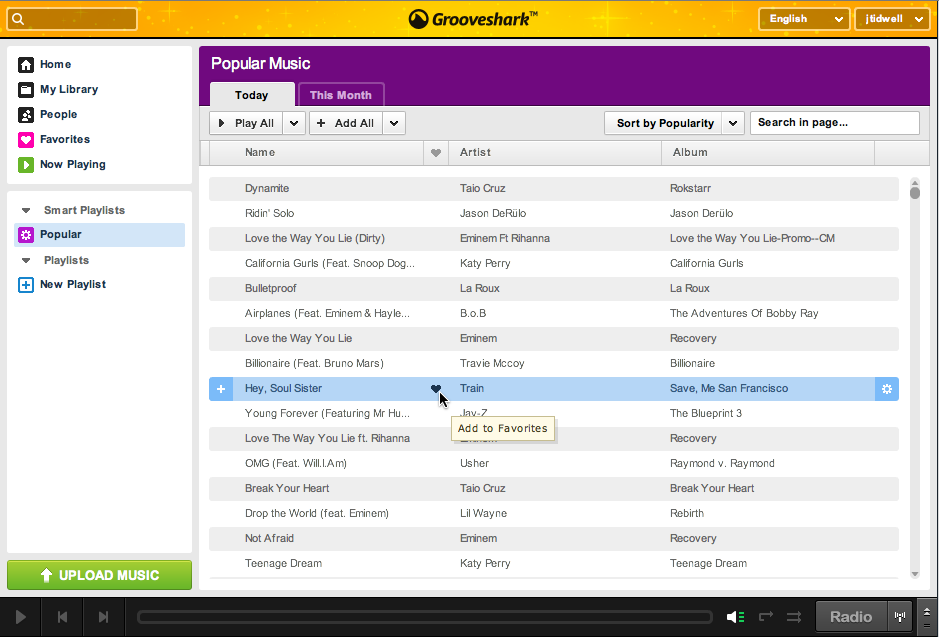
Grooveshark uses Hover Tools to show per-song actions (see Figure 6-7). The alternatives would have been to show all the tools all the time—busy, but not terrible—or to move the tools to the top toolbar, where they would only operate on songs selected in the list. That’s rather complicated for the designer, the programmer, and especially the user: she would have to figure out how to select a song, and then make the spatial and logical connection between the selected song(s) and the tools at the top of the table. In contrast, the Hover Tools are right there and self-explanatory.
The benefit of the Hover Tools pattern is a cleaner interface, but one drawback is that the user can’t immediately see the available actions. Zillow’s search results page, shown in Figure 6-8, shows one possible compromise: “gray out” the tools normally, and show them more strongly when the mouse hovers over the item.

Some implementations of Hover Tools use a lightweight overlay to show buttons or controls such as sliders. This is similar to the Dropdown Chooser pattern in Chapter 8, the only difference being your intent to use it for actions and not settings. In Figure 6-9, the YouTube player uses a hover to show the volume slider.

Action Panel

What
Instead of using menus, present a group of related actions on a UI panel that’s richly organized and always visible.
Use when
You have a list of items, and a set of actions that can be performed on each one—too many to show all the actions for each item, and too many for Hover Tools. You could put them into a menu, but you may not have a menu bar at all, or you’d rather make the actions more discoverable than they would be on menu bars. Same for pop-up menus; they’re just not visible enough. Your users may not even realize the pop-up menus exist.
Or maybe your set of possible actions is too complex for a menu. Menus are best at showing a flat set of actions (since pull-right menus, or cascading menus, are hard for some users to manipulate) in a very simple, linear, one-line-per-item presentation. If your actions need to be grouped, and especially if those groups don’t fit the standard top-level menu names—such as File, Edit, View, Tools, and so on—you might want a different presentation altogether.
This pattern can take up a lot of screen space, so it’s not usually a good choice for small devices.
Why
There are three main reasons to use Action Panel instead of menus or per-item buttons: visibility, available space, and freedom of presentation.
By placing the actions out on the main UI and not hiding them inside a traditional menu, you make those actions fully visible to the user. Really, Action Panel are menus in the generic sense; they just aren’t found in menu bars, drop downs, or pop ups. Users don’t have to do anything to see what’s on an Action Panel—it’s right there in front of them—so your interface is more discoverable. This is particularly nice for users who aren’t already familiar with the traditional document model and its menu bars.
There are many, many ways to structure objects on an interface: lists, grids or tables, hierarchies, and just about any custom structure you can devise. But Button Groups and traditional menus only give you a list (and not a very long one at that). An Action Panel is free-form—it gives you as much freedom to visually organize verbs as you have for nouns. Use it wisely!
How
Putting the Action Panel on the UI
Set aside a block of space on the interface for the Action Panel. Place it below or to the side of the target of the action. The target is usually a list, table, or tree of selectable items, but it might also be a document in Center Stage (Chapter 4). Remember that proximity is important. If you place the Action Panel too far away from whatever it acts on, users may not grasp the relationship between them.
The panel could be a simple rectangle on the page. It could be one of several tiled panels on the page, perhaps a Movable Panels (see Chapter 4), a “drawer” in Mac OS X, or even a separate window. If it’s closable, make it very easy to reopen, especially if those actions are present only on the Action Panel and aren’t duplicated on a menu!
Odds are good that you’ll need to show different actions at different times. So, the contents of the action panel may depend on the state of the application (e.g., are there any open documents yet?), on the items selected in some list somewhere, or other factors. Let the Action Panel be dynamic. The changes will attract the user’s attention, which is good.
Structuring the actions
Next, you need to decide how to structure the actions you need to present. Here are some ways you could do it:
Simple lists
Multicolumn lists
Categorized lists, such as the PowerPoint example earlier
Tables or grids
Trees
Any combination of these in one panel
If you categorize the actions, consider using a task-centered approach. Group them according to what people intend to do. However, try to present them linearly. Imagine reading the actions aloud to someone who can’t see the screen—can you proceed through them in a logical fashion, with obvious start and end points? That, of course, is how a blind user would “hear” the interface.
Labeling the actions
For each action’s label, you could use text, icons, or both, depending on what conveys the nature of the actions best. In fact, if you use mostly icons, you end up with…a traditional toolbar! (Or a palette, if your UI is a visual builder-style application.)
Text labels on an Action Panel can be longer than those on a menu or a button. You can use multiline labels, for instance—no need to be overly parsimonious with words here. Just remember that longer, more descriptive labels are better for first-time or infrequent users who need to learn (or be reminded) what these actions do. The extra space spent on long labels may not be appreciated in high-performance interfaces used mostly by experienced users. If there are too many words, even first-time users’ eyes will glaze over.
Examples
The example in Figure 6-10 is from iPhoto. Other Picture Manager, such as Picasa (Figure 6-11), use similar panels to contain per-image actions. Compare the complexity of the Picasa Action Panel with the relatively simple one in iPhoto; both work for their particular audiences and needs (iPhoto for novice users, Picasa for more experienced users).

The screenshot of Windows Finder in Windows XP (see Figure 6-12) shows a directory of pictures with an Action Panel attached to it. Microsoft calls this feature a Task Pane. The panel is composed of closable subpanels (see the Collapsible Panels pattern in Chapter 4), each of which contains a manageable handful of related actions.
Note that the first two sections, Picture Tasks and File and Folder Tasks, are completely task-oriented: they’re phrased as verbs (View, Order, Print, and Copy), and they anticipate actions that users will commonly want to perform. But the third section in this panel, Other Places, is a list of objects instead.

Prominent “Done” Button
What
Place the button that finishes a transaction at the end of the visual flow; make it big and well labeled.
Use when
Whenever you need to put a button such as Done, Submit, OK, or Continue on your interface, you should use this pattern. More generally, use a visually prominent button for the final step of any transaction—such as an online purchase—or to commit a group of settings.
Why
A well-understood, obvious last step gives your users a sense of closure. There’s no doubt that the transaction will be done when that button is clicked; don’t leave them hanging, wondering whether their work took effect.
Making that last step obvious is what this pattern is really about. Doing it well draws on the layout concepts in Chapter 4—visual hierarchy, visual flow, grouping, and alignment.
How
Create a button that actually looks like a button, not a link; either use platform standards for pushbuttons, or use a large or medium-size button graphic with bold colors and well-defined borders. This will help the button stand out on the page, and not get lost among other things.
When labeling the button, prefer text labels to icons. They’re easier to understand for actions such as this, especially since most users will look for a button labeled “Done” or “Submit.” The text in that label can be a verb or a short verb phrase that describes what will happen in the user’s terms—“Send,” “Buy,” or “Change Record” (for example) are more specific than “Done,” and can sometimes communicate more effectively.
Place the button where the user is most likely to find it. Trace the task flow down through the page or form or dialog box, and put the button just beyond the last step. Usually that will be on the bottom and/or right of the page. Your page layouts may have a standard place for them (see the Visual Framework pattern in Chapter 4), or the platform standard may prescribe it; if so, use the standard place.
In any case, make sure the button is near the last text field or control. If it’s too far away, the user may not find it immediately upon finishing her work, and she may go looking for other affordances in her quest for “what to do next.” On the Web, users may end up abandoning the page (and possibly a purchase) without realizing it.
Examples
Figure 6-14 shows a typical web form. You can see the action buttons without even reading the labels, due to visual design alone:
The blue color stands out. It’s a saturated color, it contrasts with the white background, and it echoes the blue of the headlines. (A white or light gray button with a black border would blend into the form.)
The graphic used for each button looks like a button. It’s a rounded or “pill” shape, with a very slight drop shadow, which makes it pop out from the background. The buttons are large, too.
Both buttons are positioned directly under the body of the form itself. Both the task flow (the user will work from top to bottom) and the visual flow bring the user’s eye to rest at that button.
Each button is set off by whitespace on its left, right, and bottom.

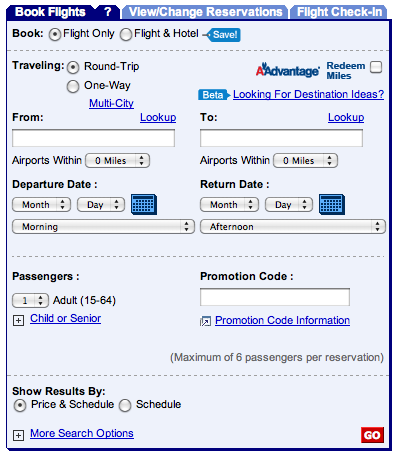
JetBlue, Kayak, and Southwest (see Figure 6-15) use strong buttons on their home page flight-search interfaces. These follow all the guidelines for “Prominent “Done” Buttons”, and again, you can see them immediately. The corresponding American Airlines button, on the other hand, gets lost in its form—it’s too small, too far removed from the end of the form, too close to the form border, and too similar to other elements in the form to stand out well (see Figure 6-16). Furthermore, the label “GO” isn’t as on-task as “Search” or “Find flights.”

In other libraries
Some other pattern libraries define patterns that are very closely related, such as Primary Action and Action Button. Luke Wroblewski, in his book Web Form Design (Rosenfeld Media), discusses primary versus secondary actions in forms such as those described in this pattern.
http://www.welie.com/patterns/showPattern.php?patternID=action-button
http://patternry.com/p=primary-secondary-actions/
http://quince.infragistics.com/Patterns/Primary%20Action.html
Smart Menu Items
Use when
Your UI has menu items that operate on specific documents or items, such as Close, or that behave slightly differently in different contexts, such as Undo.
Why
Menu items that say exactly what they’re going to do make the UI self-explanatory. The user doesn’t have to stop and figure out what object will be affected. She’s also less likely to accidentally do something she didn’t intend, such as deleting Chapter 8 instead of “Footnote 3.” It thus encourages safe exploration.
How
Every time the user changes the selected object (or current document, last undoable operation, etc.), change the menu items that operate on it to include the specifics of the action. Obviously, if there is no selected object at all, you should disable the menu item, thus reinforcing the connection between the item and its object.
Incidentally, this pattern could also work for button labels, or links, or anything else that is a “verb” in the context of the UI.
What if there are multiple selected objects? There’s not a whole lot of guidance out there—in existing software, this pattern mostly applies to documents and undo operations—but you could write in a plural, as in “Delete Selected Objects.”
Examples
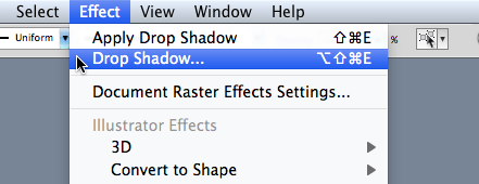
Figure 6-18 shows a menu from Illustrator’s menu bar. The last filter the user applied in this case was the “Drop Shadow” filter. The menu remembers that, so it changes its first two items to (1) reapply the same filter again, and (2) modify the filter before reapplying. (“Drop Shadow…” brings up the dialog box to modify it.) There are so many filters the user might have applied that it’s quite useful to be reminded of the last one. And the accelerator keystrokes are handy for repeated application of the same filter!
The previous two examples are from application menu bars, but this pattern can also be used effectively in per-item tools, such as the drop-down menu in Gmail (see Figure 6-19). The menu item “Add [person] to Contacts list” is much clearer and more self-explanatory than a generic alternative, such as “Add sender to Contacts list.”

Preview
Use when
The user is just about to perform a “heavyweight” action, such as opening a large file, printing a 10-page document, submitting a form that took time to fill out, or committing a purchase over the Web. The user wants some assurance that he’s doing it correctly. Doing it incorrectly would be time-consuming or otherwise costly.
Alternatively, the user might be about to perform some visual change with a hard-to-predict result, such as applying a filter to a photo. He wants to know in advance whether the effect will be desirable.
Why
Previews help prevent errors. A user may have made a typo, or he may have misunderstood something that led to the action in question (such as purchasing the wrong item online). By showing him a summary or visual description of what’s about to happen, you give him a chance to back out or correct any mistakes.
Previews can also help an application become more self-describing. If someone’s never used a certain action before, or doesn’t know what it will do under certain circumstances, a preview explains it better than documentation—the user learns about the action exactly when and where he needs to.
How
Just before the user commits an action, display whatever information gives him the clearest picture of what’s about to happen. If it’s a print preview, show what the page will look like on the chosen paper size; if it’s an image operation, show a close-up of what the image will look like; if it’s a transaction, show a summary of everything the system knows about that transaction. Show what’s important—no more, no less.
Give the user a way to commit the action straight from the preview page. There’s no need to make the user close the preview or navigate elsewhere.
Likewise, give the user a way to back out. If he can salvage the transaction by correcting information previously entered, give him a chance to do that too, with “Change” buttons next to changeable information. In some wizards and other linear processes, this might just be a matter of navigating a few steps backward.
Examples
Picasa permits users to apply one of several filters to a photo (see Figure 6-21). Each filter has a preview thumbnail associated with it—what you see really is what you get! A user might need to experiment with many similar filters before finding one that has the desired effect, and he wants quick turnaround. This is a classic preview situation. (Photoshop and other image processing applications use similar previews.)

Online product builders and customizers often use Previews to show what the user has created so far. The customizable Starbucks card in Figure 6-22 is a good example: in this review step, the user has a chance to go back and change things, or move ahead with card creation, or ask for help, or abandon the whole transaction.

In other libraries
http://quince.infragistics.com/Patterns/Preview.aspx
http://ui-patterns.com/patterns/LivePreview
The book Designing Web Interfaces by Bill Scott and Theresa Neil (O’Reilly, http://oreilly.com/catalog/9780596516253/) also describes a \. (Live Preview differs from Preview in that it shows changes immediately as they are made.)
Progress Indicator

Use when
A time-consuming operation interrupts the UI, or runs in the background, for longer than two seconds or so.
Why
Users get impatient when the UI just sits there. Even if you change the mouse pointer to a clock or hourglass (which you should in any case, if the rest of the UI is locked out), you don’t want to make a user wait for an unspecified length of time.
Experiments show that if users see an indication that something is going on, they’re much more patient, even if they have to wait longer than they would without a Progress Indicator. Maybe it’s because they know that “the system is thinking,” and it isn’t just hung or waiting for them to do something.
How
Show an animated indicator of how much progress has been made. Either verbally or graphically (or both), tell the user:
As far as time estimates are concerned, it’s OK to be wrong sometimes, as long as your estimates converge on something accurate quickly. But sometimes the UI can’t tell how far along it is. In that case, show something animated that is noncommittal about percentages. Think about the browsers’ image loops that keep rolling while a page loads.
Most GUI toolboxes provide a widget or dialog box that implements this pattern. Beware of potentially tricky threading issues, however—the Progress Indicator must be updated consistently while the operation itself proceeds uninhibited. If you can, keep the rest of the UI alive, too. Don’t lock up the UI while the Progress Indicator is visible.
If it’s possible to cancel the operation whose progress is being monitored, offer a cancel button or similar affordance on or near the Progress Indicator; that’s where a user is likely to look for it. See the Cancelability pattern (next) for more information.
Examples
When a Flickr user uploads multiple image files (which can take awhile), Flickr displays a rich and informative Progress Indicator (see Figure 6-24). It shows each file’s size, progress, and status, along with an overall progress bar at the bottom. When the whole upload is done, it tells you so boldly and directs you to the next logical activity. (Another nice touch is that the page title itself gives you a percentage done.)

Grooveshark’s interface takes a little while to load. Its Progress Indicator is a whimsical and well-branded outline of a hammerhead shark, gradually filling left to right as the page code loads (see Figure 6-25).

In other libraries
http://quince.infragistics.com/Patterns/Progress%20Indicator.aspx
http://www.welie.com/patterns/showPattern.php?patternID=processing-page
The book Designing Web Interfaces also describes a Progress Indicator pattern.
Cancelability
Use when
A time-consuming operation interrupts the UI, or runs in the background, for longer than two seconds or so—such as when you print a file, query a database, or load a large file. Alternatively, the user is engaged in an activity that literally or apparently shuts out most other interactions with the system, such as when working with a modal dialog box.
Why
Users change their minds. Once a time-consuming operation starts, a user may want to stop it, especially if a Progress Indicator tells her that it’ll take awhile. Or the user may have started it by accident in the first place. Cancelability certainly helps with error prevention and recovery—a user can cancel out of something she knows will fail, such as loading a page from a web server she realizes is down.
In any case, a user will feel better about exploring the interface and trying things out if she knows that anything is cancelable. It encourages Safe Exploration (see Chapter 1), which in turn makes the interface easier and more fun to learn.
How
First, find out if there’s a way to speed up the time-consuming operation so that it appears to be instantaneous. It doesn’t even have to be genuinely fast; if a user perceives it as immediate, that’s good enough. On the Web or a networked application, this may mean preloading data or code—sending it to the client before it’s asked for—or sending data in increments, showing it to the user as it comes in. Remember, people can only read so fast. You might as well use the loading time to let the user read the first page of data, then another page, and so on.
But if you really do need Cancelability, here’s how to do it. Put a Cancel button directly on the interface, next to the Progress Indicator (which you are using, right?) or wherever the results of the operation will appear. Label it with the word Stop or Cancel, and/or put an internationally recognizable stop icon on it: a red octagon, or a red circle with a horizontal bar, or an “X”.
When the user clicks or presses the Cancel button, cancel the operation immediately. If you wait too long—for more than a second or two—the user may doubt that the cancel actually worked (or you may just dissuade him from using it, since he might as well wait for the operation to finish). Tell the user that the cancel worked—halt the Progress Indicator, and show a status message on the interface, for instance.
Multiple parallel operations present a challenge. How does the user cancel a particular one and not others? The Cancel button’s label or tool tip can state exactly what gets canceled when it’s clicked (see the Smart Menu Items pattern for a similar concept). If the actions are presented as a list or a set of panels, you might consider providing a separate Cancel button for each action to avoid ambiguity.
Examples
The Adobe AIR install dialog, shown in Figure 6-27, is a simple, stripped-down example of Cancelability.

When long file-copy operations stack up in Mac OS, each can be separately canceled, though they’re all shown in the same dialog (see Figure 6-28). This makes sense—none of the copy operations depend on any of the others, and so any can be canceled without affecting the others.

Multi-Level Undo
Use when
You’re building a highly interactive UI that is more complex than simple navigation or form fill-in. This includes mail readers, database software, authoring tools, graphics software, and programming environments.
Why
The ability to undo a long sequence of operations lets users feel that the interface is safe to explore. While they learn the interface, they can experiment with it, confident that they aren’t making irrevocable changes—even if they accidentally do something “bad.” This is true for users of all levels of skill, not just beginners.[5]
Once the user knows the interface well, she can move through it with the confidence that mistakes aren’t permanent. If her finger slips and she hits the wrong menu item, no complicated and stressful recovery is necessary; she doesn’t have to revert to saved files, shut down and start afresh, or go ask a system administrator to restore a backup file. This spares users wasted time and occasional mental anguish.
Multi-Level Undo also lets expert users explore work paths quickly and easily. For instance, a Photoshop user might perform a series of filtering operations on an image, study the result to see if she likes it, and then undo back to her starting point. Then she might try out another series of filters, maybe save it, and undo again. She could do this without Multi-Level Undo, but it would take a lot more time (for closing and reloading the image). When a user works creatively, speed and ease of use are important for maintaining the experience of flow. See Chapter 1 for more information, especially the Safe Exploration and Incremental Construction patterns.
How
Undoable operations
The software your UI is built on first needs a strong model of what an action is—what it’s called, what object it was associated with, and how to reverse it. Then you can build an interface on it.
Decide which operations need to be undoable. Any action that might change a file or database—anything that could be permanent—should be undoable, while transient or view-related states often are not. Specifically, these kinds of changes are expected to be undoable in most applications:
Text entry for documents or spreadsheets
Database transactions
Modifications to images or painting canvases
Layout changes—position, size, stacking order, or grouping—in graphics applications
File operations, such as deleting or modifying files
Creation, deletion, or rearrangement of objects such as email messages or spreadsheet columns
Any cut, copy, or paste operation
The following kinds of changes are generally not undoable. Even if you think you want to go above and beyond the call of duty and make them undoable, consider that you might thoroughly irritate users by cluttering up the “undo stack” with useless undos.
Text or object selection
Navigation between windows or pages
Mouse cursor and text cursor locations
Scrollbar position
Window or panel positions and sizes
Changes made in an uncommitted or modal dialog box
Some operations are on the borderline. Form fill-in, for instance, is sometimes undoable and sometimes not. However, if tabbing out of a changed field automatically commits that change, it’s probably a good idea to make it undoable.
(Certain kinds of operations are impossible to undo, but usually the nature of the application makes that obvious to users with any experience at all. Impossible undos include the purchase step of an e-commerce transaction, posting a message to a forum or chat room, or sending an email—as much as we’d sometimes like that to be undoable!)
In any case, make sure the undoable operations make sense to the user. Be sure to define and name them in terms of how the user thinks about the operations, not how the computer thinks about them. You should be able to undo a block of typed text, for instance, in chunks of words, not letter by letter.
Design an undo stack
Each operation goes on the top of the stack as it is performed. Each undo reverses the operation at the top first, then the one below it, then the next, and so on. Redo works its way back up the stack likewise.
The stack should be at least 10 to 12 items long to be the most useful, and longer if you can manage it. Long-term observation or usability testing may tell you what your usable limit is. (Constantine and Lockwood assert that having more than a dozen items is usually unnecessary, since “users are seldom able to make effective use of more levels.”[6] Expert users of high-powered software might tell you differently. As always, know your users.)
Presentation
Finally, decide how to present the undo stack to the user. Most desktop applications put Undo/Redo items on the Edit menu. Also, Undo is usually hooked up to Ctrl-Z or its equivalent. The best-behaved applications use Smart Menu Items to tell the user exactly which operation is next up on the undo stack.
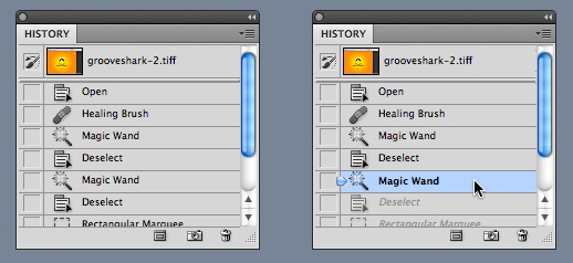
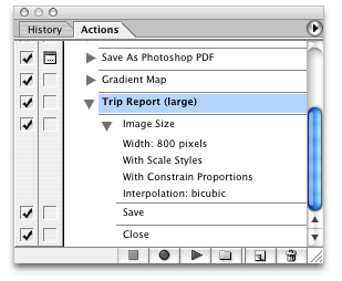
But see the screenshot at the top of this pattern (Figure 6-29) for a different, more visual presentation. Photoshop shows a scrolling list of the undoable operations—including ones that were already undone (two are shown, in gray). It lets the user pick the point in the stack that she wants to revert to. A visual command history like this can be quite useful, even just as a reminder of what you’ve recently done. See the Command History pattern for more information.
Examples
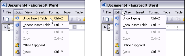
Figure 6-30 shows a more typical presentation of Multi-Level Undo. In this case, the user typed some text and then inserted a table. The first undo removes the table. Once that’s done, the following undo—the next action in the undo stack—represents the typed text, and invoking Undo again will remove that text. Meanwhile, the user has the opportunity to “undo the undo” with the Redo menu item. If we’re at the top of the stack (as in the first screenshot), there is no Redo, and that menu item is overloaded with a Repeat action.
Confusing? You bet. Most users will never develop a clear mental picture of the algorithms being used here; most people don’t know what a “stack” is, let alone how it is used in conjunction with Repeat and Redo. That’s why the Smart Menu Items are absolutely critical to usability here. They explain exactly what’s going to happen, which reduces the cognitive burden on the user.
Command History

What
As the user performs actions, keep a visible record of those actions—what was done to what, and when.
Use when
Users perform long and complex sequences of actions, with either a GUI or a command line. Most users are fairly experienced, or if not, they at least want an efficient interface that’s supportive of long-term and recurring work. Graphical editors and programming environments are usually good candidates.
Why
Sometimes a user needs to remember or review what he did in the course of working with the software. For instance, he may want to do any of these things:
Repeat an action or command done earlier, which he doesn’t remember well
Recall the order in which some actions were done
Repeat a sequence of operations, originally done to one object, on a different object
Keep a log of his actions, for legal or security reasons
Convert an interactive series of commands into a script or macro (see the Macros pattern in this chapter)
Computers are good at keeping an accurate record of steps taken; people aren’t. Take advantage of that.
How
Keep a running list of the actions taken by the user. If the interface is driven from a command line, you have it easy—just record everything typed there. If you can, keep track of the history across sessions, so the user can see what was done even a week ago or longer.
If it’s a graphic interface, or a combination of graphic and command-line interfaces, things get a little more complicated. Find a way to express each action in one consistent, concise way, usually with words (though there’s no reason why it can’t be done visually). Make sure you define these with the right granularity—if one action is done en masse to 17 objects, record it as one action, not 17.
What commands should be recorded, and what shouldn’t? See the Multi-Level Undo pattern for a thorough discussion of what commands should “count.” If a command is undoable, it should be recorded in the history, too.
Finally, display the history to the user. That display should be optional in most software, since it will almost certainly play a supporting role in the user’s work, not a starring role. Lists of commands—oldest to newest—tend to work well. If you’d like, you could timestamp the history display somehow. MATLAB, shown earlier in Figure 6-31, puts a date and time into the history whenever the program restarts.
Examples
Unix and its many variants use shell programs, such as tcsh and bash, that keep
track of their own command histories in files. The user can call it up with the
“history” command, as shown in Figure 6-32. The history is also
accessible through various command-line constructs, such as !! (reuse the last command), !3 (reuse
the command issued three commands ago), and Ctrl-P, which you can issue repeatedly to
show the previous commands one at a time.

Photoshop’s undo stack, also seen in the Multi-Level Undo pattern, is effectively a command history. You can use it to undo the actions you performed, but you don’t have to; you can also just look at it and scroll through it, reviewing what you did. It uses icons to identify different classes of actions, which is unusual, but nice to use (see Figure 6-33).

Macros
What
Macros are single actions composed of other, smaller actions. Users can create them by putting together sequences of actionsUse when:
Users may want to repeat long sequences of actions or commands. They might want to loop over lists of files, images, database records, or other objects, for instance, doing the same things to each object. You might already have implemented Multi-Level Undo or Command History.
Why
No one wants to perform the same set of repetitive interactive tasks over, and over, and over again! This is exactly what computers are supposed to be good at. Chapter 1 described a user-behavior pattern called Streamlined Repetition; macros are precisely the kind of mechanism that can support that well.
Macros obviously help users work faster. But by reducing the number of commands or gestures needed to get something done, they also reduce the possibility of finger slips, oversights, and similar mistakes.
You might also recall the concept of “flow,” also discussed in Chapter 1. When a long sequence of actions can be compressed down into a single command or keyboard shortcut, the experience of flow is enhanced—the user can accomplish more with less effort and time, and she can keep her larger goals in sight without getting bogged down in details.
How
Provide a way for the user to “record” a sequence of actions and easily “play them back” at any time. The playback should be as easy as giving a single command, pressing a single button, or dragging and dropping an object.
Defining the macro
The user should be able to give the macro a name of her choice. Let her review the action sequence somehow, so she can check her work or revisit a forgotten sequence to see what it did (as in the Command History pattern). Make it possible for one macro to refer to another, so they can build on each other.
Users will certainly want to save macros from one day to the next, so make sure they’re persistent—save them to files or a database. Present them in a searchable, sortable, and even categorizable list, depending on the needs of your users.
Running the macro
The macro itself could be played back literally, to keep things simple; or, if it acts upon an object that can change from one invocation to another, you could allow the sequence to be parameterized (e.g., use a placeholder or variable instead of a literal object). Macros should also be able to act on many things at once.
How the names of the macros (or the controls that launch them) are presented depends heavily upon the nature of the application, but consider putting them with built-in actions rather than making them second-class citizens.
The ability to record these sequences—plus the facility for macros to build on one other—create the potential for the user to invent an entirely new linguistic or visual grammar, a grammar that is finely tuned to her own environment and work habits. This is a very powerful capability. In reality, it’s programming; but if your users don’t think of themselves as programmers, don’t call it that or you’ll scare them off. (“I don’t know how to program anything; I must not be able to do this.”)
Examples
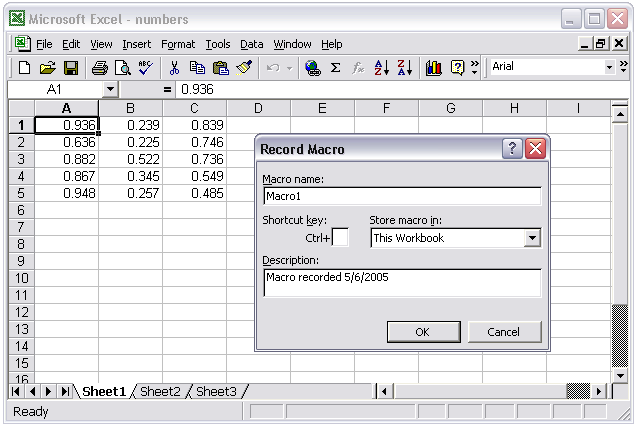
Microsoft Excel allows macros to be recorded, named, stored along with the document, and even assigned to a keyboard shortcut. The user can also choose to run a macro from a button on the toolbar, or an ActiveX control in the document itself (which means macros can be used as callbacks for buttons, text fields, etc.).
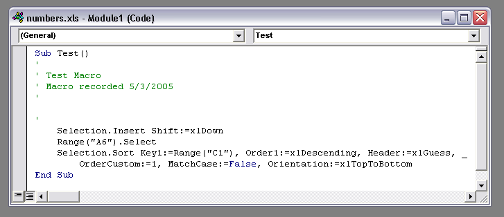
The Excel macros shown in Figures Figure 6-35 and Figure 6-36 are written in Visual Basic, and the user can hand-edit them if desired. This is when it becomes programming. Because Visual Basic provides access to so much general-purpose functionality—most of it not directly related to, say, spreadsheet operations—macros can be a serious security risk for Office applications. By sharply constraining the functionality available to macros and by limiting the number of ways users can run macros (e.g., only by clicking on toolbar buttons), you can trade power for safety.
(Note that not all versions of Excel allow Visual Basic macros as of this writing.)
[5] Alan Cooper and Robert Reimann devote an entire chapter to the undo concept in their book About Face 2.0: The Essentials of Interaction Design (Wiley).
[6] Larry Constantine and Lucy Lockwood, “Instructive Interaction: Making Innovative Interfaces Self-Teaching,” http://foruse.com/articles/instructive.htm.