Preface
Once upon a time, interface designers worked with a woefully small toolbox.
We had a handful of simple controls: text fields, buttons, menus, tiny icons, and modal dialogs. We carefully put them together according to the Windows Style Guide or the Macintosh Human Interface Guidelines, and we hoped that users would understand the resulting interface—and too often, they didn’t. We designed for small screens, few colors, slow CPUs, and slow networks (if the user was connected at all). We made them gray.
Things have changed. If you design interfaces today, you work with a much bigger palette of components and ideas. You have a choice of many more user interface toolkits than before, such as the Java toolkits, HTML/CSS, JavaScript, Flash, and numerous open source options. Apple’s and Microsoft’s native UI toolkits are richer and nicer-looking than they used to be. Display technology is better. Web applications often look as professionally designed as the websites they’re embedded in, and some of those web sensibilities have migrated back into desktop applications in the form of blue underlined links, Back/Next buttons, beautiful fonts and background images, and non-gray color schemes.
But it’s still not easy to design good interfaces. Let’s say you’re not a trained or self-taught interface designer. If you just use the UI toolkits the way they should be used, and if you follow the various style guides or imitate existing applications, you can probably create a mediocre but passable interface.
Alas, that may not be enough anymore. Users’ expectations are higher than they used to be—if your interface isn’t easy to use “out of the box,” users will not think well of it. Even if the interface obeys all the standards, you may have misunderstood users’ preferred workflow, used the wrong vocabulary, or made it too hard to figure out what the software even does. Impatient users often won’t give you the benefit of the doubt. Worse, if you’ve built an unusable website or web application, frustrated users can give up and switch to your competitor with just the click of a button. So the cost of building a mediocre interface is higher than it used to be, too.
Devices like phones, TVs, and car dashboards once were the exclusive domain of industrial designers. But now those devices have become smart. Increasingly powerful computers drive them, and software-based features and applications are multiplying in response to market demands. They’re here to stay, whether or not they are easy to use. At this rate, good interface and interaction design may be the only hope for our collective sanity in 10 years.
Small Interface Pieces, Loosely Joined
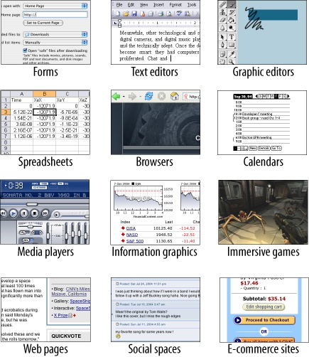
As an interface designer trying to make sense of all the technology changes in the last few years, I see two big effects on the craft of interface design. One is the proliferation of interface idioms: recognizable types or styles of interfaces, each with its own vocabulary of objects, actions, and visuals. You probably recognize all the ones shown in Figure P-1, and more are being invented all the time.
The second effect is a loosening of the rules for putting together interfaces from these idioms. It no longer surprises anyone to see several of these idioms mixed up in one interface, for instance, or to see parts of some controls mixed up with parts of other controls. Online help pages, which long have been formatted in hypertext anyway, might now include interactive applets, animations, or links to a web-based bulletin board. Interfaces themselves might have help texts on them, interleaved with forms or editors; this situation used to be rare. Combo boxes’ drop-down menus might have funky layouts, like color grids or sliders, instead of the standard column of text items. You might see web applications that look like document-centered paint programs, but have no menu bars, and save the finished work only to a database somewhere.
The freeform-ness of web pages seems to have taught users to relax their expectations with respect to graphics and interactivity. It’s OK now to break the old Windows style-guide strictures, as long as users can figure out what you’re doing.
And that’s the hard part. Some applications, devices, and web applications are easy to use. Many aren’t. Following style guides never guaranteed usability anyhow, but now designers have even more choices than before (which, paradoxically, can make design a lot harder). What characterizes interfaces that are easy to use?
One could say, “The applications that are easy to use are designed to be intuitive.” Well, yes. That’s almost a tautology.
Except that the word “intuitive” is a little bit deceptive. Jef Raskin once pointed out that when we say “intuitive” in the context of software, we really mean “familiar.” Computer mice aren’t intuitive to someone who’s never seen one (though a growling grizzly bear would be). There’s nothing innate or instinctive in the human brain to account for it. But once you’ve taken ten seconds to learn to use a mouse, it’s familiar, and you’ll never forget it. Same for blue underlined text, play/pause buttons, and so on.
Rephrased: “The applications that are easy to use are designed to be familiar.”
Now we’re getting somewhere. “Familiar” doesn’t necessarily mean that everything about a given application is identical to some genre-defining product (e.g., Word, Photoshop, Mac OS, or a Walkman). People are smarter than that. As long as the parts are recognizable enough and the relationships among the parts are clear, then people can apply their previous knowledge to a novel interface and figure it out.
That’s where patterns come in. This book catalogs many of those familiar parts, in ways you can reuse in many different contexts. Patterns capture a common structure—often a very local one, such as a list layout—without being too concrete on the details, which gives you the flexibility to be creative.
If you know what users expect of your application, and if you choose carefully from your toolbox of idioms and frameworks (large-scale), individual elements (small-scale), and patterns (covering the range), then you can put together something that “feels familiar” while remaining original.
And that gets you the best of both worlds.
About Patterns in General
In essence, patterns are structural and behavioral features that improve the “habitability” of something—a user interface, a website, an object-oriented program, or a building. They make things easier to understand or more beautiful; they make tools more useful and usable.
As such, patterns can be a description of best practices within a given design domain. They capture common solutions to design tensions (usually called “forces” in pattern literature) and thus, by definition, are not novel. They aren’t off-the-shelf components; each implementation of a pattern differs a little from every other. They aren’t simple rules or heuristics either. And they won’t walk you through an entire set of design decisions—if you’re looking for a complete step-by-step description of how to design an interface, a pattern catalog isn’t the place to find it!
Patterns are:
- Concrete, not general
All designers depend upon good design principles, like “Prevent errors,” “Create a strong visual hierarchy,” and “Don’t make the user think.” It’s rather hard, however, to design an actual working interface starting from fundamental principles! Patterns are concrete enough to help fill the space between high-level general principles and the low-level “grammar” of user interface design (widgets, text, graphic elements, alignment grids, and so on).
- Valid across different platforms and systems
Patterns may be more concrete than principles or heuristics, but they do define abstractions—the best patterns aren’t specific to a single platform or idiom. Some even work in both print and interactive systems. Ideally, each pattern captures some minor truth about how people work best with a created artifact, and it remains true even while the underlying technologies and media change.
- Products, not processes
Unlike heuristics or user-centered design techniques, which usually advise on how to go about finding a solution to an engineering or design problem, patterns are possible solutions.
- Suggestions, not requirements
You should almost always follow good design principles and heuristics, of course. And organizations need designers to follow style guides so that their products stay self-consistent. But patterns are intended to be only suggestions; you can follow them or reject them, depending on your design context and user needs.
- Relationships among elements, not single elements
A text field is not a pattern. The spatial relationships between a text field and a piece of help text near it, however, might be a pattern. Likewise, changes in a set of elements over time—as a user interacts with the software—may constitute a pattern, though some patterns capture only static relationships.
- Customized to each design context
When a pattern is instantiated in a design, the designer should adjust the pattern as needed to fit the situation. You could use some of the pattern examples verbatim, but as long as you understand why the pattern works, why not be creative? Fit the pattern to your particular users and requirements.
Some very complete sets of patterns make up a “pattern language.” These patterns resemble visual languages in that they cover the entire vocabulary of elements used in a design (though pattern languages are more abstract and behavioral; visual languages talk about shapes, icons, colors, fonts, etc.). The set in this book isn’t nearly as complete, and it contains techniques that don’t qualify as traditional patterns. But at least it’s concise enough to be manageable and useful.
Other Pattern Collections
The text that started it all dealt with physical buildings, not software. Christopher Alexander’s A Pattern Language and its companion book The Timeless Way of Building established the concept of patterns and described a 250-pattern multilayered pattern language. It is often considered the gold standard for a pattern language because of its completeness, its rich interconnectedness, and its grounding in the human response to our built world.
In the mid-1990s, the publication of Design Patterns by Erich Gamma, Richard Helm, Ralph Johnson, and John Vlissides profoundly changed the practice of commercial software architecture. This book is a collection of patterns describing object-oriented “micro-architectures.” If you have a background in software engineering, this is the book that probably introduced you to the idea of patterns. Many other authors have written books about software patterns since this book. Software patterns such as these do make software more habitable—for those who write the software, not those who use it!
The first substantial set of user-interface patterns was “Common Ground,” the predecessor to the book you’re reading now. Many other collections and languages followed, notably Martijn van Welie’s Interaction Design Patterns; van Duyne, Landay, and Hong’s The Design of Sites; the Little Springs mobile patterns, now known as Design4Mobile; the Yahoo! Design Pattern Library, which morphed into Designing Web Interfaces; and the rest of the O’Reilly design pattern library, including Designing Social Interfaces, Designing Gestural Interfaces, and the first edition of this book.
About the Patterns in This Book
So there’s nothing really new in here. If you’ve done any web or UI design, or even thought much about it, you should say, “Oh, right, I know what that is” to most of these patterns. But a few of them might be new to you, and some of the familiar ones may not be part of your usual design repertoire.
These patterns work for both desktop applications and highly interactive websites. Many patterns also apply to mobile devices or TV-based interfaces (like digital recorders).
Though this book won’t exhaustively describe all the interface idioms mentioned earlier, these idioms help to organize the book. Some chapters focus on the more common idioms: forms, information graphics, mobile interfaces, and interactions with social networks. Other chapters address subjects that are useful across many idioms, such as organization, navigation, actions, and visual style. (The book does not address idioms such as online games or communities, simply due to lack of space.)
This book is intended to be read by people who have some knowledge of such interface design concepts and terminology as dialog boxes, selection, combo boxes, navigation bars, and whitespace. It does not identify many widely accepted techniques, such as copy-and-paste, since you already know what they are. But, at the risk of belaboring the obvious, this book describes some common techniques to encourage their use in other contexts or to discuss them alongside alternative solutions.
This book does not present a complete process for constructing an interface design. When doing design, a sound process is critical. You need to have certain elements in a design process:
Field research, to find out what the intended users are like and what they already do
Goal and task analysis, to describe and clarify what users will do with what you’re building
Design models, such as personas (models of users), scenarios (models of common tasks and situations), and prototypes (models of the interface itself)
Empirical testing of the design at various points during development, like usability testing and in situ observations of the design used by real users
Enough time to iterate over several versions of the design, because you won’t get it right the first time
These topics transcend the scope of this book, but there are plenty of other excellent resources and workshops out there that cover them in depth.
But there’s a deeper reason why this book won’t give you a recipe for designing an interface. Good design can’t be reduced to a recipe. It’s a creative process, and one that changes under you as you work—in any given project, for instance, you won’t understand some design issues until you’ve designed your way into a dead end. I’ve personally done that many times.
And design isn’t linear. Most chapters in this book are arranged more or less by scale, and therefore by their approximate order in the design progression: large decisions about content and scope are made first, followed by navigation, page design, and eventually the details of interactions with forms and toolbars and such. But you’ll often find yourself moving back and forth through this progression. Maybe you’ll know very early in a project how a certain screen should look, and that’s a “fixed point;” you may have to work backward from there to figure out the right navigational structure. (It’s not ideal, but things like this do happen in real life.)
Here are some ways you can use these patterns:
- Learning
If you don’t have much design experience, a set of patterns can serve as a learning tool. You may want to read over it to get ideas, or refer back to specific patterns as the need arises. Just as expanding your vocabulary helps you express ideas in language, expanding your interface design “vocabulary” helps you create more expressive designs.
- Examples
Each pattern in this book has at least one example. Some have many; they might be useful to you as a sourcebook. You may find wisdom in the examples that is missing in the text of the pattern. If you’re a designer who knows the patterns already, the examples may be the most useful aspect of the book for you.
- Terminology
If you talk to users, engineers, or managers about interface design, or if you write specifications, then you could use the pattern names as a way of communicating and discussing ideas. This is another well-known benefit of pattern languages. (The terms “singleton” and “factory,” for instance, were originally pattern names, but they’re now in common use among software engineers.)
- Comparison of design alternatives
If you initially decided to use Module Tabs to organize material on a page and it’s not working quite as well as you hoped, you might use these patterns to come up with alternatives, such as Titled Sections or an Accordion. Other sets of “either/or” patterns are presented in this book, often with reasons to choose one pattern or another. Skilled designers know that presenting alternative designs to clients frequently leads to a better choice in the end.
- Inspiration
Each pattern description tries to capture the reasons why the pattern works to make an interface easier or more fun. If you get it, but want to do something a little different from the examples, you can be creative with your “eyes open.” You could also use the book to jumpstart your creative process by flipping through it for ideas.
One more word of caution: a catalog of patterns is not a checklist. You cannot measure the quality of a thing by counting the patterns in it. Each design project has a unique context, and even if you need to solve a common design problem (such as how to fit too much content onto a page), a given pattern might be a poor solution within that context. No reference can substitute for good design judgment. Nor can it substitute for a good design process, which helps you find and recover from design mistakes.
Ultimately, you should be able to leave a reference like this behind. As you become an experienced designer, you will internalize these ideas to the point that you don’t even notice you’re using them anymore; the patterns become second nature and a permanent part of your toolbox.
Audience
If you design user interfaces in any capacity, you might find this book useful. It’s intended for people who work on:
Desktop applications
Websites
Web applications or “rich internet applications” (RIAs)
Software for mobile devices or other consumer electronics
Turnkey systems like kiosks
Operating systems
Of course, profound differences exist among these different design platforms. However, I believe they have more in common than we generally think. You’ll see examples from many different platforms in these patterns, and that’s deliberate—they often use the same patterns to achieve the same ends.
From what readers said about the previous edition, this book has been more valuable to less experienced designers than to those who have been designing sites or interfaces for a while—they know this material already. However, even if you’re just starting out with design, you should already know the basic “grammar” of UI design, such as available toolkits and control sets, concepts like drag-and-drop and focus, and the importance of usability testing and user feedback. If you don’t, some excellent books listed in the References section can get you started with the essentials.
Specifically, this book targets the following audiences:
Software developers who need to design the UIs that they build.
Web page designers who are now asked to design web apps or sites with more interactivity.
New interface designers and usability specialists.
More experienced designers who want to see how other designs solve certain problems; the examples can serve as a sourcebook for ideas.
Professionals in adjacent fields, such as technical writing, product design, and information architecture.
Managers who want to understand what’s involved in good interface design.
Open source developers and enthusiasts. This isn’t quite “open source design,” but the idea is to open up interface design best practices for everyone’s benefit.
How This Book Is Organized
The patterns in this book are grouped into thematic chapters, and each chapter has an introduction that briefly covers the concepts those patterns are built upon. I want to emphasize briefly. Some of these concepts could have entire books written about them. But the introductions will give you some context; if you already know this stuff, they’ll be review material, and if not, they’ll tell you what topics you might want to learn more about. The first set of chapters is applicable to almost any interface you might design, whether it’s a desktop application, web application, website, hardware device, or whatever you can think of:
Chapter 1, What Users Do, talks about common behavior and usage patterns supported by good interfaces.
Chapter 2, Organizing the Content, discusses information architecture as it applies to highly interactive interfaces. It deals with different organizational patterns, recognizable interface types, and “guilds” of patterns (groups of smaller-scale patterns that work well together to support a certain type of interface).
Chapter 3, Getting Around, discusses navigation. It describes patterns for moving around an interface—between pages, among windows, and within large virtual spaces.
Chapter 4, Organizing the Page, describes patterns for the layout and placement of page elements. It talks about how to communicate meaning simply by putting things in the right places.
Chapter 5, Lists, enumerates a set of patterns for displaying lists of items, along with criteria for choosing among them.
Chapter 6, Doing Things, talks about how to present actions and commands; use these patterns to handle the “verbs” of an interface.
Next comes a set of chapters that deal with specific idioms. It’s fine to read them all, but real-life projects probably won’t use all of them. Chapters Chapter 7 and Chapter 8 are the most broadly applicable, since most modern interfaces use trees, tables, or forms in some fashion.
Chapter 7, Showing Complex Data, contains patterns for trees, tables, charts, and information graphics in general. It discusses the cognitive aspects of data presentation and how to use them to communicate knowledge and meaning.
Chapter 8, Getting Input from Users, deals with forms and controls. Along with the patterns, this chapter has a table that maps data types to various controls that can represent them.
Chapter 9, Using Social Media, discusses the ways that one might integrate contemporary social media into a website or application design. Although designers don’t always make these choices for a site, they sometimes do, and social media may influence your design in any case.
Chapter 10, Going Mobile, presents techniques and concepts that designers ought to know in order to help their designs translate well to a mobile device. Patterns throughout the book may contain examples from mobile devices, but the patterns in this chapter are mobile-specific.
Finally, the last chapter comes at the end of the design progression, but it too applies to almost anything you design.
Chapter 11, Making It Look Good, deals with aesthetics and fit-and-finish. It uses graphic design principles and patterns to show how (and why) to polish the look-and-feel of an interface once its behavior is established.
I chose this book’s examples based on many factors. The most important is how well an example demonstrates a given pattern or concept, of course, but other considerations include general design fitness, printability, variety—desktop applications, websites, devices, etc.—and how well known and accessible these applications might be to readers. As such, the examples are weighted heavily toward Microsoft and Apple software, certain big-name websites such as Google and Yahoo! properties, and easy-to-find consumer software and devices. This is not to say that they always are paragons of good design—they’re not, and I do not mean to slight the excellent work done by countless designers on lesser-known applications. If you know of examples that might meet most of these criteria, please suggest them to me.
Comments and Questions
Please address comments and questions concerning this book to the publisher:
O’Reilly Media, Inc.
1005 Gravenstein Highway North
Sebastopol, CA 95472
(800) 998-9938 (in the United States or Canada)
(707) 829-0515 (international or local)
(707) 829-0104 (fax)
We have a web page for this book, where we list errata, examples, and any additional information. You can access this page at:
To comment or ask technical questions about this book, send email to:
For more information about our books, conferences, Resource Centers, and the O’Reilly Network, see our website at:
Safari® Books Online
Safari Books Online is an on-demand digital library that lets you easily search over 7,500 technology and creative reference books and videos to find the answers you need quickly.
With a subscription, you can read any page and watch any video from our library online. Read books on your cell phone and mobile devices. Access new titles before they are available for print, and get exclusive access to manuscripts in development and post feedback for the authors. Copy and paste code samples, organize your favorites, download chapters, bookmark key sections, create notes, print out pages, and benefit from tons of other time-saving features.
O’Reilly Media has uploaded this book to the Safari Books Online service. To have full digital access to this book and others on similar topics from O’Reilly and other publishers, sign up for free at http://my.safaribooksonline.com.
Acknowledgments
First of all, I am indebted to my editor, Mary Treseler, who got this project rolling at just the right time. You knew a second edition was needed, and with the patience of a saint, you made sure I followed through with it. Thanks also to the rest of the O’Reilly production team: Rachel Monaghan, Audrey Doyle, Robert Romano, Ron Bilodeau, and anyone else I may have inadvertently missed. You all rocked.
The technical reviewers for this edition gave me fantastic feedback. Barbara Ballard, Erin Malone, Dan Saffer—thanks to you all!
The ideas in this second edition have been cooking for a long time. Both direct and indirect conversations with other UI designers and pattern writers have helped shape my thinking: Bill Scott, Luke Wroblewski, Martijn van Welie, Erin Malone, Christian Crumlish, Dan Saffer, James Reffell, Scott Jenson, and my UX colleagues at Google. I learned a ridiculous amount from all of you. I’m also grateful to the people who gave me feedback at the various and sundry presentations I’ve done for conferences and mini-conferences over the last few years.
To all who bought or read the first edition: thanks to you too! Without you, there would have been no second edition.
Finally, I am enormously grateful to Rich, who supported me wholeheartedly throughout this second-edition project; and to Matthew, who right now is too young to understand how helpful his sweet hugs actually were. I love you both!