Appendix
Design Guidelines
Vision
3.1 Maximize legibility of essential text | ▪ Use large fonts. ▪ Use plain fonts. ▪ Use mixed case. ▪ Make text enlargeable. ▪ Make information easy to scan. ▪ Use plain backgrounds. ▪ Use static text. ▪ Leave plenty of space. |
3.2 Simplify: Remove unnecessary visual elements | ▪ Present few calls to action. ▪ Keep graphics relevant. ▪ Don’t distract. ▪ Minimize clutter. |
3.3 Visual language: Create an effective graphical language and use it consistently | ▪ Maintain visual consistency. ▪ Make controls prominent. ▪ Indicate strongly, not subtly. ▪ Change links on hover. ▪ Mark visited links or not? ▪ Label redundantly. |
3.4 Use color judiciously | ▪ Use color sparingly. ▪ Mix colors carefully. ▪ Use distinguishable link colors. ▪ Combine color with other indicators. ▪ High contrast. ▪ Adjustable contrast. |
3.5 Position important content where users will start looking | ▪ Lay elements out consistently. ▪ Place important information front and center. ▪ Make error messages obvious. |
3.6 Group related content visually | ▪ Group related items. |
3.7 Take care when relying on scrolling | ▪ Minimize vertical scrolling. ▪ Don’t require horizontal scrolling. |
3.8 Provide text alternatives for nontext content | ▪ Supplement images and videos with text. |

Motor Control
4.1 Make sure users can hit targets | Desktop/Laptop Computers | Touch-Screen Devices |
▪ Big click targets. ▪ Maximize clickable area. ▪ Put space between click targets. ▪ Big tap targets. ▪ Maximize tap target. | ▪ Big swipe targets. ▪ Put space between tap targets? Maybe. ▪ Place important tap targets near users’ hand. ▪ Place swipe targets bottom or right. |
4.2 Keep input gestures simple | ▪ Avoid double click. ▪ Avoid drag. ▪ Leave menus open. ▪ Multilevel menus: avoid or design carefully. | ▪ Avoid multi-finger gestures. |
4.3 Make it obvious when a target has been selected | ▪ Make feedback obvious. ▪ Provide feedback immediately. |
4.4 Minimize the need to use the keyboard | ▪ Gesture input preferred. ▪ Structure user input. |
4.5 For touch-screen devices, provide within-app training on gestures, if possible | ▪ Provide in-app demos. |
4.6 Allow users plenty of time to complete operations | ▪ Avoid time-out. |
4.7 Avoid causing physical strain | ▪ Keep user’s body position neutral. ▪ Minimize repetition. ▪ Minimize movement. |
Hearing and Speech
5.1 Ensure that audio output is audible | ▪ Avoid high-frequency sounds. ▪ Ensure that sounds are loud enough. ▪ Make auditory signals long. |
5.2 Minimize background noise | ▪ Avoid distracting sounds. |
5.3 Convey important information in multiple ways | ▪ Supplement images with text. ▪ Make alerts multimodal. ▪ Provide text-to-speech. |
5.4 Allow users to adjust device output | ▪ Make volume adjustable. ▪ Let users replay audio. ▪ Make play speed adjustable. ▪ Let users select alert sounds. ▪ Provide alternative voices. |
| Table Continued |
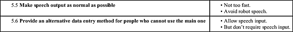
5.5 Make speech output as normal as possible | ▪ Not too fast. ▪ Avoid robot speech. |
5.6 Provide an alternative data entry method for people who cannot use the main one | ▪ Allow speech input. ▪ But don’t require speech input. |
Cognition
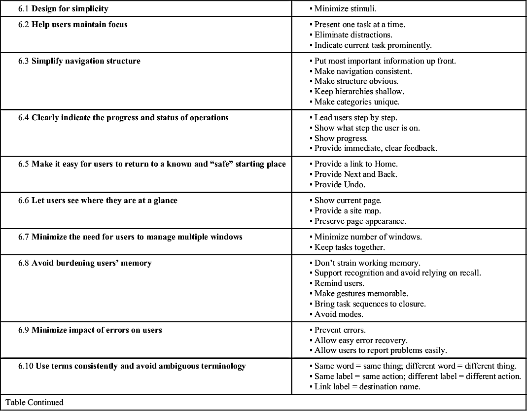
6.1 Design for simplicity | ▪ Minimize stimuli. |
6.2 Help users maintain focus | ▪ Present one task at a time. ▪ Eliminate distractions. ▪ Indicate current task prominently. |
6.3 Simplify navigation structure | ▪ Put most important information up front. ▪ Make navigation consistent. ▪ Make structure obvious. ▪ Keep hierarchies shallow. ▪ Make categories unique. |
6.4 Clearly indicate the progress and status of operations | ▪ Lead users step by step. ▪ Show what step the user is on. ▪ Show progress. ▪ Provide immediate, clear feedback. |
6.5 Make it easy for users to return to a known and “safe” starting place | ▪ Provide a link to Home. ▪ Provide Next and Back. ▪ Provide Undo. |
6.6 Let users see where they are at a glance | ▪ Show current page. ▪ Provide a site map. ▪ Preserve page appearance. |
6.7 Minimize the need for users to manage multiple windows | ▪ Minimize number of windows. ▪ Keep tasks together. |
6.8 Avoid burdening users’ memory | ▪ Don’t strain working memory. ▪ Support recognition and avoid relying on recall. ▪ Remind users. ▪ Make gestures memorable. ▪ Bring task sequences to closure. ▪ Avoid modes. |
6.9 Minimize impact of errors on users | ▪ Prevent errors. ▪ Allow easy error recovery. ▪ Allow users to report problems easily. |
6.10 Use terms consistently and avoid ambiguous terminology | ▪ Same word = same thing; different word = different thing. ▪ Same label = same action; different label = different action. ▪ Link label = destination name. |
| Table Continued |
6.11 Use strong words to label page elements | ▪ Use verbs. ▪ Make labels semantically distinctive. |
6.12 Use writing style that is concise, plain, and direct | ▪ Be brief. ▪ Keep sentences simple. ▪ Get to the point quickly. ▪ Make language active, positive, and direct. ▪ Be explicit. |
6.13 Don’t rush users; allow them plenty of time | ▪ Don’t make messages time out. ▪ Let users take their time. ▪ Make playback speed adjustable. |
6.14 Keep layout, navigation, and interactive elements consistent across pages and screens | ▪ Consistent layout. ▪ Consistent controls. ▪ Consistent order and labeling. ▪ Consistency across related apps. |
6.15 Design to support learning and retention | ▪ Show gestures. ▪ Repetition is good. ▪ Tell users what to bring to task. ▪ Let users reuse previous paths or choices. |
6.16 Help users with input | ▪ Show what’s valid. ▪ Preformat input fields. ▪ Be tolerant. ▪ Show what’s required. ▪ Provide reminders. |
6.17 Provide on-screen help | ▪ Provide easy access to help. ▪ Provide context-sensitive online help. ▪ Provide help desk chat. |
6.18 Arrange information consistent with its importance | ▪ Prioritize information. ▪ Use tables when appropriate. |

Knowledge
7.1 Organize content to match users’ knowledge and understanding | ▪ Group, order, and label content in ways that are meaningful to users. |
7.2 Use vocabulary familiar to your audience | ▪ Avoid technical jargon. ▪ Spell words out. |
7.3 Don’t assume the user has a correct mental model of the device, app, or website | ▪ Design a simple, clear conceptual model. ▪ Match users’ mental model of navigation space. |
| Table Continued |
7.4 Help users predict what buttons do and where links go | ▪ Make link labels descriptive. |
7.5 Make instructions easy to understand | ▪ Be explicit. ▪ If steps are to be executed in a certain sequence, number them. |
7.6 Minimize the negative impact on users of new versions | ▪ Avoid needless change. ▪ Change gradually. ▪ Guide users from old to new. |
7.7 Label interactive elements clearly | ▪ Label with text if possible. ▪ Use easy-to-recognize icons. |
Search
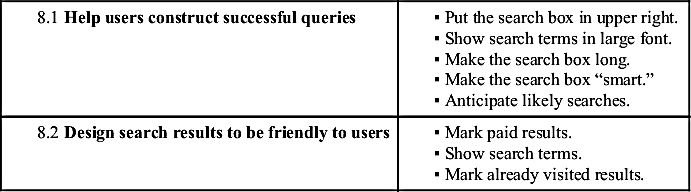
8.1 Help users construct successful queries | ▪ Put the search box in upper right. ▪ Show search terms in large font. ▪ Make the search box long. ▪ Make the search box “smart.” ▪ Anticipate likely searches. |
8.2 Design search results to be friendly to users | ▪ Mark paid results. ▪ Show search terms. ▪ Mark already visited results. |
Attitude
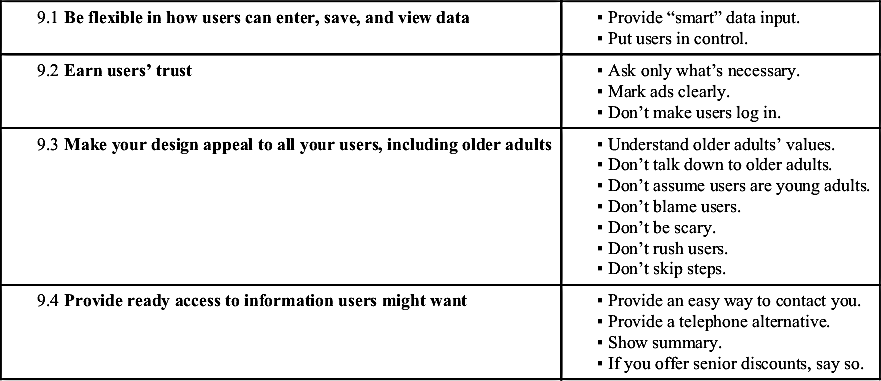
9.1 Be flexible in how users can enter, save, and view data | ▪ Provide “smart” data input. ▪ Put users in control. |
9.2 Earn users’ trust | ▪ Ask only what’s necessary. ▪ Mark ads clearly. ▪ Don’t make users log in. |
9.3 Make your design appeal to all your users, including older adults | ▪ Understand older adults’ values. ▪ Don’t talk down to older adults. ▪ Don’t assume users are young adults. ▪ Don’t blame users. ▪ Don’t be scary. ▪ Don’t rush users. ▪ Don’t skip steps. |
9.4 Provide ready access to information users might want | ▪ Provide an easy way to contact you. ▪ Provide a telephone alternative. ▪ Show summary. ▪ If you offer senior discounts, say so. |
Working With Older Adults
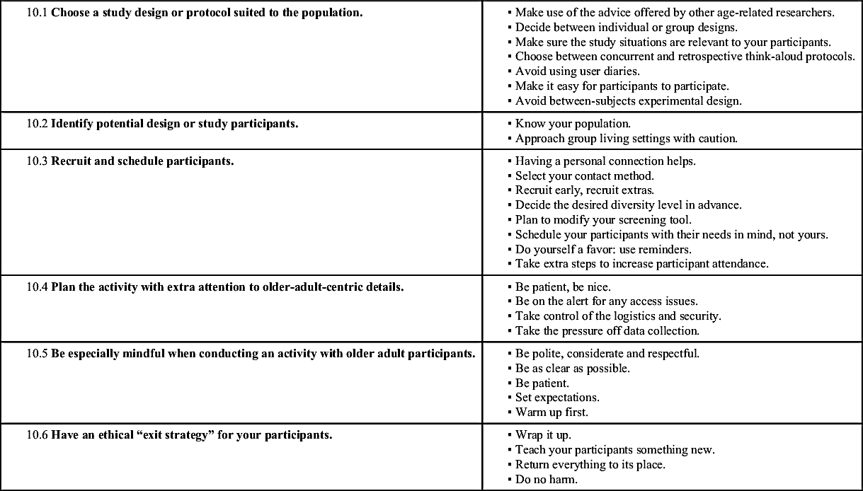
10.1 Choose a study design or protocol suited to the population. | ▪ Make use of the advice offered by other age-related researchers. ▪ Decide between individual or group designs. ▪ Make sure the study situations are relevant to your participants. ▪ Choose between concurrent and retrospective think-aloud protocols. ▪ Avoid using user diaries. ▪ Make it easy for participants to participate. ▪ Avoid between-subjects experimental design. |
10.2 Identify potential design or study participants. | ▪ Know your population. ▪ Approach group living settings with caution. |
10.3 Recruit and schedule participants. | ▪ Having a personal connection helps. ▪ Select your contact method. ▪ Recruit early, recruit extras. ▪ Decide the desired diversity level in advance. ▪ Plan to modify your screening tool. ▪ Schedule your participants with their needs in mind, not yours. ▪ Do yourself a favor: use reminders. ▪ Take extra steps to increase participant attendance. |
10.4 Plan the activity with extra attention to older-adult-centric details. | ▪ Be patient, be nice. ▪ Be on the alert for any access issues. ▪ Take control of the logistics and security. ▪ Take the pressure off data collection. |
10.5 Be especially mindful when conducting an activity with older adult participants. | ▪ Be polite, considerate and respectful. ▪ Be as clear as possible. ▪ Be patient. ▪ Set expectations. ▪ Warm up first. |
10.6 Have an ethical “exit strategy” for your participants. | ▪ Wrap it up. ▪ Teach your participants something new. ▪ Return everything to its place. ▪ Do no harm. |
..................Content has been hidden....................
You can't read the all page of ebook, please click
here login for view all page.