Describes common age-related changes in vision. Presents research-based design guidelines to help older people overcome those changes, allowing them to use digital technology productively and enjoyably.
Keywords
Digital technology; Eyesight; Guidelines; Older adults; Sight; Vision
When we talk about age-friendly technology, a common first response is “Oh, you mean bigger fonts?”
“Use bigger fonts” is indeed an important guideline for making digital technology more accessible to older adults, because vision tends to get worse as people age. However, as with all age-related changes, there is great variability between individuals in both the extent of changes and the age of onset. More importantly, “declining vision” is complex: vision has many different aspects that can decline. Bigger fonts only help for some of them.
The problem of older adults having difficulty seeing details is of course not limited to digital technology. Printed materials—books, magazines, brochures, package labeling and ingredients, drug usage directions, legal documents, and so forth—have for centuries been plagued by designs that don’t work for older adults. This continues despite laws requiring that materials be accessible to people with poor vision, such as the US’s Americans with Disabilities Act (ADA, passed in 1990) and the UK’s Disability Discrimination Act (DDA, passed in 1995).
The persistence of senior-unfriendly printed materials is due at least partly to poor communication between companies and the designers who work for them. Companies assume that their designers know the accessibility requirements and will design accordingly, but designers assume that if their client companies wanted designs that were highly visually accessible they would specify that in their requirements [Cornish et al., 2015]. The result: poor visual accessibility.
Sadly, design that works poorly for visually impaired people, including many older adults, has spread into the realm of digital products and services. Again, this is despite international standards such as the World Wide Web Consortium’s Web Content Accessibility Guidelines (WCAG 1.0, published in 1999, and WCAG 2.0, published in 2008), which were adopted by the International Standards Organization (ISO) in 2012.
In this chapter, we describe the most common vision changes that occur as people age. Then we offer design guidelines to help you ensure that your digital products and services work for older people. Following these guidelines will generally improve the visual experience for people of all ages.
Characteristics of Vision in Older Adults
Reduced visual acuity
Human visual acuity—our ability to see fine details—normally peaks between our late teens and early twenties, and then begins to decline. As explained earlier, the age at which this decline starts and the rate of decline vary, but most of us have the best acuity when we are young adults (see Figure 3.1). At some point above age 50, visual acuity typically begins to decline faster [Hawthorn, 2006; Mitzner et al., 2015], but again, when this occurs and the degree to which it occurs vary from person to person.
Figure 3.1 Mean visual acuity as a function of age. (source: Owsley et al. [1983], reprinted with permission)
People who experience this decline in acuity have difficulty seeing information on displays and trouble hitting their intended targets [Mitzner et al., 2015]. For example, research has shown that small text fonts reduce reading speed in everyone, but they reduce it more in older adults than in younger ones [Charness and Dijkstra, 1999]. Mobile devices can exacerbate these problems if designers don’t design carefully for the smaller screen size.
Farsightedness
People of all ages—even children—vary in whether they are nearsighted, farsighted, or have “normal” vision. Normal vision means the lenses of the eye can focus on objects both near (e.g., a few inches or centimeters beyond the nose) and far (e.g., across the street). Each of our eyes has a tiny muscle, called the ciliary muscle, that adjusts the lens to focus at different distances.
People who are nearsighted can focus their eyes on nearby objects but have difficulty focusing on distant objects. Farsighted people have the opposite problem: their eyes can focus on distant objects but have trouble focusing on nearby objects.
I need reading glasses to use my computer or mobile phone. Even then, the text on many screens is small and blurry.
Wong
Beginning around age 40, the lenses begin to harden and the ciliary muscles weaken, making it harder to focus on nearby objects (see Figure 3.2). This is known as age-related farsightedness—the fancy medical name is presbyopia. Age-related farsightedness is nearly universal in people over the age of 65, so it is considered a normal part of aging. We all know people who have to start using reading glasses at some point in their lives—many of us are such people.
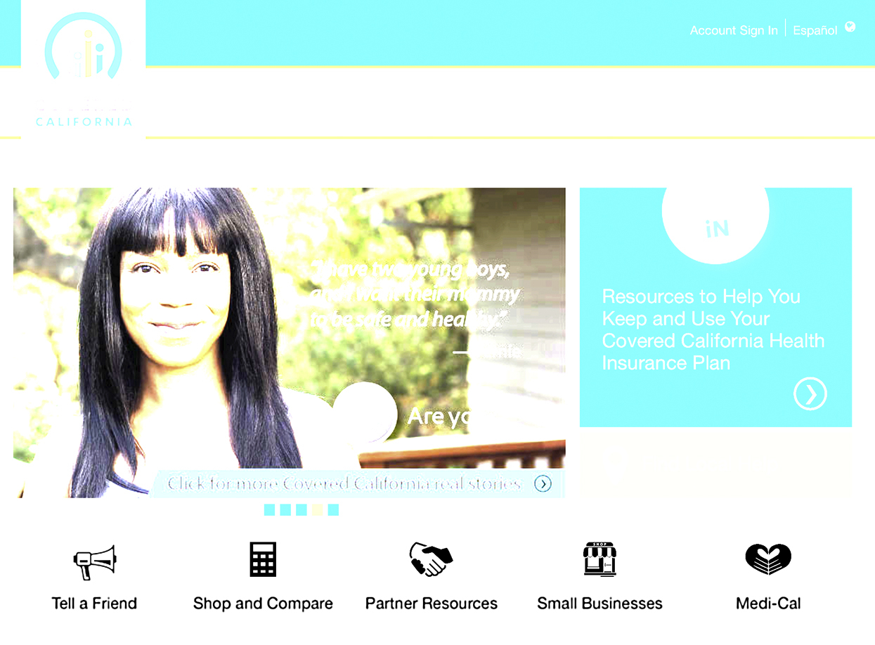
Figure 3.2 Normal vision and farsightedness, simulated using CoveredCA.com.
To allow users to compensate for poor visual acuity and farsightedness, most computers, tablets, and mobile phones these days allow users to increase text font sizes and general screen magnification. However, some older adults have not learned how to make such adjustments, especially if the controls to do so are hidden.
Narrowing of peripheral vision
Peripheral vision is the ability to see things where you are not directly looking—“out of the corner of your eye.” Even in young people with normal vision, peripheral vision is poor [Johnson, 2014]. It’s just how human eyes are: we have high-resolution vision only in a small area in the very center of each eye’s visual field—an area called the “fovea” that is about 1% of the total visual field (see box Human Vision Is Mostly Low Resolution). Most of our visual field—the other 99%—has very low resolution: it sees the world as if through frosted glass [Eagleman, 2011] (see Figure 3.3).
Figure 3.3 Only the very center of our visual field has high resolution; the periphery has low resolution.
Human Vision Is Mostly Low Resolution
The fovea—the 1% of your visual field at the center that has high resolution—is small. To see how small, hold your arm out, stick up your thumb, and focus on your thumbnail. At arm’s length, your thumbnail is about the size of your fovea. The rest of your visual field can be considered peripheral vision, with significantly lower resolution [Johnson, 2014].
As bad as peripheral vision is in young adults with normal vision, it gets worse with age. Our field of useful vision gradually narrows, so we can’t take in as much in one glance as we used to [Mitzner et al., 2015]. How much worse? It varies, but on the average, we lose about 1–3 degrees from the edges of our visual field every 10 years. By 70–80years of age, most of us have lost 20–30 degrees from the edges of our visual field. Like age-related farsightedness, this gradual narrowing of our field of vision is common and considered normal.
Sometimes, I don’t even notice things on the edges of the screen.
Carolina
Obviously, peripheral vision is needed to notice on-screen content that is not where our gaze is focused. Reduced peripheral vision increases the chance of people missing error messages, warnings, or other information that appears away from where they are looking [Hawthorn, 2006]. It also reduces peoples’ ability to detect motion at the edges of their vision.
Age-related narrowing of peripheral vision also has a negative effect on reading. As we read, our eyes focus on one group of words, take them in, and then jump1 ahead several words to take in the next group [Johnson, 2014]. Our peripheral vision prescans text ahead of our point of focus, providing information to our brain about what lies ahead, how far ahead to jump, which words to skip over, and where to pause. As our peripheral vision narrows, the scanning becomes less effective, which slows our reading [Legge et al., 2007].
Glaucoma is a medical condition that can cause sudden and/or drastic loss of peripheral vision, sometimes called “tunnel vision” (see Figure 3.4) [Haddrill and Heiting, 2014].The greater your age, the greater your risk of developing glaucoma [National Eye Institute (NIH), n.d.]. It afflicts just under 1% of the population, or about 80 million people by 2020 [Quigley, 2006].
Figure 3.4 CoverCA.com viewed with peripheral vision reduced by glaucoma.
Loss of central vision
A vision ailment that is even more common than glaucoma in older adults is macular degeneration. In contrast to glaucoma, which reduces peripheral vision and narrows the visual field, macular degeneration damages the most important part of the visual field: the central medium-to-high resolution area that includes the fovea, which is called the macula (see Figure 3.5).
Figure 3.5 CoveredCA.com, with simulated age-related macular degeneration and gaze focused on the middle of the page. The obscured area moves as the person moves their gaze around the page.
Macular degeneration is so strongly associated with age that the medical name for it is “age-related macular degeneration,” abbreviated ARMD or AMD. It is the leading cause of vision loss and blindness among older adults [National Eye Institute (NIH), 2015]. Since this age group is increasing as a percentage of the population, the incidence of AMD is increasing. Studies of US adults find that among people aged 66–74years, about 10% have some form of AMD; among adults aged 75–85 years, the percentage rises to 30%. Currently about 1.75 million US residents have advanced AMD, with that number expected to grow to almost 3 million by 2020 [Haddrill and Heiting, 2014]. Extrapolating worldwide, this suggests that hundreds of millions of people live with AMD.
Diminished light perception
The amount of light our eyes take in and register decreases with age [Mitzner et al., 2015]. This is due to:
▪ the pupil growing smaller;
▪ yellowing of the lens from exposure to sunlight;
▪ clouding of the lens from cataracts;
▪ increasing porousness of the retina—the layer of light-sensitive cells at the back of the eye;
▪ scratching of the cornea—the eye’s front cover.
The more of these problems a person has, the less light gets through to their retina. Therefore, to see and read well, they need brighter light. For example, the average 60-year-old needs three times as much light as a 20-year-old to perceive the same subjective brightness [Besdine, 2015] (see Figure 3.6).
Figure 3.6 Older adults typically receive less light at their retina than younger people do.
It’s like I’m looking at everything through sunglasses. I need more light and more contrast.
Wong
Decreased contrast sensitivity
Those websites with gray text on a white background are impossible!
Stefano
Above age 50, many people notice a decline in their ability to see subtle differences in shades of gray—or shades of any color. Contrast sensitivity continues to decline, usually becoming acute by age 80 [Hawthorn, 2006; Mitzner et al., 2015]. This suggests that information that contrasts poorly with its background will be hard for older adults to see (see Figures 3.7 and 3.8).
Closely related to contrast sensitivity is people’s ability to distinguish objects or read text that is displayed over a pattern or an image. Older adults have more trouble with that than younger adults do.
Diminished ability to discriminate colors
Lower contrast sensitivity (discussed in the previous section) also decreases our ability to distinguish similar colors.
With age, constant exposure to ultraviolet light causes the lens and cornea of our eyes to take on a yellowish tint. This yellowing affects how we perceive colors, particularly differences between colors. Imagine yourself viewing the world through yellow-tinted glasses. Obviously it would be hard to tell which items are yellow versus white (see Figure 3.9).
Figure 3.7 iOS weather app with white, gray, and blue text on gray background. It is hard to read the daily low temperatures and the percentage chance of rain, and nearly impossible to see the rain drops under the cloud symbols.
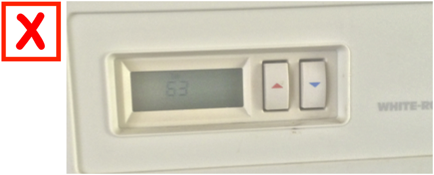
Figure 3.8 Wall thermostat with low-contrast display, making it difficult to read the temperature.
Other colors would be tinted toward yellow, making certain pairs of colors harder to distinguish, especially greens, blues, and violets [Mitzner et al., 2015] (see Figure 3.10).
Color discrimination is also affected by older adults’ diminished sensitivity to light. As discussed above, everything tends to look darker to older adults, so they have a harder time distinguishing dark colors, such as navy blue and black, or red and purple (see Figure 3.11).
Figure 3.9 Buzzfeed mobile site viewed normally and through simulated yellowed cornea and lens. Ads are marked in yellow. Users who have a yellowed cornea or lens may not see the marking.
Figure 3.10 CoveredCA.com viewed normally and through simulated yellowed cornea and lens. Users who have a yellowed cornea or lens may have trouble distinguishing blues from greens.
The incidence of hereditary—i.e., non–age-related—color blindness in the general population is 8% of males and 0.5% of females [Johnson, 2014]. The yellowing and darkening of older adults’ vision gives them a form of color blindness—diminished ability to distinguish certain colors—thereby increasing the percentage of the population afflicted with some form of color blindness.
Figure 3.11 Two Dots smartphone game, popular in a retirement community. Many residents have trouble distinguishing red versus purple dots (left). To accommodate them, the game offers a Color Blind setting that adds distinctive symbols to the dots.
I discovered the text links on my news website purely on accident. They look just like the regular text, except they are dark blue instead of black. Very difficult to distinguish!
John
Finally, our gaze is unconsciously attracted to areas of highly saturated color (see Figure 3.12) [Bera, 2016]. Therefore, gratuitous use of color in a display can be distracting, time-consuming, visually straining, and otherwise detrimental [NASA, 2015], especially to older adults.
Figure 3.12 Highly saturated colors attract our gaze more than less saturated colors do.
Increased glare sensitivity
Accumulated scratches, cataracts, and other deformities on the cornea and lens don’t only decrease the total amount of light transmitted to the retina. They also cause increased sensitivity to glare, as light passes through the scratched and misshapen areas and is scattered in all directions. This is why many older adults have difficulty driving at night. The glare from approaching headlights can be nearly blinding. Similarly, glare from external light sources, such as sunlight on a computer or smartphone screen, can cause more difficulty for older adults than for younger ones [Mitzner et al., 2015] (see Figure 3.13).
Figure 3.13 CoveredCA.com viewed with simulated glare.
I keep the screen brightness turned up high so I can read it, and I need good ambient light to see what I’m doing. But then reflections and glare often make it hard to see details on the screen.
Monika
Sensitivity to glare also means that it is possible for a display’s contrast to be too high for some older adults. Some researchers have found that reading black text on pure white backgrounds for long periods can cause eyestrain in older adults, suggesting that off-white backgrounds are better for older adults than pure white ones [Dickinson et al., 2007; Dunn, 2006].
Slower adaptation to changes in brightness
Our visual system is most effective within a narrow range of brightness. To keep the amount of light that reaches the retina within its optimal range, the iris adjusts the size of the pupil—the opening in the center of the iris. In low light or darkness, the pupil opens wide (dilates) to let in as much light as possible; in bright light, it closes down (contracts) to a tiny hole.
When we are young, our eyes adjust rapidly to changes in brightness. As we grow older, our eyes adjust more slowly. If an older person goes from a brightly lit area into a darker room, or vice versa, they might find themselves temporarily unable to see information on a screen until their eyes adjust—information that younger people have no trouble seeing.
If I am working on the computer and then go outside, the light is just blinding. And then when I go back inside, it takes quite some time before I can see well enough to read the computer screen again.
Stefano
Diminished ability to detect subtle visual indicators and distinctions
As we grow older, our vision problems grow, combine, and compound each other to cause higher-level problems. For example, narrowed peripheral vision combined with reduced ability to distinguish colors can cause older people to not be able to see small, subtle elements or button labels, even when they know where to look (see Figure 3.14).
Figure 3.14 The Mac OS Dock marks running apps with small black dots—too subtle for many older adults!
The young man at the Apple Store told me that on my Mac, apps that are running have little black dots beneath them. Who can see those? I certainly cannot!
John
Increased susceptibility to eyestrain
Even if a person can, with careful scrutiny, see details or read text on a screen at one point in time, they may not be able to do so at another time. The vision problems described earlier can increase or decrease over the course of an hour, a day, or a week.
Regardless of one’s age, prolonged reading or viewing can cause eyestrain, especially with poor displays or under poor conditions, such as glare or contrast that is too low or too high. Our vision also varies depending on our level of physical or mental exhaustion, stress, and illness. However, older adults are more susceptible to eyestrain than younger ones [Zajicek, 2001].
Continued use of one form of output mode can lead to tiredness.Eyestrain can affect levels of visual impairment where older adults may be able to read text at the beginning of the session, but start later on to rely on voice output
Therefore, making information just visible is not enough. Information must be highly visible to avoid causing eyestrain, especially in older adults.
Slower visual processing and increased sensitivity to visual distractions
In addition to the age-related declines in vision discussed earlier, the speed at which people process visually presented information declines with advancing age. This is due to several factors, some visual, some cognitive, and some attitudinal.
The cognitive factors, explained more fully in Chapter 6: Cognition, are declining short-term memory, greater difficulty storing and recalling memories, and declining ability to focus attention and ignore visual elements unrelated to our goal.
Any application window, app screen, or web page has one or more reasons for existing—the main things users can do there. What users can do on a page or screen is represented by interactive elements such as text input fields, buttons, and other controls. In user interface design parlance, these interactive elements are called “calls to action.” The older we grow, the more we are slowed down by extraneous calls to action and other distracting visual elements.
The attitudinal factors involved with processing speed are explained more fully in Chapter 9: Attitude. As we age, our scanning of screens tends to be slowed by our increased aversion to risk and greater fear of making mistakes. Older adults are more likely than younger adults to carefully read or scrutinize most of the content of a page before choosing what action to take [Carmien and Garzo, 2014]. Risk aversion also makes older adults less likely to try to make adjustments in the display or web browser that could improve their reading and scanning rate [Hawthorn, personal communication, 2016].
Taken together, these factors can cause older adults to take significantly longer than younger people to read or scan information on electronic displays. This slowdown varies greatly between individuals, but study after study of people of different ages using websites and software applications has found this difference [Hawthorn, 2006; Kerber, 2012]. A Scandinavian study found that visual processing speed decreased approximately linearly with age and was, on average, reduced by half between 70 and 85years of age [Habeskot et al., 2012].
I like to read everything on the page before I decide what to click on.
Hana
Slower visual processing means that older adults have more trouble reading text that moves across a marquee display, especially if it moves quickly or the window is short (see Figure 3.15).
Figure 3.15 Moving (marquee) text can be hard for older adults to read if it moves quickly.
If there’s text scrolling across the screen, I usually can’t read it fast enough. And I don’t know how to stop it or slow it down.
Carolina
Slower visual search
One type of visual processing with potentially distracting items is visual search. When you search for a specific item among many very similar items, your eyes focus on the items, one by one, until you spot the target item (see Figure 3.16). In such a situation, we say that visual search time is “linear”: the time to find the target item increases roughly linearly with the number of nontarget items the person must scan before arriving at the target, which in turn depends on how many other items there are and where the target is among them.
Figure 3.16 Linear visual search. Find the Z.
However, if the target looks quite different from the nontarget items—e.g., the target is a boldface letter amid a field of nonbold letters—there is no need to scan through the items. If we have normal eyesight, we can spot the target in our peripheral vision and move our eye straight there (see Figure 3.17). In such cases, where the target “pops” in the periphery, we say that visual search time is not linear; the time to find the target is independent of the number of other items and the target’s position in them.
I often lose track of my cursor on the screen.
John
Figure 3.17 Nonlinear visual search. Find the bold letter.
Figure 3.18 Mac OS X application folder has items that are distinctive but some that are similar. Finding one of the similar items takes more time than finding one of the distinctive ones, especially for older adults.
The older we get, our diminished peripheral vision means that fewer target items “pop” in our periphery, causing more of our visual search to be linear and therefore more time-consuming. The more cluttered a display or screen, the more it slows older people down, especially if the items on the screen are similar (see Figure 3.18).
I sometimes have trouble finding something on a page, even when I know it’s there somewhere.
Hana
Faster reading!
One interesting research finding is that even though older adults are slower than younger adults at visual search tasks, they are often faster at reading [Koyani et al., 2002]. This indicates that visual search and reading are quite different tasks, involving different visual and cognitive mechanisms.
Design Guidelines That Help Older Adults (and Others!)
To ensure that adults of any age can notice, see, scan, and read what your application or website displays, follow the design guidelines in this section.
We said earlier that using large fonts is the first guideline most people think of when talking about how to design for older people, and it really is important, so we start with that.
• For computers with large screens, we recommend a minimum of 12 point (4.2mm tall on the display); but 14 point (5mm tall) is even safer.
• On high-resolution smartphone screens, use fonts larger than 12–14 points to make the text legible for more people (see Figure 3.19, left).
Figure 3.19 AMD.org uses large fonts and provides a font enlarger (left), but does not display well on mobile phones (right).
• For websites, simply making them mobile-enabled goes a long way toward ensuring that text is displayed at a size suitable for small screens. When viewed on a smartphone, websites that are not mobile-enabled usually display text that is too small to read (see Figure 3.19, right), requiring users to zoom in to view a small part of the page.
• Note: following this guideline may conflict with guidelines about minimizing the need for scrolling (see Guideline 3.7).
• Use simple font families, such as Arial, Frutiger, Helvetica, Lucida, Universe, Verdana, or Tiresias.2
• Avoid fancy font styles, such as italics or condensed.
• Avoid light-weight (i.e., thin) fonts, such as Avenir Light, Arial Narrow, or Lato Thin.
• Some experts say that on today’s high-resolution screens, serif fonts (e.g., Times Roman) are OK. Most published guidelines still recommend using only sans-serif fonts, especially for body text, so that is what we recommend.
• Display body text in mixed case; avoid using all caps for body text. IT IS HARDER FOR MOST PEOPLE TO READ TEXT IN ALL CAPS BECAUSE SEEING TEXT PRESENTED THAT WAY IS LESS FAMILIAR.
• Make it easy for users to enlarge important text by providing a highly visible control to do so.
• In smartphone apps and websites, providing a visible control for adjusting the font size is often impractical, so just use large enough fonts that users need not enlarge them.
• Don’t embed text in images, as it cannot be enlarged separately from the image. If text must be overlaid on an image (but see “Use plain backgrounds”), actually overlay it, don’t embed it.
• Eliminate potentially distracting visual elements. Keep the path to users’ goals free of distractions, such as contextual advertising and animations.
• If your app or website displays banner or pop-up advertisements as a source of revenue, make sure the ads don’t distract users away from doing what they came to the app or website to do; otherwise the ads may be counterproductive.
• Ensure that main elements—links, menus, buttons, etc.—stand out. Distinguish interactive controls from noninteractive text and graphics. Make clickable elements look quite different from nonclickable ones by using different colors (not just a different hue).
• Provide prominent, bold navigation cues. If links in a website are underlined, don’t underline nonlink items.
• Many web usability experts recommend marking visited text links to remind users—especially users with diminished short-term memory—of where they’ve been and not been. When the linked-to content remains unchanged for long periods, such as health information sites, marking visited links is helpful. It is also helpful in search results. The most common way to mark text links as visited is to change their color.
• However, it makes little sense to mark links as visited when the linked-to content changes often, such as product categories in e-commerce sites or topics in online discussion forums. It also makes no sense to mark links that are meant to be visited repeatedly, such as primary navigation links or links to functions such as “Print,” “Search,” or “Checkout.”
• Ensure that color contrast between important elements—such as text and background—is high: the brightness ratio between light and dark should be at least 4.5:1.
• Display dark text against a light background (compare Figures 3.26 and 3.27), but off-white backgrounds are better than pure white ones because sustained reading of dark text on pure white backgrounds can cause eyestrain in older adults.
• Provide a way for users to change the contrast of the display. Two websites that do (at the time we are writing this) are AMD.org and CNIB.ca.
• Alternatively, if the platform (device or browser) on which the app or website runs provides contrast adjustment capability, design your app or website to use it and make it easy for users to find and use.
Figure 3.26 DW.com, the website of German broadcaster Deutsche Welle, displays text (on the right) that contrasts poorly with the background.
Figure 3.27 Encore.org displays text that contrasts well with its background.
3.5Position important content where users will start looking
• Web pages, application screens, and appliance displays should be laid out consistently. A control or piece of information should be in the same position on every page where it appears. That way, people can learn where it is and won’t have to search for it.
• Make error messages prominent: place them where users won’t miss them, such as centrally or near the screen pointer or text insertion point, and highlight or flag them boldly.
• Minimize the need for vertical scrolling. Frequently accessed content should be visible with little or no scrolling. Note: following this guideline may conflict with guidelines about using large fonts (see Guideline 3.1).
• On smartphones, scrolling is often necessary due to small screen sizes, but very long pages should be split up into multiple pages.
• On long pages or screens, clearly indicate that the content continues below, so users know to scroll down.
• Avoid horizontal graphics or elements that may falsely indicate the bottom of a page.
• Provide content in text as well as in other media, so it can be rendered in other forms people need, such as text, large print, Braille, speech, symbols, or simpler language.
• Videos should have transcripts or closed captioning.
• In websites, images should have alt tags, for example, <img src=Jeff.jpg” alt=Jeff Johnson”>.
Summary of Vision Guidelines
3.1 Maximize legibility of essential text
▪ Use large fonts.
▪ Use plain fonts.
▪ Use mixed case.
▪ Make text enlargeable.
▪ Make information easy to scan.
▪ Use plain backgrounds.
▪ Use static text.
▪ Leave plenty of space.
3.2 Simplify: Remove unnecessary visual elements
▪ Present few calls to action.
▪ Keep graphics relevant.
▪ Don’t distract.
▪ Minimize clutter.
3.3 Visual language: Create an effective graphical language and use it consistently
▪ Maintain visual consistency.
▪ Make controls prominent.
▪ Indicate strongly, not subtly.
▪ Change links on hover.
▪ Mark visited links or not?
▪ Label redundantly.
3.4 Use color judiciously
▪ Use color sparingly.
▪ Mix colors carefully.
▪ Use distinguishable link colors.
▪ Combine color with other indicators.
▪ High contrast.
▪ Adjustable contrast.
3.5 Position important content where users will start looking

 I need reading glasses to use my computer or mobile phone. Even then, the text on many screens is small and blurry.


 Sometimes, I don’t even notice things on the edges of the screen.


 It’s like I’m looking at everything through sunglasses. I need more light and more contrast.
 Those websites with gray text on a white background are impossible!
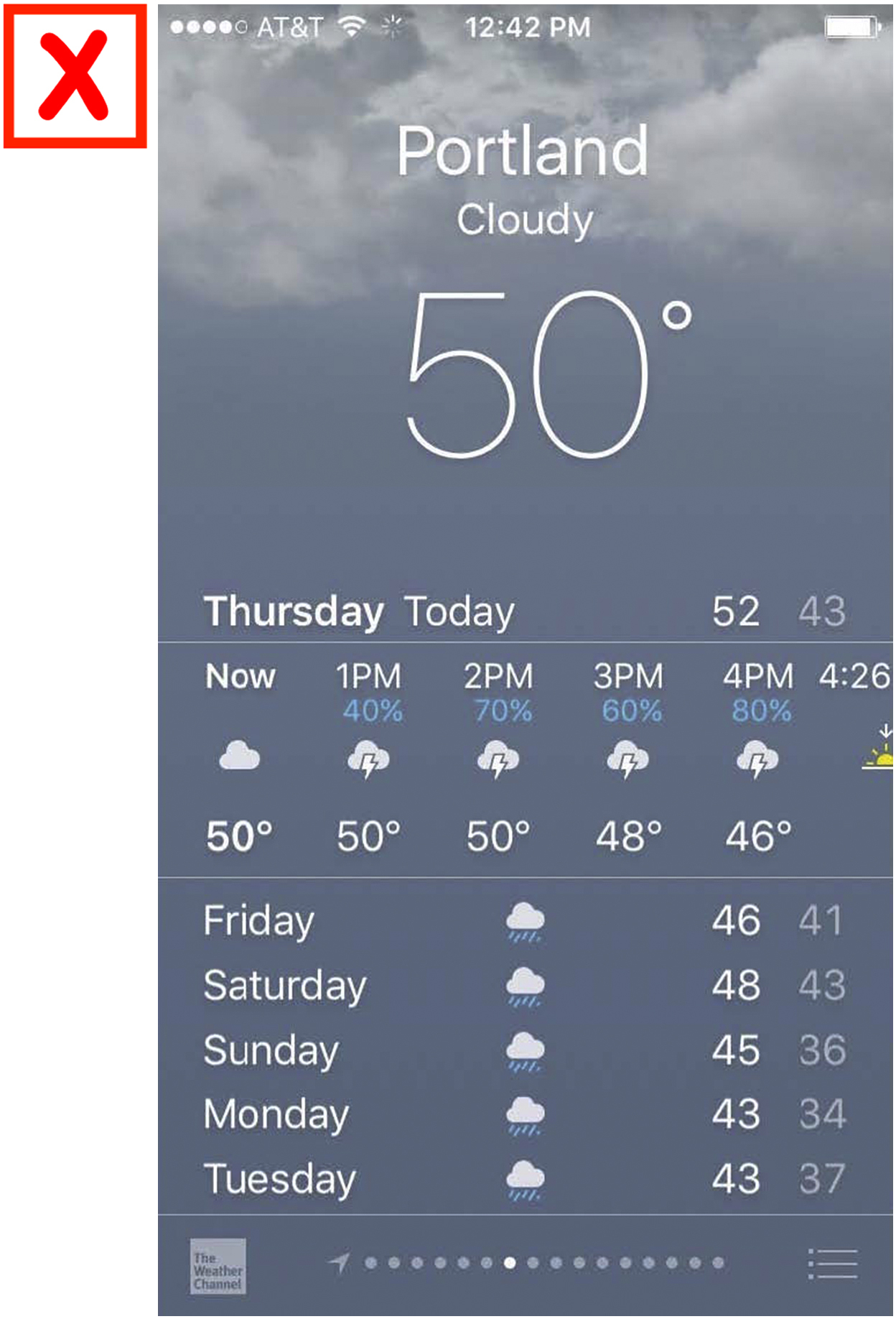


 I discovered the text links on my news website purely on accident. They look just like the regular text, except they are dark blue instead of black. Very difficult to distinguish!
 I keep the screen brightness turned up high so I can read it, and I need good ambient light to see what I’m doing. But then reflections and glare often make it hard to see details on the screen.
 If I am working on the computer and then go outside, the light is just blinding. And then when I go back inside, it takes quite some time before I can see well enough to read the computer screen again.
 The young man at the Apple Store told me that on my Mac, apps that are running have little black dots beneath them. Who can see those? I certainly cannot!
 I like to read everything on the page before I decide what to click on.
 If there’s text scrolling across the screen, I usually can’t read it fast enough. And I don’t know how to stop it or slow it down.
 I often lose track of my cursor on the screen.

 I sometimes have trouble finding something on a page, even when I know it’s there somewhere.