Chapter 8. Designing the application
Design is an integral part of any modern mobile application. Ultimately, it defines the way users are to tap into your application’s functionality. With recent advancements in design philosophy, through Apple’s iOS 7 platform, Android Lollipop, and Google’s Material Design, design is now at the forefront of how users engage with applications. Numerous frameworks have been built to give developers the toolsets and guidelines they need to enhance user experience while unleashing the full potential of their application’s capabilities. In keeping in touch with the growing importance attributable to proper design principles, Ionic provides numerous tools in the form of components and icons with the intention of enriching the usability of developers’ applications.
Before jumping into how TrendiCity is designed, we will begin by exploring the tools offered by the Ionic SDK and how they can be applied in your applications to facilitate the design process.
Essentially, Ionic provides customizable building blocks in the form of layout components, built-in animations, a unique iconset called Ionicons, as well as multiple AngularJS directives and services. To top it all off, the SDK has been built with extensibility in mind, letting you easily adapt the behavior and look of the numerous precompiled assets through the use of Sass variables and mixins, saving you from the hassle of writing huge chunks of styling code.
Layout components
Ionic comes with a set of UI components that are great for handling the layout of your application. The fundamental utilities you will become accustomed to when building mobile applications are: ion-header, ion-content, and ion-list. These AngularJS directives are components built by the Ionic team for your convenience and should be regarded as building blocks to quickly generate the basic implementation of your application’s navigation, look, and feel. In their most basic states, the provided Ionic components are built on top of a robust collection of extensible CSS classes such as bar, content, and list. These CSS classes will become useful in the future when trying to create custom directives of your own or simply modifying the look and feel of certain user interface elements.
With its vast array of styling classes, Ionic lets you quickly use HTML tags you’re used to working with, and make them look fit for mobile. An emphasis has been put onto the organization of your application’s actionable elements, such as: buttons, lists, list items, forms, and input fields. With the inclusion of wrapper classes, notably list, button-bar, card, and item, Ionic can in essence take care of your components’ arrangement.
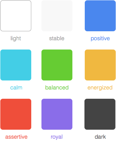
A predefined set of general design utilities have been provided and encompass colors, spacing, and animations. In total, nine colors ranging from assertive to energized have been defined and can be found in www/lib/ionic/scss/_variables.scss, which comes as part of the Ionic source code. For your convenience, here is the full list of colors and their associated values:
$light:#fff!default;$stable:#f8f8f8!default;$positive:#4a87ee!default;$calm:#43cee6!default;$balanced:#66cc33!default;$energized:#f0b840!default;$assertive:#ef4e3a!default;$royal:#8a6de9!default;$dark:#444!default;
Moreover, background classes have been defined with the latter color names prefixed. For example, a red background can be achieved by applying the assertive-bg class.
Later in this chapter you will learn how to use Sass to override Ionic Sass variables, such as the values of different colors delimited by !default. Overriding variables is an effective way of changing the look of built-in components without needing to write additional styling code.
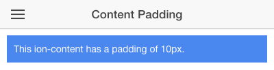
Content spacing has been simplifed with the inclusion of CSS classes in the form of rows, columns, and padding. These classes provide consistent spacing sizes that are applied throughout Ionic and its various components. The row and col-prefixed classes allow for easy grid-like organization of your app’s content. They are built on the new CSS3 flexbox standard, and function as “flexible boxes” that take the maximum amount of space possible without skewing its inner content. Moreover, these classes are easily extensible since they rely heavily on variables to maintain consistency. For instance, the inherited value of padding-prefixed classes is defined by the $content-padding variable, which by default carries the value of 10px. It suffices to modify the $content-padding variable to affect the entire layout of your Ionic app.
Further information and use cases about the Sass customization of design components used in the TrendiCity app will be provided in the Using Sass in TrendiCity section of this chapter.
Designing TrendiCity
In developing TrendiCity, we decided to restrain ourselves to mostly using core Ionic components in order to show the enormous breadth of design opportunities that comes packaged within the SDK. Fundamentally, this goes to show that Ionic is suitable for creating compelling mobile user interfaces without having to specify your own styling.
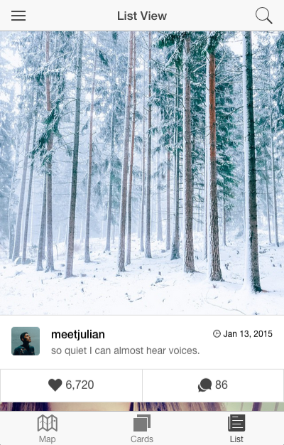
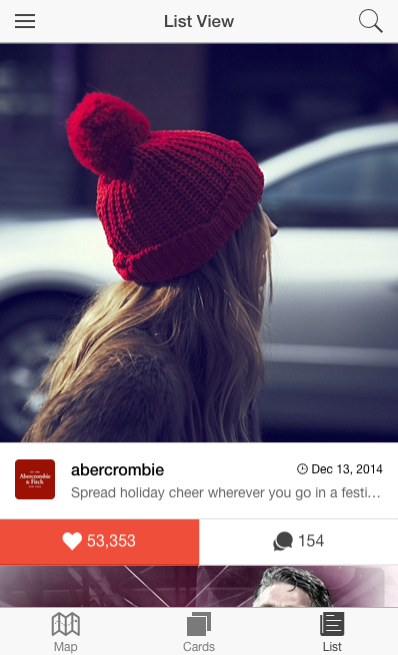
The utility classes mentioned in the previous section can be found scattered throughout our application. One particular use case of built-in color classes can be found in the tab-list view where we apply the button-assertive class in order to highlight the “Like” button in red whenever a user likes a post:
<divclass="button-bar bar-light"><buttonclass="button"ng-click="like($index)"ng-style="{ 'button-assertive': post.user_has_liked }"><iclass="icon ion-heart"></i>{{ post.likes.count | number }}</button><buttonclass="button"><iclass="icon ion-chatbubbles"></i>{{ post.comments.count | number }}</button></div>
Another interesting thing to note is the use of the has-header class on most ion-content tags. This class pushes the view’s content down by 44px (by default) and serves as a way to ensure the visibility of the application’s header bar. In most cases, you could define a header bar yourself and not have to apply the has-header class on the content that follows, similar to what we did in the login modal view. However, since the majority of our views are either children views of a side menu or tabular navigation structure, we push the ion-view’s content down by the size of the detached navigation bar defined in either home or menu views. Note that Ionic recently added a new attribute named has-header which, when set to true, applies the has-header class automatically. It is up to you whether you prefer applying the class directly or passing by the defined attribute as both end up outputting the same result.
Ionic supports many developer-friendly shortcuts when using core components. These alternative ways of implementing certain features in your application can shorten the amount of markup required to create, say, a button with an icon. One straightforward way of creating such a button would be to define the button tag and the icon tag separately and including the latter in the former, like this:
<buttonclass="button"><iclass="icon ion-navicon"></i></button>
A shorthand way of defining these types of buttons can be achieved by applying the button-icon class and including icon-specific classes within the same button. An example of this situation is located in the home view’s navigation buttons, where we defined the menu button as so:
<buttonmenu-toggle="left"class="button button-icon icon ion-navicon"></button>
Note the use of both button-icon and icon classes within the button to achieve this effect.
Ionicons
Ionic comes packaged with a custom font that serves as an iconset for your apps. In essence, Ionicons is a font built by the Ionic team for use as icons. Similar to other common alternatives on the web, such as Font Awesome, Ionicons enhance the visual appeal of your apps and are meant to be used to guide the user through the various actionable elements contained in your applications. The benefit of Ionicons is its ability to scale in size while maintaining the same high-fidelity image. Since it is fundamentally a font type, you can manipulate it using stylesheets like any other font, meaning you can increase the icon’s size with the font-size property in CSS. Furthermore, additional Ionicons are regularly provided with new Ionic releases.
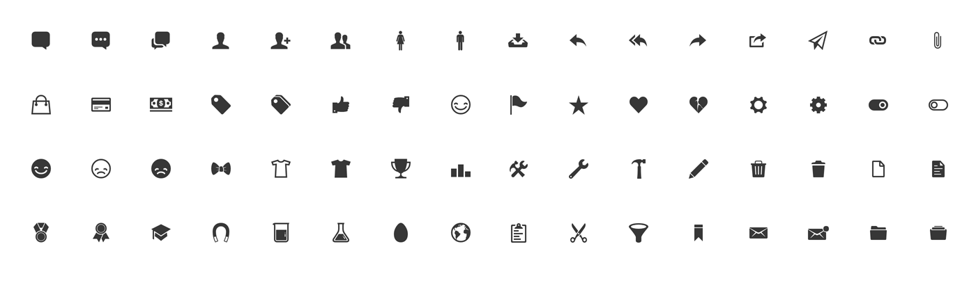
The iconset consists of four main collections: generic (platform independent) icons, iOS 7, and Android inspired icons, as well as a handful of social media icons. Ionic also provides a CSS class aptly named icon, which allows you to incorporate the full-breadth of Ionicons in your app’s UI components. For instance, to display the login icon in our app’s side menu we used the HTML icon tag in the following manner: <i class="icon ion-log-in"></i>.
Ionicons also feature CSS3-animated icons excellent for use as loading indicators. We used the loading icons in the default $ionicLoading template as can be seen in www/js/app.js:
.constant('$ionicLoadingConfig',{template:'<h3><icon ios="ion-ios7-reloading"android="ion-loading-c"default="ion-refreshing"></icon></h3>Loading...'})
Due to Ionicons’ nature as a font, you must place the provided Ionic fonts in the www/fonts directory to assure the proper functionality of your Ionic app. In TrendiCity, our fonts path has remained unchanged from Ionic’s default side menu project template. Given that the Ionic SDK is provided inside of the www folder, we can simply point to the fonts located at www/lib/ionic/fonts. However, this path must be relative to your CSS files. In our case, given that our CSS files are found in the www/css directory, the appropriate font path would be ../lib/ionic/fonts. Note that by default, when creating an Ionic project from the three main templates (blank, sidemenu, and tabs), the correct font path should already be defined. Similarly, when setting up a new project using Sass by doing $ ionic setup sass, the font path will be accurate as well.
Creating native-looking applications
To make your application stand out, we recommend using a combination of the provided ionic.Platform and its isIOS() and isAndroid() functions to determine the mobile device’s operating system, and display the corresponding icons to really achieve the native application look. Moreover, you could incorporate a custom directive to automatically select the appropriate icon depending on the platform. In our app, we have provided you with an Angular directive created by Anton Shevchenko, one of our authors, located in lib/ionic-contrib-icon/ionic.icon.js, which allows you to specify different icons depending on the platform. For example, one use case can be found in our app’s side menu: <icon ios="ion-ios7-home" default="ion-home"></icon>. In essence, this directive checks the current device’s platform using ionic.Platform and then applies the corresponding icon provided by the ios, android and default attributes. Note that you should always include a default icon, which will be applied during development in browsers or if no particular icon has been defined for the current device’s platform.
Customizing Ionic with Sass
Ionic is built with extensibility in mind. From the ground up, Ionic uses Sass as its preferred compiler for CSS styling, enabling developers like you more flexbility in terms of overriding the provided default styles. All variables used by the Ionic SDK have been conveniently defined and assembled in one file located at www/lib/ionic/scss/_variables.scss. Moreover, the variables are organized by the components that they target such as: buttons, bars, lists, forms, input fields, and more. In turn, doing things like changing the default height of all buttons in your app can be painlessly achieved by redefining the $button-height variable. Neat!
In this section, we will explore how you can employ Sass to easily adapt Ionic’s component styling to your app’s needs.
Overriding Ionic design with Sass
Knowing that Ionic’s styles are all written in Sass, the predefined classes of the SDK can be effortlessly integrated in your project by importing them using @import "www/lib/ionic/scss/ionic";. Looking at Ionic’s Sass variable definitions located at www/lib/ionic/scss/_variables.scss, we can notice the appended !default rule included with each variable. This allows you to specify a value of your choosing which will be applied instead of the default values specified in Ionic.
The proper way of going about overriding these variables is to specify their values before importing Ionic into your project. For instance, you could add the following to your main Sass file to enlarge the default text font size and lighten the character weight of headings:
//Definevariablevalues$font-size-base:16px;$headings-font-weight:300;//ImportIonic'sstyles@import "www/lib/ionic/scss/ionic";
These values will replace the corresponding !default values defined in Ionic’s _variables.scss file.
Furthermore, Ionic provides scores of Sass mixins that work like containers of reusable CSS styles and can be included with the @include keyword in your own Sass files. These blocks of code can act as “helper functions” as they can be passed parameters to generate the styling you want. Once again, Ionic has defined all of its mixins in one conveniently named file located at www/lib/ionic/scss/_mixins.scss.
Looking at some of Ionic’s source code, we can see integral mixins being used by core components such as buttons, bars, list items, tabs, and animations.
In order to become more familiar with how Ionic’s mixins can be used, let us examine how the button-light class works by applying various mixins. Knowing how to properly use mixins will prove very important in our implementation of the vertical-center class defined in the next section of this chapter.
Let us begin by extracting the pieces of styling attributed to the button-light class:
.button{//setthecolordefaults@includebutton-style($button-default-bg,$button-default-border,$button-default-active-bg,$button-default-active-border,$button-default-text);...&.button-light{@includebutton-style($button-light-bg,$button-light-border,$button-light-active-bg,$button-light-active-border,$button-light-text);@includebutton-clear($button-light-border);@includebutton-outline($button-light-border);}...}
We notice that button-light is nested in the button class with an appended &. Therefore, this class will only be applied on a component whenever the button class is also present. For instance the following will not work:
<buttonclass="button-light">Click Me!</button>
On the other hand, applying the button button-light classes will generate our desired effect properly:
<buttonclass="button button-light">Click Me!</button>
The default button class is important as it includes the button-style mixin which will define the general look of an Ionic button by passing the $button-default-bg, ..., $button-default-text arguments into the button-style mixin:
@mixinbutton-style($bg-color,$border-color,$active-bg-color,$active-border-color,$color){border-color:$border-color;background-color:$bg-color;color:$color;//Givedesktopuserssomethingtoplaywith&:hover{color:$color;text-decoration:none;}&.active,&.activated{border-color:$active-border-color;background-color:$active-bg-color;box-shadow:inset0px1px3pxrgba(0,0,0,0.15);}}
Consequently, after having compiled the code with Sass, the final output of the button class will look like this:
.button{border-color:#b2b2b2;background-color:#f8f8f8;color:#444;//Givedesktopuserssomethingtoplaywith&:hover{color:#444;text-decoration:none;}&.active,&.activated{border-color:#a2a2a2;background-color:#e5e5e5;box-shadow:inset0px1px3pxrgba(0,0,0,0.15);}...}
Note that, by default, Ionic uses the button-default colors for the button class. Knowing that all variables, including the colors, are defined in the _variables.scss file, it becomes a breeze to change the colors of the default button by simpy overriding the $button-default-prefixed variables to colors of your choosing, without affecting other button color classes.
The walkthrough we just did was only for the button class, not the button-light class. However, with our accumulated knowledge of mixins, we may conclude that the same concept applies to the button-light class, with $button-light-prefixed variables being sent as arguments to the button-style mixin.
Additionally, button-clear and button-outline mixins are included to define the light button’s look when applied with the button-clear and button-outline classes.
With our knowledge of mixins, and with further accommodation to Ionic’s Sass structure and variables, you will become accustomed to integrating these handy shortcuts at your choosing to cut down on the amount of code required to style components.
Lastly, compiling your Sass code can be achieved by setting up your project using the following Ionic CLI commands:
$ionic setup sass$gulp sass
By default, setting up Sass this way will cause your .scss files located at scss/ to be watched automatically and recompiled when running your app using $ ionic serve. In essence, the gulp sass task is automatically run and the scss/ directory is watched whenever developing locally. These tasks and watch patterns are defined in the ionic.project file. Feel free to add or modify the existing tasks to be executed when serving your app to the browser.
Using Sass in TrendiCity
Integrating Sass into our application was fairly easy to do. In order to work and compile Sass styles, we simply used Ionic’s built-in setup by running $ ionic setup sass in the terminal. This command creates a top-level directory named scss/ and by default includes an ionic.app.scss file which imports the Ionic Sass library and configures the font path automatically. We created new Sass files as we needed them by prefixing the filenames with an underscore and importing them in the main ionic.app.scss file.
In terms of structuring, we settled on a similar approach to Ionic’s Sass styles structure, through organizing our files by the components they target as well as grouping all variables in _variables.scss file.
Including Sass in our project gave us access to all of Ionic’s mixins and variables. This way our styling could be consistent with predefined values of the SDK. For instance, we used the $light variable as the popup’s background color. Our overridden slider-slide class applies the $font-family-light-sans-serif font.
Moreover, our design goal for the login modal was to center the content in the middle of the view. To go about this, we could have created a custom directive to calculate the total height of the screen and adjust the positioning of our content accordingly. However, we decided to go with a cleaner CSS-only approach leveraging the new flexbox standard:
.vertical-center>*{display:-webkit-box;display:-moz-box;display:-ms-flexbox;display:-webkit-flex;display:flex;-webkit-box-direction:normal;-moz-box-direction:normal;-webkit-box-orient:horizontal;-moz-box-orient:horizontal;-webkit-flex-direction:row;-ms-flex-direction:row;flex-direction:row;-webkit-flex-wrap:nowrap;-ms-flex-wrap:nowrap;flex-wrap:nowrap;-webkit-box-pack:center;-moz-box-pack:center;-webkit-justify-content:center;-ms-flex-pack:center;justify-content:center;-webkit-align-content:stretch;-ms-flex-line-pack:stretch;align-content:stretch;-webkit-box-align:center;-moz-box-align:center;-webkit-align-items:center;-ms-flex-align:center;align-items:center;}
Looking at this block of code, we tried to simplify it. This is where examining the various mixins available in the Ionic SDK as part of the previous section really pays off.
Finally, we applied the necessary Sass mixins and reduced our initial styling to something a lot more reasonable:
.vertical-center>*{@includedisplay-flex;@includeflex-direction(row);@includeflex-wrap(nowrap);@includejustify-content(center);@includealign-content(stretch);@includealign-items(center);}
This is a great example of the uses of mixins and especially the vast range of available tools Ionic offers to developers. If we hadn’t peeked at Ionic’s source code, we would have stuck with the initial block of code, or would have reserted to creating our own mixins. However, it is always recommended to reuse code as much as possible, like in this case.
Also noteworthy to mention is the similarity between our approach towards vertical centering and how the Ionic popup and loading components are centered on screen. Taking a peek at the source code, we find that both the popup-container and loading-container classes include three of the mixins we did in our vertical-center class:
.popup-container{...@includedisplay-flex();@includejustify-content(center);@includealign-items(center);...}....loading-container{...@includedisplay-flex();@includejustify-content(center);@includealign-items(center);...}
To wrap up, the integration of Sass in TrendiCity allowed our styling code to become more coherent as we took advantage of Sass’ selector nesting, used the provided Ionic mixins and variables, and defined our very own reusuable variables, such as $login-margin and $list-margin.
Gotchas
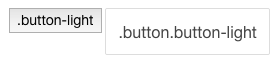
It may occur to you that in some instances Ionic’s default styling does not align with your intentions. For instance, knowing that the $light color is assigned the color white by default, you would assume that a clear light button would be white when defined like so:
<buttonclass="button button-clear button-light">...</button>
However, looking at Ionic’s Sass source code, you will see that the combination of button-clear and button-light classes will apply a color defined by the $button-light-border variable.
For our login modal, we wanted to have a clear white button on the top-right corner. To achieve this, we added the following Sass styling in our _button.scss file:
.button{&.button-light{&.button-clear{color:$light;}}}
Here is a before and after comparison:
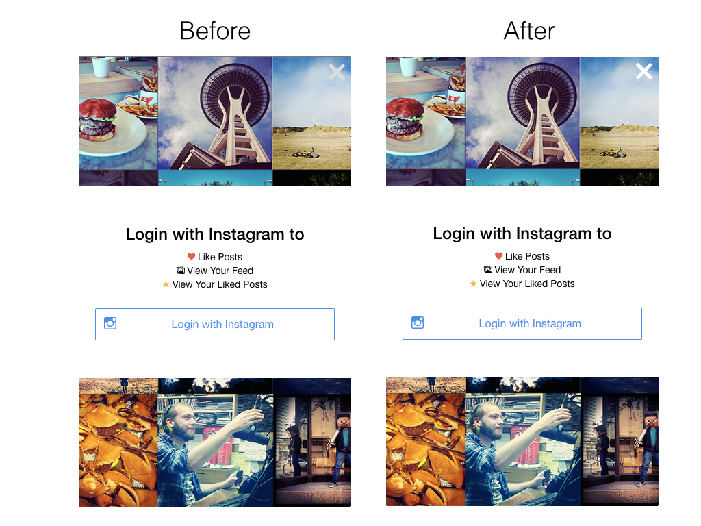
Instead of writing our own class for this particular situation, we could have simply overriden the $button-light-border variable to contain the value of the white color. No other changes would have been required. However, note that overriding any Ionic variable may impact other components because these variables are used throughout the SDK’s Sass styles. In this scenario, a notable change would be that the side menu’s items border would blend with the white background of the menu view, which is why we opted to solely override the combination of button-clear and button-light classes.
Many new directives have been integrated into the Ionic SDK such as ion-content, ion-list, ion-item, and ion-checkbox to name the common ones. It is always important to consider them as predefined building blocks, which are meant to improve workflow and efficiency. Flexibility is inherently limited with these directives because of the their nature of following a predefined structure. These components are built on top of the robust collection of CSS classes such as content, list, item, item-checkbox, and checkbox, which can always be assembled in various ways by yourself to achieve the look and feel you require.
Another frequently-mentioned problem pertains to particular scenarios that have caused weird issues with Ionic’s JavaScript-based scrolling system. In essence, in particular situations, the scroller might not display the complete view contained in the ion-content section of your template, cutting off the bottom of the container (usually) by a few pixels. In fact, it has been determined that it was precisely the amount of pixels defined by the margins applied with components such as buttons and paragraphs. Based on the amount of activity on Ionic’s forums, this issue has been faced by a significant amount of people and is deemed relevant to reveal in this chapter. One fix that has been proven to work is to apply padding to the containing ion-content directive, or to wrap all your components in a div with the padding class.
An additional issue affecting the scrolling system is the use of ng-hide and ng-show attributes, again in particular cases only. For instance, hiding or displaying components when your content overflows the screen may cause the scrollable view to not refresh the scroller’s vertical position. This is where the provided $ionicScrollDelegate’s resize() function comes in handy. This function recalculates your content’s actual size in the view, and adjusts the scroll position accordingly.
Bugs aside, the team behind Ionic and the broader open-source developer community are constantly fleshing out these issues, so no worries!
Extending Ionic
Ionic’s greatness is not only defined by its ease of use, plug’n play components and other provided help in the form of forums and documentation. The community is what really makes it stand out compared to other hybrid mobile development SDK’s and frameworks. In terms of components, the community has seen the advent of skillful component implementations which purposefully enhance the functionality of Ionic apps. In fact, numerous developers have contributed by providing great design additions that build upon Ionic’s solid base. In essence, these contributions are extensions of the core SDK.
Noteworthy additions include ionic-contrib-swipe-cards, ionic-contrib-ios-rounded-buttons, ionic-contrib-header-shrink, ionic-contrib-frost and a new iteration of swipe cards called ionic-contrib-tinder-cards just to name a few. Interestingly, during the development of TrendiCity, our very own Keith D. Moore enhanced the tinder-cards functionality, which ended up being used in our app’s card view!
Lastly, we recommend harnessing AngularJS’s power to your advantage in order to build upon Ionic’s core functionality. Create custom directives and services to unleash the full capacity of the Ionic development platform.
Summary
In this chapter, we focused on Ionic’s design components, exploring the vast array of provided styles, tools and building blocks available to hybrid mobile app developers. Because Ionic’s official documentation as yet does not include every one of the interesting components we unearthed, there is immense benefit to examining the source code. For example, background color classes and numerous mixins will probably be useful in the future. We also touched upon the Sass compiler technology, which greatly enhances workflow and can reduce code with the use of mixins and variables. Finally, we delved into the integration of Sass with Ionic in the development of the TrendiCity application.
In the next chapter, we will familiarize ourselves with the Instagram API and find out how TrendiCity works in order to fetch posts based on location and popularity, as well as handling user actions such as liking images.